#it baffles me that tumblr staff is making the site worse instead of better
Explore tagged Tumblr posts
Text
one of the worst things about the beta editor is that when you come back to edit a post, the layout and formatting are all over the place.. and it takes ages to fix all that :')
#it baffles me that tumblr staff is making the site worse instead of better#instead of fixing the community labels thing to increase interaction#or making sure ppl DO NOT leave#they are literally running users off this platform smh#like no damn clue how im gonna post long chapters and long oneshots in the future#sigh
7 notes
·
View notes
Text
New Desktop Dash, No Bueno
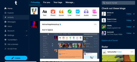
Okay so, new dash layout on desktop.

As seems to be a common reaction: not a fan.
Let's talk about some of the issues:
1. Really visually cluttered
The new sidebar crowds out the dashboard content and the bright blue popup notifications (now at the side AND top) and create-post bar pull your eyes in different directions. There is no space for the eye to rest on anymore - it's all noise. The end result is that everything flattens - there's no focal point anymore.
It's also pretty overwhelming - even for someone like me - so I can't imagine it would be very user-friendly to someone who was photosensitive or struggled with visual overload (especially when paired with the high-contrast 'true blue' default site palette and animated icons for the changes-on-tumblr/staff-picks/trending buttons).
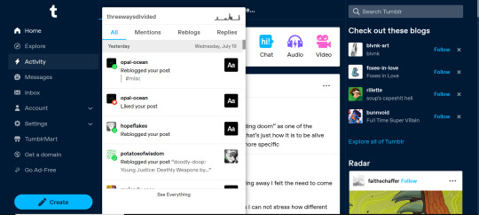
2. The activity pop-up now covers dashboard content

This is really bad from a usability standpoint. In the old layout the activity pop-up used to drop down over the recommended blogs sidebar. Now it actively gets in the way of looking at core content. The dash is why we are here, burying it like this is baffling.
The search bar now drops down over the recommended blogs banner instead, but where the old design had non-critical space on each side of the dashboard to visually allow both features to pop in, this new layout is way worse for efficiency. And for what? Having a rarely-used former drop-down menu now permanently active? The old banner with quick-links for the key use-features (notes, messages, askbox) made much more design sense.
It also means that the activity pop-up gets now completely covered by the blog pop-up that opens when you click the notification, so double demerit there. 0/10.
3. It's harder to navigate to the activity page, and the new page-stretch means you can't see new notes without scrolling down

That first bit is kind of a nitpick but cramming the 'See everything' link down at the bottom of a browser window isn't a great navigation choice. (Again, the visual signifiers and eye-direction in this new design are incredibly poor.)
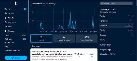
That the main activity page now requires you to scroll to even see the top note due to the new display ratio is really egregious. It makes another key site feature just slightly less convenient and accessible in a very irritating way. Bad choice.
4. The new ratio pushes the Radar and Main Sponsored slot completely off-screen
This one is directed the tumblr staff: that's also a bad choice, guys. That's your main ad-slot for people loading into Tumblr so hiding it is going to hurt both your ad-impressions and your ability to promote the ad-free option. The new layout ratio also means that the in-dash ads are going to be a lot more invasively screen-filling - and let's be real most users will either add-block or leave before purchasing ad-free. I have no idea what the new layout is trying to achieve but if ad optimisation is the goal then this ain't it, chief.
To be honest I cannot comprehend the rationale for this change. I guess it's visually a bit more like Twitter... but that site is currently being demolished from the inside by poor management decisions so maybe it's not the best aesthetic to be aping.
Well then, what do?
Okay so, new dash bad. And so, in true Tumblr spirit: we complain. However, to get results we must deploy the art of kvetching productively.
If you want the old dash back (or at least, a better new-dash design that corrects some of these big weaknesses) what you should do is head over to https://www.tumblr.com/support and lodge a feedback ticket pointing out the problems. The more users who do that, the more likely you are to see an effective response.
Remember, tagging @staff and @support in posts won't fix this. There's no guarantee they'll see it among the notes barrage.
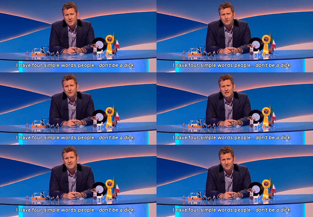
Also: please don't be rude or abusive when you lodge tickets. Whoever is manning those blogs and inboxes probably isn't the person who forced through this change. Save an intern, be polite.

Go forth in disgruntlement to keep this hellhole a hellhome.
#tumblr#tumblr problems#new dashboard#yes it's bad#but there is a way#I've already lodged tickets about it
1K notes
·
View notes
Text
Unpopular opinion, but the thing about the porn ban I’m mad at isn’t the ban itself. Like...yeah, it’s really stupid and petty, but if they want to make the site “family friendly”, then...sure. Whatever. You do you. It’s not like there aren’t other places I can go to for anime tiddies.
What pisses me off is how poorly-implemented the ban was. Not only did absolutely nothing to fix the actual issue it was claiming to be trying fix (i.e.; the various porn bots infesting the site), but countless other sites, some of which had little to no “suggestive content” posted, were flagged by a piss-poor algorithm that can’t tell the difference between a female nipple and a random cat.
Hell, there have even been people who have had posts and/or their entire blog flagged...not because they themselves posted something that was “sensitive”, but because a random person whose blog was flagged might have reglogged it from somewhere down the line. And that’s not even getting into how much of the actual porn still went untouched by the ban. Not talking porn-bots; people straight-up posting porn, but the shit algorithm just flat-out not catching it.
And despite how much of a glaringly-obvious failure it was, @staff has done jack shit to address any of it. Instead, they’re just passing it off to whatever their name is who owns WordPress and letting it be their problem. I’d like to think that they’ll at least try to fix the issues brought about by the ban itself, but it’s still disappointing that they don’t plan on lifting it.
Like, you’d think that they’d want to make an effort to at least try to appease the countless people who were straight-up alienated by the ban. But...apparently not. Now, I never used WordPress, so I don’t really know anything about it. But apparently, they allow adult content on there...which makes the decision to uphold the ban all the more baffling. Why allow it on there but not on Tumblr?
...so yeah. Basically, all of this is just a long and roundabout way of saying that I’m kinda disappointed that Pornhub didn’t end up buying it, ‘cause they legitimately (if not ironically) would have made some changes for the better simply by removing the ban.
But...I dunno. We’ll see. From what I can tell, the WordPress guys seem to at least know how to run a site (which is more than I can say for the idiots who have been “running” this site for the last several years), so maybe they’ll be able to at least make this site less of a raging dumpster fire. And maybe they’ll change their minds about not lifting the ban.
All I know is, with how far this site’s fallen, it’s hard to imagine how anyone could possibly make things worse than they already are...so...hopefully, there’s nowhere to go but up.
*immediately goes to knock on some wood*
0 notes