#is not a 3d platform player
Explore tagged Tumblr posts
Text
So, um, yeah, Infinity Nikki.

User Name: BabyBat
Stylist ID: 600705073
UID 600705073 America
I’m doomed. 😊
#infinity nikki#pretty pretty dress up#and the power of dead gods#usual stuff#btw#this filthy casual#playing on mobile#is not a 3d platform player#i see trampolines#i start yelling at my phone
3 notes
·
View notes
Text


.50 Caliber 3D Platformer Post #6
More UI More UI More UI More UI More UI:
This week has mostly been even more UI. I had a lot of fun getting the health UI put together, so I was itchin' to make some more in a similar style. I decided to knock out the ammo remaining UI (which was a long time coming), and the UI that pops up to tell you which token you've just collected. I'm happy with how they came out, so let's talk about them.
Ammo UI:
The ammo UI is something that I really struggled to visualize. I came up with several concepts on pen and paper ranging from an elongated CRT to a barrel that has each bullet slid into it, but none of them made mechanical sense, in that they wouldn't properly work with how reloading works in the game. Eventually I said fuck it and just started slamming together something more abstract. I started with a half tube and placed the 50 cal shell inside. I then started to greeble it up and realized that having a screen to indicate the number of remaining shots left would be handy. I then also realized that a few of the greeble circles I placed would house some little indicator lights nicely, so I slapped those in there as well. The player starts off with a single shot, but as the game progresses they can up their clip-size to 3, so I needed the UI to reflect the player being able to have that much ammo. Most of my designs were built around the idea of somehow having 3 different shells that would be loaded individually, but it always ended up taking up too much space, so the simplicity of the screen ended up saving the day. In the end, the shell that remains a part of the UI is more of a visual indicator as to what the UI is meant to represent, which I think works well enough.
Token Pickup UI:
I struggled for a while to think of what I wanted to pop up on screen when the player obtains a token, but I eventually settled on a mechanical screen of some kind. The inspiration for this one came out of nowhere. A windows update uninstalled all my windows media player skins, so I went into my big folder full of skins and just randomly selected one to install. The one I landed on is called Underworld and it looks like this:

My immediate reaction was something like :O, and I was immediately struck with inspo. I based the entire design of the slidey screen off this thing and it ended up looking like this:

It is pretty low detail compared to the other UI pieces I've made, but I thought it had its own charm that way and decided not to touch it.
Conclusion:
I have been sick af lately, and it sucks! I've been spending most of my time workin on this and playing the system shock remake while making a slow but steady recovery. I'm currently at the point where I can start replacing the whitebox with proper environment art, and I'm really excited about that. The next update should be all about that, so I'll see u then. Ty 4 Reading, have a good day
#screenshotsaturday#indiegamedev#gamedev#indiedev#game development#indiegames#y2k#y2k aesthetic#3d platformer#3dplatformer#sniper rifle#windows media player#50 caliber 3d platformer#50 cal
89 notes
·
View notes
Text
been a few weeks since i posted any progress on this. i'm having so much fun working on this thing. look at the lil guy move
#godot#3d platformer#game dev#if you're wondering why it's so dark it's because the game is about climbing out of a giant pit#it starts out dark at the bottom and as you climb up the shaft it slowly gets brighter#i'm trying to strike a balance between having the cool dark aesthetic while also making sure the player can actually see what they are doin#its really hard
6 notes
·
View notes
Text
At the risk of revealing I know very little about things in general, I really don't understand why Nintendo is shutting down online support for the 3DS/Wii U? Or that like, they can even Do That? Cause like, to me it makes sense that they'd have control and the say-so on the eShop, that's like, something they run as a company and Yes it absolutely sucks ass they nuked it for profit but like. Idk if I'll even phrase this right LMFAO but it seems like something they run themselves so it makes sense that they have complete authority over it. It's in their jurisdiction.
But like??? In my mind, if you have A Device that can connect to the internet it just. Should? Like I don't need a phone plan/data to use my old phone as a Youtube running device, as long as I'm connected to the internet. Like, the internet is a third party almost, one that you pay for personally and separately from any device you can use it with. I don't understand how Nintendo can intersect that and cut it off for their devices, specifically. Like, even if they have servers??? Idk how any of that works tbh I was just under the impression that if you have a device that you own and internet access. It's just those two things. Maybe it gets more complicated when it comes to games like Splatoon, but still....
#nintendo 3ds#wii u#no idea like. how else to tag this LMFAOO#i know jack about shit. full disclosure.#but like are they just being the apple of the gaming industry or am i missing something??????#any which way it's a huge bummer. and it's gonna make some games like entirely unplayable actually#LIKE. yeah there is a single player campaign in splatoon that's a platformer.#but it is seriously SUCH a small part of the game. it is Not the main point of the game. so like as far as platformers go#you will be getting WAY less out of it than like. any dedicated platformer game. mario. sonic. ect.#WAIT DON'T YOU HAVE TO BE CONNECTED TO THE INTERNET TO BUY CLOTHES TOO......#you don't even get to play dress up with your inkfish. unbelievable. unplayable.#and like. personally i only own splat 3. but i do feel like this is still devastating news and a premonition of things to come long term 💔#and don't even get me started on pokemon LMFAOOOOO#also hearing the bad news in how it effects 3DS FEs but i'm actually not super familiar w the online stuff there#it WILL be disappointing to not be able to add more avatar charas to your roster for funsies. i gotta get that sorted.#SAD.
7 notes
·
View notes
Photo

Frogun
As we’re currently in a retro revival trend for fifth gen console games, specifically platformers, there’s no shortage of options for a nostalgic buzz. What makes Frogun stick out from the pack, though, is that it doesn’t have the same sort of inspirations as the majority of the crowd. Instead of Mario 64, Banjo-Kazooie, or one of the PS1’s major platformer hits, Frogun is more interested in giving a new stab at the attempts of the middle market, particularly Chameleon Twist. The end result is something that feels unique while dressed in old school aesthetics.
Read more...
#Hardcore Gaming 101#Jonathan Kaharl#Review#Frogun#3D platformer#platforming#3d action game#mascot platformer#Xbox One#new retro#Nintendo Switch#female player character#PlayStation 4#PS4#PlayStation 5#PS5#swinging#grappling#Windows#Molegato#Top Hat Studios#video games
16 notes
·
View notes
Text
just woke up from a dream where i was playing a video game where every time you jumped, you would swap to a different character, and it was one of those kinds of like. sonic and mario at the olympics type crossover games. so it was dozens of completely different characters you could swap to at complete random. each character had their own physics as well so you'd have to adjust as the character's handling changes. and i only remember playing as shadow the hedgehog for a little bit and then jumping and the next guy i was playing as was a lego game character but i noticed he had the same voice actor as sonic and i thought that was kinda funny
#also the game was a 3d platformer in the style of like. newer mario games#which is weird bc ive literally never played a 3d mario game ever in my life. or anything like it#the only game ive ever played that was even slightly close to a 3d mario game is spyro the dragon and that's not quite it#the game in the dream controlled a bit differently and the camera was zoomed out a lot more (bc of some of the larger player characters)#and the camera didn't quite follow behind the player it was more at a fixed position following around the map#like it was Always facing the same direction kinda
1 note
·
View note
Text
i need a new epic mickey 2
#two player couch coop character/story-based 3d platformer that ican be insane about#especially with the branched quest options which make for dozens of replays#no other multiplayer game is good enough#lego incredibles was pretty good tho#we wrung every drop out of that one too though#video games#epic mickey
0 notes
Text
Implementing strict out-of-bounds checking in my 3D platformer, but instead of actually forbidding the player from going out of bounds I just use it to create a demon that chases you around the OOB space, and if it catches you it engages you in a lengthy unskippable dialogue about the tabletop RPG it's writing, thereby killing your speedrun.
6K notes
·
View notes
Text
nick all-star brawl 2 looks fun and goofy i kinda want it
i didnt play the first one but i liked watching other people play it
it feels like theyre trying to make it a lot more smash-like? by adding dodges and changing shields and other stuff
#& iterested in all the single player stuff which could be fun#i always wished smash had better single player stuff aside from subspace and smash run on 3ds..#i wouldve really loved if board the platforms or break the targets ever came back.. even if it was like brawl and every char shared levels#you could still speedrun them with each character and try to get high scores or whayevr#i really enjoyed home-run contest in smash 4 though idk why .. my fav thing was doing it without the bat
0 notes
Text
I'm like actually pretty good at fall guys but it's a curse bc playing squads/duos usually means that I get dragged down by my partner/s and it makes me sad :( I still haven't won a solo show BUT twice last night I was brushing the final finish line when someone just barely beat me
#i forgot how much i love that game#im sooo bad at 2d platformers but im MUCH better at 3d ones#once i get the physics down im golden#i don't have the reflexes for 2d ones#there's one new obstacle course that's so so easy if you just. run thru the middle#but a lot of players don't even try that. which is good news for me! i came in 1st on that one once and 2nd on a different run of it#oough. bouncy beans......
1 note
·
View note
Text
it's wild to see myhouse having escaped the orbit of Doom People, because so much of it specifically riffs on doom in a way that is laser-targeted at Doom People, to the point that i just wouldn't have expected it to be nearly as interesting if you don't pick up on that stuff
right from the outset, "my house" is even a recognizable genre, because doom was among the first approachable platforms for creating a 3D space, and if you give random people the ability to create a 3D space then many of them will just try to recreate their own house. (i want to say jp lebreton even made an effort to play through every house map on the idgames archive at one point, though hell if i can find it now.) there was in fact already a "myhouse.wad", from 1995!
frankly it's incredible that someone (or someones) put so much effort into this map and then had the gall to simply post it on doomworld as "myhouse.wad", because that is a thread title that guarantees the fewest possible people will bother to look. there are posts in the thread where people outright admit that they only checked because they were surprised how many replies a "my house" wad got.
so anyway, okay, the "classic" doom wad experience is that you download a wad, it contains exactly 1 map, and it has zero custom textures or music or other frills. most wads from the 90s are like this; if you're lucky you might get a bad midi rendition of a metallica song. nowadays there are texture artists and musicians and everything collaborating on full map packs, but "just a map" is still kind of the default mapping experience and is recognizable to anyone who's been around doom for sufficiently long.
and myhouse riffs on absolutely every aspect of this:
• the music is the MAP01 music, Running From Evil, which is just the music you get if you supply your own map in the MAP01 slot and do nothing else. so a ton of 90s maps had this same track as their background music, so everyone has heard it a zillion times. it is ingrained into so many people's skulls. subtly fucking with it is a great way to fuck with the player
• the house uses only stock doom 2 textures, or occasionally light modifications of them. again this is just what you get if you make a map and don't supply any other resources, so the stock textures are very familiar. only later, with sufficient poking around, does the map introduce new textures, which really help sell the impression of being swept away to Somewhere Else
• if you take the exit, you go to MAP02, Underhalls. this is the expected experience because doom wads replace what's already there — you're not really supplying a "new map pack" or anything, you're overwriting a map from the original doom 2 progression. (there are ways to fiddle with this now, but in vanilla doom 2, the level progression was hardcoded.) so the "ending" of a no-frills single-map wad is always, always to transition to Underhalls. the opening shot of Underhalls is practically like seeing the credits. so roping Underhalls into the experience is completely unexpected, because Underhalls is the sign that you've escaped back to regular doom
• the super shotgun is "hidden" in Underhalls, in probably the best-known super shotgun location in the whole game, because it's the first time you can get it
• incidentally Underhalls itself feels uncanny, because the player camera height is higher than usual to make the house's proportions feel sensible. (part of the trouble with exact recreations of real spaces in doom is that the camera is weirdly low.) i was actually convinced that myhouse included a modified Underhalls, but no, it's stock doom 2 Underhalls, it just feels off when you're slightly taller
but wait, there's more
• silent teleporters are a feature from boom, a very early doom derivative that added a number of helpful mapping features and is basically considered only half a step beyond vanilla. so shifting between two versions of a space without interruption isn't completely unexpected. it's only later that the portal use becomes more obvious
• although if you're especially canny, you should notice that the second version of the house shows both the upstairs and downstairs windows in full, which is impossible — doom cannot do room-over-room. (in fact this is accomplished with a semi-obscure zdoom feature called sector portals — essentially, the whole second floor and the space outside it are a separate area, and the "ceiling" of the yard becomes a view up through the "floor" of that second space.)
• swinging doors are a hexen feature (polyobjects) that gzdoom inherited. (heretic and hexen were modifications of the doom engine, and zdoom started out as a merge of all three codebases into something that could play all three games.) they might also be in other fancy engines (eternity?), but they are very distinctly not a doom thing. if you're deeply familiar with doom's limitations then they'll jump out at you immediately, but if you're looking at doom like it's any old 3D game then maybe not so much
• recreations of other humble real-world locales are also a somewhat common theme, and remind me in particular of Doom City, from way back in 1995
• a very common desire for players is to "uv-max" a map, i.e. reach the exit on ultra-violence with 100% kills and secrets. if you can't do this, the map is (reasonably) considered broken. it is comically impossible to do this in myhouse, and anyone with the skill to create the map would be acutely aware of this
• the extra weapon frames look to be borrowed from the well-known smooth doom, which adds extra frames for everything and is just pretty dang slick overall. so it's not merely "ho ho, got you, smoother weapons" but specific integration of another familiar project
• this might be reaching a bit, but mirrors are specifically a nightmare in zdoom's software renderer because they work by rendering all visible geometry as if it were physically present on the other side of the mirror — and if there be any actual geometry back there, it will also get rendered and you will have a big fucking mess. so a mirror in the middle of a room is a laughable idea. this is somewhat less of a concern now that the hardware renderer is basically the default, but it's still a spectre looming over the very concept of mirrors, so the way mirrors play out in myhouse is very funny to me
there's probably more, like, the way it intercepts noclip is a stroke of genius and not something i've ever seen done before. but i hope you get the idea
4K notes
·
View notes
Text
i was gushing about the 32-part documentary about the making of psychonauts 2 on twitter as i watched it, but i'm still thinking about it. it's a miracle that any game gets finished, but i think this deep dive really drives home how uniquely hard it is to make a psychonauts game compared to other platformers
every level in psychonauts needs to:
tell the story of the character whose brain you're in with some kind of arc, not just through cutscenes but also through the subtext of the level's aesthetics, structure, gameplay, etc.
while also advancing the overarching story in some way
have a unique art style compared to every other level in the game (meaning tons of bespoke assets)
have a unique art style compared to OTHER games, in general
have the aesthetics shift in some way across different segments of the level
be filled with bespoke collectibles (figments, memory vaults) tied to the character's story and the theme of the level
in many cases, introduce another of raz's powers and teach the player how to use it
introduce new, thematically resonant gameplay mechanics that don't appear elsewhere in the game
in the sequel especially, most levels also need to sprinkle in sections with abnormal gravity and complex dream logic scene transitions
and this all needs to come together in the form of a fun and cohesive 3d platformer level
really just makes me appreciate how special both these games are even more
4K notes
·
View notes
Text
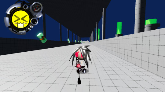
.50 Caliber 3D Platformer Post #5
(Flashing Lights Warning near the bottom of the post)
UI UI UI UI UI:
I've been working on UI mostly the past couple of weeks. It has been, as usual, both very cool & fun but also hell and evil. To be more specific, I really like designing the visual aspect of UI, but implementing it is always so horribly tedious and boring that it is really hard for me to focus on doing it. Without fail, I always end up getting UI done very slowly because of this. I am really happy with what I've got so far though, and it has brought me one step closer to getting to the point where I can just start hashing out levels.
Making the Health UI:
The health UI was something I was extremely excited about implementing, so I eagerly decided to decide that it was time to make it. Let me step u through the process 4 fun.
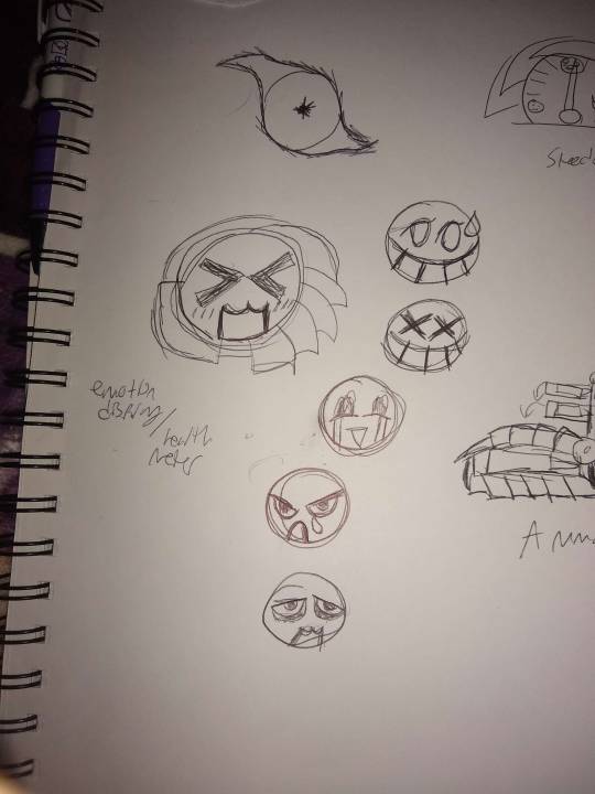
For me, it always starts with sketching out something crudely in pen. I've had this sketch done for months now, so it was p cool to see it finally come to life in game.

Next I hopped into blender and began trying to make some kind of cool y2k-era greebled out shape, but making detailed machinery (or details in general) is not my strongsuit, so I ended up with this kinda neat smooth shape that I wasn't entirely happy with. It looked cool, but I really wanted to challenge myself to make something closer to the windows media player skins I was inspired by.


More Specifically, I referenced this Half-Life 2 windows media player skin heavily, and started with a ring that I could build little pieces and wires off of. I hope u can forgive me if I maybe made it too similar lol, but I tried to get creative and put my own spin on it. I think the shapes on the top left are the most similar to my reference, and those are not-so-coincidentally the first bits that I modeled. This is my first time modeling something in this style, and I suspect that I'll get better at it if & when I do it again.

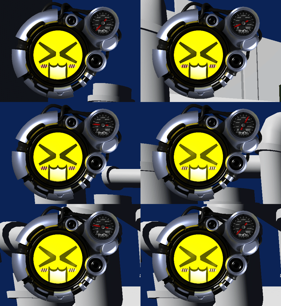
Finally, I slapped some materials on, made a texture for one of the faces I had sketched out, and rendered out a few frames of it gently(ish) flashing. I then went into affinity photo and made little speedometer components to slot into the small circle in the top right and programmed some functionality to it. The plan is to have the face represent the player's current health, so I am going to need to make a few more and then animate it rotating into a different face. But yeah, I am super happy with it, and I think it is lookin p sick!
Other Stuff What I Made:
Other than the health UI, I also added in functionality and UI for completing a level and selecting a level.
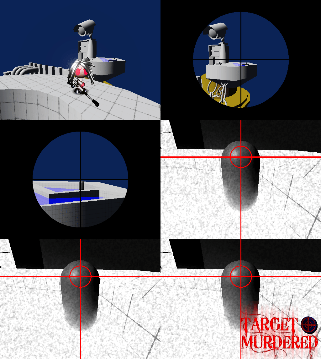
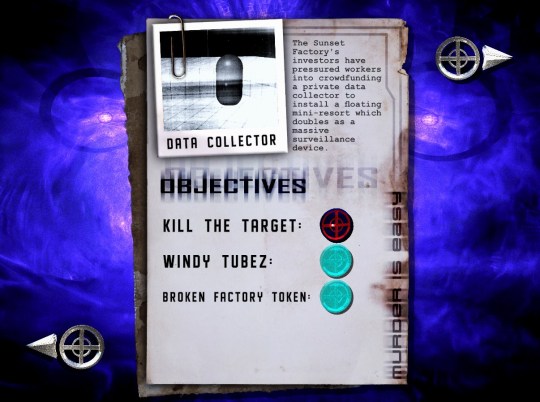
I was very much inspired by killer7 for the sequence that plays when you shoot your target, and I am addicted to intense flashing lights, so I included a lot of that. There are already accessibility options to turn that off, so if it's something that could harm u or if you just hate it (coward????!!!11) you can disable them. I've always found intense effects like that very cathartic, so I'm probably gonna include similar visuals in a few different things I make. That being said, I do also always want to make the alternative visuals (when the accessibility options are enabled) to also be cool af and get the point across. The level select screen was also really fun to make, I basically just slapped together some textures of warn-out paper into a little files situation and placed that on top of an abstract background that I made in jwildfire.
Conclusion:
I have honestly really loved working on this so far, but there has been a lot of anxiety about money in my life lately, so I really do hope to get this out in a reasonable time. I feel like I say that a lot about this game, but it is because it's always on my mind unfortunately. I don't want to make it sound like I am making this game entirely for money or w/e though, it is definitely a labor of love. Anyways, I hope to get to a point where I can get some environment art done soon, and I cannot wait to show off whatever this game is gonna look like. Have a nice day every1!
#screenshotsaturday#indiegamedev#gamedev#indiedev#game development#indiegames#y2k#y2k aesthetic#3d platformer#3dplatformer#sniper rifle#windows media player#50 caliber 3d platformer#50 cal
72 notes
·
View notes
Text
BioWare Blogpost: Accessibility
"Journal #10 Accessibility Spotlight A look into Dragon Age: The Veilguard’s Gameplay Accessibility Options --- Hey everyone! Today, we want to share many of the Accessibility features in Dragon Age: The Veilguard. Regardless of skill level or ability, we want everyone to be able to enjoy the full experience and story of our game. There are several features and settings to customize the game to meet your individual needs; so let’s dig in!"
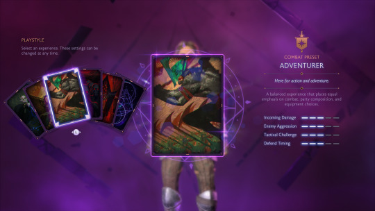
"First off, let’s discuss combat and the difficulty settings. During Character Creation, players can select from one of five curated difficulty levels or create a completely customized experience: Storyteller - Here for the story. Keeper - A balanced combat experience that emphasizes party composition and equipment choices over reaction times. Adventurer - A balanced experience that places equal emphasis on combat, party composition, and equipment choices. Underdog - Here to be pushed to the limit, requiring strategic planning and tactical decisions. Nightmare - Overwhelming battles that give no quarter. Requires a mastery of combat, equipment, skills, and game mechanics to survive. - Selecting Nightmare cannot be undone without starting a new playthrough. Unbound - Customize all settings. - Settings impact numerous aspects of gameplay. If this is your first time, consider a curated preset instead. Even after selecting a difficulty, there are more combat options available in the Settings Menu if you wish to make further adjustments. For example, you can adjust elements like parry timing, aim assist strength, or even how aggressive enemies are. See below for a full list of combat settings."
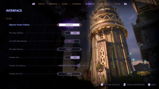
"UI and HUD elements are also customizable. Many elements of the HUD can be conditionally hidden or turned off entirely. For example, you can fully hide elements like Rook’s health, the objective tracker, or the Mini Map. There are also options for the text size in the UI."
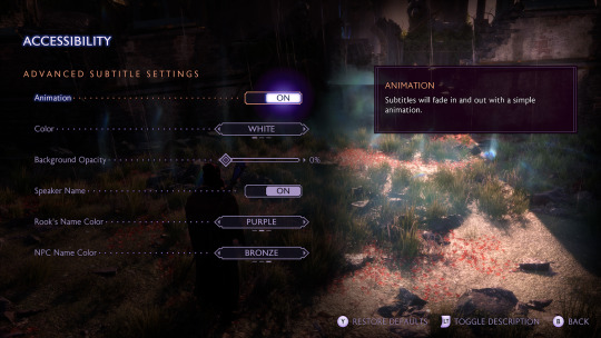
"There are some accessibility aids for interface elements. For example, subtitles are fully customizable allowing you to modify things like the size, opacity, speaker names, and color. Other settings add audio aids to visual-only elements like incoming attack indicators. For anyone with vision deficiencies, there are full-screen color filters to improve visibility."
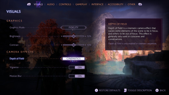
"Beyond the UI and HUD, there are a few more options regarding the game’s visual effects. For anyone who deals with motion sickness, there is a Persistent Dot Option and Motion Blur can be fully turned off. The in-game Camera Shake can also be adjusted from 0-100%. Additionally, there’s an FOV slider in the graphical settings."
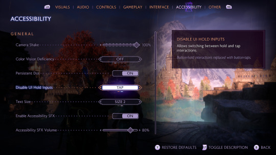
"As discussed in the PC Features Blog, all inputs are remappable for gameplay in Dragon Age: The Veilguard on both controller and keyboard for all platforms. Input sensitivity and deadzones are also customizable with sliding scales. There are some UI interactions that require an input to be held for a short period of time, but this can be changed to tap instead. All of these options allow you to play the game in whatever way is most comfortable. These settings and more are available in Dragon Age: The Veilguard! See a full list below to check out all of our Accessibility settings and check out our Accessibility Portal. Interviews and coverage of our Preview Event will be released on September 19th; so watch out for that. Chat soon! — The Dragon Age Team"
"Audio - 3D Audio - Accessibility SFX - Glint Ping SFX - Mono Audio - Speaker Type - Volume Sliders Controls - Ability Wheel Controller Activation (Hold or Tap) - Disable UI Hold Inputs - Input Remapping - Invert Axis (X & Y available) - Swap Left & Right Sticks - Stick Deadzones - Trigger Deadzones - Vertical & Horizontal Sensitivity - Vibration Intensity GAMEPLAY Combat - Aim Assist - Aim Snap - Combat Timing - Enemy Aggression - Enemy Damage - Enemy Health - Enemy Resistances - Enemy Vulnerability - Prevent Death Exploration - Frequent Auto-Saving - Library (Codex, Glossary, Missives) - Object Glint Distance - Object Glint Visibility - Objective Marker Visibility - Pause at any time - Waypoint Visibility - World & Local Maps available at all times Visual / UI - Camera Shake - Depth of Field - Full-screen Colorblind Filters - Hide-able HUD Elements (Abilities, Damage Numbers, Hints, Mini Map, Objective Tracker, Player Health, Tutorials) - Low Health Screen Effect - Motion Blur - Persist Dot Option - Ranged & Melee Threat Indicators - Subtitle Advanced Options (Background Opacity, Speaker Names, Speaker Name Color, Subtitle Size) - UI Text Size - Vignette"
[source]
#dragon age: the veilguard#dragon age the veilguard spoilers#dragon age: dreadwolf#dragon age 4#the dread wolf rises#da4#dragon age#bioware#video games#long post#longpost
129 notes
·
View notes
Text
there's something poetic about a soulless, generic, historic flop of a live service hero shooter getting pulled offline, the same day a single player 3d platformer full of charm and personality releases to critical acclaim
98 notes
·
View notes
Photo
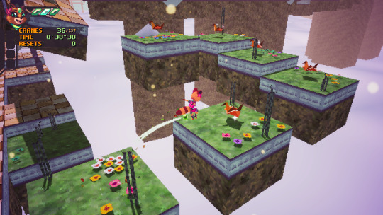
Lunistice
The 3D platforming genre has experienced a resurgence since the mid 2010s, thanks in no small part to the efforts of many indie developers. Some of these harken back to the style of older platformers while building something new from their foundations. Lunistice, the debut title of German developer Dennis “A Grumpy Fox” Kröner, is one such game in how it evokes the feel of PlayStation/Saturn-era games to create a very solid, simple platformer
Read more...
#Hardcore Gaming 101#Apollo Chungus#Review#Lunistice#3D platformer#3D action game#indie game#mascot platformer#Nintendo Switch#anthropomorph#female player character#Windows#Dennis Kröner#Deck13 Spotlight#video games
6 notes
·
View notes