#introductiontodesign
Explore tagged Tumblr posts
Text
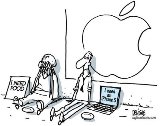
WEEK 13: Ecology and Design
Perceived obsolescence is a kind of perception of "staying up to date and maintaining social status" created by companies on people. This perception is usually created by advertisements. Although this perception is in many sectors such as fashion, nowadays, the target is especially technological products because we live in a technological age. Technological products are no longer for need as before; they are taken for color, popularity, etc. So it's like following the fashion program, whatever's in this year's creation is taken. The best-known example of this is the iPhone. The iPhone 1, produced by Apple in 2007, is expected to be 12 in 2020. 12 updated top model in 13 years (excluding models such as pro vs). You buy the most popular phone in the year you bought it, not because you actually need it, but as popular. As if you pick up that phone, you will be up to date and you will not be left behind, here is the classic herd psychology. However, when you get that phone, it's not too long before a top model comes out. New features have been added, existing features have been further improved; camera, battery, etc. This time, that phone you get because it's actually popular suddenly seems outdated or garbage to you. Even though you don't need it, now the new product becomes psychologically your need, and you find yourself buying a top model phone. In addition even the company has set a strategy, the old model that you have is slowing down after the new model comes out. So if you don't want to follow this herd psychology, the company is forced to make you up and you have to. Then again the same vicious circle after buying a top model. Better, more beautiful, more popular, more up-to-date, better quality, better photographer etc. In short, there is no limit to this. In fact, the more we consume, the more we become depleted. We can call it a black hole for perceived or planned obsolescence.
Sources:
https://tommytoy.typepad.com/tommy-toy-pbt-consultin/2012/09/apples-post-iphone-5-launch-is-full-of-production-backlogs-mapping-app-problems-and-vendor-plant-wor.html
#logbook#introductiontodesign#design#cartoon#karikatür#art#ecology#sustainability#iphone#obsolescence#perceived obsolescence#technology#teknoloji#t��ketim#consumption#planned obsolescence#technological products#up-to-date#güncel#product
16 notes
·
View notes
Text
WAYS OF SEEING (w2)
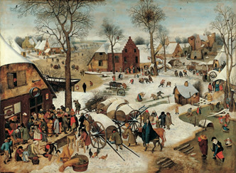
(pieter bruegel, game of the kids)
In this image is drawn as a perspective but as we see we can not see the vanishing point. This image has not a vanishing point because there are no lines that get smallet and look like they will merge in the future. We can understand that is drawn with a perspective system due to the objects that getting smaller.
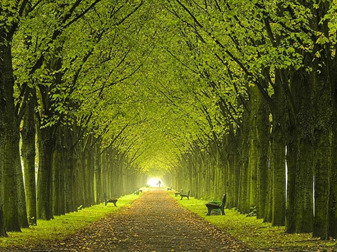
In here, we see tthe vanishing point very clearly thanks to shrinking trees that parallel to each other and road narrows. Also the vanishing point is drawn as if look straight. Not only trees but also objects that on the road became smaller.
1 note
·
View note
Photo

Anthropology Series 102 All about the dimensions and standards for Indoor Games. #indoor #games #rule #ratio #proportion #design #anthropology #InfinityArchitects #architecturestudents #thearchitecturestudentblog #studentsofarchitecture #introductiontodesign #basics #backtobasics #learn #indoorgames #letsshowitbetter #showitbetter @arch_inked @crazy_architecturee @architecture_x_design_quotes @arch.vizz @amazing.architecture @thearchitecturestudentblog @student_of_architecture @desiindianarchitect @students.of.architecture @architecturenow @architecturefactor @fondationlecorbusier @villasavoye_ @archlibrary_official @archit_magazine @thearchitecturestudentblog @arch_more @archi_students @designboom @letsshowitbetter @dezeen @foadindia.in @buildofy.india @insideoutmag @architizer @archit_magazine @architect.wow @architectanddesign @architecture_hunter @archdigest @amazing.architecture @archolution @goodhomesmagazine @theidealhomeandgarden @interiordesignmag @interiors.4you @architectureillustration @illustrarch @indiatoday_home @archdaily https://www.instagram.com/p/CHpoPuhp4Cr/?igshid=10w77xq0p7m09
#indoor#games#rule#ratio#proportion#design#anthropology#infinityarchitects#architecturestudents#thearchitecturestudentblog#studentsofarchitecture#introductiontodesign#basics#backtobasics#learn#indoorgames#letsshowitbetter#showitbetter
0 notes
Photo

#artdepartmentoperations #introductiontodesign #a2designlab #authoringactiondesign @studiomusings (at Authoring Action) https://www.instagram.com/p/B3xP_AigEH5/?igshid=i4nydlyn1api
0 notes
Text
KEYWORD: SENSORY SPACES
WEEK 7: Midterm
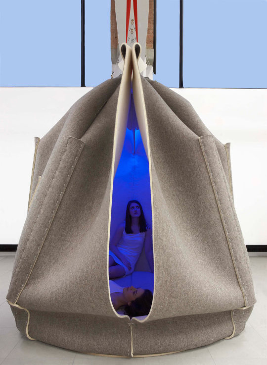
Sensory Concentration Space by Freyja Sewell
‘With so much emphasis put onto the convenience of online interaction and exploration it is more and more important to cherish the real, the honest and the actual sensation of our bodies existence in a space.’ Freyja Sewell
Unfortunately, we no longer have time to be alone and listen to ourselves because at work, at home, while eating, traveling, etc. we are constantly trapped in various worlds with the internet in today's technological world. Freyja Sewell designed SCS (Sensory Concentration Space) in order to raise awareness in these times when we are deprived of sparing time for ourselves and when we are detached from ourselves and our bodies. The cocoon-like structure SCS is designed to make it easier for people living in the modern world age to concentrate on their senses and to think about themselves. This sensory space is kind of like a small meditation room. SCS provides stimulus for sound, sight, touch and smell. Its inner parts made of %100 wool felt provide a soft, tactile and warm insulation quality. It also has LEDs, LEDs provide us with light in different colours we can experience different moods as well. The colours and sounds are controlled by an iPad. This design that appeals to all the senses is a good opportunity for people to reconnect with feelings that they have forgotten.
Sources:
https://design-milk.com/scs-sensory-concentration-space-freyja-sewell/hush-sensory-concentration-space-freyja-sewell-2a/
http://www.freyjasewell.co.uk/work/unilever.html
http://thefacedesign.hu/Home/Experimental_Design2/Sensory_Concentration_Space
#logbook#introductiontodesign#design#sensory#sensoryspace#sensory space#concentration#Freyja Sewell#scs#emphasis#empathy#sense#meditation#aura#senses#vision#art
36 notes
·
View notes
Photo

WEEK 2: Ways of Seeing
This photo I took is an example of one-point perspective, one of the types of lineer perspectives. As with the one-point perspective, the objects in this photo shrink as they move away. Also, the distance between the objects (lights, windows, etc.) becomes more narrow as they get further away. In the one-point perspective, objects shrink and narrow towards a point we call “vanishing point”, but in this photo we cannot see that point where all objects meet.
#perspektif#perspective#one point perspective#taksim#çiçek pasajı#design#introductiontodesign#photography#logbook#aura#vision#representation#art#popular culture#art & popular culture
8 notes
·
View notes
Text
vimeo

WEEK 9: Art Technology Design?
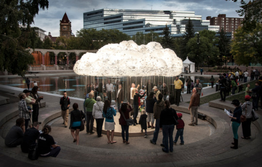
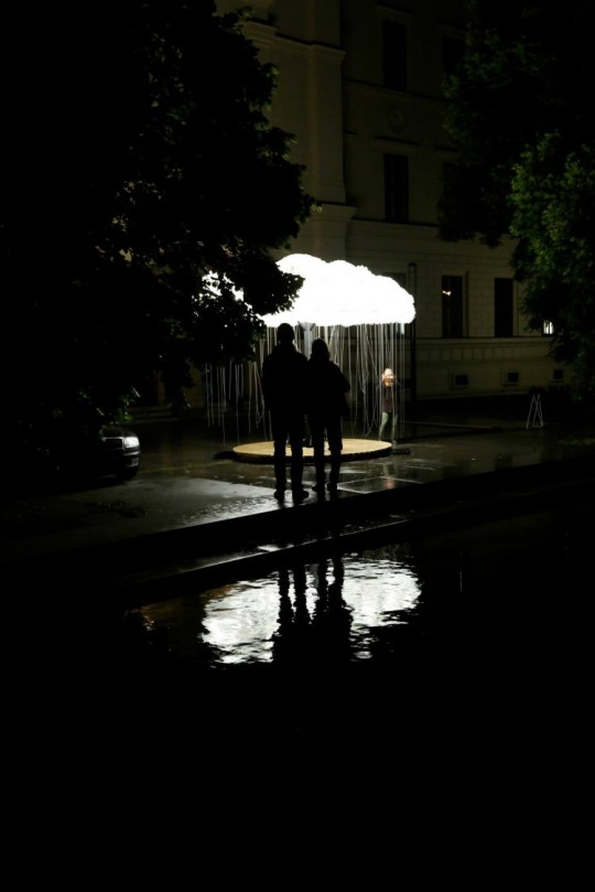
Are the clouds always in the sky? Is it a dream to touch them? Can't it just rain for us? Do we have the power to flash lightning?
It shouldn't be too hard to guess the name of this installation that makes dreams come true, CLOUD. It was made by Canadian artists (Caitlind r.c. Brown and Wayne Garrett) for a night art festival called Nuit Blanche in Calgary. The 6,000 light bulbs donated by the public (1000 employees and 5000 burned) provide the fascinating view in this installation. In addition, the chain hangs from each bulb to provide an image of rain. During the exhibition, viewers interact with CLOUD by initiating improvised collaborations, working collectively to animate "lightning" on the surface of the sculpture, turning the entire cloud on and off. The familiar rain clouds and a stormy sky are no longer far away thanks to CLOUD.
‘’Before we even considered the light bulb, CLOUD was a study of light – its magical ability to create ephemeral space, its resonance in the darkness, and its societal importance... We use artificial light in cities as a language (green means go), to the point where it is now socially intuitive. The value of artificial light is especially pronounced in places where electric light has been lost, or never existed at all.’’
Sources:
https://laughingsquid.com/cloud-an-interactive-installation-of-6000-clustered-light-bulbs-with-individual-chains-raining-down/
#logbook#introductiontodesign#design#art#technology#interactive#interaktif#cloud#rain#exhibition#sky#bulut#yağmur#gökyüzü#şimşek#light
3 notes
·
View notes
Video
youtube
WEEK 3: What is Design, Anyway?
The person I chose as a designer is Turkish Cypriot / British fashion designer Hussein Chalayan. We watched a video in Prof. Dr. Arzu Erdem’s lecture that was about “What is design?”. This video was the final part of the autumn/winter 2000 collection “After Words”, designed by Hussein Chalayan. This video got me very excited because this collection was not like the fashion shows which we all know and watch. In daily life, while we are watching a film, we start thinking about questions like “What will happen now? How is it going to be? How will it end?”. Likewise, I realized that I was thinking about these questions while I was watching this collection video. By exceeding the limits of fashion and fashion shows, something new had been created that arouses the curiosity of audiences and attracts the attention of audiences. Also, I think that chosen music increases the effect of the design. While watching the fashion show, in the final, everything used as decoration on the stage was unexpectedly exhibited on the models. The models removed the chair covers that had been on the stage from the beginning of the show wore them as a dress, and then these chairs were folded into bags. Another model wore the wooden table on stage as a skirt. Apart from the materials used in common fashion products, many different materials are used like wooden skirt. In the fashion show, the furniture we use in daily life had become wearable. It is a seriously creative and ingenious idea that the fashion designer in his collection used not only fashion items but also other products that are produced in the field of “design”. This idea has created a powerful design by revealing the interactions between our clothes and the products around us. When I researched this collection after the lecture, it was written on Wikipedia: “In Afterwords, Hussein Chalayan focused on the involuntary and dramatic aspect of mobility, and illustrated the sentimental impacts of forced migration.”. The immigrants who had to leave their belongings were considered, and at the same time, it ceased to be a thought and became a collection. I can say that I was more impressed after learning the main idea of the designs. I have watched many fashion show videos so far, but if I was asked “which one was your favorite”, undoubtedly this collection of Hussein Chalayan comes to mind first. Going out of the ordinary has turned this show into an unforgettable artistic show.
#design#fashion#fashionshow#fashion show#hussein chalayan#hüseyin çağlayan#introductiontodesign#logbook#designer#creative work#creative works#creative collaboration#interdisciplinary#multidisciplinary#practice#multidisciplinary practice#interdisciplinary practice
6 notes
·
View notes
Text
WEEK 12: Gender and Design
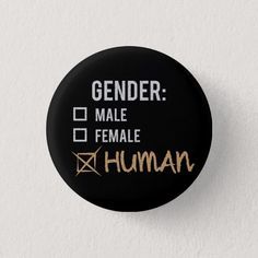
Feminism is not just an organization that further defends women's rights. Feminism means equality. Genders, races, colors, languages etc. No matter how different it is, you are you and you have to speak up where necessary. It may not be able to say "I am here too.". You shouldn't shut yourself up. Because this is your right. As a HUMAN, you should be able to freely express your rights and opinions. No one should be of higher status just because they are male or because they are white. On the contrary, since a person is a human being, he should be given equal rights in every field. If we ourselves have an awareness on this issue, we must bring this awareness to our environment. Differences can and should never cause social discrimination! Being different is always nice.
I hope feminism affects not only design but the whole world.
Sources:
https://everydayfeminism.com/2014/10/unlearning-patriarchal-lies/
https://everydayfeminism.com/2016/01/bring-feminism-to-education/
https://www.zazzle.com/agender+buttons
#logbook#introductiontodesign#design#feminism#feminizm#gender#cinsiyet#difference#fark#farklılık#ayrımcılık#racism#intersectionality#sexism#cinsiyetçilik#lgbti
2 notes
·
View notes
Text


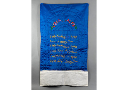


WEEK 11: Knowledge Production and Art & Design
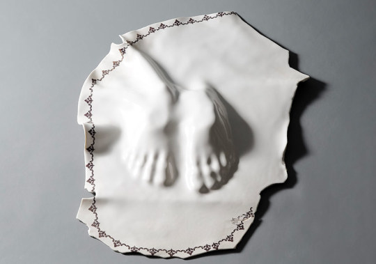
‘’I am fine but not’’ , Manolya Çelikler, 2019
Manolya Çelikler, in her first solo exhibition "I'm fine but not"; She used concepts such as cultural identity, gender, social-cultural memory in a metaphorical way of expression. Besides the point of view on the concepts, another important point is the use of materials. The materials she uses in her production actually form the basis of the concepts she emphasizes and examines. For example, she tries to criticize and explain the wrong thoughts that are entrenched in society with fragile, removable and collapsible materials through the material. So she creates a new language between concept and material, and then turns it into form. This actually leads us to think about what the space / material / form triad essentially emphasizes.
Sources:
https://kultursanat.com.tr/manolya-celiklerin-ilk-kisisel-sergisi-iyiyim-ama-degilim/
https://www.artfulliving.com.tr/sanat/iyiyiz-ama-bir-sekilde-degiliz-aslinda-i-17726
#logbook#introductiontodesign#art#museum#design#exhibition#knowledge production#critical thinking#exhibitions#biennales#public space#public art#manolya çelikler#solo exhibition#i am fine but not#gender#cultural identity#social-cultural memory#expression
2 notes
·
View notes
Text
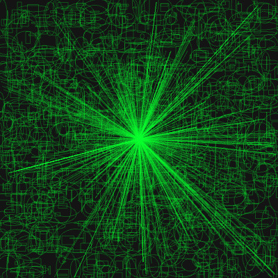
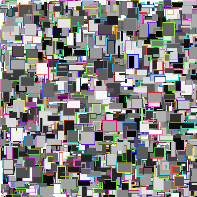
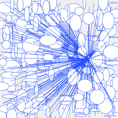

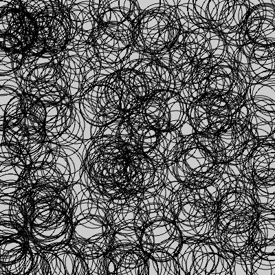
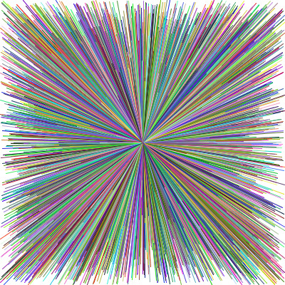
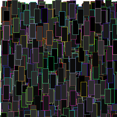
WEEK 8: Encoded Drawings
In this week’s lecture, we made a workshop with Dr. Sabri Gökmen, a faculty member at Kadir Has University. We learned how to use coding by design through an open source platform - processing - (www.processing.org). Thanks to the guidance of our teacher, we have produced various drawings by writing codes. Even though the coding seemed complicated, it became more fun as we produced it. If you are wondering how design is combined with coding, you should definitely visit the website and Sabri Gökmen’s youtube channel, there are directions.
#coding#code#drawing#introductiontodesign#design#processing#workshop#logbook#generative#scripting#geometry#recursion
2 notes
·
View notes
Text
KEYWORD: PERSPECTIVE
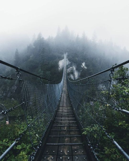
WEEK 7: Midterm
This landscape photograph has a depth due to its perspective. The photograph shows one-point perspective, the most common type of linear perspective. In one-point perspective, all lines converge at a vanishing point. Towards the vanishing point, all objects begin to get smaller and narrower. In this photograph, we can firstly see the details of the bridge clearly and in detail, but as the bridge moves away from us, we start to see only one road, and this road gradually turns into a point. This point, which is the end of the bridge, expresses the vanishing point. Although the bridge doesn’t end at that point, we begin to see it as a point because it is far from us. That is the real reason of depth. This landscape photograph also has a color perspective. In color perspective, as objects move away from us and the light changes, their color also changes. Similar to linear perspective, this bridge, which is located in a forested area, while the trees on the part of this bridge that are close to us are clear and vibrant. As they move away from us, these colors begin to fade and disappear, just like a fog.
Sources: https://tr.pinterest.com/pin/54395107983590676/
#perspective#one point perspective#introductiontodesign#design#photography#photo#vanishing point#color perspective#landscape#pinterest#logbook#bridge#depth#aura#vision#art
3 notes
·
View notes
Text
Sensory Walk in GRAND BAZAAR in İstanbul,Turkey
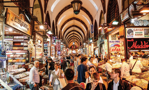
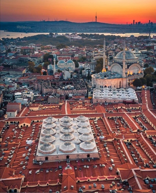
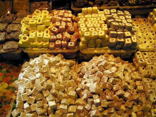
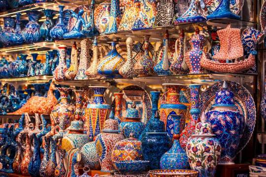
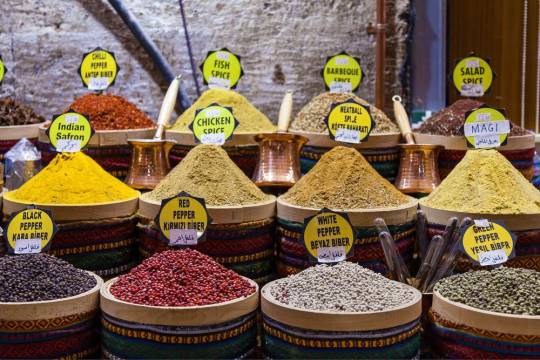

WEEK 6: How is a space sensorialized in terms of senses?
‘’Kapalıçarşı deyip geçme; Kapalıçarşı, Kapalı kutu.’’ Orhan Veli Kanık
Whoever says that I know Grand Bazaar completely would be a lie, because it is a maze where every time you go, new shops and places are discovered by leaving a completely different street. Ümit Hamlacıbaşı, who participated in Açık Radyo, expresses this situation as follows: ‘’My every visit to Grand Bazaar was a fear of getting lost.’’. Grand Bazaar is one of the largest and oldest markets in the world. It is very different from modern shopping centers today, it has a soul as well as a huge history behind it. With its colorful and complex structure, it may remind some of a Sunday, and others of something else. It is like a small simulation of life. Like a city that becomes quiet at night, Grand Bazaar is just a historical building without an unmanned one, we feel its true spirit when there are people. How a place feels, how it smells, how it looks, etc. it helps us connect with the place. Therefore, a walk in Grand Bazaar is not just a walk; It is actually a journey between fascinating spice scents, dazzling colors, hypnotizing sounds, beautiful handicrafts and, also the alluring scent of Turkish coffee.
We go to a shopping mall only for shopping, maybe we eat if we are hungry after shopping. It's just that, it doesn't make you feel anything. However, Grand Bazaar is not like that. Choosing one of the many shops that sell the same things, bargaining with the tradesmen...Being dragged elsewhere with the smells of spices and coffee coming from one side while shopping...Going into a sweet rush of disappearance among the crowd...For a little rest break, sit down and have tea in a cafe or eat in one of the restaurants...
The Grand Bazaar is not just a bazaar, each square has a separate feel, each moment is a different adventure. Be there and feel it.
Sources:
https://acikradyo.com.tr/acik-mimarlik/umit-hamlacibasi-ile-duyusal-yuruyusler-ve-bir-duyumsama-mekani-olarak-kapalicarsi
https://www.goturkeytourism.com/things-to-do/grand-covered-bazaar-istanbul-turkey.html
https://lh3.googleusercontent.com/proxy/SHd34qv8d6MfLdFUuq8BRDzctS5J1v8ep30Pvl-1bX2cW1U96ZgStac9EWd2V0-TU0CFVtYQ2ZEBYp5x5XtOL7STJsaNWvE_6NIaU87bsuQA_D47rOoFleNYXdRc4smUEQ
https://ottoman-empire.tumblr.com/post/613525603659005952
https://bittersweetvanillavibes.tumblr.com/post/77073725139/grand-bazaar-in-istanbul-turkey
https://blog.radissonblu.com/smart-shopping-istanbuls-grand-bazaar/
https://ottoman-empire.tumblr.com/post/173114939393
#kapalıçarşı#kapalı çarşı#grandbazaar#grand bazaar#istanbul#turkey#historical#history#feeling#sensorywalk#sensory#sense#introductiontodesign#design#life#logbook#skillscape#sensory walk#sensory space#senses
3 notes
·
View notes
Text
Flying Books
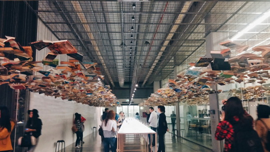
I took this photo in 2015 in Istanbul Modern. I was very impressed when I saw it. As a book lover, it was a wonderful experience to walk under flying books and look at the books as if looking at the sky.
#logbook#introductiontodesign#design#art#museum#exhibition#exhibitions#book#books & libraries#sky#experience#kitap#istanbul modern
1 note
·
View note
Text
Earthable
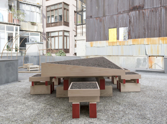
WEEK 5: Agros Istanbul & Earthable in 5th Istanbul Design Biennial
In fact, we think of empathy only as an interaction, a bond between human and human, but empathy is with us at any moment.
As we lived in buildings that started to be erected more and higher every day, we moved away from nature. Actually, we're kind of forgetting our essence. "Earthable", designed by Aslıhan Demirtaş in the 5th Istanbul Design Biennial with the theme "Empathy Revisited", derives from the verb "to earth". A table, an agricultural field, a garden, a pot full of soil borrowed from a local farm in Istanbul, and trillions of living bacteria, nematodes, protozoa and miles of mycorrhiza nests are an event that travels between them. The fact that the chair we sit is full of soil emphasizes the essence of the city we live on. The fact that the table we eat is filled with soil resembles an agricultural field, while in fact it shows us that every meal we eat comes out of a material and that material comes out of a soil. In addition, table and chairs are made from a material whose raw material is tree. This design, which emphasizes the value of the land in the city, actually reminds us of our essence that we started to forget due to urbanization. Reflecting the importance of biodiversity, this work recreates the empathy between soil and people.
In addition, Earthable will undergo a process of production and regeneration, interacting with pollen, the sun and humans throughout during the biennial.
Sources:
https://empathyrevisited.iksv.org/en/project/70-earthable
#earthable#earth#nature#bienial#design#introductiontodesign#soil#mineral#microbial#vegetable#logbook#urbanagriculture#urban agriculture#repair#care#architectureasgrowing
2 notes
·
View notes
Text
Sobya't Thawra – The Revolution Woodstove
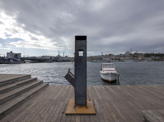


WEEK 5: Design and Experience of Being Together
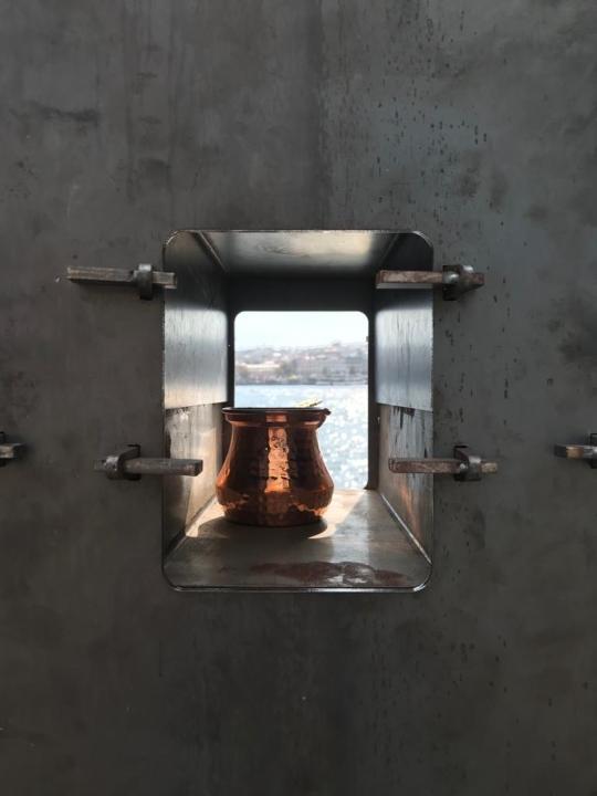
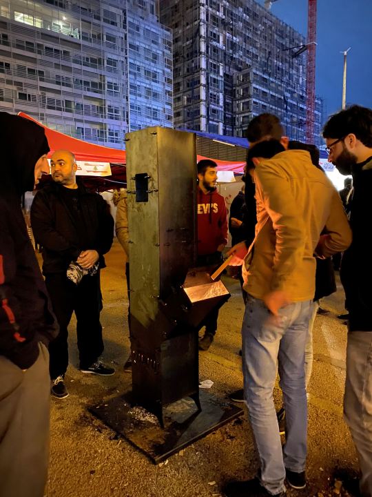
Inspired by the public protests that took place in Lebanon in 2019, designers Bits to Atoms and BeirutMakers created a simple design to meet the cold-weather heating and food needs in a practical way: a stove. A century-old technique called wedge chopping is used in the stove, whose parts are joined in about an hour by the black sheet laser cutting process, so the stove can be easily reproduced anywhere.The stove, which is designed to provide heat and works in rainy weather, has two cavities for a stove, coffee and teapot. Originally produced in Lebanon to support the revolution and reflect revolutionary values, the stove has been placed on the seaside in Istanbul-Karaköy as one of the public installations of the 5th Istanbul Design Biennial as of October 20, and this stove has the potential to bring together many different city residents; Biennial visitors, peddlers on the seaside, fishermans, those who spend time on the Karaköy seaside, those who want to heat up their chilled drinks, the homeless city dwellers sleeping in that area ... Actually, I think this design not only serves its purpose, but also allows us to connect with the environment and empathize. For example, a person walking on the seaside and a homeless person can get together and interact simply because they are cold. The empathy we do actually allows us to gain senses.
Sources:
https://empathyrevisited.iksv.org/en/project/21
www.bitstoatoms.xyz
#human#resistance#environment#empathy#introductiontodesign#design#istanbul#karaköy#stove#bienial#logbook#collectivity#collaboration#encounter#coexistence#interspecies#interaction#multidiscipline#dialogue#activation#inclusivity#public space#community#commons#mediation
4 notes
·
View notes