#inrd702
Explore tagged Tumblr posts
Text
User Interview and Testing Script
Introduction
Thanks for agreeing to this interview today. I'll quickly tell you about my project, then we can move on to the interview.
My project is researching discoverability around local events and the concept of connecting smaller, emerging artists with the community.
At the moment, I'm thinking of creating a digital platform that will show current events based on a user's location with an implemented rewards program. The idea is that it will focus on promoting events hosted by smaller artists to help them with exposure.
User Interview
Can you tell me about yourself and what kind of events you like to attend?
What do you enjoy about those events?
How often do you go to events? Events can include gigs, markets, workshops, exhibitions, etc.
How do you currently find out about events?
Do you actively search for events to go to?
Are you currently part of any rewards or loyalty programs?
Why/Why not?
Is there anything you particularly like/dislike about them?
Is it important for you to support local artists?
Why/Why not?
User Testing
Now we'll move on to the user testing session. User testing is important for my project because I'm wanting to learn more about my idea, how it's received, how easy it is to use, and what I could add or change to make it better.
I'm going to send you a link to my prototype and I'll give you a scenario followed by some tasks. Just one thing - keep in mind that it's still in its early stages, so not all the buttons and features are functioning.
So, imagine you're Naomi, you're in your early 20s and she's into finding new bands to get into and learning new things, so she's just installed the ExplorEvent app to find some events to attend in her free time.
She's into pop music, arts & crafts, going to exhibitions, and learning something new at workshops.
Here you've just opened the app and need to set up your profile. What would you do?
You see there's a craft market that's popular this week and you're interested in going so you want to save it to view later. How would you do that?
What are your first impressions of the app so far?
You happen to already have physical tickets on you to a gig and you can scan them to redeem points. Where would you go in the app to do that?
Your favourite band, The Hybrids is in your area and you've already bought tickets. Can you find out how many points the gig is worth?
Imagine you've accumulated some points already. Can you find out how many points you currently have and redeem a valid reward.
1 note
·
View note
Text
IDS Week 1 - 14/07
Review and critique HMW questions. Peer discussion and test against a series of criteria+ sight visit to Space In Between.
[ Meal Preparation App - Ideation ]
1. Buy your groceries at the beginning of the week, log it in, generates 5 meal recipes for the rest of the week
2. Take photo of fridge and pantry, AI feature detects ingredients and generates recipes
First world problems in catch phrases
“Why is there no food? There are just a bunch of ingredients to make food.”
“I’m so hungry but I don’t want to cook”
“There is nothing to eat at home”
To consider in following stages (advice from talk with Keryn)
Avoid having lots of user input. Make the process more automate (less manual and process steps)
Competitor analysis, what apps already exist? What makes them un/successful?
Recipe quality is important to users (jamie oliver, countdown etc)
Which factors are most important to users? (food experience, time, money, space, skills)
Categorisation/filtering. What is most important to users? Saving time, little effort?
[ How Might We Question: Drafts ]
How might we encourage more people to eat at home, while helping them to save time, money and effort?
How might we help people to have a more engaging experience of eating at home?
[ Testing HMW Question: Interviews ]
Q1) What is the problem to be solved?
Not being able to eat at home because of time money and effort
Q2) Who are the users that are experiencing this problem? (age, gender, other descriptors)
Busy people
Q3) Who are the stakeholders that are interested in this problem being solved?
Busy people
Q4) What are the specific user need(s) that this HMW question is focused on?
Being able to save time money effort, therefore eating at home
Q5) Is there anything else you need to know about the problem before it can be solved?
Need to know why it's important to eat at home > negative positive impacts of eating home/out
Q6) Do you think this problem is broad enough to encourage wild ideas?
No - it could look at other methods to save money and effort rather than “eating at home”
Q7) Do you think this problem is specific enough to be directive? (e.g we canЀt solve climate change, but we can encourage people to compost more)
Yes - but too narrow if it is eating at home
Q8) How is the problem currently being solved?
Meal prep kits such as hello fresh
Q9) Is it clear that the problem is backed-up by evidence?
Yes - stats into how many people eat out etc / costs
Q10) Is the problem focused on a need rather than a benefit?
If users need to save time money and effort > if they don't feel the need just a benefit
Q11) Does the problem include a baked-in solution?
No
Q12) Does the problem seem inspiring to solve?
Yes
[ Finalised HMW Question]
“How might we encourage more people to eat at home, so they can save time, money and effort?”
[ Competitor Analysis ]
Meal preparation apps already exist in the market, however many require lots of user input. My app needs to be as automate as possible / have clear card categorisation, filter systems
Trivago, airbnb, zomato
https://uxplanet.org/skill-chef-a-ui-ux-case-study-4cc2d56c50ce
0 notes
Text
Week 13- Submission
Movie
https://vimeo.com/765575202/d27c8ac42e
Prototype
https://www.tumblr.com/hoosierbae
Design Output
https://www.figma.com/proto/olfhAZ31RdYH7wlceRGZQV/INRD702-S2?node-id=449%3A600&scaling=scale-down&page-id=406%3A468&starting-point-node-id=449%3A600
0 notes
Text
Low - Fi User testing

This was the low - fi prototype I created to test on students in class. The aim of this round of user testing was to gauge how daunting certain tasks were and how the language used made the user feel.
There were 3 Participants for this user test all from my INRD702 Studio class.
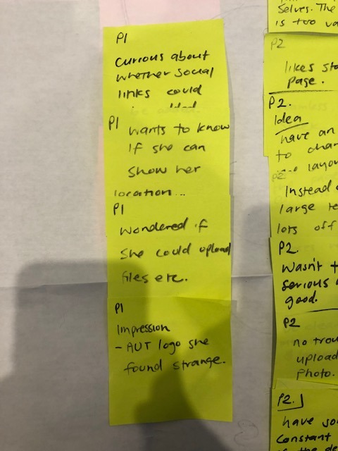
Participant one had minor issues with the prototype and focused more on the end portfolio screen, one important point they mentioned was social links.

Participant 2 had no issues completing the set tasks and had some interesting insights into the language use. They noted they liked the lay back language style but brought up a good pain point, some of the language was too formal or slang like and ended up being more confusing than helpful (e.g What's your Jam) Some revisions to the language could help refine this.
They also mentioned not feeling confident when needing to write a bio, they felt like the question was too vague and could benefit from a template of sorts to help them write an effective biography.
They also had great ideas about the project thumbnails, finding someway to incorporate some quick info about what was used for said project at a glance could be useful.

Participant 3 expressed similar issues as P2 surrounding the language used, they too liked the casual and friendly style but found some word choices to be confusing. They also reinforced the thoughts about a guided bio writing experience as they too felt overwhelmed.
0 notes
Photo

INRD702 Week 2.2 User Testing Draft
1. Introduction
2. Warm up
- Interview questions
3. Set up screen sharing
4. Task completion
5. Follow up
- What are your thoughts about these concepts, generally?
6. Wrap up
- Thank you so much for your time. Would you be open to speaking with me again in the future?
0 notes
Text
INRD702-Week 2
Continued Rapid Research and Synthesis
Conversations with friends / family
Person A: “Hmmm. I don't think I can say I feel uncomfortable getting to know different cultures generally, it depends on the instances! I think I would only feel uncomfortable if I was worried about saying the wrong thing or being tone deaf. I think the one of the best ways is through film and tv I find. You can get a glimpse into someones culture in a way that doesn't feel intimidating. Or maybe reading books as well”
Person B: “Um, if I could actually care enough, I guess an interesting fact about a certain culture written on a poster could pique my curiosity“
Idk. I just think a lot of the people who say they are interested in culture really aren’t and couldn’t care less when no one is watching“ “Nz in a multi cultural country, so most people are a bit sensitive about culture and ethnicity etc.“
Person C:
“I feel uncomfortable, because of cultural difference, example, girls can hold hands => misunderstanding, younger kiwis being disrespectful,
“uncomfortable to be inclusive
underlying difference, acceptance of difference,
Competitor Analysis:
1: Meet Up - Website / Community Platform
Can search for community meet ups based on interests
Join multiple groups
Find upcoming events that match your interest
Reviews/Stories from existing meetups from participants
Can either be hanging out / learning meet up


2: Citysocializer
Global platform, offers diverse opportunities and events
Virtual events / learning events

0 notes
Text
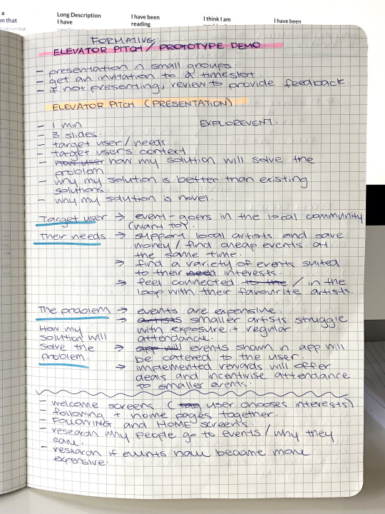
Elevator Pitch Planning
Target user
Event-goers in the local community.
Their needs
Support local artists and save money/find cheap events at the same time.
Find a variety of events suited to their interests.
Feel connected/in the loop with their favourite artists.
The problem
Events are expensive.
Smaller artists struggle with exposure and regular attendance.
How my solution will solve the problem
Events shown in the app will be personalised for the user.
Implemented rewards will offer deals and incentivise attendance to events to support smaller artists.
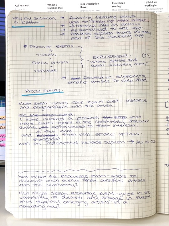
Why my solution is better
Following feature allows you to keep up with artists.
Extensive information on artists.
Personalised to the user.
Rewards system that's already part of the app.
Pitch Script
Slide 1
Most event-goers care about cost, distance, and engagement with artists.
Currently, smaller artists face the struggles of exposure and consistent event attendance when trying to make a name for themselves.
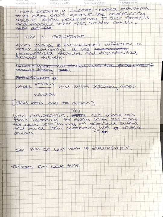
Slide 2
In response, I have created EXPLOREVENT, where event discovery and rewards meet.
EXPLOREVENT is an all-in-one location-based platform that helps event-goers discover events in their community personalised to their interests and engages them with smaller artists.
Slide 3
What makes EXPLOREVENT unique is the implemented rewards system that benefits both event-goers and the artists. Event-goers can enjoy the rewards awarded to them for attending events while also supporting smaller artists in their community.
With EXPLOREVENT, event-goers can spend less time searching for events that are right for them and more time connecting with the smaller artists in their community whilst getting rewarded at the same time.
So next time, how do you want to EXPLOREVENTs?
Thank you for your time.
To do next
Welcome screens (user chooses interests similar to when you sign up to Netflix).
Following and Home (Discover) screens.
Research why people go to events.
Research if events have become more expensive.
1 note
·
View note
Text
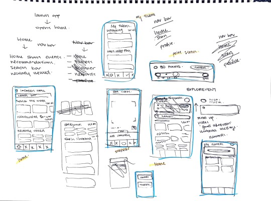
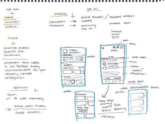
Screen Sketches
Sketching my initial ideas for the screen and figuring out how they'll flow one after the other.
Initially, I was going to have 5 sections in the navigation bar - Home, Tickets, Scanner, Rewards and Profile. At this moment, I've decided on simplifying this to Home, Scanner, and Profile, where Tickets and Rewards will be available under Profile. Grouping Tickets and Rewards under Profile makes more sense to me regarding the user flow.
Home - browse events, following, recommended for you, a bit further away, categories, recently viewed, etc.
Scanner - camera, add manually.
Profile - view points, current status, rewards, tickets.
1 note
·
View note
Text
UX Onboarding
Some users might feel "lost in space" when they open a new app or website for the first time.
Releasing a new tool or feature without guidance can leave users feeling stranded - must be avoided.
Onboarding experience is a way to introduce users to a new product. It should:
Introduce app + explain important features.
Convince users the benefits of the app.
Introduce your brand's voice and tone.
Important because it can help users to avoid feelings confused or frustrated.
Methodologies
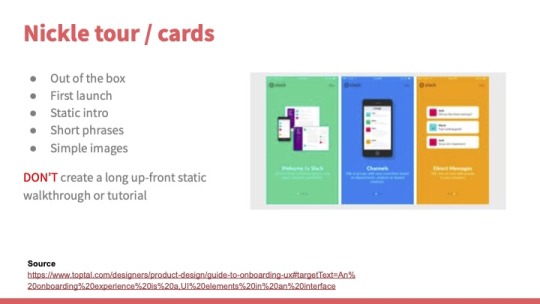
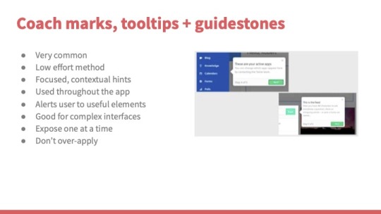
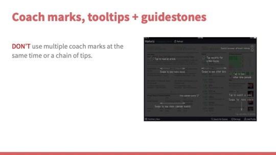
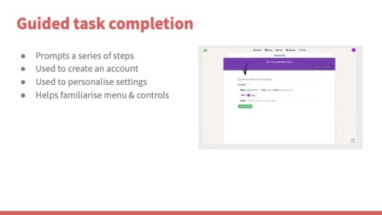
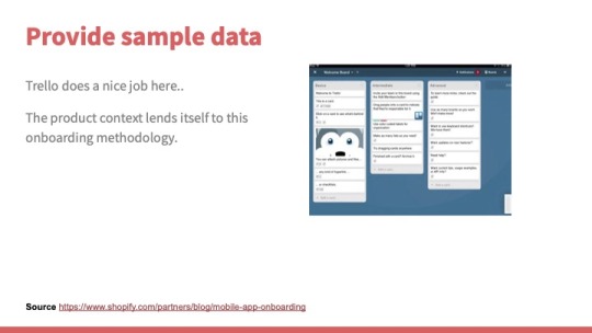
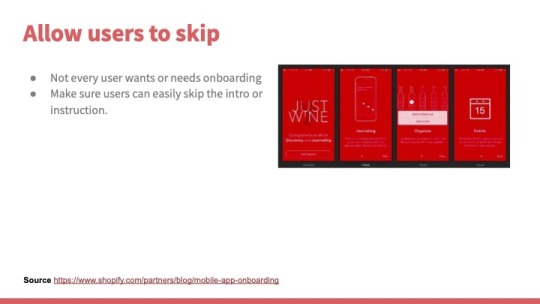
Apply user research and testing to decide which UX onboarding patterns to use at which part of your product experience.
Nickle tour/cards or coach marks.
1 note
·
View note
Text
Formative
Elevator pitch (presentation)
Video
Elevator pitch
3 slides.
1 minute.
Identify target users, their needs and problems.
Identify target users' environment, to add context.
Describe how they currently solve the problem.
Show how my solution will solve the problem.
Explain why my solution is better than existing solutions.
Explain how my solution is novel (new or unusual).
Don't show my design process, show value.
Tips
Create a script to stay on track.
No word count.
Time yourself reading the script.
Storyboard slides and test before presenting.
Don't be a robot.
Start, middle and end.
Capturing opening.
End with a call to action.
Video
2 minutes.
Showcase prototype features and functions.
Production is high standard (audio + editing).
Link features to personas.
Include voiceover to describe each feature.
Describe key features, not every detail.
Communicate novelty of key features.
1 note
·
View note
Text
Prototype References
Icons made by Freepik from Flaticon.
QR Code images from Random QR Code Generator.
Images
Mt Eden Village Craft Market (event card)
Mt Eden Village Centre (event venue)
Knitted Goods by Hailey (event creator)
Amy's Soy Candle Creations (event creator)
Sue's Plants and Succulents (event creator)
Truly Neon Live Feat. Blossom (event card)
Fragments Exhibition (event card)
Spring Sonic Festival 2021 (event card)
Beginner Ceramics (event card)
Art & Auckland Opening Night (event card)
Rhythms of Life by Adam Cullen (event card)
Printmaking Workshop (event card)
The Hybrids Live (event card)
Hannah Diamond in Concert (event card)
Profile Picture
0 notes
Text
Storyboarding
Narrate from persona's POV.
Talk about how my app directly affects their lives for the better.
Talk through the features.
Build a scenario.
Make the audience empathise with the user.
Use real quotes from user interviews.
Scenario:
User struggles with discovering events unless it is forwarded to her by friends through other platforms, such as Facebook, Instagram, etc (all over the place).
Going to an event with friends, forwarding tickets to friends.
Features
Digital scavenger hunt, QR code scanner.
Buying tickets.
Saving events to view later.
Redeeming rewards.
0 notes


