#inkspindle
Explore tagged Tumblr posts
Visit Tumblr Blog
Explore Tumblr blogs with no restrictions, modern design and the best experience.
Last Seen Tumblr Blogs


Fun Fact
130K people were victims of a chain letter scam that affected Tumblr in May 2011.
Text
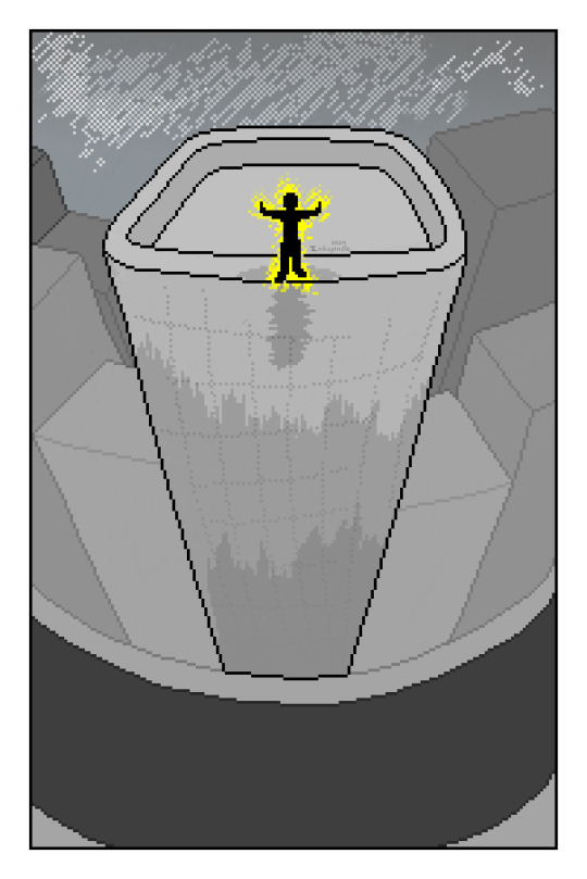
This post got a lot longer than intended (oops), so feel free to just skim the pretty pictures, or skip to the bits you find most interesting!
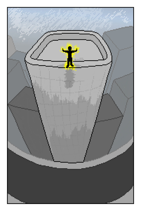
I got bored, and wanted to try something out, just to see how it looked. The goal was: Make a visually appealing pixel-object out of very limited colors, which is both clear in visual, and shaded to give a lil depth. While this isn't a tutorial on making old-school pixel art, I'd love to see if this inspires anybody else to give it a try!
Shrunk a public domain photo down for the silhouette of my base here (https://www.publicdomainpictures.net/en/view-image.php?image=173260&picture=tree) and just kinda riffed on it. Tried to "capture" the way it looked (to me) as best I could, while staying true to the original photo.
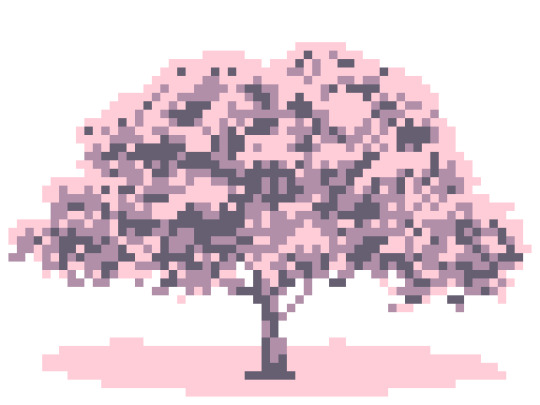
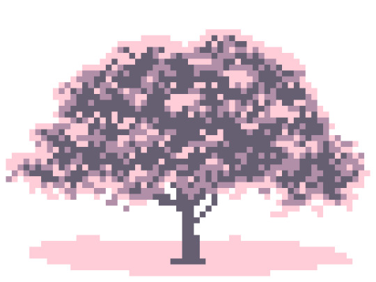
In order to tempt people into scrolling past the read-more, here is the final image I settled on after taking several passes at it. (Be warned, this is a VERY LONG post!)
(And what it looks like at normal size)

Normally, when I do pixel art, I prefer not to do the thing where you shrink a picture down, and make it more pixellated. But... I've realized there's a bunch of different ways to emphasize those same pixels. So I decided to experiment.
First-off, my initial goal: The background would be the lightest color, and I would then use a darkest color and two mid-tone colors to re-create the entire image. I couldn't work with any other shades, as it would help me simplify the shapes I'm looking at a little better. So I started by blocking in the deepest shadows I could find, and then sculpting them into more satisfying shapes.
While it "worked," I didn't like the end-result. It wasn't terrible, it just didn't look the way that I wanted it to.
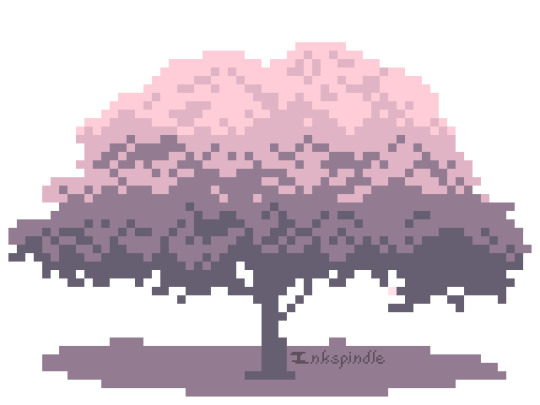
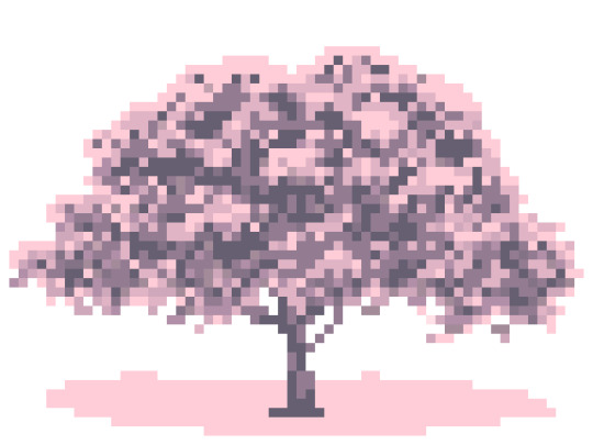
The next attempt was to make all my existing shadows the darkest color in my palette, then "fill in" between them with a nice mid-tone. Something to soften the shadows up a bit, and make it look a little more cohesive.
This also didn't quite give the effect I wanted. The shadows are a lovely shape, but I probably added too many of them. I wanted the "focus" on the bits of the tree that were fully highlighted, but it still didn't look right.
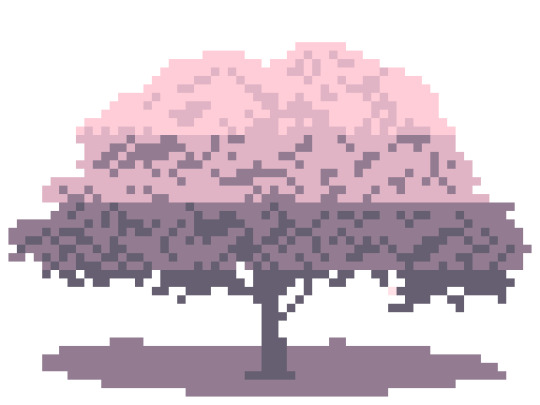
While it broke my initial "rule," I tried combining the first picture and the last one, to see what a "happy medium" looked like. The end-result... looked almost identical to the photo that I started with. (Colors notwithstanding.) While the visual effect was a bit more pleasing to the eye, that definitely defeated the purpose of the exercise. So...I started over completely.
SKIP DOWN TO THE TL;DR TO AVOID THE VIDEO GAME HISTORY RANT.
(Certain things have been heavily oversimplified, to make for a shorter explanation!)
Fun lil video-game history fact: Early visuals in video games started with "off" and "on." A lot of the modern limited-palette pixel art you see is directly inspired by the fact that the earliest screens we had to work with could only show visuals in binary; Parts of the screen were "on" (the lighter color) or "off" (the darker color) and we hadn't gotten to the point we could display a crisp white or black, yet. This meant that you might have a green background with darker green artwork. Later on, they were able to add a mid-tone shade or two for sake of depth and detail.
After we went through our early MS Paint era of video game visuals (complete with blinding use of primary colors), people stretched what early processors (CPU/video card/RAM/low-res displays) could handle to the limits. That harsh limitation on what an early computer could display without frying itself, and what it could display at all, led to some extremely clever uses of color-choice, dithering, and cross-hatching, to trick the eye into filling in with colors and shapes where early video game artists couldn't add them.
See, when we talk about "8-bit" games, we're talking about (oversimplified, mind you) the amount of colors and pixels a computer is capable of displaying, both overall, and in a given section of the screen at a time. Individual tiles and character-sprites for old games had a set amount of pixels per "square," and within those "squares," you were only allowed to display a certain amount of colors. Each separate "square" then had to be designed individually.
Some while after we figured out how to display more than "off" and "on," we developed computers that could handle showing a lovely range of different colors. But then we had a new issue; Within a single "square" (8x8, 16x16, etc) of the screen, you could have white, black, and up to 1-2 other colors. The computer couldn't handle displaying anything else; No midtone shades inbetween, no nothing.
So early video game artists compensated for this by sticking to that old method of "chunking" out the visuals on the screen into tiles, which matched that resolution. You wouldn't notice that your computer could only show 2 gray tones in the same square, if that square happened to be a stone wall. The square next to it could then be two different shades of green, and it would make a lovely piece of grass, or a tree, with shading even!
There was a period inbetween where we had such limited colors to work with, people had purple trees, orange grass, and red skies. It created a wild visual effect, and had all the right contrast (see artwork term: "Value") to allow the eye to see the detail needed for games in which visuals were really important, like early point-and-click adventures.
Eventually, artists stretched the limits further. While that resolution was slow to evolve, people began to create complex backgrounds with visible perspective, that blurred the lines between each "square" on the screen. If you wanted to create a diagonal edge, or overlap two objects over eachother, you had to use a set of colors that could apply to both objects you wanted to create.
So!!! FOR THOSE WHO SCROLLED DOWN, tl;dr-
I wanted to see if I could re-create this tree with only 3-4 total colors (+background) in a way that an early computer could have rendered on-screen. That means white/black + 2 colors per "square." Since I didn't like how harsh a pure black looked while I worked on it, I skipped using it. We're going to pretend an old computer could handle these specific shades of pink and purple (spoiler; they absolutely could not)...but the visual effect being used is true to the idea.
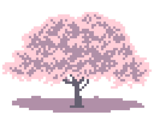
A first-attempt was made. I allowed myself one extra mid-tone, just for the sake of smoothing things out. I then decided on 8x8 pixel squares. You can visually see where one stops and the next starts. It had a fun visual effect, and it was much closer to what I was originally going for...but the artists that came before me made nuch nicer artwork with much worse tech, and I could do better. So I took a second pass at it.

THIS was much closer to what I'd been going for. While you can still guess where each square begins/ends, all the extra dithering and more organically-shaped lines helps to blur the edges of each square, without straying outside of them.
If you got all the way down here, you're amazing. I hope this entertained somebody, and that others will like the end-result as much as I do. :)
2 notes
·
View notes
Text
Looking for inspo!
Dagnabbit! I haven't had anything to post for a few days, as I've been helping a friend with an entire Roll20 tileset (6+ hours each day for like 3 days) and I don't think he wants me to post it. (yet) A lot of our mutual friends are in his campaign, and may follow this blog, so I can't spoil what it looks like, yet...
So! While I'm spending a huge chunk of my day on something I can't fill my blog with, what sounds like fun to see? I do mostly landscapes and backgrounds (not very good at people) and I prefer to mess around with stuff that looks like digital paint over stuff with harsh lines. But I'm willing to try whatever!
#pixel#pixel art#personal#inkspindle#lmk over ask if I haven't gotten replies working yet#all suggestions welcome!
2 notes
·
View notes
Text


Here's a couple pieces I made recently. I use my pen tablet and Paint.NET when on my computer, and Pixilart and my fingers on my phone. It's been a while since I made a lot of art, and I didn't used to make nearly this much pixel art, so I'm still getting used to what resolution I wanna work at, and how big I want each piece to be.
I'm gonna try not to dump everything all at once. Stay tuned for more!
2 notes
·
View notes
Text
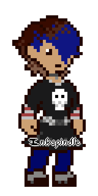
I've been pretty busy, so I did something I normally don't! I have trouble drawing people, so I built a base I can make characters with, and then made some really simple bouncing animations. These are two characters of mine, Zachary and Jade!
I totally didn't time the bounce to the beat of a song that's been stuck in my head for like week... (I've been playing too much Star Rail)
#pixel#pixel art#dot art doodles#moving dot pictures#my characters#insert clever queue tag#inkspindle
1 note
·
View note
Text
Not long ago...
Was playing Dragon Age and happened to see a cool cave -- got inspired enough to do some very painfully basic animations on Pixilart on my phone. They're not *good*, but they work! I wanted to practice showing parallax.
The second was gonna be what it looked like to kinda pass the cave by entirely, but uhh...50 frames later (moving every single layer by hand) it got a little tough on my fingies.
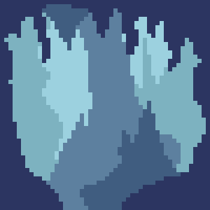

I did these a bit ago, and have been wanting to re-do them and make it look a little nicer...but I didn't have it in me to re-do either entire animation. So I focused on re-doing the look and feel of the background itself.
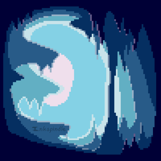
I have a tendency to draw things in very washed out, desaturated colors, because I find the colors people typically use to be very bright, and a little harsh on the eyes. So I went out of my way to use brighter colors than I normally would.
Not totally sold on the way I highlighted each part of the mid-ground, but the end-result is neat. Might come back and re-do this again, later.
#pixel#pixel art#scenery#dot art doodles#moving dot pictures#epilepsy warning#insert clever queue tag#inkspindle
1 note
·
View note
Text
Something a little different! A lot of what I'm drawing is actually practice for a potential comic I've been working on for the last fifteen years. I could never finish it in the way I used to create art, as it just took too long to complete a single page. So I'm trying to see if I can find a different way to draw pages!
Let's see how long I can keep up posting a couple drawings each day. LOL
1 note
·
View note
Text
Tags to keep an eye on!
I'm in the process of setting up my queue with some fun pieces I can roll out over the next couple days so I don't dump them all at once and I've finally worked out a couple tags to use! Feel free to follow/black-list as needed/desired.
Inkspindle
Personal ("RL"/Blog-relevant stuff, other personal-life specific posts)
Comic (As I do those every once in a while)
Dot Art Doodles (Smaller pixel pieces and quick doodles)
Pixel Opus (Larger pixel pieces and much longer doodles)
Moving Dot Pictures (Pixel animations)
Hey Look It's ART (Anything non-pixel/unrelated side-projects, which I may post every once in a while)
Insert Clever Queue Tag (Queued posts)
Will add/tweak things as-needed. If you have any questions or suggestions, feel free to message me!
0 notes
Text
Starting the blog off right!
Can't have an empty Tumblr.
Hello all! You can call me Inks, and this is my new blog. I haven't had a Tumblr in a very long time, and it's been even longer since I last posted my artwork online. (My DeviantART is 17 years old!?)
I took a very long hiatus and stopped drawing completely, and am only just-now coming back to it. Most of my old communities are dead and abandoned (or not what they used to be), and I figured I'd see if I could find somewhere new to post the art I've been working on.
It'll be a bit slow to start, but there should be some fun stuff posted here soon!
1 note
·
View note