#infographicdesign
Explore tagged Tumblr posts
Visit Tumblr Blog
Explore Tumblr blogs with no restrictions, modern design and the best experience.
Last Seen Tumblr Blogs


Fun Fact
In 2020, 27% of US Tumblr users had an annual household income of over $100,000.
Text
#presentationagency#presentationdesign#branding#powerpointpresentation#annualreportdesign#ppt#googleslide#infographicdesign#companyprofilepresentation#salespresentation
1 note
·
View note
Text
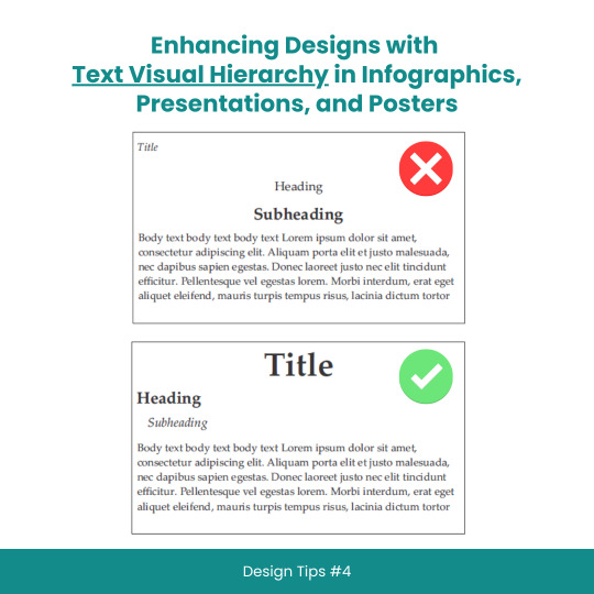
Enhancing Designs with Text Visual Hierarchy in Infographics, Presentations, and Posters
#scicomm#sciencecommunication#VisualHierarchy#TextHierarchy#Typography#InfographicDesign#PresentationDesign#PosterDesign#Layouts#Fonts#Contrast#Alignment#DesignTips#DesignPrinciples#GraphicDesign#WebDesign#PrintDesign#CreativeProcess#DesignInspiration#DesignCommunity#DesignThinking#GoodDesign#EffectiveDesign#DesignMatters
8 notes
·
View notes
Text
Strategic Infographic Design for Clear Data Communication
Okay, real talk—have you ever stared at a messy chart during a meeting and thought, “Wait… what am I even looking at?” Yeah, we’ve all been there.
At Visual Sculptors, we’ve made it our mission to fix that. I’m talking about infographics that don’t just look good—but actually make sense. We take all those overwhelming numbers and turn them into clean, sharp visuals that tell a story.
Strategic infographic design emphasizes the efficient communication of information through the integration of impactful visuals and succinct text to convey a persuasive narrative. Essential components encompass a central theme, coherent data visualization, a logical progression of ideas, and aesthetic appeal. By comprehending the audience's needs and selecting appropriate visual elements, one can develop infographics that are not only informative but also engaging and easily comprehensible.
This slide? One of my favorites. Simple layout. Smart color use. Clear data flow. Nothing screams “look at me” just for show—it’s all intentional. Because when you're sharing trying to highlight trends, clarity wins. Every time.
Honestly, I think of infographics like mini storytellers. And when they’re done right? They speak louder than a paragraph ever could.
So if your data feels like it's rambling—let’s help it find its voice.
Visit: VS Website See: VS Portfolio
0 notes
Text
Did you know? You can create eye-catching infographics in Canva using simple tips and tricks—even if you're not a designer!
#didyouknowfacts#canvatips#infographicdesign#infographics#DesignTricks#visualcontent#ContentCreation#graphicdesigning#canvahacks#marketingtools#2025DesignTrends
1 note
·
View note
Text
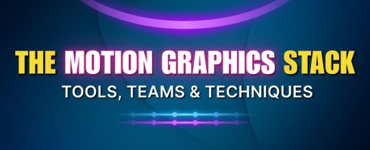
The Motion Graphics Stack: Tools, Teams & Techniques
From concept to final cut — ever wondered what goes into crafting stunning motion graphics? Whether you're a designer, animator, or just love visual storytelling, this infographic breaks down the essential stack behind the magic ✨
📌 Explore the tools professionals swear by 🎨 Discover how creative teams collaborate ⚙️ Learn techniques that bring static designs to life!
👉 Check it out now and elevate your motion design game!
#MotionGraphics#AnimationTools#DesignWorkflow#CreativeTeams#InfographicDesign#VisualStorytelling#DesignInspiration#PostProduction#MotionDesignStack#CreativeProcess
1 note
·
View note
Text

Understanding GST can be tricky, especially when it comes to exports. This infographic breaks down zero-rated GST in Singapore—what it means, how it benefits your cash flow, and when you can actually apply 0% GST.
Whether you’re an exporter, SME owner, or just someone exploring Singapore accounting services, this visual guide makes GST easier to grasp.
#SingaporeBusiness#ZeroRatedGST#AccountingServices#GSTGuide#ExportTips#IRAS#CorporateServicesSingapore#FinanceTips#InfographicDesign
0 notes
Text
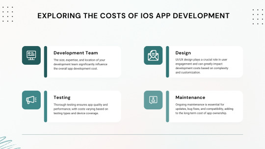
Explore the key factors that influence the cost of developing an iOS app in 2025. Learn how budgeting, features, and development choices impact overall expenses.
#iOSAppDevelopment#AppDevelopmentCost#MobileAppBudget#iOSDevelopment2025#TechInfographic#AppDevelopmentInsights#MobileAppTrends#AppCostBreakdown#AppDevelopmentTips#InfographicDesign
0 notes
Text
✨ Boost Your Sales with Eye-Catching Amazon Listing Images! ✨

Are your product images truly selling your product?
In today’s competitive ecommerce world, well-designed product listing images can be the key to increased visibility and higher conversions. I design Amazon-compliant, professional, and conversion-focused images including:
✅ Clean product images ✅ Infographics to highlight features ✅ EBC / A+ content layout ✅ Consistent branding across all visuals
Let your product stand out from the crowd with scroll-stopping visuals designed specifically for Amazon.
🔗 👉 Place Your Order on Fiverr
# ## # # # # # # #
#ProductImageDesign#ListingImages#InfographicDesign#AmazonListing#FiverrDesigner#AplusContent#ProductBranding#EcommerceDesign#EBClisting#CreativeProductDesign
0 notes
Text
Business Posters: Types & Impact
Posters are a cost-effective way to promote your brand, announce offers, and catch customer attention—whether displayed in-store, at events, or on the street.
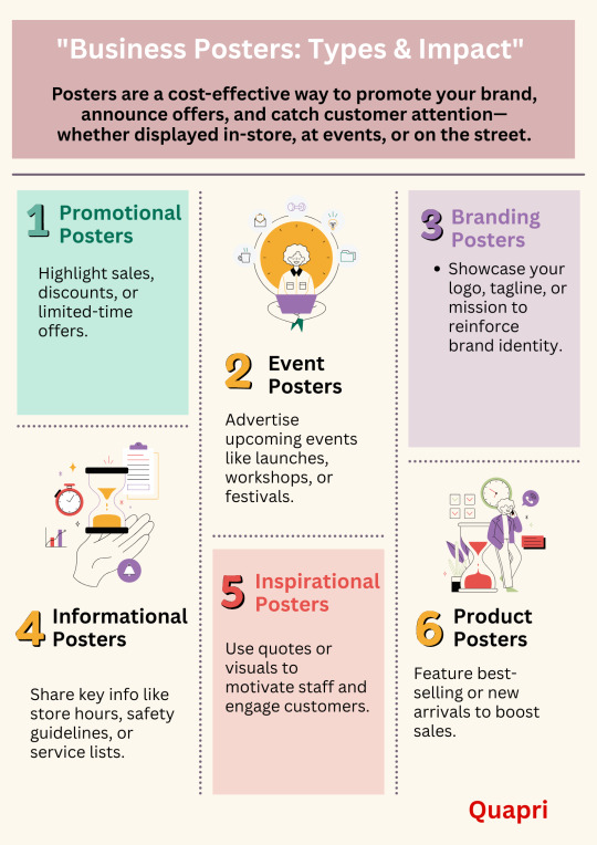
#BusinessPosters#PosterDesign#MarketingTools#VisualMarketing#BusinessPromotion#PromotionalPosters#EventPosters#BrandingPosters#InformationalPosters#InspirationalPosters#ProductPosters#PrintMarketing#SmallBusinessTips#BusinessGrowth#PosterTips#DesignInspiration#InfographicDesign#CreativeMarketing
0 notes
Text


🚀 Want to make your Web3 brand stand out? Here are 3 high-impact content formats that simplify your message and boost engagement:
✅ Pitch Decks – Win investors with clarity and confidence ✅ Infographics – Break down complex ideas visually ✅ Carousels – Tell compelling stories, slide by slide
In the noisy world of crypto and blockchain, clarity = credibility. Let your content do the talking. 💡
#Web3Marketing #CryptoContent #PitchDeck #InfographicDesign #CryptoCommunity #BlockchainMarketing #ContentMarketing #Web3Design #CryptoStartup #NFTMarketing #MetaverseMarketing #DigitalStorytelling #CryptoBranding #DeFi #CryptoInvestors
#Web3Marketing#CryptoContent#PitchDeck#InfographicDesign#CryptoCommunity#BlockchainMarketing#ContentMarketing#Web3Design#CryptoStartup#NFTMarketing#MetaverseMarketing#DigitalStorytelling#CryptoBranding#DeFi#CryptoInvestors
0 notes
Text
Revamp Your Corporate Presentations: Expert Tips for a Successful Redesign
#presentationagency#presentationdesign#branding#powerpointpresentation#annualreportdesign#googleslide#ppt#infographicdesign#companyprofilepresentation#salespresentation
1 note
·
View note
Text
Make use of eye-grabbing icons, pictures and stickers to enhance your presentations

Visual material is necessary to increase the efficiency and commitment of presentations in today’s digital world. By using the top -oriented presentation icons, graphics and stickers can improve the slide and increase the effect of your message regardless of background element, professional or designer. Iconadda offers a large selection of both premium and free design resources to increase your presentations.

Iconadda has free presentation icons and illustrations . We have a wide range of the presentation icon in Iconadda, for instance: Office and professional icons: Suitable for business and company-related presentations. Educational icon: Suitable for online courses, coaches and students. Technology icons: Suitable for software and IT-related presentations. Financial and marketing icons: Suitable for explaining the report and the company strategy. Health and medical icon: Ideal for presentations of medicine and health professionals. You can get the perfect icon for your slides, ranging from flat, outline and stuffed designs with selecting both our free and premium icons.
Iconadda offers gratis presentation icons and images.
We simplify your access to free icons, stickers and objects in Iconadda. Our resources for design will enhance the visual appeal for any presentation, whether you are preparing a marketing report, business proposal or teaching project.
Explore our collection now!
Get the top presentation icons, graphics and stickers today by logging onto iconadda . Blowing plain audience with blind performance!
#PresentationDesign #PresentationIcons #SlideDesign #VisualStorytelling #BusinessPresentation #InfographicDesign #CreativeSlides #PitchDeck #PresentationAssets #SlideIcons #ProfessionalPresentation #IllustrationForSlides #PresentationGraphics #PowerPointDesign #EngagingSlides
#PresentationDesign#PresentationIcons#SlideDesign#VisualStorytelling#BusinessPresentation#InfographicDesign#CreativeSlides#PitchDeck#PresentationAssets#SlideIcons#ProfessionalPresentation#IllustrationForSlides#PresentationGraphics#PowerPointDesign#EngagingSlides
0 notes
Text
LinkedIn has evolved far beyond a professional networking platform; today, it’s an essential marketing tool for businesses, entrepreneurs, and professionals looking to build their brands and connect with their audiences. A standout strategy for thriving on LinkedIn involves harnessing the power of visual content.
#LinkedInMarketing#VisualContent#SocialMediaStrategy#ContentMarketing#LinkedInTips#BrandBuilding#MarketingStrategy#DigitalMarketing#LinkedInEngagement#PersonalBranding#SocialMediaMarketing#ContentCreation#LinkedInGrowth#VideoMarketing#InfographicDesign#digitalzaaenterprises
0 notes
Text

Launch Your Product with Stunning After Effects Videos
Want to make your product impossible to ignore? After Effects videos can turn your ideas into cinematic magic. Perfect for product launches, app demos, brand intros, or just adding that wow factor to your story.
From dynamic motion graphics to sleek transitions and animated typography — After Effects lets your brand shine in style. It’s not just a video, it’s an experience your audience will remember.
Ready to elevate your next launch? Check out the infographic and see how After Effects can transform your vision into motion.
🔗 Click and get inspired!
#AfterEffects#MotionGraphics#ProductLaunch#BrandVideo#AnimatedVideo#VideoMarketing#StartupTools#CreativeDesign#InfographicDesign#DigitalBranding
0 notes
Text
Infographic Design Services to Simplify Data

In the era of quick-bullet digital communication, it's harder than ever to grab and maintain attention. When information is constantly bombarding us, how do you have your message heard and engage with your audience? The answer lies in the magic of visual storytelling. Perhaps the most effective way of conveying in-depth information on the spot is infographic format. It is here that the professional Infographic Design Services come into play, making boring data interesting visual communication that educates and motivates.
Why Infographics Are Important
Infographics have recently become an indispensable part of every content marketing campaign as they can make the complicated information look simpler and put them in an easily accessible format. Infographics rely on images such as charts, symbols, and graphs and on brief pieces of information, with a worthy message. Hire Infographic Design is therefore an effective method of presenting information via various media sources, from the social network websites, blogs, presentations, and even in reports.
Advantages of Using Infographics
Better Comprehension: Infographics make learning and memorization simpler regarding your target market through dissemination of facts using visuals. Researchers at the Massachusetts Institute of Technology claim that human visual data may be processed by humans after a delay of just 13 milliseconds.
Higher Engagement: Visual content is posted and interacted with more on social networking platforms. Infographics have the ability to get more traffic to your site and create your brand more prominently on the web.
Improved SEO: Infographics enhance your webpage on search engines by creating backlinks from other websites. When other sites reference your infographic, it signals search engines that your page is informative and a source of authority.
Multi-purpose Utility: Infographics can be used for a wide variety of purposes, from educational blog posts and marketing to even internal employee communication and reporting.
The Role of Expert Infographic Design Agencies
Producing a great infographic is a combination of design skill, data understanding, and storytelling. While there are plenty of DIY tools available, availing professional Infographic Design Services guarantees that your infographics are not only beautiful but also accurate and effective.
What to Expect from Infographic Design Services
In choosing an infographic design service, get the best output by searching for the following:
Experience and Expertise: Get a service provider with experience in crafting good-quality infographics. View their portfolio and notice what kind of style and range of work they have.
Customization: Make sure that the design service provides custom services to serve your own intent and requirements. A one-size-fits-all solution might not be able to convey your own message effectively.
Collaborative Method: Choose a service that prioritizes communication and collaboration. An effective design service will be closely communicating with you to define your goals and involving your input along the way.
Pay Attention to the Details: Infographics need to be accurate and perfect. A professional design service will proofread and edit their work to perfection to be accurate and clear.
Timeliness: Check the turnaround time on your project. A good design service will deliver great work within the time agreed upon.
How Infographic Design Services Help Your Marketing Strategy
Adding Professional Infographic Design Services to your marketing strategy can have various advantages, including:
Brand Awareness: Infographics with bright formatting can help establish your brand identity with your brand color, logo, and design style. Consistency creates brand recognition and brand trust with your customers.
Variety of Content Mix: Infographics add variety to your content mix and engage and interest your audience. Infographics can be utilized for blog content, social media, email newsletter, etc.
Visual Representation of Data: Infographics is one great way to visualize data-led content. Infographics can benefit highly data-based industries like healthcare, finance, and tech very much.
Educational Value: Infographics can be used to teach your audience about complex subjects, products, or services. This can make your brand an authority in the industry and gain the trust of your audience.
Success Stories: Real-World Examples
To illustrate the effect of expert infographic design services, let us consider some actual success stories:
Case Study 1: Tech Innovators Inc.
Tech Innovators Inc., a startup technology firm, needed to promote the results of their growing tech trend yearly research report. They hired a commercial design infographic firm to create a series of infographics with large-scale findings and trends. They shared them on their website, social media platforms, and business magazines.
Consequently, Tech Innovators Inc. saw a dramatic spike in website visits and social media activity. Other players in the industry shared the infographics far and wide, and referenced them, further positioning the company as a thought leader in the technology industry.
Case Study 2: Health & Wellness Co.
Health & Wellness Co., as a well-being business, had to educate their customers on why their new product line is beneficial for them. They outsourced infographic design work to create up-to-date, informative, and gorgeous infographics to describe the science behind their products and how they benefit.
The infographics were applied on the blog posts, email newsletters, and social campaigns. The clients adored them immensely and generated increased sales of the new product line. The infographics also increased the web visibility and authority of the brand.
The AIS Technolabs Advantage
We understand the magic of visualization skill and visualization ability of having your business go for a ride along with us at AIS Technolabs. We pair data expertise and talented designers as a package to provide immense infographics that are capable of speaking your message at its best form. Our philosophy towards our process has a working-cooperation approach in that you keep thinking and your aim and idea become priority and are the cause of why we get driven into work.
Our infographic design services are specifically designed to cater to the individual needs of each client. You may require more of your marketing campaigns, inform your audience, or provide data-driven insights; we can do more. Partner with AIS Technolabs and see how professional Infographic Design Services can take your business to the next level.
Conclusion
Last but not the least, it is an affordable investment which will actually bring your visual communications to a higher level. Infographics are very effective ways of conveying hard data in an attractive and consumable format. If you hire an experienced professional designer, your infographics would be great looking and accurate and effective.
No matter whether you need to build brand awareness, drive website traffic, or teach your audience, infographics have it all covered. With a good design agency, you can transform your information into engaging visual stories that touch the hearts of your target audience.
Let our infographic design services expert professionals elevate your marketing. Let the power of visual storytelling build the strength of your brand. Contact AIS Technolabs today and learn how our Infographic Design Services will help you create compelling visual stories that inform and interact.
0 notes
Text
Piktochart: Create Infographics, Presentations, and More.
youtube
As we live in a visual world today, communicating well often means presenting information in the most appealing way possible-simply putting, using visuals interesting enough to grab people's attention so they can understand it. From marketing to running presentations, preparing social media posts, and working on internal reports; aesthetically pleasing content is always attracting attention and will help understand matters in detail. Piktochart shows up as an efficient and easy-to-use platform to empower individuals and businesses to create beautiful visuals, without being much of a designer. The article covers multiple aspects, explaining all the features and benefits of Piktochart.
Do you want to be part of these success stories?
Piktochart is an online visual communication tool that provides a comprehensive set of templates and design elements for infographics, presentations, posters, reports, social media, and much more. What's more, it is very easy to use, employing the ubiquitous drag-and-drop interface; you don't really have to be a professional designer to use it. This is what makes Piktochart light and flexible; it concentrates on content while the technical aspects of creating the final visual representation are managed by the software.
Features and functionalities are summarized as follows:
User-Friendly Drag-and-Drop Editor: Easy interface is the power of Piktochart. A drag-and-drop editor allows you to add, move and configure any number of design elements such as text boxes, images, icons, charts, and maps with great ease. The intuitive approach to the editor reduces the effort for a user to learn the software, as compared to other professional design software.
Rich Template Library: Piktochart has a collective wealth of pre-designed templates to suit your needs for almost anything concerning visual communication. These templates make a good launching pad by offering pre-designed content to be altered with the user’s specific context and branding. From infographics to present data, presentations to pitch ideas, and social media graphics to promote an event, Piktochart certainly has templates for many and each occasion.
Do you want to be part of these success stories?
youtube
Awesome Variety of Design Elements: A great number of unique design elements like icons, illustrations, photos, and fonts. Users can quickly search and use those design elements in their creativity.
Do you want to be part of these success stories?
#easygraphicdesign#draganddropdesign#diygraphicdesign#designhacks#designtips#graphicdesigntools#visualstorytelling#datavisualization#infographicdesign#presentationdesign#socialmediagraphics#marketingmaterials#createvisuals#design#graphicdesign#visualcommunication#visualcontent#contentcreation#contentmarketing#marketing#digitalmarketing#socialmediamarketing#infographics#presentations#posterdesign#reportdesign#creativity#designinspiration#Youtube
0 notes