#inconsistent art is simply my artstyle
Explore tagged Tumblr posts
Text
Indeed! you are not looking at this wrong. I have returned!
To be honest I wasn't planning on being gone for so long lmao, but things kept piling on each other and I lost track of time. Bit of a shame, but it's ok. That simply means I have a backlog of art I can show off, and hopefully just a bit more skill than what I had before I first left XP Tis the hope at least!
I'm gonna try to be more active around here and a lil bit more open about my thoughts, and scream about how much I love omoyami and how we should have more of it XD I'm also gonna try to draw more variety of things, which means yet again, more ✨inconsistent artstyles ✨ XD but, at least it'll be fun!
Regardless, I hope things are going well for you all. Take care of yourself! And if shit ain't great, it's ok to admit it. Cause sometimes it's wonderful to just be straightforward and acknowledge that things just SUCK. Just remember tho that it won't be forever. You, can, do, IIIITTTTT!!! (flies to the moon, sending sparkles of love as I go)
#i also posted some art in case you missed it~#its (drum roll please......) yami! wow#what a shocker XD#kathairo talks
21 notes
·
View notes
Note
Goodness, when you said about the ai art in the marauders fandom, I was like, I literally was thinking about that !!!! And no one calls them out ??? And if they do, it's a very weird time-lapse vdo or something like that to prove they're not tracing. BUT AN ACTUAL ARTIST WOULD NEVER DO THAT??? like the struggles we go through???? Our time-lapse vdos are crazy and I would simply just take a video of me drawing (show my hand at least if Im not comfortable showing my face sjdjdjdd ) also artists know when there's ai involved you're only fooling everyone else djdjdjkd
yeaaahhhh. i just blocked this person because i was so sick of seeing their art in my tags. you can tell usually with the lineart imo — lacks weight and many tangents or useless lines. or in this case, they mostly forgo lineart…
i try and post my process and tips often and i suggest other artists do the same. i feel proud of what i have learned and my process :]
as for those who are in the fandom passing this stuff off as their own, i hope someone has the balls to call them out. and i hope all of us can use our critical eye.
another tip is: design consistency. everybody will change their designs subtly and it is def hard to draw the same characters consistently without a lot of practice. but these artists change how they draw a characters hair or features every single drawing. and that is because the ai they are using is referencing many diff artstyles, and cannot reproduce the same face, especially of characters that do not have actors attached — regulus, any of the slytherins, marlene, etc etc
and i hate this! when inconsistencies become the halmark of ai or tracing it leaves less room for us artists to experiment. i find myself nervous that my art style is not copy and paste all the time!
anywayss
46 notes
·
View notes
Text
Since Tatara's poll is coming soon I'll post this again
EXCLUSIVE DEAL:
I receive: vote and reblog for Tatara in the upcoming TG sexyman poll
You receive: one badly drawn chibi in bunnysuit, like this (yes plz notice the inconsistence in style and quality)
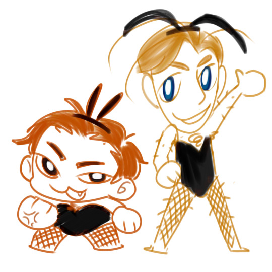

The rules are below if you're interested
The requirement is vote and reblog with something like "Tatara sweep" or anything similar. And no you can't reblog one for Tatara and another one for his opponent.......
If Tatara wins, I'll draw for everyone (who did the thing above). If Tatara loses, I'll draw for the ones who reblogged with propaganda
And yes this means that the rewards will likely to be distributed when the poll is ended. I need to prioritize my trade sorry 😭 but it can be delivered sooner if I feel like it
I don't know how much do I have to draw, how fast I can draw and how busy I'll be in the future so I can't promise you the day I'll deliver this. But rest assured that I will keep my promise I plan to take Tatara as far in the tournament as I can
It is badly drawn and I mean it. You will get a chibi in a bunny suit but the quality will vary, simply because I have inconsistent artstyle (i'm bad at drawing) if you see my arts you'll know. Also I'm better with young female characters if you need to know, I can't draw male characters as good
I accept Tokyo Ghoul characters (except T-Owl (sorry)) because they are easy to draw and I'm familiar with them. You can try asking for your blorbo from another show and I'll see if I can do them
Alright that's it folks! Let's trade honest labor for votes for my sexyman
29 notes
·
View notes
Text
Hey natewantstobattle fandom, I think there's something we need to talk about with the new v1r@l music video
It is highly likely (honestly it obviously is) that the art found in the video is AI generated. Now, this isn't me accusing nate of anything, as there's a possible chance that he is simply not aware of it being AI art. He's an artist himself (albeit a musical one), I doubt he would be in support of such theft, and he was smart enough to call out the whole NFT scandal as well.
When I first watched it it had stuck out to me that the anime artstyle found in the video seemed out lf the ordinary, but I brushed it aside automatically. I went to go see who created the art, and noticeably the only thing they had linked to was a video producer

I normally don't question give hearts when it comes to crediting, so I assumed that the person who made the video must ALSO be the one to make the art. But from observation, that must not be the case
This is not a company who has workers of different skill sets, which one could possibly be digital painting. This is one person, from the looks of it, who uses AI generated artwork. Looking at their website, there's a section exclusively for digital art. While these certainly do fit the common AI generated artstyle, and I wouldn't be surprised if it was, they don't have any inconsistencies and errors that AI art may hold, so no proof there. BUT there are certainly errors found in the music video itself that no one other than an AI 'artist' would make. My apologies if I don't point out all of them
0:38 - The boy's head resting on a vaguely shaped, stubby, backwards hand. It was no distinct structure to it, the fingers look half cut off, and no one in their right mind would twist their arm and hand like that to rest on it
1:08 - Nitpicky but this guy has the WEIRDEST hair texture I've ever seen. The parts in the light do not match the shaded parts of the hair. They're like...odd blotches of fire
2:38 - There's this out of place hood-headphone cord. It looks like it comes out of and goes to nowhere behind the old man, and attempts to be a headphone wire and a hood strap at the same time
2:57 - It may not be obvious at first but the girl's sleeve is not correctly attached to or shaded in with the rest of her shirt. Like. Just look at it
(Note: A person has said that there's one scene in which a character has five and a half fingers, but I haven't been able to spot it yet
The video also noticeably tries to hide the hands A LOT, whether that be blurring or cutting it out entirely. Considering the mistakes we've already found with the hands, and AI art commonly not being able to get hands to look right, it's very possible it was purposeful)
Now, more about what I said in the beginning about Nate possibly not knowing:
Another thing to point out is that give heart has worked with this producer before. But the past videos that were made by them don't seem to involve any AI art at all
Nate's cover for "The Day." The art found in it is from the manga/anime My Hero Academia, created by Kohei Horikoshi. This is art that obviously can't be stolen and taken as one's own
"A Taste of the Flame," Hazbin Hotel song by Shawn Christmas. This time, there is an actual person behind the art in the video and rightfully credited in the description
A normally trustworthy video producer, who is not even open about admitting that they use AI art (not stated anywhere on the business site). So, this is my good faith assumption that Nate is not aware of this. He has a team of people for his videos, and considering is personality, it's very likely of him to overlook what this mv consists of. I don't know him personally, obviously, but considering how he presents himself in his content, past opinions, and the definitely normal behavior of wanting to believe in the best of someone you're a fan of, I don't think he would support the use of AI art. He's an artist who also doesn't like his work being stolen, and I can imagine if there was (and oh dear god if there already is) an AI that generates music scrapped from him and other musicians, he would not be happy.
There are other possibilities if he DOES know it's AI. One being that he doesn't know that AI art steals art from other artists, and the second being an AI that takes from fully consenting artists. I 100% doubt both of these
If he truly does not know, I will be pretty relieved. But I will still hold him accountable for negligence on his part. It's his channel and content, and even if he overlooks some of the stuff in it, he still has full control of what gets posted there and is responsible for it. I won't be as upset, but he should've known better to not let this fly and investigated more on this VERY overtly suspicious artwork
Okay, now getting to the main point and what you should take away from this; we need to be letting Nate know what's up with this, bring it to his attention or at least ask him of what AI art is doing in this video (whether he supports it or not). Because it's important for us to know, AND if this truly was done without his support/consent, he NEEDS to be aware so he can fix it. I'd rather have no mv for v1r@l rather than one that promotes art theft
TL;DR: NateWantsToBattle's new music video for "V1r@l" consists of AI generated art theft, we don't know whether he consented to this decision or not, and as a community should let him know
#natewantstobattle#nwtb#nathan sharp#nate posting#to let go#ai art#ai generated#ai art is art theft#ai art is not art#ai art is stolen art#PLEASE don't ignore this nwtb community this is important
25 notes
·
View notes
Text
Intro post!
Hello everypony! My name is Vee. I also occasionally go by Oracle or Ora.
My pronouns are She/They/He, in order of preference, but do feel free to change them up!
I am Pansexual, and am taken — both by my wonderful boyfriend and my f/o.
No I do not do commissions!!
I hop around several different medias. The list includes:
Five Nights at Freddys
The Inkheart Series
Cookie Run Kingdom
The Magnus Archives
Portal
The Legend of Zelda (specifically BotW)
Killer Chat!
My Little Pony: Friendship is Magic
And several other, more obscure games and shows.
I have a Five Nights at Freddys AU, and most if not all of my FNaF content will be based around that.
My asks are always open to suggestions, (art or otherwise,) though it's not likely I will actually go through with them. please don't feel terrible if I don't answer your ask, it's probably because I don't know how to answer, or you've suggested something I simply don't want to draw.
I have a VERY inconsistent artstyle, but all of the art I post is mine unless credited otherwise.
You may use my art WITH CREDIT!!!!!!
I am safe to tag, and will 100% see what you tag me in!
I almost always follow back, and if I don't, it's because you post about something I heavily don't enjoy/dislike, or you don't post at all.
The Dislikes include:
Willry/hellium
Dandys world
Arcane
Most object shows
These only apply if I don't already know you outside of tumblr. The first one is a ship I heavily dislike, and the others have fandoms that just generally make me uncomfortable. It is not an attack against you in particular, I am simply setting a boundary.
Thank you for taking the time to read! Have a lovely lovely day.
0 notes
Text
2023 Final Games Ranking and Thoughts
Heya folks. This is just a ranking of games that I have played and personally enjoyed, similar to last year.
Overall, I'm very mixed this year. While we had some fantastic games, there seems to be a lot of terrible games that I did not play including Redfall, Silent Hill Asension, Gollum, or anything GameMill entertainment has made. Additionally, this was the year the game industry had the most layoffs after both the Pandemic bubble and the Live Service bubble bursted. Luckily I didn't touch any of the really bad games; most of the games I've played were decent, but I do hope the games industry actually gets their act together in the coming years. If the Game Awards this year was any indicator, they won't. So here's my list, counting backwards
13) Baldur's Gate 3: I highly respect this game's writing and extremely open gameplay systems, and from what I heard from DnD and RPG fans, its very faithful to DnD, but god does onboarding new players suck (I never played DnD or a Larian game in my life).
12) Convergence: A very frustrating game that, as a fan of Zaun and metroidvanias, I was hyped for. The gameplay is inconsistent, going from some of the most fun combat to just bullet hell nonsense. The rewind just feels like an extra life for how much the developers said it was designed to be more than that. Also, this has to be the worst story of any Riot Forge game. Most of the champion cameos felt worthless, they butchered Camille's character, and they didn't advance anyone's character or story. At least the art's pretty though. -------------------------- GAP------------------------------- 11) Song of Nunu: A very cute game with mostly okay and functional gameplay. Willump is super cute. My biggest complaint is that the ending didn't advance Lissandra's story that much given the events that actually happened, making it feel rushed and somewhat incomplete. I also think this game will probably be the representative of what I expect from Riot Forge stories. They star the characters you love in a different context, allows you to explore the world of runeterra, and advance the main character's arc BUT they will not advance too much. The status quo still lingers over us all.
10) Have a Nice Death: A cute roguelike-metroidvania with a beautiful artstyle and sometimes comedic writing. The gameplay feels solid with decent combat and powerups. That being said, there is some gamefeel and balance issues that can get annoying. Some weapons just do not feel good to use at all and there can be ALOT of visual clutter with all of the effects running around
9) Stray Gods: Extremely good visual novel story with a very unique take on greek urban fantasy with fantastic Worldbuilding and thought. Good artstyle and general staging. My biggest complaint and why its not ranked higher is simply because the music wasn't memorable. For a game that markets itself as a musical, that's a pretty big flaw
8) Cassette Beasts: An actual modern take on Pokemon that beats Pokemon Scarlet and Violet out of the water. It has a great doubles combat system, a unique typing system that forces players to think, and a lot of interesting story hooks and mysteries for the world it creates. If Pokemon Scarlet and Violet made me jaded about these types of games, Cassette Beasts revitalized my interest. I still think it needed a bit more polish and the ending felt a bit sudden, but overall a good game.
7) Street Fighter 6: The first game in the new modern generation of fighting games and its a very promising start. Modern controls and a very substantial storymode to onboard newer players with extreme mechanical depth with the drive gauge system for older, pro players. I think this might be the best launch Street Fighter has ever had.
6) Super Mario Wonder: A super mario game that made mario feel fresh and polished. It has extremely fun co-op with really cool game moments with the wonder flowers, albeit a bit short-lived. It has extremely fun co-op that I was able to play with both my sister and my dad, who never plays that many games.
5) Mageseekers: A game that adapts Sylas kit extremely well and actually gives the mages of Demacia a legitimate voice against the Mageseekers without having to sugarcoat the horrific warcrimes of a fascistic anti-mage state. There some gripes, but this is definitely the best Riot Forge game currently. Also Jarvan the 4th should not be king.
4) Pikmin 4: An incredibly polished and engaging gameplay loop that was hard to get out of once you find yourself in a flow. It was relaxing to just command Pikmin and watch them do your orders. It singlehandedly made me a Pikmin fan and I'm excited to see more of the franchise.
3) Little Gator Game: An incredibly cute game that's a perfect duration for what it offers. It's not a long game, but I was always charmed by the fun writing and solid movement tools. The ending even made me tear up.
2) Zelda - Tears of the Kingdom: This is essentially an expansion pass of BotW, but goddamn is it a fantastic expansion. The bosses are better, the resource crafting is cool, the machine creation allows a lot of creativity, and the world is still fun to explore. The ending is extremely climactic and satisfying with a decently solid fantasy story. This game has a lot more flaws than #3 and #4, but I admire the ambition and craft on display.
Hi-Fi Rush: This was easily the GotY for me. It has an extremely fun rhythm mechanic that works extremely well for the 3D style beat-em-up. The Saturday Morning cartoon artstyle is breathtaking with a witty, comical story to perfectly match its tone. The audio engineers deserve all of the awards for this work to get everything to bop to the beat. The music is not good on its own, but when you play the game, its fantastic in motion. Easily best art direction, best game direction, and best audio design for me.
1 note
·
View note
Text


[LISA The Forgiving Chapter 1 Part 1]
This took me way too long... Ughgksld... But it's finally here! I decided to make the coloring more detailed from now onwards btw! When's the next part? Hopefully in 2 weeks, but probably a month. I need some time to adjust, so please be patient if I delay the release!
Next
Previous
Index
#lisa rpg#lisa the painful#lisa the joyful#rando lisa#buddy lisa#buddy armstrong#brad armstrong#lisatheforgivingcomic#lisatheforgivingchapter1#brad is in the timeout corner rn#kinda deserved tbh#why is writing normal sounding dialogue so hard#inconsistent art is simply my artstyle#im totally not just making excuses or anything
49 notes
·
View notes
Text
Today finally ended that massive nonsensical mini series called Dark Crisis Young Justice, don't get me wrong, I'm sure they wanted it to resonate with the story told in the main series, and this mini focused on the characters of Young Justice. However, I just can't understand many of the creative writing decisions from the writer behind this mini-series.
In my opinion, and I repeat only in my personal opinion, it seems that the writer barely read the original material, at least only a small part, that and apart from possibly little research, it is as if she had read it but only understood what she wanted to understand , a fanciful version of the story.
Or even worse, and what I think most possibly happened, the writer, despite knowing at least how all the events happened, simply decided to ignore it and write her own version of the story and the characters, just to fit the metatextual message that she tried to transmit.
Be that as it may, I can't say that I liked this mini at all or that I personally consider it good over everything she tried to transmit, (besides, it hardly seems to be related to Dark Crisis, apart from the simple fact that it take place simultaneously). You can't simply write a story, metamessage or not, if you can't even get the previously established facts.
Despite all the negatives, I have to say that I really enjoyed what was related to Bart/Impulse during the mini, a writing deepening into the character, there has been nothing like this for years with Bart, so his character definitely carried the full weight of this series in his back as the best writed character of this parody.
Still, with the story making no sense to some extent (not in universe at least), Bart still falls short as the other characters (although not so much as the others) and questionable interactions (also I really liked the reference to speedsters powers, and how they knew all the mechanics from parallel universes for example), more precisely with Cassie, as it Bart somehow disrespected Cassie in the past, apart from some questionable moment from Teen Titans 2003, with a different writer than Young Justice, this never happened. Similar to this and the most affected character in my opinion was Cissie, who in resume she could be perfectly a different character, both in personality and backstory.
All this aside, I really can't understand how Fitzmartin can have a really good understanding and writing of Bart overall, and actually get the character to some point during this miniseries, but everything else falls apart and is a garbage bucket on fire in the meantime.
Whatever, at least here's my boy Impulse, who's inconsistently drawn and recycled art throughout all the issues as are all the characters, but at least he's good looking in this artstyle, here are my favorite panels of Bart from the final issue:
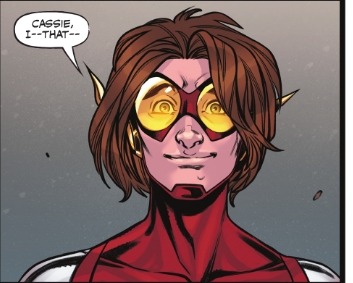
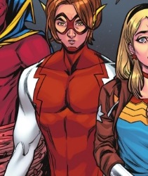
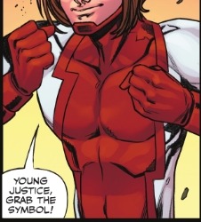
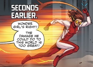
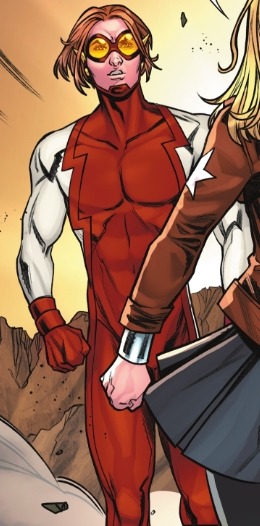
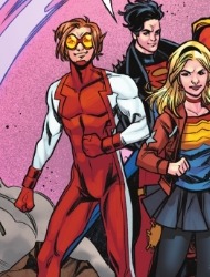
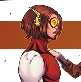
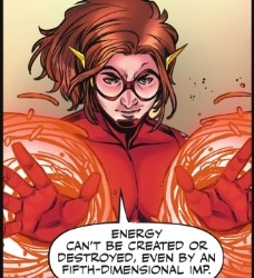
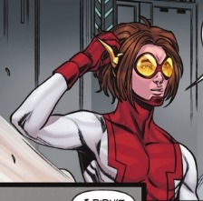
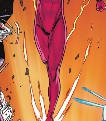
#Bart Allen#Impulse#Kid Flash#The Flash#Young Justice#Young Just Us#dark crisis young justice#FlashFam
29 notes
·
View notes
Note
not trying to be mean but i am curious why you refer to brotherhood's artstyle as ugly. i think it's perfectly fine? other anime are wayyyyy worse
okay i'll preface by saying 1. the post where i said bh had an ugly art style came from me just being annoyed as hell and in reality it's not that bad 2. everything i'm about to say is, as always, just my own opinion so Take That As You Will 3. i'm not a professional artist, i'm simply a hobbyist, so what i have to say doesn't come from much of a professional background
but with that out of the way, i'm just gonna try and focus this discussion on character art. i'm gonna start by just comparing the eds side by side

like, it's hard for me to pinpoint what exactly makes me prefer 03 ed, but something about his design just feels so much more aesthetically pleasing. 03's style is just so iconic, most of ed's most iconic and recognizable renders are ones that are from the 03 style
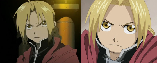
here's a few in-show screenshots from each. here i wanna point out two things that bug the hell out of me that are prominent in bh's style: the huge eyes and the coloring of ed's hair. just, look at how Huge bh ed's eyes look in comparison to 03's (this problem is even worse in the female characters) and this is 100% just personal preference but i HATE the fact that the lineart of ed's hair is different than the rest of his body. like, it makes it feel so inconsistent to me. sure, bh ed looks fine, but for me when i prop him up next to 03 ed i'm just like.... what happened to you sweetie. also i'm not gonna fully compare adult eds because i am WAY too biased towards cos's character designs but i'll just say that i also dislike how ed ages in bh, he feels so awkwardly bulky and Square and his age progression in 03 just feels so much more realistic and natural.
okay moving on to more screenshots. just so i don't make any unfair comparisons, i'm going to compare these Exact Same Shots in 03 vs bh


like.... again this is all just preference but i prefer the thinner lines, the consistently colored lineart, the more grounded coloring. and there's just something about the eyes, the way 03 does expressions, that elevates it to a whole other level. because look at the Difference between ed's expressions here, like wow. 03's is so subtle but nuanced, i love the way his eyebrows furrow and the little lines under his eyes. in bh he's just.... mildly worried. which is fine, like yeah this scene isn't super emotional or sad so it doesn't NEED to be stellar, but 03 took this small moment and elevated it with a deeper level of expression.
since we're talking depth of expression in 03, here's an even BETTER example of just how FAR 03 pushes its expressions and how poignant they are

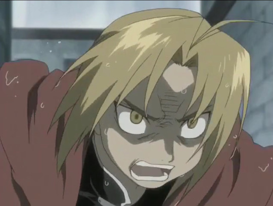
03 ed's reaction to seeing al be shattered by scar
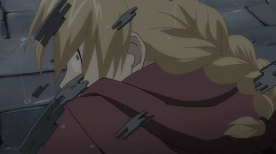

bh ed's reaction to the same exact situation. LIKE? THERE'S NO COMPETITION. and again i don't really know all the technical terms so this might be due to better directing rather than better artstyle, but this is one of my absolute favorite things about 03's art. it feels so much more emotional because of these incredible expression. and bh is so lackluster in comparison, like even in bh scenes that i think are powerful (like ed busting open the gate when he sees al's body), i think they could be even more powerful with deeper expressions
i could definitely talk more about this but it's getting late and i also don't want this to become a full on essay so i'll just wrap it up by saying that bh is not that bad, and yes, there are tons of anime that look way WAAAAAY worse. but i still think that in comparison to 03, it falls short to me
#i am NOT going to tag this LMAO#thank you for the ask though! don't worry you didn't come off as mean - i'm always happy to explain my thoughts#hope this isn't too repetitive and also makes sense LOL#ask
296 notes
·
View notes
Text
my mini manifesto on psycholonials ignore if you dont like psycholonials or andrew hussie
after a while of trying to find a direct download for it that wasnt sketchy i decided to finally shill the 2 dollars and 99 cents itd take for me to download psycholonials on steam.... couldve downloaded it on my phone for free but somehow the inconvenience of that and the desire to stream it for someone else to read led me to give andrew hussie money.

this post got long, so i added a nifty little keep reading thing for your viewing pleasure.
ART: if you loved the art in act 6, then you’ll likely enjoy the art of psycholonials too. if you didnt, then LOL. one of the most notable aspects of the artstyle he chose to go for for psycholonials is inconsistent image quality.
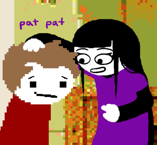
In the above example its most notable through one character interacting with another, but more often it’s on the same character, i.e. low-res body and head with a high res face drawn on top. ive seen people attribute this as being simple laziness on hussie’s part, but im inclined to see it as a specific creative choice? but the question i have about it is WHY does he choose it? i have to believe that part of the reason is simply to get it done in a timely manner, which i can somewhat understand? from what i know the entire thing was finished in a few months, which i imagine was either due to him simply not wanting to spend a long time on it or due to him wanting to release it within a Relevant Timeframe, with it having been both written during and taking place during the beginning and peak of COVID becoming a thing. for actual thematic reasoning? one of the ideas ive come up with for it is that it could be related to the themes of technology (more specifically social media) present in the story, with the pixelated appearance adding to that..? or maybe he just wanted psycholonials to have a style more specific to it, and decided that making it.. kind of shitty was the best way for him to do that. all that being said, i think the formerly mentioned reason of just wanting to not spend a long time on it is the most likely reason for this artstyle.

that being said, there are a few moments of art i actually did like, or at least find interesting. for example, in the above pic and a few other moments, hussie uses this kind of extremely strong image artifacting to highlight particularly strong moments of emotion. it’s a real gritty look, and a sort of embracement of the digital medium which i always enjoy seeing.
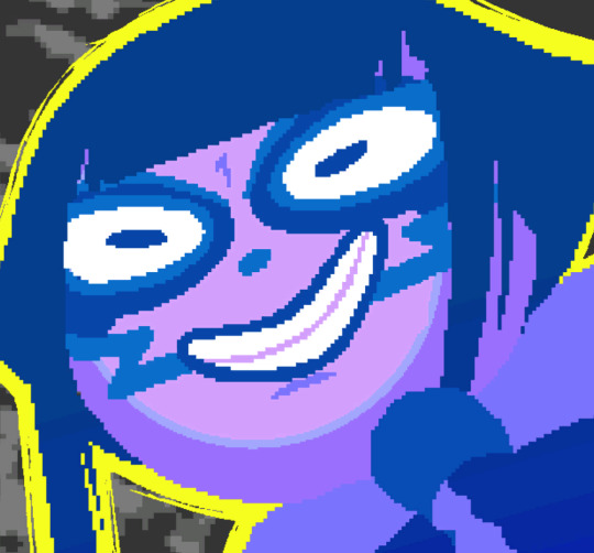
also, even though the drawings certainly aren’t the peak of hussie’s ability, there ARE some scenes with good use of color... or more specifically a single scene near the end along with a few others and some nicely manipulated backgrounds. still though!

lastly, most of the jubilite designs (which show up around 2/3s through) just plain rock. i have no complaints or snarky comments about them they’re just fun!! according to the credits, some of the jubilite designs were done by “tha sex mime”, whom i cant find any info on online so i have to assume they are either just an anonymous helper or hussie doing a lol. regardless of who did them, good work!
also after writing this all its starting to become clear that my thoughts may be too long for one post, so ill split this up as i write more and link the rest at the bottom of this one if i get around to writing them.
22 notes
·
View notes
Text
i want to add-
1.most reposters do leave the caption blank but another way i can tell or suspect someone is a reposter is if the caption is something like "look at this art" "this art is so beautiful" "cute" and stuff like that. in my experience that indicates the person who posted it found it online, thought it was pretty, and reposted it. any caption that sounds like a comment made by someone admiring the art and not the artist themself usually means op is a reposter
2.sometimes the url and the watermark/signature/etc on the drawing don't match bc the original artist simply changed either their url or their signature. even if the post is one day old this is still possible since many artists (especially now with so many new ppl coming) repost their own old artwork bc they forgot to post it on here or for whatever other reason
5.this is for me the easiest way to tell if someone is a reposter. usually you'll see a bunch of artworks that are clearly not drawn by the same person. it's not about an inconsistent artstyle, which many of us have and that's normal. it's that you literally can tell that it's impossible the same person drew all those pictures. another thing is if they only ever post fanart of one specific thing. artists usually draw like,, at least two different kinds of stuff, yknow? (some artists do have accounts just for fanart of one thing if it's like a huge interest but, yeah)
6. while i hate reblogging reposted artwork, i will actively reblog it if i find out it's a repost specifically to add credit. i take the time to look for the artist if i don't already recognize them, and link all their socials. i also will send the reposter a message telling them to either take down the artwork or at the very least give credit if they're so inclined to repost artwork without permission. some will be rude and respond harshly. others will actually apologize and make up for their mistake (serial reposters are usually on the harsh side tho. casual reposters will be the ones who might listen)
conclusion- just check for yourself whenever you suspect someone of being a reposter and if you confirm this, then take the steps to find and credit the artist
quick and dirty guide to recognizing stolen content on tumblr
there is RAMPANT art and photography reposting on this stupid website, and it occurs to me that folks might not know how to recognize it. here are the mental gymnastics i go through every time i see a sus post
1. is there a caption? most creators tend to leave one. maybe it's so their url is prominent, or to express their thoughts about the piece, link their shops/websites, etc. most reposters leave the captions blank
2. look for credit in the picture. is there a name, handle, or watermark? does it match the url?
3. check the original post. often you'll find that the original poster actually linked the artist. go forth and reblog that version!! for some godforsaken reason people keep REMOVING CREDIT on this website and i will MANIFEST INSIDE YOUR HOUSE IF YOU DO SO
4. check the tags of the original post. beyond the main fandom/character/subject tags, creators tend to have a #my-art tag or something similar. photographers often use #photographers-on-tumblr/lensblr. sometimes they'll also have thoughts about their work there. this doesn't always work, but personally i never see reposters adding tags like this
5. look at op's other posts and bio. is there anything about being an artist or photographer in the description? does the art they post look the same? usually this is where you'll Know if it's a serial reposter, because their blog will be FULL of reposted shit with no captions that all have different styles. also half the time their blog description straight up admits it
6. check the notes to see if someone added the proper credit. at this point, if you know it's a repost but still wanna reblog it, at least give credit where it's due. see if someone else already did the work for you
7. reblog and add a link with creator credit. if you know it's a repost, and you can't find credit, consider doing your part to help creators get their well-deserved recognition. usually you can just google the watermark in the picture. otherwise reverse image search on google or tineye is your friend
8. if the original creator is on tumblr, reblog their version of the post. if you've gotten this far it's not hard to search their blog for it
9. consider letting the artist know their art has been stolen and send them the link. this way they can take action and file whatever claims they need to get it taken down
10. finally, support original content creators! look at the #artists-on-tumblr and #photographers-on-tumblr tags, follow your favourite creators and reblog their work. seriously it can make a huge difference
if you read this far, THANK YOU. making sure content creators get their credit is literally the bare minimum we can do to be respectful of the countless hours they spend on their work. especially when that content is freely accessible
30K notes
·
View notes
Text
Star Renegades Offers A Stellar Take On The Indie Rogue-lite Genre
July 22, 2020 9:00 AM EST
Star Renegades is entering the saturated market of pixel-art indie rogue-lites, although its depth and string of interesting systems should be enough to make it strong enough against its competitors.
Pixel art has been undergoing somewhat of a renaissance within the indie scene for the last few years now. Massive Damage, Inc.’s upcoming game Star Renegades is part of this resurgence. It takes its own spin on the artstyle and gears it towards an interesting sci-fi setting, looking very good while doing so.
I had the opportunity to go hands-on with the first couple of missions in Star Renegades and from what I played, it’s an interesting rogue-lite strategy RPG full of varied systems, quirky characters, and slightly inconsistent dialogue.
youtube
The early moments of the game set you up for a big revenge story, crossing multiple realities in order to exact vengeance on invading forces. The game quickly, however, seems to forget about the story in favor of witty dialogue exchanges between characters and its interesting gameplay loop, which isn’t necessarily a bad thing. Strategy games aren’t always known for the best stories, so I’m hoping this continues throughout and is just supplementary to the gameplay.
The core gameplay of Star Renegades is split into two parts, exploring and battling, with each section littered with various systems. You enter your scenario on a randomly generated map that has rebellion forces scattered throughout who are trying to impede you from completing your goal.

The missions I played in this build weren’t particularly creative or different from anything else I’ve played within the strategy genre, but what did differentiate Star Renegades from its counterparts was the battle system.
When you encounter foes, you enter (with quite a long jarring delay at points) what the game calls a “deterministic combat system.” Everything within battle takes place on a timeline displayed at the top of the screen. The timeline is completely transparent, showing you how and when the giant robot enemies plan to attack, allowing you to then strategically plan your turn. Some of your attacks hit harder but will fall further down the timeline leaving you open, while others are quicker but are likely to deal less damage. Sometimes, it’s also just best to not attack at all.
The combat in Star Renegades is extremely tactical and is all about being opportunistic and having a solid but adaptable plan.
The most basic, but effective method I found was simply to attack before the enemies could attack me, which in doing so led to landing critical hits. By attacking first you could also stagger and then break the enemies, with each attack pushing the adversary further down the timeline. This lets you knock them off it and stop them from attacking this turn. The combat in Star Renegades is extremely tactical and is all about being opportunistic and having a solid but adaptable plan.
Like most RPG battles, Star Renegades has strengths, weaknesses, and immunities system incorporated into it. This adds yet another layer of depth to combat. Yes, your light attack will be quicker and allow you to hit first, but it will deal significantly less damage to your enemy and might, therefore, be counterproductive to your overall strategy. Battles also have combo attacks, which are stronger moves that take place between two of your party members whose relationships have been leveled up by the campfire (I’ll touch on this later).

Not only are the battles incredibly deep system-wise, but they also look and sound great too. The attack animations are nice and the sound design is fantastic with each move or enemy death sounding slightly different to the last – it’s really damn cool.
While the battle system is unique (at least as far as any game I’ve played) some of Star Renegades’ other features are borrowed or at least heavily influenced by other games. The opposing rebellion forces have “adversaries” – enemies that are unique and get promoted, evolve, and grow whenever they defeat you. It’s very much like the nemesis system from the Middle Earth: Shadow of Mordor/War games. It’s a system which when first released I (as well as many in the industry) thought would become much more commonplace within games. However, this seems like one of the first instances I’ve seen of it outside of its originating series, and most importantly, it has been implemented well.
Depending on what you are tackling you may also have to camp partway through or at the end of a mission. This is a system that, to me at least, feels reminiscent of camping within Darkest Dungeon. This time though you use cards to determine your actions. When you set up camp you have a predetermined amount of action points which allows you to play cards and use up these points to benefit your party. Cards range from healing and armor repairing to relationship building. The relationship-building cards help boost the affinity between two party members which in turn helps improve the aforementioned combos in battle. I’m not sure of the necessity of it being cards rather than character-based skills, but it’s not a huge gripe.
Other influences within the game are slightly more referential but are welcome nonetheless, with small nods to Super Smash Bros. and Star Wars creeping in. Most importantly of all, you can pet the dog in Star Renegades.
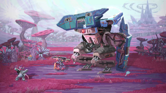
There are a couple of further systems in Star Renegades based around leveling up. The main system is simple and sees you earning DNA after every battle and then investing that into leveling up your party members. Secondary to that, when you return to base, you can spend your research points, earned by beating or damaging enemies, on new heroes, upgrades to existing heroes, and perks for your party.
Star Renegades states that there will be 13 different classes at launch. While the game itself is deep and varied, I didn’t particularly see that in the classes I got to use. Visually and personality-wise, each one is unique but I didn’t see a huge difference in play style. I’m willing at this point, based on how many systems this game has, to chalk it up to the fact my party members were all level one and at the beginning of the game, and the more they level up the more they’ll evolve and differentiate themselves. The differing personalities added some light relief and fun dialogue in what is otherwise a thematically dark game, although, at times, the conversations could feel quite contrived.
Overall, what I got to play of Star Renegades showed a deep and complex strategy RPG with some genuinely interesting gameplay systems integrated throughout. The systems and gameplay loop should be strong enough to support what I feel is, at least at this early stage, a slightly lukewarm and unoriginal story. The two missions I played have done more than enough to intrigue me and have definitely made me want to see how the game evolves before it comes out on PC and consoles later this year. It’s certainly one to keep an eye out for.
July 22, 2020 9:00 AM EST
from EnterGamingXP https://entergamingxp.com/2020/07/star-renegades-offers-a-stellar-take-on-the-indie-rogue-lite-genre/?utm_source=rss&utm_medium=rss&utm_campaign=star-renegades-offers-a-stellar-take-on-the-indie-rogue-lite-genre
0 notes
Text
IT WAS A JOKE I REALLY DIDNT THINK ANYBODY WOULD WANT THIS ITS SO MESSY AND LOW EFFORT 😭😭 also i am quite busy right now (drawing the trade) so I honestly can't draw for everyone (in time)
But uh due to high demand (3 people) let's make this real shall we... but first let have some terms and conditions
Instead of vote, the requirement is now vote and reblog with something like "Tatara sweep" or anything similar. Sorry for doing this but I can't draw for dozens of people you know 😥 have mercy for my hands
If Tatara wins, I'll draw for everyone (who did the thing above). If Tatara loses, I'll draw for the ones who reblogged with propaganda
And yes this means that the rewards will be distributed when the poll is ended. I need to prioritize my trade sorry 😭
I don't know how much do I have to draw and how fast I can draw so I can't promise you the day I'll deliver this. But rest assured that I will keep my promise
It is badly drawn and I mean it. You will get a chibi in a bunny suit but the quality will vary, simply because I have inconsistent artstyle (i'm bad at drawing) if you see my arts you'll know. Also I'm better with young female characters if you need to know, I can't drsw male characters as good
I accept Tokyo Ghoul characters (except T-Owl (sorry)) because they are easy to draw and I'm familiar with them. You can try asking for your blorbo from another show and I'll see if I can do them
Alright that's it folks! Let's trade honest labor for votes for my sexyman
Vote for Tatara in the next TGSMP round and I'll draw your blorbo in a bunny suit badly like this

33 notes
·
View notes