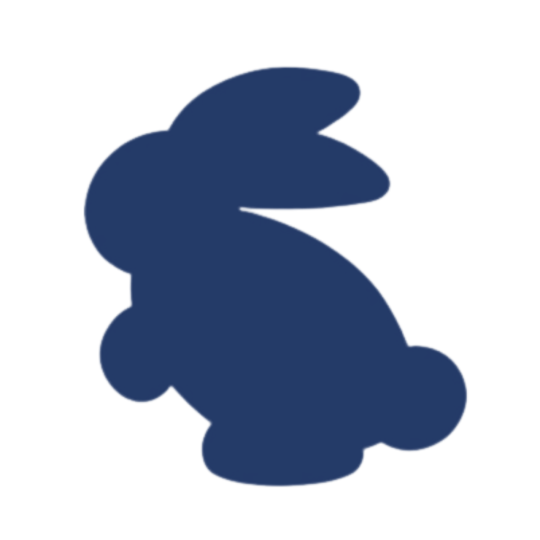
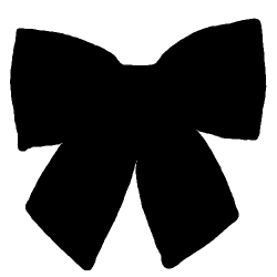
#image mask PNGs
Explore tagged Tumblr posts
Text
by z0mb1tch (Tumblr)
Scheduled: 09/02/24 – For: 10/12/24
Spooky-Scheduled Post 👻 🕸
image masks i've made out of random shit pt1
(theyre black for any1 on dark mode)
#Reblogs#by z0mb1tch#[PNG]#Masks#Image Masks#Mask PNGs#image mask PNGs#Halloween#autumn#spooky#seasonal#occasional#holidays#October#Black#Spider Webs#Spiders#Splatters#Vampires#Bats#Black Masks#Seasonal Masks#Occasional Masks#Holiday Masks#Halloween Masks#Spooky Masks#Spider Masks#Vampire Masks#Splatter Masks#Autumn Masks
86 notes
·
View notes
Text
:3 < some of these masks / divs belong to whisfer on pin , sirenreef + praysia on tumblr ! please check out all of those guys stuff they’re great editors !
#png dump#png images#png#transparent png#pngimages#transparent pngs#transparent#random pngs#aesthetic pngs#aesthetic#png pack#png aesthetic#tag spam#rentry#rentry resources#rentry stuff#rentry masks#rentry mask#rentry dividers#sntry resources#Sntry masks#Sntry dividers#dividers#blog resources#cute dividers#aesthetic dividers#what else do I tag#what the sigma
692 notes
·
View notes
Text
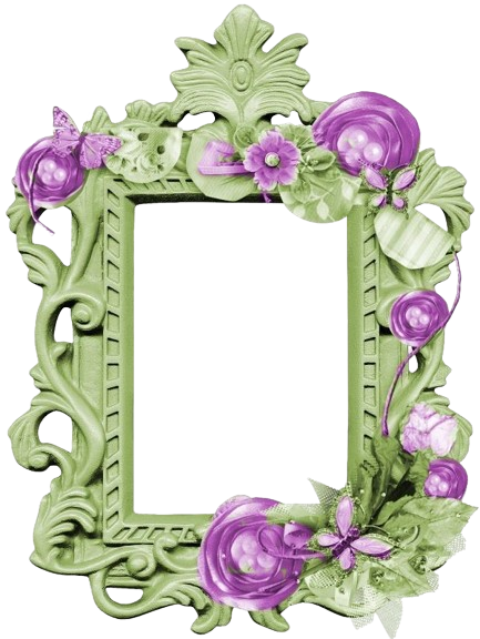
Green(ish) Borders // Frames
#🌹。 img dump. 𓏏𓏏#images#transparent png#transparent pngs#transparent#rentry image mask#rentry image#rentry images#image mask#rentry mask#rentry divider#rentry img#rentry decor#rentry#rentry resources#rentry graphic#rentry stuff
732 notes
·
View notes
Text
- CARD RENTRY MASKS -
- f2u | 10 pngs | 1 pdf -
- credit if reposting / using publically -
click read more for more options !
DOWNLOAD HQ | DOWNLOAD PSD
#rentry#pfp#icon#carrd#pfp icons#rentry masks#icon border#rp icon template#image border#image mask#carrd mask#rentry border#carrd border#cards#png#template#mine
733 notes
·
View notes
Text
New Rentry for my main account <3
#rentry inspiration#rentry inspo#rentry stuff#rentry pixels#rentry material#amino aesthetic#rentry#rentry images#rentry icon#rentry img#rentry stamps#rentry graphics#rentry gif#rentry decor#rentry dividers#rentry requests#rentry resources#rentry commissions#rentry promo#rentry png#rentry mask#rentry aesthetic#symbols aesthetic#seishu inui#inui seishu#tokyo revengers#graphics#carrd resources#carrd inspo#text dividers
96 notes
·
View notes
Text
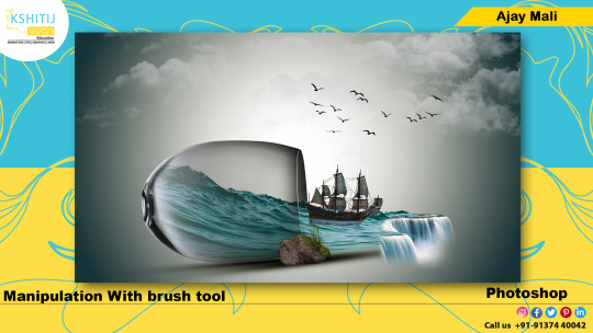
#kashitij vivan institute#photoshop#image#googel#large images#background change#pixels.com#mask#brush tool#png images#water fall image#stone#ship#Blank red wine glass#reffrence#landscap place holder#gradient colour tool#background
4 notes
·
View notes
Text
more icon mask thingies
395 notes
·
View notes
Text
ty! \(^_^)/ feelin good so ill try answer in detail for ya!!!!
most of the time i just do basic cell shading. here ill explain my rendering process after i choose my base colours, ill try keep it short & sweet!! nvm warning buckle up its really super long.
flat colours -> fully shaded!!
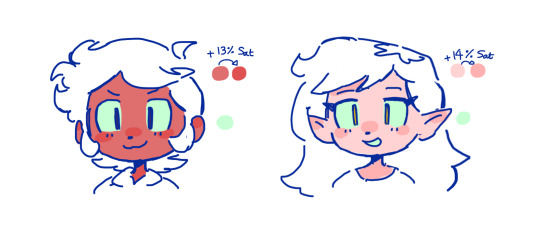
⭐️Picking shading colours!
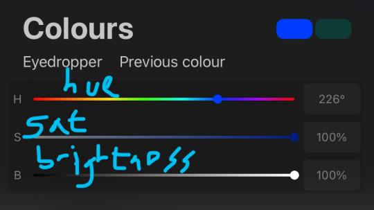
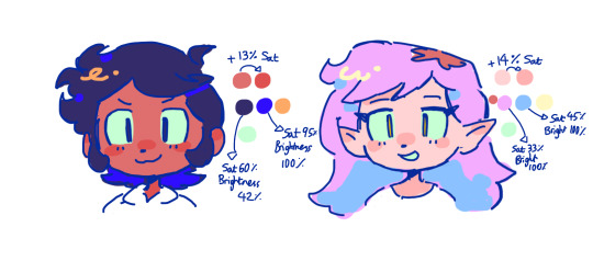
usually it's just the base colour with +saturation OR a hue shift! i dont really lower brightness.
This is what i mean by HSB, i never use the colour wheel i prefer the sliders!!!
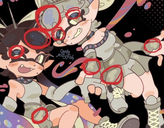
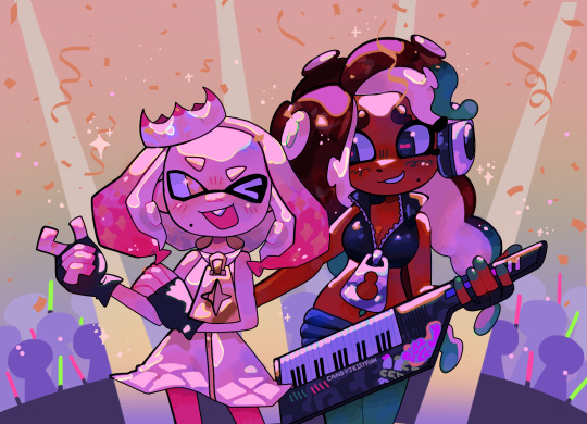
i like my art to look super colourful so i do things like shading pink with blue instead of with a darker pink or red, as shown in the above callie piece.
examples ft lumity:
skin: i always keep it very simple & cartoony! over the nose, below the eyes, the neck & sometimes the tips of the ears is where i'll put shading
hair: as u can See, it's not darker than the base colour at all!! for dark hair like luz's, i brighten & saturate the colour, and for light hair like amity's i just shift the hue a little!
⭐️more kewl tips:
colourpick from yourself!!!! instead of making a new colour for everything, try using a colour u already have down!!!! like below: by limiting my colour palette, it looks more harmonious
really messy image but i hope u get what i mean. also the "off white / black" thing is a separate choosing base colours thing!! i can expand on that if anyone's interested 😙
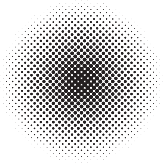
shove halftones in wherever they fit. here are the 2 pngs i use!! there a rlly good alt to gradients, i used a LOT of them in that callie piece!!! clipping mask over where u want it & alpha lock to change colour.
⭐️here's a WHERE i put the shading:
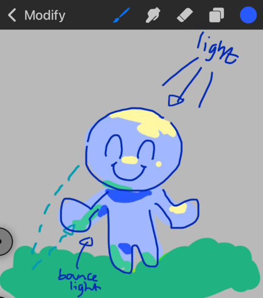
look st the environment ur guy is in!! pick where your light source is coming from & look where that light will hit and where it is blocked by something.
bounce light: the sun's light is also shining on the grass! so powerful the green reflects right back!
this is kinda more realistic lighting now.
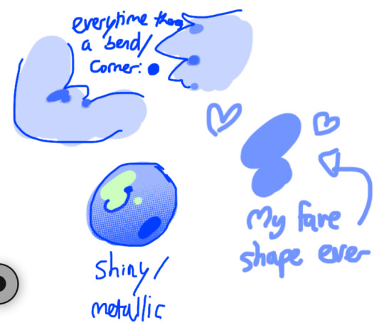
i kinda just put a circle wherever theres a corner!
and i put that Beautiful Shape a lot wherever. i change it a little depending on the character, sometimes its triangular or squarey but thats the base shape! i dont even know what its called but i love it.
look at this hello weird shape guy!!!
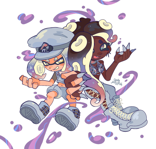
actually, my grandfest art are probably some of the most detailed art i have! u can see urself where i put shading & stuff - they do have more desaturated colour palettes though:
& here are some additional examples ^_^ flat colour -> shaded -> multiply layer -> lighting
in this one u can see the hand & leg at the back are completely in shadow too :)
anyway i think that's kinda it? i dont really know how to explain it, i just do what feels & looks right to me??? remember that im Not an expert & this is just how i do things :)
i will always repeat my no1 tips tho: keep drawing!!! and copy ur fave artists!!!!!! it really will hell u find what u like!!!!!!!!!!!!
i hope this post helps a little & answers ur question😇 never be shy to ask me anything cuz i love answering & chattin w u guys!!!!
EDIT: just saying these arent set rules or anything!!!! u can see just how many times i Dont follow my own advice LOL. my artstyle is super inconsistent, i rarely draw things the same every time
147 notes
·
View notes
Text
How to have animated rentry graphics with semi-transparency!!
Have you ever had this problem? You find this super pretty clipping mask that you wanna use...
...But when you try to save it as a gif, it suddenly breaks the pretty blurring?
So, let's talk about APNG:
APNG (Animated PNG) is exactly what it sounds like: a png that can be animated, with all the benefits of our beloved png format!! Such as unlimited colours!! Bet you didn't know this could be done!
Actually, you probably didn't know that for a good reason: APNG does not work everywhere. For example, I&'m not using it in this post because the animation won't work on Tumblr. It also doesn't work on old browsers, which you can check here if yours supports it or not:
However, even if the animation doesn't work, it will show the first frame as a still image!! So even those on older devices will still get to enjoy the graphic!!! (unless like... you want to do a fade-into-existence animation where the first frame will have nothing... but those are uncommon anyway)
But for this post, what's important is where it DOES work, and that is image hosting websites like imgur or catbox. And so, by extension, it will also work on Rentry + its forks!!
So how does one actually make an APNG?
Ezgif:
Note: DO NOT CONVERT GIFS TO APNG! It's useless because the gif file does not store any information about transparency, has less colours/lower quality, and you'll be needlessly removing backwards compatibility.
Go to APNG Maker and upload your frames individually. Check "don't stack frames" and make your APNG.
Photopea:
Works normally same as if you would save a gif. File -> Export as -> PNG. (You do need to have the frames layers in a folder same as you would for a gif)
Photoshop and Ibis Paint:
Unfortunately, Photoshop and Ibis do not let you just export as an APNG like that. You'll have to save each frame individually and then import them into Ezgif or Photopea.
As you can see, it's that simple! If you'd like, you can see a rentry template I& made using this the example APNG I& was showing throughout the tutorial here. I& was not able to find who made the overlay mask in the first place but a frame version of the cherry blossoms there did show up on adobe stock when I& tried to reverse search it so all they did was fill in a circle in the middle anyway.
Lastly, I& wanted to address one more question:
Why not use WEBP and/or AVIF instead? They offer the same benefits!
Well for one, fuck Google and fuck WEBP all my& homies hate WEBP. But for two, APNG has the benefit of backward compatibility: it's older (supported by more browser versions) and if the animation doesn't work, it still shows the first frame of it. WEBP and AVIF, on the other hand, don't show up at all/show alt text.
That's all, happy APNGing!
#rentry#rentry graphics#editblr#rentry tutorial#tutorial#edit tutorial#graphics#pfp masks#clipping mask#apng
117 notes
·
View notes
Note
hello! I love your edits and I wanted to know, for the "Steve Robin and Nancy" Gif you posted.. How would I go about doing something like that? More specificly, the bottom two where it says "Height Difference" and where it labels them as "Princess, Jock and Loser"
Thank you! Sorry this took a while to answer. I finally had time to sit down and write this. Link to original post.
Quick notes: I'm using Photoshop 2021 on Mac and working in video timeline. Must have basic gifmaking skills and know how to use layer masks. This is primarily a gif layout and text tutorial.
Fonts used in first gif:
Pea Wolfe Tracks — link here
King & Queen — link here
Fonts used in second gif:
Kiera — link here
Post — link here
Ellianarelle's Path — link here
Heina's hurry — link here
I used a light leaks/film texture, ripped paper textures, folded paper textures, and transparent pngs (arrows + post-it notes + smiley face).
We'll start with this gif.
Make your gif! The gif here is 540x600px. I color and sharpen it to my liking. Go to image > canvas size > change height from 600 to 770px. I left the anchor in the middle, though it doesn't really matter.
I drag and drop my folded paper texture and change the layer order so it's under my gif. Then I change the blending mode on my gif to Screen so the texture shows through the gif, but I keep the texture at 100% Opacity and Fill.
Now I move my gif around and add my ripped paper textures. I wanted to give it a sort of poster-like feel to it, so I made more room on the bottom for my main text and ended up with something like this. Blending mode is set to Lighten for the ripped paper textures.
I then use layer masks to hide what I don't want shown and add my light leaks/film texture. Blending mode on light leaks/film texture set to Pin Light, Opacity: 50%, Fill: 70%.
I use Levels and Brightness/Contrast adjustment layers to darken the gif up a bit more, then I add a patterned paper texture. Blending mode for patterned paper texture set to Lighten, Opacity: 100%, Fill: 75%. Result:
Now on to the text!
I'm going to be honest here, a lot of this was clicking around until I settled on something I liked. There's three layers to create this text effect. The font used here is King & Queen.
For the first text layer, the font color is set to black (#000000), font size: 87 pt, leading: 80 pt, tracking: 25.
Layer styles used here are stroke and drop shadow.
Text Layer 1
Stroke settings:
Size: 1px
Position: Outside
Blend Mode: Hard Light
Opacity: 40%
Overprint: unchecked
Fill Type: Color
Color: #5911ed
Drop Shadow settings:
Blend Mode: Difference
Color: #2d5ba8
Opacity: 85%
Angle: 70°
Use Global Light: checked
Distance: 7px
Spread: 0%
Size: 6px
Contour: Cone - Inverted
Anti-aliased: unchecked
Noise: 0%
Layer Knocks Out Drop Shadow: checked
Blending mode for text layer set to Overlay, Opacity: 100%, Fill: 85%.
Warp text settings:
Style: Wave
Horizontal: checked
Bend: +60%
Horizontal Distortion: +10%
Vertical Distortion: 0%
With all those settings applied, the first text layer looks like this:
Duplicate the layer, clear all layer styles, and change the color for the second text layer to white (#ffffff). All other text settings (including warp settings) should stay the same. The only layer style then applied to this text layer is stroke.
Text Layer 2
Stroke settings:
Size: 1px
Position: Outside
Blend Mode: Difference
Opacity: 100%
Overprint: unchecked
Fill Type: Color
Color: #d48f16
Blending mode for the second text layer is set to Difference, Opacity: 90%, Fill: 100%. Nudge the second text layer a bit so the first text layer is a little more visible or move to your liking.
With both those layers active, it looks like this:
Duplicate the second text layer, clear layer styles, and change the color of this third text layer to a dark grey (#1a1919). Again, all other text (and warp) settings should stay the same.
Layer styles applied to this layer are stroke and gradient overlay.
Text Layer 3
Stroke settings:
Size: 1px
Position: Outside
Blend Mode: Difference
Opacity: 100%
Overprint: unchecked
Fill Type: Color
Color: #d48f16
Gradient Overlay settings:
Blend Mode: Difference
Dither: unchecked
Opacity: 100%
Gradient: #cd3f00 > #ffdb5d
Reverse: unchecked
Style: Reflected
Align with Layer: checked
Angle: 90°
Scale: 100%
Blending mode for the third text layer set to Exclusion, Opacity: 100%, Fill: 100%. I also moved the third text layer around, down and to the right a few pixels to give it that 3-D Word Art effect.
With all three text layers active:
Next are the arrows.
Take your transparent pngs and place them to your liking. Blending mode for these is set to Difference, Opacity: 100%, Fill: 100%.
Command + click on an arrow thumbnail to select all the pixels in that layer. This is why the image must be transparent!
With that selection made and on a new blank layer, right click the selection and click on stroke. Settings for that are width: 2px, color: white, location: center. Move that a couple of pixels over.
Do this for all arrows for a total of 6 layers for arrows. I group them together to keep my workspace clean, then I duplicate my arrows group with no further changes made to the second group to get what you see in the final gif.
Next is the smaller text. It's three separate text layers for each word, so I can move each of them around to my liking.
Font used is Pea Wolfe Tracks, font color: white (#ffffff), font size: 24 pt, leading: 6 pt, tracking: 25. Bold and italic options checked. I set the blending mode to Difference, Opacity: 100%, Fill: 100%.
And that's it! That concludes the tutorial for this gif!
Now on to this gif.
We'll start with the background gif. There are three separate gifs. You could make them one gif, but I wanted the option to order them differently if I needed to.
All gifs in the background are the size of the canvas: 540x770px. Color and sharpen to your liking, but keep them all black and white. To get the blurry effect go to filter > blur > guassian blur. Set radius to 7.0 pixels. Add this to all three gifs.
Then I add two folded paper textures. Blending mode for one set to Lighten, Opacity: 60%, Fill: 100%. The other set to Screen, Opacity: 70%, Fill: 90%.
I found this tutorial a while back for a halftone effect. They include links to the halftone pattern used here as well as textures and gradient maps not used here.
I'm only using the halftone pattern here.
Pattern fill settings:
Angle: 66°
Scale: 8%
Link with Layer: checked
I also added a gradient overlay layer style to the halftone pattern which gives the gifs the color you see above.
Gradient Overlay settings:
Blend Mode: Overlay
Dither: unchecked
Opacity: 100%
Gradient: #0059ac > #a33600 > #e6b801
Reverse: unchecked
Style: Linear
Align with Layer: checked
Angle: -100°
Scale: 100%
Now on to the square shapes with rounded corners. In the interest of keeping this tutorial short(er), I found this tutorial on youtube that explains how to make squares with rounded corners.
I set my stroke size to 6px, stroke color to white (#ffffff), and fill to no color. I don't use the stroke layer style to make the borders of the shape like in the video! I'm only linking the video to show how to curve corners with square shapes.
Note: Be sure you know how big or small you want these to be and how they're going to fit on your canvas in order to make all the shapes and edit them. It can be tedious to change the settings.
Duplicate and resize to your liking.
In this instance, I wanted to make three squares total, so I had to duplicate twice and resize until I had something I liked.
Settings for the shapes used here are:
Innermost shape: W: 200px, H: 280px, corners: 50px
Middle shape: W: 220px, H: 300px, corners: 60px
Outer shape: W: 240px, H: 320px, corners: 70px
Once I have the size I want for all three shapes, I group them together to make a set and duplicate that group twice, then adjust each set on the canvas for my layout.
What the sets look like all together:
Colors used: orange #e47100, blue #0062d1, yellow #ecac00
To add color to the shapes, either change the color of the shape itself or use layer styles. I used layer styles.
Note: I didn't add the colors until the end after I knew what gifs went where and what color scheme I wanted, but I don't want to add more images than I need to here.
To keep this short, I found this tutorial on youtube that explains how to wrap text around a shape. However, I wanted the text to align on the outside where the white line is and not the green line (left image):
So I created another shape just inside the innermost square and used that as a path for my text (right image). Adjust the text to your liking until you have your text where you want it. Refer to the video tutorial if you need help moving the text along the path!
You don't need the shape path once you have your text where you want it, so use the layer visibility tool to hide it. You can hide your other shapes too so you can work with your text.
Do not delete your shape path!
I duplicate it once I start working with my "jock" text since all the sets are the same size. The "loser" text has to be worked a little differently, but we'll get to that later.
For the princess, jock, and loser text, there are two text layers to create the overall effect. For both layers, font used is Kiera, font color set to white (#ffffff), font size: 60 pt, blending mode set to Normal.
I added a gradient overlay layer style to the first text layer which I'll call the base layer. Opacity for this layer is 100%, Fill: 100%.
Base Layer
Gradient Overlay settings:
Blend Mode: Normal
Dither: unchecked
Opacity: 100%
Gradient: #f0b002 > #e7f0fd
Reverse: checked
Style: Diamond
Align with Layer: checked
Angle: 90°
Scale: 100%
The second text layer is your stroke and drop shadow layer. For this layer, opacity is set to 100%, Fill: 0%.
Stroke and Drop Shadow Layer
Stroke settings:
Size: 2px
Position: Outside
Blend Mode: Linear Light
Opacity: 100%
Overprint: unchecked
Fill Type: Color
Color: #0064cb
Drop Shadow settings:
Blend Mode: Difference
Color: #fb7c00
Opacity: 100%
Angle: 30°
Use Global Light: checked
Distance: 5px
Spread: 0%
Size: 0px
Contour: Linear
Anti-aliased: unchecked
Noise: 0%
Layer Knocks Out Drop Shadow: checked
End result looks like this:
When I make my shapes visible again (minus the one I used as a path), I get this:
The shapes are clearly in the way of the text, whether they're above my shapes layer or under it. I use layer masks to hide what I want, so the text is legible. It looks cleaner this way and I wanted the text to be a part of the shape itself. I do that for each rounded square.
Now on to my smaller gifs. I like to crop, resize, sharpen, and color separately because my laptop and Photoshop would kill me if I tried to do it all on one canvas. I use the size of the middle shape for my gifs (220x300px), so I can have a little wiggle room when adjusting. I then use a layer mask to hide the parts of the gif that are outside of the shape.
A quick way to do this is to command + click on the thumbnail of the innermost square. With that selection made, I got to my gif layer and add a layer mask. Sometimes you need to invert it. Use command + i with the layer mask selected (not the gif) to invert the layer mask.
I repeat this process with my Steve and Robin gifs. I have to go back and forth with all the layer masks to hide parts of the gif/shapes I don't want for each set. It's kind of a long process, but not all that difficult. I label and group my layers together as I work to keep things clean and it helps me keep track of what I edited and what needs to be edited when it comes to things like this.
The picture below shows where I hid the bottom right corner of Nancy as well as the shapes that make up her set using layer masks. I also did this with the Steve and Robin sets, hiding the bottom left corner of Steve.
Similar text settings used for jock. The gradient overlay layer style for this base layer is different than that of princess because of the positioning of the text. Again, same as princess, two text layers are used here. Blending mode, opacity, and fill for both are the same as the princess text layers as mentioned before.
Base Layer
Gradient Overlay settings:
Blend Mode: Normal
Dither: unchecked
Opacity: 100%
Gradient: #007aec > move bottom middle dot to 80% > #e7f0fd
Reverse: checked
Style: Diamond
Align with Layer: checked
Angle: -140°
Scale: 100%
Stroke and Drop Shadow Layer
Stroke settings:
Size: 2px
Position: Outside
Blend Mode: Linear Light
Opacity: 100%
Overprint: unchecked
Fill Type: Color
Color: #a05700
Drop Shadow settings:
Blend Mode: Difference
Color: #ffba00
Opacity: 100%
Angle: 30°
Use Global Light: checked
Distance: 5px
Spread: 0%
Size: 0px
Contour: Linear
Anti-aliased: unchecked
Noise: 0%
Layer Knocks Out Drop Shadow: checked
Image 1: We start with Robin.
Image 2: To make the loser text, I had to create a new path.
Image 3: I make it so the text is on the inside of the path instead of the outside. (Hint: Refer to video tutorial if you don't know how to do that.) I then adjusted the tracking between the letters in the word "loser" so they didn't look so squished together.
Image 4: Then I use layer masks to hide the parts of the shape I don't want shown.
You can then hide the path or delete it. You only need it if you want to adjust the placement of the text. I keep it (hidden) just in case.
Text settings for loser are just like those for princess. Blending mode, opacity, and fill are also the same.
Base Layer
Gradient Overlay settings:
Blend Mode: Normal
Dither: unchecked
Opacity: 100%
Gradient: #eb6400 > #e7f0fd
Reverse: checked
Style: Diamond
Align with Layer: checked
Angle: 90°
Scale: 100%
Stroke and Drop Shadow Layer
Stroke settings:
Size: 2px
Position: Outside
Blend Mode: Linear Light
Opacity: 100%
Overprint: unchecked
Fill Type: Color
Color: #e1a900
Drop Shadow settings:
Blend Mode: Difference
Color: #0068de
Opacity: 100%
Angle: 30°
Use Global Light: checked
Distance: 5px
Spread: 0%
Size: 0px
Contour: Linear
Anti-aliased: unchecked
Noise: 0%
Layer Knocks Out Drop Shadow: checked
Next are the post-it notes! This is probably the easiest part of making this gif. You just have to repeat this process for however many post-it notes you're making.
Image 1: To start, place your transparent post-it note where you want it. You can also rotate it if you'd like.
Image 2: Then create a text layer and write what you want. Font used here is Post. I wanted this text underlined to give emphasis, so I click on the underline option. I also adjusted the leading because I wanted more space between the word and the line. Rotate the text so it looks like it's written on the post-it note. Note: It looks better if you choose a font that looks handwritten.
Image 3: I wanted another line to give emphasis to the "Dingus!!" text and make it seem more handwritten. I use the line tool to create another line.
Image 4: Then I adjust that line to my liking.
Fonts used for notes: Post, Ellianarelle's Path, and Heina's hurry
Repeat this process for all post-it notes!
That finishes the tutorial! (And I hit the 30 image limit lol.) I hope this helps. If you have any further questions, feel free to send an ask or IM and I'll try to answer to the best of my ability.
Happy photoshopping!
#ask#pcocana#photoshop#photoshop tutorial#tutorials#*tutorials#userchibi#userbunneis#uservivaldi#userriel#userabs#usertiny#useralien#useraljoscha#userfanni#userraffa#tusermona#userbess#userrobin#userroza#quicklings#janielook#usernaureen#userrlorelei#tsusermels#tusermimi#userelio#usertj#userbarrow#usernolan
238 notes
·
View notes
Text
In honour of a new chapter here’s a drawing I did of Cardinal from @batfambrainrotbeloved ‘s fic The Drakes Spoiled Brat. (im sorry dad) which I am so in love with and everyone needs to go read it now. Reference under cut
63 notes
·
View notes
Text
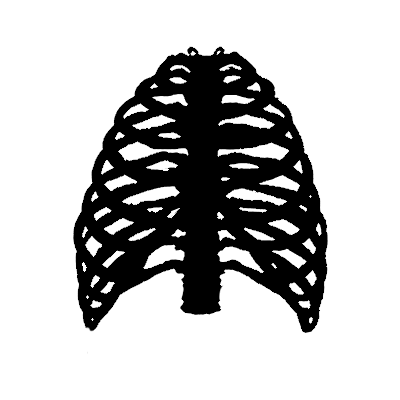
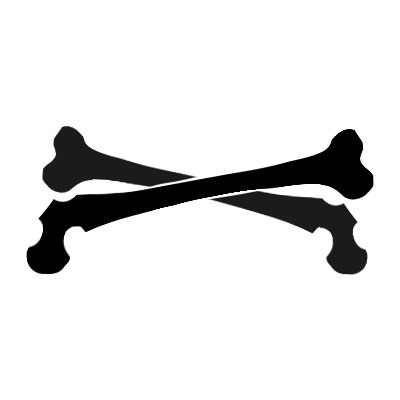
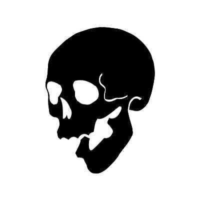
- BONEY RENTRY MASKS -
- f2u | 5 pngs | -
- credit if reposting / using publically -
DOWNLOAD HQ
#rentry#pfp#icon#carrd#pfp icons#rentry masks#icon border#rp icon template#image border#image mask#carrd mask#rentry border#carrd border#cards#png#template#mine
320 notes
·
View notes
Note
I don’t exactly know if I’m wording this right but would you mind doing TADC x png reader? Like instead of being 3D like everyone else they’re just kinda like a 2D image
TADC cast x PNG!reader!
Cant sleep so imma answer a few more requests!!! YIPEE!! I got to draw some TADC art tonight !! Dont like the sketch so I think I might post it on main when its complete...
Little self ramble aside! I hope you enjoy this op!
Written on mobile ♡
CAINE:
Honestly I can see caine making special IHAs that utilize different circus members unique digital abilities. Zoobles dismemberment thing, I like to think pomni has clown physics (as well as kaufmo!), and now you with your 2d self!
Though... I think more often than not it can lead to you possibly getting stuck somewhere... oops... he doesnt mean any harm, I promise!
POMNI:
Probably loses track of you if you turn, leads to her trying to call out for you only to be jumpscared by you turning to look at her
Eventually though she does kind of. Get used to it, at least the jumpscaring doesnt phase her anymore!
I think similar to zooble she would help you out of sticky situations
JAX:
This. Asshole. He would immediately pretend you're not in the room the second you turn 90 degrees. Will literally stop mid sentence
Mid SYLLABLE
Like he knows you're still there, hes just fucking with you
Has probably tried to see if a fan will send you flying. Like paper
Ngl this prompt is making me think ab teri from TAWOG
I need to watch TAWOG
RAGATHA:
makes it a point to keep the conversation going and include you unlike SOMEONE (glares at jax)
Always makes outwardly greets you to see if you're in the room (ie calling for you to get you to turn, ect ect ect)
Would not hesitate to help you if you got stuck somewhere somehow
Makes sure you dont get left behind in stuff
KINGER:
You know how in pomnis part I mention her losing you and getting spooked when you suddenly reappear? Given that he gets startled by gangle, when she hasnt done anything or left? I think kinger would be the same in that regard, but like. Worse. If that makes sense. Please dont sneak up on him, hes already at his wits end as it is, he doesnt need to worry about when hes going to get surprised again <\3
ZOOBLE:
Honestly I can see both of you getting along great! Unconventional digital body duo! Dismemberment mismatch body with body that literally becomes "invisible" if you turn.... do you think you've slipped through thin cracks before? Or just gaps in general?
Hey maybe if zoobles around theyd help fish you out!
GANGLE:
Kind of similar too, since ribbons are thin and flat; gangles ribbons are just curled to give her structure but they are still just ribbon.. she joins you and zooble in the unconventional digital body club
2d body, fall apart mismatch body, ribbon body
Silly club for you three
You guys both get stuck in the ground after slipping through a crack, gangles mask is the only thing visible since it couldnt fit/j
#tadc x reader#the amazing digital circus x reader#digital circus x reader#caine x reader#pomni x reader#jax x reader#ragatha x reader#kinger x reader#zooble x reader#gangle x reader
204 notes
·
View notes
Text
PRAYSIA. An editing resource blog. We no longer take requests for renders; however, we will still make them. See under cut for further information and helpful links.
RENDERS DRIVE.
Helpful Links: Upscale Images, Image Splitter, PhotoMosh, Text Symbols, UniCodes, Word Combiner, Remove Gif Background, Download Videos from MOST Sources, Gradient Maps, Tons of Laces.
Tutorials: How To Mask Renders via Critical Galaxy, Photopea for Dummies.
Misc Help: Site that has TONS of PNGs.
This will be updated as needed, so be sure to check back before asking for something please!
If you know us, it is likely from our past edit blogs @necromii, doveish and v-rtue, none of which we use anymore.
#𐐪 asks.#𐐪 tutorials and help.#𐐪 from praysia.#𐐪 by praysia.#𐐪 from [user].#𐐪 by [user].#𐐪 chatting.#𐐪 praysia's renders.#⠀⠀⠀⠀⠀⠀⠀⠀⠀#transparents#dividers#frames#masks#psds#gifs#buttons#stamps#pixels#pngs#overlays
78 notes
·
View notes
Note
hihi!!! how do you make yr rentry graphics? for example, the madohomu matching graphics u made?
Hihi~ Here’s what I use and how I make my graphics!
1. Photopea! Hosted online for absolutely free, this is an in-browser version of Photoshop
2. PSDs! These are tools used for coloring your graphics. These can be found on DeviantArt, as well as tumblr. I typically search “PSD download” + the colors I’m looking for!
3. Art! What will be featured in your graphic.
3A. Great sources of official art can be line stickers, promo art, and official merchandise!
3B. If you need transparent art, try looking up already-transparent versions of what you’re looking for! Use the keywords “render”, “transparent”, and “PNG”. (Pro tip: if you’re on your desktop using Google, and wanna avoid those annoying fake PNGs, go to the “Tools” -> “Color”, and then select “Transparent”!)
3C. If you found a transparent you wanna use, but it’s on one of those annoying wikis that makes everything tiny, open the image in a new tab and delete everything after .png in the URL!
3D. Additionally, if you’re downloading from tumblr, open any image you download in a new tab. The default tumblr file types are .pnj and .gifv. Simply replace those parts of the URLs with .png and .gif!
4. Masks! I find my masks on Pinterest, for the most part. You can find a lot of great ones all in one place here! I use this method for making my gifs custom shapes.
Hope this helps! 💖
157 notes
·
View notes
Note
hello!! how do u make the graphics for the events? they are super cute
★ apps needed
- pinterest : looking for images and overlays
- picsart : editing, adding overlays
- ibis paint x : editing, using masks
★ looking for images
- open pinterest and use some of these keywords to find nice overlays that fit this style of edit :
- doodle png
- tattoo ( sheet ) png
- doodle icon
- y2k doodle png
- y2k star png
- transparent doodle
- abstract art png
- doodle overlay
★ starting the edit
- open picsart and open the image you’re going to edit. in my case i will be using this newjeans picture and will make a ‘ cool with you ’ inspired edit :
- all of the edits i made had a 3:2 aspect ratio, so i will be using the same ratio for this edit. you can choose whatever ratio or size that fits your edit better.
★ adding overlays
- now that we have our background image ready, we need to start adding our overlay images. the first one i will add is gonna be the song title on the middle of the image, like this :
- add photo > select image > center it using the helping grid lines
★ adding non-transparent overlays
- if the overlay you’re going to use doesn’t have a transparent background this is what you’ll need to do :
- white overlays :
- add photo > select image
- effect > colors > negative ( only if your original overlay is black )
- blend > screen
- black overlays :
- add photo > select image
- effect > colors > negative ( only if your original overlay is white )
- blend > multiply
★ adding colored overlays
- if the overlay you’re going to use is colored and has a non-transparent background this is what you’ll need to do :
- add photo > select image
- opacity > 50 %
- blend > multiply
★ placing overlays
- i recommend placing the white / black overlays around the corners and the colored ones on all sides and behind the people, so they look integrated into the picture. here is how my edit turned out :
★ blurred edges
- for the blurred edges effect i use this website and choose the blur edges option. these are the configurations i used on my edits :
★ final result
#͏͏͏ ͏͏͏ ͏͏͏ ͏͏͏ ͏͏͏ ͏͏͏ ͏͏͏ ͏͏͏ ͏͏͏ ͏͏͏ ͏͏͏ ͏͏͏ ͏͏͏ ͏͏͏ ͏͏͏ ͏͏͏ ͏͏͏ ͏͏͏ ͏͏͏ ͏͏͏ ͏͏͏ ͏͏͏ ͏͏͏ ͏͏͏ ͏͏͏⠀#asks#tutorials
72 notes
·
View notes