#im using randomized color pallets
Explore tagged Tumblr posts
Photo

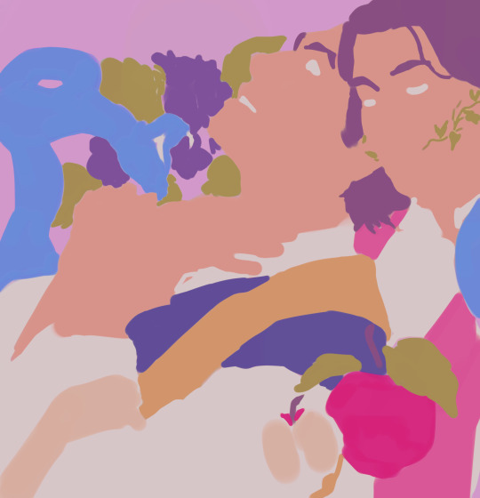
Monster Girl March 02: Turning “Seeing such frail creatures down into the depths always got her gears turning“
#This is my sweet little Penelope!#of course she was build as souless killing machine design to bring down whoever invaded her fathers office but hey!#who cares! whos gonna look into this beautiful girl's eyes and she doesnt have the kindest soul?#shes a sweet and i love her#hope she gets to leave her fathers house and explore the world#maybe meet other girls! make friends! talk about girl stuff like killing and blood and sharpening blades and playing with dolls!#i tell you shes gonna love embroidery and skin(metal) care routine#if you own a sword or an armor shes the best girl in the world to teach you how to care for it in a slumber party#And she ADORES bugs!#anyway#im using randomized color pallets#if anyone reading this decides to give me one im using it for one of them drawings#Monstergirlmarch#turning#my art#art#2023
0 notes
Note
Can I know how you color with the lining and stuff? I really like that p&j drawing from oct 30th and i would like to know how to color like you.
Experiment and see what sticks! That's pretty much what I do most of the time when coloring/rendering
#tbh Im not sure what you mean anon:(#if you have trouble picking colors i recommend checking out color pallets (ex. coolors.co)#or using multiply/overlay (you make a color base from ex. a ref then put a ex. blue multiply layer on it and bam!)#and really! dont be afraid of experimenting!!!!#sometimes the most random stuff makes the artpiece look better!#ask
54 notes
·
View notes
Text
Brainstorming ideas for some side characters for the toy story and my initial concept for them was to go super stereotypical dnd party but I can already feel myself drifting off that path because I need to do fun stuff with my worldbuilding or I will explode and die
#rat rambles#oc posting#I cant just have the one or two guys with magic I want All of them to have magic 😔#but yeah theyre still mostly just vague concepts rn but Im making them as the insight goddess's replacement blessed party#theyre going to be pathetic as hell and comically under leveled for the places shes sending the poor bastards#theyre probably mostly going to be random reacuring side characters that appear every now and then to be annoying or minor antags#but like in a oh those poor bastards kind of way#Im also playing around with the idea of killing one of them off late mid story and giving them a more serious side plot#again not taking up too much screentime but just to give us an inside look on how things are looking over there#also because I like it when joke characters get the chance to be taken seriously by the narrative#which isnt to say they are necessarily joke characters but I do want them to be mostly silly billies at least for the first good while#but yeah the real sad thing abt these guys is that I will need to actually design them myself. sigh.#its fine I have ideas I just am not excited to have to figure out colors I fucking hate making color pallets
0 notes
Text
guys i might actually draw more and draw more about my self insert + give lore about her , its just im thinking what to draw 😔😔😔
#Im actually kinda inspired by artists so TY to them#im actually thinking what to draw..#i think i'll draw woy first then self insert#i gotta actually use color palletes omg..#Random ass thoughts
0 notes
Text


ᑦ꒰ྀིྀི ◞ ̫ ◟ ྀྀི꒱ᐣ 𓈒 ⁺⠀rui kamishiro layouts day 1 of @hiddencircus’s event: random color pallet⠀𓈒✚ ┈⠀⠀🍁 no f/o tags.
⌣⌣ ⪩ ー rblg + cred if using color pallet used under the cut ! these are so fucked up im sorgy


#◌ ⠀◡◡◡◡⠀ ⠀ 𝜗𝜚 autumn. 𝒢𝜚#𐙚 layouts 𓈒♬⃝ /ᐠ - ˕ -マ#eyestrain#bright colors#glitch#glitching#eye strain#tw eyestrain#tw bright colors#tw glitch#tw glitching#rui kamishiro#kamishiro rui#tumblr layouts#pjsk#editblr#tumblr banner#tumblr banners#tumblr icon#tumblr icons
25 notes
·
View notes
Text

guess what more oc posting. This is her like way younger than the last post, before she gained her epic mohawk. According to google translate rovina means ruined in italian. I dont really care what at means i just like how it sounds, which seems to fit with p5 names. flat colors + her actual color pallet under the cut


i like using random color pallets, just like jojos,,,,,,,,, i modified her stand inbetween drawings, simply because this is easier to draw. Im still figuring out how it works, so nothing on that yet.
#my art 👽#rovina 👁️#jjba#art#oc art#oc#digital art#artists on tumblr#jojo no kimyou na bouken#jojo's bizarre adventure#jojo part 5#vento aureo#jjba vento auero#jjba golden wind#golden wind#jjba oc
10 notes
·
View notes
Note
ur art is so, so amazing, is there anyway u could do a tutorial bc I wanna draw like u so badly
i can try but idrk how to explain myself or make tutorials lol
i think my style is just a product of my brush and what im trying to get out of my art, which is trying to portray the characters as accurately as possible. i rly just want it to look like it could be a stylized redraw of a deleted scene or something
my process is kinda everywhere bc i just move on to whatever step will probably make me hate the piece less when im done with it. i draw with a more square brush (blurring marker 1 on ibis) which i def recommend. its great for focusing on shapes in ur art and it helps me not overblend/forces me to think of more interesting lines/shapes. my sketch is a thicker size of the same pen, focusing on the major shapes and proportions and i just make as many additional layers overtop of it, lowering the size of the pen and adding details as i go
once im at the lineart i usually use a site that creates color palettes based off images (usually just steal some from old catholic art) and i steal my base colors from that. it doesnt matter how terrible ur base colors look as long as they make sense and r what ur generally going for.
these were my original base, i use colored line art and shade the basic shadows using the line art mixed with the base color, highlights r whatever is the lightest color in the palette. after that i duplicate and throw it through this filter
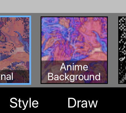
i play w the colors and use it as a color/hue/luminosity layer on top of the original version, lower opacity and render now that theres more colors on the canvas (the filter creates more contrast between the lame base colors i mix, then i can add bounce shadows and shit).
i use a shit ton of digital cheats. single color overlay layers at the end of a piece, pizza face overlay glow, using vignettes around the border to draw the eye towards the subjects at the center, filters, color palette generators, etc. they make things sm easier so u can worry abt experimenting with other things.
i dont rly know how to explain how i do clothes or hair other than focusing on the shadows and worrying abt lights later. this is honestly the best tutorial i can think of bc in my head im just drawing what i see as best as i can with the pen i use. use a fuck ton of reference, do actor face studies, and try to experiment with ur style everytime u draw. ur never gonna learn how to use ur programs or expand if ur bogged down by trying to achieve a specific look. sometimes that thing u were nervous abt bc thats not how ur style usually works is the best thing on the piece at the end.
actually draw only what u want to draw in that very moment and use that as an opportunity to experiment however u can. i just draw chainshipping and find ways to trick myself into learning 👍🏻 sorry this is so bad if u have any specific questions i can try to answer those better
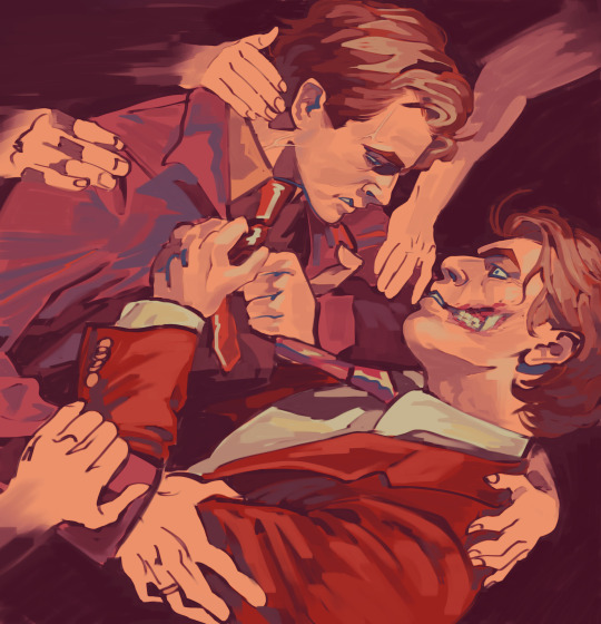
edit: this is what i mean when i say just draw with whatever base colors and use the lineart to add value. i thoroughly hated this piece at this stage but once i adjusted the pallet it felt much more cohesive and i could continue on with the drawing. the best thing i can say is to have absolutely no process past the same few first steps and resign urself to a cycle of self hatred and throwing random bs at the wall to see what sticks
#sorry this is so bad these dubious ass shroom carts beating my god damn ass HOURS later#i deadass woke up saw this and said Fuck bc i knew id want to answer it but i deadass cant think#sorry this didnt make sense. my style id just however i personally fail at achieving complete realism#also merge ur colors and lineart after the base idk makes it less stiff#ive always thought painting is much more forgiving than lineart and cell shading#theyre scary#most of my art is just how i compensate for being unable to rly fully stylize#i havent been able to since high school so i just stick w realism while i unlearn my old bad habits from having an exaggerated style#GOD ANYWAYS#rambling#larry.txt
22 notes
·
View notes
Note
*shakes a tin can that makes metallic sounds as two coins move inside it* Halvar??? Spare some Halvar sir?? *coughs pathetically as I have to hug ny coat tighter* Please, I need some Halvar...
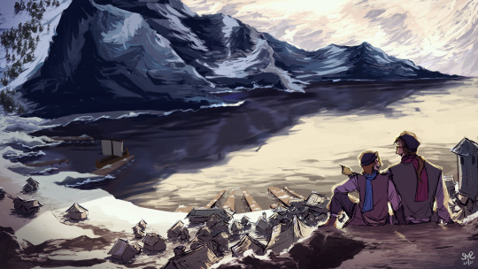
anything for you bro, trust me bro i'm a crippling tryhard (when i say fancy i mean somethjng i'm incapable of drawing but still wanted to draw) (i got hella lazy by day two which is to say that i gave up on details i hate details so much) (ignoring canon like a fuckin pro (haha csh reference get it-)) (i lost my arrow key im sad) (i'm committed to stimulating this economy) (i was high on caffeiene when i started this drawing last night until three am) (my ability to draw scenery is extremely subpar so i decided that maybe i should like,,, attempt to change that eventually. it's a work in progress)
favorite cuts below :>
i'm ngl i wanted to do the gathering thing but i'm exceptionally bad at using color palletes and the color pallete scared me so i just didn't


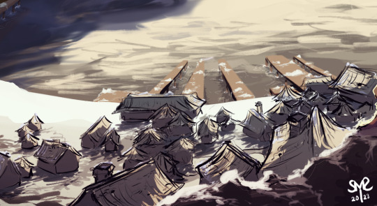
ft. my refusal to comply with canon (not out of defiance against flonkerton's word but actulaly out of pure dumbassery)
idk how to draw like,,, houses. they're kinda just random lines. it's funny cuz as i was drawing them i was thinking about how people talking about how to distinguish ai art and my brain went "wow my shapes are so indistinguishable i must look like even more of a chatgpt user than the guy at my school who wrote his grad speech using it"
also i would've been drawing more ships if i wasn't brain dead but it's too late
i color picked from some picture but i kind of forgot where i left the picture so uhh yeah
#lychee's trash art#brotherband#brotherband chronicles#brotherband fanart#hal mikkelson#ingvar brotherband#maybe one day ill come back and clean this up but today is not the day#anyway i hope you enjoy :DDDD#also ik i told you when u sent this in but your ask is so funny#lychee acquires and answers asks
27 notes
·
View notes
Note
listen i will always be forever salty and bitter that they didnt use adam's corpse to turn it into the hound.
because imagine how terrifying it would have been for everyone in the schnee manor if the one guy that's been terrorizing her for years STILL came back as a giant grimm monster
and then weiss being forced to see the SDC mark on some random faunus (idk if weiss or ruby have ever met/talked about adam so im just assuming she doesn't know who adam is)
like i get it why they needed it to be a silver eyed person (to spin the whole 'that must be what happened to mom' convo), but it's a missed opportunity to turn the guy who looked human into the Beast he was based on
Now this, this is what RWBY deserved. The world of Remnant is a twist on fairytales, so make it fucking dark and depraved since RT wanted to be mature so damn badly. Also, from what I remember RW never talked about Adam, let alone knowing his scarring. Even his color pallet matches Grimm to a tee, even though we have Ruby, Summer, and Qrow (too an extent) with those colors as well. I’m just, maaan.
But may I also propose a Silver-Eyed Adam?
You get:
A) A foil to Ruby as a huntress for “good and justice” who hasn’t been discriminated against her entire life and is ignorant to the true tragedy of the world she lives in, versus Adam. A member of a minority race who is a fierce combatant because it’s the only way he’d survive, not because it’s “fun and heroic” like Ruby. He’d get away with being a SEW because he’s a Faunus, and a lot of idiots would think he couldn’t wield his eyes because “Faunus are lower beings”, so but of course he wouldn’t be able to, because Adam’s soooo dumb. /s Also, he has a mask to hide not only his scar he would get from SDC, but hide his eyes as he became higher ranked in the WF.
B) Foil to Yang. It’s really weird but I’m not sure I’ve seen a lot of people touch on this, at least recently. Yang genuinely has (or has had if it’s still an ongoing problem) anger issues. Her lack of thinking and forethought literally cost her her arm in her fight with Adam. It didn’t change much in Volume 4. What the writers could’ve done, instead of brushing it aside because for some reason overcoming trauma is “boring”, is focus more on Yang becoming less of a party girl and more of a planner like her mother.
C) Blake development, because good GOD after V5 she had nothing going for her besides Adam. Like, we never saw how she became so enamored with Adam in detail. Her development with Adam could reverse, between her being a more serious-yet-shy book lover and activist to actually playing a more intimate role within the change for the WF. Not just, “hey why did you guys burn my mansion down, this isn’t right”. Like, Blake is the most privileged Faunus in the show. Her struggles next to what we can glean from Adam is absolutely minimal. Can you imagine, after what Adam did to her new home and found family, what the confrontation could’ve been like? Adam tearing down everything Blake has and spitting in her face? Snarling that she’s always been a coward, never wanting to actually face danger because she’s a spoiled little rich girl, and that she could never be half of what he is. And you know what, she deserves to hear it.
D) WHY IN THE GOD DAMN HELLISH FUCK DID ADAM AND WEISS NOT HAVE A SINGULAR CONVERSATION. HE COORDINATED ATTACKS ON THE SCHNEE FAMILY. AND THEN YOUR EX GIRLFRIEND IS ON THE SAME TEAM AS THE FAMILY OF YOUR NUMBER ONE OPPRESSOR? HELLO?? IT’S LITERALLY RIGHT THERE.
- 🐌
38 notes
·
View notes
Text
HEY SO IM NOT DEAD!!!
I am in the middle of a pickle though... its not DIRE but it would be a great help to get the word out there. The laptop I currently use to do my art and keeping contact with people is EXTREMELY outdated (at least a 20 year old model). So much as the video card can't even handle Clip studio Paint any longer... as well as Blender or Unity.
I am wanting to get into making models and VRchat worlds as well as 3D model commissions. However the computer I currently have can not handle the programs.
I had a second laptop at the ready to replace this 20 year old dinosaur, however taking it to a computer repair place to get the screen replaced (it was given to me with a broken screen) I was informed the power source the person had given me was way too strong and had fried the motherboard. To replace the motherboard it would cost about $700...
So you think why not just get a new laptop?
LET ME BE THE ONE TO TELL YOU, THATS THE PLAN!!!
The old baby I have right now is slowing down quickly and I do not know how much longer it will stay working... the battery is already unable to hold a charge longer than 20 minutes... as well as the wifi card in it is slowly dying as of late. It turns itself off at random, forcing me to go into the wifi access tab and not only re-connecting the wifi, but having to turn ON the wifi connection to my laptop like one would turning it on their phone every time.
So here we have the commission prices I am able to do right now!!!
Crochet hat/head coverings and scarves go:
Classic beeny, small octopus and/or head cover/shawl/hoody hat: $60 (2 color minimum)
Long body hat (runs about 3 feet long) : $90 (can be any amount of colors with small details and different textured yarns)
Drawings: prices are PER CHARACTER
$20- bust
$60- full body
$10- color (added to whatever option)
$20- if backgrounds are added... color is already added to this charge.
$50- profile detail page (front, back, side, hands and feet, any small details, as well as color pallet/splotches)
13 notes
·
View notes
Note
I absolutely love the sprites you've been posting! They're so good! Do you have any tips for spriting? I'd like to get better at it, but it's not easy :'D
Thank you so much! and oh my god im so sorry for how long this took me to get to Truthfully infinite fusion helped a lot to get me into it myself haha. Not because of anything about the concept, but because it eased me into it with editing existing sprites. That way you don't have to do a lot at the start yourself yet, but you DO have to really look at how the shading is constructed to edit things together. Maybe hand draw a new leg or alter the expression a bit- again, not a ton of work, but it'll force you to deconstruct how the sprite was made to match the style!
That is probably THE best tip I can give to anyone. Find a (preferably somewhat simplistic- video game sprites r great here) style you like, and start off by working in that. Simple edits etc arent a big bang beginning, but theyre great for learning the basics.
Now for random tips I can have. Be mindful, these are just how I personally work ! Genuinely there are so many different styles and ways of working with pixel art as with any medium- you can break any rule and still have things come out amazing!
Dont worry as much about having distinct sketch/lineart/colors/shading phases. Technically you can work this way? But I find it makes me focus too much on how each individual phase looks when most of the time (at least for me) a sprite doesnt pull together until the very end. it WILL look slightly mad until then its simply part of the process. I tend to put a rough base with some beginning colors and then simply refine from there. wips vs finished attached below for visuals
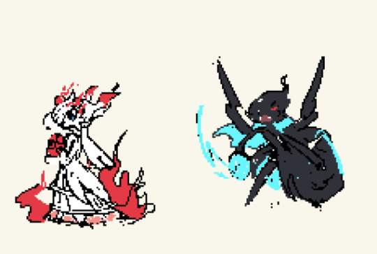
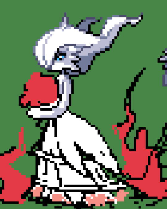
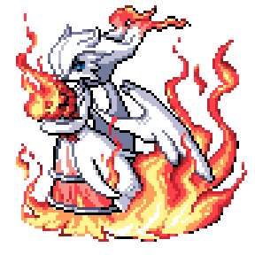
Also, careful with stuff like dithering! It can be very fun , and some styles have a ton of it which works fine and can look good! But from what I can see at least in the IF disxord a lot of ppl will slap it on anytime anywhere at the start which makes things look... messy. I personally mostly use it for fabrics. (Also, get a dithering brush. Love yourself, dont do that by hand, especially on bigger sprites)
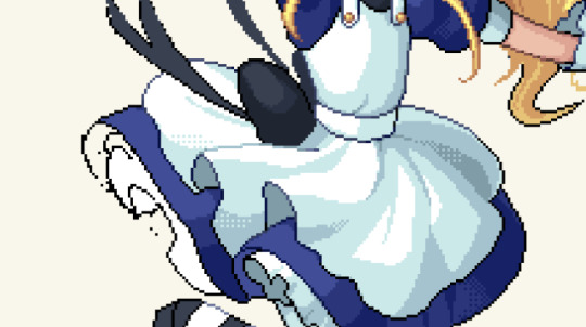
Limit your colors! This is a general tip and not tehcnically that important, but I find it really helps me.
I tend to stick to 3/4 shades per color max. Some of the darkest shades of a color can also be the lightest parts of the outline for that color! Pic below I used the browns not just for the hair, but also for the gold shading and for the darker parts of the skin. It just helps pull a pallete together easier when youre reusing it where you can.

Dont be afraid of using the outlines color to shade with either for dark shades btw ! It is fun it is fresh

Only real warning for outlines Ive got is to be careful of jaggies. Like the upper line reads 'smoother' then the lower one because the longer pixels all follow eachother gradually. Jaggies can be useful especially in folds and whatnot, but when something is supposed to look smooth or round- no jaggies usually show!
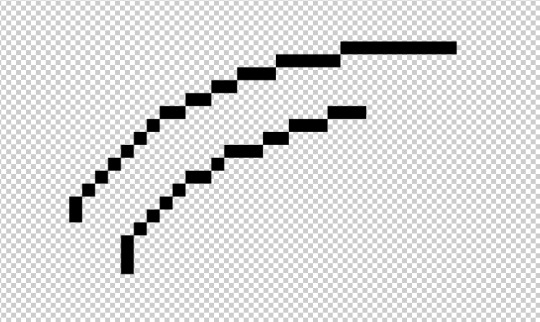
12 notes
·
View notes
Text
Gonna be so random and unnecessarily insane about this for a minute but I made a pokémon team for Jimmy. Word vomit and some pictures under the cut.
First off, the best candidate I could think of for him to have as a partner pokemon is a Raichu. The color pallet is perfect and the concept is even more so… he could use the electric abilities to power up his microphone and cameras and stuff (he probably gets shocked a bunch of times through his crutches though).
Anyways. His Raichu could have a little microphone and sit on his shoulder while he preforms. It’s perfect. See my vision? I already drew it in a previous post.

The next pokemon I can see him having is a Mr. Mime, unsurprisingly. It has a fun-oriented personality, looks like a clown, yada yada. But the main reason I thought of it was because Jimmy showed interest in making impressions of people during his debut, and what is Mr. Mime if not an impressionist?
I think his Mr. Mine could easily be a leading inspiration for him or a breath of fresh air after getting back from a tiring comedy show. Maybe both. Sometimes it stars in the shows… Definitely has a boisterous personality that Jimmy is completely unphased by.

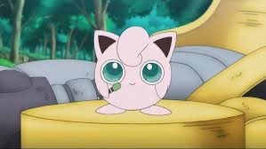
Coming up third is a Jigglypuff. I’ve seen a lot of people give him a Jigglypuff, and honestly? King shit. Solely wanted to put one on his team because the idea of him getting pranked and like, being put to sleep unconventionally and then waking up to a drawing of a million dicks on his forehead is both super funny and definitely something that he’d find hilarious.
Definitely attainted it on accident, and loves it to bits. Also, they definitely play pranks together as well. That’s a very crucial part of their friendship.
Also. It just has that look in its eyes.
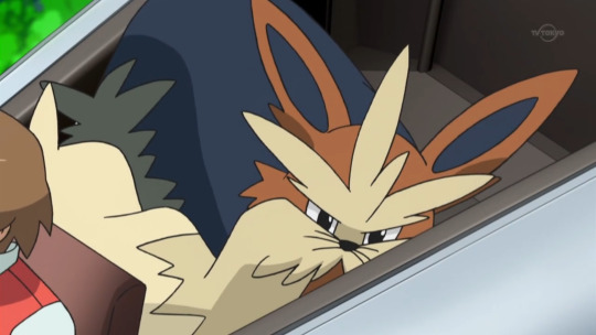
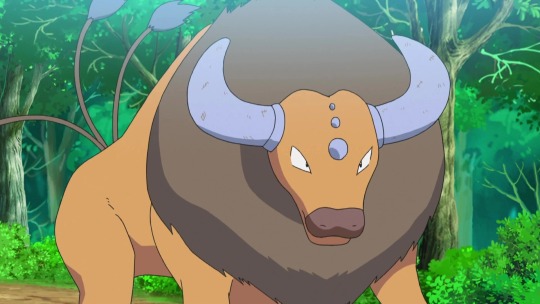
Okay. I wanted to add some bigger pokemon now, and after some debating, I settled on a Stoutland and a tauros. Here’s why.
First off, again, the color pallets are amazing. But to be more specific. I wanted Jimmy to have a loyal and older partner to balance put the wonky first three. Because even though Jimmy loves messing around, he also has a very clear set of morals and isn’t solely a silly little guy. A dog-like pokemon fit him pretty well (i think hes an in-betweener when it comes to cats vs. dogs, but most cat pokemon are pretty snarky and i dont think he’d be a huge fan of that), and Stoutland is the perfect partner for anyone.
I’d say Stoutland is his main traveling partner, but he’d only ride on his back if he was really tired. They mostly just walk together, and they have a really close bond. Stoutland is definitely his number one emotional support system.
Tauros, on the other hand, is a pokemon that caught my eye because it matches his zodiac sign (we have the same sign and im a nerd, sue me) and tends to be more stubborn. Which fits, because Jimmy is also stubborn. He literally almost got himself shot because he refused to put advertisements in his newspaper.
I think that since Tauros is naturally built like a tank, it’d make a good battling partner. Jimmy would definitely use it just to intimidate people on the field, and I can see it as one of his main (if not the main) battler. But I also think that it’d have a very sweet nature, and maybe it was one of his first pokemon. It probably tried to kill him when they first met.
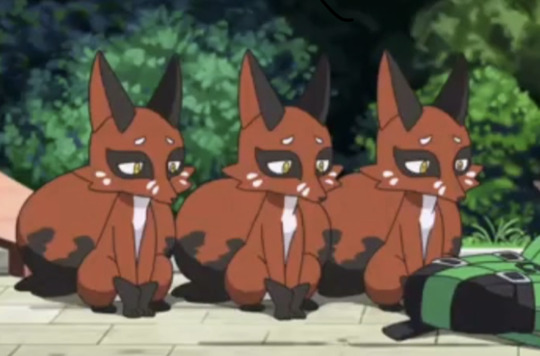
And lastly, I’m going to put my foot down and say with confidence that he would have a Nickit on his team.
Just hear me put.
Nathan’s a tricky guy, and he’s also literally the only person in the world that actively hates Jimmy. Jimmy isn’t even really aware of this either. And Nickits are very similar to Nathan in the sense that they often cause trouble.
I think that Nathan, at some point in his quest to make Jimmy’s life terrible (or kill him), gifted him a Nickit as a “friendly gesture” in hopes that it’d cause him trouble. And Jimmy would without a doubt accept the gift.
Nathan’s plans always backfire though, so I think that even if the Nickit caused trouble, Jimmy would find a way to befriend it eventually. He’d probably make an effort to understand it and end up gaining its trust.
Anyways. I think the Nickit would be a fun contrast to Jimmy and could add some small conflicts by stealing and starting shit. And Jimmy would just be chasing it around like “Oh, sorry about that miss, im not sure why hes acting like this today” after nickit steals an entire breadloaf or something (and not for the first time, either— maybe Jimmy has a little too much faith in its ability to behave). Maybe it even joined the Bloods too, who knows.
And thats it?? I had a lot of fun putting this together and coming up with everything. I might change some stuff and draw some stuff later, who knows.
Thanks for reading if you did! I had to get it out of my system.
8 notes
·
View notes
Text


Everyone meet hornet, inspired by several characters including Valentine day theme, zavy and whole lot of motivation to at least help hornet look and be original as possible, i went with a valentines day theme given hornet is also inspired by my boyfriend who i will call alabaster for the sake of his privacy.:3 (random info: alabasters are also nicknamed "white rose".:3), hornets name was from a character in hollow knight that goes by the same name.:3, hornets braid came from-, literally out of randomness, i took moonbunnys advice/info on one of her videos that she drawing mirage they were listening to music, so i made hornets theme around valentines day, and whenever possible i plan on writing a story about him, indigo and illusion someday probably, given he and them are star palace oc's.:3 (keep in note, these three are not in canon line within the star palace actual season.)
Info: broken glitch.
Like zavy, hornet does indeed have a glitch, but it makes his protectiveness spike, extremely so, so much so that its how hornet got the huge crack in one of his eyes, the nickname for said glitch was "broken" given it somehow has mind of its own when it takes over, this case was inspired by the love poison from mlp, when glitching to broken, the eyes will look similar to that case too.
hornets sexuality: pansexual.
like my love, hornet is indeed pansexual, but leans towards females or femboys due to preference.:3
used to work at before star palace: an asylum.
like zavy, hornet does have some medical knowledge, though me and my hon like the idea of asylums, especially if things get relatable in several different ways, with some knowledge from friends, and sense hornet is supposed to be inspired by my boyfriend Alabaster the most at the very least mentally, a mental asylum in the most modern day seemed officent.:3, unfortunately the glitch got him into trouble with a patient and a few doctors even, shutting him off for years until the medical field was shut down and he was sent to star palace.
favorite things (if he could have them): video games, animals, tv shows.
Specifically, hollow knight, cult of the lamb, RPG's, mlp, mlp horror, pokemon, SEVERAL TYPES of anime, raccoons.(idk why, my boyfriend just likes raccoons and i can indeed see the appeal.:b)
purpose: relatablity.
Whatever i did not list will be up to my boyfriend, including hornets past&treatment when working in the asylum and thus during in star palace too, given i want hornet to be relatable.
fluffy hair: inspired from zavy.(minus the back hair witch is shorter and the braid.)
glitch/broken: zavy's own glitch, indigo's own glitch and also the inspiration of mentally breaking+heart break.(witch is what me and alabaster has unfortunately experienced.qwq)
clothes: inspiration be zavy by a little bit, the rest was a mime+ballet theme.
personality disorders.(that we all are aware of.): bipolar disorder, d.i.d, depression and anxiety.
Im practically no stranger to this by now, illusion is an example of d.i.d too.(given they have different identitys that are named by different words in french.), and plus my boyfriend and other friends have indeed d.i.d disorders.(hense how broken has a mind of their own.), whatever broken and hornet does is self experience for not just d.i.d but the other stuff i have listed too, such as depression and bipolar disorder.:3
other stuff: again that's up to alabaster.:b
Color palette: i used valentines day themed color pallets and combined them.:3
teeth: this inspiration came from someone out of star palace actually, this inspiration is by the name of starlight from wtdw witch is by rainbot.:3
That's all for now!, i hope y'all enjoy hornet!! :3
3 notes
·
View notes
Note
On my knees begging,, can I ask about your genshinsona and about any oc you are willing to share 👀🥺????? I'm very interested ꉂ(ˊᗜˋ*)♡
you probably didn't expect to get a reply so soon but i'm afraid i don't have much to say about these</3
the idea for a genshinsona came to me yesterday when i was constructing a reply to your oc ask, more precisely to the part about vivi, so it's all very very fresh, there's a lot of ideas but barely anything firmly decided. but i can tell you what i have so far
does it have to be either a guy or a girl or can it be someone in between? well, regardless of that, they or he or whatever would be either snezhnayan or snezhnayan living in mondstadt since always. they would have a cryo vision, definitely red horns and a small braid hanging from one side of moderately short hair. oh and also freckles and red eyeliner because i always wanted to wear red eyeliner nshxhx. color pallete would be dark red/orange/light blue/black/white i think
and i have nothing more, i might eventually gather all the thoughts and construct a person but probably no sooner than after exams, though i can't promise that either and that's why im not keeping this ask in the inbox forever but answering it now with what i have so far
with ocs it's a bit more complicated
there used to be almost 40 ocs. now there's about 15? with the earliest ones i came up when i was 12 and they either went through a massive development or i decided to abandon them for good lol
generally none of them are well thought and constructed like yours and neither are they fandom related - all are original characters tied to, well, nothing. it was mostly that i was watching a show or listening to music or something and constructed a person in my brain that would fit a scenario, and then sticked to them
however, i unfortunately can't tell you about any of them or at least not in a public ask format because 1. the thought that all 200 of my followers could possibly read it makes me cringe so bad, 2. none of them are as well constructed as yours, they're more like a bunch of random ideas, in some instances with multiple version of backstories etc and what comes with that is that i did barely any research on the things i put in their stories and i think i should do that and 3. some of my ocs have parts of the events that happened to me personally tied to their stories and let's just say i'd prefer not to talk about it too much in a public ask. i don't want to answer it privately without an earlier notice because private answers don't have an option to leave comments under them and i don't want to lock that option for you
so. if you'd like to know about some of the ocs then i guess either dms/discord etc or another ask that i will intentionally answer privately, it's not that i dont want to tell you about them, it's that i dont want it to be fully public - ive never talked about my ocs, they've always just been in my head and i guess i got used to it being this way
the genshinsona thingies however i can totally answer in an ask but. first i'll need to have something to talk about jdhdhs so either ask again in a while or i'll just update you on it when i think of something :3
#me: i don't have much to say#also me: *still somehow types so much they need to put a read more thing*
5 notes
·
View notes
Note
hiiiii caelinnn °˖✧◝(⁰▿⁰)◜✧˖° this is rlly random EL OH EL but i was wondering if u had any lippie recs or any makeup recs in general (^ω^) im desi too btw ( im kind of like warm tone beige on this pallete : https://www.moodysisters.com/blog/2020/1/13/how-to-find-your-foundation-shade ) and my lip tints always look so bad on me ... i have two toned lips so my upperlip is rlly dark and the colors never match ㅠㅠ i js bought 7 glosses from like rom&nd peripera and colorgram and with more pink/red toned hues but everything looks orange on me ㅠㅠ berry tones showed up rlly dark on me it was giving emo almost ... idk if i should try brown tones or what next SO RANDOM SORRY this is js me venting bc i wasted sm money ㅠㅠ
HELLO first of all sorry for such a late response i wasn't sure what to say so i was taking my time to look up things TT im srsly not the best person to ask about makeup help ..
my skin tone is something between warm and neutral undertones so i usually use nude or neutral colours ! try to correspond your skin colour with the lip shade. i really don't recommend rich red or pink, or colours with cool tones since you said your skin tone is warm. you can try going for brown or a bit orange-red type of shade next. if you want pink, try looking for pink with orange base. ermm idk how to explain but coral influencer from ink mood glowy tints by peripera works well for me !
similarly, rose in mind from the same collection is a nice warm shade but you might have to use it with a darker shade to create a blend or something to balance out both your lips since you mentioned your lips are two toned. if you want to go more on the pink side, cheery so what is a really good shade— all in the same collection btw— but using it with a more orange-y or warm shade might be better. long story short, you should make the colour fit your complexion. if it's pink, apply it with orange-y peach type of shade. if red, use nude colours to match. it's what i do and it usually works well for me TT
don't restrict yourself to a single colour ! try using at least two tints to create a nice shade. i've seen a lot of people use red and light peach to give that lil hue to their lips— it works really well. maybe try to apply a base of foundation ? before putting on lip tints ? idk how well this works but i've seen a lot of influencers do that to neuralise colours to some extent. even my mum does that.
i would really not recommend berry tones because they are cold colours and usually don't go well on warm skin tones, unless there's a way to fix that too, which i'm not aware of. unforch i don't have many tips TT u can watch a few videos to understand your skin and corresponding lip tints better
0 notes
Text
INFO DUMP TIMMEEEEEE
Bixby’s earth is lightly based off 90’s anime like Sailor Moon and others similar that are kinda Magical Girl themed if you understand. Very sparkly very magical, weird shenanigans, magic, etc. Most enemies and heros in her wolds are magical aswell and also fall into classic anime tropes
(And before i forget: she uses She/Her and is Aro/Ace)
Her Animation Spider Style is occasionally getting staticy and color shifting (random bright color + Soft Light). Think how Hobies pallet changes in the movie. Suppose to resemble an old VHS

Miscellaneous Jazz:
Does a magical girl transformation to switch into/out of her suit
Attacks have sparkles and stuff (like if she kicks you theres gonna be some glittery effect style happening)
The spider she was bitten by was based off the Glass Spider species
The spider backpack’s name is Daisy
Eventually her hairs gonna turn completely green cuz she developing that “main character” hairstyle

Bixbys “out of costume” outfit varies but she’ll either wear something like up top or this :]

Anyywayyy BACKSTORYYY!!!!!
Bixby was an annoying child getting into everything at every chance she had, thats how her family became good freinds with the local police force, especially the sherif, (idk im not making a whole name up). They remained close family friends even as they grew, one of thr only friends she was able to keel really, most of her old ones constantly moved away and fell out of contact unfortunately.
Theyd had always been a fan of insects, butterflies, beetles, dragonflies, you name it she likes it. So when Bixby was bitten by that spider she barely cared, only putting moving the weird colored critter outside (i will delve into why that was the worst idea ever in another post >:] ) but anyway she continued on with her day and blah blah blah weirds shenanigans she finds out she has powers everyone knows this part of thr story.
OH ALSO she chose crime scene cleanups for her job cuz she finds it easy ans it pays well of course
Cant wait to unleash the horrors upon them!! I will supply info dumps later btw

Do not re-upload, sell, or trace my art without my permission. You can use it as reference but you gotta credit me
#KaidaCresto Art#art#digital art#ocs#original character#spidersona#across the spiderverse#spider man across the spider verse#spider man into the spider verse#into the spider verse#SpiderMan#smatsv#smitsv#Bixby Klein#Kaleidoscope
35 notes
·
View notes