#im just adding base colours now~
Explore tagged Tumblr posts
Visit Tumblr Blog
Explore Tumblr blogs with no restrictions, modern design and the best experience.
Last Seen Tumblr Blogs


Fun Fact
130K people were victims of a chain letter scam that affected Tumblr in May 2011.
Text
So JJK is over and my LMK brainrot is back , added with the fact i am playing a MOBA game and am being blessed with delicious illustrations it prompted me to make this


Now i am going to ramble about this because this is the first time in forever where i kinda pushed myself to make a FULL art piece-
I will be standing for this-
Let me tell you, i had no confidence in this and the composition was supposed to be way different, but this still happened. This took two days because i kept procrastinating , walking around my room dreading drawing the background BIG ADVICE FOR BEGINNER ARTISTS Watch speedpaints. You will learn so much by watching the process and that was this for me I have the tendency to kinda burn myself out and finish everything in a day and then never actually finishing. Tried something different for this and made a cheap silhouette of a sketch, then drew over that and used greys and whites fort the shadows. Then i think i colored everything in a base color (and i finally used a palette) and then i tried to find the lighting and shadow colours. It was weird. And what im saying is that i planned most of it instead of diving head in withour a plan. Crazy i know-
I also just learned about dpi PROPERLY and unfortunately made my piece so big that it kept stalling paint tool sai-
let me just post the progress shots
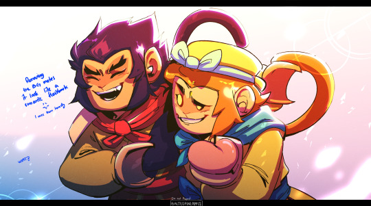


I also fucked up macaques reference and fixed it in a whim somewhere. You can see it here. I honestly wasn't planning to follow the lmk at style but that kinda happens when you're starring too much at the references.
There's still a mess and i wanted to render it a bit better ,the way i normally do but i didn't. Anyways i did enjoy the process and i actually miss them so much and i might watch LMK all over again Especially Wukong and MK
Btw this was supposed to be a moving illustration and i just didn't
I have Live2D but no
(Btw please check out my profile if you have the chance and thank you for reading this! Love you-)
#lmk art#lmk sun wukong#lmk fanart#lmk macaque#lego monkey kid fanart#lego monkie kid#lmk monkey king#lmk shadowpeach#shadowpeach#six eared macaque#lego monkie king#OK BUT I FOUND OUT HOW TO DO THE EFFECT IN THE FIRST AND I FELT LIKE A KID ON CHRISTMAS#btw im sorry i dont ever post anything for any holidays#it will be the same for the chinese new year and valentines day
2K notes
·
View notes
Note
ooo ok what about leo valdez x apollo! Reader where she’s really artsy and she makes this rlly pretty suncatcher and repair boy is like😍
Im answering my favourite of the inbox because im having a DAY yall. Anyway!! Please enjoy :>
"Any specific reason you're rootin' through my drawers?" Leo asks, leaning as far back as his chair will let him. His brown eyes shone amber in the light of the cabin.
"Nuh uh" the odd, hunched over creature replied, still crouched down with it's head in the desk.
Leo hummed, nodding as if that clearded everything up. "Any... specific thing you're looking for?"
The thing hummed before poking it's head up to reveal Leo's favourite Apollo kid. "Either some wire, or something shiny?"
Leo nodded again. "That's pretty on brand for you," he said, holding back a chuckle before shifting foreward once more. You couldn't see him, since he was behind the wall, but you heard the familiar rustle.
"Tadaaa!!" He beamed, excitedly rolling his chair back, holding a roll of copper wire up like some priceless tiara. He moved foreward, rolling the chair closer on his feet to hand it to your crouched form. "Anything else mi amor?" He hummed, cupping your jaw to kiss your forehead as he held the spool out to you.
You leaned into his warm, gentle touch. Pressing a kiss to his palm as you think. "Ive got some glass i need to cut and buff. Could i borrow your dremel tool?"
Leo paused, blinking at you a few times.
"What the fuck are you making?!"
"I DON'T QUESTION YOU!"

Leo sighed, running a greasy hand through his already greasy hair. it had been only a day and a half since you left the bunker. Leo had been alone for longer, but after he had grown accustomed to your happy presence bursting through the door, he quite missed you.
You weren't really known for vanishing like he was, but he knew you were working on something. He assumed it was for him, based off how little you told him, but this just... wasn't you. The worry was beginning to eat him alive when-
"LEOLEOLEO!" you called, pushing through the door with your shoulder.
He jumped, but quickly processed your cheery voice. "WHAT WHAT WHAT?!"
It was about 10pm, and you seemed to be fairly hyper. It was cute though, the way you bounced on your heels, beaming at him as you held a vertical box behind your back.
You took a breath, still beaming as you set the box on his desk, "Ok- so i started to feel really really bad that you always make me stuff, but I never make you stuff so-" you gently waved his hand away, now holding the box again to keep him off it. "-so I got thinking and I remembered the iddy biddy lil window in that room in the back and-" "ok baby," Leo stood, chuckling as he put his hands on your shoulder (getting black oil on your favourite hoodie) "Normally, I'd never interrupt your rants, but I think if you don't take a breath, you'll pass out"
He watched you take a deep breath, giggling as you made excessive eye contact, to emphasize how stupid you decided breathing was. Eventually, you gave up on the rant, and handed him the box with a smile.
He opened the box, cocking a faux-skeptical brow, before the gift was revealed.
It was a few scrap beads, red and orange and yellow, dangling below a stick Leo thought was cool. You found it on a walk, and he deemed it cool enough to stay in your cabin. There were a few bits of broken glass you managed to safely sand down and polish, even adding more and more sides to the reflective bits and bobs, he noticed some screws and bolts that had been through some evident scrubbing. He had never gotten a gift like this... with as much care and effort as he always put in.
The sun catcher was amateur, and it certainly wasn't professional, but it was from you. It had his favourite colours, a cool looking stick, and overall, love.
He looked up again, not realizing just how many tears he had in his eyes, "Th- thAnK yoU..." he sniffled, mentally kicking himself for the voice crack.
"Of course mi amor" you mutter softly, nodding as you move closer. You didn't really understand just how hard the nickname hit him. Way to kick him when he was down.
He moved forward to hug you, the hanging wire still dangling from the hand that now clutched at your shirt, shoving his face into the crook of your neck.
ok sorry yall, I know it took long!!! im working on the other things in my in box I SWEARR
#leo valdez x reader#leo valdez#leo valdez headcanons#heroes of olympus x reader#leo valdez x reader smut
65 notes
·
View notes
Text
ੈ✩‧₊˚ PADDOCK TO PADDOCK (LN) PART 3
series masterlist | prev part | next part
lando norris x fem!horse rider!reader
yourusername just posted a photo ੈ✩‧₊˚
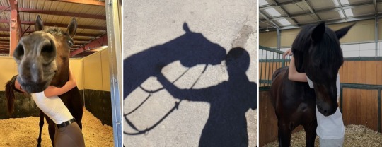
liked by landonorris, flo_norris_showjumping and 210,331 others
yourusername i CANNOT BELIEVE i am writing this post😭 so so so insanely excited to announce that mr. bean and i have qualified for paris 2024!!!!! we have an insane year of training ahead of us, but i could not be happier. thank you to every single person who made this possible. i’m gonna go cry now. maybe get drunk. WE ARE OLYMPIANS BABY‼️
view all 47,029 comments
user6 OH MY GODDDD Y/N CONGRATULATIONS
user3 omg i’m officially an olympian stan
flo_norris_showjumping AHHHHH y/n congrats!!! knew you could do it from the first time i met you🫶
yourusername i miss you crazy girl, let’s meet soon!
flo_norris_showjumping @/yourusername i’m sure you’ll be at family dinners soon enough🤪
lilymhe ALEX AND I JUST BURST INTO TEARS THATS OUR BABY!!!!!
user1 omg mr. bean is a living legend
charles_leclerc congratulations, friend!
user5 CHARLESSSS🥹
yourusername thank you charles!❤️
user8 i love how y/n changes the colour of her hearts based on the drivers’ team😭
landonorris guess i’ll meet him now he’s an olympian🙄 congrats though, y/n/n🧡
yourusername posted stories ੈ✩‧₊˚
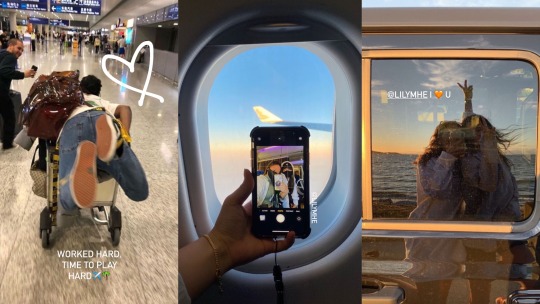
twitter reacts ੈ✩‧₊˚

landonorris posted stories ੈ✩‧₊˚

f1updates just posted a photo ੈ✩‧₊˚
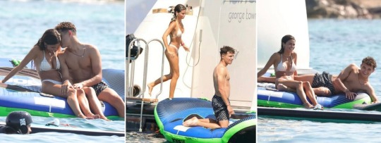
f1updates lando norris and y/n y/l/n snapped cosying up on holiday to celebrate y/n’s olympic qualification👀 the duo were joined by alex albon and lily he as they played around in the water. couples holiday, perhaps?
view all 104 comments
user7 please just let them figure this out on their own terms
user1 oh guys we’ve lost him. he’s whipped
user3 HIS HANDS ON HER KNEES!!! WHEN WILL THAT BE ME
user4 no fr that photo SCREAMS couple👀
landonorris just posted a photo ੈ✩‧₊˚
liked by yourusername, oscarpiastri and 218,119 others
landonorris back to work and another p2 baby!!!!
👤 tagged alex_albon
view all 12,303 comments
user3 so proud of you🥹
lilymhe mom and dad? @/yourusername
yourusername a plot twist i didn’t see coming…
user1 soooo mr. norris are we gonna talk abt those photos
yourusername was gonna call u cute then saw what u texted me🙄
user5 expose him queen
landonorris i take it back pls give me praise
yourusername @/landonorris fine🙄 ur cute ig
landonorris @/yourusername 🥰🥰🥰
mclaren posted a photo ੈ✩‧₊˚
liked by yourusername, oscarpiastri and 90,461 others
mclaren belgium race weekend! who’s excited?🧡
view all 1,006 comments
user11 LETS GO AGAIN‼️
yourusername ME ME ME IM EXCITED MCLAREN!!!!
liked by landonorris
mclaren we 🧡 you!
user3 she’s such a fangirl this is not what i had on my 2023 bingo card😭
f1updates posted a photo ੈ✩‧₊˚

f1updates lando norris’ rumoured girlfriend y/n y/l/n seen leaving the belgian grand prix EARLY. sources say she seemed tense all morning, and left the mclaren area for williams mid way through the practice sessions yesterday👀
view all 270 comments
user9 finally😍
user1 ur awful. get a life?
user3 no but she was so excited :( why would she leave early?
user7 f1updates get out of everyone’s business challenge
user1 she looks tired :/
user4 read a source that said she and lando were seen having a ‘heated conversation’ earlier :(
yourusername posted a story ੈ✩‧₊˚

a/n: that’s it for part 3!!! cute holiday and then boom. angst???? gonna have to come back to find out what happens👀
get added to the taglist here
- giselle xx
#🐴 paddock to paddock#f1 x reader#f1#lando norris x reader#mclaren#lando norris#lando norris smau#lando norris blurb#lando norris scenario#lando norris au#lando norris imagine
531 notes
·
View notes
Note
hi im so sorry if youve already answered this but how do u go about selecting the colors you use for your works!
hi! i've had this question a few times and every time i've only been able to answer with a vague sort of 'ehhh i just pick them'. but i think i'll actually talk some more about it now since a lot of my art actually takes a lot of beating before i decide on a final palette. but with a lot of them admittedly i already know what palette i'm using, and i organise the whole composition around those colours.
i use like two main palette methods and here they are (once you see it in my art, you won't unsee it). It mainly involves picking one main hue, and then a contrasting secondary colour.

So the most basic is to have a drawing be mostly a small range of hues, in this case the reds and oranges, and adding a single contrasting shade. Here it is the bounce light on the metallic metal parts, and doesn't appear anywhere else. It looks blue but it isn't - if I used actual blue, it would be too jarring and the colours would not appear unified. This is a warm and nice scene. So instead I pick that strong blue and blend it into a small swatch of the base colour. Then I pick from the blended portion, and what I get will be more blue than the base, but not actually blue. In fact it is yellow-orange :) The entire drawing looks warm as a result.
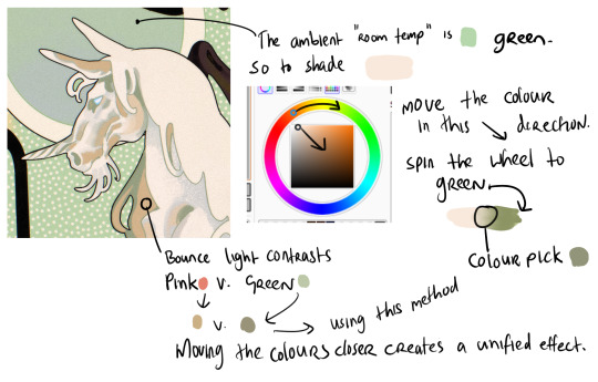
When working with marginally stronger contrast, here I have a cream unicorn on a green background. The main shadows on the unicorn will be the colour of that ambient room temperature bg - green. So I use the same test swatch method to pick a shadow colour which LOOKS green without being too disruptive of the cream unicorn. I increase the saturation and darken the value (moving the colour dot diagonally to the lower right hand corner of the box) and also spin the whole wheel towards green just a bit. Then I blend into the cream and colour pick a shade in the middle. But for the bounce light, I chose to use a common contrast of green - pink. It looks like pink in the drawing but in fact it is a low saturation orange! Using that real pink would be disharmonious. I do the exact same thing - I blend the pink into the bg colour and come up with that orange shade. It looks harmonious.
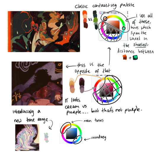
Now (top example) I am using two contrasting hues side by side. I decide the shadows will be warm, and the highlights in that contrasting zone. That means that for every colour i pick - Islin's skin, hair, his glasses, his shirt collar, his coat - every colour gets slid around the colour wheel until it falls inside that narrow band. And when I am highlighting his skin, I turn the wheel towards green. When I am shading his skin, I turn the wheel more red. I do this for every single element in the drawing.
It's the same for the Rua cover but this time I am not using such a wide band of available hues on the colour wheel, it's much tighter. I did this to replicate the look of a faded print, intentionally lowering the available contrast I had to work with by removing black as tool. It's all in that small cream to red window but it LOOKS purple - it looks like Pascal wears a purple shirt and that the smoke in the bg is lilac. Well, it isn't. That's all red and orange. I pick those colours by, again, choosing my goal "look" - a low-saturation purple, and then turning the wheel into the red range.
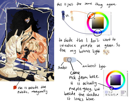
Okay so! for this it's just... the exact same thing again. Literally it always is. But since this one is recent I still have the process fresh in my mind. I envisioned it in the car, and I wanted this empty sort of desolate blue bg and a cold, distant overall tone. I ended up making the white on the chessboard & white pieces warmer, cream instead of white-grey, which worked out great. I wanted the blue, I wanted the pale cream/white, and the black of the chessboard. I didn't envision a colour for Pascal's shirt. but when the time came it was an obvious choice. It has to contrast with the bg both in value and hue, without falling outside the cream range already established by the chess pieces. So it's shiny salmon pink :) or orange, whatever you think it is. The only disharmonious part of this palette is the red velvet under the black knight piece - it works, but if I'd taken more care I might have spun the wheel more into orange and it would stand out less. But I don't mind.
607 notes
·
View notes
Text
the witch's winter event!

calling all disabled creators, be you editors, writers, coiners, artists, photographers or cosplayers!
now that im not busy with drag at the moment i have time to create this! and im hoping you'll join me!
id like to put on this event here on tumblr to bring awareness to things during the rest of winter, and you dont have to worry about running out of spoons because this isnt holiday exclusive so you can take your time with it!
this event starts after Christmas on the 28th so there wont be any added stress right before the holiday and its includive to those celebrating other winter holidays or none at all!
it will end by February 28th, the day after my birthday!
the winners will be chosen based on submissions after the event ends and the prizes will be given accordingly.
1st place- any 2 things from my store of your choosing + a free comission
2nd place- any one thing from my store of your choosing + a free commission
3rd place- a free comission
and honorable mentions will be made!
how to enter?
the days below are not set in stone but prompts! you can submit your creations when you feel like it and you dont have to do all of them! i recommend spacing them out between the months until the end of the event to preserve spoons and avoid stress.
you can submit your creation according to one of the themed prompts in whatever media you prefer.
i just need a list of whos going to be joining and to be tagged when things post! in addition to that you can use the tag #witchswinterevent / #witch's winter event on your posts
if youre joing, just send me what blog you'll be posting on, multiple sideblogs are acceptable!
bring awareness to:
(interpret as you see fit)
day one - a condition you or a loved one have
day two - an accessibility issue
day three - an aid you see less talked about
day four - lesser known symptoms
day five - free space!!
day six - your own experience with disability
day seven - comfort and safety
day eight - something inspired by another disabled creator you enjoy!
day nine - medication
day ten - free space!!
day eleven - pain and ache relief
day twelve - representation
day thirteen - symbols and motifs
day fourteen - urgent care
day fifteen - free space!!
all i ask is that you make your posts accessible! ie: readable and screen reader friendly!
any coloured text, font changes, italics and bolding, text sizing, typing quirks and images need translations and descriptions! thats the biggest and most important requirement!
if you have any questions at all please dont hesitate to ask!
and yes this is an event made by and for the physically disabled community exclusively, but you do not have to exclusively make content about your physical conditions.


#witchswinterevent#witch's winter event#cpunk#disability blogging#physically disabled#cripplepunk#cpunk blog#actually disabled#physical disability#cass rambles#cripple punk#cpunk witch#c punk#cripple punk blog#crippunk#crip punk#physical illness#cpunk event#disabled community#community event#awareness#awareness event#event#event post#coinblr#editblr#artblr#tumblr event
41 notes
·
View notes
Note
hi! not exactly a request but i do wanna ask, whats your process when you're rendering more paint like art? (if that makes sense, English isnt my first language so apologies hdskhsjdbd) i really love how you use the colors and im curious how you do it :0
i’ve been meaning to answer this one for a while so here’s how i painted miku in today’s post (put under the read more because yeah prepare for a long post
i’d also like to preface this by saying that i never follow a set way of doing things, so in terms of what my personal process is like, these are only broad strokes of what i do! sometimes i’ll combine or skip parts entirely, depending on how i feel. also, this is not a tutorial, just how i do things, so please don’t treat it like one :’D this will read like the ‘how to draw an owl’ picture if you do
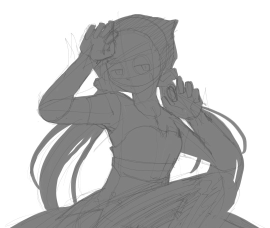
first, like every artist, i sketch. more specifically, i’m getting an idea of what i want to paint later on. this could be how a scene is set up or in this case, how a character is posed. here i’m not concerned about details or getting everything perfectly, i’m only planning how the thing will be composed. maybe a lot of canvas size changing, or adjusting what miku’s doing (note how busted miku’s right hand looks from all the transforming!) however, i still have to be concerned with how clear the sketch will be to future me, because the sketch won’t be any good if i can’t read what miku’s doing

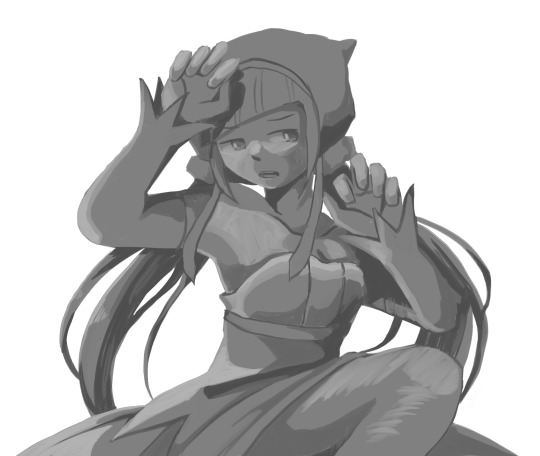
after that, i lay down a flat gray under the sketch, mainly focusing on giving miku a clear silhouette. this is also a good time to make adjustments to the composition on the fly if i suddenly feel like something can be improved upon, like shortening miku’s left arm from the sketch!
after painting a flat silhouette, i start shading in grayscale, focusing only on lighting. i usually do it in two passes, one for the lightest and darkest tones i’ll use (not black and white) and then a second for midtones to blend them better with the base gray but i forgot to screenshot the result of the first pass 🗿 nevertheless, here is where i can start adding some amount of details. i’m not including any extra accessories yet, just focusing on the base design of the outfit and the character herself (for anyone wanting to draw characters from That Gacha Game, this is how i personally make the process more bearable for myself.) i still use the dark gray to separate where certain details (like the facial features and fingers) begin and end, mainly to make colouring more bearable later.
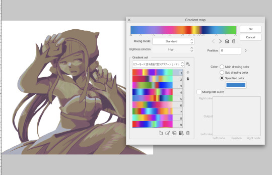
now here’s where i get the Good Colours. it’s a cheat lol. i put a gradient map layer over the grayscale painting so that there’s a little bit of color to start. some gradient maps can be applied as is, some need the layer settings adjusted to make it look good. this one, for example, is a (free) gradient map set from the csp assets store that needs you to set the layer opacity to 20% and to set the blending mode to color to achieve this result. in general, i tend to pick which gradient map i want to use based on vibes, or basically whether i want the work to be warmer or cooler, colour-wise. but this does do quite a bit of lifting for the colors in my stuff.
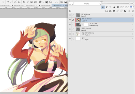
and then, finally, i add the colours. i add flat base colours in an overlay layer. at this stage, i’ve made the character silhouette clear enough that i don’t need to refer to the sketch anymore for what miku looks like. also, the gradient map layer does its magic by making the shading a bit more vibrant than it would’ve been without it. after that i paint over with a new layer to add details like the lace.
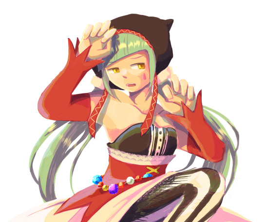
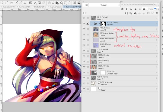
and then i put some extra shading on top. basically this is where the ‘better lighting’ happens. again, this isn’t a tutorial, so i’m not here to say what each part of the lighting is, but i’ve labeled which layers do which job. in other works where the lighting within a scene is more defined (from a window, from a small crack in the walls, etc) the glow dodge layer may be more opaque and sharper, but since this isn’t a work with that, the lighting was applied using an airbrush. the linear burn layer is also there to make the whole thing darker so the glow dodge doesn’t end up oversaturating miku. i also usually match the lights to the vibe i want, and use a complementary color for the shadows. so here you can see i have warm colors on the glow dodge layer, but light purple on both the linear burn and multiply layer.
and that’s it for the character—here’s a gif showing how each layer adds to miku! (sorry it’s so toasty)

as for the background, depending on the complexity, it may go through a similar process, or if i can settle with flat image backgrounds, i just go for that. it’s ok to use external image materials. i didn’t have a background in mind for this miku in specific, so i got some default csp materials and threw together something
and that’s about a rough overview of what my process for more finished works looks like! again, art is a fluid process so i never specifically stick to certain steps all the time, and you shouldn’t either. i can probably answer why i’d pick this colour over another in one particular work, but it’s something that kinda has to be learned on a grander scale. i think everyone can already feel what colors work with what atmosphere or what setting, even if they can’t immediately explain why. colors and composition do take some level of experimentation to find what works best!
126 notes
·
View notes
Text
DO I WANNA KNOW IF YOURE TOO SWEET?

Summary: Based on the song Too Sweet by Hozier, as well as Do i wanna know? by Arctic Monkeys.
Pairing Jolly x Reader
TW: Oral sex; fingering and bj.
A/N: I took entirely too long for n this one. This has been on my mind for weeks honestly and it got to the point where I felt I was being haunted by Hozier and Jolly. Every time I opened TikTok the first video to show up was always something to do with Hozier and then I would come here and I would only see Jolly content. And fuel was added to the fire when I heard Hozier cover Do I Wanna Know by Arctic Monkeys. Honestly this was supposed to come before I posted One more night gone (Noah fic inspired by City and Colour) but it just never felt right. Anyways I hope yall like what I came up with And hopefully it makes sense xx.
Divider by @bernardsbendystraes

“C’mon darling live a little” Jolly taunted me with a big shit eating grin.
I had been working for the Bad Omens crew for almost a year, to say that I had been going through all emotions since working with them has to be an understatement. I mostly kept to myself, I was quiet most of the time, always sticking to my tasks and schedule.
Of course I had friends within the crew but I rarely went out after shows with them or the band to dinner or to have fun. And that's exactly why I was being bothered by Jolly at this very moment.
“I'll have you know that I do live, thank you very much” is said to him with an almost annoyed tone.
“You do? i almost never see you having fun with the rest of us.” he said almost laughing.”when was the last time you actually decided to turn off your work mode?”
I stayed in silence because if I actually thought about it he was correct. I wanted to give him a witty answer but I had none. I just looked him like i was lost an im starting to think im looking fucking stupid right now.
He was trying to convince me to go out with him and the rest of the guys. It was the end of the tour and they wanted to celebrate another successful run with the rest of the crew. Thankfully this last show was scheduled in California so we didn't have to travel all the way back home. I wasn't one to go out and party, in reality I was a hermit. I loved my job and getting to know everyone around me but I also loved getting to go home and take a warm bubble bath, drink a glass of wine and get cozy in bed while I tried to catch up on movies and series I might have missed while on tour.
He kept talking as I started to set up mic stands and cables. We had a few hours before the show started and everything needed to get set up. so the guys could also do soundcheck. The longer he talked the less confident i felt in winning this fight.
“Sometimes I think you're too sweet for me,” he said with a wink. “Don't you just wanna wake up, dark as a lake? Smellin' like a bonfire, lost in a haze? “ He looked so intently at me.
“1. What do you mean I'm too sweet for you?” i took a breath in and followed it up with another question “And 2. Are you really quoting Hozier?” I didn't intend to sigh through my lips as I said that last part. I'm sure he knew Hozier was my favorite artist at the moment, I constantly had his music playing while I worked.
I thought there was some sort of tension between us, I wasn't sure if it was sexual or what but there was always an electric charge that ran through my body whenever he talked or even looked at me.
He laughed a little, “okay 2 questions that i can definitely answer for you.”
I waited for him to respond for what seemed like a lifetime when in reality it was only a couple of seconds.
“1. You're too sweet for me babe, I feel like i'm corrupting you by just asking you to dinner and 2 If i say yes and i did quote Hozier would that make you agree to go out with me?… and the rest of the crew and guys obviously..”
“You have never asked me to din..” I stopped mid sentence trying to not sound disappointed. “If i say yes will you stop asking me?” i questioned
“Yes definitely” he said laughing “I promise you'll have fun, we're going to dinner and then after we'll go to a karaoke bar, have a couple of drinks and just let go for a while” he said without a care in the world.
I hesitated for a moment. “Fine I'll go, but you owe me one,” I said.
“Okay great, you got it, we will finish up packing everything and I’ll come by to get you afterwards” he said
“You’re just trying to make sure, I don’t run off right?” I put on my best unamused face.
“No…” he replied laughing
I started to get back to organizing everything without saying anything to him anymore. Honestly it made me anxious to think about going out with everyone, I didn’t do well in crowds which is kind of ironic given my job description. I also felt like I was the most boring person and I didn’t have too much to contribute to the conversation.
I wanted to not think about it anymore, it was time for me to come out of my comfort zone so I decided that tonight I would just enjoy everyone's company and just have fun. Jolly was right. I did need to live a little so I was gonna let go and come whatever may,
The show went great, everything went as planned and after everything was packed and ready to go, we all headed out to dinner. Everyone decided that the ramen shop that was down the street from the venue was the place to go.
I was sitting between Jolly and Matt and I immediately regretted my decision. They were bickering back and forth about who had the better skills at Mario Kart, i don't really know what else I didn't really pay any attention to what they were saying anymore.
“So Jolly, how did you manage to convince y/n to come?” Matt asked Jolly
“umm i just worked my charm on her” Jolly said looking straight at me, before he turned his attention back to Marr he winked at me.
Matt just started laughing and returned to the conversation happening on the other side of him.
“So you worked your charm on me?” i asked him before i lost the little bravery i had in me
“Is it working? Are we getting somewhere?” he asked
“I…I.. what, wait where are you trying to go?” to say that i was nervous was an understatement.
He looked at me for what felt like a minute longer before he spoke again.
“you really don't know?” he says with an intrigues tone.
“I don't know what you are talking about?” i asked just as intrigued,
Before he could answer back Noah was already announcing that it was time to head out to the Karaoke bar. We all got up and headed toward the exit. We did end up having to use the tour vans in order to get to said place as it was a bit further away then what we expected.
I couldn't stop thinking about what Jolly was trying to tell me. Was I being delusional thinking he may have been about to confess his feelings for me? Most likely
We all arrived at our destination and we all seated across different tables..Some ordered some alcoholic drinks and some just sodas.
“Here, I brought you a beer,” Jolly said to me, taking the seat right beside me.
“Thank you, how did you know this is my favorite? I said, smiling at him.
“i know because i notice every little thing about you, i notice how you crinkle your nose every time you smell something you like, i notice how you think when no one is watching you you start singing, beautiful voice by the way, i notice how fast you drink your coffee in the mornings and within 30 minutes you're already ordering another through a delivery app” he took a deep breath “i know a lot of thing about you..because i..”
Before he could finish his sentence Folio was already by our table, “ Okay Jolly is your turn for karaoke, lets gooo, move it”
A little bit of laughter escaped my lips as Jolly stared at Folio for interrupting the moment, he got up from his seat and made his way over to the little computer set next to the state that had the songs loaded.
It looked like already had a song in mind since he took just under a minute to select it and for him to move over to the mic.
The lights in the stage got dimmer and the music started playing. I would know that song anywhere, more specifically, it always made me think of Jolly in one of my many delusions I had per day. I couldn't believe it, did he have some psychic powers I wasn't aware of? if i didn't know any better I would think he knew this was probably the song I would get off to when I was thinking of him.
“Have you got colour in your cheeks?” He started singing and I could practically feel pressure building between my legs.
I could not take my eyes off him, it was almost as if the world stopped for a moment and it was just me and him in this dim lit room, “i dreamt about you nearly every night this week”
We said in unison even though you could say I was more whispering than singing.
“Do i wanna know.. if this feeling flows both ways” I was forgetting how to breathe. “Was sorta hoping that you'd stay..”
I was practically wet at this point and I'm pretty sure he could tell that my face was red from all the blushing as well. I was about to explode into a million pieces, I didn't know how much I would be able to hold myself together for. and i was hoping i wasn't reading this whole situation wrong.
“Maybe I'm too busy being yours to fall for somebody new” I could say the same thing I thought. “Do you want me crawling back to you?” And there it was the last straw, I could feel the walls closing in and I needed to get a breath of fresh air.
I got up before he could make his way back to the table, I moved as fast as I could and crossed the threshold of the exit door to find myself outside the karaoke bar. I saw the lights of the street illuminate the path as I paced back and forth. It wasn't long before I heard the bar open, I stood still in one place and I saw Jolly walking towards me.
“Hey, are you okay?” he asked with a concerned look on his face.
“Hi” that's all i could muster up to say, after a bit of silence i spoke again “ah yeah im okay i just needed fresh air, the space was getting too small and hot for my liking” i tried to sound as normal as i could.
“Hey listen, maybe I read into this too much..” he sounded concerned but i let him go on “i'm sorry if i made you feel uncomfortable it was never my intent..”
I realized what he was saying and before I lost the little courage that the alcohol I previously drank had given me I took his face in my hands and leaned in to kiss him.
It was slow at first, he tasted like the sweetest wine mixed with a hint of mint. As the kiss escalated we somehow also made our way to the alley that was on the back of the establishment.
\he licked the bottom of my lip asking for entrance and i allowed him without any restriction. I felt as if I was on cloud nine. Our tongues tangled in a war for dominance that I was sure I was gonna lose. He had one hand on the back on neck and the other on my hip. He started to slowly push me up against the wall. His lip parted from mine, and we both gasped for air.
“You don't know how long i been waiting for this” he dove for a quick kiss, “how long ive been wanting to touch you, just like this.” \His hand started to roam, even though i was fully clothed i could still feel his every touch.
He moved his hand to the wall so he could steady himself and with his other he moved his hand down, first through the valley of my chest down to my stomach, he stopped right before the seam of my jeans.
He took a breath and said “\if you wanted me to stop just say so” but i didn't dare say anything. I was too lost in the moment to even try to put a sentence together and he could see in my eyes was pure lust.
He took my silence as an indication to keep going. I heard the pop of my jeans being unbuttoned and and slowly his hand sinked down to touch me in the most intimate place. I let a gasp escape my lip and I started to feel my legs weakened. i stadied myself by placing both of my hands on the wall as he slipped his fingers through my folds.
“You're already so wet for me aren't you?” “Yees” I let out a shaky voice.
He started to rub my clit slowly in circles and I was slowly losing my inhibitions. the sensation all building up in the pit of my stomach. i was certain that i was seeing stars floating around, he slipped one finger inside of me “your so tight baby” he slipped a second finger in “so tight” he repeated.
His fingers started to thrust in and out of me, and all I could do vocally was whimper. I was close to my climax, I grabbed on his shoulders as I let the euphoric feeling take over me. It was like an explosion of color and warmth behind my eyes.
I was coming down from my high and trying to catch my breath while Jolly put his fingers in his mouth. The same two fingers that were inside of me just a moment ago.
“You taste so sweet, too sweet. get on your knees” he commanded.
And obeyed like my life depended on it. He unbuckled his pants and let his member free, and I swear that I could feel the drool roll out of my mouth onto the concrete floor.
“Are you going to be a good girl and suck on it?” my answer couldn't come out fast enough “Yes”
I grabbed his thigh and my mother went to the tip of cock which was already dripping in precum. i started stroking up and down, letting him get a feel, He closed his eyes and that's when i dove, i put the tip in my mouth licked the precum, he was big and girthy i wasn't sure if he would i could fit all of him in my mouth but i would dam try.
I bobbed my head up and down the length of his cock, each time with a bit more force than the last. He tangled his fingers in my hair and guided me, for the last few minutes until I could feel the web of his cum hitting the back of my throat.
And as I sat still on my knees, and looked up to meet Jollys eyes, I knew in that moment that everything had shifted, and I was done for. He had ruined any chance of any other guy that tried to make me feel this way because no one will ever compare. Ever.
#jolly thots#joakim jolly karlsson smut#joakim jolly karlsson#jolly fan fic#jolly#thots 🔥#bad omens#bad omens cult#Spotify#hearts & melodies
22 notes
·
View notes
Text
Some old outfit sketches from the first few chapters! Feels like a decade since I drew these, but these were the basis for the finished 'Baratheon Brides' piece!

Cersei's wedding dress was largely based off of Sansa's as it was the only real example I could find of women's fashion that carried over the little capped sleeves the Lannister men tend to have, then of course coupled with the gold 'armour' bodice she wears during the Blackwater, since I felt it was a good twist of irony that she'd wear it both times she 'faces' Stannis.
Also, though we are told (and logic demands) that her wedding outfit is the one she prepared for marrying Robert, I like to think she added the rubies (and possibly even the metal bodice) somewhat last minute, as an extra fuck you to Stannis, since all the gold wasn't quite bloody/vicious enough for her.
Her 'setting sail' outfit was one of the rare cases I actually wrote a description for it first, then based the sketch off of that, instead of the other way around, but basically came from just looking at the extravagant matching mother-son capes she and Joffrey wear in Baelor, and thinking that the way that could fold around her bump would be cute, and a 'hey LOOK im PREGNANT' move that she'd definitely go for as part of her 'showing off how successful we are' departure. To that end, she's also incorporated a good bit more red for the bite of it, but is still sticking to primarily golds for unity with Stannis.

Ignore the weird off-centredness, but these were the first sketches of both our main Hightower ladies. Grey/silver is an underutilised Hightower colour (all thanks to that one really good green dress Alicent wore that one time) so I really wanted to bring attention to it, while also highlighting the differences between the two. Malora's is very drab, darker (to match her hair), and she can sort of 'hide' behind her sleeves if she really needs to, where Lynesse's is showy as it possibly can be without fully 'giving the game away'. The opposing flame colours also of course come into play, the first early sign of division amongst Leyton's many spawn.
They also both have the 'turret' motif, though incorporated in different ways, intended to reference the actual Hightower itself! A tower is a lot harder of a 'pattern' to put onto clothes compared to lions and roses etc, so you can bet every single Hightower I ever draw now is going to have it (it was also vaguely inspired by the dark blue dress Alicent wears in s1e2, where the 'rungs' of the sleeves made me think of a chequery-turret pattern being a recurring staple of Hightower fashion)

And the finished piece! Malora's sleeves ended up getting changed, I think because it was either muddying the silhouette of her skirt, or because I'd cut out her necklace and wanted to still show the amber ring on her finger; plus I generally use those slit poofy sleeves (snow white sleeves, as i always think of them) as an indicator of 'Reach' fashion, since they pop up in Loras's wardrobe a few times.
Cersei's veil also didn't make it, mostly because her curls were just TOO bodacious for me to work out the physics of it; the same reason that she has a different style of cape to Malora's! Her curls are just that defined that they actually define everything around them too.
And on the topic of her curls---
Bonus: this very quick sketch I did for a modern au I'm working on!

The specific fic this is derived from is a long way off from seeing the light of day (the main modern au I'm working on would be a one-shot set fairly late into their marriage, whereas this comes from during their dating era) but I love her energy and this DRESS too much not to share it. I imagine this is several clubs in, and her curls are SUFFERING from the humidity and dancing of it all, but every other part of her is impossibly yet steadfastly flawless (including the belly button piercing Tywin definitely doesn't know she has, which she probably conned a piercer into giving her when she was like 15)
(ranna does the exact same thing except robert definitely pays for her to have it done, because she can talk him into literally anything with very minimal effort)
(cersei is not as oblivious to this as tywin was, though she DEFINITELY curses robert out for it while letting ranna think she's gotten away with it)
(anyway psa: cersei in green > hightowers in green)
#asoiaf#asoiaf fanart#digital fanart#cersei lannister#a song of ice and fire#alternate universe#fanart#modern au
23 notes
·
View notes
Text
welcome to the third thrilling instalment of me yapping about harumasa asaba and ether aptitude regression syndrome (im sticking with the EARS acronym) beware of possibly unclear wording and half assed explanations. this isn’t a thesis.
- this twink has body dysmorphia. it’s kind of a given with all my other hcs. he either feels too much like an ethereal or too much like a human. a human in an ethereal body or an ethereal in a human body. not fun either way but i imagine he prefers feeling too ethereal over feeling too human. the latter makes him feel like he’s already a monster. a wolf in sheep’s clothing. jk he’s an unbothered king (he is not). if you hc him as not cis then double the fun (for you maybe)
- every now and then he like hallucinates himself as having an ethereal body. different to the phantom limbs sensation or the ethereal senses. this is just plain old tripping balls courtesy of EARS. def not a fun time. like he looks down and instead of a human hand it’s an ethereal claw. he looks in a mirror and thanatos is staring back. this mostly happens after a long time in a hollow or exposure to high levels of ether.
- on the other hand, he also has physical ether manifestations. yippeeeee. after a prolonged or high exposure to ether corruption crystals will grow on his body. like spores. mostly harmless and will break of or just turn into dust but very inconvenient. they rip through shirts (miyabi always pays for more) and make harumasa feel numb where they grow. for even more fun, harumasa’s veins, skin, hair and eyes can end up glowing or discoloured. his finger tips may become black like charcoal, glowing markings like crack appear on his face, you can see his veins shine beneath his skin. we know his eyes can change colours as well. it’s lowkey pretty. not to harumasa though (it’s his reason 253 to avoid work). when he’s alone he might spend hours scrubbing at his hands and face trying to wash the corruption off.
- adding on, his teeth and nails also become sharper because why not. they’re already slightly sharper than normal (we see his fangs in cutscenes) but it becomes much more noticeable after some time spent in a hollow. when this happens harumasa repeats to himself im not a monster im not a monster im not a monster and hopes that it’s true. what a silly little goober :))))
- i think his voice would also be altered by spending time around ether. his voice is distorted and warped, changing randomly in frequency and tone like he’s speaking through a glitchy radio while underwater. pretty much what we see in his demo. now for a funny thought: imagine the noises he makes while you’re giving him devious backshots
- in hollows, if harumasa has been exposed to enough ether and at a high enough level an image of an ethereal (thanatos) will be overlapped over his own body if you look from the right angle or closely enough. as you talk with him you see a pitch black sphere cover half his face in a flash. as he fires his bow, you see a glimpse of thanatos in his place. (this would be reason 379 to avoid work). again think of the scene in harumasa’s demo where he saves the kid. i imagine that dream sequence was based on real life. that must’ve been fun for harumasa
okk i believe i have emptied out the harumasa EARS hcs bucket in my head. for now. pls hope with me that i get miyabis w engine soon.
#zenless zone zero#asaba harumasa#this twink is going through it. pls look after him section 6#ahh the urge to yap is strong. might talk about the cunning hares next i love them
33 notes
·
View notes
Note
Please do you have any art tutorials, especially on colouring, or brushes I can buy?
i never think to take screenshots during my process so it would be easier to explain, but i do it like this : i sketch in a colored pencil, change it to black when i consider it done enough to start adding colors, and then i choose the dominant tones of the drawing. if i want the background to be colorful, i choose it now! if you choose all your colors against a white background but change it last second, it will change the balance completely. by choosing dominant tones, i mean picking either one color or two colors that contrast, and fill the whole sketch with these tones. for example, if im drawing a princess on a white background and i want the tones to be warm, i might fill her whole form with the same red. then i start picking her skin tone so that it matches that warm red, and it might end up being a tone that would look much too saturated and red on another drawing. but here, it looks harmonious. and if i started from a green base, i'd end up with a very different color. see here : a blonde lady wearing a blue dress, but starting from red & green
it's the same way when i paint with real paint ; i don't mix from scratch, i often reuse my mixes and change them just barely to get to the color i want. so if i paint orange flowers, i will add blue to that mix until it's green enough, and it's a nicer color that will match my orange flowers nicely, way more than if i started from scratch every single time
it's also largely a matter of practicing and training your eye to palettes you like, as unhelpeful as that is. i'd recommend looking at the palettes of artists and art you like, seeing how it's balanced, maybe color picking it for practice and see how that helps you think in colors
for brushes ; i do have a couple special brushes, i mostly use procreate defaults (6b pencil my most beloved) but i do have some from this pack (i think it's the right one?), i use sketchy sarmento all the time and it's really nice
#anon#answered#im mega tired so i hope it's somewhat coherent#i don't feel too qualified to give advice but i hope this helps! good luck to you :-)
28 notes
·
View notes
Note
hello hi!!! grfhvhghr i am in love with your artwork so much you cant believe-- i wanna ask if you have any tips on how you lineart and colourpick?? no pressure to answer tho, have a great day/night!! again, love your art <33
hi!! thank you for your kind words!! since i got asked about these a lot, im answering this for all the other ask asking about lineart and colour tips too! You can see some previous post here.
also i could only give out tips that work for my drawing style - which is heavy lineart / colours pop up the line (believe it or not it's American comic book style. ppl cant understand why my art doesnt really look like usual anime/ Asian webtoon style, even though it is still clearly anime / Asian webtoon style, but when i told them it's because im drawing these by studying American comics, no one believes it either lmao.
i do study but i do my own things too, so most of my art inspo is really unexpected to ppl, but they r really where i learn things from, cuz i dont even go to art school TT_TT).
Changing the brush size will help you achieve thick/thin lines better without having to put pressure on your wrists. Keep your hold relaxed and let bigger brush size give you the thick strokes.
I like messy sketch, to me the sketch is just an outline shape to fill details in when i do the line, it also gives more freedom to wriggle as i draw! cuz i dont really plan out everything from the start, just wing it as i go, so a lot of my work is actually very spontaneous.
that leads to this point: when you do the lineart you should start deciding which colour style you want from it to adjust the details amount. the ink shadow blocks in my art aren't there randomly, i adjust them to best complement the shape language and colours.
for piece where i want the line/shadow to...idk hit (?), the colours are almost flat with textured brush adding depth to them, so the inking is the shading, thus there are more details in the lineart / ink blocks.
for the video above and piece like this where i want the colours to be clear and pop out, the use of ink blocks are minimized and i do the shading during colouring process. but! the ink blocks can still make some places pop very nicely! just use in moderation!
when doing the base it's good to keep the colour on the left side of the colour wheel (low saturation), but as you do shading and lighting, try to spread out evenly so it won't look washed out.
toggle around with hue and saturation slider as you go! the key is always adjusting! you're making hundreds of decisions at once, being conscious of your choice in why a line or a colour should be in a certain way will help improve your process a lot! (i think you can tell which art i turned off my brain and just draw for stress relief ........ which is also a valid way to draw and sometimes the result might surprise you! but for more serious stuffs i try to be aware of most of the move i make. it's problem solving, yeah?)
i find that one way to keep your art from appearing too...yellow in the end (which is sth that haunted my ass for a long while) is always aim for cold tone, so if you accidentally make it warm either way in the end it won't be too warm (and yellow :cry:)
well that's all the stuffs i can think on top of my head. sorry i can't give more advice on colour picking cuz it's sth i don't really know how to give advice on???? i think my colours now are still pretty lame haha........ if there are still any questions i'd gladly answer within my ability, though im very slow to answer ask ( i do read and be happy at all of them tho!)
#art tip#ask#anon#albi’s art#ALSO I AM SERIOUS ABOUT THE BRUSH SIZE THING SAVE YOUR WRISTS NOW. TODAY. DONT LET IT HURT THEN TRY TO FIX IT LATER#aughhhhhhhhh *rub my wrists*
300 notes
·
View notes
Text
by the sea !!
this is my first time EVER posting a fanfic and im TERRIFIED but oh well i suppose
summary: kaz and my oc, damian, just being their usual selves and debating the future a bit... this was very much based off of the song from sweeney todd of the same name. (for reference, dami is like 13 lolz. plz don't be weird yall!) word count: 1.4k
“Ever think ‘bout what we’s gonna do after?” Damian asked over the noise of the Crow Club. Kaz had been doing that thing he did where he sat around and just watched everyone. Occasionally, he’d tell Damian something. Like how much he thought some pigeon’s jewelry was worth, or who he thought would win at the nearest gambling table. He was always right, of course.
But Damian found that rather boring, so he’d brought all the coloured wax sticks Wylan had given him and took paper from Kaz’s office before they left the Slat. Why his boss kept things like paper just lying about, he’d likely never know. He could ask, or assume. But then that’d ruin the fun.
Kaz let out a hum of acknowledgement, though he kept his dark eyes trained on the others around them. “After what?” Sometimes, Damian selfishly wished Kaz liked to talk more. He found his raspy voice pretty funny.
“Y’know,” Damian drawled. He paused to glance down at the blue colour staining his bandaged finger, then he gestured around them. “After all this. We ain’t gonna live here forever, are we? What about when we’re too old to do gang stuff?”
Kaz raised a brow, and this time he spared the kid a single glance. “Since when do you think about the future, hm?”
He simply shrugged as he looked back down at his drawings. “I’m not, like, thinkin’ thinkin’. Just wonderin’. Big fat difference. I just meant, what if we go somewhere else?” He wasn’t too sure why he was wondering about it, though. Maybe it was because Inej and Jes had both been planning to bring the others off the island eventually. Maybe he was just in need of a nap.
“But later,” he added quickly. “If business stays good and shit, once you’re more rich. We could take over other places!”
Kaz rolled his eyes. “Then we wouldn’t be Barrel boys, would we?” He spoke with this sense of teasing, it made Damian smile.
He huffed in slight annoyance. Kaz loved to play dense sometimes. “I guess so. But it could be fun, no? Even if we just left for a little while.” He chuckled as he held up one of his drawings. It was a very beautiful, very accurate depiction of him and Kaz by the seaside, in front of a big house with crows and whatever other animals lived by the waves. “See?” He knew his drawing must be pretty good, because Kaz’s mouth twitched up. Just a little.
“Are those… tigers?” Kaz asked skeptically, taking the drawing from the kid to inspect it. When Damian nodded, he almost chuckled. “Tigers don’t live near the ocean, kid.”
“Not yet they don’t,” Damian replied with a big grin, pushing his glasses up his nose. Then he gasped as he caught sight of the cane in Kaz’s other hand. He very quickly took the paper back. “I almost forgot! Thanks for reminding me, boss man.”
While he searched for the black wax stick, Kaz let out a breath that almost sounded like some kind of amused noise. “Sure thing, Dame. But I don’t think you’d like living on a beach very much.”
Damian grunted in response as he quickly added a crow headed cane to Kaz’s hand on the page. He didn’t think he’d like it very much either, but he couldn’t help himself! Sometimes, it felt like he and Kaz and everything they lived for revolved around the Barrel. “How would youse know? Not like you’ve ever set foot on one. I think the sea sounds fun. We never do anythin’ new ‘round here no more.”
“Please,” Kaz scoffed. “You’d go stir crazy in less than a week. You’ll be more bored there than you are here in the city.” He leaned closer, taking another look at the drawing now. “I see you’ve made an addition.”
“Yeah!” Damian replied brightly, looking at Kaz again. “You can bring it along when we go!”
Kaz sighed quietly. “We’re not going anywhere, Damian. You and I both know that. What’s with this new need to spread your wings, little crow? We do plenty around here.”
The Suli boy simply groaned as grabbed his coloured waxes again. “But it’s all the same ol’ same old! I just wanna see it, y’know? I bet the warm weather’d do wonders on that leg of yours. Can’t ya picture it?” He laughed as he held up a new hasty drawing, one of him and Kaz and all their stupid friends. “We could have the whole family over! Who knows, maybe you’ll conquer an army of seagulls.”
“Ketterdam is warm enough,” Kaz grumbled. Though, his gaze lingered on the colourful, and albeit messy, sketches that the kid was showing him. “And my army of crows is just fine, thank you.”
Damian hummed in thought as he tapped his chin. “Then we’ll go someplace with crows. Maybe south, like the country. Oh! We could cross over and check out where Jes was a tiny tot. His farm’s probably huge. Don’t farms have crows?”
“Some of them do,” Kaz replied slowly, watching Damian go back to drawing. “Perhaps Inej’s stories of her voyages are getting to your head.”
“Probably,” Damian snickered. He wasn’t sure what else to add to show Kaz. Maybe some fun things for them to do, in their peaceful little retirement. “Youse really gonna let this city win and work ‘til ya drop, boss?” He asked teasingly. “We deserve a bit’a rest eventually.” He spared Kaz a long glance. “Maybe a lot’a rest. Good night sleep and a long walk. Think of all the shit we’d do! I could learn to bake, knit, fly a kite, kill a dog…”
Kaz blinked hard before he glared at Damian. “That looks hellish,” he said. “And still, it sounds painfully boring. What the hell are all those things around us supposed to be?” He asked, pointing a gloved finger at the new scribbles Damian had made.
He wrinkled his nose before explaining. “Coins, obviously, ya dingus. We’d have too many to know what to do with. Youse could buy all ya wants. And ya’d have tons’a time to catch up on your most favorite borin’ things, like reading and shit!”
“And shit,” Kaz echoed. Damian could’ve sworn he sounded… What was the word? Fond. “Right. Because that’s exactly what I need, more time on my hands.”
Damian furrowed his brow. “Isn’t that what I just says? Either way, youse gotta do somethin’ with your scrub eventually. Why not a nice little trip?” He swiped the red wax stick in his hand over the new sketch of he and Kaz and all their money. “We could still do a poor sap in ev’ry now and then, of course. Gotta feed the hunger.”
“I seriously doubt ‘every now and again’ would be enough to satisfy your bloodlust,” said Kaz.
“Youse is probably right. You usually are.” Damian flipped his red wax in his hand, though his gaze lingered on the Dregs tattoo peaking through Kaz’s sleeve. It was inked into the older boy’s inner forearm, the same place he had his own mark of the gang. “But youse always says you like the quiet. Big open grass, clean air. Doesn’t sound so evil, does it?”
“Perhaps a small trip wouldn’t be so bad, eventually,” Kaz relented with an exasperated sigh. “But don’t come crying to me when you feel homesick, you little brat.”
Damian gave his best impression of Jesper’s usual, dramatic scoff. “Me? Cry? Why, I never!” He took in a breath, thinking back on what Kaz said. His mind came up a bit blank the further he thought back. “Eh, what was we talkin’ ‘bout again?”
Kaz gave a small smirk, and swept up one of Damian’s drawings to fold it. “Nothing, kid. Don’t worry your little head about it.” He noticed out of the corner of his eye how Kaz slipped the paper into his coat pocket, once he’d turned back his colouring. But he chose not to say anything. After all, it was just in Kaz’s nature to clean up all the clutter he didn’t need.
#six of crows#kaz brekker#crooked kingdom#shadow and bone#oc#fanfic#inej ghafa#jesper fahey#wylan van eck#grishaverse#fanfiction
13 notes
·
View notes
Text
14:30 | mm

pairing: assassin!momo x handler!reader
summary: good speakers are good liars, too bad momo is neither. co-written by @eternallyghosting chapter summary: momo spends the day with you
warning: sickeningly sweet, like makes me want to throw up actually
word count: 2.5k
a/n: assassin!momo is here because indigo works hard af. literally she wrote everything, again i didn't do jackshit for this part, didn't even open docs until yesterday lol. im just here to post and disappear like avatar aang, again :]
masterlist

You cursed as your oven timer dinged for the third time, barely managing to shove your hands into heat proof gloves before hurrying to take the baking tray out of the steaming oven. This had to be your sixteenth batch of heart shaped cookies, an apparent Valentine's day tradition. A cliche, more like, you rolled your eyes.
Although this influx of orders was no doubt good for your growing business, you were just about ready to gouge out your eyes if only to avoid looking at pink food colouring again.
You sighed, at least after this last order for Mr Moyo, you'd be done for the day. As you busied yourself with measuring the flour, something you could do in your sleep now based on the amount of times you'd made this exact recipe, the front door slammed shut.
Momo. Hearing the loud slamming noise would've given you a headache in any other situation, but not today. Today Momo had promised to give you a break from doing the dishes after seeing you knee deep in orders since the morning.
You hadn't even realized how tired you were until she came up behind you and laid her chin on your shoulder. You took a break from kneading and pulled her closer. Sensing your fatigue, Momo wrapped you up in her arms, gently turning you around and laying a soft kiss on your lips.
"Rough day?"
"Mmm," you didn't bother with a more coherent response. Momo got it anyway.
She gazed around at the heart cookies, with their light pink frosting and red and white sprinkles, and snorted, "I don't really get why people would want these."
A beat.
She rushed to add. "Of course not saying that because it's your baking! These look great babe, you've done a really good job on the decor." She cupped her warm hands around your cheeks, emphasizing that she didn't mean anything by what she'd said.
You shook your head, "It is a silly holiday."
"Exactly! That's what I meant," she kissed your cheek in apology.
You settled deeper into her hold. The dough could wait. "But still, it's kind of sweet that people celebrate Valentine's day," you murmured.
Momo could be quite dense sometimes. You had to often spell things out for her. But this, your unmentioned plea, she understood clearly. Maybe it was the exhaustion making you more sensitive than usual. Or maybe it was the sentimentality of the holiday that made you melt against her arm as she brushed a strand of hair behind your ear.
"Tell you what, you finish up this last batch and I'll run you a bath. How does that sound?"
That did sound great. You gave her a grateful nod as you added, "there's extra frosting in the fridge if you want to try some."
Momo hurriedly disentangled herself and gave you another kiss before rushing to the said fridge. Perhaps it wasn't just you feeling the sentiments of the holiday.
With renewed vigour, you managed to toss the new batch of cookies in the oven, having to wait only for a couple minutes before filling up all your used dishes with soapy water. Although Momo had promised to do them for you, you couldn't just leave them be without rinsing atleast a few.
You trudged upstairs, where your nose was immediately met with the soothing scent of lavender, from the bath salts you had gifted Momo a few months ago. As you slipped into the bathroom, Momo turned to face you.
"So my next flight isn't for another few days."
You nodded silently, focusing on throwing your flour stained shirt into the laundry basket instead. Momo and you had discussed her flight over dinner last night so you didn't know why she was bringing it up again.
"I was thinking we could do something together."
Now that got your attention. You lifted your head and asked with a hint of a smirk, "I thought you said Valentine's day was a shitty occasion."
"I didn't say it like that! And also this doesn't have to be for Valentine's day," she added. "It could be just a date."
"Okay," you shrugged. You would do anything if it meant spending more time with Momo.
She perked up. "Great! I'll plan it out!"
Wait, what?
Before you could ask her anything, she smiled, said "Enjoy your bath!" and left, closing the door behind her.
As you enjoyed your much needed soak in the tub and made your way out of the bathroom, you found Momo hunched over on the bed with her glasses on and laptop in hand. You smiled to yourself. She hardly ever wore her glasses, so she must be taking this date planning very seriously.
As you crawled into bed, she turned her screen towards you and pointed excitedly. "Look!"
You took a look at a website showing various people with axes in their hands. Before you could ask about what Momo wanted to do with a Thor convention, you caught sight of the title at the top of the screen.
Axe throwing. Huh.
"Seems fun, doesn't it?"
You tore your glance away from the laptop to Momo's face, grinning widely and awaiting your answer. You were looking at her, but you weren't really seeing. The only thought in your mind was how cute those glasses looked on her. You really had to make her wear them more often.
"You're adorable," you blurted out as she nudged you for an answer.
Stifling a giggle, she rolled her eyes. "I'm taking that as a yes." And right away, she booked a slot for the two of you. You settled under the covers quietly, not really having any objections but also not expecting her to be so proactive about this date.
"There, all done. It's in the evening tomorrow." She put her laptop away on the bedside table and joined you under the warm duvet.
Not that the duvet stayed settled for long as her words jolted you up. "Wait, tomorrow? I can't tomorrow, I have to deliv—"
Momo took your hands, silencing you in the action. "I know, you have to deliver the cookies. But we could do those on the way to the facility."
You weren't convinced this easily. "What if someone isn't at home? What if we can't deliver some of the orders?"
She shook her head. "The time slot I booked is their last one. It's at 8 pm, which gives us plenty of time to make the deliveries, even if someone isn't home in the morning," she emphasized the end of her sentence to lay your worries at ease.
Kissing the hands still in her grip was the cherry on top, as you finally settled down again, content that Momo had it all planned out. She laughed quietly as she turned to face you, the faint yellow hue of the night lamp casting a glow on her face. "I wouldn't have booked the slot without making your deliveries happen, babe."
"I know, I just like having a plan." So what if your handler tendencies bled over into your regular life, having a plan was never a bad thing.
"You and your lists and schedules…"
"Hey, at least I'm not the one getting lost in a city because I can't read out the itinerary made for me!" It was a bit of a deep cut to bring up something that had occured on vacation years ago, but you couldn't resist teasing her.
And Momo retaliated by doing what Momo did best. When at a loss for a verbal attack, she mercilessly moved her hands up and down your sides, tickling you until your feet kicked and squirmed in the blanket.
She only stopped when you finally cried out for mercy, ceding victory to her if only to be able to breathe properly. Having eventually caught your breath, you pushed yourself up onto your elbows to situate your torso over hers and wipe off the smug smile on her face with a deep kiss.
"Goodnight, babe. I love you."
"I love you too. G'night."
True to her word, Momo had done all the dishes last night while you had been in the bath, and walking into a gleaming kitchen almost made you want to get on your knees and sob in relief. You loved baking, but cleaning up after was often the hardest part, something you absolutely had to be particular about no matter how tired you were.
You turned on the coffee machine just as the sounds of Momo rustling around in the sheets reached your ears. You were content to just stay in and share a cup of coffee, enjoying the morning sunlight streaming through the windows onto your kitchen counter. You looked around your carefully curated kitchen, at all the designs you had insisted on, knowing that it would be one of the places you spent the most time in. Your eyes landed on the pile of trinkets in the corner, stubbornly making themselves known in the pristine marble decor of the kitchen.
Despite your hatred of the mismatched colour scheme, that corner held a special place in your heart, after all, it contained all the little things Momo had brought back from her trips around the world. The woman was talented in many areas, but interior design was decidedly not one of them. She would buy whatever she thought looked cute, irrespective of whether it was something that would fit in your kitchen or was needed by you in the first place.
Still, you couldn't bear to hide it away. As your gaze landed on the porcelain soap dish Momo had brought back a few weeks ago, you had to stifle a laugh at the memory of that particular day. All things considered, it wasn't even as horrendous as some of the other things she'd purchased, but her reasoning for buying it was what had you stumped. You remembered her ravenously eating forkfuls of the pie you had made to celebrate her arrival (and the difficult mission you knew she'd undertaken), before she had sprung up from her seat to haphazardly search through her bags.
Having found what she was looking for, she had tossed the dish towards you, and beamed as though expecting praise for her 'thoughtful' purchase. You couldn't lie, the gift had you bewildered for a good couple of minutes as you wracked your brain trying to recall why this dish would be of particular significance to you. Momo had impatiently gestured at you to turn the dish over and "look at the back!", where you found a 'Made in Greece' stamp over the dish. Although that gift had greatly confused you to the extent of looking like the human equivalent of a keyboard smash, it brought a smile to your face knowing that Momo carried your love of Greek myths with her wherever she went.
The subject of your thoughts bounded down the stairs just as you wrapped up that precious memory. Her hair was mussed up from having rolled around in bed, and her bleary eyes indicated that she wasn't fully awake yet. But to you, she had never looked better. You loved Momo like this, all soft and pliant in the morning, making you feel like you were in a never ending Sunday.
You must have taken a second too long to acknowledge her, as she whined at not immediately receiving her good morning kiss. You moved towards her and obliged, before getting a hold of her wrist and gently dragging her off to where your twin coffee mugs stood, ready for a lazy start to your day.
The rest of your day went by similarly in a haze, with you dividing your time between wrapping up your final orders, and making the most of Momo being home. Once the admittedly long and lazy breakfast was over, you enlisted Momo's help in reorganizing your closet, getting rid of items you didn't use anymore. Then, after hastily vacuuming your bedroom, the two of you made a quick lunch of enchiladas (well, you cooked and Momo tried not to get in your way), before settling down on the couch and scrolling through Netflix for a new show to watch.
You sighed contentedly in her hold as Momo, eventually tired of trying to find something new, clicked on the long memorised sitcom favoured by you. As your eyes glazed over the familiar scenes, you lauded your past self for closing off orders even though Valentine's Day was still two days away; you got to make the most of your time while Momo was still home.
By the time the afternoon hues of the sun had started to darken to twilight, you had already finished a season of the show you had put on, as well as two cups of tea and a bowl of popcorn. Deciding to clear up a bit, you turned off the television with a groan of protest from Momo, before eventually tugging her off the couch and upstairs to get ready for your deliveries.
Momo had been right in booking the 8 PM slot for your date, and as you watched her carefully load all the orders into the backseat of your car, a serene feeling washed deep in your bones. All it took really was a four letter word.
Home.
Time.
Love.
"Why are you staring at me like that?" Momo asked as you slid into the passenger seat.
You had an absent smile on your face as your fingers drummed against your thighs. "Mm, just thinking of how all it takes is a four letter word."
Momo leaned over, grabbing and fastening your seatbelt for you in a swift motion. "You're thinking of 'sexy', right?" she smirked.
You felt your cheeks being pulled upwards as the absent smile blossomed into a full one. "I was thinking more of 'dork' but okay."
"Nerd."
"Fool."
"Rude."
"Mean."
The two of you traded back and forth before Momo suddenly said, "Y/N".
"Hmm? That's not how—"
"I love you," she giggled. This time it was you who leaned in, pushing forward as much as your seatbelt would allow, and sealed her giggles with a kiss. "Wife," you murmured against her as she pulled you in closer upon hearing that fall from your lips, a revered whisper.
Despite everything in you screaming not to, you eventually pulled yourself away and let Momo start the car. You settled in your seat, putting a hand over your heart to calm it's racing, but to also feel how strongly it beat. For Momo. While the pair of you weren't really convinced by the traditions of Valentine's Day, and scorned at how the town had blown a quarter of its budget on tacky pink and red decorations, you couldn't deny just how full your heart had felt today. How it felt everyday you were by her side.
You had your own traditions with her, of course you did, honed after years of being together, but it all boiled down to one thing, a simple four letter word: Momo.
any feedback is much appreciated.
a/n: happy valentines day y'all, tell people that you love them !!! or don't, or tell them that you hate them lol, idk don't let me tell you how to spend your day :P
taglist: @someone-who-likes-broccoli @happilychaengs
#a game of hide and seek#mala's collection#sanccharine#indigo's archive#eternallyghosting :]#momo x reader#twice x reader#momo fluff#jype twice#twice imagines#momo imagines
94 notes
·
View notes
Note
So this isnt a pride req but you still don't have to answer!! But how do you draw so quickly?? I swear you draw like 2-4 times a day? I wanna get on a really good schedule about that so I can keep up with a art blog but idk how to draw fast! How'd you do it?
I hope it helps If I go over my entire process here because I've been wanting to showcase my process for awhile anyways :}
Haha! Yeah, i usually try and draw ~4 things min a day. Now, let me clarify, to run an art blog you don't have to draw fast! I do try and take breaks if I need them!!! But a lot of my speed has to do with the fact I've just been in a very art-inclined mood as of late :} It's a lot easier to draw if you WANT to draw! and knowing people like my stuff is a huge motivator.
Long post below where I explain my process and some of the shortcuts I take!! :]
For more skill-based tips though, my method definitely helps. Drawing lineless and paying attention to my stabilizer helps a lot. I'm definitely not a perfectionist when it comes to my art and I do tend to reuse poses I KNOW im comfortable with if I'm not in the mood to go all out.
I sketch freely with loose stabilizer using a pencil-like pen that allows me to get a good idea of the details I want down... Ex:

I have a very good grasp on the way i draw slugcats and how their bodies are shaped! Depending on the characters you're drawing, you should try drawing them a TON to get to a point where you can sketch them without even looking at a ref of any kind. My designs tend to stay consistent as I have a solid idea of each slugcat in my mind! It helps me pace myself as I generally don't need refs! :}
Next, I blot out my main body shape. I then, using a clip layer, add in lines and line in limbs! Generally I do this all in the same colour, get the main shapes down before you add detail and all that...


I blot out different regions of my character in different colours and section off areas to ensure I can later select these and go over them! Doing lineless helps me a ton as I don't use a lot of layers! it's just the style im more used to :}
Lastly, I add in my colours and adjust places where I can adding in all markings and details and recolouring where I need to! I use the selection wand to help me and I also use clip layers.

The details are relatively easy for me, most of the time its just getting to doodle whatever I want to make the colour combo look the best I can!!! :} The final result of this one will be posted on its own, but I just use CSP tools to add an outline-- I'm not sure if you use Clip Studio Paint, but if you do, you can use the effect feature!

Its just a little thing I add to make my drawing pop against the background!!!! :D
Anddd thats how I pump out art at an inhuman rate! Drawing is one of the few things I can do without my chronic pain kicking my ass so a lot of my day is spent at my computer cozy n' arting! Drawing for too long does cause fatigue in anyone though! I reccomend listening to something engaging in the background (if your attention can take it) and taking regular breaks every ~15-30 minutes.
This piece took me 30 minutes?? maybe a little more! I hope this gave you what you were lookin for :D!!!!! I wish u well in ur art blog n' make sure not to stress urself!!!!!
#moons - talks#long post#art guide#art tips#art advice#I hope this is actually helpful lolll ive been wanting to talk about this for a stupidly long time
32 notes
·
View notes
Note
Seems like my choice of worst dragon is out! (It was the Cavern Crasher. Cool name, horrible sleazy beast, like what even in the). What's yours?
i didn't include either fury in the previous bracket bc i knew toothless would body every other species and honestly ive seen that happen before so i dont care to see it again
however, i have included both in this bracket bc i would love to see the light fury be crowned as worst. i dont know if that will actually happen bc i think as a fandom we're quite good at picking apart the little things... i still want to see the light fury lose
i hate its beluga whale face and tiny inbred ankles and glitter scales and every "female" trait they could force on that god forsaken thing. for a movie that went all out of realistic environments and sand particles and hyper detailed scale colouring they really just went "whats gonna sell as a plushie best?" and called it good enough
im going at this with a focus on design but as someone with an art degree (that im not ever even gonna use now??? let me grieve) thats whats standing out to me. and not everyone is gonna judge based on appearances bc i purposefully left that door open so we could judge these dragons overall instead of specific traits.
but while we're on the topic
hard agree on the cavern crasher. like admittedly its not a bad design, its just gross af and i avoid looking at the screen when it turns up bc it does actually turn my stomach a bit. "mucus" is bad enough without splashing it on everything & adding squirting sounds..
i hate the knock off pokemon types too, so shadow wings, triple strykes, sandbusters, shellfire also kinda fits that, submaripper, buffalord is a bit nebulous but also fits. im probably forgetting a few. grim gnashers are weirdo looking things but it felt more like the designers tried on those things.
mostly i hate the things that dont look like they have the potential to be real. like i can see any other dragon getting adapted to an irl performance pretty well but how in tf would you deal with a shadow wing? thats straight up a pokemon (derogatory).
#asks#anon#sorry to everyone who likes these things#to me they are simply bad design#i think every dragon has good potential tho#it just wasnt realised imo
18 notes
·
View notes
Note
https://www.tumblr.com/satorena/771616112411656192/babessss-tut-on-ur-pinned-when
ma’am im sat.
this one is long so. . . stay with me now!

step #1: deciding aesthetics.
so! it’s been a while and i’m realizing i’m starting to hate my theme right? i decide it’s time to change. the very first thing to look into is what aesthetic you wanna work with. the past few months i’ve been following holiday themes, such as halloween and christmas ones. examples:
(i keep my themes on my side blog just in case)
this time, instead of following the frosty winter vibe i decided i wanted to base it off my latest obsession, sza’s deluxe album. from that point on, it was pretty simple. i typed “sza deluxe lana album” and pinterest gave me options (pinterest will be your best friend!).
step #2: editing/working on pinned
so technically i could’ve kept it as it was but i’m a complicated ass bitch so nothing is just simple with me lol. i decided to open capcut and add the parental advisory logo in the corner and added some filters/effects for an earthy vibe, because if you know sza then that’s basically her aesthetic. i also trademarked it for safety measures.
and since capcut works on making videos and tumblr is the shittiest app when it comes to videos, i opened a website to convert it into a gif.
i place it on my pinned (i run test trials on my side blog before putting it on this one) and usually add that glittery gif just to accentuate the image.
step #3: texts
this step isn’t too hard since i copy paste my texts (alias, age, etc.) but i do modify the caution warning based off my theme. since this time it’s based off an album, i used key words you’d associate with albums (tracklist for masterlist, deluxe for rules, features for tags and moots).
i then open picsart and identify the main colours of my main theme image to paste it onto certain texts, to make it more colourful (the draw button will help). the colours will come out in rgb so you’ll need to convert them to hex mode.
thennn, i open this website called stuffbydavid.com and place the hex code in the correct text box (the HTML option). it automatically shows the link you’ll need to paste the coloured text into tumblr. you’ll have to log into browser mode for tumblr, open your pinned, click settings and scroll until you see “rich text”, click on that and switch it to HTML. there will be different coding on your pinned and you can paste the link where you think fits.
(vegas made a post regarding it, i’ll link it here).
stay with me now! so when i’m done with pasting my links and i’m satisfied with the colouring, my pinned post is about finished. i’ll add in some tags related to my theme, throw in some more sparkles gifs and a thin divider. for the divider, i save the old one i had, open picsart and go back to the “draw” section, place in the rgb colour from earlier and just colour the divider, before saving it and putting it into my pinned. i also link my rules, masterlist and tags.
step #4: tweets
this is something i recently started in november, but i have this saved twitter template that i downloaded from a tumblr account (you can find these templates on tumblr). since it’s already in my previous works, i just click on them and modify them to my taste. my tweets will have something in common with my aesthetic (this time it’s lyrics off the album) and i’ll find a profile pic from pinterest.
i save them, then open background eraser to erase the background. on canva, the background colour i choose is red or green, that way the erasing app can easily erase the background colour without interfering.
then i save it from the app and open picsart to shrink their sizes. to do so, i open a blank space, click add photos and insert the first tweet. i make the image smaller by pinching the screen and move it to either the left or right side, then crop the image so the image can be saved horizontally (if you don’t understand what i mean, click my tweets and you’ll get it). i repeat the same steps with the second tweet.
after i’m finished, i upload it onto my pinned post, and then i’m finally done.
step #5: extra touches
first i’ll change the colouring of my background and accents. i often choose the colours i deducted from my main image in step 3, or if not, then i choose between black or white. i’ll paste the hex codes i feel fits the vibe.
after that’s done, i’ll work on my header. usually, i fuck around on picsart and slap images of gojo nendoroids and insert a silly text or sometimes a black girl as myself. but this time, since i’m following a theme, i remembered seeing an image for the lana album i knew i wanted as a header. however, it was in yellow and threw off the balance of the colours scheme.
so, i opened picsart on a blank space, filled in a blank text box and initially typed “lana sos deluxe”. but then, i realized rena and lana are pretty similar in writing, so i flipped shit around and decided to do that instead (sza if you see this don’t sue me thx!). i chose my fonts, saved the image and uploaded it on tumblr.
i always disable the stretch header button. it looks cleaner that way in my opinion. if the image ever looks too tiny, i crop it on picsart to adjust the size.
almost done! then i open pinterest and choose whatever profile pic i’m in the mood for. if i need to edit, i’ll open picsart. if i want a nendoroid character, i’ll open background eraser and erase the background. this time, i stuck with sza. i’ll then upload it as a pfp and choose to hide it, so you can clearly see my header.
nexttt, i choose what i want my description to be. again, i always base it off my current aesthetic, so this time i chose a song title. i’ll put in the hex code of the main colour of the theme so it changes to that. i like to stay on brand.
finally, i’ll change my inbox title. again, always sticking to aesthetics, so i chose the word “interlude” bc interludes are commonly found in albums. it’s also a pretty word lmaoo. and there you have it— a regular degular serena theme!
and then i move onto satorena and repeat most of these steps all over again ://
#─── (𝟏) 𝐍𝐄𝐖 𝐌𝐄𝐒𝐒𝐀𝐆𝐄. › from anon .ᐟ#this doesn’t mean copy theme down to the last word!#lemme make that clear
7 notes
·
View notes