#ilmare aesthetic
Photo

@oneringnet february event: the maiar
Modern Ilmare moodboard
The Silmarillion characters: (110/?)
Characters’ moodboards: (397/?)
#oneringnet#ilmare#silmarillion#silmarillion aesthetic#silmarillion moodboard#silmarillion characters#ilmare aesthetic#ilmare moodboard#characters#modern au#j.r.r. tolkien#aesthetic#moodboard#mine
53 notes
·
View notes
Photo

Ilmarë è una Maiar e ancella di Varda, dunque uno spirito guardiano della luce e delle stelle.
È ritenuta una dei capi dei Maiar insieme a Eönwë, araldo di Manwë
#ilmarë#ilmare aesthetic#ilmare moodboard#silmarillion#silmarillion aesthetic#silmarillion moodboard#silmarillion fancast#valar#valar aesthetic#valar moodboard
60 notes
·
View notes
Photo


Ilmarë
The Lovely, The Handmaiden, The Starlit One
Ilmarë was a Maia known as the handmaiden of Varda and was one of the chiefs of the Maiar. This is about all the information we get about her from the Silmarillion.
In Tolkien’s earlier works, she was at one point called Erinti and was associated with love, beauty, and music. Here she was the sister of Salmar/Noldorin and Omar/Amillo, who were both also associated with music. The three siblings were notable in that they were the only Valar (the concept of the Maiar hadn’t been developed yet) to leave Aman and live among the elves on the island of Tol Eressëa.
Tolkien later changed her to be the daughter of Varda and Manwë and the sister of Eönwë. Here they were called the eldest of the children of the Valar, since at this point Tolkien still hadn’t created the Maiar. She lived high in the sky and is hinted to be powerful, but is also described as being uninterested in war.
Once Tolkien developed the Maiar he abandoned the idea of the Valar having children, resulting in the Valar becoming more like angels and saints and less like Greco-Roman or Norse deities. Ilmarë became a Maia of Varda and her brother Eönwë became the herald of Manwë, and they are described as “chiefs” of the Maiar. She therefore retains her power and association with Varda, but she is no longer described as lovely and beautiful like in earlier texts. Of her earlier “brothers” Salmar becomes a Maia of Ulmo who made his conch shell horns, while Omar/Amillo was dropped.
As a beautiful and lovely maiden who is associated with both the heavens and the sea (Erinti lived on an island and her “brother” Salmar is associated with the sea) Ilmarë can perhaps be seen as an angelic, idealized version of the love goddess Venus/Aphrodite. It is generally agreed that Aphrodite’s cult originated from eastern cults of goddesses such as Isis, Ishtar, Astarte, Asherah, and Atargatis, who all had associations with love as well as stars and the sea. Her name also heavily implies a connection to Ilmatar, a virgin spirit of the air in Finnish mythology who is impregnated by the sea; Tolkien drew heavily from Finnish mythology in his works. Ilmarë’s depiction as a powerful, heavenly woman who has no interest in war also indicates that, like many of Tolkien’s female supernatural characters, she is influenced by the Virgin Mary via Tolkien’s Catholic faith.
#Ilmarë#Erinti#Ilmare#Ilmarë Moodboard#Ilmarë Aesthetic#Ilmare Moodboard#Ilmare Aesthetic#Erinti Moodboard#Erinti Aesthetic#Ainur#Maiar#Varda Maiar#Tolkien#Silmarillion#Tolkien Moodboard
76 notes
·
View notes
Photo

Creatures of the Night
An Ilmarë/Thuringwethil mood board; a gift for kimaracretak for Sapphic Stocking Stuffers 2020.
28 notes
·
View notes
Text
tag yourself: maiar
eonwe. feathers. “nesting” behavior. jewelry. turquoise and aquamarine. sunshine. cool breezes. blue skies. light rain. you’d have wings if you could. birds of all kinds. even the weird ones like vultures and cassowaries. authority likes you. teacher’s pet. loose, ornate, colorful clothing.
ilmare. moths. caterpillars. you’d also have wings if you could. stargazing. constellations. the moon. silver. bats. glitter. LED lights. sparkles. mist. liking women. you probably raise caterpillars, or have at one point, or want to. baking bread. honey. sparkles. cool white light.
melian. deep greens. wearing the pants in your relationships. giving advice that no one listens to. pale blues. dance. singing. nightingales. starlings. blackbirds. hydrangeas. globe thistles. mist. fog. shade. optical illusions. studying forestry. studying politics. isolationism. protecting your own. suspicion of strangers.
olorin/gandalf. having a fireworks license, maybe even making your own fireworks. soft clothes. growing your hair long. the weight of responsibility. wishing you had more help than you do. you’ve got a lot of friends and you love them all. ninety percent of everything you say is sarcasm. teaching others. studying everything. candles. pipes. fireplaces. recliners. knitted rugs and blankets. soft yarn.
curumo/saruman. craftsmanship. bad taste in friends. you want power, prestige and success. morals are a little flimsy. secretly, you idolize deviants and “bad boys.” you befriend terrible people and pathetic little guys exclusively. black iron. metalworking. you respect the arts. being a physical learner. making stuff. calluses. work-worn hands.
aiwendil/radagast. exotic pets. normal pets. large pets. small pets. pets pets pets. loving animals. you’re either vegetarian or you really don’t like to think about where your food comes from. volunteer work with animals. you don’t mind dirt. the smell of the forest. mushrooms. you can grow anything. you can raise anything. you can cultivate anything.
osse. having a temper. thunderstorms. swimming. sharp teeth. rough skin. strong hands. rope. shells. brass instruments. horns. rum. deep in your heart, you love soft, tender things, but you worry they’ll tear and dissolve under your grip. rocky beaches. salt. broken glass.
uinen. being even-keeled. long walks on the beach. sunshine. collecting shells. pearls. sandals. white girl beach aesthetic. soft skin. sunbathing. swimming. warm rain. sand. coral. flutes. singing. xylophones. sea glass. white woman drinks with little umbrellas in them.
alatar. the joy of the journey. you’re impulse driven. easily distracted. you have a best friend. you love them. you’re on an Adventure with them. dogs. horses. you have a little weenie dog. he likes to dig after beasts in the ground--bunnies, chipmunks, badgers, raccoons. flowering meadows. deep forests. trackless desert. mountains. roads that lead anywhere. roads that lead nowhere.
pallando. travelling with your best friend. the wild places of the world. self sufficiency. you had a purpose, you think, but it wasn’t enough for you, so you left to find something more. Retrievers and shepherd dogs are the best. trackless desert. wide plains. mountains. you want to see it all.
arien. cats. fluffy and round. sunbathing. summertime. berries. wildflowers. pastries. bonfires. candles. open flames. plants. you probably have a garden. lingering warmth. the sun that burns through fog and cloud. blue skies. leaves. thorns. don’t get too close. wait, please do.
tilion. wolves. silver. night. cool weather. light winds. moonstones. star gems--sapphires, rubies, etcetera. you like wolfdogs, huskies, shepherds, all the medium-large dogs with herding instincts. moonstones. fog. mist. the far, hazy places of the world. I’d like to get closer to you.
sauron. you’re into some weird shit. knives, whips, and chains, for the aesthetic. working with your hands. being the darling of your superiors. liking jewelry, especially rings. making your own jewelry. candles. lanterns. open flames. black iron. cold, piercing steel. copper. metalwork. blood on skin. wine. sharp knives. burning heat. freezing cold. so many extremes.
the balrogs. liking whips and chains as an aesthetic. living on the edge. feeling like your superiors favor someone else above you. shade. basements. you either actively spelunk or you’d like to. fireworks. preferably illegal ones. caves. mountains. you’ve got a few people you like, but not many. cool black stone. leather.
#blood#eonwe#ilmare#melian#gandalf#olorin#saruman#radagast#aiwendil#curumo#osse#uinen#alatar#pallando#arien#tilion#sauron#balrog#tag yourself#tag your friends#tag your faves#aesthetic#more of these#I just realized that out of 14 maiar 3 of them are maiar of Orome#that's like... a lot#technically there are a few different versions for who exactly alatar and pallando served#but I like the maiar of Orome one#this info is in unfinished tales if you're curious#lmk and I can send you a pdf
54 notes
·
View notes
Photo

Ilmare
Ilmare is fondest of the Noldor because they’re actually interested in her work past the aesthetic value and will listen to her talk about the actual process behind stars intead of just constellations, but she is explicitly banned by Manwe and Varda from revealing the existence of atoms because Feanor does not need to know about nuclear fission and nuclear fusion. She and Eonwe are each others rebounds because she never got over Thuringwethil and he never got over Mairon.
#ilmare#tolkien#silmart#silmarillion#maia#maiar#ilmare skirts dangerouly close to revealing nuclear fission to feanor#a lot#she wants to see what would happen#eonwe also wants to see wat would happen#they are full of morbid curiosity#my art
193 notes
·
View notes
Text


PARADISE - I ALREADY WENT AND CAME BACK
(AV17) Gallery, Vilnius Lithuania
Kristel Saan
2021 06 08 – 07 08
Photos: Jonas Balsevičius
Kristel Saan is an Estonian artist residing and creating in both Vancouver and Tallinn. She has already presented her works in Finland, Hungary, Denmark, USA, Canada, Germany, and many other countries, while her art pieces are a part of multiple international collections. She has also been working for several years now for the Hollywood movie industry and created sets and artworks for big blockbuster movies. In her process of creation, the artist is paying close attention to corporeal sensations as well as the relationship between the body and its environment. Her means of expression encompasses large-scale installations, photography, video works, ceramics, textile pieces, etc. The artist’s work often resembles diverse utopian areas where poetry, philosophical topics, and various unexpected organic and artificial materials intertwine, while one of the main aspects becomes the perception of object, material, and space.
In the exhibition “Paradise – I Already Went and Came Back” at the (AV17) gallery, Kristel Saan introduces artworks that are related to the concept of paradise through the prism of Wabi-sabi. Wabi-sabi is a Japanese philosophy of aesthetics that is based on the fact that beauty is seen in imperfect, impermanent and incomplete things – it is the beauty of modesty and humbleness. Meanwhile, paradise is often paralleled to nature, Human nature, and God. God, which is unpredictable, sometimes gentle and at times mad. Nature in the context of Wabi-sabi is untouched by humans, it is in its original state. In this sense, nature means things of the earth such as plants, animals, mountains, rivers, and forces – sometimes good-natured and sometimes violent as wind, rain, and fire. However, nature in the context of Wabi-sabi should also encompass the human mind and all of its unnatural, artificial inventions. This means that everything that exists corresponds to the western monotheistic God or in other words to Paradise.
Kristel Saan (b. 1985) acquired a bachelor’s degree in Ceramics Design from the Estonian Academy of Arts. She has also studied Visual Arts in London at Central Saint Martins University of Art and Design. While completing her master’s degree, she has also studied Visual Arts in Vancouver at Emily Carr University of Art and Design and also ceramics at Rhode Island School of Design. Apart from her international exhibitions, Kristel Saan also creates interior and product design as well as scenography for theatre. In 2014, she has been nominated for an Adamson-Eric Young Artist Award and in 2013 she received Ilmar Palm Ceramic Award.
The project is partially sponsored by the Cultural Endowment of Estonia, Nordic Culture Point, Estonian Artists Association and Kogo Gallery.
Exhibition “Paradise – I Already Went and Came Back” was open at the (AV17) Gallery, Totorių St. 5, until July 8.
Visit the show in 3D here.
http://www.satenai.lt/2021/07/05/ciabuviskas-laikas-su-savimi/?fbclid=IwAR1fl0Es8fEXsIFrLvNq9xjtBILCXfQOa7P_HhChD1ZXLulH0JFbX7n-YzI
https://echogonewrong.com/going-back-to-your-true-self-a-conversation-with-kristel-saan/
2 notes
·
View notes
Note
where did you find the pictures for your last edit? :O
I found one of the images either on pinterest or just through google image searching a key term + “aesthetic” - i wasn’t looking for ilmare pix in particular, just building up my image library. then when i realized, “hm, this could be ilmare!” i reverse google image searched it to find more poses from the same photoshoot. reverse google image searching brings up etsy pages, so that’s probably where it originated from. The webpages are all titled things like “Night Goddess Elven Corset Dress Gothic Witch Wedding Gown Fairy Fantasy Bridal Dress Wicca Pagan Couture” …so if you’re looking for similar images, there are some good keywords to use in your search! And the starscape images, idk where I got them, some of them were probably available through Canva, which is what I use to make edits.
5 notes
·
View notes
Text
27 Striking Examples of Minimal Design That'll Kickstart Your Creative Process
New Post has been published on https://tiptopreview.com/27-striking-examples-of-minimal-design-thatll-kickstart-your-creative-process/
27 Striking Examples of Minimal Design That'll Kickstart Your Creative Process

If you’ve been on the internet, chances are you’ve come across stark, simple websites or ad creative. In fact, this design sensibility — known as minimalist design — has been rising in popularity, though it’s far from a passing trend.

What is minimalist design?
Minimalism is a design aesthetic that embodies the phrase “less is more.” With minimalist design, you push an idea by stripping it down to essential (sometimes bare) elements, using clean, modern, and minimal aesthetic, font, and color choices.
Whether you’re curating an Instagram feed or designing a web page, there are plenty of advantages to minimalist design.
Minimalist Graphic Design
Rather than bogging your audience down with vibrant patterns or paragraphs of text, a minimalist approach allows you to focus on a few key components of your brand you feel are truly important.
However, minimalist isn’t as simple as white space. To avoid creating boring or uninspiring designs in your attempt to become minimalist, it’s critical you take a look at some successful examples of minimal design, ranging from posters to logos, to kickstart your creative process.
1. Braga Da Cruz
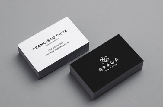
These Braga Da Cruz jewelry store business cards, designed by Luke Halota, are a good example of how minimalism can help brand name stand out on the page. Halota uses grids to center the company name on one side, with a small, unobtrusive logo placed above. On the back, he makes sure to use simple white space to make Francisco Cruz the focal point.
2. Visme

Minimalism doesn’t have to be boring. Here, Visme created a pop-up ad where the primary focus remains on the “Join us!” blue button, which contrasts nicely against the orange background. Additionally, to grab the viewer’s attention, Visme placed a large lion’s head image on the left side of the ad.
3. Heather Shaw Book Design

Heather Shaw ensures true simplicity in her Ocean Conservancy book, which grabs the reader’s attention with minimal text and colors. The information is plainly outlined and easy-to-follow. Additionally, there’s a lightly outlined sketch of an ocean behind the text — while not overbearing, it adds texture to the design.
4. Helix Sleep by Stefanie Brückler

These Helix Sleep referral cards look both sleek and helpful. Stefanie Brückler uses contrasting colors and clean font to ensure the cards can do their jobs without seeming unoriginal.
5. Pixite by Peter Komierowski

On his page, Komierowski explains, “I was asked by Pixite to create a set of nature-inspired shapes for their app Fragment.” Ultimately, his design is aesthetically-pleasing and fun, with simple, cohesive lines that form the shape of a fox.
6. Mastercard by Pentagram

One of the most iconic minimalist designs, Mastercard’s financial design is undoubtedly a staple of the brand. The simple red and orange circles signify connectedness and seamlessness. The circles are recognizable enough that Mastercard can use the icon in place of any brand text, and still convey its ownership.
Minimalist Web Design
You can take the tenets of minimalist design and apply them to brand websites, resulting in clean interfaces that guide users where you need them to go. Here are great examples of minimalism used on the web:
1. Huge Inc.

Huge Inc.’s homepage is clean and polished, with minimal text to ensure a new viewer doesn’t feel overwhelmed by the page. Additionally, the small details — like the black that appears in the logo as well as the second half of realtor.com, and the small jagged line in the bottom right corner — signify a sense of cohesiveness.
2. Bedow
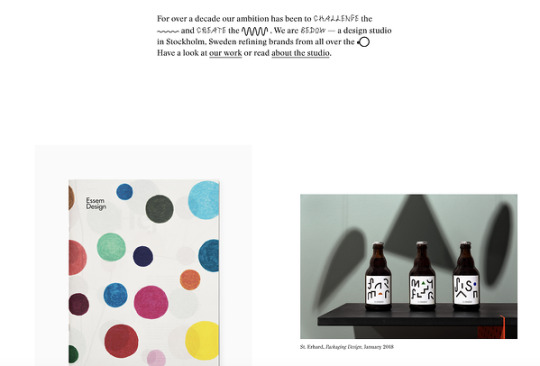
Bedow, a Stockholm-based design studio, knows its viewers priorities, and thus doesn’t waste time with a busy homepage — instead, they include a short blurb about their studio, and then leave a section of white space before displaying some of their designs.
3. Reducing the Obvious

One of the more simple designs in the list, Reducing the Obvious’s design is compelling and mysterious, with little information displayed on the homepage. However, the page is still helpful and inviting, with a small “Use buttons to navigate!” command in the bottom left.
4. Jorgeriera Flores
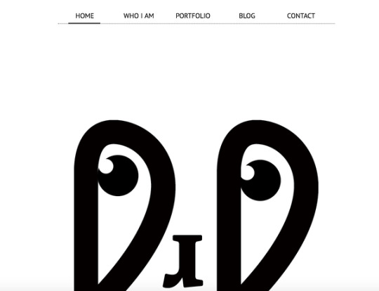
Jorgeriera Flores’ page is fun and inviting, with a blinking, life-like design and a clean navigation bar. Additionally, the creature’s nose serves as a “J”, demonstrating Flores’ attention-to-detail.
5. Design Co.

Oftentimes, minimalist design enables a brand to convey its purpose more powerfully than it could with a busier page. Design Co., for instance, is able to capture the viewer’s attention with its compelling message — spreading the creative spirit across 7,107 islands — by ensuring its background, while colorful, is devoid of distracting add-ons. Additionally, the small white logo serves to reinforce their main point.
6. Evoulve

It’s impossible to see a page like this and not find yourself curious to explore further. Evoulve does a good job expressing a sense of innovation and sleekness — with its world-icon and bright, futuristic design — without needing any additional text or imagery to compel the user to explore further.
7. Tim Brack

Brack’s use of white space and overlapping elements serves to create a clean and inviting homepage. Additionally, the photo of himself with a pig highlights a sense of playfulness and humor, and you’re able to obtain most relevant information — including Tim’s title as art director — instantly, without any distraction.
8. Tinker

Minimalism is often accomplished best when a brand knows exactly why a visitor might come across their website. In this case, Tinker understands its viewers are looking to browse and potentially purchase a watch, so it aims its design-elements to drive attention toward that single purpose.
9. ETQ Amsterdam

The close-up of the shoe offers a new viewpoint, making ETQ’s homepage intriguing and original even in its simplicity. Additionally, the small white font looks simple and clean against the photo background.
Minimalist Logo Design
The logo is one of your most important elements in your design arsenal. You don’t want a beautiful minimalist design to be supported by a clunky and overdone logo. These brands used minimal logos to support the feel of the rest of their brand:
1. UBAR

The bold block text and black-and-white contrast lends itself well to Simon McWhinnie’s UBAR design. The simplicity allows the text to dominate the logo and evokes a sense of power and strength.
2. Cloud Bed by Michael Spitz

If you have one product you sell well, why complicate it? This logo, designed by Michael Spitz, communicates the brand’s product — bedding — without text. Additionally, it’s clean and calming, particularly with the use of light blue and white, which ensures a sense of calmness for the viewer.
3. Varnom Ross by Bibliothèque

Varnom Ross’s logo is bold, powerful, and striking. Additionally, the replicated box shape around the Varnom, used again as the “o” in Ross, signifies a sense of cohesiveness.
4. The Row Apartment Homes by PurdyLogo

This logo looks retro and funky, but it uses plenty of white space, as well as white lines within the letters, to maintain simplicity. Additionally, the colors work well together, ensuring “Row” stands out most prominently in the logo.
Minimalist Poster Design
Posters need to say a lot in a finite amount of space. That’s why minimalism works so well in poster design. Here are some great examples that support this idea:
1. Miselu

Miselu’s graphic design undoubtedly supports the notion that less is more. On their page, Miselu explains the design as “simultaneously edgy, approachable, and clearly expresses our core business: music”. Ultimately, these posters, along with their other designs, reinforce their core products while remaining simple enough to be adaptable as their brand changes over time.
2. Ilmars Rumpeters
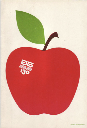
Ilmars Rumpeters created multiple simple covers for Jauna Gaita magazine, and this one in particular stands out as attention-grabbing and bold, with its vibrant colors and intriguing font. With minimalism, you want your focus to be on one or two elements — in this case, Rumpeters succeeded in drawing primary attention to the apple, and then to the magazine title itself.
3. Paul Rand

Paul Rand, a famous logo creator and graphic designer, created this poster to advertise the International Design Conference in Aspen, 1966. Ultimately, the piece is intriguing and complex even in its minimalism, causing viewers to likely pause and wonder over the significance of the black splatters or egg-shape in the background.
Minimalist Text Design
You’ll notice in each of the designs above, the text is chosen intentionally and displayed in a way that adds rather than detracts from the visual elements. With a minimalist design, one of the first things you’ll want to consider is the font choices used throughout the website or marketing collateral. You’ll want to choose fonts that are:
Crisp
Clear
Legible
Easy to read (even at small sizes)
Simple
Consistent
Geometrical
Here are some examples of fonts used in minimalist design:
1. Open Sans

Because serifs can be more difficult to read, especially on the web, minimalist designs often use sans-serif fonts. Open Sans is the quintessential sans-serif font (except perhaps Arial) and is easy-to-read and modern. The body text in particular is particularly crisp, making it ideal for long-form text in a minimalist setting (like a blog).
2. Libre Baskerville

Even though sans-serif fonts are a staple of minimalist design, serifs still have their place. Libre Baskerville does a great job of providing an air of elegance and class without sacrificing readability. The body text is just as easy on the eyes as Open Sans, and even the italicized subeading text is legible (though you wouldn’t want to rely on it too much).
3. Montserrat

Montserrat has some lovely rounded lines, making the letter shapes easily recognizable, and the italicized subheading provides a more dynamic look when paired with the bold headers and clean body font.
4. Poppins

Minimalist text design certainly doesn’t mean devoid of personality, as you can see from the graphic, web, and poster designs above. Poppins is a great font family that adds a bit of fun to the minimalist style with overly rounded and almost cartoonish letters. At the same time, it looks modern and professional.
5. Overpass

Overpass provides a more industrial look with its narrow letter shapes and sharp corners.
Now that you’ve seen several iterations of what minimalist design looks like in action, you can begin to create your visual marketing strategy and design marketing materials that supports your brand in a clean and modern but still attractive way.

Editor’s note: This post was originally published in February 2019 and has been updated for comprehensiveness.
Source link
0 notes
Text
22 Striking Examples of Minimal Design That'll Kickstart Your Creative Process
Whether you're curating an Instagram feed or designing a web page, there are plenty of advantages to minimalist design.
Rather than bogging your audience down with vibrant patterns or paragraphs of text, a minimalist approach allows you to focus on a few key components of your brand you feel are truly important.
However, minimalist isn't as simple as white space. To avoid creating boring or uninspiring designs in your attempt to become minimalist, it's critical you take a look at some successful examples of minimal design, ranging from posters to logos, to kickstart your creative process.
Minimalist Graphic Design
1. Braga Da Cruz
These Braga Da Cruz jewelry store business cards, designed by Luke Halota, are a good example of how minimalism can help brand name stand out on the page. Halota uses grids to center the company name on one side, with a small, unobtrusive logo placed above. On the back, he makes sure to use simple white space to make Francisco Cruz the focal point.
2. Visme
Minimalism doesn't have to be boring. Here, Visme created a pop-up ad where the primary focus remains on the "Join us!" blue button, which contrasts nicely against the orange background. Additionally, to grab the viewer's attention, Visme placed a large lion's head image on the left side of the ad.
3. Heather Shaw Book Design
Heather Shaw ensures true simplicity in her Ocean Conservancy book, which grabs the reader's attention with minimal text and colors. The information is plainly outlined and easy-to-follow. Additionally, there's a lightly outlined sketch of an ocean behind the text -- while not overbearing, it adds texture to the design.
4. Helix Sleep by Stefanie Brückler
These Helix Sleep referral cards look both sleek and helpful. Stefanie Brückler uses contrasting colors and clean font to ensure the cards can do their jobs without seeming unoriginal.
5. Pixite by Peter Komierowski
On his page, Komierowski explains, "I was asked by Pixite to create a set of nature-inspired shapes for their app Fragment." Ultimately, his design is aesthetically-pleasing and fun, with simple, cohesive lines that form the shape of a fox.
6. Mastercard by Pentagram
One of the most iconic minimalist designs, Mastercard's financial design is undoubtedly a staple of the brand. The simple red and orange circles signify connectedness and seamlessness. The circles are recognizable enough that Mastercard can use the icon in place of any brand text, and still convey its ownership.
Minimalist Web Design
1. Huge Inc.
Huge Inc.'s homepage is clean and polished, with minimal text to ensure a new viewer doesn't feel overwhelmed by the page. Additionally, the small details -- like the black that appears in the logo as well as the second half of realtor.com, and the small jagged line in the bottom right corner -- signify a sense of cohesiveness.
2. Bedow
Bedow, a Stockholm-based design studio, knows its viewers priorities, and thus doesn't waste time with a busy homepage -- instead, they include a short blurb about their studio, and then leave a section of white space before displaying some of their designs.
3. Reducing the Obvious
One of the more simple designs in the list, Reducing the Obvious's design is compelling and mysterious, with little information displayed on the homepage. However, the page is still helpful and inviting, with a small "Use buttons to navigate!" command in the bottom left.
4. Jorgeriera Flores
Jorgeriera Flores' page is fun and inviting, with a blinking, life-like design and a clean navigation bar. Additionally, the creature's nose serves as a "J", demonstrating Flores' attention-to-detail.
5. Design Co.
Oftentimes, minimalist design enables a brand to convey its purpose more powerfully than it could with a busier page. Design Co., for instance, is able to capture the viewer's attention with its compelling message -- spreading the creative spirit across 7,107 islands -- by ensuring its background, while colorful, is devoid of distracting add-ons. Additionally, the small white logo serves to reinforce their main point.
6. Evoulve
It's impossible to see a page like this and not find yourself curious to explore further. Evoulve does a good job expressing a sense of innovation and sleekness -- with its world-icon and bright, futuristic design -- without needing any additional text or imagery to compel the user to explore further.
7. Tim Brack
Brack's use of white space and overlapping elements serves to create a clean and inviting homepage. Additionally, the photo of himself with a pig highlights a sense of playfulness and humor, and you're able to obtain most relevant information -- including Tim's title as art director -- instantly, without any distraction.
8. Tinker
Minimalism is often accomplished best when a brand knows exactly why a visitor might come across their website. In this case, Tinker understands its viewers are looking to browse and potentially purchase a watch, so it aims its design-elements to drive attention toward that single purpose.
9. ETQ Amsterdam
The close-up of the shoe offers a new viewpoint, making ETQ's homepage intriguing and original even in its simplicity. Additionally, the small white font looks simple and clean against the photo background.
Minimalist Logo Design
1. UBAR
The bold block text and black-and-white contrast lends itself well to Simon McWhinnie's UBAR design. The simplicity allows the text to dominate the logo and evokes a sense of power and strength.
2. Cloud Bed by Michael Spitz
If you have one product you sell well, why complicate it? This logo, designed by Michael Spitz, communicates the brand's product -- bedding -- without text. Additionally, it's clean and calming, particularly with the use of light blue and white, which ensures a sense of calmness for the viewer.
3. Varnom Ross by Bibliothèque
Varnom Ross's logo is bold, powerful, and striking. Additionally, the replicated box shape around the Varnom, used again as the "o" in Ross, signifies a sense of cohesiveness.
4. The Row Apartment Homes by PurdyLogo
This logo looks retro and funky, but it uses plenty of white space, as well as white lines within the letters, to maintain simplicity. Additionally, the colors work well together, ensuring "Row" stands out most prominently in the logo.
Minimalist Poster Design
1. Miselu
Miselu's graphic design undoubtedly supports the notion that less is more. On their page, Miselu explains the design as "simultaneously edgy, approachable, and clearly expresses our core business: music". Ultimately, these posters, along with their other designs, reinforce their core products while remaining simple enough to be adaptable as their brand changes over time.
2. Ilmars Rumpeters
Ilmars Rumpeters created multiple simple covers for Jauna Gaita magazine, and this one in particular stands out as attention-grabbing and bold, with its vibrant colors and intriguing font. With minimalism, you want your focus to be on one or two elements -- in this case, Rumpeters succeeded in drawing primary attention to the apple, and then to the magazine title itself.
3. Paul Rand
Paul Rand, a famous logo creator and graphic designer, created this poster to advertise the International Design Conference in Aspen, 1966. Ultimately, the piece is intriguing and complex even in its minimalism, causing viewers to likely pause and wonder over the significance of the black splatters or egg-shape in the background.
0 notes
Photo

Chief among the Maiar of Valinor whose names are remembered in the histories of the Elder Days are Ilmarë, the handmaid of Varda, and Eönwë, the banner-bearer and herald of Manwë, whose might in arms is surpassed by none in Arda.
Ilmare moodboard
The Silmarillion characters: (49/?)
Characters’ moodboards: (257/?)
#ilmare#silmarillion#silmarillion characters#silmarillion aesthetic#silmarillion moodboard#ilmare aesthetic#ilmare moodboard#characters#j.r.r. tolkien#aesthetic#moodboard#mine
86 notes
·
View notes
Photo


Varda (Fanuilos Aesthetic)
Varda is the Vala of stars and light, the wife of Manwë, one of the Aratar, Queen of the Valar, and the one most beloved by the elves. Her face radiated the light of Ilúvatar and she appeared in shining white fana in visions to the Elves of Middle-earth, and thus was called Fanuilos. Fanuilos is an epithet of Varda and means "bright (angelic) figure ever white (as snow)"
When Melkor first began to create chaos, Varda saw his mind, and despised him. Melkor feared and hated Varda the most out of the Valar because he had been unable to control light, which Varda was most associated with. When Manwë contested with him for Arda, Varda came from the deeps of Eä to his side.
During the Spring of Arda, she filled the Two Lamps with light. In Valinor she kept the dews of the Two Trees in the Wells of Varda. When Mandos foretold of the coming of the Elves and how they would always look to Varda in reverence, she took it upon herself to set new stars for the Elves to see when they awakened. For this, Varda is the Vala most loved and revered by the Elves. She also hallowed the Silmarils of Fëanor when he created them, so that any being or creature of evil could never handle them without being burned. After the death of the Two Trees, she took the remaining flower of Telperion and the fruit of Laurelin and placed them in vessels made by Aulë.
Her handmaiden is Ilmarë, a Chief of the Maiar, who at an earlier stage of Tolkien's writings was her daughter. Olórin (Gandalf/Mithrandir) also served her in addition to Manwë, Nienna, and Irmo/Lorien. In Tolkien's earlier works, the characters Arien (Urwen/Urwendi), Ilinsor (steersman of the Moon), and Telimektar (the constellation Orion) are connected to her as well.
In Middle-earth, she was revered by the Elves who called her name and sung hymns to her (such as the Elven Hymn to Elbereth) and perhaps answered to prayers, even to Samwise Gamgee. The very mention of her name was said to be deadly to evil spirits, such as when Frodo uttered the name in the presence of the Morgul Lord.
The Valar, being divine beings below the ultimate Creator, Ilúvatar, are thought of as being the Middle-earth equivalent of saints and angels; it has therefore been suggested that Varda, in her role as the most loved and prayed-to Vala, may be an equivalent of the Virgin Mary in Tolkien's own Catholic faith.
#Varda#Varda Moodboard#Varda Aesthetic#Valar#Aratar#Ainur#Valar Moodboard#Valar Aesthetic#Fanuilos#Elentari#Elbereth#elbereth gilthoniel#Ainur Moodboard#Ainur Aesthetic#Tolkien#Tolkien Moodboard#Tolkien Aesthetic#Silmarilion#Ilmare#Ilmarë#Olorin#Olórin#Arien#Ilinsor#Telimektar#Manwë
71 notes
·
View notes
Photo


Maiar of Varda, the Starkindler
Varda is the Vala associated with light and holiness and made the stars and constellations. She is the wife of Manwë and is counted among the Aratar, the eight most powerful Valar. She was one of the first to sense Melkor’s evil and rejected him early on, causing him to hate and fear her more than the other Valar. Her character and the elves’ reverence for her has drawn strong comparisons to the role of the Virgin Mary in Tolkien’s Catholic faith.
In the Silmarillion, Ilmarë is called the handmaiden of Varda and one of the leaders of the Maiar. Her name comes from an elvish root for starlight that is present in other names like Ilmen and Ilmarin, and in turn comes from the a Finnish word for air. Not many details are given about her, but in early versions of Tolkien’s works she was at one point the daughter of Varda and Manwë and called Erinti. At one stage she was also instead the sister of Salmar-Amillo and Omar-Noldorin, who were both associated with music, and the three of them left Valinor to live with the elves on the island of Tol Eressea. She was associated with love, beauty, and music in these stages, and was also called Lotesse as well as Akairis, which means bride. The second half of January was called Enrintion in honor of her.
The Maia Olorin, who later became known in Middle-earth as Gandalf and Mithrandir, was a servant of Varda and her husband. He was also a student of Nienna and spent time in the gardens of Lorien as well. When Varda and Manwë decided to send Olorin to Middle-earth as one of the Istari he was reluctant and didn’t feel ready. But they remarked that that was all the more reason for him to go, and indeed he was a key player in the downfall of Sauron and destruction of the One Ring.
In early works by Tolkien, the Maia Arien is described as a Maia of Varda, whereas in the Silmarillion she is called a Maia of Vana. Her initial association with Varda may have been due to the fact that Arien becomes the guardian of the sun, which is placed in the sky much like Varda’s stars. It’s also worth noting that, while Tolkien doesn’t usually specify what stars are “made of” it’s implied that there is a connection to fire. Before the existence of the Sun and the Moon as well as the Two Trees, the world was lit by two “lamps” which were lit by Varda. Both Arien and Olorin, who are two Maiar who are closely associated with fire, are connected to Varda.
In Tolkien’s early legendarium, before the Maia Tilion was created, we are introduced to Ilinsor. Ilinsor is described as a sylph, which is a type of air spirit, who loves snow and starlight and “aided Varda in many of her works.” This was at a point in Tolkien’s writings when the Maiar didn’t exist and the Valar were less angelic and more like Greco-Roman deities. In addition to the Valar having children (some of whom eventually became Maiar instead), there were many kinds of minor nature spirits such as sylphs, nymphs, mermaids, dryads, leprawns, pixies, brownies, sprites, fays, etc. Ilinsor was chosen to be the steersman of the Moon because of his familiarity of and association with the sky and starlight.
Finally, there was one point in Tolkien’s writings where Tulkas and Nessa had a son named Telimektar, whose name means something like Sky Warrior. He was also called Taimondo/Taimordo, which means Shepherd of the Sky. He had a long sword kept at his waist by a silver belt, and he fought alongside his father against Melkor from a young age. It was said that his face and weapons gleam like silver in the dark and he has diamonds on his sword sheath, which will glow red at the Great End. He was placed in the sky to watch over Melkor (and hence is the elvish explanation for the constellation Orion) and Varda gave him stars to mark his presence. His character and story were eventually dropped, and the elvish name for the constellation Orion instead became Menelmacar. A version of his name was given to the 28th King of Gondor, Telumehtar Umbardacil.
#Varda Maiar#Varda Moodboard#Varda Aesthetic#Varda#Elentari#Ilmare#Ilmarë#Olorin#Mithrandir#Gandalf#Arien#Urwendi#Ilinsor#Telimektar#Maiar#Ainur#Silmarillion#Maiar Moodboard#Maiar Aesthetic#Tolkien Moodboard#Tolkien Aesthetic#Tolkien#Elbereth#Gilthoniel
186 notes
·
View notes
Last Seen Blogs

20000lemursunderthesea
On The Loose

qnainterview1
Qna Interview

chiyenmangastyl
CYEN's Art Blog


yasshighqualityflowers
Yass High Quality Flowers