#ihaveread
Photo

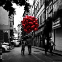
Day 18: I Have Read… One of my faves! #fourexitstohell #ardmoreoklahoma #truestory #novel #ihaveread #readandreadagain #AugustPhotoChallenge #PhotoOfTheDay #photochallenge #AugustChallenge #Summer2022 #Summer #photoaday #photoadayaugust #August2022 #happylife #fmspad @fatmumslim #backtoschool https://www.instagram.com/p/Cha9TSKtR02/?igshid=NGJjMDIxMWI=
#fourexitstohell#ardmoreoklahoma#truestory#novel#ihaveread#readandreadagain#augustphotochallenge#photooftheday#photochallenge#augustchallenge#summer2022#summer#photoaday#photoadayaugust#august2022#happylife#fmspad#backtoschool
0 notes
Photo

Looking Deeper into Project Communication and Type:
I recently read a book entitled A Pocket Guide to Combining Typefaces, by Tim Brown.
Not only did this book open my eyes to the fact that the projects I am working on often contain strong messaging, but it also helped me to understand the best practice for combining typefaces within a project and effectively convey these messages to the end user.
As a designer I’m often faced with decisions regarding typeface; I’ve been at RITH for about 9 months now and feel I can tell the difference between a typeface that fits a brief and one that doesn’t.
One thing I often overlook whilst working on a project, though, is the very fact that text can communicate powerful and often emotional messages. Very rarely have I considered the impact of a strong choice of typeface (or combination) to deliver these messages.
This book has helped me to look further than just ‘picking a font that looks nice’ and has made me start to look at project briefs in depth and research what messages a project needs to put across, the tonality of the messaging and also how to display it in a clear and cohesive manner, in a combination of typefaces, that are legible at any scale.
Thanks for reading and keep checking back to watch me progress.
2 notes
·
View notes
Last Seen Blogs

thislonelywindow
everything carries me to you

jaseshepherd
JASE SHEPHERD

id-be-an-alpha-type
Taylor Swift Is A Werewolf
💃🏼🌕🐺

verybadtype
the future is us
bedawiti
bêdawîtî