#if this does look very similar to any cultural historical garments let me know! I love researching those and incorporating them into design
Explore tagged Tumblr posts
Note
Hi!! I'm super interested in the outfits you have your kirby ocs in. If it's not too much trouble (and only if you want to) could you go through the different garments they're all wearing when you have time?
I don’t have much time so I’ll do just one character this time but I’ll definitely post more outfit breakdowns for my other Kirby ocs! But yes I am super excited about outfit design and making sure that garments make functional sense so thank you so much for asking!! Feel free to ask again to give me an excuse to draw more of these
Here’s the one character I’ll cover this time! The dark matter hero of yore oc!

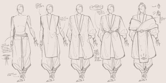
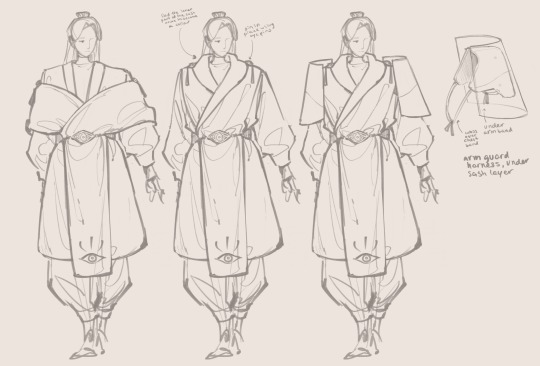
Thoughts are in the read more!
The main idea that I wanted to have for them was that they’re calm, collected, and kind of uptight due to imposed restrictions rather than it being their own character trait. Essentially my idea for this character is that they’re in a rather precarious place in terms of public perception due to the general belief that dark matter is has a negative moral connotation, but remain a “hero” just because the powers that be deemed that they needed to have four. Why? Who knows, perhaps they wanted to make sure that they had a scapegoat. They’re not a very powerful astral when they’re selected but they are made so through the gradual injection of dark matter into them, something which grows stronger from their sadness and hopelessness over their situation and begins to take over their subconscious until it is able to usurp their identity fully.
So the first layer is a full body covering in black, a turtleneck, black toeless knee socks, and a pair of sweatpants. The sweatpants are there to give the impression of looseness and relaxation, but gathered to show the bit of uptightness along with the tight turtleneck.
The second layer, a cool teal-ish gray tunic, is a nod to who they were before the injection of dark matter turned their hair white. Their original color was a greenish teal, a color that is not quite on the opposite side from red (which is associated strongly with dark matter) but still quite far from it. There’s some padding in the shoulders to give them a more solid shape with the other layers, and for comfort when the armor is put on. The side slits help with mobility. This tunic layer is made of very sturdy material that functions essentially as chain mail. It doesn’t give protection to the heart, the essential organ, but there is also a question of whether they want that to be protected or not, and whether it would even kill them or not to be stabbed through the heart.
The third layer is a cool off-white overcoat, and overwhelms the design with white because white is more associated with virtue than black is, and shows, beyond surface level light=good association, a feeling of emptiness. It is both a way that they try to distance themselves from the idea of “dark” matter and a sign of how they are forced to devoid themself of any personality or strong individuality to maintain good graces with the public.
The belt is mostly just a way for me to give more shape to the silhouette by gathering the waist, but the eye shaped brooch was a kind of last minute decision to add a bit extra detail! The leather strap of the belt wraps around the back and towards the front tapers off to a chain of metal beads, which have a hooked clasp at the front concealed by the eye brooch.
Finally, a long scarf/sash is wrapped off the shoulders and tucked in through the belt. There are two overlapping layers at the front, and the back layer is shorter than the front. This is a very constricting configuration that makes it difficult for them to raise their arms very high without displacing it. To keep it nicely on the shoulder, each side is help up with an eye-shaped pin, securing it to the white overcoat layer a bit under the shoulders. The red teardrop jewels hanging from those are just an extra pop of the red accent color. The underside of the scarf is red, but difficult to see if they keep their arms lowered.
In their more battle-ready outfit, they raise the dropped shoulder scarf up to wrap around the shoulders and neck, and fold the inside down to make it a red collar. This is symbolic of how they depend on the power of dark matter injected into them to fight. The collar is secured with the pins. Then, pauldrons are added, with the harness for them being secured with straps across the chest underneath the scarf and under their arms. I forgot to draw it but they also wear shin guards underneath the pants, over their socks.
#kirby gijinka#kirby oc#heroes of yore#besides the armor none of the garments are inspired by any specific culture I think#if this does look very similar to any cultural historical garments let me know! I love researching those and incorporating them into design#hi sorry I keep editing this post I feel bad about it being so long so I added a readmore
90 notes
·
View notes
Text
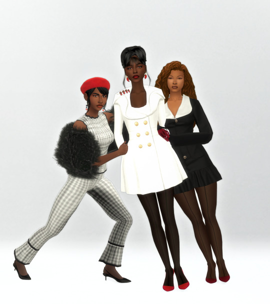
BHM 2025 - Black Fashion Figures: Patrick Kelly, Part 2
Kelly was, and still is, met with criticism in large part due to his willingness to lean into stereotypes and to incorporate racist iconography in his designs. Obvious examples include the Golliwog logo he sewed or screen printed all over garments, and his gifting of piccaninny dolls at fashion shows. Artists like Sequoia Barnes argue that Kelly was using fashion and engaging with the politically subversive nature of camp. To her, "the clothes were so over the top that it was obvious that it was a farce." She explains that artists in other mediums were met with less criticism, and questions whether the resistance Kelly's work is due to fashion still being seen as a consumerist artistic medium.
As mentioned previously, Kelly's designs were praised for their broad appeal and marketability to various audiences. Regardless of their chosen medium, for many black artists, this often results in attracting non-black audiences. In Kelly's case, his use of historically charged imagery adds another layer to the debate. In a 2022 panel, his long-term partner, explained that the imagery was not always obvious to non-Americans. In fact, he only began to engage with the political nature of the designs years later, coming up with the interpretation that Patrick was pulling these objects out of obscurity to recontextualize them.
Never having been one to talk much about the meaning behind his choice, we will never know the original intent behind his work. Patrick Kelly's run as a designer was interrupted in August 1989 as Kelly was diagnosed with AIDS, and he passed away from complications on January 1st 1990.
Thanks to all the CC creators: @serenity-cc, @madlensims, @gorillax3-cc and @helgatisha for the sick pose.
A short personal take, sources and more under the cut.
Sources:
Must read and/or watch:
Trigger Figure: Patrick Kelly’s Reclamation of Racist Iconography
Patrick Kelly: Reclaiming Racist Memorabilia
Others:
"So We Don’t Forget Each Other”: Patrick Kelly and the Politics of Gifting
Patrick Kelly: Reclaiming Racist Memorabilia
Patrick Kelly: Fashion, Life, and Legacy
From the Archives: Patrick Kelly – An American in Paris
Reference photo:
1
Word vomit:
I feel like that meme about not reading all of this but researching Patrick Kelly made me think a lot. It's a tricky discussion, and while I am a black African who grew up in North America, I am not African-American. All this to say, this is just my interpretation.
It's very difficult to reconcile with the use of blackface or any similar symbolism, whether that be in the past, present, or future. I disagree with the idea that fashion is a lesser form of art because it is so intrinsically linked to consumerism, the fact remains that many people still consume it without limited thoughts on what designers are trying to say. This idea was proved by my research and the anecdote shared by his long-term partner. Also, Kelly presented his work as fun and playful which differentiated him from the "cerebral" Japanese designers. I'm not saying he is to blame, but I do think he might have appealed to an audience that was looking for edgy and fun clothes and not one that would've immediately made the connections with the imagery.
Black artists and designers, especially the ones who try to be subversive because of their art are in a tough position because it can land in the hands of an audience that does not have the cultural background or media literacy to fully dissect it. I mean, we've seen it play out all of last year and even this week-end. Best-case scenario, the audience understands part of the message but extends the artist's position to that of the entire black community. I think in the case of Kelly had the right to let his art speak for itself, but I can't help but feel that it was detrimental to his legacy. In one of the panels I listened to, the speaker explained that even art students, who had the cultural baggage to analyze his art, struggled to engage with it.
So all in all, I don't have a conclusion other than, personally? Not for me. I guess I can kind of see what he was trying to do?
4 notes
·
View notes
Text
History of Chinese standing collars (part 3: post republican era)
Quick recap: I was debating with myself whether “Mandarin collar” should be a thing because standing collars throughout Chinese history looked different. I went through the Ming and Qing dynasties in part 1 and the republican era in part 2, now I’ll look at what comes after that. I numbered the styles in parts 1 and 2 but they’re only guidelines so you don’t have to remember anything.
So in this post we’ve kind of reached the end of the era where fashion consisted of a single silhouette in any given year and all hell ran loose. I’m having a lot of difficulties classifying things as Chinese or Western because the distinction is really blurred, and I also ran into problems explaining why certain historical European things looked so similar to Chinese ones so there will also be a lot of confusion.
1950s & 60s Chinese application
Summary of 1950s fashion, mainland and others.
Because of the communist victory in the Civil War, fashion in the mainland was different to other (capitalist) areas populated by the Chinese diaspora such as Hong Kong, Macau, Taiwan etc.. Let’s look at capitalist area fashion first; I’ll be referring to Hong Kong because Hong Kong was the center of cheongsam making at the time.
Collars on 50s Hong Kong cheongsam grew taller on the basis of collar style 10 but retained the rounded, tapering edge, resulting in a v shape gap down the middle that weirdly recalls collar style 6 from part 1 and part 2. It’s basically completely identical to collar style 6 but stiffened and extremely form fitting. It’s usually closed with one pankou at the base but because of westernization, 50s cheongsam often had no visible pankou----everything is closed with snap buttons, zippers or hooks and eyes/bars. An important aspect of collars of 50s and 60s Hong Kong cheongsam is that they left out the binding around the neck. All cheongsam prior to this point were bound around the exterior edge, the side closure, the slits and the collar seam (on the bodice not the collar), 50s cheongsam collars purposefully neglected the binding at the collar seam for some reasons. This makes the collar look like it’s one continuous piece of fabric with the bodice, which it isn’t. A lot of modern representation of cheongsam or any Chinese inspired clothing (in video games, books and anime etc.) do this, even if the character is from before the 1950s. It REALLY bugs me. If you are an artist or writer and designing costumes for Chinese characters prior to the 50s, please include binding/trimmings on all three seams, it’s an easy way to bump up historical accuracy. With that said, completely plain collars without any binding or trim was actually the most common. Let’s call this collar style 13.
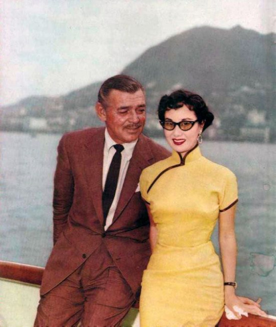
Source here
1954 photograph of Li Lihua and Clark Gable. Collar style 13 with stiffening and no collar seam binding. You can see how firm and neck hugging the collar is, contrary to a lot of modern cheongsam collars which are saggy and loose.
The popularity of collar style 13 continued into the 60s. When the cheongsam fell out of popularity, it ceased to exist as well.
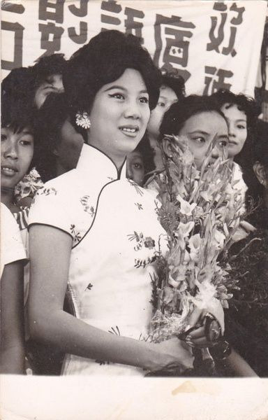
Source here
60s cheongsam with collar style 13. I’m really not a fan of the nude/light lipstick trend of the 60s, like, as a person with no lip color definition it makes me look like a potato.
Now moving on to mainland collars. In the 1950s, cheongsam with the 40s collar style 12 were still occasionally seen, but the fashionable collar shape also became taller and was similar to the Hong Kong collar style 13. Interestingly, some 50s mainland cheongsam retained the binding around the collar seam, making them look more “traditional” in a sense. However, collars both with and without collar seam binding existed and it was just a matter of personal preference.
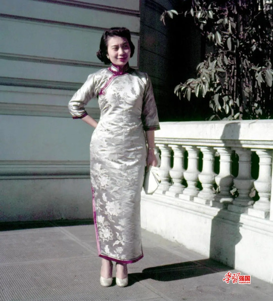
Source here
1950s photograph of a mainland lady in cheongsam. The collar is taller and closes with one button, much like Hong Kong collars of the era, but the neck binding is present.
Aoku robe collars from the 1940s onward mostly had the 40s style low collar, although in the 50s and 60s they rose in height very slightly.

Source here
1964 poster showing a girl in aoku, the robe has a low, rounded collar.
However, garments with a standing collar became worn a lot less frequently in the 50s and 60s in both mainland and non-mainland areas, since a lot of people adopted Western fashion.
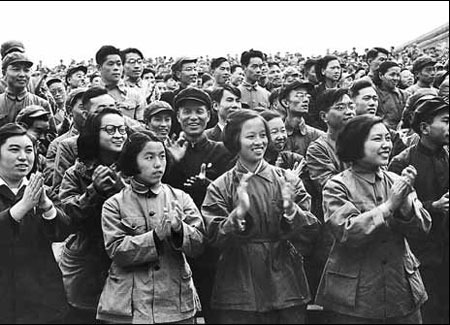
Source here
1950s photograph of a group of mainland people wearing jackets of Western construction. Some of them seem to be wearing informal military jackets, commonly known as “Mao suit” or “Zhongshan suit” nowadays, with folded collars.
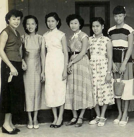
Source here
1950s photograph of some women in Malaysia, some in cheongsam and some in Western New Look dresses.
Western application
I think it’s also quite important to discuss how Chinese standing collars were perceived by Western designers, because the Western fashion industry does hold a lot more power globally and also reverse influenced Chinese collar designs in the post 1960s era. So, in the 1950s and 60s Western designers thought cheongsam was really cool and produced a lot of affordable sewing patterns for their versions of cheongsam. I think this is also because pre-1950s cheongsam didn’t use the Western construction method and patterns needed to be individually drafted so it was difficult to make mass produced sewing patterns. From all the sewing patterns I have seen personally, the super tall standing collar popular in Hong Kong was not really appreciated by Western designers at all?? Western cheongsam sewing patterns all had the very low 1940s style collar, combined with an hourglass silhouette New Look bodice and skirt, looking rather anachronistic. These collars also didn’t have binding/trim around the collar seam, in line with fashionable Hong Kong cheongsam of the day.

Source here
1950s Advance sewing pattern for cheongsam. The collar is low and has rectangular edges, something about a decade out of fashion in Hong Kong and Shanghai. No collar seam binding.
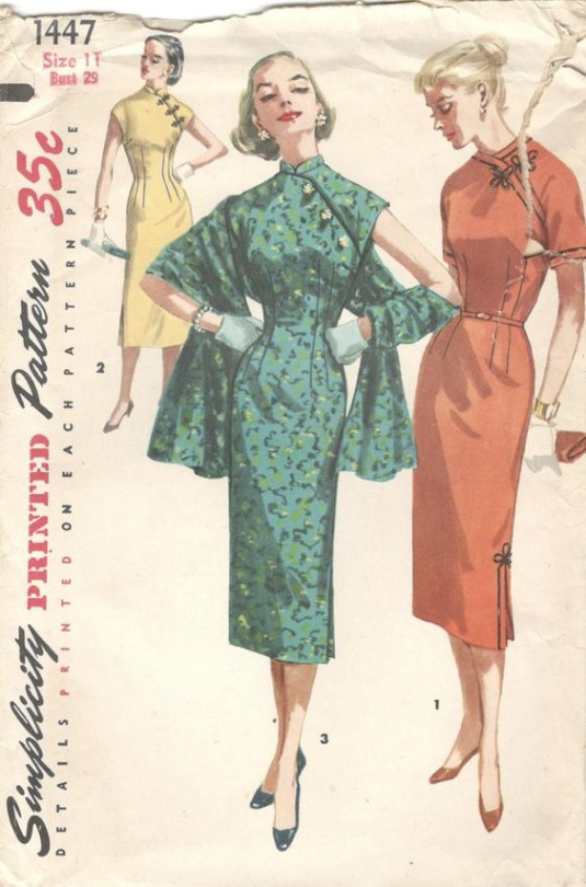
Source here
1950s Simplicity sewing pattern for cheongsam. Likewise with super low 1940s collars. Collarless cheongsam died in China in the mid 1920s, yet it lives on in the imagination of Western designers. By the way, the frog closures with a quatrefoil shape are not Chinese, I’m gonna write another post about this. I love the look in the middle it’s very glam.
1970s and later
The post 1960s era is what ultimately created the confusion around standing collars nowadays. Around this time Western and Chinese fashions started to merge and become one, and garments made completely in the historical Chinese method were more and more difficult to come by; Western construction techniques reigned supreme.
From the 70s onward, most “Chinese collars” had the 40s rounded edge shape but were either medium low or medium height. The lack of collar seam binding persisted into the current day, which is something I kind of lament because without this binding collars easily read as Renaissance doublet... (more on that later)
I usually avoid calling any standing collars from the 1970s onward Chinese/Mandarin because 1) standing collars were never a uniquely Chinese thing to begin with 2) since cheongsam was no longer fashionable among actual Chinese people, designers who made cheongsam pulled all kinds of shenanigans without any historical precedent whatsoever. Also, since clothes with structured/stiffened standing collars stopped being a staple in the average Western person’s wardrobe, white people started calling everything with the most remote hint of a standing collar Chinese to further stir the pot, emboldened by the cultural appropriation craze of the 60s and 70s. Ok that’s very loaded, but it’s true that in the 60s and 70s there was a lot of Western clothing designs that took inspiration from other cultures without permission. Westerners could totally design and wear Chinese style clothing given that the intention is respectful and they know about the garment in question, but a lot of times the accuracy of the designs leaves much to be desired. There was also a lot of Orientalist inspiration in the 10s and 20s but the borrowing back then wasn’t so... literal. When I look at so called cheongsam sewing patterns from the 70s onward, I sometimes seriously have trouble identifying if something is meant to be Chinese, Vietnamese, Japanese, Polynesian or any other region/culture...
I’ll just find pictures of Chinese inspired clothing from the 70s onward with a “Mandarin collar” label and point out their source of inspiration.
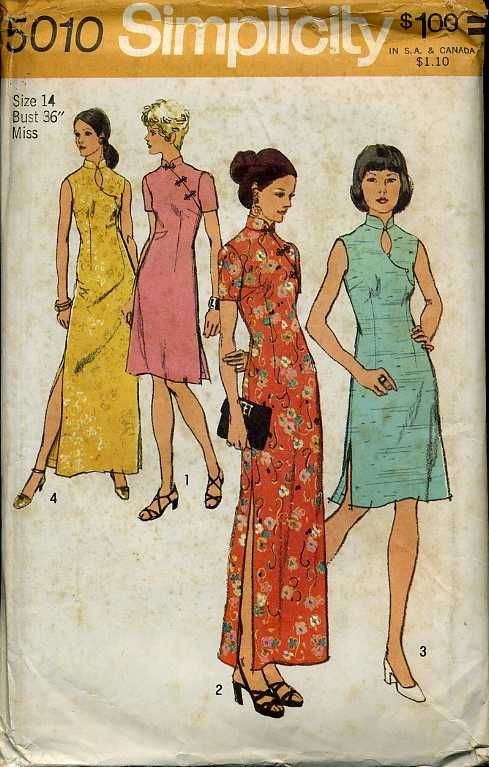
Source here
1972 Simplicity sewing pattern for cheongsam. It’s the same Western collar from the 50s and 60s just slightly taller. Oh and the closures used on the two designs in the middle are again likely not pankou. After the 60s, this neck design with a oval shape keyhole cutout became quite common and that persisted to the current day. Don’t know what the purpose of that was, just because you show 5 square centimeters more skin doesn’t mean your cheongsam is sexier?
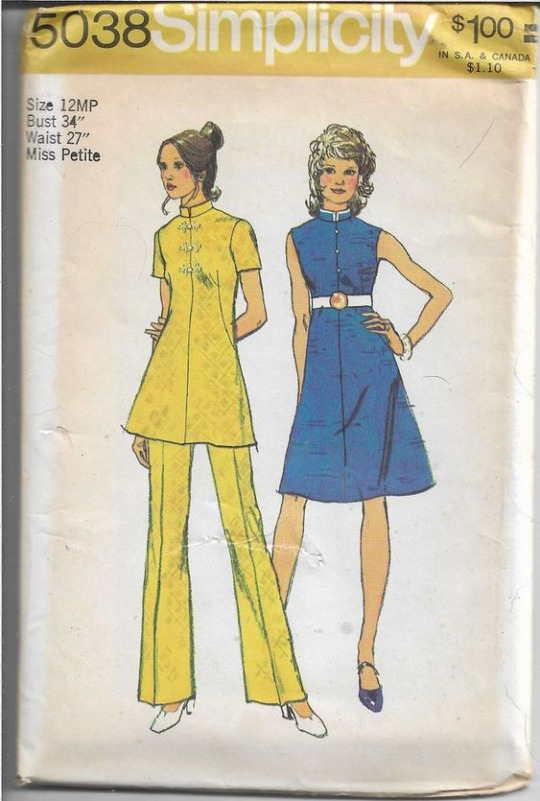
Source here
The description of this 70s Simplicity pattern says “Mandarin collar” but the source of inspiration is obviously Japanese military/school uniforms, AGAIN. The collar’s height and rectangular edges, combined with the placement of buttons above the waist on the bodice, everything about this reads as Japanese. The frog closures on the left are once again European and not Chinese pankou (sheesh I really need to make this other post). The original designer probably meant for it to be Japanese but the seller mistakenly labelled it a Mandarin collar design.
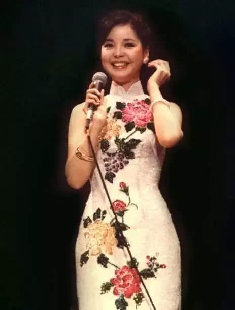
Source here
70s Teresa Teng (rest in power legend) in a theatrical cheongsam with a similar collar, either a stretched version of the 40s collar or a shrunk version of the 50s/60s one.
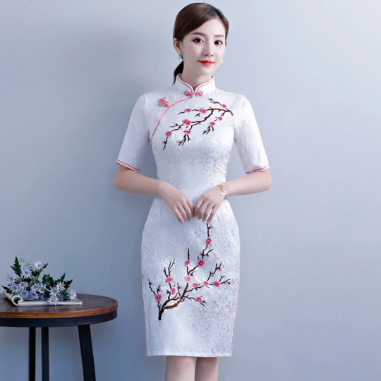
Source here
Google search result for “Mandarin collar dress”. Same Western low collar from the 70s. A new problem with modern mass produced cheongsam is that the collar oftentimes doesn’t fit the wearer and appears too baggy. Or maybe it’s not mass production, just that people nowadays are very unaccustomed to wearing tight fitting standing collars so they assume there needs to be some extra space? As someone who wears stiff standing collars on a regular basis I have to say it actually isn’t uncomfortable at all and elongates your neck a lot better. This is what most cheongsam collars nowadays look like, even the self proclaimed “traditional” ones, they literally originated from 1950s/60s Western sewing pattern companies’ interpretation of contemporary Chinese cheongsam collars.
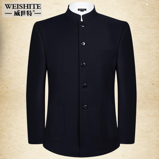
Source here
Baidu search result for “Mandarin collar suit”. This, is, literally, almost a replica Japanese uniform. The seller is also using the tag Zhongshan suit lmao (I’ve explained in my 1950s mainland post what a Zhongshan suit is not supposed to look like), delusion is not a fragrance I guess. Why is it so hard to let Japan be Japan and China be China??
Conclusion & afterthought
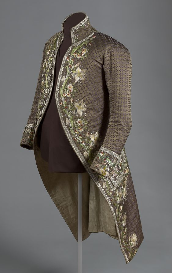
Another thing I need to mention is that standing collars are by no means unique to Chinese historical dress; they were also widely used in European historical fashion, long before standing collars became worn with uniforms of “Mandarins” or Chinese officials, which further proves my point that “Mandarin collar” is not a valid term. Also, standing collars in Europe have always been stiffened/structured, whereas Chinese collars only started to become stiffened around the 1890s, possibly due to European influence as well. For example, the 1950s collar with rounded edges and no collar seam binding reads as European Renaissance doublet very easily. To be fair though, a lot of the collar shapes seen in early 20th century Chinese womenswear had been done before in European Renaissance fashion and during that time period in China only the OG Ming Dynasty collar mentioned in part 1 was used sooooooo
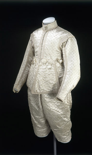
Source here
1630-40 English doublet. The collar looks mighty similar to 1930s Chinese women’s ones. I know next to nothing about Renaissance fashion so I’m not sure how it’s constructed, but it proves the point that collars like these were not a uniquely Chinese phenomenon.
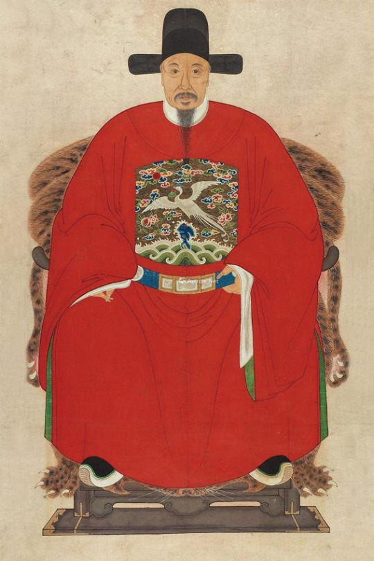
Source here
Meanwhile the Mandarins in China. He’s wearing a crossover collar robe underneath a round collar robe, no standing collar here.
Source here
1780s French men’s coat with a standing collar.
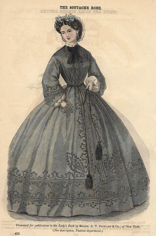
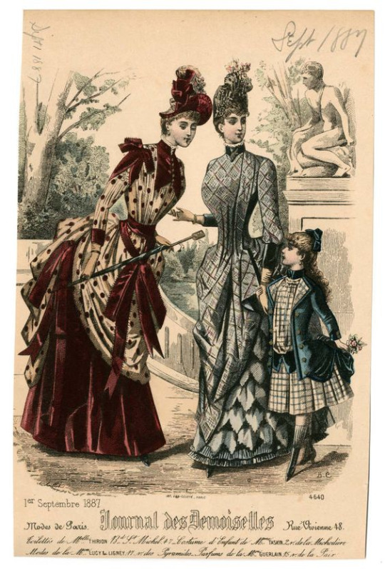
Standing collars were also commonly used in Victorian and Edwardian women’s everyday fashion without any connection to China whatsoever.
Source here
1860s fashion plate for a gown with a low standing shirt collar peeking underneath.
Source here
1887 fashion plate from the Journal des Demoiselles. Bustle gowns with standing collars.
Bonus rant
I have come to the actual point of this series of posts, to answer the question: should “Mandarin collar” be a thing? In which case I’m gonna have to go with no. In the three posts I made on the topic I categorized a total of 13 collar styles, each distinct from each other and some being inspired by Western clothing, and showed that the use of the term “Mandarin collar” nowadays is very vague and ambiguous. I don’t understand why people in the fashion industry give my ancestors all the credits for a design feature as basic and common as a standing collar... Maybe it’s a marketing gimmick like how Sternhalma (a German board game) is advertised in the US as “Chinese checkers”?? Or maybe it shows that a lot of fashion designers lack a basic understanding of historical fashion? Either way it makes no sense. I think the concept is also slightly offensive since it simply ignores the diversity of actual historical Chinese standing collar designs, kind of reinforcing the racist stereotype that non-white fashion histories are static and never changing.
If I do have to pick a most traditional/iconic style of Chinese standing collar, I would go with either the original Ming Dynasty soft collar with metal buttons or the 1940s short collar with collar seam binding used on aoku, cheongsam, changshan and magua. In the mainland Chinese countryside, the 1940s style collar was preserved and actually still made today, but in the post-Mao era it became increasingly seen by the mainland population as 土 (a derogatory term for Chinese folk stuff meaning tacky or cringy) compared to the exciting new Western fashions being imported at the time. As a result, more traditional items of clothing like aoku for women, changshan and magua for men were neglected in favor of more westernized cheongsam designs, leading to some cursed contraptions.
Maybe this is a hot take, I personally really don’t vibe with the concept of 土 because it’s very loaded and usually the gateway drug to massive internalized racism. I’ve heard so many people bash aoku and magua constructed in the historical method and put post-60s Western inspired cheongsam on a pedestal even though the former is grounded in history and the latter is an Orientalist mess. There is nothing wrong with making aoqun, aoku, magua, changshan, cheongsam or any other historical item of clothing in the historically accurate method, they’re charming in their own ways and don’t need to be “modified”. In my opinion, the puckering under the armpits caused by the lack of a shoulder seam and the rounded shoulders are what makes historical Chinese clothing beautiful to begin with :3 I think there’s something inherently modern and authentic in the pedantic, antiquarian pursuit of historical clothing, like you know how whenever a revival happens it actually brings something new to the table? It’s not problematic to wear modern cheongsam designs per se, it’s just important to keep in mind that it doesn’t have much to do with actual Chinese history and represents more of the status quo of Chinese fashion nowadays.
Ok I’m going off the collar track but it’s time to finish this post. Thank you for reading, and as I mentioned, the next post will be about Chinese pankou. I’m almost finished with that one as well and I’m really excited with what I have planned next :D
198 notes
·
View notes
Text
ok this took way longer than i expected because i got sidetracked looking at paintings and reading poetry and just admiring the mv, but it's finally finished!! let's talk about
higher
✨
i'm going to draw your attention to a few things.
firstly, these verses from rime of the ancient mariner by samuel taylor coleridge, published 1834:
The harbour-bay was clear as glass,
So smoothly it was strewn!
And on the bay the moonlight lay,
And the shadow of the Moon.
The rock shone bright, the kirk no less,
That stands above the rock:
The moonlight steeped in silentness
The steady weathercock.
And the bay was white with silent light,
Till rising from the same,
Full many shapes, that shadows were,
In crimson colours came.
A little distance from the prow
Those crimson shadows were:
I turned my eyes upon the deck—
Oh, Christ! what saw I there!
Each corse lay flat, lifeless and flat,
And, by the holy rood!
A man all light, a seraph-man,
On every corse there stood.
This seraph-band, each waved his hand:
It was a heavenly sight!
They stood as signals to the land,
Each one a lovely light;
This seraph-band, each waved his hand,
No voice did they impart—
No voice; but oh! the silence sank
Like music on my heart.
secondly, this ivan aivazovsky painting, chaos (the creation), c. 1841:
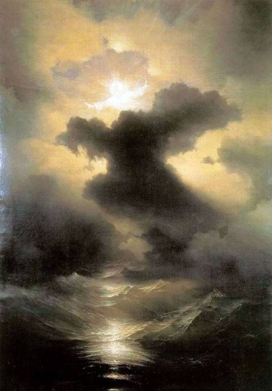
and thirdly, the memorial of percy shelley, who drowned in a boating accident at age 29, in 1822:
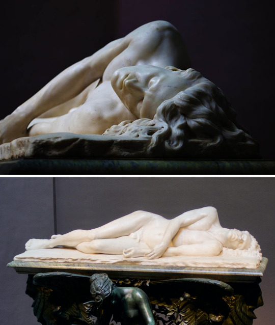
there's a common conflation between the romantic and the pastoral in the general cultural consensus because the pastoral a) has been around as an art term longer than romantic, and b) romanticism does use some similar imagery. but there is a key difference: the pastoral is specfically an idealization of 'the simple shepherding life,' often for high class and urban audiences who have no conception of the details of this life includes. one of the more famous examples is christopher marlowe's a passionate shepherd to his love, published in 1599:
Come live with me and be my love,
And we will all the pleasures prove,
That Valleys, groves, hills, and fields,
Woods, or steepy mountain yields.
And we will sit upon the Rocks,
Seeing the Shepherds feed their flocks,
By shallow Rivers to whose falls
Melodious birds sing Madrigals.
And I will make thee beds of Roses
And a thousand fragrant posies,
A cap of flowers, and a kirtle
Embroidered all with leaves of Myrtle;
A gown made of the finest wool
Which from our pretty Lambs we pull;
Fair lined slippers for the cold,
With buckles of the purest gold;
A belt of straw and Ivy buds,
With Coral clasps and Amber studs:
And if these pleasures may thee move,
Come live with me, and be my love.
The Shepherds’ Swains shall dance and sing
For thy delight each May-morning:
If these delights thy mind may move,
Then live with me, and be my love.
whereas romanticism is a more pointedly specific movement that was active from around 1800 to 1850, primarily focused on intense emotion and catharsis as the primary experiential output of an artwork. which most prominently manifested in a deep fascination and glorification of the natural environment and historical nostalgia. the movement sprung from the german sturm und drang (literally storm and drive/stress) period of the late 1760s to early 1780s, which was a direct reaction to rationalism and enlightenment. romanticism had similar impulses; it was also a revival of medievalism and a reaction against the looming urban sprawl and mechanization of the industrial revolution. a typical romantic poem from one of the originators of the english movment william wordsworth, composed upon westminster bridge, september 3, 1802, originally published 1807:
Earth has not any thing to show more fair:
Dull would he be of soul who could pass by
A sight so touching in its majesty:
This City now doth, like a garment, wear
The beauty of the morning; silent, bare,
Ships, towers, domes, theatres, and temples lie
Open unto the fields, and to the sky;
All bright and glittering in the smokeless air.
Never did sun more beautifully steep
In his first splendour, valley, rock, or hill;
Ne'er saw I, never felt, a calm so deep!
The river glideth at his own sweet will:
Dear God! the very houses seem asleep;
And all that mighty heart is lying still!
this romantic fascination with nature was underpinned by the philosophy of the sublime, generally agreed to be first treatised by edmund burke in 1756, the theory was also written about by kant and hegel. in the simplest of terms, the sublime is a quality of greatness beyond calculation, imitation, and human comprehension. the sublime is twofold; the greatness of the ocean is beautiful, but its power is also terrifying, and the experience of the sublime is to feel those two at once. to be in awe and also to be horrified of its ability to sink ships and drown a life in a tempermental change of tide.
let's take a quick detour to talk about
clothing
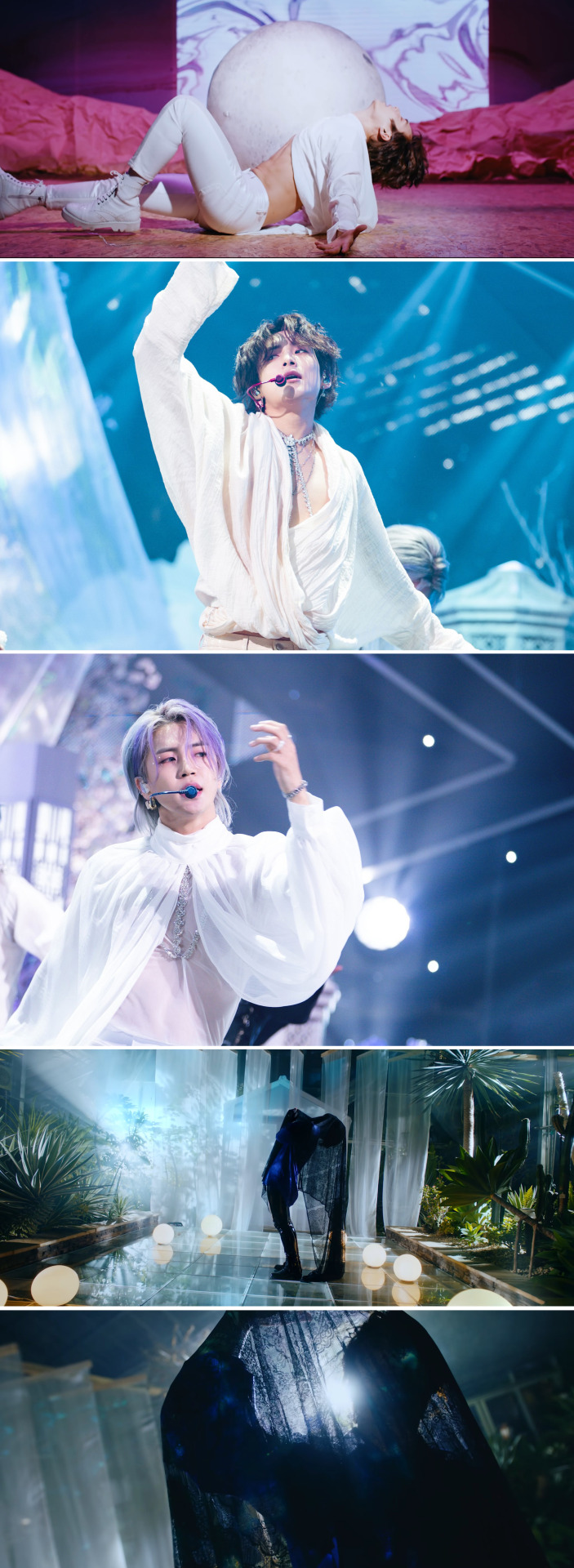
in the present day we have become much more lax thanks to the aesthetic movement in the late nineteenth century, but back in the early victorian period there are still highly structured rules about when and what clothing one can wear in public. and the clothing itself is also highly structured. anyone with a passing understanding of the victorian era knows about the whole flashing of the ankle thing and corsets galore, and it is true that the general day to day garments cover a lot of area. for men in particular, this manifests in no less than three layers in public at all times: shirt, waistcoat, and suit jacket, with a coat or mantle overtop in colder temperatures. this also includes a variation of a neck tie (depending on what year), hat, gloves, and any other decided upon accessories (this can also include a corset and other padded structural underpinnings). an important tangent to mention here is that this is the uniform of the upper classes, although the rules do apply to the lower classes if they wanted to appear 'sophisticated.' the working man's uniform was also shirt, waistcoat, trousers, but the difference here is in the textiles themselves; the colours tended to be much more drab, with less complicated patterns. obviously due to the price fabric itself, but also due to the labour of laundry. an indicator of class here is the white shirt itself and its pristine implications. (there is a longer conversation here about the invention of neckties and detachable collars and cuffs, but that's for another day). the silhouettes are very important to note here in the higher mv, as they are directly referential to the 'romantic poet' archetype of loose shirt and tight pants that we see in popular culture. but as i've just said, the reality is that men of the era were not dressed like this out in public. this look is essentially underwear; the implications are salacious. so where did this come from? well, we can blame it mostly on lord byron, who by all accounts was the first western 'rockstar.' notoriously called 'mad, bad and dangerous to know' by lady caroline lamb (a married women he publically had an affair with), byron was openly bisexual and deeply hedonistic with a lot of questionable habits, but his poetry was so popular that he was known to have women following him in the street and gathering in large quanities to see him at salons. and this was close to three decades before lizstomania. his close friends and contemporaries included percy and mary shelley, with whom he lived with abroad in italy for some time (this living arrangement resulted in the writing of both frankenstein and john polidori's the vampyre). byron's reputation was so eclipsing that the image of the lush poet lazing in his undergarments has become its own genre of romantic, slightly removed from the movement byron was writing in. it's also worth it to point out that there are no official portraits of byron dressed like this from the time. the visual assumption is somewhat apochryphal. now let's get into some specifics. a.c.e is not unfamiliar to this silhouette; as previously mentioned in this post i wrote about their styling, the boxy loose upper and fitted lower is their general mode for their styling because of its emphasis on legs. cactus was the most extreme example of this, and to prove my point, this specific silhouette is extremely common in classical ballet:
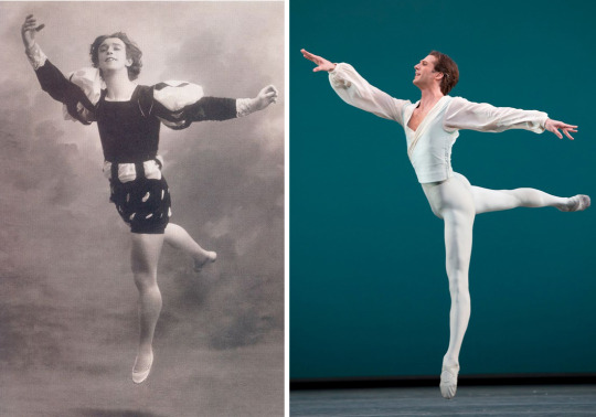
1. vaslav nijinsky, giselle, 1911 2. nehemiah kish, george balanchine's ballo della regina, 2011/12
higher fits very neatly into this same category: we have an emphasis on the legs through tightly fitted garments and also through light reflective textile, as well as a secondary emphasis on arm and shoulder movements with looser fit shirts. plus, the shirts are made from fabrics that have good drape and flow, and mimic the visual effects of water:
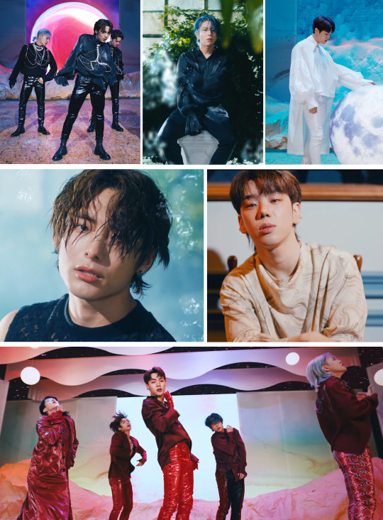
there are also several instances of scale patterning and wetlook hair styles, further elabourating on the siren theme. and the jewelry is the same, purposefully cut clear stones for oceanic sparkle or pearls, the gem directly born from water, as highlighting accents to specific parts of the body - namely eyes, hands, and torso:
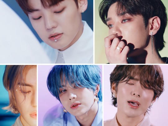
the body jewelry also serves a double purpose in addition to being sparkly; it gives a semblance of shape to their torsos so their movements aren't totally lost in the shroud of their shirts, and it also invokes some of that salacious element that us as a modern audience doesn't necessarily perceive in the same way when we see a man wearing only a shirt. all of these points are especially prominent in the stage costuming. concerning the veils, these are an aesthetic choice following the theme of depicting water without actually using water. the song has a very breathless quality to it, and the lyrics directly make reference to water and breathlessness, so it only makes sense to have a physical manifestation of struggling to breathe.
now let's talk about
mise-en-scène
unlike most kpop mvs, I would argue that higher is not a spectacle in what we normally see spectacle to be. the overwhelming visual saturation of goblin (and the goblin remix) is more in line with what we expect, but how do you follow that, top it? the answer is that you don't. you aim for something with a completely different feel, which is exact what they did with higher.
the performing arts did not escape romanticism. the very start of the movement, sturm und drang, is actually named from a specific play written by friedrich maximilian klinger that premiered in 1777. the plays of the brief period are characterized by extreme and passionate emotions, and were siblings to one of the most famous genres of theatre, the melodrama. meant to appeal directly to the emotions of the audience using sensationalist plots and stock characters, the melodrama was the predominent form of entertainment in victorian england and gradually developed a specific form of its own. in this period we also start to see the development of 'stagecraft' into the recognizable form that it takes today. footlights, limelight/spotlighting, the separation of house and stage lighting, fly galleries, elevator platform mechanics, and the first (purported) western use of rear projection are all innovations of the late 18th and 19th centuries, as melodramas were known to have very intricate and spectacular stagings. and to go along with these stagecraft mechanics we see the rise in designated stage crews, which were predominantly off-duty sailors looking to make money. the rope systems that made up the fly galleries were very similar to that on ships, and much of the terminology and supersitions crossed over: this is the origin of the term 'rigging' being used for suspending set elements, and also the origin of the 'don't whistle in a theatre' superstition. as sailors communicated with whistle patterns on ships, the same system was adopted for changing scenery, and therefore whistling a random pattern could potentially drop a setpiece on an unsuspecting victim.
so with all this backstory out of the way, what is the very first full location we see? a stage, complete with forced perspective via the painted fabric legs (the side panels) and borders (the wavy upper panels). we even have a flat painted backdrop with a projection screen and hanging overhead lamps. there's also a second interior set, a desk in what looks to be a study of some kind. bit self explanatory on this one, taking the poet notion on the nose.
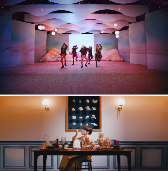
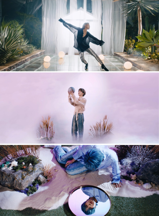
the locations have a bit of an obtuse arc, but it's there when you look for it. it starts interior spaces, where the ideas of sublime attempted to be recreated for the viewer. then it moves to transitory spaces; portions of nature isolated from a whole environment, interjections of human architecture into natural spaces:
(the white hut structure in the greenhouse is reminiscent of a skene (literally hut/tent), which is the structure at the back of the stage in ancient greek theatre used for the actors to change their masks and costumes. it was originally temporary, but slowly transformed into permanent stage architecture)
and then finally outdoors, into the sublime itself:
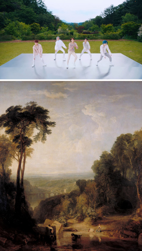
jwm turner, crossing the bridge, 1815
lastly,
lighting
there's a very clear lighting pattern here, primarily in light and dark. the base colour story is fairly simple complementary pairs; there's a lot of purple/red and green, and blue and yellow/amber, with everything relatively on the same tonal level. there are deliberate interjections of heavily saturated red for specific effect. there are also, most notably, a 'dark' version of all the sets. obviously as a reference to the eclipse that we see in the mv and in the concept photo series, but also as a reference to that darker undercurrent of the sublime, the upsetting, the uncanny, and the terrifying:

And the bay was white with silent light/Till rising from the same/Full many shapes, that shadows were/In crimson colours came.
#a.c.e#ace w#kpop analysis#group analysis#me - a staunch defender of kpop as valid spectacle: actually this one is a melodrama its meant to hit different#this essay is otherwise known as the quickest and dirtiest history of romanticism ever#i really should have pointed out that when i say romantic i mean romantic with a capital r#that probably would clear up some confusion but i have an aesthetic to maintain do not @ me#this is potentially the most pretentious thing i have ever written i am so sorry if this makes no sense#some of these connections are so tenuous who let me have opinions on the internet#did i write this as an excuse to look at the percy shelley memorial because i am obsessed with it as a piece of art? maybe#anyways read tom stoppard's arcadia if you want to know more about that#you should read all this with the caveat that the sublime and romanticism need to be deconstructed through a postcolonialist lens#because these theories are super colonialist about 'unclaimed untameable natural spaces'#when in reality most natural spaces are specifically architected by indigenous peoples in order to preserve and coexist with the ecosystem#this is may be more obviously applicable to american subliminal painting than european but it still applies#since the british were notoriously good at fucking up every kind of expedition ever#because of their lack of respect for literally anything and everything#and their inability to listen to anyone other than another white british person#see: history of the northwest passage#im a bad theorist and not caught up so i didnt get that deep into it because counter to the wordcount#i am not trying to write another dissertation#this is not as well researched as it could be but also im not reading burke and kant again#also yes byron the shelleys and polidori did just bang out the foundations for all of science fiction and romantic vampire mythology#in like three days because the all got bored during a storm and want to try and 'outscare' each other#also by 1840 like every prominent romantic poet was dead either from their own stupidity or tuberculosis#with the exception of wordsworth that motherfucker started the movement and then outlived it#text
17 notes
·
View notes
Text
S/S 2020 Fashion Month: A Basic, Uneducated Fashion Heaux’s A-Z of Everything Noteworthy (Part 3/3)
Hi to anyone reading,
I’m finally at the end!
It’s only taken me, like, over 2 months but I’m finally about to review the last 5 shows I wanted to talk about from this year’s RTW offerings for S/S 2020. It’s very frustrating that I couldn’t include them in the last post and make this a nice, neat, equally sized two part thing but Tumblr was being difficult and so here I am. On the plus side, I guess I can also make this post a bit of a round-up of my ultimate favourite collections of this year and some of my absolute favourite looks!
To quickly finish my review though, I’m gonna start this post with Vivienne Westwood’s S/S 2020 collection!

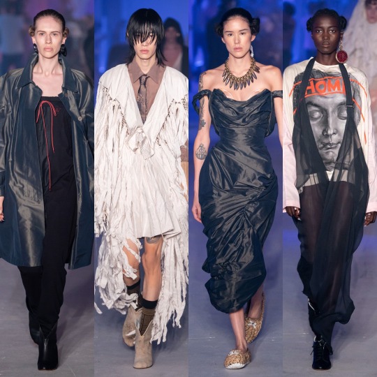

And I hate to start the post on a downer but I wasn’t wild about it. The bridal look worn by Bella Hadid and the similarly structured red dress are the only pieces that I really love. The accessories are beautiful, especially the shell necklace, and the fitted corset upper halves are very flattering, however, there’s just nothing particularly exciting about this collection for me.


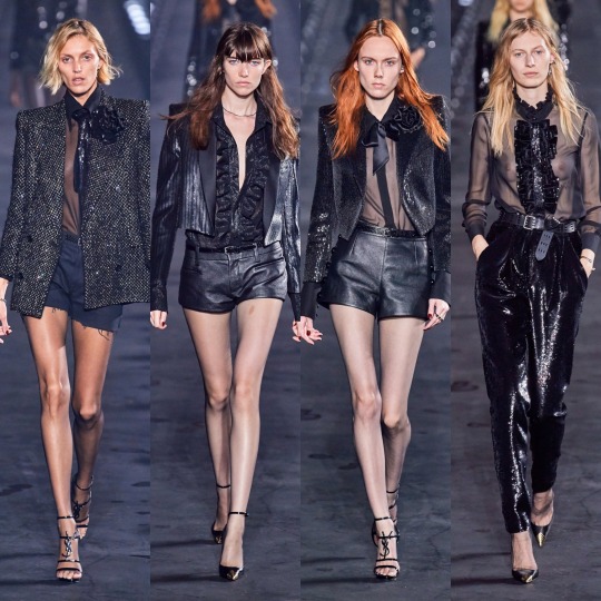
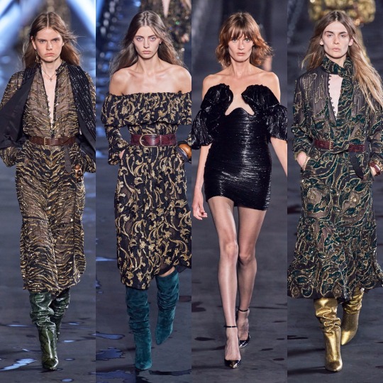
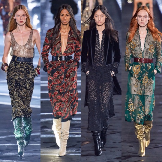
As for YSL’s S/S 2020 collection, my opinion is pretty similar. Don’t get me wrong, I personally love the embroidered pieces, and the jewell tones, and the whole art teacher/female Russell Brand vibe (I’m aware this is my second Russell Brand comparison of this review, don't @ me) but why does there have to be SO GODDAMN MANY FUCKING SEQUIN SUITS? I included a couple of the more interesting ones just for reference and can you believe that’s only about 1/10 of the sequin suits that were actually shown. I feel like they genuinely made up a good 33% of the show. It’s so boring and overdone from Saint Laurent, like you really can’t convince me that they didn’t do this exact same thing last year and the Eiffel Tower being in the background and the presence of the goddess that is Naomi Campbell and all the fancy lighting in the world isn’t a distraction enough because they DID THAT LAST YEAR TOO. It’s just disappointing from a brand like YSL who really has the money to take it to any wacky and inventive place that they want, and who has drawn on so many historical and cultural references in the past; the bohemian looks I am here for, everything else can go.
Next is Zadig and Voltaire, which is obviously more of a pedestrian brand than YSL, but still...disappointing.

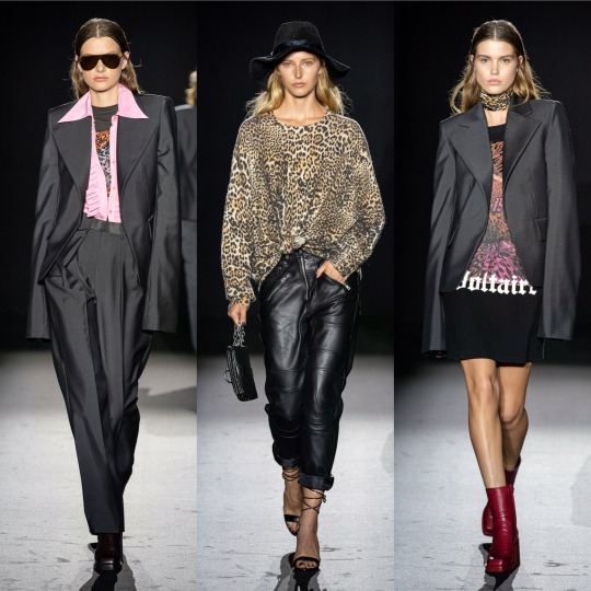

I guess disappointing is the wrong word really because it’s not as if I had especially high hopes, it’s just that in comparison to a collection like Off-White’s, which was also a lot more of a “wearable” line, this is very Stradivarius/Zara/H&M/any member of the Inditex group. I like the ruffles, but we’ve seen them done in a much more interesting way in pretty much every other show and same with the blazers and suits. Even the styling of the teal faux fur coat, which I adore, is meh. Even Emily DiDonato can’t save it for me and that’s saying something because she honestly might be one of the most beautiful women on this planet.
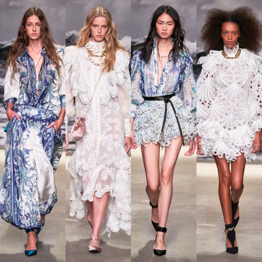

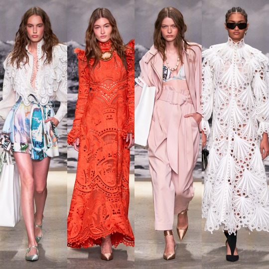
On a more positive note, Zimmerman was beautiful. In a collection inspired by the ocean, the tranquil colour palette, the ornate, frothy ruffles and the flowing materials are dead on, and indulgently so. I can see most of these pieces having universal appeal and looking good on anyone, and yet this wearability doesn’t make the collection boring by any means; I think it really is a matter of having a clear concept and attention to detail that save more subtle shows from falling by the wayside.
And lastly, Zuhair Murad, which is always a designer I look forward to; I love a good princess dress and on that, he always delivers.
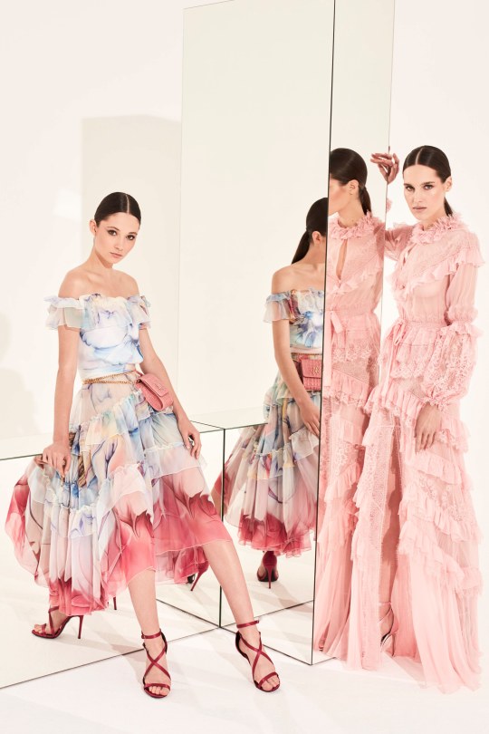

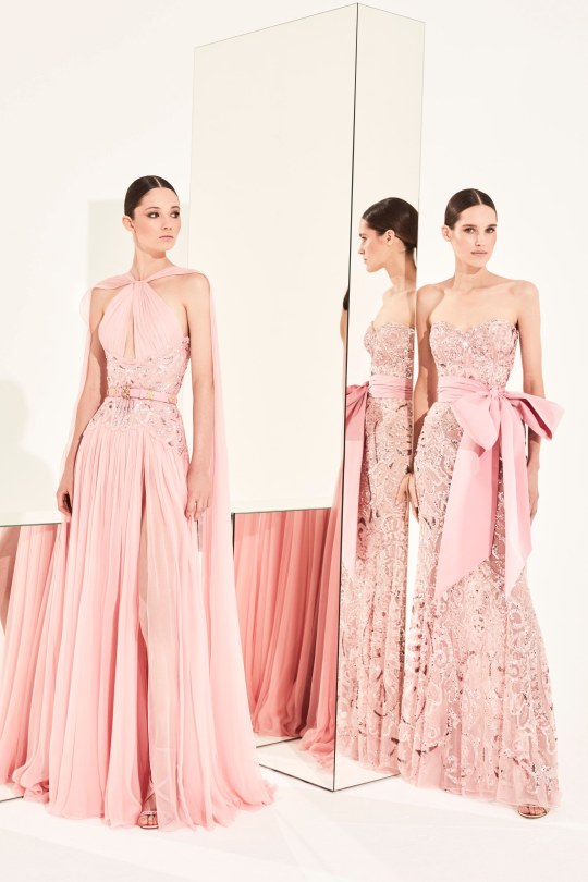

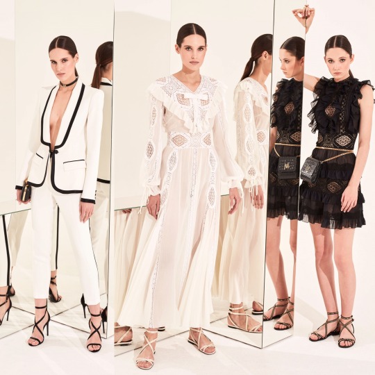
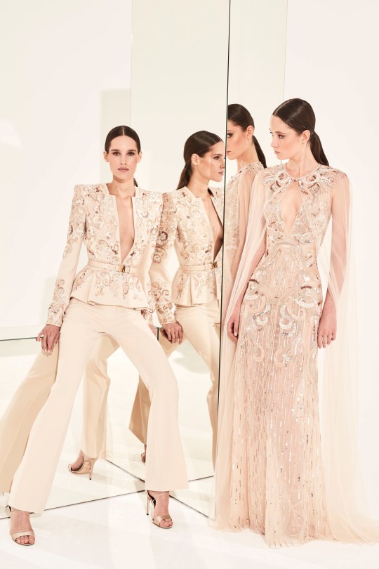
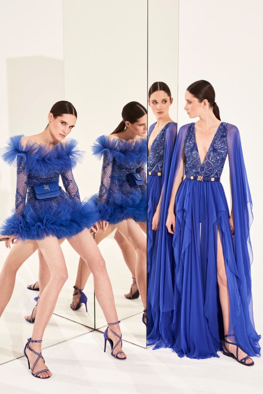

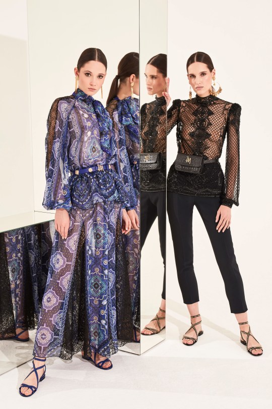
However, whilst there’s a similar feel and colour palette to Zimmerman, I’d say this collection doesn’t have quite as clear a direction. There’s definitely a lot of recurring themes of the ruffles and the high necks and the bohemian prints and suits that we’ve seen throughout fashion month, but this still doesn’t feel like the most relevant or current collection I’ve ever seen from Murad. It goes without saying that the dresses are beautiful but in the context of a red carpet where every dress is a princess dress, I can’t imagine any of these taking my breath away which is usually the case.
I really WANTED to end on a positive note, I’m sorry! And there were so so many amazing moments this season. In general, I’m excited for a lot of the trends that are seemingly going to be coming up: more of the milkmaid thing, peasant blouses, bohemian influences and a shit load of gorgeous suits!
I was going to try and do a top 10 but I honestly have too many favourites so I’m making into a...top 20. It sounds like a cop-out, but when there’s THIS many shows to go through I think a top 20 is perfectly fair.
1. Gucci

It has to be my favourite overall. The clearest concept, the most beautiful colours, and a whole range of interesting accessories and structures. Blew everything else out the water. Might make like Elsie Fisher in Eighth Grade and just start randomly saying Gucci out loud at totally inappropriate moments to express my love.
2. Marc Jacobs
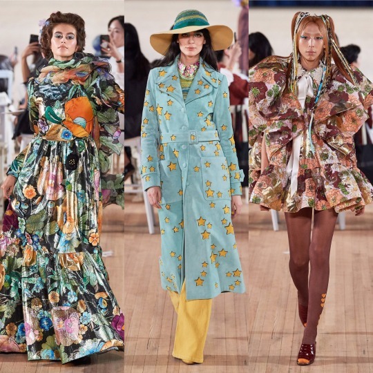
Kooky and in your face but also thoughtful and delicate. Every piece is a statement.
3. Moschino

The intersection where art meets fashion is always my favourite place to lurk and so it’s not surprise that Moschino’s Picasso inspired collection ticked so many boxes for me. Aside from that, the structures are gorgeous and on trend and I love the accessories.
4. Valentino

So. Many. Heavenly. Dresses.
5. Mugler
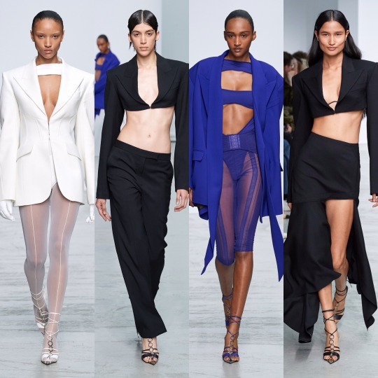
Definitely the sexiest S/S 2020 collection.
6. Paco Rabanne

I mean, yes, it is a little primary school teacher-y (it’s probably the coloured socks), but a fashion-y, wear-it-to-the-club version of primary school teacher style.
7. Ralph and Russo
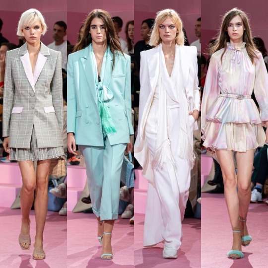
A prissy pastel dream that channels the Sandra Dee sleepover scene from Grease in the modern day, the only thing that could’ve added to the Ralph and Russo show would be a more diverse group of models.
8. Brock
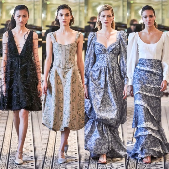
There’s never going to be an appropriate moment to wear any of the garments from the Brock collection. Does that mean I’m going to stop thinking about it? Never.
9. Balmain
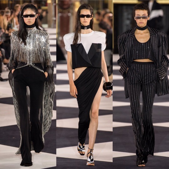
I know Balmain didn’t go down too well with the fashion critics but the noughties pop girls obsessed child in me loveddddd it.
10. Etro
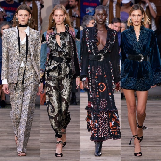
Not the most high-fashion but I would wear.
11. Dion Lee

Dion Lee took corsets and suspenders and harnesses and turned that whole dominatrix trend on its head by pairing them with androgynous silhouettes, fresh whites and subtle nude tones, and I’m here for it!
12. Alessandra Rich
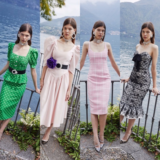
Eighties presidential candidate’s wife/sorority queen realness.
13. Dilara Findikoglu
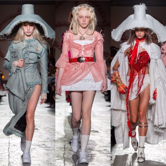
Definitely my favourite of the more “avant-garde” shows we saw this year.
14. Oscar de la Renta

These dresses speak for themselves, do I really need to say any more?
15. Christopher Kane

Christopher Kane made galaxy print cool again for the first time since it was murdered by 2013 “hipster” Tumblr and then buried 6ft under by the plethora of £5 and under wholesale retailers who thought it would be a good idea to mass produce leggings with said print on.
16. Loewe
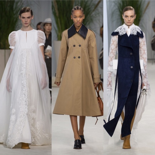
Delicate, purposeful and refined, Loewe put out a practical yet very, very pretty and season-appropriate spring collection.
17. Thom Browne

Thom Browne brought Marie Antoinette onto the runway. ‘Nuff said.
18. Louis Vuitton
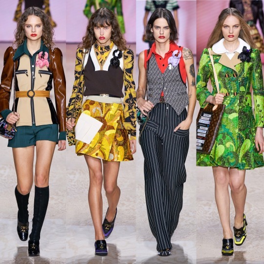
I will never turn my nose up at anything 70s influenced and Louis Vuitton’s collection was probably the most authentic (and thus kinda ugly at times) that I’ve seen.
19. Simone Rocha
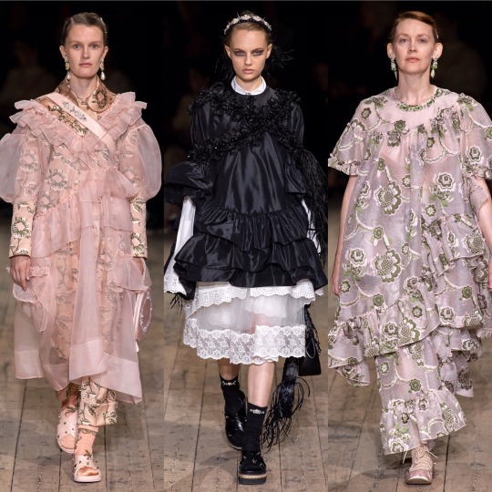
If I ever became part of some modern day witchy, forest-God worshipping cult, I would expect us all to be wearing Simone Rocha’s 2020 S/S collection and nothing less.
20. Vera Wang

Jenny Humphrey in Gossip Girl for the 2019 e-girl xoxo
SO.
3 parts and 3 months later, this is my review of fashion month 2019 coming to an end. I mean, it’s actually closer to A/W 2020 fashion week now than it is to S/S 2020 buuuut let’s just forget that little detail because I had NO FUCKING IDEA it would take this long.
If there’s anyone out there who read this to the end (and I highly, highly doubt there is and I don’t blame you) or even anyone that looked at the pictures (which is probably what I would do), please let me know! It got a bit long at times but I have generally reallllly enjoyed doing this and more than anything it’s got me sad that I’ll never see these shows in person :( sad times :( oh to be on the benefiting end of nepotism :(
Thank you sooo much!
Lauren x
#nyfw#pfw#mfw#fashion#fashion month#ss2020#2020rtw#vera wang#moschino#gucci#high fashion#spring 2020 rtw#rtw#louis vuitton#thom browne#loewe#oscar de la renta#Alessandra Rich#dion lee#marc jacobs#balmain#valentino
153 notes
·
View notes
Photo

UNTRUISMS: YOU GET WHAT YOU PAY FOR
by Réginald-Jérôme de Mans
Today price is another marketing tool. We’re still told to think otherwise, thanks to regular posts and articles that helpfully compare the differences between, say, a $500 and a $2,000 leather jacket. Those articles make price out to be the proxy for quality, with all the differences between the two presumed to indicate lower quality in the cheaper version and higher in the dearer. Price does not mean quality, as those comparisons suggest. And $500 is a huge amount of money for a piece of clothing to almost all of us.
That is, price doesn’t necessarily mean quality. Most of us veterans of the #steez wars carry the scars of at least one skirmish with the too-good-to-be-true. The new maker who turned out to be a fly-by-night or the guy with an impressive pedigree from the best houses who turned out to have nothing but that. Far more of us admit to those scars rather than the scars of paying way, way too much for mediocre quality, because the former are cheap. It’s a lot harder to admit to yourself, let alone to others, that you paid an enormous amount of money for, say, a custom suit from a famous, historically significant maker whose current staff pushes you out the door instead of making right their errors. And far fewer of us can or will pay the high prices anyway, so there’s fewer of us to report that.
You have to know what you are paying for. There are many very, very expensive makers and sellers of nice things out there. Some charge what they do because their price reflects the high price of their labor, the years of training their key staff have had, the quality of their materials, and the potential cost to them of doing whatever it takes to please the customer, including remaking a botched garment. If all of these qualities have made them famous and successful, their price will also often reflect the high rents of the address they are at. Others charge a similar price without offering all of those things, because that high price, and the heritage they market, suggests all of the rest without them actually providing it.
Unfortunately, it’s quite hard to tell one from the other without some difficult trial and error. One easy hack for many is used clothing – even the finest clothing, custom or otherwise, rarely sells used for more than 10% of what it costs new. Sometimes, as with my favorite knitwear, the quality of some of the relatively cheap old used stuff is irreplaceable today, simply because there’s little commercial reason to make them the same way anymore.
What are we looking for? What, really, do we want to get? If you’re reading this, then it’s probably more than just a piece of clothing. It’s something that attracts and resonates with you, that feels almost transformative, something that is both beautiful and somehow more than just durable, but enduring.
Lasting beauty and a feeling beyond price, a feeling of revelation. No wonder we suppose it’s expensive. It doesn’t have to be, but knowing what we’re paying for is hard – costly – as well.
You can get a lot for a little in cufflinks and other somewhat disfavored articles of men’s clothing, like ties and tie clips, if you know what you’re looking for in the vintage market. My search for the links pictured here was inspired by the vintage links selected for the most wonderful store I’ve ever seen, itself too long gone. These are tiny seed pearls set into smoke-colored iridescent mother of pearl in a chased octagonal frame, double-sided like (one of my prejudices, to which my shirtmaker takes strong exception) all good cufflinks should be. They are objectively beautiful and cost me all of twenty dollars. They were exactly what I was looking for to wear with a formal shirt (my silk #tactleneck evening shirt). Mother-of-pearl, which is obtained from various oyster, mussel or abalone shells, is not very expensive. The seed pearls may be real, cultured, or sham, but they’re mounted exactly the way I wanted, looking almost free instead of imprisoned in a cabochon setting. The frames might be white gold plate (if anything) over base metal, but the pattern is delicate and the metal, however base, wonderfully patinated. I’ve seen versions of these in solid white gold or in platinum for far, far more, sometimes rendered far less elegantly. We can find cheap joys – handsome old cufflinks that do justice to the elegance of a formal shirt are just one example.
In recent years marketers have realized that they can make these sorts of objects, too, pay, an example of the new meaning of curation. Beautiful consumer goods of any price point collected, with customers now paying for someone else’s eye, and someone else’s work collecting such items. If you care enough to read this, you care enough to know that your eye, too, can be quickly trained to recognize what will give you genuine enjoyment. Often at little expense, and instead the thrill of personal discovery.
8 notes
·
View notes