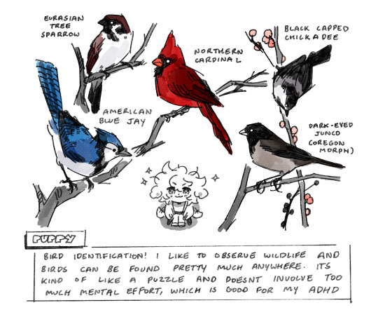
#idk if i wanna go with this style or use flat colors.... theyre both good and i wanna switch between them but i also want consistency
Explore tagged Tumblr posts
Note
When you go on walks, what’s your favourite part? Mine is when I find one of the rivers or small streams nearby my house. Or when I get to meet some new dogs- or when the temperature is just warm enough to bask in whilst the trees are rustling because of a strong breeze. Maybe my favourite part is the walk itself, I like walking places. Problem is I always need to have a destination in mind.

the weather is getting nicer so its the best time to go outside and poke around for some new visitors ^_^
#i think i overdid it drawing this but i havent drawn birds in so long that it was a nice exercise....#actually im thinking of resuming my mspaintbirdies blog.. unfortunately my tablet is ass and i dont like the new ms paint#so ill probably use procreate.. does this mean i would have to change the url...????#idk if i wanna go with this style or use flat colors.... theyre both good and i wanna switch between them but i also want consistency#i did paint a mandarin duck for a school project with flat paints but its much harder so ill probably have to play around with it#we get dark eyed juncos in the winter here and goldfinches in the summer.. ive been meaning to visit the conservation area#more often bc there are more species there like nuthatches and chickadees. maybe i can rent a camera for photos#but id really love to visit vancouver again especially since they have stellers jays there. theyre one of my favorites <3#ask#answered#doodles#birds#yapping#sona#puppysona
47 notes
·
View notes
Text
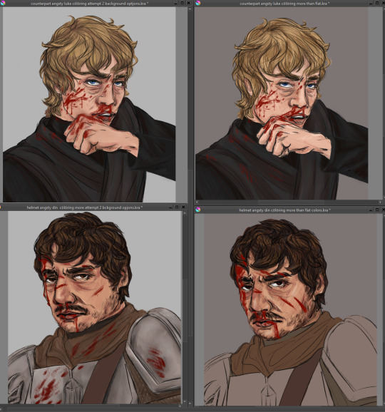
Turns out its a helluva mess when i start messing beyond flat colors!! Might be a sign to not do so much again (but yet .. practice to get to where im one day happy??)
Like ive done as much as i know how to do at this point in time to the portraits (still gratuitously bloody shame on me :') ) oh except for a background bc WHAT does one DO for a character shoulders up portrait background??? Settled for now on a gradient old school photo style lmao
I like the fix it one as is, a lot (but also i liked the lineart for the portraits better i think) and idk, imngonna try give it a light bit of shadows and lights, maybe step away from a lot of blending bc i think i think thats where i went wrong on the other one
Like, they look fine, but they also look. Meh. Like ive used too much blur tool (i havent, i tried using kritas wet brush thing and it looks....ok close up but the effect is no good when zoomed out like posting size APPARENTLY) and its all noncommittally washy.
(cont'd over thinking)
Am i gonna 'render' them a third time??? Do i have the mental strength?? Bc i think maybe trying for something not so, "realistic" could do me better, like a little more cell shady. But also i dont?? I dont know how to cell shade? I dont watch anime or cartoons v much and my style isnt that cartoony or clean lined?
Maybe on the fix it i can try a more....... Conservative and less blended shade/highlights? (And if i like it/learn smth new go back and re re do the portraits same style) I also just. Idk. How does one make it not look so. Flat and meh?? Im doing basic color stuff ok i think, ive got a bit of texture but its still? Eh???
Honestly i could just post them and move on but i dunno, i have the energy to problem solve a lil bit so why not?? (Not tonight. Im gonna sleep on this all)
Why post shit im not 100% proud of? (Ngl kinda been in the mood to take down that first sketch of the fix it bc it looks nowhere near as good as what i fixed it up to but ....... Ah fuck it i was happy w it when i did it so eh)
Why why why oh why is art so hard?????????
I wanna try and become one of those cool artists who post multiple fun things yknow, like u get inspired and can draw it beginning to post in one evening! Im probably way over thinking and pushing myself to some standard of unrealistic perfection i have for myself...
(also i like thumbnail doodled out like, all these things i wanna draw for a really nice fic i read and even after editing some i have like 8 bits i wanna draw?? 4 as like a mini comic bc i havent done one since i was a child and i think itd be kinda rad if i learned to draw short comics for fic scenes i like??? But yeah basically in one inktober post there would only be 5 ideas (a lil more complicated on average i do give for granted but like. Those took me WEEKS) but yeah i just. I wanna draw them. Even if itll probably take me for fuckin ever... (And i didnt even finish off the last two inktober batches, oh. And i have a uni thesis to do ew) .... I wanna push myself to draw faster (less iterations to get it right) and so i can have rly solid and good and quickly done drawings to then color in as i learn to for future?)
Ugh man. You know what i need to do/shouldve been doing before i jumped into coloring original stuff?? I shouldve done colored studies. Like ive been drawing scenes both from reference and original on the inktobers and i think thats why my drawing/character stuff has gotten decent. I really should just whip out like prettily colored movie screencaps and work on painting studies of them. That would really fix up why i cant figure out lights and shadows and blending in coloring! No horrid tutorials just figuring out how can i make it work for me
And you know? You know what it is okay to have pieces that are from before i figured it out right? Im gonna try a slightly different thing for the fix its (if i hate it, theyre good as flat colors too) and yes they dont have a background either please love of god someone tell me how to add random backgrounds bc im not in the mood of scene building further but they float in off white space atm.
If i learn smth ground breaking and can QUICKLY do a bette rendition of the portraits, sure the perfectionist wins. But maybe just maybe. It would be fine to post them as they are. Yea, they look roughly as lifeless as my first big painting/that dinluke poster redraw. And maybe thats okay. Because hi if i do dedicate to doing like a good few color focused studies of star wars scenes as a treat i can come back stronger and have a better piece???? Its about growth babes. YEA
Alright i said to myself thats it in gonna go sleep on it and continue tomorro but. I thought id slip in here a secret surprise for anyone unfortunate enough to have clicked read more... And i got a little whiplash opening the picture bc it looks. SO WRONG but the more you look at it its like ... Fine. Ok judge for urself and tell me pls, first and second attempts at 'rendering' the portraits (the darker bground was the first attempt just going by gut, the lighter one after trying to watch like 1 tutorial and using more brushes and just generally trying rly hard!!)

yes ive clearly fixed issues in the sketch differently in both so they... look... like different expressions?? idk man idk idk idk see now this small they look differently off!! god the curse of the zoom in and out and perception.
#art woes#but make it extra long because im DISTRESSED at not being able to just whip out ideas from my brain to page and it look good in one try#long and rambly and probably doesnt make much sense no pressure or expectation for anyone to read lmao#love yall kiss kiss time for bed itll be easier after sleep#did include a pic of current progress at the v bottom eheheheh
0 notes