#i've changed my art style like 3 times now but i still draw side profiles the same . looks weird ugh
Explore tagged Tumblr posts
Text
doodles
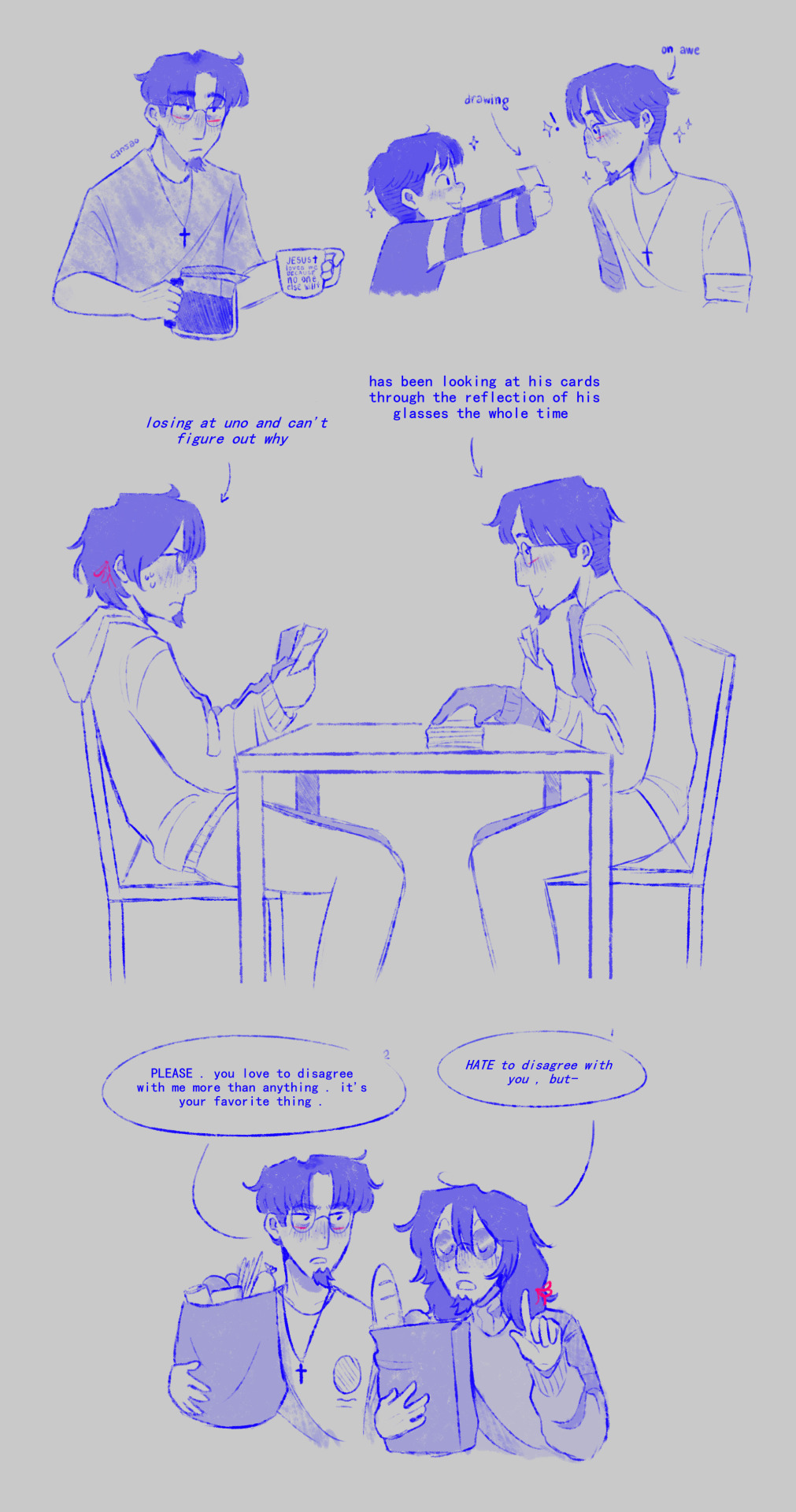
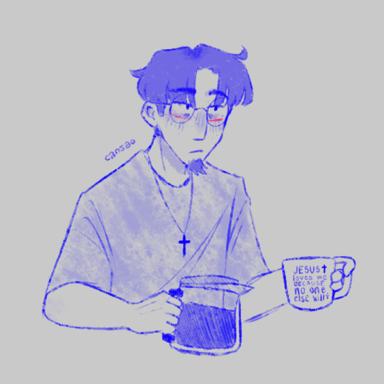
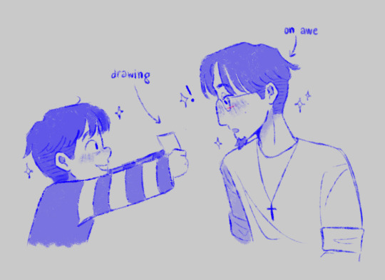
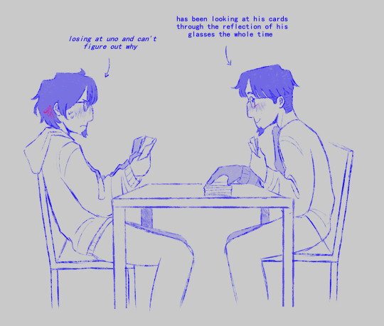
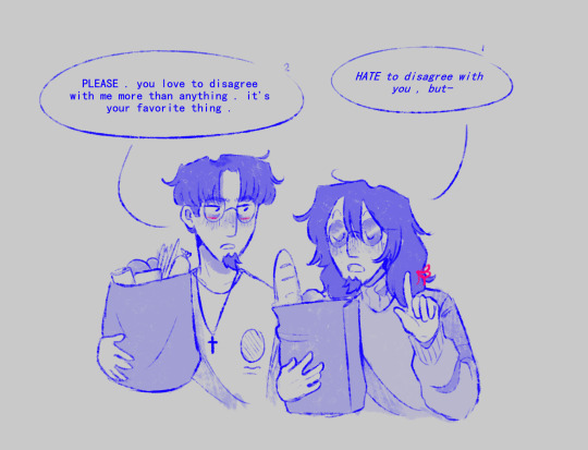
edgar vargas and squee by johnen vasquez
scriabin by zarla-s
#sunny's art#vargas#edgar vargas#vargas zarla#scriabin vargas#zarla s#scriabin#doodles#YOU THOUGHT YOU'D SEEN THE LAST OF ME . . . . !!!!#well HELLO !!!! I'M BACK !!!!!!!!#got a new brush . what do you think of it do you like it#okay i want to ramble about these wait a second#the first one looks a bit different to the rest because i was just trying new stuff .#if i spend a long time without drawing i'll forget how to draw and well it happened#i've changed my art style like 3 times now but i still draw side profiles the same . looks weird ugh#the mug says “ JESUS loves me BECAUSE no one else will ” btw . meta gave me the idea actually . thanks meta .#about the second one . finished that one like ten minutes ago . missed drawing todd aw#i just find their whole relationship so amusing .#like yes i went crazy for like a month and now i have a brother-husband and a kid ?!#they complement each other so well though . i love them#THE UNO ONE omg i've had that idea for like A YEAR NOW and i just drew it lol#i wonder how long it would take scriabin to notice though .#when i showed this to meta she said : “ oh wow !! edgar's finally winning at something !! ” and it's SO TRUE#wonder how he does it !#and the last one . i got the idea when i was looking through zarla's account searching for fan art .#love it so much though they look like their lives aren't a living hell#anyways i'll probably make more of these . who knows#going back to school on monday . and of course i had to get inspiration four days before going back .#please PLEASE I DON'T WANT TO GET BACK TO SCHOOL . PL#okay byeee enjoy these . eat my starved followers . EAT !!!!!
123 notes
·
View notes
Note
Would it be possible for you to make a guide to the shapes you use when drawing vessels and other hollow knight sillies? 🥺
I absolutely adore how you draw them and I've been struggling with anatomy recently so I just wanted to ask
HI! Thank you so much for requesting this!
I have a few main points on drawing in the Hollow-Verse, but I think it's important to remember that many characters have unique head shapes, body types, and textures, so the tips I give for the Siblings won't translate to all other hollow knight characters. That out of the way, here's...

-KEEP THOSE SHAPES ROUNDED The pointiest parts of Ghost's design are its feet, and the ends of the cape. The base-design is actually very round, while still being mostly made of squares. I keep my edges at the hands, feet, ends of the cloak, and tips of the horns, but everything else is soft!
-THE OVERALL SHAPE LANGUAGE Squares

-GHOST CUBE GHOST CUBE Ghost's head is a rounded cube. You can tell based on not only the overall profile shape, but also because of where the shadows fall on plane changes. So, to begin drawing your ghost, first draw a cube! If you can't draw a cube, draw a square! It shouldn't be perfect, they're supposed to be rounded so make sure to shave off those corners! Add the eyes (two ovals) on the side you want the face to be, and erase all other lines inside the box, and round the edges. I like drawing the eyes a little farther apart than in-game, i just think it's cuter.

-HORNS Ghost's horns are at almost at the plane change from the side to the top of the cube-shaped head, and follow a slight curve. Personally, I like lowering the connection point to the middle of the head, it just makes more sense to me when I draw. ♥To draw them, first draw an oval around the thickness you want the horn to be, then draw 2 lines from each "edge" of the oval so you find the center. Draw a line from that center-point upwards until you reach the desired size. (you can also skip this step and simply put a dot in the center if you're based and uncucked, but sadly I am cucked and unbased, so I draw the 'X') ♥That line you just drew is the center-line. Follow its curve from the topmost and bottommost points of the oval, then erase the middle. Ta-Da! A horn! ♥If you're drawing from a 3/4 angle or more, FEAR NOT! You can repeat the process, just mirror the curve you made on one side. ♥If you're drawing from the front, mark where you want the center of each horn to be and free-hand that curve! Repeat on the other side, and use the same principle as above to draw the outside edges, then erase the middle! You should have a lovely horned fellow now! :)

-CLOAK Ghost's cloak is something i actively choose not to draw accurately. This is because I'm impatient, and the in-game cloak isn't very complicated, but its movements are difficult to replicate in my specific art style, so! instead of over-complicating matters, I just draw it as a squared-off cloth. That's about all there is to say about that, because I don't have the time or energy to fully explain cloth today (sorry!), so moving on toooo....
-BODIES The bodies of Hollow Knight characters are almost always partially or wholly concealed by cloaks, so it's important to get the shape language right for the parts we *do* see. ♣Feet and hands are always pointed, I like making them more bug-like (though ironically I have a morbid fear of bugs, so what I really mean is more segmented, and with small nubbin digits instead of fingers/toes) ♣Bodies are trapezoids or rectangles with narrower necks and wider hips. This leads the eye up toward the head/face/eyes, while maintaining the weight distribution of the character. I replicate this effect by shrinking the heads, lengthening the bodies, and adding more detail in the face. THis keeps the center of attention where I want it to be.
AT LAST we put all these tips together and tada~! A Hollowed Knight! :)

-BONUS HORNET TIP Hornet's head is basically an oval with another oval cut out of it. Many artists squash her head so she's rounder, but whether you squash her or not, a partially consumed oval is what she remains.

Hope that all helps! Have a good day <2
20 notes
·
View notes
Note
hello can you show me how to draw pips and his boyfriends hair :3 I can't draw hair ;-;
Sure thing! I'm not good with guides, but I'd still love to help!
I don't make guides often so this is very messy. Also, I am assuming by 'boyfriend' you meant Damien, as they are paired together the most from what I've seen, but my apologies if I'm wrong!

The guides themselves are pretty self explanatory, but I can add bonus stuff here!
To keep things short, think of Pip's hair like he has a hair care routine. His bob cut is smooth and bouncy, so there isn't much shape aside from the bunched up hair under his cap and the ends, as well as making his hair sort of lumpy or curvy. Also, I've added bangs as he has a tiny fringe under his hat, as seen in newer model like this one!

As for Damien, his hair in the show is rather smooth as well, as seen here.

But he has some spikes like in the bangs or the top of his head! I just added a few more because it's fun, while still trying to keep his original shape (sort of (;ŏ﹏ŏ)). Like keeping most of the hair flat against his head until it juts out in low spikes. I also took the liberty in making his sideburns sharp too!
In 3/4ths, the only differences really are some bits of hair that hides behind the head, or other parts that shift along with the face as it turns. Overall, it stays the same. And since it's a cartoon art style, you can just flip which way the hair is facing when a character turns.

In side profiling, the hair either drastically changes or stays the same.
For example, Pip's bangs are always swooped over his eyes, no matter which way he's facing. But with Damien, the bangs do not change a direction. They simply phase through the top chunks of his hair and become a bit like one piece. All in all, the only thing you have to worry about is not putting the sides of the hair too far back. Always try to keep it in the middle or ahead of the middle. Otherwise, it looks like they're balding or have a mullet/swooped back hair. Just draw your shape, make some adjustments, and erase the head lines that hides behind/under the hair!
And there's not really much else! My art style is pretty simplistic, but always keep in mind that MY WORD IS NOT GOSPEL. Obviously, you don't have to draw this way! Art is a progressive element, and the way you create will always change and morph. Even I will change the way I draw over time, including characters' hair, clothing, etc. Do what you think works for your art or makes you happy! Search up some helpful guides or videos on YouTube to help you get a better understanding of what you want to draw. It takes a whole lot of practice to get used to the different elements in art, but it pays off, I can assure you! My art certainly didn't look the way it does now back when I was a teen.
Regardless, if this guide has left you confused, don't be afraid to ask any more questions! I would love to help out any way I can!

#south park#digital art#art guide#hair tutorial#pip pirrip#pip pirrup#damien thorn#south park pip#south park damien#sp pip#sp damien#the silver box
36 notes
·
View notes
Text
Some of my favourite art - a timeline
Part 3: 2013
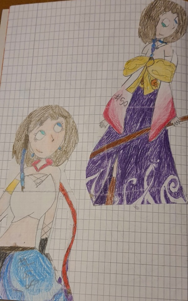
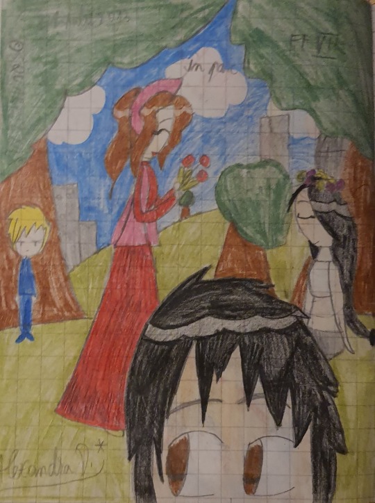
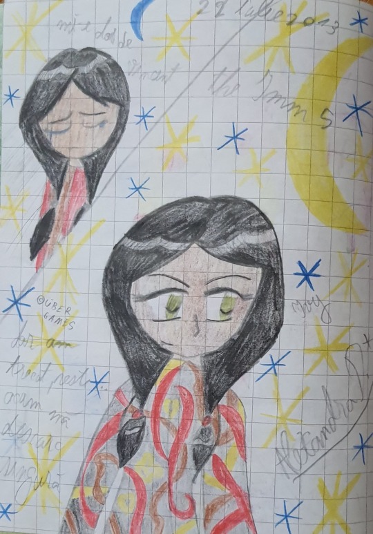
Final Fantasy X/X-2 and FFVII fanart. June or July 2013. The first pic shows remnants of my previous style, while the latter is fully anime. Late 2012-early 2013 was a transitional period in this sense. I really like the concept of the first pic, which is Yuna's past and future self looking at each other. The second pic shows an attempt at perspective and composition.
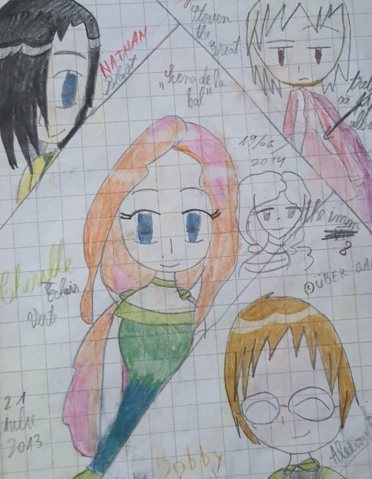
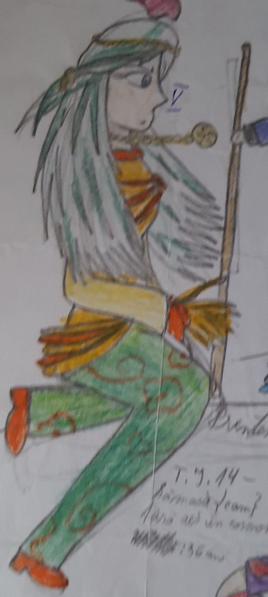
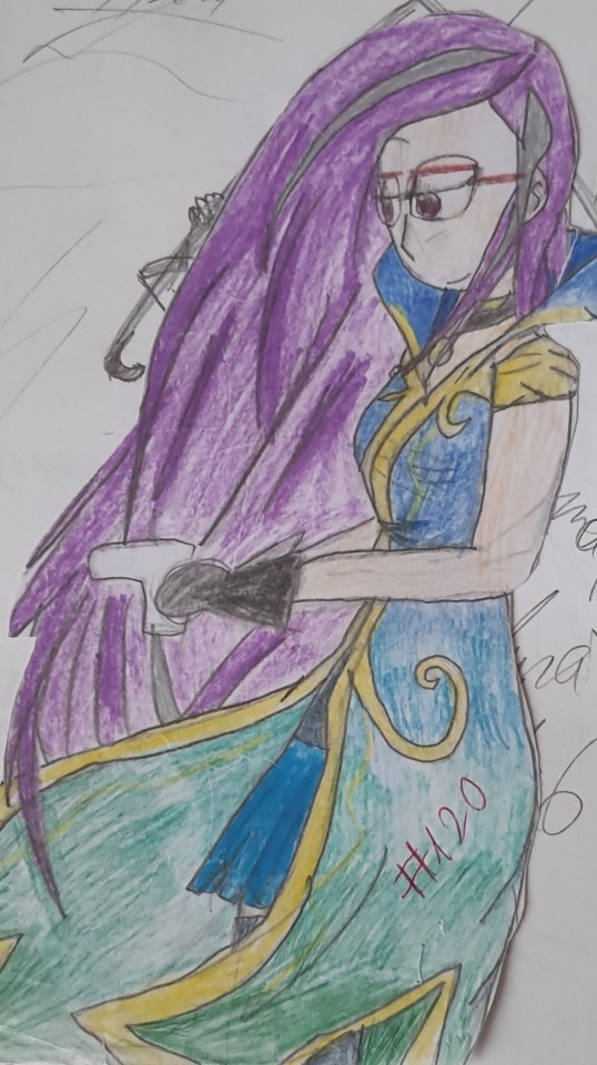
First row: July. Second row: late 2013. Not only was I growing more and more into my style, but I was trying my hand at original character design. (1st pic: Cherille and the others from the dragon story. 2nd pic: Ivy from the vampire story. 3rd pic: Thea, alien princess. 4th pic: Chleo, wanted criminal).
It's funny to me how clear it is that this is the first time I learned to do a gradient, then proceeded to use it everywhere.
And now for some of my most iconic 2013 pieces:
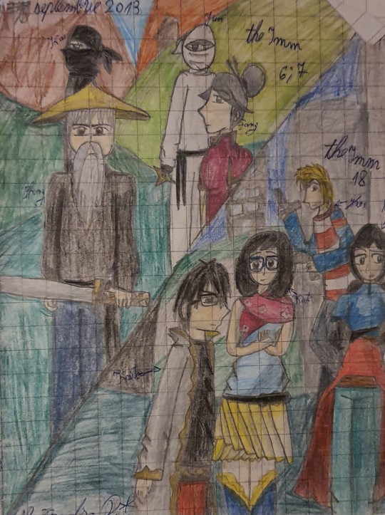
September (can't make the date out but it's somewhere between the 6th and 9th). I still love this picture. I like the colours even though I ended up changing the character designs to something more cohesive eventually. The concept of this drawing was combining my two stories taking place in Japan, the one on the left being a samurai one, and the one on the right being a modern time one (fun fact! These are the characters from what eventually became my first novel, The Image through the Thick Glass, but the very original ideas as illustrated here was a sort of whodunit/ revenge story, wherein Kaito's brother had been killed etc. It's crazy how different it ended up being from the initial concept!). I also have very pleasant memories of the drawing process, as I was in vacation with my family and we were chilling on a bench in the salt mines and having a snack (and I took my notebook with me everywhere).
In terms of art progress, the most noticeable improvements compared to just months prior are: 1. Side profiles have actual chins 2. Attempts to draw clothing folds 3. Attempts to do shading 4. Still anime influenced but slowly growing into my own style 5. Growing into my character design style
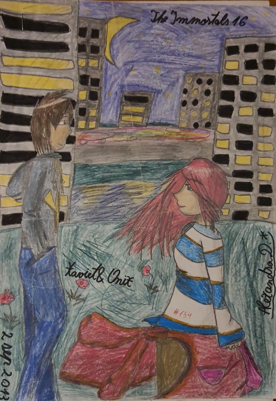
September 2nd. think this is single-handedly my favourite picture of all 2013. This is one of the first very serious attempts to combine composition, perspective, colour and mood. What I like the most is how the wind blows thriugh Onix' hair and clothes, and how the city lights reflect into the river, and how the cars are a mash of random colours to suggest the speed they travel at. This is definitely the highest effort and highest execution drawing I did in that year. And I still love the character designs (and concepts) today.
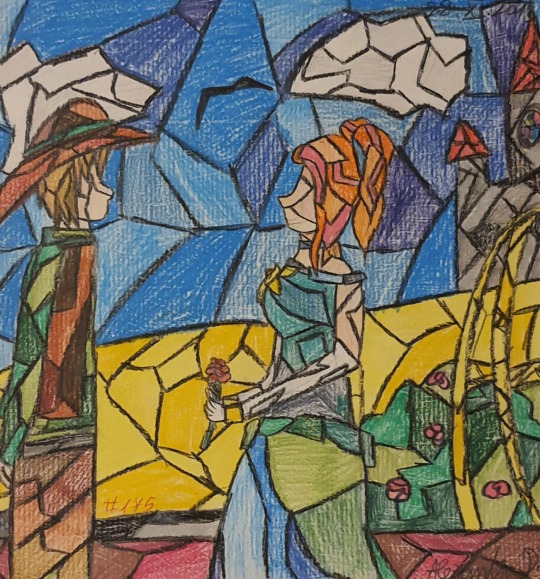
October or November. I like this because it is very experimental, and if there's a year that has been characterised by its sheer leaps and bounds in art, it's been 2013.
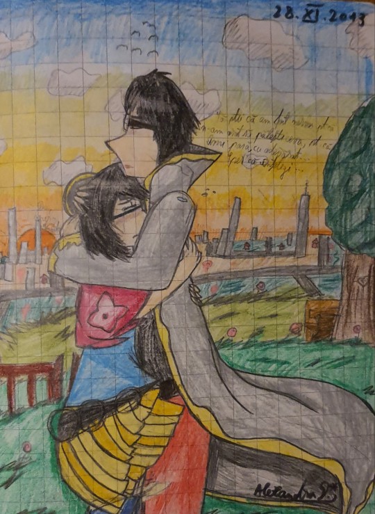
I had to check because I thought this was 2014, but it's actually dated as November 28, 2013. This is also one of my favourites, and perhaps objectively the best of that year. Compared to the Xavier and Onix pic, this had the added benefit of better contrast with the background and a more readable composition. I really like the mood of the drawing, too, it's very emotional. Also re: my gradient comments above, this is one of my first successful sunsets.
-----
The main characteristics of this year are: 1. Trying to adopt an anime artstyle 2. Experimenting with character design, as well as scene composition, perspective, gradients, shading, poses and so on. I didn't realise just how much I've improved over the course of just one year, it really seems like every new month brought a new skill with it, and the style at the beginning of 2013 and that at the end of 2013 can almost not be recognised as being from the same year.
0 notes
Text
I was watching some how to draw videos on YouTube yesterday.
Everyone should do this, by the way, even if you feel very confident in your work; you can always learn new ideas from other people. I've learned pretty basic things that I just had not thought about before that have totally changed my perspective and the way I draw.
However, if you do watch these sorts of videos, that does not mean that everything you hear is 100% right. And I don't mean that they are necessarily wrong either.
As an example, I was watching one about perspective and the face. I think being sort of sarcastic and negative was apart of this guys shtick. However, he was talking about how one piece of art was bad because it was an almost side profile, but you could see the whole eye as if you were looking at it from a 3/4 sort of view.
Yes, the perspective was off, but that isnt necessarily a bad thing. As an example, check out Ancient Egyptian art. I wish I could remember the term right now, but they painted people in a side profile view and still showed the eye as if you were looking straight on. Basically, they would paint the human body so that features and body parts would be painted from their most recognizable angle. That's just something that really intrigues me about Ancient Egyptian art.
Now, back to the painting this guy was talking about - if the artist had indeed painted the subject with the proper perspective, yes it would look more realistic, but I really dont think the painting would have been as striking.
I know that like... its not good to use the excuse "thats just my style" when painting something and the anatomy is super off, as everyone should learn those things to help them improve. But the anatomy or anything doesnt have to be 100% perfect and accurate all the time to make good art.
Creating art isn't black and white. There's all the colors in between, too.
1 note
·
View note