#i'm trying to learn how photoshop works lol
Explore tagged Tumblr posts
Text
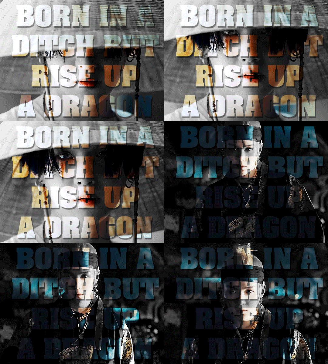
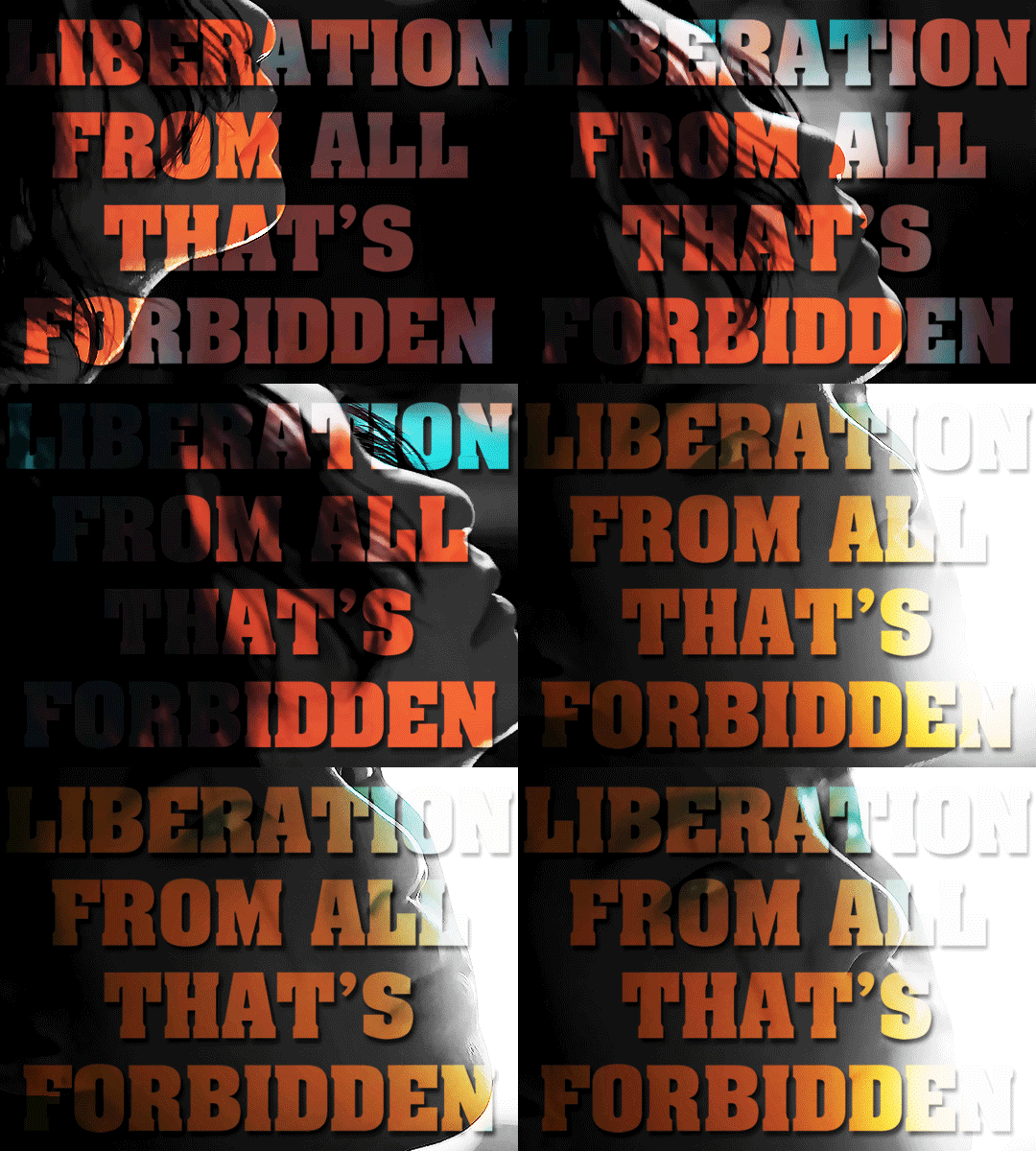
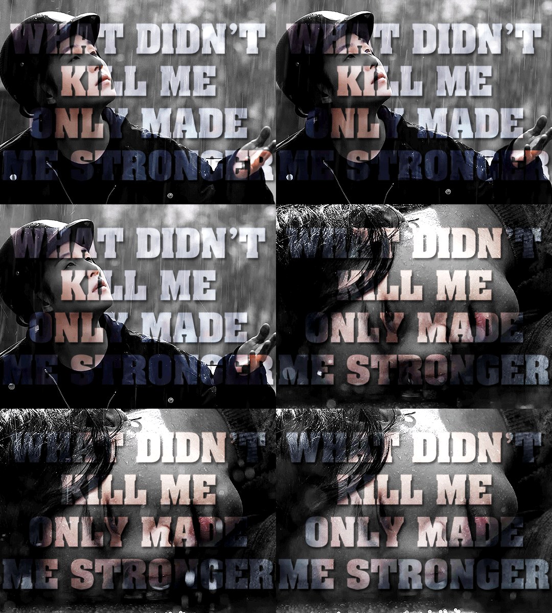
and I begin to bloom like a lotus flower once again the Agust D trilogy
#agust d#min yoongi#bts#suga#bts suga#bangtan#bangtan sonyeondan#bts gifs#btsedit#my gifs#i've had this concept in my head for a while now#and i've been trying to figure out how i wanted to do it#and i finally figured it out#the font is the pulp fiction font lol#i wanted to use the scarface font but it's paid and all the free versions look weird#and like... i'm not paying $30 for a font i'll only use once#and anyway the color effect wouldn't really work with it#this set right here is the entire reason i decided to learn how to make gifs in photoshop#anyway his eyes man#he has the most beautiful intense eyes i have ever seen#amygdala is very very hard for me to watch actually#and that's part of why this took me so long also#had to keep in mind what he said in the shoot sketch lol#cuz like... y'know really amygdala is faaaaaar from my favorite agust d track#but the sheer emotion in both the song itself and the mv#it's almost suffocating#he's tremendously talented and yeah i'm a lil obsessed tbh lol
99 notes
·
View notes
Photo



Grump and not so grump (Patreon)
#Doodles#Villainsona#Just Desserts#Lol#Happy to be the happy sona! Of course ♪#I fiiiinally got a haircut again yaaaay#Actually all the Reds did! We all went to the local barber and they do such lovely work <3#We got our hair cut on smol's birthday and we're all adorable!#It's really nice now that it's out of my eyes and off my neck - smol's is directly in her eyes tho lol#As long as she's happy haha#Continuing the happies trend <3 This was doodled before the brain weirdness but I'm mostly back onto it :)#Got brain-work to do about it |P But better is good! I like better!!#And I like pleased <3#There was plenty to be pleased about! :D Good dreams and good conversation and games and ah <3 Happies <3#Poor Charm gets none of the above! Haha poor lad ♪#The TVAU grump was just a spacefiller so not much more to that#She is cute tho even when she's grumpy#And then the Kaiein thing lol - so I mentioned a bit back about going to meet with one of Kaiein's ''inspiration sources'' ahem ahem#It's the same as before - they're honestly quite ineffectual once you get right down to it#I read basically everything they do in bad faith because there's no established trust - and also I don't care if they're trying to insult me#If they're trying to connect it's sad - if they're trying to be mean it's pathetic - which I mean? Good?? Lol#Them not having power over me in themself is a good thing I'm glad that's where I am currently#Basically they got me a how-to book on digital art - with an emphasis on Photoshop#I know SAI is a lesser-known program but they were the one who helped me buy it - they've probably forgotten#Maaahh it doesn't matter - not even into Evil Time about it it's just so nothing pff#Someday they'll learn that giving gifts isn't the be-all end-all to making friends. I know I would've preferred nothing :P#I'm just happy to be confident enough where I am that while I don't like it - it doesn't actually do anything to me lol#It's a better place to be :)
4 notes
·
View notes
Text
🍒 only fans boyfriend!toji headcanons 🍒

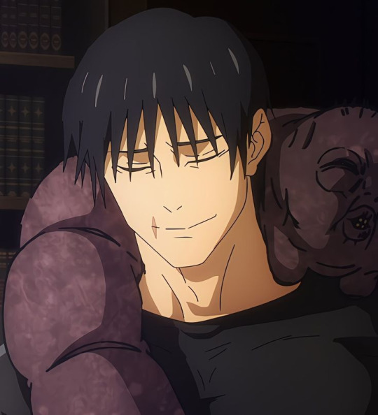

☆ pairing: toji fushiguro x afab!reader ☆ summary: blurb in which toji is your bf who helps you take your photos and videos for your onlyfans ☆ warnings: 18+ !! MINORS DNI !! dirty talking, nudes, sex work, penetrative sex, idk what else lol ☆ a/n: i'm having some serious toji brain rot send help


bf!toji who first thinks of the idea of you doing an only fans after taking his millionth video of him pounding into you. he won’t lie, initially it was because he was tight on some cash and didn’t wanna borrow from you again, but he was convinced you could be some insane OF celebrity. “i’m not sure about it, toji. i don’t want randos to see my face…” you surmise. “c’mon, we’ll cover your face, doll, if that’s what you’re worried about. i swear, we could be raking in thousands from this.” the prospect of coming across a large amount of money like that was enticing…
bf!toji who suggests that you start out simple. “maybe just a shot of you wearing somethin’ cute for the camera, i dunno.” after work one day, you both go to a lingerie store and pick out a sheer pink babydoll slip on, with silky bows on the shoulders. at home, you fish out an old mid 2000s digital camera from the garage and present it to toji. “you’re gonna be my sexy photographer, right?” you tease, as you change into the babydoll slip dress.
bf!toji who totally sucks at taking photos at first, but is a quick learner as he learns all your best angles and poses. turns out when money is on the line, he’s a hard worker after all. pictures of you sluttily sticking out your tongue, and the dress straps falling off your shoulders send toji into a frenzy, and you both take a quick sex break before going back to taking the photos.
bf!toji doesn’t know how to edit photos for shit so you use the minimal photoshop you know to spruce up your makeshift boudoir shoot. not to toot your own horn, but you kinda ate those pics up, and toji can’t get enough of it. at work, he’s partially distracted, fighting off enemies with half a brain as the other half is trying not to get turned on (one time, he did get turned on while fighting and it was awkward to say the least. the guy’s dead now so toji doesn’t really care).
bf!toji who creates the OF account for you because you’re feeling too shy to do so. the interface is confusing for both of you at first, but you guys get the hang of it pretty easily. you post the boudoir photoshoot and immediately close the laptop because you’re terrified of it flopping. “the damage of no one subscribing to me, toji, i would die,” you say earnestly, feeling nauseous. “if no one subscribes to you, i’ll fuck the memory out of you, don’t worry,” he says nonchalantly as he picks a random show on netflix to watch. he’s not bothered by this even one bit and you think it’s because he doesn’t care but really, it’s because he’s that confident.
bf!toji who wakes up before you the next morning for work and quickly checks to see if your photos gained any traction. “holy shit, doll, wake up!” he practically pushes you off the bed as he shakes you and you groggily wake up, irked at the intrusion of your slumber. “toji, i swear to god i’ll kill y-” “you just got 300 subscribers overnight, shut up.” he says, cutting you off and meeting your lips with a tender kiss. you quickly pull back, eyes widening at the news.
bf!toji who reassures you that you’re only gonna blow up more, and that’s why you need to post more photos and videos. it starts off small: simple photoshoots and more slutty lingerie. you arch your back as toji gets an ass shot with your camera. he slaps it hard, leaving a red handprint mark and snaps a couple more photos.
bf!toji who encourages you to start doing videos after reaching over 1k subscribers. you do a little strip tease/dance while toji films, but the first time you do it, toji folds almost immediately and has you pinned under him. you try again the next day, and graduate to longer more explicit videos – fingering yourself, using toys, and live streaming. toji buys you a couple cute masquerade masks to use, too.
bf!toji who loves it when you get donations during streams. he ends up creating an amazon wishlist for you of things you guys could really use around the house. he can’t remember the last time he bought you lingerie anymore because your donations would usually cover that cost. that being said, he always chooses lingerie for you. he knows exactly what other horny guys are looking for on girls. “doll, i know crotchless panties are awful but i know the male gaze – they don’t give a fuck. look, okay, i’ll buy you that one piece too, don’t give me that look.” he says to you as you throw in a bunch of lingerie of your liking in the cart.
bf!toji who finally decides to join you in front of the camera, giving your fans what they wanted. the way he sees it, he fucks you senseless for free every night anyway, might as well get paid for it. toji makes a show to tear your nice lingerie off you and leaves visible marks in your skin from his touch as he pounds into you or bites your neck.
bf!toji who joins you on your livestreams, and they usually end with you bent over a desk, skirt hiked up, and his arousal deep inside you. “you guys think she deserves to cum?” he asks the chat, feeling you clench against him. he knows you're close, and it turns you on knowing it’s out of your control on whether or not you get to feel a release. your fans love your pornographic and lewd moans, but with toji fucking you, you don’t even have to act for them to come out of your mouth naturally. speaking of your mouth, toji especially loves when you have a masquerade mask on while he makes your little throat gag. you love it when he tests your gag reflex on camera in front of an audience, and everyone can tell when they see you soaked through your panties.
bf!toji who surprises you by taking you on a lavish vacation to bora bora when you reach over 10k subscribers. “we built this shit together,” he says, talking about your OF fame and money. you can’t remember the last time you guys worried about paying rent, and he wanted to do something special for his slutty little doll. he got one of those seaside huts surrounded by a private deck. your breath is taken away by the surprise, and toji wastes no time getting all your clothes off and getting you into the water. the makeout session turns into him fingering you underwater as he pushes your bikini to the side. after coming all over his fingers, you give him a handjob under the water, and toji has to quickly climb out of the pool so he doesn’t cum inside it and has to request a clean up on the very first day.
bf!toji who fucks you more times than you can count in the water, on the bed, in the infinity pool, that one time super discretely under the blanket in the beach. you bring up the idea of filming a little here and there on vacation. “what? the grind never stops,” you say jokingly as you set up the camera on the tripod in front of the bed. he surprises you by using some silk ribbons to tie your hands back while he licks and kisses every inch of your body, focusing especially on your sensitive nipples erect for the camera. he blindfolds you, hands still tied back while he eats you out. the electrifying sensations are amplified in the darkness of the blindfold, and you make an absolute mess on the sheets and his mouth.
bf!toji who uses the last night of your trip there to convince you to film one more video, this time on the private infinity pool outside your hut. you come out with a black strappy bikini with a sheer babydoll cover up. “don’t take off your clothes just yet, doll. just come in the water.” he commands, and you slowly get into the water. his silhouette looks ethereal in the golden hour of the sunset as you approach him. he cradles your jaw and kisses you deeply and passionately.
bf!toji pulls away from you and guides you to the edge of the pool that stares out to the pink sunset and the turquoise ocean. “what? gonna fuck me while looking at the sunset like a stupid romantic?” you jeer, poking his chest. he chuckles nervously. “eventually…”
bf!toji who pulls a small black box from behind him and opens it to reveal a big shiny diamond ring. tears start freely falling down your cheeks and you don’t even hear what toji is saying (you feel a little bad – he must’ve prepped this speech for a while but you were far too emotional to process anything). all you do is nod your head vigorously as he gently puts the ring on finger. a perfect fit. and it glistens just perfectly in the dimming sun.
fiance!toji who then fucks you into the sunset like a stupid romantic.
#jjk#jujutsu kaisen#toji fushiguro#fushiguro toji#jjk x reader#jujutsu kaisen smut#jujutsu kaisen toji#toji x reader#toji x y/n#toji fushiguro x you#toji fushiguro x y/n#toji fushiguro x reader#toji fushiguro smut#toji zenin#zenin toji#toji zenin x reader#toji zenin smut#toji zenin x you#dilf toji#jjk toji
537 notes
·
View notes
Note
Several things: -LOVE your art, it’s amazing! Especially the one with Crowley and Aziraphale under the umbrella - which software do you use? Your art always look SO gorgeous (cheeky quote from GO right there lol) - how did you get so good at drawing?And thank you for encouraging other people to keep drawing and being so kind as I sometimes can’t help but compare my sketches to others and feel silly, but I guess it’s just a learning curve… Thank you so much for bringing your art to the world!😊
Thank you so much!!
I use Clip Studio Paint for drawing and Photoshop for small adjustments!
2. Haha thanks! Honestly...it's the hyperfixations. I managed to improve a lot in just a year because I've been drawing SO much cos there's so many shows and movies I became obsessed with that I wanted to create art for. So by drawing a lot I just naturally improved. For example these two Illustrations are just a year apart:
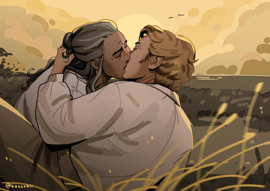
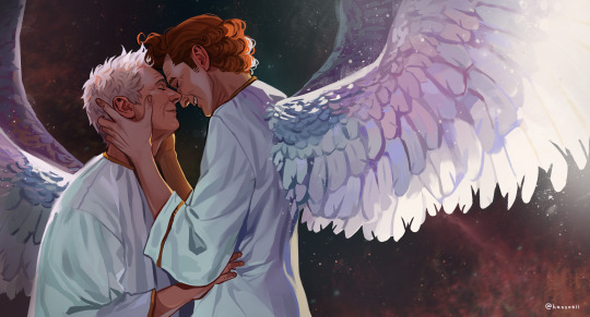
I actually didn't actively try to improve, it's been a while since I did proper studies (I just don't really have the time for it between freelancing and art school), it just happened.
But I can absoluetly recommend going on YouTube and look for some art tutorials if you actively want to start improving! There's some channels that helped me so much back then:
moderndayjames
Incredible shape language and super insightful tutorials on all kinds of topics! I learned so much from him.
Ahmed Aldoori
So many awesome tutorials on so many different areas of art. Love it.
Marco Bucci
Incredible tutorials on color theory and understanding how color works in general! Learned SO much from him!
Sinix Design
The OG tutorials I began learning from. I watched his videos religiously as a teen. I adore his painterly style and adopted it in some way, haha.
Ethan Becker
This dude sometimes drops these tiny art tips that just completely blow my mind and that I adopt immedietly. He's super entertaining but also such a great teacher.
And I can also recommend checking out this book by James Gurney if you want to get better at colors!
And for anatomy I highly recommend the Morpho books!
But improvement doesn't only come from drawing a lot. A lot of the time I don't draw for a while and just study the world and artists around me and suddenly I improved when I get back to drawing. Don't ever overwork yourself to the point that you don't enjoy what you do anymore. Take breaks and listen to your body!
I learned to try and not compare myself to other artists, which helped a lot. Through conventions and social media I made so many lovely artist friends and realized how we're all struggling in a very similar way. A lot of us don't even really know what we're doing most of the time, haha. But we help each other out, it's such a wonderful community. I think when you're not actively part of the community it tends to feel like other, more successful artists are some kind of art gods that have perfected the craft and never struggle. But believe me, all the artists you admire go through rough times all. the. time. Sometimes what they do feels easy and natural, other times (more often than not) it feels like you have to try and learn how to walk all over again and you start to doubt your abilities. I personally go through that so many times.
So what I'm trying to say is that instead of comparing yourself to the artists you admire, learn from them instead. Ask questions, befriend fellow artists, study the artists you enjoy and just have fun with it!
And finally I thought it would be fun to share some of my horrendous Johnlock fanart from a decade ago for some motivation:
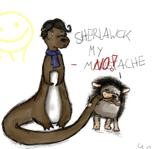
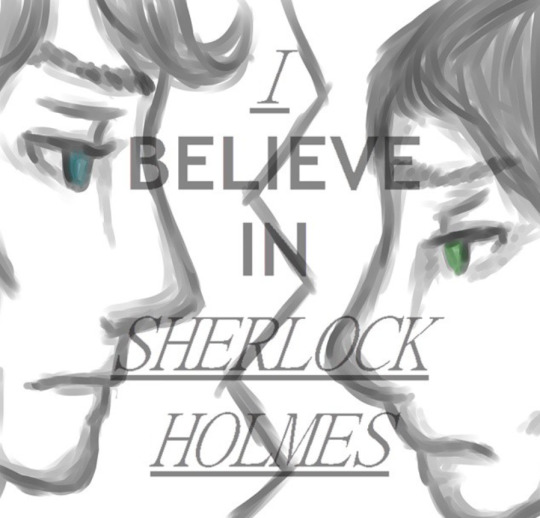

I hope my answer didn't overwhelm you, but I thoight it would be nice to give a more detailed answer!
Have a wonderful day and keep drawing! :)
473 notes
·
View notes
Note
Can you make a post about how you choose colors plz ? I'm really curious about your process
this is such a difficult question to answer bc really the way i approach colors is mostly reliant on what I find interesting and I do struggle with them, but i'll try my best to answer!
before I even start working on my piece, I like to gather a bunch of refs and think about the vibe I want to achieve since colors and values change the piece drastically. personally, I like to play around with purple a lot so usually I start with a light purple for the undertone/sky background color and I find that it helps a lot to work above that rather than the white of the canvas, it also helps me bring purple back into the shadows! I think my "secret" to why my paintings are so colorful is that I start by blocking in as many colors/shapes as I can using a brush with the color dynamics setting on, I find that it creates a good base fast without having to manually pick every single hue by hand. It's also important to try many different palettes and not be scared of scrapping something and repainting from scratch bc that's how you're able to tell what works and what doesn't! it also creates many ugly stages lol but here's a few screenshots from my process video of Under The Peach Tree as an example of how many times I repainted it
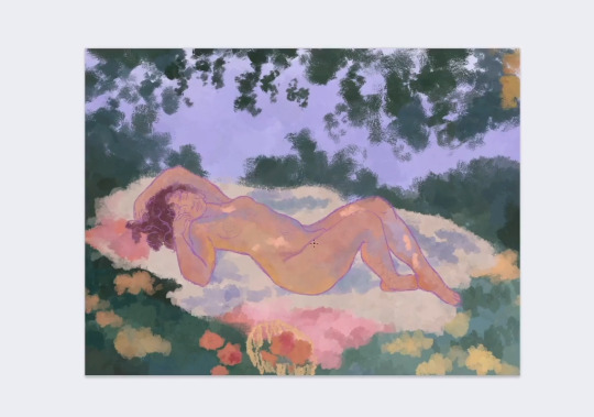
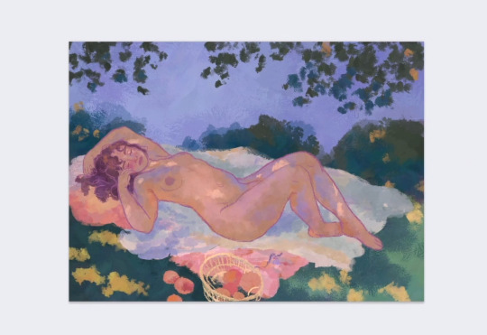
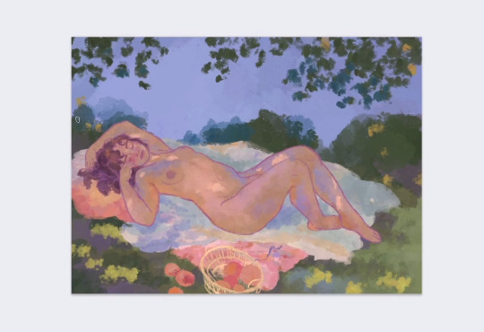
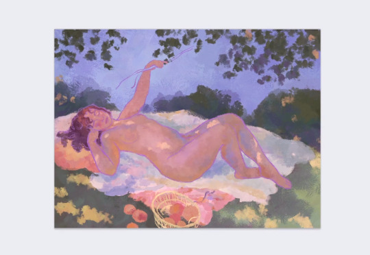
I like to keep in mind what the highlight color will be, for example in this painting I went for a skintone that's closer to the colors of the peaches and the little blanket bc that will tie everything together and make the character feel like they belong in the environment. it's similar in other cases too, for example if the grass is more cool toned then I'd go for some red pink flowers. there's a tool in photoshop that's called selective color which I use a lot as well as curves or color balance, they're all used to adjust the colors that you already have like if I feel that the yellow is not quite right then I try to change it up through those tools and see what's better. it's really a lot of trial and error and just trying things out and seeing what you end up liking, it also ofc comes with practice and learning compositional values.
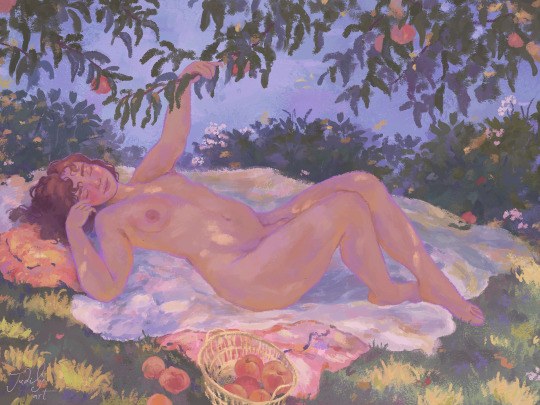
I hope this helps 💗 I do upload my process on my patreon, and I've been planning a video specifically on how I paint skin since it's an interesting topic!
81 notes
·
View notes
Note
Okay, I need context— WHAT did Mikaila trace??
I think she's traced a few things. I kinda thought this was common knowledge she does this, lol.
But the example I saw was a frame of clay face from the Harly Quinn show?
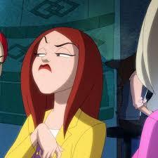
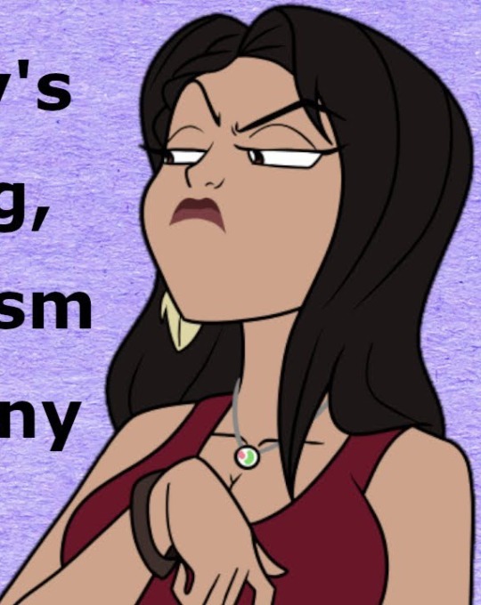
I thought Essence of Thought drew this one, but maybe it was Mikaila? I don't know.
Tracing discourse is more of an art hobbiest thing. Not really something people who do it for a living worry about. The issue with tracing is that if you do it instead of learning anatomy, rendering, the design fundamentals, etc-- you're just never going to improve.
But like, if you're working as an illustrator, animator, graphic designer, concept artist, etc. You need to know these things.
Photobashing is a very useful skill when you're a professional artist. It's basically like, high skill tracing, where you're rendering directly over/incorpating reference directly into your image. Here's an example, this concept art for Resident Evil Village is photobashed, and that's pretty industry standard:
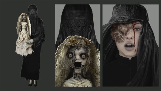
You can see the photographed elements have been integrated directly into the painted elements.
There are deadlines to be met, prints to go out, and finals to get delivered. Especially with concept art, that's just preproduction stuff, it's really not the time to lovingly render every single aspect of something you're client or project manager's going to make you redo 3 million times, if not totally scrap to go in a different direction.
Photobashing is a cheat you need to have all the skills required to render, paint or draw something properly already to do right though. You need to be able to match lighting, perspective, scale, etc. Or else you'll get fired for being incompetent and handing in something that looks like a bad photoshop job.
I wouldn't photobash while I'm painting on my own personal time because, like, why am I painting just for fun at all at that point, but. It does take longer, however.
Doing figure drawing exercises and studies are also really important to keep your abilities sharp-- it's like an art workout. Tracing or photobashing those defeats the purpose.
Honestly, I really don't care if hobbiests trace personally. If they get that they won't improve and they're okay with it, who am I to poopoo on what they do for fun?
Mikaila charges way too much for her commissions given her skill level, but. Like, you can just tell Mikaila is very limited in her abilities, so . . . You know, it's not really false advertising? It's hard to fake being a better artist than you are, lol. You'd have to be stealing art and impersonate a real artist to do that.
I think hobbiests see tracing as a sort of "stolen valor." And, yeah, it's a little funny to me if Mikaila is in her 30s and trying to hide how she does her work, but. Unless Mikay starts trying to pass someone else's work as her own to scam people, I don't give a shit, personally.
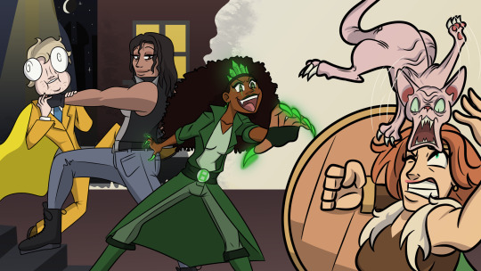
I don't want to bully here in a way I don't think is cool, but like, look at this. Look at the mismatched perspectives, anatomy and styalization. I'm kind of shocked anyone can't tell this is all traced:


#lily orchard#lily orchard critical#anti lily orchard#lily peet#lorch posting#lily orchard stuff#youtube#mikaila orchard#poke madhouse#artists on tumblr#digital art#artwork#art#eldrich lily#liquid orcard
34 notes
·
View notes
Note
I wanted to start making gifs, do you have recommendations for software?
Heyyy c:
I'm definitely not a pro gifmaker myself, so I guess I'll just tell you how I do it?
For the longest time, I've made my gifs with Instagiffer. There haven't been any updates for almost 10 years now, which means that some features are outdated/don't work anymore, but the core program itself works perfectly fine & is easy to use. (Some of the outdated features I encounter are: the option to load yt videos into the program from the url no longer works (I usually work around this by downloading the video), and the social media size warnings are wrong, but that's not too bad, especially since you can turn them off.)
Then I started using the website Gifcap to record the basic gif to later edit in Instagiffer (downside is, gifcap will often have a little fragmented/pixel-ly look. I personally think it adds a little funk to the gifs, but often time it's distracting, so I'm actually trying to find a new way to record gifs). You can theoretically already use Gifcap to make gifs, your options are just very limited (and by that I mean, the only customization you can do is cropping).
Recently, I've "abandoned" Instagiffer (except for making some really quick gifs/edits) to switch completely to Photopea for gifmaking. Unless you already know your way with programs like photoshop, this will probably be overwhelming. It took me a while to get used to it and find out what things do and what I even can do. But I love it, and I don't think I'll stop using Photopea any time soon (even though my 6+ years old laptop struggles quite a bit lol). And while I've never used it, there's also Ezgif. It looks like a less overwhelming way of customizing gifs, so I guess that's a good alternative for making gifs in browser?
And uuuhhh... yeah, that's it! I'm definitely still learning & finding ways to improve my gifs, but that's where I'm at rn. c:
If you have any other questions or other things you want to talk about, my asks & dms are always open. <3
#praying that this is understandable lol#i'm currently figuring out how i can get a gif/png sequence with programs like vlc player so i dont have to use gifcap anymore...#but that's uh. more difficult to figure out than expected!#jester answers#cachow-it
14 notes
·
View notes
Text
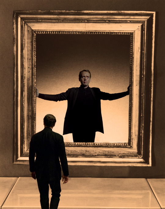
The sun was shining too bright for me to be worrying about my deadline so I guess I'll use this rare occasion to make a pinned post.
When I started blorbo posting it was simply because "If even I, who knows next to nothing about British and American TV series, can see that Patrick McGoohan was criminally underrated, then maybe this blog has a reason to exist."
The only thing I ever learned about blorbo posting is from the Columbo fandom. They have fun, and they love their blorbo. As the kids say: Love and peace on planet earth.
But McGoohan is a challenge and will never stop being one. His public image, both in front and behind of the camera, isn't that of someone who would be pleased with blorbo posting. I don't know how other blorbo bloggers feel, but I just wish I can hold a conversation with my blorbo that doesn't bore him to death or anger him to the point of throwing me out of the room.
Judging someone who talked about his nervous breakdown like it was just a cold isn't something I like to do, especially online. So if I have to talk about McGoohan, I always get quite nervous. I can only say that I regret we didn't get to know him as much as we would like to and I really wish he was still here with us.
I know many of the decisions he made, he made it for future generations. It's my privilege to say that my blorbo's gift to the three-year-old running this blog has been her greatest pride as a blorbo blogger. And her hardest and most honourable task is not to mess it up.
I actually didn't create this blog to please McGoohan (the ladies can testify to that, lol). And I think I make fun of him more than I should. But I hope he knows that life as a blorbo blogger isn't easy when your blorbo is Patrick McGoohan and maybe, just maybe, he wouldn't be too hard on me.
And just in case anyone is wondering what the hell I'm doing on here, here's a short guide to my blog.
my stupid vid My McGoohan fancams are what I personally consider the funniest part of my blog. But they can be somewhat serious too, I think.
my lousy photoshopping This can mean just about anything. McGoohan as The Little Prince. McGoohan in Ingmar Bergman's films. Anything that I made with photoshop. So I have some more tags to categorize it.
mcgoohan at the museum What I love to do the most in photoshop is putting McGoohan into paintings. I don't know why. Maybe because it easily hides my lousy photoshopping skills. Or maybe because my blorbo is as beautiful as a painting.
mcgoohan album covers What can I say? “But you don't really care for music, do you?”
mcgoohan fashion Let's be honest, don't you love a beautiful blorbo?
mcgoohan posters I sometimes try not to misinterpret McGoohan's works, I don't know if I succeed though.
no context mcgoohan Mostly just McGoohan sitting or standing somewhere. But I love it nonetheless.
mcgoohan for kids and mcgoohan anime Well, it's exactly what you would expect it to be.
mcgoohan arthouse One day I'll retire from blorbo posting and go back to watching arthouse films.
mcgoohan stickers They are not as cute as cat or bunny stickers, but they stick all right.
the prisoner redux or anything redux means my lousy photoshopping for that particular series/movie. But when there are so many McGoohans in one post I get tired of tagging and I just give up.
I think that's enough of my lousy photoshopping.
wild mcgoohan in his natural habitat McGoohan as God intended him. Trying to not give away too much information in interviews.
mcgoohan lore McGoohan in someone else's words, including his daughter's. Needless to say, my words should not be trusted. You'll know them when you see them.
my gif McGoohan gifs, mostly for losing tumblr polls. Also for making this blog popular with the ladies on here.
village poetry If there's one thing that McGoohan might like about this blog, this is probably it.
village soundcloud Blorbos and song lyrics go hand in hand - Tumblr proverb.
mcgoogoo and me Just me rambling about my McGoohan dreams and my hard life as a blorbo blogger.
my lousy shitposting It has something to do with McGoohan I'm afraid. But it's fun.
I know this blog has become quite predictable and it's filled with half of my life's story. But if McGoohan was really who I think he was, that would be the least of his problems with my blog.
And finally, my hiatus is a running joke that I'm getting worse at, I hope.
20 notes
·
View notes
Text
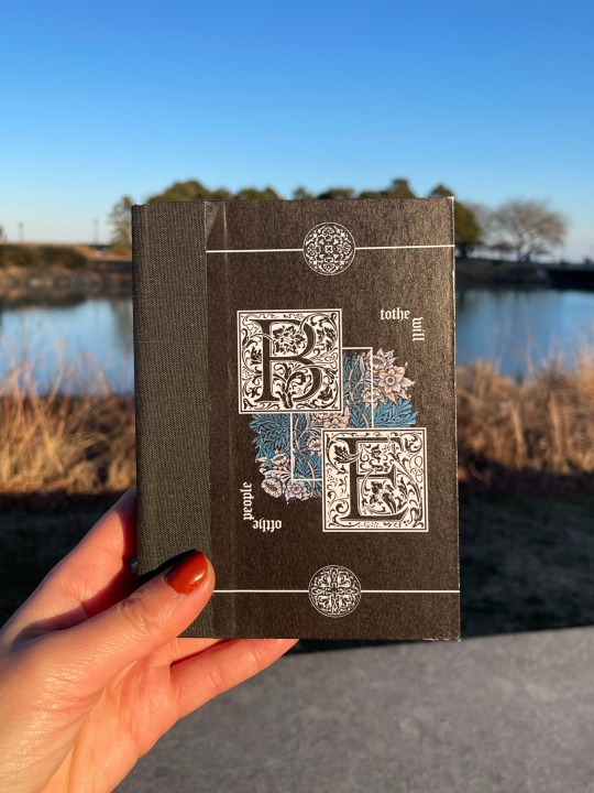
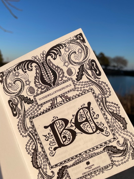
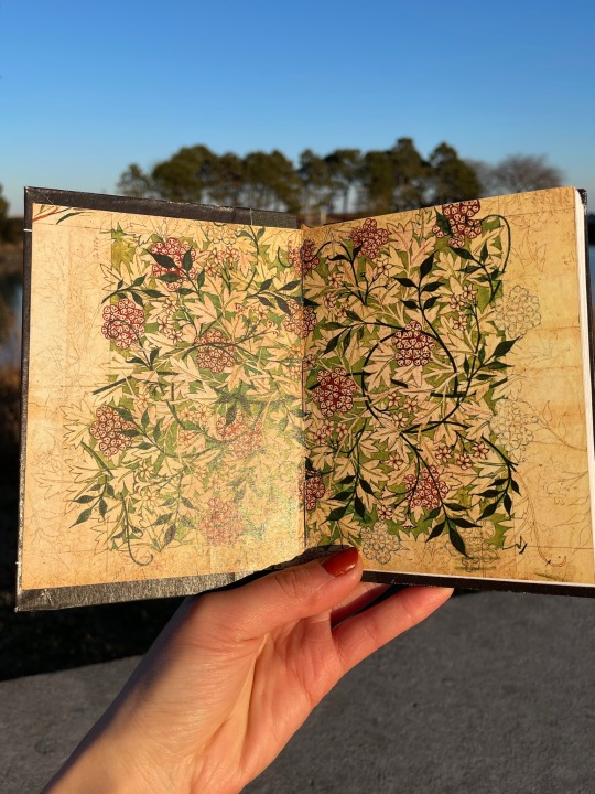
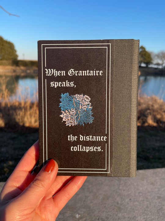
BE by tothewillofthepeople
Grantaire is earnest in this, and it’s heartbreaking. Enjolras can’t look away. This is just a rehearsal. Grantaire is still wearing skinny jeans. They have lights and phones and textual analysis and thousands of years of history between now and then and yet– When Grantaire speaks, the distance collapses. (Grantaire as Hamlet.)
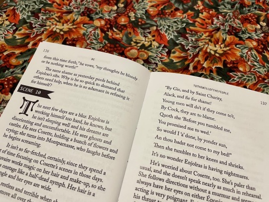
Title: Middle Ages Deco Headers/Accents: Letter Gothic Standard Body text: Adobe Caslon Pro Case title: Goudy Initialen
38,667 words | 224 pages
Binderary book 1: a long-favourite EXR fic. I love wild Les Mis AUs and I love Shakespeare and this is all of that in such a lovely lovely form. Stage manager Enjolras is inspired. Also, I've been frothing at the mouth to use my special blackletter fonts and go suuuper overboard designing and this was Perfect for that purpose.
More pictures/design/process under the cut.
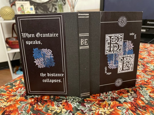
Design and Construction Case: Flat-back case binding with bradel board covers and spine. The spine cloth is Hollander's pearl linen in charcoal grey. The painted titles were done in Amsterdam acrylic ink in silver, with a pair of scissors because I don't own a painting brush and likely never will. The cover papers are printed on 80gsm white printer paper and glued with a regular Elmer's glue stick and PVA on the turn-ins, and the whole case is sprayed with workable fixatif to (hopefully) preserve it longer-term.
Covers: The front and back covers were designed in Photoshop. The centre image is a William Morris pattern, and the top and bottom little circles are Renaissance printer's ornaments (pngs by the lovely @helle-bored of Renegade Bindery) that I vectorized in Illustrator (Illustrator and I were sworn enemies until this month. Now we're forced friends. Like enemies to lovers).
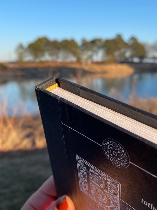
Insides: Endpapers are a William Morris pattern recoloured in Photoshop to be a richer green and red, obv, for EXR. Printed with inkjet on 80gsm printer paper and glued to gold cardstock, and sewn into the textblock. Endbands are pre-sewn from Hollanders, dyed gold with acrylic ink to match the endpapers.
Typesetting Typeset was done in InDesign. This is a one-shot with scene breaks, so to match the theatre theme of the piece I replaced the horizontal line breaks with flagged scene numbers. I tried to strike a balance in the typesetting between classic Shakespearean aesthetic with the blackletter drop caps and cover fonts versus what you might see in a theatre script book with the monospace accents. The title spread uses a transparent decorative frame, again from Helle's collection; the large box in the middle with the title was part of the original frame and then I duplicated and resized it for the author name and my imprint.
We All Do It, or, the Mistakes Section I somehow managed to print the cover papers nine inches tall and didn't see a problem with it until they came off the printer. Truly who knows how that happened. I was working on the case at two in the morning and cut the spine cloth the wrong length three separate times...earned the measure once cut twice badge big time for that one. The endpapers were an ordeal and a half for real. What I learned: print them too big and glue the cardstock to the back, then trim the paper to size, not the other way around otherwise you'll end up with big ugly gaps where the trimming was a few millimeters off. Whoops.
And...more pictures
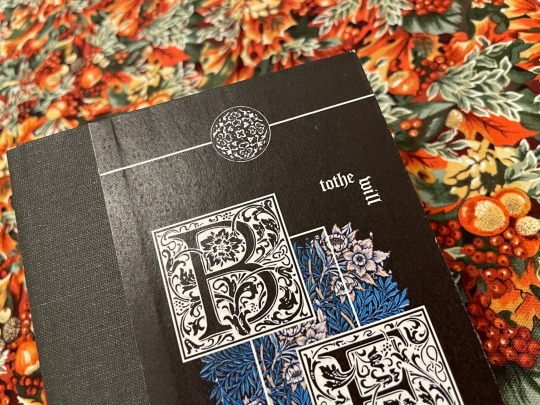
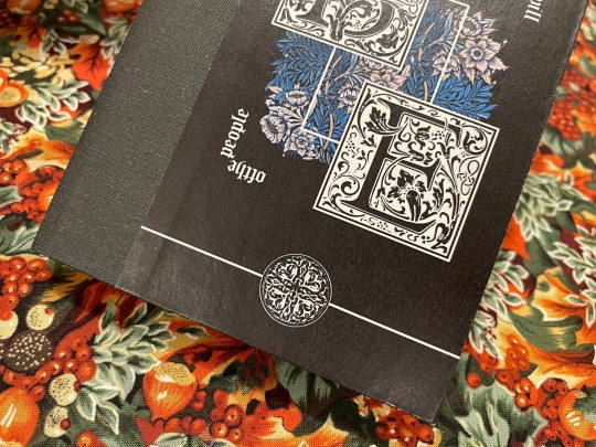
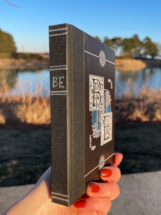
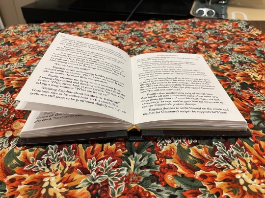
I'm particularly pleased with how the covers here came out so here's closeups. Also, the arc on the spine that you can see in the endband on the last one is really pleasing to me lol I fought a war trying to get the flatback hinge calculations right.
222 notes
·
View notes
Note
Hii, I hope you’re doing great and have had a wonderful start to 2025! You already know I love all your DA fanworks because I’m yapping about them non stop 24/7 but since you’ve been posting more art lately (that latest Lucanis study was SO AMAZING 10000 out of 10 highly recommend staring at it forever), I wanted to ask you if you had any tips you’d be able to share for someone who wants to learn digital art (my delulu 2025 resolution is to try my hand at it lol, we’ll see how that goes): from best apps to use to techniques or anything you think could be useful. For context, I’m familiar with sketching and drawing on paper, but have never done digital art, so my question is less about the mechanics of drawing and more about the medium, if that makes sense. Thanks so much in advance!
Thank you for the ask! <3
AND TYSM FOR THE LOVE ON MY ART IT'S SO APPRECIATED!! ;-; <333
I'm so glad to hear you wanna get into digital art for 2025! I'm happy to share some things that helped me get into it and bits of wisdom I've picked up from others along the way.
Digital art is an awesome medium that gives you a TON of freedom to basically create whatever (so does traditional but obviously with a few more practical constraints like materials etc.) - that being said when you're first transitioning from traditional -> digital it can be a bit finicky. Give yourself a LOT of grace/patience because just getting the hang of the basic mechanics of digital art can be a steep learning curve (at least it was for me).
I'll put everything below the cut bc this will be long and full of rambling.
App Recommendations
Recommendations for apps depends on the kind of digital drawing you're going to be doing. I have an iPad so I can only really recommend apps for iPad lol.
If you have an iPad, I recommend Procreate - I love it, it's what I've been using for the last year or so. It's intuitive and fairly easy to pick up for beginners (and there's a TON of tutorials on Youtube on how to use it/intro to the software).
It's easy to download custom brushes/patterns/textures into the app. Procreate also does this neat thing where it automatically records all of your brush strokes so you can make process videos without having to go 'oh, I should screen record myself drawing this so I can play it back later!' <- nice for someone like me who is very forgetful lol.
I tried the adobe one too (forget what it's called), and I think Autodesk Sketchbook as well a long time ago but I didn't love them. I always go back to Procreate lol.
If you have a computer/PC set up then I assume you'd be working with a tablet. Apps for this kind of drawing would be things like Photoshop/Paint Tool Sai/Clip Studio Paint. I'd recommend watching a few Youtube speedpaints by artists who use these softwares to see how they function and if they would be a good fit for you but I don't have a tablet myself so I can't offer much guidance there.
The Right Tools for the Job
I don't know if you've ever heard this, but I used to hear it all the time. The tools/software shouldn't make a difference, a good artist can work with whatever they have available and make a masterpiece.
And this is true! For expert artists. I've seen some amazing artists pull off masterpieces in MS paint without layers/brush pressure sensitivity/etc.
This is not quite so true for novices (in my humble opinion and heavily coloured by my own experience).
When I first started using procreate and was just using the default brushes I hated absolutely everything I drew. Nothing looked right. I couldn't even make a simple sketch without hating it. It took me a long time to admit that the default brushes in Procreate were just not helping me create what I wanted to create, so I caved and started buying custom brush packs made by other artists. I'm not saying if you use Procreate you'll run into the same difficulty I had, just that if you do find yourself getting frustrated with the default brushes being hard to master at first, don't be like me and feel like an utter failure instead of finding the right tools to help you succeed.
I really like Jing Sketch's brushes, I use them ALL the time.
And now that I'm more experienced, I can use those default brushes and actually prefer them in some instances.
The Right People to Learn From
There's a ton of great artists out there who make digital art/general art tutorials, who I learned a lot from.
On Youtube, check out:
Sinix Design
Marc Brunet
ChrissaBug
On Instagram, check out Derek Domnic DSouza (lots of great content about Procreate in particular, but also just in general very helpful with digital art tips). He also does free workshops sometimes :)
And that's about everything I can think of! Hopefully that answers your question! <3
#asks#thank you for the ask!#always happy to chat about art and such#although i'm still very much a novice myself lol#hopefully this was helpful
7 notes
·
View notes
Note
Seeing your art on my dash literally nakes my month oh my god so beautiful and stylish!!!
Idk if you've discussed this, but how do you find such cohesive and vibrant color palettes for big pieces?
Oh wow got to ask the hard questions huh. Lol I don't think I've talking about this. Becuase it's hard to articulate. A lot of what I do in art is just trial and error. I don't have a set formula or pretext color palettes for each mood or setting (tho I really should would save me a lot of time)
I mainly mess around with a ton of color layers in Photoshop on various blending modes at various opacity levels add in adjustment layers (mostly Selective Color) and play around with the values of the file and I let my artist intuition lead me to the atmosphere I'm trying to portray.
Here's a snapshot of just how many I used to get to the base color scheme for my Mueasume picture. ( and I used more later on in the piece.)
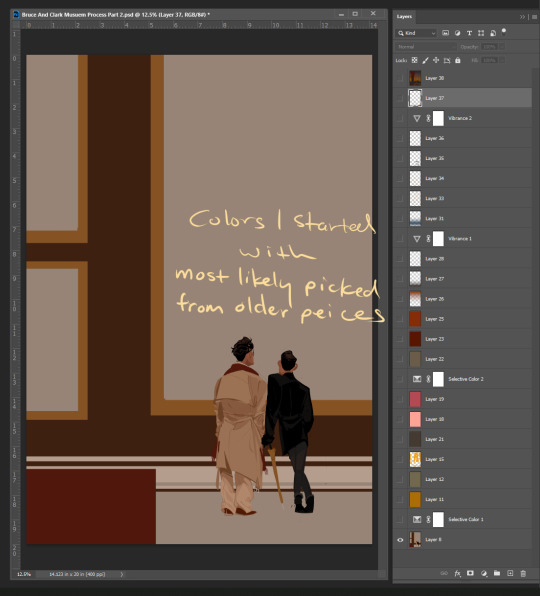
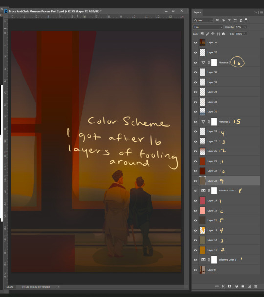
But I know that doesn't help you so here are some tips.
Know your mood and your setting for your piece (Time, Weather, Indoor Outdoor, Sad, Happy, Angry, etc.)
Learn the color language for each mood and setting Pintrest is great for this. Make some boards.
If your colors are not cohesive and you working digitally make a new layer Fill that layer with whatever color is the main mood of your piece (red for anger blue for sad etc.) and set that layer to like 50% opacity and then just go down the list of your layer options until you find something you like.
You can repeat this step with other layers and become the basket case like me and also have 20+ layers in your file lol.
You could add a color fill layer set it to Hue, flatten the image, then cut that whole image revert back to before you made the color fill layer paste your monochrome picture on top of your original piece, and then play with the monochrome layer on different layer settings and opacity
And if you have the option to use Selective Color do it and play with the sliders. The ability to tone down a hue in each value is a game changer.
You can also use Hue and Saturation tho you need a light hand if you're going to play with this setting.
I hope some of this help and I'm sorry if it wasn't clear feel free to send me another ask or message me through the chat feature and I can try to clarify.
82 notes
·
View notes
Note
Hey! I’ve been following you for a while and I really love your art, it’s absolutely stunning and I love the way you paint and capture anatomy. I know this is a bit of a broad question but I was wondering if you had any tips on getting better at painting digitally and studying anatomy, maybe more specifically blending, colour picking, and structuring anatomy in a way that looks somewhat realistic?
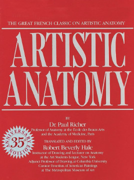
Thanks and I'm glad you enjoy my work long enough to be following me for this long! I definitely love drawing a naked body that's for sure haha. In terms of tips for getting better there's a few things I can mention but it's going to fall broadly in the general answer of "study", because this is the most sure fire way to be able to understand what it is you're trying to emulate in your art. There are different ways to study, and they teach something slightly different. For example, doing studies from life (live drawing classes) help me understand movement in a way studying from a photograph cant, simply because you're seeing the same model in different poses in real time, you can see how the fat and muscle moves around as they shift to different positions. So they're not technically moving the whole time, but you're still seeing some movement there, and understanding what sticks to what while it rotates and bends. Studying from photographs can help give you time to do some real deep dives and investigate where different bones/muscles sit while someone is in a particular position. There's also the opportunity for understanding how shadows may be formed by the body as typically photographers are more conscious of how the subject may be lit than what may be available in a live drawing class. Beware though, as more things are photoshopped than you realise, not all photos represent reality. Especially glam and fashion photos. It doesn't mean its bad to want to have these effects on your work but just be conscious they might not always be anatomy accurate if that's what you're striving for. I sometimes make a conscious decision to go against what is anatomically correct for a certain effect myself. A book I have been recommending for years for anatomy is Dr. Paul RIcher's "Artistic Anatomy". It's great for understanding muscle structure intimately - it's designed specifically for artists, but with the idea of trying to stylise the diagrams as little as possible for the sake of understanding the human form. There's a lot of great info and detail in here, but beware, there is not a lot of variety in body structure (at least not in the edition I have which is missing female anatomy I think already so I'm not sure what else I don't have in here). So you'll be able to understand function a lot from here but you wont be able to learn a lot about fatter body types sadly.
Colour picking is probably the most difficult for me to explain easily, as I have spent a long time winging it, then studying it, then being really experimental with it. I could write a lot a lot about this but to spare making this post any longer I'll refer to another fun book just for getting started on some frequent and common terms called "Color and Light" by James Gurney.
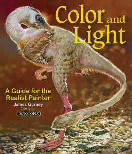
I also love that he uses like, dinosaurs for everything in here lol. It's a great starting point that can give you some go to ideas that you can then experiment from there. It's not very authoritarian (or at least that's what I feel), and doesn't push anything forward as a hard and fast rule, just showing what affects some colour combinations might instil in someone.
As a whole, I've gotten better at painting digitally by studying traditional painting techniques. They theories are basically transferrable one to one with some few exceptions. I tend to blend my colours by simply using a soft round brush in Photoshop with a low opacity. Much the same way I would with a real canvas, with a large round brush and diluted colour. I hope this answers your questions in some way. I tried to be not too specific only because this answer would be at least another 30k words lol because this is something i think a lot about! I love technique! If I ever stream again, feel free to pop in and ask more questions where I might be able to show some stuff in real time! Not sure when that will happen though!
Also the way i do stuff isn't a "correct" way either. I like painting from imagination so this is how I make that work. Some people like to only work with references for every piece, and that is a completely legit way to create stunning art as well. Good luck!
73 notes
·
View notes
Text
SIMS RELATED PROJECTS/UPDATES
My spring break is coming up in a week and holy crap do I have plans on plans on plans, especially since my summer is gonna be full of school + internship + HOPEFULLY friggin' graduating with a BA in Psychology so that I can start applying to grad schools.
Read more iffin' you'd like! It's long! Here's a picture of my golden retriever napping on her brother's food bowl to entice/entertain you:
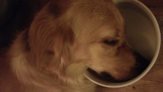
god she is so precious i would literally kill for her
GOAL 1: MASTER GSHADE/ReSHADE
I know that some people are sticklers for this but my thing is that I had no gee-dee clue what I was doing with ReShade, whereas Gshade just kinda clicked and worked for me? That said I have a bunch of resources for learning ReShade so I might end up moving back to it at some point.
My main issue is figuring out the order of all the different effects. It obviously matters, I'm sure people smarter than me have tried to use presets only to be like "why tf does this look absolutely nothing like the baller screenshots this one cool Simblr has?" Annnd it turns out it's order + remembering to turn off certain graphic settings. Also photoshop, but that's gonna take a lot longer for me to figure out lol.
Like I'd been struggling to figure out why @gunthermunch's gorgeous Lithium preset wasn't looking as sexy as it did before annnnd it's because I forgot to turn Edge Smoothing off when switching to it. Jesus wept at how dippy I am sometimes.
Eventually, what I would like to do is maybe make my own preset at some point? I would be kind enough to show the effect order too if I did so. But this requires so, so much more shader knowledge than I currently have.
FUN FACT: My first ever degree was in art, I even went to a very fancy and private art school (School of the Art Institute of Chicago if you're curious)- I dropped out after one semester because uhhh that shit is expensive. Ended up finishing my degree at a much cheaper location in MN. That said, my art was 100% analog and 2D, and it turns out it did not translate super well into trying my hand at graphic art.
It's funny because I've been gifted really neat stuff for graphic art (like a really nice Wacom tablet and Adobe subscriptions), like people just expected my mixed-media ass would know what to do with it. NOPE! But yeah, Sims is sort of my excuse to try my hand at this stuff again, especially since I have a bit more energy now that my soul is not regularly being drained out of my body by customer service and tech support jobs.
GOAL 2: GET CRACKIN' ON ANOTHER DOOR
This one is hard because I am only on Gen 2 of the Orsons and it's sort of hard to justify starting up another story while that one is less than 1/5 of the way done.
THAT SAID, I don't plan on posting Another Door until I have a decent chunk of it done. Since it's not a casual gameplay story nor a legacy challenge, I plan on editing the bajeez out of the screenshots for it, really honing in on the aesthetic. I want it to look and feel very different from my random legacy challenge.
Fortunately, this story has been fucking up my sleep schedule for *months* now and I have a lot of the writing for it done. The hard part is translating that into the Sims, making sure I get the right poses and stuff, maybe even learning how to make some super easy CC (like, posters and stuff), and stuff related to GOAL 1 above.
What I'm saying is that it's going to take a bit. But I'm super serious about sharing it because it's my obsession and honestly the first time a story of my own design has possessed me in literal years.
Also, I want to make sure I have a significant backlog of the Orsons before I start seriously simming for it, because I don't want to screw over my favorite little pixel babies. This legacy challenge is going to be the one, I have done so much to keep my save files to keep it safe from harm (ask me how many backups I have of the save files. JK don't, the number is frankly silly).
GOAL 3: START YET ANOTHER MASSIVE CC PURGE
Y'all, my CC folder for this game is honestly an embarrassment. I go so hard on CC shopping because this community is stupid-talented and I like giving my pixel babies nice things and cool looks. When I'm bored and not quite in the mood for gameplay, I just like making neat-looking sims that I do absolutely nothing with because I love fucking around in CAS.
I have built my own PCs since I was 17 years old, and when I first built COMPUTERMACHINE (current rig) back in the autumn of 2018, it was with the goal that it would run Sims 4 flawlessly no matter what I did to it. It's got ridiculous amounts of RAM, I religiously update parts for it. And to be fair, even with the current 6,907,907,890 TB of CC I have atm it runs better than Sims 3 ever had with a measly 50 GB of CC.
But for me, it comes down to finding all the stuff I wanna use. Making myself get rid of the stuff I don't wanna use. Straight up yeeting the CC that I thought was going to look incredible that uh, didn't deliver.
I do CAS CC purges about once a year but have literally never done it for Build & Buy stuff, because OMG some of this shit I've had since 2014. Like when Sims 4 first came out. YIKES. My CAS CC obsession is notable but it's honestly nothing compared to my Build & Buy. Even before For Rent made building lots slow af, my PC was starting to take a solid minute to switch to different buy categories.
It would take a long af time so I want to make sure I have a bunch of content in the queue before I do it. It's gonna be a whole ass thing and be so, so boring to do. So I'm putting it off for when I have a ton of time to do it. Like, oh, my entire Spring Break?
GOAL 4: MAKE A FRIGGIN' RESOURCES LIST ALREADY
This would obviously need to wait until after GOAL 3 is completed, but I wanna make sure the awesome creators whose stuff I use get credit, and that people know where they can grab neat stuff. It would include not only CC but mods, Gshade/ReShade presets, and maybe even lots and sims I've downloaded from the gallery?
(Since I am super anti-paywall and very unapologetic and rude about it, I will also share where one could perhaps get some of these CCs without paying some dip a Trenta Starbucks Unicorn Frappucino amount of $$$)
It's ambitious as hell because *gestures vaguely at GOAL 3* but it would make things like doing WCIF asks and lookbooks so much easier.
Somewhat relatedly, I wanna make a navigation post, especially once Another Door starts getting posted. That story is gonna be a bit huge with multiple arcs that take place over the course of like, 14 years. Plus once the Orsons get to the 4th+ generation, it would be easier to track things down.
IN CONCLUSION...
I have been having so much fun sharing my silly little Sim adventures on Tumblr, so much more than I ever thought I would! You all have been so great to me, and all of this stuff is sort of a way for me to repay that. Ever since I stopped being able to be artistically creative ever since a really nasty depressive spell in 2017, Sims has been my #1 artistic outlet. And having people who are even somewhat entertained by my pixels is incredibly motivating.
Basically, if you read all of this, DAMN would you have been a rad livejournal follower of mine circa 2007. On the seriousness, however, thank you all so much for being rad and encouraging and sweet. I promise to do you all, if not proud, then at the very least not disappointed.
Time to hit the bong and take some pictures of Lou and Tatertot before taking my IRL doggos on a walk~
#sort of an announcement#future plans#sims 4 gameplay#tales from the irl#i love the sims community so much#promises i plan to deliver on (eventually)#playing with photoshop again#talking 'bout doing another cc purge again#posts so long you'll unfollow me (i will not blame you)#tl;dr: folks i'm gonna be doing some stuff#anyways... *bong rips*
22 notes
·
View notes
Note
What program do you use to make your fanart? Is it on just an average ipad or is there special ones just for art? Your work looks so good! I’m wanting to try digital art but unsure where to start :)
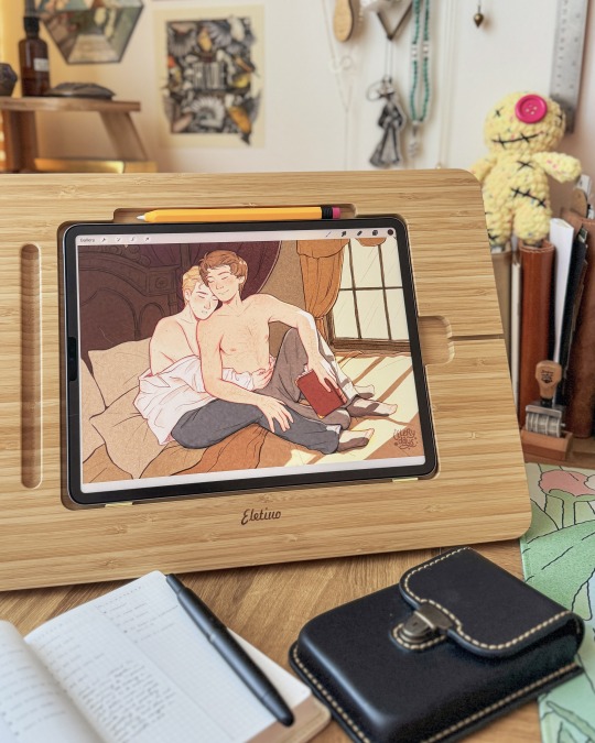
I use the Procreate app for all of my digital art! ✨
It should be available on any iPad 💗 I personally invested for my birthday this past year and I have the 12.9" M2 iPad Pro, but I'll even occasionally use my fiancé's iPad Mini and the Procreate app on there in a pinch since it's so small and portable~
The only real difference is that performance might suffer a bit, the larger an art piece is or how many layers your work has, depending on the iPad. But if you're just starting out, I probably wouldn't find that to be much of an issue!
(More rambling about digital art origins under cut ✨)
There's definitely a learning curve, especially if you're more used to drawing traditionally! It can help to still sketch traditionally (if that's what you're used to) and then upload a photo of your drawing to your tablet to work over digitally (this is personally how I started out and I used to just make little digital doodles by tracing and coloring over my traditional sketches.)
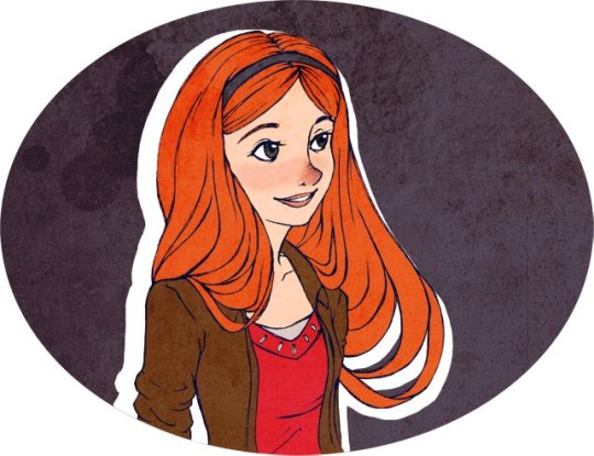
A small doodle from my sketchbook that I traced and colored digitally, from around 2011-2012, I think? Uh, happy Doctor Who day today!
My very first digital art set up was actually a tiny Wacom Bamboo tablet where the drawing space probably wasn't even bigger than my hand, and a super old bootleg version of Photoshop CS2 which was already a version that was 7 years too old for the time (CS5/CS6 was the most updated version by the time I had started on digital art).
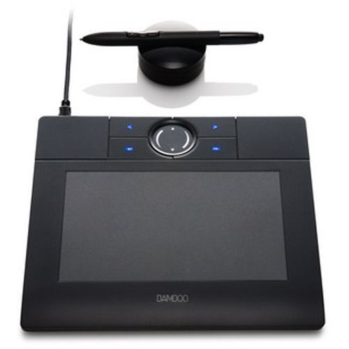
Everyone else in my class had the bigger/fancier/professional-grade Wacom Intuos and I remember my professor taking one look at my baby tablet and just going like "how tf are you drawing on that" lmao.
But still! Experimenting and doing little exercises can get you a long way – I would say to approach it with similar exercises you would do as if you were learning to draw traditionally for the first time.
Shade in circles/nail down basic lighting. Gesture drawings. Random scribbles. Just things that help you get used to the feel of digital art!
Test out different textures you can achieve with one brush, then expand it to see how other different types of brushes can behave and add to the experience.
For proof that even just one brush and not the best/most updated tools can work: these are two of my first more "serious" digital art projects I did in college (with my tiny tablet and mega outdated version of Photoshop) and 99% of the rendering was just done with the "soft airbrush" brush.
But even then, we were taught to create our base sketches traditionally and upload them to the program to work over.
Then one day I decided I wanted to just be able to also do all my sketches digitally and just worked on getting used to sketching straight on my digital program. It was then that besides the all-powerful undo-redo buttons, I started to really make use of the transform/canvas flip/liquify features which I don't think I can live without now lol. (Caveat: I'm now a little too dependent on those features so I keep a traditional sketchbook to do silly doodles in occasionally to exercise my hand because sketching traditionally without the buffer of those digital tools is pretty difficult for me now lol.)
That was a little long-winded, I'm so sorry hahaha. I hope something in this rambling could be taken as somewhat helpful for starting out on digital art!! 💗
34 notes
·
View notes
Text
long post talking about making neopets style art, but not in a way that's useful or coherent or proofread
idk why of all the things that i struggle to do, the thing i keep coming back to trying to pull off is 'imitate the neopets art style circa 2004-2007'. i'm really proud of the stuff i make in that style, but i've always got a nagging feeling about how there's like, very few applications for this very specific skill i'm building, and i could be spending this time improving at anatomy or perspective or anything else. i guess that's just the power of 'wanting to learn something really bad' combined with, critically, 'believing im really close to figuring it out'
there's something about the line weights on a lot of old pets that's really hard for me to capture, and i've gone through a bunch of different ideas of why that is- like, maybe its easier to do in flash, or its something about the way i have the pressure sensitivity set up on my pen, or maybe the official artists also carefully shaped and weighted their lines while scaling the drawing down every so often to make sure they 'feel right' on a small scale (lol), or maybe its that shit that artists who've been inking shit for a long time learn how to do intuitively that i'm just not at the level of yet.
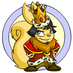
i'm looking at this smug bastard like. how do they decide which lines should be thick vs thin. my instinct is to go thicker on the corners of points like the ear tips, but this artist went thinner, and i think weighted the lines heavier on the undersides of shapes where the shadows are? neo artists aren't immune to stuff that frustrates me when i'm making pet art either, almost every pet has some part of their lineart that makes a weird tangent with the damn Circle. the linework on the hands straight up isn't clear at all, but i can tell what the pose is from how the shoulders are positioned and the expression of the character, so i guess that doesn't really matter at the end of the day
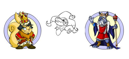
im pasting the lines i'm working on next to existing pets with varying levels of detail, but it might be too early to tell if they have the right level of clarity. i'm also i'm back in photoshop because that's easier for me, but maybe i should have tried flash again- doing the art in vectors does give the finished image that hard to detect Crispness that i'm always chasing
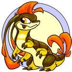


in order, these were drawn in photoshop in 2019, photoshop in 2022, and Flash in 2024. i was going to be like 'oh god, the Vully DOES look sharper than the centibyte, it must be Flash' but honestly i got the halloween one to look pretty close?? maybe i scaled down my photoshop images differently in 2019............ i think i've also gotten better at mimicking the lineart style, so it could also be that, but that doesn't account for why the top one looks kind of blurry in comparison. am i crazy. is it visible to anyone else.
anyway ive gone off on a tangent. for some reason this is what i'm obsessed with doing so i'm just gonna keep on trucking until something else seizes my attention instead i guess
#i'm not trying to put down my own work here#i am proud of the neostyle art i've made#i'm talking about that feeling of like.#knowing that there's a few things i don't quite grasp and wanting to figure them out#i need a text post tag#neopets
30 notes
·
View notes
Note
hi!! i wanted to ask where you get your patterns for the bed recolors for awingedllama? and also if you have any good resources on learning how to recolor objects like that? i'm so inspired by your recolors but i cant seem to find a good tutorial
hey!!! i learned recoloring by brandi's tutorial here! i think sims4studio updated so you don't need the dds files and can just use png or maybe it was always like that and i never knew lol.
i get most of my patterns from pinterest and fabric websites. mostly finding clean fabric pictures on pinterest and then checking out the source. most of the patterns i use aren't seamless so i try to find images that are long and wide and then i resize and up the resolution in photoshop before making it a pattern in ps!
my sources for the beds in particular were chelsea textiles, liberty london, and marimekko's print archive
if you have more questions feel free to ask! im def not the best at recoloring but i make it work lol
7 notes
·
View notes