#i'm thinking about all the compositions. the cool colour palettes we could have had
Explore tagged Tumblr posts
Visit Tumblr Blog
Explore Tumblr blogs with no restrictions, modern design and the best experience.
Last Seen Tumblr Blogs


Fun Fact
Tumblr is available in 18 languages.
Text
i don't care that there's a murderbot tv show in the works. it should have been animated instead
#i mean this in the most and least lighthearted ways possible#like. i can just not watch it obviously#and it might actually be good. who knows#but i know whatever it will be. it would have been better if it was animated instead#i'm thinking about all the compositions. the cool colour palettes we could have had#i need a fully red and black scene of [redacted because spoilers]#great acting will never rival what you can do with a medium who's main strength is exaggerating emotions and showing you how things feel aa#im not being a 100% here. i'm just bitter that there most likely wasn't even a slightest chance of it ever being animated#but i can dream#can you imagine. the murderbot diaries animated in the style of something like scavengers reign#tmbd#murderbot#the murderbot diaries#ramblings
175 notes
·
View notes
Text
CHILDREN'S SONG BOOK DEVELOPMENT.
Starting off this assignment I already have the sort of songs I want in mind. All of these songs will be more geared towards being "Child Friendly" rather than specifically targeting children, just for more flexibility in terms of options. It makes this assignment a lot more fun.
SETTING UP THE INDESIGN DOCUMENT: - A5 size 1754 x 2480 px - 12 Pages
CHOICES:
Are We Getting Any Closer - Songs Ohia Why? It's a pretty mellow song about getting close to somebody.
Place to Be - Nick Drake Why? This song is more poem like than the previous, it's more suited to these sorts of books. I would've just filled the book with nick drake songs, but I think having a wide array of different styles and approaches keeps the book fresh.
Potato Knishes - Ryan Dorin Why? This is an extremely surreal song that's just fun to think about, and it's about as non-sensical as some actual children's songs. The song itself is really weird and awesome, inspired by dadaism it takes advantage of a completely uncanny visual style to make an impact. I want to include the scene from the music video into my image.
Underground - Tom Waits Why? It's another absurd song, but it's much more grounded. It paints a clear image into your mind, which will be quite easy to put into an actual image for the book itself.
V. UNIVERSE - The Microphones Why? It's a song that helps you grasp the universe's immense expanse, and it reads like a really sweet kids rhyme. The song itself is something else (super atmospheric and scary), I wouldn't play that song to children, but I would read it's lyrics out to children.
Visualizing Each Song:
General Visual Style: For general visual style I want to think about what would appeal to a kid. OR firstly, I should probably think about what wouldn't.
No: - Visually Complex Images (because children are more likely to attach themselves to simple, approachable characters made from simple shapes). - Gore/Violent Images (obviously) - Sharp Shapes (rounded shapes are more appealing)
Yes: - Animal Characters (people aren't interesting to children, animals are much more appealing via their cute/coolness). -Simple, Vibrant Colours (Keeping things simple and visually eye-catching will appeal the most to children). - Fantasy Imagery/Abstract Imagery (Not everything has to be grounded, kids aren't picking apart all the aspects of these images, so making them visually interesting over keeping them grounded is probably the best option). A design style I want to specifically evoke is that of Scott Benson:

^I love his appealing and simple style and think it would work well in a children's book. TITLE PAGE DESIGN: I've made sure to paint all of these images in photoshop (illustrator for the vector images) with A5 sized canvases to match the InDesign file.

Here's a thumbnail I drew for the Title Page (Front Cover). I want the words to look like they're coming out of the trumpet the cat is playing. In terms of colours I'm Thinking about using orange/blue/pink, an unusual pallet, but I think it will work. I don't want to use any sorts of greens unless I absolutely have to cause it'll clash poorly.

Here's the final image. I think this palette works quite well, so I might just roll with it for the rest of the designs.

I've made sure to keep this document multilayered, adding as many layers as I could just so I can control all the aspects of the image.

^ Something to point out about this background I painted in photoshop is that I specifically designed it so it had depth and also vaguely looked like a city, just foggy. It lifts up the image quite a bit, looking more dynamic.

These abstractions exist just to fill space. The composition needed something, and I remembered that a lot of jazz album covers from the 50s utilize abstract art. So I just borrowed that idea for my own composition.

^This being one example POTATO KNISHES DESIGN


Here's the thumbnail I drew for Potato Knishes. It's heavily inspired by the video for the song.
^A screen shot from the music video (and yes, when I said surreal, I meant it). I felt like moving towards a more realistic interpretation of the character would go over better with kids. The character depicted in both the music video and my design is called Little King John, and he's lonely, so I tried to capture that here.

^This is my final design, I feel like it will pop against a good background. I'm quite proud of this, it really depicts the character of the lonely little king with only potato knishes to keep him company, all captured within this one image. Not having to explain much through the song. I think I want to make these images like that, with characters who are apart of the images that represent the songs. It's much more fun that way, and it's visually interesting for kids. When I was a kid, I remember that a lot of my favourite picture books would be the ones which depict a scene without text, one that implies something, it sparks the imagination. Obviously I have to include text here, but I want to lean into sparking the imagination of the reader. UNDERGROUND DESIGN
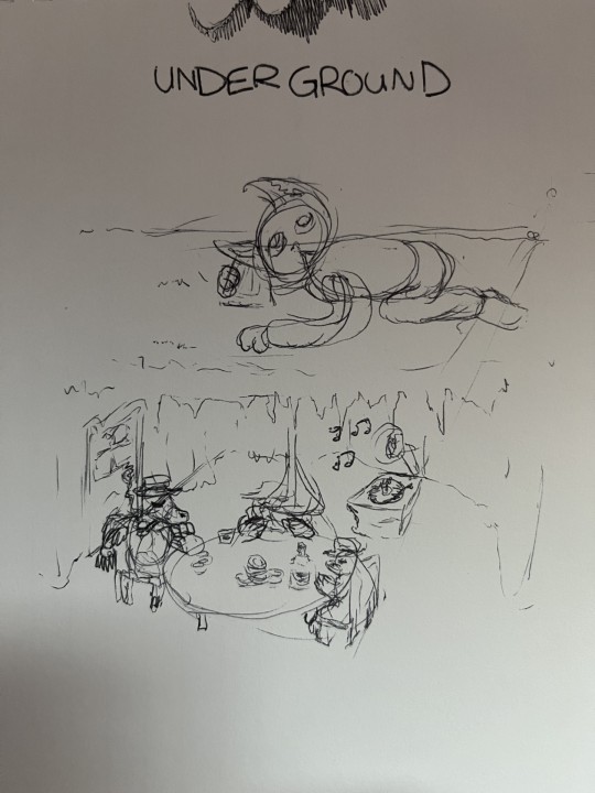
^This design for Tom Waits' underground depicts a group of moles living underground playing poker while a cat person above listens to what's going on underground by using a cup to amplify the sound. The inspiration for this is Tom Waits' curiosity for moles, so I thought it would be fitting to have the image depict them.

This final design is quite good. It properly visualizes an interesting scene that compliments the song.
UNIVERSE DESIGN
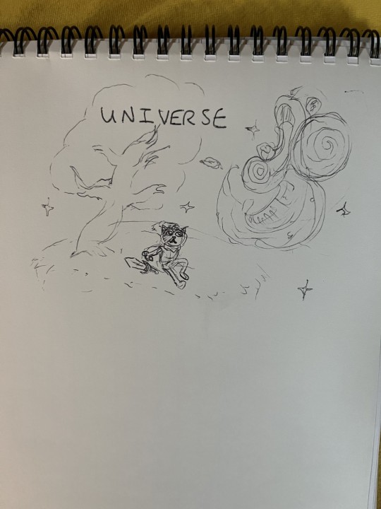
^UNIVERSE is a very unusual song. It hasn't much strong imagery within the lyrics themselves, but I based this design on the feeling I get when experiencing the totality of the lyrics. The magical wonder of the universe specifically is definitely inspiriting, and when listening to the song I imagine myself on a field looking up into the sky at night taking in it's sheer size.

^I've changed the design quite a lot from the thumbnail/concept sketch. I wanted to mix up the character a bit, taking a dog instead of a cat (too many cats already). I've also aimed to make a face in the sky with the moon as an eye, reflecting that lyric in the song itself "Oh, Universe, I see your face looks just like mine!". This design specifically evokes fantastical themes, which I like a lot. It's a consistent theme currently, so yeah.
PLACE TO BE: VECTOR DESIGN #1
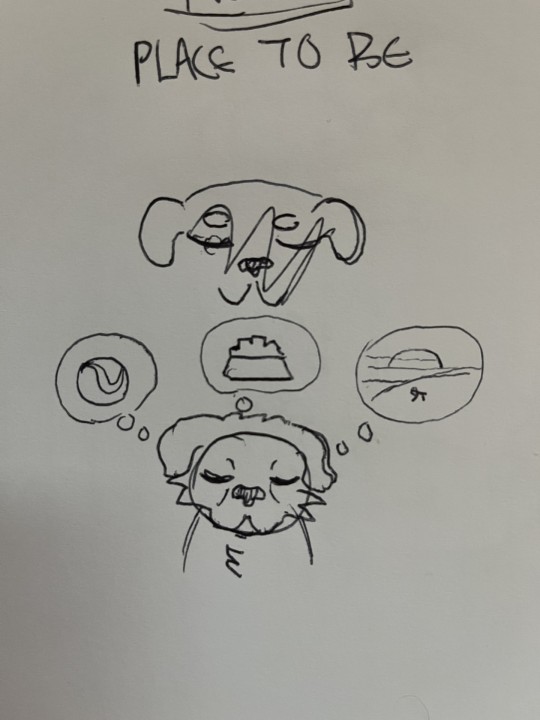
^ Vector Images are much more complex and difficult to pull off than the raster images I've been creating in Photoshop. For Place to Be I'm just going with a simplistic design.

Here I've utilized the Copy + Paste tool and the Reflect tool (O) to mirror the head shape for symmetry.

^This is my vector image. It's quite different, and it's hard to replicate the style I've been using in a vector image, so it's going to be a stylistic whiplash unfortunately, but it gets a idea across. A sad dog missing all the things he had, or a dog dreaming about the things he could have. Are We Getting Any Closer? VECTOR IMAGE #2
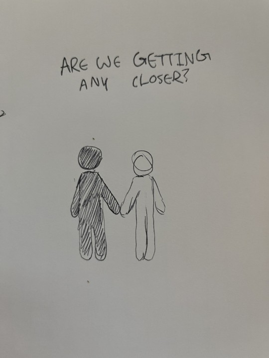
^Here I'm going for something Simplistic and easy to make. I'm running out of time. Since this is a song about getting closer to somebody, I am going to make that literal.

^This final design is simple, and gets an idea across.
MAKING THE INDESIGN BOOK
Numbered Pages:

^Just adding numbered pages to the document via the parent pages.


^All the songs are in including this contents page.

For the Title Page, I've researched this way of getting curved text. First, I make an invisible circle object, then I change the text tool to the "Type on a Path" tool which allows me to type on the curve on the circle.

^The raster image quality isn't great, I'll change that in the preferences.

^Changing the image quality.

^changing the colour of the pages. I might change them to a darker colour later.


^These are generally where I want the images to be in the compositions. I've also added some filler space where needed with the vector images with backdrop raster images.

^I've adjusted the parent pages with these pink borders I whipped up in photoshop. The frame really brings together a lot of the images and centers the eyes a bit more and fills a bit more space. I've also centered and lowered the size of the page numbers.
0 notes