#i'm enjoying this very much
Explore tagged Tumblr posts
Text
Dangerous activities to start in the morning instead of getting ready for work

#ig this is a good place to stop for now#i'm enjoying this very much#taylor swift#1989 tv#vault tracks
3 notes
·
View notes
Text

I am such a big Werewolf Stan advocate I had to jump on this particular train 🙏 (but I didn't really wanna commit to full line art, you guys understand)
Oh, and you guys aren't gonna believe this, but here's part two 🙌
#I've been really enjoying the vampire/werewolf FiddleStan#which i think.... is for some october thing? uh fiddlestantober? or uh fiddle... idk i know it's because it's october!!#and I'm very glad for it#i love werewolf stan so much 🙏#i never really thought about vampire Fiddleford but yeah I've been enjoying that part too#anyway keep making that thanks guys 😋#I KNOW IT'S NOT SUMMER but wouldn't it be funny if they met outside of the fall months#put those bozos into situations 🗣️#this is why summerween exists in this AU guys TRUST 🙏🙏#cole's art#art#gravity falls#grunkle stan#stanley pines#fiddleford hadron mcgucket#fiddleford mcgucket#fiddlestan#FIDDLESTAN ‼️‼️🗣️💯💯💯#best ship in this fandom NO COMPETITION 🙏#werewolf stan pines#werewolf stan#vampire fiddleford#fiddlestantober2024#yyeeahhhh that thing#i am not a part of it i am hijacking just this one thing 🙏#i use the praying hands emoji too much sorry guys#gravity falls halloween au
4K notes
·
View notes
Note
I just realized it'll take the eng server almost a year to reach the 3D Cheka T pose model :' ) we're at book 7 part 6, and we get a new main story update every 2 to 3 months..
Anyway, do you wanna share some fun, spoiler-free shenanigans that happened in jp's server.? Just to have some crumbs to lick off the table until we get our own sandwich (my heart is empty and my soul is crying)
spoiler-free is pretty hard, especially considering. the, uhhh, particular turn that things take directly after 6. (like, the fact that the other characters are showing up probably counts on its own?) and I do think that if you can avoid getting spoiled, most of it is definitely better as a surprise! some of the genuinely best Twst moments are waiting for you. :D
if I may, however, present one of my favorite little throwaway bits with absolutely no context:
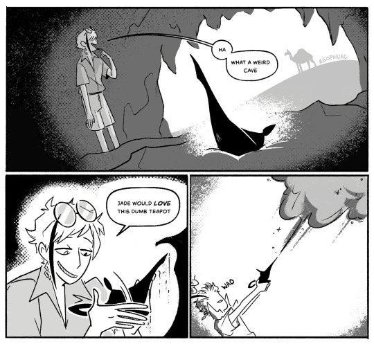
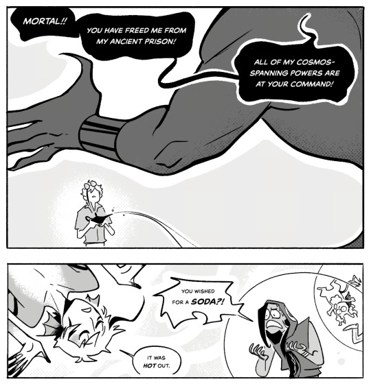
#art#twisted wonderland#twisted wonderland spoilers#twisted wonderland episode 7 spoilers#twisted wonderland book 7 spoilers#twisted wonderland episode 7 part 10 spoilers#twisted wonderland book 7 part 10 spoilers#i've been thinking about 10 in particular lately. idk.#been sort of obsessed with the fact that azul calls his parents mama and papa#maybe it was only in the dream but i choose to believe this is just true of him because it's adorable#nothing more delightful than azul getting harassed by the twins and impotently shrieking about how his papa is a LAWYER he'll SUE them!!!!#azul your papa is a divorce attorney#i'm not sure he's ready to take on the literal ocean mafia#geeze though. y'all on eng have my deepest sympathies.#i have a hard enough time waiting between parts#(7-12 is coming for us next week and i'm already DYING of impatience 😭)#i cannot imagine also trying to dodge all the spoilers like a master thief in a hallway of laser beams#you all are stronger than i will ever be#that said i am VERY much enjoying vicariously reliving 6 via my activity page#rip meleanor...how i miss you...#man. i gotta draw more meleanor.#(to be fair this is true of me at any given moment)
2K notes
·
View notes
Note
Hi Gigi :3
Are we gonna get a hold them down animation? Or no because the uncomforty topic?
that's up for the future to decide
I'll be busy with commissions up until february I think, so util then I won't be working on any Epic animatics
and then once I have time again I'll finish God Games
and after that I kinda want to do Legendary-
#why do I draw like I'm running out of time#every day I draw like I'm running out of time#I would definitely enjoy making a hold them down animatic#the vocals on this song are simply too divine I love Antinous' voice so much#like when he died I actually got kinda upset just because I wanted to hear him sing more#even though the song is a bit too dark for what I normally work on I think I could make it work in my style#I'd just make the gruesome descriptions these very subtle drawings that wouldn't last long#and let the lyrics get the message across better than the visuals#gigi's asks#epic the musical
1K notes
·
View notes
Text
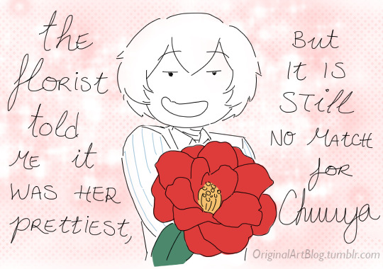
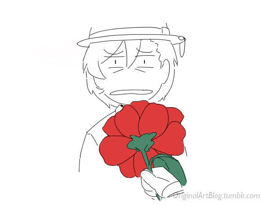

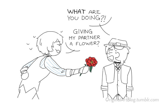
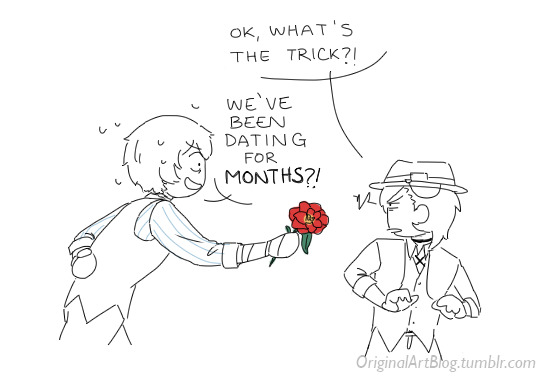
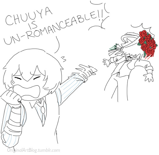
@bsdfanweek's skk Valentine's week day 2: Camellias and Floral Troubles
Dazai's love life is so hard. This is in reference to my recent skk post!
#weep for dazai he's trying really hard#they're still settling in their new relationship#enjoy my monstrosity of cursive and capital letters for maximum drama and lisibility#my cursive is rusty and i'm not convinced all of you can even read cursive in the first place#bsd#bungo stray dogs#bungou stray dogs#bsd fanart#skk#soukoku#i'm playing the romantic skk up because it's valentine's day week#when ironically it is very much almost aro week. but most of my stuff falls in the ambiguous category the rest of the year jshdgfsjhfg#also without remi i could not have come up with a corny one-liner so thank you very much
3K notes
·
View notes
Text
Some of my favourite quotes that's come out of the dream situation rn:
"That's like being shot and then saying you can reclaim guns" - Jack manifold on dreams reddit post claiming he thought he could use slurs as slurs just cause others have "gone viral" for calling HIM slurs.
"I really don't see how his audience sees him as genuine when the veil is paper thin" - Jack manifold simply being based.
"You changed up! YES. The situation changed!!" - Jack manifold yet again being based on how dream fans act like Jack and Tommy switched up on dream just for clout.
"I think dream has made a lot of money out of keeping his sexuality ambiguous" - Tubbo about the fact Dream on stream said that he is not gay and that being called the f slur doesn't even apply to him. After pandering to a queer audience and deliberately leaning into acting gay. (Obviously, him saying he's not gay doesn't necessarily make him straight, but he does seem to imply that by saying he's NOT like that and then backtracking that Nicholas Cantu wouldn't know either way)
"I do think this is partially because I played the villain on the dsmp" - Dream. The most delusional and insane thing he could have said. No, that's not why you get hate. That was 5 years ago. Are you okay?
#i do actually have a lot i could say about dream and thoughts but I'm enjoying just kinda witnessing and not getting too invested#2021/22 me would probably of had a panic attack by now and i am not going back to that unhealthy attachments and stress thank you very much#dream smp#dsmp#dreamwastaken#tubbo#jack manifold#tommyinnit
895 notes
·
View notes
Text

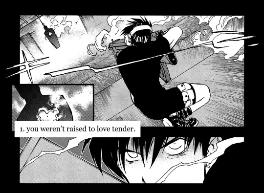
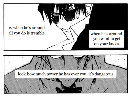

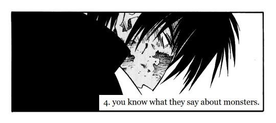

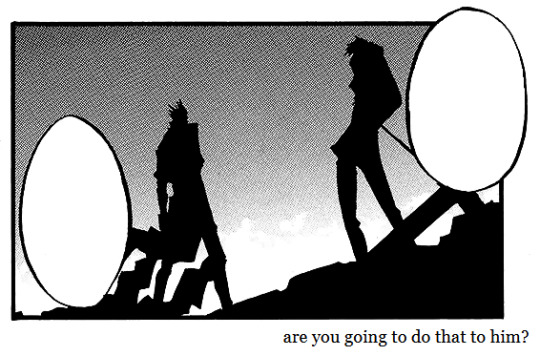

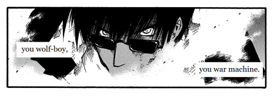

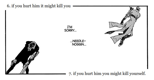
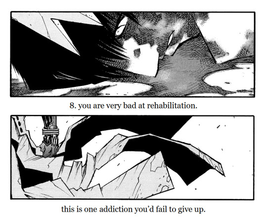
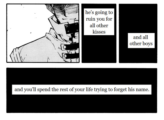
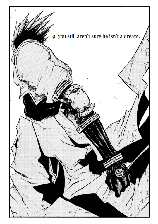
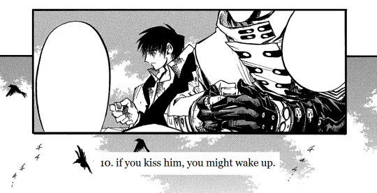

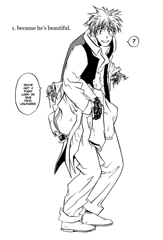


yes & no by Natalie Wee | Trigun Ultimate Overhaul
#THIS HAS BEEN COOKING. FOR TWO MONTHS#trigun#vashwood#vash the stampede#nicholas d. wolfwood#vash#wolfwood#trigun maximum#mine#edit#trimax#trigun edit#tw suicide mention#for that one line#and#tw blood#hopefully there's nothing else I'm forgetting#long post#i guess#pls feel free to critique me on the alt texts I've never done it before and would love to know what I can do better#but uhhh yeah otherwise. enjoy my baby. I'm very proud of this#I do however need to not look at it for a while now#so aside from the IDs if there are mistakes. no there aren't <3#AND THANKS TO MY QPP EEE FOR LISTENING TO ME ENDLESSLY WORK ON THIS AND OFFERING ME INPUT AND CRITIGUE!!! <3333#god. it's finally done#edit: btw I could write so much on my choices in this and what I'm going for and little details. but I leave it to the masses to interpret
3K notes
·
View notes
Text


totally lore-accurate swanqueen screencap redraws 4/∞
they're on their first date :3c
#swan queen#swanqueen#regina mills#emma swan#once upon a time#ouat#my art#sq art#sq redraw#i wanted to draw this scene mainly because regina just looked SO PLEASED WITH HERSELF i love her face#but i'm not super happy with the result :<#shoulda picked a different scene after all i felt like i couldn't really do much with this one#(or maybe i'm just not good enough at drawing her yet she's so difficult aaaa)#but i still wanted to finish this anyway!!#i hope you enjoy :>#thank u also for sending me asks with recommendations for scenes for me to redraw!!#i'll keep them in my inbox until i get around to them#thank you so much for the warm welcome to this space ; -; 💜#i'm so happy to see this ship still very much alive after all this time
1K notes
·
View notes
Text

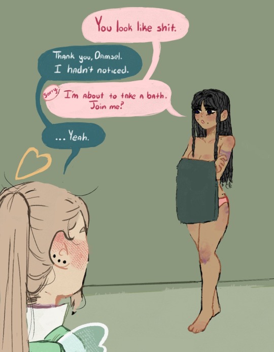
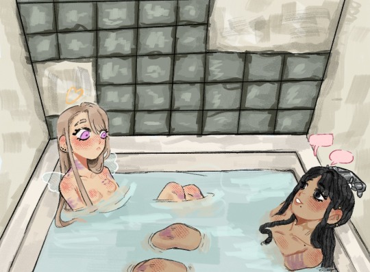
sometimes after a long day of being molested by the whole town all you need is to soak in the bath with your bestie (˶ˆᗜˆ˵)♡
with @wreckowafer 's yunie <3
#what better way to cheer up your bestie than spilling tea as you sit in the bath together and ignore the sting of your bruises <3#yunie and damsel are both severely emotionally stunted but they enjoy each other's presence. cuties ♡#wafer and i did not coordinate bathroom posts btw we literally just have the same braincell 😭#dol pc#damsel the starlet#i wanted to draw the girlies a bit bruised up since i haven’t drawn Damsel with bruises#which simply would not do#damsel doesn't get harassed as much but she still gets harassed#she's small and not very strong so she relies on her reputation mostly to send people away#and if they won't leave she gives them mind melting head and contemplates killing them off later <3#anyways...on to the other drawings i have in mind 🙏🏽#no nippies so hopefully tumblr won’t snipe me 🙏🏽#forgot Damsel's industrial in that second pic....oh well#ignore how small my handwriting is I'm trying to curb that but i'm failing 😭#tw bruising#tw implied assault#damsel draws sometimes
390 notes
·
View notes
Text
Fantasy Guide to Interiors
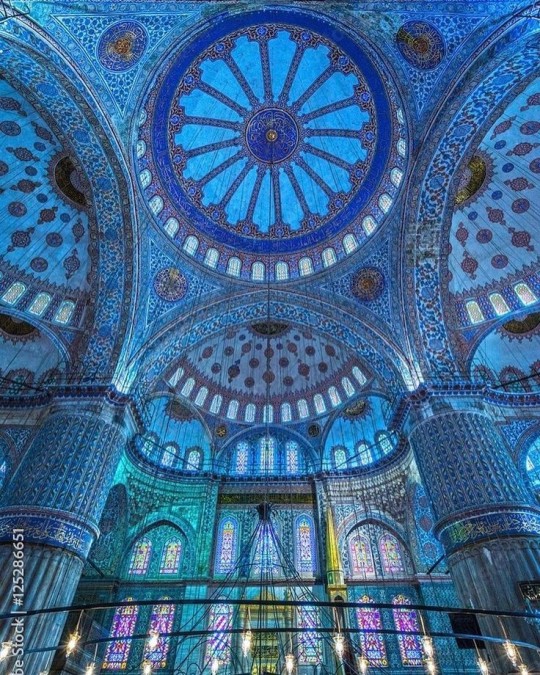
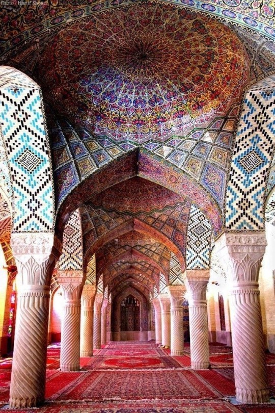
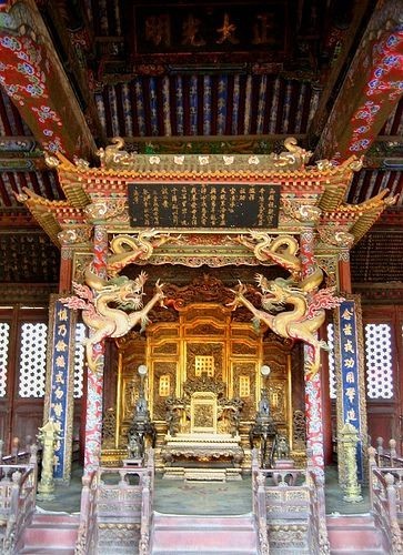
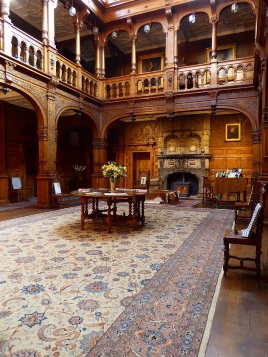
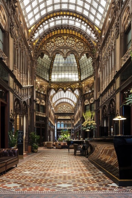
As a followup to the very popular post on architecture, I decided to add onto it by exploring the interior of each movement and the different design techniques and tastes of each era. This post at be helpful for historical fiction, fantasy or just a long read when you're bored.
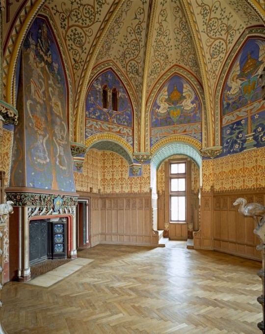
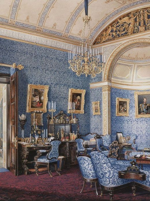
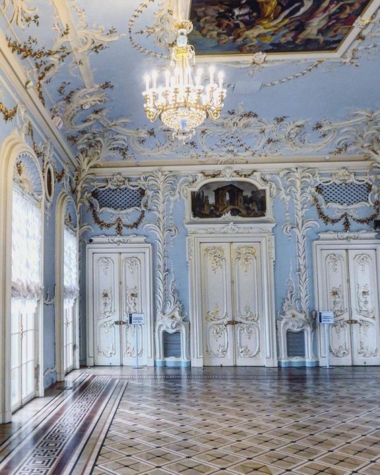
Interior Design Terms
Reeding and fluting: Fluting is a technique that consists a continuous pattern of concave grooves in a flat surface across a surface. Reeding is it's opposite.
Embossing: stamping, carving or moulding a symbol to make it stand out on a surface.
Paneling: Panels of carved wood or fabric a fixed to a wall in a continuous pattern.
Gilding: the use of gold to highlight features.
Glazed Tile: Ceramic or porcelain tiles coated with liquid coloured glass or enamel.
Column: A column is a pillar of stone or wood built to support a ceiling. We will see more of columns later on.
Bay Window: The Bay Window is a window projecting outward from a building.
Frescos: A design element of painting images upon wet plaster.
Mosaic: Mosaics are a design element that involves using pieces of coloured glass and fitted them together upon the floor or wall to form images.
Mouldings: ornate strips of carved wood along the top of a wall.
Wainscoting: paneling along the lower portion of a wall.
Chinoiserie: A European take on East Asian art. Usually seen in wallpaper.
Clerestory: A series of eye-level windows.
Sconces: A light fixture supported on a wall.
Niche: A sunken area within a wall.
Monochromatic: Focusing on a single colour within a scheme.
Ceiling rose: A moulding fashioned on the ceiling in the shape of a rose usually supporting a light fixture.
Baluster: the vertical bars of a railing.
Façade: front portion of a building
Lintel: Top of a door or window.
Portico: a covered structure over a door supported by columns
Eaves: the part of the roof overhanging from the building
Skirting: border around lower length of a wall
Ancient Greece
Houses were made of either sun-dried clay bricks or stone which were painted when they dried. Ground floors were decorated with coloured stones and tiles called Mosaics. Upper level floors were made from wood. Homes were furnished with tapestries and furniture, and in grand homes statues and grand altars would be found. Furniture was very skillfully crafted in Ancient Greece, much attention was paid to the carving and decoration of such things. Of course, Ancient Greece is ancient so I won't be going through all the movements but I will talk a little about columns.
Doric: Doric is the oldest of the orders and some argue it is the simplest. The columns of this style are set close together, without bases and carved with concave curves called flutes. The capitals (the top of the column) are plain often built with a curve at the base called an echinus and are topped by a square at the apex called an abacus. The entablature is marked by frieze of vertical channels/triglyphs. In between the channels would be detail of carved marble. The Parthenon in Athens is your best example of Doric architecture.
Ionic: The Ionic style was used for smaller buildings and the interiors. The columns had twin volutes, scroll-like designs on its capital. Between these scrolls, there was a carved curve known as an egg and in this style the entablature is much narrower and the frieze is thick with carvings. The example of Ionic Architecture is the Temple to Athena Nike at the Athens Acropolis.
Corinthian: The Corinthian style has some similarities with the Ionic order, the bases, entablature and columns almost the same but the capital is more ornate its base, column, and entablature, but its capital is far more ornate, commonly carved with depictions of acanthus leaves. The style was more slender than the others on this list, used less for bearing weight but more for decoration. Corinthian style can be found along the top levels of the Colosseum in Rome.
Tuscan: The Tuscan order shares much with the Doric order, but the columns are un-fluted and smooth. The entablature is far simpler, formed without triglyphs or guttae. The columns are capped with round capitals.
Composite: This style is mixed. It features the volutes of the Ionic order and the capitals of the Corinthian order. The volutes are larger in these columns and often more ornate. The column's capital is rather plain. for the capital, with no consistent differences to that above or below the capital.
Ancient Rome
Rome is well known for its outward architectural styles. However the Romans did know how to add that rizz to the interior. Ceilings were either vaulted or made from exploded beams that could be painted. The Romans were big into design. Moasics were a common interior sight, the use of little pieces of coloured glass or stone to create a larger image. Frescoes were used to add colour to the home, depicting mythical figures and beasts and also different textures such as stonework or brick. The Romans loved their furniture. Dining tables were low and the Romans ate on couches. Weaving was a popular pastime so there would be tapestries and wall hangings in the house. Rich households could even afford to import fine rugs from across the Empire. Glass was also a feature in Roman interior but windows were usually not paned as large panes were hard to make. Doors were usually treated with panels that were carved or in lain with bronze.
Ancient Egypt
Egypt was one of the first great civilisations, known for its immense and grand structures. Wealthy Egyptians had grand homes. The walls were painted or plastered usually with bright colours and hues. The Egyptians are cool because they mapped out their buildings in such a way to adhere to astrological movements meaning on special days if the calendar the temple or monuments were in the right place always. The columns of Egyptian where thicker, more bulbous and often had capitals shaped like bundles of papyrus reeds. Woven mats and tapestries were popular decor. Motifs from the river such as palms, papyrus and reeds were popular symbols used.
Ancient Africa
African Architecture is a very mixed bag and more structurally different and impressive than Hollywood would have you believe. Far beyond the common depictions of primitive buildings, the African nations were among the giants of their time in architecture, no style quite the same as the last but just as breathtaking.
Rwandan Architecture: The Rwandans commonly built of hardened clay with thatched roofs of dried grass or reeds. Mats of woven reeds carpeted the floors of royal abodes. These residences folded about a large public area known as a karubanda and were often so large that they became almost like a maze, connecting different chambers/huts of all kinds of uses be they residential or for other purposes.
Ashanti Architecture: The Ashanti style can be found in present day Ghana. The style incorporates walls of plaster formed of mud and designed with bright paint and buildings with a courtyard at the heart, not unlike another examples on this post. The Ashanti also formed their buildings of the favourite method of wattle and daub.
Nubian Architecture: Nubia, in modern day Ethiopia, was home to the Nubians who were one of the world's most impressive architects at the beginning of the architecture world and probably would be more talked about if it weren't for the Egyptians building monuments only up the road. The Nubians were famous for building the speos, tall tower-like spires carved of stone. The Nubians used a variety of materials and skills to build, for example wattle and daub and mudbrick. The Kingdom of Kush, the people who took over the Nubian Empire was a fan of Egyptian works even if they didn't like them very much. The Kushites began building pyramid-like structures such at the sight of Gebel Barkal
Japanese Interiors
Japenese interior design rests upon 7 principles. Kanso (簡素)- Simplicity, Fukinsei (不均整)- Asymmetry, Shizen (自然)- Natural, Shibumi (渋味) – Simple beauty, Yugen (幽玄)- subtle grace, Datsuzoku (脱俗) – freedom from habitual behaviour, Seijaku (静寂)- tranquillity.
Common features of Japanese Interior Design:
Shoji walls: these are the screens you think of when you think of the traditional Japanese homes. They are made of wooden frames, rice paper and used to partition
Tatami: Tatami mats are used within Japanese households to blanket the floors. They were made of rice straw and rush straw, laid down to cushion the floor.
Genkan: The Genkan was a sunken space between the front door and the rest of the house. This area is meant to separate the home from the outside and is where shoes are discarded before entering.
Japanese furniture: often lowest, close to the ground. These include tables and chairs but often tanked are replaced by zabuton, large cushions. Furniture is usually carved of wood in a minimalist design.
Nature: As both the Shinto and Buddhist beliefs are great influences upon architecture, there is a strong presence of nature with the architecture. Wood is used for this reason and natural light is prevalent with in the home. The orientation is meant to reflect the best view of the world.
Islamic World Interior
The Islamic world has one of the most beautiful and impressive interior design styles across the world. Colour and detail are absolute staples in the movement. Windows are usually not paned with glass but covered in ornate lattices known as jali. The jali give ventilation, light and privacy to the home. Islamic Interiors are ornate and colourful, using coloured ceramic tiles. The upper parts of walls and ceilings are usually flat decorated with arabesques (foliate ornamentation), while the lower wall areas were usually tiled. Features such as honeycombed ceilings, horseshoe arches, stalactite-fringed arches and stalactite vaults (Muqarnas) are prevalent among many famous Islamic buildings such as the Alhambra and the Blue Mosque.
Byzantine (330/395–1453 A. D)
The Byzantine Empire or Eastern Roman Empire was where eat met west, leading to a melting pot of different interior designs based on early Christian styles and Persian influences. Mosaics are probably what you think of when you think of the Byzantine Empire. Ivory was also a popular feature in the Interiors, with carved ivory or the use of it in inlay. The use of gold as a decorative feature usually by way of repoussé (decorating metals by hammering in the design from the backside of the metal). Fabrics from Persia, heavily embroidered and intricately woven along with silks from afar a field as China, would also be used to upholster furniture or be used as wall hangings. The Byzantines favoured natural light, usually from the use of copolas.
Indian Interiors
India is of course, the font of all intricate designs. India's history is sectioned into many eras but we will focus on a few to give you an idea of prevalent techniques and tastes.
The Gupta Empire (320 – 650 CE): The Gupta era was a time of stone carving. As impressive as the outside of these buildings are, the Interiors are just as amazing. Gupta era buildings featured many details such as ogee (circular or horseshoe arch), gavaksha/chandrashala (the motif centred these arches), ashlar masonry (built of squared stone blocks) with ceilings of plain, flat slabs of stone.
Delhi Sultanate (1206–1526): Another period of beautifully carved stone. The Delhi sultanate had influence from the Islamic world, with heavy uses of mosaics, brackets, intricate mouldings, columns and and hypostyle halls.
Mughal Empire (1526–1857): Stonework was also important on the Mughal Empire. Intricately carved stonework was seen in the pillars, low relief panels depicting nature images and jalis (marble screens). Stonework was also decorated in a stye known as pietra dura/parchin kari with inscriptions and geometric designs using colored stones to create images. Tilework was also popular during this period. Moasic tiles were cut and fitted together to create larger patters while cuerda seca tiles were coloured tiles outlined with black.
Chinese Interiors
Common features of Chinese Interiors
Use of Colours: Colour in Chinese Interior is usually vibrant and bold. Red and Black are are traditional colours, meant to bring luck, happiness, power, knowledge and stability to the household.
Latticework: Lattices are a staple in Chinese interiors most often seen on shutters, screens, doors of cabinets snf even traditional beds.
Lacquer: Multiple coats of lacquer are applied to furniture or cabinets (now walls) and then carved. The skill is called Diaoqi (雕漆).
Decorative Screens: Screens are used to partition off part of a room. They are usually of carved wood, pained with very intricate murals.
Shrines: Spaces were reserved on the home to honour ancestors, usually consisting of an altar where offerings could be made.
Of course, Chinese Interiors are not all the same through the different eras. While some details and techniques were interchangeable through different dynasties, usually a dynasty had a notable style or deviation. These aren't all the dynasties of course but a few interesting examples.
Song Dynasty (960–1279): The Song Dynasty is known for its stonework. Sculpture was an important part of Song Dynasty interior. It was in this period than brick and stone work became the most used material. The Song Dynasty was also known for its very intricate attention to detail, paintings, and used tiles.
Ming Dynasty(1368–1644): Ceilings were adorned with cloisons usually featuring yellow reed work. The floors would be of flagstones usually of deep tones, mostly black. The Ming Dynasty favoured richly coloured silk hangings, tapestries and furnishings. Furniture was usually carved of darker woods, arrayed in a certain way to bring peace to the dwelling.
Han Dynasty (206 BC-220 AD): Interior walls were plastered and painted to show important figures and scenes. Lacquer, though it was discovered earlier, came into greater prominence with better skill in this era.
Tang Dynasty (618–907) : The colour palette is restrained, reserved. But the Tang dynasty is not without it's beauty. Earthenware reached it's peak in this era, many homes would display fine examples as well. The Tang dynasty is famous for its upturned eaves, the ceilings supported by timber columns mounted with metal or stone bases. Glazed tiles were popular in this era, either a fixed to the roof or decorating a screen wall.
Romanesque (6th -11th century/12th)
Romanesque Architecture is a span between the end of Roman Empire to the Gothic style. Taking inspiration from the Roman and Byzantine Empires, the Romanesque period incorporates many of the styles. The most common details are carved floral and foliage symbols with the stonework of the Romanesque buildings. Cable mouldings or twisted rope-like carvings would have framed doorways. As per the name, Romansque Interiors relied heavily on its love and admiration for Rome. The Romanesque style uses geometric shapes as statements using curves, circles snf arches. The colours would be clean and warm, focusing on minimal ornamentation.
Gothic Architecture (12th Century - 16th Century)
The Gothic style is what you think of when you think of old European cathedrals and probably one of the beautiful of the styles on this list and one of most recognisable. The Gothic style is a dramatic, opposing sight and one of the easiest to describe. Decoration in this era became more ornate, stonework began to sport carving and modelling in a way it did not before. The ceilings moved away from barreled vaults to quadripartite and sexpartite vaulting. Columns slimmed as other supportive structures were invented. Intricate stained glass windows began their popularity here. In Gothic structures, everything is very symmetrical and even.
Mediaeval (500 AD to 1500)
Interiors of mediaeval homes are not quite as drab as Hollywood likes to make out. Building materials may be hidden by plaster in rich homes, sometimes even painted. Floors were either dirt strewn with rushes or flagstones in larger homes. Stonework was popular, especially around fireplaces. Grand homes would be decorated with intricate woodwork, carved heraldic beasts and wall hangings of fine fabrics.
Renaissance (late 1300s-1600s)
The Renaissance was a period of great artistry and splendor. The revival of old styles injected symmetry and colour into the homes. Frescoes were back. Painted mouldings adorned the ceilings and walls. Furniture became more ornate, fixed with luxurious upholstery and fine carvings. Caryatids (pillars in the shape of women), grotesques, Roman and Greek images were used to spruce up the place. Floors began to become more intricate, with coloured stone and marble. Modelled stucco, sgraffiti arabesques (made by cutting lines through a layer of plaster or stucco to reveal an underlayer), and fine wall painting were used in brilliant combinations in the early part of the 16th century.
Tudor Interior (1485-1603)
The Tudor period is a starkly unique style within England and very recognisable. Windows were fixed with lattice work, usually casement. Stained glass was also in in this period, usually depicting figures and heraldic beasts. Rooms would be panelled with wood or plastered. Walls would be adorned with tapestries or embroidered hangings. Windows and furniture would be furnished with fine fabrics such as brocade. Floors would typically be of wood, sometimes strewn with rush matting mixed with fresh herbs and flowers to freshen the room.
Baroque (1600 to 1750)
The Baroque period was a time for splendor and for splashing the cash. The interior of a baroque room was usually intricate, usually of a light palette, featuring a very high ceiling heavy with detail. Furniture would choke the room, ornately carved and stitched with very high quality fabrics. The rooms would be full of art not limited to just paintings but also sculptures of marble or bronze, large intricate mirrors, moldings along the walls which may be heavily gilded, chandeliers and detailed paneling.
Victorian (1837-1901)
We think of the interiors of Victorian homes as dowdy and dark but that isn't true. The Victorians favoured tapestries, intricate rugs, decorated wallpaper, exquisitely furniture, and surprisingly, bright colour. Dyes were more widely available to people of all stations and the Victorians did not want for colour. Patterns and details were usually nature inspired, usually floral or vines. Walls could also be painted to mimic a building material such as wood or marble and most likely painted in rich tones. The Victorians were suckers for furniture, preferring them grandly carved with fine fabric usually embroidered or buttoned. And they did not believe in minimalism. If you could fit another piece of furniture in a room, it was going in there. Floors were almost eclusively wood laid with the previously mentioned rugs. But the Victorians did enjoy tiled floors but restricted them to entrances. The Victorians were quite in touch with their green thumbs so expect a lot of flowers and greenery inside. with various elaborately decorated patterned rugs. And remember, the Victorians loved to display as much wealth as they could. Every shelf, cabinet, case and ledge would be chocked full of ornaments and antiques.
Edwardian/The Gilded Age/Belle Epoque (1880s-1914)
This period (I've lumped them together for simplicity) began to move away from the deep tones and ornate patterns of the Victorian period. Colour became more neutral. Nature still had a place in design. Stained glass began to become popular, especially on lampshades and light fixtures. Embossing started to gain popularity and tile work began to expand from the entrance halls to other parts of the house. Furniture began to move away from dark wood, some families favouring breathable woods like wicker. The rooms would be less cluttered.
Art Deco (1920s-1930s)
The 1920s was a time of buzz and change. Gone were the refined tastes of the pre-war era and now the wow factor was in. Walls were smoother, buildings were sharper and more jagged, doorways and windows were decorated with reeding and fluting. Pastels were in, as was the heavy use of black and white, along with gold. Mirrors and glass were in, injecting light into rooms. Gold, silver, steel and chrome were used in furnishings and decor. Geometric shapes were a favourite design choice. Again, high quality and bold fabrics were used such as animal skins or colourful velvet. It was all a rejection of the Art Noveau movement, away from nature focusing on the man made.
Modernism (1930 - 1965)
Modernism came after the Art Deco movement. Fuss and feathers were out the door and now, practicality was in. Materials used are shown as they are, wood is not painted, metal is not coated. Bright colours were acceptable but neutral palettes were favoured. Interiors were open and favoured large windows. Furniture was practical, for use rather than the ornamentation, featuring plain details of any and geometric shapes. Away from Art Deco, everything is straight, linear and streamlined.
#This took forever#I'm very tired#But enjoy#I covered as much as I could find#Fantasy Guide to interiors#interior design#Architecture#writings#writing resources#Writing reference#Writing advice#Writer's research#writing research#Writer's rescources#Writing help#Mediaeval#Renaissance#Chinese Interiors#Japanese Interiors#Indian interiors#writing#writeblr#writing reference#writing advice#writer#spilled words#writers
3K notes
·
View notes
Photo
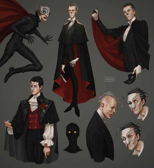
Once again I bring you some Eriks 😊
#The Phantom of the Opera#Phantom of the Opera#poto#phantom of the paradise#time princess#erik#yes I'm playing time princess just for him listen...#it is very cute#I also wanted to draw him with cat eyes because Leroux makes it sound like he has them with the perfect night vision and glow and color#and his whole little meow meow personality and Miette way of speaking it just feels correct#also that one cover#and Winslow because potp is great and I think hes neat#I may do another one of these just so I can draw Cherik because I miss him#I've been neglecting my asks!! I'm so sorry I'll get to them soon I just haven't been online much..like this whole year#so I'm falling behind and catching up gets increasingly more overwhelming#this past few months have been stressful I've been waiting on a lot of stuff to fall into place and I have no control over any of it#so I just draw Eriks#aaaaaa anyway enjoy#my art
5K notes
·
View notes
Text


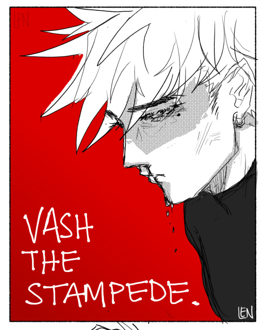
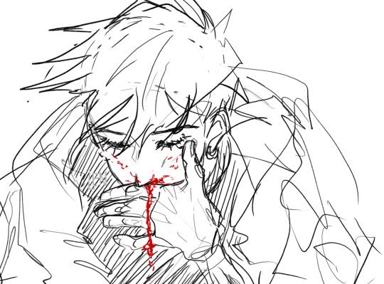


Sketch dump :)
#the first one is indeed based from the doomed baseball au from nightow..#I planned on doing something nicer but hehe...wip wip. forever.#Most of these are just stuff I do sometimes and never post. I figured I should share them now#I'm going back to uni soon so. I will enjoy my last few hours of freedom#trigun#vash the stampede#trigun stampede#nicholas d wolfwood#vashwood#trigun fanart#vash#wolfwood#nicholas trigun#lenssi draws#meryl stryfe#trimax#meryl trimax#Meryl crumbs for me specifically bc while she is going through It Horribly I am very much in love with her messy hair#trigun eriks#eriks trigun#more bloody vash for the soul (sry bby)
601 notes
·
View notes
Text


Happy birthday, Namjoon (12.09.1994)✨
#btsgif#btsedit#cyphernet#userdimple#raplineuser#userpat#annietrack#usersky#tuserandi#useremmeline#usermaggie#userkelli#usersevn#heyginkgo#usermizuoka#userines#namjoonedit#kim namjoon#bts#*#as usual i had zero ideas so i was inspired by the video i saw on twt#i was sure it was in my likes but now i can't find it i wanted to add link in the caption (videomakers pls use watermarks!)#anyway that video made me very soft and this was exactly what i needed at that moment so i decided to make soft joonie gifset💖#the idea is not original i know but i wanted to give it a try so here we are#as much as i enjoyed collecting the moments gathering them together and trying not to get 10mb+ well that was the torture lol#i'm not content with the quality and consistent coloring? what is it? idk her but this is my baby i love it#anyway2 welcome to the club big fella! it's fun here you're gonna love it😈
611 notes
·
View notes
Text

Dress me up, make it tight, I'm your dolly You're my doll, rock'n'roll, feel the glamour in pink Kiss me here, touch me there, hanky panky~
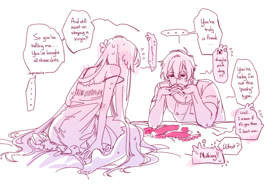
Inspired from This post of @just-dol-headshots and this ask from @hakusins. Don't worry I'm still aiming for your ass Haku-Dean :) References and something under the cut
We all have to agree Bully Robin should have some softer and caring sides. When there's only them two and no one else is around to judge, he can let loose and slip back into that kinda of "Original Robin" we know and I love. I mean, that's what JDOLH made that got me into these swap messes from the beginning jsjkhskjhd you knowww the HUG!!
Reference: Barbie Girl (Aqua) and this cute ecchi Clamp Chobit piece

All in all I'm a pink bietch and Dollya won't be losing her V-card anytime soon that I can promise so hang in there okay mr.Bully.
edit: OMG THIS IS MY 1000TH POST TTOTT)) JKSDJLASKJKDLA


SELF-INDULGENT HERE WE GO
#Warning: rant in tags#dollya art#robin the orphan#dol robin#robin the bully#swap robin#swap au#DoL swap AU#Just Dollya herself#degrees of lewdity#dol#pinkcore#pink aesthetic#I don't know man I still can't decide the title for Dollya and “the Weeb” is kinda not very cute eventhough I like it#I'm enjoying this SO FREAKING MUCH I lose track of time and want to draw so many fucking things for it#I have “Plans” for Bully Robin don't worry he will get backstory as well as character development#Dark or light I can't promise I will work with JDOLH and maybe Hakusin too to build this AU#I want to put work into this you understand me?#AAAAAAAAAA THE IDEAS KEEP COMING I hate this yet I love it#What else to tag oh right#yumejoshi#yumeship#I LOVE to draw pink so fucking much#I love pink#I want to draw more pink
826 notes
·
View notes
Text

After doing some research on the types of pets people had in ancient Greece, I'd like to imagine that Helen is the sort of person who has a whole menagerie of birds — and she loves each and every one of them very, very much.
It fits well with her being good at mimicry, you know. Talking and imitating and singing with her beloved birds 💜
Close up under the read more:

I had to include that one necklace from the minoan 'saffron goddess' fresco because it's my favourite thing Ever
#helen of sparta#greek mythology#greek myth art#tagamemnon#birds#this started as a helen with birds drawing. then turned into a chance to put helen in mycenaean accurate clothing.#and THEN turned into a sort of hades game art study/sprite because playing with half lineart + half rendering is just too much fun#speaking of fun: I really enjoyed making this!! Once I got a bit experimentative it really came together. I'm happy with the outcome! ^w^#choosing what birds and how many was a challenge... in my mind Helen has dozens of birds and all sorts of species. truly a crazy bird lady.#but I decided to focus on a few for this. maybe another time i'll make a piece with a ridiculous amount of birds for fun >:) hehe#I cant remember the source but I know I read somewhere that people would specifically train magpies to say hello/greet guests#and I love that little factoid (and love magpies very much) so that was an immediate choice for me to feature here.#I also love doves and goldfinches. goldfinches sound so delightful and stand out so they were my 'songbird' choice.#and I'd like to imagine that one specific dove snuggles up on helen's shoulder all the time <3#the only bird that's truly missing here is an indian ringneck parrot (which I initially wanted to put on the shoulder but changed my mind)#so if you're like me and watch too many parrot videos. just know helen has one of them that can't stop talking and posing lmao#capri_art
295 notes
·
View notes
Text
short asl thing based on @where-does-the-heart-lie's modern au :) i started this over a year ago but the beginning is all dialogue and felt more like a script to me i suppose??? which deflated my desire to work on it. anyway i checked it over recently and it's completely fine lmfao, self-confidence restored here we go !
-
"Yo. Aren't you usually in the middle of your shift by now?"
"I've been banned from the hospital."
"Like, for life?"
"No. For the next, uh.. Twenty-two hours."
"That's oddly specific."
"It was twenty-four, but I fell asleep after leaving the building."
"That wouldn't have to do with why they kicked you out, at all?"
"Hmmm. I'm too sleep-deprived, apparently."
"Ah. And, um, you called me because...?"
"I pressed a random number in my call log after waking up. Lucky you, I guess."
"Yeah. Right. Lucky me. And your car keys are...?"
"Confiscated."
"Ah, right, of course."
A beat of silence. Two. Three, then "Look, if you're busy, then–"
"No, no. You called me, so I'll be there. Give me twenty minutes."
"Alright. Thank–"
"Thank someone else. Also, if you fall asleep in my car, I'm taking it as express permission to drive you around wherever I want."
"Ugh, go die. I don't even know why I bothered."
"LUCKY YOU, I guess," sounds off way too loudly in his ear. "No take backs. See you in ten."
"I thought you said–" Sabo breaks off as the call ends, leaving him staring blankly at his phone's too-dim screen. He squints, turns the brightness all the way up, and still squints as the sunlight proves too strong for the display.
Ace shows up in more than ten but decidedly less than twenty minutes. Sabo doesn't waste much brain power on it, only climbing into the passenger seat and yawning into his palm while his other hand fixes the seatbelt into the buckle. Not a second too soon, too, as Ace roars the engine to life and peels away from the curb at record speed.
Ace fiddles with the radio. He turns the music up, then dial it back down to inaudible. They hit the expressway and he leans over the steering wheel, frowning with his eyes fixed on the road far ahead. Sabo yawns again and this appears to be the limit to his patience.
"Hey, so, I had a thought after you hung up on me."
Sabo grimaces. "You mean you–"
"Today's Wednesday."
He doesn't elaborate. Sabo is too tired to process. "Yes," he follows, after a second. He glances at the sky out the front window. "What time is it?"
"Oh, uh." Ace fumbles with hand placement so he can lift his watch to his face. "Nine forty."
Sabo takes a couple beats to try and process this, moves his eyes away from the skyline, and sighs as he pulls his phone out. 2:47 is what the display reads, which sounds much more believable.
"How did the minute hand get off?" he mutters to himself, chancing a look at Ace's busted wristwatch. Ace raises a brow, taking his gaze off the road to scrutinize Sabo. "No, it doesn't matter," he mutters to himself once more, sliding his phone away back on his person and out of his hands.
"My point is," Ace continues, like he hasn't just been interrupted by a whole thing. "Your timeout will be done midday Thursday. Did they switch your days off?"
"No." Sabo sighs. "They technically gave me the next thirty-six hours. Technically closer to forty. Something like that. I go back in on Friday. Sometime.” He tries to smile and it turns out very lopsided, from that he can make out in the rearview mirror. “Can you tell I’m tired?”
“I don’t think ‘tired’ is an accurate description,” Ace quips. “When did you eat a proper meal last?”
“Uh, yesterday. Maybe.”
“Maybe??”
“A ‘proper meal’ means different things to the two of us,” Sabo huffs. “On my account it was yesterday. I’ve had food since then, of course.”
“Alright, so here’s the plan,” Ace announces before absolutely whipping it around a curve. Sabo is his passenger in the passenger seat and had fully prepared to be so when he got in the vehicle, but he’d been vastly underprepared for this sudden course of action, which is how he ends up halfway out of his seat with his cheek slammed into the cold window. Ace doesn’t quite notice his brother’s terminal velocity until the car is once again on the straight and narrow, and only then it’s because of the audible thunk Sabo’s face makes when it collides with the glass.
“Aw shit. You good bro?”
“Ow,” Sabo mutters. “If I have broken bones I’m suing your ass.”
“Well, if you’re good enough to make jokes, I think you’re better than you’re letting on.” Ace keeps the wheel steady with one knee while he takes both hands away to crack his fingers. When he glances over at Sabo again, he looks even more pathetic – like he’s becoming one with the glass. “Anyway, as I was saying.
“I’m taking your ass home. You’re going straight to sleep and while you crash, I’ll make you something decent to eat and stick it in the fridge for you to heat up later. I’ll even make you two servings to eat two different times, since you clearly can’t be trusted to take care of yourself correctly.”
“Ouch.”
“I want you to conk out for as long as your body allows. We can reset your sleep schedule tomorrow, alright? Put your phone on silent; do not answer any calls. In fact, you know what, just give it to me.
Sabo glances over to see Ace’s hand held out to him, palm up. Fingers wiggling expectantly. His lips pull up into a grimace. “I’m not doing that.”
“Fine.” Ace takes his hand back. “But you will comply with everything else.”
“Wow! It’s so funny, I didn’t realize you turned into my mother overnight! Really tapped into your mom potential, huh? Anything exciting happen in your life that would cause that? I guess I wouldn’t know, since I’ve been a zombie for the past two days.”
“There’s nothing wrong with acting like your older brother, you dipshit, especially if you keep putting yourself through the wringer like this. You go home. You sleep. You wake up and eat. You go back to sleep. Then we do laundry. Does that sound agreeable?”
“That’s negotiable, at the least,” Sabo mumbles. “I will accept good food as a form of bribery.”
“Oh, nice, because I’m flat broke at the moment.”
Sabo makes a mental note of that, and then they’re pulling into the driveway. Ace lets him exit the vehicle by himself and then promptly manhandles him all the way onto the couch where it will be easier to force his body to relax than in a real bed. Ace knows this, so he calls him weird before chucking a loose blanket at his head. Sabo is almost too tired to function at this point, so he lets Ace have the last laugh in favor of finally closing his eyes.
Coming to is a surreal experience, especially since the sun is still out. He must make a noise because Ace is suddenly within view. His limbs are tangled in the blanket and still so heavy that he doesn’t bother moving. “Thought you would be gone,” he half-groans, eyes slipping shut again for a moment.
“I did leave,” Ace confirms. “I had to go pilfer some stuff to make stew with. It’s almost done, so I’ll hang here until then.”
Pilfer. That could mean any number of things. Sabo chooses to believe in the option where Ace is an upstanding citizen, and then remembers Ace saying earlier that he had no money. He frowns and squirms on the cushions enough to where it looks like he’s checking his pockets. “Where’s my wallet, Ace?” he bluffs.
“Somewhere around here,” Ace pipes up. “Your stomach will thank you for your contributions to the Portgas Household’s pantry!”
“Ugh, I got robbed,” he complains. “This sucks. ‘m going back to sleep.” He rolls over so his back is to Ace.
“Yeah, you do you, bro. Stew will still be here later. I’ll see you when you’re back in the world of the living.”
—
Luffy comes in late that night and slams the front door shut as loud as humanly possible. When he appears in the main room, he doesn’t seem to be upset, so Ace writes it off as a Luffyism. Sabo hasn’t stirred at the noise, so it’s all good.
Realizing this, Luffy pads closer to Ace’s side and looks at Sabo’s unmoving body warily. “Why is Sabo passed out like a corpse? Is he sick?”
“No, he’s not sick, he just can’t take care of himself. Which is why we are going to let him sleep for as long as possible.”
Luffy just nods to this, but it’s the uncomprehending Luffy-nod that means he’s just going to end up doing whatever he wants to regardless. Ace sighs, then jerks his head towards the kitchen. “He ate a little earlier, but I want him to eat again when he wakes up. There’s stew in the fridge if you want it – just leave him a little. Got it, Monkey D. Luffy?”
Luffy throws him a salute and then runs off in his socks. “Yippee! Ace made stew!”
“Think of your brother, Luffy, and make good choices!” Ace calls after him. “He’s a pathetic man who needs food to feel better or he’ll end up sleeping through Laundry Day!”
—
Sabo does not sleep through laundry day, but he does sleep for sixteen whole hours, so it’s just around noon when he forces himself up off the couch and into a warm shower.
Ace is around, which is mildly unexpected. But he’s still half-asleep, so everything is at least a little unexpected. He glances up from playing video games with Luffy to see Sabo leaving the steam-filled bathroom with his hair hanging around his shoulders. “You look like a wet cat,” he calls.
“Sabo’s awake!” Luffy cheers. “Ace thought you died at one point.”
Ace elbows Luffy in the gut, making him hunch over. “I did not!”
“He totally checked to see if your heart was still beating!”
“I’m undead, actually,” Sabo says completely seriously.
“Does that mean you don’t need to eat anymore?” Luffy questions. “Because I ate all the stew last night.”
“I saw that coming and made extra.” Ace finger-guns in Sabo’s general direction. “That’s why I bought two sets of ingredients. With your money!”
“With my money,” Sabo echoes, because it’s such a wild statement to have to deal with this early in the day. Well, early for him. “Fuck you.”
“I mean, I can tell Luffy where I hid–”
“Thank you, Ace, for agreeing to share your quarters with both of your brothers so we can all do laundry today on your dime!” Sabo raises his pitch so his voice is mockingly squeaky when he says this. He starts moving down the hall before Ace can start to argue, letting his and Luffy’s voices bleed into the background.
When he comes back out, now dressed, it smells significantly better than before. “I reheated the stew,” Ace announces, gesturing for Sabo to take a seat at the kitchen counter. “Let’s all have lunch before we head out.”
“You have to drink this too,” Luffy tells Sabo, sliding a Gatorade across the counter so it sets in front of him when he finally does take a seat. “Ace’s orders.”
“Gotta get those nutrients back somehow.”
“Aren’t we so considerate, Sabo?”
“Do you even know what ‘considerate’ means?” Sabo asks, lips quirking up into a half-smile. At Luffy’s shrug, it turns into a real smile. “Well, thanks anyway. Both of you.”
“No sweat. And look!” Ace brandishes a five dollar bill for both to see. “I found this baby for us to use on coins! It’s all on me today–”
“Where’s my wallet, Ace?!”
#writing#op#whery if i realized anything while doing this its that we need 2 get you a custom theme....#1) anyone whos not logged in will be able to see all your posts w/ no limits#2) (and the more important COUGHCOUGH) it'll be so much easier to find shit on your blog#if you want a cool blog layout lmk and i'll hook you up but for now#there are many benefits to a custom tumblr url........ being able to search /tagged for better blog organization is one of them#if there's a switch to writing style i wrote the first half of this in april 2023 so thats why!!#also lmao i jus spent the weekend w/ my brother so if its too mean-spirited thats unintentional n i'm prolly channeling is all#sighhhhhhh i love when they look after each other its so very very good#wittb has been great but i do wanna see them get up to other shenanigans later#after the comic (plot) at large i mean#little one-off side things still in the modern au#enjoy the rest of artfight month for now tho!!!#(< says someone who has been putting off af attacks to write things again)
413 notes
·
View notes