#i'm already thinking of like using a similar element and making a common grounds au from it LOL
Explore tagged Tumblr posts
Text
i think yall are gonna Like this gift fic i made for oshamir gift exchange teehee
#scardinata#i'm already thinking of like using a similar element and making a common grounds au from it LOL#au of my au headass lmao#hey Nora why don't you go write chapter 23 ya loser
8 notes
·
View notes
Text
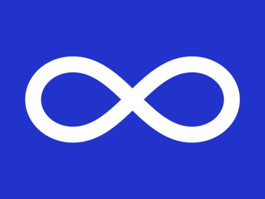
In my previous post, I motivated why we as neurodivergent people should pay attention to infinity symbol design, and I started going through ways in which infinity symbols can vary. My goal here is to encourage the neurodiversity community to use symbols that are visually distinct from the solid white infinity curve (lemniscate) that has been used by the Métis since 1815.
HOW INFINITY SYMBOLS VARY (PART TWO)
ASPECT C: ASPECT RATIO
The ratio of height to width is another thing we can change up to make our infinity symbols distinct. The Métis lemniscate, on the left, is fairly elongated. On the right is a very compact infinity symbol. The 2013 neurodiversity rainbow gradient occupies a middle ground:


- ASPECT D: COLOUR FILL
How we colour in the infinity symbol has a big effect on how much it does or doesn't look like the Métis flag. Option 1: Solid colour fill The Métis use a solid white fill; I think this should be absolutely avoided. If you must use a solid fill, don't use white. Gold is popular for autism because Au = Gold, and I think designers should be careful and mindful if they are set on using a solid yellow fill.


- Option 2: Segmenting the curve for colouring This is already common in neurodiversity symbols. Segments can stay distinct or be blended into a gradient:


- Option 3: Following the curve for colouring This gets used for neurodiversity also, but I haven't seen it as much. I think it's another solid option for differentiating from the Metis flag.


- Option 4: Colouring horizontally or vertically This also happens for neurodiversity. Here the segmentation is vertical bars, diagonal, or horizontal bands, or a gradient thereof:


ASPECT E: BORDERS
The Métis flag has no borders. In the middle I have an example of a thin border; on the right is a thick border.


I think we should generally aim to have borders on our infinity symbols. Using a border that is the same colour as the background results in a sort of semi-open infinity symbol effect, and is an option if you're trying to reduce the number of colours on a design. -
ASPECT F: BACKGROUND
Option 1: Solid colour background I think this should be avoided entirely. Solid blue and solid red are unambiguously Metis. Other solid primary colours like green may look too like the Metis flag. Solid yellow should also be avoided for similarity to the intersex autistic (middle) and intersex neurodivergent flags (right).


-
Option 2: Solid white or black background Solid white is well established as a neurodiversity flag palatte, but autistic flags have been trying other things out. I think we should stick to solid white for neurodiversity. The white background with a rainbow symbol helps to reinforce the meaning of infinite diversity!


-
Option 3: A background with stripes or other designs A bunch of designs already try out putting the infinity symbol on or near some stripes. These are all proposed autistic flags; the bottom left is my bandaid fix of an existing autistic flag. The bottom right is another design of mine, using the Disability Pride Flag as a motif.


While we should stick to a white background for neurodiversity, I'm agnostic on whether an autism-specific flag should have a white background or not.
SUMMARY
Infinity symbols can vary in lots of ways, and through design decisions we can make infinity symbols for neurodiversity & autism that won't be mistaken for the Métis flag.
RECOMMENDATIONS
I recommend that neurodiversity infinity symbols: 1. Always be an infinity *loop* rather than a solid lemniscate curve. 2. Use design elements like variable thickness, borders, and colouring, to make it unambiguously a loop rather than solid curve. 3. Never use solid white for colouring; use at least two colours (e.g. solid fill and a border) and ideally a rainbow (e.g. segments, gradient).
4. Flags for neurodiversity in general should stick to solid white for a background.
5. Flags for autism should never have a background that is a solid primary colour. Red and blue are Métis associated, and yellow is used for variations on the intersex flag. I think it is very doable to make autism & neurodiversity designs that do not infringe upon Métis cultural symbols! There are so many ways to make infinity symbols that are visually distinct.
I implore upon my fellow autistics to be mindful in which infinity symbols they create, use, and share. Thank you for coming to my Ted Talk. 💛
Edit to add: I'm keeping a list of autistic & ND flag designs that DON'T use a Metis-style lemniscate here. If there are others you'd like added please let me know!
Infinity symbols: a guide to their variations
Infinity symbols are popular in graphic design for good reason. In this post, I'm gonna describe ways to vary up the designs of infinity symbols. My goal is to educate fellow neurodivergent people on how to make infinity symbols that don't look like the Métis flag.
The neurodiversity community has been using rainbow infinity symbols since 2005. Here are neurodiversity flags from 2013, 2016, and 2019:


However, there's a problem with some of the new flag designs for a flag that is autism-specific. Here are some of the contenders:
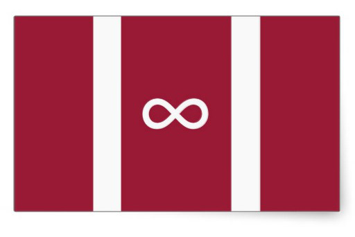
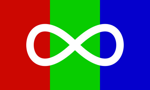
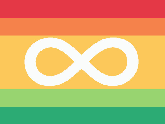
These use a solid white infinity symbol. The solid white infinity curve is a symbol of Métis. Their first flag, from 1815, has a white lemniscate on red background. Nowadays they use the blue version more often. And to the right is their queer pride flag:


For those unfamiliar, the Métis are one of the major Indigenous groups in what is now Canada, with most of their >600,000 population in the western and central parts of the country. The word métis means half-breed in French; lower-case m métis refers to those with mixed Indigenous and European ancestry. Capital-M Métis refers to the specific culture of métis that emerged, distinct from both Indigenous and settler cultures, and speaking hybrid languages such as Michif.
This has been brought up a bunch of times. While I can believe the autistic flag makers didn't know about the issue when making their designs, I know at least one of them was promptly informed of the issue and dismissed it.
The autistic community writ large has been pretty dismissive about this issue. I wonder if some of the defensiveness comes from not seeing an alternative - thinking that infinity symbol design is all or nothing.
I have some good news: it's possible to make infinity symbols that don't look Métis!
HOW INFINITY SYMBOLS VARY (PART ONE)
ASPECT A: TOPOLOGY
The first way we can categorize infinity symbols is their topology. These four varieties are most common
Topology 1: Open infinity symbol - this is the oldest style of using a figure-8 shape to represent the mathematical concept of infinity. On the left is the version Euler used.


-
Topology 2: Lemniscate - a closed curve. On the left is the Metis symbol but in black. The curve is one solid entity: notice how the rainbow gradient on the right fills the whole thing.


-
Topology 3: Infinity *loop* - imagine you take a hair tie or rubber band and twist it. One part of the infinity loop is clearly in front, with another part clearly behind it. Loops are well established for neurodiversity and I think we should stick to using these.


Notice in the left example how the pattern flips between left and right. Also compare the rainbow gradient on the right to the lemniscate rainbow gradient above it. -
Topology 4: Infinity *ribbon* - instead of a hair tie, use a ribbon. Ribbons have sides, producing an infinity loop that shows two sides.


-
ASPECT B: THICKNESS
Line width can vary, which also helps to convey a loop! Again, I think we should be sticking to infinity loops when it comes to autistic/ND designs.
Option 1: Constant Thickness The lemniscate on the Metis flag has a constant line width, as does this neurodiversity rainbow gradient from 2016. I think we should avoid constant thickness.


-
Option 2: Variable Thickness A variable thickness can help to reinforce that an infinity symbol is a loop rather than a solid lemniscate. There are a lot of ways to play with line thickness!


Many neurodiversity infinities are variable thickness and I think we should opt for this to steer clear of Metis territory.
THIS WILL BE CONTINUED IN A SECOND POST (tumblr has a limit of 30 images per post)
But just in case the second post gets lost in reblogs: I think variable thickness, combined with a loop topology, is what we should be using for neurodiversity & autism. E.g.


CONTINUED IN NEXT POST
#neurodiversity#neurodivergent pride#neurodiversity pride#neurodivergent#autism#autistic pride#autism pride#actually autistic#neurodiversity flag#autistic flag#flag design#graphic design
225 notes
·
View notes