#i was. WONDERING when i left tumblr
Explore tagged Tumblr posts
Visit Tumblr Blog
Explore Tumblr blogs with no restrictions, modern design and the best experience.
Last Seen Tumblr Blogs


Fun Fact
If you dial 1-866-584-6757, you can leave an audio post for your followers.
Text
oh shit october that makes a lot more sense
#blog archival#i was. WONDERING when i left tumblr#couldnt fit it on the timeline#anyway im not coming back this is just to keep dumblr from deleting my stuff#also SORRY TO ALL MY MUTUALS FOR BASICALLY GHOSTING YALL i.#am having an inch arresting one.#wonky ahh busy style complete lack of business#my discord has my alt i Actually Fucking Use linked in its description#(as opposed to my main; who has been in a coma for five yewars)#if yall wanna contact me again SOSORRY for disappearing#or it should. i. havent checked on it in a while#but anyway enough on that#im gonna go get my other blogs now byee
1 note
·
View note
Text
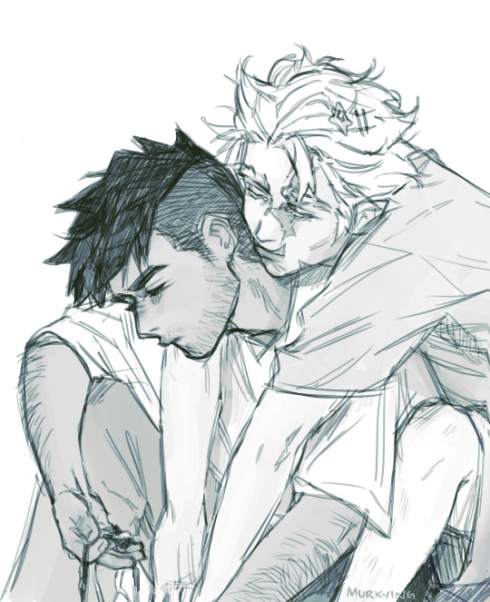
redstone supervisor
#redraw of some old art#ethubs how i missed u#also experimenting w light bdubs redesigns#and im coming to the realization that im just making both their hair more. anime.#idk i just think bdubs w a lowkey emo spiky haircut eats#omg anyone who left nice tags in my last post and remembered me ILYSM#i never really talked here just posted my art and only yapped in the tags#if anyone is wondering where i disappeared..... esports#LOL#to twt cuz tumblr has like no action on that front#im still in it! if u care abt vct my art acc there is murkyburakh#the offseason has been dry lately so etho called to me#and bdubs#actually i started catching up on his episodes first#cuz building cool#i havent watched wild life or finished secret life idk if i will cuz ngl i just liked the series more when it was simple boogeyman stuff#or maybe i'm just hung up on last life and nothing will top it for me who knows#i'm still an incurable tags yapper i guess#anyways happy new year everynyan!!#ethubs#ethoslab#bdubs#hermitshipping#my art
972 notes
·
View notes
Text
inspired by the comprehensive rygel bitch compilation by @gayspock, have the total farscape bitch tally. 88 episodes and a 2 part miniseries lead to 70 instances of the word bitch.
#i left this to post last night and it just...didn't.#so I'm trying again#farscape#mine#my edit#john crichton#ben browder#claudia black#aeryn sun#d'argo#zhaan#rygel#chiana#jool#scorpius#i mean...it's half the size of the max video file on here#it's only three minutes when the longest video tumblr supports is 10#it's just not processing#I wonder if my internet's just being shitty
134 notes
·
View notes
Text
Man I wonder where the leader of the fear realm could've gone, it's alMOST LIKE NEVIN HAS AN
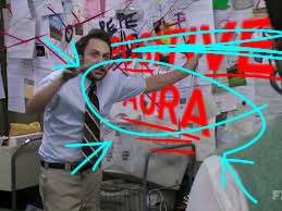
#had to re-edit the image real quick because the original edit was from a post I made about Drew years ago#and while the Drew thing is becoming less and less likely. Nevin havinv one has basically been canon since#someone mentioned Greg's (was it Britney's) aura being familiar in s2ch1. ive been putting together a list of every line#that points to Nevin's aura throughout the whole thing (most from s2ch1 but then s2ch10 came out and it was really canon at that point)#but clearly i'm running out of time to say ''i fucking called it'' before it's explicitly stated and i dont want to be in another situation#where somebody else will beat me to a theory and me posting anything about it will seem like copying them. sorry about that btw i had#thought i had already mentioned theorizing that nevin was possessed by a demon in that old theory i made but i had forgotten that one was#super old and was about sigma. so no copying there i just got extremely paranoid there was a mention of a cult and i was like ''nuh uh#that's way too specific and out there of a detail to end up in both our theories'' and i forgot the rest of my super old post was outdated#as hell. and echos had gone ''yeah they're so similar!'' and i took their word for it but now i'm realizing they were probably just trying#to be supportive. so yeah no copying there i was just beaten to the punch of saying something. but i will NOT back down from the aura shit#because i have been calling that shit FROM THE START or at least since i started reading ibvs back when ch20 came out.#also not backing down from saying chris was the worse friend because these past few chapters are the first time isaac has done anything tha#could knowingly upset chris meanwhile chris has. let edward drag isaac to the lair after isaac said edward would beat him up. chose not to#believe edward was holding the secrets over their heads because 'it was something isaac had said' and then immediately distrusted edward in#the next chapter because a random person he didn't know said to steal a book (might i mention how that entire scene proves chris' lack of#development and refusal to take responsibility because it perfectly alludes to when chris had brought those fireworks into his old school#and makes me wonder if charlie has actually gotten him in trouble with his past schools or if he's still just not taking responsibility#and if him following nevin to the woods to test out their powers is an extension of ''if something bad happens its not my fault''#like seriously this man would bring a mysterious suitcase onto a plane if he's told to). uh what was i talking about agai#anyway on a related note my mental state has only gotten worse since i left tumblr and the habit of thinking about chris instead of sleepin#or doing schoolwork has not stopped. so i was still failing for a while and might graduate now but am still staying away from tumblr.#so yeah this was a little update and im not going to linger this time im just going to leave tumblr again right after hitting post#addendum because i just can't let things go. and was thinking about chris again. i don't think his lack of development is because of bad#writing (anymore. i used to.). instead i'm certain his character arc is going to continue into him following someone (nevin probably) into#doing something really bad. and then he'll finally get actual consequences and go 'oh shit i fucked up real bad this time'#if you think that theory is reaching too far into the future you should hear mine about isaac dying at the end lmao
11 notes
·
View notes
Text
Small drawing collection of my latest creation Emran as a teenager/freshly minted Air Acolyte, for my dear partner in unhinged OC shenanigans @katkastrofa, as promised <3

#my art#artists on tumblr#the legend of korra#original character#I need to figure out a way to tag these guys#like with renny and dori I just put sotrl in front of their names and that works#but emran is technically an LaF character. though not uniquely tied to that verse. and idk what to do with Ila and Alasie#maybe I need to have some unique oc tag or smth. I’ll figure it out#if you’re wondering why I stayed up until half past 7 a.m to draw this it’s because I needed some way to cool down#after the kuviren smut absolutely broke my brain#and what better way to do that than by drawing my sweet baby boy?#yes lmao he went from baby girl to baby boy in like 24 hours. fucking sue me#but actually. actually!! they’re both. they contain multitudes :)#they probably haven’t even realised that at this point and are still in disguise#convinced that she’ll be punished for her deceit if anyone found out that she’s actually a girl#(okay off topic but the switching pronouns are really fun lmao)#but give them time. they’ll figure it out soon enough. in these pieces they’re slowly getting used to temple life#and that is the first step to self acceptance#I’m actually extremely proud of these. especially the one with the apple basket. I feel like the androgynous vibes are really there#and he looks like his brother the most in it#but the others are fun too. I loved doing the portrait. I should do them more often#and.. I will admit. I traced the lemur. I can barely draw people okay how do you expect me to draw animals#but I just think that Aiza would really love a little lemur friend#animals don’t judge and she doesn’t have to watch herself around them. she can just be. plus the lemurs are really cute <3#I want to eventually do a companion to this with Aiza instead. maybe from back before she ran away#probably something based on reflection from Mulan too bc the vibes are there. though.. to be completely honest#I’d say they have a lot more of Shurochka Azarova’s vibes than Mulan. but that’s just my love for Soviet cinema taking over#it’s essentially if mulan fought napoleon instead. and when discovered instead of left to die they promoted her to lieutenant 😁#I realise the comparison is completely incomprehensible to everyone but me but.. go watch the hussar ballad. it’s free on YouTube with subs#okay enough rambling. i shall now go to bed. @ Kat I hope this brightens up your morning at least somewhat. I love you!!
9 notes
·
View notes
Text

9 15 movies that I could watch 500 times :


because it's hard to pick even just 15, here's my letterboxd.
tagged by : @hexsreality ( thank you, this was a fun challenge 💜 ) tagging : @revenantinflames @mastcrmarksman @silverjetsystm @webheadedhero @hubofhellfire @overclocks @gammaragee @gwenbiote @spybiote @raisedcold + you !
#no but i couldn't pick just nine 😭#that would have been a lil too difficult for me -#are any of these surprising i wonder#or are they like Not A Shock at all#i left out some big time favourites#just because they are harder on a rewatch#for a variety of different reasons#even if they are good films ykim#( yes i know the shawshank redemption is right there )#meanwhile these i KNOW i have seen these easily dozens of times each already#( d a s h g a m e s . )#( o o c . )#also rip idk if the tags are working -#they show up on the post in edit#but not when it's actually posted so yk#Tumblr Being Tumblr i guess as per
11 notes
·
View notes
Text
been scrolling through my old art and I'm in pain
#not bc the art sucks. I dont resent myself for making bad art when my skill level wasnt that developed#but its sad to think of like. all the people who interacted with it#so many of them aren't on tumblr anymore#and I deleted my deviantart so I cant click through to see comments that nice people left on my art.....#I dont fuck with r*by anymore#but thanks to it I met so many wonderful friends#it was the first time my art got popular..
6 notes
·
View notes
Text
sighs and collapses and disintegrates into the wind
#Seven’s Public Diary#vent post#cw vent post#ah yes. another restless nights sleep in a cold room bc i was too upset and sick to eat enough yesterday and my nightmares won’t let up and#my heater isn’t enough to warm the room when it’s this fucking cold outside. but it’s fine bc i don’t think i deserve to be warmer anyway#i should get water but i’ve been stuck laying here for an hour wondering if im racist and feeling like i should just. leave. or smthn. idk#i need a caregiver so there’s someone here to stop me from doomscrolling tumblr and reddit discourse for two hours before bed. lol#but ig no matter how careful i try to be there’ll always be part of me thats. unconsciously? racist? bc im white so its just part of me#idk im not educated enough to talk about it so i guess the real lesson to learn here is to keep my fucking mouth shut. which i can do!#i don’t. know how to apologize correctly. bc no one wants to hear me piss and moan abt my white guilt. if that’s what it even is#im too stupid to understand what to do or say and the more i type the worse it sounds so im just. sorry. i apologize for anything i’ve said#or done. that wasn’t right or was insensitive or thoughtless or uneducated or. whatever else it is i rlly don’t know#i didn’t mean to use AAVE. i really didn’t know. so i’ll go edit the tag where i used it but. that’s only one example. how many more am i#unaware of? how often do i put my foot in my mouth and not know it? im sorry. i’ll try to do better#but there’s so much to be mindful of that i can’t keep track of it all and it’s overwhelming me so i think i should just. be quiet.#‘always a fanfic writer at the scene of the crime’ i. didn’t know there was a connection between racism and fanfic. now im worried#was that just an easy jab to make bc it’s cringe or is it actually problematic. why does it seem like theres smthn wrong w everything i do#anyways. i have to stop thinking abt it or im gonna anxiety vomit. i could go lay on the couch#it in the only warm room of the house but it’s covered in dog hair and i hate the smell from the stupid fucking propane heater#it gives me a headache and makes me paranoid. why did he install gas heat when he could’ve gone with a heat pump. all he did was make#everything harder on everybody. so now we have dangerous gas heat in the winter and shitty mold-filled window ac units in the summer#when he could’ve installed a heat pump/ac unit combo thingy and we would’ve been good to go. why is he like this.#YOURE A GODDAMN ELECTRICIAN. HAVE BEEN YOUR WHOLE LIFE. YOU CAN DO ANYTHING YOU WANT. SO ACT LIKE IT.#im staying in bed. the rest of the house reeks of burnt plastic bc SOMEONE decided to take FOUR sedatives and drink a couple beers before#trying to use the stove to cook dinner :))) so now i have to figure out how to clean that up. i take back everything i said about winter#being my favorite season. this shit fucking sucks. there’s so much more to stress over and it’s all so much more expensive and exhausting#i never want another dog or cat ever again after these two pass. im not the person i once was and i cannot care for them like i used to.#i can’t even care for myself. couldn’t if i Wanted to right now bc everything is frozen solid. can’t shower. can’t do any laundry.#just get to sit here filthy cold and miserable in the one clean-ish sweater i have left for ? days until temps get back above freezing#anyways thats enough bitching abt my first world problems. time to shut up and be grateful for what i Do have bc it could be a Lot worse
3 notes
·
View notes
Photo

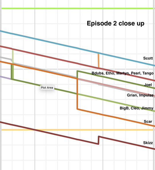
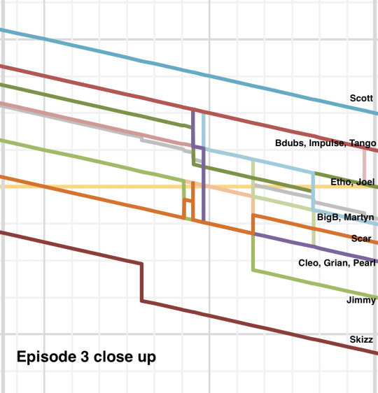
After the absolute carnage and chaos of Session 3 and 4, I desperately wanted to see a graph of everyone’s life left compared to each other, and this is the result of that. I will include close ups of each session below the cut, as well as screenshots of the full (colour-coded!!) data. Updates: Session 5, Session 6, Session 7, Session 8.
Note that I’m using the times that everyone should have based on their kills and deaths, and not what was actually shown (since I know Tango was accidentally given 1.5 hours for his boogey kill instead of just 1 hour, and Skizz hasn’t yet received his 30 minutes for killing Tango), so we’ll see if these times are rectified for Session 5, or if I will adjust my graph to show what is actually used.
Before I show the close ups, I just want to explain the colours used. I picked a base colour for each team and then used a different shade of that colour for each member of the team, to make it easier when looking at a mess of lines. TIES are red because Tango made the bowtie on the tower red (and also because of the red tie in Skizz’s skin, and also Tango’s skin is red). The Bad Boys are green because of all their crops (wheat and potatoes and carrots so far). The Nosy Neighbours are purple because of Watcher-related reasons. Mean Gills are teal because of the coral reef and the warm water colour (and also Scott’s hair). Clockers are orange because Minecraft clocks are gold, and orange is the closest colour to that. Below is a screenshot of all the colour choices I had, and I labeled each one with the player I picked for it

Now for the close ups of each session, with labelling for where each player is at at the end of each session. The grey squiggly downward line is simply the average of all the players’ times at that instant, and the green, yellow, and red horizontal lines mark out 24, 16, and 8 hours respectively. There are no markings for the number of hours, but each gridline is an additional hour, so you can count up and down from the colour-coded lines.
Session 1 close up

Session 2 close up
Session 3 close up
Session 4 close up
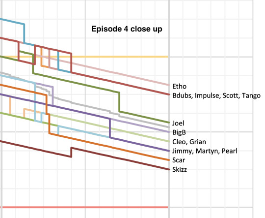
So as you can see... there’s less than three hours between the bottom nine people, and a much larger gap from them to the top five. And all three of Skizz’s teammates are amongst those with the most time, so I don’t think Skizz will be first out if TIES play their cards right.
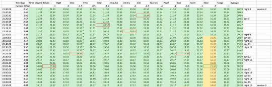
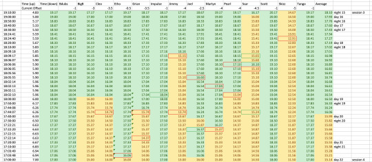
Next I am going to show the data tables I used to generate the graphs! I colour coded them so you can easily see green lives vs yellow lives, and also how often some people switched between them (and you can also see the single second Scar technically turned green during Session 3 before dying, which is also the weird orange vertical line on the graph).
There’s a new row every ten minutes, and every death created two new rows, the first of which is the times a second before the death, and the second is after the death, in order to create the sudden vertical drop.
Deaths are marked with red borders around the box, and time being gained is marked with a green border. All times are in hours and only display to two decimal places, but were calculated down to the second (and the times in hours, minutes, and seconds can be seen at the very left.
Without further ado:
Session 1 data

Session 2 data
Session 3 data
Session 4 data

I find this is a super good visualiser of all the green and yellow switches during the session.
And to visualise the absolute chaos of a specific ten minute segment during Session 3... below shows how much space the chaotic ten minutes takes up in the data due to all the deaths... compared to the entire two hours before it (remembering each row is a new ten minutes or a new death... so for a single ten minute segment to take up almost as much space as two hours, really shows a lot)

Anyway, I had an absolute blast putting all this data together and I’ve spent so much time since the weekend just staring at all the pretty graphs and data. I hope this helps other people keep track of all the death and carnage and times and so on, like it helped me.
#limited life smp#traffic life smp#24lsmp#limlife#i cant remember what other tags people are using for limited life lmao hopefully that works#anyway i love numbers and data and i made this and then couldnt show any of my friends bc none of them had seen session 4 yet#and then i remembered tumblr exists as a place to show things ive made#since my friends werent available yet#anyway follow me for more nerdy maths things or whatever#anyway :D this graph makes me so happy#the only illegal kill that was awarded time was joel in session 2#no one else has counted#except for tango's extra 30 minutes#which got me thinking bc like tango had 42 minutes left when skizz killed him#but he was supposed to only be on 12 minutes#and i cant help but wonder. if he was on the correct time (16:12:xx) would he have tried to hide for another 12 minutes and go down to#go down to yellow naturally? rather than brute force lose an hour?#because obviously tango didn't think he'd be able to run and escape for another 42 minutes#really makes you think#also i hope they gave skizz his bonus 30 minutes from killing tango when they recorded earlier today#anyway i should stop rambling in the tags so i can actually press post and you guys can see my cool graph haha#also its 11pm i need to go to sleep too probably#edit: my sister wants me to mention that she helped me pick the colours lmao#thanks sister i appreciate it#altho i think i made most decisions and you just agreed with them but whatever#my spreadsheets
42 notes
·
View notes
Text
I keep forgetting I can't seem to get the current version of xkit to work on my new laptop and going to do stuff that it let me do fjldksafjdlsaj
#text post#im p sure the mutual marker thing was a feature w/them bc i'm missing them on everyone that#as far as I know I was still a mutual with#then again I did drop like. fifteen followers over the last week#but that usually happens whenever I start actually posting my personal thoughts on my personal blog lmao#have also gotten a few messages both politely and not so politely asking me to essentially shut the fuck up re: my personal posts#idk what to tell y'all on that bc like. i have a lot of folks I follow n' enjoy who post just as much /even more than me re: personal stuff#I think im just particularly irritating even when I'm trying really hard not to be and try to edit my posts down/keep them under readmores#but im trying to be better#not trying hard enough tho apparently and this tag essay probably won't help but. idk.#i think we're all allowed to be as irritating/post as much personal stuff as we want on our blogs#but i also think im still operating uselessly on how tumblr was a few years ago. ppl don't like that anymore it seems#and that's okay but I gotta work on catching up to that and do better#anyway. it's possible i did lose most of my mutuals and tbh it's not a big deal it's just a lot of ppl at once like. damn.#makes me wonder what the last straw was just out of curiosity#bc if that's really what happened then im down to like. maybe three or four mutuals left and it hasn't been that low since I first started#on here back in like. tail end of hs beginning of college#I also keep missing the quick reblog feature which was my fave but. someday I will figure out why xkit isn't working for me#and i will fix it. at a time when im not sick and feeling cruddy lol
3 notes
·
View notes
Text
Hi
I’m fucking dying
#just spent like over 3 hours detailing two clocks in one drawing#i. i cannot do this. i dont got this.#this is only one drawing bro#i have to make multiple as well as write an at least 50 page thesis on the project#i have like only a little over a month left ughhhhhhhhhh#im gna go into some deadass horrible burnout after this istg#i also have to make a trailer/survey/idfr what else#i miss tumblr i miss my games i miss bring able to FUCKING SLEEP#sobbing crying wailing throwing up on the floor running up the walls laying on a train track going insane#so yeah if anyone has been wondering why ive completely disappeared#this is why#im dying from my final college semester#i do not live#if i do succeed in completing the fucking drawings imma post it on my art blog for yall to see bc i need you to understand bro this is pain#im fucking putting myself through the five stages of grief and torture rn#anyways good talk hope yall have a good one see you when i next decide to appear if im not dead by then
4 notes
·
View notes
Text
i love when gimmick blogs make a non-gimmick post. its a fun reminder that there's a person behind the gimmick, someone (presumably) with a main blog where they post who knows what. they could be anyone! they could be your best friend! unless they share their other blog(s), you have no way of knowing! idk man, theres an air of mystery around gimmick blogs thats just so appealing to me.
#this has been an original post#personal spewage#tumblr culture#its especially fun when there's not much “personality” in their gimmick posts#and then they answer an ask or put smth in the tags and its like#ahh!! they speak!!#i always wonder like. whats their main blog like? are they a fandom blog? are they a whatever blog?#do they draw or write or reblog cat memes?#are they a nobody blog with none followers and left beef or are they a big name blog with tens of thousands of followers?#its fascinating
7 notes
·
View notes
Text
i hit a neat follower milestone and i wanna thank all y’all for following me for whatever i contribute to this big blue marble
#I dont believe in tumblr popularity so i wont say the number but i appreciate each and every one of you#to those of you i get to know irl i promise im alive im just ill at the moment#if youve ever reached out or sent me an ask thank you so much#i think i have all of five followers left over from when i started this blog many many years ago#and yes yes they are all now inactive#so to everyone whos followed me in the past year especially#thank you v much#i love y’all and i hope youre having a wonderful day and are being kind to yourself#sorry for the lack of posts lately#life has been f u c k i n g weird lmfao#personal post#grey speaks
3 notes
·
View notes
Text
I really regret coming back to tumblr as a WondLa stan very late, way after the hype was breezed away slowly, but… was WondLa really ever actively posted about like other fandoms on this site?
#yes i was on tumblr in its ‘prime time’#yes i was a 14 year old reblogging angsty indie photo shoots#tbh tumblr scarred me- some things i shouldn’t have seen- i left and decided to come back when i was an actual adult who knows better#anyway… still wonder how it would’ve been if i had been in the wondla fandom early on#there are some dead wondla blogs from years ago that i follow because i love their posts#it’s a sad archive now#really i just don’t want wondla to die as a beloved and memorable children’s series
2 notes
·
View notes
Note
Just a good vibes message 💖💖💖✨✨✨✨ I hope you stay safe and well during the hurricane and nothing bad happens 💙💙💙💙 here’s a cookie 🍪 you’re doing great!
Awh thank you so much Ocie 😭💙💙💙
#💌#no you don’t understand like when you disappeared I missed you so much#I always wondered if you died or just finally left tumblr#but no you’re here and I’m so happy
2 notes
·
View notes
Text
I wouldn't even necessarily mind a layout change if it were good but with the negative association I have with twitter, opening tumblr to the exact twitter layout is actually making me angry + the more time I spend on it it does feel cramped + the notifs on "following" (and now "home") are sooooo annoying somehow it's worse to me than the sparkling store icon and it's harder to just ignore than the notifs on "activity" because at least those max out and stay the same whereas this is constantly changing. the constant glitchy-looking appearing and disappearing of the following/for you bar as I'm scrolling was irritating enough without a changing number on it (also why would it make sense for that bar of all things to follow you down your dash. even if I used the for you tab, why would I switch in the middle of scrolling and lose my place?? it doesn't make any sense). but I'm getting off-topic. I don't understand every website copying all of twitter's famous-for-being-bad decisions right now. I hope all the things people are trying will work. looking forward to the probable xkit fix. thank you xkit devs for everything.
#also it's harder to find everything now! left that out of the post bc that just comes with moving things around but it's still annoying#this is so obvious it almost has me wondering if it's bad on purpose for some reason. except that they're making other bad changes too#tumblr update#this is actually a good reminder that there are probably things I conditioned myself to ignore that I might actually be able to change#with ublock or xkit#sometimes curating your experience also means changing the actual site#legitimately there are some things on a site you get used to and they aren't bad but there are Definitely other things#that when you get rid of them after a long time it's such a relief because it really was bothering you#'if you don't like it try to change it' are words to live by (with anything tech really) and easy to forget. I should look into it#personal
2 notes
·
View notes