#i was trying to go for a zine-like style
Text
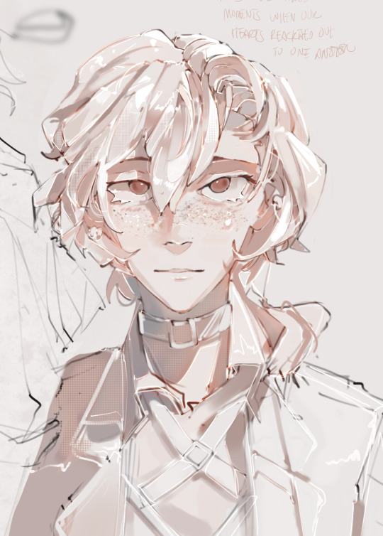
hard experimenting with my artstyle feat. an attempt at making chuuya look more realistic
#trying to make my stuff look more porcelain-like ig as well although idk if im achieving it 😭#this was more of a style test for a zine cover although idk if im going to go with it ehh#ok im procrastinating really hard rn i need to go work#chuuya#chuuya nakahara#bungou stray dogs#bungo stray dogs#bungou stray dogs fanart#bsd art#bungo stray dogs fanart#nakahara chuuya#kokoart
969 notes
·
View notes
Text

PLAYABLE ZELDA PLAYABLE ZELDA PLAYABLE ZELDA PLAYABLE ZELDA PLAYABLE ZELDA PLAYABLE ZELDA PLAYABLE ZELDA *inhale* PLAYABLE ZELDA PLAYABLE Z
#zelda#echoes of wisdom#I still can't quite believe it's finally happening tbh! took ya long enough nintendo#anyway how are you!! sorry for the radio silence lately haha#my 7-year-old computer actually chose the week I was trying to finish my piece for the magic book zine to give up the ghost entirely#(luckily I just barely managed to coax it into hanging in there until after the deadline haha!)#so all my drawing lately has been like... experimenting to figure out how to use the newer versions of everything#I am old gandalf. I know I don't look it but I'm beginning to feel it#had a really good time drawing this though! playing around with new ways to do the light effects made me positively GIDDY#and zelda's design! I've seen people saying the game's visual design looks too simple but imo that's actually a good thing?#because the simpler the canon art style is the more creative input we have in our own interpretations of it#medieval tailoring is my special interest so my take on it is very loosely based on like mid-late 14th-century kirtles#as far as I know they didn't really have split skirts or that shade of purple back then but eh it's fantasy haha#I wasn't super clear on how the cloak fastens so I based it on the one frodo wears at the start of lord of the rings. you know the one#the outer edges have tabs at the top that sort of cross over each other and attach with brooches to the shoulders#I guess it's kind of like how marth and lucina's cloaks work?#but anyway I shall see you anon! hopefully before the game actually comes out haha#only 98 sleeps to go though! ARE YOU EXCITED BECAUSE I AM
15 notes
·
View notes
Text
Let myself start sketching something as a treat (Prophecy inspired by hades portraits) and its making the cogs turn in my brain in an ungodly way
#*draws women with muscles*#yeeeee#also trying to think about the shading style?#and liking the more graphic look a lot#PROPHECY IS THE OC TO THIS FOR#Then nyria and ez i think#but i might do a bunch#maybe the can go along with the tarot pieces for mini art zine
2 notes
·
View notes
Text
Tempted to design Tiger crawl home as a visual novel or something. I like the idea of forgoing nicer writing conventions and just doing whatever speaks to me best and that’s generally a lot of dialogue & writing that’s more description, bullet pointing and noting instead of like. Scene writing ect. Obviously I’d have a thousand nice visuals peppered in bc visual story telling is my strong point but. Idk, I think it’d be easier for me, I think it’d work better and my body’s kinda falling apart and I think putting myself through a multi year comic series isn’t a safe bet in the long run.
#I think it could be good....#I also just like the format of long dense visual novels for something like this#it'd give me a lot of chances to go into like#every single side and perspective of this story that I want to go into.#musing musing musing. Idk my nerve issues are getting worse so I'm just trying to think a bit more long term... But i still love comics so#I wanna keep doing shorter run comic series.#I'd like to see Hatchfiend through to the end and then maybe just#do zine comics after that. Really short affairs ect#And more journal comic style stuff where I can balance writing and visual story telling in a way that speaks to my brain#I'll find a way to tell all my stories even if it's through a google slideshow <3
29 notes
·
View notes
Text
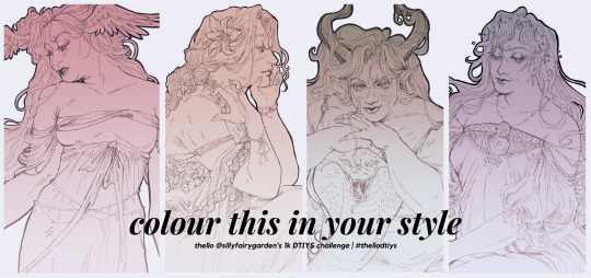
im MONTHS late to making good on this promise but !! i'm excited to try something different for a DTIYS challenge: a colour this in your style! all the rules and links to access the full pieces will be under the cut :)
rules:
1. no deadline, no due date. take as much time as you wish, and you can colour one, two, or all of them :)
2. i contemplated adding a designated colour palette to each of their designs (since these are based off an au), but i honestly think it's more fun to see the combinations people choose instead. there are basic themes for them (lizzie=chaos, gem=nature/life, cleo=decay/death, and pearl=stars), but go apeshit
3. please tag me AND/OR use the tag #thellodtiys on ur posts. i lurk on twitter/ig so you can use it there too!
click here to access the google drive folder containing the CSP, PSD, and Procreate files . there’s also like. PNGs in there too
thats pretty much it :) the rest is up to you. ive been marinating on the idea of a colouring book zine for the past few months, so this is my soft-launch to see how it goes. i cant express the gratitude i feel towards the kindness this community has shown me, and making content with these silly block women has been an unexpected source of joy in my life. to know that people enjoy my works is simply put, a treasure on its own. ty :^)
#thellos art corner#thellodtiys#mcyt fanart#draw this in your style#color this in your style#ldshadowlady fanart#geminitay fanart#zombiecleo fanart#old days#<< name of the au in case anyone is interested in going thru the tag for it !!
639 notes
·
View notes
Text
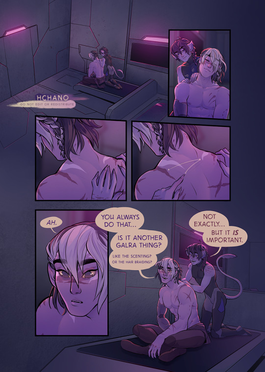
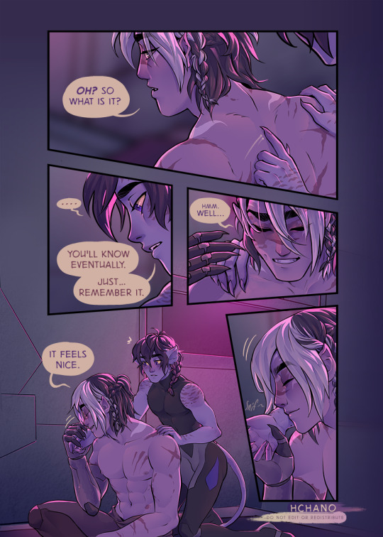
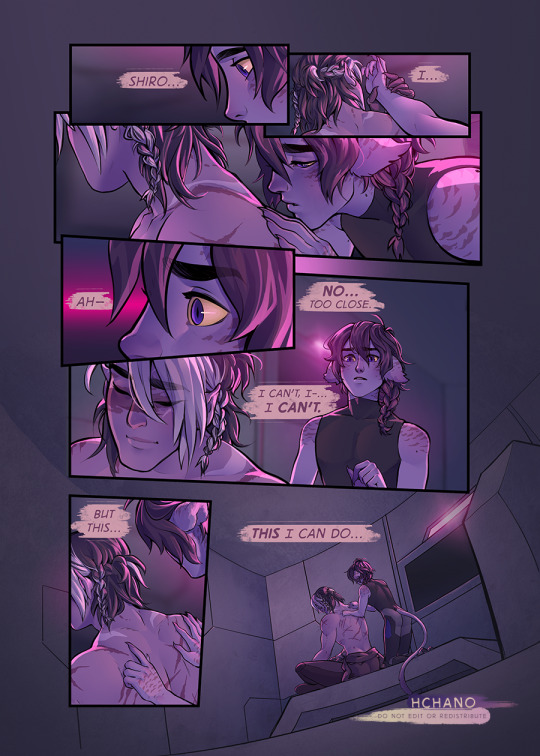
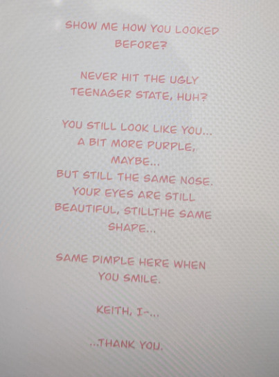
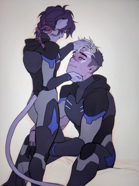
my second contribution to the binary stars zine.
sadly the fic, WHICH IS RLY GOOD, never got posted [long story, not mine to tell ;u;] but this was a telepath!keith/blind!shiro AU. basically keith is a captured BoM, and is sent to the arena in chains to be executed by a beast, but then a blind galra is thrown in to the arena was well, with a weapon. keith is able to convince him they can work together and using his telepathic link, shiro is able to defeat the beast.
afterward, they are thrown together more often in the arena and over time keith learns shiro is actually a human who has been experimented on and altered heavily. he also ends up teaching him about galra culture and how to navigate some of the wierd shit galra go thru [since shiro is experiencing a lot of galra instincts lol].
meanwhile the BoM are working on freeing keith, but keith will not leave without shiro :')
so in this scene, we have keith tracing coordinates on shiro's back, in hopes that he will be able to use them to escape. i do hope viper posts this fic one day but if not, just know it was rly good and liek the perfect slowburn.
extras under the cut!
so as i keep saying this was a rly good fic. i had like 5 diff scenes i rly wanted to draw but i realized i was NOT going to be able to fit any of them into only 3 pages lol… that didn't stop me from TRYING more than once tho…
attempt #1, 3 pics:
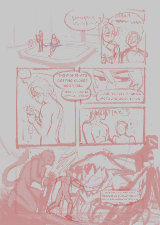
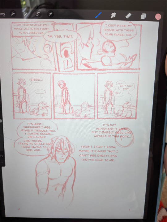
this scene is them bathing [PLATONICALLY] after a round in the arena. keith is lamenting about shiro geting hurt due to keith's reckless fighitng style leaking into shiro thru the mind meld, and thinks about how shiro still moves like he has his human body too, which shiro picks up on thanks to the mind link [which is something of a habit at this point lol]. shiro is angsting about the fact he actually dosen't know the extent of what has been done to him thanks to the injury that blinded him, and after asking to see how he looked as a human, keith ends up reassuring him that he's still a cutie lol.
the page with the dialogue only is when i realized there was no way i was fitting that scene into 3 pages lol.
attempt #2:

this scene is basically near the start to the fic. keith is brought in to the arena and chained to a pylon. he hears a bunch of rly loud monster noises and pounding at the door across the arena and is like, wow i am actually fucked 8D then shiro is brought in and thrown to the ground, along with a weapon. keith watches him try to feel around for the weapon and realizes he's blind, then calls out to him. shiro immediately goes into attack mode but keith is able to convince him that they can be allies, and briefly explains he's a telepath before melding their minds so that shiro can see through his eyes, and after a bit of clumsiness they are able to beat the beast this way :D
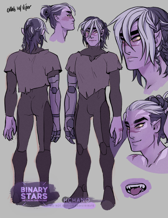
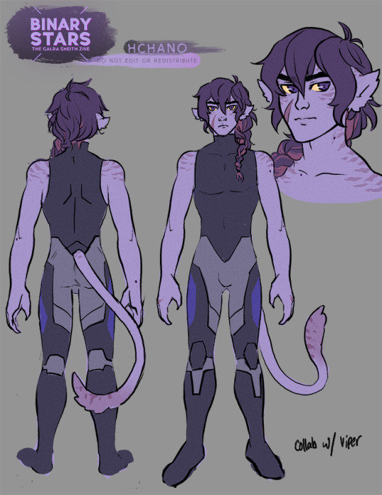
my designs for the boys. i have unclothed versions too that show off all their markings and scars but i feel like that would get the post flagged so these will have to do lol. i did post them on twitter tho, if you wanna bother looking there. also yes, this design is rly similar to the other contribution i did for this zine, which is because i rly like the idea of keith having these specific markings LOL. this is p much my official go to glara!keith design.
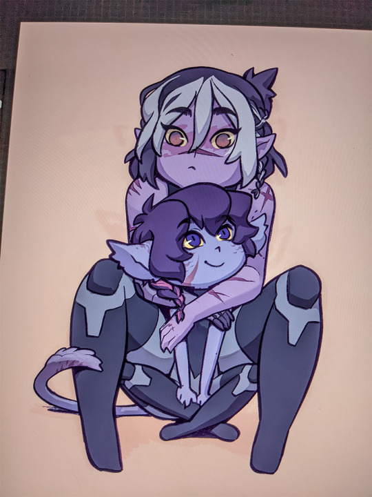
just two lil chibi guys
i actually finished this with shading, but for the life of me cannot find it, so old phone pic it is. this is post-fic, after shiro joins the bom. [so uh not so shocking spoiler, they both survive and escape lol]
#myart#art backlog#myart:vld#voltron#sheith#keith#shiro#galra!keith#galra!shiro#kinda lol#telepath!keith#blind!shiro#i still love this story so damn much#i might have to go grab my zine to reread it after this lol;;;#also i actually don't think i ever posted this cos i was waiting to see if my friend felt up to posting her fic#so uhh yay 'new' art
618 notes
·
View notes
Text

A little preview of the piece I did for @destinationunownzine!! I went a bit crazy rendering this one, but it was also incredibly rewarding.
If you'd like to get the zine you can find it on Big Cartel (for US shipping and digital bundles) or on Etsy (for international shipping).
I wonder what (or who) Ingo is looking at (and why) 👀
((a few notes and thumbnails under the cut))
The crossover I was going to work on for the zine was with Animal Crossing (of course) and I had a couple different ideas for the illustration.
I ended up making 5 thumbnails that explored those ideas (the page format ended up slightly taller than the one used here):
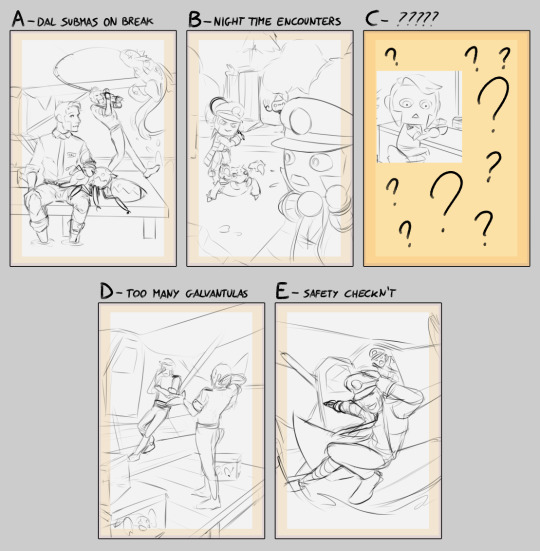
I had some options where the guys are in the DAL roles (like in the comics and sketches I made for my AU), and a couple where they are in their original uniform.
Option B in particular was more about applying the style of Animal Crossing to them as well as to some of their pokémon (chandelure was going to be referencing Wisp), while option E was very much just vibes and me trying out something a bit more dynamic (which ended up not showing the AC setting enough).
In the end C is what I ended up working on. It was really fun to work with the Animal Crossing proportions and style, and I even got to squeeze in my favorite AC character (that would normally be substituted with a pokémon character in my AU) and a little bit of humor.
#submas#subway boss ingo#subway boss emmet#saersketches#I am also working on turning one of the other thumbs in an illustration#here's to hoping it doesn't take me months
438 notes
·
View notes
Note
i hope this hasn't been asked before. what size do you make your canvas? and do you crop it to fit other socials (like Instagram for example)? i hear that 300 dpi is standard. i never know if it's good to make my canvas big or not.
hi i think this ask is like at least 4 months old but i was scanning my sketchbooks from last year and i abruptly remembered i had gotten this ask because i had made a little chart in my sketchbook trying to figure out how to answer it
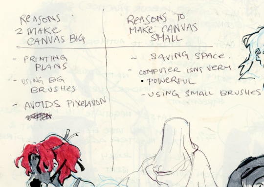
anyways theres pros and cons. and the size of your canvas is really going to depend on personal needs + preference. how good ur computer is, how complicated ur art style, how comfortable drawing feels, how much disk space you have to spare, what youre gonna end up using the art for in the end...300dpi is standard for PRINTING specifically, if you only plan to ever post things online then 72dpi works great and will save you space (fun fact a lot of professional animation files i deal with are 72dpi. and those eventually go on your tv screen). but personally i make everything i draw 300dpi because i am always printing stuff for cons, zines, etc and its nice to have the option even if i dont end up printing.
when I was a teen I used to draw on a rly shitty laptop and i made everything 800x800px 300dpi because big canvases would cause a lot of lag and also the resolution on this laptop was pretty small so 800px was a lot of the screen already. now i have a slightly better laptop with a bigger resolution and i sketch on giant 10000px-40000px canvases with the hard round brush and no shape dynamics or transfer whatsoever to minimize lag. when it comes to making a final illustration when i know ill be using a bunch of layer effects/blending modes/colors/mixing brushes etc etc ill generally crop the canvas down to the 6000px range. most illustrations i try to make sure are comfortably printable on tabloid size paper so thats pretty much anything hovering around or above 3000x5000px w 300dpi (so 11x17in). HOPE THIS HELPS?
EDIT: OH ALSO re: socials. i always ALWAYS size down my art to post on the internet. i think its crazy when other artists dont. because why would i ever let the internet have my hi-res file for free. also in general i think it looks better if you do the resizing yourself because if you don't then many social media sites will compress your file for you! a lot of people will post a hi-res file to twitter and then go "Wow twitter killed the quality of this img!!!" UH YEAH because they have an automatic image compressor. because they need to save space too lol and they dont want your image to take 248263895 years to load. same with instagram and to a lesser extent tumblr. when i post anything on social media i resize it down to 1200px-1600px on the longest side... its a little arbitrary but im kind of basing it on the smallest resolution of widely available screens. mostly because i think it looks stupid when u open up an image file fullsize and u have to scroll to see the whole thing... also iirc instagram only takes images up to 1080px before it resizes them? granted if you upload something smaller than that itll also resize it up which will look worse so I think bumping the numbers just over 1080px is pretty safe.
I should really be bringing the dpi down to 72 too when i post online but often im too lazy to do that. but it will technically help ur image load faster and stuff. and make it less likely for people to yoink it off the web and print it themselves.
147 notes
·
View notes
Note
Do u have any johndave hcs youd care to share? Literally anything that comes to mind (height hcs, habits in their coexistence, what kind of food they usually make/eat/order, general opinions towards each others family... just throwing a few out there to get thoughts flowing). I am v intrigued about ur vision for them, ur domestic sketches feel like they have a lot of thought (or at least general vibes) behind them
when i draw john and dave sometimes, i have this very specific universe they live in planned out in my head. most of this is self projecting with me and my own best friend, but i'd be really happy to share anyways!
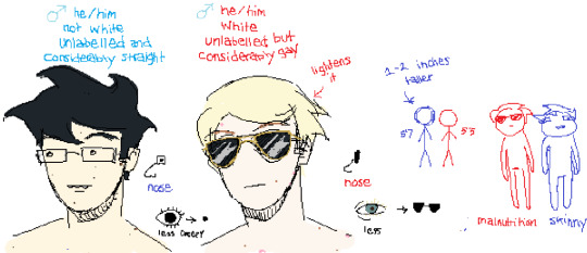
these are my headcanons for them physically. i am really not sure what race john should be. i always say he's "mystery asian" but honestly, i dunno. dave, to me, is embarrassingly white.
here are two pinterest boards i just made to try and explain their sense of style and their "vibes". i'm sorry if this is shit. i'm no experienced pinterest board creator.
dave's board
john's board
and on top of that, here are two playlists that highlight what kind of music i think they'd listen to.
dave's playlist
john's playlist
i think john's taste in music is just stuff he's picked up from other people, and movies. dave actually goes out and finds new music he'd like to listen to. john would be the type of person to have 4 songs in a playlist and hit smart shuffle on them.
i think john's favorite food is lasagna/burgers and dave's favorite food is spicy chicken wings. but since dave doesn't know how to cook and john is busy most of the time, they'd order takeout frequently.
i think john and dave would both be smokers, one more casually than the other one.
here is a minecraft house i built for them:
https://youtu.be/bXCzLp-S99Y?si=mebaL3FDafxrPt-I
but, i'll talk more about it. i think john and dave would rent an apartment in the city together so john could easily go to uni and dave can grow mold in his room. it'd be a really shitty place, but i think with john's efforts they'd manage to make the place look more homely. dave would mostly stay in his room because he has made it so that he could sustain himself in there for a week without having to come out. john wouldn't be on his case about it though as long as the living room isn't filthy. i think john would be able to tolerate a moderate mess.
i think john would be weirded out by bro strider, but then again i don't think those two would cross paths very often. i think in a world where dirk exists as dave's brother consistently he'd get really annoyed by him. that is why i made those dirk comics. i reckon that dave would like john's dad, but for some reason i always imagined he'd be dead or in a different state when john and dave live together.
in terms of what they'd do, i think dave would be a college dropout so he'd probably be working some really peculiar short-term one off jobs. like, gigs and costume mascot work. or he'd be doing some really weird crypto shit on the internet, which he'd think is really funny. like, he'd rake in a handful of money during the nft craze.
i imagine john and dave trying to live a little and be teenagers during the time. so they'd show up to or have parties and they'd be getting up to some zany and boisterous teenage behavior.
i think john would be studying at university and he'd have a job related to that. i'd bet that dad would help him pay for his expenses too. i think john would study computer science or something kind of nerdy like that. he'd be paying for most of the expenses at home. and he'd probably be doing most of the chores, but he wouldn't mind that much cause dave tries to contribute and he makes good company.
john and dave would play video games a lot and go out to eat and see movies and stuff. just kind of really casual things. maybe they'd go out to arcades too.
i suggest reading deacon_blue's moveout zine, which i enjoy a lot and has a similar basis. it is one of my favorite things produced out of the fandom regarding the beta kids.
romantically, i like to imagine they don't actually get together until like, two years of living together. not much i can say about that but when it happens, it happens late. i can't formulate the words to describe this bit, but i'll end up drawing pictures later on.
i hope this was enough, i can't really think of anything else unless i'm prompted with specific questions so if you have any i'd love to keep talking about this weird universe i've built in my head around them.
98 notes
·
View notes
Text
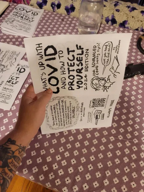
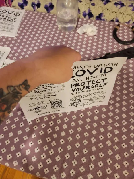
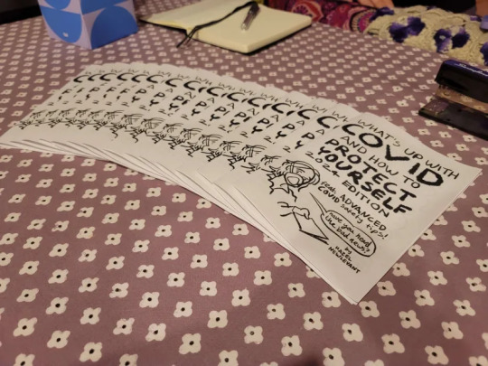
So you want to print and distribute a free zine...
I wanted to throw together a short tutorial on how I print zines using this excellent COVID safety zine by @newlevant as an example.
Printing
First make sure you are clicking on the printable file. When you open it, it should look slightly jumbled. I always look for seeing the front cover and the back cover on the same page.
Then click "print" (usually a printer icon) and open "more settings".
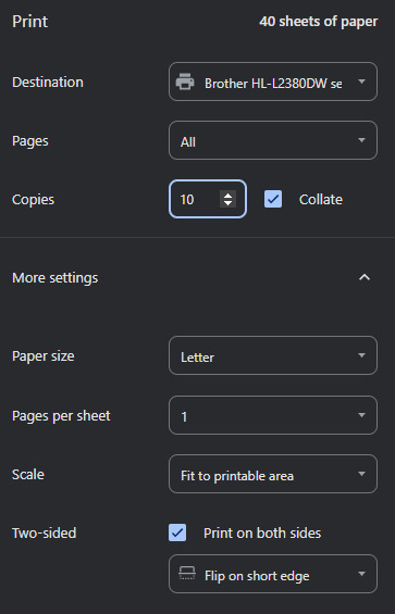
The key things people tend to get wrong when they try printing zines is they forget to make sure that it is double sided and flips on the short edge. If you tried printing one and it came out looking wonky, make sure to check this.
Also, it will make your life infinitely easier if you use the collate option should you have it available to you.
Fit to printable area is a helpful setting to have on if you're printing zines who use a different paper standard than you. This zine didn't for me but I leave this on out of habit.
When you've got this all set up - print as many copies as you want to assemble.
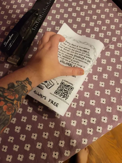
Assembling
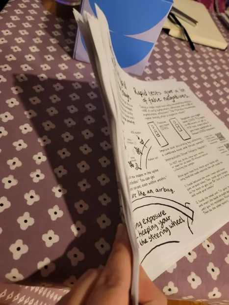
When you get them out of the printer they'll look like this. Just a big old stack. I highly recommend parsing out each individual copy before you try assembling any. I have made that mistake before.
This is how I stack mine.

I like to leave the cover side up as it makes for a clearer division as I'm assembling.
As you're flipping through these to parse and stack them, check them over for any issues with printing. I ran out of printer toner on the first three so I'm glad I checked.
Imperfections are fine but you're looking for anything that makes critical information unreadable.
To assemble a copy, get them lined up by tapping them on the table along a short and a long edge.
Both hands is a lot easier but I was trying to take a picture lol
Then fold them hamburger style and smooth down the spine as best you can. If you have a bone folder or similar use that.
Again, let go of perfection. We are looking for good enough here. Minor errors here should not make info unreadable so don't sweat the small stuff.

I recommend doing all your folding in one go to prevent errors. Or at least it really helps me.
Now it's time to staple. You will see my fancy stapler in the background - you do not require it and I would not recommend it. Unhinging a normal stapler is way easier to use in my opinion and this one gets jammed fairly easy. Use what you've got.
If you don't have staples, but you do have sewing supplies - check out this tutorial for a way to bind it with thread.
If you have no staples and no thread, you don't have to staple every zine. Smaller ones (~5 pages or less) do fine with no staple. They can be a little tougher for some people to use and don't hold up as well being taken in and out of places so I would consider that when thinking of where to leave them. They're still well worth printing and putting out.
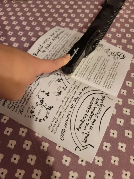

This zine is small enough that one staple in the center should be enough to keep it together.
I opted to staple in two places - one about an inch in from either edge - mostly out of habit. It does add a little stability and will make them a little better for putting in Little Free Libraries and other places where they'll be removed and placed back.
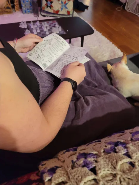
Here is my partner looking over the zines to make sure my stapling didn't cut off any important information in each copy. It's a little tedious but it's pretty important. A quick flip through can mean the difference between someone getting the info you want them to have or not.
And here's the finished product
I made 15. I'm pretty privileged and have been making zines for over a decade now so it's almost like knitting or crochet for me. Feel free to make fewer copies or just one for yourself. It still counts.
I will stick some in each car and my bag. I have some medical appointments coming up so I will for sure be leaving some of these in the waiting room.
I'm also going to keep an eye out for Little Free Libraries and other place where people are looking for something to read. I might also toss some on the tables of a coffee shop I pop into sometimes (masked, take out only) and the library to pick up books (also masked).
I tend not to give them to specific people, even people I know, because people are way more open to information they've picked up themself than something it feels like someone is pressuring them to read. But if people bring it up in conversation, I'll be sure to offer a copy to anyone who is interested.
Hope this is helpful!
Go out there and print!
98 notes
·
View notes
Text
OFFICIAL COVER ART FOR THE HUNTER FIC!
eeeeeee I'm so excited to share this! It's a literal dream come true. I spent a long time trying to decide which fanartist's style would be most fitting for the story vibes, and holy cow, it could not be more perfect! so, without further ado, may I please present the incredible work of @pinkiemme with the banner for my upcoming Hunter fic! 😍

I could go on about it forever but I really had a certain feeling that I hoped it would portray, from the characters to the details to the overall atmosphere... And Maria knocked it out of the park! 😭
I've been so overwhelmed and grateful with ALL the incredible fanart for this story, and I really can't wait to share the full thing with you all. I have to constantly fight the temptation to start posting it before I'm finished, but I want to make it the best it can be, so I wanna complete it and make sure everything connects/flows/ties up neatly. Plus, I'm hoping to keep it canon-compliant as a happily-ever-after for Hunter... with a few twists and turns along the way. 😏
Also... I've been inspired by @wrenkenstein's world of JunTech, and there's a wealth of fanart, mood boards, and fun stuff for this story, so if there's interest, and a way that I could highlight, showcase, and promote additional artists and writers... Perhaps we could create a zine?! 🫢 Maybe once the story releases, if there are scenes to draw or ways for writers to have fun in that world... Let me know if you'd like to be notified of any opportunity for that in the future!
Now I just need the right acronym for the story, cause BSD sounds like some kind of medical issue and BTSOAD sounds like a swamp creature? 😜
Tag List: @lightwise @sweetcream-coldfoam @clonethirstingisreal @have-a-hiddles @sverdgeir @roam-rs @littlemissmanga @dystopicjumpsuit @523rdrebel @solstraalaa @skellymom @internm0thb0y @sunshinesdaydream @dyolferb3 @photogirl894 @reader6898 @jedi-hawkins
Master List of Fic Goodies/Teasers and tag list sign up
#the bad batch#tbb#star wars fanart#tbb fanart#bad batch#the bad batch fanart#star wars fanfiction#star wars the bad batch#bad batch fanart#fanart#tbb hunter#hunter fanfiction#hunter fanfic#hunter#hunter fanart#clone force 99#sw the bad batch#bad batch hunter#hunter x oc#romance fanfic#romance#romance fic#love story#romantic#fanfic writing#fanfiction#fanfic#the bad batch fanfiction
118 notes
·
View notes
Note
Any ttrpgs with a distinctive “grunge” aesthetic?
THEME: Grunge
Hello friend, I’m really glad you asked this question! Grunge feels like it fits indie ttrpg design so well, because so much of it emphasizes low-budget, DIY and messy styles. As a style of music, I understand grunge is about being dissonant, dark, and “ugly”. As a theme, what I understand about grunge is that it’s about alienation, isolation, and disenchantment with how society is right now, which is so so relevant to how we feel about our current quality of life right now.
That being said, there’s so much that can be explored in grunge, I feel like there’s a lot of different pieces that could make a work “grunge’. So while I think the games that I’m presenting here all fit some element of grunge, some of them might not fit the elements of grunge that you’re looking for.
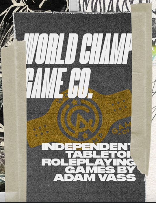

Games by Adam Vass.
Adam’s games are often nihilistic, horrific, and creatively designed with mixed media, visual distortion, and a focus on the grotesque or the weird. This includes No Future, a time loop game about punks throwing one last party, Born To Die, a pamphlet ttrpg about anthropomorphic animals in a post-human waste world, and Cybermetal 2012, a lo-fi metal cyberpunk game about surviving in an isolated city of warped technology.
If you love horror as well as a bit of a dystopian edge, you’ll probably want to check out Adam Vass’s work.
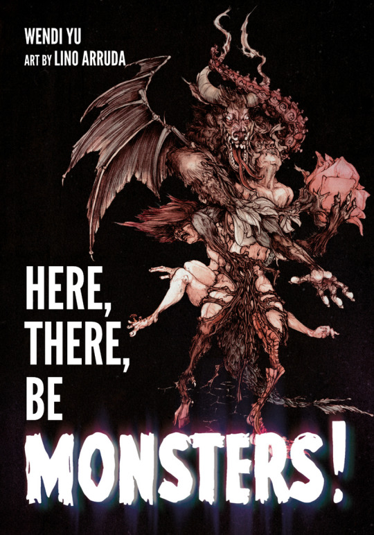
Here, There, Be Monsters, by wendi yu.
No matter what they tell you, there’s still weirdness and wonder everywhere. You just have to know where to look. At the edges and cracks of ‘normal’ life we exist, we persist, and we resist: the monsters, the magicians, the anomalies, the freaks, and the outcasts. We gather in the shadows, trying our best to live our lives in a world that, when it doesn’t exactly fear or hate us, doesn't even believe in our existence.
But we’re still here. We’re not going anywhere. And we fight back.
While the layout and art direction of Here, There, Be Monsters is purposeful and cohesive, the goal of this game feels very grunge in the sense that it is meant to acknowledge the messiness and unapologetic anger present in the monster characters. There's a lot of bodies in this art, and these bodies are meant to challenge you - if you find them difficult to look at, that's a you problem, and that feels in tune with the spirit of grunge.
I feel like this game is probably more on the border of punk and grunge, but if what you’re looking for is a game that feels chaotic and embraces the dark and “disgusting” material that grunge is known to celebrate, than this might be worth checking out.
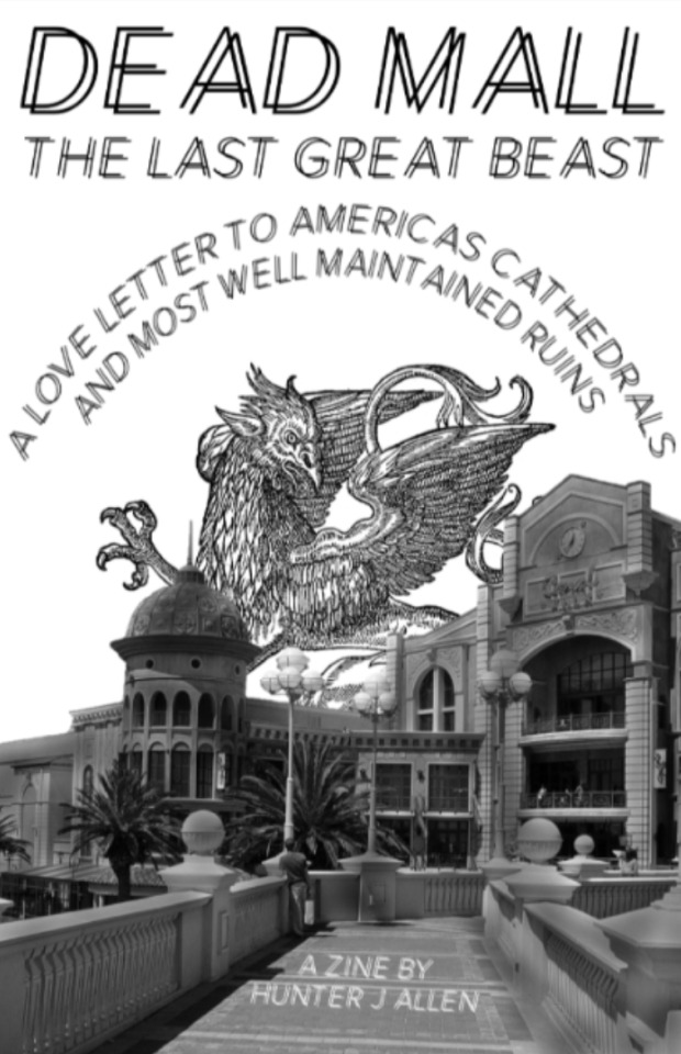
Dead Mall: The Last Great Beast, by Hunter J Allen.
They built us altars only to abandon them. Now they sit as dying, empty relics. No matter what they tell you never forget: These are our relics, not theirs. Don't let them pass gently into that sweet goodnight. They were made for profit but they remain as our playgrounds. If we choose to let them.
This here is a mini-zine and Bingo card about the American shopping mall and its relationship to us, our collective nostalgia, and the significance of cultural ruins.
This is more of a solo bingo game than a roleplaying game, but I think it might be an interesting way to build a modern “dungeon” for something like Liminal Horror. The zine also re-contextualizes a piece of American architecture that was so ingrained into the middle-class experience of the 80’s, 90’s and early 2000’s. I’m intrigued by how you could use this idea of decay and neglect in other urban fantasy and horror games.
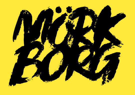
MÖRK BORG, by Ockult Örtmästare Games.
MÖRK BORG is a pitch-black apocalyptic fantasy RPG about lost souls and fools seeking redemption, forgiveness or the last remaining riches in a bleak and dying world. Who are you? The tomb-robber with silver glittering between cracked fingernails? The mystic who would bend the world’s heart away from it’s inevitable end? Confront power-draining necromancers, skulking skeletal warriors and backstabbing wickheads. Wander the Valley of the Unfortunate Undead, the catacombs beneath the Bergen Chrypt or the bedevilled Sarkash forest. But leave hope behind - the world’s cruel fate is sealed, and all your vain heroic efforts are destined to end in death and dismay. Or are they?
This is a black comedy style of game that I think has a lot of overlap with the grunge aesthetic. It’s received a number of awards for its art style, which is chaotic, monochromatic, and as best as I can describe it, “sludgy.” Then again, you might look at Mork Borg and feel like it’s more metal than grunge: it’s not casual, but rather designed for shock value. The world is destined to end, and your characters are futilely trying to make a difference in it; a lot of the cues seem to point to your own characters being not necessarily good people.
The Prophet, by The Punk Theologian.
The Prophet is a solo-journaling role-playing game. It requires a tarot deck and can be played in as little as 30 minutes or over days.
Receiving Revelations: Turn over a tarot card and let the prompts and the card image be the revelation from the deity that called you. Navigating through visions of struggle and cries of despair, following the guiding flames of insight, to help turn your people’s trajectory towards justice and equity.
Overcome Events: Flip coins to find out if the people heed your warnings and are aided by their deity in overcoming enemy invasion, surviving a great earthquake, or a raging fire, or are crushed by the weight of divine condemnation reaping upon themselves the consequences of sewing the seeds of inequity.
When it comes to aesthetics, The Prophet feels very DIY-inspired, and when it comes to design, I think the fact that it’s a solo game contributes to the feeling of isolation: your status as a prophet may separate you from your peers, and if your predictions go unnoticed, you could feel even more alone. The inspiration of the creator is defined as “punk,” but since punk is a genre that grunge pulls a lot of inspiration from, I don’t think that this necessarily disqualifies The Prophet from being a “grunge” - style game.
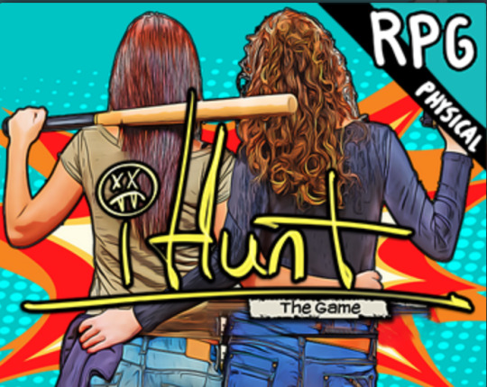
#iHunt, by Machine Age Productions.
#iHunt is a story telling game about killing monsters in the gig economy. In it, you play millennials scraping by paycheck to paycheck to make ends meet. A gig app called #iHunt offers them more money than they've ever made to hit the streets and kill vampires, werewolves, demons, and anything else that goes bump in the night.
The base game of #iHunt centres around the soul-crushing nature of the gig economy, which in and of itself I think is a great focus for a grunge-style game. The supplemental zines created by the designer have a very chaotic and collage-like look, taking photos or public domain art and re-mixing them to create something new. If you want to get really grunge, you might want to check out The 90’s Sucked Ass Or Whatever, which is focused on the specific events and details that would affect your disillusioned monster hunters during the height of grunge.
52 notes
·
View notes
Text


HOLD ME, HAND. a handmade Renchanting zine by me! Transcripts, and image descriptions under the cut. Experience it on my website! (Transcripts inline on there.)

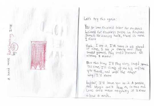


Pictured is the cover and back cover of the zine. The back cover is the same style scribbled black vertical line, but less dense, and with a streak of red scribbled lines towards the top half of the page.
Page 1 and 2 of the zine. On the left, the page behind the cover, has a crude drawing of the Dogwarts banner in red pen. It is an almost fully red banner with three white triangles at the bottom edge. The text on the side of the page, written along the side edge, says “a hand made Renchanting zine by SBY.” Renchanting is in red text, as is SBY. SBY is circled like a signature. On page two, there is a poem, titled “how it ends”, aligned left, in plain black text. It says;
Let’s try this again:
You go into fruitless labor for fruitless/business for fruitless prizes in fruitless/games. No winning here, there is none./I know
that. I see it. I’ve seen it all ahead/of time, I see it clearly now. Play/stupid games, play stupid pretend. No/winning. I know.
But this time I’ll play along, stupid games./This time, I’ll climb up the hill and see/you there, and walk the other/way. I’ll know
better. I’ll leave you to it. A gentle/nod. Magic can’t save us, in the end./Love can’t mean anything if I know
-how it ends.
Pages 3 and 4 of the zine. On the left page, page 3, is a poem written diagonally down the page. Once in black, then repeated in red. It is titled “on you.”/”(on you)” and the title is both on top and on the bottom of the poem to be read with the rest. The poem reads, “on you. drawn to you like gravity draws the axe to meet its mark (on you). drawn to you like gravity draws the axe to meet its mark”
On page 4, on the right, is a sketchy drawing of a handaxe, colored in slightly with blue pen and red hearts scribbled around the sharp end of the axe instead of blood. On the handle, all caps cut off text reads, “Red winter is-”
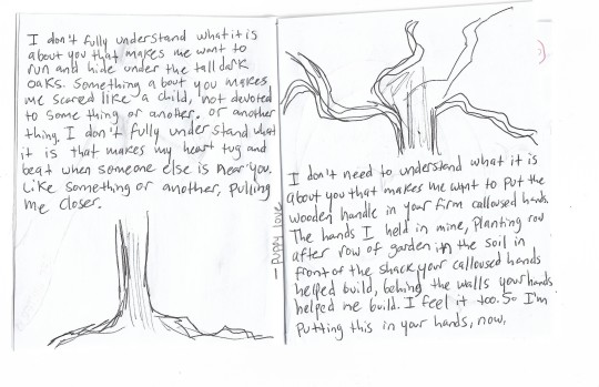
Pages 5 and 6 of the zine are in all black ink. This is a two page spread of a poem titled “puppy love”. The title is horizontal down the middle spine. On the bottom half, under the large block of poem text, is drawn the roots and trunk of a tree. On the top half, on the right page, above the text, is drawn the top half of the same tree. The text on the left reads,
“I don’t fully understand what it is/about you that makes me want to/run and hide under the tall dark/oaks. Something about you makes/me scared like a child, not devoted/to some thing or another. Or another/thing. I don’t fully understand what/it is that makes my heart tug and/beat when someone else is near you./Like something or another, pulling/me closer.”
The text on the bottom half of page 6 reads,
“I don’t need to understand what it is/about you that makes me want to put the/wooden handle in your firm calloused hands./The hands I held in mine, planting row/after row of garden in the soil in/front of the shack your calloused hands/helped build, behind the walls your hands/helped me build. I feel it too. So I’m/putting this in your hands, now."
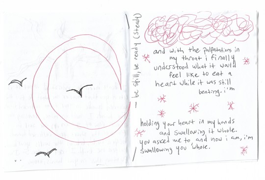
Pages 7 and 8 of the zine. On the right is a crude drawing of a red crescent moon with three black birds in front of it. On the right is a poem titled, “be still, be ready (steady)”. The title is written vertically on the middle spine again. In red pen, complementing the black ink text of the poem is a scribbled red cloud and red snowflakes. The poem reads:
and with the palpitations in/my throat i finally/understood what it would/feel like to eat a/heart while it was still/beating. i’m holding your heart in my hands/and swallowing it whole./you asked me to, and now i am, i’m/swallowing you whole.
Pages 9 and 10 are a mostly white page space two page spread of black lowercase text, that simply reads, very spread out, on a top left to bottom right diagonal, “oh./i understand,/now.”
Pages 11 and 12 of the zine are the first part of a four page spread of one poem meant to be read from left to right ignoring the middle spine. There is a long arrow at the cutoff at the end of the page, indicating that the poem continues. It is in black ink and says;
The wagon jumps --- not for joy. Executioner’s boots squeal/at the same frequency of the damn wheels creak. The same joy/peverted [sic].
I never understood an axe until I became one./Sharpen me,/deep repetitive motion, make me feel/good. How I touch/the scar around your neck and know/I made it --- mine, mine.
I smell bile/feel it in my throat too, and/I look up to see one of the men,/big and strong framed/an ox/of a man and gentle like one
Pages 13 and 14, continuing the 4 page spread. The rest of the text says;
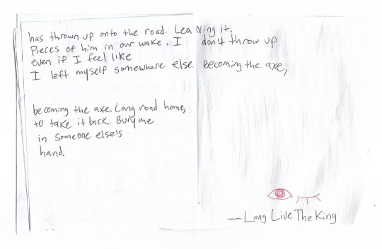
has thrown up onto the road. Leaving it/pieces of him in our wake. I don’t throw up/even if I feel like/I left myself somewhere else. Becoming the axe,
becoming the axe. Long road home/to take it back. Bury me/in someone else’s/hand.
The title of the poem is revealed on the bottom right of the last page; “Long Live the King”. Above it is a drawing of an open eye and a closed eye in red ink.
#renchanting#treebark#trafficshipping#fandom zine#3rd life#martyn inthelittlewood#rendog#debated whether to put this on my art blog but there's more writing#so it goes here!#at some point ill make it look good on the site but for now itll do#poetry
236 notes
·
View notes
Text

Official post of my contribution to the 2024 disabledstuck zine
This took so long I feel like I evolved art styles halfway through
Link ⬇️
https://harspoonz.itch.io/disabledstuck-zine-2024
I'm gonna get mildly sappy/personal talking about my thoughts while makeing this. Be warned
I was a teen when I discovered I have fibromyalgia and Ehlers-Danlos syndrome. since then iv been on a cocktail of pain meds and had issues of substance abuse.
I wasn't even safe in the mental health department becuase I got the 3 for 1 special on developmental disorders. (ASD, ADHD, OCD) For whichever ailment gave me minor hallucinations is still up in the air but bottom line. I got em. 😐😐😐
With all that information, seeing a young stoner with hallucinations and delusion I was sold. I know he flawed you don't have to tell me twice!!! I just think he's neat.
I'm nonfunctional without my meds. I get scared thinking about world disasters makeing my meds unobtainable and I just stop working. I don't know if I'd die or go insane first. I think back to when gamzee just ran out of sopar and bum myself out even more 😭.
I tried a new method of drawing objects. I would work on a seprate canvas and practice drawings of pie tins, faygo bottles, and trash. Once I got bored I did a more detailed render with a reference next to me. Then I would import it in and shrink it to fit. They got better incorporated with lighting later. Idk how to feel about it becuase they look to real?
I try to one-up myself every year for this zine. I think I did better then last year/ had more fun drawing this.
#homestuck#gamzee makara#disabledstuck#disability pride month#grand highblood#subjugator#homestuck 2024
42 notes
·
View notes
Text
alterhuman community zine interest check:
"Journal of Being: collections of personal essays"
This is more like a warning; we're probably going to dive headfirst into trying to make a zine, but first we'd like to shout out the idea for any interest and any advice available (we're first-timers!).
The zine will consist of written essays with a focus on personal experiences in the alterhuman community. Anyone nonhuman, otherkin, fictionkind, therian, etc. etc. are welcomed to join.
While I think it amusing to make the zine themed around academic journals, entries do not have to emulate any style or writing (do not fear about making a "bad" essay or not following what your English teacher told you about essay writing).
The zine will be PG13. Not sure about word count, but perhaps a hefty 8,000 words? 3-4 submissions allowed per body? Doubled space, New Times Roman, 16pt? Would that be good?
For time of submissions, I'm thinking about making the deadline be October 1st 2024, with publishing to itch.io as a PDF on January 2025.
If anyone has any questions, advice (or if it sounds good!), please let me know!
66 notes
·
View notes
Text
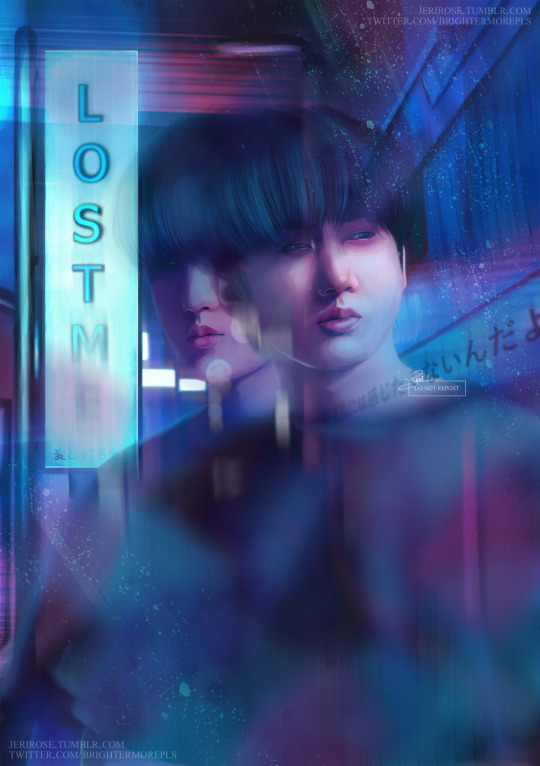
"Lost Me" for SKZMixtapeZine
I can finally share this!! I was so happy when I was told I got a place in the Zine, I'd never done one before and to be surrounded by such incredible artists was such an honour! I learnt so much painting this piece and I am truly thankful to all of those that organised it and put it together!
Image Description and my thought process on my painting under the cut!
My Twitter | Instagram
The song I got assigned was "Lost Me", which I think was my top choice if not one of my top 3. I was so happy to get this song - not only is The Sound one of my favourite Stray Kids Japanese albums, but I just absolutely love the emotions in this song. Changbin is one of my favourite song writers which is why he got to be the face of this painting. I listened to this song over and over again, I'm sure if it hadn't been for me listening to the First Take version mostly, my music app would have questioned whether I was okay or not haha.
Changbin said in a Nylon interview that Lost Me was "a very sad song about wanting to be loved by the people around you that you lose sight of yourself" and that really stuck with me - I remembered the days I would go on late night walks, feeling so dissociated from myself because I was trying to keep people around that didn't like me for who I was but who they shaped me to be, the feeling of detachment from yourself that you get from that... at first I'd a different vision for this painting but eventually, it made me think of those double exposed photos that were distorted and blurry, that feel almost like a wrapped reality, that uneasiness that they hold... that's how this song makes me feel and so I tried to translate that into a painting.
[Image Description]
A digital realism painting of Seo Changbin from Stray Kids standing in front of an alley way with a large neon sign that says "Lost Me" and under it in Japanese it says "変わっても全て" which translates to "Even if everything changes" in English is blurred and distorted. Changbin is doubled like a double exposure photograph, blurred and slightly transparent like he's fading into the background, behind him glowing lights of shop signs light their way down the alley way and a shop to his right has the lyrics "孤独には感じたくないんだよ" in Japanese which translate to "I don't want to feel alone" in English. The painting is painted in bright pinks and blues like those from a busy night-life scene, with glitch effects and light leaks, giving the whole painting the feeling of being taken on a disposable analogue camera during a night out. Changbin looks to off to his left in one of his exposures and off to the right in another, his black hair is down and not styled and he wears a simple black tee-shirt in both.
#SKZMixtapeZine#stray kids#skz#stray kids fanart#skz fanart#stray kids changbin#changbin#seo changbin#kpop art#kpop fanart#kpop artist#staydaily#stay art#staytists on tumblr#staytist#art#digital art#digital portrait#jeri rose#StrayKids6thAnniversary
76 notes
·
View notes
Last Seen Blogs