#i want to design a beautiful + logical web design portfolio
Explore tagged Tumblr posts
Visit Tumblr Blog
Explore Tumblr blogs with no restrictions, modern design and the best experience.
Last Seen Tumblr Blogs


Fun Fact
The KCSC sent more than 20K requests to delete posts related to prostitution and porn to Tumblr from January to June 2017.
Text
Why 'Follow Your Passion' Is Bad Advice for Freelancers

Freelancing isn't a hobby. It's a way to pay the bills, and you need practical skills that are in demand.
Growing up, I often heard the idealistic advice to just "Find your passion and be yourself!" This is a beautiful lie that ends up torturing many freelancers.
I found out the hard way that we should, by all means, pursue our passions, but that they may not pay the bills. Being poor isn't much fun. Neither is living purely for money and doing something you hate. As with many things in life, we must find the middle path.
A Square Peg Trying to Fit in a Round Hole
In my school years, my father pushed me to study math and science. He wanted me to be an engineer with the logic that, "Whether the economy is good or bad, there's always going to be something that needs fixing."
My attentions and fancies kept straying towards the arts throughout high school, but I relented and let him push me into engineering school where I struggled and flailed. Eventually, I quit and ended up getting an arts degree.
It was the mid-1990s, and companies were starting to want to have websites. I started doing freelance web design work and managed to leverage my "portfolio" to land a job at a software startup. While I had disappointed my father by flunking out from engineering, I had somewhat redeemed myself by gaining employment in a tech company immediately after graduation.
Being Overly Idealistic
I naively assumed I had found my dream job where I could work on my passions to my heart's content. I railed against anyone who disagreed with my design choices and arrogantly strutted around, knowing that I had it all figured out.
Not only that, but I blissfully skipped out of the office each day at 6 PM to pursue extracurricular passions. Meanwhile, my colleagues soldiered on into the night and often came in on the weekends too.
My self-delusion came crashing down when they fired me. Looking back, they had been overly generous giving me six months there. They should have gotten rid of me earlier, but they kept giving me chances to redeem myself that I blindly steamrollered over again and again.
Forgetting Myself
Brought to my knees by being overly idealistic, I snapped and made a 180-degree change, becoming entirely mercenary and money-crazed. This lead me to bounce around different companies and even starting several ventures. None of it, however, stuck because they weren't in line with my interests.
However, over time, patterns began to emerge and I was able to see what kinds of work suited me. It was easy in hindsight to see what got me into a state of flow, and what felt like ice-skating uphill. Part of this was realizing that I preferred independence rather than being a full-time employee. Indeed, the ‘security’ that the latter offers is just a mirage, but I digress.
Finding My Niche
About ten years ago, I made a full circle and came back to marketing. However, having no formal track record in it, I had to be self-taught and gain experience. This was the beginning of my freelance career.
Working on different gigs taught me how vast the field of marketing is, and I found the parts of it that I did well. I also learned the hard way how to ensure that clients had a realistic expectation of what I could and couldn't do.
I now work doing something that suits me. It does connect with a lot of my passions, but rather than say I'm "Following my passions," I'd say that I've found work that is a good fit. I feel good doing it, and my clients feel looked after.
What is Passion, Really?
The word passion comes from the Latin word "passeo," which means to suffer. When we are passionate about something, we are willing to suffer for it. It almost seems like there is a requisite amount of suffering that the universe requires, hence the concept of "paying one's dues."
Later, because of the investment we have made, it can be difficult to let go of the commitment. However, just like any investment, sometimes we have to cut our losses and learn from them. This applies to clients whom we are passionate about serving, but who don't appreciate the work we do for them.
Having a "Growth" Perspective
Telling people to "find their passion" can be harmful. We may stubbornly stick to what we perceive to be "passion" out of fear and switching gears when required may feel impossible. If we invest everything we have — all our time, energy, and emotional reserves — into a single pursuit, it can cause us to drop it when the load gets too heavy.
Instead, it's healthier to see passion as a malleable quality that can be cultivated, which makes us more open and more resilient. This thinking leads us to express greater interest in new areas, to expect that pursuing interests will be challenging, and to maintain enthusiasm in the face of resistance.
We need to be more flexible and willing to let go of our fear of failure. Don't let a rigid idea of success was hold us back. Rather than needing to follow a neatly defined career trajectory, we can use our skills in new areas of interest. A growth mindset helps us face challenges with curiosity and allowing ourselves to see difficulties as building blocks for further cultivating our talents.
Conclusion
With the world changing as fast as it is, we cannot afford to get stuck in a rut by believing that we are only cut out to do one thing. To grow requires staying detached, being open to new opportunities, and observing to find what fits our nature.
________________
Written by DLKR
Cover photo by Blake Barlow on Unsplash + edits
1 note
·
View note
Text
Alyeska Responsive WordPress Theme
New Post has been published on https://babesgobananas.com/alyeska-responsive-wordpress-theme/
Alyeska Responsive WordPress Theme
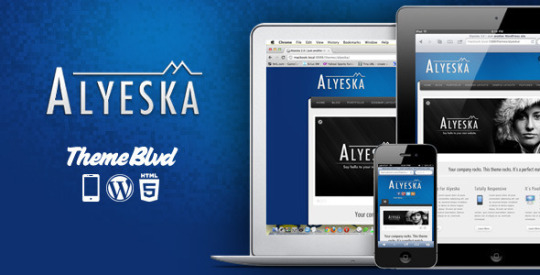


Elegance. Flexibility. Awesomeness. These are the words that instantly come to mind when trying describe this amazing WordPress theme. This is the theme that’s going to get you or your client’s site up and running in no time. With all of the possible combinations of layout options, you’re sure to end up with a unique, elegant website that you can be proud of. Nothing has been held back with this one. It has all the professional touches you’d require in a WordPress theme along all the personal ones, as well – I’ve even named this theme after the mountain I grew up shredding as a kid in Alaska. It’s professional. It’s personal. It’s the best. This is Alyeska.
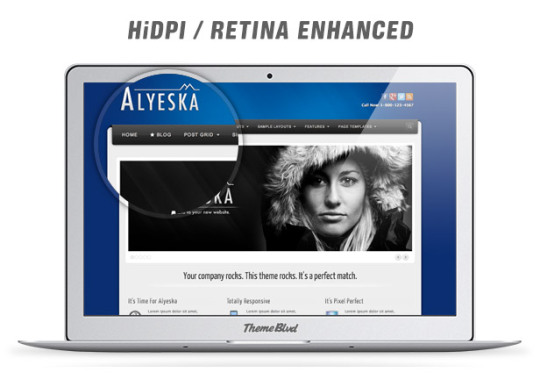
Whether your website visitors are browsing from a Retina MacBook Pro, a Retina iPad, or any of the other high-resolution devices that inevitably will come onto the market, this theme has you covered. The theme’s stylesheets automatically check each website visiter’s device pixel-density ratio, and then serve up all of the theme’s details crafted for their specific resolution. The result is a graphically beautiful experience, no matter the device.
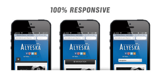
The entire theme, all the way down through the Theme Blvd Framework at the core, has been carefully built around the modern era of responsive web design. No longer should we be concerned with specifically just the iPad or the iPhone, but we need to focus on the entire mobile and tablet experience, as a whole. That is the approach we take at Theme Blvd.
Make sure to view the theme’s live demo on your various devices and browse through all of the demonstrated features. Additionally, Alyeska allows you to change how you want your website’s main navigation to display for the mobile user; you have three elegant options, as demonstrated in the above screenshots.
With complete WordPress Customizer support, just the right amount of Theme Options, and logical default values, you’ll be sure to have a unique site that stands out above the rest, without having to sift through an endless abyss of configuration.
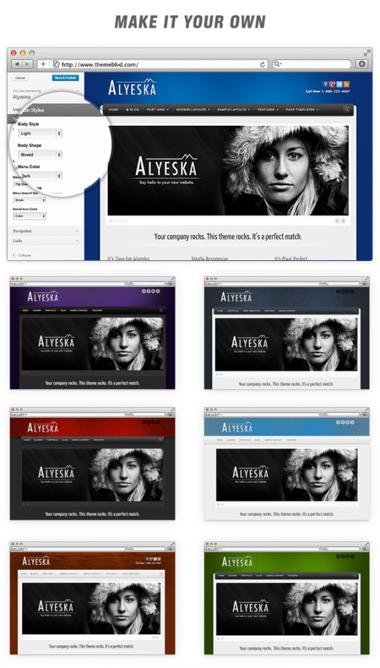
Many of our display options are pretty standard throughout our themes utilizing the Theme Blvd framework. These include standard features like selecting a custom sidebar layout, implementing a custom logo, with the option for it to be HiDPI/Retina-ready, etc. However, where you will find this theme’s truly unique stylistic options are under the “Styles” tab. —
You can choose from a light or dark style in your content area, along with whether you want it to be in a boxed or stretched layout. Then, what we really love about this theme is the “Flip Over” style main navigation. Select from one of our carefully crafted colors, and if you’re looking for more of a traditional look, select the “Classic” style navigation.
After you’ve setup your Theme Options, it’s time to finish off the main look of your site with a custom background image. This theme fully supports WordPress’s built-in background control. And to go with that, we’ve included 225 free background images in your theme package that have been created exclusively for Alyeska, combining various colors and textures. (Watch Video)
Here is an exact breakdown of each Theme Options page you’ll receive with the theme:
Theme Options Tab #1 – Styles
Theme Options Tab #2 – Layout
Theme Options Tab #3 – Content
Theme Options Tab #4 – Configuration


Popular Free Theme Blvd Plugins
Here are our most popular, free plugins that you’ll want to make sure and take advantage of to get the most out of this theme.
Theme Blvd Layout Builder – Setup custom layouts for pages of your website.
Video #1: Overview
Video #2: Starting Layouts
Video #3: Applying a Layout to a Page
Video #4: Using the Current Page’s Content
Video #5: Using External Pages
Video #6: Homepage
Theme Blvd Sliders – Manage custom, responsive sliders that can go just about any where.
Video #1: Setting Up a Basic Slider
Video #2: Image Slides
Video #3: Video Slides
Theme Blvd Shortcodes – A wide variety of shortcodes.
Usage Examples and Documentation: http://shortcodes.themeblvd.com
Theme Blvd Widget Areas – Create unlimited sidebars and widget areas.
Video #1: Locations
Video #2: Collapsible Vs Fixed
Video #3: Custom Widget Areas
Video #4: Floating Widget Areas
Theme Blvd Widget Pack – A pack of essential widgets to use with your theme.
Tweeple – A cool way to setup and display Twitter feeds.
Useful Free Theme Blvd Plugins
Here are some simple, useful plugins that have come through great buyer requests and suggestions.
Theme Blvd Favicon – Manage your favicon and Apple iOS icons.
Theme Blvd Featured Link Override – Set site-wide featured image links.
Theme Blvd Featured Videos – Replace featured images with embedded videos.
Theme Blvd Image Sizes – Adjust your theme’s image crop sizes.
Theme Blvd News Scroller Widget – A widget that scrolls through posts.
Theme Blvd Portfolios – Separate post grid items to a custom post type.
Theme Blvd Post-to-Page Link – Link a post to a page for modifying the breadcrumb trail.
Theme Blvd prettyPhoto – Swaps default lightbox functionality for prettyPhoto.
Theme Blvd Responsive Google Maps – Responsive Google Map shortcode.
Theme Blvd String Swap – Quickly adjust text strings on frontend of your site.
Theme Blvd WooCommerce Patch – Adds basic compatibility with WooCommerce.
Theme Blvd WPML Bridge – Full WPML compatibility. http://wpml.themeblvd.com
Homepage Setup
Here is the quick step-by-step guide for how this theme’s demo homepage was setup from the WordPress admin panel. You can find much more information on the following steps in great detail by viewing the documentation that came in your theme’s download package. Keep in mind this is only a quick step-by-step for the theme demo’s homepage and you definitely do not have to setup your site in this way if you don’t want to.
Install the theme and the recommended plugins. (See video)
Configure your Theme Options at Appearance > Theme Options.
Configure your background under Appearance > Background. (See video)
Go to Settings > Reading > Frontpage Displays, and make sure you’ve selected “your latest posts.”
Go to the Sliders page and create a custom slider.
Go to the Templates page and create a new custom template. Use “Alyeska Homepage” as your template’s starting point. Configure your element settings, including selecting your custom slider in the slider element, and save the layout.
Go to Appearance > Theme Options > Content > Homepage, select to show a custom template, and select the custom template you’ve created.
Image Sizes
For your reference, listed here are all of the image sizes that your images get cropped to when using this theme. If your WordPress installation already has many images uploaded, it’s best to run the Thumbnail Generator plugin after installing the theme.
Slider Full Width – 940×350 (hard crop)
Slider Staged Left/Right – 530×312 (hard crop)
1/5 Column of Grid – 200×125 (hard crop)
1/4 Column of Grid – 240×150 (hard crop)
1/3 Column of Grid – 320×200 (hard crop)
1/2 Column of Grid – 472×295 (hard crop)
Small Thumbnail of List – 195×195 (soft crop)
Small Square – 130×130 (hard crop)
Smaller Square – 70×70 (hard crop)
Smallest Square – 45×45 (hard crop)
NOTE: If you require changes to these image sizes, you do have options. Learn More
Support
We handle all support over at our support forum. Here’s how to get access with your purchase:
http://themeforest.net/item/alyeska-responsive-wordpress-theme/164366/support
Changelog
Listed here all of updates to this theme and when they were posted. In your WordPress admin panel, you can see what version of the theme you’re using by going to Appearance > Themes and looking at the version number next to the name of the theme. To update the theme, you need to download it again from your ThemeForest Downloads page, and update the files on your server. (See video: All About Updates)
3.1.18 – April 20, 2018
3.1.17 – January 18, 2018
3.1.16 – August 4, 2017
3.1.15 – August 2, 2017
3.1.14 – April 18, 2017
3.1.13 – January 18, 2017
3.1.12 – June 21, 2016
3.1.11 – December 11, 2015
3.1.10 – August 8, 2015
3.1.9 – August 7, 2015
3.1.8 – April 24, 2015
3.1.7 – April 21, 2015
3.1.6 – January 26, 2015
3.1.5 – November 26, 2014
3.1.4 – May 3, 2014
3.1.3 – April 7, 2014
3.1.2 – March 24, 2014
3.1.1 – March 7, 2014
3.1.0 – February 18, 2014 – Read here before updating to 3.1+
3.0.3 – November 4, 2013
3.0.2 – August 19, 2013
3.0.1 – August 8, 2013
3.0.0 – August 5, 2013 – Read here before updating to 3.0+
2.1.5 – August 15, 2012
2.1.4 – July 2, 2012
2.1.3 – June 2, 2012
2.1.2 – May 25, 2012
2.1.1 – May 12, 2012
2.1.0 – May 7, 2012
2.0.1 – January 28, 2012
2.0.0 – January 17, 2012 – Read here before updating to 2.0+
1.1.4 – December 14, 2011
1.1.3 – April 13, 2011
1.1.2 – March 16, 2011
1.1.1 – March 9, 2011
1.1.0 – March 7, 2011
1.0.2 – March 2, 2011
1.0.1 – February 28, 2011
View Full Changelog
Most popular item by Theme Blvd

Source
0 notes
Text
What Vitruvius Can Teach Us About Web Design
About The Author
Frederick O’Brien is a freelance journalist who conforms to most British stereotypes. His interests include American literature, graphic design, sustainable … More about Frederick …
The ancients can teach us a thing or two about design — even web design. The Roman architect Vitruvius had buildings in mind when laying out his golden triad, but its principles are just as applicable to the web as they are to brick and mortar.
There’s no escaping the ancient masters. Their shadows loom large over philosophy, literature, architecture, warfare, and… web design? Believe it or not, yes. Although Plato infamously omitted CSS Grid from from the final draft of The Republic, there is nonetheless plenty the old heads can teach us about web development.
Today’s lecture is about architecture, and how some of its core tenets apply to the worldwide web. Architectural terms are not unusual in web development, and for good reason. In many ways, web developers are digital architects. This piece will focus on Vitruvius, a Roman architect, and how his principles can and should be applied to websites.
This will focus in particular on the Vitruvian triad, three qualities essential to any building: durability (firmitas) , usefulness (utilitas), and beauty (venustas). Familiarity with these terms — and what they mean in practice — will help make your website better.
Vitruvius
Marcus Vitruvius Pollio was a Roman architect, civil engineer, and author who lived during the first century BC. He is remembered mainly for his writings on architecture, De architectura. Addressing the then emperor Augustus, Vitruvius outlines his thoughts on architectural theory, history, and methods.
Vitruvius posing for a LinkedIn headshot. (Large preview)
De architectura is the only treatise on architecture to survive from antiquity, and remains a design touchstone to this day. As you could probably guess, Leonardo da Vinci’s Vitruvian Man was inspired by Vitruvius’s writings about proportion.
For those of you interested in going down an architecture rabbit hole, the full text of De architecture is available for free on Project Gutenberg. This piece will not attempt to summarise the whole book. There are a couple of reasons for this. First, there’d be an awful lot to cover. Second, I haven’t totally lost sight of the fact this is a web design magazine. We will be honing in on the Vitruvian triad, a standard for design that applies well beyond architecture.
The ancients had a knack for reducing topics to their bare — you might say elemental — essentials. The Vitruvian triad is one such case. There are other architects worth studying, other design theories worth being familiar with, but Vitruvius offers a particularly neat ABC that applies just as well to the web as it does to temples.
The Vitruvian Triad
In De architectura, Vitruvius identified three qualities essential to any piece of architecture. In the centuries since they have established themselves as his ‘golden rules.’ If you want to make Vitruvius happy — which of course you do — whenever you make a thing you should strive to make it:
Useful (utilitas)
Durable (firmitas)
Beautiful (venustas)
Designing with these three things in mind will elevate your work. Having one of these qualities is nice; having two is good; and having all three together is divine. Divine seems like the best option. Let’s break down what each of the three qualities mean in principle, then how they can be applied to web design.
Useful (utilitas)
In principle
Buildings are designed and erected for a reason. Whatever that purpose is, it should always be an architect’s mind. If the structure does not meet its purpose then odds are it isn’t going to be very useful. A theatre with no stage has rather dropped the ball, for example.
According to Vitruvius, usefulness will be assured “when the arrangement of the apartments is faultless and presents no hindrance to use, and when each class of building is assigned to its suitable and appropriate exposure.”
You’ve heard this one before, albeit with different language. Vitruvius is the granddaddy of harping on about how form should follow function. Louis Sullivan, the ‘father of skyscrapers’, coined that particular term in 1896. Sullivan supposedly attributed the idea back to Vitruvius, although documentation of this is dubious. In any case, that’s what utilitas boils down to.
Purpose: Library. All clear? (Large preview)
Different types of buildings have different requirements. A building designed with these requirements as an afterthought will likely disappoint. This may sound obvious, but there are enough white elephants in this world to warrant caution. Labyrinthine shopping centres and highly conductive metal domes in playgrounds may look cool in investor presentations, but they don’t wind up being terribly useful.
Don’t be the playground designer whose playground gives children second-degree burns. Full story in The New York Times. (Large preview)
This also means the individual parts of a structure should be logically connected. In other words, they should be simple to access and navigate. If a building is useful and easy to use that’s a very good start.
Online
Utilitas also applies to web design. Every website has a purpose. That purpose may be practical, like a search engine or weather forecast, or it may be artistic, like an interactive story or graphic design portfolio. Whatever it is, it has a reason to exist, and if it is designed with that reason in mind it is more likely to be useful to anyone who visits the site.
Content precedes design. Design in the absence of content is not design, it’s decoration.
— zeldman (@zeldman) May 5, 2008
An encyclopedia you would expect to be easy to search and navigate, with cleanly presented and properly cited information. Wikipedia, for example, ticks all of those boxes. It is the web equivalent of an enormous library, right down to the obscure sections and staff bickering behind the scenes. It was built with usefulness front and center, and so its core design has remained consistent in the years since its founding.
Alternatively, the purpose of a publication is to produce original content that is of value or interest to its readers. To be useful, a website’s publication would present said content in a vibrant and direct way, paying special attention to the reading experience across various devices. A website with wonderful content and bad design undermines its own usefulness.
The Guardian is a newspaper. It’s purpose is to report the news. Its award-winning website doesn’t faff around with slogans or spectacle; it packs it full of content. (Large preview)
A clear purpose leads to clear design. If a purpose has you pulling in several different directions then the same will be true of the website. You can’t be all things to all people, and it is pointless to try. Usefulness tends to meet specific needs, not all needs.
When it comes to usefulness you can’t afford to treat websites as something abstract. Like buildings, websites are visited and used by people, and ought to be designed with them in mind above all others. Investors, advertisers, and all the other sordid actors will have their time, but if you let them in too early a site’s usefulness will be compromised. When a publication breaks up articles across multiple pages purely to inflate traffic numbers, its usefulness is reduced. When an e-commerce platform seems more concerned with shoving you down conversion funnels than with providing honest information about its products, its usefulness is reduced. In such cases, the purpose has become secondary, and the design suffers as a result.
We recognise the hallmarks of search engine design just like we recognise theatres, libraries, or sport stadiums. Their forms are shaped around their function. (Large preview)
Also, like buildings, websites should be easy to navigate. Ensuring the usefulness of a website requires thorough planning. Where the architect has floor plans and models, the web developer has sitemaps, wireframes, and more. These allow us to identify layout problems early and address them.
Looking at the design through different lenses is especially important here. Does the palette account for colour blindness and cultural differences? Colours mean different things in different places, after all. Is it easy to browse using keyboards and screen readers? Not everyone navigates the web the same way you do. Surely it’s better to be useful to as many people as possible? There is no good excuse for websites not to be both accessible and inclusive.
Durable (firmitas)
In principle
Firmitas boils down to the idea that things should be built to last. A fantastically useful structure that topples over after a couple of years would be widely regarded as a failure. A well-made building can last for centuries, even millenniums. Ironically, none of Vitruvius’s own buildings survive, but the point still stands.
This principle encompasses more aspects of architecture than might immediately come to mind.
Durability will be assured when foundations are carried down to the solid ground and materials wisely and liberally selected. — Vitruvius
In other words, choose your destination carefully, lay deep foundations, and use appropriate materials.
With some sections well over 2,000 years old, it’s safe to say the Great Wall of China was built to last. Photograph by Andrea Leopardi. (Large preview)
We all instinctively understand longevity is a mark of good design. It reflects quality materials, meticulous planning, and loving maintenance. The Pantheon in Rome, or the Great Wall of China, are testaments to durable design, renowned as much for their longevity as for their majesty.
The principle also concerns environmental factors. Are buildings designed with due thought to the strains of weather, earthquakes, erosion, etc.? If not, it may not be a building for long…
The Tacoma Narrows Bridge has its durability put to the test after engineers cut corners on cost. Spoiler: it collapsed.
It’s reassuring to know you can count on a structure not collapsing for a while, and in the long run, it usually winds up being cheaper. A durable building sits on strong foundations and uses materials appropriate to its purpose and its environment. Buildings that aren’t designed to last are typically glorified film sets. Before long, they are rubble.
Online
Time seems to pass much faster on the web, but the principle of firmitas still applies. Given the endless turbulence of online life it makes sense to plant your flag in something sturdy. Out of the three qualities, it is the one least visible to users, but without it, everything else would fall apart.
This starts with under the hood considerations. The foundations must be strong. Where will the website go? Is the content management system the right fit? Can your web hosting provider handle the expected traffic (and more) and still run smoothly? As anyone who has migrated from one CMS to another can tell you, it’s worth getting it right the first time if possible.
This is what a crumbling website looks like. (Large preview)
There is also the longevity of the web technologies you’re using. New frameworks may seem like a good idea at the time, but if a site needs to be around for years it may make sense to fall back on HTML, CSS, and JavaScript, as well as universally supported SEO Company markups like structured data. As in architecture, building things to last often means using established materials rather than newfangled ones.
Durability extends to design. Web pages have to bend and stretch and warp in ways that would make architects weep. A responsive website is a durable website. As new devices — foldables, for example — and markups enter come at us, websites need to be able to take them in stride. Architects don’t get to cross their arms and sulk about earthquakes, so why should web designers shy away from the hazards of the web? Great design faces up to environmental challenges; it doesn’t avoid them.
As a site grows its users will become familiar with its design. The more that happens the more of a headache it is to make wholesale changes. If a site is designed carefully from the start then renovations are more likely than rebuilds, and the appearance remains familiar even when it is updated. In this sense, a site’s durability is helped immeasurably by clear purpose. That in itself is a kind of bedrock, helping to keep sites sturdy in times of change. Even the best sites need updates from time to time.
Smashing Magazine’s 2017 redesign solidified behind the scenes elements like content management, job boards, and ecommerce while keeping the front-end character familiar. (Large preview)
There is also the question of sustainability. Is due attention being paid to the commercial realities of the site? In other words, where is the box office? Be it paywalls, advertising, or membership systems, there’s no shame in incorporating these into the design process. They are not a site’s purpose, but they help make it durable.
Beautiful (venustas)
In principle
As Vitruvius says, “the eye is always in search of beauty.” It is a perfectly legitimate quality to aim for.
According to De architectura, beauty occurs “when the appearance of the work is pleasing and in good taste, and when its members are in due proportion according to correct principles of symmetry.”
As well as being useful and well made, buildings ought also to be pleasing to the eye. Some may even touch the heart.
If you want to design a good temple, Vitruvius is useful for that, too. (Large preview)
Vitruvius outlines several qualities that help make buildings beautiful. Symmetry and proportion were of particular interest to him (hence Da Vinci’s Vitruvuian Man). Obsessively incorporating shapes into everything predates graphic design by a few millennia.
Each element of a structure should be considered in relation to others near it, as well as to the environment that it is being built. Vitruvius sums up this interplay with one word: eurythmy, a Greek term for harmonious rhythm. (British pop duo Eurythmics drew their name from the same term, in case you were wondering.) Vitruvius defines it in an architectural context as follows:
Eurythmy is beauty and fitness in the adjustments of the members. This is found when the members of a work are of a height suited to their breadth, of a breadth suited to their length, and, in a word, when they all correspond symmetrically.
Like music, buildings have rhythm; their individual pieces forming into a kind of harmony. A beautiful building might be the carved marble equivalent of a Beach Boys chorus, while an ugly one is like nails on a chalkboard.
For those curious what beautiful architecture doesn’t look like, McMansion Hell is a good place to start. (Large preview)
As well as being well proportioned and symmetrical, individual pieces can enhance beauty in other ways. Good craftsmanship is beautiful, as is attention to detail. Materials appropriate to the structure are also beautiful — reflecting the sound judgment and good taste of the designer.
Ornamentation is acceptable, but it must complement the core design of the structure — think column engravings, paving patterns, etc. All these little details and considerations amount to the building as a whole. When they all fall together, it’s breathtaking.
Online
Beautiful websites adhere to many of the same standards as architecture. Proportion and symmetry are mainstays of attractive design. Grid systems serve the same purpose of organizing content clearly and attractively. Beyond that, there are questions of color, typography, imagery, and more, all of which feed into a website’s beauty — or lack thereof.
To get the ball rolling, here are a handful of resources on Smashing Magazine alone:
An aspect of venustas that is especially relevant to web design is how users can interact with it. As well as being nice to look at, websites have the potential to be playful, even surprising. It’s one thing to sit there and be admired, it’s another to invite visitors to become part of the beauty.
Bruno Simon’s portfolio website invites visitors to drive around using their arrow keys. (Large preview)
Google’s interactive doodles are another good — and less daunting — example of this. Covering all manner of subjects, they invite users to play games, to learn, and to be entertained. It’s nice in its own right, and aligns with Google’s purpose as a source of information.
Ironically, this is just a GIF of an interactive thing rather than the interactive thing itself, but you can see the full doodle and details of its making here. (Large preview)
With the web continuing its shift towards mobile-first experience, in which users can literally touch the websites they visit, it should be remembered that beauty pertains to all the senses — not just sight.
As for the ‘environment’, with web design that is the device it is being displayed on. Unlike buildings, websites don’t have the lUXury of being one shape at all times. To be beautiful they must be responsive, shifting size and proportion to compliment the device. This is pleasing on its own, and done well the shape shifting itself becomes beautiful in its own way.
A Balancing Act
Vitruvius’s rules of utilitas, firmitas, and venustas have endured because they work, and they have endured as a triad because they work best together. Attaining all three is a balancing act. If they pull in different directions then the quality of whatever is being made will suffer. Beautiful but unuseable is poor design, for example. On the flip side, when they work together the result can be far greater than the sum of their parts.
As with architecture this requires a bird’s eye view. The pieces cannot be done one at a time, they must be done with the others in mind.
The architect, as soon as he has formed the conception, and before he begins the work, has a definite idea of the beauty, the convenience, and the propriety that will distinguish it. — Vitruviuas
No doubt the details will change, but the harmony should not.
This extends to the people making a website. As with architecture websites typically have to balance the wants of a client, an architect, and a builder — not to mention investors, financiers, statisticians, and so on. For a website to be harmonious, so do the people responsible for building it.
None of this is to say that the three qualities are equally important regardless of the project — only that each should be given due thought in relation to the others. The usefulness of the Eiffel Tower seems fairly trivial, as does the beauty of the Hoover Dam, and that’s fine. If a website is made to be ornamental or temporary, it doesn’t have to be more than that. The natures of utilitas, firmitas, and venustas themselves change depending on the project. Like most rules worth following, don’t be afraid to bend — or even break — them when the mood takes you.
My Website Is A Temple
Web developers are the architects of the Internet, and websites are their buildings. Vitruvius makes a point of saying architects are not — and indeed cannot be — experts in every field. Instead, they are jacks of all trades (my phrasing, not his). For the triad to be achieved it is better to have a good grasp of many subjects than expertise in one:
Let him be educated, skillful with the pencil, instructed in geometry, know much history, have followed the philosophers with attention, understand music, have some knowledge of medicine, know the opinions of the jurists, and be acquainted with astronomy and the theory of the heavens.
The relevance of some of these is obvious, others less so, but it’s all valuable to architects and web developers alike. Geometry informs proportion and layout; history puts designs in context and ensures they are understood as they are meant to be; philosophy helps us to approach projects honestly and ethically; music awakens us to the role of sound; medicine gives thought to accessibility, and potential strains on the eye, ear, or even thumb; and law looms larger now than ever. The theory of the heavens might be a stretch, but you get the idea.
Here are yet more links to help you on your way:
Not that theory alone will get you there. There’s no substitute for learning through doing. As the Stanford Encyclopedia of Philosophy notes, “the Vitruvian picture of architecture is rooted in experiential knowledge of making, doing, and crafting.” Or better yet, as Vitruvius himself puts it: “Knowledge is the child of practice and theory.”
The Vitruvian triad is a worthy standard to use whether you’re building a coliseum or a portfolio website. Not everyone has the lUXury of (or budget for) a team of experts, and even if we did, why deny ourselves of the breadth of knowledge that strong design requires? We can build Levittown or we can build Rome, and everything in between. A useful, durable, beautiful Internet sounds like a good deal to me.
(ra, yk, il)
Website Design & SEO Delray Beach by DBL07.co
Delray Beach SEO
source http://www.scpie.org/what-vitruvius-can-teach-us-about-web-design/ source https://scpie1.blogspot.com/2020/06/what-vitruvius-can-teach-us-about-web.html
0 notes
Text
What Vitruvius Can Teach Us About Web Design
About The Author
Frederick O’Brien is a freelance journalist who conforms to most British stereotypes. His interests include American literature, graphic design, sustainable … More about Frederick …
The ancients can teach us a thing or two about design — even web design. The Roman architect Vitruvius had buildings in mind when laying out his golden triad, but its principles are just as applicable to the web as they are to brick and mortar.
There’s no escaping the ancient masters. Their shadows loom large over philosophy, literature, architecture, warfare, and… web design? Believe it or not, yes. Although Plato infamously omitted CSS Grid from from the final draft of The Republic, there is nonetheless plenty the old heads can teach us about web development.
Today’s lecture is about architecture, and how some of its core tenets apply to the worldwide web. Architectural terms are not unusual in web development, and for good reason. In many ways, web developers are digital architects. This piece will focus on Vitruvius, a Roman architect, and how his principles can and should be applied to websites.
This will focus in particular on the Vitruvian triad, three qualities essential to any building: durability (firmitas) , usefulness (utilitas), and beauty (venustas). Familiarity with these terms — and what they mean in practice — will help make your website better.
Vitruvius
Marcus Vitruvius Pollio was a Roman architect, civil engineer, and author who lived during the first century BC. He is remembered mainly for his writings on architecture, De architectura. Addressing the then emperor Augustus, Vitruvius outlines his thoughts on architectural theory, history, and methods.
Vitruvius posing for a LinkedIn headshot. (Large preview)
De architectura is the only treatise on architecture to survive from antiquity, and remains a design touchstone to this day. As you could probably guess, Leonardo da Vinci’s Vitruvian Man was inspired by Vitruvius’s writings about proportion.
For those of you interested in going down an architecture rabbit hole, the full text of De architecture is available for free on Project Gutenberg. This piece will not attempt to summarise the whole book. There are a couple of reasons for this. First, there’d be an awful lot to cover. Second, I haven’t totally lost sight of the fact this is a web design magazine. We will be honing in on the Vitruvian triad, a standard for design that applies well beyond architecture.
The ancients had a knack for reducing topics to their bare — you might say elemental — essentials. The Vitruvian triad is one such case. There are other architects worth studying, other design theories worth being familiar with, but Vitruvius offers a particularly neat ABC that applies just as well to the web as it does to temples.
The Vitruvian Triad
In De architectura, Vitruvius identified three qualities essential to any piece of architecture. In the centuries since they have established themselves as his ‘golden rules.’ If you want to make Vitruvius happy — which of course you do — whenever you make a thing you should strive to make it:
Useful (utilitas)
Durable (firmitas)
Beautiful (venustas)
Designing with these three things in mind will elevate your work. Having one of these qualities is nice; having two is good; and having all three together is divine. Divine seems like the best option. Let’s break down what each of the three qualities mean in principle, then how they can be applied to web design.
Useful (utilitas)
In principle
Buildings are designed and erected for a reason. Whatever that purpose is, it should always be an architect’s mind. If the structure does not meet its purpose then odds are it isn’t going to be very useful. A theatre with no stage has rather dropped the ball, for example.
According to Vitruvius, usefulness will be assured “when the arrangement of the apartments is faultless and presents no hindrance to use, and when each class of building is assigned to its suitable and appropriate exposure.”
You’ve heard this one before, albeit with different language. Vitruvius is the granddaddy of harping on about how form should follow function. Louis Sullivan, the ‘father of skyscrapers’, coined that particular term in 1896. Sullivan supposedly attributed the idea back to Vitruvius, although documentation of this is dubious. In any case, that’s what utilitas boils down to.
Purpose: Library. All clear? (Large preview)
Different types of buildings have different requirements. A building designed with these requirements as an afterthought will likely disappoint. This may sound obvious, but there are enough white elephants in this world to warrant caution. Labyrinthine shopping centres and highly conductive metal domes in playgrounds may look cool in investor presentations, but they don’t wind up being terribly useful.
Don’t be the playground designer whose playground gives children second-degree burns. Full story in The New York Times. (Large preview)
This also means the individual parts of a structure should be logically connected. In other words, they should be simple to access and navigate. If a building is useful and easy to use that’s a very good start.
Online
Utilitas also applies to web design. Every website has a purpose. That purpose may be practical, like a search engine or weather forecast, or it may be artistic, like an interactive story or graphic design portfolio. Whatever it is, it has a reason to exist, and if it is designed with that reason in mind it is more likely to be useful to anyone who visits the site.
Content precedes design. Design in the absence of content is not design, it’s decoration.
— zeldman (@zeldman) May 5, 2008
An encyclopedia you would expect to be easy to search and navigate, with cleanly presented and properly cited information. Wikipedia, for example, ticks all of those boxes. It is the web equivalent of an enormous library, right down to the obscure sections and staff bickering behind the scenes. It was built with usefulness front and center, and so its core design has remained consistent in the years since its founding.
Alternatively, the purpose of a publication is to produce original content that is of value or interest to its readers. To be useful, a website’s publication would present said content in a vibrant and direct way, paying special attention to the reading experience across various devices. A website with wonderful content and bad design undermines its own usefulness.
The Guardian is a newspaper. It’s purpose is to report the news. Its award-winning website doesn’t faff around with slogans or spectacle; it packs it full of content. (Large preview)
A clear purpose leads to clear design. If a purpose has you pulling in several different directions then the same will be true of the website. You can’t be all things to all people, and it is pointless to try. Usefulness tends to meet specific needs, not all needs.
When it comes to usefulness you can’t afford to treat websites as something abstract. Like buildings, websites are visited and used by people, and ought to be designed with them in mind above all others. Investors, advertisers, and all the other sordid actors will have their time, but if you let them in too early a site’s usefulness will be compromised. When a publication breaks up articles across multiple pages purely to inflate traffic numbers, its usefulness is reduced. When an e-commerce platform seems more concerned with shoving you down conversion funnels than with providing honest information about its products, its usefulness is reduced. In such cases, the purpose has become secondary, and the design suffers as a result.
We recognise the hallmarks of search engine design just like we recognise theatres, libraries, or sport stadiums. Their forms are shaped around their function. (Large preview)
Also, like buildings, websites should be easy to navigate. Ensuring the usefulness of a website requires thorough planning. Where the architect has floor plans and models, the web developer has sitemaps, wireframes, and more. These allow us to identify layout problems early and address them.
Looking at the design through different lenses is especially important here. Does the palette account for colour blindness and cultural differences? Colours mean different things in different places, after all. Is it easy to browse using keyboards and screen readers? Not everyone navigates the web the same way you do. Surely it’s better to be useful to as many people as possible? There is no good excuse for websites not to be both accessible and inclusive.
Durable (firmitas)
In principle
Firmitas boils down to the idea that things should be built to last. A fantastically useful structure that topples over after a couple of years would be widely regarded as a failure. A well-made building can last for centuries, even millenniums. Ironically, none of Vitruvius’s own buildings survive, but the point still stands.
This principle encompasses more aspects of architecture than might immediately come to mind.
Durability will be assured when foundations are carried down to the solid ground and materials wisely and liberally selected. — Vitruvius
In other words, choose your destination carefully, lay deep foundations, and use appropriate materials.
With some sections well over 2,000 years old, it’s safe to say the Great Wall of China was built to last. Photograph by Andrea Leopardi. (Large preview)
We all instinctively understand longevity is a mark of good design. It reflects quality materials, meticulous planning, and loving maintenance. The Pantheon in Rome, or the Great Wall of China, are testaments to durable design, renowned as much for their longevity as for their majesty.
The principle also concerns environmental factors. Are buildings designed with due thought to the strains of weather, earthquakes, erosion, etc.? If not, it may not be a building for long…
The Tacoma Narrows Bridge has its durability put to the test after engineers cut corners on cost. Spoiler: it collapsed.
It’s reassuring to know you can count on a structure not collapsing for a while, and in the long run, it usually winds up being cheaper. A durable building sits on strong foundations and uses materials appropriate to its purpose and its environment. Buildings that aren’t designed to last are typically glorified film sets. Before long, they are rubble.
Online
Time seems to pass much faster on the web, but the principle of firmitas still applies. Given the endless turbulence of online life it makes sense to plant your flag in something sturdy. Out of the three qualities, it is the one least visible to users, but without it, everything else would fall apart.
This starts with under the hood considerations. The foundations must be strong. Where will the website go? Is the content management system the right fit? Can your web hosting provider handle the expected traffic (and more) and still run smoothly? As anyone who has migrated from one CMS to another can tell you, it’s worth getting it right the first time if possible.
This is what a crumbling website looks like. (Large preview)
There is also the longevity of the web technologies you’re using. New frameworks may seem like a good idea at the time, but if a site needs to be around for years it may make sense to fall back on HTML, CSS, and JavaScript, as well as universally supported SEO Company markups like structured data. As in architecture, building things to last often means using established materials rather than newfangled ones.
Durability extends to design. Web pages have to bend and stretch and warp in ways that would make architects weep. A responsive website is a durable website. As new devices — foldables, for example — and markups enter come at us, websites need to be able to take them in stride. Architects don’t get to cross their arms and sulk about earthquakes, so why should web designers shy away from the hazards of the web? Great design faces up to environmental challenges; it doesn’t avoid them.
As a site grows its users will become familiar with its design. The more that happens the more of a headache it is to make wholesale changes. If a site is designed carefully from the start then renovations are more likely than rebuilds, and the appearance remains familiar even when it is updated. In this sense, a site’s durability is helped immeasurably by clear purpose. That in itself is a kind of bedrock, helping to keep sites sturdy in times of change. Even the best sites need updates from time to time.
Smashing Magazine’s 2017 redesign solidified behind the scenes elements like content management, job boards, and ecommerce while keeping the front-end character familiar. (Large preview)
There is also the question of sustainability. Is due attention being paid to the commercial realities of the site? In other words, where is the box office? Be it paywalls, advertising, or membership systems, there’s no shame in incorporating these into the design process. They are not a site’s purpose, but they help make it durable.
Beautiful (venustas)
In principle
As Vitruvius says, “the eye is always in search of beauty.” It is a perfectly legitimate quality to aim for.
According to De architectura, beauty occurs “when the appearance of the work is pleasing and in good taste, and when its members are in due proportion according to correct principles of symmetry.”
As well as being useful and well made, buildings ought also to be pleasing to the eye. Some may even touch the heart.
If you want to design a good temple, Vitruvius is useful for that, too. (Large preview)
Vitruvius outlines several qualities that help make buildings beautiful. Symmetry and proportion were of particular interest to him (hence Da Vinci’s Vitruvuian Man). Obsessively incorporating shapes into everything predates graphic design by a few millennia.
Each element of a structure should be considered in relation to others near it, as well as to the environment that it is being built. Vitruvius sums up this interplay with one word: eurythmy, a Greek term for harmonious rhythm. (British pop duo Eurythmics drew their name from the same term, in case you were wondering.) Vitruvius defines it in an architectural context as follows:
Eurythmy is beauty and fitness in the adjustments of the members. This is found when the members of a work are of a height suited to their breadth, of a breadth suited to their length, and, in a word, when they all correspond symmetrically.
Like music, buildings have rhythm; their individual pieces forming into a kind of harmony. A beautiful building might be the carved marble equivalent of a Beach Boys chorus, while an ugly one is like nails on a chalkboard.
For those curious what beautiful architecture doesn’t look like, McMansion Hell is a good place to start. (Large preview)
As well as being well proportioned and symmetrical, individual pieces can enhance beauty in other ways. Good craftsmanship is beautiful, as is attention to detail. Materials appropriate to the structure are also beautiful — reflecting the sound judgment and good taste of the designer.
Ornamentation is acceptable, but it must complement the core design of the structure — think column engravings, paving patterns, etc. All these little details and considerations amount to the building as a whole. When they all fall together, it’s breathtaking.
Online
Beautiful websites adhere to many of the same standards as architecture. Proportion and symmetry are mainstays of attractive design. Grid systems serve the same purpose of organizing content clearly and attractively. Beyond that, there are questions of color, typography, imagery, and more, all of which feed into a website’s beauty — or lack thereof.
To get the ball rolling, here are a handful of resources on Smashing Magazine alone:
An aspect of venustas that is especially relevant to web design is how users can interact with it. As well as being nice to look at, websites have the potential to be playful, even surprising. It’s one thing to sit there and be admired, it’s another to invite visitors to become part of the beauty.
Bruno Simon’s portfolio website invites visitors to drive around using their arrow keys. (Large preview)
Google’s interactive doodles are another good — and less daunting — example of this. Covering all manner of subjects, they invite users to play games, to learn, and to be entertained. It’s nice in its own right, and aligns with Google’s purpose as a source of information.
Ironically, this is just a GIF of an interactive thing rather than the interactive thing itself, but you can see the full doodle and details of its making here. (Large preview)
With the web continuing its shift towards mobile-first experience, in which users can literally touch the websites they visit, it should be remembered that beauty pertains to all the senses — not just sight.
As for the ‘environment’, with web design that is the device it is being displayed on. Unlike buildings, websites don’t have the lUXury of being one shape at all times. To be beautiful they must be responsive, shifting size and proportion to compliment the device. This is pleasing on its own, and done well the shape shifting itself becomes beautiful in its own way.
A Balancing Act
Vitruvius’s rules of utilitas, firmitas, and venustas have endured because they work, and they have endured as a triad because they work best together. Attaining all three is a balancing act. If they pull in different directions then the quality of whatever is being made will suffer. Beautiful but unuseable is poor design, for example. On the flip side, when they work together the result can be far greater than the sum of their parts.
As with architecture this requires a bird’s eye view. The pieces cannot be done one at a time, they must be done with the others in mind.
The architect, as soon as he has formed the conception, and before he begins the work, has a definite idea of the beauty, the convenience, and the propriety that will distinguish it. — Vitruviuas
No doubt the details will change, but the harmony should not.
This extends to the people making a website. As with architecture websites typically have to balance the wants of a client, an architect, and a builder — not to mention investors, financiers, statisticians, and so on. For a website to be harmonious, so do the people responsible for building it.
None of this is to say that the three qualities are equally important regardless of the project — only that each should be given due thought in relation to the others. The usefulness of the Eiffel Tower seems fairly trivial, as does the beauty of the Hoover Dam, and that’s fine. If a website is made to be ornamental or temporary, it doesn’t have to be more than that. The natures of utilitas, firmitas, and venustas themselves change depending on the project. Like most rules worth following, don’t be afraid to bend — or even break — them when the mood takes you.
My Website Is A Temple
Web developers are the architects of the Internet, and websites are their buildings. Vitruvius makes a point of saying architects are not — and indeed cannot be — experts in every field. Instead, they are jacks of all trades (my phrasing, not his). For the triad to be achieved it is better to have a good grasp of many subjects than expertise in one:
Let him be educated, skillful with the pencil, instructed in geometry, know much history, have followed the philosophers with attention, understand music, have some knowledge of medicine, know the opinions of the jurists, and be acquainted with astronomy and the theory of the heavens.
The relevance of some of these is obvious, others less so, but it’s all valuable to architects and web developers alike. Geometry informs proportion and layout; history puts designs in context and ensures they are understood as they are meant to be; philosophy helps us to approach projects honestly and ethically; music awakens us to the role of sound; medicine gives thought to accessibility, and potential strains on the eye, ear, or even thumb; and law looms larger now than ever. The theory of the heavens might be a stretch, but you get the idea.
Here are yet more links to help you on your way:
Not that theory alone will get you there. There’s no substitute for learning through doing. As the Stanford Encyclopedia of Philosophy notes, “the Vitruvian picture of architecture is rooted in experiential knowledge of making, doing, and crafting.” Or better yet, as Vitruvius himself puts it: “Knowledge is the child of practice and theory.”
The Vitruvian triad is a worthy standard to use whether you’re building a coliseum or a portfolio website. Not everyone has the lUXury of (or budget for) a team of experts, and even if we did, why deny ourselves of the breadth of knowledge that strong design requires? We can build Levittown or we can build Rome, and everything in between. A useful, durable, beautiful Internet sounds like a good deal to me.
(ra, yk, il)
Website Design & SEO Delray Beach by DBL07.co
Delray Beach SEO
source http://www.scpie.org/what-vitruvius-can-teach-us-about-web-design/ source https://scpie.tumblr.com/post/621463158078521344
0 notes
Text
What Vitruvius Can Teach Us About Web Design
About The Author
Frederick O’Brien is a freelance journalist who conforms to most British stereotypes. His interests include American literature, graphic design, sustainable … More about Frederick …
The ancients can teach us a thing or two about design — even web design. The Roman architect Vitruvius had buildings in mind when laying out his golden triad, but its principles are just as applicable to the web as they are to brick and mortar.
There’s no escaping the ancient masters. Their shadows loom large over philosophy, literature, architecture, warfare, and… web design? Believe it or not, yes. Although Plato infamously omitted CSS Grid from from the final draft of The Republic, there is nonetheless plenty the old heads can teach us about web development.
Today’s lecture is about architecture, and how some of its core tenets apply to the worldwide web. Architectural terms are not unusual in web development, and for good reason. In many ways, web developers are digital architects. This piece will focus on Vitruvius, a Roman architect, and how his principles can and should be applied to websites.
This will focus in particular on the Vitruvian triad, three qualities essential to any building: durability (firmitas) , usefulness (utilitas), and beauty (venustas). Familiarity with these terms — and what they mean in practice — will help make your website better.
Vitruvius
Marcus Vitruvius Pollio was a Roman architect, civil engineer, and author who lived during the first century BC. He is remembered mainly for his writings on architecture, De architectura. Addressing the then emperor Augustus, Vitruvius outlines his thoughts on architectural theory, history, and methods.
Vitruvius posing for a LinkedIn headshot. (Large preview)
De architectura is the only treatise on architecture to survive from antiquity, and remains a design touchstone to this day. As you could probably guess, Leonardo da Vinci’s Vitruvian Man was inspired by Vitruvius’s writings about proportion.
For those of you interested in going down an architecture rabbit hole, the full text of De architecture is available for free on Project Gutenberg. This piece will not attempt to summarise the whole book. There are a couple of reasons for this. First, there’d be an awful lot to cover. Second, I haven’t totally lost sight of the fact this is a web design magazine. We will be honing in on the Vitruvian triad, a standard for design that applies well beyond architecture.
The ancients had a knack for reducing topics to their bare — you might say elemental — essentials. The Vitruvian triad is one such case. There are other architects worth studying, other design theories worth being familiar with, but Vitruvius offers a particularly neat ABC that applies just as well to the web as it does to temples.
The Vitruvian Triad
In De architectura, Vitruvius identified three qualities essential to any piece of architecture. In the centuries since they have established themselves as his ‘golden rules.’ If you want to make Vitruvius happy — which of course you do — whenever you make a thing you should strive to make it:
Useful (utilitas)
Durable (firmitas)
Beautiful (venustas)
Designing with these three things in mind will elevate your work. Having one of these qualities is nice; having two is good; and having all three together is divine. Divine seems like the best option. Let’s break down what each of the three qualities mean in principle, then how they can be applied to web design.
Useful (utilitas)
In principle
Buildings are designed and erected for a reason. Whatever that purpose is, it should always be an architect’s mind. If the structure does not meet its purpose then odds are it isn’t going to be very useful. A theatre with no stage has rather dropped the ball, for example.
According to Vitruvius, usefulness will be assured “when the arrangement of the apartments is faultless and presents no hindrance to use, and when each class of building is assigned to its suitable and appropriate exposure.”
You’ve heard this one before, albeit with different language. Vitruvius is the granddaddy of harping on about how form should follow function. Louis Sullivan, the ‘father of skyscrapers’, coined that particular term in 1896. Sullivan supposedly attributed the idea back to Vitruvius, although documentation of this is dubious. In any case, that’s what utilitas boils down to.
Purpose: Library. All clear? (Large preview)
Different types of buildings have different requirements. A building designed with these requirements as an afterthought will likely disappoint. This may sound obvious, but there are enough white elephants in this world to warrant caution. Labyrinthine shopping centres and highly conductive metal domes in playgrounds may look cool in investor presentations, but they don’t wind up being terribly useful.
Don’t be the playground designer whose playground gives children second-degree burns. Full story in The New York Times. (Large preview)
This also means the individual parts of a structure should be logically connected. In other words, they should be simple to access and navigate. If a building is useful and easy to use that’s a very good start.
Online
Utilitas also applies to web design. Every website has a purpose. That purpose may be practical, like a search engine or weather forecast, or it may be artistic, like an interactive story or graphic design portfolio. Whatever it is, it has a reason to exist, and if it is designed with that reason in mind it is more likely to be useful to anyone who visits the site.
Content precedes design. Design in the absence of content is not design, it’s decoration.
— zeldman (@zeldman) May 5, 2008
An encyclopedia you would expect to be easy to search and navigate, with cleanly presented and properly cited information. Wikipedia, for example, ticks all of those boxes. It is the web equivalent of an enormous library, right down to the obscure sections and staff bickering behind the scenes. It was built with usefulness front and center, and so its core design has remained consistent in the years since its founding.
Alternatively, the purpose of a publication is to produce original content that is of value or interest to its readers. To be useful, a website’s publication would present said content in a vibrant and direct way, paying special attention to the reading experience across various devices. A website with wonderful content and bad design undermines its own usefulness.
The Guardian is a newspaper. It’s purpose is to report the news. Its award-winning website doesn’t faff around with slogans or spectacle; it packs it full of content. (Large preview)
A clear purpose leads to clear design. If a purpose has you pulling in several different directions then the same will be true of the website. You can’t be all things to all people, and it is pointless to try. Usefulness tends to meet specific needs, not all needs.
When it comes to usefulness you can’t afford to treat websites as something abstract. Like buildings, websites are visited and used by people, and ought to be designed with them in mind above all others. Investors, advertisers, and all the other sordid actors will have their time, but if you let them in too early a site’s usefulness will be compromised. When a publication breaks up articles across multiple pages purely to inflate traffic numbers, its usefulness is reduced. When an e-commerce platform seems more concerned with shoving you down conversion funnels than with providing honest information about its products, its usefulness is reduced. In such cases, the purpose has become secondary, and the design suffers as a result.
We recognise the hallmarks of search engine design just like we recognise theatres, libraries, or sport stadiums. Their forms are shaped around their function. (Large preview)
Also, like buildings, websites should be easy to navigate. Ensuring the usefulness of a website requires thorough planning. Where the architect has floor plans and models, the web developer has sitemaps, wireframes, and more. These allow us to identify layout problems early and address them.
Looking at the design through different lenses is especially important here. Does the palette account for colour blindness and cultural differences? Colours mean different things in different places, after all. Is it easy to browse using keyboards and screen readers? Not everyone navigates the web the same way you do. Surely it’s better to be useful to as many people as possible? There is no good excuse for websites not to be both accessible and inclusive.
Durable (firmitas)
In principle
Firmitas boils down to the idea that things should be built to last. A fantastically useful structure that topples over after a couple of years would be widely regarded as a failure. A well-made building can last for centuries, even millenniums. Ironically, none of Vitruvius’s own buildings survive, but the point still stands.
This principle encompasses more aspects of architecture than might immediately come to mind.
Durability will be assured when foundations are carried down to the solid ground and materials wisely and liberally selected. — Vitruvius
In other words, choose your destination carefully, lay deep foundations, and use appropriate materials.
With some sections well over 2,000 years old, it’s safe to say the Great Wall of China was built to last. Photograph by Andrea Leopardi. (Large preview)
We all instinctively understand longevity is a mark of good design. It reflects quality materials, meticulous planning, and loving maintenance. The Pantheon in Rome, or the Great Wall of China, are testaments to durable design, renowned as much for their longevity as for their majesty.
The principle also concerns environmental factors. Are buildings designed with due thought to the strains of weather, earthquakes, erosion, etc.? If not, it may not be a building for long…
The Tacoma Narrows Bridge has its durability put to the test after engineers cut corners on cost. Spoiler: it collapsed.
It’s reassuring to know you can count on a structure not collapsing for a while, and in the long run, it usually winds up being cheaper. A durable building sits on strong foundations and uses materials appropriate to its purpose and its environment. Buildings that aren’t designed to last are typically glorified film sets. Before long, they are rubble.
Online
Time seems to pass much faster on the web, but the principle of firmitas still applies. Given the endless turbulence of online life it makes sense to plant your flag in something sturdy. Out of the three qualities, it is the one least visible to users, but without it, everything else would fall apart.
This starts with under the hood considerations. The foundations must be strong. Where will the website go? Is the content management system the right fit? Can your web hosting provider handle the expected traffic (and more) and still run smoothly? As anyone who has migrated from one CMS to another can tell you, it’s worth getting it right the first time if possible.
This is what a crumbling website looks like. (Large preview)
There is also the longevity of the web technologies you’re using. New frameworks may seem like a good idea at the time, but if a site needs to be around for years it may make sense to fall back on HTML, CSS, and JavaScript, as well as universally supported SEO Company markups like structured data. As in architecture, building things to last often means using established materials rather than newfangled ones.
Durability extends to design. Web pages have to bend and stretch and warp in ways that would make architects weep. A responsive website is a durable website. As new devices — foldables, for example — and markups enter come at us, websites need to be able to take them in stride. Architects don’t get to cross their arms and sulk about earthquakes, so why should web designers shy away from the hazards of the web? Great design faces up to environmental challenges; it doesn’t avoid them.
As a site grows its users will become familiar with its design. The more that happens the more of a headache it is to make wholesale changes. If a site is designed carefully from the start then renovations are more likely than rebuilds, and the appearance remains familiar even when it is updated. In this sense, a site’s durability is helped immeasurably by clear purpose. That in itself is a kind of bedrock, helping to keep sites sturdy in times of change. Even the best sites need updates from time to time.
Smashing Magazine’s 2017 redesign solidified behind the scenes elements like content management, job boards, and ecommerce while keeping the front-end character familiar. (Large preview)
There is also the question of sustainability. Is due attention being paid to the commercial realities of the site? In other words, where is the box office? Be it paywalls, advertising, or membership systems, there’s no shame in incorporating these into the design process. They are not a site’s purpose, but they help make it durable.
Beautiful (venustas)
In principle
As Vitruvius says, “the eye is always in search of beauty.” It is a perfectly legitimate quality to aim for.
According to De architectura, beauty occurs “when the appearance of the work is pleasing and in good taste, and when its members are in due proportion according to correct principles of symmetry.”
As well as being useful and well made, buildings ought also to be pleasing to the eye. Some may even touch the heart.
If you want to design a good temple, Vitruvius is useful for that, too. (Large preview)
Vitruvius outlines several qualities that help make buildings beautiful. Symmetry and proportion were of particular interest to him (hence Da Vinci’s Vitruvuian Man). Obsessively incorporating shapes into everything predates graphic design by a few millennia.
Each element of a structure should be considered in relation to others near it, as well as to the environment that it is being built. Vitruvius sums up this interplay with one word: eurythmy, a Greek term for harmonious rhythm. (British pop duo Eurythmics drew their name from the same term, in case you were wondering.) Vitruvius defines it in an architectural context as follows:
Eurythmy is beauty and fitness in the adjustments of the members. This is found when the members of a work are of a height suited to their breadth, of a breadth suited to their length, and, in a word, when they all correspond symmetrically.
Like music, buildings have rhythm; their individual pieces forming into a kind of harmony. A beautiful building might be the carved marble equivalent of a Beach Boys chorus, while an ugly one is like nails on a chalkboard.
For those curious what beautiful architecture doesn’t look like, McMansion Hell is a good place to start. (Large preview)
As well as being well proportioned and symmetrical, individual pieces can enhance beauty in other ways. Good craftsmanship is beautiful, as is attention to detail. Materials appropriate to the structure are also beautiful — reflecting the sound judgment and good taste of the designer.
Ornamentation is acceptable, but it must complement the core design of the structure — think column engravings, paving patterns, etc. All these little details and considerations amount to the building as a whole. When they all fall together, it’s breathtaking.
Online
Beautiful websites adhere to many of the same standards as architecture. Proportion and symmetry are mainstays of attractive design. Grid systems serve the same purpose of organizing content clearly and attractively. Beyond that, there are questions of color, typography, imagery, and more, all of which feed into a website’s beauty — or lack thereof.
To get the ball rolling, here are a handful of resources on Smashing Magazine alone:
An aspect of venustas that is especially relevant to web design is how users can interact with it. As well as being nice to look at, websites have the potential to be playful, even surprising. It’s one thing to sit there and be admired, it’s another to invite visitors to become part of the beauty.
Bruno Simon’s portfolio website invites visitors to drive around using their arrow keys. (Large preview)
Google’s interactive doodles are another good — and less daunting — example of this. Covering all manner of subjects, they invite users to play games, to learn, and to be entertained. It’s nice in its own right, and aligns with Google’s purpose as a source of information.
Ironically, this is just a GIF of an interactive thing rather than the interactive thing itself, but you can see the full doodle and details of its making here. (Large preview)
With the web continuing its shift towards mobile-first experience, in which users can literally touch the websites they visit, it should be remembered that beauty pertains to all the senses — not just sight.
As for the ‘environment’, with web design that is the device it is being displayed on. Unlike buildings, websites don’t have the lUXury of being one shape at all times. To be beautiful they must be responsive, shifting size and proportion to compliment the device. This is pleasing on its own, and done well the shape shifting itself becomes beautiful in its own way.
A Balancing Act
Vitruvius’s rules of utilitas, firmitas, and venustas have endured because they work, and they have endured as a triad because they work best together. Attaining all three is a balancing act. If they pull in different directions then the quality of whatever is being made will suffer. Beautiful but unuseable is poor design, for example. On the flip side, when they work together the result can be far greater than the sum of their parts.
As with architecture this requires a bird’s eye view. The pieces cannot be done one at a time, they must be done with the others in mind.
The architect, as soon as he has formed the conception, and before he begins the work, has a definite idea of the beauty, the convenience, and the propriety that will distinguish it. — Vitruviuas
No doubt the details will change, but the harmony should not.
This extends to the people making a website. As with architecture websites typically have to balance the wants of a client, an architect, and a builder — not to mention investors, financiers, statisticians, and so on. For a website to be harmonious, so do the people responsible for building it.
None of this is to say that the three qualities are equally important regardless of the project — only that each should be given due thought in relation to the others. The usefulness of the Eiffel Tower seems fairly trivial, as does the beauty of the Hoover Dam, and that’s fine. If a website is made to be ornamental or temporary, it doesn’t have to be more than that. The natures of utilitas, firmitas, and venustas themselves change depending on the project. Like most rules worth following, don’t be afraid to bend — or even break — them when the mood takes you.
My Website Is A Temple
Web developers are the architects of the Internet, and websites are their buildings. Vitruvius makes a point of saying architects are not — and indeed cannot be — experts in every field. Instead, they are jacks of all trades (my phrasing, not his). For the triad to be achieved it is better to have a good grasp of many subjects than expertise in one:
Let him be educated, skillful with the pencil, instructed in geometry, know much history, have followed the philosophers with attention, understand music, have some knowledge of medicine, know the opinions of the jurists, and be acquainted with astronomy and the theory of the heavens.
The relevance of some of these is obvious, others less so, but it’s all valuable to architects and web developers alike. Geometry informs proportion and layout; history puts designs in context and ensures they are understood as they are meant to be; philosophy helps us to approach projects honestly and ethically; music awakens us to the role of sound; medicine gives thought to accessibility, and potential strains on the eye, ear, or even thumb; and law looms larger now than ever. The theory of the heavens might be a stretch, but you get the idea.
Here are yet more links to help you on your way:
Not that theory alone will get you there. There’s no substitute for learning through doing. As the Stanford Encyclopedia of Philosophy notes, “the Vitruvian picture of architecture is rooted in experiential knowledge of making, doing, and crafting.” Or better yet, as Vitruvius himself puts it: “Knowledge is the child of practice and theory.”
The Vitruvian triad is a worthy standard to use whether you’re building a coliseum or a portfolio website. Not everyone has the lUXury of (or budget for) a team of experts, and even if we did, why deny ourselves of the breadth of knowledge that strong design requires? We can build Levittown or we can build Rome, and everything in between. A useful, durable, beautiful Internet sounds like a good deal to me.
(ra, yk, il)
Website Design & SEO Delray Beach by DBL07.co
Delray Beach SEO
source http://www.scpie.org/what-vitruvius-can-teach-us-about-web-design/
0 notes
Link
Become a full-stack web developer with just one course. HTML, CSS, Javascript, Node, React, MongoDB and more!
What you’ll learn
Be able to build ANY website you want.
Craft a portfolio of websites to apply for junior developer jobs.
Build fully-fledged websites and web apps for your startup or business.
Work as a freelance web developer.
Master backend development with Node
Master frontend development with React
Learn the latest frameworks and technologies, including Javascript ES6, Bootstrap 4, MongoDB.
Learn professional developer best practices.
Requirements
No programming experience needed – I’ll teach you everything you need to know
A Mac or PC computer with access to the internet
No paid software required – all websites will be created with Atom (which is free)
I’ll walk you through, step-by-step how to get all the software installed and set up
Description
Welcome to the Complete Web Development Bootcamp, the only course you need to learn to code and become a full-stack web developer. With over 12,000 ratings and a 4.8 average, my Web Development course is one of the HIGHEST RATED courses in the history of Udemy! ⭐️⭐️⭐️⭐️⭐️
At 50+ hours, this Web Development course is without a doubt the most comprehensive web development course available online. Even if you have zero programming experience, this course will take you from beginner to mastery. Here’s why:
The course is a taught by the lead instructor at the App Brewery, London’s leading in-person programming bootcamp.
The course has been updated to be 2020 ready and you’ll be learning the latest tools and technologies used at large companies such as Apple, Google and Netflix.
This course doesn’t cut any corners, there are beautiful animated explanation videos and tens of real-world projects which you will get to build.
The curriculum was developed over a period of four years, with comprehensive student testing and feedback.
We’ve taught over 280,000 students how to code and many have gone on to change their lives by becoming professional developers or start their own tech startup.
You’ll save yourself over $12,000 by enrolling, but still get access to the same teaching materials and learn from the same instructor and curriculum as our in-person programming bootcamp.
The course is constantly updated with new content, with new projects and modules determined by students – that’s you!
We’ll take you step-by-step through engaging video tutorials and teach you everything you need to know to succeed as a web developer.
The course includes over 50 hours of HD video tutorials and builds your programming knowledge while making real-world websites and web apps.
Throughout this comprehensive course, we cover a massive amount of tools and technologies, including:
Front-End Web Development
HTML 5
CSS 3
Bootstrap 4
Javascript ES6
DOM Manipulation
jQuery
Bash Command Line
Git, GitHub and Version Control
Backend Web Development
Node.js
NPM
Express.js
EJS
REST
APIs
Databases
SQL
MongoDB
Mongoose
Authentication
Firebase
React.js
React Hooks
Web Design
Deployment with GitHub Pages, Heroku and MongoDB Atlas
By the end of this course, you will be fluently programming and be ready to make any website you can dream of.
You’ll also build a portfolio of over 25+ websites that you can show off to any potential employer.
Sign up today, and look forward to:
Video Lectures
Code Challenges and Exercises
Fully Fledged Projects
Quizzes
Programming Resources and Cheatsheets
Downloads
Our best selling 12 Rules to Learn to Code eBook
$12,000+ web development bootcamp course materials and curriculum
Don’t just take my word for it, check out what existing students have to say about the course:
“Angela is just incredible, awesome and just fantastic in this course. I’ve never had such an instructor; detailed in every aspect of the course, gives precise explanations, gives you the anxiety to learn etc. She’s got that ability to make fun while explaining thing for better understanding. I really love this course.” – Ekeu MonkamUlrich
“Angela is very thorough without ever being boring. I’ve taken MANY online courses in my life including my Bachelors and Masters degrees. She is by far the best instructor I’ve ever had. This course is packed with thousands of dollars worth of great instruction, and paced well enough for anyone to pick coding up and run with it- Thank you!” – J Carlucci
“Love the way Angela explains things. Easy to follow and full or logic. I can say she must spent a lot of energy creating this great course. Thank you and I recommend to all who’s interested in coding!” – Yiqing Zheng
“So far (on my third day) this course has taught me more than I was able to learn in multiple other programming courses. This course is clearly outlined and builds upon itself gradually in an easy to understand way.” – Normal Ramsey
“This course will take you from beginner to intermediate level for real. If you don’t know how to put together the pieces of web development this is what you’re looking for. Angela explains in an amazing way by creating projects all the way during this course, explaining the concepts in real practice. Thank you very much, Angela. I will always consider you my mentor. Look forward to taking more courses with you.” – Moises Dionisio Cruz
“An amazing course, perfect for absolute beginners at the start of their coding journey! Angela is an amazing tutor and can explain in the most simple and comprehensible way even complex coding notions. Learning web development cannot get any more fun!” – Zoe Moyssoglou
“It’s a different approach to teaching Web Development. I like that you are given everything possible to succeed from the onset.” – Ronick Thomas
The tutor is simply AMAZING, by far the best tutor I have ever had. I would give her 10 stars out of 5. She is not just punching the code and talks to herself, but she is actually explaining things. She keeps on giving a really usefull hints and she will give you a great load of other references. I always knew what I was doing and why I was doing it. All the extra challenges have just made me to remember and understand things better. – Peter Dlugos
REMEMBER… I’m so confident that you’ll love this course that we’re offering a FULL money back guarantee for 30 days! So it’s a complete no-brainer, sign up today with ZERO risk and EVERYTHING to gain.
So what are you waiting for? Click the buy now button and join the world’s highest rated web development course.
Who this course is for:
If you want to learn to code through building fun and useful projects, then take this course.
If you want to start your own startup by building your own websites and web apps.
If you are a seasoned programmer, then take this course to to get up to speed quickly with the latest frameworks and NodeJS
If you want to take ONE COURSE and learn everything you need to know about web development, take this course
Created by Dr. Angela Yu Last updated 4/2020 English English
Size: 30.99 GB
Download Now
https://ift.tt/2RTE8X1.
The post The Complete 2020 Web Development Bootcamp appeared first on Free Course Lab.
0 notes
Link
The Complete 2020 Web Development Bootcamp
The Complete 2020 Web Development Bootcamp
Become a full-stack web developer with just one course. HTML, CSS, Javascript, Node, React, MongoDB and more!
What you'll learn The Complete 2020 Web Development Bootcamp
Be able to build ANY website you want.
Craft a portfolio of websites to apply for junior developer jobs.
Build fully-fledged websites and web apps for your startup or business.
Work as a freelance web developer.
Master backend development with Node
Master front-end development with React
Learn the latest frameworks and technologies, including Javascript ES6, Bootstrap 4, MongoDB.
Learn professional developer best practices.
Requirements
No programming experience needed - I'll teach you everything you need to know
A Mac or PC computer with access to the internet
No paid software required - all websites will be created with Atom (which is free)
I'll walk you through, step-by-step how to get all the software installed and set up
READ ALSO:
Agile Fundamentals: Including Scrum and Kanban - 2020
R Programming A-Z™: R For Data Science With Real Exercises!
Complete Python Bootcamp: Go from zero to hero in Python 3
The Web Developer Bootcamp
Description
Welcome to the Complete Web Development Bootcamp, the only course you need to learn to code and become a full-stack web developer. With over 12,000 ratings and a 4.8 average, my Web Development course is one of the HIGHEST RATED courses in the history of Udemy! ⭐️⭐️⭐️⭐️⭐️
At 50+ hours, this Web Development course is without a doubt the most comprehensive web development course available online. Even if you have zero programming experience, this course will take you from beginner to mastery. Here's why:
The course is taught by the lead instructor at the App Brewery, London's leading in-person programming Bootcamp.
The course has been updated to be 2020 ready and you'll be learning the latest tools and technologies used at large companies such as Apple, Google, and Netflix.
This course doesn't cut any corners, there are beautiful animated explanation videos and tens of real-world projects which you will get to build.
The curriculum was developed over a period of four years, with comprehensive student testing and feedback.
We've taught over 280,000 students how to code and many have gone on to change their lives by becoming professional developers or start their own tech startup.
You'll save yourself over $12,000 by enrolling, but still, get access to the same teaching materials and learn from the same instructor and curriculum as our in-person programming Bootcamp.
The course is constantly updated with new content, with new projects and modules determined by students - that's you!
We'll take you step-by-step through engaging video tutorials and teach you everything you need to know to succeed as a web developer.
The course includes over 50 hours of HD video tutorials and builds your programming knowledge while making real-world websites and web apps.
Throughout this comprehensive course, we cover a massive amount of tools and technologies, including:
Front-End Web Development
HTML 5
CSS 3
Bootstrap 4
Javascript ES6
DOM Manipulation
jQuery
Bash Command Line
Git, GitHub and Version Control
Backend Web Development
Node.js
NPM
Express.js
EJS
REST
APIs
Databases
SQL
MongoDB
Mongoose
Authentication
Firebase
React.js
React Hooks
Web Design
Deployment with GitHub Pages, Heroku, and MongoDB Atlas
By the end of this course, you will be fluent in programming and be ready to make any website you can dream of.
You'll also build a portfolio of over 25+ websites that you can show off to any potential employer.
Sign up today, and look forward to:
Video Lectures
Code Challenges and Exercises
Fully Fledged Projects
Quizzes
Programming Resources and Cheatsheets
Downloads
Our best selling 12 Rules to Learn to Code eBook
$12,000+ web development Bootcamp course materials and curriculum
Don't just take my word for it, check out what existing students have to say about the course:
"Angela is just incredible, awesome and just fantastic in this course. I've never had such an instructor; detailed in every aspect of the course, gives precise explanations, gives you the anxiety to learn, etc. She's got that ability to make fun while explaining things for better understanding. I really love this course." - Ekeu MonkamUlrich
"Angela is very thorough without ever being boring. I've taken MANY online courses in my life including my bachelor's and Masters's degrees. She is by far the best instructor I've ever had. This course is packed with thousands of dollars worth of great instruction, and paced well enough for anyone to pick coding up and run with it- Thank you!" - J Carlucci
"Love the way Angela explains things. Easy to follow and full of logic. I can say she must spent a lot of energy creating this great course. Thank you and I recommend to all who's interested in coding!" - Yiqing Zheng
"So far (on my third day) this course has taught me more than I was able to learn in multiple other programming courses. This course is clearly outlined and builds upon itself gradually in an easy to understand way." - Normal Ramsey
"This course will take you from beginner to intermediate level for real. If you don't know how to put together the pieces of web development this is what you're looking for. Angela explains in an amazing way by creating projects all the way during this course, explaining the concepts in real practice. Thank you very much, Angela. I will always consider you my mentor. Look forward to taking more courses with you." - Moises Dionisio Cruz
"An amazing course, perfect for absolute beginners at the start of their coding journey! Angela is an amazing tutor and can explain in the most simple and comprehensible way even complex coding notions. Learning web development cannot get any more fun!" - Zoe Moyssoglou
"It's a different approach to teaching Web Development. I like that you are given everything possible to succeed from the onset." - Ronick Thomas
The tutor is simply AMAZING, by far the best tutor I have ever had. I would give her 10 stars out of 5. She is not just punching the code and talks to herself, but she is actually explaining things. She keeps on giving really useful hints and she will give you a great load of other references. I always knew what I was doing and why I was doing it. All the extra challenges have just made me remember and understand things better. - Peter Dlugos
REMEMBER… I'm so confident that you'll love this course that we're offering a FULL money-back guarantee for 30 days! So it's a complete no-brainer, sign up today with ZERO risks and EVERYTHING to gain.
So what are you waiting for? Click the buy now button and join the world's highest-rated web development course.
Who this course is for:
If you want to learn to code through building fun and useful projects, then take this course.
If you want to start your own startup by building your own websites and web apps.
If you are a seasoned programmer, then take this course to get up to speed quickly with the latest frameworks and NodeJS
If you want to take ONE COURSE and learn everything you need to know about web development, take this course
The Complete 2020 Web Development Bootcamp
Created by Dr. Angela Yu
Last updated 3/2020
English
English [Auto-generated]
Size: 23.24 GB
Download Now
Content From: https://ift.tt/2OhRa3b
0 notes
Text
Software engineer dating site
The best engineer dating site An example is I could buy something at Target, or build it for my daughter the Mechanical Engineer in me. We can guarantee you a better dating experience than any other dating site. We use digital currency from times I can recall. I will scare the shit out of anyone who actually tries to mess with us, even without going in front him. Also, most engineers are in some fashion color blind and blue is the most dominate color. Time for searching and proving they are who you can trust Independent in-house developers provide a quote in a short time ~1 business day Moneyback Not provided Provided Awards Not awarded iDate Awards annual finalist and winner Documentation Provided Dating Pro Academy with categories: Startup guide, manuals and technical documentation, monetization ways Feature range Low 3 ready-to-use packages, Marketplace with add-ons and services Feedback and clients Not provided Feedback, portfolio and cases. Yet I am simple, I could talk about anything and I find romance in the most simplistic of places.
6 Things That Happen When You Date A Software Engineer I like the article and thanking you for sharing! I have been dating a Mechanical Design Engineer for almost two years and still feel excited to see him when its been a few days and by the time I have spent 3 or 4 days with him I need a break. Pros: He generally makes good money, and you may benefit from that, either in presents, vacations, or nice dates. I like that I must stand my ground with my Engineer and that he is safe to be myself with and to say my peace. I am in a relationship with my boyfriend who is a mechanical engineer and is all of the above. When you get in a fight with your best friend, he will listen and analyze the situation with you.
10 Dating Profile Headings for Software Engineers He is loyal, helpful and kind! I spend the majority of my time on the computer. We have to deal with computers, which are dumb as shit. When dating an engineer you have to remember they think analytical and practical. I just said thank you for having me. There is joy in creating and problem solving. Get a free quote for any ideas In-house expert team. We speak English, German, French, Russian.
What are the pros and cons of dating a software engineer? All of a sudden, something magical will happen. If you are interested in rich engineers, you should come to our website to find your partner. He went quiet for a couple days, and I thought that would be it, there would be no more date with him. EngineerMatch has been catering to rich and attractive singles for the past 17 years! I am an artist and we also different…. Well I come from a family of engineers, my mother a civil engineer and brother a civil and mechanical engineer, I spent 13 years living in Silicon Valley the mecha of engineers working in the robotics, software, telecom and nanotech space surrounded to engineers and had to understand how they think so I can market products to them and in 2012 married a software engineer. Software engineers are the the best freelancers. Those same engineers are probably saying what makes her an expert? A new technology that comes out should be on our tips, we need to survive.
What are the perks of dating a software engineer? Because if I figure out you did this, you are so dead. Even your dad, who refused to hire anyone to finish the bathroom in the basement of your parents house and now has a forever running toilet, will ask for help every now and again. Say, someone plans a long car ride and wants to find people to keep him or her company as well as share the costs with. Custom changes within the shortest timeframes. At the same time there are similarities. He can read a book and instantly figure out how something works.
6 Things That Happen When You Date A Software Engineer I do not like high maintenance guys and would rather amble around in my most comfortable clothes. He made me feel beautiful, special, and unique… up until I saw the way he looked at his laptop. . Full control over your website from design to tariffs and member data. Perfect for any niche Dating, speed dating, matrimonial, matchmaking, social network, classifieds.
6 Things That Happen When You Date A Software Engineer After he dropped me off, he gave me a hug and said finally he gets to meet me. At any rate, while thinking of a good profile heading to test out I came up with first in the list below. Some may consider it a waste of money, but the way I play recklessly with these machines, I am sure they get spoiled easily. With the Companions functionality, you will enhance your users experience by letting them search for travel companions, be it a one-on-one trip or a group travel. Cool features make the site interesting for the members and prompt them to come back and stay longer. The first is a bit old, but again, a good insight into the life of an engineer. The Bonus add-on will help your site members receive bonuses for performing certain actions on the site and convert bonus points into real money.
What are the perks of dating a software engineer? It was the shortest date I ever had haha…like two hours or less. Web Developer with a Great Sense of Style sheets Geeky yet playful. Logic is the only thing that works, and it never fails. One friend said she knows for a fact that her boyfriend has read books and studied diagrams. Some engineering wardrobes are full of free shirts, jackets and hats with company logos of companies they have worked or vendors gave them as a gift. We do tend to be very loyal, and look beneath the surface. He took time and effort to build something just for me.
10 Dating Profile Headings for Software Engineers Not only is he intelligent, but he is intuitively rational, organized, detail oriented and sometimes a perfectionist, in the best way possible. Free support In live chat, by email, phone, Facebook and Twitter. Weird technological dependencies and all. Your dating site users will be able to decide whether they wish to receive such system messages as: -Someone sent me a chat request -Someone sent me a secret gift -Someone sent me a virtual gift -. They want to make sure it is right, they probably wanted to tell you for a but feared it is too soon. So, I was the one doing the talk and had to bring up stuff to keep our conversations going.
What are the perks of dating a software engineer? The ones I have met are the least douchey guys I have ever known. This type of thinking is excellent for a life partner if you are seeking marriage or a long term relationship that is stable. It ensures that the person will be visible in search. I dislike how things are thrown away too quickly and go for quality, yet would love a simple band of gold or silver for a wedding ring. Full technical documentation from developers for developers. It truly takes a special woman to be able to understand us and love us just the way we are.
0 notes
Text
Content Design
Content is anything you create/consume/interact with.
What do users/people actually need from my portfolio? In order for me to present myself/get a job.
WANT V NEED; If someone is in debt, they are going to want a quick, simple solution. But what they need is a series of simple, manageable steps to help get them out of debt. This is what they need but not what they want.
Content can be anything. A combination of many forms could be what users need.
About me page in portfolio; could it be a video? A gif?
BOOK RECOMMENDATION; Content Design By Sarah Richards. Sarah worked on the .GOV website which is amazing looking now but when she started it had 30,000+ pages. So she printed all the pages out, laid them all out and the team walked about deciding what pages were essential and what weren’t. She paid a lot of attention not only to the content itself but also the way people talk about the content. Eg; people tend to use the word doctor as opposed to GP. Intuitive content design in action.
It’s important to put hours into the development of the content of your website. Content needs to be easy to find/use/consume.
Gazillions of webpages on the internet. Unless you’re incredibly specialised ie a government website, there are going to be competitors. You need to develop smart content. Design entrepreneur vs designer? Innovator or disruptor? We don’t want more content, we need smarter content.
Push vs pull content
Trust
Ease of use
PUSH CONTENT; look at this new iPhone, buy it! Ie bus stops, it’s THERE PULL CONTENT; This cool new phone makes your life easier and puts the entire world in your pocket, and it’s only £500. Pull content is you pulling it towards yourself ie searching things or following links etc.
Turning push content into pull content is an important skill. Your content needs to standout. Any push content can be turned into pull content, all you need to know is what your audience wants to see.
Why are we creating portfolios? MONEY. Good work will get you more work! Kyle ranks this as the most important thing. Portfolios should illustrate your work, your skills and how to contact you!! A bit about who you are is very good also.
People will pay more to use a good product. If a website is easier to use people are more likely to use it, even if the service is more expensive than a more difficult to use website. You need to make sure your website works and they can find your content. Your website has to be really good because employers KNOW what they’re looking for and they know what you’re talking about.
BRIEF; Portfolio Site and Content Strategy Example; Garry’s website. 3 portfolio items minimum.
Each portfolio piece should have its own page and case study; pics and exploration of the brief and process etc. Link blog through case studies? Words and images; prototype, video! It’s up to you!! App prototypes in invasion etc
CONTENT AUDIT; If you’re working on any kind of redesign project you’ll have to do a content audit Compiling all the content into a big list. Full content inventory
What are they used for? The list of content will come in handy at various stages of the project. If you’re redoing the information architecture you’ll come back to it again and again. It will give you a better idea of the content that you already have. Pre-courser to content analysis.
What to include Nav title Page name URL Comments Content hierarch
Content type Basic description of content; brief reminder. Topics, tags or categories; meta data Attached files; how many and type Related; links, related links Availability desktop, mobile, app? Numbering system; index
http://tinyurl.com/ContentAudit1234
Page is whole number Items within page are decimals
Site map Desc/comments
Tobias Van Schneider An incredible beard; the moustache work is a thing of beauty. First page is who is and what he does. Semplice, GOOGLE THIS Latest instagrams in the html not a link, a showcase. He doesn’t demonstrate much work because he’s working for other companies but his website is still slick.
Lefft (Paddy Donnelly) Illustrator, blogs are individual to the project he creates. Newsletter, styles his articles very well, about him page, links used. Colour changes of text to highlight. Paddy exhibits his work straightaway. Cloud whale is amazing.
Both he and Tobias have their own newsletters, Tobias also has a podcast. CONTENT EVERYWHERE. A newsletter could even be things you’ve found on the internet this week, or facts you learned or new words you heard etc.
Wenizhou Simple grid but exhibits her work immediately, and it’s lit. Little animations that are easy to do. When you click on each piece of work it talks about the project, this is what we need to. Her process is amazing.
Shantell Martin Unreal, I love her. Her website and the way she’s used photography is amazing. Detailed discussion of each piece within the page and how she arrived at the end product. Lots of photos. Website is fluid as heck. Worked with Kendrick.
John Hicks Big headers and pieces that take up the whole screen. Lots of content without over crowding. Then case studies which are very important. You can talk about what was easy and also what obstacles you encountered as well. Downloadables? Goodies.
Brian Holf Home page is one portfolio item but it changes the odd time, keeps the site fresh, not the same viewpoint every time. You can then go into the case study from the piece, takes you to an individual page. Contact deeds at the bottom along with an “All Work” button.
Case studies are so important! Four case studies looks far better than four finished pieces.
Xavier Cusso, Toy Fight, Cédric Pierra <- research in own time.
HAMBURGER MENUS ARE FOR MOBILE
SITEMAP YOUR OWN SITE
A sitemap is a planning tool, structure, navigation, page hierarchy, plan logical presentation to users, visualise user paths.
Marking algorithm has changed; 2nd year worth 30% and final year is 70%. Both new and existing algorithms are going to be used and we will receive whichever gives the best outcome. If you want to do a masters you need a 2:2 or a first. Grades count, don’t faff about!
Fathom talk, they’re offering placements. In next Thursday afternoon. Russell in the following Thursday. recruit.ulster.ac.uk lists all placement opps.
Apply for jobs even if you’re not sure!! Check linkedin about that Disney placement. Santander SME.
CONTENT DISCOVERY AND RESEARCH Discovery is an important process! Not just dribbble. Prototyping, attempting to build so you can see what works and what makes sense. Problem solving. Not all looking at computers, a lot of it is discussion. Understand the problem. Understanding comes from discussion. Discovery helps you discover your audience, what you think you want, what you need, when you should publish that and the channels in which to do that. Using discovery to bring people with you. Sometimes you have to sell things to people. Content discovery as a team is a great way for everyone to be involved at an early stage and dissolve confrontations etc. Everyone has a chance to share. Everyone can see the same data or idea. Helps build a collective understanding and appreciation.
Figure out who your audience really are, what they want from you and how to speak with them. You need to know all this before you write a single word.
What can you do for them? What is your skillset? What have you done and how did you do it? Understand beforehand. Your audience are human beings as well. Writing good content with real human language is what gets you ranked on search engines etc. You’re writing good content for humans.
Sometimes the audience you think you want isn’t the audience you’re actually creating content for. Finding your audiences vocabulary. What vocabulary are you using? What words are your audience using? Search data = the words people use. Google trends for example.
Web designer is OUT. App design is IN. Content strategist is solidly known. UX design is on the rise.
Using web analytics and metrics. Login to your gmail and it starts working, telling you how long people spend on your site etc etc More vocabulary, what your readers want to know most, their mental models. Unique visits. Bounce rate. How long people spend on your page; time spend there.
Digital language and spoken language. Absence of body language. You don’t put search terms into google the way you’d ask a friend. Language patterns, common usage.
Narrow it down; what do you do? Can you do it? How can I contact you?
Doing discovery and research means you’re better informed and better equipped to start tackling the content design problem.
Write the content for your portfolio in plain html - no styles. Focus on the content. Write it in markdown.
Include images, pages and links as well if you wanna. Case studies. Home page and one case study as a minimum.
Content Audit
Look at what heroes are doing
Research and Discovery; google trends
Site map - in illustrator
Start to write your content for your website in HTML
STATIC AND DYNAMIC CONTENT What is a static sitE? Fixed content written in html Each page written separately as it is o the web Every web page saved separately Any changes need to go into the separate files
Advantages Easy to develop Cheap to develop Cheap to host
Disadvantages IDK KYLE MOVED THE SLIDE
Dynamic side Construction is controlled by an application server processed by server side scripts
Webpages not coded and saved separately Point 2 Point 3
Main difference is that the layout can be changed quite quickly.
Advantages Much more functional Easy to update Easier to add new content Good for large websites
Disadvantages More difficult to develop Requires you to understand databases
What is a Cms Content Managed System Bro. What is it? Allows users to manage content Separate content from structure Versioning of post content Manage media Manage content grouping Easy to use Manage any time/type of content.
FLAT FILE SITES A hybrid of both? Jekyll is a ruby based parsing engine that generates sites based on what is put into it. It’s main components are yams, liquid and markdown. YAML Aint Markup language. Liquid is ruby based?
Jekyll gives you a lot of freedom as a designer because you can build whatever you want. But it is also angry emoji, huff puff emoji. sO INSTEAD.
Kirby, file based CMS east to setup, easy to use, flexible as an Olympic gymnast. You gotta build a website with Kirby. getkirby dot com. You can use it for free until it comes to hosting. We are gonna use it for either portfolio or elements!
0 notes
Text
[Udemy] iOS 12: Learn to Code & Build Real iOS Apps
Master iOS 12 and Swift 4 by building full-stack iOS apps in this brand new course. Incl. Core ML 2 & ARKit 2! What Will I Learn? Build full-scale iOS 12 apps Become a Swift 4 programmer Submit your app to the App Store! Develop Augmented Reality apps using the newest ARKit 2 framework Develop CoreML 2 apps Learn how to build apps with Firebase Requirements Must have a computer running macOS High Sierra or Mojave (for some sections) Should have Xcode 10 Beta installed (But can do most the course with stable release) The desire to learn and become an iOS developer! Description Welcome to the iOS 12 Masterclass. This course teaches you how to build beautiful iOS 12 apps using the latest in Swift 4.2. This course is designed to be super accessible to beginners, so don’t worry if you don’t have any programming experience. The course includes tons of engaging video tutorials and builds your programming know-how through project based learning. Build real iOS apps to build your portfolio, worthy of submission to the App Store. All content is brand new with no reused material from iOS 10 or iOS 11 courses. All recorded on the latest version of Xcode 10. We cover Apple’s updated ARKit 2 for building Augmented Reality apps as well as Core ML 2 & Create ML for creating apps that think with Machine Learning. You’ll generate your own machine learning models that use Artificial Intelligence to recognize objects and faces in images and tone of voice in comments. You’ll also be building 3D augmented reality apps that bring outer space into your living room and let you measure objects without any tools! By the end of this course, you will be confidently programming in Swift 4.2 and be prepared to build your own apps or start a freelancing career as an iOS 12 developer. You’ll also create a portfolio of 15+ apps that you can show a potential employer. Enroll today, and get excited about: Building awesome apps including ones that use Firebase, Core Data, Cocoapods, machine learning and augmented reality All the knowledge you need to start building any app you want Why should you trust us with your time? Time is short. You have to make the most of every minute. If you wanted to watch boring instructors teaching outdated content, you’d be elsewhere. By getting this course, you can relax knowing that everything we’ve created has been carefully designed and edited. We have put a lot of time and thought into each lesson to make sure they are easily digestible, even for beginners. There are animated lessons that explain some of the tricky concepts with practical examples and we’re always available to answer student questions. By the end of the course, you’ll completely understand: What’s new in Swift 4 and Xcode 10: Perfect for experienced developers who want to get up to speed. Object Oriented Programming (OOP): Variables and constants, functions and loops, inheritance and polymorphism, optionals and enumerations, classes and protocols. Control Structures: Using if/ else clauses, switch statements, and boolean logic to control the flow of execution. Data Structures: How to work with collections like arrays and dictionaries. Software Design: How to organize and format clean code for optimal readability and how to implement the Model-View-Controller (MVC) design pattern. TableViews & CollectionViews: How to display and update information in UITableView and UICollectionView Networking: How to make asynchronous calls to RESTful APIs, store and retrieve data from the Internet, and use the JSON format for working with data. Persistent Local Data Storage: How to use Core Data, Codable, and User Defaults to store your app data locally. Source Control: Use Git, Terminal, and GitHub to create local and remote repositories for storing versions of code. Machine Learning: Build apps that use artificial intelligence and build your own machine learning models using the new Core ML 2 and Create ML frameworks. Augmented Reality: Play with 3D objects in augmented reality and create breathtaking animations and real-life interactions using the updated ARKit 2 framework. Siri Shortcuts: Integrate the power of Siri into your apps with SiriKit and the new Shortcuts API Submitting Apps to the App Store: Learn how to create certificates and deploy your apps to the App Store. See what our past students had to say about our other content: STUDENT REVIEWS “Caleb’s approach to presenting the concept concepts contained within the iOS 12 platform is truly unique. He not only has the command of all the subject matter he teaches, but his jovial disposition and subtle humor make this series a worthwhile investment. Typically, you would be searching for hours to hit all of these topics, and to find it all in one spot, is a great, great value” –Douglas Spencer "I’ve taken several courses taught by Jonny, including for iOS, macOS, and Android. He is a very down to earth instructor that makes learning enjoyable. He takes the time to make sure you understand the topics he is teaching. And it doesn’t stop when the videos end. He is very active with his community of students on social media and is more than happy to provide extra help when asked. It’s been a pleasure to learn new things with Jonny!” – Keli’i Martin "Super excited to be jumping back into iOS development at the same time that Caleb and Jonny are branching out on their own. I’ve taken courses taught by them before and found the content to be first-rate and if I ever had a question about a topic I was struggling to understand they were always happy to help.” – Conor Howard “Jonny B is an excellent teacher and mentor. He produces high quality content that makes hard topics easy to digest. Jonny is always open to taking on student questions and answers promptly.” – Dr. Chris Le Brese (Senior Android Engineer – 5 years experience) We’re so confident that you’ll love this course that we’re offering a FULL money back guarantee for 30 days! Sign up today with ZERO risk and SO MUCH to gain. What are you waiting for? Click the ‘Buy Now’ button and happy coding! Who is the target audience? Beginners to coding Beginners to app development Android developers who want to learn iOS Web developers who want a mobile experience for their web products source https://ttorial.com/ios-12-learn-code-build-real-ios-apps
source https://ttorialcom.tumblr.com/post/177665036118
0 notes
Text
[Udemy] iOS 12: Learn to Code & Build Real iOS Apps
Master iOS 12 and Swift 4 by building full-stack iOS apps in this brand new course. Incl. Core ML 2 & ARKit 2! What Will I Learn? Build full-scale iOS 12 apps Become a Swift 4 programmer Submit your app to the App Store! Develop Augmented Reality apps using the newest ARKit 2 framework Develop CoreML 2 apps Learn how to build apps with Firebase Requirements Must have a computer running macOS High Sierra or Mojave (for some sections) Should have Xcode 10 Beta installed (But can do most the course with stable release) The desire to learn and become an iOS developer! Description Welcome to the iOS 12 Masterclass. This course teaches you how to build beautiful iOS 12 apps using the latest in Swift 4.2. This course is designed to be super accessible to beginners, so don’t worry if you don’t have any programming experience. The course includes tons of engaging video tutorials and builds your programming know-how through project based learning. Build real iOS apps to build your portfolio, worthy of submission to the App Store. All content is brand new with no reused material from iOS 10 or iOS 11 courses. All recorded on the latest version of Xcode 10. We cover Apple's updated ARKit 2 for building Augmented Reality apps as well as Core ML 2 & Create ML for creating apps that think with Machine Learning. You'll generate your own machine learning models that use Artificial Intelligence to recognize objects and faces in images and tone of voice in comments. You'll also be building 3D augmented reality apps that bring outer space into your living room and let you measure objects without any tools! By the end of this course, you will be confidently programming in Swift 4.2 and be prepared to build your own apps or start a freelancing career as an iOS 12 developer. You'll also create a portfolio of 15+ apps that you can show a potential employer. Enroll today, and get excited about: Building awesome apps including ones that use Firebase, Core Data, Cocoapods, machine learning and augmented reality All the knowledge you need to start building any app you want Why should you trust us with your time? Time is short. You have to make the most of every minute. If you wanted to watch boring instructors teaching outdated content, you’d be elsewhere. By getting this course, you can relax knowing that everything we’ve created has been carefully designed and edited. We have put a lot of time and thought into each lesson to make sure they are easily digestible, even for beginners. There are animated lessons that explain some of the tricky concepts with practical examples and we're always available to answer student questions. By the end of the course, you'll completely understand: What’s new in Swift 4 and Xcode 10: Perfect for experienced developers who want to get up to speed. Object Oriented Programming (OOP): Variables and constants, functions and loops, inheritance and polymorphism, optionals and enumerations, classes and protocols. Control Structures: Using if/ else clauses, switch statements, and boolean logic to control the flow of execution. Data Structures: How to work with collections like arrays and dictionaries. Software Design: How to organize and format clean code for optimal readability and how to implement the Model-View-Controller (MVC) design pattern. TableViews & CollectionViews: How to display and update information in UITableView and UICollectionView Networking: How to make asynchronous calls to RESTful APIs, store and retrieve data from the Internet, and use the JSON format for working with data. Persistent Local Data Storage: How to use Core Data, Codable, and User Defaults to store your app data locally. Source Control: Use Git, Terminal, and GitHub to create local and remote repositories for storing versions of code. Machine Learning: Build apps that use artificial intelligence and build your own machine learning models using the new Core ML 2 and Create ML frameworks. Augmented Reality: Play with 3D objects in augmented reality and create breathtaking animations and real-life interactions using the updated ARKit 2 framework. Siri Shortcuts: Integrate the power of Siri into your apps with SiriKit and the new Shortcuts API Submitting Apps to the App Store: Learn how to create certificates and deploy your apps to the App Store. See what our past students had to say about our other content: STUDENT REVIEWS "Caleb's approach to presenting the concept concepts contained within the iOS 12 platform is truly unique. He not only has the command of all the subject matter he teaches, but his jovial disposition and subtle humor make this series a worthwhile investment. Typically, you would be searching for hours to hit all of these topics, and to find it all in one spot, is a great, great value” –Douglas Spencer "I've taken several courses taught by Jonny, including for iOS, macOS, and Android. He is a very down to earth instructor that makes learning enjoyable. He takes the time to make sure you understand the topics he is teaching. And it doesn't stop when the videos end. He is very active with his community of students on social media and is more than happy to provide extra help when asked. It's been a pleasure to learn new things with Jonny!” – Keli’i Martin "Super excited to be jumping back into iOS development at the same time that Caleb and Jonny are branching out on their own. I’ve taken courses taught by them before and found the content to be first-rate and if I ever had a question about a topic I was struggling to understand they were always happy to help.” – Conor Howard “Jonny B is an excellent teacher and mentor. He produces high quality content that makes hard topics easy to digest. Jonny is always open to taking on student questions and answers promptly.” – Dr. Chris Le Brese (Senior Android Engineer – 5 years experience) We're so confident that you'll love this course that we're offering a FULL money back guarantee for 30 days! Sign up today with ZERO risk and SO MUCH to gain. What are you waiting for? Click the 'Buy Now' button and happy coding! Who is the target audience? Beginners to coding Beginners to app development Android developers who want to learn iOS Web developers who want a mobile experience for their web products source https://ttorial.com/ios-12-learn-code-build-real-ios-apps
0 notes
Text
Facebook launches gameshows platform with interactive video
New Post has been published on https://latestnews2018.com/facebook-launches-gameshows-platform-with-interactive-video/
Facebook launches gameshows platform with interactive video
Rather than build its own HQ trivia competitor, Facebook is launching a gameshow platform. Today the company announced a new set of interactive live and on-demand video features that let creators add quizzes, polls, challenges and gamification so players can be eliminated from a game for a wrong answer. The features could help Facebook achieve its new mission to push healthier active video consumption rather than passive zombie watching that hurts people’s well-being. Creators and publishers who want early access can sign up here.
Gameshow launch partners include Fresno’s What’s In The Box, where viewers guess what’s inside, and BuzzFeed News’ Outside Your Bubble, where contestants have to guess what their opponents are thinking. Plus, Facebook is testing the ability to award prize money with (Business) INSIDER’s Confetti, where viewers answer trivia questions and can see friends’ responses, with winners splitting the cash.
“Video is evolving away from just passive consumption to more interactive two-way formats,” Facebook’s VP of video product Fidji Simo tells TechCrunch. “We think creators will want to reward people. If this is something that works with Insider and Confetti, we may consider rolling out payments tools.”
When asked if Facebook was inspired by HQ, Simo repeatedly dodged the question and avoided mentioning the startup’s name, but relented in saying, “I think they’re part of a much broader trend that is making content interactive. We’ve seen that across much more than one player.”
Facebook won’t be taking a share of the prize money in this test. For now, it’s also forgoing its cut of its $4.99 per month subscriptions option that lets fans pay for exclusive content, which rolls out today to more creators. Facebook also just launched its Brand Collabs Manager that we scooped in May, which helps brands browse creators by demographic and portfolio so they can set up sponsored content and product placement deals.
Initially Facebook is not taking a cut there either. For all three of these features, though, Simo says “that doesn’t mean we never will.” Creators can sign up for these monetization options here.
The new interactive video features will be available to all publishers and creators, alongside the global launch of the Android version of Facebook’s Creator app for web celebs. The tools range from offering basic in-video polls to creating a full trivia gameshow. Creators will be able to write out their trivia questions and designate correct answers, as well as “write down the logic of the game,” says Simo.
While polls will work for Live and on-demand videos, gamification that impacts the outcome of the broadcast is only for Live. Brent Rivera and That Chick Angel are two creators who will be testing the features in the coming weeks. Facebook already found that fans enjoyed polling on its Watch show Help Us Get Married, which let viewers influence the wedding planning decisions about themes and the venue.
Facebook’s last attempt at original video, its Watch hub, saw mediocre adoption as the content felt also-ran rather than something special or must-see. That’s why Facebook is expanding Watch to offer a broader range of shows for more creators, including potentially longer or non-episodic content. That includes bringing Facebook videos originally only hosted on Pages into the Watch destination.
Facebook’s family of apps will get another chance at an original video home run when Instagram launches its long-form video hub tomorrow, according to TechCrunch’s sources.
What we’re seeing here is positioning that diverges Facebook and Instagram’s video efforts. Facebook’s might be more interactive, about playing and watching with friends, and embrace more novel new formats like mobile gameshows. Instagram, with its history of polished photos, could house more traditional high-end entertainment content.
“We’re not trying to do one show or one trivia game. We’re trying to get every creator to create such gameplay. The beauty of the creators space is that they each have a unique audience,” Simo tells me. With 2.2 billion users, making an in-house one-size-fits-all game may have been impossible.
0 notes
Text
Facebook launches gameshows platform with interactive video
Rather than build its own HQ trivia competitor, Facebook is launching a gameshow platform. Today the company announced a new set of interactive live and on-demand video features that let creators adds quizzes, polls, challenges, and gamification so players can be eliminated from a game for a wrong answer. The features could help Facebook achieve its new mission to push healthier active video consumption rather than passive zombie watching that hurts people’s well-being. Creators and publishers who want early access can sign up here.
Gameshow launch partners include Fresno’s What’s In The Box where viewers guess what’s inside, and BuzzFeed News’ Outside Your Bubble where contestants have to guess what their opponents are thinking. Plus, Facebook is testing the ability to award prize money with (Business) INSIDER’s Confetti, where viewers answer trivia questions and can see friends’ responses, with winners splitting the cash.
“Video is evolving away from just passive consumption to more interactive two-way formats”, Simo tells TechCrunch. “We think creators will want to reward people. If this is something that works will with Insider and Confetti, we may consider rolling out payments tools.”
When asked if Facebook was inspired by HQ, Simo repeatedly dodged the question and avoiding mentioning the startup’s name, but relented in saying “I think they’re part of a much broader trend that is making content interactive. We’ve seen that across much more than one player.”
Facebook won’t be taking a share of the prize money in this test. For now, it’s also forgoing its cut of its $4.99 per month subscriptions option that lets fans pay for exclusive content, which rolls out today to more creators. Facebook also just launched its Brand Collabs Manager that we scooped in May, which helps brands browse creators by demographic and portfolio so they can set up sponsored content and product placement deals.
Initially Facebook is not taking a cut there either. For all three of these features, though, Simo says “that doesn’t mean we never will.” Creators can sign up for these monetization options here.
The new interactive video features will be available to all publishers and creators, alongside the global launch of the Android version of Facebook’s Creator app for web celebs. The tools range from offering basic in-video polls to creating a full trivia gameshow. Creators and will be able to write out their trivia questions and designate correct answers, as well as “write down the logic of the game” says Simo.
While polls will work for Live and on-demand videos, gamification that impacts the outcome of the broadcast is only for Live. Brent Rivera and That Chick Angel are two creators who will be testing the features in the coming weeks. Facebook already found that fans enjoyed polling on its Watch show Help Us Get Married, which let viewers influence the wedding planning decisions about themes and the venue.
Facebook’s last attempt at original video, its Watch hub, saw mediocre adoption as the content felt also-ran rather than something special or must-see. That’s why Facebook is expanding Watch to offer a broader range of shows for more creators, including potentially longer or non-episodic content. That includes bringing Facebook videos originally only hosted on Pages into the Watch destination.
Facebook’s family of apps will get another chance at an original video home run when Instagram launches its long-form video hub tomorrow, according to TechCrunch’s sources.
Instagram plans to launch Snapchat Discover-style video hub
What we’re seeing here is positioning that diverges Facebook and Instagram’s video efforts. Facebook’s might be more interactive, about playing and watching with friends, and embrace more novel new formats like mobile gameshows. Instagram, with its history of polished photos, could house more traditional high-end entertainment content.
“We’re not trying to do one show or one trivia game. We’re trying to get every creator to create such gameplay. The beauty of the creators space is that they each have a unique audience” Facebook’s VP of video product Fidji Simo tells me. With 2.2 billion users, making an in-house one-size-fits-all game may have been impossible.
Instagram plans June 20th launch event for long-form video hub
from iraidajzsmmwtv https://ift.tt/2K5iJcx via IFTTT
0 notes
Link
Rather than build its own HQ trivia competitor, Facebook is launching a gameshow platform. Today the company announced a new set of interactive live and on-demand video features that let creators adds quizzes, polls, challenges, and gamification so players can be eliminated from a game for a wrong answer. The features could help Facebook achieve its new mission to push healthier active video consumption rather than passive zombie watching that hurts people’s well-being. Creators and publishers who want early access can sign up here.
Gameshow launch partners include Fresno’s What’s In The Box where viewers guess what’s inside, and BuzzFeed News’ Outside Your Bubble where contestants have to guess what their opponents are thinking. Plus, Facebook is testing the ability to award prize money with (Business) INSIDER’s Confetti, where viewers answer trivia questions and can see friends’ responses, with winners splitting the cash.
“Video is evolving away from just passive consumption to more interactive two-way formats”, Simo tells TechCrunch. “We think creators will want to reward people. If this is something that works will with Insider and Confetti, we may consider rolling out payments tools.”
When asked if Facebook was inspired by HQ, Simo repeatedly dodged the question and avoiding mentioning the startup’s name, but relented in saying “I think they’re part of a much broader trend that is making content interactive. We’ve seen that across much more than one player.”
Facebook won’t be taking a share of the prize money in this test. For now, it’s also forgoing its cut of its $4.99 per month subscriptions option that lets fans pay for exclusive content, which rolls out today to more creators. Facebook also just launched its Brand Collabs Manager that we scooped in May, which helps brands browse creators by demographic and portfolio so they can set up sponsored content and product placement deals.
Initially Facebook is not taking a cut there either. For all three of these features, though, Simo says “that doesn’t mean we never will.” Creators can sign up for these monetization options here.
The new interactive video features will be available to all publishers and creators, alongside the global launch of the Android version of Facebook’s Creator app for web celebs. The tools range from offering basic in-video polls to creating a full trivia gameshow. Creators and will be able to write out their trivia questions and designate correct answers, as well as “write down the logic of the game” says Simo.
While polls will work for Live and on-demand videos, gamification that impacts the outcome of the broadcast is only for Live. Brent Rivera and That Chick Angel are two creators who will be testing the features in the coming weeks. Facebook already found that fans enjoyed polling on its Watch show Help Us Get Married, which let viewers influence the wedding planning decisions about themes and the venue.
Facebook’s last attempt at original video, its Watch hub, saw mediocre adoption as the content felt also-ran rather than something special or must-see. That’s why Facebook is expanding Watch to offer a broader range of shows for more creators, including potentially longer or non-episodic content. That includes bringing Facebook videos originally only hosted on Pages into the Watch destination.
Facebook’s family of apps will get another chance at an original video home run when Instagram launches its long-form video hub tomorrow, according to TechCrunch’s sources.
Instagram plans to launch Snapchat Discover-style video hub
What we’re seeing here is positioning that diverges Facebook and Instagram’s video efforts. Facebook’s might be more interactive, about playing and watching with friends, and embrace more novel new formats like mobile gameshows. Instagram, with its history of polished photos, could house more traditional high-end entertainment content.
“We’re not trying to do one show or one trivia game. We’re trying to get every creator to create such gameplay. The beauty of the creators space is that they each have a unique audience” Facebook’s VP of video product Fidji Simo tells me. With 2.2 billion users, making an in-house one-size-fits-all game may have been impossible.
Instagram plans June 20th launch event for long-form video hub
via TechCrunch
0 notes
Text
How to Choose a Web Designing Company
On the Internet today, there are many individuals who call themselves website specialists and website architecture organizations. A few people do it for entertainment only, as a side interest or low maintenance. Website specialists that plan full-time are the approach.. Somebody who webs plan in their low maintenance tends not to consider it as important as somebody who does it as a profession. There are additionally individuals who do website composition, who have no formal preparing. Ensure your website specialist has some formal preparing from a perceived school. Individuals who are self trained, in spite of the fact that I cheer them for doing it, have depended on the Internet for all their data, and as you most likely are aware data on the Internet can be incorrect.
Important Experience
The Web Designing Company you decide for your venture ought to have pertinent experience. In the event that you might want them to outline an internet business site, it is best to pick a website specialist who has web based business sites in their portfolio. Your web designing company ought to be prepared to present a proposition for your site extend alongside an agreement. Be careful with organizations who don't give you a formal contract. The agreement ought to diagram precisely what the website specialist will do and to what extent it will take, the cost, and what you have consented to supply. A formal contract is the most ideal approach to maintain a strategic distance from contradictions between the website specialist and you. Ensure your agreement plots each conceivable issue that can happen.
Distinctive sorts of sites
There are distinctive sorts of sites, for example, static HTML (leaflet sort), web based business (with a shopping basket), database, Flash and a site with your own particular substance administration framework. These must come into viewpoint when you are searching for a web designing company. For instance on the off chance that you are searching for a completely intuitive Flash site you better ensure that the website architecture organization you pick has done many Flash sites. There is a contrast between organizations who can do Flash headers for a standard HTML webpage and website specialists who can make a full glimmer site. Your most logical option while picking a web designing company is to have an eye to eye meeting while talking about what it is you might want to have your site look like , additionally some representations and a few locations of sites that you like. This allows the website architecture organization to completely comprehend what you are searching for and a superior opportunity to give you an exact proposition.
Things to mull over
Does the web designing company have an overhaul bundle? You should realize that after your site has been made, every once in a while you will require upgrades. Perhaps they will be little perhaps not. On the off chance that the website composition organization you are picking does not have an upgrade bundle, you ought to ask about the cost of redesigns after the underlying outline. You ought to take the cost of redesigns into thought before you start the plan procedure. Ensure the web designing company or website specialist you pick sets sensible objectives for the course of events. Typically in the event that it sounds pipe dream then it is.
Many website specialists have their very own style. For instance my own style is spotless and brilliant hues. Some web designing company cherish Flash and dependably fabricate Flash sites. This would not be perfect on the off chance that you are searching for an amazingly internet searcher inviting site.
You would likewise need to consider ensures. Does your potential website architecture organization offer an assurance? Most web designing company don't. So when you discover one who does, you can realize that they feel extremely certain about their capacities. Something else to consider is: Does the website architecture organization show a telephone number that they can be reached at. Here and there as a customer you might want to talk with somebody, not simply get an answer to an email the following day.
The most effective method to a discover a web designing company
There are a couple approaches to discover web designing company in your general vicinity. One route is to look the web for: "Vancouver website architecture" or "Sarasota Web configuration", clearly relying upon the city nearest to you. You could likewise look the Yellow pages for web designing company. Most website architecture organizations who can stand to publicize there have officially fabricated a beautiful go notoriety and have been doing business for some time.
Another alternative is hunt the web and when you see a site you truly like, check for a connection on the base of the page or on a contact page.
0 notes
Text
reblog with one creative goal that you would like to pursue in 2025 in the tags
it doesn’t have to be ‘big’ and there is no pressure to complete said goal. but i’d love to hear from writers, artists, performers, academics, designers, coders, and so on! 🤍
if it’s a creative outlet, it’s included. let’s inspire each other ⋆ ˚。⋆୨୧˚
#thoughts#i want to design a beautiful + logical web design portfolio#that showcases my specific taste + problem-solving skills 🪽
20K notes
·
View notes