#i usually really like more stylized art but it does kinda seem like everyone is trying to copy the arcane look these days huh
Explore tagged Tumblr posts
Visit Tumblr Blog
Explore Tumblr blogs with no restrictions, modern design and the best experience.
Last Seen Tumblr Blogs


Fun Fact
The average Tumblr user visits about 67 pages every month.
Text
I'm still very 50/50 on the new art style tbh. Part of me really wants to like it but it's just such a drastic change from what we've had. Guess we'll see how I feel after seeing the gameplay on tuesday...
#i usually really like more stylized art but it does kinda seem like everyone is trying to copy the arcane look these days huh#its a good style but if everyone copycats its gunna get old real fast#and to completely change the look of a long runing series...its an interesting choice
1 note
·
View note
Text
What are the Elliott from Earth characters’ eye colors? An investigation
Another wordy investigation into minor character details, it’s the spiritual sequel to my height estimates post…
The default eye color for most EFE character renders is the same: a dark reddish purple pseudo-black (or sometimes just actual black), used generally for the lineart of features on nearly every character design. But beyond that stylization, what eye colors do they have, and where can we find a hint of it?
The best/most direct approach here is just to find and base it on some official visual source where the characters ARE shown with actual, distinctive eye colors in some way or another. And since there’s nothing that does that in the show itself, probably concept or production art.
Indeed, the only available visual that wasn't just the same usual render images using either black or that dark red-purple color, and that gave them unique individual eye colors at all, turned out to be this production art gif, a run cycle animation test with the early designs:

The eye colors there are based on unique outline colors for each character—and although it’s still a situation of matching eye and outline colors, I think these can be considered legit and not just like the stylized black pupils in the regular character renders, since
1. in this animation the eye color is something unique and different for each character rather than the same for everyone, and both eye color and lineart color are features that are often chosen to reflect or match the rest of a design (like they do there) so those features could easily go hand-in-hand and overlap like that anyway
and 2. in this case there’s actual colors for the eyes being indicated at all rather than it just being black or a purplish substitute for black, so it’s the most direct thing we’ve got for an eye color reference
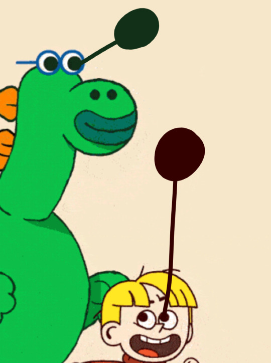
So there’s a deep green for Mo (technically his earlier version Martin there, but design-wise they're similar and have the same colors), and a warm brown for Elliott. BUT, there’s one more thing. That’s not the color palette Elliott has now, so it's questionable if this should even apply to him for his eye color still!
But we can still use this—if we just adjust what we've already got here to match his current design.
The warm brown and deep green lineart/eye colors in the designs above seem to have come from the overall color palettes of the characters, since like I mentioned both those features are ones based on the rest of the design here. There’s a green used for the mostly-green Martin, and warm reddish brown used for the warm reds and yellows that define Elliott’s palette there.
So if a warm-colors palette gets a warm brown outline color, a palette with its main colors split between warm (e.g. red-orange hair) and cool (e.g. blue clothes) gets a more intermediate hue. Orange and blue in particular can even mix to make a warm (brown) or a cool (green) color…
So an intermediate outline/palette color like that is probably best matched by or interpreted as an intermediate human eye color, like hazel, a mix of warm (brown) and cool (green and gray) colors! Like these:
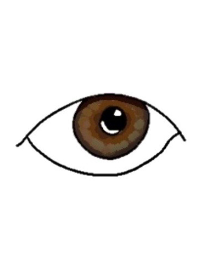
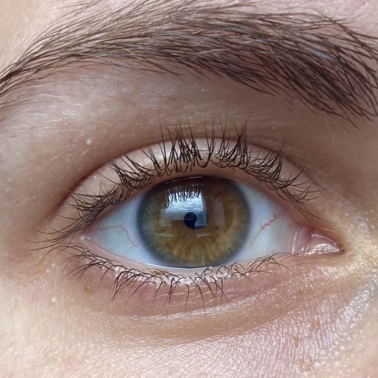
(Plus, a warm hazel like that is visually rather close to brown and kinda has the same overall feel to it, so even then this color is still akin to the original brown eye color we got from the gif earlier and it isn’t too drastic an “adjustment” from it)
So, with that development art as our closest official indicator of eye colors: Mo has deep green (fitting for a reptile?), Elliott has warm hazel, what about Frankie?
Although it took a few extra steps to bring things up-to-date and find our conclusion for Elliott, with him there was still some sort of source material to start from. But Frankie isn’t in that development art gif, and while maybe we could do that “based on palette colors” method again, that was really only done to follow the pattern of the designs from the gif for the characters there in it and slightly adjust it to the new palette; and besides, repeating that method for more characters might not keep working as fittingly anyway.
But that’s all really besides the point. There’s a simpler way for Frankie. Assuming she and Elliott are genetically related (which is material for a whole other post, but long story short I have my reasons and evidence to think that they are), we can just extrapolate from Elliott for her!
If Elliott has hazel eyes, it’s likely he got them from Frankie, especially considering Frankie’s warm/reddish but darker natural hair color—see below—that makes a hazel or even light brown eye color fitting for her. So it’s likely she’s also got a warm hazel, maybe even more of a light brown (the lines are kinda blurred with defining eye colors anyway).
The end! A bit of a long read for what should have been a simple question, but if you made it down here I hope you enjoyed it, I love making pointless investigation posts like this they���re so fun
#I’m glad I found that gif for some sort of official source depicting eye colors for them in some way#seeing as it’s the most direct evidence we get#since this is a topic I’ve actually been curious about for a while#elliott from earth#elliot from earth#cartoon network#cartoons#animation#character design#eye color
6 notes
·
View notes
Photo

here are the sprites on their own! not all of them, but there are way too many to fit up there. i’m leaving the rest under the cut.
others include significantly asymmetrical sprites, as well as a bonus set. 8)
these don’t really clarify their relative heights. they are not adjusted to the bottom pixel i actually drew for sure, that’s not how i aligned them. i actually have a guideline in the file, but. i can’t really show that.

above are the regular sprites. it took ages to figure out what i wanted to do with virgil’s plaid, but it turned out going simple with it was the best plan. also it looked very bad until i figured out to use values correctly.
also, while we’re at it, i can tell you some things i changed between projects! this is a remaster of my last attempt at pixelology, and i do believe it’s an overall improvement.
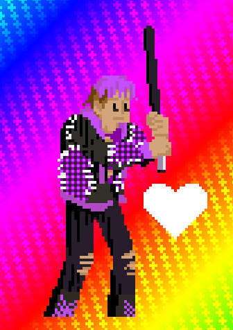
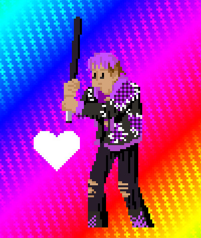
virgil’s plaid, yeah, changed that, but also the colour of his hair, because the old one blended too much with his skin. glad that happened to virgil, because i was trying to keep the hair highlights the same for everyone, with differently-tinted shadows. i did give him a bat instead of the wings this time, because a, he seems like a bat kind of guy, and b, the wings sucked and i don’t think i could improve them. like, the best thing about those wings is that they were the ace flag colours, and since his general colour scheme is already like that, it’s not a spectacular saving grace. they also made the frame fit weird, but i don’t like drawing wings absurdly small, like why bother? i alos tried to be a bit more competent with the jacob lines in his shading. those are an indicator of fear so of course i wanted to keep them included, but last time i feel like i didn’t do great, and this time i think i improved. especially on the legs. it is kind of a pain how there are adjacent sections where the shadows are done in the same colour, but. that’s really who virgil is, let’s be real. wouldn’t be the same without the all-black clothes.
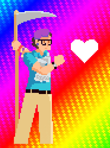
also, patton’s different skin tones were really bad, you could barely see the shadows, so i changed them. his overall shape also did not work, so this time i stylized it a bit more to fit with the pixels. also i gave him a different weapon. hopefully it’s still funny in its incongruity!
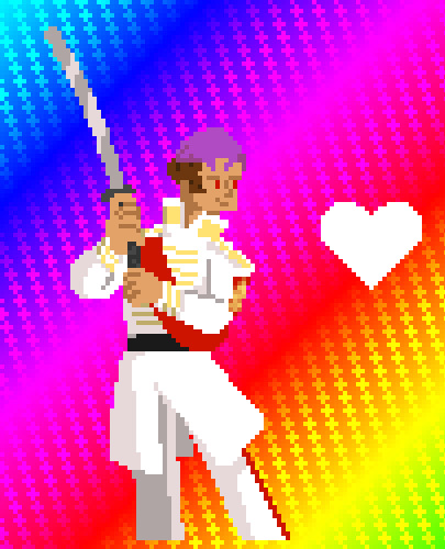
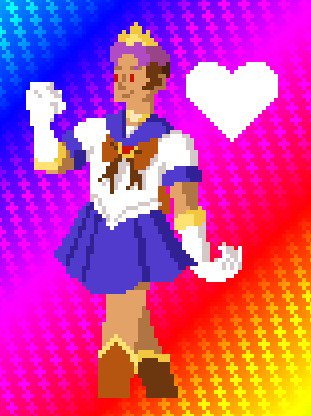
roman had very little change. like, i really like his original sprite! i did change some of the gold details, but the biggest thing is probably the pants. they’re white with a red stripe because, a, it looks very good, and b, it set up a parallel with remus.
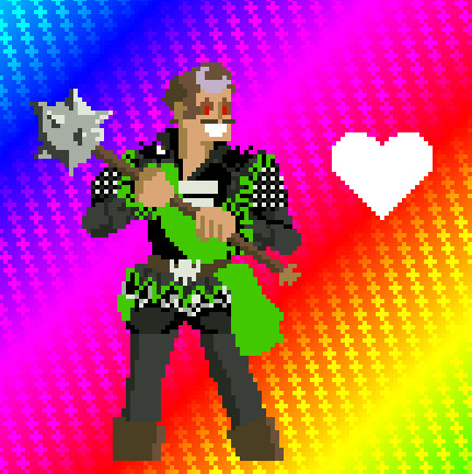
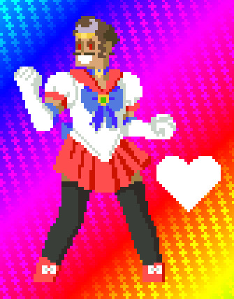
and remus. most obviously in the first one, his different head angle super didn’t work. it was very bad! which, in his case doesn’t automatically rule it out, but this one looks way better next to the majority of these. i mentioned relative heights earlier and this one should actually be the same height as roman, you can align them by their chins. aside from that, i added a lot mor detail to his ruffles, i tried my best to maintain clarity on his torso, i got the sleeves just plain wrong, but it looks fine, and it happened to be very good art that led me astray on that, so whatever. i feel like his morningstar might have gotten worse between versions, but what can you do. maybe i accidentally put it at a slightly harder angle to make look nice. whatever.
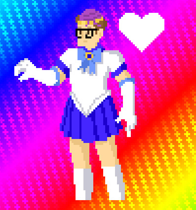
logan! i don’t think i’m doing these in any real order, sorry. like patton, his shape has been changed to be more stylized to fit the pixel thing. like, a realistic taper on the legs, as it turns out, looks pretty bad! exaggerate it or make it just straight lines and it is better. i feel like i very much improved his hair, and i also added the belt that he wears which i forgot last time.
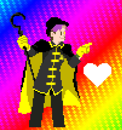
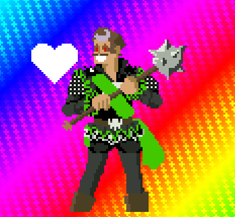
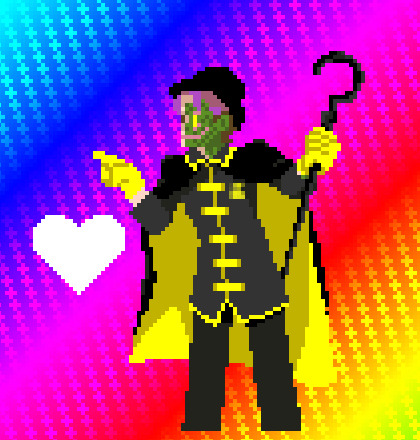
lastly, janus. well, lastly for now, but the next one won’t be a remaster of anything. i gave him his canon weapon instead of snakes, which, not sure what i was thinking gameplay-wise for those. [that’s a lie, i was thinking nothing about gameplay because i am no gamemaker. i’m not even an animator, much as i’d like to be.] when i made his last sprite, i forgot the lining of his cape is yellow. also last time i had not seen the magnificent longer cape from the game sections of svsr, which as i’ve mentioned elsewhere i am never letting go of, ever. so that features here. it kind of blends with the backgrounds i use for the vs character selection screens, but i don’t think that’s necessarily a downside. aside from that, i did remove some scales from his right hand because we have now seen it, and it’s proven bereft of those. as you’ll see in a second though, fortunately no such thing can be said of his legs. nor upper arm.
now for the bonus set. you may recognize this theme if you’ve followed this project awhile. 8)


some notes on these specifically:
-this is simply a complete set based on janus’ bonus sprite from the original project this is remastering.
-i tried to base the colours on their onesies. that proved harder than expected. remus and janus have no shown onesies, but
>i had janus’ previous sprite on hand, so that was him taken care of.
>virgil’s onesie didn’t really have multiple colours, so it’s just different shades of black, with some grey thrown in because white is already a base colour.
>logan’s, oh boy, i thought i remembered it having two colours, but i was wrong, it is just blue. and white, but again, that doesn’t work. so i gave him a couple of shades.
>patton’s, i didn’t really want to use grey as a colour, but it actually had two others, they were just in trace amounts. it was okay.
>remus. nghh. i wanted to use like, an inverted version of roman’s colours, but it turns out blue and yellow inverted is yellow and blue. so i used the orthogonal colours instead, and i’m not really sure it was a good look.
-aside from colour schemes, each of these has its own little variation, because i felt like having fun. aside from any kind of socks/leggings, because whatever, those are pretty variable anyway, each has one detail different. from most to least noticeable as i see it:
>patton has pants instead of a skirt. i just thought the look suited him better. the thing about patton is i always imagine him in Dad Fashion, which doesn’t have a ton of skirts in my mind. maybe that’s just my dad, but eh. i do think it’s a good look but i didn’t draw it very well.
>roman has a different crown. need i explain further? adding the others’ crowns was a bit of a pain considering how they interact with hair that isn’t drawn in anime style.
>virgil’s might not be too noticeable on its own, but the leggings kind of direct the eye there. he’s wearing his own boots instead of any variety of sailor scout ones. mostly because they are much, much cooler.
>logan has a different collar. closer to his usual polo than... whatever the sailor collar is actually called. he also might not have the same choker necklace as everyone else, but mostly you just can’t tell. still tied with a weird bow thing, though. how the hell do those bow accessories work?
>janus has a longer cape. again, need i explain further? he’s also the only one with a magical girl wand, because his colour scheme* was the most permitting and i really wanted to draw coily ribbons.
>remus is kind of like virgil with the leggings, but again, those don’t count, and with remus they draw attention away from his change. anyways, the different thing about his outfit is the sleeves. i only noticed long after i was out of the pixel stage that none of the sleeves are accurate, but his are even more not accurate, they do the poof thing. also his neckline’s a bit lower, but i mean, how could i not?
-i might assemble a full scene with these, if anybody asks. or nobody, i kinda just want to. it’s not too much trouble, but it won’t be animated this time, that took ages and i don’t think it even turned out well. i gotta find somewhere to actually get taught things about animation, though it also just does not gel with my medium.
-i can’t for most of these, but for janus i can talk about some improvements. his crown looks more visible, though that might just be compared to this side of his face. the skirt is not better and might be worse to be honest. also the bow on his chest. other than that it’s definitely better for the gloves actually being incorporated in this one.
*i do actually have set colour schemes for these. i tried to even limit the number of colours for each one. that said, most of them have exactly 17 instead of the nice power of two 16, and one of them couldn’t even fit that bill.
96 notes
·
View notes
Text
the losers and their tumblr blogs
ik there’s already a billion hcs out there but none coming from my niche hellbrain soooo
richie (tttrashmouth)
his blog is one big ADHD mess, he has a new interest every few weeks and his blog changes accordingly, though there are several common ones
he never seems to lose many followers for it though
his original posts are funny enough that people put up with it
he’s that user that you start following out of genuine interest and then realise that you’ve already rbed a lot of their popular posts and you’re like
oh shit, i know this fool
he has tags dedicated to each of his friends, they’re usually filled with shitposts or one of their Big Interests
eddie has two tags, one he knows about, one he doesn’t, and gets mad at richie for not telling him who the tag is for
the one he doesn’t is full of really gay shit
stan (corvid-company)
stan’s blog started out as a big vent but it was starting to get Unhealthy™ so they switched up their content
stan knows about richie’s secret tag for eddie and constantly gives richie shit for it like they vague posts about it all the time to get under richie’s skin
‘the intricate rituals of creating a seperate LoveCore tag for the best friend ur pining for....... like the richard siken of it all.......’ ‘THIS IS BIPHOBIA STAN’
it’s 70% bird watching stuff, 20% posts for mike, 9% vaguing about richie’s gay shit, 1% abt being nb (because i fucking CAN ok)
they also have a pretty impressive following, some of it is due to being mutuals with richie, but a lot of it is due to the Wholesome Bird Content
its a surprise to them but they get so damn happy when they receive asks and stuff about their favourite bird watching spots or how to distinguish between different subspecies
‘i dont know who this guy is, nor do i have a particular interest in birds, but what kind of fucking person would i be if i DIDN’T follow them?’
their tag for mike is pretty cute too, usually its just FarmCore but Romantic stuff they finds, other times its little thoughts they has about them
bev (marsh-makes)
initially set up to advertise her store and products
she makes things like pins and sew on patches that are really fucking good
she gains a pretty big following from that, people like her stuff and she has a really good quality track record
richie models for her sometimes and everyone kinda loves it
she has a lot of stuff about ethical fashion and makes a lot of posts about the problems with the fashion and clothing industries (eg fast fashion and sizeism)
she also has some quality shitposts
‘i dissociated for like five hours one night and woke up with the best skirt i’ve ever pleated and a top to go with it. my power is unmatched’ ‘op are you ok????’ ‘ye i got a kickass outfit why wouldn’t i be’
eddie (kaprisun)
his blog is pretty simple: things he’s interested in, whatever his friends tag him in, and roasting the shit out of richie
‘tttrashmouth will never be content because he knows im funnier than him’ ‘ur not wrong, eds’
a lot of richie’s popular posts are shittalk between the two of them
he also gets into a lot of discourse because he’s feisty like that, usually about comics or comic book movies
‘imagine thinking marvel is better than dc based on 3 movies’
yes he’s a dc fanboy
he’s not as anti-marvel as he can come across he just really doesn’t get the hype around it
he Also has a secret romance tag for richie and its half stuff of his own, half rbed from Richie’s Secret Eddie Posts unknowingly (and a bit of bens)
he tags them with ‘mood’ and it gives richie a heart attack each time
mike (hearth-and-heart)
farm core!!! original farm core content fresh from the oven!!
he takes photos around his farm and posts them and ohhh everyone loves them
same energy as stan’s blog (he has a lot of photos of them and the two of them together as well)
he also writes important dates down as well as books he likes
a Solid shitpost now and then but it’s mostly Pure and Wholesome content
people love his photography and unfortunately it gets stolen a lot but other aesthetic blogs but he doesn’t mind so much
he also is the only loser other than bev with an actual Impressive theme: it’s sleek and really fits the vibe
though every now and again he’ll rb one of richie or bev’s shitposts just for a little variety
bill (deadbrgh)
he posts horror stuff (both from other people as well as his own art/writing) and little bit of vent/rant stuff
his rants are about tropes in horror he hates (eg: ableism and other general bigotry)
his vents are usually about grief or trauma, and he keeps them properly tagged and under a cut
his horror stuff too, he makes sure to keep everything tagged properly and has a link to the tag list in his description
he sometimes makes a Spicy addition to richie’s posts, and people are like ‘wait why does this Super Serious and Talented creator follow that goblin??’
he also rbs a lot of ben’s stuff, people think they’re the same person for a hot minute because ben also writes and draws, but their styles and aesthetics are totally different
‘people thinking me and eggboy are the same person is really flattering but unfortunately im nowhere near as ripped as he is’ ‘luv u bb’
then people think they’re dating, but also think the one of them is dating bev
they never clear it up
ben (eggboy)
all of his poetry and drawings
he also makes a lot of lovecore posts that are definitely not for beverly at All
his a few of his poems get really popular so he kinda blows up a bit and he is Unsure How To Handle it
his first haiku for bev is his most popular like people go crazy for it
where his drawings are more stylized, bill’s are more realistic and gritty
people always think he’s straight tho and he’s like ‘could a straight person do this??’ *proceeds to capture the Essence of adoration and devotion*
bev rbs every one of his original posts and hypes him tf up, they collab on a few things and bev puts some of his Iconic lines on patches
the january embers line,,,,,,, people lose it
a lot of his stuff ends up in mike, richie, eddie and stan’s respective Love tags which he finds Perfect
he writes a poem about richie and eddie’s obliviousness and they’re both just like ‘god i wish that were me,,,,,, sounds familiar tho,,,,,,’
#the losers club#reddie#stanlon#benverly#kinda#ben/bill/bev#idk their shipname#headcanon#it 2017#it 2019#richie tozier#stanley uris#beverly marsh#eddie kaspbrak#mike hanlon#bill denbrough#ben hanscom#idiot.txt
263 notes
·
View notes