#i understand from a game design pov it’s bc well they did what they could y’know
Explore tagged Tumblr posts
Text
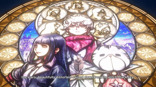
literally don’t talk to me don’t touch me
#IF THIS IS PLAYER’S HEART. because they don’t have a canon appearance#so they made do by including just everyone player is close to…#i understand from a game design pov it’s bc well they did what they could y’know#but i want to look at things from an in-universe meta pov. the idea that player doesn’t have their own identity#but is just composed of the love of other people who have touched their life and made them someone#something something that thing about how player starts out as a silent blank slate#but by the end of the story has the agency and wit required to think of a plan and pull it off all on their own#something something player being a type of replica theory#kingdom hearts#khml#mine: kh#IT’S GORGEOUS MAN
254 notes
·
View notes
Note
Rico besides Kama what do you think about the other indian servants?????
AHHHHHHHHHH THIS IS GOING TO GET SOOOO LONG!!!! i have a different view of the indo fam as a whole. i call them the indo fam but i mean the found family trope!!!! theyre like a group of college students sharing a dorm if that makes sense, since their servant selves are obviously different from their initial myths/human vessels!!!
OK SO. RECENTLY, i have an oomf that found books about arjuna that summarize his exploits in the mahabharata(I DONT HAVE THE STRENGTH TO READ IT ALL IM SO SORRY) and also talk about him in a more philosphical manner such as his states of mind during each event etc and i’ve been meaning to read said book because im genuinely interested in arjuna now!!! and i’d like to know more about this indo prince because from what i’ve seen, he is portrayed in a rather bad light(?) in FGO which i find extremely !!!!!!!!!!! and incrdibley !!!!!!! strange !!!!!!! the mahabharata’s conflicts can be put in a mostly grey area where there’s no good nor bad, its not black and white. so seeing arjuna get bashed because of the way his conflict with karna was written is... hm. let’s say that im REALLY starting to understand arjuna fans that dislike seeing him get mischaracterized so much. OTHER THAN THAT, his design is adorable, his travel outfit is my favourite because he deserves to relax and have some fun!!! fgo making him a chuuni is cute and his VAs little moans are cute cute cute!!!!!!!!!!! (mash grabs my shoulder and forces me to sit down) i think that arjuna deserves better and im really happy to see him have fun in his travel costume voicelines. i think we should take arjun on a date!!! he’s a great lover, we’d have the best time!! OH ALSO, kama seeing him as the student council president in their interlude makes me SOOOOOOO HAPPY its unreal, i think it fits him very very well, the seitokaichou who was elected because of everyone’s hopes and recommended by teachers because he’s suuuch a good student but because of that, the pressure to be good is constantly towering over his head and everytime he looks out the window he wishes he could ditch class and skip a day just because he felt like going to the arcade and be a bad student.......just this once........i think hes very very cute...... i want him to cook for me. HAVE YO U READ HIS BOND 4 VOICELINE ?mmmmmggg i want him to get embarrassed everytime i praise him for having such a muscular waistline. AUG
ANEWAYS i also have quite the thoughts about karna, his characterization in the game is linked to arjuna’s and thats fine but i think that forgetting how much of a little sassy bastard he can get was a mistake! did you know that in apocrypha’s german dub on netflix, when jeanne calls his name like “You’re Karna, aren’t you ? The son of the Indian Sun God !” HES LIKE “So ?” AND THAT WAS SOOOO BITCHY OF HIM, i think that karna is a good boy in fgo but the fact that he was such a fighty old man in the mahabharata shouldnt be forgotten and is a charm trait. I MEAN ???? HE THREW HANDS WITH AN 18 YEAR OLD(ARJUN) WHILE BEIN LIKE... THIRTY TWO. WHATS WITH THIS ANNOYING OLD MAN !!!!! knowing these little facts about him made me like him so much more actually !! i think karna being so nice is adorable!! but the little bitchy energy u can find in his voicelines is also very charming!! i think karna looking at me emotionless as i ask him to lend me his notes for the nth time that week and then saying “...Mn.” when i thank him is cute!!! his voiceline towards things he dislikes is interesting to me. karna seeming aloof and mean bc he doesnt know how to communicate but is actually nice underneath...... hey... thats a little delinquentcore........ i wouldnt say yankii but hes like... hes like... u know hes the handsome quiet one of the group of yankiis... u know the one...? hey where are you going
ganesha is also a character im deeply interested in but i havent played CCC so i dont know that many details about jinako herself !! my brain goes HMMMMMM it seems lord ganesha is trans in fgo ! (since kama used to be a male god originally as well!!) ganesha uses all pronouns!!! and ganesha is also special to me because they share similar traits with kama when it comes to their characterization AND mischaracterizations. ganesha isnt JUST jinako. theres a part of a god in the servant mix!!! and jinako HERSELF is actually a pretty sad character imo. the whole otaku/neet thing is obviously a facade and her true wish being that she wants to redo her whole life is also proof of how much she hates what shes become, yet at the same time, she doesnt know what else she could do. but anyways, i prefer looking at servants from a lore POV so i think that ganesha should still be considered a god and be adressed as such!! i like seeing people portray ganesha as jinako but i prefer it when a certain lavish more godly side of them is put forward. a side of jinako that managed to move on a little bit if that makes sense ? that got more serious. and became someone else entierly despite sharing similarities. needless to say their bond with karna makes me happy since he shows them respect as you should towards a god!! its a bit different from their bond in CCC... like they matured somewhat!! anyway ganesha is the one who taught everyone else in the indo fam about video games and technology and i will NEVER shut up.
ashwatthama..... MMMMMMMMMMMMMMMMMMM %_’(’ç_”’è_ç(è_’”545656455456545453£¨¨µ¨µMµ¨++°=)=)°+ goodness. jesus christ on earth. my love story with him makes me so embarrassed. when he got revealed i instantly fell in love with him despite knowing JACK SHIT ABOUT HIM but since i was the only one in my friend group who was hardcore into fgo at the time, i kept my love for him to myself and just... (looks away)(i drop my wallet full of picturses of him) quietly adored his everything in silence. WELL, ree having an intense crush on yankii type characters isnt new, its been my favourite trope for ages (gyarus go in hand with them!!) and im still very attached to it so thats what made me love him in the first place!!!! BUT THEN. I GOT INTO HIS MAHABHARATAN LORE. And OHHHHHHHHH BABY.......... (im twirling my hair) so theres this 7ft tall war criminal..........<3<33<3(mash leans in and informs me that the convention of geneva didnt exist at the time) SO THERES THIS 7 FTTALL IMMORTALMAN.......<233 gOD he makes me absolutely CRAZY9909840385%£%%£%%µ%µ%µ the love i have for this character is immense and whenever im sad i remember that pako exists and has a tablet and can draw and i suddenly feel so much better. ok im gonna stop horny posting a little bit. but hes my wife. AND WHAT I LOVE ABOUT HIS PORTRAYAL IN FGO IS THAT, they actually made him a good boy despite his initial roughness and misdeeds ???!!! HELLO?? ashwatthama wishing for a redemption ark is my favourite thing and his righteousness that was born because of his regrets is a very interesting drivepoint to me !!! hes a gorgeous character and im buying a ticket plane as we speak right now so i can go find him in northern india. i’ll find him. GET YOUR HANDS OFF ME !!!!!GET OFF ME !!!
miss lakshimi makes me very sad! because every female servant in the indo fam is an already known face. (... would sita count.) and lakshi being a jeanneface is a waste. well, she’s still very pretty and her lore is also quite interesting!! i havent looked into it fully yet but i think she should be kissed on the mouth. her bad luck makes me slip on a banana peel whenevr i get close to her to kiss her and i hit my head on the pavement and pass away-
parvati is on a tough spot for me atm. i genuinely love thinking of her as the way the indian goddess herself is portrayed because thats where the fun lies for me in her character. especially when shes involved with other indian servants, thats a given!! i would like to see parvati grow, suffer and heal. because branding her as an “all-knowing mom” is easy, but every single parent makes mistakes if you follow that logic. also, since shes the sakura servant “thats closest to her initial personality”, she’s got some of the most Repulsive fans ive Ever witnessed in fandom spaces and lets say that im trying to work my way out of this hellhole and find things to like about parvati without the fandom’s influence. needless to say, im going to keep looking into her mythos and her lore by myself at my own pace and keep doing my own thing in my little corner.
rama shouldve been a jock. THE RAMAYANA IS OLDER THAN THE MAHABHARATA, WHY IS.....Hrm well him being summoned as his baby version gives me hope for a future rama alt perhaps??? but i think that he shouldve been a total jock and he shouldve been huge with a huge red lion-like mane for his hair and a teethy grin and big biceps and intense love for his wife. SPEAKING OF SITA, her charm point is her purity but i wish.... that their artist still hadnt drawn them like That, im not a fan of lily servants and i think purity = being young is a bit of an annoying excuse!!! rama and sita looking similar is because of their shared history which is fine but... rolls my eyes............. rama shouldve been 6ft tall and sita shouldve been a milf to match...... anyways i doubt ravana would be added as a servant but i’d love to have a ramayana centric event!! where all indo servants have their own lore centric role to play!!! oh thatd be a dream.... but i have learned to not expect much from a fanservice game so im jus gonna draw my own stuff! (strikes a pose!) (mashu claps!)
45 notes
·
View notes
Text
ok so im just gonna pick at fr from a web designer pov because looking at this site on mobile will drive me into madness if they don’t fix it at some point. The rest of this post will go under a read more because it’s both super long and image heavy.
before i hit mobile though, I’m going to point out some things i just don’t personally like in general with the site design (and yes i am conscious that they are slowly updating to a new look)
this will come as a shock to no one, if you’ve seen previous web design related posts by others anyways, but i cant. stand this menu
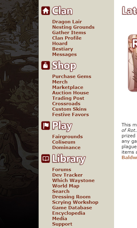
[ID: A cropped screenshot of Flight Rising’s Main Menu]
fr, understandably, has a shit ton of links. it’s a petsite with lore and all that, whatever. The thing that bothers me specifically is the length of links and where some are placed.
1. i BELIEVE this counts as an accessibility issue where longer links kinda trap shorter links, goes into misclicks to other pages in the site, etc. etc. 2. i don’t think. the search link should be under library personally ? Maybe make it its own category.
Dev Tracker & Media could go under this category, possibly add separate links to forum, player, and dragon searches with updated formatting
Dressing Room and Scrying Workshop could go under the “Play” category
Forums can be it’s own category with possible subcategories being: Announcements & News, Help Center, and Flight specific discussion forum, maybe more
Library category could then just be: Which Waystone, World Map, Game Database, and Encyclopedia.
Support should be it’s own category.
One thing on the shop category, and i hesitate to say this because im not CONFIDENT on this one, but I’m not sure Custom Skins exactly fits? or at least, it should be Purchase Gems -> Marketplace -> Custom Skins, not between crossroads and festive favors
Merch should probably go under purchase gems, and they should maybe uhh..... i guess change the name for it overall? because 1. “merch” alone does NOT look good with its placement, 2. its another actual money purchase thing and I think those should go on the same page
Along with that, in putting merch under that page, they could put previews of the merch with a button to go purchase instead of immediately going to their merch site (which to begin with it should open in a new tab if its going to a separate site?!!)
then this is a mix of both not liking it on laptop OR mobile,
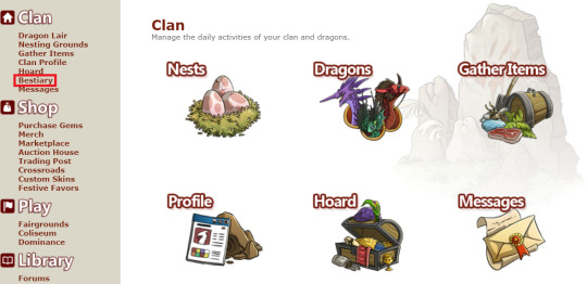
[ID: A cropped image of Flight Rising’s Clan Home page. The Bestiary link has a bright red box highlighting it]
Obviously these pages are old, but the graphics need to be updated, and there needs to be graphics for every link in the category-- seeing with this category alone there isn’t a graphic for the Bestiary already. On top of this they need to be in link order preferably. if they had a normal dropdown menu for mobile, mobile users wouldn’t be able to access the bestiary unless FR wanted to be STUPID and do further dropdown menus w their 200 links which would be STUPID and CLUTTERED
also in my opinion the Messages link isn’t necessary since we have the button at the top. If they put it there as an excuse for accessibility, they can just. add text to the buttons. like here’s a scuffed mockup but.

[ID: Screenshot of Flight Rising’s Messages, Friend Requests, and Alerts icons edited to have Messages, Friends, and Alerts written next to the icons]
for the friends tab, they could prolly add friend requests at the top like they do for baldwin alerts, then have an online status thing for friends below with buttons to PM, trade, delete friend, etc. I think you’re already able to disable the online status thing with page visibility? but like, make those options separate if you dont wanna block off your entire page, but dont want to be seen online.
For mobile, they can just make the icons bigger.
then. i THINK. last thing on laptop site.

[ID: A screenshot of Flight Rising’s Social Media links with old Logos to YouTube, Tumblr, Reddit, Twitter, Facebook, and DeviantArt]
update these fucking icons they are personally killing me, none of these logos are in use anymore (ALSO UPDATE THE TUMBLR THEME JESUS CHRIST)
ok now for mobile. what this post was originally for.
-
as you all know, if you visit this site on mobile, there is literally no form of a mobile version for it. It is just a condensed version of the computer version of the site which is...Very Bad!
Most of a sites visitors are going to be through mobile, i forget the exact percentage, but like it’s almost a given that people more readily have their phones with them than their laptop or tablet (which. im not going to bother with the tablet version, you can apply both computer and mobile criticisms to the site). in fact a lot of my time on FR is through mobile since I’m not at home 24/7 and I don’t tote my laptop around. Playing this game through it’s mobile site is Not Fun!
I like, won’t be too pissy or anything bc like. it’s a petsite and I’m making this post for fun. but also like it was made in 2014? 2013? so I’m not going to be u kno. angry. but it nearing the point of ten years with this site and there still isn’t a mobile friendly version. that is lazy. If anything, if they wanted a site update to be the anniversary thing, they should’ve made that update be
Mobile update as primary thing, because designing the site for mobile is a shit ton of work with the amt of pages they have to work through.
Dragon Profile page update (*LOUD SIGH*)
Clan page update
Hoard update (i have thoughts on this too but i wont dive into it this post)
Purchase Gems page update
Dev Tracker update
Forums update
“but that’s a lot to update” well. that wouldve made the anniversary being a website update considerably more worth it, because in my opinion having the dragon profile pages be the ONLY thing to happen during the anniversary was a waste and a bad decision, because other website updates are just. normal whatever updates. it made the anniversary SUPER underwhelming especially bc the past ones (to my knowledge) have only been major game mechanic updates like the eye & ancients update and i believe? the color wheel expansion was an anniversary thing? someone can correct me on that I haven’t played this game as long as most LMAO
as for how i personally would situate the mobile site. shitty graphic time, bc im not putting too much effort into this (warning this will be LONG)

[ID: Image 1. A crudely put together screenshot of the top half of a Mobile View of Flight Rising with comments on either side. It ends with the Latest News segments “Riot of Rot” and “Hoard & Vault Revamp”
Comment 1, Left side: “no banner make it a solid color that matches the burger menu. size the logo correctly etc. Comment 2, Right side: “burger menu w ONLY the categories, goes to the homepages of the categories” Comment 3, Right side: “TWO latest news posts, maybe a button to go see earlier news (which may b something to add to comp too)” Comment 4, Right side: “center dates and comments maybe idfk”
At the bottom of the image there is an added “button” that says “more updates button”]
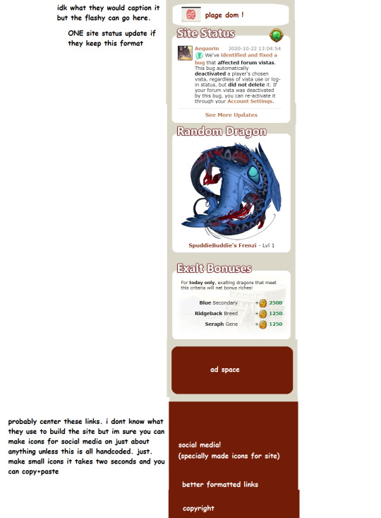
[ID: Image 2. The bottom half of the mobile view with comments on the left side. There is a put together white box that has the Plague Flight Logo and “plage dom !” written in it. Below it are the Site Status, Random Dragon, and Exalt Bonuses boxes from the site. Underneath that is a red box with “ad space” in the center, with a red footer at the bottom.
The footer contains, “social media! (specifally made icons for site)”, “better formatted links”, and “copyright”.
Comment 1: “idk what they would caption it but the flashy can go here.” Comment 2: “ONE site status update if they keep this format” Comment 3: “probably center these links. i dont know what they use to build the site but im sure you can make icons for social media on just about anything unless this is all handcoded. just. make small icons it takes two seconds and you can copy+paste”]
i dont even want to THINK about how the lair and all that would look on mobile, it was a chore doing the home page alone SOBS
anyways, in ref to these images though--
this is just slapped together and definitely wouldn’t be a final draft, it could use some tweaking
the flashy i refer to is the box that’s above the user box that says what flight is in dom, what festival is going on, etc.
when i mention building the site and “you can make icons for social media on just about anything” im referring to wordpress, wix, whatever is used to format the site. I really only have experience with wordpress thru elementor and divi (so far) so im not CERTAIN about other places but I feel it would be pretty common to have that tool. if not, making icons (or snatching some) is rlly not that hard, probably only costly depending on what their webdesigner(s) charge for icons
I’m not like certain on who does what, how the webdesigner(s) work with/price this site, etc. etc. this is just. going off of my own knowledge. and in general this whole post is my own knowledge abt shit i did no further research to FRs team specifically
i think this is basically it, i’ll reblog with more if i think of anything, but feel free to add things yourself or in general discuss things. again this post was made for fun so im not taking it seriously or demanding for these changes to be made, just personal annoyances and preferences.
This is also my first time doing picture IDs for a post so if I need to correct anything or the like let me know and I’ll edit it in the post!
#im afraid to put this in the tag but you can rb i dont care#but GOD this post ended up so much longer than i anticipated..............#the more i looked at the site the more i saw to point out LMAO#also i tried making this post more accessible bt if theres still some things that dont make sense please let me know#esp the picture ids#theres also so much more i could add whether it's inconsistencies or whatever but i do not !! have the time for that
4 notes
·
View notes
Note
🔥 pokemon and SU
OKAY THIS IS LONG. WAY LONGER THAN I EXPECTED. MORE THAN AN UNPOPULAR OPINION POST, IT TURNED INTO AN ALL-OUT OPINION POST
putting it under a cut; the pkm one is way longer and more detailed, SU is a plain ol unpopular opinion post and shorter so im putting it first.
SU:
honestly, i’ll be the first to say that the show is not perfect, that the characters cant stay on model (its still not enough to bother me or ruin everything because, cmon, im getting to watch the show for free) that the crew have made mistakes, that certain characters deserve better/worse, that certain lessons felt out of place, and all that jazz.
but hey, its not the worst thing to ever happen. i found SU while it was at its peak (late season 1 - early season 2, the best SU has ever been IMO) and even though im trying to not interact with the fandom anymore because of some toxic stuff that happened, i find myself enjoying the storyline, the worldbuilding is great and everything about the art style that is not proportions (backgrounds, palettes, character design) is arguably some of the best in current animation.
my beef with the fandom and most critical blogs is that the discourse sounds like the same stuff over and over and the general attitude is very snarky and condescending. my rule of thumb is that if youre going to critique something, you have to also give your ideas on what you would do in their place. i also felt talked down to everytime i interacted with them, and most people dont even know how to discuss things so any valid points they might bring up didnt phase me after rolling my eyes at their behavior. they also tend to treat their opinions as the objective truth - or only reblog from their fellow critic blog friends.
pokémon:
oh, pokémon. one of my most beloved video game franchises of all times. yet theyre not exempt from criticism. of course, none of what im about to say ruins the experience for me (otherwise, i wouldnt still play the games and making fanarts, DUH)
the games. first of all i have to say that theyre incredibly engaging. i find myself caught up in the hype before a big reveal, preordering and picking up the new game as soon as it comes out, and then playing non-stop until im satisfied with it... and usually thats it. yeah. one of my biggest complaints about pokemon is how replayable the games COULD be, if only gamefreak did the simplest thing of just adding more save slots. of course, ive ended up deleting old save files in order to replay a game, and thanks to pokebank i can keep my babies, but cmon. all the items you collected, the complete pokedex, how far you went in the battle chateau/battle tree/etc... its all lost forever. the game would also be infinitely more replayable if the post game were more extensive (rather than being like “here, go to the battle building of this generation and battle”). i think implementing side quests or achievement unlocking that gives you in-game perks would add so much.
ALSO GAMEFREAK please stop adding and changing and removing features that we like every single generation!!!! i was not bothered by character customization being removed in ORAS because i understand its a remake and they wanted to keep something similar to the original designs of may/brendan but!!!!! The PSS was GREAT, but you replace it with festival plaza that was... not great!!! you take away pokemon amie, which allowed more experienced players to farm hearts very fast via the minigames!!! you took away the super training!!!!! it makes it look like they dont know what theyre doing, and i understand that they want to shake things up, but i stg if we dont get ride pokemon in gen 8 and instead we are back to HMs, im gonna scream.
my next complaint is how... small the games feel. im not asking for an open world yet (short answer; yes i believe its doable) but the amount of hand holding and tutorials in the last games bothers me, not to mention how limited the exploring feels when compared with older games? dont get me wrong, the gym/trials system is not bad per se - its mostly the map, its soo so so tiny and easy to navigate. i feel like they could look at earlier zelda and mario games and do something similar; an exploration mechanic like twilight princess’s would work so well. you have huge areas to explore while keeping it closed-world, and i never found myself getting tired of roaming around hyrule. in comparison, routes in pokemon feel very small, towns especially are SO tiny, and pokemon is a franchise that would REALLY benefit from the sense of adventure that non-linear larger maps offer.
next is the art direction. im definitely not a genwunner; i think some pokémon designs are good, others are not as good, but i dont have a huge bias towards, say, kanto (kanto’s good designs are good, but kanto’s bad designs are the worst, if it makes sense?) if i had to choose, i’d say gen 2, 3 and 4 are the ones that better represent what i want pokemon to look like in general, but that might be because i love monster-like pokemon like ampharos, swampert, garchomp - huge and bulky-looking pokemon - rather than pokemon that look too much like regular animals or inanimate objects.
human character design is also good. they have been doing great in terms of racial diversity lately, but i do wish there were more “not-paper-thin skinny” characters (especially women) (and the ones that are fat/obese dont look suspiciously more cartoony/comic relief-y than the main characters); and older characters as well, specially women.
i think my fave art direction is from black/white (1 and 2), the stylisation, clothes design and especially color palettes were gorgeous. i like a lot how the eyes and highlights/shading looked in black/white (1 and 2) - i think it was Take who did most of the art, instead of Sugimori and Ohmura.
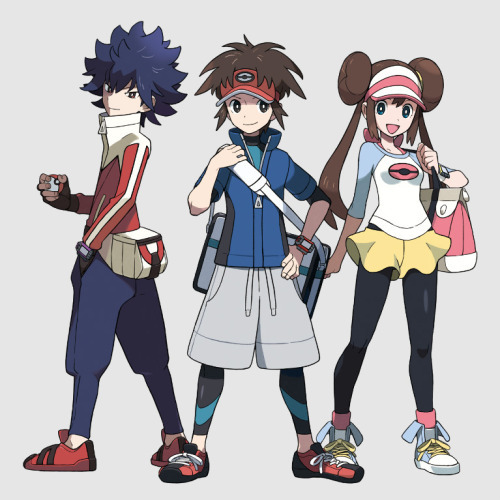
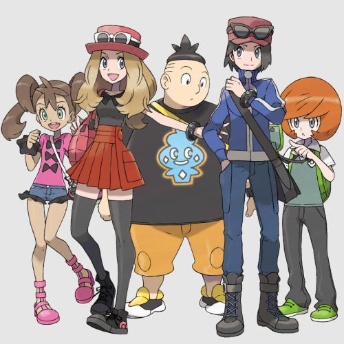
(im sorry but im feeling the top image squad look much more)
my biggest complaint about pokemon’s art direction is that the 3D simply doesnt look its best as of now. im not a fan of the pixel-y black outline all models have, the colors of most pokemon in their 3D models look so washed down in general, and the backgrounds really suffer from this. i must say that changing the angle from a zenit POV to a third person camera in sun/moon was a step in the good direction, you get to see further in the distance and feel like the world is immersive.
the color palettes for backgrounds could be better too, they have definitely taken a step in the wrong direction and went from this:


(pretty, muted but not extremely pastel or washed down; nice colors, those greens and browns are gorgeous - and yeah sorry about the bottom pic having a slight filter on, but cmon, its not like base game looks much different, remember?)
to this:


(aggressive colors, dont give me a sense of harmony, that extremely orange dirt and sky and almost neon green grass make my head hurt)
i have to say i preferred how the pixel-y, half 2d half 3d style of gen 4 and 5 looked, imo its the best pokemon has ever looked, but they clearly dont have the technology to make breathtaking, fully 3D games yet. i’d say its a necessary evil though so im hopeful for the future. and no, i dont want hyperrealistic textures or pokemon designs either (pokken style is so detailed it feels a little uncanny valley at times, specially with less realistic pokemon like gengar or gardevoir). ideally, pokemon will look like breath of the wild’s 3D character models, with that watercolor-ish style, the cell shading and the vibrant vivid colors. AND NO OUTLINES PLEASE.
finally the last point about the games is the storylines. I generally like pokémon storylines. they’re very good when you are caught up in the action, specially as of late, theyre adding cutscenes and dialogue-heavy scenes that dont feel out of place. but i cant bring myself to LOVE THEM as much as i love other videogame storylines. they still feel a little basic (this is not a problem because of the game’s formulaic nature, mind you) and while they havent shied away from more mature elements in the past, the overall tone is a little immature at times with a big huge plot heavy climax thrown in, and thats it. (and before you tell me pokemon is for kids: i know, but other shows and games for kids dont fall in the same plain secondary characters rut as pokemon does.) i would love for the Main character to have some sort of agency too because i feel like im following what other characters decide for me (at least give me dialogue options that, you know, DONT YIELD THE SAME DIALOGUE NO MATTER WHICH YOU CHOOSE).
thats about all i have to say about the games themselves. not gonna talk about anime or manga bc im not really into those
as for the fandom... its generally chill. its huge, but its divided in so many sub-groups that you never feel overwhelmed. the competitive community might be more toxic ive heard, but im more into the plot and characters anyways.
i do have to call out the huge p///edophilia problem there is. being a franchise most people grew up with, characters like idk, misty, may, dawn (its girls more often than not) were older or the same age as most of the older fans were back in the day. as a result, they have obsessed with their image since they were kids, and this obsession has continued now that theyre grown ass people, and they have no problem consuming and producing huuuge amounts of porn for these characters. as for the latest games, these disgusting people have even less excuse (not that they ever had) there’s tons of CP and adult x minor ships out there, and its allowed to thrive more often than not because of the sheer size of the fandom, too.
PHEW.
6 notes
·
View notes