#i think the rendered versions didnt turn out quite how i wanted
Explore tagged Tumblr posts
Text
I wanted to try doing a gijinka version of my iterator oc
very inspired by @lyss-butterscotch's iterator gijinkas
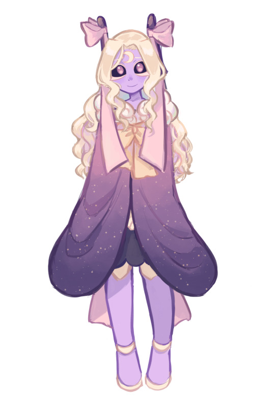
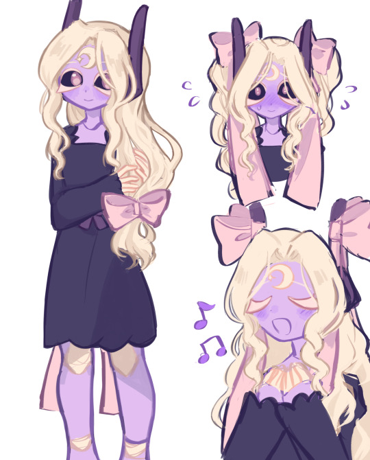
awawawa
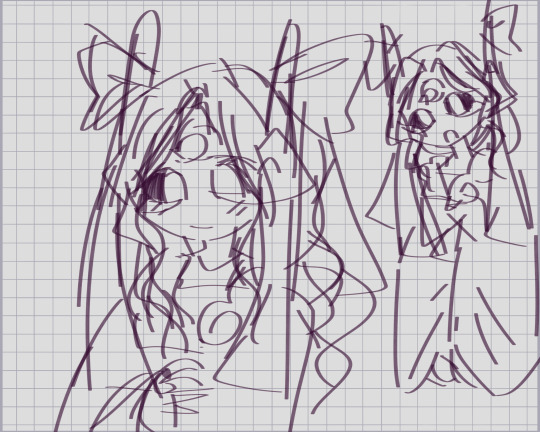
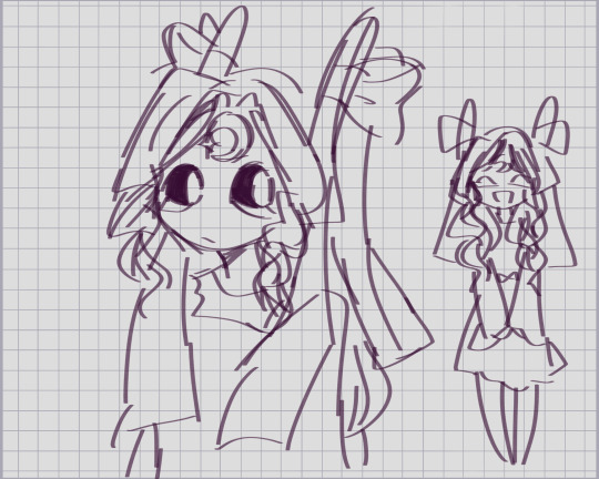
extra doodles

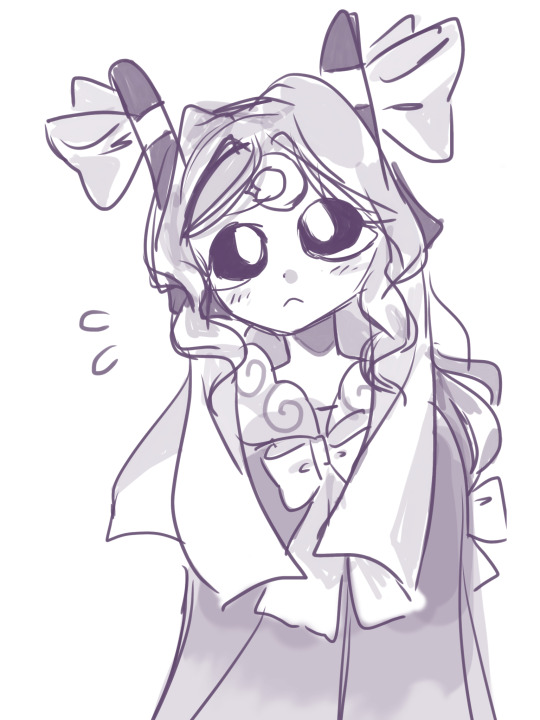
#iterator gijinka#egg art#egg doodles#eggmoon oc#sona tag#starlight symphony#sls#rain world oc#rain world#iterator oc#i hope this is ok ds sh jfldsfke#it was fun to do#i think the rendered versions didnt turn out quite how i wanted#but thats ok!! it happens when u draw something new
130 notes
·
View notes
Note
hey Becks! North_was_here here (pun intended). i mentioned in a comment on SPPF that i've been working on a fanart. i said i wanted to take my time to make it good...
well, i lied! (unintentionally)
i didnt take my time at all and finished it that same day, after about 4 hours (i think. could be more and closer to 5 or 6, as i'm using an older version of my program that doesnt track work time). i've just touched it up and decided id share it now before i can overthink anything else about it!
i recorded a timelapse (around 3 minutes) of me working on it but i dont think i can upload videos to tumblr via Ask. if you want to see it id be happy to share, i think i can just upload it on my own tumblr. I've literally never uploaded anything on tumblr before LOLOL

here it is! I'm quite happy with the result. heres a breakdown of the drawings, my struggles, extra info, stuff like that if you wanna read it!! (timelapse shows more detail and probably makes this whole breakdown make more sense):
before we start off, let me just clarify that since i'm getting back into art, ive been experimenting with different art styles (and with that using references) which is why some things look different than others in this drawing
I started with the left drawing (labeled with her hero name) with a pose reference, then drew her body and clothes. i used that ai image of Yoru you provided during the battle training chapter as reference for her hero suit. it was actually quite fun drawing it, especially the wrinkles in the clothing and such!! did her face, scars, eyes and then her hair (which i later redid as i was unhappy with how it came out).
the second drawing, the USJ attack, in the bottom right, is by far my favorite of these three. i used a reference drawing i found on Pinterest, and added some more detail to it and it turned out great. the hair was minorly tweaked from the reference, hence why it looks so much better than the other three's hair. i added her scars, and added the wound on her throat toward the very end of this whole project as i debated whether or not (or rather, how) i would draw it
the third and final drawing, top right, is probably my least favorite because its so simple, even though thats the point lol. i was thinking about making it an art of younger Yoru at first then decided id stick with older Yoru, so i made her hair longer, since i originally had it quite short on this drawing, and added her throat scar (i faded it out quite a bit, maybe more than i should've, as this is after the USJ). after all these drawings i shaded and added some more details
finally, after i added the watermark, title, your user and mine, i went back and polished it up (this is where i, as i mentioned earlier, changed the hair on drawings #1 and #2, added the shiggy scars, and even more details to make me more happy with it, and hopefully raise your chance of liking it) and now im here!
as im writing all of this, ive already noticed quite a few things id go back and fix up on this drawing, but im not going to because 1. by the time im done overthinking, SPPF would be finished lol and 2. i can go back and look at mistakes during future projects to learn!
anyways thank you so much, first of all, for even creating SPPF in the first place. This series is one of if not my favorite fanfics of all time. you're an amazing writer and i cannot wait for more chapters and things from you in the future. secondly, i really hope you like this fanart! this is actually my first time doing fanart for anything, but i plan to do more in the future - especially for SPPF. and hopefully, in the near future, i'll relearn how to color and render again to provide you with better art than this haha
feel free to include this drawing in the next chapter's notes. if not thats alright too! (that'd actually be such an honor tho not even kidding)
yap session over lol <3
NORTH! HELLO! 🙌
Sorry for the ultra-late reply, I just came back home from France and was out and about with work, walking through Marseille, and flying back home and all that, so it took me a long ass time to give your message the time it deserves! :(
This is so ridiculously AWESOME! I want to hug you and gently pat your head (maybe even give you a kiss on the forehead if you'd be comfy with that) because THIS IS SO DAMN AMAZING!!! 😍😍���
You got her hero costume down to a T! It's perfect! And the way she's standing kind of reminds me of her Dad's seemingly disinterested stance. And her scars and her face and expression!
The portrait is awesome, too! OMG I love it!
AND THE USJ ONE!
!!
It's perfect, shows her exhaustion and her empty stare so well! Like, her swollen eye and the dirt and grime and messed up hair and all that!
Now, personally, one of my most favorite things about your stunning drawings are the handprint-scars! I never managed to got them right and had such a hard time explaining the placement, and you did it exactly how I envisioned it in my head!
THANK YOU so much for this, North! I feel so damn honored that you (and people in general) draw Yoru! And put in so many details and thought behind everything, too! And since you said that it'd be okay for me to include it in the next Author's Notes, I'll definitely do it - thank you for allowing me :)
And thank you so much for your kind words, it makes me super happy to hear that you like the story so much! 🤍 Especially to such an extent that it inspires other people to get creative and bring the story to life even more. That fact is still so wild to me. I'm giggling like a schoolgirl (kicking my feet, twirling my hair, and all that!) everytime I get a new comment, even more somebody making art for the story. I love you readers all so much. People spending their precious time doing something like that is really moving
P.S.: Also, I'd love to see your drawing process! It's so interesting to see how people's brains work when they draw + I learn so much by watching it, too!
HAVE THESE FLOWERS AS A THANK YOU!

8 notes
·
View notes
Text
therefore you and me post-production notes (or: murphy’s law as a project that has been two years in the making)
ive had this idea for ‘therefore you and me’ and Fritz ever since i first played CindPhenon. nothing ever fell into place until i played Evermore though, so here we are!
drafting this project was pretty easy tbh (see: hubris). the parallel imagery and everything about the lyrics was right up my alley aha.
fun thing with the lyrics: TadanoCo uses ‘要る (iru)’ in the line ‘Which do you want (iru)? Or do you want neither (iranai; aka negative form of ‘iru’)?’
‘ 要る ‘ as a verb can mean ‘to be wanted’ or ‘to be needed’.
hence, the line can also be read: ‘Which do you need? Or do you need neither?” or any other variation of the verb’s usage.
it’s halfway through drawing the lineart that murphy’s law began. 1) i drew ~15 panels on the wrong dimensions, and had to redraw them all (lol), re-grey tone (LOL), and re-ink (LOLOL). it was not a fun three days.
then i lost momentum because of lunar new year (happy late lunar new year btw! happy year of the ox :”) )
anyway: the moment i regained momentum for the project again, i hit a roadblock in the form of overconfident, sloppy drafting (see: hubris is my downfall).
because of the lack of clear drafting for certain panels (and changes to previous panels), i had to redraft two different sections of the PV while keeping in mind that there was the bridge still to be drafted. fun !
i decided to simplify the bridge. can you believe it was supposed to be another animation. i can’t. so i scrapped it.
(slight tangent. Evermore’s release honestly cleared up a lot of uncertainty regarding the direction of the PV and whether or not to include Fritz’s mother (who I still fondly call Beatrice). im really happy the PV never came to fruition before Evermore’s release, as im not sure i would have done half as good a job without Evermore’s content.)
back to the hubris of proceeding with a messy draft - there was a lot of push and pull internally for me as to how much i should keep to the original PV and how much i should just put my spin on things. i ended up doing a bit of half-and-half, i think.
but really, it only delayed things as i ended up redrafting and having multiple drafts of certain panels haha//
the last two choruses were honestly my favourite parts to draw. the shift from Varg’s clothes and colours to Fritz, Fritz’s acceptance of Varg and the soft way Varg looks at Fritz (and no one else). there’s something cathartic about acceptance and acknowledgement. i think that’s what i aimed to really capture.
also: in between drawing all the panels, murphy’s law 2) my Evermore itchio game file ? got deleted off my computer ?
it’s a very old, barely functional brick so im lowkey unsurprised but at the same time it was a crazy experience and setback when i needed to reference certain scenes. oh, and Steam decided to not download Evermore too. i still haven’t fixed that one. haha. ha.
i have screenshot posters to thank for uploads of certain CGs, although im still pretty sure its best not to post a ton of those publicly at one shot?
also, i had to scrap the recreation of the famous ‘did you love Varg’ scene because of this aha. looking back now, i think it worked out.
(another tangent: using referencing as an excuse, i actually took the opportunity to replay Fritz’s route for the third time. i ended up checking nothing at all and falling in love with the masquerade scene again.)
up till the very end, im still not sure if everyone got that the line “You are love itself.” was meant to be said by Lucette to Fritz. i colour-coded Lucette with her own unique blue for the PV, which was the same hue as the line. i hope that it got across, aha.
with that said, video production was a whole entanglement in and of itself. i think murphy’s law really took up a hammer and swung hard at this stage.
timing was actual hell. im usually not this bad at it, but this project in particular was tricky bc TadanoCo uses a lot of background beats that aren’t overt, which his PV also matches - i think? or maybe im just not good at recognising beats from lack of video/music production haha//
hence there were certain scenes i was stuck at and kept revising because i wasnt clear where the beat was meant to be, what transitions i should use, and when the transitions should be.
subtitling was actually really fun! until i rendered my first version and realised all the subtitles were completely off and blurry.
turns out my project properties were different from my video properties, hence the off-alignment. huh. didnt know those were Actual Things(tm).
also, quick tip to all vid-making amateurs like me out there: you may have to double the dimensions of the font’s media properties if you dont want them to come out fuzzy. another thing i didnt know lol.
anyway all this lead to: me needing to spend another evening to redo subtitles. haha. it was not a fun two back-to-back 3am nights + extra evening afterward.
in between all this was countless rendering tests to guess-and-check what’s causing numerous errors in the video btw.
and with those rendering tests came: glaring mistakes in the panel art that i only now spotted and had to fix, and refix, and refix again. then reimport into sony vegas, put it into the video, render and double check if it’s alright. rinse and repeat countless times ! haha ! PV making is fun !
i think i nearly redid a certain scene with the exact same panels once. like i said: not a fun two 3am nights.
that said: i dont know how all this technical issues (and more) popped up and were resolved over two 3am nights and one evening. im not about to question it either.
at this point: panel art - fixed ! subtitling all redone ! render works fine, everything checks out.
i make the mistake of uploading it directly to yt instead of leaving it unlisted first.
murphy’s law 3) when im watching the vid on yt, the yellow parts in the second verse were completely unable to be seen.
panic put it on unlisted. people are already watching it and leaving (very sweet) comments. panic delete it.
btw if you’re one of the first three commenters reading this: thank you for the quick response !! it means a lot and made me really flustered in a good way :”))
cue me re-colouring those scenes, redo-ing the section and oops, is that a panel in the masquerade scene where Fritz literally is missing his mask ???
i think i lost my mind entirely at this point. from then on i was fueled by spite to complete this cursed project.
at thereforeFINAL.mp4, (version five of the full PV, version maybe 10-11 of all the rendered videos, including tests) finally. finally it is done.
i upload it.
the end !
(except, not really. because here you are at post-production notes detailing the worst luck i’ve ever had with PV making.
i learnt a lot from this though, and honestly on hindsight i should have learnt all these from my first PV but nothing went wrong at this magnitude so i kinda just...shelved it aha//
but really, im relieved it turned out well, and that i took the time to redo scenes until i was satisfied. for a PV that’s been waiting in the background for two years now, i think this is the least it deserves.
if the comic about Fritz and Varg (which i referenced in one of the last choruses, i wonder if anyone caught that?) was meant to be a love letter to Fritz’s route, i think this PV ought to be a tribute to the character himself.
although - hm, this isn’t quite as good a tribute to Fritz as it is to his route, maybe? i don’t know, haha ! maybe it’s just myself wanting to make excuses to create more for him//
i was thinking of continuing on about the PV and it’s significance to Fritz and Varg, but hm. maybe not on this post. maybe some other one, some other time.
but at it’s core, at it’s simplest, most raw - i think i just wanted to explore what it means to Fritz to ‘want’ and to ‘need’ with this PV.
thank you for watching the PV, and thank you for reading this.
- blu.)
0 notes
Text
Evaluation
For this evaluation i have decided to split it into sections as i am trying to work on the whole ‘being too hard on myself thing’ so i thought why not split it up into segments and try and focus on the positive and negative of each thing.
Filming For this project I had decided to film the footage myself in the new green screen studio. Prior to filming, i was fully prepared with storyboards and shot lists to ensure i could capture everything i needed on the day and i even shot extra versions of certain shots just to be sure. However, my footage still wasn't great. Some of it was out of focus and i had also forgotten to use the clapperboard to help with shot organisation this time around. However this has been a good learning curve for me because i now feel that i have the knowledge to plan a live action project and enough technical ability and understanding to direct a team in order to achieve what i want in future projects.
Using Nuke I absolutely loved using nuke and after completing this project i feel that i have enough understanding to use it again in the future. However i don’t think that i used to it to its full potential and i would like to further my script based skills in the future. This is a program i will definitely turn to again when keying and rotoscoping.
Matte Paintings I think that my plans for my matte paintings went out of the window as this project came closer to the end because i underestimated how hard t can actually be. I don’t know whether it was because i struggles to make the own correlation between green screen footage placed onto a matte painting in my head or because i just cant get my head around live environments. But either way i struggled in the creation of it. I am somewhat happy with how my street one and my forest one turned out but the others, well, i’m not really sure if you can even call them matte paintings. Especially not the image used for the last shot because i literally ran out of time so badly that i just used an unaltered image. Also, i missed out majorly on furthering these matte paintings by not thinking about ambiance. For example. my last two shots look so strange because the sea is not moving, and i didn't think of that until i had rendered it out and thought to myself ‘why is that not right’. Although most of the evaluation here is negative; again it is another learning curve for myself.
Tracking I feel like by now, i have talked about learning curves enough, but nope, this was another one. Corner pin tracking can be really hard, especially when the device is shaky, one corner is often covered and the corners you are trying to track are black or washed out by lighting. Having said that though, i was happy with how the majority of this went. I have never done this before but, scene 2 especially, i thought, worked pretty well. Then there was the actual tracking using the track markers. That was a completely different story. I was unable to even do this in the end because my track markers were out of focus so i couldn't get my matte paintings to sit with them well enough. SIGH, this is something i definitely need to think about when filming again.
Phone Screen This was the part of the project i probably enjoyed the most. I was really happy with how it turned out as it was a pretty good replica of the iphone home screen and Spotify app. having said that, i probably spent a little too much time on this than i should have.
Ident This started out as a really strong idea that i had the basis for but, as time went on, i neglected it a bit and dint put enough time into it. There was definitely a good idea behind it and i think if i re-did this project i would make sure that there was a stronger ident or at least work on this a little more to nail it. Its almost there, but not quite.
Idea Personally, i thought that this was a pretty strong idea. Unfortunately it just wasn't executed well enough to do it justice. The project started out really well and once i had an idea going i was pretty on the ball. i have never done so many storyboards or test before. But clearly that still wasn't enough! or it was, but it took me too long to complete that stage of the project which caused a knock on effect to the rest of my work, i dont know. I would love to revisit this idea definitely and just do it better.
Final Piece Now i think this section is where the majority of the negativity is. i dont know how or why, but i just dint consider render times. This again was a massive downfall for my final outcome. There was a lot that i had planned to achieve, which i have outlined above, that i didnt actually get to achieve/finish. As i have already said, i would love to maybe do this again and do it properly with a team of people and do the advert justice. Im actually so horrified by the rushed final piece i havent posted it on my blog. I was stuck between a rock and a hard place towards the end as i faced making the choice between submitting 4 average scenes where things are completed but need massive improvement, or 3 unfinished scenes and one completely finished. In hindsight i think i should have gone with the latter but there we go! another learning curve for myself!
0 notes