#i think mullet was my favorite link's hairstyle
Explore tagged Tumblr posts
Text


rip link's mullet 😢
(x)
#link neal#good mythical morning#gmm 2478#he had a haircut#and got rid of the mullet#i'm actually so sad#lmao#i think mullet was my favorite link's hairstyle#this haircut looks fine too but i like when it grows out a little bit#oh well#whatever makes him happy#my post
21 notes
·
View notes
Text
girl is just another word for rabies psa
another week another comic update! I somehow did a lot and absolutely nothing with this comic this week!
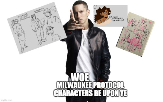


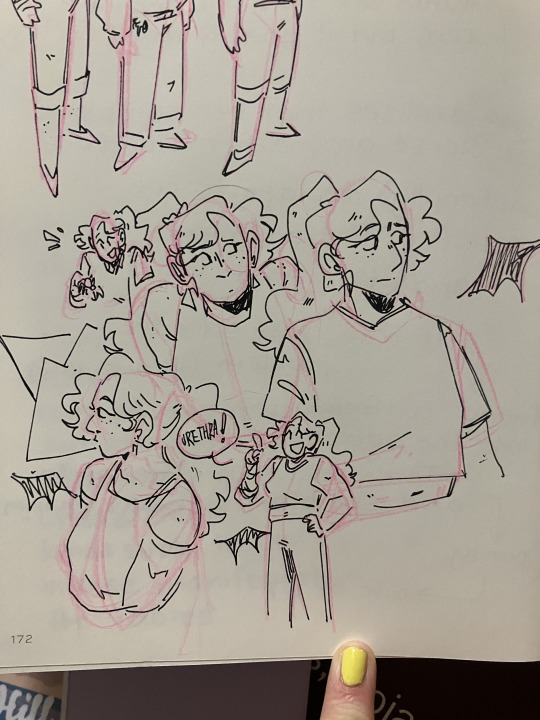
They actually have appearances now! Nobody comment on Terry being like, the fifth character I have with a mullet I am normal about the mullet hairstyle and do not desire having a mullet in any way shape or form. I'm trying to stick to designs and everything, but he might get a redo because I'm getting insecure about how many of my characters have mullets. That said, I'm not really a character designer, Im mostly here to write about rabies.
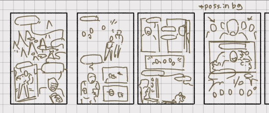
I didn’t like how the script was going and decided to change a lot of things about it and I’m entirely back to square one with writing aside from the first scene, which I feel good about (hence the fact that I started thumbnailing it). That said, I think I have a much more solid outline than I did before, so that whole process will hopefully be a lot quicker from here on out! The connections to the actual Milwaukee Protocol are getting stronger. Here's a peek into the shorthand I’m using for this comic.

The other Nat projects this week involve 1) homework, 2) trying to remember how to clean up the one million billion drawings I've sketched out in the past 1.5 weeks, 3) watching Derry Girls with my friends and 4) being sick. Here is one of the one million billion things I'm not working on.
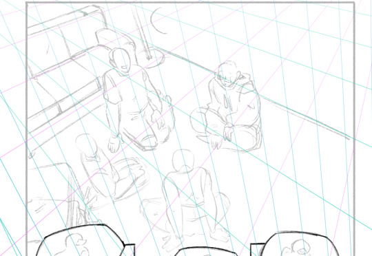
I also realized I forgot to link the MILWAUKEE PROTOCOL PLAYLIST last time!! I would add the entire Nerdy Prudes Must Die soundtrack if it were on Spotify, but it isn’t so you’ll just have to switch over to whatever other music streaming service and listen to that after getting through this one.
WHAT AM I LISTENING TO THIS WEEK:
The Wrong Station! It’s a horror fiction podcast with a lot of individual horror stories. My favorite one this week was the Eloise Kestrel episode, which was incredibly eerie and very well done.
Creature by half alive
Literally the entirety of Now, Not Yet by half alive
Say Amen (Saturday Night) by Panic! At the Disco
Anyone with access to the CAPE playlists can probably figure out exactly which ones I’m listening to from the songs I put in these updates even though it’s been like, two weeks of song updates
Ship in a Bottle by fin
#comic update#big one this week im kinda just throwing everything I get done into these#once I start doing more I'll probably try to make them more concise but like. whatever#milwaukee protocol
5 notes
·
View notes
Note
sorry if this is random but what are each of the members’ iconic looks in your opinion, like outfits/hairstyles that you can clearly associate with each of them? for example vernon’s rainbow hoodie + beanie + weird sunglasses outfit
it’s for science…. (if this is too much, no need to respond <3) hope you’re having a good week!
WAIT OMG LOVE THIS ACTUALLY?????????
ion think tumblr will allow me to insert more than 10 pics so i'm just gonna give u links to the pics/vids <33
pioneer eyebrow studs cheol literally changed the trajectory of my life <3
hana & haru/happy ending jeonghan is sooo dear to me tbh but this one of him in a yellow beret takes the cake <3 and these ones from your choice (the way they did his hair in that pc </3) & hit era (the blue shirt lives in my mind rent free for some reason) AND THE BURBERRY SHIRT LOOK
joshua in that yellow shirt for lnr’s studio choom perf 👁 really got me interested in svt tbh it was The Beginning of The Journey for me fsdkjfhsdjfhs also red cardigan milf shua
jun is ALWAYS gorgeous but him during the last BeTS concert has some kind of spell on me 😭 maybe i feel this way bc it’s recent but like <333 he looks good what can i do :/ AND THIS JUN <3 beret jun <3 AND HIM FROM THAT ONE PHOTOSHOOT
hoshi’s lnr fits tbh (the racecar suit especially 😭) also him in touch 👁 and the pink slutty fit from spider 😭 AND THE CUTE NEON HOSHI BANDAID AIRPORT ONES <3
everyone was rb-ing lnr crop top wonu which also led to me getting into svt (not for his crop top but like.. i kept seeing em on my dash since then JKFHDSJHD) mama 2019 fear wonu... PURPLE WONU
this woozi...... dispatch hit woozi...... cherry shirt an ode woozi.... not obsessed w the look itself but woozi from kcon in that funky yellow shirt....
this magician red suit dk was the first thing that came to mind please do not ask 😭 also rmb being SOOOO taken by this specific semi;colon press con dk he’s still my phone’s lockscreen to this day <3
mama 2019 mingyu... are we all seeing this.. also grab driver mingyu
green fit hao from lnr <3 mullet hao (my favorite look on him tbh and the only mullet i can accept) <3 mullet hao pt 2 bc i love it vm <33 and OH MY GOD.... this one... HAUNTS ME EVERYDAY PLEASE
1st look boo in the white dress shirt...? also sumn abt him Changes during concerts tbh he’s absolutely glowing here’s an example, and another one, and another one (i call it the Concert Look)
you’re right abt That Vernon fit + the one with goggles but honestly... this vernon selfie... anything with beanies tbh.. ok but his fts teaser is sumn else tbh the tatts were SOOO
OK BUT THIS SPECIFIC HIT DINO......................... OR SHHH CHAN.................. dear GOD have mercy (sumn abt 2019 dino in general tbh),,, BLONDE DINO... ALSO ANYONE KFDHJHJDS i literally saw everyone turn into dinonaras it was one of the best days of my life (also was the starting point of his hot boy era for a lotta people tbh) or the home;run teaser pic that sealed the dinonara fate for me <3 i’m lying actually just wanted to show u all of those but my absolute favorite is blue dino <3
ik u were prob just expecting 1 each but i got so carried away i’m saur sorry KJFDHSJFDSHD 😭😭😭😭 i’m also prob forgetting SOOO many looks but these are the ones i can think of off the top of my head <3
#also no need to be sorry at all pls 😭 this was v fun to do <333 thank u for even sendig it#*sending#i really enjoyed this sm sorry i couldnt just pick one KJFDSJFHDS#thank u again hope ure having a great one <333333#anon#y.ask
25 notes
·
View notes
Note
Karkat Vantas
First impression: assigned myself karkat kin at age 14. im MOSTLY kidding but at that time i had an awful anger temperament, swore a lot, and delved myself into books because i kept being rude to my friends so REALLY UH :thinking:
Impression now: unassigned myself karkat kin but hes still one of my favorite characters lmao. hes great and also i love writing his dialogue. hey wait do yall think karkat wrote fanfiction and if so do you think itd be ironic if we wrote fanfiction of him knowing that karkat would hate it knowing we wrote fanfiction of him despite also writing fanfiction himself. actually scratch that theoretical he completely WOULD have written titantic fanfic trying to make jack alive lmao
Favorite moment: yes
Idea for a story: alas at the moment where im in need of my brain to think up of a good davekat au it then chooses taht right now is the moment it needs to be completely dry. i mean its midnight so its not exactly like im running on my most creative juices here im most productive around 1 am and im not willing to postpone this ask for an entire hour but i also dont wanna leave this blank so heres a link to my fanfic. im gonna update it soon. hopefully. i mean you can relate right since when am i ever known for being formulated and great at scheduling but yeah im trying to get it done before my bday eyy
Unpopular opinion: karkat has a MULLET. fools. do you actually think karkat cares about his hair. hed either trim the front or clip it to the side (by which dave would successfully provide dick shaped hairclips) to keep it out of his eyes and as long as his hair doesnt tickle his buttcrack or impede his movement he wouldnt care how long it gets and thats a mullet hairstyle recipe right there
Favorite relationship: davekat lmao do i even have to say it. take one look at my blog and scroll roughly 10-20 posts its a consistency at this point hey do you think i should cease talking too much
Favorite headcanon: filipino karkat. self indulgence strikes again and the newspaper rapidly records the aftermath while nonhomestucks scratch their heads and wonder wtf happened in one brief second while the homestucks all drop unconscious at my projected thought shot into their neurons at 69420 mph i dont know how neuroscience works
#if you actually read the fanfic please leave a comment#it gives me life ds;jf;alkdjlfa#talking back
23 notes
·
View notes
Text
what’s up everybody! it’s time for part 2 of my taz graphic novel review.
part one covered (most of) my beef with the writing and storytelling choices. this part is gonna cover character designs!!! you should know going into this that my opinions are not positive. this post is also a lot less analytical in tone than part 1, because art is not my forte.
disclaimer: i love the mcelroys. i truly do. taz has gotten me through some very difficult stuff and i have a tattoo. all this to say i’m not doing this because i hate them or because i like hating things. if you feel the need to message me about how i am overreacting, specifically to green taako, or about how i should just calm down and ignore it, or about how it’s sad that i’m getting so worked up instead of just enjoying the show, i’ve heard it and i don’t care. you will not be taken seriously. save yourself the energy.
there are spoilers for the graphic novel under the cut.
alright. i’m getting the elephant in the room out of the way first because it’s the most important thing to address, and once it’s out of my system i’ll feel better goofing on the rest of the designs. as i mentioned in the disclaimer: Green Taako Is Bad.
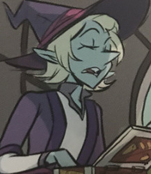
[ID: a panel focusing on taako. he’s skinny and minty green with chin-length light blonde hair and a big, pointy nose.]
now, a lot of people have made posts about this before, and i’m not saying anything new about it by any means. i’m also not the most equipped person to talk about why green taako is bad, because i’m a white gentile (i’ve heard conflicting opinions on whether or not green taako is antisemitic, but it feels remiss not to mention that there’s been discussion) and therefore not part of any groups affected by this whole debacle, but in short: when pressed for more diversity, specifically in taako’s case as a pretty large chunk of his arc involves literally inventing a mexican cultural food (fun note: that’s never mentioned in this book,) carey pietsch decided he should be green and the mcelroys were down with it. this is not an issue that cropped up when this design was released; it was something that there was already a ton of discourse surrounding, and it should never have gotten concepts drawn, let alone made it to publish.
this article by natt cuesta has been linked before on the subject, and i think it’s a good, concise explanation of why green taako is bad as well as why aracial characters in general are bad. this is a racist design.
now that we’ve gotten those ethical ramifications out of the way... i’m sorry, but it’s an ugly design, lmao. he looks like a palette-swapped version of pearl from steven universe with less character. the ONLY thing about this design that i like is the prominent lower lashes, if only because they’re the only thing that keeps him from looking entirely generic. because, like, y’all, when has anything about taako been generic?
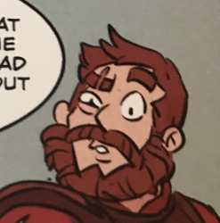
[ID: a panel focusing on magnus. he’s a muscular fair-skinned man with auburn hair, a bushy beard, and a scar over his left eye.]
generic is a word that’s going to come up a lot over the course of this review, because i genuinely can’t think of a more apt descriptor for pietsch’s designs. it feels like she went with the lowest common denominator of every character’s design, a synthesis of all of the most popular (and most boring) ones, except in instances where that would lend any personality to a character’s design. magnus fits what brief description we’re given in the podcast: auburn hair. beard. big. and i guess that’s all you need?
i understand that by appealing to the most common and basic designs for these characters you’re inviting a lot less ire than you might by going with something more individual, so i get the motivation behind it -- or i would, if her designs hadn’t always been about this dull. but it’s bizarre to me that in a story as unique as the balance campaign, we ended up with the most basic ass Fantasy Hero lookin’ dude in the world as one of our protagonists.
i just really don’t have a lot to say about this. i’m just bored by it.
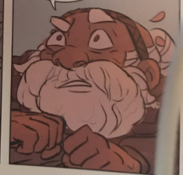
[ID: a panel of merle. he has medium-dark skin with a smooth white bun and beard.]
merle is simultaneously the design i like most out of the boys and the one that throws me the most, because i feel like he’s the most out on a limb one. which... oof. most merle designs i see give him a floral motif (i guess he has a few petals in his hair, maybe?) and big coke-bottle glasses, and i miss those things with this design, but at least it doesn’t totally feel like pietsch threw every merle she could get her hands on into a blender and poured it out on a page, although honestly, that might have been more satisfying. people do some really fun shit with their merle designs, but again, he’s. generic.
as the cuesta article mentions, with how much of an issue it was to get any of the boys to be poc in the first place and in conjunction with minty up there, this design also feels like tokenism -- an appeasement rather than an honest attempt at diversity or god forbid because the artist actually headcanons merle as a person of color. personally, i wish that she’d gone a step beyond re-coloring his skin and idk given him a natural hairstyle or something. he still feels very much like a recolor to me rather than a character who was designed as a person of color from the beginning.
i feel like he looks more like a cleric than he looks like a merle, which i feel like is pretty contradictory to who merle is.
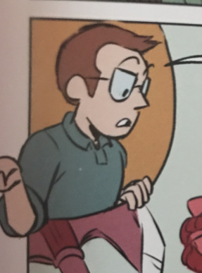
[ID: a cutaway showing griffin, a white man with brown hair and glasses wearing a collared shirt.]
i’ve said before that it feels a little odd to talk about her design of a real person, so i’ll keep this brief, but... you know how every drawing of a basic white dude looks a little bit like griffin mcelroy? you know how that one arthur character looks a little bit like griffin mcelroy? you know how everyone is constantly messaging mysillycomics about how her avatar looks like griffin mcelroy?
how did carey pietsch manage to actively attempt to draw griffin mcelroy and miss the mark? it boggles the mind. he doesn’t not look like griffin, i guess, but he doesn’t look like griffin, either. i don’t know, man
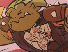
[ID: a generic gerblin. he has yellowy-green skin, slight tusks or fangs, and weird, nubby little horn-type things.]
i hate these gerblins. they are ugly. next
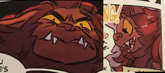
[ID: two images of klaarg/g’nash. he’s a bugbear with brown fur and yellow eyes as well as a mouth full of pointy teeth. in the first image he looks pissed off; in the second he’s starry-eyed and delighted.]
klaarg is probably my favorite design in the book, and that’s just because he looks like a cute dog for most of the time he’s on the page. he’s fluffy and i love klaarg anyway, so like. did not take a lot to reach this mark. especially considering how i feel about most of the other designs lmfao
i do definitely think he keeps up the trend of looking generic, though.
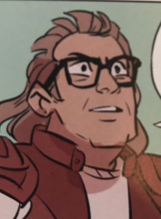
[ID: an image of barry bluejeans. he looks like tom arnold, kind of; he’s square-jawed and white with thick-rimmed glasses. he also has a light brown mullet.]
i hate this. i hate the mullet. i’m sorry, y’all, i really, truly, cannot stand the mullet. i don’t feel like barry has mullet energy. i feel like it’s too powerful a move for him. it wouldn’t be a good move, mind you, but it would be a big one. i don’t know y’all it’s just bad
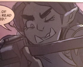
[ID: an image of killian. she’s a green-skinned orc woman with prominent eyelashes, eyebrows, and tusks, and straight brown hair.]
i can’t have been the only one who was hoping for a badass, visibly muscular, maybe even butch killian design, right? that wasn’t just me being a big old lesbian, that’s a pretty common theme of killian designs? i guess kudos for going out on a limb again, but then, like, take the kudos back for going out on the most boring limb possible again. i could hang with the face if her hair wasn’t so boring, but it’s... it’s so boring
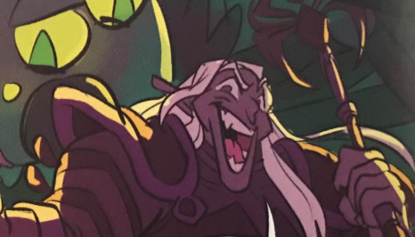
[ID: an image of magic brian. he’s a drow with long white hair and an oblong face and oddly shaped nose.]
for how many of her designs are syntheses of popular ones, i..... don’t understand how this happened. i don’t understand how whimiscal and flamboyant magic brian who’s often drawn as taako-but-a-goth-dark-elf ended up looking like this. he looks like he used to play football and got his nose busted up and peaked in fantasy high school. he looks like the first quarter of a monster factory video where the thing’s just ugly but doesn’t have a personality or any endearing traits yet. he didn’t have to be the goth twink we all know he is but what.......... is this
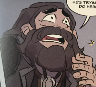
[ID: an image of gundren rockseeker/bogard. he’s a light-skinned dwarf with dark long hair and a matching beard.]
..........listen i know they’re cousins and distant cousins at that but all of merle’s cousins are light-skinned and, like, not to say that that can’t happen but having them be anywhere near merle’s skin tone would’ve been such an easy way to help bolster the obviously inaccurate idea that this is a work concerned with diverse character designs, or rather to help ppl claim it was being bolstered, and yet
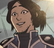
[ID: avi, a fair-skinned man with long dark hair kept up in a ponytail and slight scruff on his face.]
i feel like maybe avi is intended to be east asian so i think at this point that brings the count up to a whole two characters of color. we’re almost done with the book. cool. he’s cute, i guess, but guess what word i’m about to say again (it’s generic)
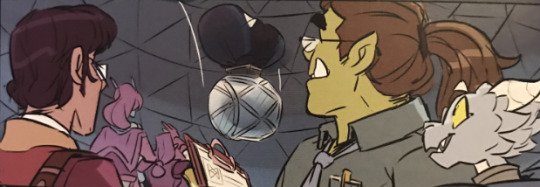
[ID: a panel of several unnamed cameo characters. from right to left: carey fangbattle, a light blue dragonborn; brad bradson, a green orc man with a long brown ponytail; and presumably lucas miller, a tan human with glasses and dark hair.]
ok. deep breaths.
first off, there’s another panel w these three as well as boyland, who looks fine, but i didn’t grab that one bc it’s harder to make out detail. carey is cute. brad is fine.
i assume the third guy is lucas miller because i’m not entirely sure who else he would be, and... oof! as you may know i can’t stand lucas miller, which has nothing to do with his necromancy or nerdiness and everything to do with the various human rights violations he commits in the small time he’s got focus as well as the fact that he’s got a theoretical redemption arc that’s not actually an arc so much as us being told he’s better now. lucas is an entitled jackass who repeatedly uses other people’s bodies and minds without their consent, from the obvious offense of using the bugbears as brainwashed chore-doers (read: slaves) to the less-oft discussed dragging of noelle and others out of the astral plane into robot bodies, again to do his chores for him. because of this, it has always sat very uncomfortably with me when people make lucas a poc, because everything about him screams Shitty White Nerd Boy to me. it sits extra uncomfortably coming from carey pietsch, given how white all of her other designs are.
it’s a little hard to tell because i took all these pics with my phone camera in my room’s lighting so they’re not super high fidelity or anything, but pietsch’s lucas is noticeably darker than any other character we’ve seen so far save merle. maybe he’s just a white guy with a tan, but all the same, it strikes me as incredibly skeevy to have one of so few characters of color be this fucking guy.
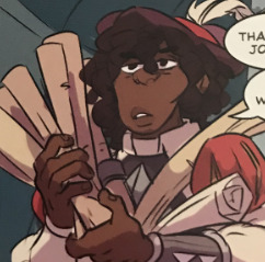
[ID: johann, a black man with an oblong face and textured dark hair.]
johann’s design is fine, although this is a similar face shape to that brian from earlier and i just. i don’t. understand it. it’s not especially interesting, but hey, at least he’s not another generic white guy.
that being said, as i mentioned in part 1 of this review, johann’s role is severely cut in this -- he’s reduced to three panels, when in the show itself he’s the one who escorts the boys to the voidfish’s chamber and inoculates them. as i mentioned in that post i understand that they shifted it some to give lucretia a more prominent entrance, but as i also mentioned in that post, they should have compensated for that. three panels.
johann is not a character with a great deal of screentime as it is, but he’s a character with a major impact. he is the reason story and song happens. his song serves as a direct foil to john’s nihilistic conversion of his own home plane into the hunger. the fact that he’s been reduced to three panels with little to no characterization at this point, especially in conjunction with the fact that he’s one of very few poc, makes me really, really uncomfortable. avi is in more panels in this book than johann is, and while i love avi and as i said i am parsing him as an asian dude, he’s also still light-skinned enough and the style is nondescript enough that there are definitely people who will parse him as white, and also, avi’s role in the story is not as big as johann’s.
it doesn’t sit right with me.
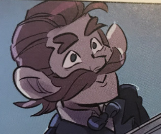
[ID: an image of davenport, a fair-skinned man with a big red mustache and slicked back red hair.]
ginger davenport with a big mustache. groundbreaking.
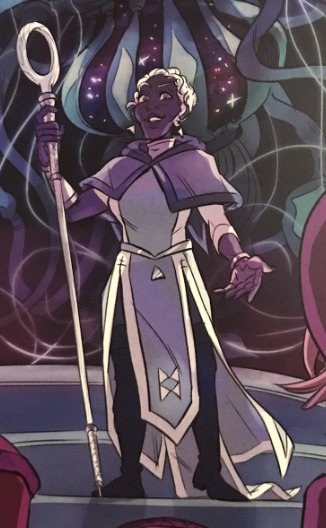
[ID: an image of lucretia, a slender black woman with short white hair dressed in blue layers.]
and finally, lucretia. now, i’m biased, and it’s hard for me to see a lucretia design i don’t like. i also think that this is, compared to a lot of the others at least, one of the more interesting designs in the book, at least as far as her clothes go. it’s not a long robe that would be hard to move in, and i appreciate that -- it strikes me as a pretty practical outfit while also being ornamental and wizard-y. and she’s pretty, and she’s not whitewashed, and that’s all great. i like her earrings.
all that being said, i feel like it’s not enough. luc’s hair continues a theme with merle’s and johann’s (as well as the preview we’ve seen of angus,) which is that it strikes me as very low-effort on pietsch’s part. it’s short and it’s definitely not straight, but it doesn’t feel to me like it had as much thought put into it as, say, minty green taako’s hair. we could’ve had a lucretia with a big beautiful afro, or long box braids, or so many other natural hairstyles; we got this. it’s not bad, but i do think it’s disappointing. without going looking for it and without being a person who reads a great deal about character design, i’ve seen a fair amount of discussion from black women (artists, writers, and none of the above) about the portrayal of black women as it pertains to their hair. they’re never designed to be as feminine as their white counterparts. their hair is never treated with the same amount of detail or respect as their white counterparts. it’s short, maybe curly if you’re lucky.
i’m gonna circle back quickly to killian’s hair. it’s long and smooth and kept down, despite the fact that killian is an action-oriented women and might not want it to be in her face all the time -- it could have at least been braided or in a bun. it could’ve been short! and that would’ve made sense. and i don’t mean to say that lucretia couldn’t have short hair, but she’s a very elegant woman whose dress is described as intricate. she wears business regalia. she could have any number of hairstyles, from something elaborate to something simple but more out-of-the-box than this, but she doesn’t. i found this on a quick hunt through my ref tag -- it’s a tutorial for drawing black folks with just a small selection of interesting things you can do with afrotextured hair. these resources aren’t hard to find! and i’m doing this for fun -- carey pietsch is a professional artist who was paid for these designs. if she’d put in more than the bare minimum effort, we could’ve had some really interesting shit going on, but she didn’t.
and that’s the core of the issue here. i truly do not feel like pietsch put the same amount of care into the designs for the few characters of color we see as she did into the white ones, and that’s upsetting and emblematic of a larger problem in the work: neither pietsch nor the mcelroys put in very much care at all for the fans of color who spoke up and asked for representation.i know i said i was getting taako out of the way first so the majority of the post could be goof-heavy, but goddamn, y’all, it’s hard to goof about when it’s so blatantly shitty. pietsch’s designs are boring at best and racist at worst, not to mention conspicuously lacking in anyone who is not skinny, muscular, or a dwarf. people have praised this thing so uncritically, including people whose opinions i generally really respect, as if the fact that the mcelroys signing off on green taako made it above reproach.
it didn’t, by the way. there’s no such thing as an unproblematic fav, because everybody fucks something up now and then, but even then, this is a pretty egregious fuck-up! and it was willful!
i’m not saying y’all need to burn your copies of the gn or stop listening to the mcelroys entirely or anything of the sort -- you may remember the disclaimer at the top of the post where i say i really, really love them, and more specifically, i really love taz: balance. but i am BEGGING YOU to think critically about their work. good, good boys can do bad, bad things. white people can produce work that’s racist even if they’re gay women. it’s not mean to critique the boys and it’s not homophobic (or god forbid reverse racist, which is still not a real thing) to critique carey.
¯\_(ツ)_/¯ the real kicker of this whole thing for me is that there’s a small fanart gallery in the back of the book. most of them aren’t labeled with the artist’s handles, just their names, but there are some truly beautiful pieces featuring diverse designs -- galacticjonah and milkychai both have beautiful latino taakos featured! galacticjonah’s is fat, too! but even after the backlash against green taako, even aside from that being the design that people are going to accept as canonical, there are pieces in the gallery of green taako, as if doubling down on it was the right move.
and by the way, yeah, i’ve read griffin’s apology. but i thought we all learned in kindergarten that an apology doesn’t count if you don’t act on it.
18 notes
·
View notes
Text
What Watch Does Jerry Seinfeld Wear?
Comedian and actor Jerry Seinfeld likes to spend his considerable fortune on luxury cars and watches.
This combo can be seen in every episode of his series Comedians in Cars Getting Coffee. Where he pairs a fellow comedian with a car that suits their personality. I don't think he pairs his watches to the guest comedian, but a little part of me hopes that he does.
Before getting into some of his more recent watches, let's backtrack a little to the glory days of Seinfeld. Jerry Seinfeld was, and remains, an avid Breitling fan-boy. His most popular watch during his sitcom days was a Breitling Chronomat with a bullet bracelet as seen below:
Images: NBC
I would argue that Jerry's Breitling Cronomat has stood the test of time and would still look fantastic if he wore it today. I can't say the same for his 90's mullet-esque hairstyle...
Anyway, his love of Breitlings continued and can be best seen through his web-series Comedians in Cars Getting Coffee (CCGC), which is available on Netflix. It first aired on 2012 and has been building momentum ever since.
I watch CCGC primarily because I enjoy learning how different comedians think. I'm also a fan of Jerry's comedy and enjoy his casual interviewing style. These keep me coming back for each new episode. But what keeps me engaged within each episode are the watches worn by Jerry (and his guests) and the cars.
Need a recap of Comedians in Cars Getting Coffee? Here's some highlights from the 2019 season to get you in the mood. You also get a sneak peak of several of Jerry's watches:
youtube
Jerry describes each car at the start of the episode, but not his watches. So, it's always fun to do some watch spotting throughout each episode and I've compiled some of these for you below.
Jerry's Breitling Aerospace
Jerry sports a Breitling Aerospace in numerous episodes, including those with Ellen DeGeneres and Kevin Hart. Jerry's wearing a jacket so it's difficult to spot - especially when distracted by Ellen's Paul Newman Daytona!
Images: Netflix
Jerry's super distinctive Breiting Aerospace is an analogue-digital watch known as a 'super quartz' because of its high accuracy.
The pilot watch has many handy features such as a night vision goggle compatible backlight, 1/100s chronograph, countdown timer and secondary timezone. These are all operated via the crown by pushing, pulling, turning & turning fast.
In a way, the Aerospace take some practice and effort to master. Much like driving the manual 1977 Toyota Land Cruiser he chose for the episode with Ellen.
Jerry introduces the Land Cruiser, "It's basic, it's classic, it's durable, it's user friendly."
The Aerospace also ticks most of those boxes, so I'd say he's done a good job of matching it to the Land Cruiser.
See, I told you there were some links between his car and watch selections!
Jerry also wears his Breitling Aerospace in other episodes, including S5 E1 with Kevin Hart .
I enjoy the ridiculousness of the goggles as Kevin and Jerry cruise around in the 1959 Porsche RSK Spyder.
Images: Netflix
Jerry's Breitling Navitimers
Jerry's love affair with Breitling continues as he chooses the Navitimer for several episodes, including the one below with Will Ferrell.
Images: Netflix
Jerry's Navitimer in this episode features white dials at 12, 6 and 9. This departs from the more common 3, 6 & 9 format mostly associated with new Breitling Navitimers.
Breitling still release a Navitimer with the 12, 6 & 9 dial layout that some prefer because it can appear more balanced. This is the Navitimer Chronograph 41. As the name suggests, it's also a little smaller than most Navitimers at 41mm, which some find more wearable than the larger 43 or 45 Navitimer models.
Breitling Navitimer Cosmonaute
The next Navitimer on Jerry's wrist is another Navitimer. This time it's a limited edition black steel Navitimer Cosmonaute.
The idea behind the Cosmonaute is that allows calculations to be made by pilots (or astronauts such as Lt. Cmdr. Scott Carpenter) directly on their wrist.
Images: Netflix
How do you use the slide ruler on the Navitimer?
If you're not accustomed to how a slide ruler on the Navitimer works, they can look terribly complicated and even intimidating.
It's actually quite easy to use once you know how. Check out this video for a 90 second explanation:
youtube
Breitling Navitimer Chronograph 41
The Chronograph 41 is a very wearable size for Breitling, while still making a statement with loads of functionality.
Chronograph automatic movement
Built in slide rule
41mm (ie wearable for most)
Check Prices
The Breitling Navitimer Chronograph 41 pays tribute to the original Navitimer 1 with it's vintage looks prominent circular slide rule on the perimiter.
It mostly comes in stainless steel with several face color variations. But there is also a rose gold model that is considerably more expensive.
The slide rule allows on-the-fly airbone calculations to be made such as fuel consumption, climbing times & converts miles into nautical miles or kilometers.
The 41mm watch size has proven popular with those like Jerry that are after a classic looking watch that is unlikely to ever make a calculation like fuel consumption. This wearable size means it avoids the criticims levelled at some other Brietlings for being too big.
The movement is Breitling Calibre 13, based on the super reliable Valjoux/ETA 775. This external movement is different to other Navitimers, which has also required the sub dial layout to change to the less familiar 12, 6, 9 layout. But, I like this sub dial layout as it makes the watch look more well-rounded than some other Navitimers.
Jerry clearly loves his Navitimers and it's easy to see why. They make a statement but are still very functional and have a great history (and story).
Pros
Inspired by iconic 1952 design
Circular slide rule
Wearable 41mm size
Cons
Be good to have more than 30m water resistance
Specifications
Movement: Chronograph automatic
Crystal: Sapphire
Case: Stainless steel
Case size: 41mm
Band material: Stainless steel
Bezel: Unidirectional
Water resistance: 30m (100 ft)
Check latest prices
Breitling Navitimer Chronograph 41
Check prices
Jerry's Heuer ‘Siffert’ Autavia
This vintage watch from Heuer really speaks to the car enthusiast in Jerry. Autavia's are very sought after by watch collectors as they are synonymous with F1 racing of the 60's and 70's.
One of the most sought after from the 1960's is the 'Jo Siffert'. Jo was a Swiss motor racer who won two races as a privateer and died in competition in 1971 at the age of 35.
Jerry confirmed his purchase of a Heuer 'Siffert' Autavia with this Instagram:
View this post on Instagram
Watch in Box.
A post shared by Jerry Seinfeld (@jerryseinfeld) on Mar 5, 2016 at 10:04pm PST
You can see Jerry sporting his Heuer 'Siffert' Autavia in in this episode with comedy legend Jerry Lewis (S10 E12):
Images: Netflix
Watches worn by guests in Comedians In Cars Getting Coffee are included below too.
Ellen DeGeneres - Rolex Daytona 'Paul Newman' (S10 E3)
Guest Ellen DeGeneres who sported a super impressive Rolex Daytona 'Paul Newman' in season 10 episode 3:
Images: Netflix
We've previously covered Ellen's watches in more detail. She particularly loves her Rolexes and I would love to see her Rolex collection side-by-side with Jerry's Breitling collection.
Kevin Hart - Rolex Sky Dweller (S5 E1)
Not to be outdone, Kevin Hart shows off his Rolex Sky Dweller.
Images: Netflix
The Rolex Sky Dweller is one of the most complicated mechanical watches in Rolex's impressive line-up. The pilot watch allows Kevin to view two time zones simultaneously. This would come in very handy with his busy acting schedule.
The other significant feature is the annual calendar, which only requires setting every year (to account for February's leap year) as opposed to every month.
The Rolex Sky Dweller comes in white gold & stainless steel versions. I'm not sure which version Kevin wears, but if there's an actor that can afford the white gold version, it is the incredibly successful Kevin Hart.
Barack Obama's FitBit Surge
We've previously covered Barack Obama's watches here, but we did not include this FitBit in the list.
This is one of my favorite episodes of CICGC because of Barack's candid nature and surprisingly good sense of humor for a president.
This exchange between Jerry and a Secret Service agent is the best:
Jerry: "We're just going to run out for a quick coffee.
Secret Service: "I'm sorry, that's not possible"
Jerry: "I do this little show called Comedians in Cars Getting Coffee. We'll be right back."
Secret Service: "You're a comedian with the president going nowhere. Back it up."
Images: Netflix
I will try and update this list of guest comedians and their watches too. But if you have a particular guest you want me to cover, then please let me know if the comments below!
amzn_assoc_placement = "adunit0"; amzn_assoc_search_bar = "true"; amzn_assoc_tracking_id = "best20050d-20"; amzn_assoc_ad_mode = "manual"; amzn_assoc_ad_type = "smart"; amzn_assoc_marketplace = "amazon"; amzn_assoc_region = "US"; amzn_assoc_title = "Jerry's Amazon Picks"; amzn_assoc_linkid = "c2a7db5d0d49aa7ae91bdac69ec0ccb0"; amzn_assoc_asins = "B00EIJTLK4,B07K2P6S5W,B00GZQNG7W,B06XDWJVVN";
The post What Watch Does Jerry Seinfeld Wear? appeared first on What Kind of Watch.
from What Kind of Watch http://whatkindofwatch.com/jerry-seinfeld/
0 notes