#i think flats look better with my lineart anyway
Explore tagged Tumblr posts
Note
HI HI JUST WANTED TO SAY THE WAY U COLOUR YOUR ART AND DO THE LIGHTING IS SO SO PRETTY AND COOL LIKE ??? FULLY GASPED WHEN I SAW UR SUPERBAT ONE HOLY SHIT
thank you so much!! do not ever expect it from me again.
#danswers#what a nice thing to wake up to i rly appreciate it ☺️💗#it almost makes up for the fact that it got mature labelled 🥲#i like my rendering style but i wish it wasn’t such a laborious process </3#i think flats look better with my lineart anyway#(<- excuses)
4 notes
·
View notes
Text
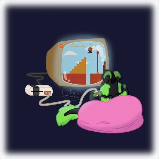
🕹️ Video Games 🕹️
A Dragon a Week 10/52
Happy Mar10 Day!!
#woo dragons art be upon you#my art#art#does it count tho? i mean. my fursona is there#eh fuck it. I'll tag it#dragon#dragons#a drawing a week#a dragon a week#mar10 day#I've tried out a thing I've seen a few days ago#there's a brush that gives you an immediate lineart together with flat colors#i does save time but... for me it's not worth it#i think it looks better the way I've done it before#anyway#it was fun doing the pixel art#i took my smb game package as a reference instead of looking it up#i know an nes hasn't had that many colors for one sprite yet shut up#this is my art and i get to decide the (amount of) colors
2 notes
·
View notes
Note
Hello hi I just found out you're the artist of my favorite pic of Jamil from all time 🥹 I absolutely LOVE LOVE LOVE LOVE LOVE LOVE LOVE LOVE LOVE LOVEEEEEEEEEEEEE SO MUUUUCH his bday art from 2020!! It's my favorite one from every art and he looks so pretty and hot and cool and like he's in a music clip and about to drop a fire verse!! I LOVE your painting style so much, as a baby artist, would you one day show us how you color? I'm sure you put so much blood, sweat and tears into your hard work and it would great to get a little bit of that wisdom. Please keep drawing, keep doing what you love because it makes the world a better place to live!
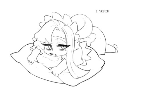
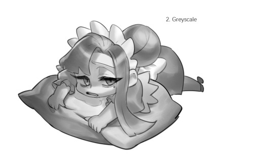
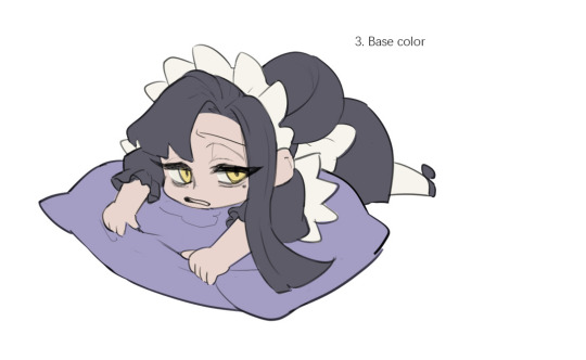
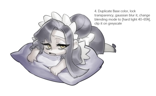
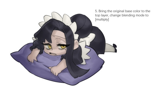
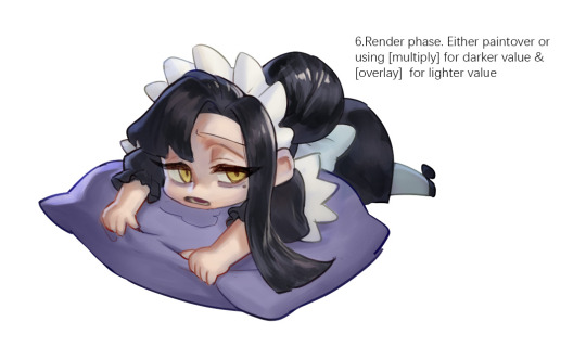

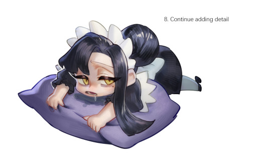
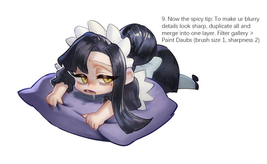
Sketched my sleepy and tired oc to do a very quick demonstration but it covers how I color when i render things:
Start with rough greyscale first, it's a good start to roughly decide light direction and value of your overall work. Especially if you have no idea on your shading.
Next, apply base color to greyscale. I'll use gradient map if I want to keep the details of my greyscale. But if not, I'll just start with a flat base color, and try whatever I can to apply color.
Rendering phase. Add layers and just paint on top to refine it. Merge all layers if it's too messy. Then add layers again. My rendering really depends on how much time taken because it's just a loop of paint over and refining. Thats why i do more simple fanart cuz I sometimes get bored of rendering Also at this stage when doing lineless style, I merge lineart with layers and cover up the lines.
Final touch. Merge all layers and use [filter gallery > paint daubs (brush size 1, sharpness 2)]. It will sharpen your work and look detailed. Or add some very fine noise texture, it will look detailed too.
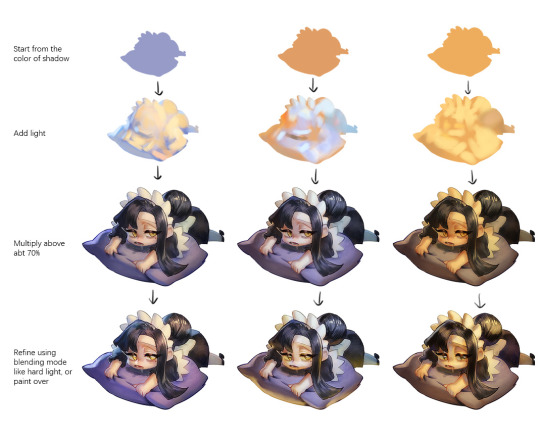
Another very rough demonstration on how i apply color mood. This will be after step 2. And same will be more refining and even paint over to ensure the colors look ok.
Other tips:
Add warm and cool colors especially on skin.
Use pinterest. Always find more than one reference for a subject if you want to draw better than yesterday. Pure ref is a nice tool to gather reference on your pc. When i draw a single hand I had a lot of ref. (pose, color temperature, lighting, photos, artwork, all diff ref)
Color theory is so important I still struggle a lot. I highly recommend beginners start from practicing Marco Bucci's ball practice. After that slowly change to adding character into movie scene and photographs, the purpose is to adapt different color moods and learn the lighting from the image. Learn more from famous movie and cinematic. They did their best to nail the colors.
Anyway,
this is a long answer about how I color. My previous job influenced me so much on coloring so there's a lot of thinking and struggle on my colors.
So, I suggest you be more experimental and try new ways, at the end what remains is what fits you.
117 notes
·
View notes
Note
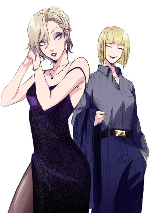
can you pretty pretty please with extra sprinkles on top drop the speedpaint for your most recent rookvil art? i wanna see how you did vils pretty dress and everything else cause its all so beautiful
I am so happy you like how it looks!! I would love to make a speedpaint, but unfortunately, I didn’t record it + the base for the drawing was actually done traditionally with a pencil. A lot of my drawings are done this way, actually…
Even though I can’t drop the speedpaint, I’ll do the next best thing and explain my process for this specific drawing step-by-step. It’s actually not that complicated!
Here is how the sketch looked initially. As you can see, I shaded the dress very crudely; in fact I was kind of upset with how the dress looked at this stage. Ironically, I ended up not doing much to the pencil shading, and it still turned out okay somehow?? Anyways, the first thing I did was to prep the sketch for the colouring stage: I adjusted the contrast, fixed Vil’s face, and erased some dirt and imperfections.

Then I create a new layer, set it to Multiply (this way I can colour the sketch without disturbing it, as if I was just colouring a digitally done lineart) and do a base colour layer. There is a gradient in Vil’s hair and Rook’s belt buckle, but other than that, all the colours are flat at this stage.

Before doing all the shading needed for this sketch, I add details such as makeup and tights. If you want to know how I did these, let me know, but I basically looked at a tutorial once and then simplified it lol

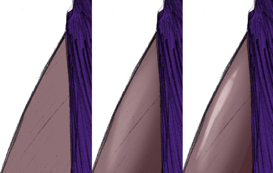
Now, the dress.
To be completely honest, there isn’t any proper technique to what I did, everything is always just trial and error and an hour of me going “does that look good? NO IT DOESN’T >:(“ until both Katsu and I are satisfied. This time I was lucky, because it didn’t take very long, and the “solution” was pretty simple.
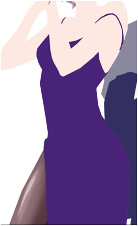
Starting with the base colour. I turned off the sketch layer to show that it is indeed completely purple. And it looks kind of bright at this point, almost too bright even, especially considering that the dress is supposed to be mostly black, or at least dark purple. But bear with me.
Next I added some highlights (new layer, set on Overlay or Screen, depending on what looks best). Usually I would add the shades first, but I wanted to make the fabric look more “shiny”, you know, the type of fabric that would reflect the floor and make this highlight under the boob lol.
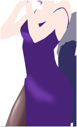
And after that I just went ahead and added black gradient (on a new Layer) from the bottom of the dress to make it look darker, silkier and a little bit more interesting for the eye. I erased some parts of the gradients as you can see, because it looked too dark on the highlighted parts… could’ve just placed the black gradient layer under the highlights layer and saved myself a headache, but hey, where is the adventure in that.

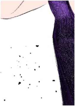
Finally, it turned out looking like this. It looks better than it used to look like initially, but there is one more thing to do. We don’t get to do this one too often, so it always excited both Katsu and me: THE SPARKLES!! Somehow, making the dress sparkly makes everything much better.

How do I do the sparkles: I use the star brush… or was it a snow brush? I use this brush when I draw both of these things lol + when I draw anything sparkly. I would’ve given you this specific one, but I don’t really remember where I got it from, and I honestly think that any starry or snowy brush would work wonderfully as long as the specs are small enough.
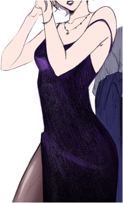
After that is done, I just shade the rest of the drawing. Nnew layer set on Multiply, the shading is done with darker purple/red + darker blue, whatever looks better on any particular material: the skin really likes warmer colours, but Rook’s suit looked bad with red shades, so I adjusted it to blue.
And here is the post where I talk about how I colour hair! Good thing I already wrote that one, this post is getting long lol
And the last step is to add details. The original sketch was done in a rather small (smaller than A6) sketchbook, so I couldn’t draw all the details like Vil’s earrings and stuff properly. Basically I just paint on a separate layer on top of everything.
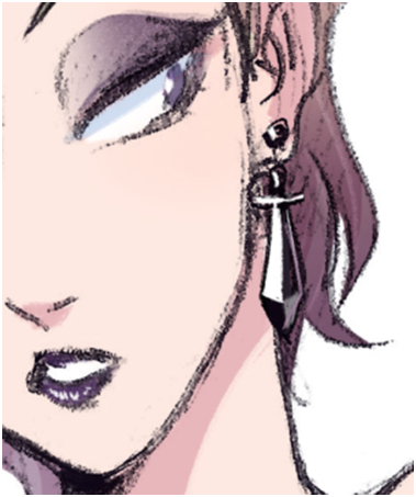
And there you have it! I hope it makes sense, please let me know if you have questions.
106 notes
·
View notes
Note
Really love your art ❤️ the wings you draw looks amazing 👏 how does one draw them? 👀 do you use any references?
Oh my god, this ask is making the circle full fr. ;; Thank you SO MUCH, Anon!! I've had an enormous wing kink most of my life, but scared of drawing and avoiding them for uh.......... most of my life lol. So reading this means A LOT. TLDR - yes, use refs of all sorts of birds! use gradients! don't overdoit with brushstrokes! wings are paperthin!
In 2021 I said fck it and-- asked my partner, @lesoldatmort, who's a wing-master to teach me how to wings. And the answer was simple - use refs. I did! And it looked better than before. But. Uh.
Most of my wings looked like-- pillow sheets? Or. Pillows. Blankets. Puffy and thick. (Rafe from December, 2020)
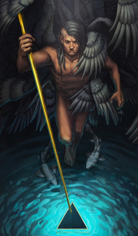
So the biggest trouble for me personally (and for my partner, who was trying to knock it in my thick skull), was to get the wings as thin as possible. And use refs. And draw a lot of wings.
The biggest and best advice I got from my man, was to think of wings as of paper. Flat and thin. And use gradients for the sections instead of too many brushstrokes for each feather. Actually, save on the brushstrokes where you can.
January 2022 this was the best I could do. And that's after a LOT of interference from my partner, who kept nagging me to get rid of brushstrokes and add. more. gradients.
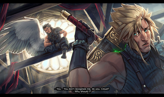
In June I decided I'm cracking the case. Gave up on trying to paint too much, because I prefer lineart 95% of the time anyway and drew the Howl piece. Still too many brushstrokes, but I used vulture photos as a reference for this one. Adoration is from this time as well. Used a pinned down bald eagle as a ref for Zack's wing.
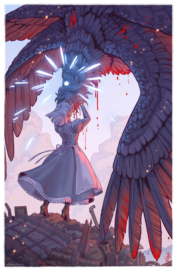
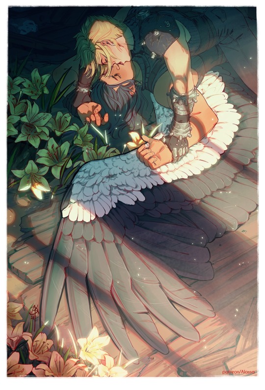
In summer, I did some more random studies, kept looking at wings very closely. Looked at other artists drawing them. In September I was lucky enough to get cmed to draw safer Sephiroth. And that was probably the final moment I gave up on too many details and brushes and started stylizing the hell out of it. And using gradients. And lasso tool. As my partner's been telling me for almost two years at that point. Thin. Finally.
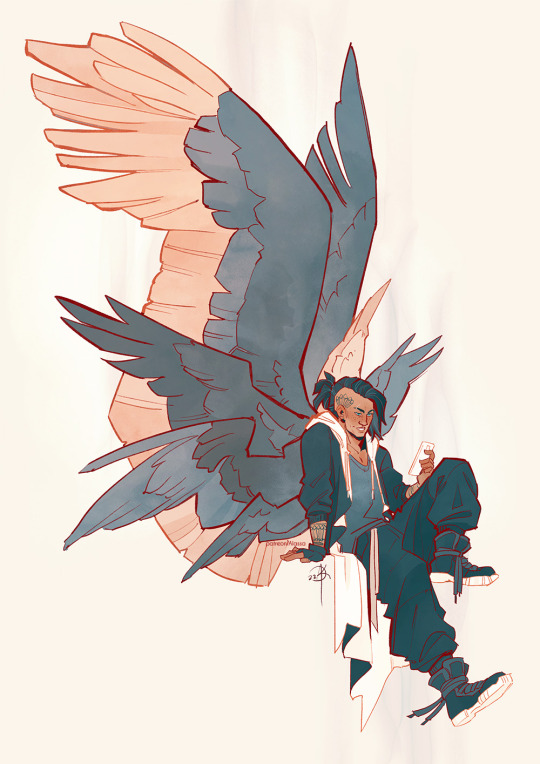
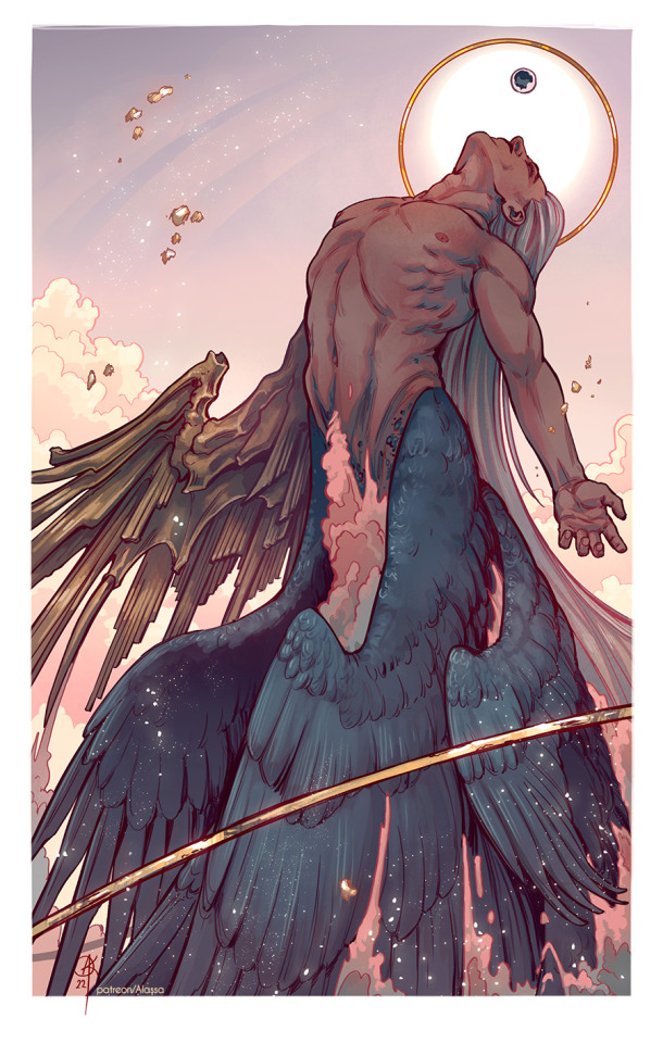
And then I just kept going. Simplifying the hell out of them............
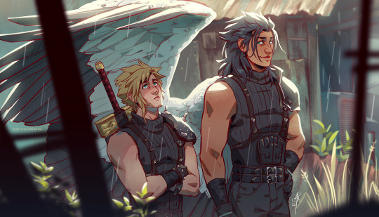
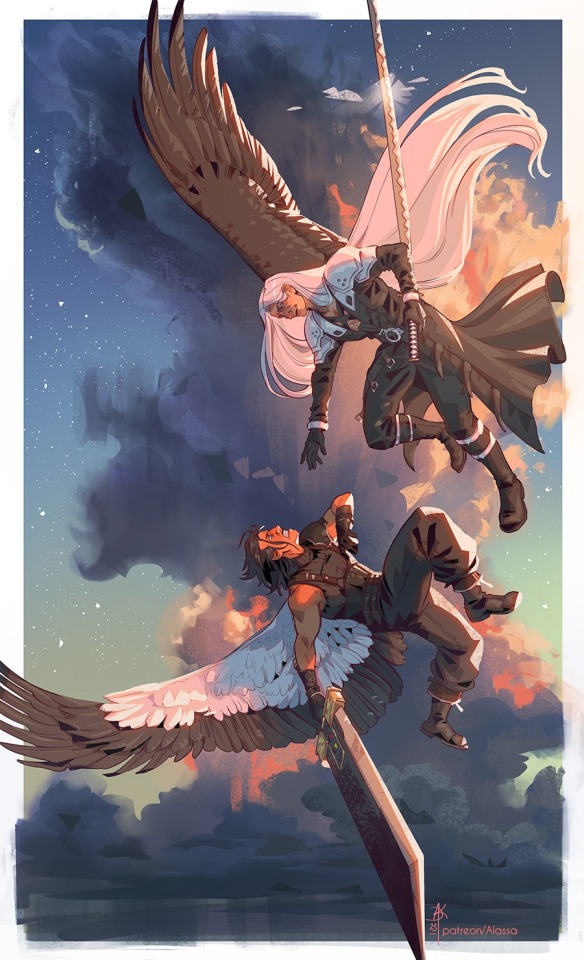
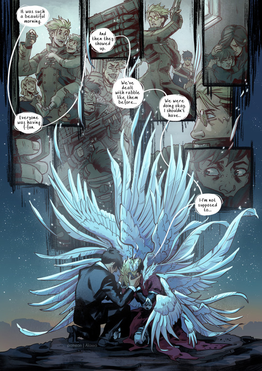
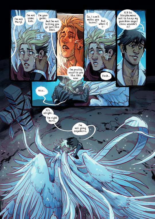
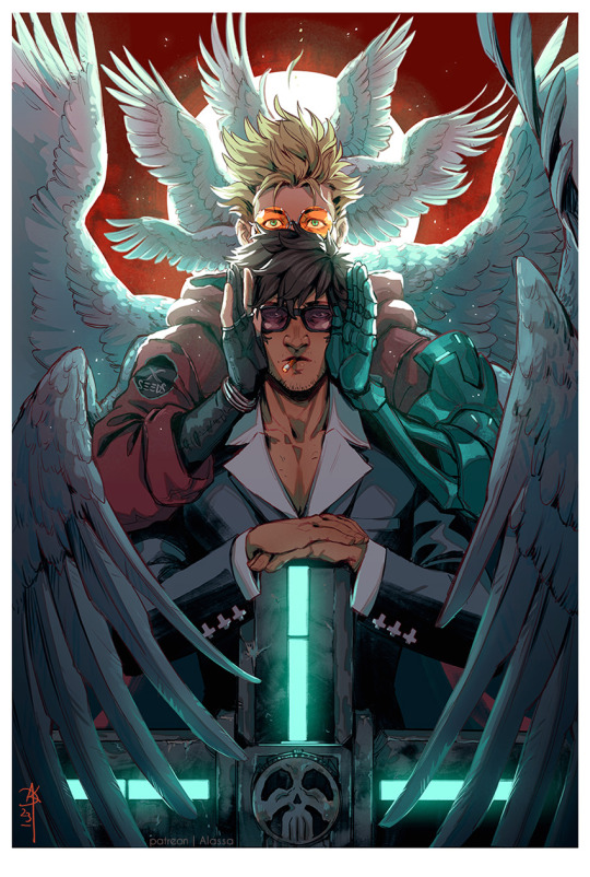
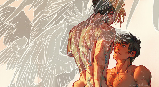
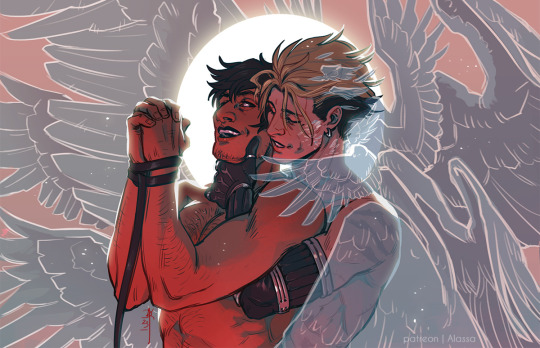
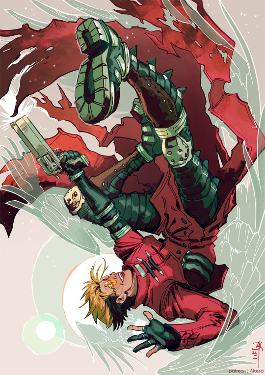
And here we are. I have a problem. It's called a wink kink. And I'm loving it. <3
A few months ago, due to a gender crisis, lol, I even started using the name "Alas" along with Alassa. Which supposedly means "wing" in latin.
So... Thank you for coming to my ted talk and personal vent and rant. Sorry this got so long! However, seeing somebody asking me specifically about wings in my art... feels like reaching a finish line after years of whining. Thank you so much! ;; <3
166 notes
·
View notes
Note
what's your process for coloring like? the look of that elendira is so textured and interesting, i can't figure out how you do it
AA THANK YOUU ^__^ !! textures & brushwork are my favorite things abt my art, so im happy you find it interesting hehe . its SOO cool to look at & so much fun to draw imo
i prefer to color by building in layers , if that makes sense 🤔!! hundreds of them !! such that i'm always drawing on Top of previous layers, working from big & messy blocks of color to, eventually, small and refined blocks of color until it feels processed enough. as a result, i rarely ever erase (!!) and i rarely ever draw lineart aside from the initial sketch
a rough, patchy textured brush is key here, as it'll give you dimension and variability w/ your colors. i recommend "Brush and various sets of fountain pen style (万年筆風ブラシと色々セット)" on Clip Studio (ID: 1679706) !! :3

im terrible with explanations though, so i'm going to show a step by step of that elendira drawing if you dont mind :3
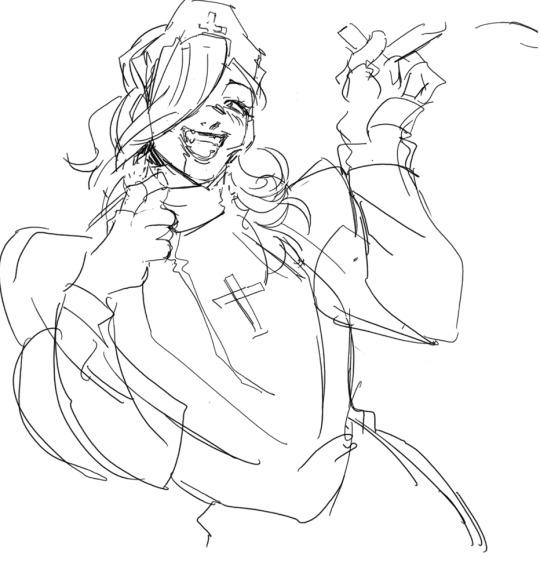
sketch layer !! because i mostly render through color alone, i try to make this as close to the finished thing as possible . ^__^ i hateee drawing the same thing over and over and like the expressivity and movement of my sketches anyways , so the more i can preserve at this step, the better. if u were to look at a side by side of my sketches and finished pieces, youd notice a lot of those og lines are present in the final drawing :3

2. flats !! pretty self explanatory, but the solid background gives me an idea of where the figure begins & ends while the colors themselves help distinguish whats what . i stick to ambient lighting @ this point because im usually not sure what i want to do with the overall palette or lighting yet . having two tones (ex, dark and light in her hair or dark and light on her skin) can also help in identifying key features early on that u wanna preserve. as you build layer by layer, sometimes these areas will remain untouched and i think it makes for a rly lovely feel at the end

3. start blocking !!! to be totally honest with you, i dont really know what i do here HAHAHA. like i just scribble the shit out of it, usually focusing on what i might want to do with lighting (ex: grey areas to accentuate folds in her costume). i think i like to start "erasing" the sketch where possible by coloring on top of it .. like if you look at her hat or her arm , you can tell i'm starting to get a sense of the shapes i like vs the ones i dont. it's at this point that the final image starts to emerge in my mind , like im gradually pulling her from a tarpit of scribbles until shes recognizable lol. chipping away at the marble until i can free her. tbh.

4. keep blockingg...when u think u are done , block some more . as you can probably see, the brushwork becomes more intentional as i add more shape, with specific focus on line weight. this is also where the patchiness of that textured brush comes in - notice how none of the colors seem totally uniform (ex: the red cross or the original sketchlines for her waist). you can see bits and pieces of the layers underneath pushing through and i really like that !! ^__^ its very fun and sketchy to me, so i try to keep them around. those areas are also great to colorpick from, because it'll give you "new" colors to work w/ that are already part of your palette.

5. GRADIENTS & GRADIENT MAPS !! TONE CURVE !! COLOR PICKER !! this is the best stage tbh. flatten your image so its all on one layer and just go crazy with all the color settings in ur program. add gradient layers and set them to darken, or overlay, or subtract, orrr. lighten or dodge glow or divide or soft/hard light.! OR!! edit the hue, saturation, luminosity and contrast.and then color pick from these edits, block even more on top of ur image, flatten, color edit again, etc. etc. until u feel satisfied.
ANYWAYSS . i hope that makes sense @__@ sry i wrote this out and deleted it like 23 times trying to make it make More sense but thats what ive got HAHA i hope its useful though :3 !
#SRY I STRUGGLED 2 EXPLAIN THIS#dude its like my brain bcomes stuffed w/ cotton anytime i try 2 write#i hope it makes sense tho..#it also probably sounds so redundant to make new layer one after the other for just a few brushstrokes#but those brushes i linked have a multiply property so if you draw on top of prev lines they'll create dark patches#and so if im working over a large area ill generally need like . 5 layers each with one brushstroke :sob: if that makes sense#this one had . 84 i think. total. layers i mean. the merylvash one had 300+ HAHAH so it rly depends#like YEAAH i could just use a normal brush but i really like the way this looks#andd sometimes the multiply function works really well or will give me the proper shadow tone im looking for#anywas.wanywaysn anyways#asktag#anonymous#long post
58 notes
·
View notes
Text
Okay can I talk?
eric belonging to @night-light-artz
Patches @eve-pie
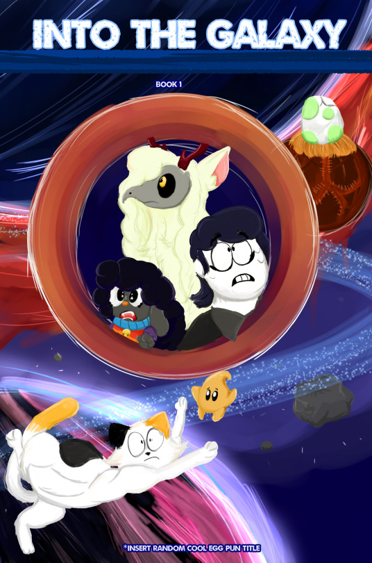
Okay for the image above I was doing a “mock” warrior cat book. I miss the old covers but anyway
I kinda feel my art is…boring. I mean it just feels that way. Sometimes I feel I rush myself to get things done, and to be honest I hate having to rush myself. I look back at my recent post and they just fall FLAT. Flat as in the colors are just boring as heck. Lineart? I don’t really like. Not only that but everything feels so unpolished
My anatomy/details
I hate the fact I miss crucial details of my chat starts or even other people characters. I mean, HAVE YOU SEEN HOW I DONT EVEN ADD SILKY’s ANTLERS 99% of the time? That bothers me. And I see other people add them and I’m just “well damn I’m so lazy I can’t even add antlers on my own fucking character”.
Not to mention the poses. Everything feels so stiff with me. So dang stiff that you may as well call my art wood and use it as a support beam. I hate how I don’t use references for my art. Maybe If I used them more and actually took my time stuff wouldn't look like your average horrific Netflix Original cartoon of some movie.
Backgrounds/minor objects.
Do not get me started. I hate all of them. They look so low effort. I mean, I know I can do better with them! But it seems like I worry about the main characters so much. In fact, I feel the background just falls flat or blends in too much with the characters that it looks. Messy. If I draw a cup, i'll skip over details and it will look awful! Which isnt good, as it shows im lacking severly.
Time
And for time I rush. I feel like I have to literally push things out by day’s end and well…it affects my art. Lately o just been so focus on the hour and time it just makes the art suffer. Even if no one else sees it I do. I love my painted style, but it takes quite some time. And forgive me but I hate just doing sketches to and posting it. I prefer my art to be colored in and all the way. Now im not saying i dont like it when other people sketch. That would be a dick-head move of me.
Some days I fear if I don’t post or read inboxes everyone is going to think I purely abandoned them. I try to focus on my page. but just giving them a sketch at the end well...it makes me feel as if I just dissapointed them. I think to myself and say "I could have done better than that. Why did you even do that in the first place {Name}. "
I have like so much on my agenda and plans and then i realize I can’t do it all in one day. Hell sometimes I just make one day spefically on one subject.
If that day was animation day; I focus on an animatic.
If a certain day is art day and I want to set up my commission page (which is so messy I deleted it) then that’s the settled day. But I feel like I’m going so slow. It's like I am running out of time, and time is just passing by as I look at my clock.
And I'm not blaming anyone it's just my stupid head that makes me feel this way. I know no one is trying to rush me. But head is like "Oh but what if- and why not-". It bothers me. It clouds my vision and i don't realize in reality...no one is saying the things my brain is saying. Sometimes I feel like I'm bothering people when i draw their charcaters so much and tag them. I fear they just say 'Aw great it's this one person again."Sometimes I feel I need to be MORE original. And some days i feel i just need to give up entirely. Some days I think posting everyday will aggervate folks. Sometimes I envy the attention of others, and when I see what they gain or what following I have i look back at myself and say "Well maybe if you did this better than MAYBE you people will be interested in ya". And damn do i slam my head in a wall. Everyone just seems so happy, and yet here I am fretting over if this fucking dog I drew looks remotely interesting. And I just feel it...blends in. Like what is there so special about my art?
MY BLOG
And for this blog, I don't know if I truly have an identity for myself. There's Silky, there is Minty and Syrup, there is Simon and there is Shrimpy. But who do they belong to? What roles do they even serve in this blog? I want them to be my identity. I don't want them being just some sort of character leech. They lack story, they lack purpose, they are thrown in tropes and gag. But what do they relate to? Nothing. Nothing at all. And yeah yeah I know im thinking to DEEP into this. But it's been on my mind so much. And hell call me crazy for talking about them if they are real, but they mean a lot to me. A LOT.
So I tried to make my art interesting here like, i tried referencing images space. I tried adding more anatomy to Snowy since I am tired of doing the usual standing up pose. I even wanted to make the background feel more detailed. I feel a bit better, but I still fear everything is too...eh...bland. Maybe it is just me.
Sorry for the ungodly word of text. I know I shouldn't vent here.
#vent post#artist on tumblr#super mario galaxy#eric velseb#patches bashful#silky silksong#welcome home#mario
33 notes
·
View notes
Text
EXCUSE ME WHILE I RANT FOR A BIT
So anyway I finally started with the graduation project and, lemme tell ya, it was annoying. I mean I expected this, but it's still annoying.
The school and the mentor wants things to be of a certain aesthetic and standard so it can fit with the general public's taste and eventually it can be picked up by a publisher. it has to be commercial and easy to digest, for a lack of better words. Which is like, the opposite of essentially what i am as a person and as an artist.
So anyway I'll be doing Truyện Kiều again, illustrating the full book with better art this time. Here are some sketches I did:


Below is the mentor's very quick sketch for demo:
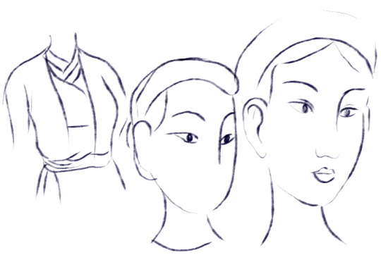
Which is. Ok cool, it's very traditional, Vietnamese fine art design and aesthetic. The thing that you see everywhere in books and media. The thing that is taught in fine art school. And it's also very HIM because he's a very prominent artist since a long time ago. I'm not talking about the difference in the era clothing tho because he demoed in Nguyễn dynasty while mine is of the Trần dynasty.
My style was criticized (politely) that the face doesn't look pretty, the nose is too prominent and big, the lineart is too scratchy and loose, and that I have to restrict the freedom in my lineart more.
Which is. Like. Pretty much all the things that i like about my art the most. I don't really like drawing "pretty" people, I wanna draw distinct and unique people. I like the fact that the nose is prominent because that's a very Vietnamese facial feature. Our nose is big, flat and flared. And I like it. AND I DIDNT EVEN DRAW IT THAT BIG. it's already stylized and stuff. The lineart is scratchy and spontaneous because that's how my ADHD brain works! And I like the freedom, the raw unfinished feel to it. And my way of scrawing is kinda similar to sculpting in a way that I like to put in a block of line or shape (yang) and then erase it and putting in more nothing space (yin). And I like Maximalism and Kitsch and Neo-traditionalism so I love to do things a bit crazy and new and filled with emotions.
My mentor comes from a very different generation, and a different field than me. He's very commercial, leaning more into minimalism, fine-art conservative and traditional aesthetic. WHICH IS THE OPPOSITE OF ME. Sadly we don't get to choose mentor cos there's only one lmao.
And also I don't understand why I have to aim for publishing in Vietnam too, because that's not where my target customer is. I'm a niche artist with limited customer base and they are international clients (who mostly pay better, treat you better, and appreciate your art more than the general public in VN do). Luckily I have a bachelor in business admin so I know how to do brand and marketing myself, othewise id just keep on trying to please everyone (flexing a little bit, but i was graduating with excellence and on the top 10 of my intake lmeo). Not to mention the fact that why do I even have to publish in the first place, because this is a school, it is a place to experiment, make mistakes, and learn. It's not a place to conform to the industry to make a living. If I wanna do that I would not be here and start working for a company already!
I understand it when they said that it would be a huge advantage if you can get published, but then again, that route is not for everyone, and it's not the only way to be an illustrator like they said. I have my own path to walk on, and I don't think they are aware that we even have those paths, because they are from a different generation. I mean, that's why I was struggling so much before to find a footing, because virtually no one here knows there are other paths! I had to dig things up myself through sweat, blood and tear.
Anyway I rant but i will keep trying to fight and do it on my own terms. They can't make me anyway. There's gonna be sticks and stones, but I mean, I can't physically make myself do something I do not wanna do. There's another option which is to drop it because I don't need the certificate anyway, but I wanna finish a big project of my own too.
#might regret posting this later tho#but i doubt it because i know where i am now finally#and i know where they are too and its not where i belong#my Việt babies here probably know of the mentor if i mention his name#he is from a waaaaay different place than me#i mean this school is a commercial art school anyway#but like im cant attend fine art because thats even more far off than what i am lmao#cryptic na posting
20 notes
·
View notes
Text

It took me almost 5 years, but I have finally completed the set I started way back in 2019 December. My very first ever completed art set with all my main characters too!! not the first one I attempted either, but the first I saw through and I am oh so very happy!
Drawing the last half of these was such pain, since when I did the first two, I was actually experimenting with a few things, mostly the line art, having a textured brush and setting it to the shade layer mode. Funny thing is, this does not work very well with my thick line art style sooo it made the flats very tedious to do. I am very happy to be finally free of that.
Aside of the lineart, the other parameters I had set for these was that both hands had to be shown, which ahaha was so much pain posing wise cause I didn't want any of them to be repeats, my sonas being the only exception since it made sense for them to mirror each other; have the circle/bg and the lighting be their signature colour; and lastly, show off their personality (or the one they present to others) as best as I can, which was also very challenging but I think I did an okay job there.
Not gonna lie I am over the moon to have these done aaaah, they took so long!! Even tho drawing one really doesn't eat that much time, I could've def done the whole thing in three weeks tops if I wanted. And yet... 5 years man... Amazingly, I think I'm only really unhappy with one of them, maybe like 4 total that I'm not fully satisfied and that's quite surprising to realize.
Though looking at these also hurts cause man, it feels like.. very real visual proof that in all those years I haven't gotten better at art.. and like I know in some ways I have but.. it sure looks that I haven't made any progress at all in terms of head anatomy and hands and that's just a big ouch to me.
Anyway, for anyone curious, here's the timeline of these:
- Takara and Tairan in 2019 December; - Aren and Sindri in 2020 June; - Dajete in 2021 June and Zonran in November and then Boumobaku in December; - Kaito in 2022 June; - Besh and Hal in 2024 April and Y in 2024 July.
(I can't believe I didn't do a single one in 2023 rip...)
#Pokemon gijinka#Icon#Headshot#Original Character art#oc art#Giltine13 art#Giltine’s ocs#Aren#Aren art#Boumobaku#Boumobaku art#Dajete#Dajete art#Kaito#Kaito art#Sindri#Sindri art#Takara#Takara art#Tairan#Tairan art#Y#Y art#Zonran#Zonran art#The Reapers#The Reapers art#Beshean#Beshean art#Haldulan art
3 notes
·
View notes
Text
Gotten several comments on my art I posted for Ciels bday that yall liked the colors/haven't seen my work colored before. And honestly that's because I think I'm shit at color work (and lineart too, 80% of my work is just my painstakingly cleaning up my sketches to look decent.) It always never looks good enough to me or too flat and nine times out of ten I'm like fuck it and greyscale art cause my eyes understand that better for some reason lol
Anyway I'm glad yall liked it and I will color more to get better at it :) maybe that and backgrounds will be my new years resolution or something lol
12 notes
·
View notes
Text
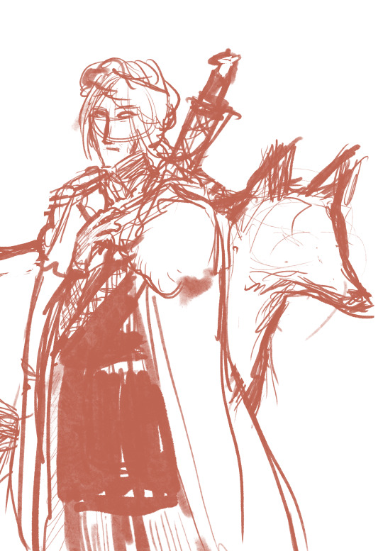
sketches sketches sketches
got inspired by looking at some of those year end wips (by artists way better than me) and decided to post some old sketches i could find bc sometimes i enjoy the sketches more than the final illustration lol. so without further ado:
similar to the one of jon i posted above, here's a really ancient one of arya. don't know where i was going with this one i think it was just a doodle
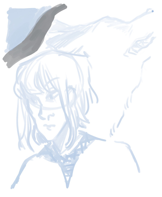
here's a progress pic of the sansa collage i posted way back that looks godawful to me now but whatever. hashtag behind the scenes
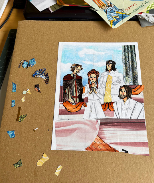
i made a whole bunch of collages that i never got around to posting (i should). here's a progress pic of one of those (as you can see i colour the necessary bits first, then add the cutouts, then the final lineart):

and here's a screenshot i took in the middle of drawing the cat and brienne scene. i actually think i overworked it a little, i liked it better with flats (also the colours look like ass here, they always look more vibrant in procreate but when i export the pics they end up super desaturated. idk why)

NOW to the fun part! so when i first read the books way back i had this notebook that i doodled scenes that i liked or made an impact on me (i guess) in. i might or might not post some in the future - they're simple pencil doodles and super old and certified rubbish but they're still kinda funny because of that lol. in any case here are a few of them in the rough sketch stage:
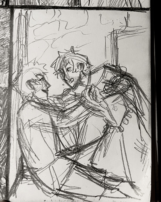

arya and gendry playfighting at acorn hall, mel visiting davos in jail (LMAO)
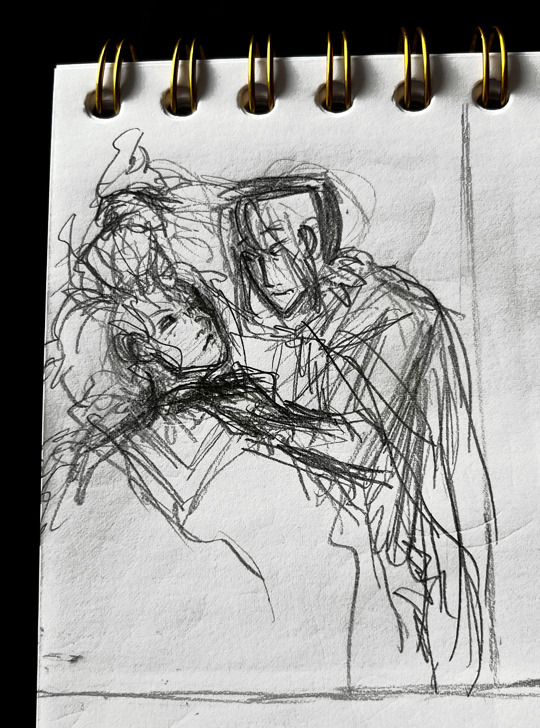
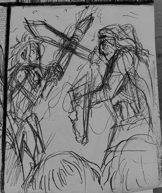
jon and ygritte first meeting (you can barely tell what's going on there at all lol). sandor and beric fight
Ok so now it's theon time. in that drawing i made of him with reek!ramsay in acok i initially yassified his crown and had to stop when i remembered it's supposed to be shit.
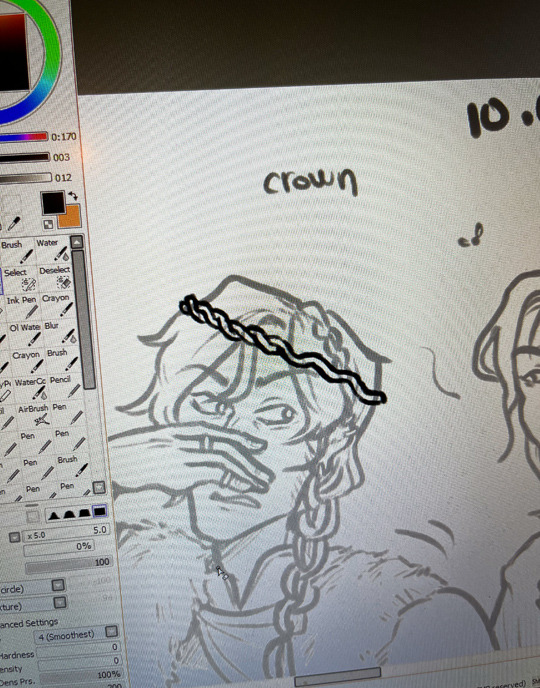
"crown" (it does look a little like worms at this stage so i guess it's not so ill-fitting after all)
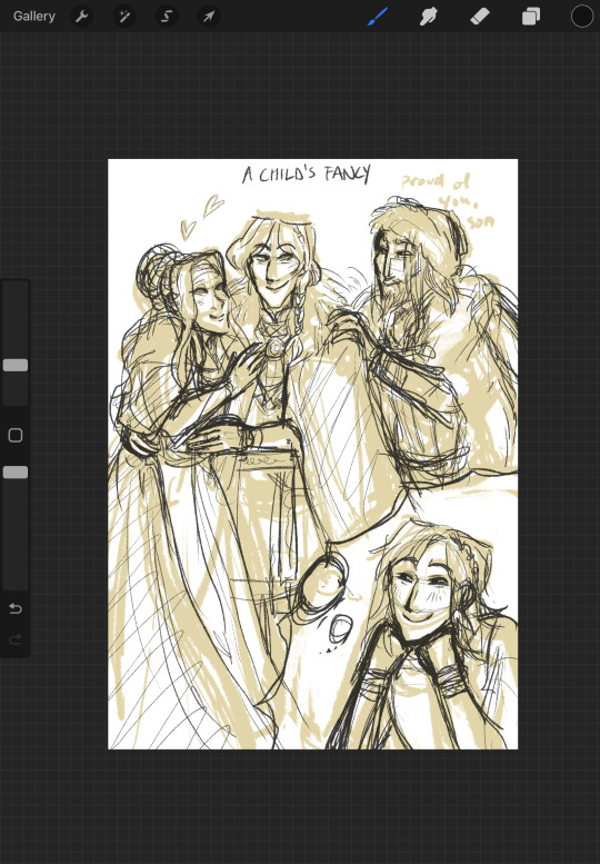
uhh anyway you all know what this next one is about. love this delusional child <3 (might just refine it to make it post-worthy so look forward to that i guess...........)
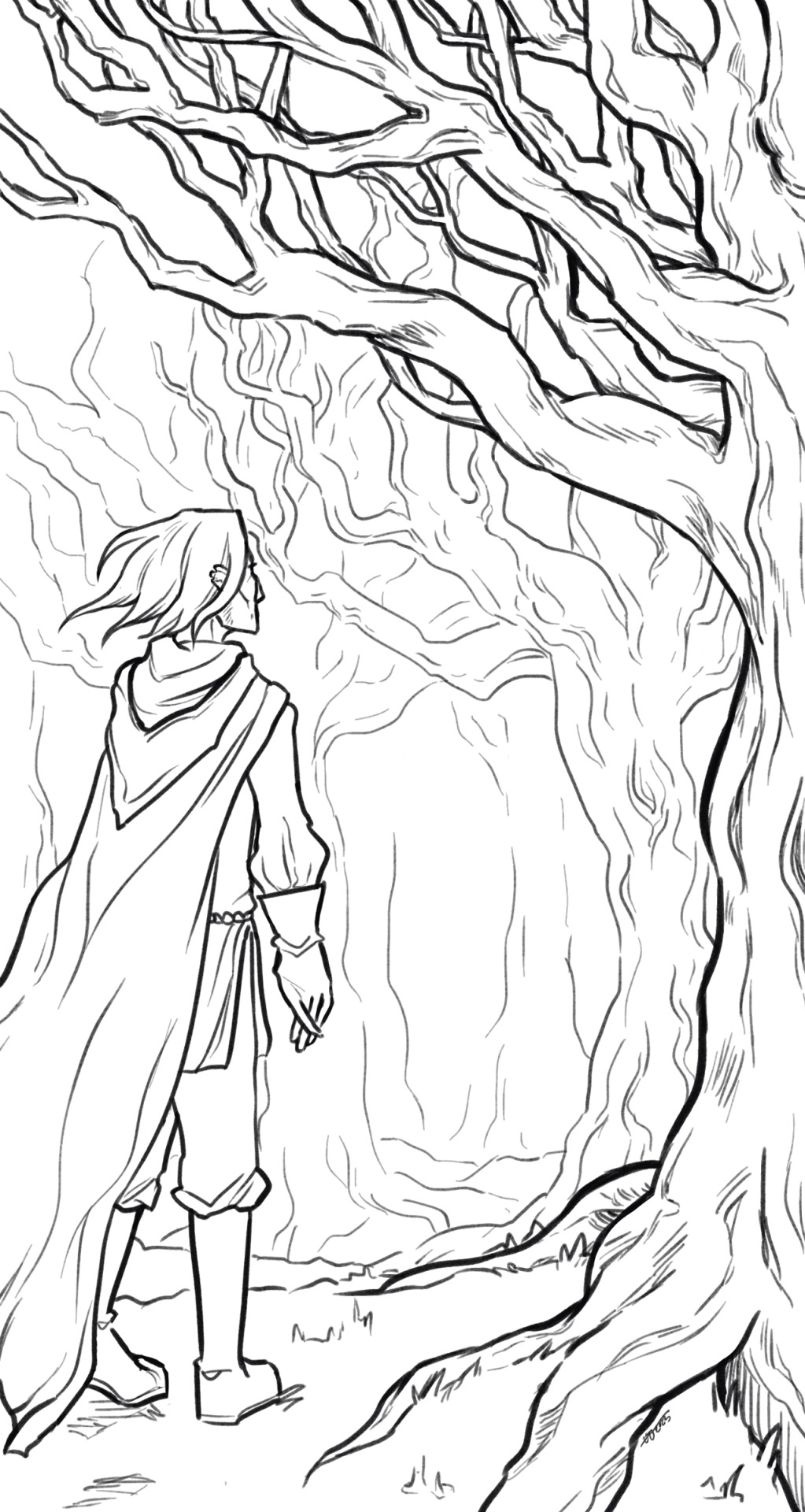
and finally the Tree drawing but it's just the lineart bc my colouring skills are... lacking
#my drawings#some of these ARE incredibly cringy imo but i'll put myself on blast idc it's funny#there are more for sure#i wish i drew even more asoiaf related stuff so there could be more Quality but unfortunately it's all like this#sketchpost
5 notes
·
View notes
Text
sold my soul, broke my bones, tell me what did i get?
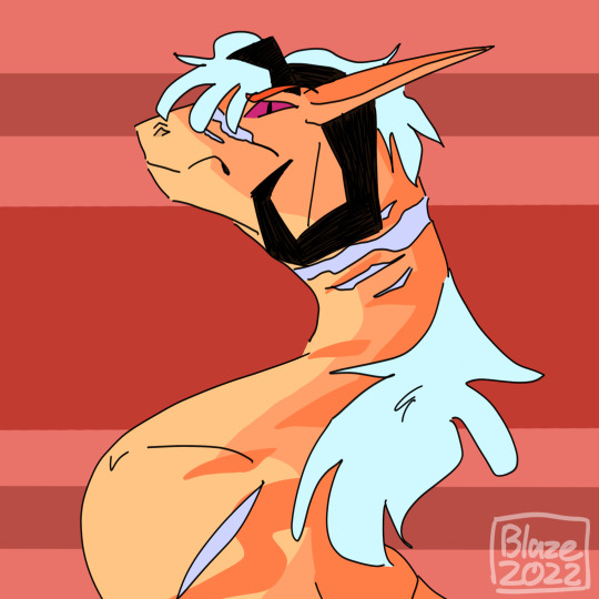
malikite's design makes it really hard to shade him in a way that looks good tbh. like, i get too attatched to the flat colors and then i dont want to build off of it from there. its a problem lmao.
anyways, the one, the only: malikite! part of the spotify playlist covers series. i think this was around the time i started thinking he needed a new reference because the old one ended up outdated and i needed something to make his playlist look generally better. is also around the time i was still trying to figure out how i wanted to draw lineart. his is very simple compared to everyone elses.
hope you enjoy!
#art#artwork#drawing#digital art#digital drawing#digital artwork#dragon#dragon drawing#dragon artwork#dragon art#OC#oc art#oc drawing#oc artwork#malikite
2 notes
·
View notes
Text
Summary of April:
Was away at the beginning of the month and then when I got back got really unmotivated. I joined a Discord study check-in chat two weeks ago which helped get me back on track - hoping that my extreme competitiveness will help me at least get through the DAB stuff without giving up. I was really off track for finishing stuff, but I managed to pull it together in the end, and I think I actually managed to finish more of my monthly goals than I have in a really long time!
My drawing skill is kinda all over the place atm, which I'm hoping means it's going to consolidate itself into something better soon xD
Plan from April:
3x 100 comp ✗ forgot to do two of these AGAIN
5x scared ✓ didn't technically do 5 but they were longer than 5min anyway
DAB Lesson 7 - 2 vehicles ✓ YEAHHHH
Proko - shoulder bones ✓
DrawThis - 2x 2h videos ✓
Rough sketches for all 5 FEH alt ideas ✗
1x background sketch/screencap study (1h timer) ✓ well I drew over a bunch of rooms and discovered that I can't do it in an hour
1x simple form studies (1h timer) ✗ did do some form studies though not 1h
Look at how FEH artists handle small details/trims with lineart ✓
May plan:
at least one day/week playing games (not art but important to relax with)
Draw May 4th/5th pieces
Rough (pose) sketches for all 4 FEH alt ideas and finish current one before 8th
10x scared
4x 100 comp
Proko - review notes + watch shoulder critiques
Proko - pecs and breasts I guess
4x Ges Draw Party
DAB Lesson 7 - 4 vehicles
1x master study - comic background or screencap study with perspective
notes and improvements from finished stuff:
USE PHOTO REFERENCE FOR EXPRESSIONS and try more open mouths ✗ did expressions but not referenced, do more hair studies ✗, use photo reference to figure out stylised ¾ eyes AND NOSE ✓, push unhorizontalness ✓, see how other (FEH) artists handle trims ✓
5MIN SCARED IDEAS: find good hair examples and trace ✗, find ¾ photos and trace eyes/nose ✓, trace torsos for gesture ✗, review/learn leg muscles ✗, trace thigh high boot opening contours from actual photos ✓
knoll: not detailed enough (did a drawover to add details which made a BIG difference), hand unintentionally too wide, browbone doesn't go in to lead into cheekbone
h/ux: not enough ribcage space, crop looks like his forearm is just really thin, eyes aren't in perspective (not lined up + eye area is a bit too wide and flat), hand wasn't referenced and it shows
elan: values too close, REALLY BAD HAND, antennae shouldn't be that swivelled, folds don't make any sense
t/ana: tried to do too much of a dynamic pose and made an unnatural twist between upper + lower halves, eyes aren't looking at viewer, arm holding bouquet/shoulder/underarm area is flat and too far off to the side, lighting not consistent + shading on skirt too conservative (should have pushed the back of it way further into shadow to bring out the roundness), sash thing has no texture and is placed really awkwardly because I realised during the colouring phase that the entire skirt was off-centre, value contrast too low (not engaging to look at). HOWEVER I did try to clean up my lines AND shading at the end, and also used a much smaller brush (doubled canvas size to A4 and used a 3px/1px brush) so it looks a lot neater overall
ACTIONABLES: USE PHOTO REFERENCE FOR EXPRESSIONS!!!!! JUST DO IT, do hair studies, decide whether majority of piece is going to be dark or light and base contrast around that, draw out ribcages (+ shoulder bones) for every sketch, use photo/RL reference for EVERY HAND - even doodles, do a separate detail pass the day after 'finishing' something, use photo reference for folds
5MIN SCARED IDEAS: find good hair examples and trace, trace torsos for gesture, review/learn leg muscles, draw one hand, identify fold type in clothing photos
3 notes
·
View notes
Note
Hey, absolutely LOVE your art and I enjoy seeing your comics! Small question, how long does it take for you to make one page? And what is your process?
thank you!!!
THANK U!!!!!!!
it's a decidedly long-ish process and i'M KIND OF WONDERING HOW I MANAGED TO CHURN OUT TWO PER WEEK FOR A WHILE... (it was bad for my mental health i think is how). some artists can do like THREE OR EVEN FOUR PER WEEK!! but i am slow and so it takes me like 4-5 days to make one dfkjhgfdkjg
anyway first step is thumbnailing! that's when you make a tiny comic page and map out where you will have the panels, and what you want in them. also very good to figure out where your text bubbles will be at this stage.
NEXT!! transferring the thumbnail to a regular comic canvas! i like to thumbnail on paper with pencil because i eRASE STUFF A LOT (paneling is hard and i'm still learning), so i take a picture of it and then paste it onto the canvas >w>
NEXT!!! rough sketch phase. the picture quality tends to be jank as hell b/c i'm lazy & refuse to take more than one picture EVEN IF IT'S BLURRY, so i go over everything with a VERY QUICK SKETCH to lay out the same ideas. then I go in with a vector tool to make the panels!!
NEXT!!! Sometimes skipped depending on the page, is any 3D background work if I feel like i need it! which is usually always, because my perspective skills are uh. LACKING. (aND YES IT'LL TAKE LONGER TO LEARN PROPERLY IF I RELY ON 3D TOOLS BUT I DON'T CARE!! I JUST WANT TO TELL STORIES RIGHT NOW!)
this also involves MAKING the 3-d structure which i try to do if i know the scene i want to make is in a moderately complex looking area. it takes.......... so long............................ 3D modelling is hard....
NEXT!! Actual Sketch. This is me figuring out what the characters will look like Proper instead of throwing vague blobs on the page. i have to turn my brain on a higher setting for this part so it's usually a harder step for me. i also like to finish the background lineart by this stage.
NEXT!!! THE DREADED PEOPLE LINEART........ hardest stage. VERY BORING. lack the attention span for this to not be a horrific slog. HAVE TO HAVE SOME FORM OF ENTERTAINING NOISE ON OR ELSE CAN'T COMPLETE.
NEXT!! FLAT COLORS AND SHADOWS! self explanatory! i usually do the background first since it's cooler to watch characters come to life on an already completed BG.
NEXT!!!! Text stuff. Drawing out proper text bubbles, adding in text, changing the colors of the bubbles to match the characters.. this is also where i attempt to add SFX if there are any, and this is extremely difficult for me for whatever reason. STILL LEARNING LMAO.. i also blur stuff if i'm trying to show like... depth at this stage. like making one character blurry so you know they're closer to the "camera" so to speak
NEXT!!!!!!! AND FINALLY!!!! THE BEST PART!!!! Gradients. MAKES EVERYTHING BETTER. FUN TO APPLY. PULLS THE ENTIRE PAGE TOGETHER.
....................hm that's actually quite an involved & difficult process. i am only now realizing that
HM.
62 notes
·
View notes
Text
Hello! To give an update to Spirit’s World, production is currently on extended hiatus. Of course, episode 2 is done, and slowly being uploaded to buy myself some time, but episode 3 has unfortunately been on halt in the mean time. This is primarily because I’ve developed #brainrot for submas, or those funky train guys from pokemon. See my main blog (which is my art blog at this point), and yeah. You know how it is.
Additionally, I’m trying to make spirit’s world better, so the break will hopefully give me fresh eyes to make it better. I’m very critical of how the pages look now, and honestly, I think they look kind of like hot crap. Story wise, the episodes out right now are okay, but this one is too lengthy, especially when it comes to weekly updates, and also is very burdensome on me when I do work on it. So some learning experiences.
Episode 3 is still in stuck in storyboard, and I haven’t touched it in months. But I have been thinking about it, and letting the plot marinate, so I can make the episode a bit more refreshing. I did flub up by starting Spirit’s World before some key elements were established, but if I kept waiting, I personally would have never started, so some things in the future may be retconned though I don’t believe I need to do that because enough information is vague enough, or tracks enough for me to actually just roll with it. Expect minicomics, the key ones being between episodes.
Some things I’m thinking about changing: style - style will still roughly be the same, but there’s going to be more lineart used, and perhaps I’ll let some sketch layer peep through for more texture. Currently I find it too light, and flat, but I can’t paint all the pages because that’ll absolutely kill me. So I’m hoping to make episode 3 more visually interesting. Which, that’s what a lot of webcomics do, so terribly new. | backgrounds - they will probably go some level of style change yet again because these are sooo time consuming, and are a big factor as to why i spend so long making pages. I want them detailed, but I’ll probably utilize some level of loose lineart to give some depth while saving my hands.
Anyways, apologizes for the strangeness that comes with this fic. Trying my best, and hey, I’m learning some things, and hopefully each episode comes out a little bit better.
#coral yaps#2022#delete later#i just need a break for a while#and working on something else will give me tons of practice
8 notes
·
View notes
Note
How do you ink and color? Any tips? I love your art! 💜🖤
oh shit i got this ask months ago and forgot to answer
inking: god i hate lineart so much. the trick is to not do it 😂 unfortunately, i still find myself spending hours on lineart all the time @_@
the biggest thing i’ve found is making your lines varied in thickness. it adds to the interest. i also try to make my outside line thicker than my inside ones to break up the figure from the background. don’t be afraid to skips some lines and imply them with shading instead. i will color over my lines at the end to make them not as strong, but i’ve learned to still keep some lines black for extra emphasis.
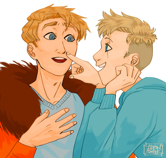
^ here’s one of my older pieces that i’ve been considering redoing. it has very little line variation, ALL the lines are colored so there’s no solid black, and there’s very little hard contrast in shading values. overall, it looks flat and uninteresting and if i had the time i’d redraw this one.
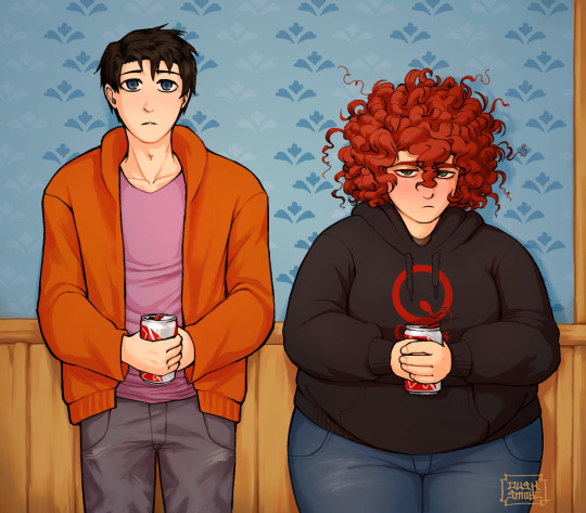
this is a more recent example of lineart that i think works a lot better. the characters are really well defined with a strong outline, but the inside lines aren’t harsh and distracting. you can see i recolored the lineart in kyle’s hair to be a dark red, and in some places it blends with the shadows to imply areas with more highlights. stan’s pants don’t have and lines in them, just the outside shape and pockets.
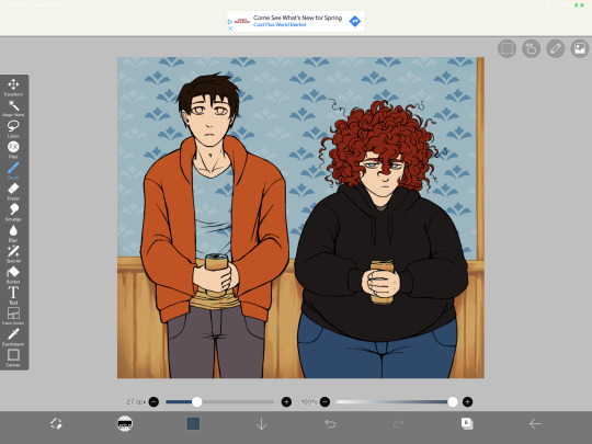
you can see in this wip what the lineart looks like before i do all the shading and fancy stuff. stan’s pants look totally flat and straight until i start shading.
a lot of the time though i won’t even do lineart, especially if it’s a big scenic piece. the more zoomed out less detail you can convey, and lineart takes up a lot of space.
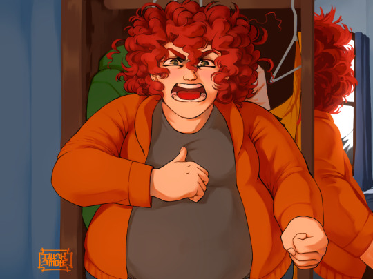
^ this piece is an example where i do both, lineart and no lineart. the mirror image of kyle isn’t the focus, and i honestly didn’t feel like going in and drawing exact lines because they’d probably look fucked up anyway. i typically don’t put hard lines in backgrounds because it would take FOREVER and just be distracting.
the one thing you do have to be careful of with lineless art is contrast. hard lines are good contrast that show you what you’re looking at, and without them your image can blend together.
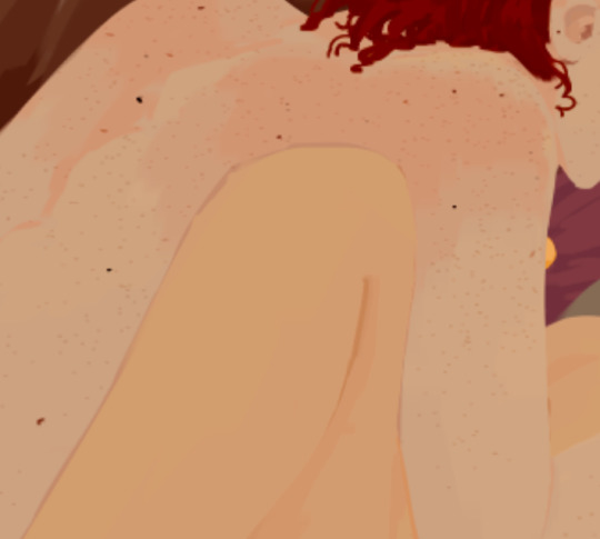
here’s part of a painting i did last august, when i was first experimenting with lineless styles (full image on my NSFW twitter). can you tell what’s going on here? i sure as fuck can’t. there’s no contrast, and it makes all the skin tones blend together in an unintelligible mush.
contrast has always been one of my biggest weaknesses as an artist, so i’ve been trying to improve over time. here’s a more recent lineless drawing:
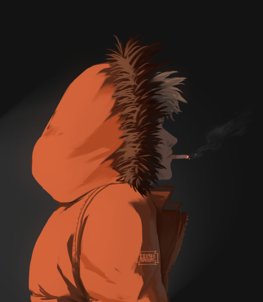
this one works because it had high contrast. the highlights are really bright and the shadows are really deep. you can still make out the facial features too, but there’s no ‘lineart’ layer’. everything was painted on in the same layer.
-
-
coloring: oh my god i love coloring. it’s my favorite part of drawing and the reason why shit takes forever. a lot of the same stuff from before comes into play, like contrast. you can also portray some really interesting moods based on colors if you’re being stylistic, but also pay in mind to your environment.
i always color my background first. in fact, a lot of the time i’ll do the entire background before coloring a piece. the environment establishes your light levels and light source, and it’s typically easier for me to tweak colors on a figure than the ones in the background. in the above example with kenny, the background is a mostly solid black with a beam of light from the left. i picked kenny’s colors to fit in this environment.
it’s also important to use references.
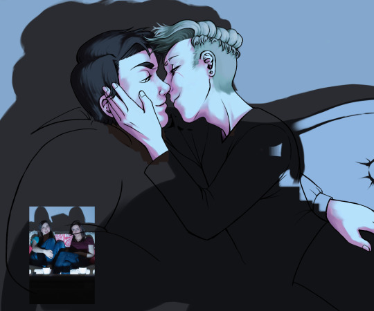
you can see in this wip i’ve got a reference image for how light from a TV looks against figures and the way their shadows are cast across the wall. it also helped me figure out what colors to use in this situation.
a lot of coloring is just trial and error to see what works. i usually start with a flat base color and add value to it. if you put all your colors on different layers it’s really easy to change them quickly.
here’s an example:
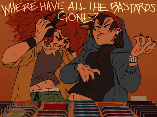
i got my base colors down and here i can see the skin tone is blending with the background, so i lightened it up for better contrast
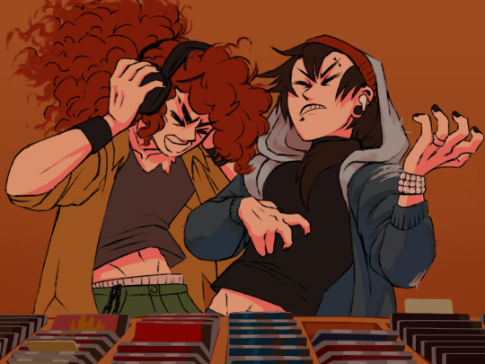
i typically shade the skin first, then clothes. you can see here i did a dull skin tone with a bright colored shadow. this adds more contrast and interest. i always try to avoid doing dull shadows where you shift toward black. black shadows are really uninteresting and they can make your piece look muddy. i’ll typically shade with an orange, red, blue, or purple.
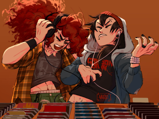
the final piece has a really bright highlight on it coming from behind. this just adds more visual interest and contrast. you can also see i’ve gone back into the pink shadows and added an even lighter, brighter peach value in places to show reflected light. this also gives the darker pink shadow an added outline effect, because it touches the base skin tone but looks lighter within.
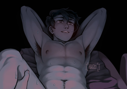
^ this one’s a good example of light and shadow (full image on my NSFW twitter lmao). there’s not a lot of color because it’s dark out, so everything had to be conveyed in values. there’s hard light across the stomach and then a shadow over the chest, but there’s still light being reflected up into stan’s face that lets us make him out. the rest is deep shadow and unimportant, so it’s all black.
that’s the other part, color and value determine where your eye is gonna look, so consider that when drawing.
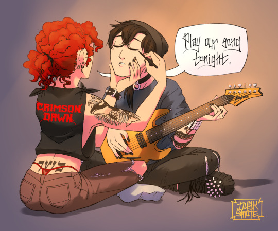
^ consider this piece i drew like a year ago. it has a lot of blues and reds, and originally i was going to make stan’s guitar blue. i don’t have the wips anymore, but it didn’t stand out and it didn’t look right with the image. after a lot of playing around i went with yellow because it’s bright, it breaks up the image, and it adds another color to the piece to balance it out.
the same thing happened when i was working on the cover image for What They Say About Us.
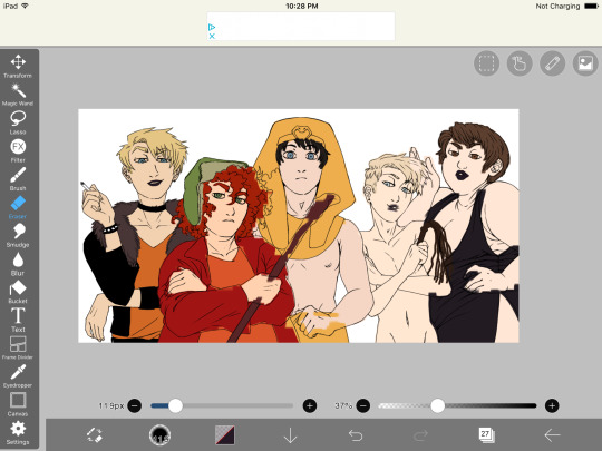
you can see in this really early wip that i’d blocked in the colors and butters is totally naked. for one, i was like “damn that kid is WAY too naked in this image” and he also blended in with stan and cartman. additionally, there was a lot of warm colors on the left, a lack of color on the right, and an overall lack of blue.
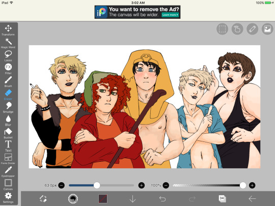
first change i made was throwing a shirt on him and it made a huge improvement. the image looks much more balanced now and he’s not super distracting with his naked-ness.
other than that, coloring is just picking your base colors, blocking in shadows, adding highlight, and cleaning it up. if you wanna improve, look at photo references. look at other people’s art and examine how they use color and value. practice practice practice. have fun with it. the most fun i have coloring comes from figuring out interesting textures like the pharaoh headdress or kenny’s leather jacket.

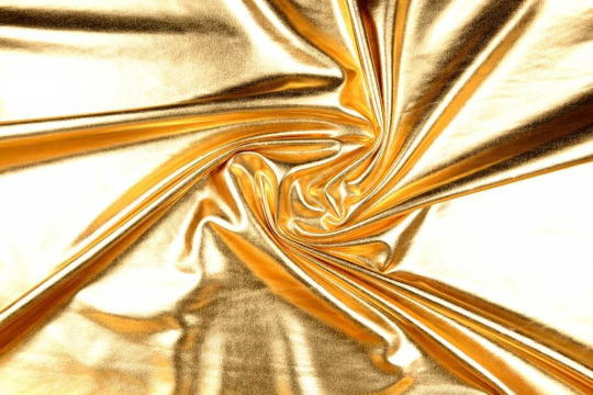
i find stock photos like this and study them to see how the light works
other than that, the rest is just playing around, seeing what works, and making things up as i go!
70 notes
·
View notes