#i sized it so i could print it out at a4 but like
Explore tagged Tumblr posts
Text
Update on fanbinding dissertation: binding the dissertation itself!
After many days and nights of writing and wrangling footnotes and proofreading (where I couldn't convince my laptop that yes, I meant textualisation, not sexualisation), 'twas time to bind the beasts! In three copies, no less! Which I approached with way too much confidence from my one fanbind experience, and came with many fun little surprises due to the format guidelines I had to follow 🤡
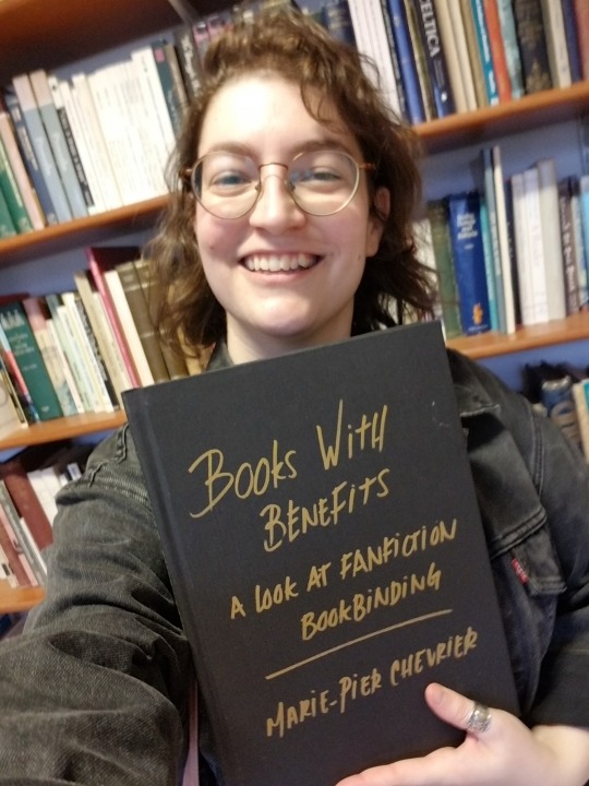
This is going to be a long one, so here's my happy unfocused mug to confirm that it all ends well:
First pickle: The typesetting. I absolutely loved typesetting fanfic, but the dissertation had to be A4 (way less fun, boo-hoo), one-sided, with every page numbered. Did you know that LibreOffice won't let you add blank pages and only number the non-blank ones, without skipping numbers? In order to print signatures I could fold into one-sided pages, only numbered on the right-hand pages, I ended up switching to landscape orientation and including the equivalent of a blank page in the left margin.

Second pickle: The imposing, which I couldn't figure out using the amazing bookbinder with my weird landscape 2-page layout. I finally gave in and rearranged all the pages manually, which looked like p. 1 on the recto / p. 10 on the verso, then p2/p9, p3/p8, p4/p7, p5/p8, p6/p7. And because there was no way I was paying print-in-colour prices for all of this, I further split the manually imposed pages into two files, one for the greyscale printer (cheaper) and one for the colour printer (highway robbery). Still came up to ~£70, just for printing.
Very glad I went in chunks of 10 for the signatures, it made both the math and the folding using sheets from two different piles much easier, highly recommend (if for some absurd reason you also want to bind one-sided numbered pages in folded signatures).
Third pickle: Linear time. Had planned on having so much time to print and bind this thing, but kept writing and rewriting and proofing and oops! It was due in less than 24 hours and it was still not out of the laptop. So.
22/09/24, 6pm: Got to the library, started printing.
6.45pm: Found another printer where all the paper was the same shade of white, started printing again 🤦♂️ (kept the the misprints to use as scrap paper when glueing)
7.30pm: Started folding the 150 sheets of paper (3 x 100-page dissertation, 2 pages per sheet). Went from the last episode of The Magnus Protocol, to an episode of Welcome to Night Vale, to deciding restart The Magnus Archive, which felt almost poetic.
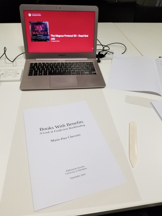
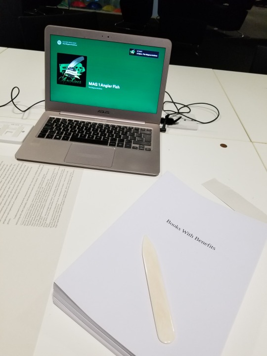
9pm: Headed back home, trimmed the edges (with a borrowed guillotine), folded the endpapers, stabbed everything. Lack of pictures to be blamed on my inability to mess with linear time, and the eventual sleep deprivation.
10.30pm, I think? Started sewing the signatures together, again with Supernatural (which I started rewatching when I submitted my first dissertation assignment in mid-May, and finished 2 days after submitting the dissertation itself, again, such poetry).
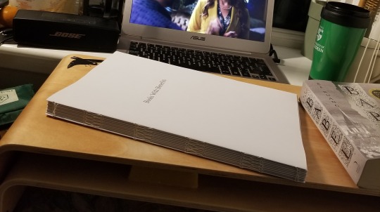
2am, probably? Tipped the endpapers and glued cheesecloth over the spines. Somehow figured out where to set the three textblocks to dry (I don't have a press). Sadly gave up on sewing on (or glueing) headbands, because time.
3am-ish: Cut the missing cover pieces out of millboard (had already cut 4 of 6 covers, since I knew it had to be A4), measured the spines of the three textblocks and cut those as well.
???am: Did some math, because sure, that's the right time for that. Cut the bookcloth to size, glued the cover pieces on the bookcloth. Remarkably only messed up the measurements on one of them! That means one of the copies has a millimetre of millboard showing in the inside corners of the back cover, but not enough time/bookcloth/millboard to redo it, onward we go!
Way past dawn: Took a break for food while the covers somewhat dried. Cased the three textblocks in the three covers, with the endpapers bubbling, which took me by surprise since it was the same paper and same glue I had used for the fanbind without any problem. I'm now thinking that bigger book = more time needed to apply the glue = endpapers getting warped, but I was so exhausted by this point that who knows. Again, no time to redo it!
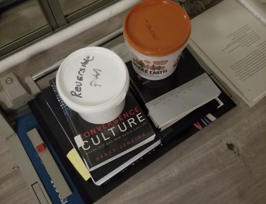
9.30am: Stacked the dissertations under the heavy reference books I used to write the dissertation. Toute est dans toute hein. Went to bed while they (mostly) dried.
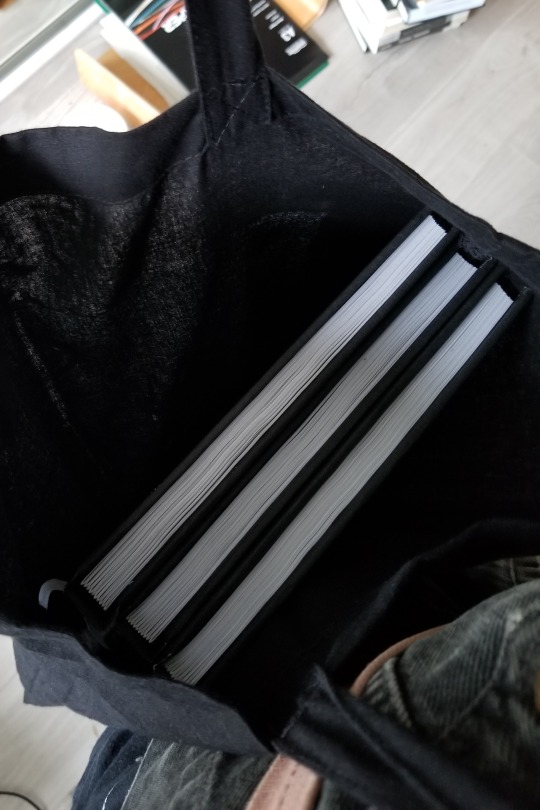
2.30pm: Woken up by my neighbour's dj set. Eventually put all that hard work in a tote and walked to school to hand it in at 4.30pm.
Fourth and last pickle: The titling. Couldn't find paper long enough to do a half-dust jacket like I did last time. Had big cutout plans, ran out of time and couldn't finish testing those. Also had some thicker textured paper I thought of cutting and glueing to the cover as a title card, but it turned out too thin and was warping. Finally resigned myself to submitting it with a blank cover, but one of my teachers asked if I would mind adding the title on with metallic markers to make it easier to identify (one copy will eventually be on the shelf at the Institute), and I'm SO HAPPY with how it turned out. Metallic markers. Why didn't I think of that. (I did, however, think about dressing appropriately for the occasion.)
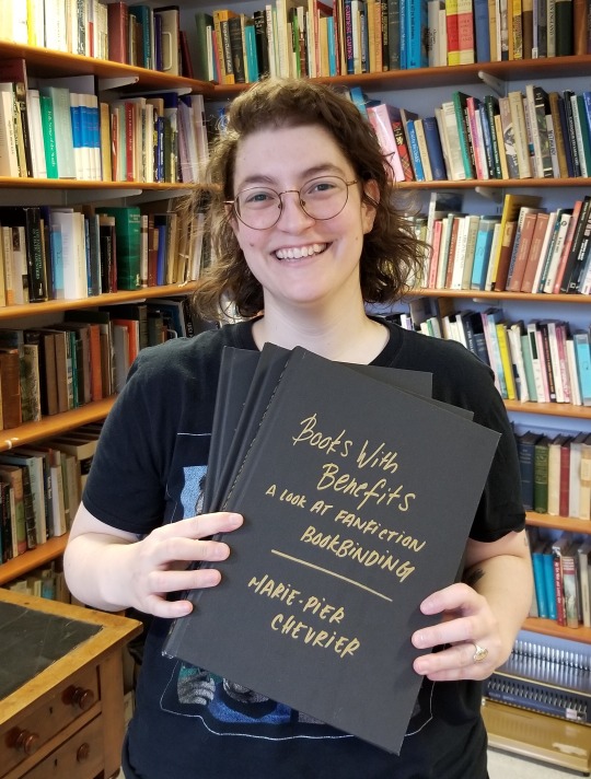
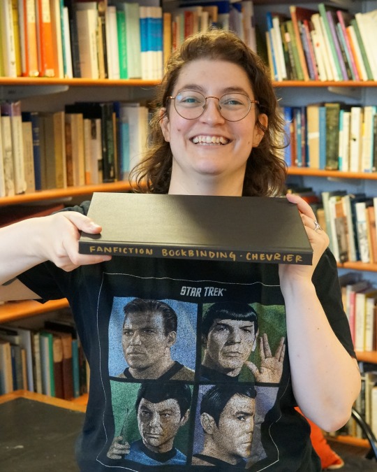
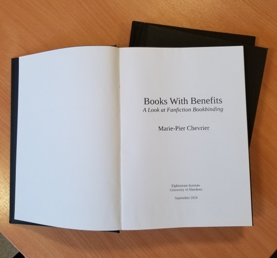
So, is it possible to print and bind 3 books in less than 24 hours? Yes! Am I glad I did it? Also yes, very satisfying, love being extra! Would I do it again? God no, I've been sleeping for two weeks and I still haven't recovered. Can't wait to start binding something else though, so I guess it wasn't that bad.
That's it! That's over! Aaaaaah! Now waiting for the grade and comments, and hopefully soon I'll be able to share the content as well.
I'll also try to post some more about the research/writing process itself, somewhere between the late nights reading international treaties on income tax and the early mornings spent figuring out how to apply for a phd next.
Thank you so much to everyone who followed along, this was way more fun than I ever could have hoped!
#fan studies#fanbinding#bookbinding#research#ficbinding#dissertation#fanbinding dissertation#autoethnography#fanfiction#fandom#fanfic
429 notes
·
View notes
Note
As you've asked for asks!:
Do you have any quick-and-dirty book/fic binding methods a terrified-of-failure novice could use to bang something out to get over the first collywobbling step of Actually Doing The Thing? (this may be something I've been meaning to ask for ages)
yes! I absolutely do! in my opinion the best quick-and-dirty bookbinding method is a no-glue pamphlet: you don't have to mess with glue or measuring or cutting anything, all you need is your text, some paper, a needle and thread. you can use the same needle to punch holes if you don't have an awl.
this is going to be a little long but that's because I'm going to write out some fairly detailed instructions for an A5 sized pamphlet. If you don't want detailed instructions and think you can glean the necessary info from photos, just skip to the photos! I've also linked tutorials.
for preparing the text to printing, in whatever software you use (word, libreoffice, gdocs, whatever) make sure your document is set to page size A5. make it look readable. then save as/export that document as a straight-paged PDF. now go to the bookbinder JS tool (https://momijizukamori.github.io/bookbinder-js/), and upload the PDF. source manipulation: none printer paper size: A4 display unit (you can ignore, or choose cm if it gives you anxiety that it automatically displays points) printer type: select single-sided or duplex accordingly* rotate paper: ignore flip on long side: check if you are printing duplex and if your duplex printer flips the paper on the long side page layout: tick folio page scaling: original page positioning: centered ignore the rest flyfleaf: ignore signature format tick: standard signatures. in the length drop down, this depends on the type of pamphlet you are doing. for folio i generally find 4-5 pages per signature a comfortable thickness. if you have 6 whole A4 pages you can still do that as a single signature or you can split it into two signatures 3 pages each. wacky small layouts: ignore this signature info click the generate preview button to see what your PDF looks like imposed! I love this step especially when I'm doing quarto (A6) or octavo (A7) sized books generate output - click this to generate an imposed PDF
for A6 and A7 sized books the instructions are much the same, except for these you make sure the page size is A6 or A7 in your software, and then you choose quarto or octavo instead of folio. for signature length drop down I keep signature length to 1 for octavos typically and 2 for quartos, as this still refers to sheets of paper, and for octavo 1 sheet of A4 paper will turn into 4 smaller sheets in one signature once folded and cut.
*if you don't have a duplex printer you will have to manually turn the paper to print on the other side. I cannot be arsed with this so I bought a printer capable of duplex printing (I didn't have a printer anyway). if you already have a printer check what it can do as you might be surprised and go from there.
now to the pamphlets! you don't need a cover - I have one for the long stitch pamphlet but for the saddle stitch one I didn't bother and just made sure the first page had a title on it. you can always take a different piece of paper and print a cover on or or just use coloured cardstock and create a simple cover, but a cover is not necessary unless you're doing a long stitch pamphlet. all you need to do is to punch holes and start sewing. there are a few different stitch types below, I wouldn't say any of them are more difficult or easier than others, but they do look different so...pick one you like the look of and go from there?
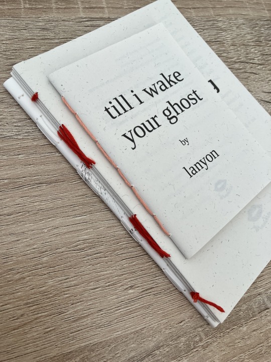
pamphlet stitch (uneven number of holes) I haven't ever done a pamphlet stitch but here's a tutorial for how to do it: https://www.starpointestudio.com/simple-pamphlet-stitch-book-step-by-step/
saddle stitch (uneven number of holes) I realised that what I was thinking of as a pamphlet stitch is actually saddle stitch, as in this A7 pamphlet:
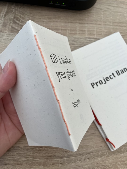
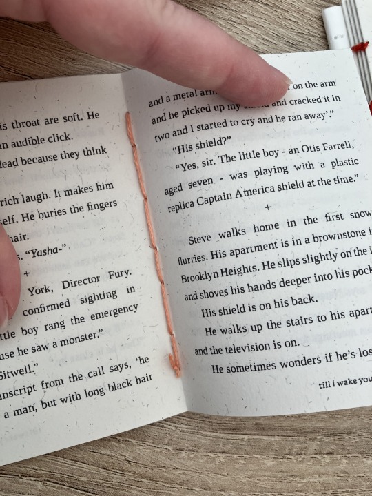
here's a tutorial for how to sew saddle stitch: https://www.bookbindingworkshopsg.com/saddle-stitch-bookbinding-tutorial/ here's a video tutorial: https://www.youtube.com/watch?v=aWHkY5jOoqM (sealemon has a lot of bookbinding tutorials and I know many people who like her videos, I used her tutorial for coptic binding way back when I first made a book but I can't otherwise vouch for the quality as I haven't used her videos)
french link stitch (even number of holes) in this one I used french link stitch which I typically use for thicker textblocks that i'm not planning to use tapes with as the french link gives it some robustness, I used it here because I had never done it before and wanted to try it out. I am planning to take these stitches out and re-sew this pamphlet with a cover now that I've found a suitable piece of transformer fanart to use as a cover:
french link tutorial. it's quite long but it has a colour coded bit towards the end that shows how the thread is supposed to link which i find very helpful to visualise: https://www.handmadebooksandjournals.com/bindings/french-link-stitch-binding/
here's a video tutoral from DAS bookbinding (he is my go to for techniques and he has the most soothing Australian accent as well, though fair warning not all of his videos are for beginners): https://www.youtube.com/watch?v=O4ZPdbaM-Ws
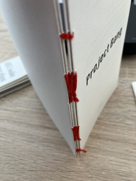
long stitch (even number of holes) for this one I used long stitch and I had a cover. this one is my favourite variation because I can make these pretty and simple covers and the stitch looks nice on the outside as well, so this one scratches the 'i want to make a book' itch for me.
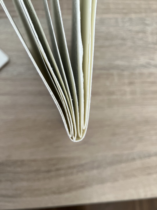
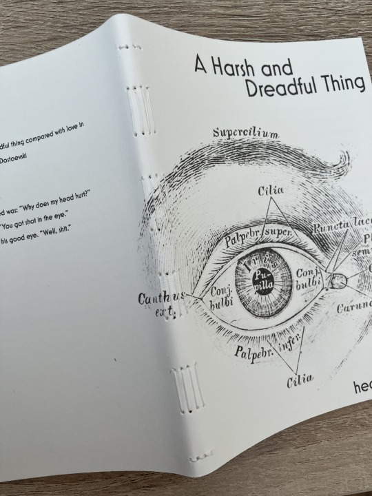
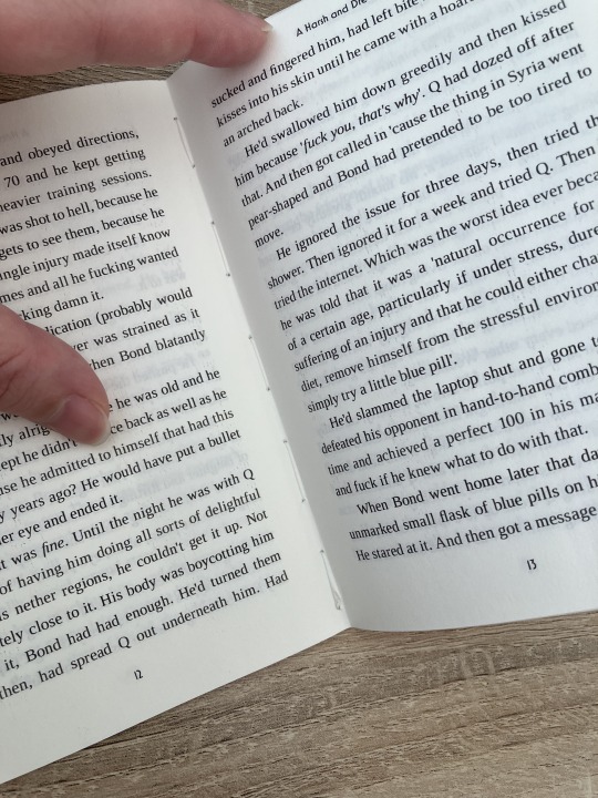
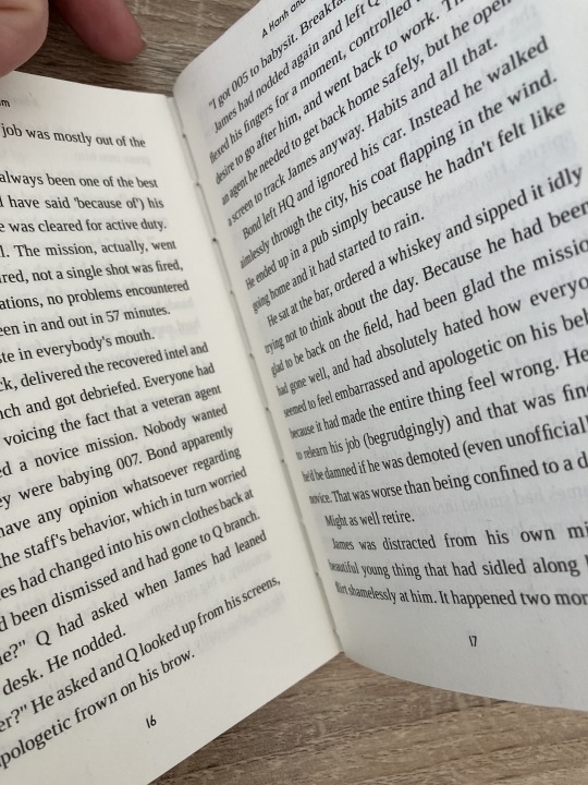
here's a tutorial that also includes a how to on a cover that is different from my cover: https://lccprintmaking.myblog.arts.ac.uk/files/2020/06/Long-Stitch-Tutorial-A4.pdf DAS also has a video tutorial for long stitch but it's like three videos long, maybe watch it later :'D here's one I haven't watched but seems decent: https://www.youtube.com/watch?v=XnignTL_wDQ
you can use saddle stitch for this kind of pamphlet as well, that's what I did for dozens of ships and hundreds of souls (https://ashmouthbooks.tumblr.com/post/681587080267202560).
I hope this helped!!
2K notes
·
View notes
Text
Sewing Zero Waste Culottes from The Craft of Clothes
Zero Waste Culottes From The Craft of Clothes
Behold! Fancy pants!
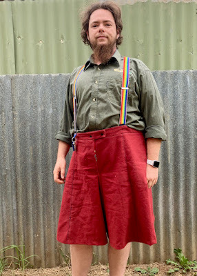
The pattern for these pants was one of my Christmas gifts. It comes from Liz at The Craft of Clothes, a zero-waste designer. I've really gravitated towards self-drafting and zero-waste sewing in the last couple of years, and this pattern has been on my list for a good six months, so I was excited to get into it.
Drafting
The first step (after reading the pattern through twice) is drafting the pattern pieces.
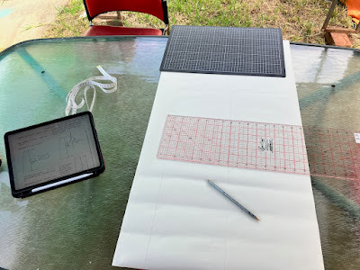
My biggest starting hurdle was deciphering "the culottes are designed to sit on your waist" when choosing the correct pattern size. Most designers consider "the waist" to be the teapot - that is, the true waist. (It's easiest to find if you bend to the side and stick your hand in the crease - like you're singing "I'm a little teapot".) But some consider belly button height to be "the waist". I generally wear my pants at the latter height, and there's a good 2" circumference difference between those two for me.
I eventually decided to call my belly button my waist, on the grounds that that's where I prefer to wear my pants. It's also easier to take seams in than out, if I guessed wrong.
Decisions over, it was smooth sailing from there. Pattern drafting is not a technically difficult process, as long as you have good instructions, and Liz's patterns definitely fit that bill. But there's a lot of attention to detail required to make sure the end result is good. That sort of thing always makes me nervous. Fortunately there was only two pattern pieces to draft, and they're 98% straight lines and based off rectangles.
Interestingly, this is the first zero-waste pattern I've tried that has you draft pattern pieces to use. The others I've seen (most by the creator of this pattern - our library had a copy of her book, Zero Waste Sewing) have had you draw directly on your piece of fabric to create the layout. (In fairness, I didn't have to draft my own pieces. The pattern came with the option of self-drafting, printing on A4, or printing on A0.)
I much prefer the direct-draw method to faffing about with pattern pieces. But given that this pattern is designed to have the pieces tesselate, having a set of physical pattern pieces does make more sense. It's also got me wondering if I could successfully make a pair out of old jeans legs, using one leg per pattern piece. But then, I'm always looking for ways to use up my denim pile...
Sewing
I prefer structure rather than flow in my butt coverings, so I was somewhat limited in my fabric choices for this first pair. (I know the fabric I really want to use, but I am being a sensible apprentice and trying things out on a nice-but-less-hideously-expensive fabric first.) Most of my stash acquisition has focused on stuff for shirts, since I wear those out faster than pants. I eventually settled on this nice brick red, 100% cotton, table cloth.
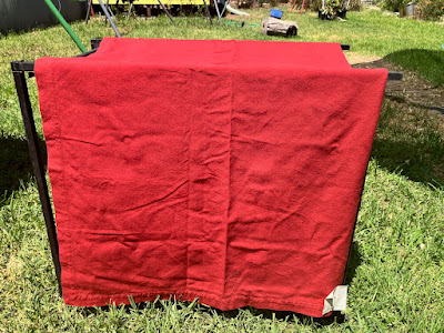
The picture is suffering from sun exposure. It's nowhere near this bright in person.
I laid out the pieces and huzzah! The fabric was just big enough! ... But only if I unpicked the hems (they're monsters, a full 3 cm/1.2" each side) and ironed them flat first. Thus, it was time for a marathon unpicking and ironing session.
After that was done, I checked the pattern fit again. Huzzah! I had enough space for all the pattern pieces, and not very much scrap left over once I'd cut them all out. (Of course, it was late and I wasn't paying as much attention as I should have been, so I didn't add an extra inch when I was forced to cut the waistband in two pieces. There was enough extra fabric that this was only an annoyance and not a complete disaster.)
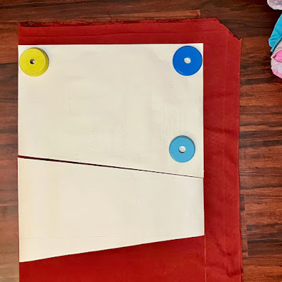
The fabric at the top is scrap. All but a few inches of the stuff on the right became waist bands and plackets.
Sewing was a fairly straightforward exercise, though it required enough brainpower that I completely forgot to take any progress shots as I went. Almost every step of the pattern comes with a diagram to show you what to do, which helped me immensely. So did having the seam allowances specified at each point, as there's three different ones used in different places.
That's not to say I didn't screw up, of course. While sewing the crotch seam, I somehow managed to close up the front of the pants entirely and leave a gap for the placket open at the back. (That will teach me not to double check the direction the pockets are facing before I pin and sew that seam. Maybe.)
I also made a highly decorative and completely awful to sew with choice for topstitching thread, which I quickly became too stubborn to stop using. So the topstitching is, uh, not great. But it is purple and sparkly, and if I'd had any sense at all I would have left it til last (or even done some sort of hand embroidery with it).
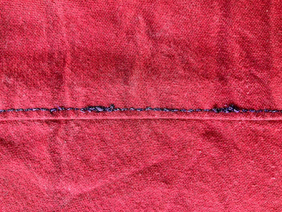
I was tricked by the first line of stitching being so easy. LIES. It was all lies.
Why should I have left it til last? Because it turns out that the culottes are, in fact, designed to sit on one's true waist. Which meant I had a two inch difference between what I needed to fit me, and what the waist measurement was. If I hadn't top stitched the panels, I could have simply ran another line of stitching down the seams that didn't have pockets in the way, and taken the waist in without much fuss or bother. Unfortunately, I didn't do that, so I was left with two choices.
Take out the topstitching and take in all the panels, bitching and moaning about the effort I went to and the number of times the topstitch thread broke while I was sewing the stupid sparkly goodness onto things.
Work out how to take the waist in by the necessary two inches, using only the crotch seam and maybe some darts or pleats or something.
Choice #1 would have been the logical, rational decision, so of course I went with option #2.
An hour and change of basting, pinning and unpinning the waistband, and completely forgetting how seam allowances work later, I managed to get a fit I was happy enough with. I ended up grading in a dart-like object at the centre back. (If I decide later that I'm not happy with the fit after all, I'll try out the modification for adding elastic to the back waistband that the pattern also includes. Probably while questioning my life choices and lamenting the amount of time I spend with a seam ripper in hand.)
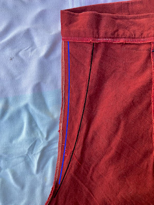
The original stitching line is in blue, the new one is in black.
After all that fitting woe, I wasn't in the mood to try buttonholes (my good machine, the one with the automatic buttonholer, is currently out of action). Instead I dove into my snap stash to close the placket.
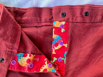
I love using bright, vivid colours for inner details. It's the sewing equivalent of wearing leopard print underwear.
A nice bonus of using the snaps is that I could put them through just the placket, leaving the fly front clean. This did make the placket pull slightly when I'm wearing the pants, exposing a trace of bright red. I fixed that by invisibly whip-stitching through the placket and outer fabric to hold everything in place. Next time I'll also double check the understitching, and topstitch the edge if needed, before installing the snaps.
Field Test and Adjustments
Trying stuff on as you go is all well and good, but nothing tells you what you really need to fix like being out in the field. I quickly discovered several things:
The waistband needs serious help to stay where it's supposed to be. Which, y'know, I did make a size larger than I should have. This was not surprising.
The crotch needs to either drop a wee bit or (preferably) rise a couple of inches. The latter will likely spoil the skirt-effect somewhat, but it will be far more comfortable for my legs.
I need a loop on the waistband to hold my keys.
For the waist woes, I had a few choices - 1) belt loops, 2) suspenders, or 3) add elastic to the back waistband. Belt loops are fiddly to make and sew on, but would solve the key-hanging issue. Suspenders technically wouldn't need any sewing changes, but the clip-on style are notorious for pulling off when you're doing things. And while the pattern includes instructions for adding elastic to the waistband, I wasn't confident it would do the job I wanted (I stick a fair amount of junk in my pockets and elastic can't always cope with the weight).
After some dithering, I went with the suspender option for this pair. I like the look of them, and the "floating" effect they give when they pull the waistband a bit above where gravity wants it to sit is extremely comfortable. But I didn't want to deal with clips always popping off. So I indulged in a quick side-quest of improving my suspenders, then sewed buttons into the waistband of the culottes.
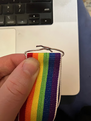
This used to hold the clips, but the wire was easy to bend flat with needle-nose pliers.
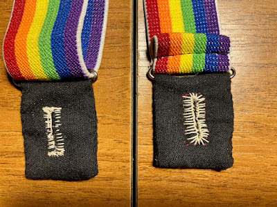
Gee, I wonder which buttonhole I did first?
Fashion Show
Overall, I'm quite happy with how it all came together. I'll definitely be making at least two more pairs - the "men's" version (less flare in the hems), likely out of recycled denim, and a pair in heavyweight stash linen.
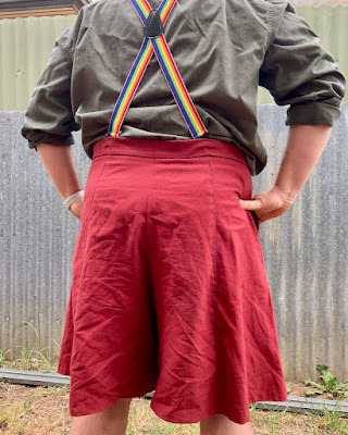
The back panel adjustment is basically unnoticeable.
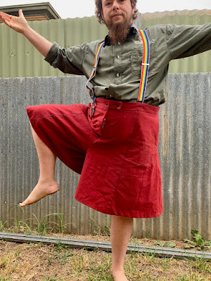
They have great range of movement - maybe I need to make a workout pair?
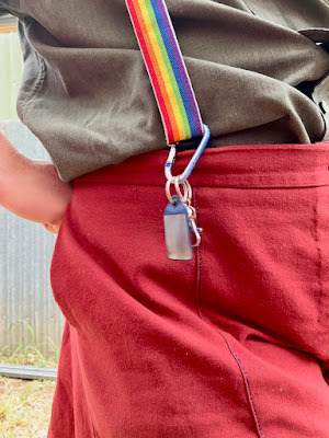
And I even have somewhere to hang my keys.
This post was originally published on my blog, Garak's Apprentice . I currently syndicate my content at Micro.blog, Tumblr, and Ko-Fi.

or Tip me via PayPal
132 notes
·
View notes
Note
Hey! Just wanted to come in and say your art rocks! It's super nice looking and I love your character and story so far! Also I wanted to ask a bit about your art, like: What program/s do you use? What size canvas and brushes do you use? What types of brushes? And what does your process, like sketches, look like? Also anything else you'd like to say about your art, I'd love to hear it 💖
Hi! Thank you so much.
My drawing program is Paint Tool Sai 2. I usually default to smaller canvas sizes when I'm feeling lazy, but use A4 for better quality when I'm planning to print an artwork.
Here's a custom brush I've made for my inking.

And a regular default brush with low opacity for my roughs, it's like a soft brush.
When I sketch, I try to get the idea out as quickly as I can, and just make corrections later down the line.
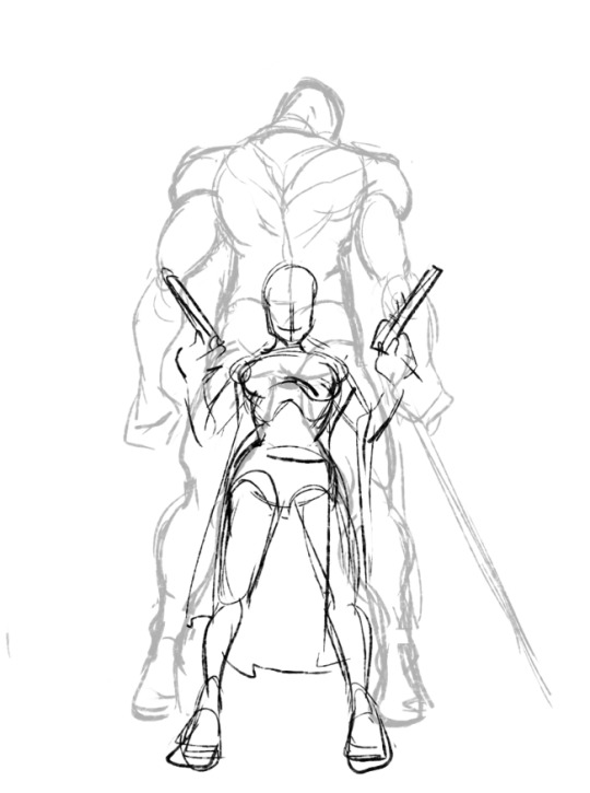


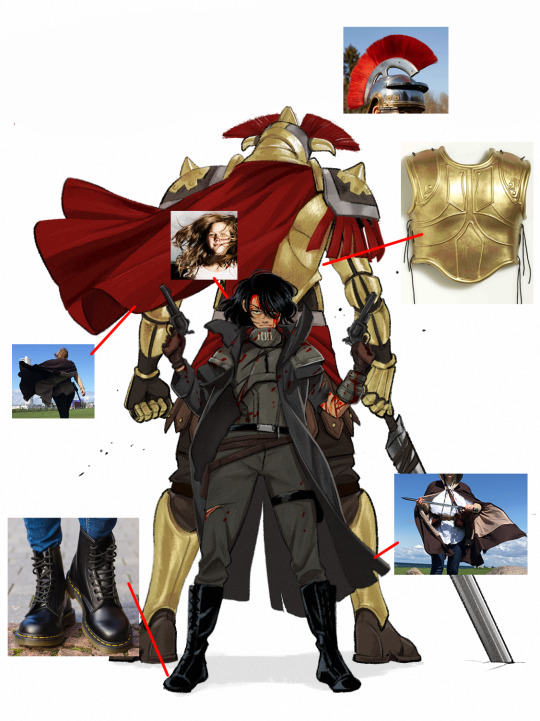
I do use reference images when I want the detail to be spot on! And they've been really helpful for me.
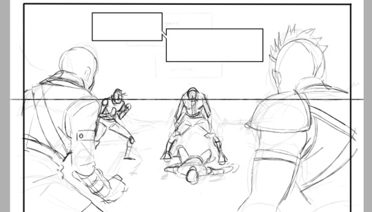
Other sketches I could find:

I'm still practicing and trying out new styles. Kim Jung Gi, Satoshi Kon, and Kentaro Miura have been really huge inspirations for me art-wise, and I'm always reminded that I still have a lot to learn. ^^
105 notes
·
View notes
Text
(ANOTHER) COMMISSION OPEN NOW!
Heyyy there... Guess what, I open another commission!
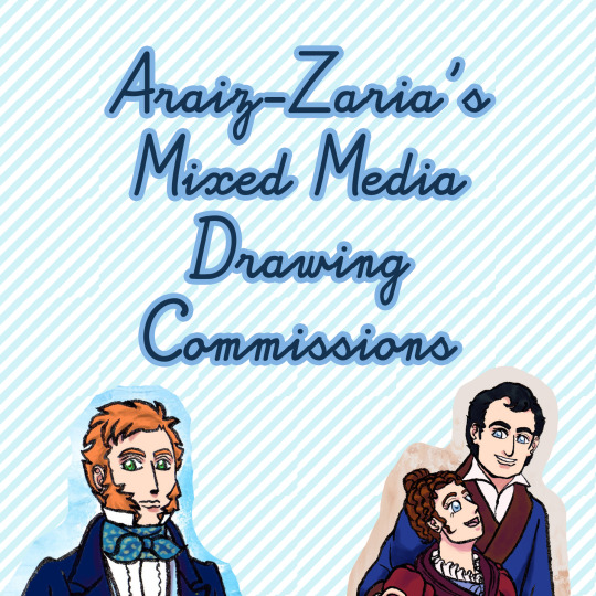
If you've been wanting a drawing like this...
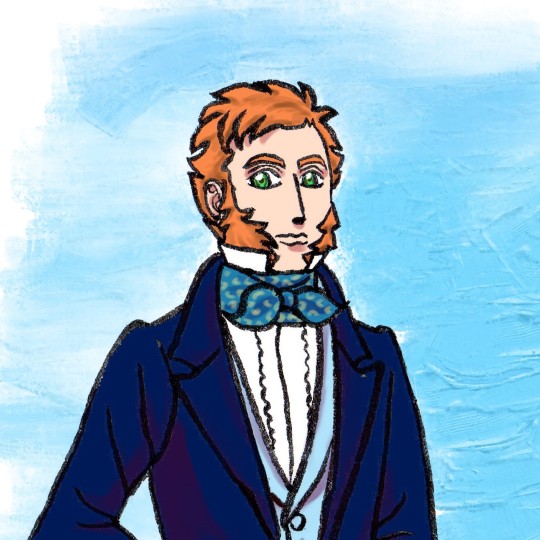
or this...

...then you're in luck! I am opening 10 slots for my mixed media drawing commission!
Here are the terms...
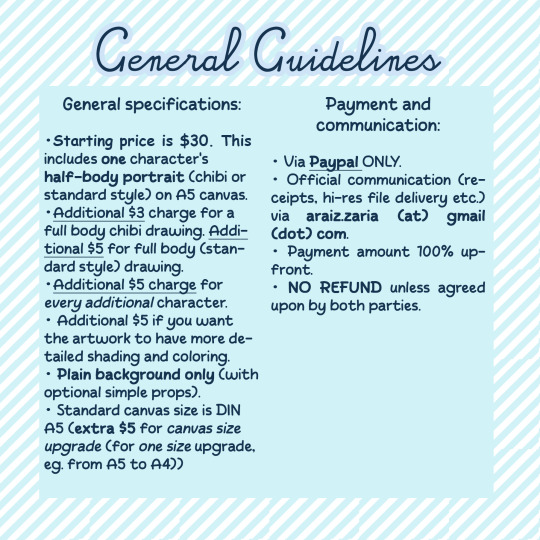
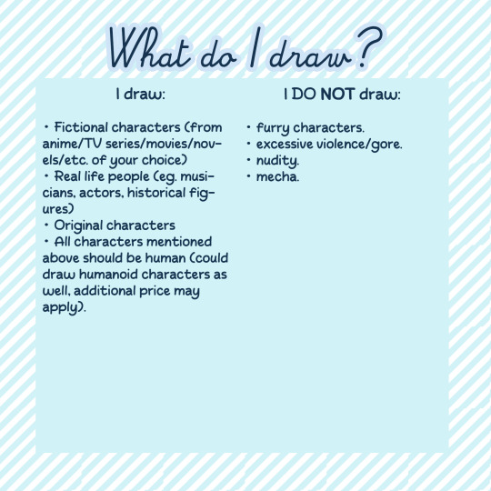
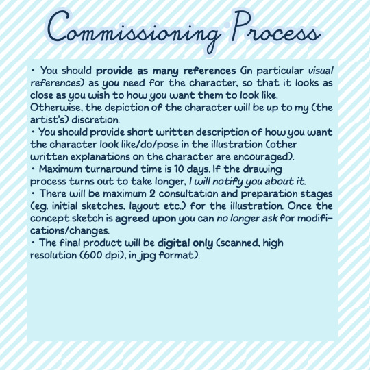
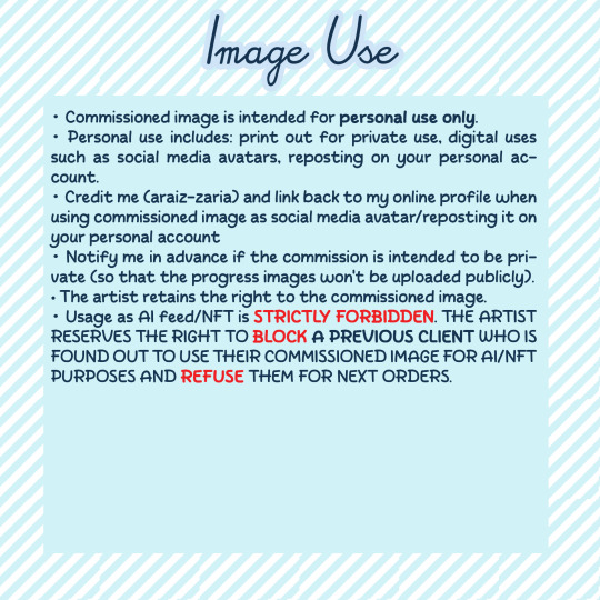
Feel free to DM me to ask more about it, or even to start commissioning me!
General guidelines under the cut
General specifications:
Starting price is $30. This includes one character's half body portrait (chibi/standard style) on A5 canvas.
extra $3 for full body shot (chibi), extra $5 for standard style full body shot.
extra $5 for every additional character.
additional $5 if you want the illustration to have more detailed shading and coloring.
plain background only (with optional simple props).
extra $5 for canvas size upgrade ($5 for each size upgrade, eg. from A5 to A4))
Payment and communication:
via Paypal ONLY.
Initial contact via DM (here or over at ko-fi). Official communication (receipts, hi-res file delivery etc.) via araiz.zaria (at) gmail (dot) com.
Payment amount 100% upfront.
NO REFUND unless agreed upon.
I can draw:
Fictional characters (from anime/TV series/movies/novels/etc. of your choice)
Real life people (eg. musicians, historical figures)
Original characters
All characters mentioned above should be human (could draw humanoid characters as well, additional price may apply).
I can't draw:
furry characters.
excessive violence/gore.
nudity.
mecha.
Commissioning process
You should provide as many references (in particular visual references) as you need for the character, so that it looks as close as you wish to how you want them to look like. Otherwise, the depiction of the character will be up to my (the artist's) discretion.
You should provide short written description of how you want the character look like/do/pose in the illustration (other written explanations on the character are encouraged).
Maximum turnaround time is 10 days. If the drawing process turns out to take longer, I will notify you about it.
There will be maximum 2 consultation and preparation stages (eg. initial sketches, layout etc.) for the illustration. Once the concept sketch is agreed upon you can no longer ask for modifications/changes.
The final product will be digital only (scanned, high resolution (600 dpi), in .jpg format).
Image use
Commissioned image is intended for personal use only.
Personal use includes: print out for private use, digital uses such as social media avatars, reposting on your personal account.
Credit me (araiz-zaria) and link back to my online profile when using commissioned image as social media avatar/reposting it on your personal account
Notify me in advance if the commission is intended to be private (so that the progress images won't be uploaded publicly).
The artist retains the right to the commissioned image.
Usage as AI feed/NFT is STRICTLY FORBIDDEN. THE ARTIST RESERVES THE RIGHT TO BLOCK A PREVIOUS CLIENT WHO IS FOUND OUT TO USE THEIR COMMISSIONED IMAGE FOR AI/NFT PURPOSES AND REFUSE THEM FOR UPCOMING COMMISSIONS.
#artists on tumblr#art commissions#commission open#mixed media#brush pen#digital art#illustration commission#original character#drawing#manga
5 notes
·
View notes
Text

aaaand, I had this idea that I'd have it completed by the end of the month. It's not there yet. But I took photos for notes on what to adjust after doing two rounds of test printing, and I wanted to put it out there. I want to update this blog more regularly, but I rarely finish what I start, making this blog pretty barren in terms of stuff worthy of showing off? Well. I've never tried a progress report post, so here we go. It may be cringe,and i'm sorry in advance. Look away.
so like i said i'm MAKING BUNTING!
Why? Because I thought with the release of Veilguard a month away now, I thought... a launch party... in your own home... could be fun?
What if I drew all the party members from previous games dangling as part of the bunting? And have them be arranged so that people could make it so they're kinda holding hands? Wouldn't that be a bit funny?
The plan: have print-friendly bunting! A4 sized, folded in half, maybe have it double sided so that folks can choose which way they'd like the characters facing.
I sketched up Morrigan first, and immediately realised that I will not be able to make this work lol. Morrigan being one of the few (wait, only? idk) characters in Dragon Age: Origins with a unique outfit. Because her outfit is asymmetrical I won't be able to get these silhouette cut outs to work without some real brainpower on my end to make it work. I need this to be a do-able project for myself, so I unfortunately dropped the double-sided print. Instead, I'm going for character on one side, and either a solid colour or pattern on the reverse.

I simplified the characters appearances much as I could without losing their details. I admire character designs that can have the character recognisable even with changed proportions. I've never worked on developing a chibi style, so I set another soft goal to practice that while drawing these. Look at the cranium sizes of Alistair and Zevran here. And their torso sizes. Yeesh.
I had made the decision to draw every party member in the armour they're wearing at the time of their recruitment. I think everyone will have them wear different armour or robes during the game, but at least we all consistently saw how they looked when we first encountered them.

Doing these chibis has really helped me appreciate the varied appearances of each party member. I see the limitations though, they had to be able to wear the same armour and therefor fit into the same body mould with adjusted proportions, but still, that's fun. I had mapped out on an A4 sized document that each character needs to fit into a square half the size of the canvas. This is so that it can be folded in half to be a double sided cut out. I printed, folded in half, glued then cut each of these. Size wise, I think it worked out? They're bunting-sized? Once these are all finalised I plan to print one of them on A3 just to see how lorge that looks.
Anyway, side note - I don't know why, but for this printing and assembly test I cut the string short and tied each character along individually. Why. Why did I do this I don't know.
So because I drew each character within this square, it helped me know where not to draw past if I'm folding the paper in-half. It also meant I had to get creative for drawing the larger party members. For Sten, I tried to look like he is slouching to be in-line with his comrades. As for Shale, because she's a heavy stone golem, she would be weighing the line down, maybe?

I was listening to party banter from the game, and I either overlooked or never realised how much of Oghren's interactions are about drinking. I tried something different with his silhouette. Thought about making his cut out smaller to fit with the vision I was forming about the different heights of the party members, but realised by making him smaller I'd also be shaving down an already reduced amount of detail I was going to draw on him. So while it was just a proportion test in the first print, I decided to lock it in.

Look at them. Their awkward, inconsistent shapes and amount of details.
Despite trying to simplify their shapes for easier cutting, they may not be for everyone. My take away for these characters were that I'll thicken the outlines for the characters, no need to hug the lines while cutting with scissors. A cutting blade will of course be best, but I don't have a cutting mat. And should not expect anyone else to either. After a friend gave me some good feedback, I decided I should add good ol' bunting triangles. I had been on the fence about it, for some reason. I doubted I could do anything interesting with a triangle. Maybe slap a grey warden emblem on one to look like a shield? I dunno. But I'll defiinitely try.
For the second printing test, I wanted to reflect on the art style of Origins. So much blood splatter. By this point I wondered COULD I DO THIS FOR EVERY GAME? CHARACTER BUNTING FOR DA2, INQUISITION, AND VEILGUARD? Yeah, Awakening too. I want an excuse to draw and do a character study of the Architect from Awakening, my favourite character. Absolutely fascinating character, and a really unique appearance. I've shied away from trying to even attempt him, so much detail.
Whoops so back on track, today I did a print of test 2!

I've detailed each character with what I hope is the Goldilocks sweet zone of not too much detail, not lacking details either.
It was today that I thought ohh I might document my process? So I tried to take better photos of my notes. And just overall nicer photos to show people.

When it comes to chibi it's really the proportions that are my greatest struggle. I like cute things. I can't draw cute things lol.
I'll be real, I don't like these big eyes. I don't know what style I was trying to imitate here? I did that think where you drop the whites of the eyes, just focus on eye colour - an identifying character trait of their appearance. I don't want blue eyes to disappear into the skin tone either though, so I kept an anime lid. Appropriately, an anime face?
idk i don't love what I did there. I went for smaller eyes for the rest, and I deliberately avoided looking up a reference but I know I tried recalling the artist who did the art for the cover of Bravely Default, I think he did Nier Automata art too? I can't look up his name without being shown the art, but, that artist! I have seen for the DS/3DS games he did designs for characters for that it's just the oval eyes with detailed everything else. The dots are expressive enough when they've drawn them imo, so I tried that for the rest to varied results.

Took some notes about cutting. Where to thicken lines to make it easier if you stray with scissors. Also took note of a tip for how I'm making some of the finer cuts, like in Oghren's hair.

Even smaller, a gap on one of Shale's legs.
Also, again from listening to the party banter on repeat, I forgot about her bird thing, haha.
For the first print test I did include the pigeon, so for this one I made it optional.

I only did one, I think I'll try adding two more! Other pigeon colours.

First very rough draft of the bunting triangles. Because they're an easy shape, this is definitely something that can be double-sided (left example above).
Experimented with two different shapes, slightly bowed (top right, pink backgrounds) and straight lines (bottom right, blue backgrounds). Straight triangles are just the classic shape, quick and fast to snip if that's what people would want. But it doesn't leave as much room for an illustration as I would have liked... so I tried bending the lines outward slightly. Also, tried a version with an outline and another without. I personally likee the lineless look? But it may make it harder to cut. Looking at the photo above on the left again, this was a test where I didn't include the outline but wanted to see if I could have a visual for where the edges are, and if cut outside of the border, so long as the colour is similar then it shouldn't be a problem. Hopefully, anyway.

Noticeable height differences with the characters and the triangles. Hmm.
I may still be able to get these done by the last day of September, I'll certainly try! If not, first week of Oct.
I really really want to draw these for every Dragon Age game. It's a really fun project for studying and analysis character design. I hope I can do these for more games. There's something about pintables that I think are so fun. Admittedly I have a second objective here, which is to advertise my Kofi. I just launched it and hope to use it to take commissions over the next few months. While I'll be testing out how charging through Kofi will work, I also wanted to test how free downloads will work there too.
As well as Kofi, I plan to upload these to Google Drive for download. So no Kofi account needed to access.
I don't know how to end this. Maybe just to say, I hope I have another update and hopefully download links next week!
Edit: cut added because loooong post
#fanart#dragon age#dragon age origins#diy craft#bunting#this is the longest post i've ever made on tumblr#sorry for the long scroll! i think i should have added a cut but was unsure where to put it. something i am considering though!
7 notes
·
View notes
Text
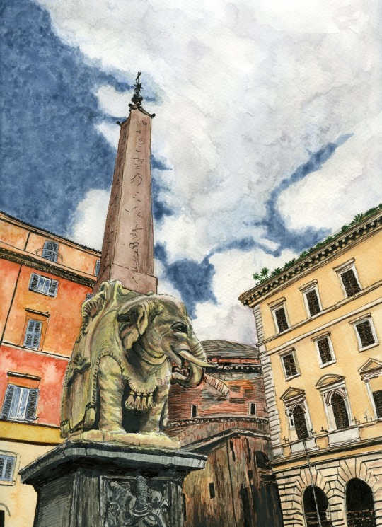
Today, I wanted to ask does anyone else here love Rome too…?
If so, you may recognise this elephant, just near the Pantheon…?
I started this piece by sketching it out from a photo I took in September 2019, and then started inking in the dark areas in artist's pens in the airport waiting for our next flight to Rome last month.
The only problem was that when we next walked passed Bernini's elephant I realised that the photo I'd based my art on was reversed, selfie style. 🤣🤣🤣
I remembered that the only way I could get a decent shot without other tourists in it in 2019 was to take it in this mode, over my shoulder. But this time we saw so many people taking selfies in Rome, using sites like the Colosseum as backdrops to their own personal take on their holidays, I thought "Why not! Why shouldn't Bernini's elephant, the background to so much exuberant holiday photography himself, have his own selfie!"
My A4 (21cm x 29.7cm) unframed original piece is available for £85 including UK postage. If we live close enough for me to deliver to you, I can provide it framed for £100. Please just message me to arrange your purchase.
It's also available in a mix of different types and sizes of prints, and printed on all sorts of lovely things (like accessories, apparel, homewares, gift items, etc) at:
Thanks!
Sam aka LymphomaLass xx
3 notes
·
View notes
Text
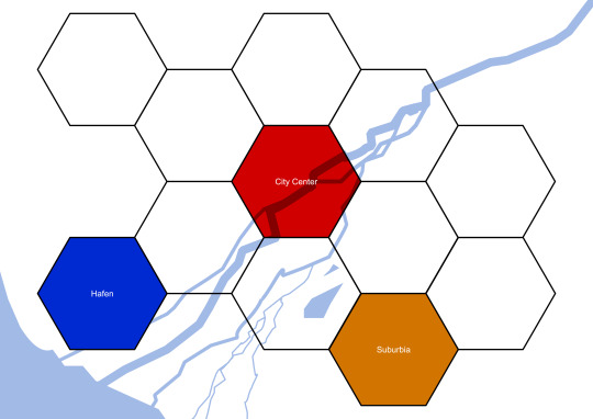
I'm about to go to bed and I don't particularly feel like translating these wip graphics into english but I wanna scream (affectionate) about the project anyways, so here goes:
I'm building a cyberpunk city for a shadowrun ttrpg campaign :D
... or not, if it no longer strikes my fancy.
Anywah, I thought long and hard about how best to do this and came to the conclusion that to simulate the experience of a city that you can actually get to know as a player without getting lost in making huge-ass, mostly empty maps is instead making a few large-ish maps that represent a part of a city.
Above you see a symbolic representation of the 12 city parts, currently named after their function more than their history. For each of these maps I'll make a large-ish maps which has a unique feel and represents that city part, e.g. this one, the "worker neighborhood":
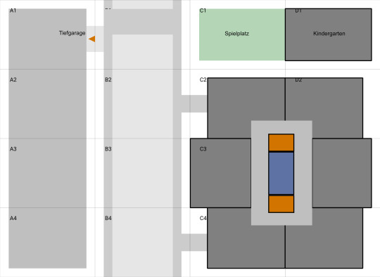
It features, left to right: a supermarket with a parking garage under it, a main street with a bridge over it, a playground (green) with a kindergarten next to it and (below) an apartment complex (orange are lifts, blue are staircase).
Now you might wonder: hey chicken, why are there rectangles and numbers/letters on there?
I'm glad you asked! it's because this is only an intermediate-sized map which is supposed to give an overview. The tiles are named A1 to D4 and each of them in its final form can become a battle map if needed, see here:
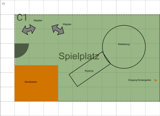
This is the C1 tile, which is the playground, except zoomed-in. (It features rocking animals, sandbox, climbing tower and slide). As you can see, each map once again has square tiles and I picked a size that has a somewhat generous amount of space for minis.
Each map-tile prints easily on a din-a4 page, so you can either use the intermediate map-size to give an overview of an area ooooor you can print out every single map tile individually and assemble them together into an Din A0 map which should hopefully fit on your kitchen table (ca. 80 cm x 120 cm = ca. 2' 9" x 3' 11")
Of course you could always build upon this by pretending that a mission you thought up yourself or bought takes place in one of the city parts but doesn't connect directly to one of the large-ish maps, oooor you can keep drawing the maps bigger, if you prefer.
One way or the other, you can establish places and come back to them because these maps are big enough and have enough going on in them that they can easily become recurring places (e.g. someone's contact lives in the apartment but also the supermarket becomes relevant in a mission. Also. ALSO... gang territories! The possibilities!!)
I'm so looking forward to filling these out!
9 notes
·
View notes
Text
Akiba Maid War Setting Materials
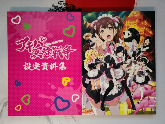
Akiba Maid War was arguably the start to international viewers becoming aware and cognizant of P.A. Works penchant for anime originals, and their continual improvement with each series (though real ones know The Aquatope On White Sand or Appare-Ranman). What differs here is the reception of the material, one popular enough to warrant an art book. And well, I've got it in front of me finally, so I wanted to share it with those that might be interested in it.
In terms of size and cost and quality, it's what you'd expect. It's that same A4 size that a lot of artbook are, and it opts for a horizontal layout which makes sense. The paper is very white and smooth, but it's somewhat thin as you can see in images like this one, letting you see silhouettes of the other side. At its 3,000 Yen price tag I'd say it's a somewhat decent deal, and I'd expect that after initial purchasing dies down you'll be able to find it for even cheaper. So overall, not a bad first art book from P.A Works, and here's hoping we'll get to see more!
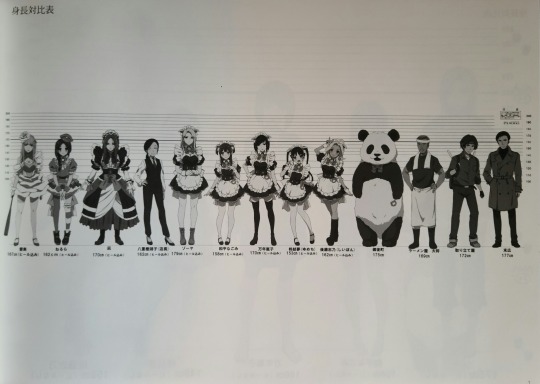
Anyways, I'll get into the book. It's very much setting material. There's not any storyboards, there's not any key animations. There's not even any color (probably to cut printing cost). It's a very sleek art book that puts a focus on getting the material down onto the page for people to look at.
And it does that in three different sections: Character Sheets, Prop Design, and Environment Design. Of course, I'll go in the order that I've listed and that they appear in the book, so we'll start with Character Design.
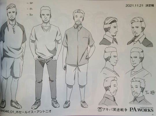
It's a very uniform approach to it, they don't fill the page creatively with the character designs or details, but rather take the actual sheets for the characters and paste them into this book. You have the horizontal lines to make sure that the character is proportionately accurate and consistent, and even a few measurements listed for things like height. You'll have a front side and back view for the more notable/detailed characters, while more simple characters only have front and back.
Alongside that, the lead characters typically have several outfits so the art book showcases those as well (here I've chosen Ranko to display that). In addition, you get facial expressions and different angles too, plus a close up of the design for the eyes of the characters. It's a very robust showing that might not be everyone's cup of tea considering how rigid the display is.
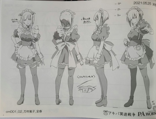
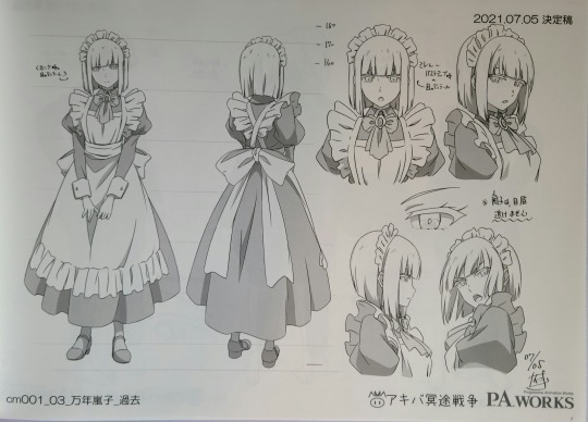
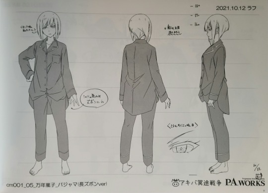
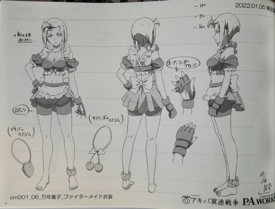
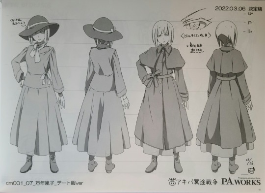
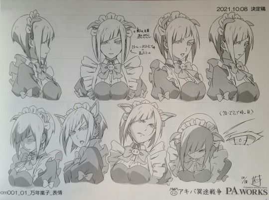
In comparison to lead characters like Ranko, the side characters get a bit of a mix in terms of character sheets. Some of them are just groupings of characters that appear briefly, shown only in a head on view, others have a single sheet with a front/back and a few facial expressions, and some end up having a mix of the two.
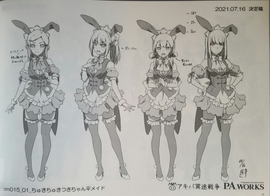
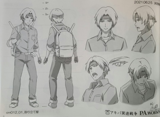
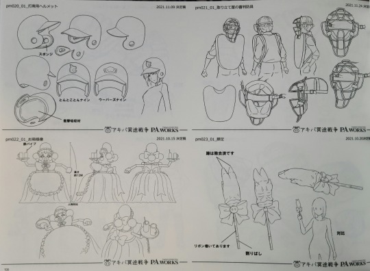
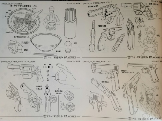
Following the Character Sheets we've got Prop Design, which is a somewhat slim section. There's not a whole lot of props in the series, but they do a really good job at properly detailing and designing them. From the various guns, to baseball helmets, to maid related props, they're all well done. Also, in comparison to the character sheets, the prop design pages are typically more full and "creative" as different ideas and designs share a single page.
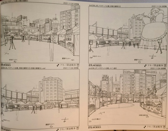
And closing it out we've got the Environment Design. This part was really cool, and I sort of wish they were able to make the art book bigger so that the scenes could take up more space. These pages are packed with layouts and flows and structures that form the various locations of the series (apologies for the second image, had to retake and natural light was too dim at that point, so the picture is tinted a yellow/orange. The pages remain fine).
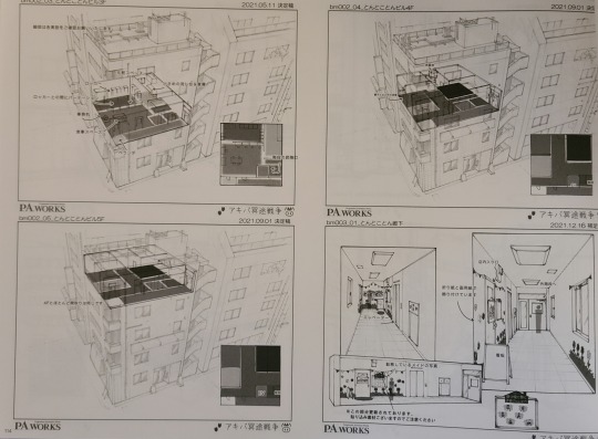
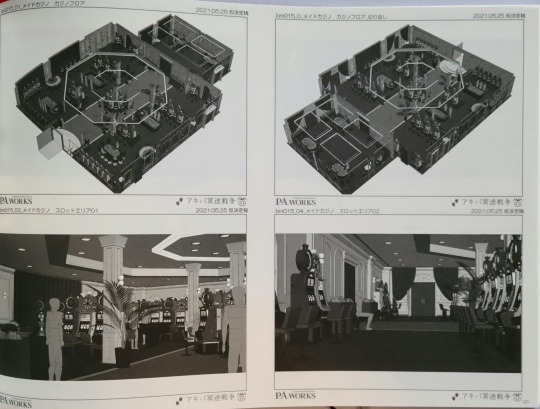
Even cooler is how they worked towards building some of these areas. In a few pages within the Environment Art section they include 3D rendered layouts to give a feel for spacing and depth.
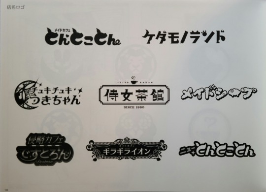
It's just a really cool piece to see, and definitely something that P.A. Works seems to care about throughout this art book. They impart a lot of little details and pieces that you might not otherwise see. For example (though it's a pain to make out because of Tumblr image compression), each page/image/layout has a date associated with it. From it, you can see that the character sheets were made over the span of an entire year (effectively from the start of January to the end of December). And they even include little additional pieces like these logos for the various maid cafes that exist in the world.
In general, it's a really cool but rather simple art book, something I'd say is about what I'd expect from the first art book from P.A. Works. It's got a lot of cool material to it, but is forced to shorten it to make it economic and cost-effective. I feel like they could have condensed some of the character sheets as characters like Ranko can easily take up 5 or so pages on both sides. But that's neither here nor there, if you don't mind a less "artsy" and sort of more technical art book than I'm more than fine with recommending it at its price point.
#akiba maid war#akiba maid sensou#akiba meido sensou#アキバ冥途戦争#mannen ranko#wahira nagomi#anime original#anime art book#anime art#anime recommendation#anime and manga#anime#art book
10 notes
·
View notes
Text
How I bind my fics - Part 1
So, I said to one of my mutuals (@imstressedx) that I might do a step-by-step on how I bind books, so this is as good as opportunity as any! The first glue up on the spine is drying, so while I'm waiting I'll show you how I assemble the text block ready for trimming and endbands.
The fic I'm using for this is "Making Moves" by @areseebee and @derrygirlstrash, and starts with typesetting:
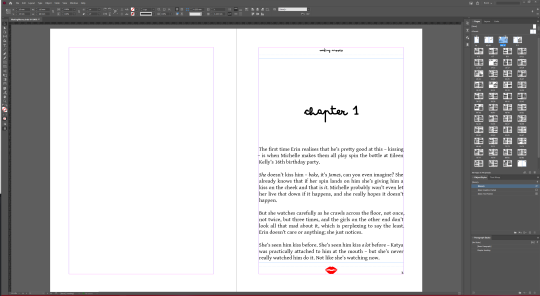
I've recently switched to using inDesign (previously I used LibreOffice), and for the most part it's pretty good - explaining how to typeset is far beyond my skills, but the basics are pretty easy to get a grip on.
Since we're printing two pages to each side of the sheet, and printing front and back, the number of pages in the document should be divisible by four - we add in extra pages or tweak the layout to get this number. Ideally the number of pages match one of the numbers in this grid, to make the signatures the same size.
For this book there ended up being 96 pages, which gave me the options of six signatures made of four sheets, four signatures of six sheets, to three signatures of eight sheets. I went with four signatures, but in retrospect I'd probably go with six signatures next time.
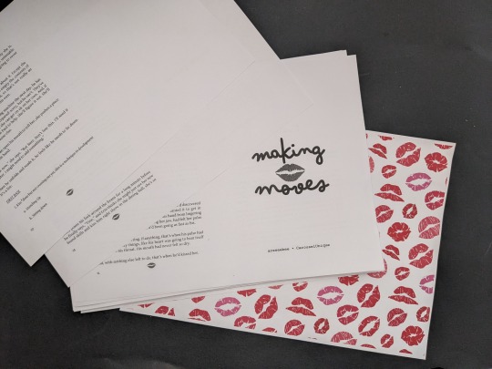
Next up is to print it, grouped together into the desired signature size and laid out accordingly (e.g. the first sheet would go pg 24, pg1 on one side, then pg2, pg23 on the other) so that when we fold and stack the pages they are in the correct order. We also print/cut/use the endpapers at this point. I've printed this on 100gsm A4 paper (approx 27lb letter paper for you Yanks, although the measurements aren't quite identical)
Next, we fold the pages. It's a simple case of aligning the corners, folding flat, then using a bone folder (actually made of teflon) to make the crease nice and crisp:
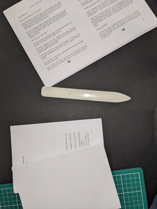
(The first two signatures folded and stacked)
Next, we need to pierce holes in the creases to sew through, so we make a template using scrap paper/card (I used a piece I was using as a glue shield on a previous bind - I like to use a bright/contrasting colour to make it easier to see):
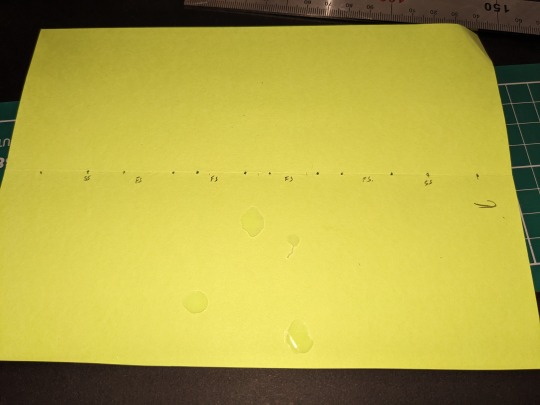
The gaps at the top and bottom are quite large on this template, and that's because I'm intending to slice off an entire inch of paper on those sides due to the way the printer scaled the margins.
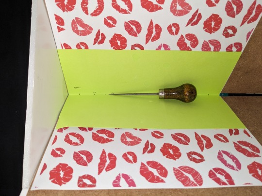
We then place each signature/endpaper in my janky, homemade punching rest, and use an awl to pierce through according to the template:
Once that's done, we can stack them ready for sewing, and wax our thread. We use thread as wide as the signatures, and use that number of passes to get a decent length. We then wax it, to make it easier to slip through the paper and to untangle any inevitable knots. I use beeswax and cotton thread, although I originally used parrafin wax and polyester - there's not much difference IMO, but if I'm doing this by hand I want materials I'm happy with.
Next, we sew - I like to use French Stitch, as it gives a nice finish. If it were thicker I'd use cotton tapes behind the wider sections, but for this book I just went with the thread. Tip - keep the thread taut, but not tight, otherwise the pages could rip.
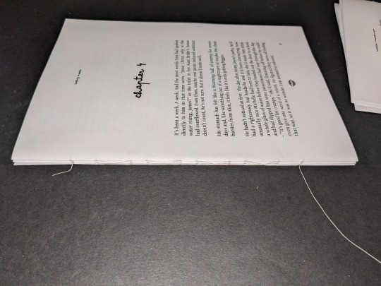
(Half way done - fun fact, chapter four takes up two of the four signatures by itself)
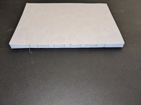
Finally, for this part, we just need to put it in my (also) homemade press, and apply two layers of glue to the edge.

Once this is dry it'll be onto the next part!
#fanfic binding#bookbinding#making moves#i may have spilled half a pot of glue in the making of this...
5 notes
·
View notes
Note
Hey what's an early fic you wrote that you still come back to/think really holds up? :D
Thanks for asking, that's a good one! :D
So this'll be a loose interpretation of 'early' - to the best of my memory I started writing in the mid/late 80s, about a hot minute after I had enough motor control to hold a pencil - Star Wars and Doc Smith inspired space opera, and then a bit later some myth-inspired historical/urban fantasy stuff, apparently I'm consistent like that. It's probable the floppy disks with my actual early-early writing are in a storage box somewhere in this house, and there might even be a 5.25 disk drive somewhere else kicking around, and I did a few computers ago download a BBC Micro emulator and check out what was in there - and came to the conclusion that those could be, ah, safely left to the mists of time.
But fast-forwarding into this century, a few weeks ago I was at a live roleplay event, someone handed me a printout they'd made of an in-game history which I wrote at least 9 years ago. After getting over the fact that it was, like, a 1/2" stack of paper (I didn't remember it being that long! Though it didn't help that I'd sized the PDF to be bound in A5 and they'd printed on A4) I ended up scanning through it to refresh my memory and put together a shorter summary my character could give to those who weren't there.
And there I was standing in the middle of the camp, remembering where I'd put words around actual events and documents from the game, where I'd been whole-cloth inventing something to fit a gap, and where it was kind of a collaboration with the plot-writing team. And I found myself thinking, you know what, I'm happy with this, this is pretty cracking actually. It might not be what I'd write today, but the editing fingers weren't itching too badly at all; it's something I'm happy to have my name on.
(Also something I am reminded I need to put up online again. Adding that to the to-do list and trying to remind myself that no, really, I don't need to build a website first, lol)
6 notes
·
View notes
Text
First time trying perfect binding
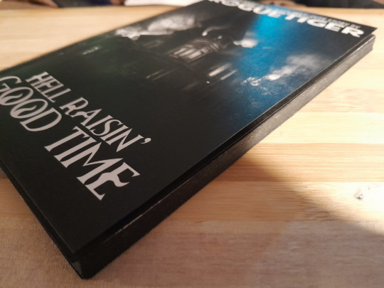
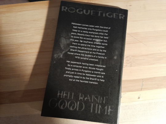
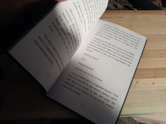
I have not had much luck with binding as of yet. Lack of funds and talent sucks but out of it I have managed to make book-shaped things that if I had a shelf I would put them on, even if opening them would just remind me that I have not managed to find an inexpensive way to trim vast amounts of pages without them looking like I had my eyes closed while trimming them.
SIGH!
Most of my stories are a little on the massive side (1 I had to break down into 3 books because it was so big). However, I have always wanted to have a try at perfect binding and I remembered a story I wrote in 2023 that would be a good candidate.
So, I printed it off, trimmed it, glued it, made the covers and put it all together until I had a book in my hands.
If only it had been that easy, lol.
The printing... I put in page sizes and margins, all carefully measured. And in the end what was should have taken under 20 sheets of A4 (70+ pages of text on 11x18cm) took well over 100 (too close to 200). It printed it too small even though the sizes were right), it refused to center them so they lined up with the pages on the other side. And don't get me started on trim markings! I tried 4 different programs before I managed to beat one into submission enough to print something off I could work with.
The cover... My inkjet just flat out butchered the colour version and it refuses to play nice with my thicker paper. I have a nice laser though and it took the thicker paper and the cover didn't look too bad at all in black and white. But, the paper isn't for laser printing (there was no label on the packaging so I found out when the toner rubbed off). Several attempts later and I managed to use some clear spray to seal the cover.
Yayyy!
Yay apart from the thinness of the 'book' and maybe the clear spray made it so the cover wouldn't fold.
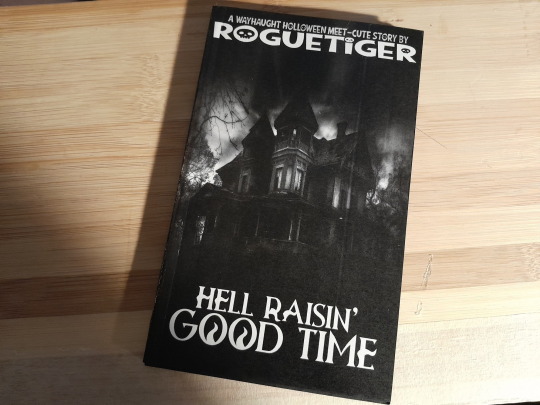
In the end, with some black paint to hide the terrible fact that even when I go slow and carefully I still can't trim even a small stack of paper in a straight line... I finally had another book in my hands to add to my growing stack.
1 note
·
View note
Text
Week 10- On da grind
Figure 1
Indonesian meme

Note: This meme can be roughly translated as "I am going off(line) first (bray is slang for bro). I am questioning my life right now"
Honestly speaking, I feel mentally better in week 10 than I did in the previous week.
What?
This week was characterised by two words: stress and grind. However, this push might be a good aspect, as I managed to get my card design quite literally finished. Buttttt at the same time, a declining state of sanity. I feel immense gratitude to the FabLab technicians (especially during printing, cutting and sudden laser cutting) for supporting and helping me despite the short notice and the recognisable cramming.
Week 10 felt like an emotional rollercoaster. One moment, I was stressed, and then I felt relieved. The week was dominated by late-night calls with my friend and black coffee. I know. Who drinks black coffee at 2 am? Apparently me. Despite being a whirlwind of emotions, this experience I gained new insights about approaches.
Since beginning my design journey, I have been scared to come into the FabLab. I do not know what influences me to feel this way, but I just know that coming into the lab--even the old Design space--makes me anxious. However, I have to admit that this experience was a letdown. I am disappointed in myself for allowing this to happen in the first place, but I am grateful to have gained new knowledge along the way.
Final designs
Figure 1
Flora and Fauna cards

This is the design I created for the flora and fauna cards. By combining the two colour palettes I have and decreasing and increasing hues, I was able to obtain the colours of the card. On the cover page of the cards, I have included a Māori word and its meaning. Inspired by a piece in the museum, I chose Haumanu, meaning to revive.
Figure 2
Question cards

As for the question cards, I have chosen the word Whanaungatanga, which roughly means kinship. The chosen words reflect the card game themes, of connecting, environment and communication. Slightly different from the flora and fauna cards, the questions deck adopt a ticket-style design.
Overall, I aimed to make the card designs inviting, warm and easy to the eye. Hence, the mixture of warm and cool tones.
Figure 3
Rulebook

Similar to the style of the question cards, I designed the rule book to look like some kind of ticket. The rule book will be folded piece of A4, and includes the details of the game.
Figure 4
Prompt Sheet
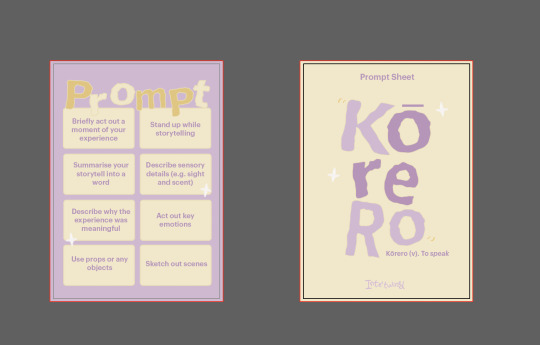
The prompt cards are replaced with the prompt sheet, but this time, using this is optional. The game provides a list of prompts and also encourages players to make their own prompts. Moreover, the cover page follows the theme of the cards and includes the word 'Kōrero', meaning to speak.
Figure 5
Map sheet

Instead of A4, the map will be printed out in A3 size. This will allow for more drawings, notes, and scribbles of thoughts. The map includes the names of areas where the species might potentially be and some quick facts, which will be improved and added in the final iteration.
Printing
Printing is evil. I encountered multiple struggles when it came to printing, and nothing seemed to work 😭. At first, I felt relieved as I had completed my file and needed to print it. Everything was sorted, and the paper; I allocated some time to print. I thought everything was going well until I encountered the first problem--being unable to print from my laptop. All the computers in the design space were fully booked, so I had no choice but to print from my laptop. Printing normally went well, but the challenge came when I had to use my own papers. Somehow, my laptop did not have the bypass tray settings; despite getting help from the technicians, I ended up on a closed road.
The technicians helped me print using their computers. However, the second problem occurred. Using my papers meant that I could not use the double side feature and had no option but to put it back in for a second round. This is risky, as me being me; at some point, I might forget which way the paper goes. In the end, wasting paper if I repeatedly make a mistake 😃🙏.
Therefore, to mitigate this problem, I decided to go to a printing location where my friend had previously used their service. This is where everything went downhill... It turns out I did not set up the document properly, which took more than two hours for me to reset it. And guess what? I did not end up printing as the store closed and I partly gave up.
Nevertheless, I did not give up. I went to another location with public university computers. This is where I encountered the irritating challenge of having a somewhat corrupted file. It turns out that sending the file, downloading it, and printing it from my university email caused the outcome to be darker and have dark boxes. At this point I was very annoyed and in the verge of crying.
I rushed back to the design space and asked for help once more. This problem could not be solved; hence, I had no option but to print with printing paper and paste it onto the paper I bought. I was filled with anxious thoughts and was irritated. However, the support, help, and advice I received from my peers and the FabLab technician profoundly helped me to become calmer and relieved.
Laser Cutting and Final Outcome
A FabLab technician recommended cutting the cards using a laser cutter. And being quite a messy cutter, I feel a burden off my chest hearing that I am able to do this. However, after a few trials, I manually cut as I had little time left. Over an hour, I felt my soul leaving my body and entering again. However, I finally finished it and was ready to take pictures! I felt relieved but not fully relieved.
Figure 5
Photograph
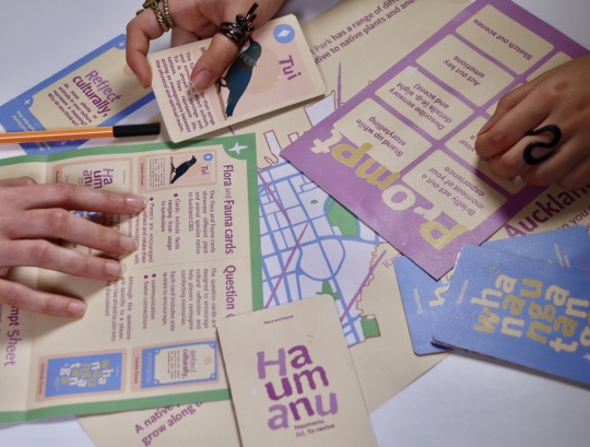
Note: This is a photograph taken for the poster.
Figure 6
Photograph
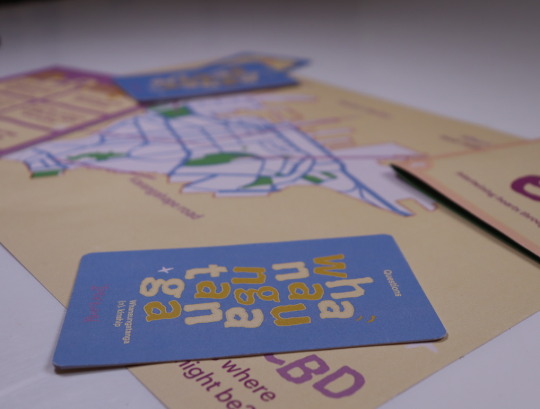
Note: This is a photograph taken for the poster, but not used.
Figure 7
Photograph
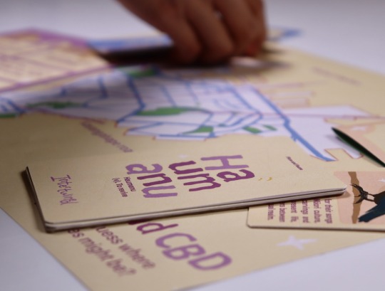
Note: This is a photograph taken for the poster.
So What?
I gained some valuable insights from this experience. Overall, this emphasises the importance of having a backup plan. For instance, if printing back to back does not work, then printing normally is the backup plan. If laser cutting does not work then manual cutting it is. I know I made a project plan with plans A, B and C, but this experience alone shows how important these plans are.
Furthermore, when talking about my regrets, I was fully expecting to be hit by reality or roasted by my peers and the technicians. However, I received responses that I did not fully expect. Instead of being roasted and being told the straightforward truth, the reactions I got were generally optimistic. Particularly not to dwell in the past and just focus on the present moment. Yes, I regret my actions, but I cannot change them anymore. All I can do is focus on what I am currently doing and what I will do in the future.
Buried underneath stress and panic, somewhere deep within me, I believed in myself that I would complete this. I did complete the assignment, but at what cost? I was not fully satisfied with the outcome, and I felt ashamed and embarrassed of myself.
Now What?
Now what? Well, it is time for a reflective action plan. I think my main challenge is overestimating my time, leading to poor time management. Along with setting priorities and creating backup plans, having a moment of reflection can be helpful. This way, I can both think idealistically and realistically about how the plan will be executed. Having a plan of what I hope and what might actually happen helps estimate the time I need or have left. At the same time, pushing me to continue.
Referencing Bersuwara. (2024). [Social Media Post]. X. https://x.com/bersuwara/status/1802968063228400002
0 notes
Text
Camera-less Project
08/09/2024
The first post for the account is me starting the process of the "Camera-less" project for uni.
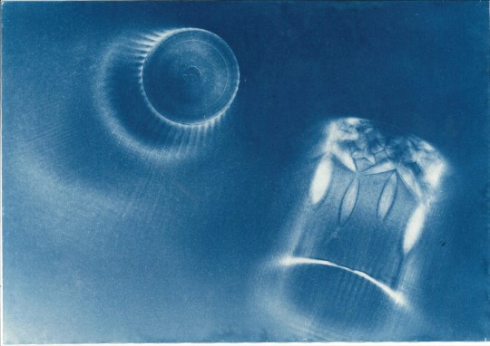
After work today I picked up some sheets of tissue paper, transparent film, brushes, UV lamp and the cyanotype kit. The uv lamp is pretty flimsy for the cost it just about broke when I was putting it together 💀 I have also mixed the two bottles that came.
I was planning on mixing the dye with the tissue paper and leaving it to dry overnight but the packaging said for the best result to let it sit for 24 hours so I'm gonna listen to the cardboard.
In excitement to start this tho I've been looking up what folk have done to give me ideas of how I want to mess with it, the transparent film is for me to make negatives on, I'm keen on working out how to do that properly and mixing that with other physical objects also.
I am also very interested in bleaching the blue out of the print and using a toner like tea bags to give it a different colour, very excited to see if I can maybe combine colours to make a full coloured print. But there's are all just ideas I have so far with nothing done! Excited to give it a go tomorrow :^)
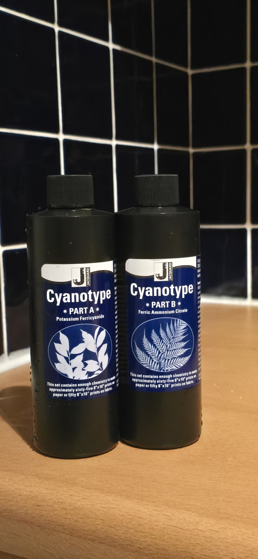
Also saw online folk tend to use droppers for this so I'll probably try and find some also.
09/09/2024
I tried to print a few images on a4 acetate in the college but the quality was horrible, asked around for assistance and nobody seemed to have any answers until someone told me to nip to a printers. I ended up going to 5 different printers, 4 of them didn't seem to print them anymore. Got 5 acetate prints of 3 different images of different sizes just to see what I can produce and see what I might want to layer with it for my prints.
I'm about to apply some of the cyanotype mix to a few of the paper sheets to see how the turn out.
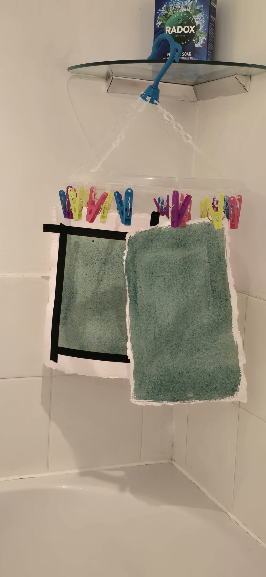
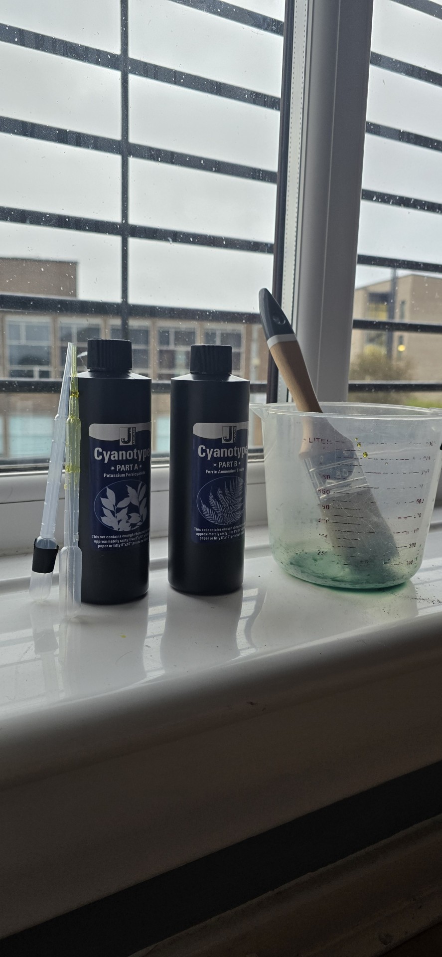
Got my first two test papers painted, got one that I used masking tape for the smaller ones see if I like the affect it gives, also have one that is just smothered in it all.
For the smaller scale one I only used about a quarter of each the droplets but for the larger one I used about 2 3rds. I tried to keep my brush strokes consistent but we'll soon find out if that matters.
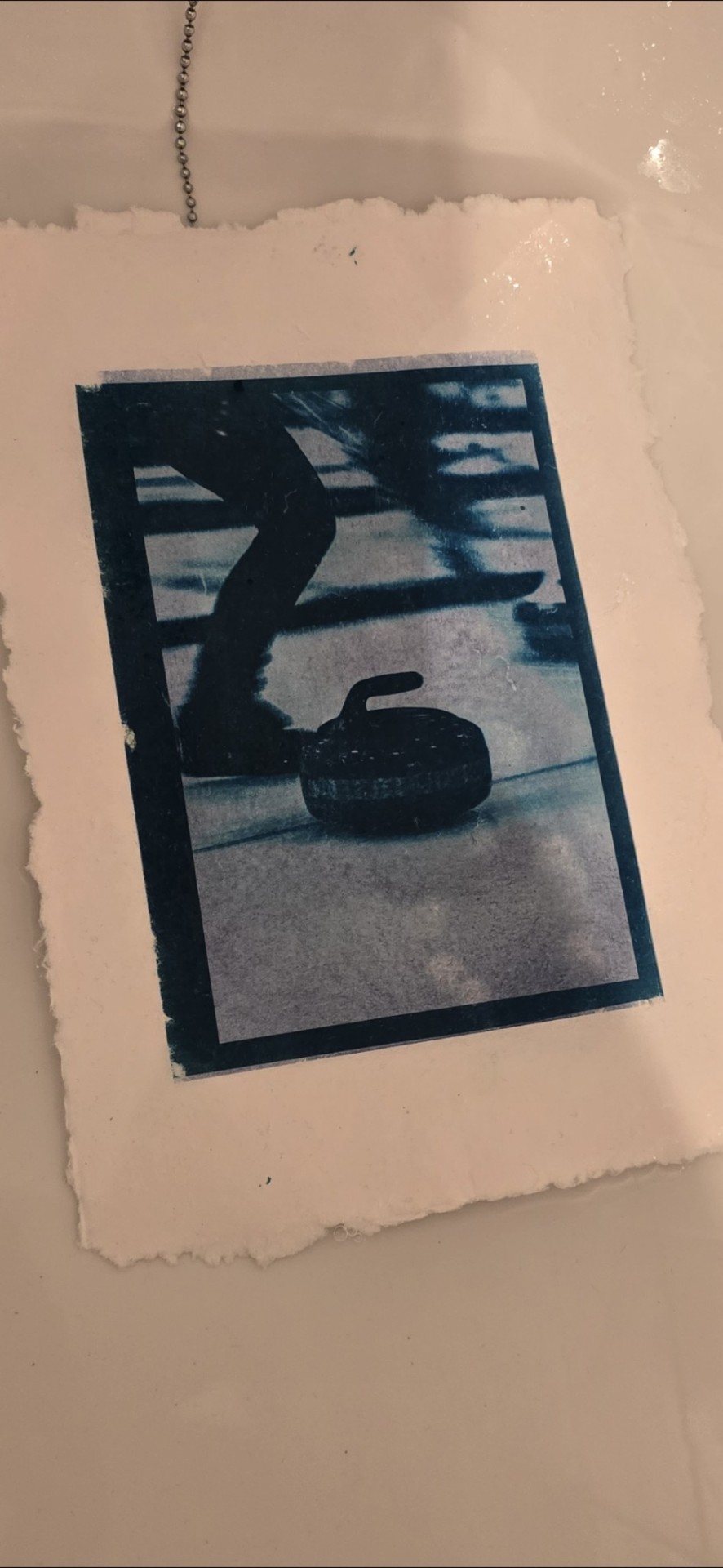
I'd say that's a successful first test! I don't think I'm too keen on this paper, I thought it'd like the more textured look but I'm not thinking otherwise. This was with a pretty low amount of the cyanotype mix and exposed for 15 minutes under a UV lamp. It's pegged up and drying now. Going to have a good go with the 5 other sheets I've got tomorrow.
10/09/2024
The print from last night turn out pretty well I think. Realising it may have been a stroke of beginners luck tho, tried two more of the same image but different sizes and neither of them seem to be turning out great. It could be a number of things that have happened so I'm going to try and do a test strip and see if that helps me get an idea of exposure times.
I have also ordered cartridge paper online, I'm not really enjoying how the cotton paper is turning out like I thought it would.
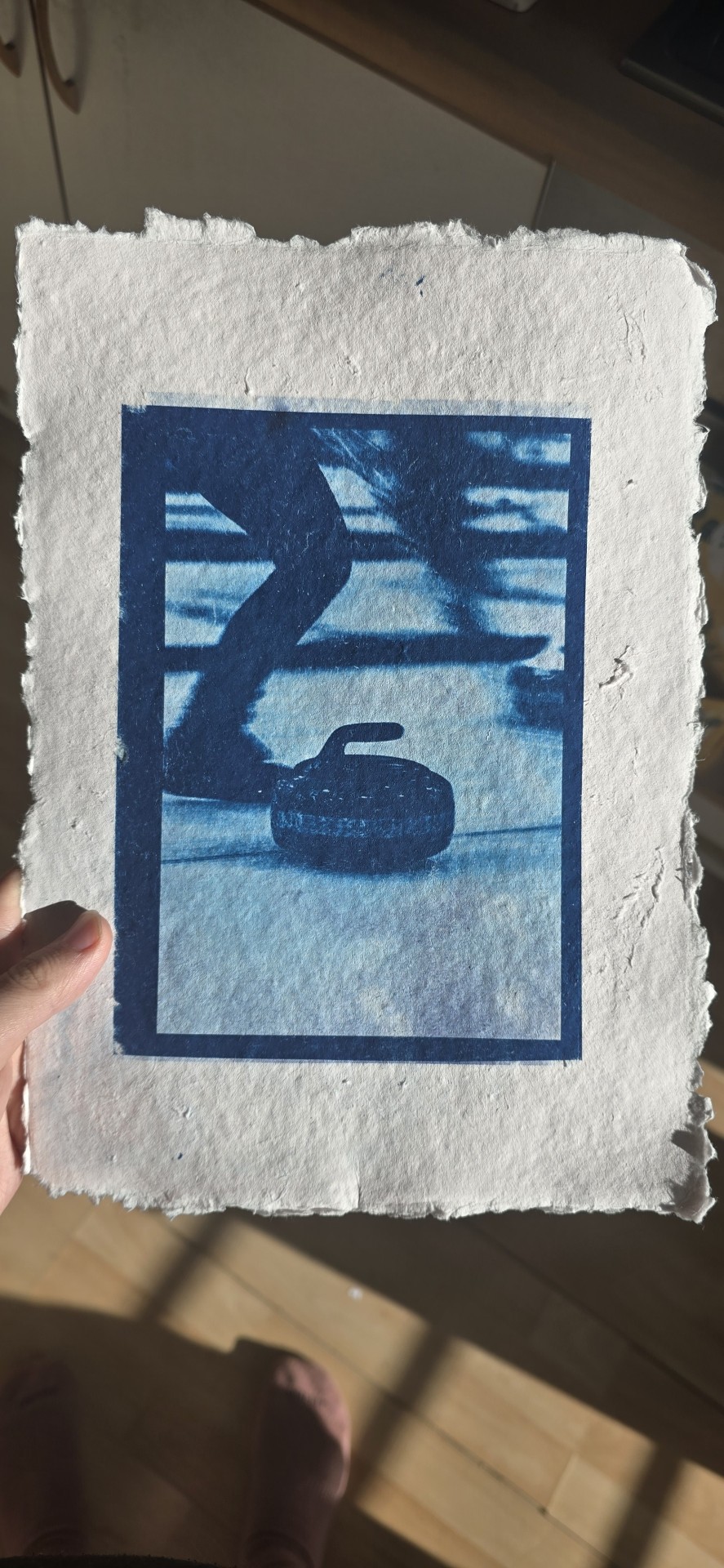
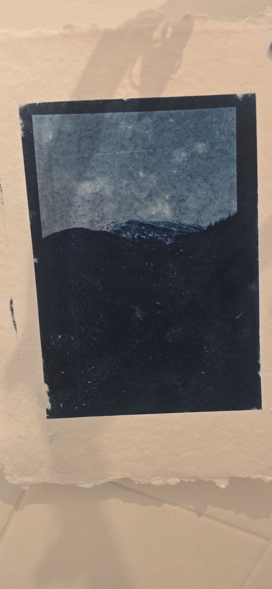
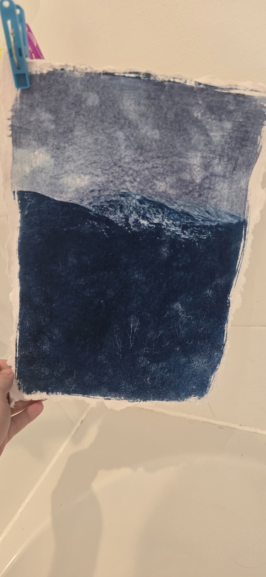
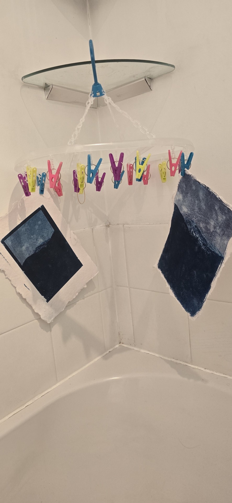
15/09/24
Been a busy week done a few prints. I feel like I'm starting to get the exposure times down, halved the time from 15 minutes to 7 -8 minutes and that seems to be working could possibly even do them shorter. I have also been trying ti expose just object in my flat and mixing that with some negatives also.
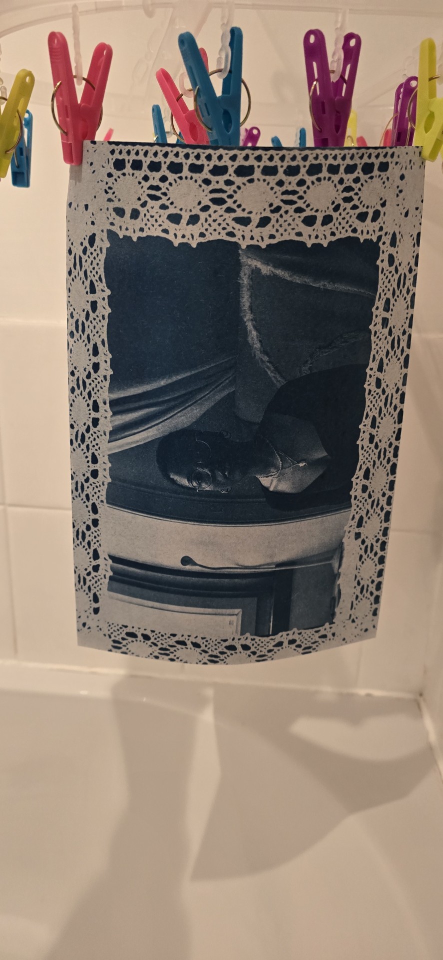
1 note
·
View note
Text
Place of words (final magazine print & bind):
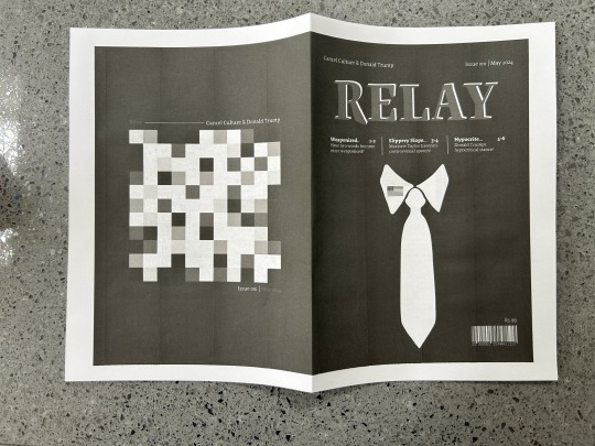
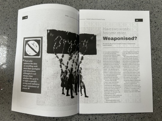
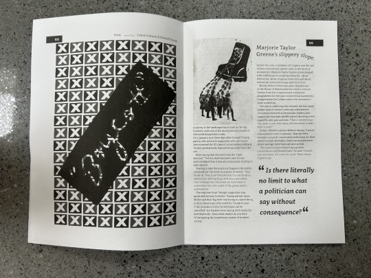
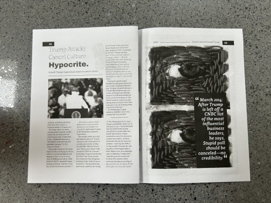
Here i wanted to not only print my magazine for the hand (both with and without guides) but i also wanted to bind it together so that i could see it as an actual magazine! To do this i saved my magazines as spreads (all pages) and then printed on the 'booklet' setting on acrobat, it would only print double sides with both sides being the right way up when printed on A4 so i chose to print on A4 paper for this as i will hand in the regular spreads true to size anyways! I also only printed this test in B&W to save my print balance, but i did then next once i had the print settings worked out print in colour. It was really good to see what my magazine looks like when bound together as an actual magazine as it put the project into perspective and felt like this drew a close to the project which was good!
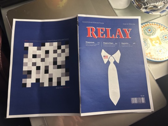
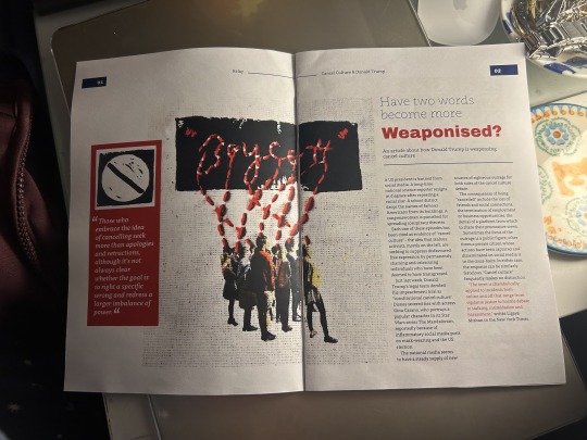
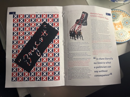
These were the final pages when i stapled them together into an actual bound magazine! Again, this was only printed as A4 not true to size because for some reason printing on both sides of paper the right way up was only possible on A4!
0 notes
Text
COMMISSION OPEN NOW!
Hey hey... Have you ever wanted to have an ink illustration drawn by me?
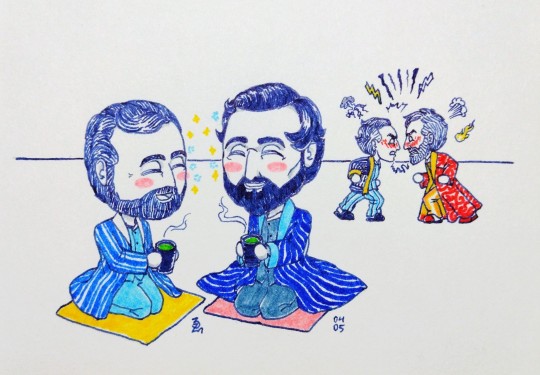
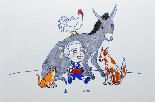
...like this, for example? 😏😉😺
Well now YOU CAN! Because I am opening commission now!
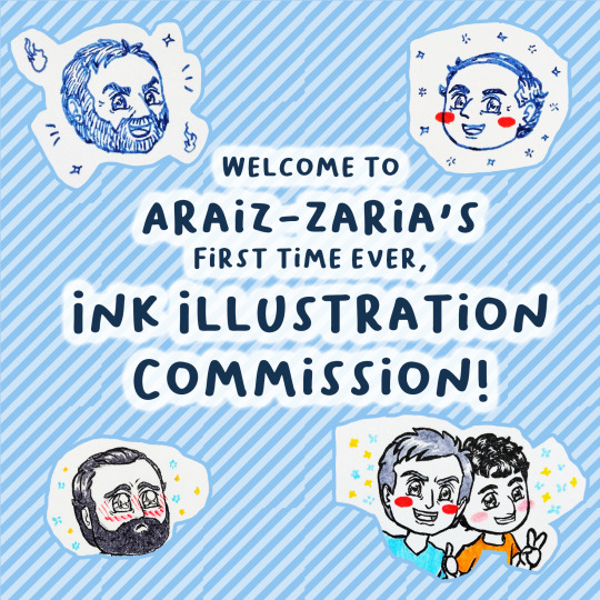

Ink illustrations, to be precise 😏 (gouache illos comms coming later this year, stay tuned for info 👀👀) General Guidelines below the cut:
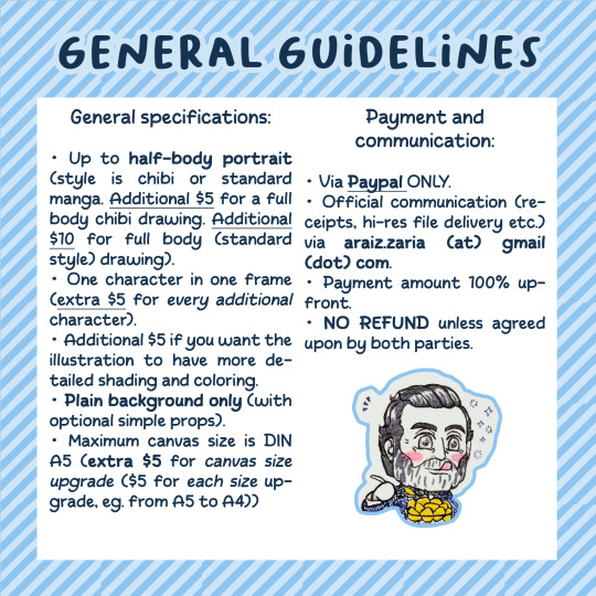
General specifications:
Up to half-body portrait (style is chibi or standard manga. additional $5 for a full body chibi drawing. additional $10 for full body (standard style) drawing).
one character in one frame (extra $5 for every additional character).
additional $5 if you want the illustration to have more detailed shading and coloring.
plain background only (with optional simple props).
Maximum canvas size is DIN A5 (extra $5 for canvas size upgrade ($5 for each size upgrade, eg. from A5 to A4))
Payment and communication:
via Paypal ONLY.
Initial contact via DM (here or over at ko-fi). Official communication (receipts, hi-res file delivery etc.) via araiz.zaria (at) gmail (dot) com.
Payment amount 100% upfront.
NO REFUND unless agreed upon.
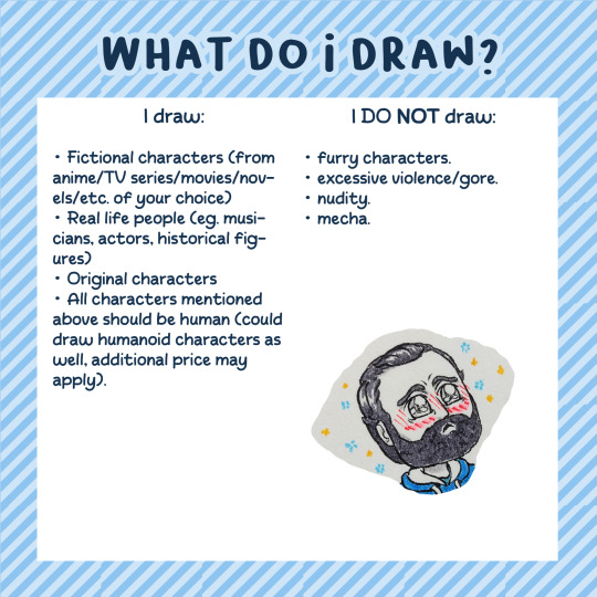
I can draw:
Fictional characters (from anime/TV series/movies/novels/etc. of your choice)
Real life people (eg. musicians, historical figures)
Original characters
All characters mentioned above should be human (could draw humanoid characters as well, additional price may apply).
I can't draw:
furry characters.
excessive violence/gore.
nudity.
mecha.
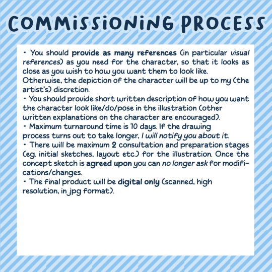
Commissioning process
You should provide as many references (in particular visual references) as you need for the character, so that it looks as close as you wish to how you want them to look like. Otherwise, the depiction of the character will be up to my (the artist's) discretion.
You should provide short written description of how you want the character look like/do/pose in the illustration (other written explanations on the character are encouraged).
Maximum turnaround time is 10 days. If the drawing process turns out to take longer, I will notify you about it.
There will be maximum 2 consultation and preparation stages (eg. initial sketches, layout etc.) for the illustration. Once the concept sketch is agreed upon you can no longer ask for modifications/changes.
The final product will be digital only (scanned, high resolution, in .jpg format).
Image use
Commissioned image is intended for personal use only.
Personal use includes: print out for private use, digital uses such as social media avatars, reposting on your personal account.
Credit me (araiz-zaria) and link back to my online profile when using commissioned image as social media avatar/reposting it on your personal account
Notify me in advance if the commission is intended to be private (so that the progress images won't be uploaded publicly).
The artist retains the right to the commissioned image.
Usage as AI feed/NFT is STRICTLY FORBIDDEN. THE ARTIST RESERVES THE RIGHT TO BLOCK A PREVIOUS CLIENT WHO IS FOUND OUT TO USE THEIR COMMISSIONED IMAGE FOR AI/NFT PURPOSES AND REFUSE THEM FOR UPCOMING COMMISSIONS.
#artists on tumblr#art commisions#commission#traditional art#drawing#original art#illustration#traditional art commissions#pen and ink#ink#manga#history art#sort of#modern au of sorts#fan art#those are the kind of drawings you can order from me 😆#reblogs are highly appreciated ofc 🥺
5 notes
·
View notes