#i put different colors on the text depending on the character bcs its easier to read hehe
Explore tagged Tumblr posts
Text
UF!KILLERMARE KIDS !!
After getting really interested in @milkybnnuy 's underfell au, I decided to make these ocs of mine in that au! >:3
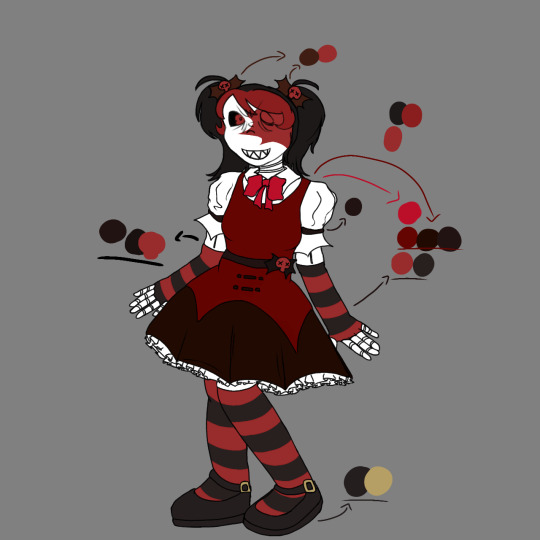
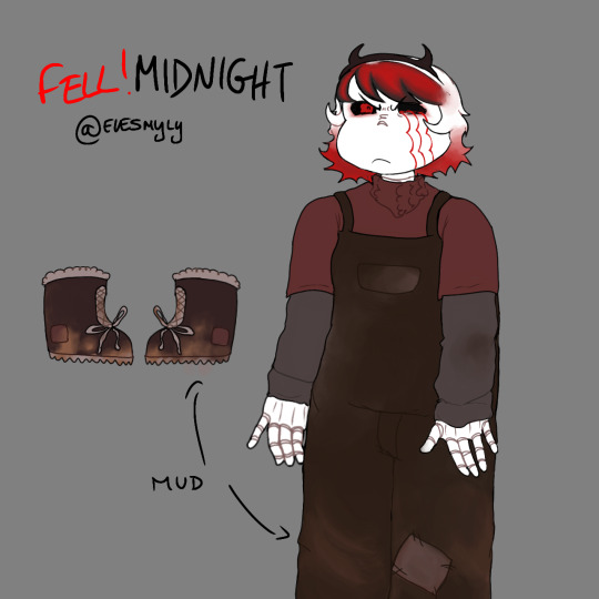
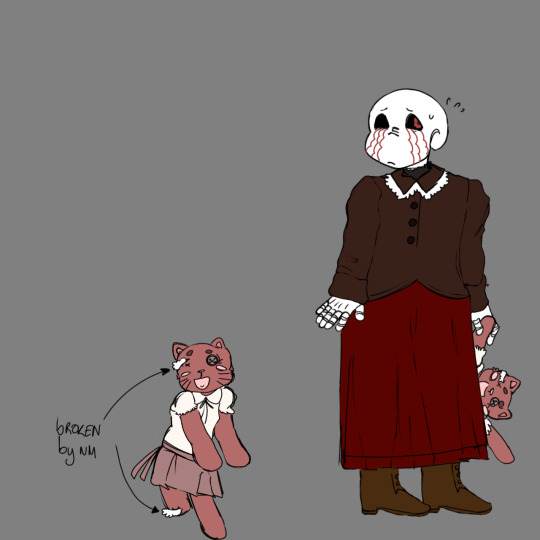
Mercilles, Midnight and Moonlight belong to me
Mad sanses + inspiration @milkybnnuy
Variants + more info:
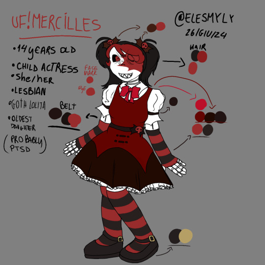
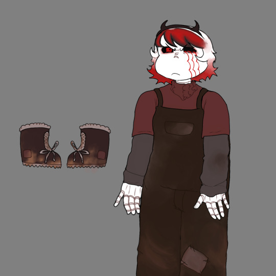
- both Midnight and Moonlight are 11 years old
- Mercilles is lesbian and she's dating Viorel (like in the normal au)
- Mercilles is still obsessed and has attachment to her dolls
- Midnight somehow always has her clothes dirty because she's always outside and stuff, meanwhile Moonlight doesnt and is always inside of the castel or doing whatever Midnight tells him to play. Moonlight would do anything Just to play with her because nobody else's does
- Moonlight has adhd and he's really sensible.
- Mercilles is very mentally ill because of the stress of behing a child actress and the neglect and abuse she gets from her dads.
- Nightmare is a bit bipolar, by the meaning that he often changes behavior with his children just to get something out of it or just don't make them realize the abuse they are getting.
- Mercilles loves punk and nu Metal music, like Mindless self indulgence and koRn (her favorites).
- Mercilles is an actress mostly in Horror Movies, because directors love her "Crazy" behavior and expressions she can get.
- Midnight has anger issues and they are very bad and visible due to the her neglect, so she hits Moonlight very often to realise her anger.
#uf elverse#elverse#i put different colors on the text depending on the character bcs its easier to read hehe#uf!Mercilles#underfell#moonlight sans#Midnight sans#uf! Moonlight sans#uf! Midnight#oc#undertale shipchild#killermare#killermare shipchild#mercilles sans#mad sanses#dreamfell#digital art#elesmyly art
15 notes
·
View notes
Text
uhh kenikari dev fun facts because why not
Under spoilers bc this thing is long with tons of images and text, but it doesn’t spoil any future game events dont worry
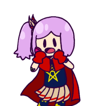
this was the first ever sprite I did for the game! I ended up discarding it bc it was more like a joke to see how the style would work and all. I hadn’t settled on a color for the tongue yet and I already had half of what would become the hair shading style
Originally I wanted to made the sprites more simplistic so to speak by adding next to no shading, because I wanted to draw them in far more different poses n stuff. In the end i realised that you would literally be looking at these for 90% of the game so they should probably be nicer and have actual shading
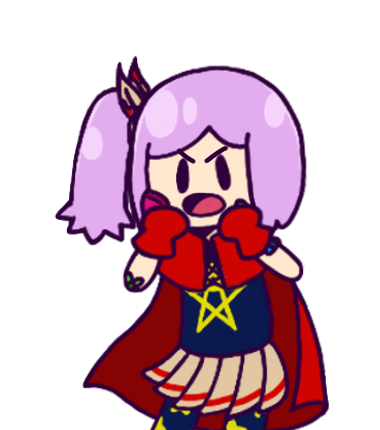
I made an alteration lol
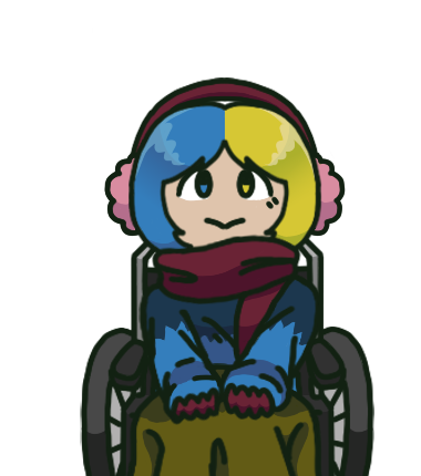
Here’s the first ever shaded sprite, with Chuyo. The shaded hair had settled in, though I would end up giving him a different symbol thingie. I still followed the rule of somewhat minimal shading, but as my style developed I put it more details in the sahding and cloth folds. A fun fact about him is that I made him and the sprite and I put a name to the sprite and then i put it in my pc folders
And then I couldn’t find this sprite but it was okay bc his wheelchair design had changed and my style had too so I redid him completely. and gave him a nose lol. and then when it was time to present him in the game i DEADASS FORGOT I GAVE HIM A NAME. SO I MADE ANOTHER ONE.
his og name was Misuke and that’s the name of this file lol
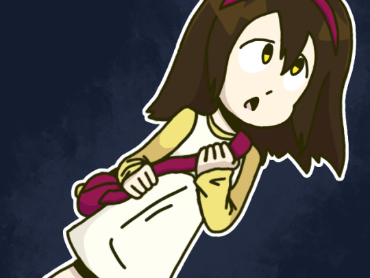
A forgotten sprite for Lare’s presentation that i didnt end up using bc it kinda looked like an ahegao. if we push that aside you can compare it to the sprites that do appear in the game and see how I altered them later down the line to give her slightly more complex and accurate shading to the game’s current style. I’d say the biggest difference is the whole collar thingie. Originally the dress and shirt were meant to end like. the same way. but then i dont know how i came up with it but i started making the dress more square-y and it differentiated itself more from the shirt, so i changed the sprites to reflect that specifically
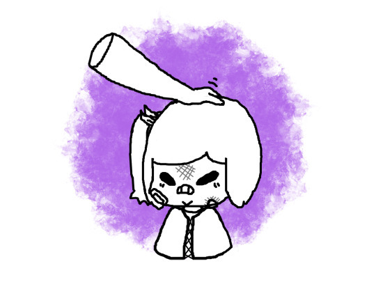
a lil drawing I made in 2019 with a laptop trackpad of Mako. I made another one before that and it was the first ever drawing of her, but I can’t find it so I can’t put it here
Originally Mako was meant to have more bruises and bandages but i ended up simplifying it so it could be easier to animate her and draw her from afar. She was the most complex design I’d made back then and I still kinda think she is, topped with other characters like Mero (he doesnt appear in the game its a sepparate mf)

the og Lare sprites that i made before i figured out how RPGmaker XP worked. she hasnt changed much, just removed the background and moved them around so that the walking cycle worked properly
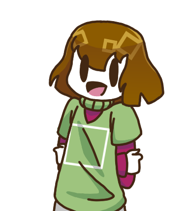
in one of the incredibly early builds of the game that I only showed to my parents to test, I made some quick sprites of myself to announce that the demo had come to an end. These were rushed as hell and have a lot of imperfections and color spills, and I only made like 4. They have been removed from the files bc i wouldn’t use them again
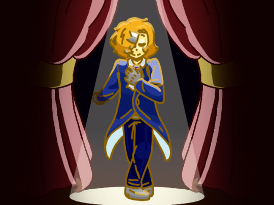
the ending screen actually started as a quick doodle in my notebook. I liked it so much that I took a picture of it and digitalised it, and then I decided to use it in the actual game. I would show the original drawing, since i do actually have it, but it’s spoilers. idk maybe ill show it when the part it spoils comes out
This actually got me thinking that it wouldnt be fair if only alex were the one to say goodbye, since he’s not even the damn protag, so I’ve started to form ideas of end screens with the rest of the cast. Maybe the full chapter will have a different end screen, maybe it won’t. It depends if I do actually feel like doing it mid development bc i got bored with other stuff
That’s all, goodbye! :3
9 notes
·
View notes
Text
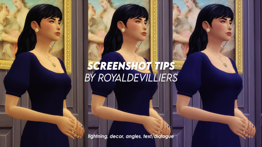
this is less a tutorial and more a semi in-depth explanation on my process while taking screenies. my do’s and don’ts about lightning, angles, text/dialogue, close-ups and other!
as a disclaimer, anyone is free to take their screenies however they want and this is just my personal preference and opinions ♡ everything is under the cut! i did say its LONG so dont say i didnt warn u 😳
i use the nobluv2 and noglo mods by luumia! i recommend them 100000%
1. lightning
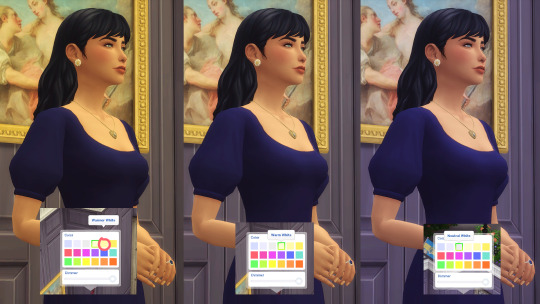
with its exceptions, this being i’m in a room with candles/chandelier/anything that doesnt naturally produce a white light OR ambiance reasons, my setting with screenies is with the ‘Neutral White’ color. this is for me, more visually appealing than just bathing your sim in yellow light.
EXAMPLES!!!!!!!!!!!!!!!!!!
warmer white:
poor lit:

good <3:
i usually test my lightning before i actually take any screenies so my sim is well-lit but also preventing overexposure bc of the lighting. an example of overexposure is when for example the lighting is SO strong, your sim looks like its ‘shining’
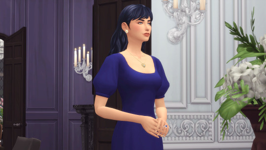
you can see it here on her chest highlights, her arm and her cheeks. i exaggerated it here so its more obvious. fixing overexposure is HARDER than upping the brightness in a poor-lit screenshot. overexposure and makin sims look like they are SHINING is a crime. JAIL
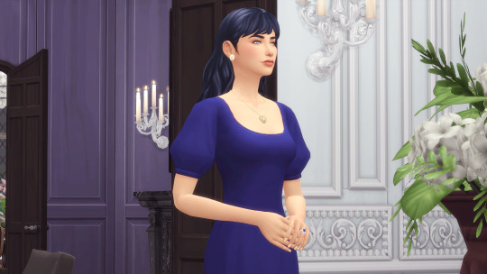
the best light ever tbh. just dont get... to carried away

1.2 outdoor lightning
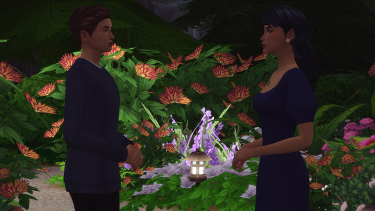
this is one a bit trickier depending on your location but USUALLY your screenies would look well dark. again, test lightning before actually shooting screenies! i generally look for a lamp posts that have good lightning and shrink them down so if im taking angled shots, it doesnt get in the way. change the color to neutral white and if its too much lightning, just lower the dimmer:
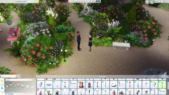
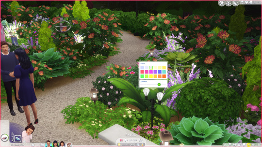
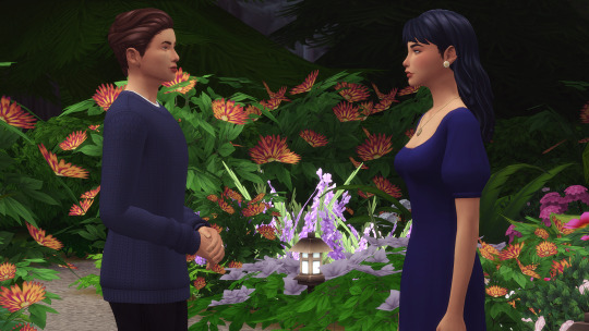
2. just no
just no to all this:
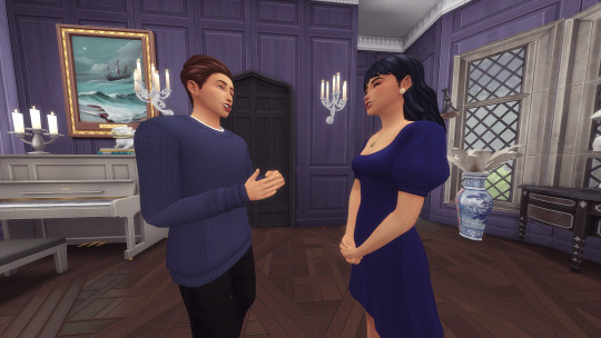
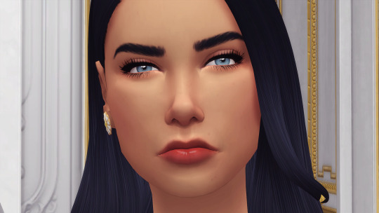
in general, you can ZOOM to the max, and with the scroll-wheel zoom out THREE TIMES. four times we on the edge but its still acceptable. five times and you are goin to JAIL!!!!!!!!!!!!!!
in general i also recommend having a semi-big room so you can move around without any problems. small rooms DO work but chances are while moving around you’re either going to go outside the room, run into a plant in the shot or into another decor item.
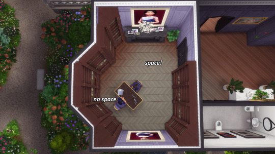
for example, this is a ‘small’ room. while taking photos i have run into the bookshelves for over the shoulder shots like 8000 times. still, doable, but why put myself thru the suffering>?????
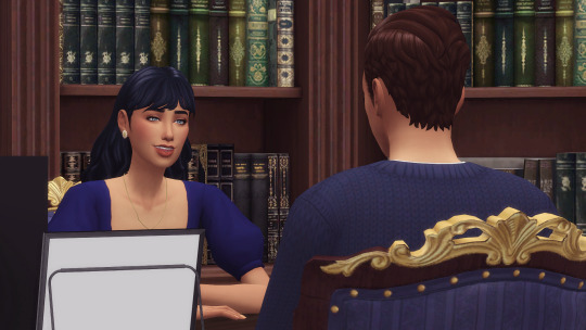
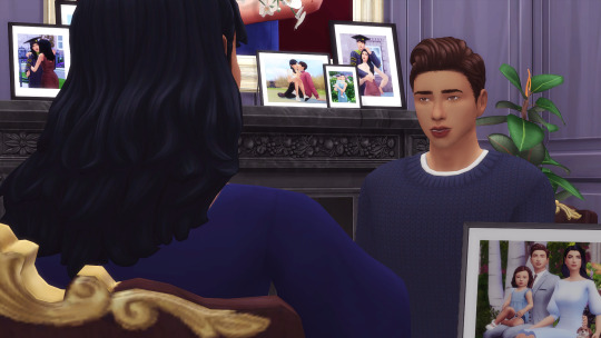
2.2 fill the room
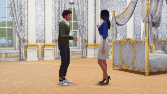
nothin sadder than, for example, doing a bedroom scene and there just being...a bed. the game comes with so much clutter and theres also a lot of clutter cc to make rooms seem more ‘lived in’. its also a lot more visually appealing than the room being empty.
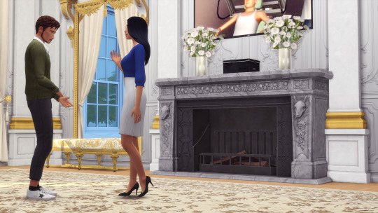
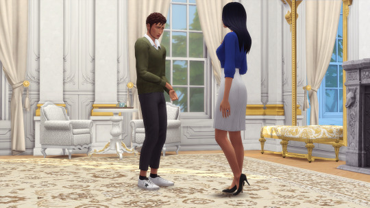
3. angles for screenies
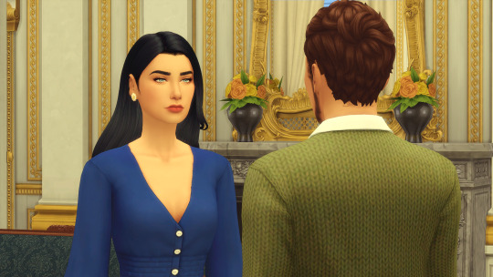
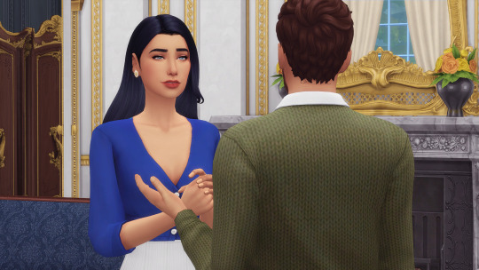
my controversial OPINION!!!! i dont care for FULL surroundings shots for more than for a singular panel. THERE I SAID IT!!! usually i show the surroundings/scene setting in ONE panel and then i move on to other angles. again, has exceptions. these being a banquet, party, ball, another sim joins the scene, montages, etc! ANYWHERE that has something happening with multiple people in general.
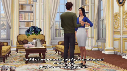
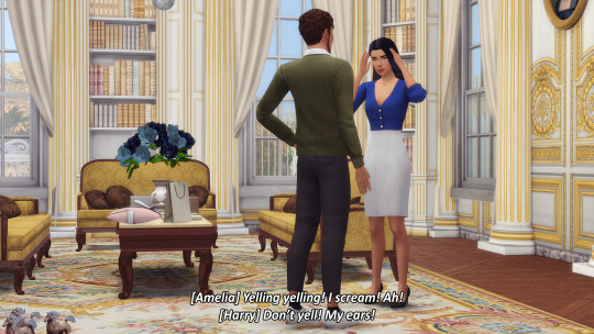
for example, i don’t see why repeat the same angle with different poses. i can do it for one panel, but for the next ones? there’s the option of over the shoulder shots, detail shots, them looking at each other shots, cinammon tography shots........... more than likely your reader already has an idea of where your characters are so showing it in every single panel is not necessary.
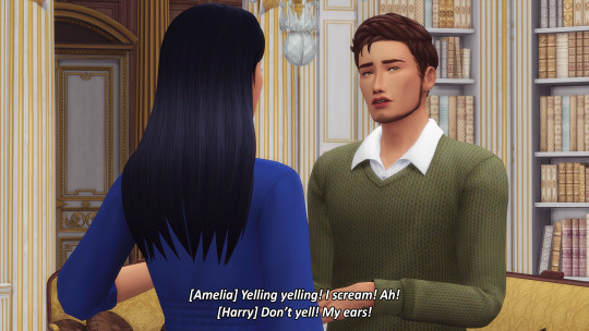
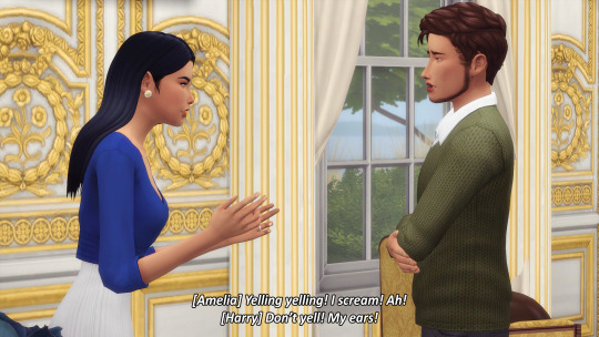
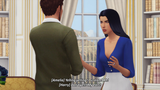
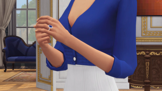
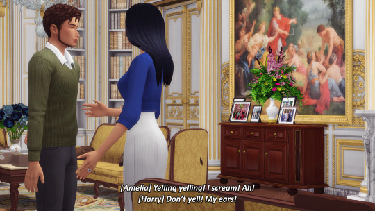
always try and leave a lil breathin room for the heads on top so it isnt all CRAMPED! but this all depends on the pose, if theres a height difference included in said poses and the angle you are taking the screenshot from!
same thing about not just doing...full on surrounding shots for when something is HAPPENING. say, someone is fainting, collapsing...ANYTHIN!! theres so many shot options than just repeating the same angle over and over again. DONT BE SHY!!!! DO VARIETY !!!
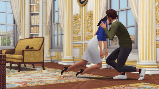
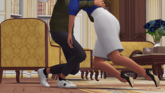

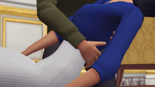

we in photography class now. BUT yes keep these in mind ALSO while taking photos so it isnt just the same angle, same distance just different pose. your sim has a nice outfit? showing it once is enough! every panel? ummmm......... your sim is crying? do a medium close up/medium shot and not a full body shot!
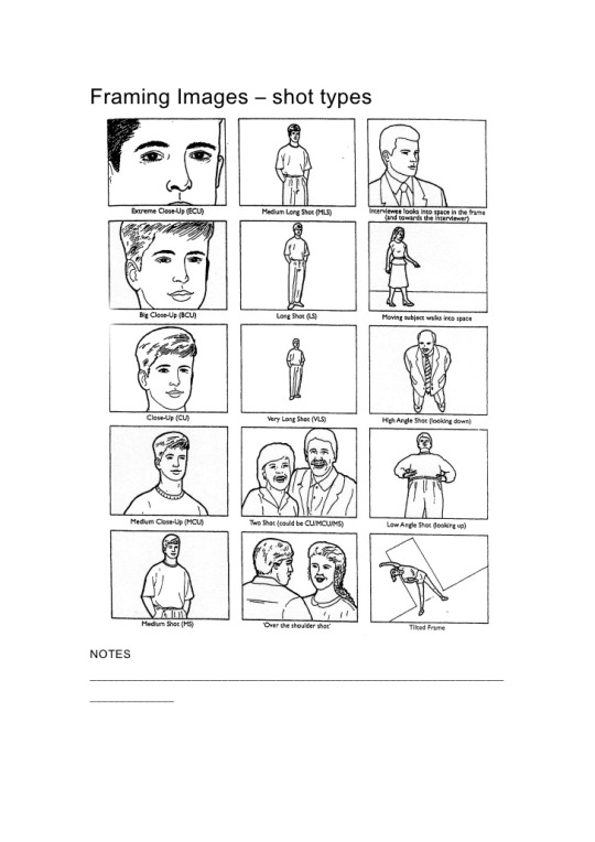
3.1 close ups
your close ups and ALL screenies in general, don’t have to be FRONTAL only. they can be right/left side, a lil angled...
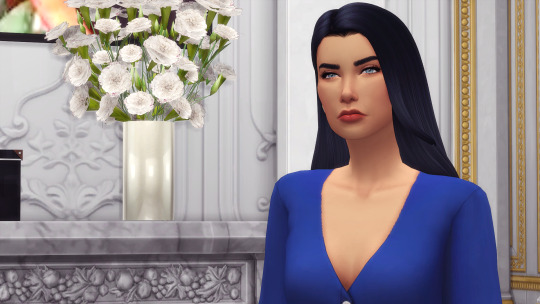
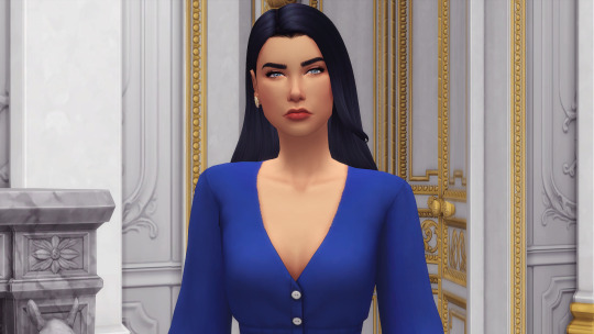
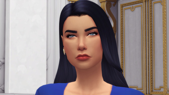
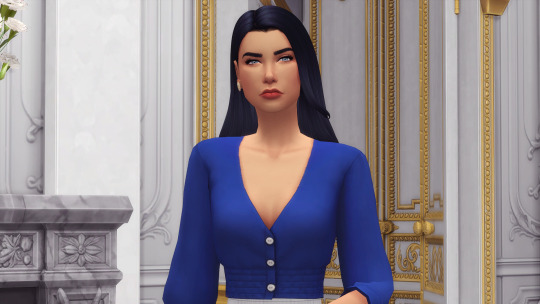
waist/chest level is a good level for a close-up sim wise since if you ZOOM in too much WELL

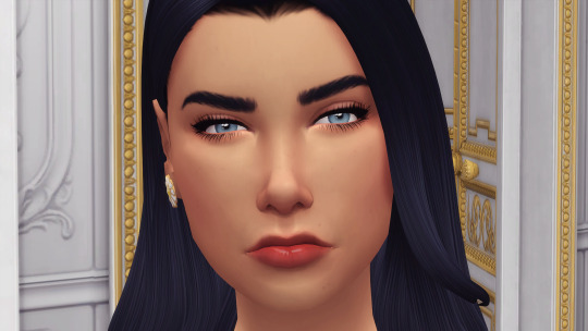
4. text/dialogue
i’d recommend any SANS-SERIF fonts. serif fonts are so hard to read even if nice looking. usually a font-size of over 40px+ works and you can add outside stroke and even drop shadow!
i personally use calibri (bold italic) for my screenies, but other subtitle fonts like arial, myriad pro, helvetica...really any sans-serif ones work.
my stroke settings:
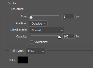
i also wouldn’t recommend putting 4000 word paragraphs in ONE screenie because it’s just visually exhausting. the MAXIMUM i’d do and thats if ABSOLUTELY necessary is FOUR!!!! lines of text. id keep it to three ONLY and thats if your text is the same size as mine. if bigger then two 😳
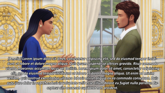

yes <3:
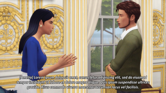
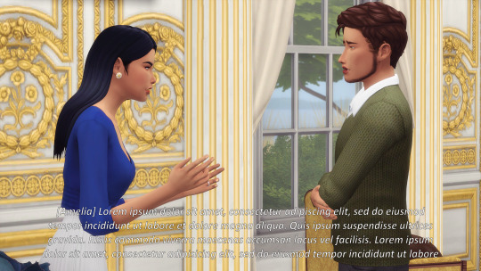
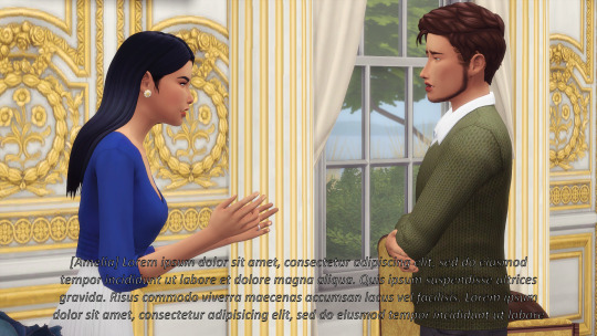
another no-no for readability is INSIDE stroke or adding bevel/emboss to the text. pick bright, contrasting colors to the background or even clothes your characters are wearing so it’s not hard to read.
something a lil extra i also recommend is if your dialogue has different sentences and one ends and another one starts in the same line, continue it on another line. DOES THIS MAKE SENSE ok lets see:

the “Yes, maybe I went on [...]” continues on the first line, but to make it a bit easier to read just press enter and move it to the second line so it’s on it’s own line.
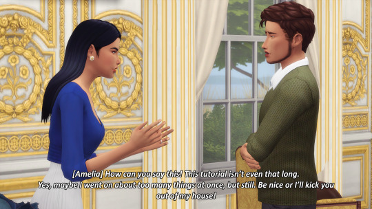
same thing for the "Be nice or [...]” line! it gets cut off to the third line anyways, so just put it in a singular line. final result:

for me, this is easier to read, less I GUESS ‘immersion breaking’ and easier on the eyes too.
and just other quick things to keep in mind:
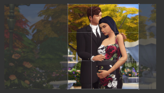
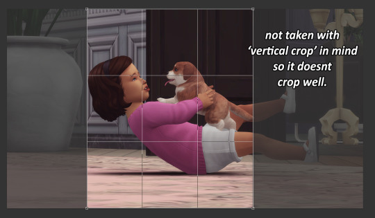
will the post be horizontal or vertical? if its vertical, you have to angle and move the camera around keeping in mind you’re going to crop it later. yes, the scenary might be nice if its horizontal, but a lil vertical photo is cute!
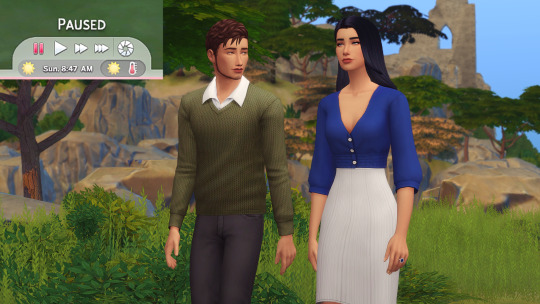
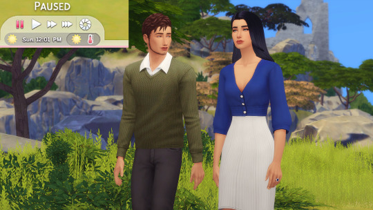
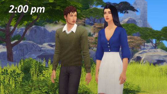
best times for OUTDOOR lightning photos are 2pm-4pm. morning light is a bit too dark, 12 pm is the slightest too bright, but 2pm-4pm is just ENOUGH!!!
and thats all : ) i THINK i talked about most things screenies wise??? if you have questions, my askbox is always open : ) and remember these are just my opinions : )
#howto#AGAIN?? yes i again i talked for 5000 words or something#NO IM EXAGGERATING just a lil tho#why this feel like im doing a presentation for uni sdkjfksdjfks
357 notes
·
View notes