#i might update her digital color palette at some point
Explore tagged Tumblr posts
Visit Tumblr Blog
Explore Tumblr blogs with no restrictions, modern design and the best experience.
Last Seen Tumblr Blogs


Fun Fact
Tumblr is used by 21% of adults online aged 18-29 years.
Text

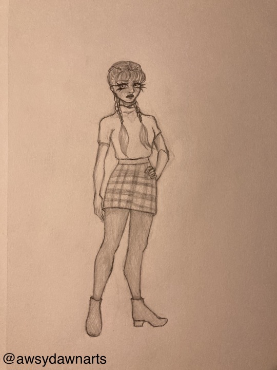
hi guys welcomr to the worst ref sheet on planet earth because its been several months and i dont have the motivation to finish the good one but i still want her to have one so here we are
sona ref but shitty
her name is iemon pronounced like lemon but with an eee sound instead of an L
colors arent exact but it doesnt matter much
#half the design elements were stolen off characters i like PLEASE ask me about those fhdjshhdhs#art tag#i might update her digital color palette at some point#idk its basically the same except her sweater is hex code fffa85#again doesnt matter much though#bracelets also dont matter i change them pretty much every time i draw them#i keep forgetting to make her skirt fluffy but the petticoat is there#her name is iemon and not berry cus iemon was my first real online nickname and it just kinda stuck with her#berry.post
3 notes
·
View notes
Text
Update: holy shit I actually had the time and motivation to draw today, it was difficult bcs I don’t really do it that much anymore but at least it got done lol
This au is really gettin me all creative n shit lol, this is more stuff for my magic school bus university au. I really love D.A. in this au, she wasn’t my favorite as a kid (I was a Phoebe fan) but I think she is now lol. She spends the majority of her freshman year biting off more than she can chew and desperately trying to not lose her shit (spoilers she’s not super successful). I’ve been thinking about it and I kind of want her to be going for a degree in aerospace engineering, which might not be a good idea since I know nothing about that myself but I feel like it makes sense for her. Obviously she’s a huge perfectionist and overachiever when it comes to her grades, but I can also see that seeping into other aspects of her life as she struggles to stay in control. If her makeup and outfits are always perfect, there’s no way someone will see through the facade and realize what a stressed-out disaster she is, right???
(Wrong)
I would describe her style as “pastel academia.” I want to kind of keep the kids in the color palettes that they had in the original show (I might actually color this one day, pretend her skirt is teal and purple lol), and the stuff I’ve done so far has posed a really fun challenge in incorporating those colors while not making them look stupid. D.A.’s the only one of the girls who I see as a skirt person, although that might just be my personal dislike of wearing skirts. I wanted to have her hairstyle echo the original but be it’s own thing, so she’s got the braids now (a good hairstyle to sleep in and not have to waste precious time redoing!) and of course she still has bangs. I’m hoping that at some point I’ll make this digital which will allow me to color it and also make a couple different outfit variations, but I guess we’ll see how it pans out. Hopefully I’ll have the inspiration to do more for this au bcs I really love it, but who knows.
3 notes
·
View notes
Text
Drawing the kraken-draws way!
this is a continuation of the ask from @colorfultrashcan. i wasn’t sure what type of advice i wanted to focus on, so this list that goes over a few major things. a quick disclaimer, being both self-trained and a hobbyist this may not be the most qualified advice in the world. it’s certainly not as much a “how to be a great artist” guide as much as it is a “how i like to do art” guide.
General advice and setup
💡 to reiterate the info on my FAQ page, i use medibang and a wacom tablet to draw.
💡 i like to listen to music or streams while i draw to help me focus. songs really influence my art, as you may have guessed!
💡 if i’m doing anything more complex than a simple doodle i like to use layers. it is much easier to make small adjustments to an image when you have everything organized.
💡 also for digital artists - save your wips early and often! there’s nothing more demotivating than losing quality art to a crash or a computer update that took you by surprise!
💡 USE REFERENCES! this is a pitfall i fell into in my youth and am still paying for it now. the attitude that “using a reference is cheating” was extremely common among amateurs in the mid-2000s. it is not true!!! draw from real life, draw from 3d models, photos, and other drawings! trace over photos to learn shapes! if it helps you learn, you should do it!!!
💡 if you’re feeling uninspired and unmotivated, don’t be afraid to take a break and go out and appreciate art. you might find inspiration and influence anywhere!
Sketching and lineart
✏️ i’ll be honest, i don’t use a lot of different brushes these days. for the last few months i’ve pretty much only been using the one below, plus some of the ones you can download in medibang, like the edge pen and the airbrush. before i liked using the G Pen 2 when i did use a brush with pen pressure. i might return to that one with time, but i like how my lines look now.

✏️ i like to do a short warmup before i get right into drawing. sometimes it might be a small picture, but more often i’ll just do a few shapes and squiggles to make sure the tablet is calibrated correctly.

✏️ some people like to do a sketch layer and then do their lineart on a new layer. i feel that my lines suffer when i do this, so usually i just do lineart in one pass and clean it up as i go. if i do draw guidelines on a separate layer they’re usually pretty rough. i’m not sure how much i’d really recommend this to other people, but it’s how i personally do it.
✏️ while drawing i put a big emphasis on bold and clear shapes! you could probably break a good number of my pieces down into circles, squares, and triangles.
✏️ when doing outlines, i try to reduce the number of strokes to get a cleaner, smoother line. it helps to zoom out for this process. don’t be afraid to undo and go back and draw the line again and again until you get what you want. (i use ctrl+z a lot...)
✏️ if you’re a digital artist i recommend using the line stabilizer option if it’s available to you. i have some unsteady hands so it definitely helps me draw smoother lines. there is such a thing as too much of a good thing though! if you set your line stabilizer too high and you try to draw sharp angles, for instance, you may find your corners getting rounded out, which you might not find desirable for certain situations.

Coloring and shading
🎨 i keep a palette of colors i like and use often. i find myself using the palette more and more as i’ve been trying to commit myself to coloring my images more often - they can often be a good jumping off point when i feel stuck on picking colors for a piece.
🎨 i’m a big fan of limited palettes so you’ll often find me using as few as 2 or 3 colors for a piece. i strive to have a good contrast when i pick colors too, so areas are easy to tell apart. i have trouble putting this into words, but there are plenty of guides out there on color theory that could cover the topic well.
🎨 don’t be afraid to play with your hue, brightness, and saturation as you color and shade. for example: when i did the aika village piece, i almost shaded aika and her dolly in purple, as it looks good with most colors used in the piece - but by adjusting the hue of the shading layer, i found that a cooler color like blue gave the piece a less welcoming cast - more fitting for the atmosphere i wanted to project!

Character design
👦 vary face shapes and body types, and more importantly, don’t be afraid to draw characters that aren’t pretty! some of my favorite characters to draw, past and present, wouldn’t be considered attractive by western beauty standards. 👦 not to reiterate my points from the color section too much, but use contrasting color areas to help give a character an easily readable silhouette.
anywho, that’s about all i can think of right now. hope this guide was helpful! feel free to reply or ask if you have any questions on what i’ve written.
6 notes
·
View notes
Text
Thinking Through Photography with Maria Antelman
Carlin Brown interviews Maria Antelman on the occasion of her solo exhibition My Touch, Your Command, Your Touch, My Command.

Maria Antelman makes videos, photographs, sound installations, and sculptures using both new and traditional technologies. Conceptually, her art practice points to our interaction with machines and the complicated systems they weave around us. Her themes come from disparate sources like space exploration, crash test facilities, artificial intelligence experiences, and utopian possibilities. Recent shows include On the Exactitude of Rain at Ryan Lee Gallery (NY), A Nonexistent Event at Melanie Flood Projects (Portland, OR), Notes from the Field at the University of Melbourne, Soft Machines at Impakt Festival (Utrecht), Private Matters at Apexart (NY), Stigmergy at 247365 (Brooklyn), The Amateurs at the Agency (London), …But the Clouds… at Room East (NY), and Capsule Spaces at the Eugenides Foundation (Athens). Antelman received her MFA from Columbia University.
—-
CB: There are a few repeating motifs in your work; a hand collaged over footage, explicit references to science and science-fiction, and of course the machine. The title of your exhibition at Melanie Flood Projects, My Touch, Your Command, Your Touch, My Command suggests back to some of that same imagery. I think of voice command systems, tactile technologies, and Artificial Intelligence — the difference between the “touch” (whether physical or psychological) of a human hand or that of a machine becomes blurred. Technology and the machine is an extension of us. This is something you’ve addressed before, like in the sound piece The World of Blocks (2015). Can you speak to that?
MA: We used to handle machines. Now we command technology with a sound, a voice, a touch, a gesture, a motion. There is a relationship of power and a feeling of control attached to how we use it, and it’s intelligent. With the machines, the master and slave component was clear. Digital technologies are kind of sneaky. We create tools and then these tools transform us. We become extensions of the technologies we use. Objects are turning into information technologies and are entering our personal territories. An example is prosthetics: your bionic hearing aid is smart, and thus accessible by a third party (hackable). There is a vulnerability inside its intelligence. Also, on a larger scale, we become dependent to smart technologies serving us. We are losing the ability of doing certain things by our selves. There is always the underlying question: who is in control?
CB: There are also intimate and sexual connotations behind the title. What is the correlation between human intimacy and our computers? If machines are not an extension of us, how might you otherwise describe human-technology relationships?
MA: “We are gathered around the altar of high technology, transforming our loneliness into some kind of community”, a quote from a forgotten source.
CB: You grew up in Greece and studied history in Spain, but relocated to Silicon Valley during the dot-com boom, bust, and rebound of hi-tech. Starting from a place so rich in its own history and moving to a hub of fast-paced technology, your artistic practice seems to act as a bridge between these two worlds. How does the parallel of past and future exist in your work?
MA: Rich history can become a burden, while the hub of fast-paced technology can feel extremely empty. The poet says that thinking about the past connects us to our mortality and thinking about the future connects us to the idea of utopia. What conjures past and future is our imagination. My father was a political cartoonist, and I grew up looking at all these sophisticated comments on politics, economics, society. I loved how they were sad and intense but always made you laugh. Their effect lasted for a second, but that second was amazing. I really admire this quality: being comic and tragic at the same time. Maybe the past is tragedy and the future is a comedy, or vice versa.
CB: You’ve often made work that sits somewhere between video and still image by animating sequences to an audio track. The Repeater (2016) superposes slides of side-by-side photographs with the soft, echoing voiceover of a hired actor. How did you come to this process? Given that your new exhibition is a part of the series Thinking Through Photography, can you describe your relationship with photo as medium?

MA: “Death is a photograph, life is a movie”, wrote Susan Sontag. A photograph makes you wonder what happened, while a movie is an anticipating experience. The viewer is expecting to see what is going to happen next. So, I make movies with photographs, because I am interested in the contrasting feeling of these two reading responses. I started taking pictures very young and later as a cinephile, I felt great admiration for filmmakers. Years later, I came across a video editing program in a box with a user manual, and I started making videos using my photographs. I make these compositions, or rather juxtapositions of different elements (images, sounds, voices, texts, motion, etc), which question the sanity of our society.
CB: “If there is a copy of you, while you are still alive, then the real you ceases to exist at that moment. You can never know if you are the very same person, for fear of an unknown double running around somewhere else.” There is a really powerful message here — it makes me think about the way our virtual presences can succeed our “real lives” and in a way have a separate existence. Can you elaborate on this quote from The Repeater?
MA: This is part of a philosophical argument, also known as the duplication objection. It has been used in the film Total Recall with Schwarzenegger, a technophobic film from 1990. Arnold, the man-machine has had his memories duplicated in multiples. He ends up losing his sense of who he is. The best moment in the film is when Arnold watches a video recording of his original self talking to him, his physical duplicate. It is very nicely confusing. It makes me think of the way we are dealing with our multiple digital personas, which we curate and update constantly. These copies or representations inhabit multiple platforms and data banks. In the Repeater, the images transport us to a natural setting, on an island, with a bunch of amateur radio operators, far away from a dark machinist urbanscape. The radio operation is low key, a couple of stations set on the sand, surrounded by stray dogs, antennas facing the sea and a few careless tourists taking selfies. It feels harmless, and innocent, but the slight possibility of such duplication absurdity creates an intense feeling.
CB: In 2015 you showed in Portland for the first time with your exhibition A Non-Existent Event at Melanie Flood Projects. There are some clear aesthetic differences between the work you presented at that time to the work in MTYC, YTMC. How would you say your practice has shifted since your last exhibition?
MA: Then, I presented a photomontage series inspired by the J.G. Ballard’s novel The Drowned World. The novel takes place in a post-apocalyptic tropical London with high-saturated color descriptions. I loved the feel of the story, the characters and the landscapes. I had shot these black and white negatives inside a metal shop at a NASA center, there where satellites and rockets are built. Again, I was thinking about the interrelation of the mechanical with the digital world. My photographs were shot with a mechanical camera and were about mechanical tools, but I was using digital tools to manipulate them. The result was an amalgam of these two technologies, dipped into the color palette of the Ballards descriptions. Then, I played a sound piece about one of the first inspiring AI intelligent program created at MIT. Two voices were reenacting the human machine interaction, highlighting tensions of knowledge and nonknowledge. Now, that I think about it, I could have used the same title for that show as well.
CB: The work produced for A Non-Existent Event includes photographs you captured during your visit to NASA centers in Mountain View, California and Hampton, Virginia. Can you describe your experiences visiting the NASA centers and how else those visits informed your practice?
MA: I have visited three NASA centers, Ames, Langton and Glenn. All of them were initially Aeronautical Centers, and have wind tunnels built in the first stage of space exploration. Walking inside these humongous architectural monuments, was an incredible experience. The feeling was very archeo-futuristic. The most fascinating part was how they stood there, immense and empty, as proofs to ideas that don’t exist anymore. After the space exploration funding ended, all the space technology was applied to global networks and economies. Satellites now orbit earth, support the communications systems and mirror back to us all our posts, selfies, locations, data, etc. Digital culture technically flourished, using the technological infrastructure of the cold war. During those years people’s vision was directed outwards; now we are looking at each other. It is strange how the culture we are experiencing is a byproduct of another process.
#mariaantelman#melaniefloodprojects#Thinking Through Photography#precipice fund#calligram foundation#carlinbrown#carlinb
1 note
·
View note
Text
Phases of Web Design
When planning a site, there is a certain methodological process you need to take to ensure that you have developed a web site efficiently, appropriately, and technically….especially with the needs of the client in mind. What follows is a particular process for website development that I strongly urge all of you to follow or modify for your own developmental/work flow purposes.
The Discovery Phase
At this point have you have been assigned criteria for a website, be it a school project or a client. In order to fully understand the needs of the client, you have to address the problems that their current website is experiencing, which essentially demands the redesign from you. You need to do a SWOT analysis: Strengths, Weaknesses, Opportunities, and Threats for the website. What are the opportunities for your client? What can they do differently that they weren’t doing before in order to succeed? You need to ask these questions, and you need to understand the impact they may have on your solution. How do you do this? RESEARCH. Research your client. Their site. Their competitors. Their industry. See how everything related to them lives on the internet. Understand how that works and do a SWOT analysis of it all, and then apply that to your client. The research phase can be as long as you prefer, obviously the longer it takes you the more information you have compiled. Understand that, unlike what is sometimes found in print design, web design cannot be designed based on your assumptions of what is best for the client. You need facts, figures — measurable data, user testing, testing scenarios, and more — to make your website successful. This is not an overnight process, and any great website takes a long time to make sure every nook and cranny is spoken for. RESEARCH.
Web site goals will need to be set. As you ans your client site down to plan a site, you should ask questions similar to the following:
• What service will the site provide to the user? • What will the site achieve for the business? • Will the site concentrate on selling or promoting a product, or will it be educating, informing, provoking, or communicating a message to the user? • Could the site also be a hub for users to interact with each other? • What will be the main emphasis? • After conducting research, do you consider the site to be viable? • How will the site be an extension of the company? • In what way will this website promote the business?
In order to compile all of this information, you may have to go through an interview process as well as conversing with the client in order to finalize the goals of the website. To find out what the needs of the end users are, you may need to conduct one or more of the following:
• Interviews • Focus Groups • Surveys • Online and Offline correspondence with various stakeholders
Collecting information about users can be daunting. There are, however, techniques you can use to acquire this information. Some of these are as follows:
• During an interview process, you should give your undivided attention to the target user. • Do not allow phones, loud noise, or other forms of commotion distract you or the person you are interviewing. *Panera Bread is a great place to meet clients, but as delicious as it may be, it’s entirely TOO distracting, FYI.* • Always start with easy questions first. These kinds of questions could revolve around things like individual interests, age, children in family, level of education, computer skills, income range, physical constraints, if any, the types of computers owned, the web browsers used, software used, network speed, and monitor size. • Next, begin to delve into open-ended questions that deal with the user’s thoughts or opinions about the current site [if redesigning the site], what he or she would like to see on the site, what would make him or her visit the site, and why. this is an opportunity to have an in-depth conversation about what the end user is looking for and how you might make the site be the best it can be.
The Exploration Phase
The second phase is the Exploration Phase. During this phase, you will begin to create prototypes by first sketching roughs of the layout and site map, as well as any other special features of the site. In this phase, it is imperative that you spend quality time thinking about the organization of the site in addition to how the pages will flow from one section to the next. Consider the user experience, how your client’s audience will be viewing this webpage. Generally, you can create at least three unique prototypes and present them to the client for project continuation.
The Refinement Phase
The third phase is the Refinement Phase. Once you have decided on a final solution, you must begin the process of polishing your design. In this phase, you will refine the navigation and layout, as well as the flow of the pages within the site. Once this phase is finalized, you will have a detailed prototype to present to the client. This prototype will encompass a clear picture of the site’s theme, navigation, typeface, body text, precise size, and appearance of images, navigation structure, and color palettes.
Please not that when presenting a prototype with so much detail, you will only design key pages such as the home page, second-level pages, and any other pages that need to have special attributes of technology associated with them, such as a shopping cart. these key pages will provide you with a template to work from.
The Production Phase
Production is the fourth phase of designing a website. During the refinement phase, we were dealing strictly with non-interactive, flat designs that merely give the impression of a working page. Now, it is time to transfer the design to the digital format. Here, you will finalize the overall design as well as begin the process of making your site interactive. In this phase you will quickly illustrate to the client how drop-down menus, forms, navigation, rollovers, links, and other interactive tools will appear on the final site. You may create this prototype or wireframe using Dreamweaver and/or Flash. Additionally, you will ensure that all content is finalized and images compiled. Templates will be created for the back pages and any other technical specifics, special programming, scripting languages, databases, and HTML versions.
The Implementation Phase
At the implementation phase, the website goes ‘live’ on the internet. During this phase, it is advisable that you test the site with users to correct any navigational glitches and interactive flaws. When the phase comes to its conclusion, the client will receive the HTML web pages and any software and data information that needs to be attached with it, along with images. Between the time the site goes live and the end of this phase, all documents on the site need to be checked to ensure that they are up to date.
The Launch Phase
The sixth step is the Launch Phase. This phase allows users on the internet to gain full access to the site. In this phase, you may still make minor corrections such as misspelled words, broken links, and images. However, no major changes such as changes in navigation and structure should occur.
The Maintenance Phase
The final phase is the maintenance phase. This phase is the most overlooked by a designer and a company. However, it is as important to the site as the previous phases. Besides uploading new content and updates and answering customer concerns via e-mail, you will need to consider the following issues:
• changing code and fixing bugs • collecting usability and satisfaction metrics • verifying that all links point to valid pages • checking that there are no spelling or grammatical errors • ensuring that pages in the website follow the design guidelines • periodically backing up the entire website [to a safe, distant computer] • updating the frequently-asked-questions pages • checking that your team is writing for search engines • maintaing sever logs taht show where people come from, what search terms they use, and what they’re doing on the site.
See: <a href="http://www.google.com/analytics/">Google Analytics</a>
Think of each of these phases as building blocks for your site. Each block is important to the structure of the site. When a phase or step is skipped, you run the chance of having your site collapse and fail. It is, therefore, important that you spend time working on each phase.
Navigation
Information architecture involves the design of organization and navigation systems to help people find and manage information more successfully. Websites need to be easy to surf. How long do you find yourself searching a new website before you give up and lose interest, and go to another page? The average web user’s attention span is very very short, some say as short as 10 — even 5 seconds long. You need to make your sites as easy as possible to navigate if you want people to visit repeatedly and stay longer.
An appropriate labeling system and a detailed site map are the two most important elements that define the information architecture of a website or application.
Information Categories
Information within a site can be categorized in a variety of ways. They can be categorized in context of the:
• user • topic or department • task or function • department • product
Organize By User
Information in this context is categorized based on the various types of users who may visit the site. If your client deals with x-ray scanning and imaging, and caters to a specific audience, say, people from years 40 to 60, then you can design with your target audience in mind and adjust the navigation according to their priorities.
Organize By Topic or Department
Information in this context is categorized by topic of interest. This allows a user to quickly find a specific topic or retrieve relevant information. When looking at sites as webmd.com or imdb.com, one will notice specific topics. instead of a user sorting through unwanted information, he or she may click directly on a particular subject title. This will save the user from having to go through uninteresting or irrelevant content. Not only has webmd.com supplied lists, it also has an interactive feature that allows a user to click a body part or section to learn more about a specific location. This not only saves time for the user, but also provides specific and relevant information on the topic at hand.
Organize By Task or Function
This type of categorization requires the user to have previous knowledge of the site as well as prior activity with the site. For example, a bank site, student loan site, or even a site such as the Pennsylvania Department of Driver Services [or whatever it's called] requires a user to input information as well as keep a password and login name.
Site Maps
A site map is an integral piece of any website. a site maps is created during hte exploration phase. A site map provides a blueprint to a site. Often depicted as a flow chart, this visual representation provides a diagram of the variousl levels of information on a site. In addition, the site map also informs the web user how to access a specific page and/or locate key information. One key thing to remember about any site map is that it has the ability to expand and grow with time.
Navigational Tools
Browsers such as Firefox, Safari, and Expolorer provide the basic navigation needed for surfing the Web. As a designer, it is imperative that you provide other supporting navigation on your site so that users may navigate effectively through the site. Some designers choose to hide basic browser controls. For example, on online shopping sites, designers may decide that the navigation buttons within the site do a better job of taking you through the entire billing process. Browsers only provide the user with general control of a site. They do not interact with functions of a site. It is, therefore, imperative for such sites that you develop a solid navigational structure for the purpose of transactions.
Navigational Models
When surfing the web, you may notice that there are various navigation models and/or schemes. The navigation model that a particular website uses depends on its purpose and the processes and functions that site fulfills. Therefore, as you begin to think about the design of your site, navigation should be one of the main concerns. The reason for this is that the navigation structure, depending on how it is designed, could either ruin a site or make it successful. KISS!!!
Your goal should be to allow the user easy navigation and quick arrival at his or her destination within the site. As the target audience member interacts with a site, it is important that he or she be able to answer the following questions:
• Where am I? (present) • Where can I go? (future) • How do I get there?? (future) • How do I get back? (past)
Navigation Types
There are several types of navigation to use while creating your site. It is up to you to make the final decisions on what pattern or navigation type to use. However, you will have your target audience to consider as well as the goals that need to be accomplished. The navigation structure on websites is often hybrid, or combined with other navigational models in order to better provide content access for the end user.
End users have a set goal in mind when visiting a site. This may be to accomplish a specific task [such as looking up a business location] or fulfill a general task [such as shopping] or to just peruse a site for entertainment or because it was recommended. Once a user is on a site, he or she may deviate from the initial goal and navigate to another subject that attracts his or her interest. Two things that drive users to action, as observed by researched, are intention and impulse. These may also be described as goal and trigger, or need and desire.
Hierarchical Navigation
This navigation type provide condensed navigation for numerous information groups. For example, if you look at Yahoo.com, you will notice how a directory below the main navigation panel is provided for the user to navigate. Also on reviewing categories, a user will notice that in addition to primary links, secondary links are present as well. Although H-Nav organization is an effective way to organize content, it takes a lot of research as well as communication with the end user to finalize the category titles and to thusly ensure clarity and prevent confusion.
Task-Based Navigation
Task-Based Navigation asks the user to start a process or fill out information based off of provided links. Oftentimes, tasks hinge on other tasks. In order to fully understand the information the site provides, you must interact with it. Monster.com is a good example. The FAFSA site is also a good example.
Alphabetical Organization
This type of organization seems to be the obvious choice for many sites, as users may instinctively navigate through the website using the location of the topic in the alphabet as their guide. However, if the content has long lists, this may cause the users’ experiences to become unpleasant, as they may have to deal with cumbersome page lengths. This type of layout or navigation is normally found in database-driven sites.
Chronological Order
Chronological Order navigational types assist the visitor of a site in finding information based on the order of time. Enabling the user to view content through time not only educates a viewer on a particular timeline, but also allows the content to be easily updated.
Popularity-Based
This navigation type always has the items they are based on fluctuating and being updated. The place of an item or selection within the navigation is based on the popularity of the content it represents. Check Youtube.com or Digg.com for an example.
Category Pages
Category-based navigational types list content as well as products under recognizable labels or names. Clear titles are key, as they determine how users may navigate through the site. Having ambiguous choices can and may confuse users and result in them not revising the site.
SUMMARY
It is important to remember that any site you create must be easy to use and easy to access. You only have one chance to make a positive first impression. Once ou have frustrated or lost a visitor to your website through confusing navigation and layouts, he or she will more than likely not return, but rather visit competitor websites. So, always keep the end user in mind and carefully consider the structure and design and navigation elements on your site. The website design plan described and discussed in this unit will always help in making a first strong impression.
1 note
·
View note
Text
Hyperallergic: Diana Copperwhite: Signal to Noise
Diana Cooperwhite, “Depend on the morning sun” (2016), 150 x 150 cm (all images courtesy Gallery Thomas Jaeckel, NY)
Sometimes a single, simple pictorial device is all it takes to set your work apart from your contemporaries. At mid-career, the Dublin-based painter Diana Copperwhite has hit upon a crazily recognizable way of applying paint that both updates (somewhat tongue-in-cheekily) the concept of the “autographic mark” so prized by the analysts of Abstract Expressionism, and simultaneously taps into a leitmotif of contemporary, computer-inflected visuality, the color gradient.
The new Diana Copperwhite monograph with an essay by Gail Levin and the painting “Confucious confused” (2016) on the cover.
She hasn’t totally figured out yet what to do with it, but her command of painting’s essentials is sure and her determination to work through the ramifications of this particular device amply evident, so it seems like just a matter of time before she starts making truly magnificent work.
Six oil-on-canvas paintings dated 2016 constitute Depend on the Morning Sun, Copperwhite’s second solo show at 532 Gallery Thomas Jaeckel. They are broadly and energetically painted, using (apparently) an array of tools for scraping, wiping, splashing, and smearing— nothing unfamiliar there.
But Copperwhite also uses wide, flat brushes that were evidently loaded with a precise sequence of hues along the bristles’ tips, so that the resulting stroke is a multi-colored band. The constituent colors blend a bit where they meet but generally hold their places in the line-up whether the mark is short and choppy, drawn out into a meandering trail, or (most often) something in-between, taking a curve or two. It is a flashy move — it could become gimmicky if Copperwhite’s not careful — but for the moment, at least, the artist’s mark-making chutzpah is working in her paintings’ favor.
Diana Cooperwhite, “Weird glamour” (2016), 230 x 180 cm
These blended blurs tend to be the paintings’ focal points. A tricolor swatch in red, pale yellow and yellow-green pops up near the center of “Green light,” flapping like a flag in the wind. Nearby, crimson and blue striations (merging into purple and violet variations) punctuate the canvas, structuring the otherwise chaotic space. Just above the centerline, an incongruous semicircular curve, fat with phthalo blue, naphthol red, and a salmon-pink core, puts a brake on the action around it— ultimately, it is the composition’s primary figure, and the rest of the painting is ground.
It may be an abbreviated human figure, as well — a cranium, to be exact. At the center of the 90-by-70-inch “Weird glamour” and the smaller but compositionally similar “A pale thunder” are juicy strokes tracing the unmistakable contour of head to neck to shoulder to upper back (or upper arm). In “Weird glamour,” a window of deep space behind the head and a subtle but telling diagonal descending from the upper left are enough to place the figure in an architectural interior: an office, maybe, full of free-floating banners and awnings in orange, scarlet, magenta and teal.
Diana Copperwhite, “A pale thunder” (2016), 100 x 100 cm
My American eye detects the possibility that California painters such as David Park and Elmer Bischoff, who painted figures and their immediate surroundings with both precision and laden brushes, lurk at the back of Copperwhite’s mind. (For that matter, so might the British painters Leon Kossoff and Frank Auerbach.) But beyond the matter of Copperwhite’s touch is the strong sense that the personage in the picture is going it alone in a hostile (or anyway bewildering) environment, making his or her way through a signifying blizzard of signs (be they icon, index, or symbol). As such, they are second cousins to Francis Bacon’s forsaken souls.
Bacon often isolated his subjects at the center of oppressively stark settings in which details are scarce. Copperwhite goes in the opposite direction but arrives at the same place; though nearly engulfed by the sensations that accrue to their situation, her head-and-shoulder figural units are no less isolated than Bacon’s naked, abject loners.
Not much in painting is truly new, but some tropes, once adopted, can be amplified and recontextualized, their potential rediscovered by another artist’s creative imagination. I associate this banded-brushstroke technique with Howard Hodgkin, who has for many years made occasional use of a rougher sort of proto-gradient, loading his brushes with multiple colors and laying in blunt and/or sensuous strokes of thick, multicolored paint.
In my read of Hodgkin, whose eye-hand coordination was formed well before the digital era, the device accentuates the manual; the much younger Copperwhite (b. 1969) makes it look technological, potentially abrasive and slightly hallucinatory. Not as hallucinatory as Bernard Frize does, mind you — though Frize seems to me to be concerned primarily with painterly procedure for its own sake. I’ve no doubt there are others working with this method. (There must be someone in L.A.)
“Predilection for fiction” contains no overt figurative hook. There are few indicators of architecture but for a pretty arch — two strokes of the brush — peeking out from behind the painting’s main event, a central, horizontal rectangle streaked vertically with some of the punchiest chroma in the show. Here as elsewhere, it appears that Copperwhite used a blending brush to further soften the transitions between the bars of color. The painting’s interior framing of this cloistered, intensified core echoes another of Hodgkins’ pictorial inclinations. It is a take on the painting-within-a-painting idea, or (if you shift the scale to landscape) maybe a drive-in-movie-screen-within-a-painting.
Diana Copperwhite, “Predilection for fiction”(2016), 170 x 230
At about five feet square, “Depend on the morning sun” is among the smaller paintings in the show, but it contains one of the broadest gradients — two horizontal-ish swipes of a brush outfitted with crimson, titanate yellow, Prussian blue and orange-pink, about a foot wide — slapped onto the upper right corner like a warning sign. Secondary, vertical banding on this patch looks like a blurred reflection such as you might see on the side of a passing train, and thus creates the illusion of rapid movement (which, interestingly, most of these blended passages don’t). Copperwhite uses whites, light grays and pale tints (especially pinks and violets) extensively, but here her snowy palette becomes chalky, and the artificial light she seems to be pursuing dissipates.
When a painting or other artwork is titled after a song lyric, you’ve got to wonder what aspect of the music is reflected in the art. New Order’s “True Faith” contains the phrase “depend on the morning sun,” so we surmise that a wistful daybreak epiphany of self-worth and personal agency is somehow relevant to Copperwhite’s motivation for the eponymous painting. But actually, looking at the show I found myself thinking about the great Dublin band My Bloody Valentine.
Phenomenally loud, MBV’s guitar-driven avant-rock features drifting, haunted melodic lines that emerge from a deluge of electronic distortion, dissonance, and pure noise. There are correspondences in the way Copperwhite’s squalls of non-depictive paint frame and support her shimmering pools and polychrome slipstreams, which seem to border on description (acid rainbows? ribbon candy streamers?) but sidestep mimesis. The music’s layered construction, cavernous scale, and otherworldly glissando effects call out for a Copperwhite painting on the band’s next album cover.
Diana Copperwhite, “Green light” (2016), 175 x 235 cm
The presence of an elliptical narrative is clearly discernible, if not readily deciphered, in Copperwhite’s paintings of just a few years ago. While the artist has eliminated (or temporarily set aside, as time will tell) all but traces of narrative from her working method in larger canvases, she continues to paint heads, roughly life-sized (though this show includes none). The attitude and disposition of these heads is so specific that they function as portraits, even though facial features are usually absent, partially obscured, or eclipsed entirely by passages of brushy paint.
On the same scale as these heads is “Confucius confused,” a real gem. It’s a raspy, slithering, half-head-shaped arc — purple into red into pink into a yellow or two into charcoal gray — against a tar-black ground. As usual, the palest hue (in this case, the pink) is the centermost stripe, so the whole stroke seems to radiate light, to glow. It’s both a curiosity in this show of ambitiously-scaled paintings, and its most succinct embodiment of Copperwhite’s paradoxically impersonal “signature” move. If only it were seven or eight feet wide!
So is Copperwhite’s work Ab Ex redux? No, but not because it isn’t truly abstract — why, de Kooning himself almost never quit the figure entirely. If a key strategy of historical Abstract Expressionism was to trim the lag time between impulse and response — the belief being that doing so would allow form to emerge from the subconscious, unmediated by culture, the “literary,” or the artist’s internal editors — then Copperwhite’s calculatedly eye-grabbing tricks with the brush are in quite the opposite spirit. (And anyway, you can’t go home again.) Rather, Copperwhite approaches “action painting” as an inherited language, to which she contributes some striking dialect of her own.
Diana Copperwhite: Depend on the Morning Sun continues at 532 Gallery Thomas Jaeckel (532 West 25th Street, Chelsea, Manhattan) through January 28.
The post Diana Copperwhite: Signal to Noise appeared first on Hyperallergic.
from Hyperallergic http://ift.tt/2inNnwO via IFTTT
0 notes