#i might change the font ...
Explore tagged Tumblr posts
Text

moon 0, page 3
>goldenpaw has gained the STRANGE trait.
PREVIOUS || NEXT FIRST
#boughmoon#boughlore#clangen#clan generator#clangen comic#warriors#warrior cats#warrior cats art#warrior cats ocs#clangen ocs#art#i might change the font#haven't found a sans serif one i like yet#serif my beloved why are you so inaccessible
130 notes
·
View notes
Text

Idk if I should say it in tags or in the post itself heheeshhg but the drawing is actually heavily inspired by @loadingbnha stainmight fic "Let's not make promises we can't keep"!!! Please go check it out it's amazing >:D
Ref undercut

I remember seeing this video and then seeing that people already turned it into a drawing trend lmaoo
#cj 24#art#meme redraw#i think i like boys#bnha#boku no hero academia#mha#my hero academia#toshinori yagi#all might#stainmight#(mentioned lmao)#also guys you can think of literally any ship while looking at that drawing hehehehh#chat do we like the colours#I picked them without any filters or layers heheh I'm so cool guys#it's my speciality to draw funny memes and use them as an opportunity to practice difficult stuff like perspective colours etc etc#also I had to download a tiktok font to change that username on the creenshot lol#I would add more funny stuff there but ehh I was lazy sry mb
328 notes
·
View notes
Text


No Context Killjoys (35/∞)
#killjoys syfy#killjoys#no context killjoys#:::...#i think this might be the last one of these...#changed my subtitle settings at some point in my rewatch hence the different font sizes
16 notes
·
View notes
Text
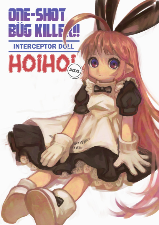
нoiнoiнoiнoi-san
#ichigeki sacchu!! hoihoi-san#digital art#clip studio paint#pacing around my enclosure#id in alt txt#hoihoi-san#oooooooooofffffff finally finished something personal woooooo#well it's fanart. but. yknow. passion project#lauuurve this textured brush that changes color ever so slightly it's so fiddly though i might get used to it in the future.#tried to write ichigeki sacchuu hoihoisan in jpn first but got frustrated after like 5 tries so i wrote it in eng#and then got frustrated again and typed it in (still fussed about the fonts for like half an hour. dw nothing is easy)#i referenced the manga art rly closely so the old scan (?) look is intentional#anyway can u believe the hoihoi manga is gonna be 20 in a month? wow#ichigeki sacchuu!! hoihoi san#ichigeki sacchu hoihoi san#one shot bug killer!! interceptor doll hoihoi-san
180 notes
·
View notes
Text

Producer 08 by Dedf1sh (©℗ 2013 goodlooking)

#splatoon 2#dedfish#dedf1sh#acht mizuta#octo expansion#art#graphic design#ltj bukem#goodlooking#The original “Producer” series actually lasted until the seventh rendition with Producer 07 by Big Bud!#Dedf1sh continuing the legacy of goodlooking records would be hilariously accurate. I might make a few songs for this cover#When designing this I also realised that the font and positioning of the Producer logo and the general designs of the covers#changed a BIT over the run of these albums#For example#The font for the artist text in Producer 01 (LTJ Bukem) looked kind of funky before they changed it to the expansiva-esque one#Producer 05 also does not list LTJ Bukem as a member of goodlooking records#it just says “rarities” which I carried over!#Producer 03 Producer 06 and producer 07 all have all the text and logos in the bottom left corner (probably because the subjects are#in different places) and the font for Big Bud's artist text on Producer 07 is this strange barely readable 2020's y2k esque font#cool stuff!!
48 notes
·
View notes
Text
guys i am so fucking high rn but i just had a thought as i doom scroll tumblr.
deadpool and wolverine, right? just two guys who got nasty freaks and they match so well. concerning well. like it should be illegal how well they match the freaks because it's for the greater good.
thats just andrew and neil.
in this essay i'll explain why neil is deadpool coded and andrew is wolverine coded and how they match each others freaks and how the honda odsyssey scene is--[*gun shots*]
#moonie.rambles#moonie.books#moonie.movies#all for the game#aftg#deadpool#I MIGHT BE JUST SHOOTING HERE#BUT GOOD LORD#IT'S SO THEM#CHANGE MY MIND#deadpool and wolverine#andrew minyard#neil josten#andreil#SAME GUYS DIFFERENT FONT#ill die on this hill
34 notes
·
View notes
Text
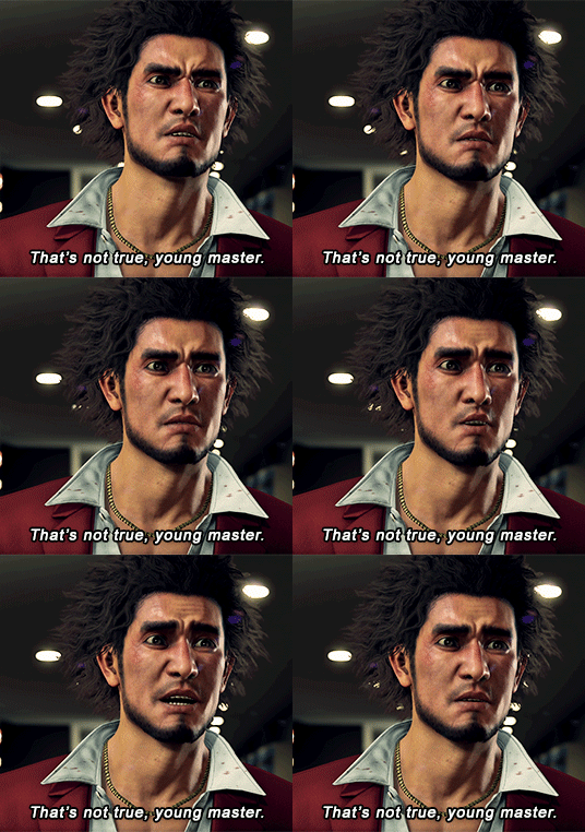

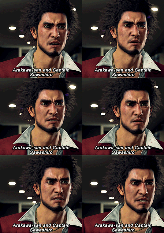
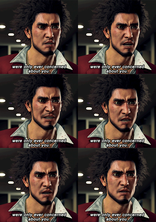
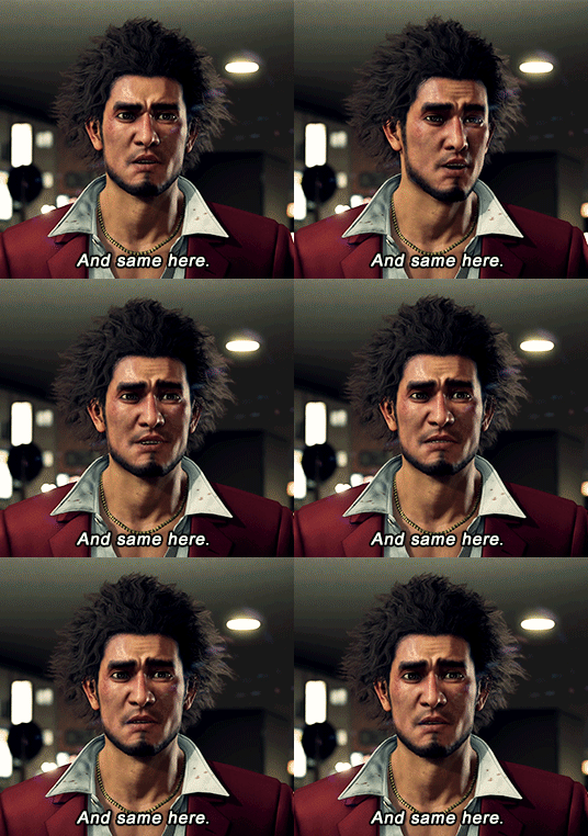

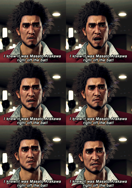

You say that no one appreciated you!? Bullshit! No one could stand to let you go! We never once abandoned you! It was all for you!
#like a dragon#yakuza like a dragon#kasuga ichiban#ichiban kasuga#gamingedit#yakuza#yakuzaedit#b does gifs#spoilers#yakuza spoilers#yakuza like a dragon spoilers#if you followed me last year you might remember i gif'ed this scene before.they were first gifs i ever made. & i always wanted to redo them#mr aoki ryo himself is sir not appearing in this gifset even though the whole set is talking about him whoops#i had to cut the one with him in it because the post was getting too long#gif#also some of these might be one frame longer than others. i thought they were 104 frames but i noticed the last few were 105??#ALSO if you noticed the font size changed please pretend you Did Not See It (because i didnt notice it until i already posted)
118 notes
·
View notes
Text
I CANT USE CSS ON ARTFIGHT...............
#I WAS REALLY HOPING TO FIX THE FUCKING. PARAGRAPH WIDTH. SIGH#idk why but it stretches across the ENTIRE page like. it takes up the full width of the browser and it BOTHERS ME. ON ALL THE PAGES#i could try manually putting shift breaks but im worried it might not look so good on mobile. ugghh... auyggghhh.....#im already learning CSS and API so i thought i could put it to good use but. AUGH#this whole time ive had to go into the inspect panel myself and change the padding so i dont have to read the length of the screen#like a fucking typewriter... i would have also loved to use custom fonts and animations......#i did find a guide for BBCode which the site uses on default and it covers basic styling but its not the same. sniffle#you CAN unlock CSS if you donate $25 to the page which seems fair. and if i could do it i would but. i do not have any way of#sending or receiving money online </3 i really need to figure out how to do that so i can set up comms like i said i would last summer#but it intimidates me.... and im already kept on a short leash when it comes to that so it feels like a lot of things could go wrong#i think toyhouse allows CSS or some sort of code...?? i remember seeing some oc pages with custom layouts#if thats the case i'll try fiddling with it but im not very familiar with using toyhouse so thatll take a while#(thanks again for the code sal ^_^ ill put it on my pin once its ready but im trying to learn my way around the site heh ;;)#at least i can use my pixel dividers.. ive been digging around for pixels to use and found some really cute ones#yapping
49 notes
·
View notes
Text
#taylor swift#tbh other than red i cant remember if she changed any of the fonts for the tvs 🤔#and i know folklore and evermore are more or less the same but im 67% sure evermore is slightly more italicised . i might be lying idk#polls#the tortured poets department#ttpd#midnights#folklore#evermore#lover#reputation#1989#speak now#fearless#red#taylor swift debut#fearless (taylor's version)#speak now (taylor’s version)#red (taylor’s version)#1989 (taylor's version)#fonts
39 notes
·
View notes
Text


#undertale#undertale comic#undertale ask blog#frisk#frisk dreemurr#chara#chara dreemurr#mk#monster kid#verdana#banjo#...yknow i never had to worry about accidentally spamming unrelated tags when tumblr only used the first five#but now i feel bad about putting my ut comic in the tag for a musical instrument bc i have an oc called banjo#i can't be assed to change his character tag though and it's only 1 post a week or so at most#for that matter it might be worse to spam the verdana tag? do typography nerds use tags for individual fonts??#i guess if so y'all are probably used to the utdr fandom's bs by now#anyway feel free to block me or whatever
10 notes
·
View notes
Text
Posting your fic will unlock 7 trillion typos that were previously unavailable to you no matter how many times you reread.
8 notes
·
View notes
Text

moon 0, page 5
>little things.
PREVIOUS || NEXT FIRST
#boughmoon#boughlore#clangen#clan generator#warrior cats#warriors#warrior cats art#clangen comic#art#i gave hollystar a little star because i like the star designs#oh and i did change the font! on the last page#i got a huge pack of fonts for $19 on itch........ huge for me#sorry i love to ramble in the tags#it wont stop but i do apologize#maybe one of these days i will show you all my awful thmbnails#i. hmm. struggled to make snowkit look as scraggly as i wanted#might need to do some actual studies of nestlings to figure out how to translate the encased feathers into my art style without having#to like add a ton of texture & shading & such or have it take 3 million years per page. im sure de-furring the kittens a little bit would#help make them look scragglier but thats not how it is for like. actual kittens. Hrrmmmm.#things to figure out after moon 0 i suppose.
90 notes
·
View notes
Text


#ts4#sims 4#the sims#welch legacy#raven welch#i might change the font so not everything is in caps since this font is caps only but i dunno#i like it and i don't#there's no apostrophes for that font unfortunately 😂
7 notes
·
View notes
Text


testing out a new hud i made on toonhud :)
#tf2#team fortress 2#screenshots#im thinking i might change the chat back font back to default because it can be a bit hard to read without the background
4 notes
·
View notes
Text
Sneak peak of the Possessed Man's bio:

The demons are from different time periods and backgrounds, so I don't know what other likes most of them would have in common (they can't enjoy food or drinks anymore).
I'm making a post explaining the thought process for his/their design. I'll post it once I finish designing the man's face and the demons' appearance.
"What's his name", you ask?
H i s n a m e d o e s n' t m a t t e r.
#my post#my oc#tumblr oc#character info#if you compare this bio with liliana's or saúl's bio; you'll notice the 100 demons are a different type of demon#i can't change fonts in the same sentence so for future posts i might write the possessed text like this or like giygas' dialogue#(i tried writing the words in separate paragraphs with the fonts in the text editor and it didn't look good)#i'm not using zalgo text or changing colours
5 notes
·
View notes
Text
.
#leon speaks#i had to remove this from the tags of the gifset bc otherwise it wouldn’t appear in the main tags#but i havent giffed in like 10 years dont kill me!!!!!#the font looked so nice in the first two gifs but then it severely let me down and it was too late to change it lmao#the gifset might have looked better without any words on it probably#it was still fun to make though!!! i missed making gifs#ill try to make more ✌️#probably without shitty fonts next time lmao#tbd
2 notes
·
View notes