#i love doing watercolor and ink on top
Explore tagged Tumblr posts
Visit Tumblr Blog
Explore Tumblr blogs with no restrictions, modern design and the best experience.
Last Seen Tumblr Blogs


Fun Fact
Tumblr posted its first advertisements in May 2012 and subsequently earned $13M in revenue.
Text
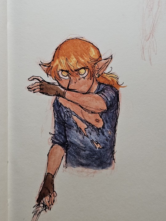
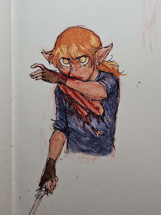
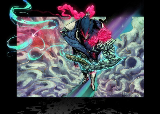
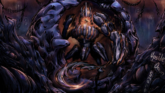
sometimes you just gotta cover your guy in blood, you know how it is
#dnd#dungeons and dragons#sketchbook#character art#illustration#watercolor#gnome#rogue#I went ahead and messaged these DIRECTLY to limerick's player who I knew would appreciate them the most#'limerick is dead. dying. Let me....um....ahem....Felix. I'm gonna...heal you' mmhm thought so 😏#UM ALSO this kinda process of sketching VERY roughly in red pencil-- inking directly on top of that-- and then painting without erasing#I only just did a few times last night and then this today but wow I love it haha#takes tremendous courage tbqh lmao but it feels good and I like the rough loose feel of the finished results#honestly the trick is to not over-detail and over-perfect on the pencil stage because then I end up something too nice to risk messing up#it's more fun to ink and paint! gotta figure out more ways to let myself do it#my OCs#felix#dungeons and doodles#emberstead
44 notes
·
View notes
Note
hey, how are you? i love your art! i am just learning how to use procreate, and i was wondering what brushes or canvas do you use to get the paper effect when you’re drawing? sorry, i hope you don’t mind me asking. thank you. ☺️
hehe well i’m gonna do a basic comprehensive tutorial on my drawing process and general guidelines i follow when doing art (hope you dont mind im using ur ask), i’ll start with my process first
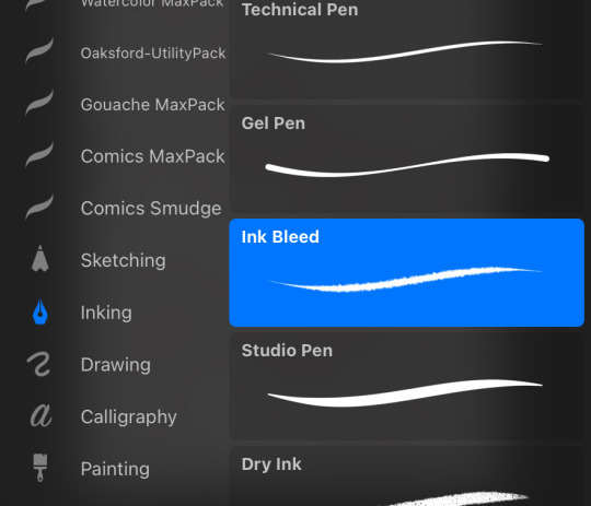
brushes i use:
lineart: “ink bleed” brush that comes preprogrammed in procreate
coloring/texture: maxpacks watercolor set (while in the pricy range, ive been using it for years and i think its a worthy investment, he also has sales occasionally)
for sketching: HB pencil that comes with procreate but you can use whatever
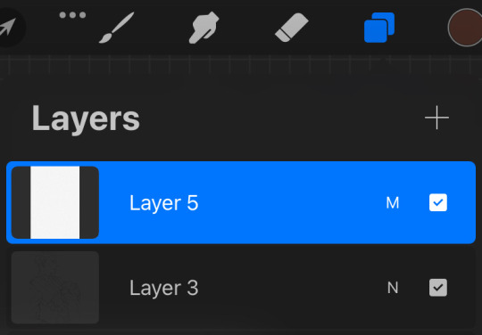
so my lineart, i typically duplicate my original layer, “color fill” the new layer with a dark red (or any dark color of ur choice), gaussian blur it @ 3% and set it to multiply and that just gives it some depth (for this piece i actually copied my dark red lineart and adjusted the opacity to make it a little darker so there’s 3 layers in total here)
now on to COLORING, i start off with a solid bright color (usually one that goes with the general palette you’d like to use, i wanted something warm so i went with a pink base)
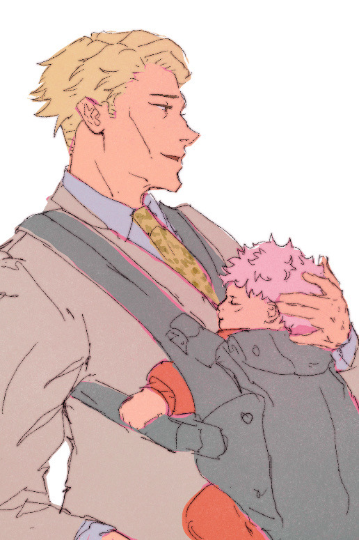
create a new layer and thats where the colors come in, i typically do a rough estimate of the colors i want to use at this point, cause they can be adjusted later in the “color balance” setting under “adjustments” once you have your coloring done (this is all on one layer)
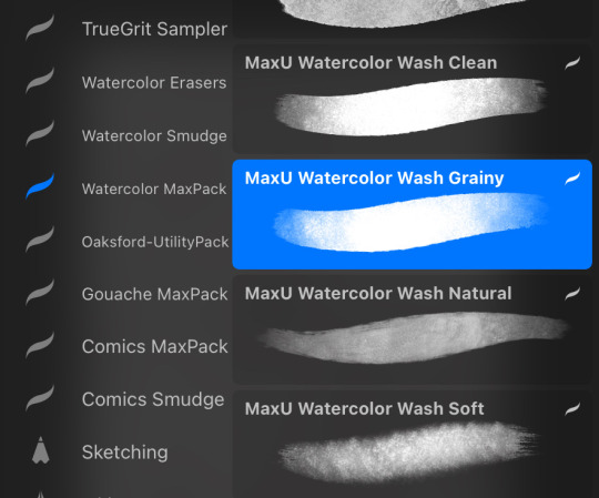
now my SECRET is i use the WASH GRAINY brush as an ERASER and lightly go over my color layer so the pink base comes through a little and unifies the colors and gives it that yummy texture. sometimes i erase the base color too for a little more texture but thats not necessary for every single drawing. once i erase enough, i go to “color balance” adjustment tool and mess with the hues till i get the result i want.
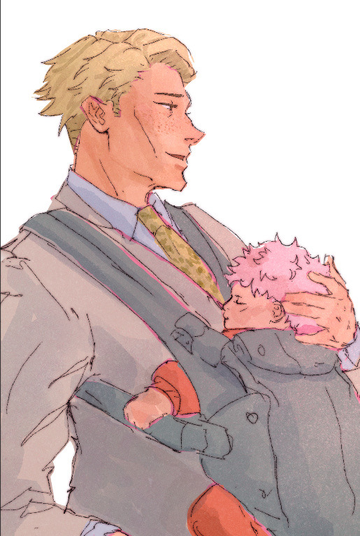
after that i create a multiply layer and with my WASH GRAINY brush i do shadows/face rendering. and with this piece specifically i did an add layer to simulate sunlight on them (i do extra layers at my own discretion, so have fun with it :)
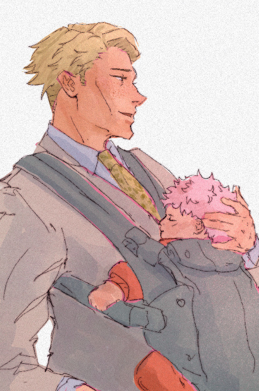
as a final cherry on top i create another multiply layer, fill it with white and then set a noise filter on it @ 17% (dont ask why that number it just works for me lmao) and thats it!
if i need to clarify anything dont hesitate to ask! like i said we dont gatekeep here
and some general tips: dont over-articulate your drawing, cause i find the more i fuss with details the more stiff my drawings look, so i suggest being a little more loose with lineart/sketching and dont sweat the small stuff
same goes for coloring, the more simplistic your shapes are the more cohesive ur drawing will look
another coloring tip: if you’re having trouble with ur drawings looking “muddy” i recommend starting off with a black and white render so you can get a handle on your values before you worry about hue (i do this with my more rendered portraits but i find it helps you focus on the depth of your drawing)
63 notes
·
View notes
Text
✧ welcome, traveller. what is it you seek? ✧
⟣✧⟢
art tag: #oh wormwood
COMMISSIONS STATUS: CLOSED
⟣✧⟢
hello! this is artemisia speaking (artemis or ari for short)! nice to meet you!

⟣✧⟢
current fandoms: in stars and time, witch hat atelier, the legend of zelda, dungeon meshi
⟣✧⟢
✧ here are the basics... ✧
artemisia ✧ artemis ✧ ari
she/her/they/them ✧ nonbinary ✧ demisexual/sapphic
20 ✧ libra ✧ INFJ-T ✧ adhd
arts major ✧ illustration certificate ✧ gender/sexuality studies minor
⟣✧⟢
here is some stuff about me and what i do!
⟣✧⟢
✧ inside my brain... ✧
✧ my special interests lie in crows/corvids/birds, symbology, spirituality/religion, creative writing, worldbuilding, and gender/sexuality studies ✧ i dabble in a lot of art mediums, but mainly specialize in illustration, digital art, watercolor, printmaking, and writing ✧ when i'm not drawing i play rpgs, write stories, kick ass at boxing, listen to music, garden, or research random topics of interest ✧ i have a pet leopard gecko, her name is circe and i love her very much
⟣✧⟢
✧ about my art...✧
i primarily work in digital illustration and sketches, but I like to do larger pieces with watercolor, ink, acrylics, or linocut printing.
i post a lot of fanart currently, but my primary goal is to eventually make the majority of my content about my original characters/stories/worldbuilding and life experiences.
i take a lot of my stylistic inspiration from the golden age of illustration, art nouveau, vintage storybook illustration, tattoo art, contemporary comic styles, woodblock printing, botanical/zoological illustrations, and abrahamic/biblical iconography.
most of my work outside of my fanart includes imagery derived from nature, birds (specifically crows), spiritualism, religious iconography, and fantasy.
my favorite thing to draw are birds and celestial beings!
⟣✧⟢
✧ current interests...✧
✧ current fandoms: In Stars and Time, The Legend of Zelda, Witch Hat Atelier, Dungeon Meshi ✧ currently playing: The Legend of Zelda: Majora's Mask ✧ currently listening to: Winter by Yabadum, Blurt by Mega Mango, FIRE4FUN by Jhariah ✧ favorite food: mangos... ✧ favorite drink: strawberry-mango tea with mango popping boba, mango chunks, and lychee ✧ favorite season: autumn ✧ favorite plant: wormwood (duh) ✧ favorite color: olive green ✧ favorite animal: crows
⟣✧⟢
✧ top 3's...✧
✧ top 3 games: The Legend of Zelda: Link's Awakening, Deltarune, Little Nightmares ✧ top 3 music artists: The Crane Wives, Mother Mother, Eve ✧ top 3 visual artists: Lauren Marx, Marian Wawrzeniecki, monsterSOVKA ✧ top 3 comics/graphic novels: Are You Listening? by Tillie Walden, Witch Hat Atelier by Kamome Shirahama, Nimona by N.D. Stevenson ✧ top 3 books: House of Leaves by Mark Z. Danielewski, Six Of Crows by Leigh Bardugo, Sawkill Girls by Claire Legrand ✧ top 3 movies: Kiki’s Delivery Service, Nope, Romeo + Juliet (1996)
⟣✧⟢
thanks for reading! i usually post at least once a week, on thursdays, so keep an eye out for more content in the future!
#oh wormwood#just chatting#blog intro#introduction#get to know me#illustration#tumblr intro#commission#introductory post#about me#fanart#original characters#worldbuilding
36 notes
·
View notes
Note
Sorry if you’ve been asked this before, could you share what brushes you use? I just love your art and have been trying to learn about that more textured style in digital art. Not just your line art, but the big texture shading you use too AHHH so scrumptious! 🫵🔥 you are a dream machine
okayyy i need to start this by saying im a brush hoarder. i literally have so many brushsets imported because every now and then i download new ones for fresh air but i boiled it down to the ones i love the most so here u go. more info on how i use them below <3

starting with my beloved brush flat rough which i use for sketching, this comes in a paid brushset however if you’re willing to spend $ on brushes i’d say it’s def worth it, the whole set is very yummy. i found this one while i was looking for a marker brush that mimicked the one csp brush i used all the time 🥲

it’s perfect for setting up proportions and establishing interesting shapes from the get go. however its not good for lineart and small details so i mostly use it when i have the intention of covering it up with colors later. my comfort brush fr
and now my versatile queen gloaming (default brush) the only brush that doesn’t make me hate myself whenever i attempt to do lineart. when its used in a tiny size it’s very sharp and has an ink look to it, in medium size it’s perfect for sketching and maximum size it’s great for a watercolor-ish shading style. i also have a modified version where i just changed the brush tip to a round shape and made it more opaque (i used in for the lines in her coat here)

grain is a brush from tasia ms’ set. its gets opaque very fast so its great for doing the larger shadows of a drawing. it has a nice little texture to it and its free (they ask you to log in to the site for you to download it though :()
and theres this one from fatima mandouh which is meant to mimic colored pencils and its literally perfect. it genuinely looks like trad art and it feels so soft while you’re drawing its just 😘👌 no words. and its free!!! i mostly use it for the last steps of a painting but its good for anything honestly, here’s a sketch i did using it:

overall i feel like the real secret to make your art feel more textured is just shading in a hatching style tbh. like seriously just slap the flat colors and build up with a pencil brush trust me. also add a little texture on top of the finished artwork. and add sharpness and noise too. go whack.
#asks#also thank youuu <3<3<3#my whole blog is just asks now because i decided to stop being lazy lol
8 notes
·
View notes
Note
Hi!! I was wondering if its okay to ask what brushes u normally use in krita? I love your art!!
Thank you so much!!! I only use the ones available in Krita by default and I tend to jump around based on what I think will work best for each piece, but I can give a little rundown on which ones I use the most and what I use them for :)
Here's an image guide with each of the brushes I've used and that I recommend checking out:
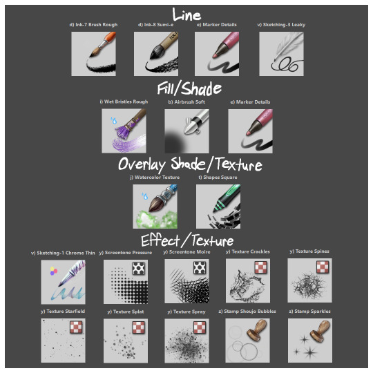
I'll highlight my favorites as well with some examples where they were predominantly used! (though in some cases multiple or even all of these brushes were used)
Marker Details:


Varying opacity and size makes this one my favorites for sketching, especially since it can easily be nearly transparent or fully opaque which helps with value range.
I also like using it for silhouette sketches!
It can also be used for final linework, but it takes more work to get to a full opaque and its lack of texture makes it a little less interesting than Ink-7 Brush Rough imo.
Ink-7 Brush Rough:
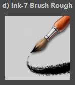
Really good for linework, especially for comic styled drawings with it's slight texture, varying weight, and opaqueness.
Also good for just filling in entire areas with a single color as well as non-smoothed shading!
Wet Bristles Rough:
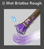
Actually just an amazing brush, its pressure sensitivity is crazy.
Blends strokes like paint and can vary in size and opacity.
Also has a nice subtle texture!
Amazing for smoother coloring and shading, especially if you want a more painterly style.
Watercolor Texture:

(hard to show examples of this, just assume that I've used it in any piece that has smooth shading lol)
Not the best for painting/drawing on its own, however I've found it to be really useful when set to white or black on an overlay layer for adding extra shading and/or highlighting on top of the shading I've already done.
I usually shade individual figures, objects, and parts separately, but using an overlay layer with Watercolor Texture (or even Shapes Square) on top of everything helps make the entire piece feel more cohesive.
Also adds a hint more texture!
Another thing to note is the importance of layer modes!
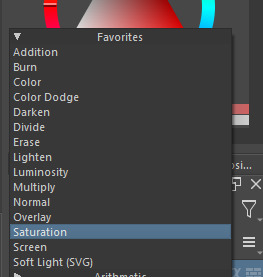
I know that you asked about brushes specifically, but many of these brushes (particularly those to do with effects and textures) work best when experimenting with different layer modes other than Normal. Overlay is generally a safe bet and most of the best for, well, overlaying multiple layers for interesting effects. But please try out all of them at any given opportunity, sometimes things like Burn, Color Dodge, Soft Light, etc can have more interesting effects!
In addition, mess with filter masks! You can even edit where they apply by drawing on the mask directly! HSV/HSL Adjustment (also accessible with ctrl+u) in particular is INSANELY useful for fiddling with the colors and balance of a piece, from individual layers to whole groups and drawings. I also really like blur filters, often times I'll duplicate a layer and make the bottom one blurred to add a glow affect to something without losing its definition.


While this latter stuff isn't about brushes specifically, its generally very important to how I use and experiment with all these different brushes!
Anyways I hope this helps!! I kinda went overboard with this post, but I had a lot of fun writing it! Thank you again for the wonderful ask!! :)
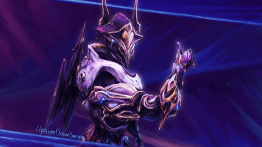
#krita#krita art#warframe fanart#art#artists on tumblr#my art#UpsideDownSmore's art#art tips#art guide#art reference#long post#ask#didn't mean to spend so much time on this but ngl i'm actually so thrilled to talk about my art processes#like man i'm so grateful to be in the position where i can make an art guide like the ones made by people i look up to#sorry if this response is a bit long winded i just had to get a bunch out there lol#love asks like this :)#scheduling this 9 hours from now cause it is currently almost 1am lmao
39 notes
·
View notes
Note
Hello sorry to bother but today I went through the mor and dom tag and I can’t help but notice how good you are at designing tattoos! Both for Dylan and Mor, there’s just so much detail there!
I was wondering if you have any tips on your process for designing them? I have a lot of ocs I think would look good with some but just don’t know how to go abt it. Love your art and again sorry for bothering and have a good day!! :]
Oh thank you so much!!
I've had experience designing tattoos for friends and commissioners before, so I think that helps me a lot. But here's some advice off the top of my head:
Research tattoo styles! There are so many types out there, from blackout tats, to classic nautical styles, watercolor, quotes and number tattoos etc. the world of tattoos is HUGE and there are constantly new styles being created by artists. Finding the specific style that fits your character is really helpful
Understand the tattooing process. This is important if you want your ocs' tats to look more realistic. Everything from pain threshold and placement, to how much certain colors or styles need upkeep, to how realistic specific details would be on specific areas of the body-- these can help a lot with choosing design elements as well as learning where to put the tattoos on the character's body. (My biggest advice for this on the drawing/design side: always prioritize the black ink first! Figure out areas where you can have the negative space/underlying skin be part of the design)
Placement, then design! I think of tattoos for OCs in two steps: 1) where and 2) what. I usually figure out placement first, and draw blocks of color on the body parts I want tattooed. Then I'll isolate the shapes and work on each design until I'm satisfied. As you've seen in my characters, I often make a tattoo sheet for them (which I'll copy and paste onto them as needed)
Personality! For characters, it really comes down to what the tattoos say about them. This doesn't necessarily mean all the tats need to be loaded with meaning, bc there are definitely people who get things for fun or for cheap. It's all about reflecting what your character is all about: are they the type to get really meaningful tattoos and only have a couple that are very symbolic for them? Are they the type to wanna be covered head to toe? Maybe to a character like that, each tattoo meaning isn't as important as filling in the space! Maybe it's a character with one really important tattoo but a lot of other random ones. Does one character have to have them in discreet areas for work? Tats that do mean something to your OC will probably say something important about them, while the visual style of the casual tattoos will say a lot about their style or fashion sense
35 notes
·
View notes
Note
Would love so so much for you to elaborate on the happiest looks for the oc quartet and what took you by surprise about them and what you think each of them conveys/implies. Sol I'm seeing longer hair and more comfortable less exposing clothing, etc, but can you talk a little about what each of their happiest option looks means and how it took you by surprise and how it contrasts with the reality and why it would be them at their best? thank you!! if you do
oh this is so sweet 🥺 thank u for permission to infodump about my guys.....
reference images here!
i often joke that devin and i have the same gender feelings in opposite directions, which basically boil down to, "i know i'd be a lot happier with my body on prescription hormones, but i am Way too sick right now to give a fuck."
so like. a happier devin is one who's been on E for years and grown her hair out for just as long. i was taken by surprise by Just How Femme she was (...similar to me having some weird masc revelations doing the same exercise for my idealized self).
also was mildly surprised that her clothing remained exactly the same as in the main verse. i played around with all the other clothing options, but a black tank top + ratty pants + bare feet are all Quintessential Devin Items.
the very visible scarring is bc she's never cared if people see that her body is fucked up & i want that to be true in the happy timeline too.
ruby's surprised me in that i didn't have to change much at all to get her Idealized External Self. she's already pretty true to what brings her joy. in professional environments, her clothes are much more muted, but everything she's wearing could come out of her non-work wardrobe.
her hair is worn fluffy instead of in box braids because she would Love to dye her natural hair like this. however she does Not love the need to carve out time and motivation to maintain it every damn day for the rest of fucking eternity, so. box braids it is!
also important is that ruby isn't wearing anything practical. those sandals aren't safe for difficult hikes/on-your-feet labor. that skirt is a massive mound of fabric. that jewelry gets in the way, that shirt has no armoring or support, she hasn't prioritized pockets or a practical bag or hidden defense weapons or anything. this ruby is free of basically all of the responsibility and weight dragging her main timeline self down
sol's long hair surprised me -- she had long hair when she was much younger & she has not wanted to grow it out again for trauma reasons. but she likes it better long. so a long-haired sol is one who's overcome at least some of her trauma. her hair has been silver since birth but the white streaks signify that she's aging gracefully & older than she ever expected to become
as for her clothes, it's comfy athletic wear that she's wearing for the sake of mobility and comfort. (with the red-and-black shoes to sneak in a little of her murder aesthetic.) in the main timeline, she'd SAY that she dresses for herself, but the amount of sharp & tailored & restrictive clothing she wears is.... Definitely for other people. or at least, it's for preserving her own image toward other people.
and then transmasc butch nova. LMAO. GOD.
main timeline nova puts an insane amount of effort into "i'm a pretty barbie girl <333" and has sunk So Much of her self-worth into being blonde and blue-eyed and glowing and gorgeous. she also has watercolor sleeve tattoos, but when i did her full-body picrew tats, black ink felt..... more correct. like. what would your tats look like if you weren't a Rainbow Goddess of Light
and then the rest of it is also very. what would you be if you weren't a Rainbow Goddess of Light. if you take away all the Rainbow Goddess of Light features, nova is.... desperately unhappy. and desperately compensating for something. and i think having top surgery and working as a butch car mechanic somewhere would fix her.
as for the pink shoes and hot topic jewelry, that's just bc i think nova would find it fun to do gnc nonsense. nova-without-divinity isn't A Man or fully married to doing Man Things... i feel like it would be wrong for her to just go as gung-ho for performative masculinity as her main timeline self does for performative femininity. nova-without-divinity is wearing whatever she wants and looking however she wants and being hilarious and delightful while she does it <3 god bless.
#replies#long post#original fiction#original fiction quartet#i started writing this reply yesterday and then fell asleep for almost 24 hours because i had a knife in my eye#still have a slight knife in my eye but it's mostly resolved now. hopefully this is coherent.
24 notes
·
View notes
Note
I love your art so much, you’re part of the reason I started drawing again. Your old art is cool, and your new art just has so much emotion and detail in it, it deserves so much praise. Do you have any advice on how you upskilled so well into the amazing art you do today? I really want to learn to be skilled like you are and improve to your level
Dude, thank you so much. I'm super flattered but also have major Impostor Syndrome right now lol.
The biggest thing that helped me was getting a drawing tablet and learning how to use digital art programs like Canvas or Procreate. I am a very messy artist - my traditional sketchbooks were always a nightmare because of how often I erase shit, so being able to use programs where I can simply undo or reposition a line was a game-changer.
I'm also incredibly indecisive and struggle with linework, but I found some great brushes that mimic the effects of ink pens and watercolor so I can achieve the messy, painted look. (This Sketchbook set and lineart set are the two I use the most)
Use as many references as you need! Gather a bunch of base poses to get the hang of proportions and anatomy (my go-to artist is Mellon_Soup. Screenshots from movies and shows work great too)
Try out posing tools like this one
A fun exercise that helps me is to paste a photo or drawing on one layer, and then on the layer above, sketch the main aspects in 30 seconds. Delete the first layer and then work solely off of the sketch (and yes it will absolutely look spooky and/or silly). If you need more time at first, start with 60 seconds and work your way down as you get the hang of it:
Take pictures of yourself in the poses you want to draw
Find artists with a style that resonates with you and study their work
The Multiply tool on Procreate is AMAZING for adding depth to artwork. I use this on almost everything. Add a slightly darker color on top of the whole set of layers, switch it to Multiply, and then go in with the eraser to mark the areas where the light hits
Keep practicing, no matter how shitty you think it looks! Just keep going!!
Uh I think that's it? I'll add more if I remember anything else.
I wish you the best of luck on your art journey! <3
24 notes
·
View notes
Note
hello darling <3 one would like to request a level 4 nilou fictive if possible! the only thing one would like to specify is she/her & lesbian, otherwise everything is creators choice.
hello blue text anon~ nilou is so pretty!! i hope mew enjoy fleur -🍥
gonna flesh her a lot out cus her personality ingame kinda sucks. no offense -🐝

name :: nilou, padisarah, ćeline, lilah, leila, adrienne (ari or adri as a nickname), haniya, naira, calypso, seriyah, alara, or anahita
age :: 21 to 23
pronouns :: she/her && sometimes fleur/fleurs or fae/feyr
roles :: reliever, pacific, curacormate, dear, obsonātor, social pleaser
species :: human performer
gender identity :: viscarian (the flower), myosotian (gender), musigender, genderconcerto, tambougender (first def.)
orientation :: lesbian, sapphic
source :: genshin impact
aesthetic :: bloomcore, spring, dreamy, ethereal
appearance description :: haniya is rather short, clocking in at around five feet and three inches tall. she has red-brown hair that stops just shy of her thighs, and often wears fancy dresses or outfits that look good during her dances. closed-toed shoes are rather uncomfortable and rarely fit properly due to her feet being a touch too small for her body, so she opts for sandals instead. ćeline has had abnormally short hamstrings from birth. she works hard to keep her physique and ability to move intact; this is why she dances so often, to help remain flexible and mobile. even still, fleur is somewhat chubby: the muscle she has built up from years upon years of dancing has given her a lithe yet muscular frame, and seriyah’a love of pudding has placed some chub on top. leila has a cane that she uses on days when she has pushed herself too hard; the shooting pain of walking makes it a struggle to move, even with having worked so hard. these days, her use of a cane is rare — but the chance of it happening is never quite zero.
personality description :: adrienne is a normal girl: she is sweet to her friends, kind to strangers, and harbors a deep love for dance. she is seen as the quiet girl among the dance troupe who is eager to help. those in the troupe who have problems often come to her for solutions or mediating arguments. more than this, though, naira is outspoken. what she views as misdeeds are never let off lightly; she confronts those responsible, admonishing them for their crimes and urging them to “do better next time”. she is keen to giving people second chances — but if that second chance is used up, alara will not give them a third. creativity blooms from her every movement. whether it be dance, embroidery, watercolor, or cooking, naira will do it to the fullest. minor mistakes of her own or her friends (ink smears, accidental color leaking, et cetera) are not taken too serious. there is always a chance to try again.
likes :: kind souls, cute animals such as kitties, bunnies, and puppies, her specialty pudding (other types of pudding are also good), ballet, classical music, leg strength training, wide open flower fields, embroidery, the inteyvat flower, lotus flowers, creating flower crowns or flower centerpieces, mentoring and teaching other people to dance, decorating her cane with fresh flower garlands, picnics in nature, and spending time with her close friends.
dislikes :: bastardization of any culture, hard rock, punk, or pop music, those who assume her whole personality is dancing, those who think she’s “fragile”, assumptions of ability, the rampant ableism in the dance world, those who mock others who are trying to improve and succeed, those who assume art is “easy” and that they could do it themselves (it is not easy for everyone; art is an expression of the soul. to claim it easy or that you could do the same undermines the original meaning of the piece and the work that was put into it). she has argued with other troupe members over this before.
front triggers :: classical music, dance lessons, soft and sweet piano compositions, watching ballet, and going to an art gallery
signoff :: ⚜️ or 🩰 (no others really match…)
mood board :: can be found here
songs for you :: merry go round of life from howl’s moving castle, le cygne by camille saint-saëns, clair de lune by claude debussy, the mercy of the wind by million eyes, return to versailles by joshua kyan aalampour, ballerina by yehezkel raz
kins :: the sugar plum fairy from the nutcracker, odette from swan lake, ondine from ondine
typing quirk? :: spaces out her words . . . nothing is ever too close together . avoids capital letters , does not use adverbs or contractions very often , and has a flowery way of speaking . manner of speech is comparable to purple prose .
image source here!
#banner creds: @blues and hues png#alter packs#baa blog#bah blog#build a alter#build a headmate#build an alter#headmate creation#headmate pack#kitty creations#🍥 post#🐝 post#🌳 post#level 4#level four#blue text anon
6 notes
·
View notes
Text
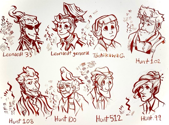
I’ve been drawing with dip pens lately so I did a nib study using my ghost trick redesigns.
for anyone that’s interested here’s some notes on the nibs under the cut.
Leonardt 33 - Easily the one of the most flexible pen nibs I have. Technically this is designed for calligraphy, specifically spencerian, so the sideways movement isn’t great and there’s little control when doing hatching. Really dramatic swoops with high pressure that aren’t entirely appropriate for character portraits but I kinda dig what it did to Sissel’s hair. Will probably use it for special effects like fire and smoke and stuff.
Leondardt 33 - This one is actually intended for drawing so naturally it has a fairly consistent line weight with a low flex. The hatching marks are kinda scratchy but not in a bad way. Would probably work really well for continuous contour and styles of lineart that are more sketchy, loose, and dynamic than my normal character art style. Would prob use for larger pieces or figures closer to the camera cause the line weight is generally a bit too thick for the usual size I work with.
Tachikawa G - This is a nib made for drawing manga specifically and it’s really easy to use for drawing. Some of the calligraphy nibs really take some thought and careful motor control to look good but this one was forgiving. I see myself using this a lot for really casual art. It was kinda hard to do hatching or filling with this one tho, which was kinda surprising. Very gentle line variance, makes really clear shapes. You can see in the other characters than too high flexibility can make it hard for the brain to turn lines into form so this really mellows it out. Prob best to use this nib to block out the lineart then hatch/fill/detail with others.
Hunt 102 - this is a speedball job made for mapping and oh my god do I love this nib. It’s just so 👌👌👌 on the details??? the line variance perfectly matches the brushes I use on photoshop and it’s just. mwah. it holds onto literally so much ink despite being so tiny. interestingly hatching is unstable but two or three lines together seem to be just fine. Kinda sad that jowd’s hair is a little hard to focus on cause of the variance but with a little practice I can prob find ways around that cause I already know I’m gonna love using this nib for heads and faces. Filling is a bit patchy but otherwise I think this is gonna be my go-to detail nib. (also no jowd isn’t in overalls that’s supposed to be an art apron but with only like the top portion showing it’s hard to tell.)
Hunt 108 - ok this is Supposed to be a drawing nib as well as a calligraphy nib and it does mimic brush strokes but I’m pretty heavy handed so it’s hard Not to make those super thick lines. Not bad with details and has enough control to make thickening up the outline super easy, but really easy to mess up. This nib did Cabanela dirty by flexing a bit too much when I was doing his mouth so I had to correct it with a white pen. Spreads the ink too thin in areas for solid filling. I can see this working really well with mixed media, like with watercolor, and once I get some more colored ink I’ll use it for coloring.
Hunt 100 - idiot stupid rat bastard of a pen nib. ok the art looks fine right? can’t be that bad, right? it took me so long to make that because the ink just. wouldn’t come out. so this nib is another mapping nib and it’s super delicate so it breaks really easily. I broke my first one bc I’m heavy handed, so I ordered another like ‘ok I’ll be more careful with this one’. it broke again. I don’t even know how. Ideally I’d use it for small spaces or reeeally fine details but I can’t even get it to work long enough to try. speedball can meet me in the pits.
Hunt 512 - A calligraphy nib that’s actually really easygoing to draw with. There’s not much line variance, so the hairlines have a lot of control. Makes for really good hatching. Also does really great long, thin lines. Sideways movement is kinda meh but it does the job. Definitely the cleanest looking of all them, tho the lack of variance makes it a bit boring to look at. Gonna use this one for shading and textures or for drawing on really rough paper.
Hunt 99 - like the first nib this one is really dramatic, and it’s supposed to be a calligraphy nib, but it has a lot more weight control than the hunt 108. Also the fine lines are easier to control. A lot of ink comes out so it might not be great on paper with risk of bleeding, and it takes a while to dry compared to others, but it would be good for filling since it can cover a large opaque space while having good control over the shape and points. Could also use for different warping/texture techniques.
Other notes:
I used smooth illustration Bristol for the paper, since ink looks more vibrant and swooshy on it and also some of these nibs can Only be used on smooth paper.
Also used terracotta India ink, which is kinda on the thick end but still looks good. matches with the colored lineart in Ghost Trick lol
got all of my pen nibs from Paper & Ink Arts cause u can order a nib for like less than a dollar fifty each. You can also get paper, nib holders, and ink for a good price too.
if u wanna start with dip pens PLEASE prepare your nibs before drawing. stick them in a potato for like 10 minutes. please trust me on this you will have a bad time otherwise.
ok thanks for reading through my Very Indulgent experiment.
#ghost trick#my art#idk maybe this is a bit unconventional for fanart#but I think a lot of ppl only ever post super polished art and not the experimental stuff#which gives ppl who want to start drawing the idea that every drawing has to be a finished one#and that everything you post has to get likes#sometimes art is about the journey#. . . ok my cat just died so maybe I’m being all maudlin and philosophical to cope but still#this is also here cause I could find jack shit useful reviews for pen nibs#so Hopefully this can help ppl that want to try dip pens but don’t know how#feel free to reblog if you want to reference or share the info on nibs lol#character design#traditional art#nib review
66 notes
·
View notes
Note
OKAY OKAY SO SO
Lately I've been more interested in buying inks
I'm like so so confused at the labels for ink. Because like. I know there's like India ink (or "china ink"), acrylic ink ect
But sometimes what they would call China ink is actually acrylic ink and I remember seeing somewhere that china ink penetrates the fibersof the paper while other inks stay on top but that's. Not what I see when I use them I'm so confused. WHAT!!!
I think maybe china ink (how they're labelled in my country) is like. A whole category of different inks. I have no idea man I'm sleep af wahhh
But yeah so I got red "China" ink (lemme check the label rq) yeah it's "china" ink. It is not! That's not how China ink behaves!! But it looks so so so pretty although it's hell to get off nibs and my glass pen. It dries so so fast. That's crazy
I also got two bottles of Daley Rowney inks one is indigo and the other is black. I am in love. It looks so so so good.
However I'm so nervous to use them as "watercolors" because it dries out so so fast
Speaking of watercolors AUGHHH Prussian blue my beloved (also got the color in gouache)
It's such a regal color. It goes so well with red and in some instances orange. Maybe lavender. I need to draw Basil with this colour again WAGHHHH
What I love doing is drawing random aah patterns and flowers with Prussian blue, a bit concentrated so it's vibrant.
Augh I need to take care of my paintbrushes. Fuck it I'm buying new ones. Like, how do people do to make them look like. Pointy forever. I guess they wash them well but there HAS to be something else.
My red ink is like. Orange when unblended. Madly in love. I love oragn
Sorry this makes no sense a
Prussian blue will like always be in the top #15 as a whole and top #5 as paint 🙏 also yeah if you ever find out how to make paintbrushes not explode and die and become evil please tell me I’m going to lose my mind actually I’m cooked
4 notes
·
View notes
Note
Your style is just amazing, your work with shapes and lines... ohh it looks so dynamic and stylish, I love that!! What materials do you use? Or what markers/liners can you recommend?
Thank you so much for this lovely message!! 💗
Off the top of my head in terms of recommendations- I gravitate towards professional artist materials these days. I know there’s a lot of cheap art supplies these days so it’s good to explore, even if the brand isn’t ‘high quality’ or anything!!
Under the RM is more in-depth :)
I use a variety of alcohol-based markers, technical pens, inks, and (especially gouache) paints. I layer that shit like I’m burying a body, lol.
I almost shop strictly online at Jerry’s Art-o-rama for all my traditional media needs and tools! Can’t promote them enough 🫡
Ok I’ve rambled enough, omg. In no particular order- TLDR;
Top 3 Markers I recommend: Windsor&Newton, Prismacolor, Copic. (I’ve owned my 48 marker Prisma set for over 12+ years. Christmas gift in middle-school omg)
Top 3 Liners: CreativeMark SuperBlack pens, Zig Millennium pens, Gelly Rolls for white liner.
Top 3 paper/media brands: Canson Recycled series has great bristol and sketch pads. Strathford watercolor pads, mixed media boards! Honestly though? Any surface will do haha
Top 3 paints to try out: Turner Acryl-Gouache, Windsor&Newton designer* gouache, Prang semi-moist watercolors. I always come crawling back to these girlies😭
Color pencil wise? I strictly only use old-formula/stock Prismacolor pencils. Soft-core is ⭐️
(*IT MUST BE THE WHITE DESIGNER TUBES!! W&N has like some other cotman/scholar gouache series and it’s absolutely shit. Don’t get that!!)
5 notes
·
View notes
Text
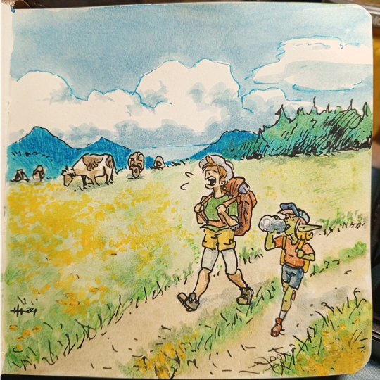
PLANTOBER # 24 LOTUS You were expecting Nelumbo nucifera? Too bad! It is Lotus genus, not a single plant type! As you may have guessed by now lotuses are once more, yet again, and surprisingly still in terms of this channel, one huge family of plants, growing on the entire globe AND related to beans as well!!! You just can't make this things up! So most popular in people's minds are mentioned Asian lotus flowers, but the genus is wildly vast. To top that span, probably 40+ have their specific plant types explained in detail on their individual wikipedia pages, so as previously, I just don't feel like there is a possibility for me to do the justice to the people, who are familiar with certain types of lotus plants. That said, I have decided to focus on more common in my region Lotus corniculatus which grows in large quantities over meadows, plains, and such. Little yellow flowers create cheerful carpets and many animals graze trough those - for example cows! Like many other plants, different types of lotus can be toxic and harmful, but there are also plenty of varietes that are edible and key part of certain types of cuisine in parts of Asia for example. And that's that! Either flower carpets or water plants, decoration or part of a dish, lotus is omnipresent, and people love them in every type and form! As always, thank you so much for taking a look at my art! Leaving a like, comment or sharing means a ton to me, and is more than appreciated! 🤗 Tools: pencil, ink, watercolor and watercolor crayons, acrylic paint. My socials: keik-keik.carrd.co
#cara#inktober#plantober#traditional media#watercolour art#goblin girl#ink#plantober2024#traditional art#lotus#cow#alps#mountains
2 notes
·
View notes
Note
Hay :D
Can you tell us what do you use to color your drawings on traditional? I need some tips •́ ‿ ,•̀
why hello!! Sorry for such a late answer!!
so, I’m a fun little something we call ✨inconsistent✨(sigh) so while I may not be the best person to ask…but here’s things I commonly use color wise (favored art supply dump)
Alchohol ink markers
I use these most, they are a beautiful thing, my favorite are Ohuhu as they are high quality and a much lower price then brands such as Copic. (Can you taste the salt.)
They have less blend ability in comparison to Copic but are overall a much better investment if you ask me! They are great for a more smooth look! Another one I have around that I use for less saturated colors is touch youch youch
I very much prefer brush pens over the chiseled ones, for a paint like experience, and more dynamic application! Again these are just personal preference!
(I have a bad habit of opening ink capsules and painting with ink. I would not necessarily recommend this.)
Watercolor
There’s lots of pretty nice watercolor you can get for a pretty cheap price! The ones I prefer currently are MeiLiang, I got them online for a good price and they are very nice!
That said I do mix around different brands and such, whatever is on hand.
Gel pens
I love gel pens, even if you just have like one or two it’s such a difference!! I love just having white ones for adding little details and such to drawings! You can also get colors if you like! I use the Jellyrollers!
Colored pencils
a lot of people hate colored pencils which I get, but I find them very helpful for detailing (when I have motivation to do so lol) I often use them on top of drawings I’ve layed down a base of alcohol ink with! That way it has a clean base and can add the fun texture and stuff afterwards!! Those smooth looks can be achieved with pencils alone, I often just don’t have time for that :) it’s very fun though, layering is key with pencils
I do very much enjoy prismicolor colored pencils!!! It’s an investment I don’t regret lol, although I’m sure any soft core colored pencils would have the same effect!!
Posca
occasionally I use posca markers for large poster sized drawings, esp for the ink capsules. I like the paint coverage!! That said they can be a pain to work with.
it’s probably not good to be like me and use all of this on sketch paper. (I know. I’m aware that that is psychotic.) but I do normally use sketch paper, getting some multi medium paper might be good if you are interested in paints inks and pencils though, that way you can use it for all of the above :))
Color wise that’s what I commonly mix and match with, when it comes to pens my FAVORITE pens to sketch or do lineart with are Tombow calligraphy pens. Simple brush pens, it makes detailing harder but I enjoy the dynamics. There’s lots of micro pens you can find for small details as well!! I also prefer to use mechanical pencils for sketching, simply because the mechanical lead stays thin and sharp instead of getting dull. That said, I use very cheap mechanical pencils, and sometimes you need a full pencil depending on the project.
There’s a little mini rant on the art supplies I use color wise, again these are just my preferences from what I’ve tried!! I’m by no means a professional haha, i very much experiment and make a mess of things!
Traditional art can become…quite the investment. Especially when it comes to buying all of the art supplies as your resources dwindle. I have to buy new art supplies much more often than I’d like to admit.
All that said, I am a firm believer of art being able to be formed from any medium!! >:D
be it a simple 2b pencil, a ballpoint pen, or crayons products, I think anything can be used to make something really pretty :))
Only real advice I have is don’t be scared to mix and match, get messy, and experiment!! Do whatever’s most fun, and don’t think you can’t make something great from something simple!! There’s no real rules. Only techniques and suggestions. It can be daunting because there’s no undo button in traditional art, but I think that’s a really good way to expand your abilities :0 it teaches you to roll with mess ups and learn how to work with them!!
Most importantly, let yourself learn from others, but NEVER let people force how you use your supplies, don’t be scared to beat them up if that’s what you need (the art supplies not the people.), and don’t think you need the fanciest things to make nice things >:D
if you want more specific tips and such feel free to ask, I’ll do my best to answer :,)
#karineverse#art#traditional art#art rant oops#I’m probably bad to ask as I use a mix of whatever I can find#But these are some things I like to use!#hope this helps :.)
13 notes
·
View notes
Note
do you have a list of pathologic blogs you recommend?
won't lie most of the blogs i follow are Nawt pathologic because i've been on tumble since i was 13 and on this one specifically since i was like 16. i've accumulated quite a lot. but some i can think of off the top my head (some that i follow some that i just like to check out makes me smile are). mostly artists (but not all) who might draw/paint/make patho fanart but like. subject to changes as we all are
maxbanshees lots of illustrative art, some work with blender modes and nodes and whatnot [spooky] which i find fascinating, especially like to see the processes on they twitters. if i need to see a scary peter daniil andrey image i know i can go there.
berlogauwu quite fond of the colored pencil look, full, lush, almost overwhelming aesthetic of some of the daniil images on it. it's what he deserves truly it is.
rathologic while not artist has productive interesting and generally Sane discussions about the game and its intricacies (a breath of fresh air) + my source of updates on the patho subreddit & ongoing bachelor ARG because i ain't touching that website with a 10ft pole. also a fellow rubin enjoyer
ultra-balkan-the-ovosh the ink/watercolor lewk stays unmatched honestly very powerful. very beautiful.
zu-zup tastey morsels of art and of animation... powerful... everyone tell them good luck they had the misfortune of trying to podfic my ATA everyone hope they make it out alive
magicky-hands her yulieva........ head in my hands in whatnot
mindblownie quite fond of his traditional medium fanart makes me happy to see it. fan of when he sends dankovsky to hell
zeiinep their bibis stamatins like little creatures to me. daniil as a kid with his little butterfly collection too. (i think there is cropped pics of their nsfw art on that blog but it's still a no-below-the-belt zone as far as i rember)
zero1qn2 burakhovsky if there was peace and love on earth
i probably follow more but like. i'm hungy. also i need to peterstakh because next week... might not be able to
27 notes
·
View notes
Note
Fav medium for traditional art? 🎨❤️
P.S. I love your art so much!!! 😍
Ecoline inks + watercolor pencils combo! I like to sketch with a light-colored watercolor pencil, then 'erase' with water, define the sketch with a darker color, color with ecoline inks on top, and then back with the watercolor pencils to add detail. For complicated pieces though I usually do the 'sketch step' digitally and print on watercolor paper. (that said I haven't drawn traditionally in almost a year oops).
P.S. ♥️♥️♥️!!! Thank you!! 💕
3 notes
·
View notes