#i like the layout sometimes rectangles in a line are just boring
Explore tagged Tumblr posts
Visit Tumblr Blog
Explore Tumblr blogs with no restrictions, modern design and the best experience.
Last Seen Tumblr Blogs


Fun Fact
Tumblr has a 66 index score for customer satisfaction in the US.
Text
liv makes graphics for her friends:
SKYLAR HANNIGAN and JASON TODD
we’re burned for better, i vowed i would always be yours cause we survive the great war.
read metanoia here
#ch: skylar hannigan#fic: metanoia#gs: for friends#this. this was NOT as successful as i wanted#I ENVISIONED SOMETHING ELSE#BUT LIKE#I LIKE IT???#i like the layout sometimes rectangles in a line are just boring#oc: rika#rika’s ocs#dc comics oc#fandom: dc#ocappreciation#ochub#ocapp
11 notes
·
View notes
Text
AWHM - Yancy’s First Tattoo(?)
Yancy has a rather interesting tattoo on his left arm. Have you noticed it?
A ‘blink and you’ll miss it’ reference to this fic by @miishae
Word Count: 508
-
He was twenty, and had been drinking heavily the night before.
In a way, it was no surprise to wake up with a slight hangover and a fading pain in your left arm. As Yancy blearily adjusted to the harsh morning light streaming into his bedroom, he thought he noticed some dirt on his arm. A quick rub with the other hand did nothing. Eventually, his brain woke up enough to pull his arm back to see what was going on.
It was a tattoo stretching from his wrist to his elbow. His first one, in fact!
However, he didn’t remember what happened.
“Th’ fuck is this…?” Slowly, he sat up and twisted his arm enough for the light to show the full detail. It was a series of rectangles with small lines in the middle of them. Each rectangle connected to at least one other, with the paths ultimately meeting in the middle. To Yancy, it looked like a competition layout, only the teams were scattered around. But it didn’t explain anything. Why would drunk him choose something so abstract? Nothing weird happened the day before to warrant such an impulsive choice.
Strangely, the tattoo got attention from the gang he was in at that point. Stranger still, not a one of them could tell him what happened.
“You didn’t go anywhere like that, Yance.”
“We dropped you home on the way to check those Violet assholes.”
Ultimately, the only time Yancy was alone while drunk was when he was at home. Not a soul could tell him how he woke with a tattoo.
As the years went by, Yancy soon stopped questioning it. He had gotten other tattoos that had meanings of some sort: some that could be seen at a glance, others that were hidden from plain sight. Whether they were something profound or funny didn’t matter - they had a meaning. The boxes, as he started calling them, were just there. When people asked, they were given a choice of answers. They ranged from ‘cyberpunk’, to ‘bank floor plan’, to ‘it’s one of those sci-fi keyboard things, see’, to ‘a colour-in page when I’m really bored’, to ‘I dunno, it just looks cool’.
But sometimes, he would sit alone in his cell, eyeing the rectangles and poking them with his right index finger like they would solve the mystery. He would press his finger against a certain rectangle nearest his elbow, and the room would grow dark. Whispers echoed faintly around him as everything in the room faded to black.
Don’t question it.
Go back to sleep.
Ignorance is bliss.
He would be startled awake by a guard rapping the bar with their baton to check if he was ready for lunch. He wouldn’t remember anything about what he was doing before that. What he did know was that the same brief burning in his tattoo. It was the only one that burned at times. Curiosity for the strange tattoo was forgotten as he would roll off the top bunk and continue with his day.
50 notes
·
View notes
Text
Grid Systems
24/11/17 - Today we researched 4 different types of grid systems in graphic design.
What are grid systems in graphic design?
They can act as guides as well as split art boards into equal sized shapes. They make design layout/composition easier and can help create balance. It also helps eliminate inconsistencies. It is sometimes very important to use a grid system in graphic design because it is very useful as it shows you good positions to put certain things like text boxes or images. The benefits of using a grid system would be that you can just put shapes and text into the boxes and they would be perfectly aligned and neat, and then you can simply turn off the grid or delete it when you’re done.
Manuscript Grid
Sometimes called a block grid or single column grid, the manuscript grid is the simplest grid structure. It’s mainly a large rectangular area taking up most of the space inside a format. The primary structure is defined by large text blocks and margins, which position the block within the format. Its secondary structure defines the location and proportions of folios, footnotes, running headers, and other secondary information.
Manuscript grids are good for extensive and continuous blocks of text. They’re used in books and long essays and perhaps lend themselves well to blog posts. They aren’t limited to text though. Images can be used to fill the block.
Column Grids
When people think of grids, especially online, they likely think of column grids. As you would expect column grids are made up by placing multiple columns within the format.
Column grids are good when discontinuous information needs to be presented.
Modular Grids
Modular grids are like column grids with the addition of horizontal divisions marked by rows. The columns and rows and the gutters between each create lots of cells or modules.
Modular grids are good for complex projects that require more control than a column grid can offer. Image galleries and shopping carts are likely candidates for modular grids.
Hierarchical Grids
Hierarchical grids are commonly found on the web. They’re based more on an intuitive placement of elements, which still conforms to the needs of the information.
Customized proportions are typically used in hierarchical grids instead of regularly repeated intervals. The column widths tend to vary as do the location of the flowlines.

Task
We had to create a multi-layered document that shows the incorporation of a grid system, and then introduce shapes into our grid system and experiment with different layouts, to make it look like something you might find on a website or something similar. I mainly experimented with shapes and patterns.
First we had to create the grid system on an Illustrator document. To do this we had to firstly create a rectangle which perfectly fit over the art board. This was easy because of Illustrator’s aligning feature. Then we had to go to Object>Path>Split Into Grid which meant we could change the rows and columns size as well as the height and gutter sizes.

This is the box that we got after selecting the above things. It says that we can change the number of columns and rows etc. so I set mine both to 10 and then changed the gutter umber to 2mm which were basically the gaps between the squared created by the columns and rows. It’s best not to make them too big because then the things that you’re going to put into the grid will be far apart from each other.

Next it was time to add some things into it. I really didn’t have much of an idea of what to put into it so I just made a gradient thing which went across the top and down the right side. A bit random but it looks alright and it could be used on a website or something as a design maybe.

Next I decided to create a hexagonal kind of design on the left which could once again be used as a cool design or something on a website perhaps. I just created multiple hexagons and then cut lines out of them to make it look like they were behind the gutters. I made it look like a gradient and also decided to cut certain parts of them to create a cool effect. I also created a blue and red checkered pattern on the right side, maybe you could use it as a design.

Lastly I created some boxes, coloured them and labeled them to show what parts they represent, for example, the red represents the text boxes, which I put in a repetitive design which went in opposite directions so that it wouldn’t look too boring. I feel you’d probably find this kind of design in a magazine or non-fictional book, which displays information with images above and below as examples.

I think that I was more or less successful in using the grid system and experimenting with different shapes and patterns to create designs which could be found in a website or magazine or something like that. I think that if i were to do this again in future I would need to develop this further by using text more and by using more shapes and patterns to make it look more like a website layout.
0 notes
Text
5 Design Techniques for Better CTA Buttons
When we visit most websites, we often have a goal in mind. To get to that goal, there’s usually a series of steps we need to take and the first step starts with clicking on a CTA (call to action) button. Think about the last time you signed up for a service, or downloaded an app, the process likely included an interaction with a call-to-action button.
CTA buttons are the buttons you use in your website to guide users towards your goal conversion. The whole point of a CTA is to direct your site visitors to a desired course of action. Some common examples of CTAs include:
“Start a trial”
“Download the app/book/guide”
“Sign up for updates”
“Get a consultation”
Today we’ll be discussing 5 best practices for designing CTA buttons together with the best real-world examples to help you get the most clicks out of your landing page.
1. Visually Striking Button
Your button color matters. In fact, if you’re going to take only one single piece of advice from this article, it should be this one: “Consider your CTA button color”. Using color you can make certain buttons stand out more than others by giving them more visual prominence.
Use Contrasting Colors
Contrasting colors work best for CTA buttons, using contrasting color it’s possible to create striking buttons that stand out. You should select a contrasting color from the color scheme of the webpage, while still fitting in with the overall design. Consider the Firefox example below. The green color of the CTA button on the Firefox page is jumping off the page and immediately gets user attention.
Firefox CTA button is bright green and stands out well on a dark blue background
Another eye-catching CTA button can be found on the Hipmunk homepage. A bright orange button captures user attention and defines the next possible action.
Negative Space
Not only is the color important for a CTA, but also the amount of space around it. Whitespace (or negative space) creates essential breathing room and separates your CTA buttons from other elements in your user interface. The old Dropbox homepage was a good example of using negative space to make their primary CTA pop. The blue “Sign up for free” CTA stands out against the light blues of the background.
2. Action-Oriented Text
Writing text for your call-to-action button that will compel your visitors to take the right action isn’t an easy task. Fortunately, there are a few things that can help you to do it:
Begin With a Verb
You should avoid vague and boring words like “Enter for more information” for your CTA buttons, and replace them with more action-oriented words like “Start your free trial” or “Get discount now.” Evernote has one of the most common, but still working action-oriented texts for their CTA button.
Begin with a verb like “Start,” “Get” or “Join”
A more interesting example can be found on Treehouse homepage. The CTA on Treehouse’s website doesn’t just say “Start a Free Trial”; it says “Claim Your Free Trial.” The difference in wording may seem subtle, but “Claim Your Free Trial” sounds much more personal.
Use Brief and Easy to Understand Text for Buttons
Be sure to state exactly what the visitor will get if they click on the CTA. Ideally, you want to keep button text to between two and five words.
Add Value Proposition
Most probably you’ve noticed that many buttons have the words like “free” in their copy and that’s not a coincidence, using such words in button copy emphasizes your offer’s value proposition. Thus, when writing your CTA, try to find a way to integrate one (or all) 3 persuasive words:
Free
Bonus
Instantly
Let me give you an example: One big fear users have before committing to sign up for something, is that it’ll be a pain to cancel their subscription if they won’t like the service. Netflix relieves that fear using the promise “Cancel anytime” right next to the “Join free for a month” CTA.
Create a Sense Of Urgency
Constructing a sense of urgency in your CTA buttons can yield some impressive click-through rates. For example, you could use button text like “Sign Up and Get 25% Off Today Only!” Limiting the time someone has to make the decision makes people want to claim their offer while they can.
Helpful Text
Sometimes you may want to consider adding an extra line of information within your button text. This practice is common with free trial buttons. For example, a free trial button might say “30 day trial, no credit card” in smaller text below the CTA button with “Start Your Free Trial” text. This extra text should ease the decision-making process.
3. Make It Visible Without Scrolling
The placement of your call-to-action buttons is as important as the color and message. A CTA button should be located in an easy-to-find spot that follows organically from the flow of the webpage. You should try to keep your CTA button above the fold so that users never miss it. Ideally, your CTA button should be among the first things a user sees on the page when they reach it. The additional information should stay below the fold, where it remains accessible but not distracting.
4. Large Button With Rounded Corners
Think about how the design communicates affordance. How do users understand the element as a button? Use shape and size to make the element look like a button.
Make it Big Enough
The CTA should be large enough to see from a distance, but not so large as to detract attention from the main content on the page
User Buttons With Rounded Corners
Button shape can play a big role. It’s a proven fact that rounded corners are easier on the eyes. In ContentVerve’s test, a rounded green button did better than a blue rectangle.
5. Less is More When it Comes to Choices
Keep in mind that if you want your customers to take action, you’ve got to assist them, by removing all possible obstacles from their way. When users are given too many choices, they tend to get confused. So, it’s better to offer the potential customers only one option.
If you still want to include multiple button choices, give weight to one choice over others to help funnel users towards a specific path. One good example is Evernote: as soon as you reach a bottom part of Evernote’s homepage, it’s pretty clear that a preferable choice is “Sign up for free”, while the CTA for users to compare plans is very much secondary.
Conclusion
To achieve effective CTA design, you need to consider more than just the button itself. It’s also important to think about background color, surrounding images, surrounding text and many other elements. Basecamp team understand the importance of these elements and designed a perfect layout for their landing page. Even the microcopy they use under the CTA button (“4,714 businesses signed up this week!”) boosts the confidence of potential clients.
I hope that tips mentioned in this article will help you to create a better call to action button for your website. The last moment is the importance of testing—if you decide to recreate a CTA on your site, remember to test to see if it works for your audience.
Photo Size Optimizer for Mac: Optimize Your Images with 1 Click – only $9!
Source from Webdesigner Depot http://ift.tt/2y9lKCT from Blogger http://ift.tt/2wOO0Xa
0 notes
Text
5 Design Techniques for Better CTA Buttons
When we visit most websites, we often have a goal in mind. To get to that goal, there’s usually a series of steps we need to take and the first step starts with clicking on a CTA (call to action) button. Think about the last time you signed up for a service, or downloaded an app, the process likely included an interaction with a call-to-action button.
CTA buttons are the buttons you use in your website to guide users towards your goal conversion. The whole point of a CTA is to direct your site visitors to a desired course of action. Some common examples of CTAs include:
“Start a trial”
“Download the app/book/guide”
“Sign up for updates”
“Get a consultation”
Today we’ll be discussing 5 best practices for designing CTA buttons together with the best real-world examples to help you get the most clicks out of your landing page.
1. Visually Striking Button
Your button color matters. In fact, if you’re going to take only one single piece of advice from this article, it should be this one: “Consider your CTA button color”. Using color you can make certain buttons stand out more than others by giving them more visual prominence.
Use Contrasting Colors
Contrasting colors work best for CTA buttons, using contrasting color it’s possible to create striking buttons that stand out. You should select a contrasting color from the color scheme of the webpage, while still fitting in with the overall design. Consider the Firefox example below. The green color of the CTA button on the Firefox page is jumping off the page and immediately gets user attention.
Firefox CTA button is bright green and stands out well on a dark blue background
Another eye-catching CTA button can be found on the Hipmunk homepage. A bright orange button captures user attention and defines the next possible action.
Negative Space
Not only is the color important for a CTA, but also the amount of space around it. Whitespace (or negative space) creates essential breathing room and separates your CTA buttons from other elements in your user interface. The old Dropbox homepage was a good example of using negative space to make their primary CTA pop. The blue “Sign up for free” CTA stands out against the light blues of the background.
2. Action-Oriented Text
Writing text for your call-to-action button that will compel your visitors to take the right action isn’t an easy task. Fortunately, there are a few things that can help you to do it:
Begin With a Verb
You should avoid vague and boring words like “Enter for more information” for your CTA buttons, and replace them with more action-oriented words like “Start your free trial” or “Get discount now.” Evernote has one of the most common, but still working action-oriented texts for their CTA button.
Begin with a verb like “Start,” “Get” or “Join”
A more interesting example can be found on Treehouse homepage. The CTA on Treehouse’s website doesn’t just say “Start a Free Trial”; it says “Claim Your Free Trial.” The difference in wording may seem subtle, but “Claim Your Free Trial” sounds much more personal.
Use Brief and Easy to Understand Text for Buttons
Be sure to state exactly what the visitor will get if they click on the CTA. Ideally, you want to keep button text to between two and five words.
Add Value Proposition
Most probably you’ve noticed that many buttons have the words like “free” in their copy and that’s not a coincidence, using such words in button copy emphasizes your offer’s value proposition. Thus, when writing your CTA, try to find a way to integrate one (or all) 3 persuasive words:
Free
Bonus
Instantly
Let me give you an example: One big fear users have before committing to sign up for something, is that it’ll be a pain to cancel their subscription if they won’t like the service. Netflix relieves that fear using the promise “Cancel anytime” right next to the “Join free for a month” CTA.
Create a Sense Of Urgency
Constructing a sense of urgency in your CTA buttons can yield some impressive click-through rates. For example, you could use button text like “Sign Up and Get 25% Off Today Only!” Limiting the time someone has to make the decision makes people want to claim their offer while they can.
Helpful Text
Sometimes you may want to consider adding an extra line of information within your button text. This practice is common with free trial buttons. For example, a free trial button might say “30 day trial, no credit card” in smaller text below the CTA button with “Start Your Free Trial” text. This extra text should ease the decision-making process.
3. Make It Visible Without Scrolling
The placement of your call-to-action buttons is as important as the color and message. A CTA button should be located in an easy-to-find spot that follows organically from the flow of the webpage. You should try to keep your CTA button above the fold so that users never miss it. Ideally, your CTA button should be among the first things a user sees on the page when they reach it. The additional information should stay below the fold, where it remains accessible but not distracting.
4. Large Button With Rounded Corners
Think about how the design communicates affordance. How do users understand the element as a button? Use shape and size to make the element look like a button.
Make it Big Enough
The CTA should be large enough to see from a distance, but not so large as to detract attention from the main content on the page
User Buttons With Rounded Corners
Button shape can play a big role. It’s a proven fact that rounded corners are easier on the eyes. In ContentVerve’s test, a rounded green button did better than a blue rectangle.
5. Less is More When it Comes to Choices
Keep in mind that if you want your customers to take action, you’ve got to assist them, by removing all possible obstacles from their way. When users are given too many choices, they tend to get confused. So, it’s better to offer the potential customers only one option.
If you still want to include multiple button choices, give weight to one choice over others to help funnel users towards a specific path. One good example is Evernote: as soon as you reach a bottom part of Evernote’s homepage, it’s pretty clear that a preferable choice is “Sign up for free”, while the CTA for users to compare plans is very much secondary.
Conclusion
To achieve effective CTA design, you need to consider more than just the button itself. It’s also important to think about background color, surrounding images, surrounding text and many other elements. Basecamp team understand the importance of these elements and designed a perfect layout for their landing page. Even the microcopy they use under the CTA button (“4,714 businesses signed up this week!”) boosts the confidence of potential clients.
I hope that tips mentioned in this article will help you to create a better call to action button for your website. The last moment is the importance of testing—if you decide to recreate a CTA on your site, remember to test to see if it works for your audience.
Photo Size Optimizer for Mac: Optimize Your Images with 1 Click – only $9!
Source p img {display:inline-block; margin-right:10px;} .alignleft {float:left;} p.showcase {clear:both;} body#browserfriendly p, body#podcast p, div#emailbody p{margin:0;} 5 Design Techniques for Better CTA Buttons published first on http://ift.tt/2fA8nUr
0 notes
Photo
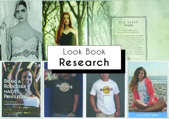
I am now beginning to research different lookbooks to use as inspiration for my lookbook template and design. I have found different lookbooks and promotional material with relevant images to my project’s theme. I have also tried to find different layouts of work such as lookbooks, postcards and promotional books to gain a variety of research and help me decided on what I’d like to create.
The first lookbook I looked at is by the fashion brand Ted Baker. This book features their 2012 Autumn/Winter collection called ‘Survival of the Fittest’. The cover is very simple made of beige textured card. In the centre of the cover, on a white triangle vector, is the name of the collection, this is in a thin and long sans serif font which is the same as the font on the rest of the cover. However, for the word ‘Fittest’ they have used a calligraphic style font. They have also added imagery of a needle and thread to create the lines going across the ‘T’s. I think this is very clever and shows to people who wouldn't know that this book is related to fashion. Inside of the book features lots of flood filled imagery, no of the imagery doesn’t fill the entire page. On all of the spreads the mages even stretch onto both pages. Throughout the book they have kept a continuity of the images of the models being on the left hand page and any text is on the right hand side. The text or sometimes imagery on the right hand side is about the collection or is related to their ‘Survival of the Fittest’ theme. Such as there is imagery instructing the audience on how to hunt or how to style a sword. I think this is very unique and stops the lookbook from seeming to repetitive and boring. It makes the lookbook seem more interesting and makes the audience want to look through it more. I think this is very clever and I would like to experiment with this type of thing in my designs for my lookbook. Throughout the book there is a consistent theme of the photos being green as they are shot in the woods. The models are either on their own or with another model. The shots are always a wide shot as you can see above their heads and the ground beneath them. I think this looks very consistent and flows well, however, I don't want my lookbook to be this consistent as I feel it looks very repetitive. I would like to differ the style of shots throughout my lookbook . I really like the colour scheme in their lookbook. I like how the photos are predominantly green and any text or imagery features the colours from the cover of the book such as white and orange. They have also used a dark complimentary coloured green for some text so it doesn't contrast too harshly with the background image but the audience can still see it. The body of text on the right has a central alignment in a border surrounding the text so it doesn't get lost on the page. Overall, I really like the look of this lookbook, I love how professional and high quality it is. The cover is nicely textured and the images are glossy. Even though I don't have the equipment, the budget or that many photos to make a lookbook on the same level to this. I will still try in my own way to make it as professional as theirs.
I have found two promotional postcards, one from a graphic designer and another from a fashion brand called Anphropologie. The first post card is promoting their skills to anyone who would like to contact them. On one side of the postcard is imagery of the graphic designers work which is black and white monochrome. On the other side they have kept the black and white theme. There is text in the bottom left corner, their name is in a heavily weighted sans serif font. The rest of the text which include information about how to contact the graphic design, is in the same font family, however, this has a lighter weight to it. This postcard design is very simple but it is also effective. There is no unnecessary imagery or colours on the back of the postcard which could distract the target audience away from what is important which is their contact details. These postcards are obviously supposed to be next to someone's work for people to pick up if they would like to. I really like this idea as it promotes their work well. I’m interested in creating an idea like this for my final piece. On the other hand, the other postcard that I have is quite different. On one side is a flood filled image of a women also in black and white, staring directly into the camera. This shot is called a mid shot. On the other side of the card, instead of continuing the monochrome theme like the other postcard decided did, this one features a light pink paint brush strokes. The light pink is very classy and feminine and I think it works well for this brand as they tend to use very pale colours. If they hand used bright fuchsia pink, it would not have suited their brand. On top of the pink is text which is all in the same serif font. However, they have used a different font style such as italics, capital letters or they have altered the size. The body of text which is place slightly higher than middle of the page, has a justified alignment. The text at the bottom of the page has a central alignment. I think this works well as they flow straight down the centre of the page. This postcard is different to the first as it is instead promoting the brands wedding collection to a very different audience. I really like how simple the first postcard is which makes ti effective and straight to the point, I will experiment with this during my designing process. However, I definitely prefer the second postcard just because of how feminine it looks without being too busy. They have included text which they have laid out so it doesn't overwhelm the audience when they look at it. I definitely want to experiment with this style. I feel like a postcard design would be useful to have by my video at the exhibition for people to take if they are interested in my blog.
My next research is of a promotional book by the makeup brand Urban Decay. This book is different and similar to my previous research in many ways. On the front of the book features their signature colours which is purple as the background. On top of that is embossed text in a lighter colour of purple, featuring the brands name in the centre. There is also an elegant swirling design coming off of the text and filling the rest of the cover so it doesn't look plain or boring. The embossed elements gives the text and nice glossy look and added texture. Inside of the book features images of women in a medium close up shot on the left hand side to the page. Similarly to the Ted Baker lookbook they have a similar layout of placing images on the left and writing on the right. However, unlike the lookbook, these images are only on the left and don't carry on onto the rest of the spread. These images show examples of makeup looks which can be created with their products. Unlike any other research I’ve done so far, this promotional material uses shapes to make their images look more interesting. Such as, on the right hand side of the spread, they have used a circle shape with an extreme close up shot of the women’s make up inside of it. So the target audience can clearly see how to wear and style the makeup that the brand sells. The circle also features the same elegant details as on the front cover to make the page look less boring. Underneath the shape is a sans serif font in a different font family. The title is on a separate line in a bigger size and with a heavier weight to it. The body of text has a lighter weight to it. Both text elements have a right alignment which is unlike my other research and is very unique as it’s not often seen. I really like how they have continued the elegant details throughout the promotional material. I will experiment with using different shapes for my images, similarly to their style as it’s very unique and will be remembered by my target audience.
My final research is a promotional leaflet which folds up and can be stood up. The leaflet is for the brand Hard Rock Cafe. It features eight images, four on either side of the leaflet when unfolded. Each photo has a white border framing the images. All of the images are mid shots but they all differ slightly. Two images of men are in the middle of the leaflet, these were both taken in a studio setting. In both images the audience can clearly see that the men are wearing the Hard Rock Cafe merchandise which promotes their products. Two images on the edges of the leaflet are of women which were taken on location. On these two images they feature text about the company such as a rewards systems and the shop’s menu. A lot of the text is the same, a bold sans serif but in different sizes, colours and laid out differently. On one image the text is at the bottom of the image with a blue rectangle behind it. As the text is at the bottom of the image, the audience can clearly still see the image. The font is white with central alignment so it stands out. However, on the other image it is a lot busier. The text has left alignment in a bigger size which takes up quite a lot of the image. This image also features the colours red and black which shows that the reward system relates to wealth and prestigious. As this format is a leaflet it is very unique from my other research. I think this could be an interesting design as it is small yet it shows a lot of images unlike a postcard design. However, I don’t think my images would suit the style of a leaflet design so I will therefore not be using this format.
From this research, i have concluded that I would like to create either a book design or a postcard design to go alongside my video final piece. I think these design will work well and my audience will be able to take them if they wish. This will promote my work, myself and my blog. It will also make my project more memorable. I will now begin to create designs inspired by my research and a mood board which I will create.
0 notes
Text
6 web layout myths busted
Jen Simmons will explain how to design with CSS Grid at Generate New York on 28 April. The conference will also feature Sara Soueidan, Mina Markham, Steve Fisher, Jennifer Brook, Abby Covert and eight other great speakers covering information architecture, conversational design, web performance, user research, and much more. Get your ticket today!
When the web was first invented, there was no technology for page layout. Every background was grey. Every page was a single column of text, filling the whole space from side to side. Over the years, we’ve created one hack after another to tackle page layout.
The hacks have become far less messy, but everything we do today is still a hack. To hand-code a page layout, you must master the art of clearing floats, using negative margins to rearrange order, and dodging browser quirks. It’s painful. Many of us have given up and instead use a third-party framework; Bootstrap, Foundation, or one of their many competitors let us outsource the pain.
We’ve shipped a lot of work using layout frameworks. We’ve been more efficient and suffered through fewer bugs. But now every website feels the same. Every website reaches for an identical 12-column symmetrical grid. Every site uses the same user experience, shapes and patterns over and over. And we are totally bored.
In her talk at Generate New York on 28 April, Jen Simmons will explore the realities and possibilities of new layout technologies and how they will change our craft
A new era
But there’s good news. Finally, we are getting real tools for page layout. Instead of hand-coded hair-pulling or boring formulaic frameworks, we can get creative. Flexbox, CSS Shapes, Masks, Clip-path, Initial Letter, Rotation, Multicolumn, Viewport Units, Object-fit and more are already opening up a world of new possibilities.
Most profound of all, CSS Grid Layout will arrive sometime in the next year, completely changing how we approach page layout on the web.
We should start asking ourselves, what kind of page layout will best serve this project?
The question will no longer be ‘which framework should we use?’ We aren’t going to need them any more. In fact, once CSS Grid arrives, using a framework will be much less efficient than hand-coding your own layout in vanilla CSS. Third-party frameworks – even new frameworks based on Flexbox or Grid – will just get in the way.
We should start asking ourselves, what kind of page layout will best serve this project? How can we tap into a hundred years of graphic design practice to communicate through our layout?
Fighting the code will no longer be the hardest part of creating a layout. Our biggest challenge will be fighting the limitations of our imagination. We developed powerful habits over the last 10 years. We squashed our creative ideas under piles of ‘the web doesn’t work that way’ and ‘you can’t do that’. Well, things have shifted. The boundaries between possible and impossible have drastically changed. It’s time to let go of long-held habits and myths.
layout.land will become home to a community of designers trying out different layouts
Myth 1: Everything must be a floating bar of soap
Any float-based web page layout is like a bathtub full of hundreds of bars of soap. Every element on the page is a rectangle, fighting to rise up to the top. The header is a bar at the top, followed by a bar of navigation, followed by a hero bar, a sidebar, a bar of content. Any time the viewport is resized and a different media query kicks in, the soap bars rearrange themselves, jostling for a position on top.
Floats don’t allow for white space. Floats encourage busy pages crammed full of crowded content. Floats require us to artificially create content of the same length or aspect ratio.
Although it still works on the basis of a grid of columns, CSS Grid has a different mental model to the layout frameworks we’ve been using. One of the biggest changes: it has rows. Rows! These allow us to line things up horizontally, but also let us distribute vertical space. Rows let us create white space. Our default will no longer be everything crammed up against the top of the page.
There are ideas from a century of magazine design that become possible when we have the ability to control the space vertically. I’ve been collecting books on grid and layout design. In one of them, I saw a poster for the Lincoln Center’s 2007 Jazz Festival and wondered if the design could be accomplished as a web page: Figure 1 shows the result.
CSS Grid lets us place things in vertical space, instead of cramming everything against the top of the page
Myth 2: Rectangles; only rectangles
By default, everything on a web page starts life as a rectangle. The tools we’ve been using keep it that way – we line up one box after another. Box. Box. Box.
Now we have tools to help us break up the boxes. You can use Clip-path, Masks or Gradients to cut a box into a different shape. Triangles, diamonds, trapezoids – content can be cut into all sorts of silhouettes. Create a headline with a bold background colour, and slice across the bottom of that box with a diagonal line. Take a series of bio photos and cut them all into hexagons.
CSS Shapes lets you float an element to one side, and flow the content that follows in a shape that’s not a rectangle. Float a photo that’s been cut into a circle with border-radius , and then flow the accompanying text in a circular shape around the photo using shape-outside .
Or create a complex illustration with lots of odd shapes, and use that image as a mask to get the browser to flow text around the shapes in the illustration. In Figure 2, a photo of grapes is floated left, while the text flows around a polygon.
With Rotation you can escape the perfection of everything being square to the page. Tip a headline a bit askew. Tilt a photo to give it some character. Put the credit for a photo sideways along the edge.
The photo is floated left, while the text flows around it in a non-rectangular shape
Myth 3: We can’t control the fold
On the web, we have no control over where the bottom edge of the screen cuts off the layout. We pretended for a while that all screens were 1024×768 pixels (or 800×600), but in reality we’ve never controlled the bottom edge of the screen. Despite meeting after meeting where people insisted their special snowflake must appear ‘above the fold’ , we haven’t had any way to know where ‘the fold’ is. Until now.
With viewport units, we can size or place items in relation to the viewport.
If we want to style an item so it’s a certain proportion of the viewport, we can. img {height: 50vh; width: 50vw} will size an image so it fills exactly half the viewport in each direction.
In the past, defining both a height and a width for an image was a terrible idea. The image would end up being squished. But now, object-fit: cover tells the browser to maintain the aspect ratio of the image, and crop it to fit the defined box.
Figure 3 shows an example. No matter the size of the browser window, the photo of Grace Hopper is always half the width and all of the height. Start scrolling and the article appears just ‘below the fold’. This layout is accomplished with Viewport Units and Flexbox.
No matter the size of the window, the photo is half-width and full-height
Myth 4: 12 columns is best
It was in 2006 that the industry started advocating for the use of a 12-column symmetrical grid. We didn’t intend to become prescriptive, we just wanted simpler maths for hand-coding our fixed-width websites.
960 pixels fitted nicely inside a 1024px-wide screen and allowed us to create column units of 60px with gutters of 20px. Plus, having 12 columns meant we could easily break the space in half, thirds or quarters.
Starting new projects with a Visio template made UX design seem more legitimate. It was easier to impose a standard on a team when you could point to a popular website and say ‘everyone is using this tool, we should do this’. We needed to tame the chaos. But after 10 years of almost every site using the same grid, web design has become incredibly boring.
The 12-column symmetrical grid conveys a feeling of stability and sturdiness, and we use it without asking if that’s really the feeling we want to convey. We’ve learned to art-direct through our choice of typefaces, but not yet through our layouts.
With responsive web design there is no reason to maintain mathematical ratios based on a 960 grid. For years, Mark Boulton has been advocating the idea of using odd numbers of columns, like nine or 11, and trying out grids where the columns are not all the same size, but instead are based on a ratio like the golden ratio.
Such grids are the staple of great graphic design in print. Creating custom grids would allow us to convey so much more about each project through its design, but somehow these ideas have not taken off.
Why not? I think it’s because the maths is too hard when the underlying technology is the float. The team at Mark Boulton Design created an app called Gridset to make such design work easier, and the Sass community has built one library after another to abstract away the maths of complex grids, but either way it all still feels too tricky and fragile.
CSS Grid will make designing custom grids trivial. It will be just as easy to create 11 columns as it is 12. It will be a piece of cake to create a ratio-based array. The browser will handle most of the maths, we just have to get creative with what we want to do.
There’s no reason to keep to 12 columns. Do something new and give your site a fresh look. We’ve got decades of graphic design practice to guide us.
A brief look at how layouts have evolved; we are at the beginning of a new era in web design
Myth 5: We have to use a layout framework
Actually, writing CSS using the new Grid syntax will be easier than applying a framework, and updating old-style frameworks with CSS Grid will only make life harder. Get out of the habit of reaching for a framework. Write your own vanilla CSS.
Myth 6: We are stuck in a rut because of RWD
I don’t believe that for a minute. It was hard for the industry to wrap its head around responsive web design, so we leaned on tools to help us relaunch our sites quickly. But there’s nothing inherent to RWD that requires we all use the same half-dozen layout patterns.
We can create anything we want with CSS, and change it to whatever we want to at any breakpoint. Stop using cookie-cutter tools and you won’t have cookie-cutter results.
Here’s a taste of the surprising waiting in CSS Grid: it can rearrange the order of the content to make it fit the available space using the grid-auto-flow: dense; property. Figure 4 shows the result.
Apply grid-auto-flow: dense and the browser rearranges the order of content to make it fit
Letting go
If you can let go of these myths, your work will stand out. You can make a splash and have a strong impact. Take advantage while the opportunity is still new. Start playing with these properties and see what’s possible.
This article originally appeared in net magazine issue 284; buy it here!
See Jen Simmons live at Generate New York on 28 April, alongside Sara Soueidan, Jennifer Brook, Steve Fisher, Mina Markham, Abby Covert and eight other great speakers. There are also still a few tickets left for the workshops, which will cover usability testing, information architecture, design and content sprints and frontend tooling. Get your ticket today!
Can’t make it to New York? There’s also a conference in San Francisco on 9 June, featuring speakers from Netflix, NASA, Uber, Airbnb, Microsoft and more!
This post comes from the RSS feed of CreativeBlog, you can find more here!
The post 6 web layout myths busted appeared first on Brenda Gilliam.
from Brenda Gilliam http://brendagilliam.com/6-web-layout-myths-busted/
0 notes