#i kinda wish i had a sharper art style
Explore tagged Tumblr posts
Text
apparently my style is veeeery soft because people keep bringing it up hehe /pos
i’d like to think my art is a cotton blanket of sorts
#text post#i kinda wish i had a sharper art style#just to see hehe#my brush isn’t exactly made for hard edges#so soft style it is!!
12 notes
·
View notes
Text
Okay i'm watching the gameplay reveal thing for dragon age and i'm going to bitch about it for a hot minute. Under a cut because i'm sure 99% of you don't need it on their dash.
But i finally figured out what irked me so bad with the previous trailer. Varrick's hair of all things. He was a ginger, tell me he dyed his hair or something because no way it is that dark on it's own now, especially when he starting to grey. He look like Thorin instead of Varrick....and i still can't get over the tonal shift... like.. where are we from the sacred ashes or the destiny trailers? or the fires above?
But this is besides the point. About the gameplay, live reaction bulletpoint style.
Can we like.. leave frostbite in the dust? Bioware please i'm begging. Besides that, the visuals are.. it's pretty. I kinda still feels kinda like a mobile game which i'm not a fan of. Too many soft edges for my visual tastes. for a second i thought it gives more third person immortals of aveum but even that had a much sharper feel to it.. no it is more the new art direction of world of warcraft. yeah, that. which i also don't like.
are.. we gonna be able to create a character on our own or is it going to be companion characters as origin characters only thing?
uuuhhhh the combat looks a bit weird to me but it's mostly just preference, probably other classes and higher levels are balancing it out
uhhh that mage falling off looked.. not great. but it is still an early build of the game so could be fixed. but it's still frostbite so probably not.
i'm not the fan of these spell/projectile path projections.. they somehow don't fit into the style of the game. they really take away from the visuals of the spells.
aaaah is that ability wheel is a console thing right? right?
while we are at it, i hope the hud is not staying this minimal. especially for pc
i miss the old demon designs. these look cool and all but where are the shitty old blobs
is it me or the visuals actually were better looking in inquisition on certain effects? Like.. the big green shit in the sky.. but maybe this is on console and the pc visuals are going to be a bit more upscaled
i do NOT like the new pride demon design. they were so much more imposing before. i don't want them to float and teleport around, i want them to stomp the living shit out of me while i thank them for it.
also why does every enemy has to glow with a neon light somewhere? we are in a dark fantasy world (supposedly) not in cyberpunk ffs...
i know it's a prerendered cutscene but by gods solas looks shit
at least Gareth David-Lloyd is back but i don't know if it is going to be a win for him as well, he barely sounds like himself
This really does not feel like a tonal continuation of inquisition at all, let alone origins and 2. I know it is just a short snippet but it definitely does not give me confidence so far. And it won't change much until autumn probably, unless they drive the devs half to death to rework half the game yet again.
Don't get me wrong, it very well may be a solid, good looking game, and i wish all the best for it but right now it sure does not look like a Dragon Age game.
5 notes
·
View notes
Text
Fire Emblem: Awakening Thoughts
As of the date May 20th, 2020, I finished my playthrough of Fire Emblem: Awakening on its one year anniversary of when I got it. It is now June 5th of writing this. This post will be my thoughts and feelings on Awakening, much like the KH3 Grievances and Blessings post last year. Let's get into some history between me and Fire Emblem before I go into Awakening.
As I've said before, Awakening was both my first Fire Emblem game and my first Tactical RPG. Smash Bros. was where I had heard of Fire Emblem but it wouldn't be until Ultimate came out that I would start to get interested. It was because of my friend's preference for Lucina that got me into playing as her in Smash and that's pretty much how she became both one of my mains and a favorite. It honestly wasn't till I listened to the Smash remixes of Id, Conquest, and Lost in Thoughts All Alone that I decided to play Awakening and then Fates. So thanks go out to both Smash and my friend Eric for converting me to Fire Emblem trash!
Much like the KH3 Grievances and Blessings post, I'll be going over every aspect of Awakening I can think of, from the graphics to the gameplay to the story. I'll even include a Best/Worst Girl and Boy of both generations because that kind of thing seems to matter to some people, along with my reasons for why X is Y. Keep in mind that whoever I choose as those categories, it is just my opinion and you're free to disagree with me. I say this because I know that, no matter what I say, some diehard fans will get pissed at me and come at me for daring to shit on their favorite character. I already know some people are gonna get mad because they think X should be Best/Worst and that'll be fun to see (You can interpret that as sarcasm if you want).
Listed below are Awakening spoilers, so if you want to play the game and don't want to be spoiled, now's your chance to stop reading. I know Awakening came out in 2013, meaning 6 or 7 years ago, but there may be some people who haven't gotten around to playing it yet so I want to be courteous to them. Here are my thoughts on Fire Emblem: Awakening!
First off, the graphics. I think they looked really nice for a 3DS game that came out in the early 2010's and I believe this was Fire Emblem's first fully 3D game as well so that's really impressive. The in-game models were nicely detailed, the in-game sprites were nice looking, and the prerendered cutscenes were beautiful. This doesn't mean they're not without their faults, though. I wish the in-game cutscenes were more animated because it's easy to tell when an animation's been used over and over again, I feel as if the in-game sprites have some dissonance with official art, and there are times where expressions or animations for the prerendered cutscenes have looked pretty awkward. In terms of the first and last point, I'm giving IntSys some slack because, as I stated earlier, they were developing a game for the 3DS, a powerful handheld device but it's still a handheld, and this was FE's first 3D game so there may have been issues transitioning from 2D sprites to 3D models. I'll explain what I mean by my second point. I've looked at Cynthia's official art and when I see her face, I tend to see what I'd call a baby face, pudgy cheeks and all. Her in-game sprite, however, her face is sharper, more mature, if that makes sense. Maybe it's the pigtails throwing me off or it's just a difference between two art styles, I don't know. I'm not an artist so there's not much weight behind this but I'm just saying there's somewhat a dissonance between official art and in-game sprites.
Secondly, gameplay. I loved how easy it was and how I could switch between a simple and complex UI if I wanted to see which attacks could hit or what the enemy's stats were. This may sound stupid but I honestly thought it'd be way more difficult due to this being a Tactical RPG. I know strategy's a big part of Fire Emblem but strategy's not a big problem if you're like me and you grind to hell and back. Speaking of which, I played on Easy Casual mode so that might be why it seemed so simple from the get-go. Just to give you an idea of how much I grinded, I put in 200+ hours and that mostly consisted of buying a shitton of Reeking Boxes, spawning Risen on some of my favorite grind spots, and fighting them over and over again. I went through the 3 basic classes each character could have, maxed out their default class one last time, promoted them to their advanced class, and maxed out those classes 2-3 times over. I have a video on my Twitter that shows the stats of these characters and most of them are over 220 (The shapeshifters 300). Needless to say, I loved each and every fucking crit I got. Cordelia even got what I call a miracle crit, which means she got 2 crits in one round and after the enemy attacked, she got another 2 crits. Level grind ain't a joke in this game.
Thirdly, the music. Considering it's part of why I got into this game in the first place, I loved it. As I'm writing this, I'm listening to the OST and it sounds so much better when you don't have the ambient sounds and you're not listening to it through the 3DS speakers. The song that hit me the most and just gave me the overwhelming feels was Id~Sorrow as it played in Chapter 21. It fit so well with the tone of the scene and I just sat there for a few minutes, letting it play in the background as I did shit. Other notable mentions are Id~Purpose, Destiny, Conquest, and the song that is just ellipses. If the music is this good in Awakening, I can't wait to see what's in store for Fates!
Fourthly, the voice acting. For a game where most of the voices come in forms of clips, I thought they were good. Each of the actors tried their best to convey their characters in the clips they were allowed to have and I think it shows. The only critique I have, and it's not the actors' fault, is that some of the characters' voices don't fit them. I'm not saying they miscast these characters, it's more like the direction was off, if that makes sense. Let me bring up Cynthia, Kjelle, and M!Morgan as examples. I don't think it's a stretch to say that, sometimes when you look at a character, you kinda imagine what they'd sound like before you hear their actual voice, right? I already brought up Cynthia's looks so I imagined her voice to sound very high-pitched and maybe a little childlike. I hear her voice and, while she's high-pitched and some of her voice clips do go into that childlike territory, she's nasally sounding and more mature. Kjelle is a complicated case in that, her voice fits her appearance (minus the armor) but not her personality. Her personality is similar to Sully's so I figured her voice would sound gruffer and not...cute, if that's the right word. M!Morgan's, I think, everyone can see the problem with. He's supposed to be the youngest of the kids, right? Since he's the only third generation character and all that? I think he just sounds a little too old for the supposed baby of the kids. Again, I'm not saying the voices are bad or that the delivery/emotion was bad, I just think the direction in which they were voiced don't fit some of the characters. Maybe I'm just thinking in terms of archetypes or something.
Now we move on to the story. I can't say as to whether it was good or not, mainly because I spoiled myself on it way before I decided on playing Awakening, so I don't think I can say much to the quality. The least I'll say is it's serviceable. I'll admit, the one thing I was shocked by was the appearance of the Grima Avatar because I thought Grima was inside Robin the whole time and I didn't think he'd have a separate vessel. I straight up thought Grima!Robin was either my mother or a twin I wasn't aware of so I'm giving credit to the writers for surprising me. Anyway, I think the only flaw I have with the story is with the pacing. I thought the first half was fine, it wasn't too fast or too slow. It was the second half that the pacing couldn't find a middle ground. Now I'm going to say that this half was stretched out over months of my playtime so whatever I say next might be exaggerated because of my procrastinating ass so... I feel like the Valm arc was way too slow and the Grimleal arc had so much trouble finding a middle ground. The beginning of the Grimleal arc was quick but Grima himself decided that I had to finish 2 and a half chapters before I finally got to beat him and you have to deal with constant reinforcements before you kill off the target. I think if it weren't for my overleveled as fuck units, I wouldn't have finished Awakening in time for my birthday.
Just for shits and giggles, I'm gonna say what I picked for my choice with both Luce's judgement and Grima's fate. I picked the self-sacrificial choices, which means I accepted Luce's judgement and allowed her to kill me and I dealt the final blow to Grima so Chrom didn't have to. While I knew the outcomes of both choices and them ultimately not meaning anything, I wanted my Robin to reflect what I would've done and I'm a very self-sacrificial person. Because I made Chrobin happen in my playthrough, which meant Luce was my daughter, I believe that, if my child who came from an apocalyptic world told me I was the reason for that happening and that she came back through time to stop that future from happening so she and the others wouldn't suffer, I would've let her kill me. Parents would and should do anything for their kids and if my death possibly gave my daughter the chance for a better life, I'd take it in stride. As for me dealing the final blow to Grima, if it was to save everyone I loved, I would've done it. Although there's some feelings of wanting to give a big "Fuck you" to Grima and to permanently end the problem so any future descendants wouldn't have to deal with it. This section may sound more philosophical and personal than I usually write but I think it deserved it.
Now we're on to Supports and who I chose to be together. I don't think it's wrong to say that this is where the characters really get to shine and it's because of the Supports I love these kids and how much I'm going to miss them when I move on to other FE games. As for the "canon" couples, I mainly went with characters that I thought would complement each other and this was one of the few things I tried to choose for myself. I tried my best to go for pairings that weren't fan favorites but I'm also not very connected with the fandom as of writing this so I may be completely wrong in which ships were favorites or not. So here are the pairings I got for my playthrough!
Chrom-Robin
Frederick-Sumia
Virion-Miriel
Vaike-Nowi
Stahl-Sully
Lon'qu-Cordelia
Ricken-Lissa
Gaius-Maribelle
Gregor-Cherche
Libra-Panne
Henry-Olivia
Lucina-Inigo
Owain-Cynthia
Brady-Nah
Kjelle-Laurent
Severa-Yarne
Obviously, there are some characters missing from this list and I can explain why. I didn't recruit Kellam and Tharja and it's because your girl is a dumbass. Kellam, I thought, was already on my team, he was just labelled as an ally so I didn't need to recruit him. They really should've made that clear. Tharja, on the other hand, was an even bigger dumbass than me because she decided to charge after Robin, who happened to be in front and was way overleveled, and got her ass promptly beaten with a crit. I regret not getting Kellam but after hearing how awful of a person Tharja is and how many fans are willing to put aside emotional abuse and stalker-like tendencies to have a chance to fuck her, she can stay buried in the sand where I electrocuted her ass. Unfortunately, this does means Noire didn't pop up in my recruitment list and that fucking sucks. The only characters left I didn't have a pairing were Gerome and Morgan. I think Gerome wouldn't really care for a romantic partner because he's all about not wanting to create ties in this time and shit and, since I see Morgan as the baby of the kids, I figured he'd be a little too young to be in a relationship. Despite that, I wish I got him and Nah together because I found out after she was shipped with Brady that Morgan's the only S-Support she'll say "I love you" to and I was immediately filled with regret.
Before I move on to the Best/Worst contest, there's something I need to bring up because I can see what sensible fans have shown now. This game is HELLA gay. Like, holy fuck, how many instances are there where you have two characters of the same sex and they have dialogue that seems to have been written with romantic intent but the writers decide it's meant to be platonic? Maybe I just have this weird line of thought on how straights are because there's no fucking way some of these gay moments would be a thing with even the most accepting straights. Maribelle calling Lissa darling and other pet names, Robin blushing from some of the girls and even mistaking Flavia's proposition for a marriage proposal, Severa looking at Kjelle's abs, the list goes on. I'm not straight because I'd be doing some of this shit with a potential girlfriend if I could! Why did it take IntSys until 3 Houses to implement LGBT+ pairings when this game is right here?! At least this game doesn't have the weird student/teacher relationships 3H has and believe me when I say that, if it weren't for the fact I could give less of a fuck for 3H, I wouldn't play that game for that reason! Anyway, Awakening is hella gay and it should've been the first LGBT+ FE game instead of 3H.
The Best/Worst contest... As I said in the beginning, there'll be a Best/Worst Boy and Girl for both generations because that's fun and it seems to matter a lot to some people. Repeating what I said, this is just my opinion and you're free to agree or disagree with me. One rule I'm putting in is I will try my best to not pick fan favorites. Don't get me wrong when some of the crowd pleasers are good but there are other characters that deserve just as much love as the fan favorites so this is why I'm putting in this rule. Without further ado, here are the rulings!
1st Gen
Best Boy-Lon'qu
Best Girl-Panne
Worst Boy-Virion
Worst Girl-Miriel
2nd Gen
Best Boy-Owain
Best Girl-Cynthia
Worst Boy-Inigo
Worst Girl-Severa
Let's see how many people I piss off with these judgements. So, my reasoning: Best Boy for 1st gen was a big toss-up. I kept wanting to choose between Chrom, Frederick, Stahl, and Lon'qu because they really endeared themselves to me but I chose Lon'qu in the end because he's honestly such a dork (I mean, all of them are) and I gotta admire how he tries to overcome his fear of women and try being there for his wife and daughter if he happens to have one. There's also the fact he has to literally psyche himself up to talk to women if you check in with him in the Barracks and I'm just like "Fucking hell, that's adorable and I GET it". Best girl is Panne because believe me when I say that the moment I see this woman and hear her voice, I'm immediately gay for her. Then she transforms into a giant rabbit, kicks so much ass, and I'm in love. Funny story, I'd talk to my friend about my progress in Awakening on Discord and the moment he asks me who best girl was and I answered Panne, he called me out for being a furry. Granted, I would've automatically said Luce but I'm trying not to pick fan favorites so I get his criticism. If a woman like Panne existed in real life, bunny ears and tail and all, I'd probably become a furry for her, no questions asked. As for worst boy and girl, Virion and Miriel are characters I honestly don't give much of a fuck about. Not that they're bad, I just don't care about their archetypes, if that makes sense. Miriel I found to be boring and Virion's of the Casanova archetype and I've always kinda hated that archetype so that's why they're on the ranking.
Oh boy, 2nd gen. So, best boy being Owain. This boy is going to kill me. He's so adorable and sweet and he's just a good boy. There are literally Tweets on my Twitter where I just gush about him and he deserves so much love. He's just a sweet boy who loves his parents so much and is so proud to be their son and how he manages to rope his cousins (Luce and Morgan) into going with his fantasies and how they just go along with it! Owain is a cinnabun and I want to protect him and love him. Anyway, best girl being Cynthia is sorta the same reason as Owain. She's just so bubbly and happy and just adorable. Yeah, she may get carried away with showboating but I just love her earnest desire to be a hero. I think everyone can see why I paired Owain and Cynthia up. Now for the worst. Inigo and Severa are probably the only characters in this whole game that straight up got on my fucking nerves and for different reasons. Outside of his supports with Olivia and Henry, Inigo's constant flirting with the girls and Robin and inability to take no for an answer just rubbed me the wrong way. I actually put out a Tweet saying how Inigo's like an r/niceguy and I still think he is one. Course, this doesn't mean I didn't have my fair share of laughs from him. I fucking died at his and Gerome's A-Support where he ends up pathetically crying after the emo loner got more game than him and Gerome has to comfort his ass, that was hilarious. It also helped the fact that Liam O'Brien, who I've only heard him as the brooding emo loner role, voiced Inigo as the complete opposite of that and I had a blast. Severa, on the other hand, was...really unpleasant. There's a reason I hate Tsunderes with a passion and it's because they're unnecessarily bitchy towards everyone they know, even if they have no reason to be. Severa, however, was somehow worse because she went out of her way to be horrible to people. My dislike for her was cemented the moment I saw her and Cynthia's C-Support and she chose to make fun of her, despite Cynthia minding her own business and Severa just going "fuck it". However, I should express that I understand why Inigo and Severa are the way they are and that's why I'm not being as harsh on them as I could be. They still have their good moments and I can appreciate them while also raking them over the coals.
So that concludes my review/experience of Fire Emblem: Awakening! Despite some moments of frustration and annoyance, I had fun playing this! I mean it when I say I'm gonna miss these kids but I had plenty of time to spend with them so it's time to move on to newer lands. Next up on the list is Fates and I think I'm siding with Hoshido first. It's funny how, despite me spoiling the story for myself 3 separate times, I still can't remember much, if any, of it so that may say something about the quality. I also know Fates is pretty divisive among the fandom but the thing I know it for is the weird pseudo-incestuous ships it has so that's going to be fun! Hopefully, I'll get around to playing as one of my other mains in Smash, my water horse dragon Corrin, sometime soon and I'll be sure to let everyone know when my journey will start!
4 notes
·
View notes
Text
My Small Review of Tawna and Mario 35th All Stars
So Crash Bandicoot 4 and Super Mario 3D All Stars.
Seeing Crash Bandicoot 4 reveal of Tomboyish Tawna is surprising. I really like her design, but a few quirks. Well, seeing her part, she seems interesting, and I favorite some fanarts. I haven't completed the first or third game, but I am excited to see Crash 4. Tawna's design is known to be attractive. On one thing, I know her hair style looks like a design from Fortnite, and a blue dye seems a bit off. I would pick red to suit the style more. People mentioned that she looks like a Tumblr style of art, but her outfit and facials looks more detailed. Her hair kinda looks like an odd choice, but tolerable! Wished they kinda picked a better hair dye. Still, it's nice to see another dimensional Tawna. She's known for having a curve behind. Hehe. I would like to see more of her when the game comes out. She seems like a cool character.
Also, Super Mario 3D All Stars reaction review and the compilation itself. When it was announced, most were happy, but some had concerning thoughts about it. It was first announced to be only digital and limited, so you can't really buy the game after March. Back then, we never heard about a physical copy, so it was more concerning that being limited and only digital would mean you could never find a legal copy of it ever again. Super Mario 25th All Stars Limited Edition was only physical release with Super Mario All-Stars inside the disc, which you can still find on sites like Ebay or Amazon, regardless of the price at least. Around the time the compilation came out last week, I see people getting physical copies, which is a good thing. Another problem was the price. It's $60 for three games. It didn't need to be that much since they're just emulated (Galaxy 1 is partial) with texture pack. I think it could be at $40, unless if they included Super Mario Galazy 2, which would make sense to be $60. It should be somewhat easy to include the second game inside the compilation, since both use the same engine and could be compiled the same way as the first game.
Still, besides the limited edition (somewhat dissolved with physical release appearing) and the price (lack of SMG2), it's a great announcement for Super Mario 3D All Stars. Super Mario 64, I like the HUD having high textures. It's 720p, even in Docked mode, which should be 1080p. Still, it's a popular game that many people want. I know there's unofficial port for the Switch that runs in 60fps and widescreen with texture packs and is more truly a remaster, but official choice is not a bad take at all. I saw Digital Foundry's video, and for Super Mario Sunshine and Galaxy, they look a lot cleaner and sharper. Sunshine has widescreen which is an exciting take. Dolphin Emulator won't run that well on the Switch or Nvidia Shield, both being Tegra X1 chips, so Super Mario Sunshine and Galaxy are excellent choice for the 35th anniversary bundle to play the game officially on Nintendo Switch. If you don't have the switch yet and want to get it, you can find the physical copy if you plan to buy a switch later.
Those are my two takes, and all positive, while addressing a few things. Those are exciting thing for gaming this month. June was a horrible take, because I had to write about Pokemon Unite and address its huge problems. Here, it's generally positive. I plan to write a review for Sword and Shield once I finish the game completely, with TWO DLCs first to take a look back to when it came out. Have a happy night!
1 note
·
View note
Text
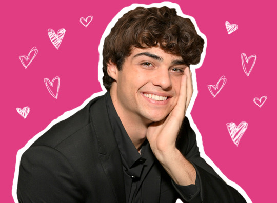
s u r v e y : p e y t o n p e l l e g r i n o.
what’s this? there’s something paper clipped to the page... a stick of juicy fruit. how thoughtful.
basic information
FULL NAME: jamie claverton peyton pellegrino PRONUNCIATION: PAY-ton pell-eh-GREEN-oh MEANING: noble, royal REASONING: his kidnapper father said he always looked like a peyton. strong, wise, dignified. NICKNAME(S): pey, pellegrino, pillsbury ( monty ), sparkles ( tess ), etc. PREFERRED NAME(S): peyton BIRTH DATE: july 24, 2000 AGE: 18 ZODIAC: leo GENDER: cismale PRONOUNS: he/him ROMANTIC ORIENTATION: heteroromantic SEXUAL ORIENTATION: heterosexual NATIONALITY: american. ETHNICITY: italian-american. his father’s got pellegrino pride.
background
BIRTH PLACE: milton, delaware HOMETOWN: milton, delaware. his dad said he was born in ohio. everyone thinks he’s from cali, when they meet him. SOCIAL CLASS: upper-middle. FATHER: presley claverton. matthew pellegrino. fire chief. 52. west ham’s most eligible and charming single father. and peyton’s best friend. faceclaim. MOTHER: theresa claverton. francesca milluzzo. peyton never knew her. his dad said she deserted them shortly before his first birthday. SIBLING(S): none. BIRTH ORDER: first of three. the clavertons needed to fill the void. first and only. PET(S): none. but he adores anything fluffy. OTHER IMPORTANT RELATIVES: n/a PREVIOUS RELATIONSHIPS: n/a. he’s always been too scared of his own shadow to ask a girl out. ARRESTS?: squeaky clean. PRISON TIME?: not unless you count double-shifts delivering pizzas.
occupation & income
SOURCE OF INCOME: works part-time as a pizza delivery boy at one of west ham’s most beloved pizza joints. CONTENT WITH THEIR JOB (OR LACK THERE OF)?: very content, usually! people tip well and peyton enjoys the small talk. PAST JOB(S): assistant life guarding at the local pool in middle school, but that quickly ended after he had a panic attack on duty. SPENDING HABITS: peyton’s pretty frugal! his idea of a fun time is boarding around town with monty, or grabbing a scoop of ice cream at one of the local places. he’s not too big on driving, if he doesn’t have to. longboards almost everywhere. his dad’s job gets them ample cash, being fire chief, but they live modestly. pellegrino men are humble. MOST VALUABLE POSSESSION: his longboard. unfortunately, his anti-anxiety meds.
skills & abilities
TALENTS: deduction, longboarding, mock trial, stage lighting, studying, making people smile. he’s mario kart champion and he’ll never live that down. SHORTCOMINGS: overthinker. often, he limits himself just by thinking in circles. he... finds the good in people. assumes the best. LANGUAGE(S) SPOKEN: english, and enough italian to get friendly with the kitchen staff. DRIVE?: yes. JUMP-STAR A CAR?: yes. CHANGE A FLAT TIRE?: yes. RIDE A BICYCLE?: yes, but longboards are way better. SWIM?: yes. PLAY AN INSTRUMENT?: he has a guitar and plays it decently well. sometimes he’ll hum a little tune and strum a few chords, but it’s nothing too major. PLAY CHESS?: yeah. BRAID HAIR?: ha! him? able to braid hair? he wishes. TIE A TIE?: he can double-knot his shoes. PICK A LOCK?: no.
physical appearance & characteristics
FACE CLAIM: noah centineo. EYE COLOR: deep hazel, primarily chocolate with pools of mossy green. HAIR COLOR: dark brown. HAIR TYPE/STYLE: wavy/curly. it does what it wants, and he rarely styles it, unless it’s for a mock trial competition or a student gov event. reference. GLASSES/CONTACTS?: he has a glasses prescription but always wears his contacts. DOMINANT HAND: right. HEIGHT: 6′1. WEIGHT: 165 lbs. BUILD: lean, trim, athletic. EXERCISE HABITS: he’s co-captain of the lacrosse team with monty, so they have daily team workouts. he goes for runs a lot, and likes HIIT training. does longboarding count? it should. he’s boarded all over this town countless times ( it’s also how he chooses to deliver pizzas, when the weather’s alright. ) SKIN TONE: tanned, smooth. reference. TATTOOS: none. he can’t handle needles. PEIRCINGS: none. MARKS/SCARS: a few on his arms and legs from nasty longboarding falls. NOTABLE FEATURES: his wild hair. million-watt smile. USUAL EXPRESSION: peaceful, welcoming. CLOTHING STYLE: reference. leather bracelets, cuffed jeans, lots of solid colored and colorblocked tees. when he dresses up for mock trial, the girls kinda swoon. boy looks dashing in a suit. has a glasses prescription but always wears contacts. his dad says he looks sharper that way ( but it’s actually because, with glasses, he looks too similar to the claverton family. ) beat up chuck taylors, kind of untied on purpose. he’s got that whole loosely kept together, sleep deprived look down pat. JEWELRY: leather bracelets. sometimes he’ll wear a thin chain. ALLERGIES: n/a. BODY TEMPERATURE: the standard. he runs a little warmer than most. DIET: lots of pizza. mountain dew. juicy fruit gum’s basically a whole other food group. PHYSICAL AILMENTS: n/a. he can be a bit jumpy, sometimes, if he’s feeling on edge. his left pinky kind of clicks funny when he makes a fist, from when he broke his hand his freshman year.
psychology
MORAL ALIGNMENT: lawful good. TEMPERAMENT: phlegmatic. ELEMENT: earth. MENTAL CONDITIONS/DISORDERS: anxiety disorder. SOCIABILITY: very approachable. warm. kindhearted. there’s a reason he’s the one tasked with getting class dues, as class treasurer. there’s a reason why he leads the lacrosse team. EMOTIONAL STABILITY: typically very levelheaded. his anxiety can make that fluctuate, though. PHOBIA(S): having another panic attack in public. he hasn’t had one in front of anyone besides monty in a year. ADDICTION(S): does juicy fruit qualify? DRUG USE: none. very straight-edge. ALCOHOL USE: occasional, as much as you’d expect. PRONE TO VIOLENCE?: not at all.
mannerisms
QUIRKS: peyton shoves his hands into his pockets when he’s nervous. he always looks for monty or tess in a crowded room, to get grounded. whenever he wears a flannel or a sweatshirt, he always pushes the sleeves up midway to his elbows. HOBBIES: lacrosse, longboarding, mock trial, reading, parkour ( a phase in freshman year ). watching football games with his dad. trying out weird recipes. HABITS: biting the edge of pens. turning his head to the side when he’s listening. offering people pieces of his lunch until he realizes there’s nothing left for him. NERVOUS TICKS: not knowing what to do with his hands. trailing off. looking at the ground. laughing. counting his own fingers. biting the tip of his tongue. DRIVES/MOTIVATIONS: he genuinely wants to see people happy. he wants everything to run smoothly and willingly along. FEARS: his meds will stop working. he’ll have a panic attack in front of his classmates, who are supposed to see him as calm, collected, put together. he’ll never get to know more about his mom. it bugs him. POSITIVE TRAITS: benevolent, bona fide, conscientious, suave, tenderhearted. NEGATIVE TRAITS: anxious, critical, restless, self-limiting, yielding. SENSE OF HUMOR: puns. wit. a lot of inside jokes with tess and monty. DO THEY CURSE OFTEN?: not really! he’s more likely to say frick or flipping than anything bad. CATCHPHRASE(S): “ oh shit ! ” & “ dude ! ” & “ what’s good ? ”
favorites
ACTIVITY: longboarding, hands down. ANIMAL: he’s got a super soft spot for rabbits. BEVERAGE: mountain dew or 7-up. BOOK: growing up, he loved the percy jackson series. CELEBRITY: stephen hawking. COLOR: green. DESIGNER: designer? he guesses, like... is gucci the right answer? he’s not really plugged in to that. FOOD: does juicy fruit count? FLOWER: he’s learning more about flowers, but he thinks sunflowers are pretty nice. kelly’s teaching him more about those. GEM: tiger’s eye. HOLIDAY: christmas. that’s when the famous pellegrino slutty brownies surface. MODE OF TRANSPORTATION: longboarding !! MOVIE: original star trek. MUSICAL ARTIST: saint motel. QUOTE/SAYING: “ we’re dead ! we survived but we’re dead ! ” – dash, the incredibles. SCENERY: rolling hills. sunset. SCENT: cinnamon. SPORT: lacrosse. SPORTS TEAM: in connecticut, he’s surprised he hasn’t been vilified for being a chicago bears fan. but he and his dad spent some time there, and going to those games became a weekly tradition. they watch them now, and it’s like a little piece of their story. TELEVISION SHOW: saturday night live, honestly. WEATHER: that golden-hour sunshine, just before sunset. lukewarm. mid-60′s. VACATION DESTINATION: hawaii. he’s always wanted to longboard down those colossal volcano-side roads.
attitudes
GREATEST DREAM: go into tech/lighting design for broadway. ask cassandra pressman out, for real. GREATEST FEAR: his dad won’t be able to function without him in west ham next fall. he’ll panic in front of people when he needs to seem strong. MOST AT EASE WHEN: he’s with his squad, the belugas. LEAST AT EASE WHEN: he’s allowed the time to overthink. when his dad doesn’t come home from his fire shift on time. when things don’t feel right. BIGGEST ACHIEVEMENT: the west ham mock trial team won the state championship this spring. BIGGEST REGRET: he never pressured his dad more about finding his mother. MOST EMBARRASSING MOMENT: he had a panic attack in the middle of his treasurer speech freshman year. someone pulled the fire alarm right as he couldn’t breathe. to this day, peyton has no idea who that was, but he’s so friggin’ thankful. BIGGEST SECRET: his biggest secret’s not even known to him yet. matthew pellegrino isn’t his father; he’s his kidnapper. peyton pellegrino’s fake. doesn’t exist. TOP PRIORITIES: having monty and tess’s backs. taking care of his dad, since he’s still reeling from peyton’s mom leaving almost 17 years ago. bringing the lacrosse team to the state championships. making sure every single thing he does for west ham high’s theatre department is flawless: making art on that stage. finding out how to... conquer this anxiety. finding out how to muster up enough courage to make a move before it’s too late.
#newhamhq: task#🍂 –– shallow graves for shallow hearts ! isms.#🍂 –– there's no place like home ! psyche.#yoooo..... cackle at that header image bc i'm still laughing
3 notes
·
View notes
Text
Mini Challenge #2 - No Need To Adjust Your TV Sets...
This mini had our girls twisting and turning with their makeups, designing their best optical illusion makeups! Let’s see how they did!
Analyse Thropic

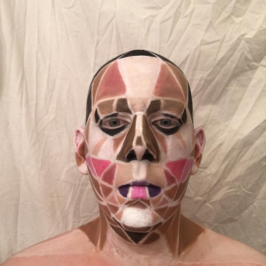
For this illusion makeup mini, I did a low-poly makeup look made of graphic triangles and quadrilaterals. The shapes are arranged and colored to mimic the placement of a standard drag beat, but the non-blended nature of these shapes gives the look a sort of computer-generated feel.
Lila: When you said you were doing a low poly look, I was so excited because it’s such a fun aesthetic. Now, I do like how you’ve set it out, it’s really intriguing and the effort into even the most minute areas, like how the hair and ears are covered. It’s just that your white line spacing is really putting it off the perfect-o mark for me. If you used a really, *really* thin brush the finesse your white spacing, it would honestly have made it look more low poly, because it’s coming across as mosaic rather than low poly. Good job with this, however! I hope you come back to this look in the future since it’s such an original idea.
Gluttoni: Anal! This is a very cool optical illusion and I like your take on the facial anatomy. Can't say it's the most innovative of them all but I can tell you are listening and learning so I can really ask for more.
Letha: I quite like the idea here, Analyse, its very “Your internet connection ain’t shit, so here’s some 144p playback”. The placement of the shapes, as well as the colors, make sense when deconstructing a face. Where you lose me is the white lines. They make everything too stark and disjointed, instead of just low-poly. I think had the shapes been connected while still holding their crisp lines, it might have been more effective. But good job, nonetheless!
Toni:I think this is a really interesting concept and I like that you went outside you comfort zone! Clearly you know your base paint because this style of paint requires you to know where everything goes. I would have loved to see thinner lines between the shapes to really drive home that it was all one image that was in low poly, as well as adding a few more triangles to add a bit more of the feel to it, but over all this is well done!
Antonina: Hey darling! I like what you’ve done here, it’s a great base for a future look. It just doesn’t feel like something finished. I think using this and adding more drag details, like more eye makeup, lashes and a fuller upper lip is something you should explore in the future, because it really is a good start. I’m not getting a super strong illusion from this, but I love the colors you have used and even tho the lines on your face could be sharper, I think they look good right now as well. You keep surprising me, keep it up!
Avana Noir
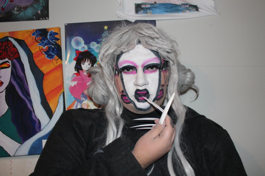

Hello Judges and TDR community. For this Mini I was inspired by surrealism art. So i decided to paint myself with three faces. Since surrealism if very out of this world and very imaginative. I really wanted to push what i can create with a makeup brush. This was kind of challegning but I think I did a great job. I was also inspired by the makeup used by the Japanese Geisha, hence the white face and uses of pinks. I hope you enjoy this look! Thank you!
Lila: On paper, and in execution, this is a great optical illusion and I hope you indulge with it a little bit more since it sticks to your aesthetic really well. For what it is, however, I wish you could’ve blended the Ghost In The Shell-like real face a lot more to show that the face is beneath the illusion of a split. I’m getting a Kim Chi vibe from this and I really think you could use this makeup in your look again, just as a whole white face rather than the split, but if you were to do this again with the split, I would concentrate on detailing the looks to appear more consistent with your features, because its looking a little messy. Overall, I do enjoy this, good submission, Mom!
Gluttoni: I was actually really surprised with your submission in the best way possible. This was ambitious and quite a cool illusion. I think this is probably the cleanest I've seen your makeup so honestly keep on this track.
Letha: This is a really fun idea, Avana, and the creativity really shows through with this concept. The illusion works if I don’t look too closely at it, but the details up close sort of spoil it. It would be more effective if your lines were crisper, and had more highlights/contours on the faces you added, as well as the perimeter of the middle face, to make them really pop. But still, good job!
Toni:Oh she had to show me she wore her nails, okay i see you! I really like this! I think it was a smart optical and for your first time atempting it I think it’s really well done. I do wish the lines were cleaned up more so it was clear that it was a clear split of the two faces and so that there arent just these huge black lines going down your face. I so think that you could have used a bit on the fine tuning of the fake faces. But over all this is a really cool look and something I think you should redo to go out in!
Antonina: You were one of my personal favorites this week! I’m getting Picasso meets Studio Ghibli from this. I don’t have a problem with the messy lines in this, because it’s supposed to be artsy. I got dizzy looking at your submission, and that’s a good thing when it comes to optical illusions, right? The line’s could be darker though, and the wig looks a little to plastic-y. A really dark line around the white face, and maybe a black wig would take me all the way to Spirited Away, but I still love this as it is.
Daddie Dearest
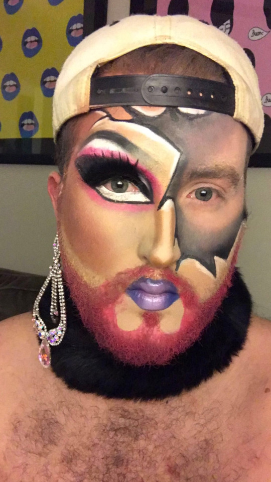
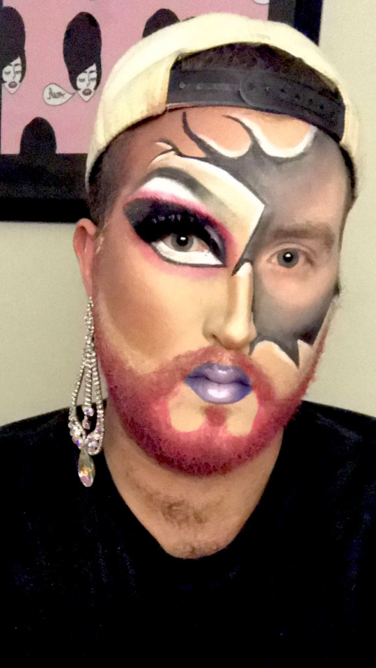
Let me first apologize for the quality of this submission. I was on very constricted time this week, and I hope the judges know the quality of my work is better than this. Anyway, my favorite part of drag is the transformation, so I chose a look that displayed both sides of Daddie in an interesting way. The drag side was heavily inspired by my lovely boy-girlfriend, Ellie Dee. For the boy side, I wanted it to look like someone took a hammer, smashed my face, and removed the pieces. Thanks judges!
Lila: I think makeup is one of your strongest assets, and I love your beat a lot because it’s so creative already with the element of your beard. However, I know this mini challenge has thrown half of you off, but you could’ve taken the crack to the Nth degree here. It would’ve been fun to see some sort of skin peeling illusion or something like (this) where the paper would rip off. Although there is an illusion here, I wish it was a little bit more than it is. Nevertheless, good job!
Gluttoni: Yo Dad, I'm just going to be honest and say I was expecting just a tad more from you. You are clear one of the more advanced makeup artist in the competition so a take on something you've done the previous week disappoints me slightly. I'm going to hold that against you because I respect you as an artist and this evidently still good work.
Letha: Daddie! The makeup is BEAT as always, and I love the contrasting tones/colors. That being said, if I haven’t seen this exact look from you, I feel like I’ve seen similar, and while it’s good, it’s not really pushing the creative envelope. I don’t get a big sense of an optical illusion, but still, there’s no denying your skills, so good job!
Toni: I know this week was really rough on you because you had to scrap your first idea and then quickly make something new out of nothing so I want to give you points for that because I know you were in a panic. I like this a lot, is it the most exciting thing out there? no but Its solid. I think you could have gone all the way and maybe blacked out some chips where it looks like pieces of your face had fallen off kinda like a cracked doll. Over all I think this is a good submission for your situation.
Antonina: Hola papi! This is very pretty, it’s a cool submission, but it’s not the best match for the challenge. But you already know that. I think this was just another chance for you to keep practicing your makeup. You look great, but it was not one of my favorite looks I’ve seen from you so far. The gray part looks a little random and rushed. Maybe if the parts where your real skin tone was showing was white or at least a lot lighter it would give it more dimension. Keep on pushing papi, you got a lot of stuff to show us I can tell.
Dotte Com
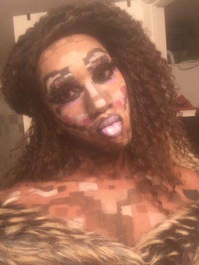
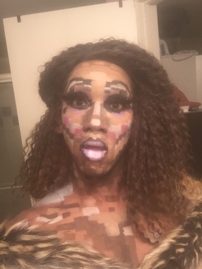
Behold the face of pixel perfection! It was difficult to mine my crafting skills when it came to this challenge, but that didn’t stop me one 8-bit! There’s more than just drawing squares, since your 3D shape has to appear 2D. It was one direction that I enjoyed playing with and I feel like I rose to this cyber-occasion.
Lila: I LOVE this, and I expect to see you continuing this type of experimentation. This was a huge risk and it is up there with one of the more creative choices of this mini challenge. Two things (because I’m nitpicky) that you could’ve enhanced our digital experience with, the pixels could be a lot smaller in some places, your nose contour is looking a lot wider than usual and it could’ve been shaped just to make it more narrow. And, instead of the wavy hair, you could’ve treat us to more of a squared off headpiece or wig, just to tie in that digital look you were trying to serve. This illusion was really exciting to wait for and you did such a great job with it, none the less!
Gluttoni: Dotte! I am so proud of you for this one! You really took the theme and ran the fuck away with this. Not only that you definitely tied it into your own persona to really seal the deal. It's a little rough around the edges but I think got good grasp on different hues and saturation that I wouldn't expect from you. Keep blazing a path like this for yourself and I think you may find yourself in the top way more often. Being tenacious will get you everywhere in life.
Letha: This is a really cool idea, Dotte, and totally fitting for your aesthetic. I’m not totally feeling the hair here, as something shorter or maybe with a blunt bang might have carried the whole “cybernetic technomatic” type vibe a little more. Overall, the pixels are in cool places and seem to mimic a face (as well as down the neck yas thank you for doing that), I would appreciate cleaner lines though, as it appears muddy in places. I love how you took this mini as an opportunity to both experiment with your makeup skills, as well as expressing who Dotte is, so Halleloo to that!
Toni: Dotte I was worried for you with this that it wasn’t going to be enough but I really love this. I think its fun and just enough of an illusion to really be interesting to look at. I love that you paid attention to the challenge and did everything from shoulders up because that was asked of you and not many of your sisters took that chance. I think if you were to do this again it would be nice to slow down and really make those lines hard and crisp, mostly around the eyes. I really loved that, good job this week!
Antonina: I think this is the best I’ve seen you look! The colors are perfect for your face! Of course you shouldn’t do pixel makeup every week,but I think you could really use parts of this in your “normal” makeup. The dedication alone of painting your chest is great. I know hair isn’t part of this challenge, but a small comment on that anyway. I love this hairdo, I just want some more volume on top of your head. Great work this week.
Ebony Boss

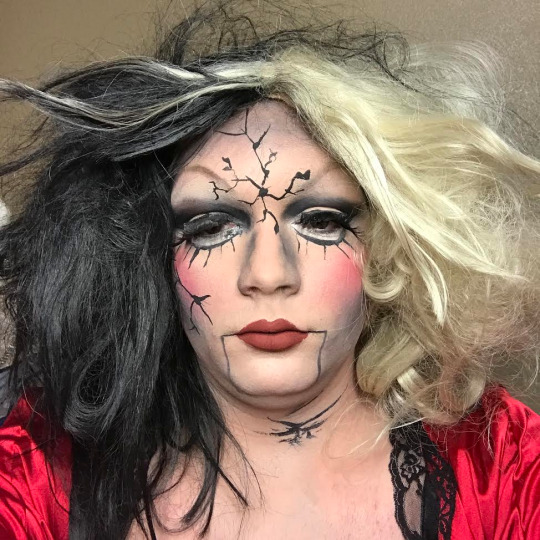
For week 2 I told myself I was gonna step it up majorly. I feel as if my cracked porcelain doll really did that. I wanted to do an illusion that is not the most well known for being an illusion. I think the look is one of my best and really does make me look like a cracked porcelain doll.
Lila: While I agree that this is the best you’ve looked in a while, this is a little safe for what we’ve received for the challenge. I do think you have stepped in terms of bringing us a stronger beat than you’ve done in the past, but I think it’d be much more impactful if you chiseled your contour to a fine point to try and create that porcelain perfection most dolls have. Try to bring in your contour on your nose a little bit more to make it seem more narrow. I wish the elements had a lot more, like adding really thin cracks in different shades, a brown perhaps, just to compliment the harsher cracks. Overall, this is a good submission this mini!
Gluttoni: My dear Ebony, I am glad I got to see you start and finish this look because I can easily differentiate the growth for the before and after. You took my advice for cleaning up your line and might I say I think the overall illusion benefited from that greatly. You have a very stoic face which I think would be softened if you were a little more expressive. I want you to look as personable as you actually are. The concept of this look is good and extra points for making it a whole look but do you think this the most inventive idea you could achieve. Push yourself darling.
Letha: You really are improving with every mug you do, Ebony, and that is evident with this look. The cracks have believable shapes to them, especially on the forehead, and some shading/highlighting would sell them even more. The nose contour is a tad muddy and doesn’t really make your nose look thinner. The cheek contour could also be moved up a bit, as it is basically on your jaw. The contour color threw me for a second, but it does make sense with the story you’re telling, but it is a bit muddy/patchy in places (the forehead, for instance). I wish the lips had a more “dolly” shape to them, but the mouth lines are cute. I will say this for taking mug pics- find your lens and find an expression. A wide-eyed doll expression could have helped sell this look, but you look a tad over it, so keep that in mind for the future! Strong work!
Toni: I said this to you before but I’ll say it again, I think this is the best you’ve looked ever to me. I think that you should take what you did here and apply it to your normal makeup. I do wish the lines were a bit more clean and sharp, as well as maybe being a bit more, for lack of a better term, polished and flawless like most dolls are if that make sense. I think if you spent more times on your eyes as well to give us that doll eye shape would sell this more. Also girl, where is your lash going? what is she doing? over all I am really proud of you!
Antonina: Hey babe! Great step up, I don’t even recognize you besides that nose contour that still needs work! The look is very cute though. To really make it an illusion, I would have wanted you to make your skin look like porcelain. A lot of shimmering highlight might do the trick. I see doll, I just wanted MORE doll. Take it over the top, the concept is cute but needs more work to really fool us you’re a cracked doll. Keep on pushing doll face!
Judah Kiss
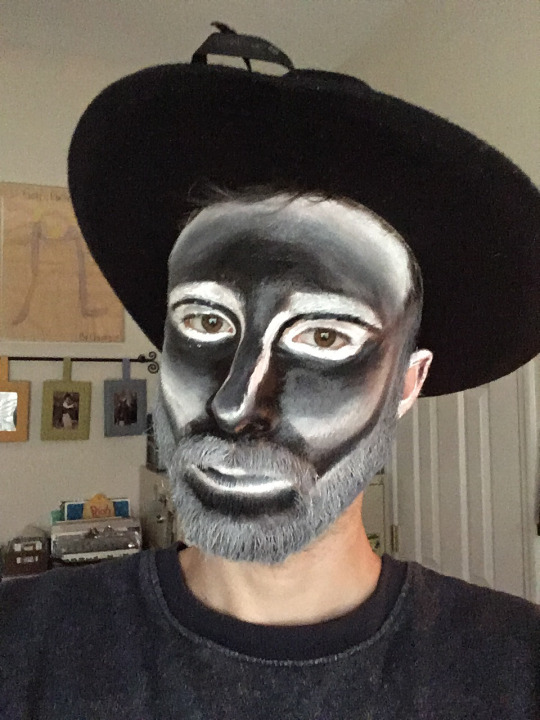

Hi judges! So we originally talked and this mini was going to be late due to personal circumstances around my new job, and I was very upset about it. Woke up this morning at 7am and couldn’t sleep; so I got right to work to submit something.
For this mini, i chose to attempt to recreate Bearonce Knowes’ negative face makeup, with the purpose of makeup turning my face into ‘camera negative’. With more time and more blending I think it would have come out better, but the idea is there, and I’m very happy to have submitted something on time.
Lila: I see a drive in you that is surrounded in a lot of passion for this competition, so I wouldn’t be so hard on myself! Now, Although there are elements that are slightly askew and rushed, I do like this. It’s a nice play on an optical illusion in the sense that it’s more of a inversion - bezold illusive where you’d have to manipulate the image to see it’s opposite contour-highlighting. I think you’ve said it best in your description that if you did have a little more time, you’d have been able to perfect this makeup job. Nevertheless, great job, I hope to see you come back to this idea and perfect it in the future because its a fun little makeup you’ve created!
Gluttoni: Judah, girl.... This is probably the opposite of what I expected from you. I know you have a keen eye for detail and this keep of makes me want to retract that idea I have of you. The idea itself it's definitely on par with the creative force that I know you to be but the execution leaves something to be desired. I think your proportions need to flesh out sometime during the competition.
Letha: This is such a cool look, Judah, and even though it is a replica of a look someone else did, it’s very creative. I do agree that some more time on blending would have served you well, as well as having more time to make crisper lines. More work around the eyes, and perhaps some white lashes would also have been a really neat addition. I do think the bare neck reads as stark against the grayscale face and the dark shirt, so either painting it black or some sort of gray would have helped. All in all, strong work, Judah!
Toni: I’m glad you were able to get on in time and I see the clear influence. I do like this and think for your first attempt at it that it was done well but due to rushing there are issues with it that really shatter the illusion. I think if you had more time to slow down and focus on blending and making sure it was one flawless transition from dark to light then it would be a really amazing look! Good job!
Antonina: I didn’t need to read your explanation to understand your concept. It’s very obvious, and I like that. It’s a good thing that you have references and tries new things. I know your lines and blending is normally much more clean than this, so I hope stress won’t be your downfall in this competition. I see creativity and passion, so I hope you will have time to really perfect your next submission.I know you’ve got what it takes.
Klinker
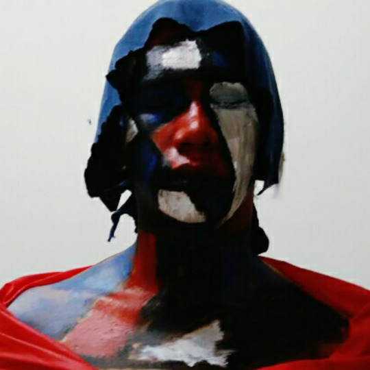

I'm the Russian Window. The ruined country post war represented by Windows with their flag's color.
Lila: I’m gonna be honest, I don’t see much of an optical illusion with this makeup. It’s more mondrian artsy fartsy than a head being taken off the body or an eye socket being pulled all the way down to the chin. With your makeup, try to set it so that it isn’t shiny with translucent powder, or even baby powder for that matter. I wish you gave this a little bit more dimension as well as the flat colours could’ve had that Phi Phi O’Hara look to them. Overall, its an alright submission.
Gluttoni: *Gluttoni’s Critiques will be edited in later, she apologises in advance!*
Letha: Heya, Klinker! This look makes for a cool photograph, but I’m not really getting “optical illusion”. Part of optical illusion is tricking the eye to seeing something that isnt really there, and the best way to sort of “cheat” new shapes is to have either a totally matte surface, or to have shine in very specific areas. With this paint, the colors aren’t “set”, so your skin sort of shines and the illusion is betrayed by the real shapes that are there. I would suggest powdering to make it more believable, but good job, nonetheless!
Toni: Well dear I can’t say im too excited about this submission because it seems instead of doing an optical illusion you decided to give us a bit more of an art movement, something very “some body that I use to know”. that aside im glad you went out of your comfort zone but for next time you do this make sure you set your makeup so you dont look so dewy and make sure to have very clean and very sharp lines like an actual mosaic would have.
Antonina: As art photographs, I think this is really cool. As submission for this challenge, not so much. I don’t know how to critique this really, because I like it for all the wrong reasons. The photos are strong and feels almost political for some reason? You are so unexpected, and I love that, but for the second time in a row I can’t really connect your submission to the challenge. Don’t waste this chance to grow, because I see a lot of good in you that I want to see more of.
Lexi Lamour

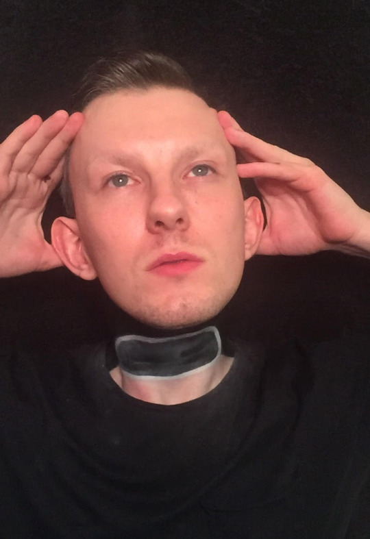
Well would you believe this shit?! I woke up from a well deserved nap after results were posted Monday and when I went to roll over and get comfortable my body moved....but my head didn't!!! When I went to reach for my head I found that it was detached from my body! In a PANIC I picked it up and ran to the mirror only to find out that my fear was true! I came to get my phone only to find a message from that witch bitch, Analyse! She was NOT happy about coming 2nd in the main for week one and while still in her witchy look cast a spell on me to sever my head! Only thing is there are 2 things that worked in my favor. 1) She got the spell wrong.....and 2) I don't have a soul....just a dark empty void of a shell. At first I was shocked, but then I decided I still looked good. I guess things could be worse! ¯\_(ツ)_/¯Hi, Judges! I knew what I wanted to do as soon as I saw what the mini challenge was. This was a fun bit of makeup that I've always wanted to try and see how it looked. I really enjoyed doing it and taking a multitude of different pics. I couldn't choose which ones to do, so I picked 2 that fit in with the first part of my description. Now....can you tell Analyse to fix me.....before I throw my head at her!!!!!!
Lila: I am honestly happy with this. No, it’s not a full face of makeup, but it’s definitely an optical illusion that I was expecting to see. It would’ve been fun to see you in some face makeup, even if it was just like a little beat on, it would’ve been funny to even have some sort of like Toni face mask realness, like you were in the spa chair getting your facial done. Take care with how you draw the hollow part of the neck, I would’ve love to have seen some reds or whatever your drag character oozes inside, even if you stuck Lisa Frank stickers all over the inside area I wouldn’t have been mad! Nevertheless, I’m happy that you went down this route, and I like this submission a lot!
Gluttoni: *Gluttoni’s Critiques will be edited in later, she apologises in advance!*
Letha: Now THIS is an optical illusion! Even if I hadn’t read your explanation it would have made sense, which is always a plus. I’m guessing the “curse” aspect is why it’s such a clean cut, but I still think adding some things like a trachea or some arteries (not gore, just a cross-section) might have helped sell the illusion a bit more, as right now it’s just sort of a patchy gray. I do wish there was a little more going on on the face, even like a sleeping mask because you “just woke up”. Still, this is a great job, and you really sold it!
Toni: This is an illusion! I really am shocked by this because this is so cool and at first i was like “what the fuck?”. I would have loved if you had done more thought, because it is a shoulders up it does seem a bit bare, even a light paint would have added something to this submission. It was smart to ahve a balck back ground that way it would make sense to have the black in your neck. Over all this is a really well done illusion.
Antonina: Hi Lexi! I’m gonna be honest....I don’t see it. Maybe I’m just stupid lol. The disconnected head is a good idea though. Without any face makeup, the neck is the only thing to look at, and then it looks a little weak. Maybe I’m just a little spoiled with your last main challenge submission. The top part of the neck makeup where it’s really black looks really cool though. The idea is good, it’s exactly the kind of thing I was hoping for. The end results just didn’t match my expectations because I know how fierce you are.
Marcella Fox
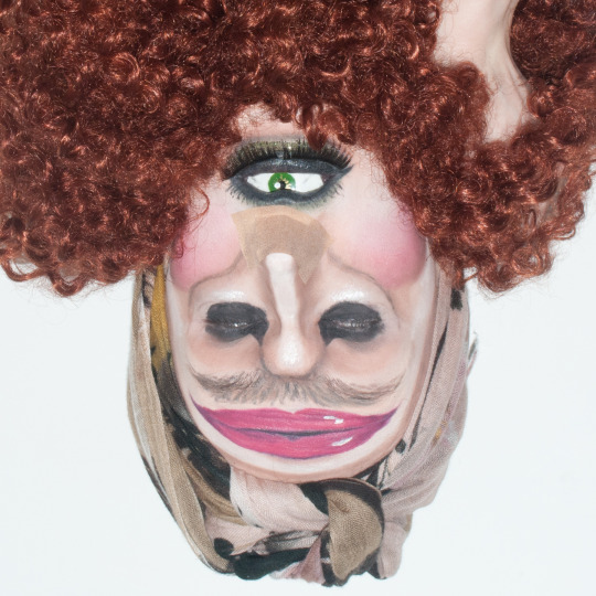
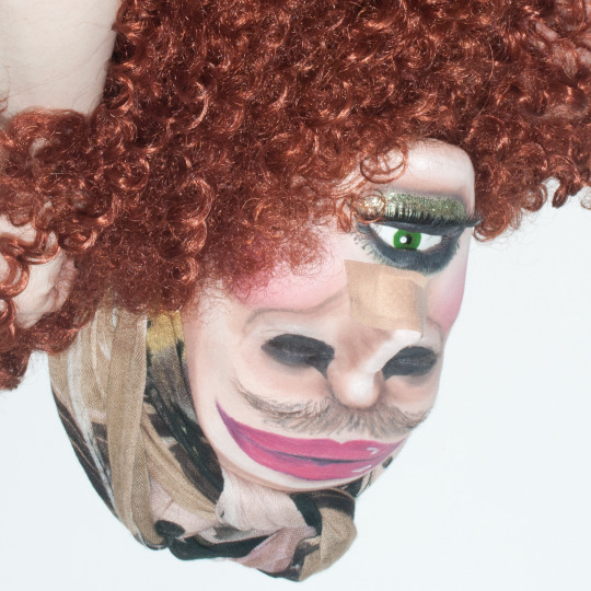
Hello judges! Let me introduce you to my great Aunt Hortense - she was a model back in the 1980s, known for her high cheekbones and striking gaze. She felt out of the public eye after a scandal involving a grapefruit, and since then has kept a low profile. The menopause has been rather unkind to her, resulting in a more-than-barely-noticeable moustache and, as you can see, she is still recovering from her recent rhinoplasty procedure. Still though, she never steps out of the house without a face full of make-up - I’m sure you can all agree she still looks glamorous! I had a lot of fun with this mini challenge! I immediately thought of doing an upside-down illusion, and I was inspired by this cyclops I saw while googling ideas. I made an eye to put in my mouth, turned my actual eyes into giant nostrils, and hid my real nostrils with a plaster/bandaid. My eyebrows became a moustache, and I drew a giant pair of lips on my forehead. I wrapped a scarf around my head to look like, well, a scarf :p And held some hair underneath my chin to complete this fab 80’s look :]
Lila: SHOCKED. GAGGED. PULLED THE PAG. Marcella Fox, this is friggin’ CRAZY and I love it. The fact that some people won’t be able to establish you’re upside down and your eyeball is your mouth opened, I keep having to look back and do double takes because it’s SO interesting. I only noticed that you were upside down when I saw your hand holding the wig, and I’m just a sporadic mess because there’s no words to describe how you hit the nail on the head for me this challenge. One thing, and it’s a little nitpick, is if you had some sort of stand or piece of fabric tacked to your headwrap so that it looks like your character has a body, but like, honestly, the tiniest nitpick isn’t gonna take away how much I am impressed by this look. Great submission, Marcie!
Gluttoni: *Gluttoni’s Critiques will be edited in later, she apologises in advance!*
Letha: Up until this very moment, Toni had always been my favorite Cyclops from the 80′s. But NO LONGER, Marcella, it’s your Aunt Hortense! You managed to brilliantly combine camp/comedy with technique and the result is honestly so amazing. The lines are great and make sense, and the highlighting on the lips is so good. Your workarounds for hiding your natural features are also quite clever (though i would have suggested a bit more dramatic of a bandage for the rhinoplasty, as the beige of the current one gets a little lost in the shuffle of the face). These are honestly just nitpicks though, because I am still in AWE of this piece. Amazing job, Marcella!
Toni: YOU COME INTO MY HOUSE? AND MAKE ME LOOK AT THIS MONSTER?? I’m shocked, gagged, disgusted, horrified and I love every bit of it! This makes me so freaking uncomfortable to look at but in the best was possible. I think this holds truest to what a makeup illusion should be because this is so hard for my brain to process. If you wore this look out youd get tipped no question. Just make sure to have those really clean lines so that everything looks a bit more realistic, but over all im SHOOK BITCH.
Antonina: Wow! This is like a challenge: “How many faces can you find?”. I get so much backstory just by looking at your pictures, and to read your description was a joy. Keep taking every chance to be funny! The creature you created is so interesting and I can’t stop staring at it! I honestly don’t know what to say more than you did such a great job.
Paprika
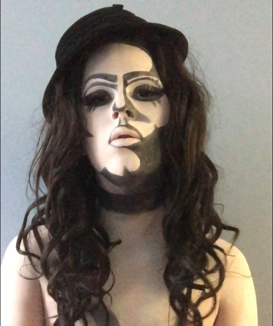

My makeup for the mini was inspired by 80s Patrick Nagel, in the way that he drew the features of so many of the women in his prints and the color scheme he used, as well as (obviously) miss Kim Chi. I love drawing on my face and doing creative mugs so for the opitcal illusion challenge I wanted to play off of that and BECOME a drawing.
Lila: You are so pretty and no matter what you do, optical illusion or normal face, you’re always gonna make me jealous. I would consider this an optical illusion because I’ve seen a lot of people try this with the Marilyn Monroe tutorials and stuff, so I’m pleased to see you go down this route! You look like a CD cover for an indie music band which I enjoy. I wish the black was a little more black than grey. I’m guessing you used either a black face paint or eyeliner, so to get that pure black just set the area with some eyeshadow of the same colour. However, great submission this week, Paps!
Gluttoni: *Gluttoni’s Critiques will be edited in later, she apologises in advance!*
Letha: This is a very cool look, Paprika, and beautiful as well. The colors are simple but the effect is still striking. I would suggest better lighting (I’m guessing that’s a window to your right, try facing it so the tone is more even all over your face) as well as a better backdrop, even hanging up a black sheet could work. I like the shapes of the face a lot, but I would recommend setting the black with shadow to help make it as opaque as possible. The hair is brown instead of black, which is fair if that’s all you have, but having a more solid (less flyaway) hairstyle would match this look I think. Overall, great job, Pappy!
Toni: As someone who has Nagels art hanging all over her drag room i am so glad to see you do something like this! I really think this is striking and true to the art style. I don’t think this is what would be considered a standard illusion but the way you did it really sells it for me. I think if you really darkened thosse shadows and cleaned up your lines it would be so amazing. Good work this week babe!
Antonina: I really like this. I wanna see a video of you in this look reading poetry in french. It looks really good, there are some areas that could use some more work though. For example, the crease lines are very different from eachother. If you’re gonna do this again, make the dark parts darker and maybe some cool collar bone shadows? I think you’re on the right track, keep it up.
Phoebe St. Jefferson

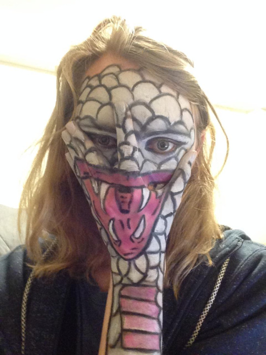
For my mini I was really anxious about this, because make up is for sure one of my insecurities in drag. Despite this i chose to do something really ambitious and yolo my way through this. I decided to turn myself into a snake/reptile type creature, but also blend my hand into my face. For this I followed the example of this video: https://www.youtube.com/watch?v=sekYblpNDAo But I also tried to make it a little more cartoony, something fun that will actually look like my kind of style. For the make up I primed, sketched out where the mouth was with clown white, then darkened the lines with a cheap eyeliner pencil. For the color of the snake I went in with clown white mixed in with a little black eyeshadow. The hardest part of this challenge was taking a picture where all the lines matched up. Anyways enough of me rambling. Hope u enjoy boos xoxoxoxo.
Lila: WHAT? Scared of makeup my ass! This is by far it’s one of the more creative submissions we received! I see an optical illusion in this, honestly. It must be a trend to have snakes on this cycle, so I cant wait to see who does a snake for the main challenge. One thing to watch is your positioning with this type of optical illusion. I can see a small shed of skin at the bow of your thumb and index finger, and you could’ve colour matched your hoodie and background to try and make it pop a lot more. Otherwise, great submission, Phoebs!
Gluttoni: *Gluttoni’s Critiques will be edited in later, she apologises in advance!*
Letha: This look is honestly incredible, Phoebe! It’s very creative, and you went outside the box by incorporating/camouflaging your hand into the illusion! Are the lines perfect and crisp? Not entirely, but the effect is still there. I would appreciate a bit more detail on the mouth itself, as it reads more of a flat pink, but it’s still really cool. One way I could see this look being elevated would be to have had the hand painted as a CLOSED mouth with maybe the tongue flicking out, then lowering your hand to reveal the open mouth, but I can understand the difficulty of trying to pull that off lol. You should be very proud of yourself, Phoebe, and I hope this mini helps you with your makeup insecurity, because from what I see, you can do great work!
Toni: Honestly for your level of makeup skills this is amazing and I’m so glad you went down this route and took my suggestions. I would make sure to pay attention to where you are taking your pictures and their position because they can alter how its viewed and I think if you had the opportunity to take it against a solid background it would have made this more striking but I really love this over all!
Antonina: Thanks for the nightmares Phoebs!! This creature is scary af lol. This is one of the most memorable submissions we got this weak! That paint must have taken you quite some time to do! If you want to do this look again, get some snake eye lenses to get the full fantasy, but for a week 2 mini challenge of TDR I think you’ve shown a lot of dedication already. All the blacks could be darker, but most imporantly around your eyes. It looks a little sloppy. But hey, whatever, this is a great sssssssssssubmission.
Sugar Monroe

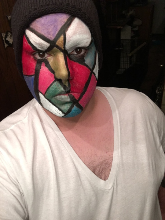
For this “optical illusion” mini, I was inspired buy a lot of color blocking makeup I saw and also stained glass? Idk. This is what I came up with. Lol
Lila: When I opened up the submissions, I got a little bit of an Indiah Ferrah / Phoenix 1st Episode Workroom vibe when I saw some of the other girls doing a similar look to what you’ve done this mini. While the whole mondrian-mosaic fantasy is kind of the go-to illusion, it’s not really optical, or for that matter original. a spin on this could’ve been following the natural contours of your face with the shapes or even doing your contours with the black lines and a blending of all the colours. It just doesn’t scream illusive to me. With your colours, try to add a darker and a lighter hue too, just to make them seem 3-D. Overall, this was an alright submission.
Gluttoni: *Gluttoni’s Critiques will be edited in later, she apologises in advance!*
Letha: While I do think the colors are very refreshing and vibrant, a lot of the critiques I had for Klinker apply here, Sugar. The black lines are generally strong and not muddy, but setting the areas with a corresponding powder (or even a translucent color all over) would have sold an illusion more. You lose opacity in some place, the white/purple most noticeably, but most of the areas pop quite nicely. I feel like the illusion aspect of the challenge could have been executed better, but I do enjoy the look you made. Solid work.
Toni:I know you had some troubles with this mini but i do wish you had worked more with the judges to find something you were able to do ebcause this is much less of an illusion and more just kinda an art style makeup if thake makes sense. Be careful on that babe. But I do want to give you props for going out side of your normal paint, if you were to do this again I’d say think out those black lines so that you can have more color showing as well as adding more shapes. Good luck this week love!
Antonina: The red and the pink looks really bright and good, but what’s going on with the purple on your forehead? All the other colors looks good, but you should have filled in the purple a lot more. It’s not my favorite submission this week, but that doesn’t mean you look bad, it’s cute. I just wasn’t surprised by it. I think you did a good job for what it is, but I wanted more of a concept. Also, a little more color on the lips wouldn’t hurt. I believe in you Sugar, surprise us next time! This is alright, but give us more!
6 notes
·
View notes