#i just realized that i forgot to color the lineart but oh well
Explore tagged Tumblr posts
Photo
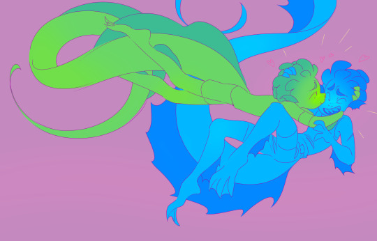
only just processed that luca added the flames to the colander helmet...implicitly b/c of alberto’s “also i added flames” dream vespa design alteration...
#like evidence afterwards that someone was paying real attention even when at the time the other party felt ignored / tuned out....So sweet.#which also my audhd life experiences like. if i learn anyone ever absorbed anything i said it's like oh whoa living large lmao#anyways the point is it only occurred to me the other day lol. like i'd noticed the flames but just didn't piece anything else together#i Love how many like. threads & details you Can piece together like that but are just kind of quietly in the bg otherwise#and fun how everything luca needs for the race is definitely like Somewhere Underwater...colander fell in the sea...bike by the sunken boat#god knows what color situation i fumbled my way into here. so the classic spin of just like Also there's more stripped down versions#who knows if i'll like do more of a full color approach version. they can't stop you. nor stop you from just posting lineart#or stop me from going off the walls w/their tail lengths lol#luca#luberto#lucalberto#😚😚😚#fish freckles you are everything to me...#eta not me forgetting to save the [solid bg color]less pngs as transparent....i was up all night#didn't help w/the color selecting that i'm bad at anytime lol#ok hopefully now they're actually transparent#smhhh now i've realized i forgot a little line to indicate webbing betwixt alberto's fingers there#not as big a deal as how i ALMOST forgot to include any of their arm/leg fins. i'll fix it if i do the [full coloring] deal lol. imagine it#yet another eta: occurs to me i could've made alberto purpler & the bg blue. well;
358 notes
·
View notes
Text
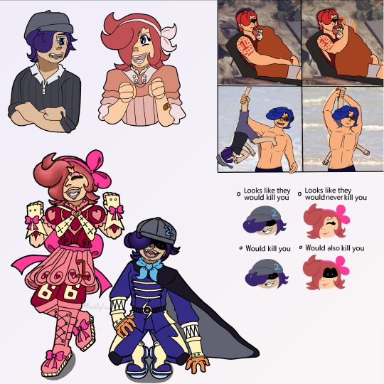
appears looking at you with autism creature eyes. hello @sangerie your vs bros fankids (one of which i had a hand in making bc. glances at the reblogs/notes in @loopyarts post. i have confessed there fskakfafsga) are really really neat .u.
SPEAKING of loopyarts ty for allowing me to take inspo for nijis kids raid suit fit!! i really liked the softer yellow and the thicker lightning bolts on his pants you gave him so tysm for letting me yoink it <3
uh uhh individual pieces and also design/character rants under the cut bc. i wanna.
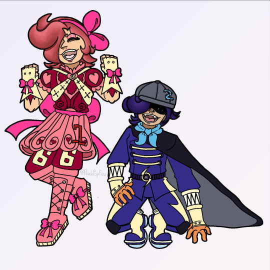
RAID SUIT RAMBLING TIME bc i spent the most time on those. also you might be asking 'why is only their hair rendered in those pieces?' well the answer is because i am Lazy. moving on . (/HJHJ i AM lazy but also rendering it further would mess up the colors and i didn't wanna do that lmao. carrying on..)
Ichiji's daughter i am so SO proud of her fit. i did not look up a reference or even inspo ideas at all, that all came from the ole noggin baybeee. anyways she is obviously based off a magical girl(s) fit bc she wants and DESERVES to be. also since Reiju doesn't have any kids of her own (based wine aunt) i also decided to let Little Red have some of her motifs instead of just purely Ichiji's!! primarily the 66 on her pants but also all the pink on her instead of just red :) and obviously she has her dads number and while she DOES have a (white? bc like daddy shes a special little princess /aff) cape i didn't include it here bc it looked reallly bad lmao. but she does have one tucked into the bow probably!! there she is, Sparkling Red Neo!!! (get it.. sparkling instead of sparking... bc magical girl.... im funny i think.) onto Little Ocean Boy
OKAY LET ME TALK ABOUT THE MOST MINISCULE YET MOST IMPORTANT DETAIL TO ME AND ME ALONE FIRST. that being the symbol on the brats belt. it was actually inspired/based off of this post which really stuck with me with me after reading it which i later realized was bc the "that something has been completely reversed" REMINDED ME OF THIS POST OF YOURS. i don't think im especially good at theory crafting but. idk i think there could be Something about how after judge came and turned germa into mercenaries their symbol turned from what once symbolized 'purity' into the skull of war mongers and then BACK to purity after 0124 get germa on the right path... poetry or smthn. ANYWAYS yah shoe shiners got a pretty basic fit bc like i said in the og ask, hes a sora warrior of the sea fan, once he saw the raidsuits irl methinks he'd want to stay pretty close to the og design. HOWEVER he refuses to drop the hat (much to Niji's dismay) and i came up with a reason besides 'its one piece and therefore there's GOTTA be a kid with a weird hat that they're attached to': and that is the fact that it hides his eyebrows. Little Red has the curly brows, all of Yonji's cabbage patch does too, and the brats the only one without. even if literally no one else notices or cares, he wants to hide the fact that he doesn't have em because it Separates him. and he doesn't want that. at all. he really, Really wants to be a part of this family (oh no i made it. angsty). ANYWAYS UHH YAYYY HE HAS A TWO ON HIS HAT (that he sewed on himself which is why i made sure you can see the stitch-lines) BC NIJIS HIS DAD WAHOO YIPPEE :D:D:D Dengeki Blue Neo: little shoe shiner edition!!
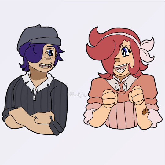
UHH second image is just a refined piece of that first doodle i sent you. with lineart and a better color pallet and all. actually looking at it again now i realize i forgot little brats freckles and i am now punching the air bc its too late to fix. just act like they're there. please :,,,) edit: nvm its the next morning i fixed that kjahsdah
i don't even have much to say about the last two because i Think i am Rightgksfjgasjkfa but for the third i think the brats a bad influence on Little Red especially. ALSO FOR THE FOURTH NO I DIDNT FORGET ICHIJIS TATTOO. I AM JUST LAZY. (and I also forgot his tattoo :]) ANOTHER edit: i also. fixed this :]
CHRIST i am incapable of contacting you on Tumblr via any way that includes anything less than 250 words i am so sorry sangerie.. i hope you like these tho cause i really do tbh :3 (PS you have to take literally NONE of what I said here [mostly about shoe shiner] as like.. canon about them?? these are YOUR ocs obvi so please, change Little Red's raidsuit design if you find it unappealing!! make shoe shiner have a backstory of your own!!! i hope that isnt weird or rude to say, i just thought it was important too bc i threw sm at you so strongly ^^' okay thats all tysm for reading this it means to world to me byebye <3)


#one piece#vinsmoke ichiji#vinsmoke niji#one piece ichiji#one piece niji#others ocs tag#vinsmoke siblings#my art#im so happy with how the raid suits especially turned out like i can't get over it#i haven't been truly proud of an art piece for MONTHS this is so refreshing#like this aint perfect in a lotta other places but that alone is carrying this for me#also sangerie i am SO sorry if it looks like im virtually stalking you fjagskdakfsfa first the trans vs sisters and now this..#i promise im not there's just not a lot of ppl in the Vinsmokes tags and you and your stuff is really cool 😭 im normal i prommy /irony#okay ive literally said enough in the post im shutting up now gday or gnight take care#OH WAIT YEAH throwing in a#scopohobia tw#scopophobia cw#bc little brats eyes are borin into ya#OKAY now gday/night <3<3
32 notes
·
View notes
Text
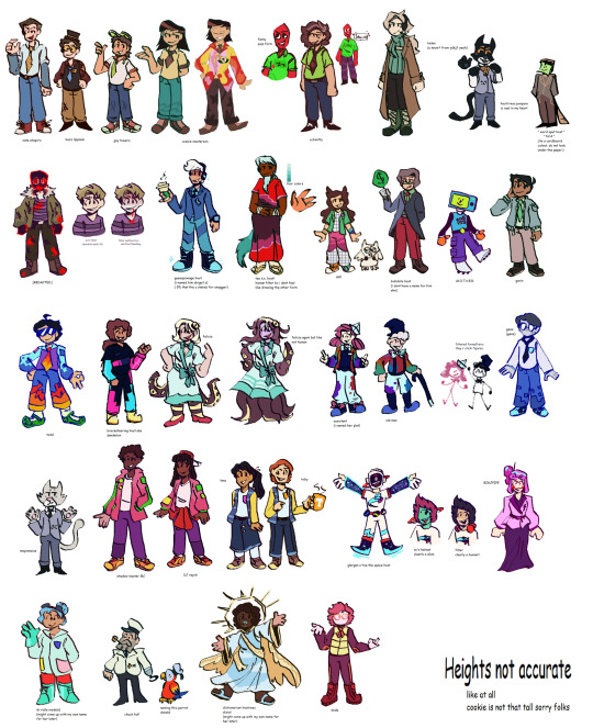
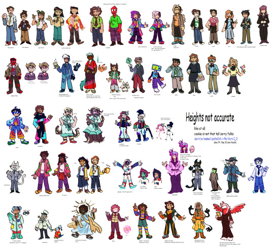
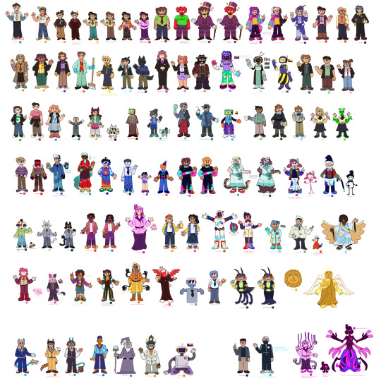
remembered some of my host design thoughts from 2020 just gonna straight up copy and paste them some grammar mistakes don't mind that too much
host design progress/thoughts/etc/etc
schmitty - when i listened to his (scared) tmp2 voicelines i imagined him (and did like 2 doodles) as a humanoid red quip. whether or not that's because me and my friends memed said quip a lot and i began assoisating the quip with schmitty might...idk be up in the air lol.
anyways i basically made him a human verison of the red quip and my human verison for him came later
cookie masterson - i think i listened to his F U easter eggs? and then boom. cookie, made his tie a ...cookie tie bc of his name lol
REDACTED - i think i listened to the tmp1 " voice reveals "? i forgot, man it's only been two months. anyways i know i based their look soley on something said on their tumblr page, " based raised in the woods ". and i made their " not shadowy " form not too long after
to quote myself: " well hes a serial killer or something right " . oh and i believe i made his shirt purple bc that color is sometimes associated with evil! woo. as for my first take on his Totally normal man in society he did not seem like a guy that could play off being a Totally normal man in society. he had fricking pink eye and was bleeding from his mouth and looked really sickly
todd - ah the funny internet man! my first design for him ..funky hair. i know i went through like 3 hairstyles for him and whether or not i wanted to give him shorts.
the 3 things that stayed through out all the designs are: shades, fire tie/fire on the pants and green crocs. now that i think about it his clothes are weird lol..
nate - soley based on his F U easter egg. " i'm pretty (fricking) expensive. " i also wanted to use a different head shape.
from my first sketch of him, nothing has really changed except for the stripes on his tie
guy towers - oh fgod my first reference drawing of him, the colors and design are pretty much the same now except i changed his shoes a bit and give him a short ponytail
idk hes the sports guy and sports people wear visors...yea
oh my gosh i think i gave guy a ponytail bc of some " au doodle/ the whereabouts of the ydkj hosts "
binjpipe - oh uhhhhhh ,is pink , hair shapes a b, she is the only character with a eye color (i guess bc i didnt really bother giving eye colors to any of my hosts)
my design for it has not changed, the onyl thing i added recently was circuits on her hands! bc . idk circuits are cool
schmitty but human - ohhey i found it, i imagined in his ydkj days hes just...pretty tired. hence gray hairs! and i know the tie i very loosely based on Funny Faster Funnier or wahtever it is
dr ro (hc name: dr.rangsey) - short science girl! idk i think the phrase " lab safety is mint colored! " fits her and thats something i thought about..and her colors are based on her game
again her design did not change much i think i just made the labcoat look better
hfelicia - ohhh i remember really wanting to make a design for her . i was like I GOTTA DO THIS.. and tentacles were a requirement. and a eyeball in her hair
one sketch i have is her with eyes on her arms which i believe i did put in, in her monster form . ok i just found when i got around to linearting and coloring, i realized her outfit was too similar to the mother in her game so i changed it (and ngl i was thinking of maid outfit kinda) i looked up vintage clothes and gave her something from that, and red shoes lol
guesspionage host (hc name: abigail s) - oh!! i doodled him on paper first, my final design is pretty different my gosh
my next sketch for him then has boots and a different head shape , uhh yea, eventually i made the shoes Not fricking big and i gave him some cool glove thing with...circuits! bc to quote on my reference page " epic shocking prank ". ngl that was mostly bc of gandra dee in dt17 bc she has nanobots or whatever on her hand and its pretty cool and i thought this host would be the kind to get stuff like that
and could be used for self defense i think? shocking hurts and its like ..opposite of binjpipes' kinda. his are on the palm while hers are on the opposite of the palm (??i dont know my human terms)
dandelion - design hasnt changed much either! and i hc him to be schmitty's brother so i uhh yea made them look similar somewhat. BUT MAN THE SHOES IN HIS FIRST DESIGN............not great. i added a bit more to his suit..jumpsuit? in my latest design for him! swaggy
buzz lippman - when i first heard him there were 2 things i know were needed - a tophat and yellow glasses
my first design for him isnt different from his latest deisgn, i jsut gave him a blue tie. blue as to tie into nate bc theyre cousins and i gave nate a yellow tie os yea
dixie - aww my first sketch for her was cute, i wanted something flowy, i made her somewhat angelic! and her dress has clouds ..and the thing around his waist and her cape are supposed to represent the millions of words made up! (vaguely bc no way am i gonna write words there) oh and the cape is kinda uhh like her wings persay!
civic doodle hostress and old man - AHHA my first doodle of old man was just a stick figure bc thats how hes shown in the ride. and i gave them both stick figure forms bc why not? EHAj i wasnt sure what colors to give to them at first so i used ms paint colors, AND OLD MANS BEARD WAS MADE OUT OF POMPOMS..God haa i didnt give him a beard at first when i finalized both of their designs
gene - referenced from his ingame look in sti, thought hed be a office guy so yep! and his pants have pixels similar to todd's sleeves , bc they are kinda a duo right
helen - awhhg she looks pretty anger in her first sketch and latest design...i thought of her color being green at first and man her skin color was more sickly
otherwise her hair style and form havent really changed. ohh there was a short time where i thought she was the ceo of binjpipe ..glad i didnt continue on with that thought, anyways stan helen bc she has to deal with 5 men sending each other to the bottom constantly </3 , or did so in teh ride
dot! - ah! my first digital sketch of her, really the two things that changed were her hairstyle and her pants. hairstyle is a thing thats stumped me several times lol, ooh her colors changed a bit too
ahh i wanted to give her a tuxedo shirt at first but i didnt 😔
bob - hairstyle REALLY stumped me with this one . and for my first digital sketch i quote myself " honestly keep seeing bob as bald " , then i saw the tvtropes page where it says he implies he has 80s hair or something and i was like " shit "
bidiots host (hc name: quant) - not much here, i based his suit on one i saw on a show we were watching in one of my classes. idk why i gave him a red gem thing tho, why not i guess!
dode - i know i looked up reference images for short hair! her design has changed p much the same the most ive changed were her colors
eventually i drew her ingame look :P
word spud host - literally a cardboard cutout, i think it was seriously inspired by box from inanimate insanity / a humanization of box that was a cutout cardboard and i thought it was nice
as for a serious design for them? maybe,
Ok um i guess the canvases are down here it goes august 2020 -> september 2020 -> started in 2021 minor edits here and then so this is most recent one 2023 -> december 2023

10 notes
·
View notes
Text
Ijiranaide, Nagatoro-san - Rant
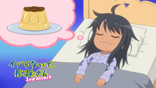
I am currently watching season 2 and I have some thoughts (about both seasons).
First of all why did I start watching this anime? Erm... So I know what the target audience is, it's people who self insert as Naoto and want to date Nagatoro. As for me? Oh, it's the other way around. I think Naoto is cute and I want to bully him. I thought maybe my female friends were similar but the only friend I have who read the manga wants to make out with Nagatoro. Sorry, I forgot lesbians exist.
Uh, anyway yeah Naoto is cute and I want to be Nagatoro. Not sure if girls like me watching this was intended since these anime are usually made for lonely dudes, lol. Anyone else feel like me though?
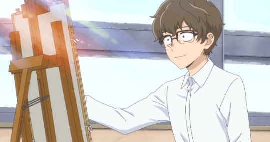
The scrunkly.
Okay, so, my thoughts on season 1... Lemme check the episodes to bring back my memory a little bit, as I watched that to calm down from the stress that is social work during last Winter.
The first two episodes made me really scared to watch this series, for real. Nagatoro just straight up mentally tortured Naoto, and not in the hot way. I felt really bad for him because I know what it's like to be the shy nerd kid. Anyways at around episode 3, I think, Nagatoro starts showing her softer side more. And she hardcore crushes on Naoto.
The dynamic between Nagatoro and Naoto is really cute in my opinion, even if it is very simple. Nagatoro has her first crush because she finally found a guy that doesn't bore her to death but she doesn't know how to handle it so she bullies the fuck out of him. Naoto is pretty much the opposite? He doesn't really realize how much he likes Nagatoro sometimes and thinks he would rather not be around her. He tries to manage that by fighting her off in which classic anime romcom things happen. You know the "Holy crap you did something on accident, PERVERT!" thing, except it sometimes works really well. Maybe it's just because I think both of them are really cute, but I like when they have their little "Oh god, we both fucked up" moments.
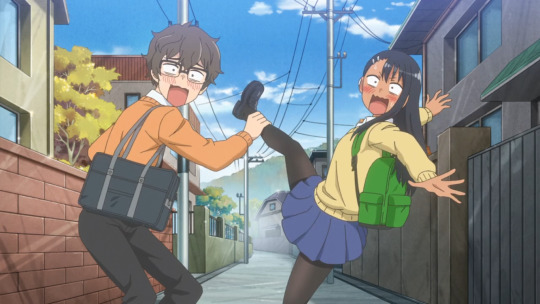
Then there's the more obvious romance aspects and they're by far my favorite. The momens of honesty and the cute glances... Yep, they're adorable. I don't want to give away too much, sorry. Just know it's, in my opinion, the best thing in the series.
I don't care for the side characters by the way, but they can be enertaining when they point out how obviously both of our main characters are trying to "prove" that they don't like each other. They're the audience, the "just kiss already!" guys.
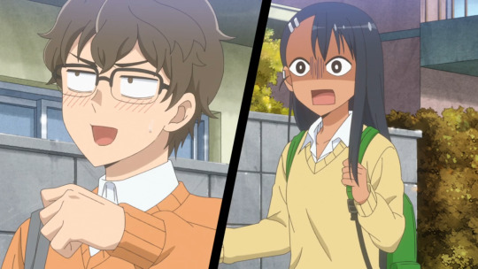
Also funny face cute. I like when she snaps. I like her. The cutesy. Okay no, for real, I love when Naoto and Nagatoro support or protect each other when they really need it. They can be a bitshitty towards each other sometimes but in the end they're actually kinda... healthy? Like Nagatoro is creepy but I love when the girl is a creep instad of the guy, since Naoto is actively watching out not to disturb Nagatoro. And how she will constantly accuse him of being a creep makes sense later when you realize that she's actually much worse than him, lol.
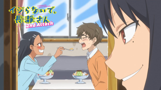
Okay let's get to season 2, since I keep using too many screencaps of that season anyway.
Oh boy, another anime studio took over with season 2 (now OLM, before it was Telecom) and it's very noticeable. The animation is stiff and sometimes just straight up doesn't move right, the art is a lot more bland, in season 1 there were a lot of beautiful warm colors and lineart, and the voice direction is very strange... That and also our main characters seem to regress a bit? Now being overly flustered over small things that they would've been fine with in season 1? I get it, they're supposed to be cute and awkward but it's the classic romcom regression...
I'm in the middle of watching season 2 and sadly the things I loved in season 1 just aren't that apparent anymore. It's still cute and I love Naoto and Nagatoro together, but I can hardly pay attention to that when Naoto is animated like Chargeman Ken.
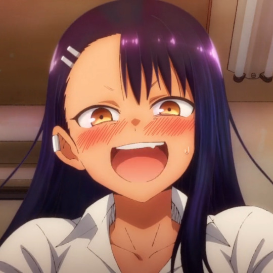
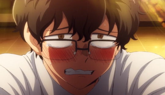
^ little appreciation for the beautiful lighting in season 1!?
Anyway, Ijiranaide, Nagatoro-san will forever be my biggest guilty-pleasure comfort anime and I'm only a little ashamed.
Love ya
#anime#otaku#rant#anime review#ijiranaide nagatoro san#nagatoro#don't toy with me miss nagatoro#naoto hachioji#hayase nagatoro#anime rant#weeb#romcom#comedy anime#romance anime
31 notes
·
View notes
Text
How to draw in my art style:
1. Put on kikuo
2. Stare at colors you think work well together and try to replicate them
Also 2. Color as close to the colors you want, and if you're in procreate, use curves and color balance stuff to adjust the colors more to your liking
3.lose your mind as you slowly realize that someday you might have to work a 9-5 if your art doesn't take off
4. Take a shower and cry underneath the water as you sing sad songs under your breath that you forgot the words to so you end up going "umm blahalasbak sob sob oh yay chorus time"
5. Go back to your art and then transfer that slight feeling of insanity and sadness into if
6. Use an overlay layer as shadows :D put blues and purples in those shadows, then on the lighter side use yellows and pinks
7. Find random texture brushes and experiment with those
8. Realize holy shit I have to pee
9. Get distracted for 3 hours straight
10. Try to draw again but your cat is now sitting in your chair so I guess you can't draw anymore
11. Throw your cat to assert dominance
12. Use some kind of hard light or vivid light layer or something and then take saturated colors and SCRIBBLE EVERYWHERE
13. Have fun, take a couple drinks of water and make sure that Kikuo music is still playing so the drawing is the most amount of crazy
14. Get curious about what the Kikuo lyrics are about, look it up, and then have to sit in your chair thinking "why the hell was I dancing to that holy shit."
15. Think about those lyrics and, I quote, "what the hell" while scribbling more (make sure youre having fun"
16. Make sure the lineart is still visible. If not, just redo it with a dark saturated purple on multiply
17. Realize you forgot to flip the canvas. flip it, and have a mental breakdown
18. Reconsider why you even are trying to do art in the first place
19. Fix it up. Oh wow that looks better good for you
20. Post it online and then get positive feedback and go >:D
21. Realize holy shit I forgot to fix that and then spin in circles in a spinny chair until you start to feel sick
22. Get distracted for the rest of the day
AND THATS MY SECRET GUYS!!! I HOPE THIS HELPS YOU GUYS MAKE SILLIER ART!! MAKE SURE TO PUT YOUR EMOTIONS INTO THE DRAWING AND GO CRAZY!!!
9 notes
·
View notes
Text
hello! been a long time since my last original post but it’s May now so that means
Mermay time!
my bestie Livia made a prompt list, as follows:

and here’s my art for day one: coffee!!

I most likely won’t get to every single prompt but I’m already having fun so we’ll see what happens!
(shit I just realized I forgot to color the lineart of the jewelry— oh well)
18 notes
·
View notes
Photo

still haven’t quite figured out how to do lineart with this intuos, but i though i’d try drawing my avatar on sapherna
#sapherna#my art#yeah I know I didn't color the skin lol#it's monochrome#or something#also just realized the parts I forgot to shade lol orz#oh well#I would still really like to figure out how to do lineart#and also how to not have a hard time with large canvas#idk if 1000px is even that large#I had to downsize the canvas on this thing to 600px coz it just didn't look right with 1000px orz#guess it'll take a while for me to get the hang of drawing on a large canvas again#my samsung note stuff is all in 2000px now lol
4 notes
·
View notes
Photo
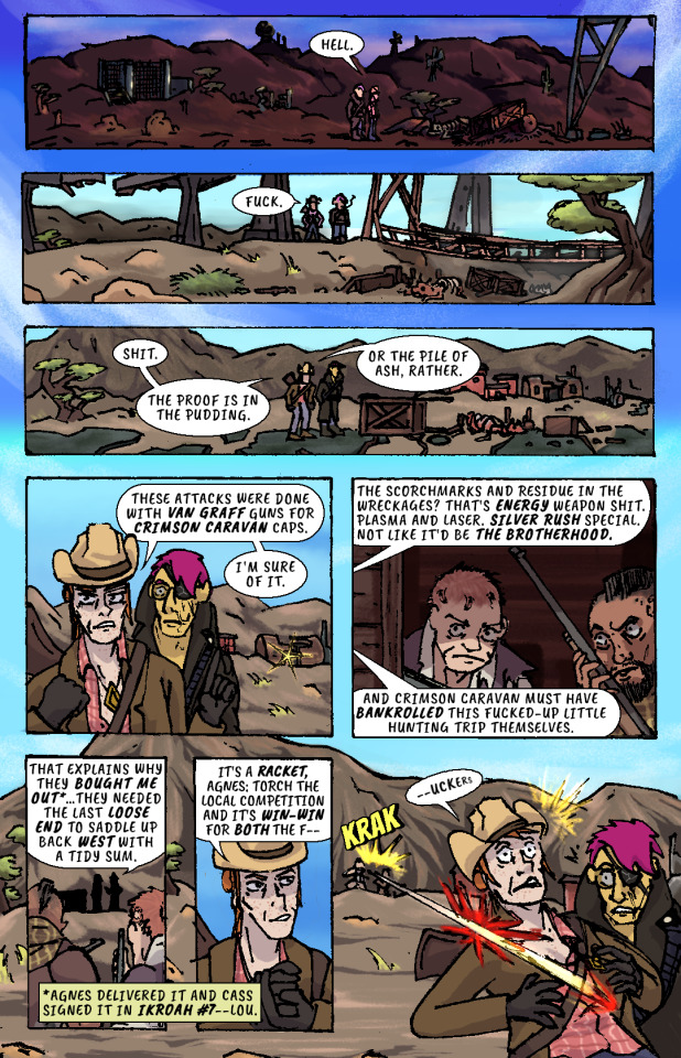
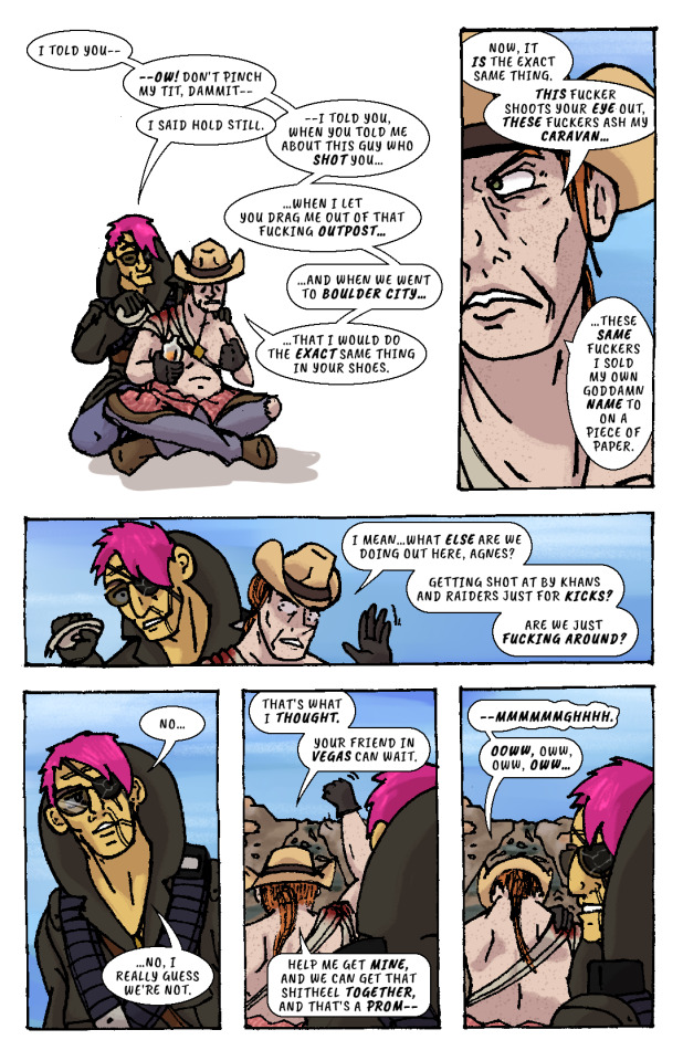
Whiskey river, take my mind, don't let her memory torture me. Whiskey river, don't run dry, you're all I got, take care of me. —“Whiskey River,” Shotgun Willie (1973)
It Keeps Right On a-Hurtin’ #15 - Vegas Outskirts
Collaborative Issue! Guest Colorist: @malpaislegate / @socksual-innuendos
Archive Links
«« First | « Previous || Next » | Last »»
Read IKROAH on Archive of Our Own
Notes / Original Pencils / Transcript:
Notes:
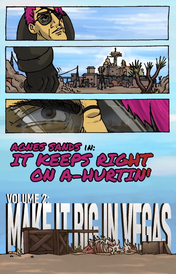
MAN that’s gotta hurt!! Volume 2 kicks off with a bang, literally if you count the gunshot and honorifically if you count Socks’ knockout color job on this issue. Look at those lovingly rendered bullet wounds!! Muah!!!
It’s been a relief having a month off from the comic as I handled a bunch of other things but there’s a lot to look forward to in Volume 2, as you can probably tell from that very forboding fist clench at the end there. Will Agnes and Cass get the revenge they’re looking for? Can they make it big in Vegas? Will it keep right on a-hurtin’? Find out next ish as Cass leads Agnes to meet the first of their new “friends.”
Original Pencils:
The pencils for this issue are like an autopsy report of all the things that can go wrong with your art if you don’t plan ahead and pay attention. Listen, friend, to my tale of woe, and learn from my mistakes so they don’t become yours!
First, you can see a lot of places where there’s floating objects, empty backgrounds, and incomplete heads. Part of this is because I always intended to just copy and paste repeated elements across each panel instead of drawing them multiple times, but other times I was forced to just because of my lack of planning. The top three panels on page two, for example, required me to draw the background I’d use for them on a separate page.
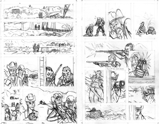
Second, you can probably tell that I actually had to flip the two raiders around in the final lineart because I forgot to keep the hands their were holding their guns in consistent—and since I couldn’t flip the middle panel on the second page without ruining the composition, I decided to flip all of their other appearances so that they’d be lefties. I doubt you even can seamlessly wield those particular guns left-handed.
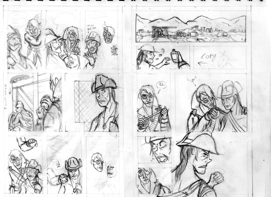
Third, the size of the cart that Agnes and Cass are kneeling behind changes CONSTANTLY and is dramatically oversized from the third page onward. After inking these pages, it took a lot of work to correct the inks and shrink that cart in each panel, but fortunately it came out looking good.
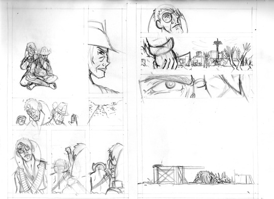
And finally, I completely redrew the second panel on the fifth page because it wasn’t until I had already handed he pages off to my colorist that I realized having a second profile shot of Cass so soon after a first one was just...redundant and lazy-looking. So I went back to my sketchbook and whipped up a much more unique, striking angle (I also just wasn’t satisfied with the quality of my art on that panel, so I’m very glad I redrew it). But again, my failure to plan ahead bit me in the ass and my redraw attempt wound up taking up a lot more space than I thought it would, so after inking it I had to basically surgically remove it from the other inks.
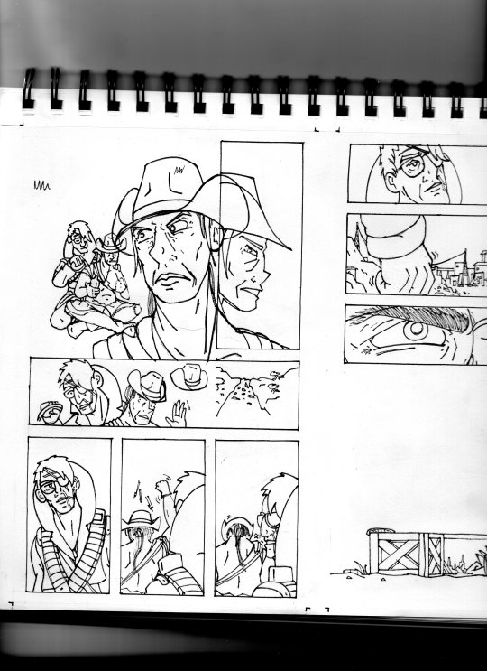
I’ll be honest with you folks: part of the reason that I work in such simple, thick, high-contrast lineart is because it’s very easy to make corrections and adjustments with stuff you could technically color in Microsoft Paint.
Transcript:
EXT. SOMEWHERE IN THE MOJAVE, morning. AGNES SANDS and ROSE OF SHARON CASSIDY stand over the wreckage of a caravan, scattered over a dirt road.
CASS: Hell.
EXT. SOMEWHERE ELSE IN THE MOJAVE, midday. Looking over a second wrecked caravan, at the bottom of a ditch.
CASS: Fuck.
EXT. PRE-WAR HIGHWAY OUTSIDE OF VEGAS, mid-afternoon. AGNES and CASS survey a third wrecked caravan.
CASS: Shit. The proof is in the pudding. Or the pile of ash, rather. These attacks were done with Van Graff guns for Crimson Caravan caps. I'm sure of it.
As CASS explains her theory to AGNES, a short distance from the caravan two RAIDERS peer at the two of them from inside a barn at a ruined farmstead. They have snake-bite tattoos on the sides of their shaved heads and are holding rifles.
CASS: The scorchmarks and residue in the wreckages? That's energy weapon shit. Plasma and laser. Silver Rush special. Not like it'd be the Brotherhood. And Crimson Caravan must have bankrolled this fucked-up little hunting trip themselves.
The RAIDERS move out from the barn, sneaking up on two passers-by who’ve stopped at the caravan wreckage.
CASS: That explains why they bought me out...they needed the last loose end to saddle up back west with a tidy sum.
(NOTE: *Agnes delivered it and Cass signed it in IKROAH #7—Lou.)
CASS: It's a racket, Agnes: torch the local competition and it's win-win for both the f—
SFX: KRAK
A gunshot rips out from one of the RAIDERS’ rifles and sears across CASS’ shoulder.
CASS (gasping): —uckers.
CASS slumps down beneath the overturned caravan wagon on the road, clutching her shot shoulder.
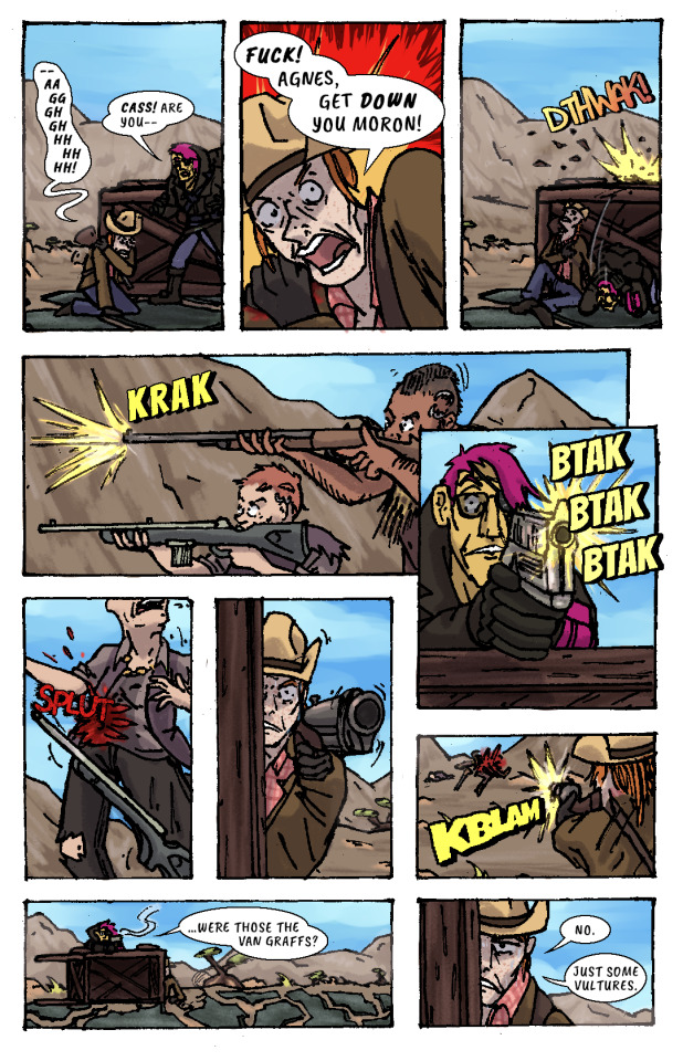
CASS: —Aaggghghhhhhhh.
AGNES: Cass! Are you—
CASS: Fuck! Agnes, get down you moron!
AGNES ducks behind the cover of the wooden caravan wagon just as another gunshot splinters the top lip of it.
SFX: DTHWAK!
The RAIDERS advance on CASS and AGNES’ position, firing at them from off the road.
SFX: KRAK
AGNES leans over the top of the wagon with her pistol, returning fire.
SFX: BTAK BTAK BTAK
AGNES lands a shot right in one of the RAIDERS’ guts, and she drops her weapon and falls down.
SFX: SPLUT
CASS, leaning out the side of the wagon, takes as careful of aim as she can with her shotgun by holding it with her good arm. Trembling, she fires, connecting with the other RAIDER.
SFX: KBLAM
The would-have-been RAIDERS are dead.
AGNES: ...were those the Van Graffs?
CASS: No. Just some vultures.
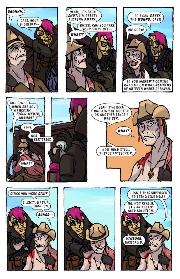
CASS leans back behind cover to sit against the bottom of the overturned wagon again, wincing from her shoulder injury.
CASS: Ugghhn.
AGNES (slipping off duffel bag): Cass, your shoulder—
CASS: Yeah, it's been shot. I'm pretty fucking aware.
AGNES (unzipping bag): Quick, can you take your shirt off—
CASS: What!?
AGNES: —so I can dress the wound, Cass!
CASS: Oh! Good! So you weren't coming onto me on what remains of Griffin Wares Caravan.
CASS starts removing her shirt while AGNES produces a bottle of something from her duffel bag, and dampens a rag with its contents.
CASS: And since when are you a fucking field medic, anyway?
AGNES: 2269. NCR Certified.
CASS: What?
AGES: Yeah. I've been one kind of doctor or another since I was six.
CASS: What?
AGNES: Now hold still, this is antiseptic.
CASS: Since you were six!? I...shit, wait, hang on, Agnes—
AGNES pressess the rag onto CASS’ shoulder wound, and CASS winces instinctively. But, confusingly, there isn’t any pain.
CASS: ...isn't this supposed to sting like hell?
AGNES: No, not really. It's an acetic acid solution. Vinegar, basically.
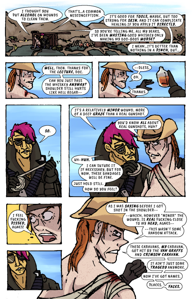
AGNES begins cleaning the wound with the rag.
CASS: I thought you put alcohol on wounds to clean them.
AGNES: That's...a common misconception. It's good for tools, maybe, but too strong for skin. And it can complicate healing if you apply it directly.
CASS: So you're telling me, all my years, I've been wasting good whiskey only making my boo-boos worse?
AGNES: I mean...it's better than nothing in a pinch, but...
CASS: Well, then. Thanks for the lecture, doc. Can you just pass the whiskey anyway? Shoulder still hurts like hell regar—
AGNES hands her the whiskey bottle. She’d already gotten it out.
CASS: —dless. Oh. Thanks.
AGNES unspools a roll of bandages in her hands, then begins wrapping it over CASS’ shoulder and across her chest..
AGNES: So. It's a relatively minor wound, more of a deep graze than a real gunshot.
CASS: You'd know all about real gunshots, huh?
AGNES (unfazed): Uh-huh. I can suture it if necessary, but for now, these bandages will be fine. Just hold still. How do you feel?
CASS: I feel fucking pissed, Agnes!
AGNES recoils, taken aback slightly.
CASS: As I was saying before I got shot in the shoulder—which, however "minor" the wound, is real fucking close to my head, Agnes—this wasn't some random attack. These caravans, my caravan, got hit by the Van Graffs and Crimson Caravan. It ain't just some tragedy anymore. Now I've got names. Places. Faces.
AGNES resumes bandaging CASS.
CASS: I told you—ow! Don't pinch my tit, dammit—
AGNES: I said hold still.
CASS: —I told you, when you told me about this guy who shot you...when I let you drag me out of that fucking outpost...and when we went to Boulder City...that I would do the exact same thing in your shoes. Now, it is the exact same thing. This fucker shoots your eye out, these fuckers ash my caravan...these same fuckers I sold my own goddamn name to on a piece of paper. I mean...what else are we doing out here, Agnes? Getting shot at by Khans and Raiders just for kicks? Are we just fucking around?
AGNES finishes bandaging CASS, then leans back, pensive.
AGNES: No...no, I really guess we’re not.
CASS: That's what I thought. Your friend in Vegas can wait. Help me get mine, and we can get that shitheel together, and that's a prom—
CASS raises her arm to shake her fist as she speaks, straining her shoulder injury.
CASS: —mmmmmmghhhh. Ooww, oww, oww, oww...
CASS grabs her shoulder in pain while AGNES looks off in the distance and stands up. She looks out towards the horizon—towards VEGAS, and the pre-war casinos and hotels that still gleam and glitter in blinding sunlight.
Her fist clenches. Her brow furrows. Her body tenses, all over, staring at that city, that place.
The caravan wreckage remains alone on the highway, brahmin bones long picked clean by scavengers.
AGNES SANDS IN: IT KEEPS RIGHT ON A HURTIN’
VOLUME 2: MAKE IT BIG IN VEGAS
178 notes
·
View notes
Text
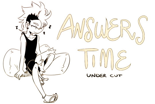
Anon said: Do you have any more of the comics where Kiri's cat gets into Bakugo's apartment?? B being a dumbass is adorable hrnfjf
I don’t, sorry!! But the very amazing extremely skilled chonideno wrote a whole wonderful fic on it, so you can read that if you want more!! I still can’t believe she did that for me ily mag ;;;
Anon said: kirishima with......... a braid
Honestly the best thought horikoshi should get on that already 🙏
Anon said: i think... that bakugo should give kirishima a sleeby nose smooch..... as a treat.........
Anon said: hello it is i, sleeby nose kiss anon, and i want to say that kiri should also get to wear bakugo's sweatshirt. as a treat. i think he deserves it.
I think kirishima deserves anything and everything in the world and then some so honestly yes, bakugou should absolutely do that! It’d be very soft and it’d make me very happy
Anon said: your blog is a kirishima fucking goldmine thank you for your service in these dark ass times
I’m very glad you enjoy my indulging myself for the past 4+ years hahahaha the more kirishima there is in the world the better, that’s for sure 💕
Anon said: WHAT is your drawing process please reveal your secrets I am b e g g i n g you
It’s nothing complicated, honestly! I sketch out a very rough idea of what I want to draw, then line it as loosely and smoothly as I can manage, add flat colors on another layer, shadows on a multiply layer clipped on the flats one, and then adjust the light/intesity of the colors with a airbrush tool on an overlay layer - it’s really the simplest process known to human artist hahaha I posted a step by step on my patreon at some point, but maybe one day I’ll find a way to make a process video and show you guys how I do it.................... maybe if I’ll ever get to buy an ipad, that’d make my life easier
Anon said: OH MY GODYOUR VIGILANTE AU JUST-- HSJXJDJDJS THESE IDIOTS
So very glad people are still finding and liking that one! I had fun for the little it lasted, it was a very self-indulgent au haha
Anon said: Your art is honeslty the only thing keeping me going atm cause I'm going through a tough time rn and your kiribaku art just 🥰🥰🥰 also what program do you use?? I've cycled through so many and I cannot for the life of me find a good one
Thank you so much! I use easy pain tool sai, which is the easiest, most simple program I could find since I’m easily overwhelmed by too complicated things lol it’s got its shortcomings but it works perfectly for the little I have to do :D
Anon said: so i, like, keep going back and reading and re-reading that really long kiribaku comic (the one where kiri won't let baku kiss him) and everything about it makes me happy!! like, your art is already such a delight to look at but you also write them so well and it makes my heart feel all bright and happy and that comic feels like a culmination of all of that and i just feel like '!!!!!!!' everytime
Oh god I nearly forgot about that one, I loved that comic! Had so much fun making it and it was so satisfying to post it 😭😭 I’m happy you still like it and go look at it!! feels very very good to know, thank you! ;;; <3
Anon said: you draw touches, like hugs and stuff, and remind me that i'm a bit touch-starved and i honestly can't say i regret it
Sorry I hope this means that you don’t regret looking at my art even if it reminds you of being touch-starved because I’m!!!! glad to hear that??? though I really hope you’ll get to be hugged soon, anon! ;;;;
Anon said:For some of your black/white art (lineart), do you mind if people color it with proper credit?I like to color manga panels, and I really like your art, so, along with crediting you, is it okay if I color your peices?
I’m not a hundred per cent opposed to it, but I’d prefer it if you could ask before doing so telling me specifically which piece we’re talking about! Cause there’s a couple I’d prefer didn’t get reposted in any form or way, after all ;;
Anon said: I was looking through the jujutsu kaisen tag and found you and looked through some of your recent art and I was about to follow you and then I realized I already followed you for your bnha stuff
!!!!!!!!!!!!!!!!!!!!!!!!!! glad to hear I could make you want to follow me twice over, then!!! 😁
Anon said: Reminder to drink water and relax, overworking yourself isn’t healthy and we all need time to wind down!
Anon thank you!!!!!!!! The same goes to you, take care of yourself!! <3
Anon said: you are the light by nine lashes has me feeling kiribaku feelings and i have not a single person around me who i can tell ;n;
OHHHHHHHHHHHHH I absolutely do know the feel, please feel free to come cry about them in my inbox whenever you’d like anon ( TT^TT)9
Anon said: Could you do a tutorial on lineart? Yours is so clean I’m jealous
It’s not like I don’t want to, it’s just that there’s very little to it I could actually make a tutorial about? I try to keep my sketches vague and simple to not trap myself in the need to make the line look exactly identical to the sketch, and I try to keep my lines as long and uninterrupted as possible, let my hand kind of go the way it feels most comfortable to it if that makes sense, and I use ctrl+z A Lot to be sure the line flows the way I want it to in the direction I want it to go, and that’s honestly all there is to it! It’s not really about technique as much as it is about letting yourself keep as loose and fast as possible while putting down the lines, I really have no idea how else to explain it I’m sorry m(._.)m
Anon said: Sorry if this is an overasked question, but... what are your pronouns? I don’t wanna misgender you -.-
she/her! and don’t worry, you asking is no bother :D
Anon said: can ppl send, like, random hcs or thoughts to you? not like, drawing requests, you don't take those i know, but just because?
Hell yeah, please do!! I love to hear thoughts and headcanons, it makes my own creativity itch to get to work!!
#fran answers#i woke up the other day with eight new asks and i had a little heart attack thinking something had happened LMAO#it was just a lot of love though sob thank you sm <3<3<3
145 notes
·
View notes
Text

I might actually be in love with these bloody socks he’s bought me. (I’m never going to tell him so, but I’ll bloody well wear them.) (I am wearing them. He wanted to see how they looked on. They’re an absolute disaster with this outfit, and if that doesn’t show him how soft I am for him, well. I doubt anything could. Fucking cyan with camel and burgundy; how atrocious.)
—Baz, chapter 19 of Between the Lines 🦖
I liked how my latest pen & paper drawings turned out so much that I tried to replicate the style digitally (as close as I could, anyway). I’ve tried out a bunch of coloring styles, & this honestly might be my favorite so far! Back to black lineart for me, I suppose. Or maybe not. I’m notoriously uncommitted. Also I need someone to please stop me from ever attempting to color corduroy pants ever again. I’ve done what I could here LOL
Also I may be insane but I’m considering making a piece of art to go with each new chapter of BTL. Partly so I have something to post on my IG when new chapters come out. Partly because I am once again overestimating my abilities. We’ll see 🤣


just now realizing i forgot the scars on his hwands. oh well.
click images for better quality
#my art#btl art 🦖💙💛🦖#baz pitch#bookshop bloke baz 🦖#baz's dino socks#idk how many times i’ll draw him in these socks but i want y’all to know i have the pattern saved#between the lines#carry on fanart#snowbaz fanart#snowbaz#snowbaz fanfiction#carry on fanfiction#carry on fandom#uhhhh what other tags. what will help me beat this godforsaken algorithm. please jesus i hope y’all actually SEE this
62 notes
·
View notes
Text
Agapanthus - Art Process (Part Two)
Down below!
Step Three: Coloring

When I was planning to do Vil, I definitely wanted to give an angelic and regal vibe for him. To me, angels represent purity or at the very least - perfection. Angels are known for their beauty, so I thought that Vil would be absolutely perfect for the image.
For the scheme, since angles are bright and light in color; I chose to do Vil in that same format too.
For choosing the flower, I decide with one that not only represented his goals of beauty - but his immense strength and uniqueness as well ( ‘to special ones only.’)
Moreso, the Purple agapanthus is considered as something that is worth great value and effortful (’to those who deserve it’) which really hit the mark for Vil.
My first search for his flower was the Calla Lily, but I realized that it didn’t fit Vil; the flower seemed rather plain and superficial, so I scrapped that flower for someone else instead.
As for the Crocus, I added that for design. The Crocus represents youthfulness, gladness, and glee (more written on the website) which really accentuated the goals of beauty (youth -> youthfulness) but a reference to Pomefiore: Memories as well! :D
Step Four: Shading

For the shading I used:
Purples + Blues - Agapanthus, Crocus, Poofy Things (Shoulders), Hair, Halos, Eyes
Greens - Stem of Agapanthuses and Crocuses
Oranges + Yellows - Hair, Eyeshadow, Poofy Things (Shoulders), Crown, Halos, Skin, Pattern on Shoulders, Upper Body, Lips
Tips and Tricks?
I tried to do some form of light, but it wasn’t working out. Luckily, the next album (;D) has compensated for that.
I forgot to say - but a good idea when shading accurately (especially the program I use, Krita) is to FIRST DO THE BASE (coloring), THEN go to Group ->> Quick Clipping Group. There will be a layer called a Mask Layer - that’s the layer you use to darken or highlight your areas.
Remember when doing your shading, that you shouldn’t choose random colors. Most artists use the darken (under the word ‘Layers’ and you’ll see the word ‘Normal’. You can then click on the word and it’ll show you a ton of modes) to shade their stuff to get their work done more efficiently and quickly.
For me, I pick out the colors myself to practice my color theory in a way (not the logical side of it). I mainly choose use hues to shade to make my art look colorful.
For example - the Agapanthuses: light purple -> dark purple.
Different types of shading can change the atmosphere of your piece - so you must be careful with it. Using tints (+white), tones (+grey) and shades (+blacks) can make your piece more interesting, unique, and more dimensional in a way, so you should definitely try it out!
If I sound really stupid just remember that I looked half of this up lol
Step Five & Six: Final Background + Blur + Dark Blue & Purple Lineart + Loopy Design + Highlights
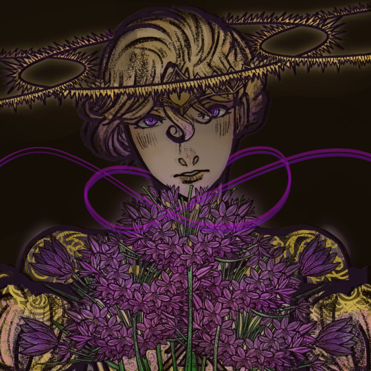
Lastly, I used eight layers to highlight and shade Vil.
Note that this is different from Step 4 because in Step 4 you shade the OBJECT/THING/BODY. Here in Step 5 and 6, you shade the ENTIRE THING.
E.g, Step 4 -> The petals and stems of the flower. More specific areas of the piece. Requires breaking down different sections of the artwork.
Step 5 or Step 6 or Both -> The whole piece, all areas. Focuses on the atmosphere and direction of the piece overall.
Some of the layers were duplicated for a darker effect, while some layers highlighted parts of his design (for e.g, the hair, halos).
Highlighting:
To highlight, I would duplicate the base and/or the shading layer I want highlighted on TOP of the dark layer. This helps that area to be excluded from the parts I want to shade. Just note that you can only do this once you’ve fully done the base (coloring) and the shading.
When duplicating, make sure the duplicate is OUT of the Quick Clipping Group or else it won’t work.
Sometimes, highlighting is as simple as erasing the shadows of the piece. For example, parts of Vil’s hair is darker than others. The more dark layers you have, the more you need to erase in order to make the artwork ‘pop-out’. But in the artwork above, this has been done poorly.
For Blur:
Normally I would duplicate the base and/or shading layer and put it on TOP of the dark layer before using the Gaussian Blur ( Filter (top-left corner of default workspace of Krita) ->> Blur ->> Gaussian Blur). If it doesn’t work, I put the duplicate layer on TOP of the lineart instead.
Dark Purple + Blue Lineart:
For this I would duplicate the lineart, use the Contiguous Selection Tool to select the lineart ( middle left corner of default workspace of Krita with a shape of a fairy’s wand) and changing it to the color I want. In this case, it would be purple and blue. Note that purple and blue are TWO separate layers of the same lineart.
Lastly, you place the two layers on TOP of the original lineart, and there you go!
To get a glitchy or glassy effect, you lower the LAYER OPACITY to less than 100, and move the layer either a little bit to the left or a little bit to the right, and you’re done!
Loopy Design:
Oh I just used horizontal mirror tool ( above, right of file name) and whipped up the loop lol. I think I did it on two separate layers before moving it a little bit more down or something
Step Seven: Title + Final Piece!

YAAAAAAAAAAAAAAAAAAAAAAAAAAAAAAAAAY!!!! WE MADE IT - YOU MADE IT AND I MADE IT!!!!! :DDDDDDDDD
But overall, I believed that the end result was done poorly.
Light and shadow was not mainly evident here, even though I put full on effort into my work. In my opinion, this was a life lesson for upcoming works in the future and hope I remembered what NOT to do LOL
Completion of Track Cover: December 30th, 2020 - 2:17 PM
Time taken: 3 days (2 days if being more specific)
Release of Track: December 31st, 2020
I’m such an idiot calling it an album cover before-
Anyhow...
Thank you for supporting the fan-made music (and art) of Twisted Wonderland x Date A Live!
Curious? Agapanthus [ Art Process - Part One ] here!
Wanna hear some music? Agapanthus [ TWSTxDAL Track ] here!
#TWSTxDAL#TWSTxDAL art process#twisted wonderland#twst#date a live#pomefiore#twst vil#vil schoenheit#Don't mind me just dying in the corner :)#Till next time - which likely will be tomorrow! I guess...#heh
11 notes
·
View notes
Photo
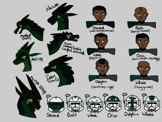
Tried a drawing challenge two years ago, abandoned it, then decided to use the rest of the space to showcase my ARC squad!
description from my dA under the cut, it’s quite long:
So two years ago I did a weird art style challenge with Nightfalcon but then I abandoned the project due to how rare a dragon is to show up in a 2D animated show (at least, in the shows I knew, I got desperate to use MLP's style aksjfkw) and looking back, I might do the challenge again but actually follow through from lineart to coloring bc I didn't know how animation worked back then, hence the stars still on the models even though it shouldn't be there bc they're tiny details and dots. So I tacked on my ARC trooper squad to fill in the rest of the page and because I needed to design them. I drew them four years (!!!!) ago in this doodle: www.deviantart.com/cobracatdra… (Twistedjaw is now Twist and will get a redesign, but I wanted to work on my ARC squad before then) i just realized i forgot to put eye highlights in Wave's eyes, oh well, it's fine, he has the same eye color as the rest lol Shroud and Orca have the standard clone cut, but they have different personalities and scars - Orca is a little more social with his vode than Shroud is, along with Shroud having black pauldrons while the rest of the squad has the left grey pauldron and a different colored right pauldron. Shroud, Bolt, and Wave became ARCs shortly after the Battle of Geonosis, while a few months into the war, Orca, Dolphin, and Whale were promoted to ARC troopers, hence the different colored pauldrons. I changed Bolt's tattoo color from yellow to black simply because it's more likely that black ink was available for the troopers (though Hardcase has blue ink for some reason ahahaha) and also so that it shows up on his skin a lot better Wave has the sides of his head shaved but grows the rest of his hair to the standard clone cut, while Dolphin I wanted to give him the Sokka warrior wolf tail kind of look (though he doesn't grow his hair out there) and Whale I kept him shaved bald. Then I slapped on scars on them because I could >: D Designing their helmets was also pretty fun - Orca's I changed the design slightly to cover the entire helmet, but the original concept is still there - keeping the design to the forehead/top of helmet Shroud's helmet's face is painted because I thought it'd fit his more serious "mask" personality - he has a tendency to hide his emotions under the guise of having it all together. Bolt has symmetrical lightning bolts to throw off nat-born commanders if and when he takes off his bucket around them. Wave's was really hard to do - I knew I wanted the cheeks of the helmets to have the same "symmetrical patterns on helmet, asymmetrical face underneath), but I also wanted to evoke a seafoam theme on the helmet - then it hit me. I could just do paint splats so that it looks like sea spray, so I did. Dolphin's design goes from his helmet all the way down his chest plate, so I'll draw that later, but this is a rough estimate on how much is on his helmet. Whale's was also difficult to design, I didn't want to go basic on him, but I didn't want to repeat the design I gave for Dolphin, so I put his whale design on the top of the helmet.
#nightfalcon arts#star wars#star wars: the clone wars#clone trooper oc#arc trooper oc#arc trooper shroud#arc trooper wave#arc trooper bolt#arc trooper orca#arc trooper dolphin#arc trooper whale#nightfalcon
5 notes
·
View notes
Text


it's now digital gamers


why'd i draw this? you may ask. simple. i have 0 impulse control and was thinking about that one ash and amanda interaction
#i dont like how the digital ones came out#just bcs amandas lineart is purple#and ashs is black#and i hate the bavkground cause i couldnt get a good color#saw#dead by daylight#evil dead#amanda young#ash williams#🍒#and i forgot a bunch of stuff in these i just realized. oh well
5 notes
·
View notes
Photo

Drawing 2: If you couldn’t tell from my url, it’s my favorite pokemon!!!! Whimsicott’s design is SO good and creative and I love that they can wreak havoc with their Prankster ability.
Used one of the official trading card art pieces as reference, I think it came out okay! Even if it still looks like a little kid drew it, it’s better than the first time I tried to draw Whimsicott anyway lol.
Just like last time, I drew it on my 3DS haha so I’m REALLY starting to feel the limitations of that...medium. I have to get really creative by juggling sketches between layers because I only get 2 layers!!! Which, granted, is one more than traditional pen and paper, but also makes it very difficult for when you want to experiment with erasing lineart and suddenly realize that there’s no going back bc you didn’t save beforehand. Also now that the image is on my laptop, I’m seeing issues with the colors that didn’t show up on my 3DS screen. But it’s okay because I think the curtains look preeeetty cool!
The colors are a lot better than yesterday though because... I totally forgot the blend tool existed!!!! I really spent hours handpicking a million shades of green yesterday!!
Oh well :P I don’t know if I have the willpower to keep drawing every day but we’ll see. Per the request of my friend, next drawing attempt will be Ampharos O-O
#imperfect things#is this a journal? i guess this is a journal#loneliness will make you talk to the void that is tumblr!#4.19.20#pokemon#my art
2 notes
·
View notes
Photo

time for bunnies- top 10 favorite cybunny colors, and bonus top 5 favorite pre-conversion cybunnies
Mutant- I love this ridiculous thing- its got stripes, and spots, and skulls, and claws, and a really charismatic face and i love its weird nonsensical tentacle ears
Jelly- this one’s really pretty! I actually like the decision they made to leave off the spots, and the colors they chose and the way they shaded it looks really good
Robot- I love the color scheme on this one, and the way the ears attach to the head. they forgot its nose, and I think i like it slightly better without it, although they probably should have remembered it. maybe if they made it a red crystal to match the one on its chest, instead of having it be solid black?
Stealthy- I’m not sure why they decided to make it shiny, but I think the olive and gold accents on the outfit look really nice. they should have given it a little blade to hold or something though, this feels like a color that had the perfect excuse for the hand to be raised!
Chocolate- its got nice colors, and I like the stripes. also Neopets’ rainbow pool kind of sucks so the tail of the Cybunny isn’t actually white, its supposed to be the same shade as the body. I tried to catch every time it displays a pet color wrong and fix it, but I must have missed this one, oof
Halloween- i think i read one of the Bunnicula books, once? anyway this was a really good idea for the Cybunny, and the blood red accents are great. i wish the cape was a little better looking but overall, this is a nice Cybunny color. also, I almost completely missed the spikier hair- that’s weird, but i don’t dislike it
Plushie- the tail is wrong on this one too- it’s supposed to be the same color as the ruff. I’m not super familiar with Cybunnies, so I think that’s why I missed it when I was putting together this list, but god that’s annoying. Anyway I like the simplicity of this one, and I think they did a great job with the color scheme (even though I think they kind of got the ears wrong- they seem to have eyedropped the old artwork’s ears, but those were in shadow, so now the insides of the ears are kind of off looking, value-wise)
Pink- this is silly but I think its nice that they gave this one slightly different markings, in that the ears have dark pink tips. they also just picked nice shades of pink, this is a very pleasant pet
Water- I like how they rendered the underwater texture on the legs- could have maybe used more of that in the head or ears, but its most important that the face reads, so I think this works
Gold- so this one doesn’t look very shiny, but I think that works to its advantage. it doesn’t have the problem of looking like butter that some gold pets have, and I think the colored lines look really nice. its just pretty!!
bonus:
UC Plushie is very cute- I have other pre-conversion plushie pets I like more, but this is probably the cutest cybunny in my opinion
Mutant again!! they barely changed it when they converted it, but they did choose a different pose’s expression and i think this expression is cute too
I think the pose looks a lot nicer for the pre conversion Robot Cybunny- it feels a little more alert, and the smaller head helps it look less like its head is crushing its little robot body. also the way they drew the hind feet in this art is just objectively better looking, i didn’t realize until i was comparing the two how weird the converted one’s hind leg looks. oh no all converted cybunnies are like that. their foot is just broken... oh no i won’t be able to unsee this will i
Royalboy!!! I love that they made him a little herald, and I think the Brightvale color scheme works really well
I love that they gave Royalgirl lop ears, and lavender, yellow and orange look really nice together
super bonus: least favorite Cybunny color award goes to....

okay, so it was going to go to Maractite, because it looks abysmal on the rainbow pool page. but if you actually look at the flash file...

it doesn’t look bad!!! the artist just got SO into making it look shiny that they colored a lot of the lineart, and in some places its way thinner than the lineart usually gets, and in other places places its virtually invisible. anyway after seeing it up close I don’t think it exactly works but I can’t hate it, its like a beautiful glass sculpture
so my actual least favorite cybunny color is this then:

and yes, its because they just copied the wrinkles from the elderly cybunny for some reason, and left them all black for some other reason, and i can’t fathom what either of those reasons were but I DO hate it. and its a shame because the shading is pretty nice, and the colors are garish but I think they work for Toy (besides maybe the red eyes? but i feel like a good artist who wants to make a character out of this pet could make them work)

runner up is pirate because the pink feels like it should have been at least desaturated, and at most swapped out for a different color, like grey or even a more reddish pink, if they really wanted to keep pink in there. the shirt looks extremely weird and un-shirtlike, and the pink whisker dots are an odd touch too... and on top of all that, red eyebrows?? there’s some weird decisions going on here. the fact that the base fur color is blue is kind of interesting though, and could have potentially been really nice if they’d paired it with gold and navy instead of red and pink
#neopets#cybunny#there are a lot of bonuses this time because it turns out i have some thoughts about cybunnies i guess?#i was never really a cybunny fan but i do appreciate them more now than i did in the past
7 notes
·
View notes
Text
Commissions Update
Hey, y’all! Ha, I’ve been spending all this time fretting about prices for commissions, and then I realized that OH YEAH I’m driving out of state this Thursday and I totally forgot. I’ll be busy traveling until the 22nd.
So here’s what I’m thinking: if you’re just wanting something sooner rather than later, I’d probably just be able to do a sketch for you. I’d do my best to get it done before I leave. If you’re wanting something with lineart or color, it’d be with the understanding that I wouldn’t be able to really get it done for you until after all that traveling is done.
For prices I’m imagining:
For 1 or 2 characters
Sketch: $10
Lineart: $15
Color w/out Lineart**: $15
Color w/ Lineart: $20
For Any Additional Characters: $5 each Add A Background: $10 (like an actual setting or place, designs and colors, simple elements like flowers or elements and the like are free):
**When I say color without lineart, this can mean one of two things:
Lineless color art, so like this
Or color on top of sketch like this
Sketches can be digital or pencil. For lineart and color, I’m going to stick with digital for now.
I’m willing to draw pretty much anything except NSFW (I’m just no good at it tbh) and no realism (I’m just too out of practice and you’d be disappointed). I’ll be emailing completed images, and I’ll leave it up to you if you want me to post it online as well.
Since I’ve been going through some things, I won’t ask for payment up front. I will require payment before I send the completed image however, so basically after I let you know it’s done. I can make changes to the art if you’re not satisfied (within reason).
If you’d like to order, you can either send me an ask or DM me here on Tumblr. If you’d rather correspond through email, let me know here and I’ll send you my address.
Thanks, guys!
13 notes
·
View notes