#i just don’t think the creators had that scene in there for just stylistic purposes
Text
i literally am obsessing over jayvik in arcane once more, but they’re really getting me tonight. to be frank here and now, i adore their platonic relationship and anyone else who thinks that their relationship just is that, cool that’s you. but the thing my thoughts keep going back to is that sex scene between jayce & mel being intertwined with viktor dying as he’s working with the hextech. they literally had viktor lying in the hospital bed be in complete symmetry with mel lying in her bed alone. LIKE I NEED TO KNOW EXACTLY WHY THE CREATORS DID THIS.
#like i really do believe there are romantic/sexual undertones along with their platonic relationship#and even if there isn’t those undertones intentionally they’re definitely saying something about the passion that’s there#with vik & jayce and jayce & mel. i would even make an argument that there’s a stronger connection there with vik over mel#i just don’t think the creators had that scene in there for just stylistic purposes#but i’ve yapped enough and need to sleep#arcane#viktor#jayce talis#mel medarda#viktor arcane#jayce arcane#mel arcane#jayvik#meljayvik
39 notes
·
View notes
Note
Hi. So, since you seem to know what you're talking about, I wanted to ask if you could give like ... a short list tips ... of things to always be aware of/think about/question when analyzing something or getting into writing? Have a nice day.
well I had typed something but X’ed out like a dumbass without sending it because my RP group is crack and consumes my focus so lemme try this again.
A few things to track, but I’ll expand on:
Author intent
Cinematographer intent
Production intent
These are in no way mutually exclusive and are very collaborative. However, recognizing that they are not all the same can help you figure out who’s putting in what level.
Realistically, anyone involved in the visual part of the art – directing, camera operation, set design, lighting – could be considered about on par with authors in regards to the validity of their storytelling, as they generate elements to the screen that if this were a book, the author would be etching out themselves. On the other hand, it’s important to recognize the limitations of screenplay format. Pull up some screenplays – SPN, or anything – and recognize it’s almost comedically barren on details. And that’s not to undermine the amount of thought that goes into screenwriting, either.
Screenwriting is an art of packing as much of your intent as you can into as few words as possible, leaving it to the director that takes on your work. Certain directors have made statements (it’s escaping me who it was–Sgriccia?) about understanding how the writing room works and what they’re aspiring after. And that’s good.
But even after you get a collaborative writers room working with a collaborative cinematography team, you also get editors that run full circle back to the showrunners and other office end team that polish, rearrange, pin together, and trim.
So we have multiple phases of a process that’s really difficult for most people to casually eye, and I get that.
Generally speaking, if you’re looking at seeing primary plot arc direction as the authors at the start of this process intend, you need to look at what’s in the script. And we don’t get access to all scripts, but on reviewing a plethora of scripts both SPN and non-SPN, you can at least have a fairly clean shot at what kinds of things likely are or aren’t.
The directors collaborate off of work started by the writers, so the writers are the cornerstone in direction, characterization, etc; these are the primary things that propel our story, the rest just fulfills it. Knowing where to divorce these things from each other can be a huge step.
That’s not to say you completely ignore visuals either. There’s a vast wash of art in the crafting of set, the framing of shots, the choices in lighting and so on.
One of the problems I find, however, is that people will just get hell bent on an idea that X color will always mean X thing in X situation. Taking a few days to research color theory in film is something I very loudly suggest as a start. There is, most definitely, color theory but it’s not so clear cut as like “the drapes were blue here and the chair three episodes again was blue and Dean sat in it while talking about Cas so clearly the drapes are his window to thinking about Cas” because that’s… That’s not… I promise you that’s not how creators think. I literally just promise you that.
Hue, Saturation, Brightness, scale of color, there’s all kinds of psychology attached to the use of these in film, or different color coding. It’s the same logic on why most trashy high volume fast food places make their logos red and yellow or red and orange, because that evokes a feral side that induces hunger (or, depending on HUE, SATURATION, BRIGHTNESS AND TONE, anything from fear to rage to passion). Basically, lighting and elements like this are your Big Mood. Big Mood matters. But a random prop happening to be a random color is very unlikely to have major significance unless it is a focal point object. Objects that are chosen as focal points often have meticulous consideration put into them.
Ambient set design is huge. It can be everything from light to shape of a room, to a consistent theme in the background. For example, if Sam and Dean are reading a lot about exorcisms, the books we see littered around and most disturbed are all about exorcisms or demons. Sometimes it’s less front-facing than that, like perpetually taunting the background with themes related even if they aren’t textually searching for this. Modernly, that’s hermetic books and emblems, for example. These are all very relevant to the overall story arch. But if you’re looking to find that one Red or Blue or Green book binder to compare to a lamp shade from several episodes ago, you’re probably gonna have a bad time and sort of wander off into an area that ends up completely unfulfilled later.
Just like the writers all have their own style – and they do, and recognizing these styles can help with a lot – the directors do too, and how they choose to work and frame sets with the lighting team are not identical. You wouldn’t try to directly conflate the art of Munch with Gauguin, I hope, and that’s something we have to recognize here. The writing is the subject and they are the painters. And there is a strong stylistic theme, wherein the later production ends like editors mostly tie it into a product that doesn’t look like a wild disaster, but each of their styles bleed through.
Sgriccia’s directing is not Wright’s directing and never will be. They’re both great. They both visualize the elements and empower things being lifted from the script masterminded from the authors to render it to us, but where they choose to put That Orangish Lamp is going to be in the microcosm of their episode/painting/works, not the macrocosm of the season, as given by the writers, who still will drive our direction.
The directors know and deeply understand what the writers are after, but there’s a bit of a hazard in conflating everybody like they’re one singular artist, rather than dozens of collaborative artists manifesting this on different tiers.
Directors can, to some extent, know the story arena in the future too and choose to frame shots in it with strong visual storytelling. Knowing keys to visual storytelling is also really important, rather than getting lost chasing the story behind a black pipe that set designers just put in there because the building needed a damn pipe. Because part of building a set is also making it coherent and a lot of elements simply exist. Understanding if the director is dynamically framing it to call attention to it, however, is something else.
One of the boldest examples I can think in recent history was when I had random directing drabbles about 14.7 (x) I simply observed very pointed plot (re)construction that changed depending on angle in a conscious decision. Dean being “boxed in” was a statement I wouldn’t even understand the full ironic dickslap of for a while, but it was right there, in visual storytelling, in something I couldn’t ignore. Or another one about the difference of focal point objects, such as the keys to the comic legacy (x) which finalized my faith that John was, in fact, returning.
Or in text, the literal dialogue of Michael (and, before that, Lucifer), over daddy issues, that had me swearing Chuck literally was going to come back this season, non-negotiable, in echo to resolving John-Sam-Dean issues as well.
The thing is, many of these do boil down to the script - focal point items (mix tapes, literal keys by the ghost, dialogue). And the directing drabbles picked out a specific set of frames that literally required purposeful (re)construction which caused a visual storytelling element.
Personally, I am very, very picky about what I meta over or point out. And that’s not popular around here. Somebody’s always gonna crow “how do you know better”, and any time they get that answer they get offended like “well now you’re just rubbing it in my face!” – in the end, anyone CAN analyze anything, the point is whether people are wrapping their brains up in an idea that’s sort of sending them off to never-neverland and won’t pay out.
Key focal point objects versus ambiance; text versus cinematography; they’re all important, but all don’t drive our forward motion with the same thrumming baseline as the writers churning out content beneath it all. The others bring it to life and yes, collaborate with them, but there needs to be a certain level of judgment applied before diving off chasing dogs in picture frames if you actually expect it to lead anywhere.
And again, I point out to scene ambiance, which can be great to discuss! But those need to be held as microcosms unto themselves or at least that director’s hand. It can be interesting to study little things painted in the layers. My Red, Yellow, and Blue studies for Optimism are an example of that. I do enjoy color theory, but I often restrain myself from engaging in it because people tend to get ahead of themselves and not apply the other… stuff. *gestures vaguely above*.
Honestly, read about things like color theory, dynamic cinematography methods and more for that front, and read through some scripts to recognize the levels before trying to study and pitch into them entirely.
#supernatural#my meta#meta adjacent#ask me anything#authorial intent#directors#cinematography#editors
18 notes
·
View notes
Photo


Analysing the Animation of Into the Spider-Verse
In this post, I’m presenting my research and exploration into my chosen film Into the Spider-Verse. Here, I want to delve into the film as an example of successful and engaging animation- exploring the various techniques and artistic risks the creative team took in the production of the movie. I’m primarily exploring the film in relation to this predefined essay question:
‘Only available in animation.’ To what extend does this Paul Wells quote apply to your chosen film? Explain how the medium and materials enter, shape and define the narrative. If your chosen film subverts, or ignores conventional expectations of a plotted narrative, identify the strategies employed in it’s place. Discuss the film as an animated narrative.
Into the Spider-Verse has been praised, by critics and audiences alike, for its groundbreaking new visual style, a love, and appreciation for the comics of old that’s been hand-drawn into every frame. And it’s not just how every shot of the film looks and feels like a comic book through hand-rendered graphic printing techniques - it’s the film’s snappy approach to computer-generated animation that makes the movie shine and stands out from the crowd. There’s nothing that really feels like Into the Spider-Verse, and that’s because the creatives behind the film took almost two years to simply establish the look of the film. They wanted something fresh, new and exciting - taking the visual language of comics and adapting this to cinema.
The animation doesn’t flow at a consistent frame rate - instead, characters ‘pop’ between dynamic poses, with action lines and smear frames serving as an organic, hand-rendered way to smooth the motion, creating a stuttery, sharp and crisp style of motion. Up until recently, feature-film CG animation has put a focus on realistic movement. Into the Spider-Verse presents a refreshing style of animation that we haven’t seen before, as the focus shifts from replicating reality to embracing the ideas of graphic illustration and abstraction found in the comic book source material.
This revolutionary approach to animation arose out of a desire to do something different than all computer animated feature films in the past: a style of animation which has more in common with an illustrated comic book than a live action film. The use of the technique effectively shapes the narrative of the film, as the graphic art aesthetic allows characters of vastly differing visual and animation styles to sit naturally shoulder to shoulder with each other, without shattering the consistency and world of the narrative: it is testament to both the film’s visual language and plot when a 2D cartoon spider-pig throws his hand out to a disbelieving Miles Morales.
The snappy and ‘crunchy’ approach to CG animation compliments the ‘computer glitch’ effect when the world starts to break and shift into varying art styles as the dimensions start folding in on themselves. It perfectly fits the ‘psychedelic’ glitching visual language that the creators establish throughout the narrative, and further works to immerse the audience in a whole new visual experience to anything they have seen before. It’s ‘a living comic book’, rather than an animated film.
A few critics were criticizing the film for it’s ‘choppy’ animation. Some even found it difficult to watch, calling it ‘dizzying and nauseating’. In reality, it’s not that the animation is necessarily choppy, it is just that there are very few in-betweens in the animation.
“In computer animation, there's an image every single frame, and there are 24 frames in a second. We stripped out half of those images to make the movements feel crisper. And because we took out every idea of a motion blur, everything's crunchy and sharp—it helps make the images pop off the screen.”
Bob Persichetti, a director on the film.
This gives the film its signature stylised and dynamic look. Something also worth noting is the lack of overlapping action going on too; most action sequences are simply easing in and out between key frames with dynamic posing. Our character hits a pose and then eases into the next. A benefit of working with such a stylised approach to animation is that because there are very little inbetween frames, every pose has to count.
A great example of this would be the battle between Spider-Man and The Prowler. It’s a quick, snappy fight with a real impact. If we look at the animation frame by frame, we can see that every single pose is clear. In every frame, we can see what the characters are doing and feeling - and this has to be so, given the limited number of in-betweens. The filmmakers don’t really have time to have a frame in which the audience can’t quite make out what’s happening - meaning every single second of the film has to register with the viewer in order to know what happened, and what’s going to happen next.
This is largely achieved through the use of smear frames: an animation technique used to depict a ‘blur’ of motion in a single frame. This is unlike the traditional approach to movement in animation, which uses key poses and in-between frames to create the illusion of movement instead. With a more snappy approach to motion, animation smears accomplish the illusion of motion in a single frame, or short run of frames, in between the typical keyframes. This ‘blur’ creates the sensation of a sudden burst of speed, giving the animation a sense of frantic pace and action that traditional animation can’t quite match.
We can see this in action in the first act of the film, in which Spider-Man is facing off against the Green Goblin, and gets thrown into a storage container. The purpose of this scene is to suggest the sudden impact of the character into the solid storage container - to communicate to the audience a sense of sudden speed and power. Using smear frames and brilliant visual storytelling, the animators are able to communicate this successfully, and with a creative flair.
There are three smear frames in which Spider-Man hits the container, which exaggerates the motion and creates a real sense of speed, additionally to creating a very fluid movement. The character then settles into the final pose, as he’s embedded into the container due to the brute force of the impact. We see Spider-Man lift his arms out and up, as if he’s stuck. This little touch, along with the smear frames, allows the movement to be read as powerful, fast and sudden. It’s an example of good visual storytelling through stylised animation.
As a final example of this, we can return to the Prowler fight mentioned earlier: a flurry of fists and dynamic poses. The sequence features a smear frame of Spidey’s hand as he rapidly hits the ground, and after he gets hit by the villain, thrown into a wall. It’s these touches that lend a real fluidity and dynamic sense of motion to the film, something which greatly adds to the overall success of the film and its understanding of Spider-Man as a character.
Perhaps unlike any other superhero, the character of Spider-Man is intrinsically linked with this idea of fluid motion and agility. When we think of the hero, we vision him swinging through the New York City skyline, striking a few iconic poses in the process. The film completely understands this aspect to the character, and is the sole reason in which the creators wanted to bring Miles Morales to the silver screen through the magical medium of animation.
‘The magic of animation is that it can be anything that you can dream up. There was no better medium than animation to make a Spider-Man movie.’
Bob Persichetti, a director on the film.
This post represents my initial analysis of the film’s use of stylistic animation, and how this impacts the narrative of Into the Spider-Verse. Initially, I wanted to explore a more rudimentary approach to the task: looking at the film in relation to the Hero’s journey. This would allow me to explore the character of Miles Morales in more depth, but when digging further into the film I realised that the narrative wasn’t what makes the film a groundbreaking piece of cinema.
That credit goes to the stunning visual language and animation style of Into the Spider-Verse, directly inspired by the comic book source material. With this, my approach to writing the essay (and research) had pivoted: instead of looking at Miles’ story, I’m now wanting to explore how the film presents Miles’ story. For this investigation, I wanted to look at the two most important aspects of the film’s visual storytelling: the art style, and how the characters move. From this, I could then discuss the film’s comic book language, but also the stylistic, snappy approach to animation.
It’s a visually distinct movie: there’s nothing else like Into the Spider-Verse, and that’s because the creative team behind the film effectively established a brand new production pipeline and approach to visual storytelling within animation - one that originated from a real love of the comic book source material. The finished film possesses a break-through in animated storytelling, pulling compositional and aesthetic inspiration not from live-action cinema - instead, the artists pulled from the pages of the comics themselves: adding a hand-rendered, graphic feeling to the film previously never attempted before. It’s important to realise how ground-breaking this new approach to animation is - and it’s so successful that Sony (the studio who produced the film) are trying to patent this new style of animated storytelling.
Having briefly looked at the animation style of the film, I’m now intrigued to explore how the film began: investigating the history of Into the Spider-Verse, and how the project developed from storyboards, 3D modelling to final product.
1 note
·
View note
Text
How Words Can Build (or Obscure) Images
We can think of words or texts as being compliments to visual works, upon which those words impose contextual obligations onto the reader as to what an image’s interpretation should be. To this effect, words serve the purpose of either building images from scratch within the subjective minds of the audience, or of capturing images and morphing our understanding of the content and the purpose of that image. In simpler terms, words can be used to add on or take away something to the visual aspects of whatever we are viewing.
This idea most readily presents itself when we analyze things like advertisements and political cartoons. The following are examples of where words are actually a part of the artwork, which isn’t necessary for the existence of the above relationship between words and images, but does “frame” them together nicely.

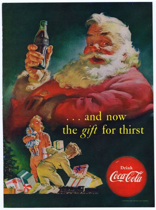
When we see the hydra-like, multi-serpentine figure in the political cartoon, then our cultural and social instincts begin to tell us that there is a conflict between a just human and a horrific monster. When we see the advertisement, then our modern understanding of Santa Claus kicks in and steers us towards relating Coca Cola to the family functions, warmth, and festivity of Christmas. Those examples are fairly surface level, but one of the most intriguing things to note here is that Coca Cola as a brand, and political artists/commentators as a group, build these cognitive associations from their choice of images and words. They take existing images, and they use words and aesthetics to transform art from descriptive to definitional. It is because the words associated with a “Coca-Cola Red” Santa Claus in the picture are welcoming and wholesome, that we relate the figure with the idea of “home” and “Christmas joy”. It is because we associated the words detailing “devilish serpents” to images of snakes that Andrew Jackson can be portrayed in political cartoons as he is.
This is of amazing importance! The underlying claim behind all of this is that, like words, images too can be like “speech acts” (definitional instead of descriptive), where their sheer existence crafts together not only a cultural identity, but a newly found truth. (Note how the use of the word truth here is independent of fact and is entirely a human quality, as Toni Morrison defines it in The Site of Memory) This is not a foundational quality of images alone, however, as these visuals require the existence of words to either build off of or contrast. In order to have the effect of these images, artists must play off of the ideas that people have in words and combine them with the above pictures. Essentially, images and words can weave together collective memories through which the creators and/or the subjects of the works can define themselves (or define our political opinions / the colors and emotions that Santa Claus embodies).
Let’s take as our first major example the famous portraiture that relates the Mughal emperor Jahangir to the then-ruler of Iran, Nadir Shah in one of Jahangir’s dreams. For reference, Jahangir is the elegant and tall man that stands atop a lion that rests over vast lands. Nadir Shah is the simpler, maroon-dressed man bowing over a lamb that is being elbowed into an obsolete and distant ocean.

Unlike the preceding examples, there are no words directly on the print of this artwork (or the next piece for that matter), but the scripts and written records in the Mughal empire serve as an accompaniment to this piece. We should also note that, in contrast to the picture itself, Jahangir was shorter than Nadir Shah and the Mughal Empire didn’t extend into Iran, which lead us to believe that the stylistic tendencies of the painting are metaphoric and not literal.
In this context, we see words obscuring one’s true feelings and identity while images bring them to life. Vocally and in writings, Mughal emperors would consider their fellow rulers in the Islamic world as “equals”, and this might be a sentiment that historians reinforce through modern, nationalistic lenses when archeologists dig through and find such records. This image, most likely commissioned by the emperor himself to his karkhana (or workshop), tells a different story that reflects some other things that we know about the Mughal emperors and their ambitious natures.
The name Jahangir literally translates into “World Conqueror”. We also know that a plurality of artwork and architecture (such as the construction of large minarets and extravagant buildings) was often a display of power in contest of other Muslim rulers, claiming dominance over each other. This artistic tradition is not codified in the aforementioned writings of the time, for Mughal emperors and other Muslim rulers had to uphold a certain Islamic identity where intra-religious conflicts were minimized, but what this painting reveals is not written fact, but rather a human truth (alluding again to Toni Morrison’s definition of truth). Jahangir (and associates of the Mughal emperor) probably did consider their ruler to be the greater of any two rulers. Something subjective like this wouldn’t be written in public records in order to maintain good political/trade relationships, but art was a vessel through which such opinions could be easily and earnestly expressed.
This case describes one of the core relationships between words and images because the words carry with them the weights of obscurity. They cast ambiguity upon the honest feelings of the Mughals, indicating that words and images can sometimes have a conflicting relationship that ends up working for whoever the subject of the artwork is. Jahangir, like other rulers, was able to uphold a political decorum with words while expressing his innate feelings through paintings. Both of these factors, in turn, contribute to the varying perception of Jahangir’s character to different audiences and build up his cultural identity, and the cultural memories of the Mughals, for what they felt their role was in a global context.
This effect that words can place on images is not always one that obscures, but sometimes can be one that explicates and creates. Take the artistic masterpiece that is The Death of Socrates, which showcases how a collective, cultural memory and reality can be forged in imagery that was fueled by philosophy.

In the previous example, we saw words contrasting with a picture to build complex, politicized, dichotomic images. This case is a bit more nuanced, though, as the image is a reflection of philosophical writings and anecdotal accounts, which in turn build a cultural identity. In fact, the true meaning of The Death of Socrates comes from the fact that the man sitting on the left foot of the bed (the old person in gray clothing), is Plato, who wasn’t actually present at the scene, but was added into the scene by the artist to send a message.
The artist is trying to say that everyone has access to Socrates’ views on mortality, not just the disciples present at his death, because those views were written down or passed on through oral traditions. While there is a lot more to discuss and analyze about this specific piece of art, that is the crux of the artist’s message. This relates to the overarching idea of mine concerning the relationship between texts and images because words are being used to breathe context into a picture, and that meaning fundamentally points out to the fact that writings allow for people to build images out of collective memories. Geometrically, it looks as if the scene of the death of Socrates is literally pouring out of the back of Plato’s head, as he imagines it after consulting the records of the event and his base knowledge about Socrates’ work.
Both scenes, first of the Asian rulers and then of the Western philosophers, show how words and images can work either in parallel or perpendicular to each other to build cultural identities and memories. Words can be used by the powerful to obscure their true feelings and opinions as Jahangir would call Nadir Shah an equal, while thinking him not and bolstering himself within his personal and cultural spheres. Images can bring to life a collective culture of students by tying together memories and thoughts that were only once spoken or written down, as Socrates’ students carried forward his views on death and his traditions, many of which are taught in philosophy classes today. There is a certain truth that forms out of nothingness (or out of one’s humanity). Because of these images, if we were to say that Jahangir was “taller” than Nadir Shah or that Plato was “present” at the death of Socrates, we wouldn’t exactly be wrong because those were the mental images that the subject of the artwork adopted. But these truths are what Toni Morrison describes as fact-less, human-full truths. They don’t pinpoint every detail in a description of an event, but rather, they empower the audience of the images and the texts to gain a greater understanding. These relationships between words and pictures can build or reveal larger networks of peoples and thoughts that one medium alone could not do as efficiently.
Credits For Pictures:
Andrew Jackson Political Cartoon: https://www.google.com/url?sa=i&rct=j&q=&esrc=s&source=images&cd=&cad=rja&uact=8&ved=0ahUKEwiRyp7Y2tTSAhUhxVQKHXW4AfAQjRwIBw&url=http%3A%2F%2Fmrkash.com%2Factivities%2Fjacksoncartoons.html&psig=AFQjCNGYz6MKZfdSnVZB26J6N0hO3J4EWQ&ust=1489536678793466
Santa Clause/ Coca Cola: https://www.pinterest.com/stt03/coca-cola/
Jahangir and Nadir Shah (Abbas Shah): painting Jahangir's Dream (around 1620) by Abul Hassan showing Abbas I (Shah of Persia, left) and Jahangir (Moghul Emperor of India, right)
Socrates: The Death of Socrates, by Jacques-Louis David (1787)
Credits to Idea References:
Toni Morrison, The Site of Memory
1 note
·
View note
Text
Credit: Rebecca Faith Photo
When Kerry of Angel’s Kitchen asked if I wanted to be Creative Designer and Stylist for a Wedding Photoshoot to showcase her incredible work along with some super talented wedding professionals at Coombe Lodge Blagdon, I DID A LITTLE DANCE INSIDE!
I simply couldn’t say no and whilst our work is being shared to wedding publications in the conventional way, I thought I’d post a ‘behind the scenes‘ scoop as it wouldn’t be true to Oh So Kel if I didn’t share the DIYs and design details now would it?! I’ve shared the thought process that led to our design choices and what I learnt which I hope helps if you’re planning a wedding or photoshoot of your own…
The Concept
The idea was to create a beautiful Boho Chic look to inspire trend-loving brides and grooms who want a unique relaxed vibe to their day, using hues from Pantone Colour of the Year ‘Living Coral’ mixed with aztec patterns and pampas grass. This trend has graced my Pinterest boards across interior decor and destination weddings across the globe and I have a big soft spot for the boho vibe (check out my Boho Fiesta Garden Party) so it was rather exciting when the dream team were just as excited about the concept too!
Coombe Lodge is a knockout venue with the most beautiful window which we wanted to work with by creating a floral frame backdrop with exposed copper piping where you could see through to the beautiful grounds, giving a nod to the nature and freedom-loving theme by creating the impression of the outside being in. This was the perfect setting to showcase the Angel’s Kitchen cake and The Secret Garden Somerset flowers, surrounded by aztec rugs, bohemian style accessories and pampas grass.
Credit: Rebecca Faith Photo
Credit: Rebecca Faith Photo
The magnificent four tier ombre effect cake had to be a real showstopper to fill the space underneath the floral frame display, and a showstopper it was. We decided it couldn’t be all white because it may get lost but it also couldn’t be too heavily patterned because it may clash with the aztec rug and accessories, so the ombre effect coral icing adorned with wreath made entirely of sugar flowers and leaves offered the perfect combination. Elevating the cake on an oak and white marble cake stand (from the Homesense clearance section) gave it an air of sophistication and allowed the flowers to peep through the space underneath.
Orange lace used at our Day of the Dead Halloween Party added an eclectic vintage touch, offering a real sense of free movement and connectivity between the table and floor displays, along with the use of pampas grass throughout. The unstructured approach to the floor display where the elements appear ‘random’ along with the foundation built on aztec rugs is what really pulls this scheme together. A seemingly effortless mix of eclectic pieces, romantic blooms, vintage lace and ethnic aztec patterns come together harmoniously, epitomising the bohemian style.
Credit: Rebecca Faith Photo
Credit: Rebecca Faith Photo
For Cost Savvy Brides and Grooms
The idea was that the beautiful vignette could also double up as a Registrar Table for the Wedding Ceremony and the cake be added later for the Reception to provide inspiration for budget savvy brides and grooms.
The wonderful thing about this trend is being able to introduce props and accessories that aren’t ordinarily associated with weddings and what I love is the sentimental (and cost-saving) idea that they can be used in the couple’s home afterwards; a permanent reminder of their special day after the suits have been returned and the dress packed away.
Credit: Rebecca Faith Photo
Credit: Rebecca Faith Photo
Behind the Scenes
This was my first wedding-related photoshoot and the first one on location, so to settle my nerves and give me a bit of confidence in my own abilities I roughly mocked up the vision at home…spot the Christmas sprout cake! It was really useful for my own purposes but also for Jess and Kerry creating the flowers and cake as it helped them to visualise it too.
If you follow me on Instagram you may have seen that I obtained the pampas grass by asking on our local Facebook page if anyone would be willing to share some from their garden, which also led to multiple smutty comments about me being a swinger?! Yup, a swinger! It was worth the effort (and embarrassment) though; don’t you agree that the grass adds a different dimension and depth when mixed with the flowers? I also love how beautifully chic it is on its own. To prevent the fluffy bits going everywhere Jess from The Secret Garden Florist gave THE best advice – spray it with hairspray! Genius!
The large aztec rug used on the floor was from Etsy and usually belongs in our family room as featured in my Festive Boho Bonanza with Baylis and Harding. The smaller one on the table was from Homesense at Cribbs Causeway in Bristol.
I’d seen beautiful copper piping frames but didn’t have the budget for one so instead I spray painted my black photography backdrop frame using ‘Copper Rose‘ from Craig and Rose Paints. It worked a treat and now I know it works I can spray it different colours for other shoots too!
What I Learnt
It’s worth planning ahead so you have time to pull your perfect props together and discuss the best solutions with other partners/suppliers
Take extra of everything, including lots of fabrics of varying colours and textures
Having a ‘set up kit’ consisting of items like scissors, sellotape, clear fishing wire and all-purpose glue can save lots of time
If you’re pushed for time, place your whole set up on a large rug. We found out by accident that you can easily drag it along a wooden floor to photograph it in a different location!!
Working with a top class cake creator is always a good idea, because they tend to bring ‘samples‘ for the team 😉
Have confidence in yourself and your abilities. You’ve been asked to do this for a reason!
What do you think?
I’m pretty convinced the bohemian trend will continue to be a huge hit with brides and grooms in 2019 and beyond, as well as throughout the home. Let me know in the comments below what you think of the trend, if you’re having a boho wedding or if you’re planning your first photoshoot. I’d love to hear all about it!
I’d also love to see the results, so please tag me on Instagram and use #OSKinspired so I can enjoy your work.
The Dream Team
Contributors:
Venue: Coombe Lodge Blagdon, Bristol, Somerset (www.coombelodge.co.uk)
Creative Designer and Stylist: Oh So Kel (www.ohsokel.com)
Cake Designer: Angel’s Kitchen (www.angelskitchen.co.uk)
Florist: The Secret Garden Florist, Somerset (www.thesecretgardensomerset.com)
Photographer: Rebecca Faith Photo (www.rebeccafaithphoto.com)
Videographer: Fire & Diamond Films (www.fireanddiamondfilms.com)
Credit: Rebecca Faith Photo
Credit: Rebecca Faith Photo
Credit: Rebecca Faith Photo
Credit: Rebecca Faith Photo
There may be affiliate links. Read more here
BOHO PAMPAS GRASS WEDDING SHOOT (+ BEHIND THE SCENES) When Kerry of Angel's Kitchen asked if I wanted to be Creative Designer and Stylist for a…
0 notes
Last Seen Blogs

ambresong
Sans titre

disneychannelusa-blog
Disney channel east

kirkworld
how to make a life
auntymatter
AuntyMatter

pepamadrigcl
⛈️