#i initially designed him as one but i forgot his horn in the sketch
Explore tagged Tumblr posts
Text
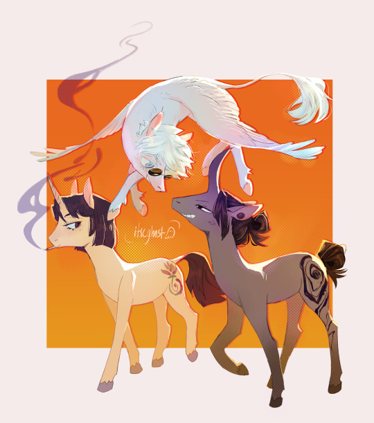
target audience for this is me but quick sashisu ponies :]
#jjk#jujutsu kaisen#sashisu#stsg#satosugu#geto suguru#gojo satoru#shoko ieiri#mlp#mlp crossover#gojo should really be an alicorn#i initially designed him as one but i forgot his horn in the sketch#and then decided i didnt want them all to have horns anywyas#but any time i make a character with powers into a pony??? i feel like they need 2 be a unicorn by default#and like shoko's a magical healer and geto does well That#pegasus gojo is just built different idk he can still do All That#the joke is with infinity the wings are basically just a prop#he can just around w them out#ok#itseart#my art
256 notes
·
View notes
Text
Merlin Starhawk's character design (an analysis)
Back when I started playing AFKJ some three months ago, my Merlin looked very different. Some things have stayed consistent with him; his pointy but short ears, black lipstick, glasses, his bitchface, his transgender identity, and his fashion sense being on the sophisticated side.

His initial design is rather different (no horns, no hat, shorter hair), the art style skews more realistic and less anime.

The second version is where you can see the recognizable aspects of his design take shape. The style is also more anime now. His hat is present, although it's missing a tassel, and his hat is far smaller. He used to have a cape and dressed in a more boring way. His glasses are also missing in these sketches, but I just forgot them lol. Another sketch has him with horns and a tail- I did keep the horns.

And finally, the third and last version of Merlin. His design and theme have solidified. Stars, a motif of lightbearer designs as well as a nod to the pentacle, and plants, a motif of wilders and his connection to the earth. (Fun fact- his horns are muntjac antler-inspired.)
My main inspirations for his design were classic depictions of the Merlin from from various legends ( and Starhawk's story also parallels Merlin; being half-demon/non-human, prophecies, shapeshifting) and stereotypical depictions of wizards in the modern day.
What comes to my mind when I hear "wizard" is an old man with a long grey beard and hair wearing a hat and cloak covered in stars. (Also, to let you in on a secret, one piece of inspo were wizards from Adventure Time from that season 1 episode. The tassels are probably subliminal influence from Orville Peck. The coins are based on Ukrainian jewelry from hundreds of years ago, replaced with Esperian coins. And the bell? My cats wear bells. I think it's cute.)
I took that in a different direction to subvert expectations you'd have of a great wizard- the great Merlin isn't some old human, he's a 20-30 year old stuck in time, bumbling his way through life, queer and plagued with joint pain and fainting episodes. He is wise but never takes his own advice. He is dedicated, kind, and all too forgiving, but is often lazy and petulant. He's antisocial and blunt but dresses finer than people do in the royal capital.
Besides inspo from some elves and small bits of inspo I took from all over the place, I also used Mirael and Celestials as reference, to draw a connection between them. I kept his colors bright and cool to make him stand out from all designs in game, which are muted, to show that he's built different.
He's a creep, he's a weirdo, and that's about it.
#i could go on#i would love to actually#afk journey#magister merlin#merlinverse#magister merlin starhawk
21 notes
·
View notes
Text
Blog #4 - Interdisciplinary Work
During my studies of a Bachelor of Animation, I was told to do some work for another group of students, outside our Trimester level. We all set up what we were working on across two classes and were asked to check out what everyone else was doing and pick whatever looked cool to you. What no one informed me of was that the team we worked with had to be from another artistic discipline (web design, game design, audio engineering, or film… not animation) halfway through the trimester as I was happily working with another animation team, I was suddenly told to split from the team, and check out a game development team. Since the secondary animation team was horribly understaffed I felt bad about it and tried to work with three teams for about a week, while thinking up what to do with the game dev team, eventually I broke off from the animation team.
Long story short, the game dev team quickly realised that character designer/ animator me wasn’t going to draw good spaceships, so they told me: Draw some aliens. So I did.
Here is a quick stock of alien sketches I did for the game dev team.
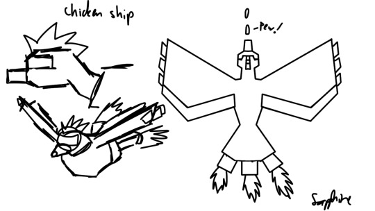
So before I was asked to draw aliens, I took a crack at drawing a spaceship, I promised it would in fact just be a metal chicken, and I’m sure I did indeed deliver a metal chicken. I recall a lecturer from my Tafe days showing me the works of Feng Zhu, who taught art students, and drew vehicles inspired by the animal kingdom, mostly fish. So… I drew a chicken, because I like chickens.
Understandably, I couldn’t go far with my brazenly absurd and above all…well, bad spaceships.
So, when I got the note that I should shift to character design instead I breathed a sigh of relief, then sighed again for disappointment, as this was still very much a science fiction game, and drawing monsters tends to be rather different from drawing monsters… and my strengths are in drawing humans, animals, furries and monsters. Aliens would be difficult step, but hey, at least I’m drawing something organic, can’t complain.
So back in Tafe, I was running with a group making a cartoony sci fi platformer, and I’d drawn astronauts, T-Rexes and common Greymen. So I thought I might as well throw in a grey to start off with.
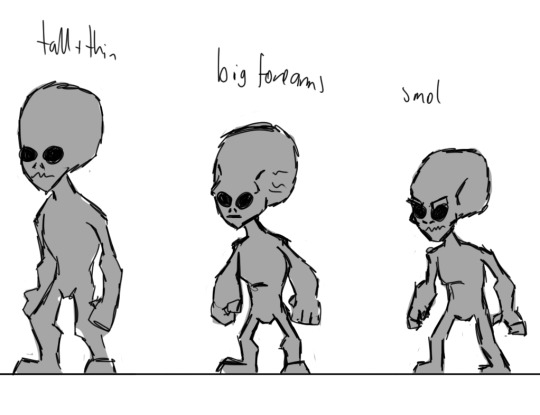
As I’d been spending months writing essays and blogs and building things in 3DsMax, it had been an unreasonably long time since I’d actually drawn something, seeing as Greys are rather neutral humanoids, they are a good alien to experiment with how you are going to play with proportions for a given set of characters. These guys were scrapped pretty quickly, but I have no problem with that.

So after I’d drawn the greys, I thought “bugs are sci fi, right?” and totally was not thinking of the movie I saw that weekend and drew two entirely random bugs. I was trying to determine if the bugs in the game would be centaurian (hexapeds with two arms and four legs) or four-armed bipeds. I like my bugs nice and chunky, so I drew the limbs a little thicker. My wasp I feel doesn’t look particularly exciting. So I moved on to other bugs.

Recalling that some people are terrified of moths and butterflies, I thought I try drawing a vicious moth-man. Had I bothered to look up moth-man legends I might have actually drawn something scary, but instead I came up with this hilariously bad joke of a moth alien.

So I came to the conclusion that if I was going to draw a decent bug-alien, I would have to make it something big and strong and tough. So I thought of beetles, they’re tough, and pretty huge. I drew out the form being mostly triangular, with a greatly exaggerated upper body; and found out I prefer four-armed Biped aliens to centaurian bugs. Since I am not an entomologist, I just threw in all the insect mouth-parts I could think of on a human-skull-shaped head and gave it horn-like antennae. In order to further exaggerate the ludicrously tiny legs, I just left him with actual beetle legs, which don’t really look like they have feet. I made the abdomen rather small, and mostly for balancing purposes, and just threw a bunch of spikes on him where I felt they were needed. Strangely the whole dev team liked all of my bugs, but the War Beetle was definitely the best loved.
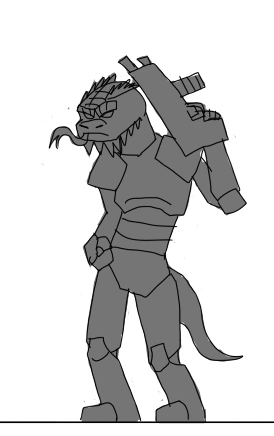
Reptilians are a given, after greys and bugs, and apparently before Lion-Men, according to my alien conspiracy friends. This one is a standard grunt, mostly modelled off Ratchet and Clank robots and a certain Ratchet Deadlocked skin called W3rm. What isn’t from the game wasn’t playing last weekend is that he is in fact bearded dragon, holding a crappy gun, because I just can’t draw guns at the moment. Swords? No problem. Guns… problem. I tried to draw him in an IDGAF bad-boy pose… I don’t think it worked; however the dev team liked it.
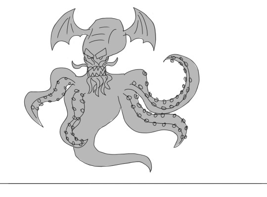

The dev team was strangely insistent on my drawing an eldritch monstrosity inspired by a cephalopod. I frankly, do not understand this wave of interest in the works of H.P Lovecraft, I consider the man a racist jerk with serious mother issues. Plus I’ve never read anything of his as I just don’t have an interest in his stuff. So yeah, I drew some cephalopods with bat wings on their heads. That’s probably as close to drawing Cthulhu, Shubniggurath, shoggoths or any other abominations of R’yleh I don’t care to learn the names of. Understandably, the dev team didn’t pick either, because… well, look at them.

When I informed the dev team that I’m not particularly great with aliens, I let them know that without a doubt I was going to draw a cyborg dragon. My only real concerns with this picture are that the not enough of him is robotic, particularly is right arm, jaw and wings. Also the silhouette isn’t very good, I doesn’t clearly show off his six limbs. However the dev team was quite entranced with him, likening him to Charizard of Pokémon fame.
Now for the final coloured versions of the top 3 characters the developers chose.
To be honest, I have no idea what I’m doing with colours, and I began with red for all of these guys, and used the Photoshop Hue and Saturation tool to change layer colours until I went through the rainbow, saving out .pngs, and picked out my favourite colours from there.

Red Army Ant
I redrew the arms, and shoved a gun in his hands, it shoots plasma. I’m not amazing with guns, but whatever, I gave it a shot (hehehehe…) I picked red colour, because ants are usually red or black in colour.
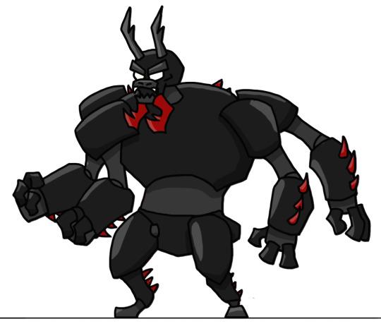
Dread Scarab War Beetle
I call this colouration ‘dread scarab’ because red and black are scary. I wanted the viewer to feel as if the spikes are either poisonous, or covered in blood.
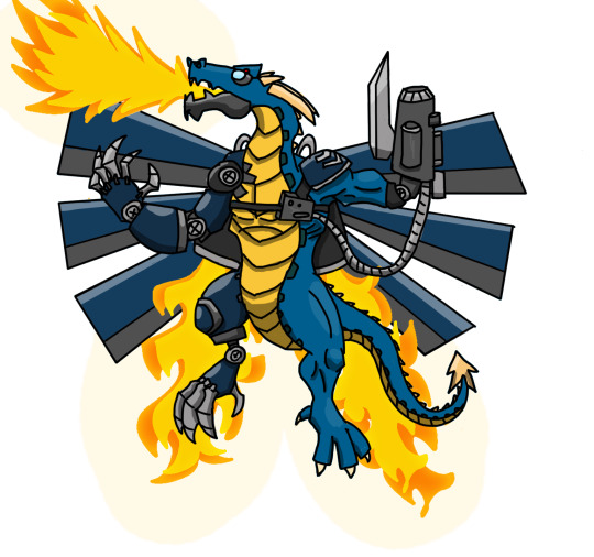
This guy I decided to redraw the cyber-dragon with a more dynamic pose, in order to show off the 6 robotic wings and make the arms easier to read. I felt that the war beetle was already super beefy, so I toned down the shoulder length. Then I made the tricked out gun and connected up a wire to a small machine by his heart. I completely forgot my initial ‘harlequin’ bionic setup, and put the other leg on the same size as the wholly robotic arm, but I still think it works. I also drew some crappy fire.
I hope you have enjoyed my concept art blog :)
0 notes