#i have to simplify the shapes of that charm tho ..
Explore tagged Tumblr posts
Text

starts foaming at the mouth
#one of -- if not -- the cutest harrys ive ever doodled ASJSJS#ive read somewhere abt inland empire resembling what elysium looks like and oughghrghg#'with her freckled face'#so idk!#i think itd be fun to make a shaker charm ive always wanted to make a shaker charm pfttt#i have to simplify the shapes of that charm tho ..#like i like the ideas of the clouds to make it have a lil smth more than just#inland empire's big ol head#but it looks messey rn (i mean its a doodle so pftt) but!!!!!!!!!!!!#i need samples for merch stuff ok ASKSKS#sunnysidewips
199 notes
·
View notes
Photo
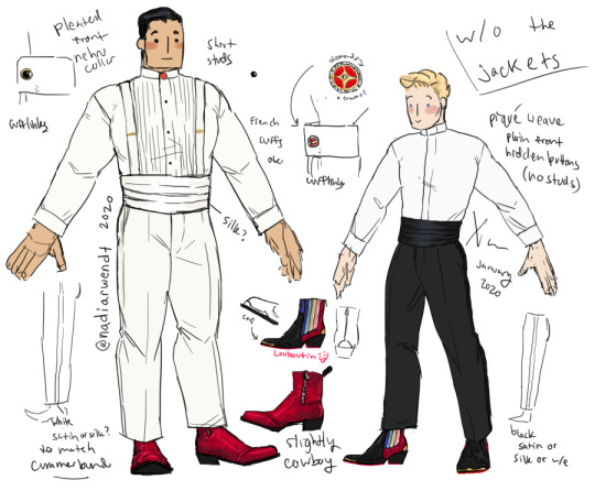
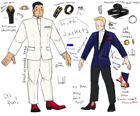


johnnywyatt wedding outfits cause i... have NO self control. and just do things. for fun. just because i enjoy them. technically for a fic but it’s not done yet so i can’t link that.
i’d like to, in theory, draw an actual illustration with this but i like to design things so that’s what i did instead. maybe in the future.
post on twitter: link
re: beadwork:
transcription of what the jewelry detail image says:
“I think it would be nice if Wyatt had a collar stud mounted with some beadwork, as a small thing. BUT. I'm white. And it's really not my place to try to design something like that, with visual language I don't understand and lack the cultural context for.”
idk that i have anything more to add, really, but i want to include some links to some actual Indigenous artists/info about finding them--
profiles of beadwork artists: https://www.vogue.com/vogueworld/article/indigenous-beadwork-instagram-artists-jewelry-accessories
a contemporary beader/jeweler: http://dorlah.tripod.com/index.html
and Beyond Buckskin's list of Native-run businesses: http://www.beyondbuckskin.com/p/buy-native.html
I have..... words.... about all the rest.
So have a readmore for all my words:
As far as everything else
Here’s my notes on some of that:
(my condolences if readmores don’t work for you)
For the outfits overall, I wanted them to be a little less... well, boring, for one. I didn’t want to go with simply the traditional tuxedo style so I looked for different kinds of shirts and jackets I could use that were a little less typical but still suitable--though overall this does make them less formal, especially the lack of bowties.
This works for me cause I was also considering a less formal wedding--still nice and fancy but not like... church-going. not white tie. Not even a huge event. Friends and family, you know?
I’m also just a fan of upright collars. Which I’m sure is tooootally not obvious to anyone who’s seen a lot of my outfit designs through the years.
I liked Wyatt in all-white. I dunno why. I just thought it worked. That’s very classic but still a little bold. Johnny... I am not sure if I can explain why I ended up choosing the dark colors or the blue velvet... but I like it. The silk lining is SUPPOSEDLY Liberty London but I’m not sure how true that is--it’s from a random Etsy listing that’s actually for a pocket square. lol.
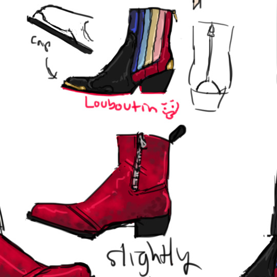
Shoes... shoes.... I just love drawing shoes and I like outfits where the shoes pop. So I went. a little ham. wyatt’s are based on a pair of red leather men’s boots I found on google.. with some modifications so they aren’t just the same as the pair I found--I used a few different references including western and cowboy boots. these red things were the main inspiration though--

For Johnny’s shoes I also used severa different references--mostly women’s Chelsea boots, wanting to retain some of the cowboy boot influence (idk WHY i just thought it was fun and he’s worn cowboy boots a few times), but also a fire-themed pair of suede Louboutin high heels, which is where I got the overall color scheme from--

yes i do collage my refs
as far as jewelry and accessories-- like I said I didn’t feel comfortable trying to design a beadwork collar pin for Wyatt but ideally he would have that small bit of his culture.
in the WIP fic johnny proposes For Real (after already planning some) with a leather bracelet w/ infinity charm--as you can see. I just thought it was romantic and suited Wyatt’s overall very masculine sense of style... a sparkly diamond ring didn’t seem like the right choice to me, and I kind of wanted them to have the same number of rings.
Tye mentioned the possibility of Johnny having a matching bracelet too which I had NOT thought of since Wyatt’s return gift was a little less concrete, but it is very cute to think about...
YES johnny is wearing diamond stud earrings. I just think it’s cute.
The cuff links were really just me saving a few varieties of cuff links and seeing what I liked.... just noodling around. I knew I wanted red enamel and I initially wanted some kind of pave diamond settings but I spent so long between saving refs and actually drawing this that I forgot my original idea XD So I just made up a new one. Arguably it fits some of the theming with the wedding rings BECAUSE
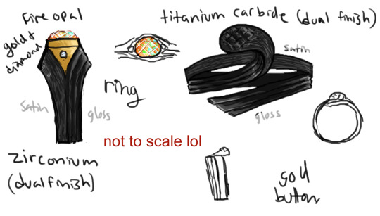
the wedding rings are shooting star themed.
i know, it’s corny. call me a cornivore.
moreso i originally wanted to work the infinity into both of their rings but I ended up dropping that mostly.
I saved a lot of pictures of various shooting star and comet themed rings--comet rings are actually an existing style and I looked at those a lot and at various shapes and tried to come up with something that evoked some of those but uh without like. stealing a specific design. I think I managed?
(you can also see peeks at designs for wyatt’s dad’s wedding ring where i decided on the simple 2 diamond band)
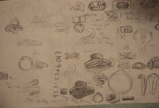
Wyatt’s was kind of hard for me to design at first.... though I def wanted some kind of art deco style for some reason? maybe just saw a ring and went, damn that’s cool. but i wanted it to retain the shooting star motif--it went through a few versions trying to work that in until I finished designing Johnny’s and realized something and just simplified Wyatt’s down a lot and let the motif be in the fact that it matched and also had sparkly stones.
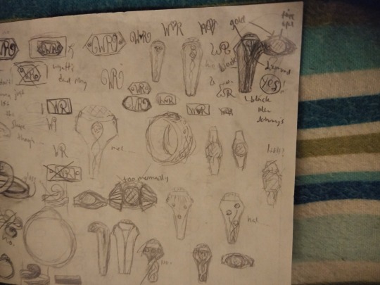
As far as material, me and Tye had several entire conversations about heatproof jewelry (for johnny obvs) and i decided no stones, and on using ceramic... I also spent a bit of time looking up jewelry stuff and metal types and eventually settled on black colored titanium carbide (ceramic) for Johnny and on black zirconium for Wyatt, since his doesn’t need to be fireproof. Wyatt's ring has a fire opal (LISTEN. romance.) and gold + diamonds from father's ring (the band with diamonds) and...
I did it so that even without a stone Johnny’s still was faceted to match the opal on Wyatt’s..... yes.... i know...... i amaze me too.
I’m not actually sure if the process to make the metal black (assuming it’s not naturally black?) would hold under extreme heat but I figure re-blackening is less of an ordeal than like.... making an entire new ring. not that even ceramic would hold up if he went nova, but... that is truly asking a lot lmfaooo he can just put it in a special unstable molecule pouch or something. before he, you know, uses his emergency ultra-huge explosion power. yeah, ring would be the least important in any situation where he burns hot enough to destroy... *squints*... a material used on spacecraft for heat shielding.
that’s def a ring that has to be very precisely and carefully made.
....
anyway.
i think... that’s everything..... very long post...... if you read it.... congrats? i’ll probably add a fic link to this post when i actually finish it, not for another month at least tho lol
maybe someday i will get around to drawing an actual drawing using these outfits.
15 notes
·
View notes
Photo


Thoughts on Pokemon SS reveal trailer
I’ve been busy but I think it’s time to take a closer look at the gen8 reveal trailer and share my thoughts before more information comes out. Here we go.
+ Galar region looks great. Farmland, misty forests and classical european cities are cool additions to the environmental gallery of pokemon and I feel that they fit into it nicely. The map, being basically Britain upside down, has some nice variety of environments that Alola lacked in my opinion. A bit bummed if it follows the same pattern where the icy mountain area is placed near the very end of the game again, but that’s just my taste. PokeLondon looks like the main focus on the map so I hope it delivers in activities. The region’s name has a nice ring to it as well.
- I’m not too fond of the starters to be honest. None of them stands out to me particularly well and it’s kind of odd that two of them share the same eye style - something they haven’t done since gen1. Sobble and Grookey sharing almost the same body shape too is turning me off cause it makes their silhouettes almost identical. But as usual, it’s the evolutions that matter to me the most so I’m in no way deciding my favorite based on what we have now. Just saying that our starting options are far less varied than they have been for a long time.
- Trainer characters are a big disappointment. The male is as generic as he has been since XY and the female is uncomfortably close to the Sun&Moon girl protag. I really miss the variety the characters got back in gen2-5. And not just that, but their models and animations are the same as in Sun&Moon. This is extremely disappointing to someone like me who already disliked gen7 visual style when it was new. Bums me out to see the same wonky walk cycle again on a newer console. So overall, these two don’t get any points from me. The “female protag is an angry scott with a thick accent” meme is gold tho 10/10.
+ - Graphical look is unimpressive, but has a lot of charm. Let’s Go gave us a taste of what the Switch can do with lineless, smoothly textured pokemon and vastly improved lighting and textures, so I’m a bit disappointed to see them revert back to the cel-shaded, untextured style from before. That said, in a vacuum it looks wonderful and it’s much better than the pixelated style form the 3ds games. I was expecting more, but don’t hate what we got is what I’m basically saying. Battle animations look a w e s o m e! Nothing to complain there!
+ - Random encounters are back, no more Let’s Go style roaming wild mons. I really liked the Let’s Go style but I could see where it was lacking. Going back to classic random encounter style id fine with me, no complaints. Except it might mean they’re making another Let’s Go game. Oh well.
- Sports? Ugh... Why? Because brits love soccer? It’s not like Unova had school shootings and super bowl like come on, I’m extremely put off by this and I HOPE it’s just a visual thing disguised as something more pokemon-themed than just straight up sports. Pokeathlon comeback? I’ll pretend that’s what it is.
+ New pokemon game on the Switch. No matter what it turns out to be, I’m in.
Random list of wishes and predictions for these games:
Entirely new UI for battles since it’s back to a single screen format.
The good things from Let’s Go - size variations, nicknaming mons wherever you want, releasing multiple pokemon at once, accessing the box wherever (although maybe limited in E4 and some cool endgame dungeons) and Pokemon GO connectivity.
A more PSS-like online system instead of the nightmare that is Festival Plaza or Let’s Go’s online functions.
More varied trainer customization that isn’t just an abundant selection of colors to a very limited set of clothing. Bonus points if we get more unique hair and eye colors than before. It’s the least they could do since they’re recycling the models already.
A partner pokemon following you like in Let’s Go. You can’t give us something like that and then just take it away.
No HMs as it’s meant to be.
Longer and more puzzle-focused exploration (Twist Mountain & Victory Road in gen5 as examples) than what the simplified XY and SM gave us.
Z crystals get the boot. Out. Entirely. Maybe keep species-locked ones?
Mega stones are simplified into one stone that works for all of them.
No more regional variants. Instead more evolutions to old mons.
New pair of eeveelutions with evolution methods or items we already have. Trade Eevee holding a Reaper cloth to get the ghost evo? Or level up holding a Toxic orb to get the poison evo? Something like that.
Legendaries that are not shiny locked.
Wolf-based legendaries to match the logos.
Legendaries AND regular pokemon that are NOT based on british folklore and culture. Hawaii isn’t particularly known for its wrestlers, archers and draft horses now is it. Toucans are american, koalas are australian and Togedemaru is based on a mix of american and japanese rodents. All regions have and should have pokemon that are not “culturally appropriate for the region” and I want more of them.
New breeding mechanics or reworked breeding mechanics.
Difficulty. Even a resemblance of it like we had in USUM. Give out EXP share much later in the game, or only post-game even.
Now to wait for the next news.
34 notes
·
View notes
Text
What’d they do to Sora?—A visual analysis of KH 1, 2, & 3
One of the biggest staples of the original Kingdom Hearts games is their visual charm. The team managed to do what Disney rarely could: transform the animation giant’s 2D into amazing 3D and then some.
But something kinda funky is happening in KH 3. Somehow Sora and the gang are looking less, well, Sora-and-the-gang-y, and it’s not just the new wardrobe.
Before I get into what’s off about KH 3, I need to map out what makes KH 1 and 2 so visually appealing. There are three big reasons for why KH’s visuals have stood the test of time:
Color
Style
Animation
Color is usually what our eyes notice first in a given scene and is a vital tool for setting the mood. We universally associate color with so many things that we can immediately assume the tone of an image with a quick glance before even looking at the details. This psychology of color is utilized in everything from retail, to movie posters, to social media, and so on. Unsurprisingly, KH has also tapped into this with lush, playful color palettes that hearken back to each respective property. Disney takes us to places with magic, fairytales, talking animals, and monsters—nothing of the “real” variety, and KH reflects this first and foremost with color palettes that immediately tap into that fantastical setting. The color schemes that exist throughout KH are not likely to exist in real life settings, and they work hand-in-hand to assist cartoony shapes.
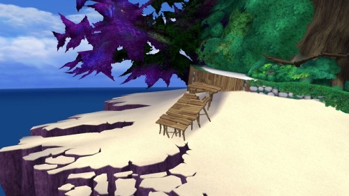
(At least, I would hope you don’t find something like this in real life.)
This lack of realism ties directly into style, another key factor in letting your audience know what kind of vibe you’re going for. KH sets this fantastical tone by taking elements from Disney and breaking them down into their most basic parts, playing with stylistic choices popular in both Western and Japanese character design to create something new. It’s a “less-is-more” approach to art direction. Simplify, simplify, simplify. This, combined with its vibrant colors, allow for unreal environments, ones reminiscent of the same childhood wonder classic 2D films instilled in audiences. Likewise, Final Fantasy characters, who normally exist in realistic settings, become softer in order to accommodate their new space. The end result is a world that seamlessly blends the simplified visuals of hand-drawn animation together with the complexities of 3D modeling.
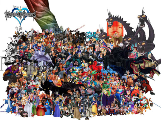
(The gang’s all here.)
These would not be complete, however, without equally fantastical animations. No matter the medium, the best way to tell the audience more about your character is through body movement. How characters move is also dictated by the overall tone of your content. Sora and the gang are animated with exaggerated motions and grandiose body language to remind us of the fanciful world they inhabit, and the larger-than-life personalities they have.
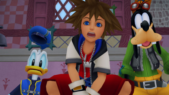
(Donald’s hat jumps with a mind of its own while Sora’s facial features spread across his face. Goofy unfortunately missed the pantomime memo.)
Contrastingly, characters from live-action movies rather than animated films move with much less grandiosity because they exist in realistic worlds. They are dictated by their setting just as much as stylized characters.
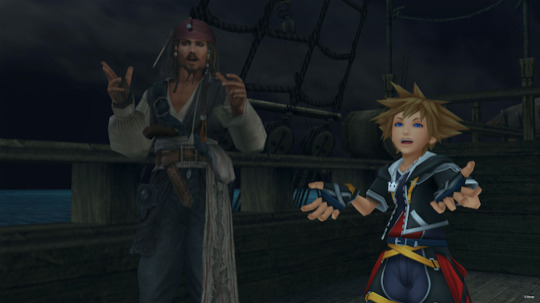
(Jack Sparrow may move in dramatic ways for a human, but Sora’s got all that and more thanks to being a spiky-haired shounen with giant feet and hands.)
Levels like Port Royal are where we can begin to see the problem with KH 3: once you strive for realism, you’ve already aged.
Achieving realism is still incredibly limited by technology. We’re getting closer, but as it stands we don’t have the necessary technology to make 3D indistinguishable from reality. Games especially fall victim to what’s known as Moore’s Law, which (as far as games are concerned) states that a graphics chip will upgrade every two years. So, once something is put out, it already has to worry about looking dated within as little as two years. Because of these limitations, a lot of media dip into uncanny valley real fast. Simply put, when something is meant to look realistic but fails, our brains take issue with it. We think, “Hey, I know that’s supposed to be a real bear, but it doesn’t quite look or move like a real bear, so I’m uncomfortable.” But take that same bear and turn it into a stylized cartoon and we no longer have a problem with it not looking like a real bear. The former is what’s happening to the KH 3 crew, while the latter is what they should be aiming for.
To begin, let’s look at these two screenshots of KH 2 and KH 3 respectively.

(Feel old yet?)
The bottom shot may be an early reveal, but it’s not far from the material they’ve released recently. As you can see, it’s much more detailed than the top image, but this is actually hurting the scene rather than helping it. The colors are muted and muddy in comparison, which would more accurately represent a real environment, but it’s so starkly contrasted by the unrealistic characters that it doesn’t connect. Sora is harder to see against the background because his colors and effects are also mimicking a more realistic application. Even the UI is harder to see, compared to the brilliant colors and shapes of the top image. What the top image lacks in explicit detail it makes up for in readability, creating a cartoony scene of implied information that more closely resembles a classic Disney film (which is the point of KH’s art direction to begin with).
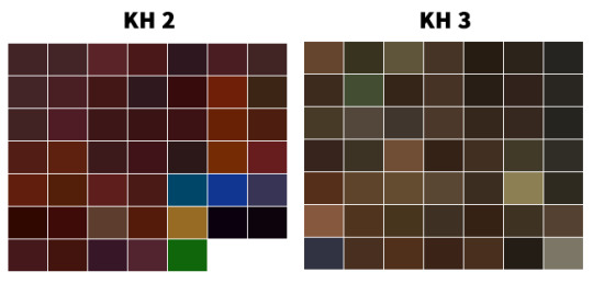
(While both swatches contain brown hues, KH 2 is more vibrant and thus allows for better readability and contrast. KH 3 literally looks like mud here.)
KH 1 and 2 largely avoid this readability and incohesive problem because hardware limitations were used to their advantage. When you’re tasked with creating a game full of Disney- and Final Fantasy-inspired assets but lack the technology to make anything look as “real” as pre-rendered cutscenes, you opt for airbrushed gradients, vibrant colors, cartoon features, and exaggerated shapes. Everything needed to look distinguishable from one another because PS2s were still developing and TV screens were fuzzier. Looking at the games now, it’s easy to see that they were made in the early 2000s, so of course they show age, but it’s also easy to see how beautiful they still are when compared to other games of the era which took on a realistic approach. (Also, imagine if Okami had gone with realism like it originally planned instead of sumi-e, and you can get a further idea of why style can easily trump realism in 3D aging.)

(Only one year apart. Neither are ugly, but when you aim for realism like in the first game, your age shows more and you dip a bit into uncanny valley.)
Now, I don’t think all of KH 3 looks terrible. The technology and efforts should be applauded, and in truth the Disney characters and Heartless shown thus far retain much of their original charm, and definitely benefit from the graphical upgrade most of the time. The animation is spot-on, as well.

(You just can’t look too closely, or else you get a face full of suddenly detailed textures that do not belong on a cartoon character.)
The counter is, unfortunately, that based on other released material, the art direction is not cohesive yet. You have some great-looking enemies and allies, those of which you know right away belong in a KH game, but stacked against a realistic background with lighting, effects, and muted colors that make it difficult to see. Details that are there solely because the technology allows it. More-is-less rather than less-is-more. They can’t seem to find a balance between simplified and detailed, 2D and 3D, Disney and Final Fantasy, that the original games built.
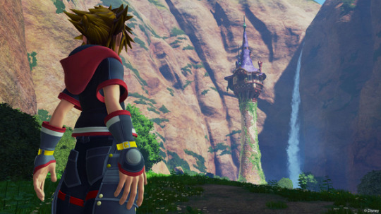
(I don’t even know what to say about this. It’s just straight up ugly. Why do his hands look like that? I feel like I’m looking at one of those nightmare-fuel fan renditions of “X character in real life.”)
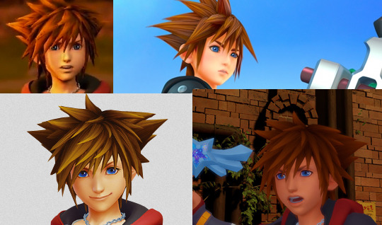
(fix this.png)
Until they make up their minds about modeling Sora and other original characters, and about how to handle the lighting, effects, and other issues which are holding simplification hostage, there’s always going to be something off, something that isn’t translating well from the jump to next-gen consoles and preventing the games from feeling as KH as possible—and it has everything to do with the industry’s fixation on realism. Cartoony/anime-esque characters comprised of simple shapes and designs, like 90% of the ones in KH, do not mesh well with realism, whether it’s in the details on their clothes or their environments. Hopefully the team can see that before release date, otherwise, KH 3 is going to be full of uncanny valley and readability issues.
im still gonna play the shit out of it tho
#kingdom hearts#kh#kh3#kh tag#for the record I like the Toy Story models but overall the scene was difficult to see#also if I see anyone regarding this as hate...............do u know me#Do U#kingdom hearts is my momther#this should also be titled WHATD THEY DO TO RIKU???#bc wow. that shot of him with kairi i just. water u doin
14 notes
·
View notes