#i have a version of it up on my portfolio site but it has a lot of bugs ive fixed since so dont go playing that one lmao
Explore tagged Tumblr posts
Text

fighting screaming biting this thing
#im finally trying to fix up my renpy point and click game#currently trying to fix the UI so its not just the renpy default#but the things arent going where i want them to be RAUGH#its ok i'll figure it out tomorrow#just wanted to show you guys what ive been up to#havent been doing digital art in a bit so havent had much to show here#anyway#my friend offered to make music for this game which would be awesome and definitely a good incentive for me to finally finish it#i have a version of it up on my portfolio site but it has a lot of bugs ive fixed since so dont go playing that one lmao#it's not a long game just a silly little story#i'll show it to you guys when its done
10 notes
·
View notes
Note
Hello there! do you still have an older version of evolwallpaper? I was late to the party and I can't install it properly anymore T_T
Hi anon, unfortunately I no longer have the old .exe 😩 I checked weibo, other users in China are having problems with it as well, my conclusion to this is that it's a broken app full of bugs, probably got nothing to do with regions (ノへ ̄、)
Babe because of your ask, I spent good 5 hours tonight trying to debug it, because I insist we all get the dynamic wallpapers!!!
Original guide // Deepspace PC guide
By the end of this tutorial, we should have a video like this applied to our computer wallpaper:

There's Nikki, MLQC, Deepspace and The Perceiver wallpapers.
New guide:
https://paperwall.papegames.com/

Same step as before, download this but don't install yet!
The following was actually hidden in their Q&A, you'll also need this for it to run, download the runtime version.
https://dotnet.microsoft.com/en-us/download/dotnet-framework/net48
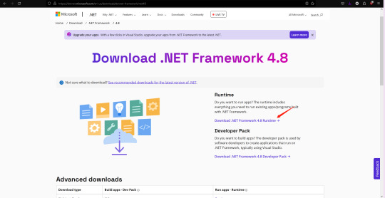
After you install the .NET Framework 4.8 go ahead and try to install the PAPERWALL .exe
→ If it works, great! We solved the problem!! 🎉 (You can skip to the section on the bottom on how to use the app)
→ If you get this error message, ugh congratulations, this is where I tried about 67 solutions for hours just so you don't have to
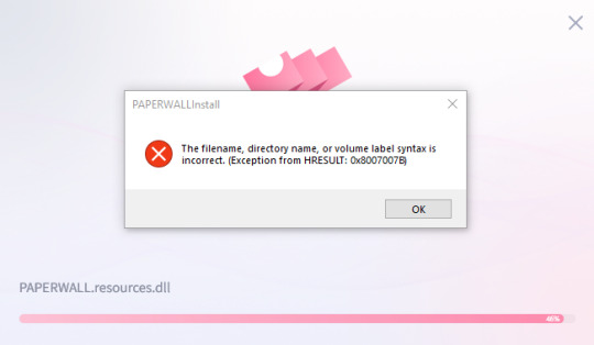
It's weird, because at this point, the thing have successfully installed on your local drive but it won't run.
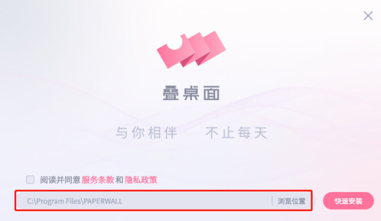
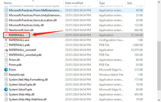
Let's go back a step, if you open the .exe again, take note of where it's at on your computer. For me you can see that it's in the C drive, I presume it'll be the same for you.

Find the folder, open it
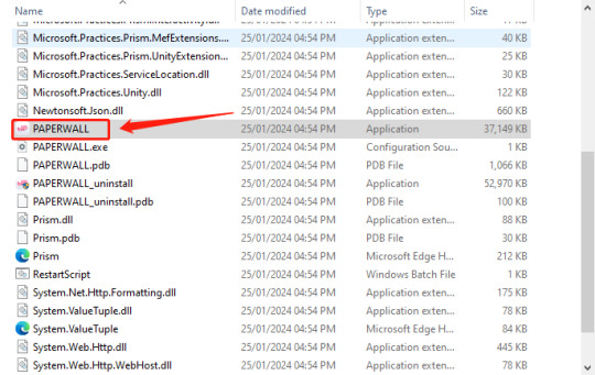
Open the app
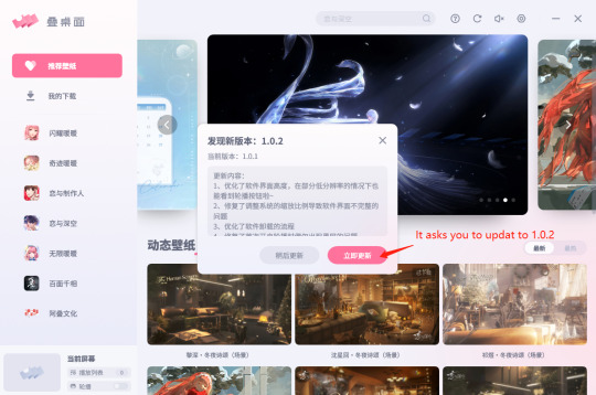
→ If it works, great! We solved the problem!! 🎉 (You can skip to the section on the bottom on how to use the app)
→ If you get the same error message, read on:
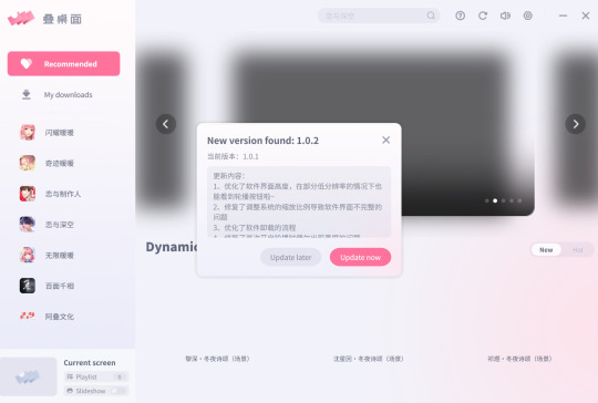
If the images haven't loaded in the 1.0.1 version it will most likely going to crash when you try to do anything on it, so read on:

Let go back to the C drive

We are gonna move this somewhere else, if you have a hard drive, paste it to your hard drive, if you have another drive on your pc, you can move it to the other drive. BUT DO NOT MOVE IT TO YOUR DESKTOP!!!! Because we practice good computer hygiene 🙏
Once you've moved everything away, open it back up and try to install it again in your new file location
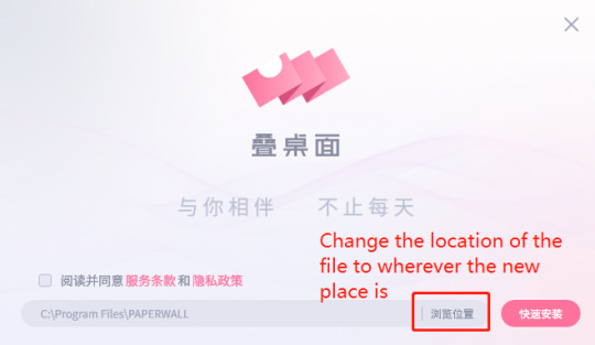
→ If it works, great! We solved the problem!! 🎉 (You can skip to the section on the bottom on how to use the app)
→ If you still get the same error message, I will send my portfolio to Paper Games to be a software developer in their office and write a new app

Once you get it running *fingers crossed* move the entire folder back to your C drive if you moved it to your hard drive, unless your hard drive is plugged in all the time.
If for whatever reason you get the "access to the path is denied" error message, try the right click and select the "Run as administrator" option.

For easy access:

Go onto your desktop, or wherever you want to access it from quickly and paste shortcut!! Remember it's the shortcut!!

───── ⑅ ♡ ⑅ ─────
How to use the app
The UI has changed a little since the original one, but it's easy to navigate.

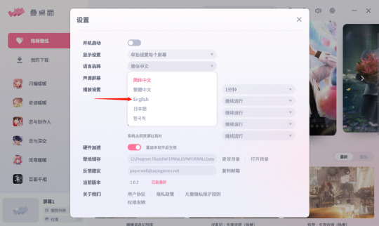
Change the language to English, it should reboot the app
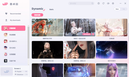
From here it's self explanatory
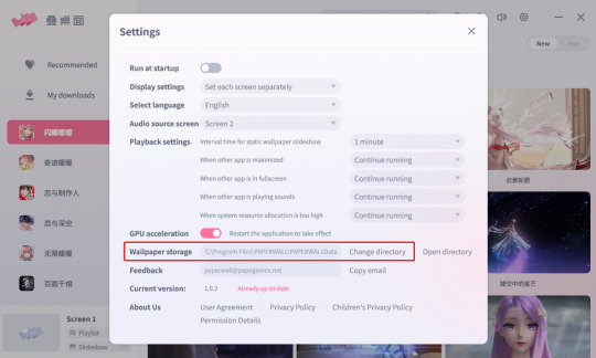
For good computer hygiene you might want to double check where the wallpapers are stored and change directory if needed.

If you're like me and have 2 monitors, this is what it'll look like with the wallpapers applied and the game opened, looks like I need a 3rd monitor for Shen Xinghui ⭐
(Desktop icons should show up, I just don't have icons on the desktop)
───── ⑅ ♡ ⑅ ─────
If you still have problems, check your PC specifications against the following that were recommended on the official site:
System: Windows10 or above
RAM: 1024MB or above
Processor: 1.66Hz Intel i5 or above
Graphics: HD Graphics 4000 or above
DirectX: 10
Secret third thing: you might be able to run it and have the lovely wallpapers but it suddenly goes glitchy or black screen... that's because of the faulty app, I've seen people mention it on weibo, it's not just you 😔
───── ⑅ ♡ ⑅ ─────
Feel free to drop me an ask with images if you still run into problems, hope this helps, until next time~ (✿◠‿◠)
Check out this tag for already answered questions #/wallpaper woes
#ask#anon#love and deepspace#love and deep space#love and producer#mlqc#shining nikki#love nikki#the perceiver#mr love queen's choice#live lockscreen#this is not a good sop its written all over the place but ive spent too long sorting it out and writing this up it'll have to do for now#if this helped you out i would appreciate it if you can reblog it!#you dont have to but its a good indication for me to post more things like this in the future for the english speaking fandom 💕
59 notes
·
View notes
Text
Basics of HTML5: Let's build a webpage!

I'm a huge advocate for learning HTML5 as your first coding language (remember, it's not a programming language)! HTML5 is a great and easy coding language to get you into the feel of coding, especially for complete complete beginners!
I see a lot of people on Tumblr wanting to get into just creating their own websites but don't know how to start - coding is a new thing to them! So, I'm here to help with the language I know like it's the back of my hand!
And I am also an advocate of building projects in order to learn anything in coding/programming! Thus, what better way to learn the basics of HTML5 than to actually build a simple webpage? Let's get started~!

What is HTML5?
HTML, which stands for Hypertext Markup Language, is a special coding language that is used to create webpages. With HTML, you can tell a web browser, like Google Chrome or Safari, what to display on a webpage, such as text, images, and videos. And 'HTML5' is just the latest version of HTML!
HTML tags are special words or symbols that you use to create webpages. You use these tags to tell the web browser what content to display on a webpage, like headings, paragraphs, images, links, and more. Tags come in pairs (most of the time) so you'll have an opening tag and a closing tag. An example of the syntax:


The Simple Webpage
As I mentioned, we will be making a simple webpage for a person called David - see, he needs a portfolio webpage to start off with, and we're going to help me (as well as learning HTML5, of course).
Here is the code we will be using:
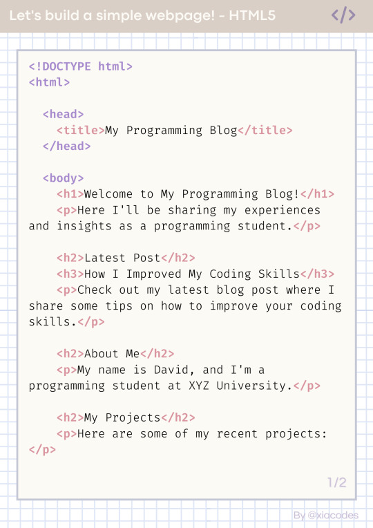
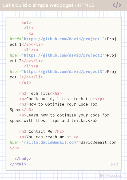
Pretty code, I know but also a bit confusing - let's get into understanding the code by grouping them into chunks! But just a heads up, the code includes these tags:
!DOCTYPE html (mmh it's more of a declaration really)
html, head, body
title
h1, h2, h3
p, a
li, ul, ol
These are some of the common tags used in all webpages on the internet! Okay, let's look at the code finally~!

The basic structure of every HTML page
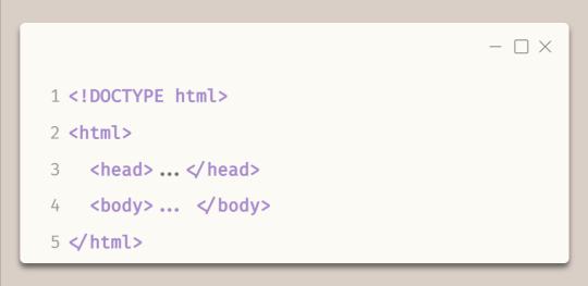
Every HTML file looks like this - it has to have all of these tags!
The first line, !DOCTYPE html tag, tells the web browser which version of HTML is being used.
The code is contained within html tags, which enclose the entire webpage.
The head tags contain information about the webpage, such as the title and links to other resources.
The body tags contain the main and visible content of the webpage, such as text, images, and videos.
Together, this code provides the basic structure for an HTML webpage, with the head tags containing metadata and the body tags containing the actual content.
In the head tags
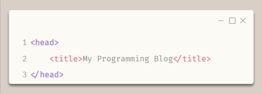
The title tags enclose the title of the webpage. In this example, the title is "My Programming Blog".
The title appears in the title bar of the web browser and is often used by search engines and social media sites to display the name of the webpage.
In the body tags - Headings and paragraphs
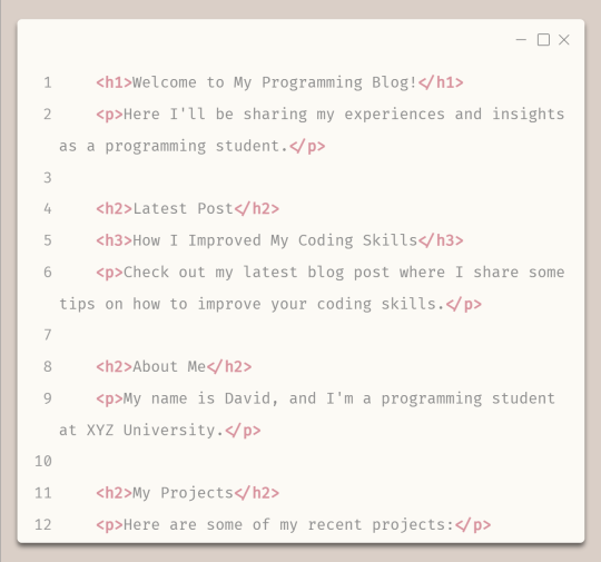
The h1 tags create a main and biggest heading, which in this case is "Welcome to My Programming Blog!" - you can only have one h1 tag on a webpage.
The h2 tags create subheadings, which in this case include "Latest Post", "About Me", and "My Projects" - you can have multiple h2 to h6 tags on a page.
The h3 tags create a sub-subheading under h2 tags, which in this case is "How I Improved My Coding Skills".
The p tags create paragraphs of text that provide more detail about the blog's content and purpose, including a summary of the latest blog post and information about the author and their projects.
In the body tags - lists and links
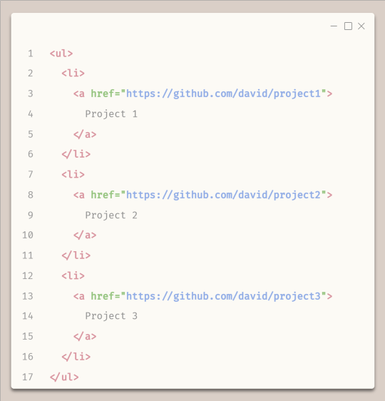
To start any list, you need to either start with ul tags or ol (ordered (numbered)) tags
The ul tags create an unordered list of items.
The li tags create list items within the unordered list.
Each list item includes a hyperlink created using the 'a' tags, with the text of the link being the name of a programming project.
The href attribute within each 'a' tag specifies the URL where the project code can be found on GitHub.
Attributes go inside the opening tags' arrows '<' and '>'.

The End Result
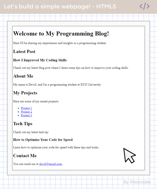
Boom - she's gorgeous, I know! A basic, simple webpage! We did it! You can see the page live + the code used here: [LINK]. Play around with the code, change things, experiment, break things, fix them - do what you need to learn further!
And that includes some online resources to help!
LINK 1 | LINK 2 | LINK 3
And some resources/posts I have shared about HTML
LINK 1 | LINK 2 | LINK 3
What next?
Learn CSS3! The page looks basic and looks like what pages were like when the internet was invented! You need colour, fancy fonts and layouts! CSS helps with that, as it is a styling sheet! Be sure to do some research but I also share resources on my blog under my #resources tag!

Thank you for reading and best of luck learning coding/programming! Remember, this isn't the only way to get into coding! People even recommend languages like Python to be beginners' first language, but I say that HTML5 should be the first coding language and then Python is your first programming language - don't know the difference? I made a post about it here!!
But definitely for people going into Web Development, HTML5 all the way! I don't think you can avoid learning HTML5 with Web Development (not 100% sure though...)!
Anyhoo, have a nice day/night! 👋🏾💻💕
#xc: programming blog post#my resources#codeblr#progblr#studyblr#resources#coding#programming#computer science#comp sci#technology#tech#software developer#programmer#coding resources#studyblr community#code newbie#learn to code
352 notes
·
View notes
Note
HEY! I FOUND OK KO CRUMBS!!
I was gonna make a post about it but I cba but still wanted to share it!
So I found Iggy Craig's (one of the storyboard artists for the show) portfolio website, can't really remember how, I go on weird tangents with Google searches sometimes, and it has loads of storyboards and design work of theirs on there. It's really cool early pre-production stuff really appeals to me.
There's a lot of this stuff for the Fionna and Cake episodes and Distant Lands, and OK KO! A lot of the storyboards to look through.
I've seen some animatics for episodes before but the boards here are the much earlier versions of the episodes, and some bits are different and it's really interesting and cool. Especially since I've got lines of the episodes memorised so it's cool to spot the differences.
I haven't looked at everything yet, I don't have the time haha but I looked at the boards for Let's Fight To The End, and there's quite a big difference!
The storyboards detail a longer scene of K.O. being stuck in the subconscious at the start of the episode. I took a couple screenshots.
I really like it. I'm guessing the main reason it was cut was for time. How it was handled in the episode was just a quick version of this.

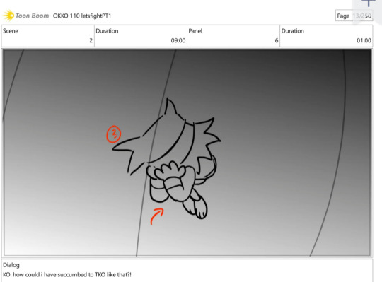
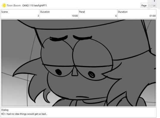


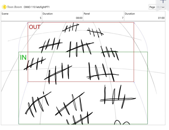
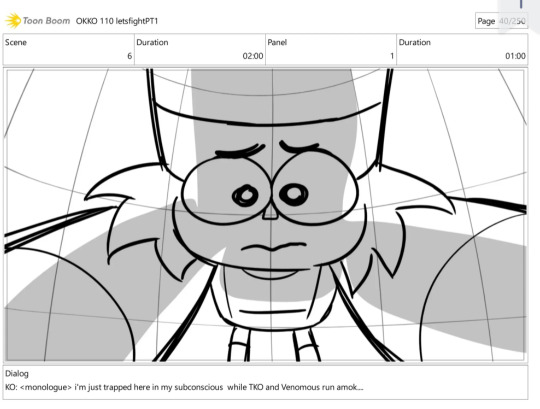
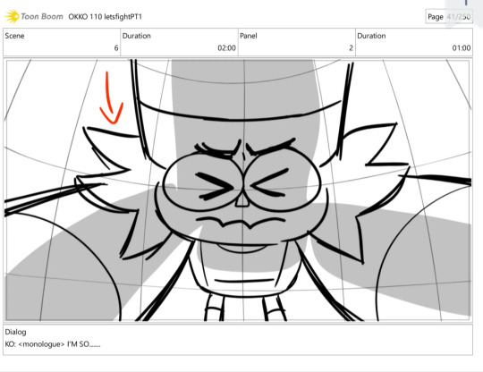
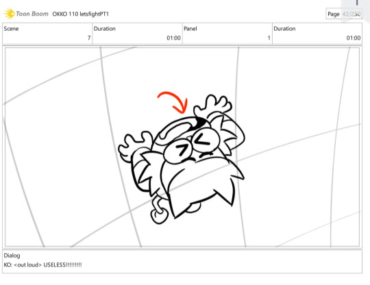
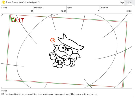
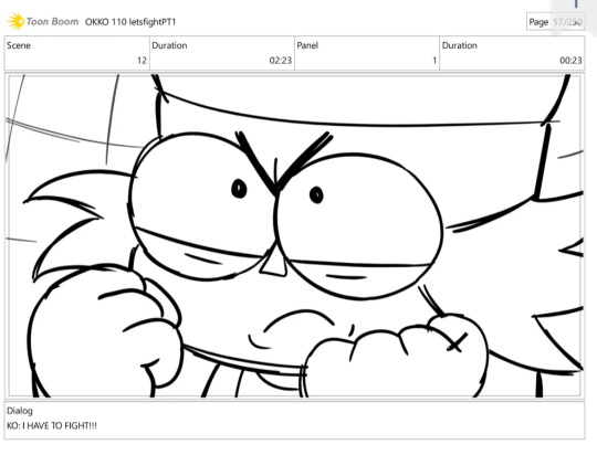

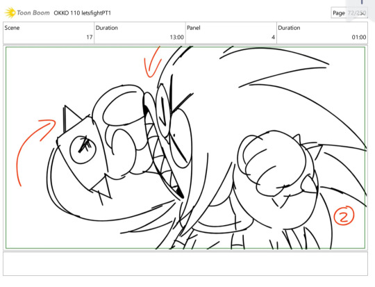

Also here's a link to the boards Tumblr says the link isn't "complete" so sorry if it doesn't work or doesn't show up just search up Iggy Craig and find their page.
There's also this site called Slideshare.Net which I think all of these boards are being uploaded from, and on that site there's also boards from Ryann Shannon and Danny Ducker. There's the boards from LFTTE where TKO disempowers everyone and they disintegrate instead of lay on the ground. (As well as other episode stuff too)
I don't know how interesting all this really is to people and if it isn't I apologize haha. I just have a fascination with storyboards and animatics for cartoons and paired with OK KO I love it even more.
OH MY GOD THANK YOUUUUU I love these kinds of stuff so much you have no idea how hard im screaming rn.. new ok ko boards auhgjfkgnfjfksnd
Theres something so appealing about storyboards.. I like animated stuff but storyboards!! They're a whole thing!! It's like im looking at the building blocks of an episode!!! Cut storyboards feel like another universe's version of it where different writing decisions were made (imagining lftte as a 40 minute special rn) and spotting lines or scenes that didn't make it into the final product is really interesting. Plus looking at storyboards makes me feel like im a little gremlin digging thru someone's treasure pile and indeed i do giggle annoyingly when i find them
Anyways thanks again for sending me these !!!! youve extended my lifespan by approximately a thousand years
+ no joke i have literally been looking EVERYWHERE for the tko actually murders everyone boards since they mentioned it in the twitter ama. I am eternally in your debt
#time to freak out in the tags#STORYBOARDS!!2!2!! AUJSBDKDNNFKSK#the lines are. the lines are too crunchy. theyre too perfect for this world#someone get me my chair i need to faint#wow i was NOT expecting this right after school#new ok ko boards!!!#with tko in it !!!!!!!#<<<<<<<<<#gdnnfndkdknfkksndkdk#best day of 2023 period#oh my god i need to check that website right now#im not sleeping tonight#asks#save tag#storyboard ko is so SMOL AAAAAAAHHGHBHBJJM
46 notes
·
View notes
Note
hello! im sorry if you get asked this a lot, but I was curious how you got into doing art ttrpg? and what should an interested artist have in their portfolio? thank you 💖
hi! so i wrote out a big "how to" before re-reading your message and considering you maybe just... asked how it happened for *me*, not necessarily how someone else should do it LOL. so, how it happened for me: i've been actively courting freelance art work since ~2009, and fantasy ttrpg is a natural extension of my interests - my portfolio was already full of world of warcraft fanart by the time ttrpgs & D&D really started having their modern moment. TTRPG is a good low-to-mid level place to find leads, as well, because the barrier for entry is super low for creators, which means a lot MORE projects to go around. (If you want to make a board game, your artist has to know a LOT about packaging, printing, manufacturing, graphic design, etc. if you wrote a D&D module and just want to publish it on itch.io? your artist only needs to know how to send you a decent sized .jpg.) as far as portfolio goes, when i started getting consistent replies to my cold emails, my portfolio had mostly covers and half-pages (ie, narrative illustrations), portraits, and animals. If you want to be more well-rounded you could also include pieces focusing on environments, items, and creatures. Don't include anything unless it's GOOD though. (i am so serious about this - bad work in your portfolio makes the good stuff look like a fluke.) now. if you wanted a "how to" answer, here is 600 words lol. I'm gonna start with the base assumption that your work is already hirable so we can focus on just like, specialization + client acquisition tips. getting a folio up to snuff is a whole other can of beans short version goes like this:
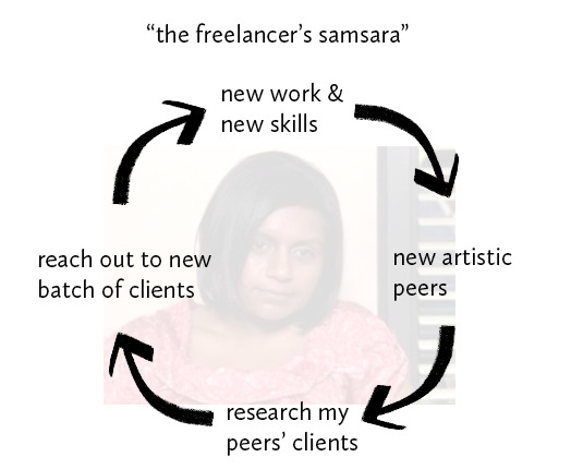
this whole thing only works if you have the ability to honestly self-assess. new work & skills: you should have fresh stuff that's a snapshot of what you can do *right now.* this doesn't mean old work can't stay in your folio if it's still good, but a small, current folio that really hits is WAY better than a bloated old one with irrelevant studies or student work. new artistic peers: as you continue to evolve as a professional, you should have an idea of which other working artists your work is most similar to, in terms of skill/tone/specialties/other relevant skills (3D/graphic design/etc) in order to see how you stack up to your """competition""" for lack of a better word. Additionally those artistic peers have hangout zones (discords or FB groups, etc) where you can talk shop & pass around job leads. research peers' clients: research who those peers are contracting with. See if your work would be a fit for them; if so, find their contact info and put it on your list. Those clients are probably also promoting other similar projects or publishers on their feeds; twitter has a handy "you might also want to follow" list that has other similar accounts you can explore. You can also work backwards from the product to the creator (see any cool battle maps, CCGs, board games, etc? find out who made it and whether they're the ones doing the art hiring.) Additionally, those discords & fb groups I mentioned will have leads (of varying quality) shared around that you should be assessing as they come in. reach out to new batch of clients: cold email. be realistic about who's worth contacting, but don't self-disqualify. that part is a balance. art directors are people with problems to solve, and you need to be able to A. anticipate the problems they need solving, and B. confidently (and honestly) let them know exactly what you can do for them. Attach A FEW, SMALL, RELEVANT jpgs that they can easily download and keep for reference. do not send massive high res attachments, their inboxes are full enough as it is. If you're responding to a specific call, attach relevant pieces or curate a page on your portfolio site specifically for work that would fit the project. If reaching out to clients doesn't result in a lead - *or*, if it takes them 3 months to get back to you, you should spend that time doing your own stuff and bolstering your skills. eventually your portfolio will be good enough that it kicks down doors for you.
you'll notice i never included "be active on social media! post your new work! feed instagram's ad revenue by giving it more content!" in this strategy because it doesn't matter. i'm not professionally active on any social media. we were getting hired before twitter existed and we'll still get hired after it dies. just do make sure you have an online portfolio (your own website >> artstation >>> other free folio builders >>>>>>>>>>>> an instagram feed.) the more times you do this cycle the easier it gets; both because you'll just get good at every step of the process, and because more people will know you and have known you for *longer* so you seem like a safer bet. I'll be honest: it's a ton of rejection lmao. I would get a rejection in my inbox at least once a week - even more than that i'd just get radio silence. But eventually you'll get a yes, and if you're lucky that yes will result in high quality new work you're proud of and can put into your folio (taking you back to step 1 lol.)
the freelance life is (INSHALLAH!!!) behind me since i now have a full time job doing marketing/supporting art for video games. But my portfolio never would've gotten there if i didn't have the experience of going through the freelance meat grinder first. it really taught me how to be an actualized *creative* (who can stand up for her own expertise, think like a project manager, and take creative ownership of / responsibility for my assignments) and not just a hired hand. my team likes that. i think
#not art#ask#freelance artist#not sure i want to tag this for discoverability tumblr thank you#art advice
13 notes
·
View notes
Text
How To Become A Writer?
Responses will vary. They all won’t answer you.
It happened when I started working full-time.
It’s interesting that — as soon as Teams calls and spreadsheets became a reality, the adjoining tabs open would have Google searches on how to become a writer.
The very question: how to become a writer? It’s funny to think that Google could’ve provided an answer to something writers themselves has been struggling to answer for the longest time. Every single Paris Review Interview provides a different response — albeit they all share the same trait of being philosophical, artistic and not at all straightforward.
The only straightforward thing I could find on how to become a writer was the Google-sponsored website of Medium. It seemed like this was the updated version of early 2000s blogging and Wordpress.
I had tried Wordpress. I had also given up on Wordpress.
And so I tried Medium. I shortly gave up on Medium.
It wasn’t due to the same reasons, though. Wordpress was confusing and isolating. Medium was easier and you already had articles to read before you noticed the little button to write your own. However, therein lay the problem: Medium gave me nowhere to hide. Was I fully ready to embrace it? Was I ready for my life to change? Eevery word I put out there has to be perfectly selected and crafted in my own original way that I am changing lives with each paragraph. No matter the fact that I don’t even know what I’m doing or why I’m doing it. I just know that I need to do it.
The imposter syndrome got to me. No matter the inherent desire to do this — something existing since the days of waking up 5am before school to write fanfiction — I just couldn’t stay consistent.
During my brief Medium interlude last time, I did see a trend. People would try to build their following through writing consistently for 30 days. 90 days. It didn’t really matter. They ahd set a goal and wrote — and posted — consistently for that alloted amount of days.
I read some of those posts. They weren’t all life-changing. They weren’t philosophical or even artistic. But they were straightforward. They were here, I did it. It’s not great, but I showed up and did it anyway. If I think about what is missing from this, it’s that very thing. To get just get over myself and write badly because bad writing is inevitable.
So, here is my own 30 day challenge. I'm documenting this not just on Medium but also on the website that has had my back since the inception of my personality as a whole. Tumblr.
It may be odd to think that I am using Tumblr as a means to post my work and start to build up a portfolio, if you will. Tumblr's day has passed and it gave the likes of Rupi Kaur her platform back in 2010s - we've moved past that!
Sure. Neil Gaiman is still on here.
Also, unlike Wordpress or Wix or any of those other sites, the 10+ years I've spent on this forbidden 'hell-site' means I actually know how to use the damn thing. If we're going to embark on the journey of writing everyday, at least give me the past of least resistance. I know Tumblr.
Because, really, this is all so I can get out of the ivory tower that is every writer’s self-doubts and insecurities. Who knows, maybe I’ll start to figure out just what it is to be a writer.
(It also helps that F1 is back. That may or may not be a coincidence.)
#writers on tumblr#writerscommunity#writers and poets#creative writing#female writers#writeblr#author#art and poetry#poems and poetry#poets on tumblr#poetic#poetry#the tortured poets department#writing#my wriitng#on writing#writer#writer stuff#saintescuderia#f1#medium
11 notes
·
View notes
Text
Time for our second "Questions and Answers" session!
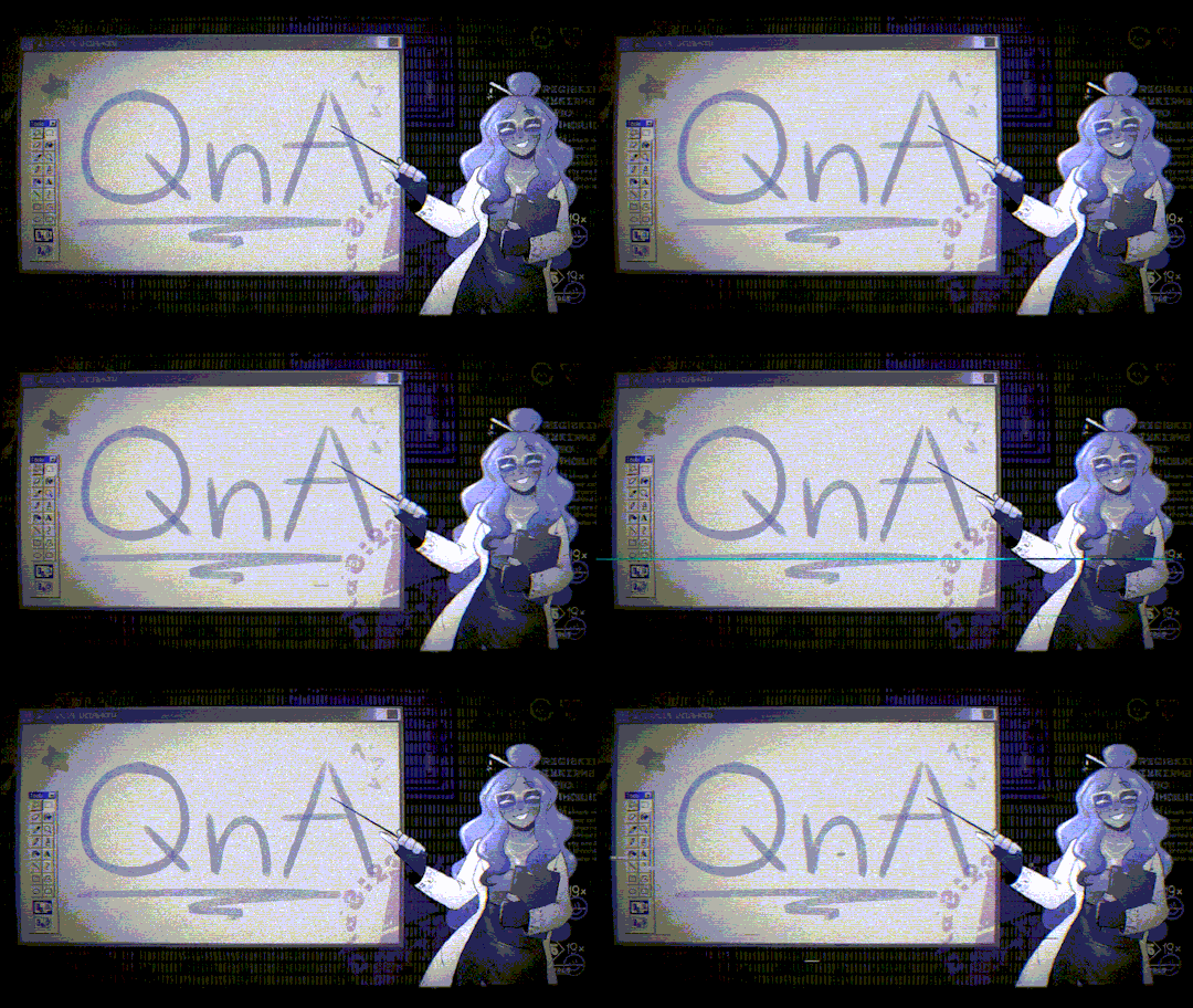
I, Rebi, will once again help you out. It's always lovely to see you! Here, us scientists will resolve all doubts. Remember you can ask us anything via our Curious Cat, Twitters DMs, Tumblr ask-me-anything or email. Now, let's begin! . . . «The following questions belong to: CONTRIBUTOR APPLICATIONS.» 1.- “If we, the artist submitting an application, created an artwork we believe fits in our top 3 after sending the application, are we allowed to change it before said applications close?” R = Applicants should be able to edit their form to do any changes they wish to. If this is not the case, feel free to reach out to us through Twitter, Tumblr or our email! 2.- “Are applicants going to be sent emails regardless of acceptance?” R = Yes! All applicants will receive either an email on March 11th with their acceptance, pinch hitter role or rejection. 3.- “It seems that this kettle/site is missing, is this a mistake?” R = All missing kettles/sites have already been claimed by guest artists and staff. This is to avoid someone picking most, if not all, taken kettles. 4.- “Are we allowed to use our own ocs as agent 3?” R = All contributors are allowed to use their own Neo 3 OCs in their pieces, as well as any interpretation of the canon cast, other agents and involved OCs. 5.- “Any word on the research figuring out if squids are real or not yet?” R = That’s classified information we cannot reveal at the moment. ----- «The following questions belong to: CURIOUS CAT.»
1.- “hello! I never saw the musician option before, was it in your Interest Check? I wanted to ask what is expected of a musician contributor. What kind of music are you accepting and the overall guidelines! I am also slightly concerned as I do not see a music Moderator, are mods knowledgeable about composition/production? Would there be any specific assets provided to make my music?” R = It was not, but we received some answers proposing musical involvement and we are happy to oblige! We think all art forms should be celebrated and given proper space to shine, we are just facilitating the stage. Any kind of music is accepted. For example, you can make a melody that can blend seamlessly with the alterna soundtrack, a remix, full lyrical song about the story mode, acoustic, acapella.... It can be something as small as a ringtone or big as an album... It's all up to you! You own all rights for its publishing and distribution, we are just sharing it with your authorisation on the zine and not anywhere else. Changes to our carrd have already been done when this answer is published to reflect these guidelines. As for experience, host Rebi has received musical education and was part of an orchestra and a choir not so long ago as well. Although she no longer plays music due to health concerns and time restrictions, she is happy to help in any way to the best of her abilities. Host Tari has dabbled in composing and has musical education not only themself, but their family too. If by assets you mean music sheets or programs and alike then no, assets aren't provided. At this moment, Rebi works only with synthesisers and Tari with free chiptune/composing sites. Please keep in mind that this zine isn't serious, just a fun project to show off the members of the splatoon community and how they interpret the artificial land of Alterna! 2.- “If multiple people have the same level as their first pick and their portfolios are roughly equal, how will it be decided who gets the stage? by better pitch, other level pick availability, randomizer, smth else?” R = Stage assignment is decided solely on the chosen level availability, pitches are just for us to see how people think. 3.- “For pieces featuring Neo 3- does it have to feature the “canon” version of the character, or are OC interpretations allowed” R = All contributors are allowed to use their own Neo 3 OCs in their pieces, as well as any interpretation of the canon cast. 4.- “Hi! Ummm When we fill out the application forms and send it, do we automatically receive an automated email saying the form was sent? I'm unsure whether or not I actually sent it after filling out one since I never received anything saying it was sent unlike other forms.” R = Please feel free to reach out through our email or social media DMs to check if your application went through or if you wish to edit something! 5.- “Do you need a social media presence to join? I plan on posting more online, but i only have a few posts on public social media so far” R = You do not need a social media presence to apply! It's an alternative if we cannot reach you through email when sending application results. 6.- “Is a downloadable pdf or a google document ok as a portfolio format?” R = Yes! As long as we can clearly see your work, it counts.
. . . This has been all for today. We thank you all for your interest and support. Now, I must go back to the Alterna center… One must keep an eye on the researchers. Some are still missing- Please look forward to our application results on March 11th!
« Art by @calatarii. Graphics by @rebiisea. All rights reserved. » « Information Hub: https://alternazine.carrd.co » « Open Contributor's Applications: https://www.tumblr.com/alternazine/741452328861908992/contributors-applications-start-now?source=share »
#zine#alterna#splatoon#splatoon zine#splatoon 3#return of the mammalians#fanzine#qna#questions#answered
10 notes
·
View notes
Text
The Perfect (Editorial or Agent) Match
Hey there, Yogi Bear!
To start out today's blog, I wanna talk about a kinda fun recent thing. Steve Lieber, who I've mentioned before for having his 12 point portfolio review critique without even looking, asked about the writing review equivalent. Jim Zub took a stab at it and his list is pretty good. And Chip Zdarsky's were also recommendations! And all of these are from Bluesky, so hope you can read 'em all! But, while I liked the other lists, I also had some thoughts. So my 12 critiques are here, which I consider pretty supplemental to Jim's!
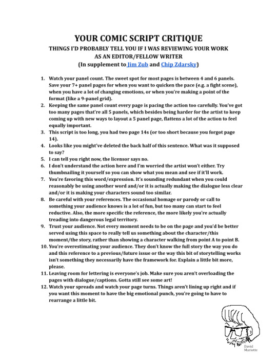
And now that you've taken all this advice and are feeling really comfortable with your script, writer-type, what're you gonna do with it?!
What Does an Agent do?
Before I get too far, let me make explicitly clear--I do not have an agent. I've worked with a number of agents. I know lots of creators who have them. But I don't have one myself, so I can only provide so much guidance. Okay, that disclaimer out of the way, what is a literary agent and what do they do?
It's a lot like other forms of agents you might've heard of. Your agent is a person who supports you and represents your interests in business. They are an advocate on your behalf. This means everything from reading your manuscripts to help refine/sell them to reviewing paperwork for you to making sure you're getting paid what you're worth and more. In the book market, there are certain publishers that will almost exclusively review agented submissions--you need to have someone who has been trained to know what the publisher might want and who has access to contacts there to advocate for your work. The reason for this is often to cut down on submissions that otherwise just have to go unanswered and to preserve some level of privacy for editors. Having an agent might not work for everyone, but if you can find someone who you like working with and can afford, they're going to be a lot of help. Agents can get your work to more potential buyers, help identify where your work will best fit in the marketplace, and, again, generally advocate for you.
But just like publishers and editors, not every agent is looking for every type of story. Specific agents, and even whole agencies, can have niches that they are interested in working in and representing. This is really important when we're talking comics. There are some agents that don't really represent cartoonists because they don't do art representation. There are some agents who only do art representation and might not be the right fit if you also wanna write. There are agents who primarily focus on books for middle grade or young adult readers. There are agents who just plain don't do comics. So how do you find an agent who might be a good fit?
Manuscript Wishlist
Manuscript Wishlist (or MS Wishlist) is *an* option for finding your agent, but it's one that I think can be really helpful. The basic idea of MSWL is that the website version has vetted agents and editors who have submitted profiles explaining what they are looking for in submissions. It's built off of a Twitter system where agents and editors tag posts #MSWL to flag the sort of work they're looking for from writers. One of the things I really like about the site is that in addition to details on what the agents and editors are looking for, and how to go about querying them, a lot of folks also take advantage of the sidebars that include things like lists of "what I like" so you can get an even clearer idea of if your work will mesh well with their interests and if your personalities will mesh well while looking to work together.
There are a ton of other resources out there for how to write good queries and each agency/agent/publisher/editor is going to have their own submission guidelines that you'll have to look up and follow--so I won't get into those--but this is a way to start seeing who might be interested in building a relationship with you.
Also, keep an eye on Publishers Marketplace. This is a primary source for what publishing deals are happening. Maybe you want to submit a query to an agent about a talking dog. Might be good to check publishers marketplace to make sure that agent didn't just sell a book about a talking dog.
MSWL Editors
MSWL also includes editors and for similar reasons. Editors have things they're interested in working on and it helps clarify to agents and to unagented folks what sort of titles they might be interested in acquiring. I *do not* currently have a MSWL set up on my own because I am not currently seeking submissions (sorry), but next time I think I might be, I'm going to be looking into it because I know what sort of stories I like to tell and what I would like to see from other folks.
Obviously, if you don't have an agent, double-check that the editor you're submitting to accepts unagented submissions. That's hugely important. But especially in comics, only taking agented submissions is uncommon. And if an editor is making clear what they'd like to acquire, you wanna get it in front of them because that is the most direct pipeline to traditional comics publishing. But it's also worthwhile to remember that because of how agents and editors work together, there's a lot of outreach between the two where editors are searching for talent, but only want to reach out, not be reached out to--especially if you're looking to do work on an existing property, rather than an original.
Now I'm gonna go batten down the hatches and prepare to ride out the rest of the coming storm!
See ya next time!
What I enjoyed this week: Blank Check (Podcast), Dungeons & Daddies (Podcast), Craig of the Creek (Cartoon), Honkai Star Rail (Video game), My Adventures with Superman (Cartoon), The Broken Room by Peter Clines (Book), Crime Scene Kitchen (TV show), Dumbing of Age (Webcomic), Shortpacked (Webcomic--though some of these pop culture strips sure are dated and/or in poor taste!), Solve This Murder (Podcast), Praise Petey (Cartoon), the acoustic Sonic Symphony performance at the Speed Cafe (see below), at time of posting having power and not a lot of rain/hurricane weather, owning (but not having watched yet) the Venture Bros finale movie, getting 3 5-star (the best possible) character pulls in a row in Honkai (but not the character I really wanted, who I only have like 9 days to get now if I can...).
New Releases this week (8/16/2023): Brynmore #2 (Editor) Godzilla: The War for Humanity #1 (Editor) Sonic the Hedgehog #63 (Editor)
Final Order Cut-Off next week (8/21/2023--last day to get your preorders in): Brynmore #3 (Editor) Godzilla: The War for Humanity #2 (Editor) Sonic the Hedgehog: Amy's 30th Anniversary Special (Editor)
New Releases next week (8/23/2023): Godzilla Monsters & Protectors: All Hail the King TPB (Editor--on the latter half)
Announcements: Becca is at Cartoon-a Palooza in Temecula on 9/15 & 9/16. It's a cool free all-ages little con, so come on out and see them!
Wanna support me? Consider joining my Patreon! This week, in addition to this blog (but without the Patreon plugs!) and one of my legacy blogs, I shared for the $10 and up members the script (and some extras) for my Beast Wars 2022 Annual story, "Rhinox's A-Maze-ing Adventure". You can only see it there! And I'll have more scripts, pitches, comics, etc going up in the weeks and months to come! Also coming soon, just coordinating with Becca, we'll be releasing a tease of a new comic we're working on together. It'll be on both our Patreons, but if you like art and adult art in particular, definitely don't miss Becca's either!
Or, you can buy something from my webstore! A lot of what is there is no longer in print and won't be going back to print anytime soon to my knowledge. The stock I have up is pretty much the stock I have. And you can get it signed and personalized and sent to you for a pretty reasonable price which includes shipping. Alternatively, I still have a few things up on eBay and I'm going to be adding a few more!
Sorry to be hyping ways to send me money so much recently, but between rising rent and utility and gas costs, not so rising work hours/pay for Becca and I, and us also trying to plan a wedding for a year from now, money's been tight a lot! I know that's the case all around, and if you have been supporting me in any way, it has not gone unnoticed at all! This week, Becca and I checked out a venue that we really like for the ceremony and reception. So, hoping we can make that happen!
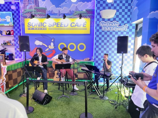
Pic of the Week: I referenced it earlier, but the Sonic Speed Cafe pop-up here in San Diego did a special mini acoustic performance of the Sonic Symphony that's about to be touring the whole world! So we had three musicians in the restaurant playing some Sonic hits! It was a lot of fun!
#comics#comics editorial#sonic speed cafe#sonic symphony#manuscript wishlist#find an agent#find an editor#making comics#comic script critique#steve lieber portfolio review#jim zub portfolio review#chip zdarsky got jokes
11 notes
·
View notes
Note
Hi hi!! Just so say in advance but for some reason i cant write questionmarks so ive just put them in brackets of where they go lmao. I wanted to shoot you a message and so I hope you dont mind but I was wondering what sort of portfolio you submitted to be able to work on Unicorn Warriors Eternal, I currently am an animator who has been struggling on getting a 2d animation job for a few years now and I was wondering if you would have any advice for someone who feels like they are struggling to get into the industry (Questionmark) Your animation for the show is amazing and I love the little bit of fanart that you made of melinda and edred too!! Once again, sorry if this is a bother but I figured that I would atleast try to ask :)
Heya! No worries at all!
I still feel super lucky honestly and I've only ever been at this one studio so far, so I don't know how helpful this is gonna be but I'll give it my best shot haha
This was my old showreel straight from the end of university which I had on my portfolio site when I applied:
https://youtu.be/42ubnrPGx2Y
I was lucky in the fact that the main thing I enjoyed doing during uni was animation clean-up in TVPaint, aaaand then I saw the job listing looking for... animation clean-up in TVPaint! I'm still not the best at rough animation, but as you can see my reel had lots and lots of clean-up examples, and that was exactly what Studio Zmei was looking for.
So, first tip: Focus your showreel on what you want to get a job for! If you're applying for rough traditional animation, show your roughs vs the final thing, or a clean-up heavy reel like mine if you wanna do clean-up, or a reel just for ToonBoom rigged animation if that's what you're applying for.
Second? Tip? Look for more obscure studios, or ask around your local studios (if you have any) if they offer internships or even junior level jobs? Studios are often really biased towards local people, and I was lucky that Zmei just happened to be situated in my home city. We often get interns not from any listings but just from people showing interest in an email. But I also know that's a bit unusual and a lot of studios are more closed off?? And going back to the more obscure studios part: The more well known a studio is, the more insane the competition to get a spot is, hence why usually it's not so much your portfolio's fault rather than the huge influx of candidates. This is where looking at general animation job listings sites can help a lot, and I even found Zmei's listing here in the first place:
https://animatedjobs.com/
aaand there's one for games too: https://gamejobs.work/
Lots of studios use these and they also have twitter/instagram pages to keep you updated as well. If a job is listed as remote, go for it! A lot of smaller studios that handle outsource animation are often starved for animators. (a lot of those do 2D rigged animation in ToonBoom or Adobe too, so it's def worth making a fresh reel for that if it's up your alley) Following a lot of studios on social media and especially LinkedIn helps too, as some of them post listings there exclusively.
And, third tip - there's no shame in starting small. I constantly get spammed by studios looking for mobile game animators or educational video animators on LinkedIn. Sure not all of those are gonna be worth looking into, but a lot of my friends started off like that. Every little bit of experience counts and builds up your CV. It's really hard to jump straight into being a rough animator, or a designer, or a storyboarder. Even my role of doing clean-up is considered more junior, and we had lots of people who did only coloring and shading too. And the more entry level version of a storyboard artist would be a storyboard revisionist. Everyone starts somewhere!
Other things like putting a direct link or linktree to your portfolio site or showreel easily accessible on all of your social medias could also help, as recruiters often have no time to dig for that stuff. (altho I'll be honest I've only ever been approached once (1) by a local studio on just instagram, so that's a really rare occurrence. still helps to be prepared though!)
I hope this was somewhat helpful haha. Good luck!!!
8 notes
·
View notes
Text
Making Tuff improvements
My approach to building Tuff, my static site generator that I began working on last November, was to jump in as quickly as possible by publishing my personal website publicly very early in the development process. Doing so forced me to make rapid improvements and to focus on the most important features.
By spending 5am to 7am most weekday mornings I was able to publish my entire website publicly within 14 days of starting to code and I wrote a short blurb on how Tuff works within 30. Considering that my personal site has a portfolio, podcast, and thousands of blog posts I was surprised by that timeline.
As a quick aside, this 5am to 7am time slot for coding personal projects did not appear on my typical day post from January 2021 because I wasn't doing it then. As I get older I find myself waking earlier and earlier. Rather than blow all of that time on YouTube (I love my YouTube) I decided, just a few weeks after that post, to begin working on personal projects instead. I've done a lot of programming, photography, and side hustle business during these early morning sessions over the last two years and I hope to continue. Waking early and being productive feels like a super power.
Development on Tuff has not stopped. I've been chipping away at improvements to this website, the efficiency of the build process, and adding the capability to build multiple websites. As you can see in the changelog, each release brings a few small improvements but they begin to add up over time.
One feature that I've missed the most since switching to Tuff for my personal website has been search, which I finished a first version of yesterday.
In very early January, just a month or so into development, I added a local command line search command to Tuff to help me find posts in my archive. It works pretty well and I continue to use this to help me find older posts. But I knew I needed to add on site search so that visitors to my site could do some basic searching. I wasn't sure how I was going to go about it statically. Should I build a client side search forcing the visitor of the site to download some large index? Should I use a third party tool? Should I do what many have done and push people to a search engine?
I thought, don't be dogmatic about building static. Most modern content management systems are full of bloat, load too much unnecessary junk on the page, and have far more features than most people need for a personal site. It is why I decided to build Tuff to begin with. But that doesn't mean I have to get all self righteous about server-side code and only publish HTML, CSS, and JavaScript. I can sprinkle in some server-side code where it makes sense.
That is why I'm now calling Tuff a Static+ Site Generator. S+SG. Is this a thing? I don't know. Don't forget, in my original building Tuff post I mentioned that I never looked at other static site generators. And I still haven't. I'm oblivious to best practices.
As of today, I use Tuff to build three sites; this site you're reading now, a private local network website that showcases over 100,000 of our family photos by date, and a new static site for The Watercolor Gallery that I hope to finish before the end of the year. In addition to that I'd like to begin working on publishing Stripe Transfer, Stupid, and at least three other websites that I've yet to debut with it.
Tuff is now a tool I plan to use for the rest of my computing life (see also). I love it.
3 notes
·
View notes
Text
Extra note after seeing staff's response to what's apparently the new panic.
My takeaway from the original post wasn't that they'd be getting rid of the chronological followed only dash. Wasn't actually worried about that. I'm fairly confident they'll keep it around, even if it gets deprioritized.
I'm frustrated by the increasing invasiveness of the algorithmic features and the way they're being forced on longtime active users that have already strongly indicated their preferences. I'm personally inclined to think that onboarding new users into a default still barely functional algorithm driven environment will be bad for retention, engagement, and site culture, but I'll admit that some people are into that junk!
What's really setting me off here are the bits about post and conversation formatting and "navigation". We've already seen the beginning of that, with the change to direct links to posts. It's already breaking critical functionality! Functionality that directly impacts access to "high-quality content", "user participation in conversations", and "users returning to Tumblr"!
The ability to jump to a reply on a post in the full context of the blog it was posted to is an incredibly powerful feature in so many ways. It lets you see any tags that were added (half the conversation, navigation tool for related content that Tumblr should be developing), see the chronologically adjacent posts that give context to the content and conversations, and makes it easier to explore existing archival content!
Do they or do they not want to leverage the decade plus of content they've got? Do they want to encourage interactions with smaller creators that have built up portfolios, or do they want a site filled with flash-in-the-pan disposable viral content from established popular blogs? The whole reason they're pushing this product strategy is to increase revenue, because it costs so much to run the place. It costs so much in part because of how many damn posts we've all made in the last decade.
If they're already paying to host all of that junk, why not make it easier to explore? If you can't access a blogs archive without being logged in, and you can only see that archive one post at a time, then it's basically invisible. It might as well not exist. We could all (users, creators, brands) just go use snapchat for fuck's sake.
(I'll acknowledge the theoretical bandwidth issues of loading entire years old chunks of a blog every time a user just wants to see a single post, but come on. Make the single post view the one you get from the blog link and the in context one the version from the whitespace, if you must. And if that's your reasoning, just admit it! Don't try to pretend it's a UI issue for new users! That's insulting for everyone involved!)
(I get it, the prev tags stuff could get stupid. But it was a little quirk of site culture that did more to encourage conversations and networks of mutuals than half the shit staff has tried to do deliberately. Rolling a UI change out that seems to have killed it entirely by accident is just so half-assed.)
And look. There are so many neat ways they could explore reblog chain tree visualization that would improve navigation. Full collapsed subthread forum/reddit style views that retain tags. Or imagine the dot reblog graphs with more info and seamless zooming to different levels of detail.
Instead they seem to be pushing towards a version of tumblr that prioritizes bare original posts, with replies and reblogs tucked away in the notes. And that bit about "[e]xpand[ing] ways to co-create content, such as by adding the capability to embed Tumblr links in posts." Reblogs and replies are too hard, so we're just going to do fucking quote tweets? Seriously?
Tumblr’s Core Product Strategy
Here at Tumblr, we’ve been working hard on reorganizing how we work in a bid to gain more users. A larger user base means a more sustainable company, and means we get to stick around and do this thing with you all a bit longer. What follows is the strategy we're using to accomplish the goal of user growth. The @labs group has published a bit already, but this is bigger. We’re publishing it publicly for the first time, in an effort to work more transparently with all of you in the Tumblr community. This strategy provides guidance amid limited resources, allowing our teams to focus on specific key areas to ensure Tumblr’s future.
The Diagnosis
In order for Tumblr to grow, we need to fix the core experience that makes Tumblr a useful place for users. The underlying problem is that Tumblr is not easy to use. Historically, we have expected users to curate their feeds and lean into curating their experience. But this expectation introduces friction to the user experience and only serves a small portion of our audience.
Tumblr’s competitive advantage lies in its unique content and vibrant communities. As the forerunner of internet culture, Tumblr encompasses a wide range of interests, such as entertainment, art, gaming, fandom, fashion, and music. People come to Tumblr to immerse themselves in this culture, making it essential for us to ensure a seamless connection between people and content.
To guarantee Tumblr’s continued success, we’ve got to prioritize fostering that seamless connection between people and content. This involves attracting and retaining new users and creators, nurturing their growth, and encouraging frequent engagement with the platform.
Our Guiding Principles
To enhance Tumblr’s usability, we must address these core guiding principles.
Expand the ways new users can discover and sign up for Tumblr.
Provide high-quality content with every app launch.
Facilitate easier user participation in conversations.
Retain and grow our creator base.
Create patterns that encourage users to keep returning to Tumblr.
Improve the platform’s performance, stability, and quality.
Below is a deep dive into each of these principles.
Principle 1: Expand the ways new users can discover and sign up for Tumblr.
Tumblr has a “top of the funnel” issue in converting non-users into engaged logged-in users. We also have not invested in industry standard SEO practices to ensure a robust top of the funnel. The referral traffic that we do get from external sources is dispersed across different pages with inconsistent user experiences, which results in a missed opportunity to convert these users into regular Tumblr users. For example, users from search engines often land on pages within the blog network and blog view—where there isn’t much of a reason to sign up.
We need to experiment with logged-out tumblr.com to ensure we are capturing the highest potential conversion rate for visitors into sign-ups and log-ins. We might want to explore showing the potential future user the full breadth of content that Tumblr has to offer on our logged-out pages. We want people to be able to easily understand the potential behind Tumblr without having to navigate multiple tabs and pages to figure it out. Our current logged-out explore page does very little to help users understand “what is Tumblr.” which is a missed opportunity to get people excited about joining the site.
Actions & Next Steps
Improving Tumblr’s search engine optimization (SEO) practices to be in line with industry standards.
Experiment with logged out tumblr.com to achieve the highest conversion rate for sign-ups and log-ins, explore ways for visitors to “get” Tumblr and entice them to sign up.
Principle 2: Provide high-quality content with every app launch.
We need to ensure the highest quality user experience by presenting fresh and relevant content tailored to the user’s diverse interests during each session. If the user has a bad content experience, the fault lies with the product.
The default position should always be that the user does not know how to navigate the application. Additionally, we need to ensure that when people search for content related to their interests, it is easily accessible without any confusing limitations or unexpected roadblocks in their journey.
Being a 15-year-old brand is tough because the brand carries the baggage of a person’s preconceived impressions of Tumblr. On average, a user only sees 25 posts per session, so the first 25 posts have to convey the value of Tumblr: it is a vibrant community with lots of untapped potential. We never want to leave the user believing that Tumblr is a place that is stale and not relevant.
Actions & Next Steps
Deliver great content each time the app is opened.
Make it easier for users to understand where the vibrant communities on Tumblr are.
Improve our algorithmic ranking capabilities across all feeds.
Principle 3: Facilitate easier user participation in conversations.
Part of Tumblr’s charm lies in its capacity to showcase the evolution of conversations and the clever remarks found within reblog chains and replies. Engaging in these discussions should be enjoyable and effortless.
Unfortunately, the current way that conversations work on Tumblr across replies and reblogs is confusing for new users. The limitations around engaging with individual reblogs, replies only applying to the original post, and the inability to easily follow threaded conversations make it difficult for users to join the conversation.
Actions & Next Steps
Address the confusion within replies and reblogs.
Improve the conversational posting features around replies and reblogs.
Allow engagements on individual replies and reblogs.
Make it easier for users to follow the various conversation paths within a reblog thread.
Remove clutter in the conversation by collapsing reblog threads.
Explore the feasibility of removing duplicate reblogs within a user’s Following feed.
Principle 4: Retain and grow our creator base.
Creators are essential to the Tumblr community. However, we haven’t always had a consistent and coordinated effort around retaining, nurturing, and growing our creator base.
Being a new creator on Tumblr can be intimidating, with a high likelihood of leaving or disappointment upon sharing creations without receiving engagement or feedback. We need to ensure that we have the expected creator tools and foster the rewarding feedback loops that keep creators around and enable them to thrive.
The lack of feedback stems from the outdated decision to only show content from followed blogs on the main dashboard feed (“Following”), perpetuating a cycle where popular blogs continue to gain more visibility at the expense of helping new creators. To address this, we need to prioritize supporting and nurturing the growth of new creators on the platform.
It is also imperative that creators, like everyone on Tumblr, feel safe and in control of their experience. Whether it be an ask from the community or engagement on a post, being successful on Tumblr should never feel like a punishing experience.
Actions & Next Steps
Get creators’ new content in front of people who are interested in it.
Improve the feedback loop for creators, incentivizing them to continue posting.
Build mechanisms to protect creators from being spammed by notifications when they go viral.
Expand ways to co-create content, such as by adding the capability to embed Tumblr links in posts.
Principle 5: Create patterns that encourage users to keep returning to Tumblr.
Push notifications and emails are essential tools to increase user engagement, improve user retention, and facilitate content discovery. Our strategy of reaching out to you, the user, should be well-coordinated across product, commercial, and marketing teams.
Our messaging strategy needs to be personalized and adapt to a user’s shifting interests. Our messages should keep users in the know on the latest activity in their community, as well as keeping Tumblr top of mind as the place to go for witty takes and remixes of the latest shows and real-life events.
Most importantly, our messages should be thoughtful and should never come across as spammy.
Actions & Next Steps
Conduct an audit of our messaging strategy.
Address the issue of notifications getting too noisy; throttle, collapse or mute notifications where necessary.
Identify opportunities for personalization within our email messages.
Test what the right daily push notification limit is.
Send emails when a user has push notifications switched off.
Principle 6: Performance, stability and quality.
The stability and performance of our mobile apps have declined. There is a large backlog of production issues, with more bugs created than resolved over the last 300 days. If this continues, roughly one new unresolved production issue will be created every two days. Apps and backend systems that work well and don't crash are the foundation of a great Tumblr experience. Improving performance, stability, and quality will help us achieve sustainable operations for Tumblr.
Improve performance and stability: deliver crash-free, responsive, and fast-loading apps on Android, iOS, and web.
Improve quality: deliver the highest quality Tumblr experience to our users.
Move faster: provide APIs and services to unblock core product initiatives and launch new features coming out of Labs.
Conclusion
Our mission has always been to empower the world’s creators. We are wholly committed to ensuring Tumblr evolves in a way that supports our current users while improving areas that attract new creators, artists, and users. You deserve a digital home that works for you. You deserve the best tools and features to connect with your communities on a platform that prioritizes the easy discoverability of high-quality content. This is an invigorating time for Tumblr, and we couldn’t be more excited about our current strategy.
65K notes
·
View notes
Text
Introducing The LaTeX Theme
So I went and actually did it.
I installed the LaTeX theme onto this blog (as a follow up from my last post), and it's already more visually accessible than the Vintage Mac theme that I've had for over a year and a half.
It will take a bit of time to get used to this theme, but I like the minimalism of it (as well as the fact that I literally cannot customise it, since it's literally just black text on a white background, similar to my portfolio website), since you can actually read the text without having to squint at the screen, although it does feel weird to read text set in a serif font on a screen, since I'm so used to seeing sans-serif fonts mainly on screens all the time.
However, it does kinda suck that I replaced such an awesome theme with such a basic one (especially since it feels like I'm gentrifying myself one bit at a time), but it does look like those minimalist yet thought provoking blogs and sites that I admire, so I'll give it that.
I guess this is pretty much as sign that I'm growing up, but hey, it's gotta be done, especially now that I emerge into a new version of myself that I'm still uncertain about, simply because the rug has been aggressively pulled from underneath me.
On another note, the LaTeX software itself seems pretty cool, and I've been meaning to try it for some time, so that's a bonus, especially since it's primarily used in academia, which feels fitting, since I want to find a way to get back into academia (I know a few academics with PhDs on a professional-yet-social level (meaning that I can attend all of their conferences, read their papers, and look at anything else that they've done, yet still feel comfortable going out to dinner with them afterwards and sending them messages in an informal setting), yet these are the types of people that I seem to really get along with the most, since they actually talk about interesting things and that it feels like we're on fairly similar wavelengths (okay, I probably might be going too far with that one, but you get what I mean), despite the fact that they're at least twice my age), but being a part of academia so that I still get paid, and so that I can actually focus on being a researcher and analytical person for once, because I've realised that it's what I want, possibly much more than creating fancy visuals and pretty pictures.
Overall, I do enjoy working and having a job, but after having worked in a fairly laid back startup for about a year by doing things that are so within my comfort zone, I want to do something that's more interesting and within a more established setting.
Additionally, I also like the fact that LaTeX is free software (I'm not too fussed about the fact that I can get the software for free, but I am interested in the fact that it's open source, and that it's fairly anticapitalist), so it already feels aligned with my interests and values.
I guess at this point, I'm a completely different person compared to how I was just a few months ago, and I guess this can be viewed as a form of manifestion/praying/dreaming for the type of job that I actually want, as well as the type of person that I genuinely want to become: analytical and research-oriented, where I provide insanely in depth analyses about the way things work and why they work the way that they do.
0 notes
Text
Today turned out to be an even less productive day than yesterday.
In my heart, I want to put it down to the fact that the weekend has come, but it's better not to do this.
So, the result:

1) I messed up with creating a website on Tilda, so I spent 6 hours trying to fix everything. The fact is that in the homework for creating a website, they wanted to warn us against Zero-block, because it is difficult. Who finally decided to do everything there? I. And I spent 6 hours correcting errors. But why am I writing this here? Because it's cool, I'm learning and I won't make this mistake a second time. But here's what worries me.. I have made all possible adaptations for the site, and everything looks good, but why is it that when you try to open the PC version of the site from your phone, only half of the site is visible? I don't understand, and I need to find out what the problem is.

2) I ordered myself 5 pizzas that I'm going to eat for the next 7 days. Because I want to. Hehehe and I don't care
3) I watched the last training of my online school, and it's time to prepare for graduation. So exciting
4) Initially, I was going to make a second website to put it in my portfolio, but in the end, so far I have only made a dry layout. Well, it still looks cool.

5) All yesterday's tasks were accepted! I did a huge job and everyone appreciated it, I'm proud of myself.
Now I'm going to brew myself a Shu Puer and work on sketches for the characters. The number has increased to 8, and tomorrow will be a really difficult day. Like that.
It was a very chaotic day, I can say that I spent it correcting mistakes. But it's okay, any mistake is a step towards professional me. I can't be productive forever and not make mistakes. The main thing is that I managed to fix them.
All love and kindness, and good night, or good morning

#motivating myself#motivation#self growth#self improvement#self care#stay positive#motivatingwords#planning#online courses#learning#educate yourself#life goals#figmadesign#marketing#daily routine#study routine
0 notes
Text
MotoAi Designed by 6 Figures IM Launches Developers
The entire expertise of the Themeforest and Codecanyon Elite Author Team has gone into this!
The Most Effective AI Tool for Starting a Web Agency and Building Profitable Websites, Landing Pages, Graphics, Videos, and Content Preloaded with 3000+ Images, 10,000+ Graphics, 500 Logos, 200 Videos, and Unlimited Content Build a Professional Website 10X Faster With AI Get AI-Generated Content and Images Instantly Build Top-Converting Websites in Any Niche
Drag-and-drop editing makes it simple to modify any website.
With the included commercial license, you can make 100% profits.
Create as many sites as you want to boost your income without spending more.
No Specialized Abilities Required: Fledgling Well disposed. Make money right away.
Make sure you pay. Our steadfast 14-day money-back guarantee covers everything.
During this exclusive launch, only a once-only price and bonuses are available!
Team Behind MOTOAI After Successfully Delivering MOTO Themes To More Than 13000+ Customers, We Are All Set To Create MotoAI. Our Stats From Various Marketplace team-img Check Out What Our Customers Have To Say About Us quote-icon Guys, I have been developing my own personal websites as well as those of my clients using Moto Theme Premium for the past two years. I value every aspect of your theme. It's slick, good for personal branding, and I think it's very much a business-oriented website for the internet. In a nutshell, I'd say that I can't wait for your next move. Cheers..!
test-img Mikail Mokuena's quote-icon I must say, I truly appreciate your kindness. I guess I like the MOTO theme better than the others I bought. It is so simple to use, and the premium demo sites are excellent. I also tried BeTheme, RocketBuilder, and other themes, but your theme works great. The origin page builder, the various header styles, and the brand-new checkout page all look great to me. Again, my sincere gratitude.
The Moto Theme by Santiago Pena is simply outstanding. It has a lot of value, and the demos are amazing. They make it easier to build websites from scratch and inspire even less creative web developers to be creative. They have nailed it with this one, and I always look forward to the new versions. You can actually get up and running in no time because there are so many demos to choose from. Guys, keep up the great work!
Kardy Laguda: Why MotoAI? test-img
The Essential AI Tool for Starting a Profitable Agency This Will Change the Way You Work With Clients Forever. MotoAI Is the Essential AI Tool for Starting a Profitable Machine.
MotoAI is a WordPress theme with built-in modules. Our Moto theme was a huge hit with more than 13,000 customers; however, with MotoAI, we have taken it to a new level that no other theme can match.
What MotoAI Is MotoAI is a one-of-a-kind website creation tool that comes packed with up to 3000+ niches, 14 header variations, 40+ awesome shortcodes, and a lot of premium tools. It is also integrated into a very easy-to-manage, drag-and-drop page builder that has seamless instant action technology, endless design possibilities, and no coding skills are required at all.
This means that you can now create virtually any type of marketing page, sales page, landing page, e-commerce site, company website, portfolio page, or blog for yourself or any of your clients' business requirements.
What MotoAI Is MotoAI Is, and that's all you need to start a web agency and start making money from it. You can use it with a developer license in any way you want, and you can charge for it or make 100% of the money. MotoAI is designed specifically for all business owners, online marketers, drop shippers, shop owners, industry creatives, bloggers, offliners, and many more. There are no hidden fees.
Additionally, everything is contained within a single MotoAI THEME. What MotoAI Is How Much Profit I Can Make Using This Tool?
With MotoAI, you can charge the same amount for the same services and keep 100% of the profit (commercial license included) only if you act now!
Single Site License Purchase a Single Site License Right Now for Only $37.00!
Developer License Purchase a Developer License Right Now for Just $47.00!
Make sure you pay. Our steadfast 14-day money-back guarantee covers everything. During this exclusive launch, only a once-only price and bonuses are available!
What distinguishes MotoAI from competitors?
PixelNX is a ThemeForest and CodeCanyon Elite Author Team that was developed by developers who have worked on 20 or more 6 Figure Internet Marketing Launches.
Detailed HD Video Tutorials We put a lot of effort into creating a comprehensive collection of HD video tutorials that will walk you through each step of the process so that you can quickly construct effective marketing pages.
Support Time of 60 Minutes or Less We will not, of course, abandon customers on their own. On average, MotoAI Theme users will get a response to their questions within 60 minutes or less.
More than 80 "in-house" developers are on hand We have a fantastic WP Theme expert development team ready to create any top-notch WordPress marketing tool, and we have done so for nearly a decade.
We're Here To Help
Group
Look at What You Can Make With MotoAI
In Only A Couple of moments!!
One-Click Demo Installation of Amazing Theme Options Framework Single Page Website Supported RTL Supported WPML Supported Under Construction Pages Free Google Fonts 50 Marketing Layouts Masonry Layouts SEO Optimized and Valid Code Advanced Blog Layouts Ultra Responsive and Retina Ready More Customization Options CF7 Form Builder 40+ Awesome Shortcodes Powerful Page Builder Three Types of Google Map Countdown Timer Browsers Support Chrome Firefox Safari Opera Internet Explorer 10+ / Edge
0 notes
Text
Actually I forgot something(s) importanter.
It's not at all ready, but I highly recommend bookmarking this if you want to keep up with my work:
If you'd like more, go to test.allorey.world instead for the old version of the site, it has a few more pages :]
(The header is broken but if you search blank space on the search bar at the bottom, everything should come up)
I also have a neocities under the same username as usual, not sure what i'll use it for though, probably a portfolio. Mayyybe a log of my local plants I see.
Its jus someones template I was testing right now... i'd tell you to say hi but neocities doesnt have comments on your sites, but it does if you go look at it on neocities itself...? Big reason i use wordpress tbh, the backend for managing those sorts of internals. Anyway yeh. Say hello somewhere if you want lol. Idk what people do with these.
Just in case, letting you know I will probably be on tumblr until it literally explodes (with hammers) but if anyone wants to keep up with me (not difficult, i am slow) on anything else, im under the same username pretty much everywhere, give or take the hyphen.
'Course, I don't post to anywhere consistently except sort of here... but I do exist on them.
If I was forced to 'move', the likeliest places to see new stuff would be cohost, assuming it somehow sustains itself and doesnt stagnate, and the bluesky thing, because... well everyone is probably going to move there, even though no one likes twitter style posting. *shrug*
#i really wanna have my site set up...#slowly chipping at it#had a fantastic idea for how ill do comics with my site too#i may try upload my old comic to test the format
4 notes
·
View notes
Text
Free web host quick rundown
Storage: How many/how big of files you can put on the site. If you plan on hosting images on the website itself, or running something like a forum, you probably want a lot. Bandwidth: The amount of data that be transferred to users within a set amount of time. The more users accessing your site, the more bandwidth the site has to use just to load simple web pages. For websites that have dynamic content and media like video and audio, even more bandwidth is required. Be wary of free plans promising unlimited bandwidth--it does not exist. They just don’t tell you what the cap is. PHP: Open source general scripting language, required for self-hosted forums, Wordpress/Content Management Services (Cutenews etc) and some kinds of Send Forms. (if you wanted to make a custom commission form, for example) Mysql: A database, also needed for CMS/Forums and some other software.
Neocities
Storage: 1GB Bandwidth: 200 GB Advertising: No PHP/Mysql: No Notes: Currently my top choice for being upfront about their limits on space, you can also read about their other features on their website. It is best for static hosting, so you can’t run a CMS or anything that requires php even if you upgrade.
Geocities.ws
They claim they have unlimited space and bandwidth, but I would be wary. Advertising: Doesn’t seem like it, they claim their services are supported by the premium plans. PHP/Mysql: No Notes: Haven’t used this one before, but have seen it recommended a few times in the personal website crowd.
Awardspace
Storage: 1 GB Bandwidth: 5 GB Advertising: No PHP/Mysql: Yes. Notes: I’ve personally had lag issues with their cpanel/website in general, but it’s been a while since I’ve used them so that may have changed.
Freehostia
Storage: 250 MB Bandwidth: 6 GB Advertising: N/A PHP/Mysql: Yes. Notes: Haven’t personally used this one.
000webhost (Powered by Hostinger)
Storage: 300 MB Bandwidth: 3 GB Advertising: No PHP/Mysql: Yes, 1 database and typically whatever PHP version is current. Notes: I used to use the free plan and had no issues myself, but I would host images off site and only use it for small websites where mostly your friends or small following visit. I personally use the hostinger plans for my wordpress websites and other content requiring PHP
This is by no means an exhaustive list, and is mostly made up of websites I’ve heard of, or that I have some amount of experience with myself. Feel free to add more in reblogs/comments. :) If you pick one of the smaller options but still want to have a forum, I’d recommend checking out my forum post and using a remotely hosted forum to pair with it. I doubt I'll make a paid version of these posts because they're intended for the general public, but if you intend to host a portfolio or business website rather than a personal website, I sincerely recommend looking at a cheap web host rather than a free one—none of them will really meet even small business level needs, especially in terms of bandwidth.
28 notes
·
View notes