#i guess. more like. my font design.
Explore tagged Tumblr posts
Text

i was a bit in awe of the goosebumps book covers recently, so much i though it would be fun to try and make a color palette picked right from each cover. its. a lot. and some of them are a bit samey but. i sure did the assignment. regardless i tried to make a fun collection of colors. you just gotta... zoom in. but yeah. goosebumps covers very good.
#goosebumps#color palette#color palette challenge#art challenge#color palettes#my art#i guess. more like. my font design.#if theres a typo or something no there isnt. i dont think there is though.#this was mainly an excuse to admire them. but the simple existence of goosebumps and goosebumps book covers are. artistically inspiring.#some of these probably could have been shrunken down or simplified but eh.#palette challenge#ask game#i guess
6 notes
·
View notes
Note
I would be very interested in hearing the museum design rant

by popular demand: Guy That Took One (1) Museum Studies Class Focused On Science Museums Rants About Art Museums. thank u for coming please have a seat
so. background. the concept of the "science museum" grew out of 1) the wunderkammer (cabinet of curiosities), also known as "hey check out all this weird cool shit i have", and 2) academic collections of natural history specimens (usually taxidermied) -- pre-photography these were super important for biological research (see also). early science museums usually grew out of university collections or bequests of some guy's Weird Shit Collection or both, and were focused on utility to researchers rather than educational value to the layperson (picture a room just, full of taxidermy birds with little labels on them and not a lot of curation outside that). eventually i guess they figured they could make more on admission by aiming for a mass audience? or maybe it was the cultural influence of all the world's fairs and shit (many of which also caused science museums to exist), which were aimed at a mass audience. or maybe it was because the research function became much more divorced from the museum function over time. i dunno. ANYWAY, science and technology museums nowadays have basically zero research function; the exhibits are designed more or less solely for educating the layperson (and very frequently the layperson is assumed to be a child, which does honestly irritate me, as an adult who likes to go to science museums). the collections are still there in case someone does need some DNA from one of the preserved bird skins, but items from the collections that are exhibited typically exist in service of the exhibit's conceptual message, rather than the other way around.
meanwhile at art museums they kind of haven't moved on from the "here is my pile of weird shit" paradigm, except it's "here is my pile of Fine Art". as far as i can tell, the thing that curators (and donors!) care about above all is The Collection. what artists are represented in The Collection? rich fucks derive personal prestige from donating their shit to The Collection. in big art museums usually something like 3-5% of the collection is ever on exhibit -- and sometimes they rotate stuff from the vault in and out, but let's be real, only a fraction of an art museum's square footage is temporary exhibits. they're not going to take the scream off display when it's like the only reason anyone who's not a giant nerd ever visits the norwegian national museum of art. most of the stuff in the vault just sits in the vault forever. like -- art museum curators, my dudes, do you think the general public gives a SINGLE FUCK what's in The Collection that isn't on display? no!! but i guarantee you it will never occur, ever, to an art museum curator that they could print-to-scale high-res images of artworks that are NOT in The Collection in order to contextualize the art in an exhibit, because items that are not in The Collection functionally do not exist to them. (and of course there's the deaccessioning discourse -- tumblr collectively has some level of awareness that repatriation is A Whole Kettle of Worms but even just garden-variety selling off parts of The Collection is a huge hairy fucking deal. check out deaccessioning and its discontents; it's a banger read if you're into This Kind Of Thing.)
with the contents of The Collection foregrounded like this, what you wind up with is art museum exhibits where the exhibit's message is kind of downstream of what shit you've got in the collection. often the message is just "here is some art from [century] [location]", or, if someone felt like doing a little exhibit design one fine morning, "here is some art from [century] [location] which is interesting for [reason]". the displays are SOOOOO bad by science museum standards -- if you're lucky you get a little explanatory placard in tiny font relating the art to an art movement or to its historical context or to the artist's career. if you're unlucky you get artist name, date, and medium. fucker most of the people who visit your museum know Jack Shit about art history why are you doing them dirty like this
(if you don't get it you're just not Cultured enough. fuck you, we're the art museum!)
i think i've talked about this before on this blog but the best-exhibited art exhibit i've ever been to was actually at the boston museum of science, in this traveling leonardo da vinci exhibit where they'd done a bunch of historical reconstructions of inventions out of his notebooks, and that was the main Thing, but also they had a whole little exhibit devoted to the mona lisa. obviously they didn't even have the real fucking mona lisa, but they went into a lot of detail on like -- here's some X-ray and UV photos of it, and here's how art experts interpret them. here's a (photo of a) contemporary study of the finished painting, which we've cleaned the yellowed varnish off of, so you can see what the colors looked like before the varnish yellowed. here's why we can't clean the varnish off the actual painting (da vinci used multiple varnish layers and thinned paints to translucency with varnish to create the illusion of depth, which means we now can't remove the yellowed varnish without stripping paint).
even if you don't go into that level of depth about every painting (and how could you? there absolutely wouldn't be space), you could at least talk a little about, like, pigment availability -- pigment availability is an INCREDIBLY useful lens for looking at historical paintings and, unbelievably, never once have i seen an art museum exhibit discuss it (and i've been to a lot of art museums). you know how medieval european religious paintings often have funky skin tones? THEY HADN'T INVENTED CADMIUM PIGMENTS YET. for red pigments you had like... red ochre (a muted earth-based pigment, like all ochres and umbers), vermilion (ESPENSIVE), alizarin crimson (aka madder -- this is one of my favorite reds, but it's cool-toned and NOT good for mixing most skintones), carmine/cochineal (ALSO ESPENSIVE, and purple-ish so you wouldn't want to use it for skintones anyway), red lead/minium (cheaper than vermilion), indian red/various other iron oxide reds, and apparently fucking realgar? sure. whatever. what the hell was i talking about.
oh yeah -- anyway, i'd kill for an art exhibit that's just, like, one or two oil paintings from each century for six centuries, with sample palettes of the pigments they used. but no! if an art museum curator has to put in any level of effort beyond writing up a little placard and maybe a room-level text block, they'll literally keel over and die. dude, every piece of art was made in a material context for a social purpose! it's completely deranged to divorce it from its material context and only mention the social purpose insofar as it matters to art history the field. for god's sake half the time the placard doesn't even tell you if the thing was a commission or not. there's a lot to be said about edo period woodblock prints and mass culture driven by the growing merchant class! the met has a fuckton of edo period prints; they could get a hell of an exhibit out of that!
or, tying back to an earlier thread -- the detroit institute of arts has got a solid like eight picasso paintings. when i went, they were kind of just... hanging out in a room. fuck it, let's make this an exhibit! picasso's an artist who pretty famously had Periods, right? why don't you group the paintings by period, and if you've only got one or two (or even zero!) from a particular period, pad it out with some decent life-size prints so i can compare them and get a better sense for the overarching similarities? and then arrange them all in a timeline, with little summaries of what each Period was ~about~? that'd teach me a hell of a lot more about picasso -- but you'd have to admit you don't have Every Cool Painting Ever in The Collection, which is illegalé.
also thinking about the mit museum temporary exhibit i saw briefly (sorry, i was only there for like 10 minutes because i arrived early for a meeting and didn't get a chance to go through it super thoroughly) of a bunch of ship technical drawings from the Hart nautical collection. if you handed this shit to an art museum curator they'd just stick it on the wall and tell you to stand around and look at it until you Understood. so anyway the mit museum had this enormous room-sized diorama of various hull shapes and how they sat in the water and their benefits and drawbacks, placed below the relevant technical drawings.
tbh i think the main problem is that art museum people and science museum people are completely different sets of people, trained in completely different curatorial traditions. it would not occur to an art museum curator to do anything like this because they're probably from the ~art world~ -- maybe they have experience working at an art gallery, or working as an art buyer for a rich collector, neither of which is in any way pedagogical. nobody thinks an exhibit of historical clothing should work like a clothing store but it's fine when it's art, i guess?
also the experience of going to an art museum is pretty user-hostile, i have to say. there's never enough benches, and if you want a backrest, fuck you. fuck you if going up stairs is painful; use our shitty elevator in the corner that we begrudgingly have for wheelchair accessibility, if you can find it. fuck you if you can't see very well, and need to be closer to the art. fuck you if you need to hydrate or eat food regularly; go to our stupid little overpriced cafeteria, and fuck you if we don't actually sell any food you can eat. (obviously you don't want someone accidentally spilling a smoothie on the art, but there's no reason you couldn't provide little Safe For Eating Rooms where people could just duck in and monch a protein bar, except that then you couldn't sell them a $30 salad at the cafe.) fuck you if you're overwhelmed by noise in echoing rooms with hard surfaces and a lot of people in them. fuck you if you are TOO SHORT and so our overhead illumination generates BRIGHT REFLECTIONS ON THE SHINY VARNISH. we're the art museum! we don't give a shit!!!
8K notes
·
View notes
Text
#I guess it probably wouldn't be practical#but I wish these modifier emoji applied to more characters#like the way it works on a technical level is that there's a 'component' character 🦰 (which I haven't included separately)#and then you use a special 'joiner' character to attach it to the person emoji for whatever gender and skin tone you want#(or practically speaking your phone does this for you)#there are other emoji that work this way like the curly hair and bald ones#and I think you should be able to attach them to all the different people like the jobs and sports and gestures and whatnot#the problem is someone would have to draw all those variants#but it would be nice#maybe someday if I design my own emoji font
0 notes
Text
I was doing some planning for a little Wrightworth comic I want to draw, and it came around to me thinking about Edgeworth’s glasses; the ones he has in his Chief Prosecutor design. What’s his prescription?

He has them on in all his sprites when you’re talking to him out of court-

-but takes them off when he’s in court.
I’m not sure what form of visual impairment he’d have that would require him to have glasses on while out and about, but removed when in the courtroom. My guess regarding this is that Edgeworth doesn’t really like to show “weakness”, especially in a professional setting. Needing glasses isn’t really a weakness, but I could see him not necessarily wanting to show that his vision has deteriorated.
So my next thought was, “maybe he’s farsighted and doesn’t really need them in court since everyone else is a ways away from him”

But then this sprite exists where he’s reading up close with his glasses off. So either his condition is mild enough that he can still make out words, even if they’re a little blurry, or Detective Gumshoe is printing out all his reports with the font sized up for him.
Personally, I’m nearsighted and would love to claim him as such as well, but with how much he enjoys going up against Phoenix in court, I think he’d like to see his struggling opponent clearly. (“wright only makes that ridiculous face when his back is pressed against the wall” etcetera, etcetera)
So my guess is that he’s farsighted, but not to the point where things up close to him are entirely illegible.
Anyway that’s me thinking far too much about a fictional attorney’s glasses. If any of you have your own hcs about that, I’d love to hear them. I don’t know a whole lot about vision impairments besides my own, so if someone else has a different experience or more knowledge that would provide a better explanation, I’m totally open to having my mind changed.
420 notes
·
View notes
Text
penultimate update :0 do you feel my pain

hello it's part 3 of 3 for my cool fun graphic design adventure!! part 1 and part 2 got too long. to recap i am recreating this t-shirt design but with the magic 8 ball songs instead of city names:
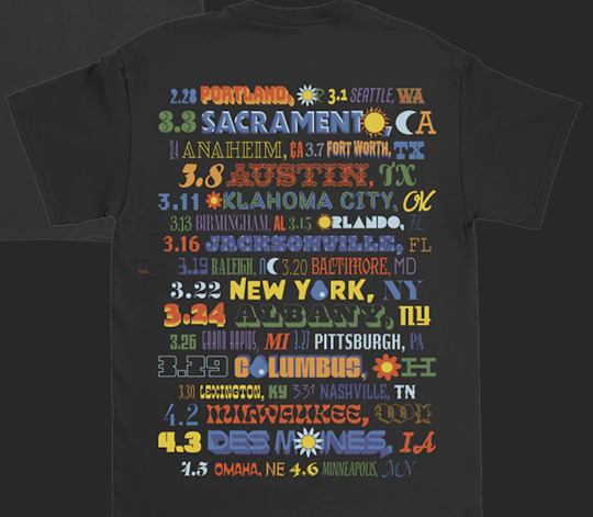
here is the current draft, updated through 3/27 (pittsburgh) (!!!!)
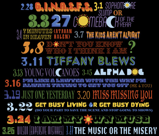
#TO THE PERSON IN THE NOTES WHO RBD WITH THE LET ME INNN MEME. I LOVE YOU???#i don't really know where to start!!!#but i'll post the files up here once it's done so if u know how u can print it yourself#and i'll continue trying to figure out how to put it up as a shirt or a print or whatever ppl want#anyway. Anyway. fob when i get you.#WHY DID GET BUSY HAVE TO BE THE REPEAT IT'S LITERALLY THEIR GEOMETRICALLY LONGEST SONG TITLE#whatever graphic design is my passion. I GUESS.#i changed sophomore slump bc i wanted the state fonts as parentheses/doubles to be more consistent but idk i might hate it??#hmm i guess i should change the question mark too huh. i have never liked it so maybe it will be better idk#what do y'all think. blease give constructive criticism i am lost#bees' graphic design adventure#two more shows!!! scared!!
40 notes
·
View notes
Text
hi guys! im back. i went tokyo for a few days. got back at 7 this morning after taking an overnight 7 hour bus ride.... that i did not sleep on bc i cant sleep in moving vehicles. this will be something closer to a proper blog post i guess. splatoon related convention? experience below
i've kept my mouth shut about my plans to go because its not as well known on the english side of the fanbase and i didnt wanna make people too jealous sorry LOL , but i went to splaket 22! it's an unofficial, splatoon-only doujinshi market/artists alley. this was my first convention-sort-of event ive been to since i was... in high school. i also dont really get to meet many other hardcore splatoon fans irl. i was nervous about it because i don't know a whole lot of people on the JP side nor do i have a lot of confidence in my japanese speaking/listening, but in the end it was SUPER fun. i wish i couldve talked a bit more to the artists i did encounter to comment on what i liked about their works but. Skill Issue very few non-japanese people at this event of course but one of the only english speakers i saw i called out to bc they were wearing a shirt with this exact image printed on it no video and no photos outside of designated areas were allowed so i got like. zero pics of my own. but there was a lot of cosplayers i saw! oh and here's the Loot Haul. a few doujin, a clear file, stickers, microfiber cloth and a keychain. im surprised at how little i got, i think i shouldve gone a bit crazier with it
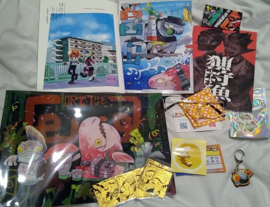
the one with Tao Blu and oonie in the top left (by sachikazerick) I came across by chance and bought because it was cute, featured splatband characters, and also because it all in some familiar inkling language (the last point of which i told the artist as i was buying) when i finally got home and saw the back credits...

SMALL FUCKIN WORLD LOL (i tweeted at the artist afterwards to let him know i came by the table and to thank him for using me and my friend's inkling language fonts!) though truly, i think ardnin deserved the credit more rather than me since he made most of those fonts! ah well, still cool to see more and more fan works using deciphered inkling language. top middle book is a story with some salmonid characters that i havent read yet but im looking forward to it, the art is lovely. top right one was the first thing i bought. the artist is rk_splaworks, whose art i love, and we've been mutuals for a few years and have talked a bit here and there! i was so fucking nervous to meet them in person since my japanese sucks LMAO but they were happy to meet me too and we got a selfie together yippy <3 also havent read their doujin Yet since ill have to rub all my brain cells together and huddle over the dictionary, but i want their oc lore
ok that's all i'll say, next splaket is...june 22. very soon....im already thinking ill. go again. yknow. while im still in japan and all that. i guess ill have to study harder on my jp in the meantime teehee ...i doubt it, but in the off chance anyone following me is going to the next splaket in june lemme know!
#much of this is me cross posting my tweets from the past few days and then some#rassicas speaks#ive forgotten to make a tag for my non-ask original posts so i guess thatll be it#anyway ill get to work on translating that famitsu interview teehee
155 notes
·
View notes
Text
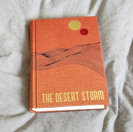
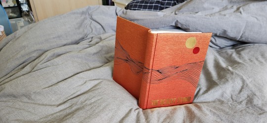
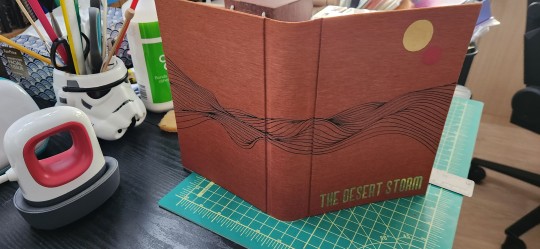
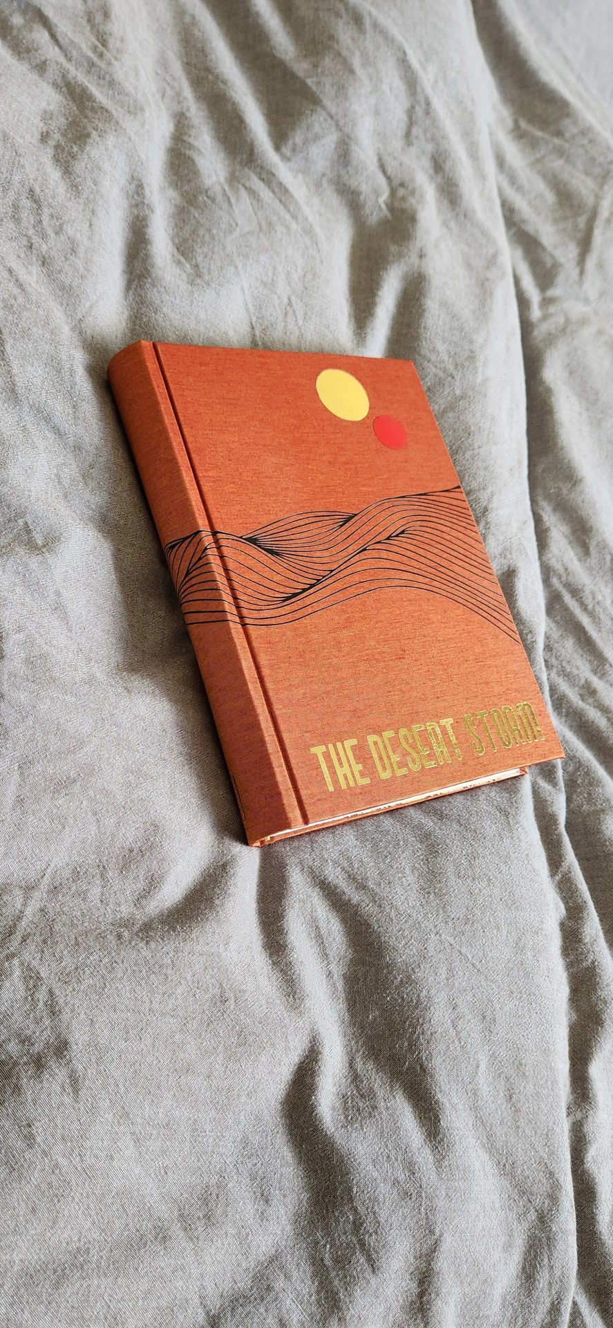
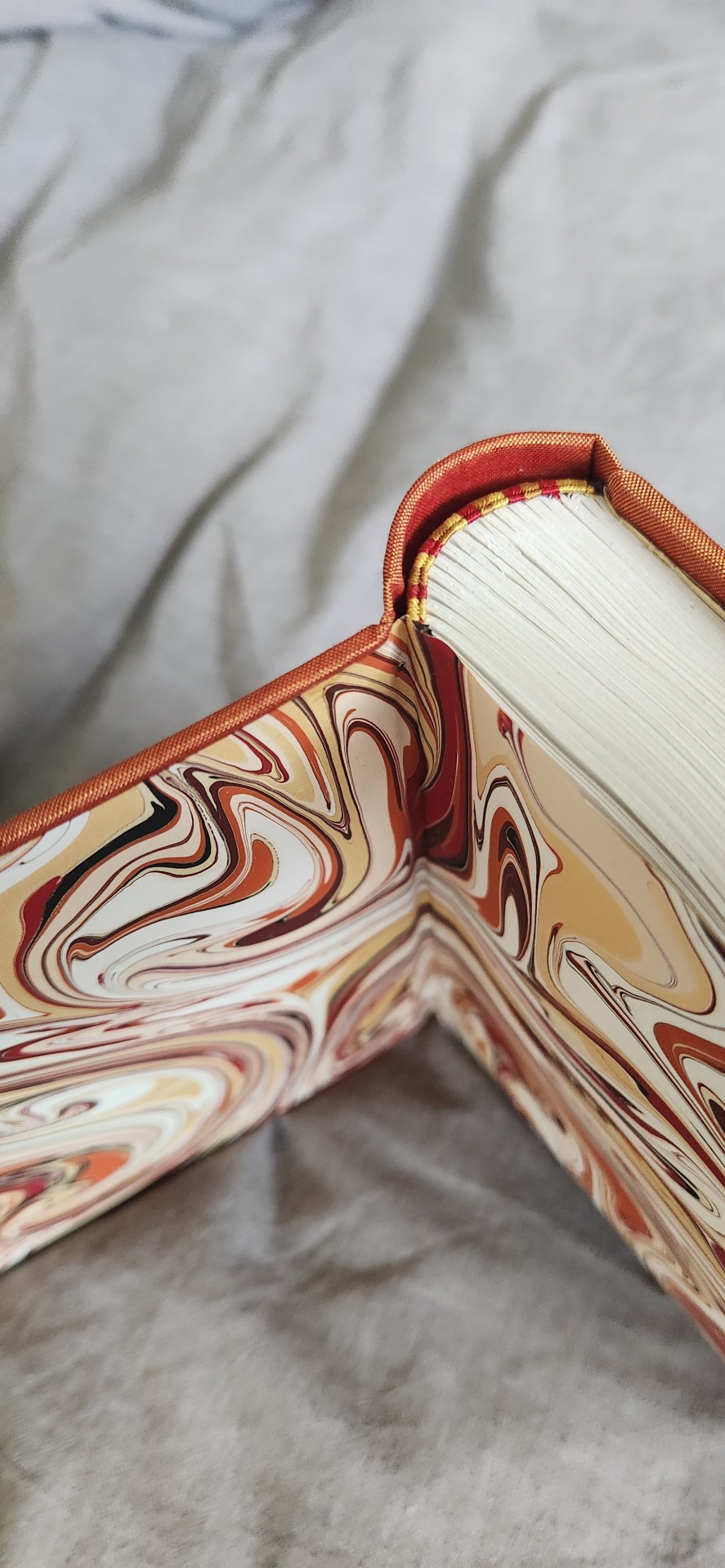
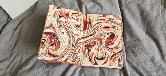
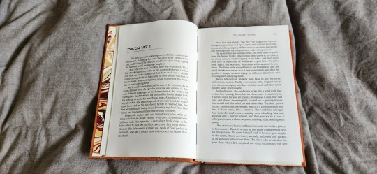
So it's been a while since i posted any books - mostly because i've been hiding my progress like a little sneak.
I just finished this bind last night of The Desert Storm by @blue-sunshine-mauve-morning, or really it's volume 1 out of like ??? 15, maybe. Please take whatever i say with a pinch of salt (I have had 0 sleep for more than 24 hours, and that tends to make me a little very sleep-deprivation drunk a.k.a. unhinged). Okay, on to thoughts! The Desert Storm was foisted onto me by @celestial-sphere-press who told me under no uncertain terms that I WOULD FUCKING LOVE THIS SHIT. Well, I did. This more than 1 million word epic about Ben Fuckin' Kenobi is pretty much god-tier fanfiction. It reads like a goddamn novel. I can never think of canon again without thinking that this good shit should be canon. I read it and then consumed half of it within a week, and I have zero regrets. @blue-sunshine-mauve-morning, i absolutely love you and love your writing. It is the best thing since sliced bread. It is better than sliced bread.
I also had the benefit of @celestial-sphere-press saying, hey would you want to use the typeset? MY GOD, i am grateful. I love this fic, i would have typeset it if it hadn't been typeset but Des did such a beautiful job that i am absolutely in awe and thankful that she and the author allowed others to use it. Look at it - it's so beautiful. I only had to think hey, i just gotta design the cover and et cetera and so the book happened.
Please also check out @celestial-sphere-press 's amazing post here and here, who is the only person i know who's started and is almost complete in fanbinding this epic, and is also making an author a copy of the entire series.
Some stats, if you will.
96215 words || 380 pages
Title font: Ghaomiec
I took some inspiration from starblight bindery's lovely desert scape as well as this amazing cover of Dune which i own. I love that the landscape emanates Dune vibes while being oh so Tattooine - just sand and heat, relentless loneliness and melancholy. This fic centres around Obi-Wan Infinite Sadness Kenobi so it needed SAD VIBES TM, which i tried to deliver in desolate landscape form.
Also thank the heavens for Renegade members, who in a masterful stroke of Group Buy Saves Money, managed to source extra-out-of-production colours of Colibri and help a fair number of us get really cool limited edition versions of bookcloth. I am now a proud owner of a lorge stash of Duo and Colibri of which i am now sitting on like a shifty dragon with a hoarding problem. Good luck getting your bookcloth now, Folio Society, ha ha (gloating)! This particular bookcloth is Colibri Copper which has been wholly stashed for The Desert Storm series. I am leaning on transitioning to Malachite for Rise and Fall when I get to it.
The front cover design was done with a stock image and converted to a PNG, which i then fiddled with and did some HTV magic with. It was remarkably easier to weed than expected. I tried something new and ironed the design on the naked bookcloth first before gluing it to the boards, which was a new challenge in making sure everything was aligned.
Endpapers are marbled endpapers (Renato Crepaldi) which I got from Hollanders, which perfectly fit the colour scheme of the bind. The only hiccup was as I was cutting, I realized the sheet was running in the opposite direction of his usual papers and half the size, and only yielded 3 A5 size endpapers and so my heart went noooooooooo. oh well. i guess i will use it for quartos.
Endbands are my favourite - silk in 3 colours in the french doublecore style (as i was binding this i did not have the mental capacity to handle the difficulty of 4 strands). the truth is i usually only can do 4 when I have higher brain function and am willing to spend 80% of my time unraveling it from getting tangled.
I also forgot to mention I had mild fuck-ups, I got glue on the front endpaper which I had to hastily remove with wet cloth, and the back square is preposterously bad but I'm ignoring it for now.
Anyway, i've actually managed to complete a few other binds which have not been mentioned here as they've all been gifts/ surprises or event books in some form. I am SO EXCITED, also because I am travelling in the latter half of July to San Diego and L.A. and I get to meet some bookbinding friends in the flesh. Renegade is fucking amazing y'all. I am ready to embrace these crazy lads who have enabled me for the last 1 year, even when i'm the solitary (1) weirdo from my country of origin in the server. Also... potentially bookbinding trip early next year??? I am enthused.
#bookbinding#fanbinding#renegade bindery#my books#star wars#clone wars#obi-wan kenobi#ben kenobi#ben naasade#infinite sadness#the desert storm#the ben naasade epic
700 notes
·
View notes
Text
So more sticker designs!
I'm doing this for the first time so I guess I'm just winging it!!


I especially liked doing this one!!! Although the lettering was a pain to do since the type setting of the art app I'm using is kinda abysmal. Essentially I downloaded a picture of a font and then individually traced the letters. I can't use my handwriting since that is a) barely legible and b) Not what I wanted for this design
#ace#asexual#asexuality#ace sticker#ace art#asexual art#lgbtq#lgbtq+#lgbtq art#sticker#sticker design
52 notes
·
View notes
Note
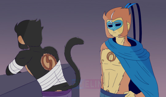
You say third brand, I’m not sure if it was mentioned before or if it’s a spoiler (I’m going through the blog and only saw it being mentioned once and only seeing the chest design)…. What exactly is the branding in the Esau? How badly does it hurt them? :(
Answer:
I was waiting for someone to ask about their brands fhfgnhfg-
It's not much of a spoiler, it's more of an identification thing. And no worries, it doesn't hurt anymore. But it did hurt a lot when they got those. They did get marked with eternal branding iron, after all. :D
Basically, the biggest and first brandmark on their backs stands for "Servant". I guess also technically slave for some, but being a servant would be the generally nicer term. Quite a few have this mark within the palace, so it's not uncommon.
The medium and second brandmark is on their chests and stands for their titles as their Master's "Champion"s. The champion title is like the VIP rank of servants, which does include more direct responsibilities, such as being a bodyguard, personal servant and all that. In return, Champions do get so much more attention and recognition though. They also got more perms and can be put in charge of soldiers like generals. Only a handful of the Master's most trusted have this mark.
*And lastly, the third brandmark is a lot smaller and is basically only available to those who are worthy of being in the Master's chambers. It stands for "Toy". I'm not gonna go into details cuz the position of that one is already telling of how NSFW that shit can become. But there's only very few selected ones with the third mark. This mark specifically is usually treated like a sacred symbol however, so the boys don't like showing it to anyone except their beloved Master.
(*Update from 12/3/23: Due to the recent drama that happened, the third mark is now no longer being considered part of the canon as of today. People can still go the NSFW route with characters regardless. Nothing is being affected by this change other than the characters' designs.)
It's not required to always show either of the marks, but they do come with benefits within the palace. Wukong actually tends to prefer showing his champion mark for the respect he gets; Macaque on the other hand doesn't deem it necessary as he doesn't need the crowd's approval if his Master loves him.
Fun fact: There was actually the idea of having the Reader trail their fingers along at least Wukong's brandmark during the Obedience one-shot, but then decided against it cuz I wanted to let that happen another time. So instead he just got headpets like a good boi.
But generally speaking, literally anyone with the champion marks are very much obsessed with their Master and they love it when their Master places attention onto those marks. c:
Another fun fact: Each symbol is actually a letter from my self-made alphabet font/language I use in basically everything for years. Like, especially now with those mysterious members from the group pulling on the strings... Ehe~
#lmk esau#eternal servants au#esau wukong#esau macaque#esau qna#lmk x reader#lego monkie kid x reader#lmk au#lego monkie kid au#sun wukong x reader#monkey king x reader#macaque x reader#lmk fanart#lego monkie kid fanart#tw: branding#at least the talk/mention of it#tw: brandmark#art
251 notes
·
View notes
Text
there's a lover in the story, but the story's still the same
Ahh, don’t you love it when fear motivates your drawing mood? (not really)
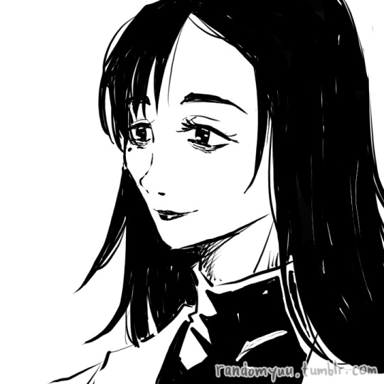
That’s what I felt reading the scene that is drawn below. It’s fear for Yuuji but also feeling excited picturing an emotionless teen!Gojou so here I am. Always down bad for Vox’s Goyuu fics, aren’t I? *sighs*
Welp, here we go.
Title: there’s a lover in the story, but the story’s still the same
Author: @voxofthevoid
Second fic of the series there’s a lover in the story, but the story’s still the same
Pairing YuuGo, NSFW, please read the tags carefully before giving it a read... the usual drill ∠( ᐛ 」∠)_
!!! SPOILER FOR THE FIC !!!
Highly recommend you guys to read them first. Or not, it’s up to you honestly :v
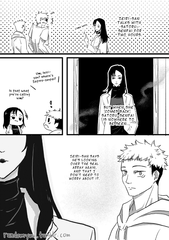

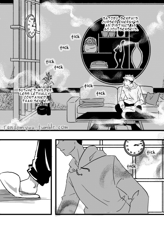

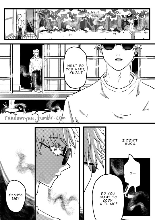
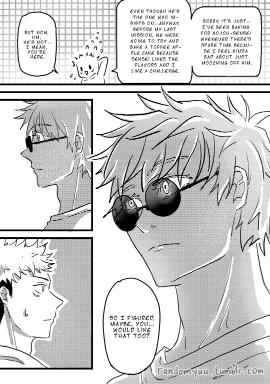
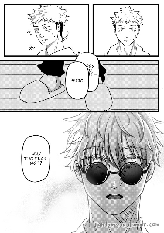
Usually I would gush about the fic but I’ve already done that under the fic itself so I just want you to know this comic is solely carried by me wanting to draw the ticking time bomb called teen!Gojou-post-discussion-with-adult!Ieiri. You could probably guess what they’re talking about :”)
The fear for Yuuji’s well-being started this, but Satoru’s cold eyes kept me going. I can’t get rid of it from my mind lmao
You can say drawing these kind of expressions is my jam ( ̄▽ ̄)
I hope I did Satoru’s emotions justice haha
A bit of my thoughts and doodle below. Unhinged maybe, it’s midnight, I got more work to do after this, and my brain cells are barely hanging on. Haha I'm living the life-
I AM STILL REELING FROM THE FACT I MANAGED TO GET THIS DONE.
There are so many things I want to talk about in the process of making this. But after I typed it out, most of them sounded so unnecessary so I rewrote it a few times. I tried to make this as short as possible lmao
Typesetting and sketching are the roughest parts of this project. During these stages, I kept feeling everything I did wasn’t doing the scene enough justice, and it was frustrating. As I planned this project, I read a few doujins and noticed the font types scanlation teams use. There are so many of them, and each helped convey the tone of each image. Felt like crying when I realised I’m not knowledgeable enough to apply good typesetting, ngl. And then the interior design. Fuck, the frustration is so real. I am absolutely clueless about this kind of thing. Tracing lots of references because I have no perception of space makes me feel even worse. I knew first times rarely create a masterpiece, but I was not satisfied with my accomplishment and the feeling of failing to fulfil my own expectations hurt.
BUT.
Thank goodness most of the things I need to draw are Shouko, Yuuji and Satoru. Because dear g o d drawing them healed me. I found so much comfort in drawing Shouko’s long hair and Satoru’s eyes and drowning Yuuji in an oversized hoodie. The comfort zone of character drawing never feels so real lmaooo
Drawing them was so effective that I can look back at the backgrounds with acceptance. Hey, I did it! Not perfect just yet, but I did it!
Haha I feel like I’m losing my mind. I don’t know if it’s in a good way or a bad way. Guess I do have one or two screws loose.
Only for Yuuji lmao
(nah I just need sleep, or cooling down from the rush of having finished this)
It might come off as a surprise if you’ve only seen my art on Tumblr, but I’ve always preferred to draw feminine-leaning ladies. I’ve always loved drawing their curves, whether it’s the figure, the clothes, or the (long) hair. But I’ve grown to like drawing masculine gentlemen as well with their sharp edges and straight lines, and now my ladies start to look more androgynous lmao
Anyway, I was pretty stoked to be able to draw adult!Ieiri! I… I kind of miss drawing long hair so here have some more before you go on your day ∠( ᐛ 」∠)_
#yuu's art#jjk-fic-fanart#jjk-ship#五悠#goyuu#goyu#5u#gojou x yuuji#I'll see you sometime later#if real life lets me haha#:")
209 notes
·
View notes
Text
Devlog #142
Hi-ho, Wudge here.
Time to talk about these past two weeks worth of work. Haha... ah....... The good news is that there's quite a lot. The bad news is now I have to type it all out. 😭 The things I do for love (for Herotome) amiright.
Note to self I'm gonna have to carefully save drafts of post throughout because, again, it's A Lot.
Ok so, we'll start off with some Mia stuff.
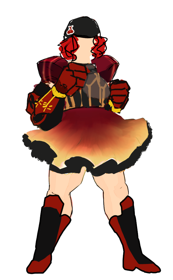
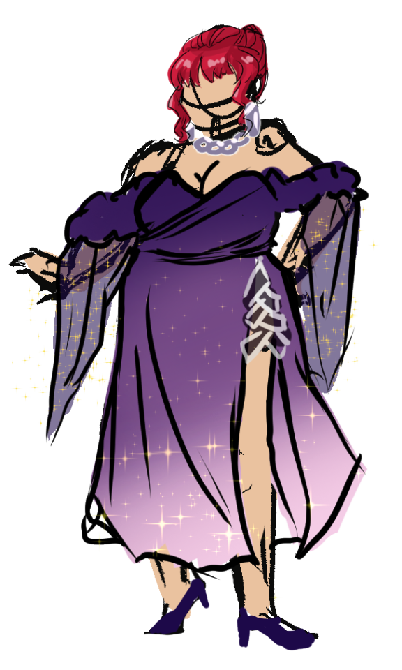
Outfit concepts!! Some of yall may recall I struggled hardcore with her hero outfit, but I think it's finally getting somewhere?? After uh... I allowed myself to use black. :') I had it in my head that Dart is the only one who can wear black-- but how unfair is that?! There's a limited number of color families in the world, characters should be able to borrow colors from each other in accent colors! So, I'm much happier now that I've gotten over that mental hurdle.
On the right is a 'party'/gala outfit. I have a few events in mind where the LIs can dress up and look nice, so this is a concept for that...!
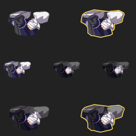
I also made a bunch of these... cut-out images, so highlight her injured hand in-game... ....... Then I realized I could literally just. Show her full sprite and pan it down. Then add a lil spotlight/vignette effect if I damb well want to. :| So uh. I'll be throwing all these out I guess....... It was a learning experience!!!!!! just a bit of a painful one hahaha.
Moving right along, expressions.
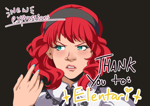
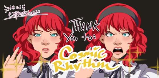
I got through a huge set of Griffin and made some new mouth shapes for Mia! Much to my dismay, Mia's lips are rather more detailed and thus take a bit more time to render..... but I'm getting the hang of it.
I also have been coding in these new expressions for the Mia and Warden scene in the federal center lobby.
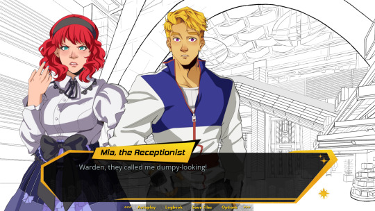
Here's a preview! Maybe I can make a gif of a few branches to crosspost to Ko-Fi...
As for Griffin - I haven't started coding in any expressions yet, but I did set up all his PNGs and can show off the full set here:
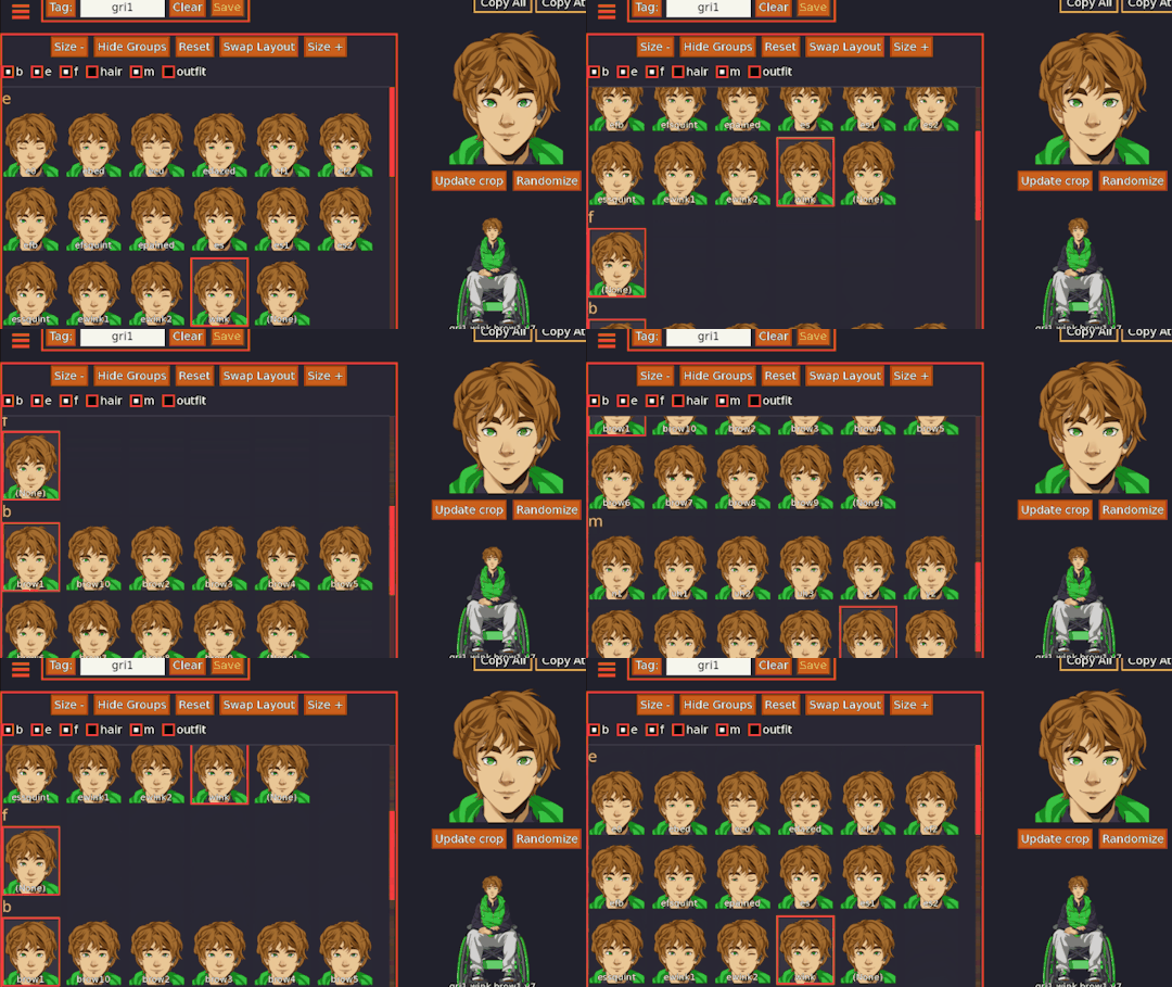
The pictured tool is by Feniks - wonderful, wonderful way of seeing all the expressions at once and quickly converting a specific mood from image into code (which you can see in the lower rightmost corner). I highly recommend it for any renpy devs who are have an overwhelming surplus of character expressions!

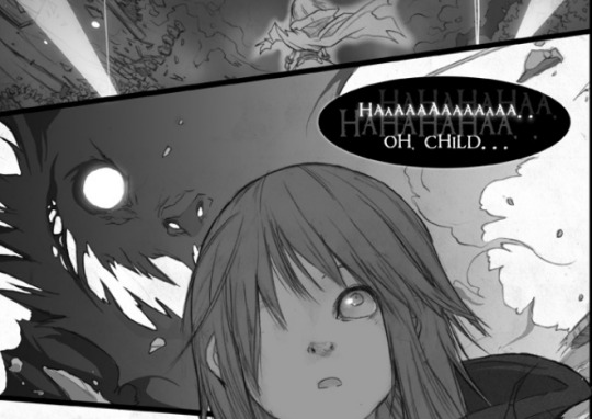
And I experimented with a ghostly text effect (using altered code from Wattson's dripping effect). It's hard to read at the moment and I dont love it - in Herotome it will likely have a proper outline and I might use a special font. It's inspired by this one artist named Endling - back in my teenybopper deviantart days, he had this comic with a big bad wolf character who would talk like this--!
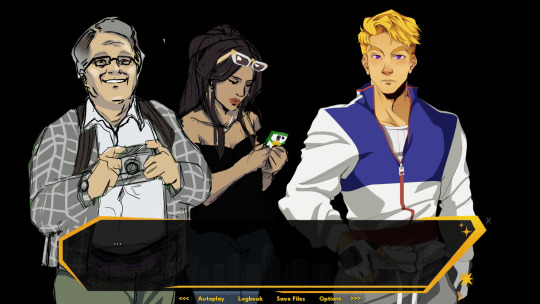
And of course, updated art of these fools (as seen in my last not-devlog last week)
I also wrote.. a decent amount... did a fair amount of outlining/plotting.... and Remnantation and I made progress on a new Griffin CG... I designed some other potential NPCs.......
...... You can tell I'm running out of steam for this devlog, I'm sure. I think that'll do it for now.
Stay safe and keep warm,
Wudge.
57 notes
·
View notes
Text
F1 books recommendations — part 1

By no means I'm a book reviewer, but I like to read and I like F1, and there are so many books that one maybe don't know where to start, so perhaps this will help with the decision.
I'll not rate them, just describe the overall vibe, but I'm gonna set them up against each other, so bear that in mind, that's just my opinion. (disclaimer: I read two of those in Polish, so maybe the takeaway was tainted by the translation)
"Unstoppable: The Ultimate Biography of Max Verstappen" by Mark Hughes — It was a great read, you just flow through the pages and eat up every word. It's compelling, it describes Max and his nature so on point sometimes. It gives you insights into new things, even if you are a fan of the (for now) 3-times WDC. The author is in a league of his own, the way he describes racing, it gives such depth (it helped me with my own writing). This book is the expectation of the rule that you shouldn't write about a driver until he retires.
"Charles Leclerc: A Biography" by Adam May-Nicholls — See the above. The way it was published, the big font to make it seem longer, a lot of quotes — too many of them. It's just a nice summary of what happened till the year it was published. It has nice moments, but overall it just doesn't give you an inside to Charlse's head, not like it could have done, it's a nice memoir of people and places in Charlse's life, but if you're a fan, there's not much in it for you, but it's a great introduction still.
"Aussie Grit" by Mark Webber — The infamous one, the must-read for some (like me). It's a really good autobiography. You get an inside view of the world of F1 but it's a book about Mark first and foremost. I enjoyed his storytelling, even if it was with the help of a ghostwriter. It was like sitting by the fire, stars above your head and listening to a compelling, mesmerizing tale, not void of simple human mistakes. It's his and you have to take some things with a grain of salt.
"How To Be An F1 Driver?" by Jenson Button — I know it's not his autobiography, but I need a pair so, deal with it. The book is, I think the longest of those four, but you never feel it. I breezed through it, despite this one not being in my mother's language. It was such an easy and fun read, but not without its depths. It was so true, with so much meat in it. Just… Great. No notes hah. You just get immersed in it, despite the fact that you only read about one experience of many. Jenson entertains you, gets philosophical at times, but it all with the great description of the cars and places and how the F1 circus works, gives you that perfect mix. It's a nice drink that goes down well. I can't wait to read more of his books. (I need to incorporate two quotes from it, because they made me pause, so: "In F1 everything is a selfish act until you stop being a driver, and then it's not.", "I love the fact that they're not making the car beautiful, to make it beautiful, they're making it beautiful because that's how it looks like when you design a car aerodynamically.")
I hope I gave you some direction on what to read first <3 I have plans to read more (Newey's, about Kimi, about Ferrari's history) so, stay tuned for more, I guess?
#f1#formula 1#book rec#charles leclerc#max verstappen#jenson button#mark webber#red bull racing#ferrari
38 notes
·
View notes
Text
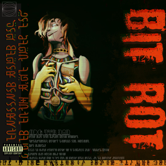
Sad she only got one album out before everything went to shit, but what's a girl to do?
This is a fake album cover for my dnd character, Helvia, and her fake band THREAT DISPLAY!!! Context for this piece and Helvia as a whole under the cut because once I start I can't stop talking about her <3
SO the campaign hasn't started yet, but Helvia is my character for a science fiction campaign. She's robot!!! Well I guess that's obvious now. BUT the basic gist: Helvia was manufactured as an industry-controlled and maintained electronic "punk" singer. When the project ended up making no money, everything related to it (including her), was abandoned. Three years later, she wakes up out of stasis with no clue what happened, an insane debt, and a failing memory. You will look at her !! Her full name is Helvia Cardinalis. This is just a genus of mantis it doesn't have any special meaning I just like bugs <3
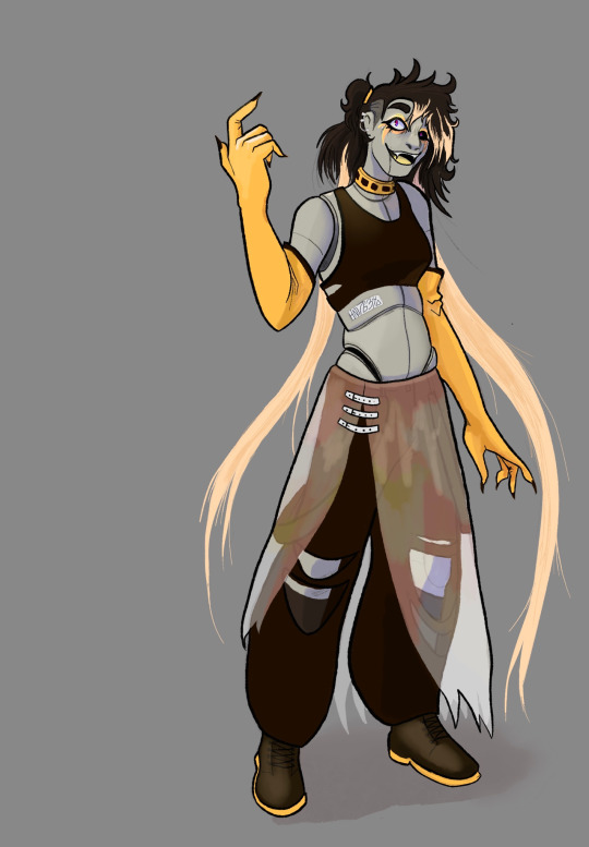
-she has generated "background" memories of an entire life, but there's no telling which of those are real. I don't actually know which of them are real. My dm does!!! We'll be finding out together!!
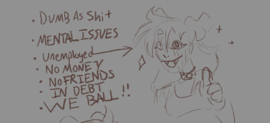
-sometimes she uh. Doesn't know basic information. Whenever something she should reasonably know gets brought up I get to roll a flat d20 to do a "memory check", the checks getting harder the older the memory is. When she fails, she gets to lie or change the topic etc because she would rather DIE than admit anything is wrong with her.
-the album cover is kind of an intentionally really poor introduction of her character. She's more silly than anything? The entire project was meticulously micromanaged by the company that made her. The "novelty" and aesthetic of having a construct as their lead took forefront in its advertisement. There were two other members of THREAT DISPLAY!!! But she has no memory of them because they were considered comparatively SO unimportant to advertising and to her that they have gone... forgotten.
-Helvia herself is. A real character alright!!! Based entirely in what a corporation thinks a "cool alternative girl" is, she's impulsive, selfish, and just. So fucking stupid. She's firmly a "might makes right" type of person who was designed to appear counterculture but still ultimately serve and be fine with the status quo as long as it benefits her. She's going to do anything that grants her immediate satisfaction, and is obsessed with maintaining her image as "cool and above it all", even as her body is actively breaking down. She easily falls for flattery.
Notes about the piece: yeah I downloaded and used splatoon fonts for the nonsense text. I think I typed gay sex like twice I'll be real none of it translates to relevant information. I think there's something in there about how I hope it came across as an adequate parody of machine girl album covers (my main inspiration). The composition of the piece itself is meant to feel kind of skeevy and exploitative because well. It is!! It's drawing the fine line between 'wow this is so cool and counterculture of us wow!!!' and fetishistic? Etc etc missing the chestpiece as an analog for putting a woman topless on the cover. There's actually a separate sketch I did as a canonical "mock up" for the design that originally included the other members, treating them like props because they're so unimportant, before they were scrapped from the final design because they were That Unimportant.
Notes on Helvia's design: I pulled from a few sources for this!! Notably I looked at so many pictures of that band Tramp Stamps. Remember Tramp Stamps? I don't. They're like the direct analog I think to her. I also pulled from vocaloid designs!! Impractical, cool, kind of "anime" feel. This comes across most in her hair I think which is just so beautifully impractical. The yellow gloves are so stupid important to me actually they're kind of ugly but it's the only way her name ended up being important: helvia cardinalis (mantis) is Bright Yellow and raises its 'arms' in its threat display, which I wanted to pull from for potential posing of her!! So. Bright stupid yellow gloves <3 they're an easy way to tell her character apart too & mean I don't have to worry about drawing all the nonsense on her arms. The translucent skirt also comes from the mantis, sort of pulled from its wings!! Original concepts for her included synthetic skin rotting away but her design was already more complicated than I normally go for and we ultimately ended up realizing her being openly and visibly a construct was important for her image in her music career so it worked out well! She is at least missing an eyeball :] doesn't affect vision since the mechanics are still in place but I guess she just gets that fun sans glow socket <3 her outfit is meant to look simultaneously cool, vaguely expensive, but also super super cheap?? Overall I'm happy with the fact that she looks both cool and really stupidly impractical in that classic 2000s deviantart oc way <3 it's important to me! Ultimately:
#Palart#robot character#robot art#robot oc#my art#character art#art#dnd character#dnd art#dnd oc#oc: helvia#cw suggestive#? pretty. idk I've stared at this too long to know anymore#described by me#synth.solo#I think I've talked about her before a little bit but <3 she's just all the tropes I like jammed into one character I refuse to apologize#accidentally started the draft on this blog instead of my art blog so oops guess it's here now!!
72 notes
·
View notes
Text

Hi again. If you've been around a while you're probably going to be like "Em, again??" But guess who got sick for the 6th time this year and this time it was a full on chest infection!! It has been three weeks, and somehow I am still Not Free!!
Anyway, BA fell to the wayside this month because it was Velox Fabula time and I've yet to miss a Velox jam (also...chest infection). I also needed to get my sudden and newfound Pirates of the Caribbean obsession out of the way so! I made a short pirate visual novel for the jam and I'm normal again. I also released the prologue of my side IF To Taste Sweet Silver (@sweetsilver-if) just to have it out. Feel free to check it out if you want, but it likely won't be updated for a while as I'm shifting gears back to BA for September!
I don't have much to report but:
UI update should be out in the next week or two depending on how I'm feeling. It won't look like much to y'all since it's more for my sake via cleaning up the code LOL but there were things added (friendship indicators, open dyslexic font option, character page updated, stat page updated, glossary page added) I'm not a graphic designer but it's better organized I think. There won't be an Official Post about it because it isn't new content, but I will make a small announcement when it's out. It'll also include the originally deleted Lars/Zoe/Nevio lunch scene in Chapter 2 as well. Sorry this is taking so long, I just really struggle with the coding side of things which has made the process slow.
Writing in August was also slow, and honestly, I think I really needed those few weeks off not thinking about BA. My inbox being very quiet helped as well, so I really did take a real break from BA. When I opened up the writing doc, I felt a whole lot better about working on BA again, and we have hit 100k words finally!
Anyway, I don't want to lament much, but I did have a personal goal of releasing up to Chapter 4 this year which obviously is Not Going to Happen. It honestly sucks I got sick so often this year because it cut into so much time for creative projects, be it BA or anything else.
I'm not really going to be hard on myself for it, though. I think releasing 3 chapters this year considering everything that kept Going Wrong this year is actually pretty good. I just think its annoying when I know I could have done it but the universe said no instead akfjalfa Anyway, I'm not sure when Chapter 3 will release but I do have a good feeling about September and I think I'll be able to at least get a decent chunk done this month!
Finally, September marks the one year anniversary for this blog and October marks the one year anniversary of BA releasing!! I feel like I literally just started writing this, the fact it's September already is wild.
I was going to do art commissions, but due to surprise car issues, I don't really have the money for that now (next year for sure though!!), so I was thinking of maybe doing character Q&As to celebrate? I've also seen some authors do raffles, but I'm not entirely sure what I would raffle off? Maybe personalized short stories with readers MCs if there's interest in that? I'm not sure yet, but I have a month to figure it out lol
But also thank you to everyone who has followed along!! It's been a really fun time both writing BA and on the blog. I know I say this a lot, but I'm really glad this is such a chill place. It's nice for me the author obviously, but it's also nice because I always want the spaces I have to feel like safe places for others as well so! Thanks again!
Lastly, I normally would end on a little snippet or preview but since most of what I wrote was just the two different openings, I feel like I have nothing fun to tease (or maybe I'm too picky about snippets idk). Hopefully Zoe's bday post tomorrow makes up for it, and I'll post some snippets later in the month instead!
Thanks for reading!
#BA: updates#also sorry if this sounds low energy this chest infection has made me So Tired#and if the raffle sounds like something yall would want let me know I'm very bad at ideas aflakjsfajlf#(if you have other ideas lmk too)#the character Q&A I think is a for sure though because it sounds like fun
47 notes
·
View notes
Text

it's september 1! 😩
so i said that i planned to continue trying to write an average of 500 words a day for august, but then i spent the first half of the month feeling depressed because living alone is deceptively difficult 😭 so i gave up having a goal to focus on self-care. thankfully, i'm in a much better headspace 💕
so in august i think i added around 2,000 words story-wise (i didn't keep track in an attempt to not feel so bad about a tiny number 🫣), but i also decided to add a major choice into the first plot beat of chapter one and that set me back a little. i also did some coding and moved my draft from gdocs to scrivener for the corkboard and color coding. in the end, the rest of my writing has mostly been spent on exploring the shared backstory between mc and all the ROs.
definitely the most fun i had this month was answering all of the great asks sent to me. i have a few more asks half-answered in my drafts so uh i guess expect more essays, and once i have those finished, i'll answer the newer asks i've got. thank you for sending them in 🥰
(i'm saving the nsfw asks for after demo release, which i'm planning to be the full first chapter. plan is still fall! but probably late fall.)
for those curious about the change in the chapter, you still arrive home, reunite with your brother, and spend some time with one of your dads, and then that's where there's a shift. i moved the reminiscing for the next plot beat when you arrive at your family's solstice party. instead, i decided to throw in a really fun decision that i won't spoil 🥰
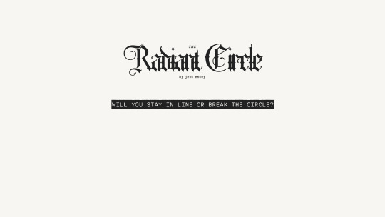
coding-wise, we've got a profile now. also made some more unnecessary design decisions like changing the font and adding more colors. i love vibrant colors, but i know they're annoying lmao i'll definitely include a black/white theme.
here's a preview of what i've got so far, though same caveat as before: any of this design could change between now and the demo. some of it already changed in the last month like twice. i am indecisive as hell when it comes to aesthetics...
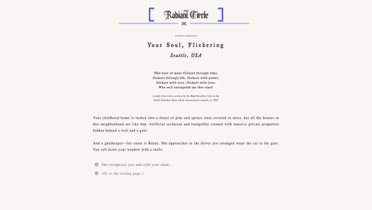
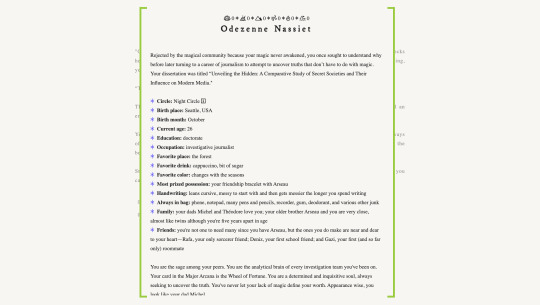
(the name on the profile is from a french band called odezenne that i really like if you're looking for a random recommendation.)
plan for september is to go back to writing an average of 500 words a day at least for the first half of the month. unfortunately, i have to work on my dissertation as well and the academic year starts near the end of the month, which means i'll be busy with teaching/grad schooling again. that'll slow me down for sure, so i'm sorry in advance.
ok that's all. until next update 🙃
#radiant circle if#rc update#its me jess#im waiting for a different design idea to strike me but so far this one has stuck#im positive in a year the only things remaining the same will be the fonts....#but i will always love the colors so trust these'll be on a theme for sure lololol
20 notes
·
View notes
Text
Okay, the Cybertruck logo is hurting my brain.

I feel like I am looking at a magic eye puzzle and hoping if I stare long enough I can recognize all of the letters.
I finally got so frustrated that I went into Photoshop and isolated the characters so my brain would stop melting.

The lowercase B was part of the issue. And that E is really odd. I thought that was part of the R, but I double checked and that is how the E looks. And the "uck" looked like a V with two Ks growing out of it. It read more like CYbERTRVKK.
I get wanting a cyberpunk graffiti aesthetic, but if this is going to be an actual logo for something, legibility should be a design priority.
Like, I can actually read this and it still accomplishes the aesthetic goal.

I guess I shouldn't expect more from a man who chose the new Twitter logo from a free font website.
82 notes
·
View notes