#i feel like it's obvious my favorite part of the art process is lineart
Explore tagged Tumblr posts
Text

taking a moment to appreciate our gorgeous girls imelda and natty ❤️💚🦁🐍 (and taking a moment to appreciate this lineart.. even I'M impressed..)
standalone lineart ver. under the cut! 🎨

#look. i ship natty with garreth and imelda with poppy BUT#hear me out on this ship?? like i feel like the dynamic would be so interesting!#sorry i'm a multishipper so i think about ALL the dynamics hahah#but anyways. they're actually really good friends in milena's canon universe!#also CAN YOU BELIEVE?. I DID THIS WITHOUT A REFERENCE?!?! i'm so proud of myself#i feel like it's obvious my favorite part of the art process is lineart#hogwarts legacy#hogwarts legacy fanart#hogwarts legacy art#imelda reyes#natty onai#natsai onai#sparxyvdoodles
176 notes
·
View notes
Note
Hey bean!!!! I love your art so so much and your comics fill me with joy!! Would you mind sharing what's your process to make them?
Helllooooooo ty!! Of course!! Tbh it’s pretty loosey goosey and procreate isn’t the greatest program for comic building, but I manage lol. I usually start with the dialogue (my favorite thing to write!) which may initially be written blearily in bed at 3am in my notes app or directly onto the canvas. I usually build scenes based on the dialogue, which I’m sure is obvious in hindsight since most of my comics are just long drawn out arguments LOL. From there, I do a very rough sketch/storyboard to get the idea of the page down and how I want the panels to look, expressions, movement, etc. I’ll use a piece from queening the pawn act 2 part 2 as a simple example:
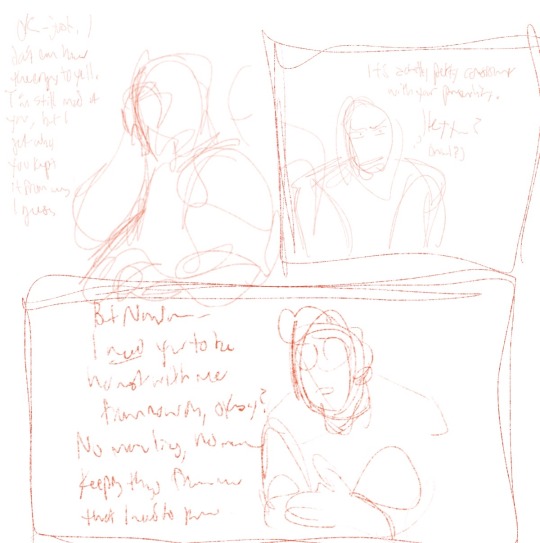
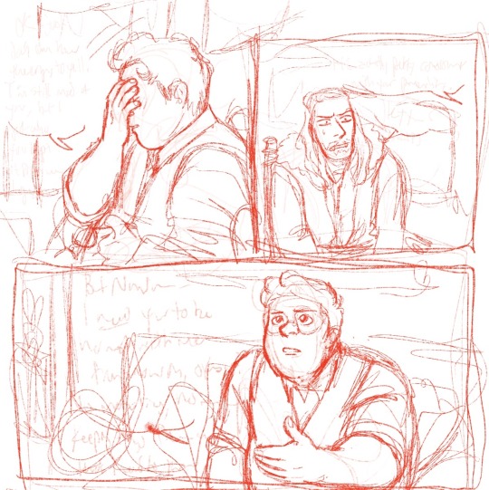
I primarily use the 6b pencil for these two stages. Very rough!! Then I turn the opacity wayyy down and do a cleaner sketch over the top, nailing down more details and expressions. This is also where I will use pose references if needed and warp the lines if I need to make something bigger/smaller (bc I don’t have vector layers and they will get blurry once I resize lol). I also usually add the dialogue text at this stage so I can refer to it without having to open up and squint at the barely-there storyboard layer lol. (More under cut, I am not known for my brevity)
Now I can do the lineart (studio pen!) and draw the panel boxes (by hand like a loser using the monoline calligraphy brush). I do the panels after the lineart so I know exactly how to size them for the characters and what I might be cutting off. I do the background lineart after so I don’t end up drawing more than I need to outside the boxes.
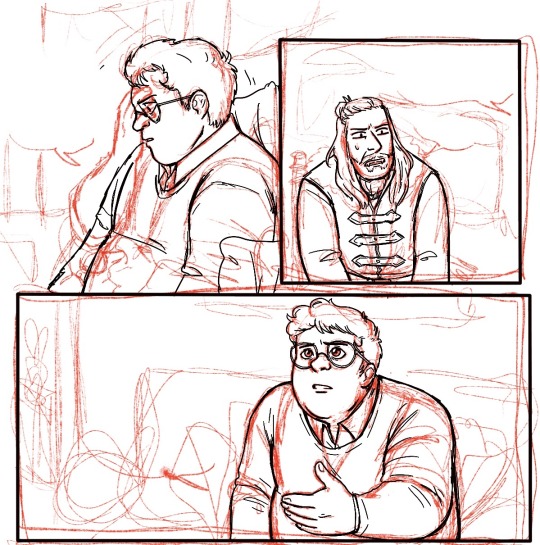
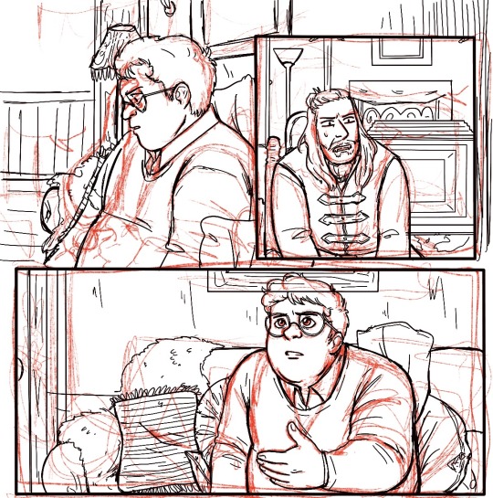
You can see at this point I decided to change Guillermo’s position in the first panel, having his arms down rather than up and removing his glasses - the angle of his left hand ended up being very finicky and I decided I wanted to see his expression (and not worry about his glasses immediately reappearing in the next panel lol). I can now add the background, which I either erase around the characters or use a masking layer on (if I have room for more layers lol) Then I start coloring, primarily using a very plain no-pressure paint brush (custom, for to save my wrist) for base colors and then build on patterns from there, changing layers as needed. I add my cheek color at 50% multiply, pop on the dialogue bubbles, and that’s pretty much it!
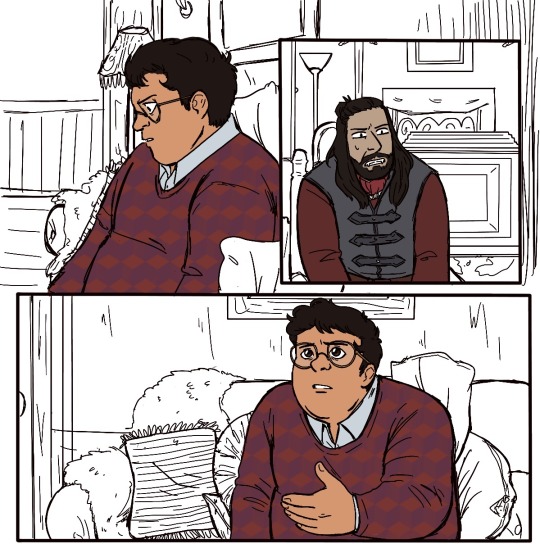
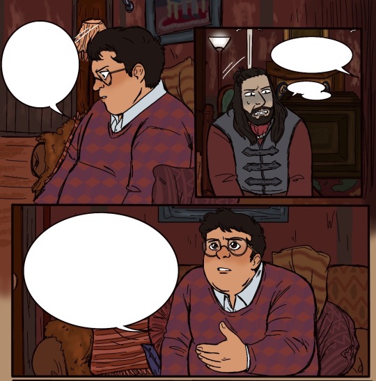
Very simple shot-reverse-shot scene, but my process is pretty much the same even for more complex stuff like
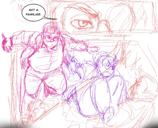
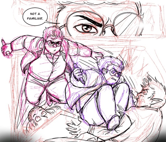
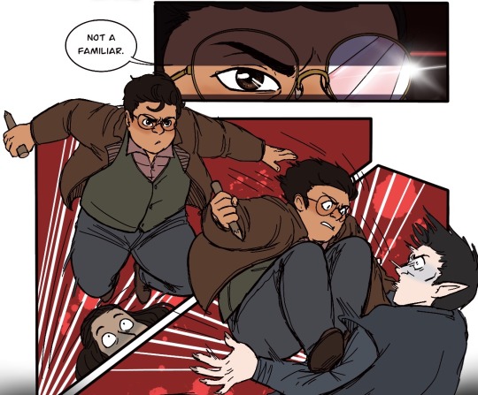
I’ll play around a lot with effects and background and lighting if I feel like it or if I feel the scene demands it (like the glasses panel - the Tarantino eyes and the glasses flash add to the dra~ma lol), and one thing I know I need to work on is flow! My instinct is often to expect your eyes to go left to right, down, and left to right again, but it’s really pleasing to have something to follow with your eye -like dialogue boxes. In the above you can see how I warped the panels and the angles of Guillermo’s attack to try to make it more exciting to look at and have a smoother flow. Def better than just two rectangular panels on top of each other, but I could have gone way harder on the angle of impact. Always learning and growing!! I just run out of room so often bc I hate using different canvasses for multiple pages, I feel like I lose the flow if I can’t see them on top of each other lol.
ANYWAY. Long fucking post. If you want to start drawing comics my advice is to Just Do It. The more you do them, the better you’ll get and the more fun you’ll have making them!! I never ever thought I would be the kind of person who does longform fan comics (we love you reapersun), but here I am having a blast lmao. Hope this answers your inquiry even a little bit, I’m afraid I am both long winded and extremely undisciplined!! ❤️❤️
50 notes
·
View notes
Note
who are your art inspirations?
Oh gosh, a lot of people. All of my artist friends and mutuals inspire me pretty much every day, but I can't list em all, so ,,, here's some less obvious answers!
I'd say it's mainly comic artists who can consistently do super loose and fun sequential art that feels fresh everytime, with the occasional illustrative piece. Artists with fun interesting shading styles or somehow no shading at all, yet still managing to make absolutely captivating pieces that feel rendered in comic form, while not looking like "too much" or too polished.
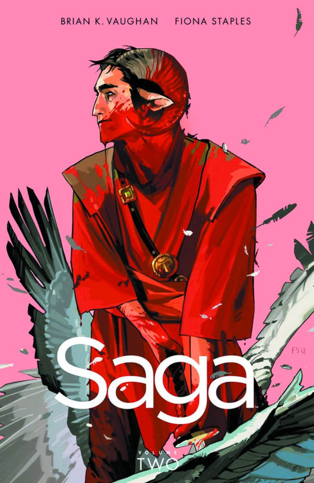
^^ First artist that comes to mind when I'm asked about inspirations is the visual mastermind behind Saga, Fiona Staples, her stuff just itches my brain SO right because it feels really… real? Despite the stuff she draws being absolutely crazy shit, the expressions and looseness of it and just the raw feelings is so cool… I appreciate how her illustrations still look like her sequential stuff, it's always very "in the moment" ykno. It's hard for me to read Saga in a single focused sitting because I just end up distracted with art inspo the whole time HAHA-

^^ As far as art styles go, I'm well aware of how much I've taken and learned from IncaseArt, which is kinda.. Funny. Don't look him up if you're a minor lol. If you recognize this No You Don't. Regardless I absolutely love how he draws diverse people and faces, the way he renders skin, hair, backgrounds,,EVERYTHING,,,, There's a lot of nuance to his style that I've subconsciously started using in my own the past few years. I don't know how he does it man x.x He understands colors SO well ahghghghg

^^ Feel obligated, but reluctant, to say SarahDraws, she's had some crazy bad controversies !!!!WHICH I AM BRINGING ATTENTION TO HERE SO DON'T GET MAD AT ME!!!! but I'm still absolutely enamored with her art. Gotta give credit where credit is due, man u.u But, seriously, even though lineart is my favorite part of the process, I envy how amazing she can make any piece look with her insane sketchy lines, I genuinely don't even know if she does a sketch beforehand or just cleans it up--it looks so beautiful either way. Love her dark goth imagery paired with a super bright accent color WAAAGHG
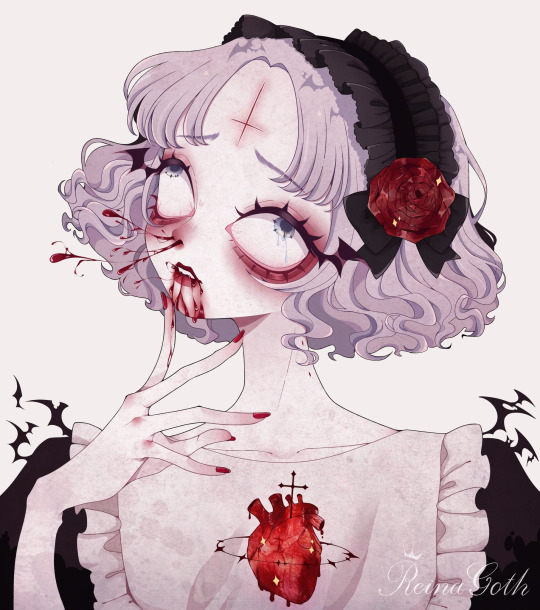
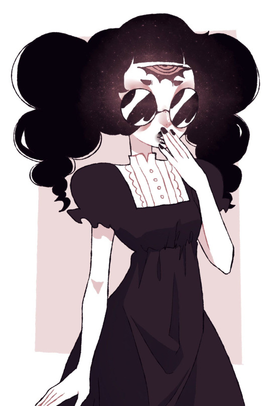
^^ Growing up I know I was inspired by a lot of...erhm ... Traumacore and guro artists DollieGuts and ReinaGoth, but how much their style ended up sticking to mine,,,I dunno! You can kinda see it I guess? I was pretty innocently into artists of this scene but ultimately shied away due to a phobia of mine LMAO. Still love their work though! I know DollieGuts is the reason I line with such a crunchy brush, considering I used their brushes on Sai for a few years straight 🥴 (also love how much they've been playing around with their style lately...mwah. love to see an artist breaking out of their comfort zone)

^^ It goes without saying I get inspiration from a lot of fandom artists, too, Wilddaggers and Nenanugget definitely come to mind,, I feel like they both use super satisfying colors and a lot going on despite not having full shading, which I hope to achieve so badly.
Thank you so much for the ask, and sorry the late reply ❣❣
#oh hell naw snelly did not just point out 3 problematic people and say ''art inspo''#idk if ill delete this or not. i feel like im just reposting ppls art..#dont reblog#ask#junes1#blood#gore#long post
33 notes
·
View notes
Text
thank you teresa and soph for tagging me for 2020 Creator Wrap: Favorite Works
Rules: it’s time to love yourselves! Choose your 5 (or so) favorite works you created in the past year (fics, art, edits, etc.) and link them below to reflect on the amazing things you brought to the world in 2020. Tag as many writers/artists/etc. as you want (fan or original) so we can spread love and link each other to awesome works!
no particular order lol. wait also i didn’t quite follow “favorite” i suppose, i like, judged by Significance. but in a way that was still plenty subjective, so
tayston kiss on the Mouth - self-explanatory like of course it was crucial to draw a Tayston Kiss and i finally got around to it. also when i opened it now it was like “oh nice that’s cuter than i was remembering it even” lol. rly enjoy taylor here too like them in a tee and i like that they’re leaning back a bit but w/drawing their forearms/hands where i did it feels like they’re pulling winston in and i’m just overall like “nice that turned out well” @ drawing them here. i also personally enjoy the Blush Patch drawn in one linear stroke between them. it’s fun to try to have that essential detail be both Soft enough but also have some geometry to it b/c i’m always On That
riawin kiss on the Mouth - same thing all over again lol of course i had to draw it. and it started with several different failed attempts which was annoying but then i got this one in one night and it works well enough. also has a fun clothing detail in rian w/a hoodie (of winston’s) and once again i draw the hand-on-jaw l’intimacy and i think it Works Well again b/c why wouldn’t it, classic. also i’d been intending to draw the Lines detailing rian’s hair curls rather than silhouette and that was pretty fun to just jump into. oh i did the same thing with the Blush also, s/o to that. and the fact that there Is that height diff as depicted here....hopefully artistically successful in having you Think About It
tayston embrayston Cuddling - i think the first proper Fanart Of Fic? so that’s crucial. helping put the essential tayston ideas into the world and hopefully helping put People into Reading Said Fic, i’m glad this turned out to have enough of a relaxed vibe to do the concept’s written execution some justice....this was also just a success of “the colors i put down originally managed to be really Incongruous palette-wise” and i had to wrangle that situation with some added Layers lol but now they’re soft and nice i think, a much more Congruous pink-purple and i’m now remembering i struggled a lot picking a Solid Bg Color even though now a pale yellow seems like an obvious choice, s/o to the little border highlight around them i like that too....things turned out solidly here....enjoying the Geometry going on re: winston’s sleeve lol
agtikbi reprise - again i think it was Important to have done something for this absolutely iconic bit of media, thank you so much obcr for including this track. did a bunch of coloring for it (ft. many purple overlays as usual lol but that was always the plan) and the lineart i knocked out pretty fast w/o worrying about editing it super hard but it turned out solidly which is always a gift. really this was one of those “yeah it takes a while but i make pretty consistent progress and just knock it out in a couple of days” works ft. a decent amount of detail and that’s always an Epic Win and again i love agtikbi reprise so much so it was Very Good to have officially done something for it. also i’d been meaning to draw jeremy again for eons so that accomplished that goal too
monthlong riawinning - the opposite experience but also I Guess its own kind of win, where drawing is not quite as cooperative and one thing takes me A Month where it’s v much not consistent progress and i Do edit a lot which has pros (looks kinda fancy i guess) and cons (sweating details unnecessarily / overthinking or second guessing stuff / forest for trees or whatever / it takes ages and was it worth it....) like when i started with the Lineart Layer i was like “uh oh i’ve Cleaned This Up a lot but there’s already stuff i like too much to Restart this even though i’m not even close to halfway done yet” and yeah it took me ages to finish with lineart that’s been entirely Cleaned Up but then hey, you get this one thing with Completely Exhaustively Edited Lineart....i’m very Particular about like these self-imposed geometry rules re: lineart / shapes according to my own ~aesthetic sensibilities~ and stuff so like, it’s not even just a matter of Are The Lines Fairly Uniform Width / erasing stray marks / making sure the lines are all Closed and stuff, and even w/ the finished product it’s like “oh i could’ve connected some lines in rian’s hair for more Flow or moved this thing over by a few pixels or w/e,” isn’t that always the way though....it’s fun to have 1 Thing from this year v polished though. and i like the riawin contribution of “what if winston went down on rian and then there was this Snapshot Of Affection afterwards ft. an embrace and a kiss and the love language of tenderly feeling him up in the process” i was like “is this all Obvious or am i being too coy” and i was being too coy but here come opportunities like this one right here to make the meaning clearer i hope. that’s part of this pic’s Importance as well lmfao. the content of it and all
(everyone is tagged i think lol)
#now the cheating zone of Honorable Menchies#Winston Looking Sadly At His Phone. implied benston! colors! lighting 4 once! composition notebook! his Expression is good i think!#winston the autistic quant bicon moodboard! further Self Explanatory Importance. s/o to having a usable Winston Pic now/like other pix used#Dollar Bill Harassing Winston Video: what could be more transformative than getting some fun out if that. handful of well timed moments lol#Are You Bi(lingual). jokes. prescience (cassandra). bisexuality. my 1st formal attempt drawing rian & turned out well. love Tiny Winston#Riawin(ston Billions Gets Pegged): obviously! a lot of care put into it obviously! i am V happy w/a lot of the details around winston's Head#and then of course for similar reasons Tay(win)ston Billions Gets Pegged. the colors there are Chefs Kiss & again love how tay turned out
4 notes
·
View notes
Video
tumblr
This is an animation I did for a self portrait project in my drawing class. There’s a couple things to explain, especially if you watched the video before reading this description. My intention with this animation was to show my process for working on a project. The project I’m working on can fall under animation stuff I do for fun, or projects for school (which is why I’m working on both my computer and a giant sheet of paper). The music in the background is an instrumental version of the second theme song to the anime Bakuman that someone made on Youtube (and by “made, I mean distorted the sounds so the voices are edited out for the most part). I haven’t seen Bakuman, but I’ve read about a fourth of the source material, and I know the series’ main theme is wanting to achieve your dreams. So, I thought I just use that and go for a similar vibe.
I intentionally kept myself from seeing Bakuman’s opening animation for the first time since my junior year of high school in order to avoid mooching off already established imagery. I also planned on singing the song, and wrote lyrics that would flow better in english at one point, in order to mirror how a lot of teenagers used to make ametur covers of their favorite anime themes. Thankfully, I realized it was a VERY bad idea, that would shift the focus on the video completely. Also, the two thirds of this animation was made in the last two days. On the night of October 23rd, I only had the rough version of what I wanted to represent. So the lineart isn’t the cleanest, and backgrounds are very simplified (for the lack of a better word). Although I did include a small detail where objects I payed attention to had a broader range of color. Two long nights were spent trying to meet the deadline, meaning I’m only partly satisfied with this. Oh well, you can’t win them all (I am working on two separate projects for another class along with this).
As I said earlier this animation shows my process when working on a project. I start working at a decent pace. Then at some point I stay up way too long into the night, and my sleep schedule is messed up for about a day and a half. I text with my brother in the video, but I text with other family and friends as well. In the video I’m texting while getting hot chocolate from Dunkin’ Doughnuts the morning after drawing for a project. The morning after I stay up way too late, I’m usually tired and over dramatic about getting out of bed and getting the day going when I’m waking up. Sometimes I think about not wanting to let down family and friends by just laying in my bed and doing nothing after making it to college. Not that I’ve done that, but the thought of doing that is enough to motivate me to do the opposite. Then it shows a silhouette of myself growing up and my art growing up with me. The screen at one point transitions by becoming a punch of separate pages that slide to the top of the screen, and another transition is made from the top of a pencil I’m holding glowing so bright it envelops the entire page. The section near the end where I shed a single tear (I would have included more tears, but time restrictions wouldn’t allow for such) is supposed to represent how thinking about experiencing all of the things that influenced by wanting to draw and the fact that I ended up in the art school of my choosing because of those influences gets me emotional once in awhile. I wanted this to be obvious as it could be, so in an attempt to do so, I placed this part directly after the section where it showed my old art. After that, the animation ends with me well rested, working another long session on the project until it’s finished (this process usually feels like a rush to put the finishing touches on a project so I can be as satisfied as possible). The last thing we see is my signature (at least my signature when I don’t feel like writing my name). Usually I’d include my signature on the same page as my work, but since I’m turning in an animation instead of a drawing, I put my signature at the end instead.
I felt this project was a mixed bag. I feel I had some good ideas, but I ended up without enough time to flesh them out properly. I can live with the sketchy linework and limited visuals, but I wish I could have made the presentation feel less rushed. If I ever do another animation for an assignment, I’ll definitely take the time to plan it out better so I don’t have to rush to finish two thirds of the project over the course of two days.
0 notes