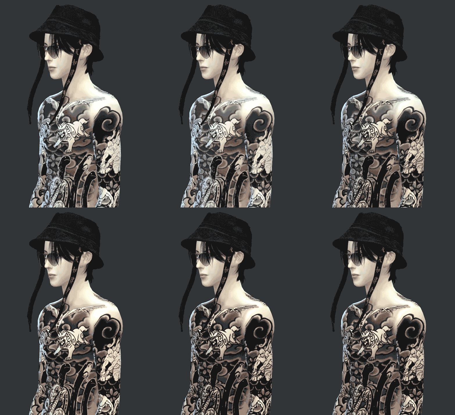
#i downloaded this image from google and it was a screenshot from a gif so the quality is sooo crunchy
Explore tagged Tumblr posts
Text
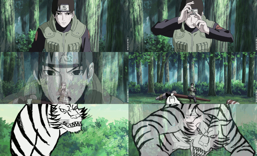
Sai Yamanaka Modern lookbook + Beast Scroll tattoos (TS4 CC Download below)

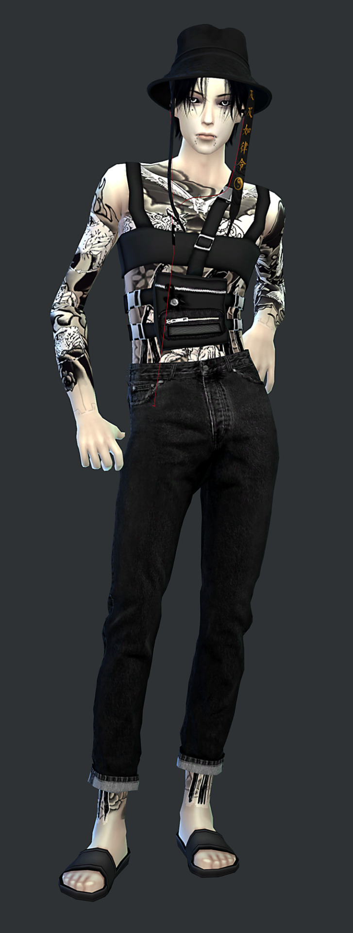
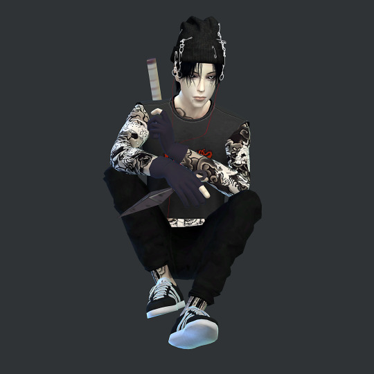
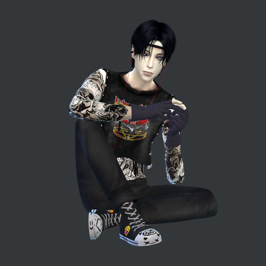
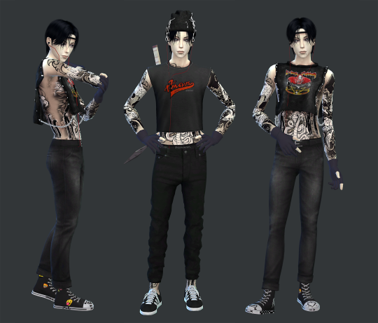
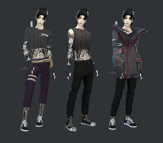

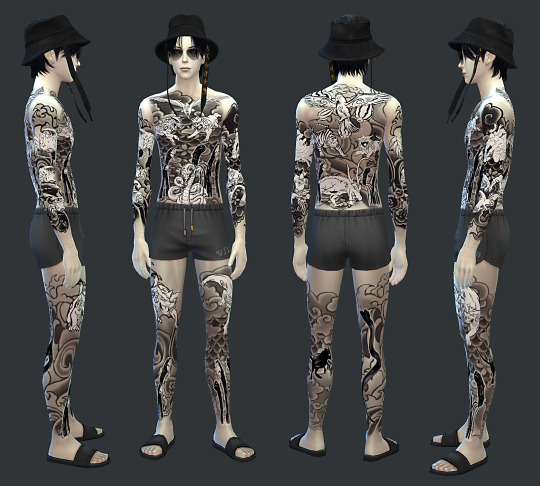
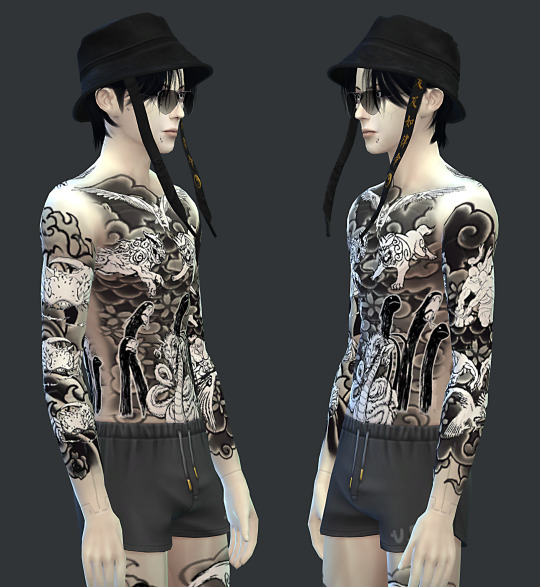

☯So I was inspired by this fanart of Sai by @seoz-gets-artsy and wanted to make tattoos for my modern/cyberpunk au version of him. I'm pretty happy with how it turned out.
☯Made a version for Upper right arm, Upper left arm, Left leg and Right leg tattoo categories and all are base game compatible. You can have all of them installed for if you need a tattoo category for something else, or choose the one you want.
☯I struggled to get the opacity the way I wanted so included 8 swatches with slight differences (I made a gif but they look much better in game):
-Normal black and white
-Black and white, lower opacity
-Normal only black with transparent instead of white (you can see this much better on darker skin)
-Same as former, lower opacity
☯All four of these also added the same swatches using a different composition method which means it blends with the sims skin colour a bit more for example on Sai's pale skin it becomes a little bit sepia.
☯ I tested on a dark brown skin and you can see the different between the white and non white ones a lot better but the composition method thing is less noticeable:

☯Designed with male frame in mind; but I didn't restrict the frame, the seams might not align properly though on female body frame because I used the male template.
☯I used EA tattoo textures for the background, all the beast scroll images were found on google, and either fixed in photoshop by me or upscaled with AI, taken from the anime, the manga, the videogames and possibly fanart but it's hard to tell...
☯I did my best to clean up all the seams but sorry if there is still any you can see, I have checked it so many times and redone it. Also if you see strange lines on his wrists or body in the pics that is just Sai's cyberware accessory.
☯I'm sorry I haven't been making a lot of cc and I know this is only one item but editing all the animal pictures and making the tattoo actually took me a similar amount of time as my bigger sets.
☯Please respect my TOU
CC Terms Of Use :
- PLEASE DO NOT REUPLOAD
- PLEASE DO NOT PUT BEHIND PAYWALL OF ANY KIND
- PLEASE DO NOT INCLUDE CC IN SIM DOWNLOADS
- PLEASE DONT CLAIM YOU MADE IT
-I don't mind conversions to ts2 or ts3 but please tag me :) If you use it in screenshots please tag me I'd love to see 🖤
IMPORTANT: don't unmerge the file, some of the versions rely on the first version I made cause they're cloned.
☯Sai's CC LIST + Tattoos DOWNLOAD FREE HERE
☯Credits to the creators of the CC:
@pralinesims @cryptiam @magic-bot @helsoseira @natalia-auditore @trillyke @the-crypt-o-club @mooo-oood @belaloallure3 @simsontherope @darte77 @plushxsims @luumia @madlensims @ashwwa S4AnimeCas for the Weapons and Sai stuff


#yamanaka sai#moonbiscuitsimscyberpunk#moonbiscuitsims4#moonbiscuitsimsnaruto#moonbiscuitsims#moonbiscuitsimscas#mbsdownload#moonbiscuitsimscc#naruto#naruto shippuden#sai#sai naruto#sai yamanaka#ts4#the sims 4#sims 4#sims#the sims#sims 4 cc#ts4 cc#ts4 tattoos#cyberpunk#naruto modern au#naruto cyberpunk#cyberpunk naruto#sai fanart#sai yamanaka fanart#naruto fanart#naruto shippuden fanart#ts4 simblr
37 notes
·
View notes
Note
Hello! Thank you for sharing your PingXie fic recs! Since you post a lot of fics on Weibo, I don't know if you're a Chinese speaker, but if you're not, I was wondering how you read Weibo fics since a lot of them are in image format, and sometimes the Google Translate app doesn't work very well for them. I'd really love to read them, so if you have any tips on apps or translators to use I'd be grateful!
Hi! It's my pleasure to share! ( ◜‿◝ )♡
I'm not a Chinese speaker, I use machine translator. Since I always use my phone to read them, I'm not sure how it works on computer.
I assume that what you mean is the super long images, because normal images work fine on Google Translate. For long images, the Chinese characters are so tiny that they can't be detected properly and thus failed to translate. To solve this problem, I need to either crop the images using a photo/image editor or screenshot them. I usually do the latter, so I don't have to go back and forth editing them. For flipped/mirrored images I still have to use a photo/image editor though. For scribbled images, I have to resign to my fate and hope that the app would recognize them >.<
Other than Google Translate, I'm also using 2 translation apps in which all of them can also translate text from images; Microsoft Translator and DeepL. The former, I use it for comparison and the latter, the quality is pretty good but it has limited usage. If you don't mind spending more money then you can consider it.
I usually don't directly use Google Translate app though, I use Google Lens in my file manager. It's more convenient for me, here is what I usually do:
1. Download the image (it's optional, but I decided to download it just in case that it's suddenly gone) → go to File Manager and find the image → zoom it → screenshot it (one image needs many screenshots, I did it in one go to avoid getting the same image)

It's a gif, Tumblr didn't let me post more than 1 video :(
2. Find the screenshot image → scan it with Google Lens (make sure that every sentence is in white line which means it's detected by the app)
If the result is too tiny, you can choose to open it on Google Translate app.
It's a bit tricky, but I haven't found another way.
Hope this helps!
Thanks for asking! (。・ω・。)ノ♡
4 notes
·
View notes
Text
[ID: an animated GIF that reads "Tumblr 2022 My Year In Review", and shows a variety of moving stickers including the anon profile picture, grabs, stars, hearts, the plinko horse, the reblog symbol, and the tumblr symbol. It looks like a page out of highschool sketchbook. End ID.] (ID by @thetragicallynerdy <3)
I posted 7,770 times in 2022
118 posts created (2%)
7,652 posts reblogged (98%)
Blogs I reblogged the most:
@tmoblrina
@pathos-logical
@carfuckerlynch
@generic-internet-name
@three-magpies-in-a-trenchcoat
I tagged 6,482 of my posts in 2022
Only 17% of my posts had no tags
#described - 2,771 posts
#that's my queue - 1,032 posts
#described by me - 809 posts
#storytime - 675 posts
#unreality - 273 posts
#tumblr - 263 posts
#to watch later - 242 posts
#mutualsposting - 226 posts
#lovecore - 213 posts
#tropes - 184 posts
Longest Tag: 135 characters
#i didn't see a post like this earlier and didn't have time to say it myself but happy diwali to all who celebrate i love you 💜🪔🌟🕯💛
My Top Posts in 2022:
#5
who needs IDs, how do they help and why are they used? i've always been curious, i mean no harm by asking, so sorry if this is rude
Not rude at all anon, I'm so glad you asked!! Image descriptions are accessibility aids for vision-impaired folks and anyone who may have issues parsing an image (ex: an autistic person unable to comprehend a visually busy art piece). For people who can't see an image for any reason, IDs provide a way to understand what's on screen, whether it's a meme or tweet or art. For example, a blind person using a screen reader (a device that reads text out loud) wouldn't know what an undescribed all-image post was talking about, but with an ID they could know it's a tweet and then a meme mocking it
IDs can look abstruse and intimidating when you're unfamiliar with them, but I promise they're not! The simplest step to making your blog more accessible is scanning the notes of a post to find a comment with an ID and reblogging that version of the post instead! If you're interested in learning how to write your own IDs, I really love this post as a resource, plus the amazing People's Accessibility Server if you have questions or want to request descriptions! I'd also like to plug my pinned post, which has a link to a doc with templates for a ton of memes so you can describe posts yourself!
I hope this wasn't too much text and that your question was answered clearly, anon! Please feel free to go through my "image descriptions" and "accessibility" tags for more info!
115 notes - Posted October 13, 2022
#4
Copying tags in accessible ways on mobile
(Large text: Copying tags in accessible ways on mobile)
People screenshot tags all the time, whether to share a funny joke or add important commentary, but they often don't realize that this is inaccessible to vision-impaired people and many others. This is a problem because a lot of people primarily use Tumblr on the mobile app, which doesn't let you interact with tags at all unless you screenshot them. However, accessibility is always worth the extra time and effort you can spare, so here are some ways for you to easily copy tags without spending too much of either!
Image-to-text softwares
(Large text: Image-to-text softwares)
If you simply must screenshot those tags, you can still convert them back into usable text! There are plenty of easy-to-use websites that allow you to take any downloaded image and extract the text from them. I prefer onlineocr.net, but the Google Translate app has the same feature! All you need to do is input the image and hit the button, and it'll spit out the text for you to copy. This method is fantastic for images with lots of text, not to mention it's easy to do and generally accurate, and I use it all the time to great effect!
Going to browser
(Large text: Going to browser)
If you're on mobile, it's probably a safe bet to say that your phone also has a browser app. If so, all you need to do to copy the tags from a post is copy the link of said post into a browser and then copy the tags from there. This method can mean extra formatting, since hashtags and links won't copy over, but it's relatively low-effort to do and doesn't take long at all!
Going on PC
(Large text: Going on PC)
If you're on mobile, you can also consider saving the post with desired tags to your drafts. This means you can easily access it on another device, aka a computer, and copy the tags there! Copying tags on desktop is possibly the easiest way to do it, since all you need to do is highlight the text and paste it later- it'll even save the link formatting when you do! The only extra step you might have to do is add spaces between the tags, since they'll automatically come smushed together and only separated by hashtags. This method might mean you take a little longer to reblog the tags, but it is very much worth it to make the post accessible to all!
Going forth
(Large text: Going forth)
These methods are a smidgen more effort than just screenshotting or prev tagging, but I don't think it's a bad tradeoff at all! I hope this can provide quick and easy ways for everyone to get more used to thinking more conscientiously about accessibility. And these aren't your only options- alt text helps people who use screenreaders, and you should always add an image description below screenshots if you're going to add them. Hope this helps!
TL;DR: Instead of screenshotting tags, which makes them inaccessible, other options are: using image-to-text software, copying the tags on a mobile browser, or copying them on desktop Tumblr.
290 notes - Posted January 5, 2022
#3
Gif makers will be like "how can I fit as many inaccessible font options as exist on planet earth into one three-word movie title"
413 notes - Posted June 28, 2022
#2
How to Keep Doing Descriptions (from someone who does a fuckton)
Plain text: How to Keep Doing Descriptions (from someone who does a fuckton)
This is a list aimed mostly at helping people who already write IDs; for guides at learning how to do them yourself, check my accessibility and image description tags! I write this with close to two years of experience with IDs and chronic pain :)
Get used to writing some IDs by using both your phone and your computer, if you can! I find it easier to type long-form on my laptop, so I set up videos and long comics on my phone, which I then prop up against my laptop screen so I can easily reference the post without constantly scrolling or turning my head
I will never stop plugging onlineocr.net. I use it to ID six-word tags, screenshots of posts, and even comic dialogue! On that last note, convertcase.net can convert text between all-caps, lowercase, sentence case, and title case, which is super helpful
Limit the number of drafts/posts-to-be-described you save. No, seriously. I never go above 10 undescribed drafts on any of my four blogs. It doesn’t have to be that low, but this has done wonders (italics: wonders) for my productivity and willingness to write IDs. If I ever get above that limit, even if it’s two or three more, I immediately either describe the lowest-effort post or purge some, and if I can't do that then I stop saving things to drafts no matter what. No exceptions! Sticking to this will make your life so much easier and less stressful
My pinned post has a link to a community doc of meme description templates!
Ask! For! Help! Please welcome to the stage the People’s Accessibility Server! It’s full of lovely people and organized into channels where you can request/volunteer descriptions and ask/answer questions
I make great use of voice-to-text and glide typing on my phone to save my hands some effort!
Something is always better than nothing!!! A short two-sentence or one-sentence ID is better than no ID at all. Take it easy :)
If you feel guilty about being unable to reblog amazing but undescribed art, try getting into the habit of replying to OP’s post to let them know you liked it! This makes me feel less pressured to ID absolutely everything I see
I frequently find myself looking at pieces of art which feel like they need to be considered for a bit before I can write an ID for them, and those usually get thrown into drafts, where the dread for writing a comprehensive ID just builds. Don’t do that! Instead, try just staying in the reblog field for a bit and focus on the most relevant aspects of the piece. Marinate on them for a little; don’t rush, but don’t spend more than a handful of seconds either. I find after that the art becomes way easier to describe than it initially seemed!
On that note, look for shortcuts that make IDs less taxing for you to do! For example, I only ever describe clothes in art if they're relevant to the piece; not doing that every time saves a lot of time and energy for me personally
Building off of that, consider excusing yourself from a particular kind of ID if you want to. Give yourself a free pass for 4chan posts, or fanart by an artist who does really good but really complex comics, whatever. Let it be someone else's responsibility and feel twice as proud about the work that you can now allot more energy to!
As always, make an effort to find and follow fellow describers! It’s always encouraging to get described posts on your dash, and I find that sometimes I'm happier to ID an undescribed post when the person who put it on my dash is a friend who tagged it with "no ID"
TL;DR: To make ID-writing less stressful and more low-effort, use different devices and software like onlineocr.net and voice-to-text, limit the amount of work you expect yourself to do, and reach out to artists and other describers!
442 notes - Posted November 8, 2022
My #1 post of 2022

[ID: A cropped screenshot of two crabs on the tumblr dashboard. They are right next to each other and both say “love <3.” End ID]
PEACE AND LOVE ON PLANET EARTH!!!!!!!!!!!!!!!!!!!!!!!!!!!!!!!!!!!!!!!!!!!!!!!!!!!!!!!!!!!!!!! (Plain text: Peace and love on planet earth!!!!)
821 notes - Posted April 1, 2022
Get your Tumblr Year in Review 2022 ->
#tumblr2022#year in review#my 2022 tumblr year in review#your tumblr year in review#:))))#my posts#kay talks#described#long post
5 notes
·
View notes
Photo
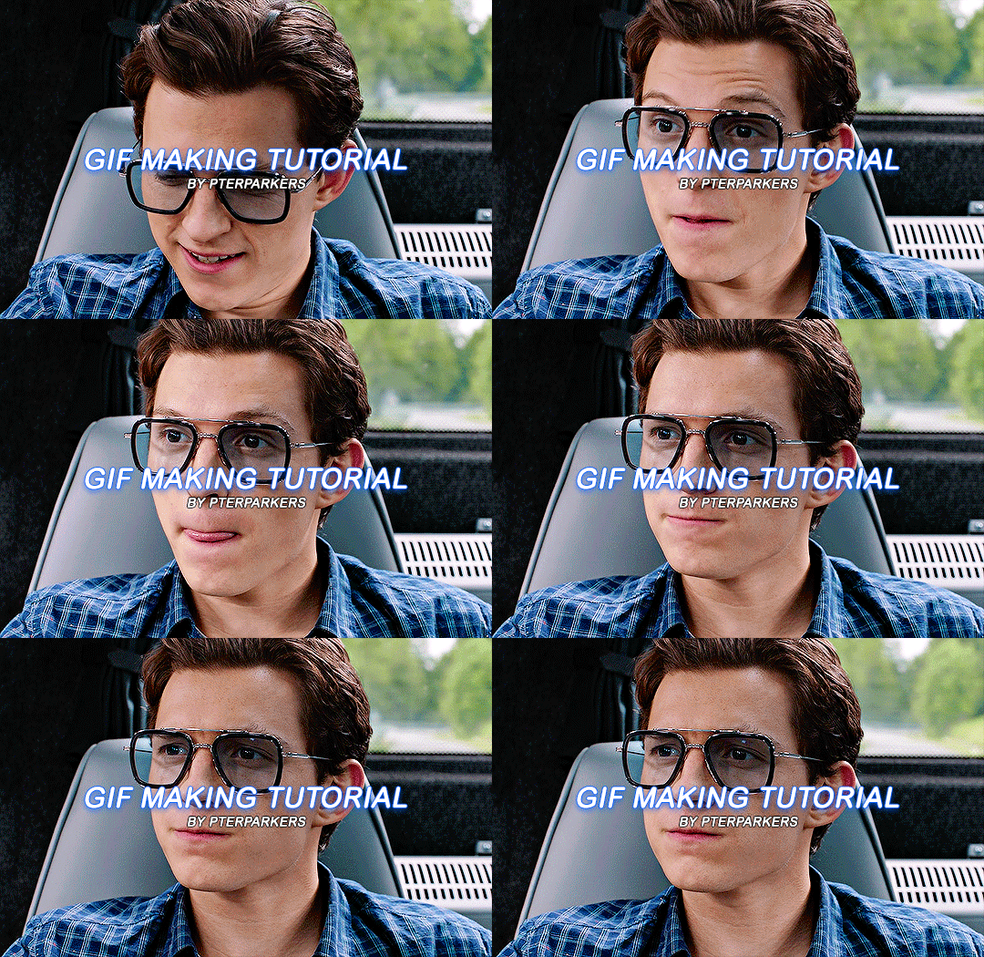
i finally decided to take the time & do a heavily requested gif tutorial! this will be very detailed & is how i make every single one of my gifs from start to finish! i’ll also include resources for ps downloads, actions, etc. if you have any questions, don’t be afraid to ask! & if this helps you, pls rb!!
TUTORIAL UNDER THE CUT!
i’m going to break it down into sections to hopefully make it easier to understand!
1. software i use
2. hq movie/tv show/video downloads
3. screencaps
4. importing screencaps into photoshop
5. cropping
6. actions/sharpening/gaussian blur
7. image sizing
8. time delay
9. coloring
10. saving
1. software i use
photoshop - i use photoshop cc 2020 on my macbook air but any version of photoshop with video timeline/frame timeline will work for creating gifs! i pay for my photoshop but i know there are ways to get it for free. if you don’t want to/can’t pay for photoshop, here (x, x, x, x) are some links to download it without paying!
mplayer osx extended - this is the software i use for my screencaps. there are a lot of software’s out there & i think it truly comes down to preference. i’m just more familiar with mplayer & the screencaps come out really smooth in my opinion. it’s free as well & here is a link to download it!
2. hq movie/tv show/video downloads
ok so i’ll be real, i never used t*rrents until recently & i’ve personally noticed a huge difference when it comes to quality. before using them, i was using files from MEGA & if you’re not comfortable with t*rrents, i would definitely recommend MEGA links! when it comes to downloading any videos, try to make sure they are 1080p or 2160p if available! 720p is also ok but always try to get 1080p. also i’ve found that with movies, 1080p Blu-ray versions look better but again, it’s all about preference!
t*rrents - i only use one t*rrent site which is r*rbg. they have a huge variety of tv shows & movies from what i can tell.
MEGA - MEGA is really nice for people that aren’t comfortable with t*rrents. the way i used to use MEGA was, i followed accounts on twitter that would upload MEGA links to tv shows. here (x, x, x, x, x, x) are some of the accounts that post a wide variety of links to MEGA downloads! i will say, the only downside to MEGA links is that they seem to take longer to download & you can cap out at a certain amount of GB each day.
folx - i use this to download stuff from r*rbg! download this before you try to download anything from r*rbg. its free to use & there are multiple sites you can download this software from but i’ll link a few right here (x, x, x this one is a link directly from the apple store but it costs $15.00). if you don’t want to download from any of those links, you can just simply look up ‘folx mac/windows download’ in google!
4k video downloader - i use this to download videos from youtube! it’s free as well & you can download it here!
3. screencaps
once you’ve downloaded a movie or tv show or whatever you want to gif, open whichever screencap software you’re using & start playing the video. for mplayer osx extended, to screencap you just go to the scene you want to gif, pause the video, & hold down shift + command + S on mac (i think it’s the same for windows i’m not sure).
4. importing screenshots into photoshop
now that you’ve got the screencaps of the scene you want to gif, it’s time to open photoshop! to upload the screencaps, in photoshop go up in the lefthand corner to file > scripts > load files into stack. once you click on that, you’ll click ‘browse’ over to the right & the files on your computer will pop up. go to wherever you saved your screenshots & select all of them! once you’re done selecting them, hit ‘open’ in the bottom right corner.
5. cropping
now all of your screencaps are imported!!! now it’s time to crop the screencaps. go to the crop icon over to the left.

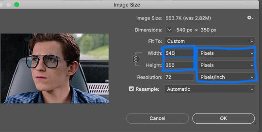
for this gif, i want dimensions to be 540 x 350, so i go up top & type it in

great! now the gif will look like this:

6. actions/sharpening/gaussian blur
now that the gif is cropped, we’re going to sharpen it. i use actions because they are so much faster & easier. i use the action that kylos uses in her giffing tutorial & the direct link to download the action is right here! to access actions, you can either go to window > actions or go over to the play button to the right that looks like this:
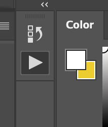
when you hit that play button, you will see the actions that you have downloaded pop up! select where it says ‘select here!’ & then go down to the play button at the bottom to play the action. i circled both steps down below

the default radius in this action is 0.3 & i normally change it to 0.4 (it’ll normally pop up & ask you like shown below & just change it to 0.4!)

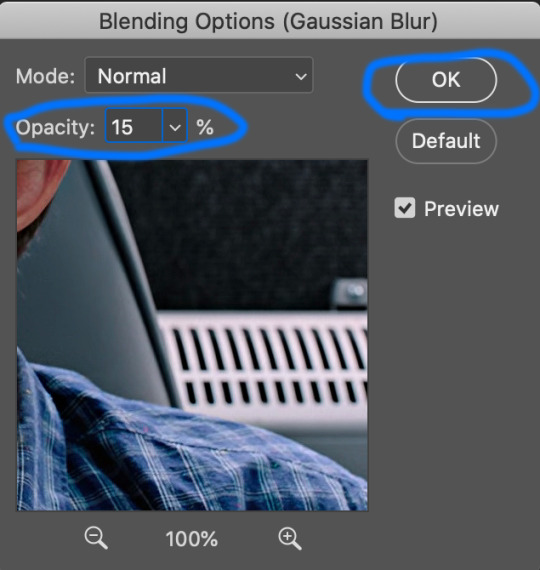
now the action has been played!! i add an extra step but it’s optional! what i do next is i add a layer of gaussian blur on top of the action. to do that, go to filter > blur > gaussian blur. once you select that, it’ll have a pop up that looks like the one below & you’ll just select ok or hit the enter button

once you do that, you’ll notice your gif looks soft or not sharpened so the next step is to change the percentage of the gaussian blur layer you just applied. to do this, you go to the bottom right corner & hold down option by clicking on the gaussian blur layer. there will be options that pop up & you’ll select ‘edit smart filter blending options’ like shown below (my handwriting looks like a five-year-olds ik)

another pop up will show up in the middle of the screen & you’ll be able to select which percentage you want to place on your gif. the opacity really depends on the gif but i normally do 10%-30%. for a lot of my gifs recently i’ve applied 15% which is what i did on this gif! once you change the opacity to whatever you want, hit ok!
after that you want to change the image size to the same size you cropped the gif to. to do this, you’ll go to image > image size > & change it to 540 x 350 (or whatever the size of your gif is! also make sure it’s switched to pixels instead of inches! once you’ve done that hit ‘ok’ or press enter.
once that’s done, go ahead & save the gif! to do this, go to file > export > save for web (legacy). it’ll show you the size of the gif down in the bottom left & as long as it’s under 10mb you’ll be fine!!! down below i circled my save settings as well! also its SUPER IMPORTANT THAT YOU SET LOOPING OPTIONS TO FOREVER! once you’ve done all that, save your gif by hitting the ‘save...’ button down below that’s circled. you can name your gif however you like just make sure you keep the .gif after it!

now my gif looks sharper than before:

now for time delay & coloring!!!
7. time delay
open the gif you just saved in photoshop by going to file > open. once it’s opened, you’ll see a timeline of all the frames towards the bottom. it’ll likely say 0.07 sec with a small little downward arrow next to it. select the downward arrow & select other. change the speed from ‘0.07′ to ‘0.05′! gifs look much better & more natural at this speed. (also yes i did delete a few frames because i felt it was too long so to delete frames you just select the ones you want to delete & click the trash button down by the scroller!)

8. coloring
coloring can be so much fun but so tricky! i personally use a base psd that i made for all of my gifs & then adjust it according to the gif i’m coloring but for this gif i colored it from scratch! so for most of my gifs i only color/edit them using levels, selective color, brightness/contrast, curves, color balance, & vibrance (in that order) to access these, go to layer > new adjustment layer > & then select whichever one you want to start with.
1. levels


2. selective color
blacks: black +2
reds: cyan -9, magenta +1, yellow -3
cyan: cyan +100

3. brightness/contrast
brightness: 5
contrast: 6

4. curves
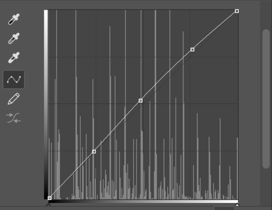

5. vibrance
vibrance: +16
saturation: 0

then you save it just like earlier by going to file > export > save for web (legacy) & you’re all set!!!! i hope this helps anyone who is trying to get into gif making & if you have any questions, don’t be afraid to reach out!!!!
#this is so long i apologize#gif tutorial#allresources#resources#completeresources#quirkyresources#my tutorial#photoshop
640 notes
·
View notes
Text

I posted 212 times in 2022
That's 212 more posts than 2021!
207 posts created (98%)
5 posts reblogged (2%)
Blogs I reblogged the most:
@silentkimblyarchive
I tagged 212 of my posts in 2022
#silent kimbly - 212 posts
#webcomics - 212 posts
#infoposting - 48 posts
#doublepost - 7 posts
#fanart - 3 posts
#? - 2 posts
#kimblysweep - 1 post
#kimbly sweep - 1 post
Longest Tag: 13 characters
#silent kimbly
My Top Posts in 2022:
#5
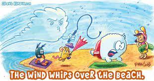
“the wind whips over the beach”
(found on google images)
0 notes - Posted July 24, 2022
#4

a screenshot of the very second save of silent kimbly’s site. around this time, only 12 SK strips were created.
apparently there are some MORE SK comics out there. who would’ve known?!
1 note - Posted October 25, 2022
#3

from ryan sias’s site. apparently he’s a game producer, as well.
i didn’t watch the video, so i can’t give any comments on it.
1 note - Posted October 26, 2022
#2

an unknown SWF file found on silent kimbly’s site.
believe me, attempts were made to find out what it was. i downloaded tactics technologies’ supernova player from nitrome’s site, but it only works with compatible content(for example, nitrome’s 130+ flash games).
maybe one day... one day...
1 note - Posted October 24, 2022
My #1 post of 2022
fact: comic 143, “trying to make ends meet”, has NOT been archived in the wayback machine.
for those curious, here it is.
2 notes - Posted October 28, 2022
Get your Tumblr 2022 Year in Review →
0 notes
Text
Snip It For Mac

Snip It For Mac Os
How To Take A Snip On Mac
The Internet becomes one of the important sources of knowing new things, searching for required information, etc. If we search for like any information internet, we will type that particular name and instantly get the result. Importantly, when we get our desired outcome, we want to store those for further use. Here, the user sometimes falls into a problem like can’t download correctly or save those particular items. So, many snipping tools are developed to get rid of such mentioned issues. And, through those tools, the user can easily capture his required photo. Today, we are going to discuss the snipping tool for mac, and hopefully, you can benefit from here.
Snipping tool for mac free download - Free Snipping Tool, Snipping Tool, COBRA Snipping Tool, and many more programs.
6 Best Snipping Tool for Mac. A snipping tool is a great tool that helps to capture whatever the user wants from a computer screen. Here we enlist some reasons that can be done through the snipping tool. This tool helps to make visual tutorials; You can share your screen with friends; You can send screenshots for work.
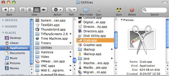
Now, Mac has a default tool like Snipping Tool, which is called, Grab. It comes pre-installed in every mac and does the job pretty well. As mentioned above, Grab is the official tool that Apple offers in the Mac. It is the closest tool as compared to the Snipping tool in Windows. There are multiple features for taking a screenshot.
The Process of snipping tool for mac
There are some free methods that help to capture a screenshot of your required information on Mac. So, here we enlist some free methods that you can apply without using any free or paid tools.
1st method: You need to press (CMD + SHIFT + 3), and this step will help to capture a full-screen screenshot
2nd method: If you want to capture a selected area as a screenshot, you need to press CMD + SHIFT + 4.
3rd method: This process will help you to capture only an active chosen window. So, to do that, you need to press CMD + SHIFT + 5.
However, if you need a screenshot of a window or menu, you need to press (Shift + Command + 4 + Space bar).
6 Best Snipping Tool for Mac
A snipping tool is a great tool that helps to capture whatever the user wants from a computer screen. Here we enlist some reasons that can be done through the snipping tool.
This tool helps to make visual tutorials
You can share your screen with friends
You can send screenshots for work
Snipping tools help to keep a record of important documents that a user cannot download.
So, if you are eager to get the best snipping tool for mac, let’s check out our discussion below.
Snagit
Our first choice is Snagit screen capture software, and it is very much popular among corporate customers. Besides, Snagit screen capture software comes with powerful features and aesthetic interface. Therefore, the user will get a blissful experience during editing and screen recording sessions. Whenever the user opens to use it, he will see a small control panel that lies at the top of the screen. This control panel lets the user change settings, customize hotkeys, and capture screenshots. Moreover, here lies the editor features nifty tools such as arrows, blur, callouts, and so on. In addition, this tool allows for creating videos straight and animated gifs from the app.
Furthermore, Snagit offers three ways to capture your screens, such as:
Capture the entire screen.
A specific region
A specific application.
Moreover, this tool allows you to get images from cameras and scanners. Interestingly, Snagit allows the user to capture text from a picture and then paste it into the text editor. Sad to say, all the features are not free instead; you need to pay $50 for all features. Since the charge is higher than others, the features are pretty and easy to use. However one con is the video editing is cumbersome through this app.
Designed for macOS up to OS 10.7, TuneupMyMac is compatible with the latest version of macOS. Apps keep files and folders scattered about your Mac; however, finding them is the hard part, which is why so many people hope to find a free app cleaner to remove them without any difficulties. Cleaner apps for mac. Shows you them first, and when you are confident the right files and cache folders have been located, you can Zap them with one click. Usually, good app cleaners aren't free, but they will get the job done.AppZapper locates the files related to the apps you want to delete. TuneupMyMacTuneupMyMac is another Mac app cleaner known for removing unwanted apps quickly.
Lightshot
Technology comes to make our life simple, as well as easy. Besides, life becomes comfortable with many sophisticated tools and software. Whenever we look for any tools or software to use, we seek easy to use amenities at first. Likewise, if you are looking for a snipping tool that offers an easy-to-use mechanism, Lightshot is such a tool. If you want to take a screenshot, you need to press the print screen button from the keyboard => select the area. Moreover, this tool allows you to edit the screenshots by adding color, shapes, text, etc. Interestingly, this tool makes some tasks like capture, save, and upload easy for the user. Besides, if you take one shot, you don’t need to wait for a long time to take another shot. Also, you can use the Lightshot tool without spending anything and allow you to do:
Print your captured screenshots
Upload images to Prntscr.com
Search for a similar picture on the internet
Copy and save
Nevertheless, if you look for the cons of this app, then you will find the following things:
This app does not have capture modes.
You can’t find a separate editing screen with advanced tools.
SbapNDrag
Here is another snipping tool that helps capture a full screen, a window, or a specific section. SbapNDrag offers both free and paid versions and the paid or pro charge $10. So, if you get the pro version, you can assign global hotkeys, turn off adverts and resize images. Beyond those, you will get some additional features from the pro version like:
A library for our screenshots
You will find the option to share your captured screenshot to Facebook, Twitter, email, and so on.
You can annotate your captured screenshots without losing the original format.
Here lie multiple output formats like JPEG, TIEF, or PNG.
You will find border and scaling, batch rename.
You will find a custom keyboard shortcut.
Monosnap
Here we bring another snipping tool for mac that has more than 1 million users worldwide. Monosnap is that service provider, and through it, users can grab the entire screen and a specific portion. After capturing the screenshot, the user can use built-in editing tools to edit and share with others. Moreover, this tool also works on Chrome and Windows. Beyond those, now let’s see the additional features of Monosnap below.
You can grab the pixel-perfect screenshots.
You will find customizable hotkeys.
This tool allows you to highlight important information and blur the sensitive data.
With this tool, you can record videos or GIFs.
You can use Monosnap Cloud Storage or the other storage services.
However, as the cons, you may face ads while upgrading this tool.
Greenshot
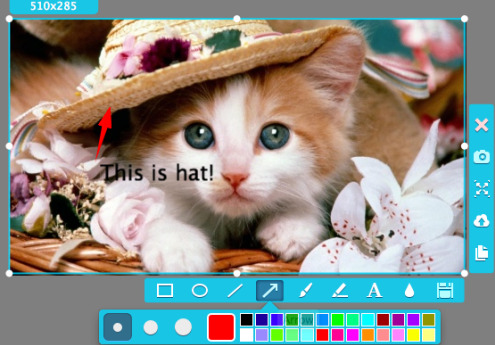
Greenshot is another renowned screen capture service provider for Mac. Here include several beneficial features such as:
Hotkey combination.
Can copy the images to the clipboard then send it directly to a cloud-based program like Dropbox, Confluence, etc.
If you have any sensitive information, this tool helps to blur that area.
This tool allows you to customize some default settings.
You can use your own hotkey combination to get better functionality.
Skitch
If you are looking for a free snipping tool for Mac, Skitch will be your perfect choice. Moreover, the user can take a screenshot, edit it, and then share it with their friends and others. By the way, Evernote designs this tool. Interestingly, the user can quickly and simply use this tool because of its interface. Here the user will find seven tools in its mark-up function like:
Text ShapesA pixelater for blurringA highlighterArrows A color palette with eight colors Cropping tools
Many functions from the Skitch are free. But if you want to markup PDFs save files to Evernote, you need a premium account. Particularly, PDF markups are a useful feature, mainly used for conversations with clients and business emails. Interestingly, with this feature, the user can easily highlight the critical area. However, the mentioned premium account will charge you $7.99/month. After getting this premium account, it will integrate with Outlook, Gmail, Google Drive, Salesforce, Microsoft Team, and slack. However, one drawback you may face like this tool doesn’t allow you to save a note while quitting the app.
FAQ of snipping tool for mac
How do I snip on a Mac?
There is some free method that helps to capture a screenshot of your required information on Mac. So, here we enlist some free methods that you can apply without using any free or paid tools.
1st method: You need to press (CMD + SHIFT + 3), and this step will help to capture a full-screen screenshot
2nd method: If you want to grab a selected area as a screenshot, you need to press CMD + SHIFT + 4.
3rd method: This process will help you to capture only an active chosen window. So, to do that, you need to press CMD + SHIFT + 5.
However, if you need a screenshot of a window or menu, you need to press (Shift + Command + 4 + Space bar).
Also, you can use tools to grab a screenshot on your Mac device, apart from those free methods.
How do I snip a screenshot on a Mac?
There is some free method that helps to capture a screenshot of your required information on Mac. Here we enlist some free methods that you can apply without using any free or paid tools.
1st method: You need to press (CMD + SHIFT + 3), and this step will help to capture a full-screen screenshot
2nd method: If you want to grab a selected area as a screenshot, you need to press CMD + SHIFT + 4.
3rd method: This process will help you to capture only an active chosen window. So, to do that, you need to press CMD + SHIFT + 5.
However, if you need a screenshot of a window or menu, you need to press (Shift + Command + 4 + Space bar).
Also, you can use tools to grab a screenshot on your Mac device, apart from those free methods.
How do I snip an image?
There is some free method that helps to capture a screenshot of your required information on Mac. Here we enlist some free methods that you can apply easily to snip an image.
Mac pro 2 1 specs. Mac Pro is designed for pros who need the ultimate in CPU performance. From production rendering to playing hundreds of virtual instruments to simulating an iOS app on multiple devices at once, it’s exceedingly capable. At the heart of the system is an Intel Xeon processor with up to 28 cores — the most ever in a Mac.
1st method: You need to press (CMD + SHIFT + 3), and this step will help to capture a full-screen screenshot
2nd method: If you want to grab a selected area as a screenshot, you need to press CMD + SHIFT + 4.
3rd method: This process will help you to capture only an active chosen window. So, to do that, you need to press CMD + SHIFT + 5.
However, if you need a screenshot of a window or menu, you need to press (Shift + Command + 4 + Space bar).
Here are some free tools that have blissful features to grab a screenshot
Snagit
Lightshot
SbapNDrag
Monosnap
Greenshot
Skitch
How do you copy and paste a snip on a Mac?
If you want to copy and then paste a snip on Mac, you need to follow the following process.
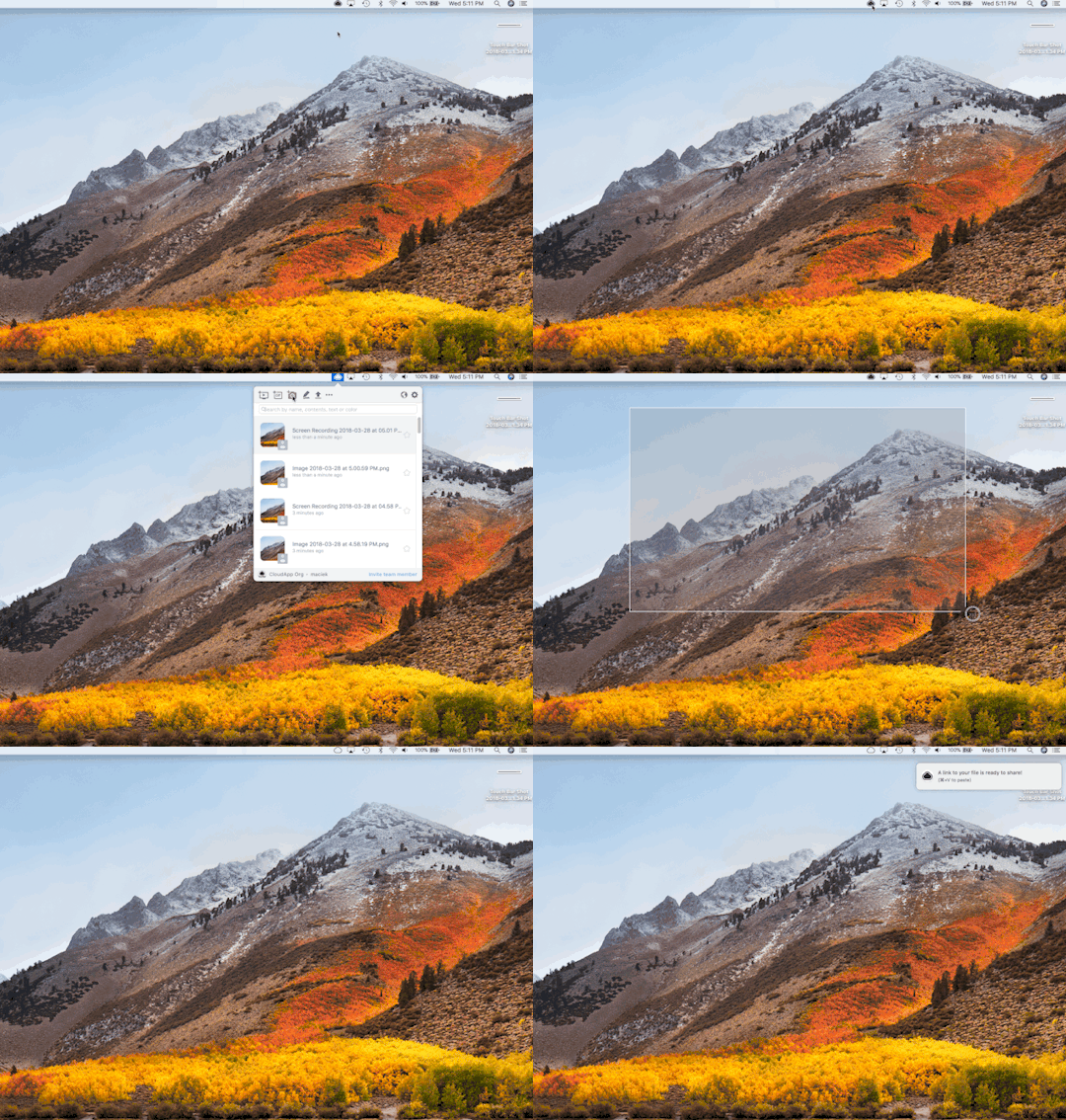
To begin with, you need to hold down (Command+ Shift + 4). After that, you could see the screenshot selection tool.
Secondly, hold down the Control button =>select your required area on the screen using the mouse.
Finally, you need to pull up the document that you want to paste the selection into => press Command + V.
What is a good Snipping Tool?
You may use the internet to acquire knowledge or collect the required information. Whenever you gather information, sometimes you may fall into a problem due to no save option. Here a snipping tool is a great tool that helps capture whatever you want from a computer screen. Moreover, some free tools have blissful features to grab a screenshot. So, if you are eager to get the best snipping tool, let’s check out our discussion below.
Snip It For Mac Os
Snagit
Lightshot
SbapNDrag
Monosnap
Greenshot
Skitch
Final Thought of snipping tool for mac
How To Take A Snip On Mac
Here we finish all our discussion on the snipping tool for mac, and hopefully, you can get our tone. However, if you have any queries on our discussion, you are welcome to ask in our comment section.
Apple Footer.This site contains user submitted content, comments and opinions and is for informational purposes only. Apple disclaims any and all liability for the acts, omissions and conduct of any third parties in connection with or related to your use of the site. Codec all in one for mac os. Apple may provide or recommend responses as a possible solution based on the information provided; every potential issue may involve several factors not detailed in the conversations captured in an electronic forum and Apple can therefore provide no guarantee as to the efficacy of any proposed solutions on the community forums.

0 notes
Text
Landscaping Design Software For Mac Free Download

At my college, I teach a course named “Computers in Landscape Design” where I train landscape design students in AutoCad and Adobe Suite Programs, among others. These programs are tremendous for landscape designers who wish to use industry-standard software like regular landscape architects; however, they can be very expensive.
3d Landscape Design Software Free
Best Free Landscape Software Downloads
Students often do have access to free trials of the software, but for anyone interested in continually using them for the purposes of their professional business, eventually they will need to pay for the programs. To provide some perspective, currently the subscription for AutoCad software is around $200 per month. Unfortunately, this is just too expensive for many new business owners.
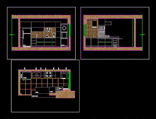
The most advanced landscape design software, for the most incredible landscape designs. VizTerra offers a streamlined interface, intuitive tools, and an extensive 3D library that makes it seamless to draw in 2D, transform your ideas into 3D, and then create a fully interactive 3D presentation to share with your clients — instantly. Home Designer Landscaping Software by Chief Architect (Paid) Chief Architect is one of the leading developers and publishers of 3D Architectural home design, and have also developed a software for landscape design that is just as up to par. This is often used by architects, interior designers, landscape designer and home designers, even DIYers. A free version of DreamPlan home design software is available for non-commercial use. If you will be using DreamPlan at home you can download the free version here. See more house design software screenshots.
Students often ask me if there are any free landscape design apps that work well for professionals. Over the past several years, I tested many free landscape design apps on various projects. In this article, I will review the pros and cons of the market’s five main free landscape design applications.
First, I won’t keep you guessing – my recommendation for the best free app is iScapes. The iScapes app is by far the best free landscape design app among its peers, having quality graphics, a solid user-interface, and a good plant library. In the table below, I provided a breakdown of some of my ratings for each of the five design apps. In case the image is too small, click here to download the pdf version. I will provide some helpful insights of each app in the sections that follow, along with some common issues that may influence your decision before downloading. But before you head off and just download the iScapes or PROLandscape app, I want to give you a little piece of wisdom I’ve accrued over my years of design. There is no substitute for a poor knowledge of landscape plants or design. If you are new to gardening or landscape design, before you purchase any app, I would highly suggest picking up a copy of The Essential Garden Design Workbook along with some essential drafting supplies and learn the old-fashioned way. Not only will it be fun, but you will be a better designer by doing this.
Okay, that’s my word of warning – now onto the reviews
Finally – before I diveinto each application – I must state that noneof these free programs compare to the professional industry standards ofAutoCad, Vectorworks, PROLandscape, or Dynascape. Although these programs dohave some good features – they just simply cannot match the quality of theprofessional software. But for those designers that are looking for a cheapoption that can get the job done, some are worth checking out.
iScapes (Rating: 16/20 )
The iScapes software offers a free and paid premium subscription service. The paid service offers a larger plant library, along with additional image downloads, and project archives; however, the free version is very useful for a beginner landscaper or do-it-yourselfer. The biggest disadvantage of the app is that it is currently only available for iPhone or iPads. For Android users, they will need to find a substitute. To try iScapes, click here.
Pros: The biggest advantage of this app is the graphic quality of the three dimensional landscape elements. The drag and drop interface, along with the visual characteristics of the app make it very useful to professionals doing quick designs for clients on-site.
Cons: As with most of the apps you will see on the list, the major disadvantage is that if you want additional quality add-ons, you will need to pay. A more extensive plant library, along with additional project storage is available with payment.
Home Outside (Rating: 10/20)
I originally had high hopes for the Home Outside app, as the average app review was 3.8/5.0 with many positive comments. After having used the app in many different types of projects, I was disappointed in the lack of three-dimensional perspectives and the limited plant library. To test out the software, click here.
Pros: For plan graphics, the renderings are quite nice and the app allows for the importing of google maps of your customer’s property.
Cons: The biggest downside to the app is the lack of any real plant library. The plants are categorized by “tree” or “shrubs” with no indication or availability to specify the planting in the free version. The paid version does offer some extra features.
Home Design 3D (Rating: 5/20)
Home Design 3D was an intriguing app that had very distinctive reviews when I originally had downloaded it. People seemed to either love it, or hate it. Unfortunately, I was one of the latter. The app is very useful for interior planning and design, but falls short for any realistic landscape design applications. To try the app, click here.
Pros: The only thing the app has working for it is the 3D aspect. The three-dimensional rendering capabilities are better than I would have expected for a free app.
Cons: The user-interface is very poor and the app itself is not intuitive. This combination makes for a very difficult experience for a designer, especially when there are other options available. I would hope that future updates provide pop-ups or a tutorial at the beginning to help designers navigate the platform prior to starting a design.
PROLandscape Home (Rating: 5/20)
I will start off with a disclaimer. In one of my classes, I train designers on the PROLandscape Professional Softwares (Planner, ImageEditor, and Proposal). These are good (but expensive) programs that are very useful for design. I believe it is a great marketing strategy by the developer Drafix to provide this free app to showcase some of the basic features of their paid programs.
With that being said, I found it difficult to provide an honest review of the free version because I kept remembering the full functionality of the paid programs. In any case, I did my best to realistically provide good feedback on the user-interface. Overall, there are many elements that can be improved. To test this out app, click here.
Pros: The free software has many similarities with the overlay perspectives of Home Outside, but with a greater plant library. The biggest drawback of the software is that most of the plant database is only offered for the paid version.
Cons: The app is not very intuitive and there is very little within the program to provide help or support. Also, there is a limited availability of plants, with poor customization, and relatively no ability to modify the existing library.
Sketchup Viewer (Rating: 5/20)
I had originally downloaded the Sketchup Viewer because I had received a recommendation about the app from another designer. I already have extensive knowledge in Sketchup, along with a variety of other 3D Software programs including three-dimensional CAD, Rhino, and Revitt, so I figured the Sketchup Viewer was worth a try. In general, it was a big disappointment as the viewer does not really offer anything valuable for a designer that does not have access to the base-program of Sketchup. To test out the viewer, click here.
Pros: If you have the ability to work on a regular computer to complete a great 3D model in Sketchup, the Viewer is useful -essentially just a tool to view the model and show it to your client on site. Other than that, the viewer does little else.
3d Landscape Design Software Free
Cons: It is not a design software and offers no specific landscape capabilities. The app is obsolete without actually using Sketchup to generate the landscape model.
Final Thoughts
If you are looking for the best free landscape design apps that also offer some assistance in designing and showcasing designs to clients in a professional manner, then I would recommend iScapes. If you do not have an iPhone or iPad, use Home Outside.
None of the free apps have great functionality when compared to their paid counterparts. If you are starting out in the design profession, the free apps might be worth exploring but you will quickly find better value from some of the other paid alternatives.
If you haven’t already – check out my article on Gift Ideas for Landscape Designers – you can use the money you’ve saved on some nice things for a fellow gardener, or yourself.
Best Free Landscape Software Downloads
For more articles on Landscape Design, please be sure to check out our Design resources and landscape Business articles.
____________________________________
ImportantLegal Disclaimer: This site is owned and operated byDraftscapes. We are a participant in affiliate marketing programs designed toprovide a means for sites to earn advertising fees by linking to participantvendors. Affiliations include Utrecht Art Supply and Amazon Associates.Draftscapes is compensated for referring traffic and business to thesecompanies. Recommendations for products or services on this site are not influencedthrough the affiliation.

0 notes
Photo
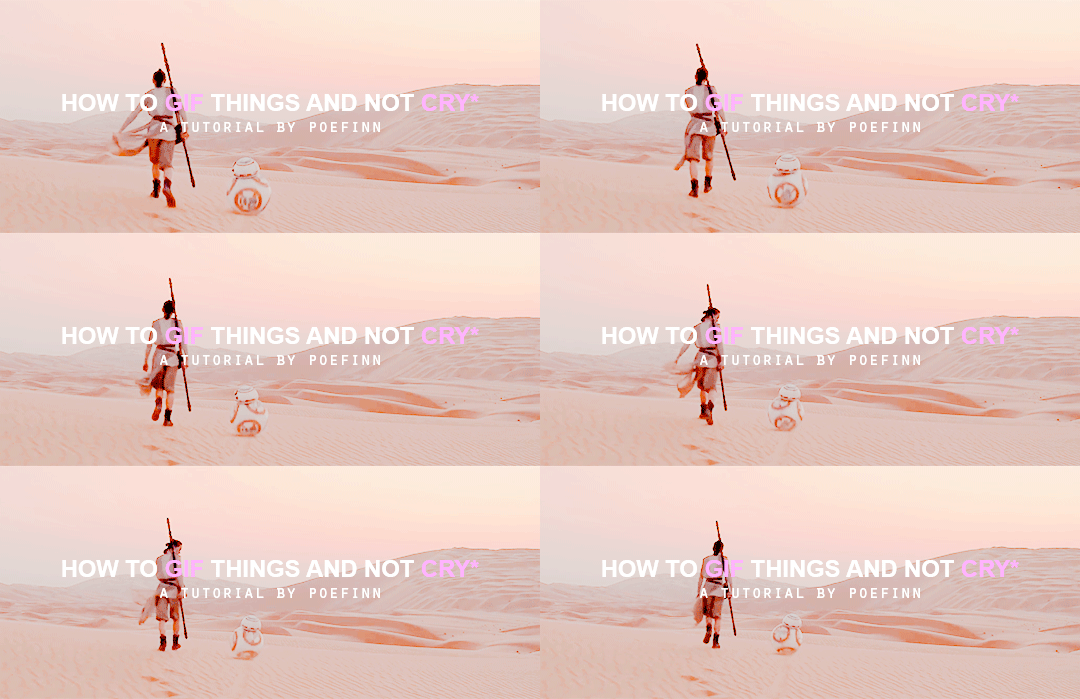
*tears guaranteed but it’s ok i’m here for u
Hello and welcome to my tutorial! I made one awhile ago but it’s outdated and I have better methods now. The first part is gonna be how to get your clips, the software I use and how to load your frames into photoshop. I don’t use KM player. If you already know how to do that skip to part two! I will also go over coloring in part three!
You will need photoshop Cs6 or CC. There is minimal difference between the two when it comes to making gifs. I do not have the download links for it but honestly torrented versions always died on me so :( Anyways! The rest is under a readmore. Have fun and welcome to photoshop purgatory.
We are going from here:

To here:
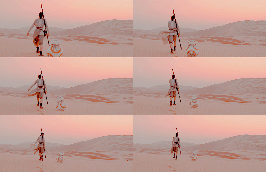
I use ps cs6, so if the layout is different than what I show in my screenshots, google “how to ____ in CC” and it should show you the other navigation in CC. ^^
PART ONE. GETTING READY.
1.Get this handy dandy program. It’s so much easier to use than KM player in my opinion. With this you can download any youtube video in any quality that you desire. Just copy and paste the URL. I believe it has steps for you and it’s a very simple program so we will move on into how to get your “gif” into photoshop!
DON’T download clips longer than ten minutes. The longer they are the more space they take up on your computer and the harder it is to select your frames. DO keep track of your video files by keeping them in a folder with all other photoshop related files. 720p or 1080p is a fine quality for making gifs. Make sure your video is at least 720p or you will have ugly gifs srry.
2.Loading your frames into a single document. The top bar of photoshop is your friend. Particularly FILE and IMAGE.

To load your frames, go to FILE >> IMPORT >> VIDEO FRAMES TO LAYERS. Select the video of choice. Your screen should look like this:

The two little sliders at the bottom are your best friends. Move them to select the part of the clip that you would like to gif. Once you do that it should switch to “selected range only”. DON’T limit to every ____ frames. Make sure “make frame animation” is checked off.
Remember that gifs are usually anywhere from 30-80 frames so when you are selecting what you want to gif, if it says you have selected over 500 frames narrow down what you want to gif. That is too many frames. Put some of them back. Pls.
3. Making sure window settings are correct. After you hit OK you should now have a document open! Does it look like this?

If you don’t have the bottom part or the side part, go to WINDOW >> WORKSPACE >> ESSENTIALS. If you still don’t see the side part or the bottom part go to WINDOWS >> ADJUSTMENTS & TIMELINE. You really need both of those.
PART TWO. TECHNICALITIES.
1. Fixing the amount of frames you have. If you are looking at the sidebar and it says over 100 then you have too many frames. For the sake of this tutorial, cut them down to a smaller amount. Bringing it down to 60 is a safe number.
In order to do this, you have to shift+click to highlight more than one frame/layer. First go to TIMELINE (bottom thumbnails) and remove ones you don’t like/need by highlighting them and then hitting the trash can icon underneath. You probably got some frames from a different clip so get rid of those first. The side thumbnails will not change accordingly and that’s fine. Make sure the frames in TIMELINE only go to 60.
*At the end depending on the coloring and sizing you may have to go back and change the amount of frames because it changes the file size and tumblr only allows for 3MB gifs. This will be explained later but just remember how to get rid of frames.
2.The speed of the frames. The actual movement of the gif nine times out of ten is too fast! You have to slow them down so they aren’t nauseating to look at. Don’t worry though! It’s easy.
Shift+click and highlight all of the frames in TIMELINE and then, on ant of the frames hit the little arrow next to the numbers that look like 0.04 (they might say something else) and then click on OTHER and enter 0.06
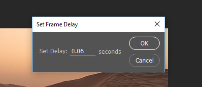
*Later when you go to save you might need to change the speed again, but 0.06, especially when it said 0.02-0.04 before hand is a good speed.
You can also hit the little play button at the bottom to see what your gif looks like, however they will probably play slower than how it will actually look after saving.

3. Cropping and resizing your gif. On your left is the bar called TOOLBOX.
To Crop: All you have to do is click this icon, drag the grid on the frame around and hit enter and crop as you please! (It will crop all of the frames the exact same.)

To Resize: The dimensions of tumblr posts are 540px wide, so if you are doing two columns of gifs (side by side gifs) the dimensions are 268px x 268px. The smaller the actual size of the gif, the more frames you can have and still be under the 3MB file size limit.
So go to the top bar, click IMAGE >> IMAGE SIZE and enter the dimensions you want.
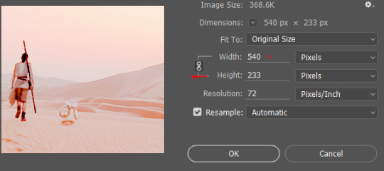
Height doesn’t matter, only width. Make sure that chain icon is there otherwise when you change the width it will make your gif look weird.
PART THREE. COLORING.
Now comes the fun part!
The right side of your screen, the ADJUSTMENTS is now coming into play. For this I’m going to show you how to add a PSD and be done with the coloring AND how some coloring tips of my own.
1. How to load a PSD (coloring). First of all, search “PSD” on tumblr, find one that you like, and follow that person’s steps for download.
Go to FILE >> OPEN >> and select the PSD. It will open as it’s own photoshop document. All you have to do now is drag the document so it’s not sitting with the other tab (like using google chrome) and shift clicking all the coloring layers on the ADJUSTMENTS bar and then dragging them onto your gif’s ADJUSTMENTS bar.

*Make sure when you drag them that they land at the very top of your adjustments (above the last frame layer- probably layer 60 in your case). COLORING AND ADJUSTMENTS affect all the layers below it, which is something to keep in mind.
ALWAYS put all your coloring at the top of the adjustment layers.
Now, if you like the way that looks skip to part four.
If you want to change something about the coloring, you can click the eyes next to the PSD layers to see what it looks like without that adjustment layer OR YOU CAN
2. Color on your own. I will go over some of my favorite tools and ways to color things. I’ll be making a masterpost soon of my favorite ways to color and PSDs and tips etc.
Here is a tutorial on how to make vibrant gifs. Here is another general coloring tutorial.
I recommend for awhile just playing around and messing with all the different sliders which are any of the following:

Vibrancy and Saturation: The more you mess with those two the grainier the gifs can get. Turn it up a little at a time. When you save a gif there can only be up to 250 colors, so adding more doesn’t mean the gif will be prettier. You can do selective saturation with the square icon under the sun. It will let you make certain colors more saturated. The upside down triangle allows you turn up vibrancy.
Adding value and shadows: The first three top icons are great to lighten/darken a gif.
The first one adds contrast and can brighten your gif. The second one messes with three different levels- the dark tones, the light tones and the medium tones. The third messes with curves, which can smooth out tones and shadows. I love these three.
Here is a PSD for my coloring for my gif of Rey. If you want, open it as you would another PSD. As you can see there are a lot of layers so take some time to click the eye icons on and off to see what changes what. Coloring takes practice and lots of different layers, so go check out some other tutorials and practice.
PART 4. SAVING YOUR GIF.
I know you’re thinking why does this need it’s own part. Well,
1. To save your gif go to FILE >> EXPORT >> SAVE FOR WEB*
*Saving for web is the key part of this whole operation.
You should get a window like this. Make sure everything red matches on your screen.
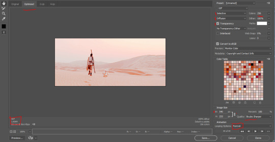
The square in the bottom left is your file size. If it says anything more than 3.00 MB then the gif will NOT load on tumblr. Double check your width size, make sure it says 540px. Make sure under color it says 256. And to make sure the gif plays correctly hit the play button.
Does it look good? Is it under 3 MB? Then hit save and upload it to tumblr! Congrats! You made your first gif!
To correct file size: click cancel and then in TIMELINE delete a few frames. Go to SAVE FOR WEB again and check the file size. Keep doing this until it is under or exactly at 3 MB.
If you have any other errors with your gif shoot me an ask! I’m happy to help! It’s probably something very easy to fix, photoshop is just VERY touchy.
Thank you for reading! If you have any questions, requests, anger, or want to throw your jar of tears of frustration at me my inbox and submit is always open!
Stay tuned for some masterposts for PSDs and overlays etc. and a tutorial on my general way to make graphics.
306 notes
·
View notes