#i don't even like colouring but i was interested in how people colour panels
Explore tagged Tumblr posts
Visit Tumblr Blog
Explore Tumblr blogs with no restrictions, modern design and the best experience.
Last Seen Tumblr Blogs


Fun Fact
Kazakhstan’s Minister of Communications and Informatics has blocked the Tumblr site because it contained 60 sites of terrorism, extremism, and pornography in 2015.
Text
I wanted to try colouring a manga panel soooo I spent an hour and a half on this scene from Edens Zero (I forgot the chapter number, it's been a long time oof) (I hate colouring, why did I think this was a good idea, again..?)

I think I did a great job for my first try!! (≧▽≦)
#edens zero#elsie crimson#justice edens zero#james edens zero#jelsie#manga coloring#manga panel#colouring#i don't even like colouring but i was interested in how people colour panels#hence the attempt#which was successful enough for me#but i don't think i'll try colouring another ever again#once was enough for a lifetime?#spoilers#edens zero spoilers#i can't believe edens zero is ending in a month#i will reread it all over again ♡
15 notes
·
View notes
Text
A Fear Even Greater: BSD Ch. 121 vs. BEAST Ch. 4
I was reading the new chapter today and I couldn't help but notice some similarities to BEAST that I wanted to share. I'm sure I'm not the first person to notice this nor do I usually do this kind of analysis post but I thought it was interesting and I'd like to share so please bear with me!
BSD CH. 121 SPOILER WARNING


I've highlighted the segments from each work that I think are thematically relevant to each other in the same colours because my brain works that way, but if yours doesn't don't worry - I will explain:
In YELLOW we have Atsushi's instinct to flee in the face of the enemy. I touch on this a bit more later on but BEAST!Atsushi is further along this thought process than canon!Atsushi. B!Atsushi seems mostly afraid of pain and violence while canon!Atsushi is more despondent. He's lost hope and had his spirit broken from watching his surrogate family die in front of him (understandably, poor baby)


In GREEN we have Dazai acknowledging/calling out Atsushi's cowardice. BEAST!Dazai is mostly describing how Atsushi used to be while canon!Dazai is snapping Atsushi out of his current doom-spiral.


He does this in most of his other hallucination appearances, not dissimilar to his interaction with Atsushi in Ch. 25.


In PURPLE we have the core of this whole rambling post (*´▽`*) There really isn't any contrast in these two, both B!Dazai and canon!Dazai are saying the same thing here.


Which brings us to CYAN where we see how the purple bits deviate slightly with context. It's a minor difference but B!Dazai lists the things that Atsushi used to fear (pain, violence, etc.) but canon!Dazai lists the qualities that Atsushi feels he's lacking (courage and hope). B!Atsushi is already able to use this "technique" (for lack of a better term) in combat, likely because he was exposed to terrifying situations earlier and more frequently than canon!Atsushi and has had more time to adapt to them (again, poor baby [╥﹏╥])


Now in RED we skip ahead a bit in the BEAST chapter to Dazai giving Atsushi his next directive. B!Dazai uses Atsushi to enact his plan and (eventually) bring Atsushi and Akutagawa together while canon!Dazai urges Atsushi to compartmentalize and focus on saving the people that he's still able to save.

Canon!Dazai's request is reminiscent of Oda's final words to him which - knowing Asagiri - could very well be intentional even if this is obviously not the "real Dazai" but rather the manifestation of some part of Atsushi's inner thoughts or Byakko (personally my money's on the tiger theory but we'll see). The Oda/Dazai/Atsushi/Akutagawa parallels will never stop and I'm here for it tbh.
[Dark Era excerpt from this translation from @nkhrchy]


Which brings us to MAGENTA (Could I have done these in chromatic order? Yes. Did I only realize that after typing it all out? Absolutely.) In both cases at this point Atsushi comes to a realization and I think the difference in what that realization is really drives home how well BEAST uses alternate universe to emphasize characterization in canon. Some of this is based on my assumptions about the final page of Ch. 121 and is therefore at risk of being jossed next month BUT I think that what canon!Atsushi is realizing in the final panel ("who you really are") is that this Dazai apparition comes from The Tiger. If it isn't Byakko explicitly I think it's fair to say that it's coming from somewhere within Atsushi himself. So, that being said, let me explain a little bit: B!Atsushi's only recourse is to take refuge in Dazai's plans/orders. His "greater fear" stems from an instance when he deviated from those orders and as a result he feels safest behind the bulwark of going along with Dazai's will. Not the healthiest coping mechanism, but it makes sense considering what B!Atsushi has experienced up to that point. Canon!Atsushi, however, is (I assume) realizing that the safety and reassurance - however harsh it may seem - of the Dazai in his head has actually been coming from himself the entire time. I think it's safe to say that whether it's his subconscious or Byakko, this apparition takes the shape of Dazai because that's who Atsushi trusts during times of crisis; that's the voice he's desperately wishing he could hear. Ultimately canon!Atsushi is in a much better place (despite... everything lol) because he's able to recognize his own internal strength instead of clinging to the safety he sees in Dazai. B!Atsushi does eventually start this process after Dazai fires him and Kyouka (and then steps off the roof of HQ RIP) but he has to take the time first to heal from the anxiety his violent upbringing inflicted on him (quite understandably - let's all say it together: poor babey T_T) There's more I could say about canon!Akutagawa undergoing a similar process re:Dazai but this post is too long! So I won't ♡
OKAY! My brain has never been satisfied with using one word when I could use ten so if you made it to the end thank you and I'm sorry ♡ I am not a writer and doing this reminded me why!! So I will definitely stick to drawing pictures (I'm almost finished one I swear! I'm like a plant, I wither into nothing in the winter months)
41 notes
·
View notes
Note
Small question, does it have to be Gotham for Cass? There's charas like Dick that can go establish their identity in a different city. Then there's Bruce, Steph, Jason and Duke who are so intrinsically tied to Gotham that this has to be the city for them. Where does Cass lie on this spectrum? Tq!
EXCELLENT question. I think Cass' situation is somewhat unique because of the way her character was handled post-Batgirl (2000).
In favour of Cass not staying in Gotham, she doesn't have the same emotional connection to Gotham as the four people you listed. She wasn't raised there, and in Batgirl (2000), she has next to no ties to Gotham civilians. In fact, it's when she moves to Bludhaven in Gabrych's run that she gains her first civilian friend and civilian love interest. The iconic volving panel is from Bludhaven, too. It's undeniable that the distance from Gotham, from Bruce (and arguably Babs), helps her grow:
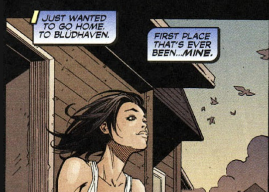
Batgirl (2000) #71
It can't be overstated how important ownership is to Cass. To own something means, necessarily, that you not an object. You are a person who something belongs to, and who belongs to something. By calling Bludhaven the "first place that's ever been... mine," she's explicitly saying that Gotham was not hers. Bludhaven was the first place that made her feel fully human.
But there are caveats to this. Cass goes to Bludhaven in the wake of Stephanie's death, a Gothamite through and through. It's probable that Steph's death colours her view of Gotham here, and her willingness to embrace Bludhaven is in response to the pain that Gotham now brings her. (This is also after Babs calls Cass stupid). Feeling like Gotham doesn't belong to her might stem from these specific circumstances, and not be applicable in current canon.
Still, if the story had ended there, I'd say Cass doesn't need to stay in Gotham. Unfortunately, it doesn't.

Red Robin (2009) #17
After Bruce's death, Cass goes to Hong Kong. Well, 'goes' is putting it nicely. She was written off to make Steph Batgirl, which resulted in Cass a) not appearing in most comics, b) being stripped of the bat symbol, and c) being isolated from everyone she cares about, besides Tim. It's a horrific and undeserved fate, reversing everything Cass' story once stood for (narrative agency; becoming a hero; finding a family).
Though Cass regains the symbol and becomes the Bat of Hong Kong, she is no longer part of the narrative; her distance from Gotham became a representation of her distance from narrative importance. That's the real danger of Cass leaving Gotham - unlike Dick, who is a big enough character to be guaranteed solos in Blud, Cass leaving Gotham will forever hold the threat of erasure.
I'm discussing this in a meta-textual sense, but textually Cass knows the danger too.


Gates of Gotham #5
Here, Cass rebuffs Dick's assertion that Gotham will never keep either of them because they don't belong. She says, "It's about how you choose to see the world. Everything else is just an excuse." She's repudiating multiple things: editorial's decision to boot her from Gotham; Bruce's decision to take Batgirl away; even, somewhat, Dick's ascension to the Bat mantle when she wasn't given a chance.
This is ultimately why, though Cass could work elsewhere, I think she should work in Gotham. It's the place she ran to after David Cain, the place she chose to stay in, and the place that gave her Batgirl. Most importantly, it's the place that rejected her. It's not about Gotham itself - It's about how she was ejected from it, and how she fought her way back, over and over again. Cass staying in Gotham ensures history doesn't repeat itself. It rewards Cass fans who survived OYL, Batman Inc, and New 52 with the light at the end of the tunnel.
This is just my opinion! I do love her stint in Bludhaven, so I understand other people preferring her elsewhere. Just for me, she may not belong to Gotham in the way Bruce, Steph, Duke, Jay, or Babs does, but she deserves to be there.
#cassandra cain#ask#gotham#batman#batgirl#i hope this answered your question#cass has spent comparatively so little of her history in gotham for a gotham character because she was constantly mistreated#i think she deserves to make a home there#i also think the line 'family is not home' from red robin 17 is incredibly bittersweet#nicieza was trying his best but for a character like cass to just be separated from her family like that? to be so utterly alone?#to be so divorced from the agency and narrative focus that defined her run as batgirl?#it stings so bad#anyway if new batgirl solo introduces a new city i'm all for it since she's the main character and it's not erasure at all#but we haven't even scratched the surface of all her gotham stories yet so#let her be the bat of gotham!
67 notes
·
View notes
Text
More thoughts on aroace Goku/the autistic Son family (+ headcanons and postcanon ideas)
Because I couldn't justify putting them all in the art I just posted lmao

[Image ID: An aroace flag colour picked from Super Saiyan Goku, with Goku in front of it. End ID.]
I have always read Goku as somewhere on the aroace spectrum, especially during the early series.
(Thoughts/Goku-based thesis under cut)
In early Dragon Ball, Goku often has to have social concepts such as sex, gender, romance, etc., explained to him. This, of course, is related to the running joke that he's sheltered and has no comprehension of things which are second nature to most people.

[Image ID: A panel of Roshi saying "I am appalled by your inability to judge women!" Goku responds, "Really...?" End ID.]
(From Chapter 25, where Roshi is horrified that Goku does not objectify women. The surrounding panels are worse, typical early series jokes.)
He's 12 here, around the age where media often portrays young people as developing feelings of attraction. Though his lack of interest may be portrayed as due to his isolation, that really wouldn't have that much bearing on experiencing romantic interest when he explores the rest of the world. Toriyama consistently choosing to write Goku like this seems to say something more about him than just this running joke.
Then, of course, there's the (somewhat infamous) scene where Chi-Chi confronts Goku when they are both 18 or so and insists that he promised to marry her.

[Image ID: Two panels. In the first, Goku thinks, "Wow... And all this time, I thought she meant something to eat! Well, I guess that's it... I did promise!" In the second, he faces Chi-Chi and says, "Okay! We'd better get married!" and she says, "Yay!" End ID.]
(From Chapter 171. Searching for this exposed me to too many people's opinions on Chi-Chi.)
Goku is remarkably casual about agreeing to marry someone, especially as he didn't really know what it meant a few minutes ago. I really don't think this is intended to be taken too seriously -- it's largely a joke about how nonchalantly Goku treats things that are super important to most people, because he has other priorities than most people.
I don't think this is a reckless/stupid moment for Goku (or a predatory moment from Chi-Chi as I've unfortunately seen people say). He's young and doesn't understand social expectations very well and you know, he made a promise. It's perfectly reasonable to him.
Goku is now 18 and still exhibits the same cluelessness when it comes to romance, even though he has been around the world and met many people, including people his age.
This moment also makes me think a lot about my headcanons of both Goku and Chi-Chi (and the whole Son family) being autistic. Goku is so so autistic to me -- he largely exists outside of social expectations and is confused when they are imposed onto him, he is focused on one thing (mastering martial arts) to the point where other things seem unimportant to him, etc. On the other hand, Chi-Chi is also autistic but in the way of attempting to adhere strictly to social expectations because she wants to Fit In (#girlautism). Women get married because they were promised to someone when they were young and that's that.
This diverts from manga canon/Toriyama's writing, but in the anime filler about Goku and Chi-Chi's wedding there's a whole dumb bit where a character called Grandma Hakkake 'teaches' her how to be a good wife by making her clean her house.

[Image ID: A screenshot from the Dragon Ball anime where Chi-Chi is intently cleaning up a pile of dishes. End ID.]
(Episode 151)
It's so absurd that it makes me think about Chi-Chi rather desperately adhering to the social role of a Good Wife. When you consider this, it contextualises a lot of her characterisation. She is frustrated with Goku because he doesn't fulfill some socially-expected aspects of a Good Husband, such as earning the household's income, keeping Gohan in school, etc. She is frustrated because she has done her very very best to be a Good Wife and yet he doesn't seem to be trying at all.
This is NOT an attack on Goku in any capacity, I don't think he's a bad husband or father at all. There is a difference, however, between Goku's personality and the social construction of a Good Husband.
I'm thinking about this post by @gokustits where @dbfandom breaks down this rather infamous panel from the original Japanese (I highly encourage reading and interacting with the post because it's excellent).

[Image ID: A panel where Chi-Chi is yelling "Oh, come off it, Goku-sa! You never do any work, and you never look after Gohan-chan--!! Have you ever made a single penny since we got married--!?" End ID.]
@dbfandom: The first bubble is her scolding Goku for being an absentee father, but it's through the societal lense. She's saying he's a bad father (by societal norms: aka a "provider"), but not a bad "dad", and she's angry about the year and a half in which Goku was absent but could have not been (due to the wish to Porunga to be brought back that Goku refused!)
The difficulties in their marriage largely come from this miscommunication, where Chi-Chi assumes that Goku knows these societal norms because they're societal norms, but of course he doesn't. This isn't really either of their faults, especially as they got married at 18 (!!!). It's more tragic than anything to me.
Their early relationship feels kind of like 'playing house' to me. Chi-Chi has a very specific idea of marriage and Goku goes along with it. I do think they're happy, especially before the Saiyan Saga starts, but it feels less related to the social expectations and more in spite of them. They develop a relationship and enjoy spending time together, fall in love in some capacity for sure, but when Goku is pulled in other directions that relationship is strained.
This is going more into the realm of reading between the lines/headcanon, but my interpretation of Goku's feelings for Chi-Chi are really just that he enjoys spending time with her and doesn't mind what form it takes. I view him as a sex-neutral ace (he doesn't care much either way).
I don't think there's any doubt that Goku loves Chi-Chi as their relationship ends up.
While Chi-Chi's initial feelings for Goku definitely seem like she convinces herself that she has them because she's betrothed to him, I also think she develops very real feelings for him. I read her as a little aroace-spec too, though I think she specifically enjoys romance as compared to other ways of being with someone more than Goku.
Anyway! Onto the kids!

[Image ID: A coloured DBZ chapter cover in Japanese, with Videl, Goten, and Gohan. End ID.]
(Chapter 428/DBZ 234)
Gohan is actually the only one of the Son family I read as totally allo, lmao. Well, there's really not much evidence either way, but his romance with Videl feels fairly natural to me. If anything, they have more obstacles to their relationship than pressures.
(Except that one weird moment where Chi-Chi is excited that the girl Gohan likes is rich, but I personally don't think that influences him too much.)
I do really think Gohan and Videl is just one of these rarer cases where people fall in love in high school and get married young but end up with a pretty healthy relationship.
(It happens. I started dating my partner of 8 years in early high school lmfao, though we do certainly have some aroace-spec shenanigans going on)
Not to say they're completely untouched by social expectations and all. Being in a heterosexual marriage certainly comes with plenty of that. Gohan getting married young like his parents does also play on my mind. Even if he wasn't pressured into it, society certainly doesn't object to anything he does.
As for Videl, she is also very allo to me with her initial crush on Gohan. I like a lot of their early relationship which is built on training together.
(This only makes Super even more frustrating with how they completely strip Videl of her personality and what made this relationship interesting.)

[Image ID: A trading card of high school Videl and Gohan back-to-back, looking at each other over their shoulders and smiling. End ID.]
I also read Gohan as autistic, though he's better at masking than Goku. He also sometimes struggles socially (though this may also be part to his isolated upbringing) and has special interests (entomology in Super, of course, but also martial arts just like Goku -- I'm sure he has complex feelings about this considering his trauma but also his earnest love for it in less high-stakes situations i.e. Saiyaman).
Okay! Finally nearing the end, onto Goten (and a bunch of my headcanons)!

[Image ID: Three panels. In the first, Trunks says, "Y'know what, Goten?!" and Goten responds, "What?" In the second, Trunks says, "If I tried... I bet I could only beat you with one arm!" In the third, Goten says, "What?! One arm?! You can not!" End ID.]
(Chapter 433/DBZ 239)
To the surprise of absolutely nobody, I love Goten. I love the energy that he and Trunks bring the Buu Saga and their fun, childish outlooks.
I read Goten as autistic too ("no way, tumblr user autisticgoten"). Alongside some of his characterisation which feels very inspired by young Goku's, his friendship with Trunks also makes me think of this.
Often, Trunks is the instigator, proposing schemes for Goten to join in on. This may be explained by Trunks being the older and more confident kid, but I also like reading this as Goten being Autistic in the way that he really wants to fill the role of Trunks' friend well.

[Image ID: A full-body illustration of young Goten in his gi, smiling. End ID.]
(my art! full post here as I remain proud of it)
As for queer stuff, well...
We only have brief appearance of teen Goten as written by Toriyama, in the DBZ epilogue.
It's fairly brief and the most insightful thing, really, is that he mentions he's going on a date, which means he's interested in romance in some capacity.

[Image ID: A panel where Goten says "And I had a date tomorrow, too". End ID.]
Honestly, any conclusions drawn from that alone would be pretty narrow (I'm not analysing GT or Super in this particular post).
So... now for headcanons and my personal ideas!! Everything from here is from my own writing of post-canon DB, so fair warning if you're only interested in the analysis.
I really, really like teen Goten being bisexual and aroace-spec.

[Image ID: A digital sketch of teen Goten in a gi holding up a peace sign and saying "i love bisexuality", with a bisexual flag in the background, and another tiny doodle of him in the corner. End ID.]
(little scribble from 2023 I didn't post)
Goten is the first one in his family to actually identify as queer. This brings up a whole BUNCH of feelings when he comes out. Goku wouldn't care at all, of course. Chi-Chi definitely isn't intolerant but has some traditional ideas. Her entire marriage is built on heterosexual gender roles. She has a lot of talks with her son which lead her to consider a lot of things differently.
Goku never identifies as aroace because that doesn't matter to him but the idea helps him understand that the way he sees romance may not be the same for everyone. He and Chi-Chi talk a bit and while I think their relationship is definitely better after the Buu Saga in general due to their age and a lack of stressors, this really helps them come to terms with the unexamined issues in their relationship and how they've always had different expectations.
(Young queer people helping their older relatives understand things about themselves is so, so important to me and I just want to see it more. On a personal level, my sister and me coming out helped my mum realise she's bisexual.)
Anyway, my interpretation of teen Goten does flirt around a lot but he rarely has serious relationships and the people he dates always just end up as friends. This is because he's aroace-spec, and also because he can't conceive of anyone in his life being more important than Trunks.
In the end, as an adult he has a semi-romantic bestfriendship-based queerplatonic-y thing with Trunks. No particular labels. They just live together and are in multiple kinds of love!
(I hc Trunks as a trans man and gay but I will not go into that today because I will never shut up)
I think Gohan is definitely the first person Goten comes out to, though. After Gohan moves out, Goten has a habit of just appearing on his roof to talk with him, and this happens during one such talk.

[Image ID: A digital sketch of Goten and Gohan sitting on a roof under a night sky. End ID.]
(an unfinished sketch also from 2023)
And, to circle back to the Autism! During one of these talks, Gohan also tells Goten that he's been doing a lot of introspection/research and thinks he's autistic (and their dad is likely autistic...). And so the family are able to put a name on that certain thing that seems to set them apart from others.
(Last personal anecdote: I got my autism diagnosis right around the time my dad started to realise he is autistic too, as runs in his side of the family.)
Anyway! I could go on and on but this headcanons segment is already too long so I'll save it for other posts.
If you made it through this monster of a post, thank you!!! I hope you found something that rings true for you.
AROACE AUTISTIC GOKU FOREVER!!!!! <3
#this turned into a monster SORRY i hope you like it regardless!!!!#more thoughts on queer dragon ball to come!#next on my list is trans trunks hehe#dragon ball#dragon ball z#db#dbz#goku#son goku#chi-chi#son gohan#videl#son goten#aroace goku#autistic goku#autistic chi-chi#autistic gohan#autistic goten#gochi#hanvi#meta#dragon ball meta#dragon ball manga#myth's thoughts#myth's art
46 notes
·
View notes
Text
There's a small theory that I've had for a while but recently felt more validated after seeing what Hori said on the popularity poll livestream
The thing he said being this:

Which is interesting because we all know he infamously said back in 2018 that he planned on revealing Hisashi at some point in the story. Which as we know today never happens. So, it leaves us with the question, what happened?
Because in order for him to say this he must've had something in mind at the time for what he wanted to do with Hisashi. The first time we learn his name is in the BNHA Ultra Archive book that came out in 2016. Never officially translated into English btw so this is all we got.

Anyways this means he had something in mind for Hisashi for a while then, but then he changed his mind and kept him out of the story. He feels he put everyone and he wanted to put in the story and wouldn't change anything.
My theory is that he might've planned to make DFO a thing initially but decided it would be best if the story goes a different route and kept it out.
Because why else would you say you plan to reveal who is Hisashi is at some point only for your story to end with no sight of him? Not even a tiny mention. Let us not also forget how people pointed out that Inko's birthday 07/04 spells out nana shi in Japanese which is like Nana's name. It's also canon that All Might pointed out how her hair reminds him of Nana. So I wonder if he also planned on her being Nana's daughter and had AFO target her as a result. This was also something I found to be rumored among some Japanese fan forums. Even though the translations I got weren't great the little I could understand suggested it.
And even though I lost interest in DFO and stopped believing before the story ended this one panel has always stuck out to me.

Hori is insanely detailed oriented, like during Dabi's first appearance he's in front of a hair salon which foreshadowed that the hair colour he has now isn't his real one and was used as proof in Dabi is a Todoroki theory. So the fact that Hori chose to place the "my only family" bubble over a shot where Izuku is watching everything unfold stands out to me even now. Keep in mind this chapter released in 2018 which was the same year Hori said he planned to reveal Hisashi. Maybe could be me reaching, but still something to consider.
I'm not entirely sure of all of this actually and could be wrong. But it's an interesting theory as to what could've happened behind the scenes.
Another theory that I'm less sure of but can see it being possible is that the elements of the reveal he intended for DFO ended up being used for the reveal with Tomura.
Think about. It's actually crazy how similar the Tomura reveal in 419 was similar to what a lot of DFO fans were hoping for all these years.
AFO took on a whole new identity to get close to a civilian, he helped build the home Tomura would live in, played a part in Tomura's conception, he took away his original quirk, set Tomura up as a successor, and AFO had a big reveal moment that left Tomura devastated... like I remember several posts that theorized things like this about Izuku. The reason why AFO targeted Kotaro in the first place was because he was Nana's son and I remember that Inko being targeted for being Nana's daughter was a big part of the Inko Shimura theory.
I don't know for sure if this reveal was built off of his ideas for a DFO reveal he had initially planned. Really it depends on when he first created the idea of AFO being behind all the terrible things in Tomura's life and if he even had DFO in mind in the first place at some point.
But it's fascinating either way. Either DFO fans were right in how they interpreted some aspects of the story to suggest DFO were true and correctly guessed some aspects of the story that were recycled for a different reveal later on, or they were completely off the mark and by coincidence some of their theories for DFO ended up being eerily similar to how the 419 reveal ended up being.
#anyways been thinking about this for a while so glad I get to post this now#again idk I have some doubts about this and seen others discuss it and it's just my take on it#fine if I'm wrong he probably didn't intend for hisahsi to be this huge thing in fandom int he first place lol#but yeah
40 notes
·
View notes
Note
So completely random ask that you don't expect at all but, what do you think would be Peem's favorite Vam Gogh painting? And Phum's? Because I do believe that as soon as he finds out he is Peem's favorite artist he would go on a research spiral and would like him too.
Bonus, any head canons about Q and Toey's favorite artist/painting?
🫡
thank you so much for this completely random ask that i didn't expect at all!! 😌🫶
PEEM
asking an artist about his favourite work by his favourite painter is like asking a (good) parent who their favourite child is. but i think there are a couple of paintings i could definitely highlight for peem!
first of all and painfully obviously, many of the water-related ones, whether it be the ones focused on it:


Seascape at Saintes-Maries (F415). 1888. Oil on canvas. Seascape at Saintes-Maries (F417). 1888. Oil on canvas.
or with it present:


Fishing in Spring (F354). 1887. Oil on canvas. The Seine with the Pont de la Grande Jette (F304). 1888. Oil on canvas. The Langlois Bridge at Arles with Women Washing (F397). 1888. Oil on canvas.
the colours, the way the movement is portrayed, and really all the details in the water would really captivate peem, i think.
i believe he would also have a special relationship with the portraits - both those vincent made of others and those he made of himself:


Portrait of Armand Roulin (F492). 1888. Oil on canvas. Self-Portrait with Pipe (F180). 1886. Oil on canvas.
who isn't partial to a bit of armand roulin at the end of the day (and the entire roulin family in general, honestly, who were vincent's dear friends). i think this particular painting might be peem's favourite portrait vincent had ever done of someone else, with it's bright colours and bold strokes, as it really shows that one does not have to be overly-academic in their portrayal of people, while still remaining true to their appearance.
out of vincent's self-portraits, on the other hand, i think he would prefer one of the earlier ones from 1886. perhaps because they were the first steps of vincent's in portraying himself or perhaps because they are "less impressionist / post-impressionist" for the lack of a better term and are therefore not as affected by vincent's self-flagellating image of himself (his self-portrait dedicated to gauguin, for instance, is quite haunting, and it alone reflects a lot of the horrors of that time in vincent's life and of their relationship).
for a final, perhaps a little more random one, i will say vincent's studies of weavers in 1884:


Weaver Facing Right (F162). 1884. Oil on canvas on panel. Weaver, Seen From the Front (F30). 1884. Oil on canvas.
there are dozens of these, by the way. these are just two examples. how many weavers vincent painted is unclear (it could be just the one, it could be the same one many times and some other sporadically - who's to say), but he loved coming to their shop and watching them work. he was so enraptured by them, he even wrote his brother theo that he should come and watch them some time as well. peem certainly loves a theme and being randomly captivated by men isn't a foreign concept to him either (/hj), not to mention that this series is one of vincent's first major steps in art and reflects a lot of the values and inspirations he carried through his entire oeuvre (if you see a van gogh landscape and there is a plower or some other worker portrayed in it, even in the distance - you can be sure that they were the subject of the painting, not the nature: workers meant the world to vincent).
all this said, however, i do really think you could send any van gogh in and i'd be like "yeah, peem loves this one! [this] is why!" djkgjhdflkjgjlkfdg
PHUM
i fully agree that phum would get into van gogh simply for the sake of supporting his boyfriend, but i've also been known to make some parallels between their lives, and i do really think that the more phum finds out about him, the more he will be interested in him as a person, while maybe not being as knowledgable about the art. so his two favourites would be of the more famous variety and connected to vincent's biography in some special way.
the first painting (or, i suppose, paintings) he would love would be the bedroom, any of the three iterations:


Vincent's Bedroom in Arles (F482). 1888. Oil on canvas. Vincent's Bedroom in Arles (F483). 1889. Oil on canvas. Vincent's Bedroom in Arles (F484). 1889. Oil on canvas.
there is a lot to be said about this painting. the presence of two pillows and two chairs mirroring vincent's yearning for a partner in loneliness. the very history of his time in arles, trying to create a space for artists and find friends, but only ending up stumbling upon one despicable man who caused the worst breakdown of his life. and the fact that - a decade after vincen't passing - one of these paintings contributed to his sister willemien's treatment for her own issues with mental health, and it was the accommodations and help that selling vincent's works (including the bedroom) provided that made sure she did not pass away tragically early like her two brothers and lived until the age of seventy nine instead.
i would imagine he would also be rather partial to almond blossoms:

Blossoming Almond Tree (F671). 1890. Oil on canvas.
vincent painted it in honour of his nephew, his brother theo and sister-in-law jo's first child. first of all, it's really really pretty, and second of all, i think phum would find vincent's immediate dedication to this newborn child very endearing, for obvious trauma-related reasons. "imagine if one of the adults from my family cared about me so much that they made an entire painting, just for me!"
and i think he might love all the water-related painting as well, simply because that is peem's subject and he always pays special attention to any paintings that portray it.
TOEY
i will admit, i am fairly limited by my expertise here, as i essentially only have in-depth knowledge about van gogh, his inspirations and european contemporaries, as well as his sister-in-law jo's. with that said, and considering the fact that we haven't seen much of toey's works and he is clearly still soul-searching in terms of his own art, i think he would really like edgar degas. he painted (and sculpted) ballerinas a lot and there is just something about toey that immediately makes me think of degas's most common subjects.


Dancers in Blue. 1890. Oil on canvas. Blue Dancers. 1897. Pastel on paper.
as for toey's favourite van gogh, i don't know why this is where my brain went, but it immediately went "omg, the rats!!"

Two Rats (F177). 1884. Oil on panel.
perhaps i thought of it because it's such a cute random little van gogh from an earlier period, when he hadn't yet truly found his unique style, and i think it would be equally charming and endearing to toey, who is still not quite there himself.
Q
even with my previously mentioned limited expertise, i feel like q's favourite painter would be some niche but supremely talented modern artist few people have heard of. don't get me wrong, he definitely has an appreciation for the greats, but considering his art style and his own maestro status, i think he is chin-deep in all sorts of modern art and that's where most of his inspiration lies. i do think it's still more traditional-leaning modern art though (rather than your more statement-based modern art).
in terms of his favourite van goghs, i feel like he likes the "edgier" stuff, such as:


Skull with Burning Cigarette (F212). 1885/1886. Oil on canvas. Skull (F297). 1888. Oil on canvas.
and, as a huge art nerd, i definitely think he's got a whole speech prepared on how the drawings are just as important as the paintings as well, and he would probably highlight something like these:


Worn Out (F997). 1882. Pencil on paper. Sorrow (F929a). 1882. Pencil, pen, and ink on paper.
#thank you for asking so much actually for real#we are the series#archer responds#almayver tag#phum tag
25 notes
·
View notes
Note
I absolutely adore your work! What's your process been like for writing NewOldRare and developing Neil and Louis? Your art and character writing feel so genuine and realistic to me, so I'm really curious how you go about it!
Thank you! I've always been obsessed with character-driven stories and interaction, so I guess this is the result of years of practice and observation, and dismantling stories that do and don't work to see why.
Unfortunately, there isn't a clear way to explain it. It's one of those "you know when you get it right" things, requiring an eye developed over a long time. I will redraw things if I don't feel like I've captured the nuance I wanted to, and a few months later I'll look at it and see where I could have done better. Same with writing. I'm obsessed with pacing and page design, I had a moment of "that's how I think about it too" when Will Eisner described comic panels like music.
The technical approach is I make notes about stories I want to write, then I expand that into outlines, then scripts, then thumbnails, then I draw the comics and colour them and finalise the dialogue. At every stage I'm asking myself if it feels right, if I'm getting across what I want to. That's not to say there aren't surprises and things don't develop organically, but every stage is an attempt to solve as many problems as I can before the next stage. My thumbnails are quite detailed because it makes pencils easier, and I spend a while on them.
I have total aphantasia so I am operating off feeling rather than any mental images. I have no idea how it works and no idea why I pursue this when I'm missing what many visual artists describe as a crucial component. I just do it and I have better things to do (art) than wonder about something I can't change. I don't think it's made me a better or worse artist, though I think it has given me different ways of approaching/developing things. But also, literally everything about you makes your work different to everyone else's work.
You need to care. If your character is into music, listen to that music. If they have an old car that keeps breaking down, read up on common problems for that model. If they work as a film projectionist, watch a training film about using the machine. The characters care about things, have things in their lives that matter, have skills and interests and challenges. If I don't care enough to understand them, why should anyone reading it care, and also why am I writing it if I don't care?
So I do, and in caring I understand them better. This helps me develop characters/story but it also gives me so much more to write/draw. Understanding how things work and how they are done from a physical standpoint makes writing/drawing them easier too. The more you put into your head, the more you can get out later. I'll do way less for a 12 page short than for a 300 page graphic novel, obviously. Pick your battles, a little can go a long way.
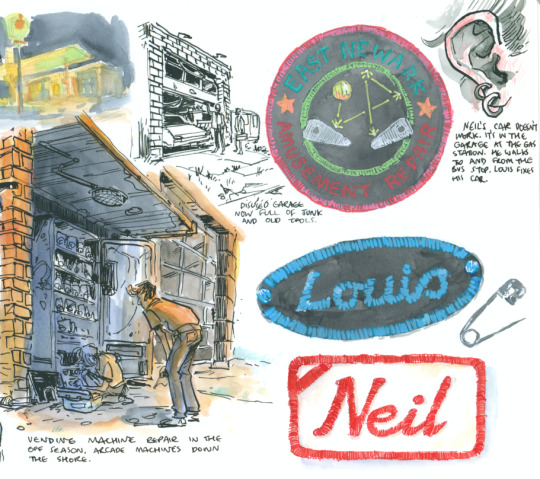
They tell artists to collect visual references - solid advice - but you should collect substance too. If you pay attention, you will hear and see things you could never in a million years make up.
I find online socialising difficult, so I go out regularly and talk to people, or just hang around and observe. Chatting with strangers mostly involves listening to them. No one in gay spaces is interested in flirting with me (I'm rather homely and queer men assume I'm straight) but I think an audience is just as appealing sometimes, and maybe even harder to find. You'd be amazed what people will tell you if you're genuinely interested and listening. I once spent forty minutes at a sci-fi con talking to a guy who'd recently gotten into fisting. While I have zero personal desire to partake in that activity (and he had no interest in being fisted by me), I'm engaged, I'm invested, I'm asking questions, spare no detail.
I collect behavior and movement and the ways people interact too. Reading stories on reddit or whatever is one thing, but the words might not be as interesting as the way they're standing, the way their hands move, the way they respond. A guy in a bar once literally humped my leg like a dog because he felt I wasn't paying enough attention to him. I would never think of that as a response to that situation, but he did, and he followed through. Fortunately my friend had just tried to drunkenly sit down and missed the chair, otherwise I would never hear the end of it.
I see the leghumper around sometimes, he's got a boyfriend and avoids making eye contact with me, thank god.
116 notes
·
View notes
Text
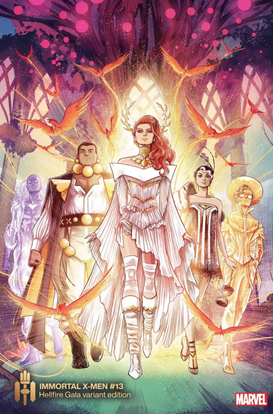
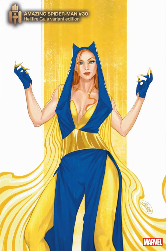
Rating all* the Hellfire Gala 2023 Outfits in my Correct Opinion
*At least, all that I can find, because Marvel decided fuck making that easy in a little book or a single post like last year.
(Long post alert!)
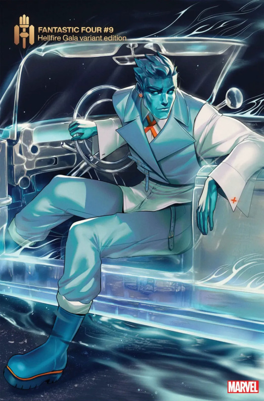
Iceman, I love most of this look. The accented orange is perfect for the mostly blue look, and I love that he has a matching earring for his cuff-links. Such a nice touch! But those rubber boots, man... those rubber boots ruin it for me. 8/10
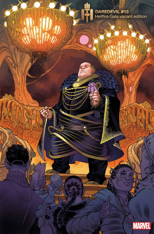
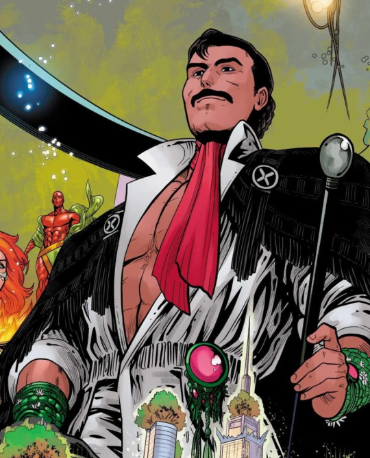
Fisk is giving off some Doctor Doom vibes with this outfit. I love the regalness of it, especially the golden leaves behind the ear. 9/10
??? I'm not sure who this is, but their outfit looks like they're going to a Halloween party rather than a gala. 3/10

Emma, oh my god, YES. Almost always delivering, and this is definitely one of those cases! 10/10
Xavier... I hate to say it, but I genuinely love this look. He's bringing major space man vibes, and it's super elegant at the same time. 9/10

Bishop doesn't even get points for effort. He got a red suit then slapped some belts on it. Boring as fuck. 1/10
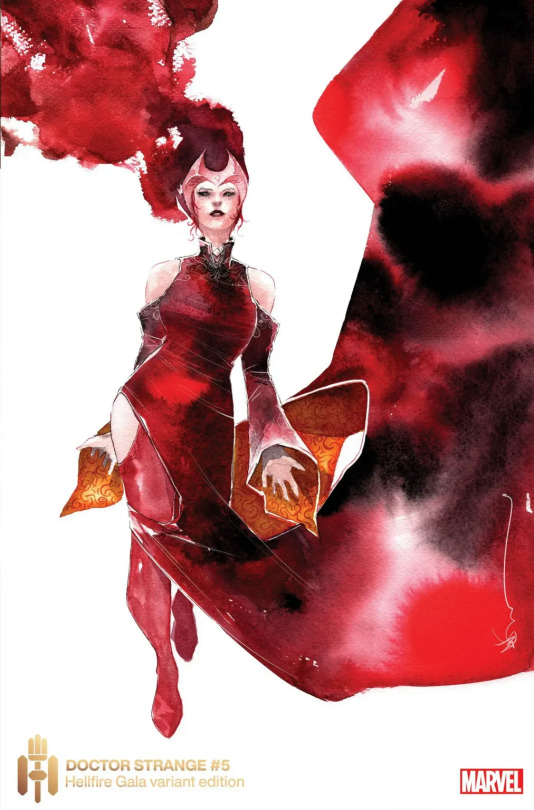
I was about to write another "???" because I had no idea who this was, until it occurred to me that I think this is supposed to be Scarlet Witch? Except she is super duper whitewashed, so I did not even recognize her. Auto-failure regardless of the look. 0/10
Proteus looks moderately snazzy, but out of the Five is the least interesting in my opinion. 3/10
Egg has a cool coat, but those balls around his neck are way too big and awkward. 4/10
Hope looks a little like a fairy princess here, and I like that! 7/10
Tempus looks like she's going to a prom more than a gala, and I don't know what's going on with that giant shoulder piece. Did Cable lend it to her or something? 4/10
Elixir, my golden boy, is embracing the shiny and I love it! 9/10
Exodus seems to be trying out a new costume rather than a gala look, but in terms of style, it's fine. 5/10

Vision's outfit is as boring as he is. 1/10
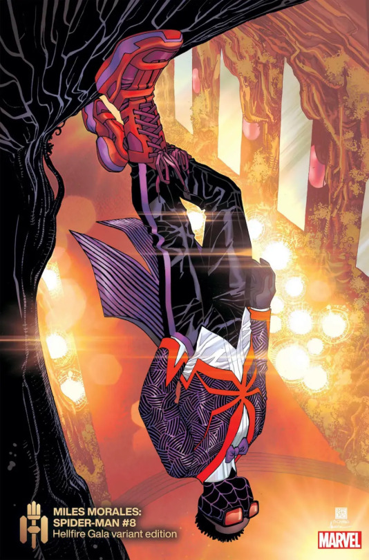
Miles, holy shit. Miles should be giving lessons to everyone else on how to actually make a suit look unique! Bishop, take notes. 9/10

Old Laura looks like she's dressed for a gothic funeral more than a gala, but at least that's to her style rather than some crazy OOC look. So, points for that. 5/10
T'Challa... I. Am. Swooning. I know he's not a king right now but damn does he ever look like it in this outfit. The beautiful patterns and complimentary colours, holy shit. 10/10

Synch has certainly done way better in the past. It's just a plain black suit without a shirt, for fuck sake. 2/10

Captain Marvel looks like she's a marching bad, lol. The stars in the hair are a nice touch, though. 3/10

Jean's look is, I know, divisive. I've seen some people say they adore this design, and some people say they hate it. I'm personally on the fence. I think it would be better without the stupid helmet, that's for sure. And I think it looks a little too much like an Emma Frost design, if you were to just colour it white. 5/10
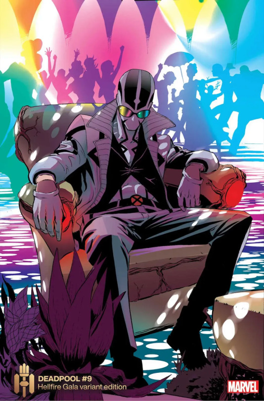
Fantomex? Where the fuck have you been? Anyway, he literally just looks like he always looks but with some sunglasses lmfao. 0/10
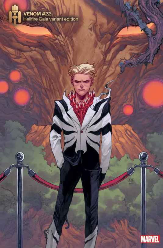
Dylan looks like a moody teen as ever, lol. I do like the black and white though. 6/10
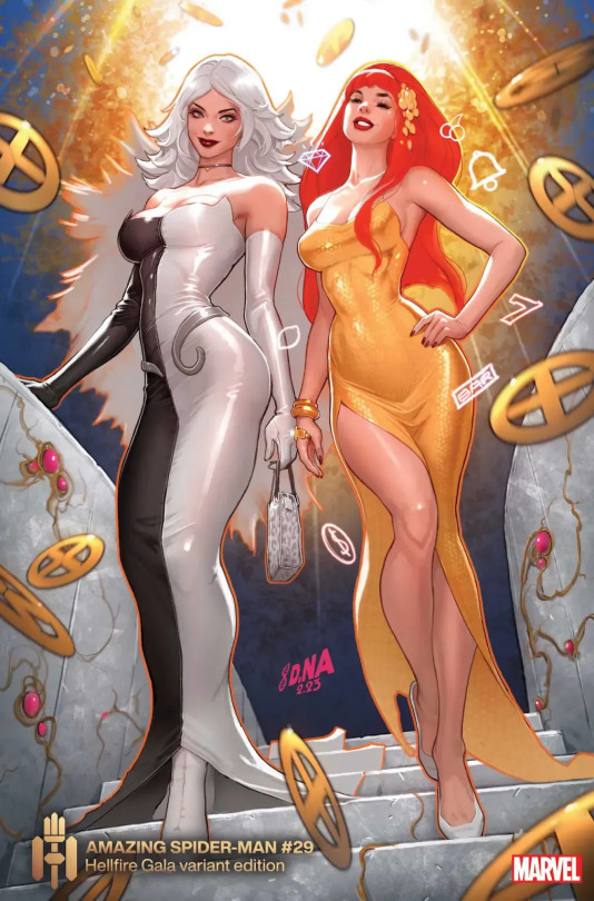
Black Cat... Like I said, I like black and white together, but this is giving me too much Cruella de Vil vibes. 4/10
Mary Jane just picked up an evening gown off the rack I guess. 2/10
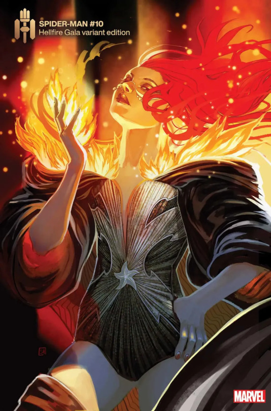
Firestar, I think? Not actually positive if it's her. Anyway, the sleeves are a bit too much for me, but I love the fiery frills on the cape. 5/10
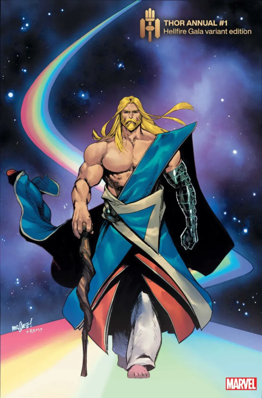
Thor looks so ugly here lmfao I'm sorry but I hate this look. It's way too clunky. 0/10

At first I thought this was Kwannon, but then I remembered seeing panels and I believe it's Kitty/Kate. Anyway, I like the lace-up boots and I like the frills. 7/10
Hellcat looks like she's took some inspiration from a wrestler's pre-fight look, and I like that. It's simplistic but just enough stylish to pass. 6/10
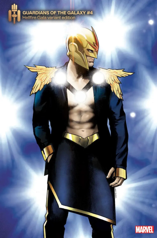
Nova, going with a tits out look as well I see. I like the feathered shoulder pads, and I like the skirt. 6/10
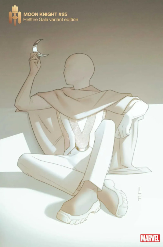
Moon Knight, oh my god, I have a strong feeling it was Steven who pulled the strings to get a gala look, because there's no fucking way Marc or Jake would be caught dead there. Anyway, this is exactly the type of vibe I would expect from MK, maybe even a bit more playful than that with the mesh part of the top. And I really like it up until the strange boots. He and Iceman must've compared notes or something. Still, 8/10
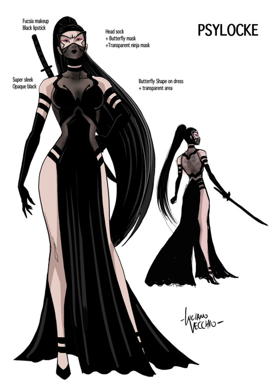
Psylocke - now THIS is Kwannon for sure! I like the classical ninja meets evening gown look, and I like that she's sexy but not to the point of being objectified, which is a refreshing change for how artists often treat her. 8/10
Destiny and Mystique I will rate together because the score is the same: A what the fuck level of 0/10.
Forge looks fucking awesome, especially compared to last year. I love the fringe and the scarf and the jewellery and the cane... it's a complete look that gives me great vibes. 8/10

Cyclops, come on, man. You can do better than this, can't you? He looks like Mister Sinister dressed him or something. 1/10
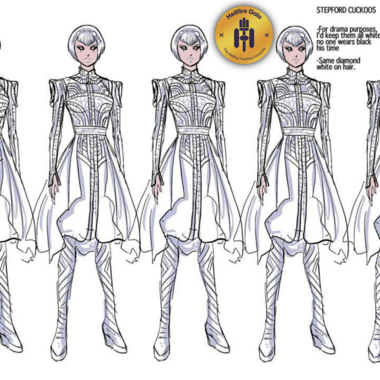
Cuckoos look like they stepped off the set of Tron: Legacy. Or a Daft Punk concert. Not complaining to be clear, this look fucks. 10/10
175 notes
·
View notes
Note
This might sound like an odd question but I’m planning on making my own comic at some point and I was wondering if you had any advice? Specifically in making the plot, deciding what each character does and maybe panel/page composition and how to make harmonious colour palettes?
Also one more question but when you were at the beginning of developing Stray Souls did you post little lore/plot snippets and character doodles/info or did you mainly wait until the comic was out?
(Sorry I know this is a lot but I was just wondering sort of what your process is because everything seems so seamless and well-put-together :> )
Ehh first of all the seamless and put-togetherness is an illusion 🫠
A lot of my work is built organically (fancy way of saying I just sorta wing it) and very dependent on what makes me excited at each given point. Generally, I come up with an idea for a character or a plot point and from there start branching out.
Say, I create character A. A needs a story so I create some beats for them, a beginning-middle-end type thing. While thinking of this, characters B, C, etc pop up as placeholders/devices for A's story, and the world gets shaped around it as well. Then suddenly something in the world gets decided that in turn changes A's story a little, and so on. Then I go into B, C, etc and do the same thing (build a story, let it bleed into the world and let the world bleed into it).
There's pros and cons to this sort of thing of course. Most of the time I over-develop characters or world bits that are completely unnecessary and clutter the narrative (especially when it's something like a comic, where things need to be explained visually and economically), and because of this sort of chaotic process I also tend to get entangled in my own concepts and lose track of my main threads. I don't dislike it entirely so it's just a matter of figuring out what works best for your own goals and processes.
Some general advice for comics that I've learned from trial and error: try stripping your story down to its bare bones and see what you absolutely need VS what's there for flavour or added context. Only add flavour once you're sure you can tackle the minimum, both in writing and artwise. Keep your character designs simple if you value your hands lol. It's fun to design complicated details but you WILL get tired of drawing them after a while. Sometimes it's ok to tell and not show 🤷♂️ if you're a one-man team sometimes you just gotta bite the bullet. Bear in mind that long stories will take YEARS to complete in comic format. Not an end all be all, but you do need to think about that. Also just go for it once you've got a structure you feel good about. I personally don't like over planning and don't even script things, so I don't think you need to have everything on paper before getting some chapters rolling. Most of what I've learned about comics has been making them, not thinking about making them. Oh, and readers tend to be more lenient than we give them credit for - if you're passionate enough about your world or characters, chances are at least some people will be interested regardless of whether you think art or writing are up to par
As for the other question, I spoiled the shit out of stray souls before launching it and still kinda do it for fun LMAO. Nothing too serious ofc but I've always loved giving people an insight into characters and world outside of the comic since the comic itself is a little peek into the whole thing. It also kinda serves to keep people interested imo
And I just can't keep my mouth shut about my stories lol
72 notes
·
View notes
Text
i will work on that and post a set this week :) kiell was very fun!
hmm i can't say i'm sure about sandi — though i'm loving her hair this series and she's beautiful as ever!
i would also love to know anything about miles' new show, if anyone has details about it to share 🥺 it's gotten lots of positive reviews, pretty solidly 4/5 stars everywhere i've seen. but even without a personal panelshowsource follower review i recommend getting a ticket!! and then coming back and telling us about it!!
hello and thank you :) sure, i put that on my drive for you here. enjoy!
he actually is 100% that bitch

i don't have this on drive atm only because it's really so easy to source. both were just posted in tv_bunny a couple of weeks ago, for example 🥲 i recommend heading over there and making a request, and someone will have links for you right away! lmk if you have any issues

does watching it on dailymotion work for you?

hello! yes, you can find ladsladslads over in the standup folder :)
their breakup was certainly intense for them both... i think i recall sara saying around the time-ish that she had expected they would really be together for the long haul, so as things began to disintegrate she was very disoriented. i also recall there being a bit of an ugly period between them — like, publicly — which was unfortunate, but they both seemed to be carrying their own bitternesses and that was surely hard
it's funny — i talked a bit about this a couple months ago, but thinking about them both reminds me so much of the rhlstp with john kearns: he talked about how, in this day of social media, audiences expect comedians to show themselves on stage, to give you that peek behind the curtain and personal anecdotes/opinions/details, and really share who they are with you — and he doesn't like that expectation. he's doing surreal and often absurd comedy, playing a character who's almost nothing like him at all, so the real john doesn't need to bleed through for the show to work. but people like sara and john...they use the stage as a form of therapy; sara uses it as a form of workshopping, communicating, connecting, sharing; i often think john is grasping, sometimes desperately, at the opportunity to be seen and heard. (his new show howl, which has gotten quite good reviews, is about his sobriety, for example!) so even though there were aspects of their breakup experience that were intense and very personal, i really hope that sharing them helped them both :)
hope we'll get to see his new show howl sometime soon, which is about his sobriety!
i have my theories about how john will be on taskmaster... let's just say, i think he'll be quite earnest and try very hard, and i think what alex has said about it being very difficult to do a character on taskmaster/the show showing people's true colours will be very relevant LMAO i can def see john coming on and trying to be cool and collected and just breaking down LMAOOO but agree it will be interesting! and personally i do always love the dynamic between greg or alex and one of their good friends heh
—————
PANEL SHOW WATCH LINKS / NON-PANEL SHOW WATCH LINKS FAQ / TAGS / ASK
18 notes
·
View notes
Text
The Issue with "Foefic"
For as long as humans have created things, others have looked at the fruits of their labour and thought, "I can do that better." Drawing inspiration from something you see and think you could improve upon is not wrong, it is how innovation works when it comes to creating tools, art, cooking. However, some people mean it in a malicious way. A way that teeters on jealousy and, if I may, clout-thirsty.

Lore Rekindled is a "retelling" of the (unfortunately) Eisner award winning webcomic Lore Olympus. From what I saw on the post introducing it, it is "better drawn and better written." I, like many, have issue with Lore Olympus. The writing is lacking and absolutely not award-worthy, and it even misses the mark as a cheesy harlequin romance. Persephone's characterization has no consistency. The art, while striking and easily recognizable, leaves a lot to be desired, especially when it comes to backgrounds. I don't consider it noteworthy, but it is heavily pushed by Naver's Webtoon, and that is probably why it keeps winning awards. With how low my opinion of Lore Olympus was, I dived into Lore Rekindled hoping to find something with more substance.
I did not find that substance.
LR suffers in different ways than LO. It assumes that you have read or are at least familiar with the major characters of Lore Olympus, which is understandable. The characters are re-written and interact strangely. Many of the characters in LO are meant to come off as "old money," and this shows in their lifestyles, fashion, and way they speak. The characters in LR all appear to have the same voice. If I were to print out a transcript of this comic and read it out loud, they would all be indistinguishable. LR is "better drawn," but what I think they meant is it is less toony. The backgrounds are better most of the time, but the panelling is boring and lacks the dynamicism seen in the original work. The plot is, if I'm being honest, just AU fanfiction (derogatory).
When I also learned that this creator had an original comic, I was very interested to see what it brought to the table. As I understood it, LR was a side project. So you can imagine my surprise when I looked at both the old and the new Project Reaper and it is just objectively a worse comic. The the majority of the cast has same-face syndrome, and seem to live in a cool-tone hell with no furniture most of the time. The concept of how to dress and style characters seems to be locked into what a 15 year old thinks is badass, but that fits for the story. The plot and dialogue reads like something a middle-schooler would make as an RP scenario with friends. The colouring is lazy dodge and burn, which just emphasizes that the author does not care about cultivating a space or atmosphere or world for these characters to live in. They are just toys to mash together to make your angsty super cool comic that you're going to pitch to Dark Horse for REAL, GUYS. And the first comic for this series is written right to left. In the author's defense, they were a teen when they started the original comic.

So how does someone whose average panel looks like the example above come to the conclusion that they can make a better comic? It's simple: Project Reaper is original, but LR has base material you can go off of. Anyone can read a comic and think "I would do THIS for this panel, and I would do THAT for this character introduction." I did it reading both of these comics. But if I were handed only the script for either of these projects, it would not come as easily. Lore Rekindled only looks "better" because it has Rachel's work to build off of. This goes back to what I was saying at the beginning, that the "I could do that but GOOD" view isn't doing you any favours, especially when you aren't doing your own IP well.
I think writing a little hate piece once in a while is good. Draw a hate piece if you really need to (though I would just show it to friends, personally.) Consuming a little media you hate is also good. As a creator, it is important to see and understand why you hate something, what you would change, and what little glimmers of good are in an otherwise pile of garbage. It helps you grow, to realize your tastes, and what not to do in your own work. Critically acclaimed writer Alan Moore agrees! But to have a whole comic with a regular update schedule redrawing something you hate is... It's giving "look at my sonichu comic redraw!" It is loser behavior.
Plenty of people create media out of spite, and I encourage it. I do it too. But the work should be your own. You need to put this energy into your IP. If you keep being a "hater," you'll never guess what you attract. Other haters! And those haters will like you, for now. But one of these days, someone will go through your list of essays and think, "oh, but I don't see any fat people in YOUR work that aren't plus-size model attractive." All it takes is one comment or take that a similarly-minded reader doesn't like and there could be a master list about you!
I am, of course, not saying you can't make derivative works at all. The doujinshi market is full of fan creations, and every art site you go to will be full of fanart. But the difference between LR and these works (generic sexy flavour of the month artists aside,) is that they are made with love. With passion for the original work. I think back to Homestuck AUs because, while I may not have liked them, these creators were doing it out of love for the characters. I follow a few guys on twitter who have been drawing a picture of their anime wife every day for over 10 years. That's love! Then you have more transformative works like Hello from Halo Head, of which some of it's characters are off-brand animal crossing characters. I love that. I think it's neat that the creator loved that little cat twink enough to bring him into their comic in a new form.
I think the point of this post is that you can use spite as a motivator, but it should be for your own creations. We have a limited time on this planet, and even less time where our hands are still able to pick up a pen. Put this towards your passion for the medium, for the stories in your heart. It's rough out there for creators, and it can be hard to find an audience in the ever-churning seas of the internet. But, please, don't put all your effort into "foefiction." That is cringe. And, if you're going to anyways, it'd better actually be good.
PS B^u

28 notes
·
View notes
Note
hey #1 sayaka fan (appointed by me) . how do you come up with your compositions and stuff?? like the colors u use and just generally how ur drawings are layed out, do you have any inspiration or is it just from your brain? absolutely love them ‼️‼️‼️
Oh, hello. ^^ Firstly, thank you for graciously giving me the title of the "number 1 Sayaka fan". I can think of a few people who like her way more than me, though! Anyways. You have provided me an unfortunate opportunity to ramble incoherently about my main inspirations.
Aside from acknowledging that Gekidan Inu Curry is a titular player of how my madomagi works turn out, I very much like video games a lot, specifically the abstract, no-explanation-walking-task-simulator types. Visuals and music combined can help create an otherworldly ambience unlike any other, even more so appealing if the graphics are striking, colourful, and personalised. They sort of resemble liminal spaces, and I want those vibes in my works. It's hard to directly translate them into my own drawings.

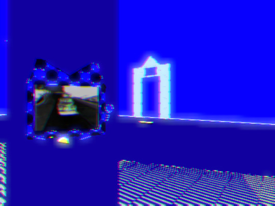
Dull colours are very effective at being gloomy, but since I'm not good at mixing them together, I often end up sticking to bright ones instead. Whenever I draw Sayaka, I also like to imagine that I'm drawing her in a world where she is the only inhabitant wandering around in it, so that's the 'composition' part. Everything in her world is lonely and vast but ambiguous in a way that feels unintentionally hostile. Music can also affect this. Did you know loneliness can be heard too?
I mentally revisit the colours and visuals of games I have previously played and kind of rotate Sayaka around in them and see what clicks for her that day. I also like putting a bunch of 'boxes' in my drawings of her, which are panels that show something happening elsewhere entirely - they are the way they are since I struggle to blend two different scenarios of Elsewhere in the same drawing. It's meant to resemble the weird, clunky interfaces of the games I like, essentially making it a drawing with interactive mechanics that don't exist.
It is also fun to try and put as much nonsense into her surroundings as possible. Because why shouldn't you give her a bunch of different irrelevant things to look at. Most of the time, though, my backgrounds are fairly empty, since I want Sayaka to be within the frame of focus, and the only thing for others to look at. Having spontaneous close-up shots of the character's face and experimenting with that also yields interesting results. < That's a lot of words to pretend I know what I'm doing.
I do take inspiration from other artists' works as well, but I'm too reluctant/awkward to post their drawings here or mention them. There is probably a lot more that I am forgetting to mention, but this is all I can compose for now. I hope it has been satisfactory. Thank you for the ask!
14 notes
·
View notes
Text
Character Designs for Wings Outstretched
I didn't want to waste time (or words - I can be verbose enough as is) describing original character designs outside of what's relevant to the story, so I'm helping myself justify that decision by sharing them visually here!
This is part one out of... three(?) posts, probably, given how the character introductions are staggered out (there's only five characters, that's not that many, right? I cut it down to as few as I could, I promise) for Honeymeans and Rilice, who are introduced in Chapter 2.
I'm keeping it below the read more so people can just ignore me and imagine whatever they want if they'd prefer, and also because I'm including some (probably quite long) pretentious character design rambles.
I have used some of the mods available from the in-game mod manager for these two, so I'll be listing the names of those mods "like this" (and authors).


Honeymeans! - (Pictured outside the magic mirror because her coat outfit is technically camp clothes so won't show up in there).
Her glorious curls are from "More Hair 2" (by eleanorroos), with "P4 Bangs Bangs Everywhere" (by padme4000) to give her that little fringe. Her hair's a mix of blond and brown through the highlights and the greying colours (using all three inputs to make really interesting and complex hair colours is like my favourite thing to do when it comes to character customisation in this game). It's not the most practical haircut, but Honeymeans definitely values feeling a little pretty over being 100% practical all the time.
Her outfit is the Longcoat from "FearTaylor's Camp Clothes" (by feartaylor) with base game yellow dye. It hasn't quite come up yet, but she's from a family of beekeepers, so I wanted her to have some honey-yellow in her outfit to show that connection, while the purple tint of her lip make-up is intended to symbolise her distance from them. She also has the neck ribbon from that mod (which I really wish was dyeable!) as a nod to her ribbon collecting habit. If I could dye it, I'd probably make it green to indicate her initial allegiance to Rilice, but a warmer shade to show how she's a friendlier character.


Rilice Torath - (She is technically wearing a Selunite outfit, but the Infernal Robe didn't look as good, so we don't see all those lunar symbols they aren't there shusshhh)
She also has a little extra bit of fringe from Bangs Everywhere just to add to the slightly-disheveled spikiness she's got going on, and frame those scales a bit more. She also has some faint green tattoos around her scales if you look closely, just to make them pop a bit more, and frame her whole head down to her neck. As much as they are pride of place, proof her claim, her right and her heritage, they're also something of a cage around her - the proof that she's part of a declining house forever embedded in her skin, unless she can find a way to save them.
Her Draconic heritage is central to her whole character and design, her whole family is known for it. Even her House name - Torath - according to this source means "mistresses of the dragons". Her little fang/talon earrings speak to that aesthetic - something she's done on purpose to embrace it even more. She accepts her role, she accepts her duty to her house, she isn't trying to escape it.
Her outfit is technically using the Myrkull dye from "FaerunColors" (by techroot) but that's not relevant to her character - she's just wearing green to again emphasise her Draconic heritage through colour, but a duller shade that you might use to lurk in shadows, to show how she's trying to remain beyond suspicion before her plan kicks in. Her choice of weapon is a sickle - a tool designed for harvest. I also gave a side view here to show off those light green panels on her sleeves that I think look really cool. They kind of remind me of, like, a lizard's underbelly if you can picture that?
That's all I can think to say about both of them for now, but if I remember anything else I might to add that as well in a reblog later. Or, if anyone has any questions for some reason, feel free! I welcome any chance to talk about the little weirdos that live in my brain.
3 notes
·
View notes
Text
Sonic the Comic Liveblog: Issue 102

We start off this issue with a very vivid looking cover

And the vividness continues in the main comic itself! I don't think I've seen colouring quite like this so far

A very tiny and cute Sonic in this panel

It has been 27 years since this issue was published yet I feel the themes of this story become increasingly more relevant as time goes on.

Actually this is reminding me a lot of a movie a saw a couple of years ago, Geostorm I think it was called?

Oh! I LOVE her design! I was not expecting her to have such funky colours like this.

StC doesnt do female villans super often, but when they do I find them pretty enjoyable

…not the smartest move to make rainclouds indoors then

oooooooh nice colouring

Having Nigel Kitching (who I believe often does the Decap Attack comics) tackle Super Sonic is an interesting choice but I think it works! Like dang, he is great at nightmare imagery.

And even with what I just said about nightmare imagery, a great job has been done here of making Super look more like an innocent kid here while still giving him that discint Fleetway look.

Meanwhile this guy is a wee bit of a cunt

It's a very interesting point and it's one that I actually pondered myself when making my Sonic Underground reboot; where after Robotnik is gone people of Mobius have complicated feelings about how he kinda did improve technology and infrastructure a lot.

It's never too late for a divorce ma'am.

Fuck yeah, Madge rocks.

This is even funnier if you imagine Super still glows even after being weakened and these two somehow still missed him.

Oh right, the vegetables. Forget about them. Anyway, this is an exceedingly cute artstyle for Sonic, it kinda has little hints of Toei Sonic.

I like it when mobians have animal attributes

I took a look back at the art in question and yeah, it was pretty good, clearly a bit of Disney influence to the artstyle.
2 notes
·
View notes
Text
X-Men 57 (June 1969)
Roy Thomas/Neal Adams
As we saw yesterday, the Neal Adams era is altogether upon us. It was mere months ago that this book was composed of stiff four-panel layouts in bright primary colours, with each panel featuring a bunch of people pictured from the waist up, conversing with each other like talking heads on the TV news. Now issues open like this.
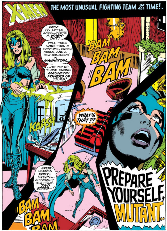
The answer to "what's that??" is the Sentinels, but we don't have time to dwell on them because we're back to Egypt for Alex Summer's emotional crisis, which is like a Jack Kirby page if Jack Kirby had known how to draw human faces.

Then the Egyptian police show up and, let's be real, it's all a bit insensitive (I'm actually not showing the grimmest bits). Hmmm.

The Sentinels, however, are after Alex too...
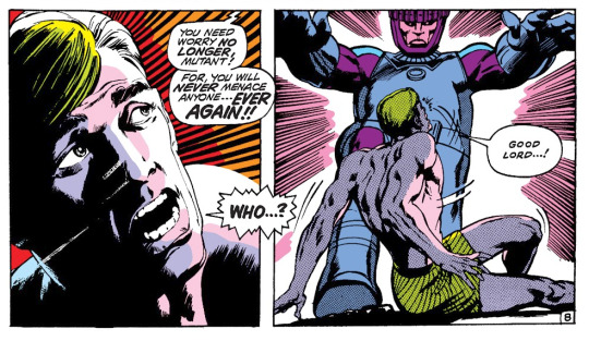
Look at this! There were hippies taking industrial amounts of acid the same month this came out who weren't seeing anything even half as interesting as this.

It turns out - I'm skimping on story here to yell about the art - that Larry Trask is back, along with the Sentinels, in another defining bit of Adams work: he had some sort of fascination with, and gift for, television on the page, with all its distortions and possibilities: we'll see more of this in subsequent issues too.

Unfortunately I do have to interrupt this to talk about the back-up feature of this issue. The last few issues have all had back-up features telling X-Men backstories, and they're mostly just too dull to really go into: they don't serve the ongoing story and they're very clearly filler. But this issue's one focuses on Marvel Girl and...yeesh.

This is the first writing credit for a woman on X-Men! Ever! Yikes!

Oh my god.

Huh. Hmm. Huh.

This is so fucking abominable. To be clear, all the other stories of this kind are stories. This is just a list of gags. And then it ends.
So, that was kind of an issue of two halves, huh.
4 notes
·
View notes
Text
Round 3 and FINALLY I'm onto Vic's solo. I've read all of these at least twice and have a lot of ground to cover, so this won't be as measured as they deserve, but hey maybe it'll be something.
The Question Vol. 1 (1987) #1
This is such a fantastic first issue, it gets me every time.
Tot's here! Myra's here! Shiva's here! Vic sucks!
First real appearance of the drowning motif, and it's a good one. The countdown til death is so good.
#2
Batman sucks at giving advice. I mean, I interpret this as a hallucination and the previous meeting as a real memory, but I'm still going to blame him.
Shiva is so fucking cool. There's a lot to criticize about how she's written but every time she shows up I get distracted by how cool she is.
The reinterpretation of the stock transformation sequence is SO good.
#3
Myra my beloved.
I love Tot's stupid project car. He's got his own interests, even if Vic isn't paying attention.
The lack of sound effects and minimal hit effects is a really cool look.
#4
Myra my BELOVED.
"better you than me" I am going to bite drywall. What is wrong with you.
#5

gender
Izzy's self-perception is a really succinct criticism of the police, and then it immediately shoots itself in the foot.
I like that Vic still says dumb one-liners. Bits of his old characterization show, even in his better moments.
The detours into other people's lives are a fascinating choice. They give the series a distinct mood, even if they aren't always well-executed.
#6
Vic and Tot referring to each other by full name is more natural here than in a lot of other books. It feels like a running bit between them.
Same with the exposition. Tot loves explaining.
This is one of the best transformation sequences. No dialogue, interesting texture, cool use of panels.
The art, inking and colouring on this whole series is fantastic. It isn't often pretty, but the texture and movement is consistently excellent.
#7
Vic and Myra's relationship is so. Augh.
This story sucks. I knew it was racist but it's worse than I remembered.
#8
I don't know how to feel about this issue. The core of it is interesting, but none of the actual pieces mesh quite right, and the Mikado theming is just bizarre.
I respect Tot's theatre kid past though.
#9
The lettering is odd in places. It's being affected by the hallucinations, I guess, but it's subtle enough on a couple pages that it's just strange.
The panelling is so good in this issue.
I love Tot and Vic's banter. Even if Vic's not a great friend, they're still clearly close.
6 notes
·
View notes