#i did originally draw the full body like in the panel but eh. i like how this looks more. its got more focus
Explore tagged Tumblr posts
Note
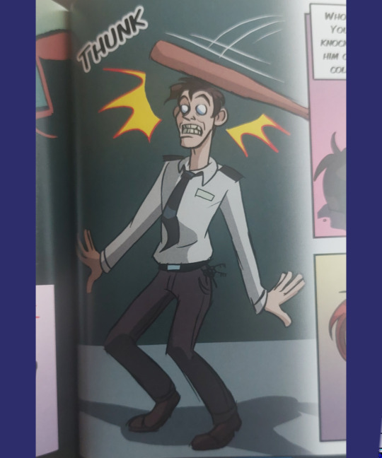
can you draw william getting hit over the head like that one panel from the silver eyes comic. that would be funny i think :3c
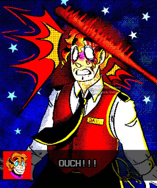
IbispaintX released a new filter called 'retro game' and I had ALOT of fun messing with it on this drawing bxkzbxks. I ended up liking the filtered version way more! So here it is, complete with a little dialogue box. It reminds me of point n click games. Like a really saturated clocktower, or DotT
I imagine a really specific voice saying the "ouch" but I could not possibly put it into words
.
And here's the original!

I'd be surprised if he didn't get a concussion from this!
And, some bonuses :]c I remember the tse graphic novel having Alot of bright yellow rim lighting but when I looked though it I could?? Barely find any??? So anyway here's a bright yellow rim lighting version bdjsndks
(w a bonus pic of the graphic novel)

#fnaf#five nights at freddy's#dave miller#william afton#fnaf fanart#fnaf graphic novel#ask to tag#eyestrain#i love the retro version so so much it saved this piece for me tbh#i would love to make it my icon but its so eyestrain-y. very not good for something that can't be filtered out#i had alot of fun with this request! i love how it turned out!!#i did originally draw the full body like in the panel but eh. i like how this looks more. its got more focus#the bg looks like the bg of school photos bcksbxks#my art#darlingsfnafau#blood#a lil bit#i have edited this so many times in the past few minutes i dont think its gonna show up in the tags bfjsbjfks
22 notes
·
View notes
Text
Basic Guide to Clone Trooper Armour
I don’t know about you guys, but I have a hard time keeping the terms for various parts of clone armour straight in my mind. So, I decided to make this Guide To Armour, to make my life easier for those times I’m drawing or writing stuff and need to reference what this, that or the other piece is called, how it’s put on or taken off. (I’ve also tried to include/come up with some casual or slang terms for some parts because you cannot seriously expect these guys to use the Right Proper Terminology for everything all of the time.)
This is based on the Clone Wars cartoons, because that’s what I know best. Also, this is just the standard armour of regular troopers; if y’all want something about the possible additions/variations that you could have then lmk and I’ll see what I can put together I guess?
Note: a lot of this terminology is taken from medieval knights’ armour. Many terms are originally French; alternative names provided where possible. I did do a bit of research on medieval plate armour, which is the closest thing I can think of to clone armour, but I am by no means an expert so if you have any input or corrections feel free to @ me. Likewise, if you’ve cosplayed as a clone trooper or stormtrooper, I’d very much like to hear about your experience wearing this stuff, how it moves and how it might be similar or different to the “real thing” so to speak.
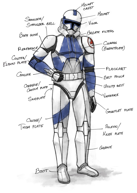
Figure 1: Clone trooper armour, front view. Kix got chosen for this because he’s a vain little bastard and loves to be painted. (ETA: this diagram now comes with a second, funnier version.)
(long post under cut)
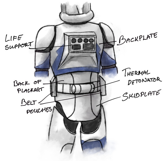
Figure 2: Back view of armour.
According to Wookieepedia: The armour is produced on Kamino and has UV spectrum markings visible to Kaminoans. It is made of plastoid-alloy composite, and the plates are attached to the bodysuit via magnatomic gription panels. In general, Phase II armour is lighter, stronger and more ergonomic than Phase I, which has been described as heavy and uncomfortable (Wookieepedia also says that it weighs ‘just under forty kilograms’ which sounds like way too much but eh, I’ll roll with it.)
Body glove/bodysuit – the stuff worn under the armour. Provides thermoregulation, some level of protection from things like blasterfire, vacuum, etc. AKA: blacks.
Helmet – The Bucket. Stuffed full of various tech: tracking device, display screen, comlink… Phase I helmets also have life support capabilities, while Phase II helmets do not, requiring an external oxygen supply*. Helmet crest contains comlink antenna. AKA: bucket, I think Rex once called them sun-bonnets, etc… this is the piece likely to have the most slang terms associated with it. Go wild.
* this is according to Wookieepedia; I’m a bit sceptical but I haven’t yet seen the episode it refers to. I headcanon that Phase II is capable of limited life support for emergency situations, but extended missions require external respirators.
Cuirass – there is some conflicting information on whether this refers to just the front chest armour or both front and back. If both, it consists of breastplate and backplate, joined at the sides and shoulders. Shoulder connections appear to be different for Phase I and Phase II: Phase I has a separate piece covering the shoulder seam, implying that it can be opened, whereas Phase II looks like it has an integrated flexible band; it may or may not be possible to disconnect. Either way, the front and back pieces must be able to separate in order to get the whole thing on.
Plackart – belly piece, wraps around the back to protect kidneys as well. Probably flexible to some extent, has been seen to slide down under belt, as demonstrated by Jesse in Figure 3. Might also have to have at least one open-able seam in it in order for troopers to get into it efficiently.
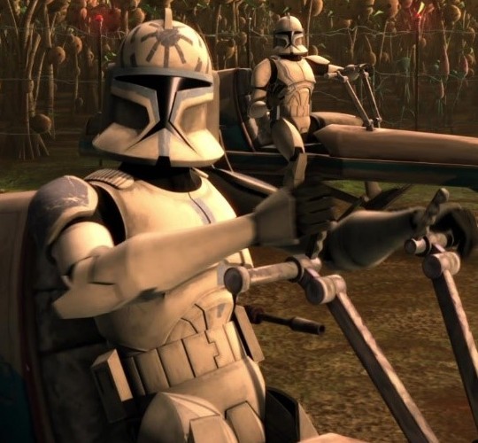
Figure 3: I have no idea how the lower edge of this isn’t stabbing him in the crotch, but *shrug*.
Spaulder/shoulder bell – also known as pauldrons irl, but that term refers to a different item this context (the pauldrons that commanders, captains and ARC troopers wear), so I feel like it might be better to differentiate between them with different terms to avoid confusion. That’s just my opinion though, you feel free to do as you wish.
Rerebrace – bicep plate. Phase I has cutouts in the back to fit pointy elbows (see below); Phase II does not.
Couter – elbow plate. Pointy elbows in Phase I, unpointy elbows in Phase II, as shown on Figure 4. In Phase I appear to be attached to vambraces in the animated version, Phase II is more mobile. I admit, I’m not a huge fan of this word, I kinda prefer elbow plates.
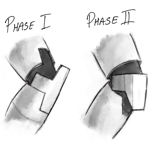
Figure 4: Phase I and II elbows. Am I getting way too into this that it’s gotten to the point of studying clone elbows? *shrug* who knows.
Vambrace – forearm armour. Has wrist-mounted comlink (see below).
Gauntlet plate – covers back of hand. The 212th absolutely calls these “droid-punchers”, no you cannot convince me otherwise. I think I’ve seen fanon that some troopers sharpen the front edge of this plate to do more damage when punching. Decide for yourself if plastoid alloy would do more damage to the metal of a droid’s chassis if sharpened or unsharpened (and therefore sturdier).
Codpiece/crotch plate – covers the front hip and crotch area. Possible slang term, courtesy of @mockingjay34: cockblock
Skidplate – covers butt and back hip. A lot of troopers probably just call this piece their shebs, and once again you cannot convince me otherwise. Note that in the clone wars cartoon, Phase I armour is triangular in the back and has a sort of erm… diaper shape, in that the codpiece and skidplate are connected in the crotch (I cannot imagine that being comfortable in any situation, but then again, I have Thicc™ Thighs. Do clones have thigh gaps? Also, I would not want to get pinched by the armour joint between crotch and thigh plates).
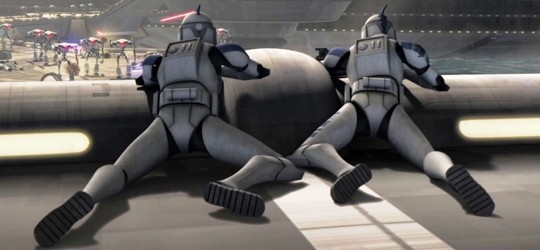
Figure 5: Sniper Butts! (Featuring Echo and Fives in quite possibly the only comfortable position in this armour.)
In Phase II the crotch and butt pieces are separated, which sounds a lot more sensible, as well as having better butt coverage – think cheeky panties vs full briefs.
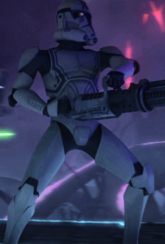
Figure 6: Hardcase kindly demonstrating the new crotch plate alongside some significant gaps in his armour… please get yourself some bigger shoulder bells my dude!
I’d imagine that, given the amount of time these guys spend fully armoured, there should be some way of conveniently opening some of this up or removing individual plates for practical reasons (and if any particular trooper wanted to use this feature for… other things, well, that’s their own business).
Cuisse/Thigh plate – covers thighs. Phase I and II have different shapes in the back to account for skidplate shape, with Phase II having significantly less coverage in the upper thigh/butt area, but I guess better range of motion.
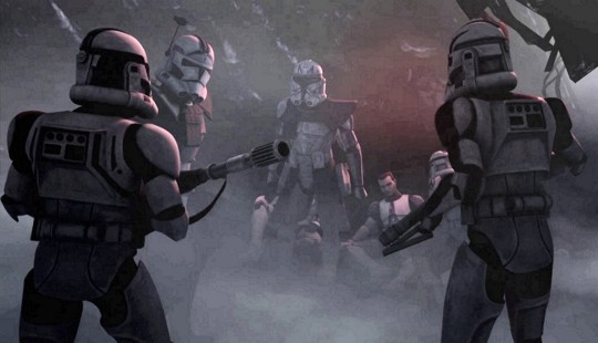
Figure 7: Troopers Hardcase and Dogma demonstrating the Butt Cutouts, or Buttouts.
Poleyn/knee plate/knee pad – important for maintaining kneecap integrity. Like elbow plates, appears to be integrated into greaves in Phase I, but moving freely in Phase II.
Greaves – cover shins, nothing fancy.
Boots – boots. Do not appear to be armoured, are soft enough to bend your toes for walking/kneeling/whatever you need bendy toes for.
Belt pouches/boxes/compartments – A place to keep your stuff when out & about. I’m assuming this is a Pocket Substitute. Clones deserve pockets too!
Comlink – Generally four large square buttons and one smaller one (live action has more buttons). They also have comlinks in their helmets. Wookieepedia mentioned that they used wrist comms in the show so that the audience could clearly see when characters were talking to each other. Possibly used for long-range communication, whereas the ones in the buckets could be for shorter range?
Life support/those box things on their back – I have no idea what they’re actually called but these also have different designs for Phase I and II. On stormtroopers they contain a power pack and a small oxygen supply, and I guess it’s reasonable to assume that they have the same life support function for clone troopers. Also read somewhere that they have comlink scanner for long-range communication?
Thermal detonator – why would they all have bombs on their back? Seems unsafe. Also I don’t think I’ve ever seen one used? Idk. These things confuse me.
#star wars#the clone wars#swtcw#clone troopers#clone armor#clone wars meta#wow this got long#also damn I've missed just... sitting down with a mug of tea and going down a research rabbit hole or three#star wars meta
5K notes
·
View notes
Photo


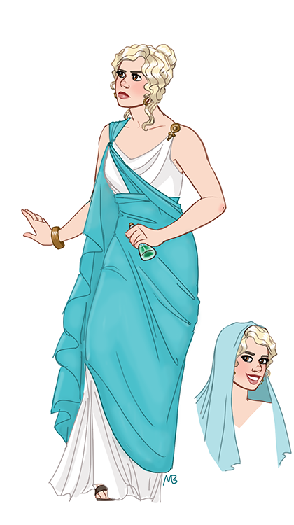
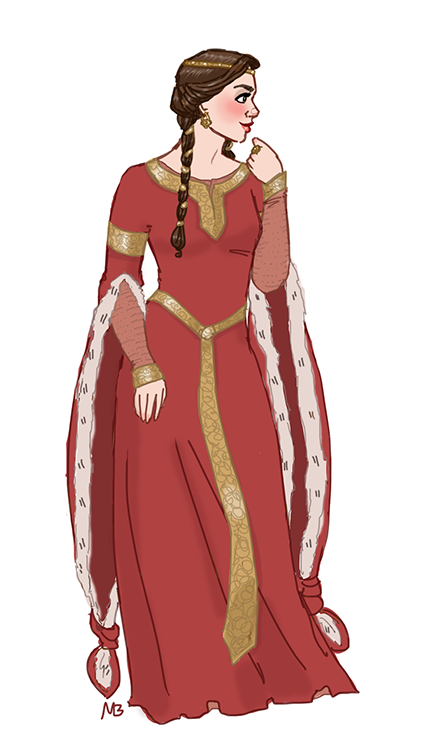
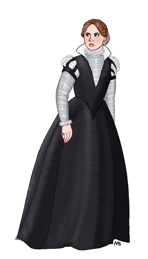
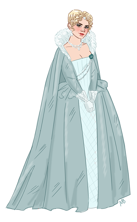


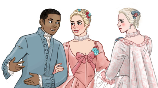
so after sketching out the doodle for this post upon the request of the lovely @chiaroscuroverse, I decided it was high time I finally got started on something I’ve been wanting to do for a while now. Thusly, I present to y’all the first installment of my sketch series New Who Companions in (Mostly) Historically-Accurate Period Costumes! :D
(clicky on the smaller images above to embiggen; clicky the read-more for costume history facts and assorted nerditude for each design!)
So long story short, I’m a big ol’ fashion history nerd, studied a good chunk of fashion history in the Western world during ye olde college days, and sometimes I like to think about what our New Who companions might have worn if they wanted to go mostly-historically-accurate in their old-world adventures. Below are some descriptions of what those costumes could have looked like, and a little bit of the historical context surrounding the ensembles. Thanks for joining me on this sartorial nerd-journey! <3
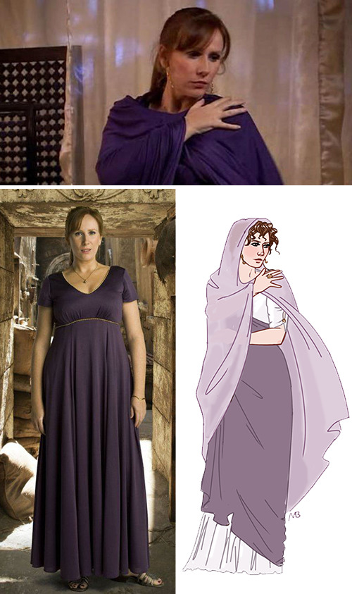
Fig. 1: Donna Noble, The Fires of Pompeii (Roman Empire, 79 AD)
So Donna’s original costume, while very pretty, is not accurate in any way; I can only imagine the designer was held back by some untold constraints (i.e. this costume is either constructed based on stylistic requests from Catherine Tate or it’s the product of executive meddling). Here, Donna wears a stola, i.e. a dress-like garment fastened with fibulae clasps and held in place with a girdle high above the waist. This garment would technically be worn by a married woman, to sort of show off her wealth and worth, but I figure Donna don’t give no shits about that, just give her the pretty dress already. She’s also wearing a palla, a shawl Roman women wore when going about their business outside. You would typically see the palla wrapped around the woman’s body to both accentuate her curves where desired, to hide her features when wanted (women might draw the hood close to the face to hide from unwanted male gazes), and to keep the material from dragging along the ground. The volume of fabric in the shawl signified a woman’s status; the more fabric, the wealthier the lady. Donna’s garments are fashioned from the finest material available, being linens imported from Egypt and silks imported from China.

Fig. 3: Bill Potts, The Eaters of Light (Scotland, c. 100 AD)
So, finding solid details on how women dressed in this time and place was fun,* but I did my best to sort of piece things together into a design that would make sense given the convergent influences and the materials (cloth/fibers, dyes, equipment) available in the area at the time. Basically, you’ve got a tunic cinched at the waist, and a woven cloak on top sporting a Pictish-type design, and simple jewelry fashioned from alloys that were commonplace at the time. Bill’s brooch and belt would definitely be met with approval from the other ladies; only peasant-women left the house without a belt.
* It was not fun. It was frustrating.

Fig. 2: Rose Tyler, The Stone Rose spinoff novel (Rome, 120 AD)
Rose’s garments and hair are intentionally sculptural in design, inspired by a series of Roman statues built around the time the story is set (I figured it was appropriate given the book’s plot!). Here she is wearing half of her Fortuna costume, on her way to save the Doctor (obv). Typically, a not-yet-married woman would only need to wear one layer (as unmarried women were, shall we say, low on the priority list in terms of Roman fashion), but here, on her way to being immortalized as the great Fortuna, an exception has been made for Rose; Marcia’s servants have draped, wrapped, and pinned some very fine material over Rose’s close-fitting tunica. Rose is also shown with a mantle, for covering her hair in public. Both Donna and Rose would have had their hair curled using a calamistrum, or an early curling iron, which varied in shape and style, but in this case likely would have actually been made of iron, and warmed over hot coals.
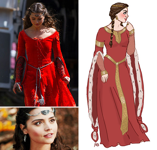
Fig. 4: Clara Oswald, Robot of Sherwood (England, 1190 AD)
Okay, so why did they make this look like a Halloween costume? It’s just, this episode clearly had a budget, the designer clearly did their homework, so who made what decision and where and when that led us to this? I mean, don’t get me wrong, it’s a nice Halloween costume! Like, one you would have to rent instead of buy, because she is le pricey. But I’m curious to know why the designer ventured so close to the actual periodwear without actually committing to it. Like the sleeves—the flare at the elbow suggests the overdress, or bliaut, is of French design, except those sleeves ain’t near big enough, neither in terms of volume or length. Sometimes these sleeves were so long, women would have to knot them to keep them from dragging the ground. If you don’t wanna deal with big sleeves for your action heroine, that’s fine, just go with a more English design, which forewent the exaggerated trumpet-shape in favor of something more subtle. The current shape just looks weird—like, it’s halfway there, but got tired and gave up. Then you’ve got the front-lacing on the bodice; this is a nope, and only enhances the Halloween/fancy dress look. Dresses would fasten on the side or in the back; if you were upper-class, you might be looking at a modesty panel to hide the lacing in the case of the latter. The hair is another instance of halfway-there; the top half is pretty good, with its center-part and the wraparound braid, but the loose bottom portion and the salon-curls are a big no-no. Curls weren’t really in vogue in the area at the time; ladies’ hair was worn long and braided, both to keep it out of the way and to show off elaborate styles. And last but certainly not least, why the heck is Clara’s circlet shaped the way it is? It’s like they took a necklace, situated it with a bunch of slack in the chain, and stuck it to her forehead using spirit gum. Would noble ladies have worn circlets/coronets at the time? Sure! Would they have been shaped (or stuck-on???) like that? Nope! The original ensemble is full of potential but it feels like someone somewhere along the decision-making process looked at the original, better design, said, “Eh, can you modernize (read: sex) that up for me?” and then this was born. Again, it’s not horrible, just, it could have been so much more.

/rant

Fig. 5: Amy Pond, Vampires of Venice (Italy, 1580 AD)
So I realize there’s a class difference between what Amy wore in the show and what’s depicted here, but I figured the upper-class depiction made more sense, given the fashions of the other young ladies accepted into Calvieri’s school. (That being said, Amy’s original outfit still isn’t quite there; this shows an example or two of what a working-class woman would wear at the time.) On the right, Amy is wearing a velvet gown over a petticoat; even though the color and bodice-shape denote a heavy Spanish influence, the dress would have been referred to as a French gown due to its fitted shape. Were Amy to go whole-hog and give herself some true mid-sixteenth-century hair, the front would be short, and regularly wound into tight, compact little curls, while the back was kept long, for elaborate braids and updos. That’s right--the sixteenth century was technically full of mullets. Mullets everywhere.
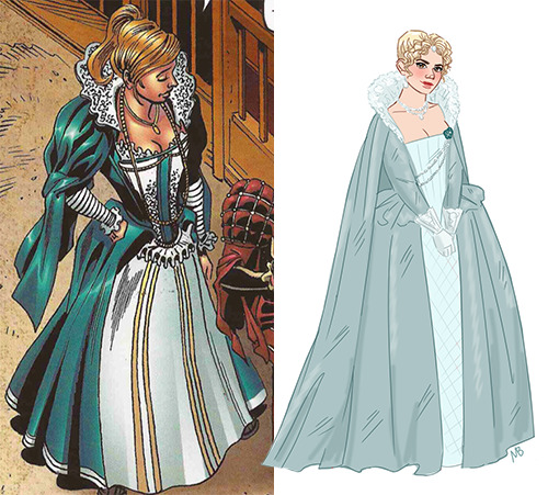
Fig. 6: Rose Tyler, A Groatsworth of Wit spinoff comic (England, 1592)
ok but the design in the comic, just

I don’t even understand why the artist drew it this way. It doesn’t make sense, not from a costume history perspective and not even from a design/fudging-the-details-for-the-sake-of-modern-sensibilities perspective. (Also from a perspective-perspective; dude’s having some major issues figuring out how foreshortening works, but that’s neither here nor there I suppose.) It would actually be way faster to focus on what this gown does right instead of wrong. So, let’s see here: it has a lace collar, which was a thing. It has a structured, paneled bodice; also a thing. Full layered skirt, that’s good. And, that’s officially it. The rest of this design is garbage. Like, why the eff is she wearing a ruffle as some kind of low-slung belt? Is that supposed to be cartridge pleating? What century are those sleeves supposed to be from? (Do those outer sleeves even? Show up in any century to speak of, outside of my nightmares???) If you’re going to do a lace cuff at the end of the fitted sleeve, why not do it right (i.e. like the way they actually looked at the time, which was usually in a cone shape flaring out from the wrist to the elbow)? Why would the artist imagine that Rose would go to the trouble of pouring herself into this 80’s-teal monstrosity without bothering to do anything to her hair except for a ponytail? What the fuck is up with the fucking boob lace??? See, I know the artist can draw actual historically accurate outfits, because Shakespeare in this comic looks fine. His shit’s pretty accurate. But for some reason, when it came to Rose’s dress, it’s like the artist lost their goddamn mind. (Don’t even get me started on the jewelry and accents, not if there’s a loving god in this universe)
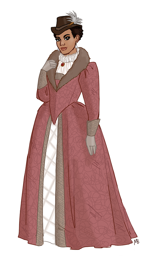
Fig. 7: Martha Jones, The Shakespeare Code (England, 1599)
So Martha has herself a lovely heavy brocade gown, trimmed in sable, accented with soft leather gloves, and topped with a cartwheel ruff round the neck. (Don’t worry; I imagine the TARDIS only carries ethically-harvested furs, like they’re grown in a lab somewhere or collected after critters have had a long and prosperous life or the hairs are vacuumed up and reconstituted by some futuristic device, etc. etc.) Elizabethan sumptuary laws dictated that folks had to dress according to social class, so depending on what your social class was, you may not have been legally permitted to wear things like silks, certain colors, certain furs, and more. Fashion was such a surging industry and indicator of wealth that, at the time, you had higher-ups selling huge swaths of land in order to have the money to dress themselves as well as possible--it was seriously that important to be fashionable. Martha’s garments indicate that she has pretty high social standing, given the materials used. Also, she wears a pretty bitchin’ hat.

Fig. 8: Yazmin Khan, The Witchfinders (England, 1612)
Yazmin’s dress sports a fashionably high-necked bodice featuring embroidered linen silk, topped with a standing collar and “wings” at the shoulders. The dark hues shown here were super-popular at the time due to a surge of obsession with melancholia in arts and literature. Yaz also wears a “Cavalier” style hat, accented with an ostrich feather. Her outfit is basically a riding-habit/hunting-habit, constructed with ease of movement in mind.
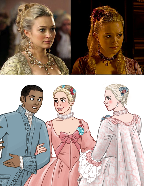
Fig. 9: Mickey Smith, Rose Tyler, and Reinette Poisson i.e. Madame de Pompadour, The Girl in the Fireplace (France, 1758)
Setting aside my many issues with this episode’s story/plot, the bugaboos I have with Reinette’s original costume design in the show are relatively minor, and I imagine can mostly be explained-away with stuff like “this is what the BBC already had on hand” and “goddamn that’s pretty.” Both pretty salient points! But I do think it’s interesting that the designer(s) went the way they did--Madame de Pompadour was actually famously not in favor of glittering gems (actually, she supposedly donated palace jewels to the French treasury more than once to help out during times of war); she tended to prefer fairly simple pearls as embellishment, instead. She also wasn’t really into big hair; obviously the styles shown here on Ms. Myles aren’t exactly Marie-Antoinette-big, but they’re definitely more voluminous and modernized than the styles the real-life MdP typically sported, which usually consisted of a slight pomp and fairly close-knit curls framing the face. (It’s also interesting that Moffat wrote her with such a heavy innuendo for sex/romance, because rumor had it she didn’t really actually enjoy things in the bedroom all that much, instead preferring to pull political strings, promote the arts, patronize motherfucking Voltaire!!!, help design architecture!!!, and keep the king constantly entertained and distracted so he literally didn’t royally fuck everything up. She was a very busy lady! Also she like. Paid contractors and artists on time? Instead of dicking them over with “credit” bullshit like other wealthy patrons??? Sorry she was just WAY more awesome than the show gave her credit for!) Anyhoo, long story short, Rose and MdP are shown here wearing gowns and hairstyles that are heavily inspired by those worn by the real-life MdP wore in some of her many many portraits.
Thanks for tuning in to my giant costume nerdfest; see you next time for part 2! <3 <3 <3
#donna noble#bill potts#rose tyler#clara oswald#amy pond#martha jones#yazmin khan#mickey smith#madame de pompadour#doctor who fanart#donna noble fanart#bill potts fanart#rose tyler fanart#clara oswald fanart#amy pond fanart#martha jones fanart#yazmin khan fanart#mickey smith fanart#madame de pompadour fanart#man i wanna post this right meow but the timing#al;kdsjflsakdjf#anyhoo this has been a lot of fun to work on#and this is the first time i've drawn amy! so that's fun#also this is an interesting illustration of How Colors Look Very Different On Different Computer Monitors#this computer (the ol' at-homer) is more saturated than my iphone or work computer so we'll seeeee how the colors turn out elsewhere lol#anyhoo more commentary in the read-more in the post#thanks for checking the post out! <3#mbb draws
374 notes
·
View notes
Text
I got a lot of line art work done today.
Some of them look really interesting and are poses I have never tried before.
This project has truly been pushing me as an artist and I feel like I am improving constantly.
I do feel really tired because I work late at night and also my body cramps a lot.
I do some like stretches and stuff but it’s difficult for me to move like that a lot of the time and so I feel a lot of pain often.
I have been also adding little details to the story too.
It’s around that time now that my general outline is becoming more realized and dialogue is being written as well.
Originally I had more single panels of just works or page if just words.
I didn’t think it would be feasible for me to do like an entire manga series traditionally so I and borrowing a lot of format from web toon/light novel.
But I have expanded it a bit amend have more traditional format manga panels which may or may not affect the overall page size of the project.
I also may have found an assistant and depending on what we can do together, doing more full manga panels might be easier to do.
Ideally I would like to do as much as a traditional manga as possible, but I am well aware that are constraints.
I am also taking more risks than I normally planned on taking.
And the reason why I was holding back was purely from a stance of feeling unsure of myself.
But I am feeling more confident and feel braver to take chances where I thought I would not initially.
Some of the scenes really intimidated me and I was not sure if I could draw them.
Also some of the content is risqué, though in my opinion, vital to the plot.
Not only that but I had previously never drawn anything like that before so I have in the past been filled with a lot of self doubt.
Recently, however, I feel braver and more confident.
Everything is incredibly tasteful and I think wlw deserve more content like this.
Also realistic bodies from woman in a manga (also drawn by a woman) what a concept eh!?!?
Anyhow,I feel a little run down this morning in the body. And slightly in the mind.
I did make myself a nice breakfast though and that’s helped some on both fronts.
I even have some nice green tea to drink.
There are still some portions of this story I feel concerned about.
I have gotten really attached to my protagonist and I feel really protective of her.
It’s hard to tell because I have been so biased towards the internets actions and opinions on things that I am concerned about how a general audience is going to treat my autistic protagonist.
I feel like too often characters are hidden away and labeled as “quirky” or “unconventional “ or they’re espers or some fantastical super human.
This character is just a plain everyday woman who is autistic.
Nothing overly special. No super powers. Not overly savant like or anything.
I want her to be treated with respect.
It’s going to be a challenge perhaps. We will see.
2 notes
·
View notes
Photo
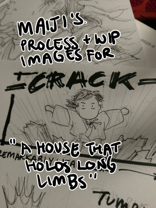
Process and wip images for A House That Holds Long Limbs (Part 4)
Previous process and wip documentation: Part 1 / Part 2 / Part 3
Read the pages for part 4 here (full complete version will be linked from YYH North Bound master post)
This is a rare glimpse into how I tackle action scenes!! It’s rare because I rarely do it. Action is honestly one of the hardest things for me to draw, and as I’m sure I’ve said here many times before, I have the utmost respect for shounen manga artists whose works are steeped in them. It’s a really impressive skill to be able to do it well - to create a cinematic, dynamic sense of motion that doesn’t dissolve into visual confusion and incomprehensibleness.
This was as interesting for me to document my thought process as it hopefully is for you to read and discover what the heck was going on in my head (a big honking mess, that’s what). There was much screaming and crying while working on this hahaha.
Aside from Hokushin’s beautiful face (lmao), Part 4 is packed with things I don’t usually draw. Specifically: action, things taking place in the dark, and corpses. For things taking place in the dark, I heavily referenced the dark room rounds from the tournament for Genkai’s successor in volume 4, because it involves action and Togashi used practically zero screentones in it and I didn’t want to either. For the dead rokurokubi, I looked up photos of skulls and drew on my memory of various horror comics I’ve read, like Kurosagi Corpse Delivery Service. (At one point I also googled photos of rotting skulls, but TBH I didn’t really want to spend a lot of time looking at detailed photographic references of corpse and decomposing bodies for obvious reasons, especially as I usually work on these comics late at night before I go to bed. The last thing I need is for images to get stuck in my brain when I’m sleeping.)
The rest of this post focuses mainly on action and redrawing things.
Script
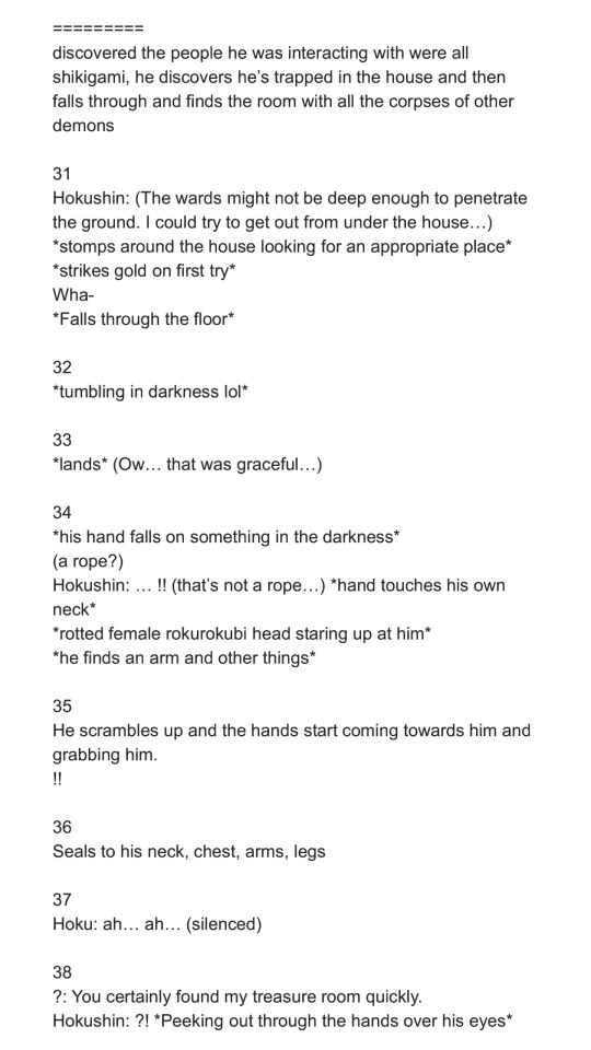
The original script for this section actually ran a little further in the story than what’s shown here, but in order to convey the sequence effectively, I ended up stretching a number of key moments out and have booted the later ones to be completed for Part 5.
Thumbnails
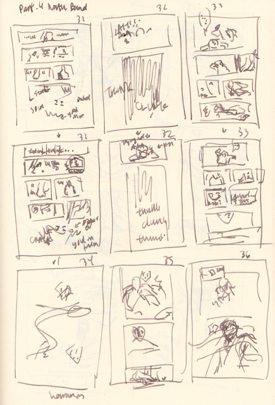
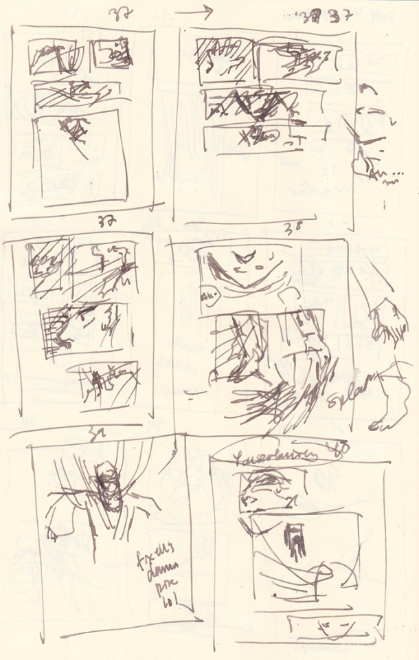
In the thumbnails above, you’ll notice quite a few are redraws of the same page as I struggle - pages 31-33 repeat immediately in the rows after, page 37 was attempted three times, etc.
Page count growth
A script of 8 pages turned into 10 pages at the thumbnail stage, and then ultimately netted out at 12 pages in the final version that was posted. As you can see, effective action sequences generally take me more pages than I think they will. With an exception (documented below).
Thumbnailing/storyboarding things out should theoretically minimize the page count creep! But because I tend to treat my thumbnails as such a loose stage (to avoid later disappointment when I can’t recreate it as nicely in the final page), I rush through them. Unfortunately, action sequences require me to think a lot more carefully through the scene as a director - staging the shot and the experience of the motion and coordinating people’s limbs and all the items in the scene more carefully and whatnot than, say, just a couple of heads talking. So inevitably, when I rush to get ahead to the finished pages, that’s when I realize it doesn’t flow as well as I was imagining (or not really imagining it).
As a result, the actual “live” pages turn into constant mental checks and runthroughs of the panels, realizing it’s not flowing as well as I’d like, and restarting. By restarting I mean mentally reenvisioning the sequence, sometimes quickly doodling alternate thumbnails (I didn’t bother in this case, so I have no alternate examples from after I started redrawing), and erasing and redrawing and adding pages. I guess I could probably avoid this if I just stop and put more time into thinking through the thumbnails… but it seems like I end up revising no matter what. So, constant juggling forever.
The evolution of the key action sequence
In my head, the main sequence was:
Hokushin lands.
He gets up and feels something in the dark.
He discovers the rokurokubi corpse.
He turns around to discover a swarm of hands in the dark!
Ahhh hands!! Ahhhh!!
Then he gets sealed and stringed up. End action sequence, back to people standing - or hanging out, I guess - and talking.
I roughed out my panels and pencils for all the pages following my thumbnails instead of doing one page at a time, because I’m impatient and also tend to think of all the pages as a wholistic narrative and then drilling down to the details on each page (big to small perspective).
As I went back over each page and detailing the base pencil art more, I began noticing more issues with the flow of the action and the pagination. Things started really shifting and changing at point 4. Here’s essentially how my thinking played out as I drew:
He turns around to discover a swarm of hands in the dark! - WAIT he just sees the corpse and then turns around? I should have him sense something is behind him first to get you more into his head and experience. OK, insert another panel of him sensing and whatever. THEN he can turn around. This is also good because I can erase the panel where he’s turning around and give the first panel a bit more room so I can draw more of his body in the first one and make his startled falling back motion a bit clearer.
HANDS!! AHHH HANDS!! - Wait, I have hands coming from BEHIND him and don’t effectively show that before they just appear to grab his hair. Which I suppose they do, but when I review panel flow it seems jarring, like a poorly directed cut and something was missing. Let’s try adding some hands behind him in the panel where he looks shocked. Never mind, this looks dumb and he looks dumb and basically seems even more like an afterthought. Ooh, better idea: let’s have him dodge the first wave of hands. That’ll be kinda cool and more interesting. And then he can land and be like OH SHIT MORE HANDS FROM EVERY DIRECTION
Ahhh hands!! Ahhhh!! - Hmm, maybe I should add a page here to better capture his dodge sequence. So the panels will be hands, dodge, and then the next page is he lands, then he realizes there are more hands behind him. How crouched down should he be? I guess in the later pages I basically drew him in a practically fully upright position… eh.. Working this out...
*starts drawing extra page* … Mmm, thinking about this again, no. It stretches things out too much. Now it feels like he lands, the new page adds an extra pause that could be interpreted unconsciously as he thinks he’s ok, then he gets attacked by hands from behind. But that’s ridiculous because he’s a rokurokubi, he KNOWS the hands can come back around or whatever, and he’s a good and cautious fighter, the extra pause doesn’t seem to fit. Thinking this through, basically I need it to feel faster - he lands (typed “he hands” there first time around haha), and he doesn’t have a chance to react again before it turns out hands are coming from all directions. So, I’ll keep it to the one original page and draw the reaction to the sound of the hands coming from everywhere. Done. (one of the few instances where I reduce page count in an action sequence)
Oh yeah, I forgot about his arms and legs getting sealed. Er, add another page. OK done.
For comparison, below are photos of the pencils for pages 35 and 36 before the above process:
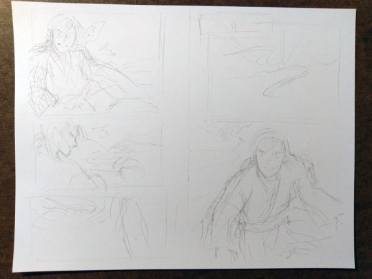
... and after:

Redraws
I generally try to avoid redrawing an entire image/page from scratch if I don’t have to. Even if I don’t like the overall drawing, I’m still terrified of effing up the parts that turned out OK the first time around. However, sometimes you gotta know when to cut your losses and start anew and save yourself time and grief (I’m definitely still learning how to know lol). I do have a few strategies to ease my mind - I often take photos of something before I proceed to the next step or change direction (which is where many of these wip photos come from). This helps calm me down because at least now I have a reference for what it was before I took the leap of faith to move forward. Another option is to just leave it and draw on a completely new blank page.
Page 37, where Hokushin is getting his head pulled back by the hands, was an incredibly rare instance of the pencils for a page turning out almost exactly how I wanted on the first try, so I was loathe to redraw or adjust it. This means I basically forced myself to shuffle things before and after to accommodate not having to change it.
On the flipside, page 40, where the shot backs away so you can see Hokushin tied up with the hands, is one I full-on redrew from scratch. I was having a hard time with his pose and how all the hands were wrapped around him and how everything was actually working. I wasn’t happy with the drawing the first time around, but inked it anyways to see if I would like it better the next morning (sometimes this works, to wait and look at it with a distanced frame of mind). Spoiler, I didn’t lol. However, the process of inking the entire thing helped me better hone in on what parts I liked and didn’t like, so when I sketched it out again I was better able to adjust.
This photo shows the original (with the words REDRAW :/ at the bottom), a sketch I did trying to figure out his posture and where all the hands were/how the wrapping actually worked, and then the pencils of the redraw.

Final miscellaneous things
The end page of Part 4 is once again a last minute addition that resulted because I was facing a blank page (again!) after adding the page where Hokushin gets his arms and legs sealed. I changed the spoken line multiple times. First it was a line that’s been pushed to the upcoming part 5, then it was the “You certainly found my “treasure room” quickly” (that’s on the previous page). In the end, I just wrote a completely new line for it. It seemed to work better with the panel and closing off this part at a good point.
Last but not least, I somehow broke my pen inking this part lmao. Fortunately it’s a Muji pen so I only broke the tip off the cartridge somehow, probably in my intense scribbling/shading at some point. It’s not super clear in the photo but if you look closely at the point you’ll see this thin line coming out of the tip of the pen - it was this metal filament that basically scratched the paper without any ink coming out. I had to make an emergency run to two Mujis, neither of which had the black refills, so I ended up just buying two pens with similar thicknesses. Worst case scenario, I would have just inked with my blue cartridge, since the scanning would turn everything black and white anyways... the original pages would have just looked weird.

Phew! Hopefully it worked out and isn’t a totally incoherent mess!
#yu yu hakusho#comics#fanart#hokushin#wip#process#drawings#yyh north bound#art by maiji/mary huang#action sequences#redrawing#art supplies
5 notes
·
View notes
Text
MAGI 345 Full Spoiler Translation
Disclaimer: i only to this for fun, to share it with you guys, and to practice my japanese :) which is very basic so keep in mind that i could be completely mistaken in some parts. This is just a fan translation of incomplete spoilers so: Don’t forget to support the official releases of Magi!
Source: From Tieba Baidu’s Japanese scans and from Jump-Netabare’s texts ^^
@sayakakat2012 @maumauxmau
UPDATE: I added the jump-Netabare info that was missing. I checked it while looking at the korean scans so i would be able order it as if the texts were the in word balloons ( you can read it that way if you want to, while you look at the pics on the korean scans) ^^
Page 1
Narration:
Even if he dies, he won’t give up!! How did he came back to life?
*Netabare text: Wahid, Setta and Tess are piling up stones. Lethargic people are floating around them.
Alibaba: I want to come back to life!
Wahid: Again, with that? Come do masonry too, Alibaba! Everything will be fine among us anyway!
Alibaba: Nothing will be fine!
Wahid: Since Alibaba came here, he has been investigating around and listening to everyone’s conversations nonstop.
Tess: Hey big brother Setta
Tess: What kind of feeling is “to want to be alive again”?
Setta: Who knows, but Tess was also alive a long time ago.
Tess: Hmm.
Night 345: Magical Connection
Page 2
*Netabare text: Tess is watching Alibaba desperately talking to Wahid.
Tess: “wanting to live”, what kind of feeling was it?
Tess: I don’t understand… That big brother, he is strange…
*Netabare text: Tess stares motionless at the desperate Alibaba.
Alibaba: Which reminds me, aren’t all the people in this place magicians? Please lend me your strength!
Wahid: There is no strength to lend you. We can’t even use magic in the first place.
Alibaba: Eh! Why?
Page 3
Wahid: The things that are on this place might be nothing but an illusion! Maybe even our bodies.
The rukh doesn’t dwell in this place. Naturally, there’s no Magoi either. That’s why we can’t use magic.
Alibaba: I see… there’s also no rukh in my body, right?
Setta: There’s not.
Setta: Ah! But… you see, there is rukh in this stone.
Alibaba: huh?! In the stone?!
Setta: Only these stones aren’t illusions. They were picked up by the “dimensional hole”
Alibaba: The “dimensional hole”?
Page 4
Setta: Hey! We told you during this time, right? A little before David was resurrected, in accordance with his prediction, there was a turmoil that opened the “dimensional hole”
Setta: In that moment, various things came and slipped into this side from the other side of the hole.
*Netabare text: In the background, there is a depiction of the stones falling from the dimension whole when it opened.
Setta: On the other side, there was something like a war taking place, there was a black giant who had a lot of hands growing from its head…
Alibaba: Yes, perhaps that’s the sight of Magnostadt’s war and the “medium”, so therefore, these are stones from the world I exist in?
Alibaba: Therefore, in this place there are objects that have rukh and aren’t ilusions?
Setta: That’s right.
Page 5
Alibaba: Then, this is a heavy crop*! Isn’t it? Rukh is the source of Magoi, right!? In other words, if you use these stones… doesn’t that mean that you will be able to use magic?
TN: *Sorry, it’s weird but I didn’t know this word and the dictionary says it refers to a heavy harvest but I see that it can mean “a big deal”
Wahid and Setta: Ohh!
TN: Alibaba starts to get the other people’s attention, the manuscript on the corner of the next panel says: “what’s happening?”/ “what is it?”
Wahid: Now that you mention it, that’s right. I hadn’t thought about that.
Setta: Because we don’t want to do anything in particular…
Tess: …
Tess: Big brother Alibaba! I Heard you but…
Alibaba: yeah?
Page 6
Tess: How will you live again? I don’t want to do anything in particular…
Tess: I Think that I’m okay this way, in this place, doing masonry…
Setta: Tess…
Wahid: Yes! That’s right, that’s right!
Alibaba: There are a lot of things that I want to do!
Alibaba: There’s people that i want to see, a country I want to protect, promises that I couldn’t keep, things that I have left undone… There are a lot of things that I still don’t know.
Page 7
Alibaba: oh! I have never even dated a girl!
Please!
Alibaba: Please lend me your strength!
*Netabare text: Alibaba blushed with his face down while the others stare at him blankly.
Wahid: oh, you died without knowing a woman that way? What a pitiful guy you are!
*Netabare text: Wahid starts tearing up.
People: Wahaha
Setta: However, neither this material nor the white rukh belong to Alma Torran. It is doubtful whether it can be handled by us or not.
Person 1: If this stone is from Alibaba-kun’s world, Can’t Alibaba-kun use it?
Person 2: No, first of all we have to create that Magic to revive…
Tess: How do you create magic, papa?
Wahid: eh!? How do you create it? That’s…
*Netabare text: Wahid becomes silent while he sweats
Page 8
*Netabare text: After being Silent for a while, Wahid smiles while he gently brushes Tess’s head.
Wahid: ... you do your best and you create it.
Setta: Tess’s dad is not very good at dealing with such complicated things. Since long ago, brain work was completely left up to Ugo and me…
*Netabare text: Wahid grabs Setta’s chest.
Wahid: You are so noisy! I tell you that i can make more than enough magic! Bring something to write on! I will perform a Magical formula* at a super-fast speed!
TN: i put magical ceremony before, but given tha they are developing something that looks like a formula in the later pages, i guess formula fits better the context. but this is also some kind of ritual so formula/ceremony are both correct in my opinion. The kanji can have any of those two meanings.
People: hahaha
Random Person: But, what is magic to revive? I wonder if it’s like a telepathic system?
Random Person 2: No, it might be power magic. Because, to start with, it is said that it’s beyond the dimensions…
*Netabare text: People who were lethargic are happily talking and consulting each other.
Page 9
Tess: Somehow, this place has become lively!
*Netabare text: Tess’s eyes are shining.
*Netabare text: The people are drawing smoothly the magic formula on the ground.
People: Because time is the only thing that we have more than enough of, we can research a much as we want!
People: An unknown magic invention. It’s been too long, right? … since we had this feeling!
*Netabare text: Tess is trembling and watching with excitement.
Wahid: Ah! Alibaba! There’s nothing else left but to train!*
TN: *Something like that.
Tess: !!
Page 10
*Netabare text: Alibaba is being trained by Wahid until the magic formula is completed.
Wahid: Come now! Even if the magic formula is put together, you will not come back to life if you can’t use magic!
Alibaba: Can I do this even if I’m not a magician?
*Netabare text: Tess runs to Alibaba’s side.
Tess: Should I show you the secret?
Alibaba: Yeah! Thank you, Tess!
Tess: We finally rest!
Tess: What kind of people are the people that Big brother Alibaba wants to meet again?
Alibaba: A lot of different people! The people who I grew to care are in crisis!
Tess: hmm
Tess: What about your mama big brother?
Alibaba: My mother is dead, so she’s not there.
Tess: Hmm, that’s sad, right?
Alibaba: That’s right. At the time when Tess died, Tess’s mom also seemed really sad…
Tess: Hmm... Mama…
Page 11
*Netabare text: Tess looks down at his feet and swings them.
Alibaba: Hm? What is it?
Tess: I… think I want to see my mama again…
Alibaba: ….
*Netabare text: Alibaba observes Tess silently while the people in the background become engrossed about writing the magic formula.
Tess: Such a feeling, why did I ever forget it?
Tess: I want to see my mama again!
*Netabare text: Tess blushes a little and smiles to Alibaba. Alibaba gazes at Tess’s face. After that, Tess shows Alibaba the secrets*
TN: The secret tips Tess mentioned to Alibaba on the previous page.
Page 12
*Netabare text: And, as the sun goes down, the magic formula is completed.
People: We did it! The magic formula is finished!
Page 13
Tess: What is this stone statute? It’s so cool!
Person: Because, even if Alibaba will come back to life, a body will still be necessary, so we are making a custom one with the stones!
Tess: I see, so when big brother Alibaba revives, he won’t die right?
TN: haha it seems like it doesn’t make sense but it does, I just don’t know how to phrase it English. Tess means that the reason they are making that body is because if he revives without a body we will “be nothing”.
*Netabare text: Tess observes Alibaba and the others. Wahid and Setta make Alibaba stand on a black circle.
Setta: Listen, Alibaba-kun! The great magic that we created is a magic that connect dimensions with one another just for an instant.
Setta: You will go through that path and return to the original world.
Alibaba: Then, will I be able to come back to this place again?
Page 14
Setta: No, the load of this great magic can’t be endured by a human flesh body. it’s a strange way of putting it, because you are already dead, please think of it as a separation technique that can be used only once.
Wahid: It will be a slow training of your spirit* You will have to become able to move on a temporary body made of stone. How will you feel in 100 years? How will you feel in 200 years? Will you be able to remain sane?
Alibaba: Let’s find out!*
TN: *Put in a simpler way: “i’ll try”
*Netabare text: Alibaba starts training inside the black circle.
Page 15
Narration: The day of departure
Alibaba: Well then, see you later! Thank you so much for everything until today!
Wahid: yeah! I hope you can stop it! The downfall of your world!
Alibaba: And in addition to that… I thought about one more thing that I want to do.
Tess and Wahid: ?
Wahid: Something that you want to do?
Page 16
Alibaba: This magic that i received, it can connect dimensions, right? Maybe it can even connect rukh?
Setta: Connect the rukh? What do you mean?
Alibaba: The people that die on my world become white rukh, and go to the place of the “great flow”
Alibaba: But the fallen guys become black rukh and are left out. You guys that are inside ill illah are in a different place. The guys from Al Thamen are also in a different place…
Alibaba: why do dead people have to become all dispersed now? If i could connect them all together…
*Netabare: People around have surprised expressions.
Page 17
Setta: Can we meet again? Brother...
People: I want to see my family!
Tess: I want to see mama!
Tess: I want to see mama!
Wahid: Can we meet again? Falan...
Wahid: Alibaba, if it was your intention to sell us a favor so you could be repayed, you would have better said it since way earlier.
TN: Still not sure about this line...
Alibaba: You are wrong! This is what I want to do.
Alibaba: Living and rescuing the world.
Alibaba: I won’t stop for anyone else’s reasons…
Page 18
Alibaba: Even if it’s not wanted by anyone else, i will live by my own will…
Alibaba: That’s what i have decided.
*Netabare text: Alibaba becomes Hanibaba and departs with* the magic formula
TN: by means of.
People (Manuscript) : Take care, Alibaba!
Setta: Thanks to him, it was fun for the first time in a while.
Wahid: He was a weird guy! He constantly believed that he could be revived by his energy alone… just like that guy…
*Netabare text: Setta and Wahid exchange glances
Wahid and Setta: HAHAHA! It can’t be!
Text in white:
His will is strong!
( i think that after that, it says something about the next issue having some coloring)
..
.
As always, thank you for reading ^^
#Magi 345#Magi spoilers#Magi#magi the labyrinth of magic#Alibaba saluja#Tess#Wahid#Setta#my magi translation#so is alibaba a singularity too? XD
82 notes
·
View notes
Text
off the rack #1168
Monday, June 26, 2017
It's the last week of June, so Canada Day is soon. With the country celebrating its 150th anniversary, this year is a big deal. I was 10-years-old when we had our centennial in 1967 and I was part of a children's choir that sang at city hall as part of the year-long celebration back then. We're getting together with friends for Canada Day come Saturday and I wish you all a great week and weekend.
Peter Parker: The Spectacular Spider-Man #1 - Chip Zdarsky (writer) Adam Kubert (art) Jordie Bellaire (colours). Get ready to be assaulted by an explosion of Spider-Man stuff as we near the theatrical release of the movie "Spider-Man Homecoming" on July 7. I still remember picking up Peter Parker: The Spectacular Spider-Man #1 off the spinner rack in 1976, happy that there was another comic book starring my favourite super hero. I wasn't sure I wanted to read this new incarnation because I am not a big fan of Chip's writing. I was not impressed with his work on the new Howard the Duck and Jughead books. My problem is that he comes across as too frenetic and eager to please by writing way too much. The double page spread with Peter and Johnny Storm having lunch together is a great example. Look at all them word balloons. The rest of the book is no better. Almost every panel is jammed full of word balloons. And what's with Peter leaving his mask on during lunch? Johnny knows his secret identity already. Wouldn't it have been more comfortable to take his mask off? I know I'm being picky but it's these little details that annoy me. The other thing that annoyed me was that I had to Google two acronyms to get what was being said. I'm an old fogey so I didn't know what NBD and NPC meant. Maybe it was to balance out all the other words used that "no big deal" and "non player character" were shortened. My quibbles are not enough to keep me from reading the next issue however because Chip pulls something out of the asphalt at the end that makes me want to find out more about the surprise person that Johnny meets. Well played Chip Zdarsky, well played.
Batwoman #4 - Marguerite Bennett & James Tynion IV (writers) Steve Epting (art) Jeromy Cox (colours) Deron Bennett (letters). The first story arc ends with Kate and company saving the day. I was satisfied with how the story ended and there is enough mystery to keep me wanting to read more. What is Plan B and who is the shadowy figure in the last panel? I want to find out.
Shirtless Bear-Fighter #1 - Jody Leheup & Sebastian Girner (writers) Nil Vendrell (art) Mike Spicer (colours) Dave Lanphear (letters). This takes place in a land where Yogi Bear would fit right in. The well endowed Shirtless Bear-Fighter's origin story is part Mowgli from Jungle Book and part Superman and part Punisher. This issue was mildly humorous but I didn't chuckle or laugh out loud. Maybe I'm too old. Is this the next Teenage Mutant Ninja Turtles #1? Or The Walking Dead #1? Do bears poop in the woods? Buy it, read it and you be the judge. I only read it because Ottawa's own Tom Fowler did one of the variant covers.
W.M.D. Weapons of Mutant Destruction #1 - Greg Pak (writer) Mahmud Asrar (art) Nolan Woodard (colours) VC's Joe Caramagna (letters). I hope you've been reading the new Weapon X comic book with Old Man Logan, Sabretooth, et alia because this is a direct tie-in to what went on there. No worries if you haven't because Greg spells everything out very clearly. The good guys are fighting an evil anti-mutant organization that is creating mutant killers. The Totally Awesome Hulk is one of the good guys so look for part 2, 4 and 6 of the story in that book. Parts 3 and 5 are in Weapon X. I'm reading them all.
Aquaman #25 - Dan Abnett (writer) Stjepan Sejic (art & colours) Steve Wands (letters). This title has gone "Game of Thrones" but that's not why I took this extra-sized anniversary issue off the racks to read. It was the cover and interior art by Stjepan Sejic that made me want to give this book another try. I sure am glad I did. The story of a new power mad King of Atlantis and the return of the usurped King isn’t anything new but the beautiful art makes it more exciting to me. Stjepan knows how to draw hot women and Mera and Dolphin gives him plenty of opportunity to show that off. Aquaman is going back on my "must read" list.
Crosswind #5 - Gail Simone (writer) Cat Staggs (illustrator) Simon Bowland (letters). It's nice to see Gail back on the racks again. Here she does a grown up version of Freaky Friday where a housewife and a mob enforcer switch bodies. Juniper and Cason are introduced pre switcheroo, which happens at the end of this issue. I can't wait to see what happens next. Cat's art is nice and that made it easy to put this new book on my "must read" list.
Plastic #3 - Doug Wagner (writer) Daniel Hillyard (art) Laura Martin (colours) Ed Dukeshire (letters). The "hero" of this story is a psychotic killer but I like him a lot. A damsel in distress who may suffer a fate worst than death (haven't heard that cliché in a while eh?) plays a big role in this issue. Punisher fans will like this series.
Royal City #4 - Jeff Lemire (writer & illustrator) Steve Wands (letters). This is a really cool ghost story. Patrick's thoughts about aging hit close to home.
Archie #21 - Mark Waid (writer) Pete Woods (art & colours) Jack Morelli (letters). OMG (I know what that means) they killed…! You have to read this issue to find out who.
The Mighty Thor #20 - Jason Aaron (writer) Russell Dauterman & Valerio Schiti (art) Matthew Wilson & Veronica Gandini (colours) VC's Joe Sabino (letters). Loved the Walt Simonson tribute cover by Patrick Brown. Speculator alert: it's the first appearance of a new Thor. You won't believe who it is. What motivates this guy to pick up the hammer is heart wrenching and the bad guys are going to get it. I can't wait to see him in action. There's a scene between Jane Foster and the Odinson that puts into question the fate of the Mighty Thor. I really hope she sticks around.
Batman #25 - Tom King (writer) Mikel Janin (art) June Chung (colours) Clayton Cowles (letters). What made last issue worth reading was the kaboom on the last page. This whole issue is worth it for the build up to "The War of Jokes and Riddles". It's Batman versus the Joker and the Riddler and it's super intense. Mikel's art is the cherry on top and it's yummy. Batman is getting really good again.
Wildstorm #5 - Warren Ellis (writer) Jon Davis-Hunt (art) Steve Buccellato (colours) Simon Bowland (letters). You should read this. It's all coming together beautifully.
Luke Cage #2 - David F. Walker (writer) Nelson Blake II (art) Marcio Menyz (colours) VC's Joe Sabino (letters). This is an uh-oh issue as Luke investigates what the scientist that gave him his super powers was up to. Kind of reminded me of Orphan Black.
Superman #25 - Patrick Gleason & Peter J. Tomasi (writers) Doug Mahnke & Patrick Gleason (pencils) Jaime Mendoza, Mick Gray, Joe Prado, Ray McCarthy, Scott Hanna & Matt Santorelli (inks) Wil Quintana & John Kalisz (colours) Dave Sharpe (letters). The conclusion to "Fade to Black" has guest stars galore and highlights the core of this title as the good guys prevail. I've enjoyed this book more because of the family values that Clark, Lois and Jonathan embody and the art is spectacular.
Star Wars: Darth Vader #2 - Charles Soule (writer) Giuseppe Camuncoli (pencils) Cam Smith (inks) David Curiel (colours) VC's Joe Caramagna (letters). By the way Vader is mowing down storm troopers he must be really pissed at his boss. We find out who he's going to get his light sabre from in this issue. From the looks of the next issue teaser, it's going to be a scorcher.
Nick Fury #3 - James Robinson (writer) Aco (pencils) Hugo Petrus (inks) Rachelle Rosenberg (colours) Travis Lanham (letters). This is freaking awesome. All you fans out there not reading this are missing out on some excellent writing and art. This reminds me of how I felt when I first saw Jim Steranko's art on Nick Fury Agent of S.H.I.E.L.D. in the sixties as a teenager. Aco and Hugo's art with Rachelle's colours is so pretty and pops off the page. Buy this book.
Super Sons #5 - Peter J. Tomasi (writer) Alisson Borges (art) Hi-Fi (colours) Rob Leigh (letters). Few writers know how to make young adults sound genuine but Peter is one of them. This issue establishes Jon and Damian as the young dynamic duo. I can't wait to see what they get up to next.
Invincible Iron Man #8 - Brian Michael Bendis (writer) Stefano Caselli (art) Marte Gracia (colours) VC's Clayton Cowles (letters). This sets up next issue's fight with Lady Von Bardas. We'll see how bardas she really is.
0 notes