#i could typeset the entire thing if i wanted
Explore tagged Tumblr posts
Text
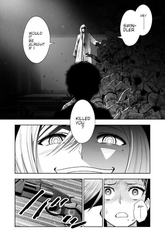
I just learned how to download fonts and use them in SAI2
so here's a test page with the generic manga font :D
#tbh considering i already (poorly) translated this chapter#i could typeset the entire thing if i wanted#it's actually not too hard?#even with sai2 having a very very annoying text editor system#though gsdfhjkjshgdhj i don't know how to format things properly anyways like actual typesetters do#you know#considering that i hardly know ANY japanese and i'm using the worst typesetting software imaginable#i could have this entire chapter done in under a week#and yet the official translation made by a team of paid professionals#updates chapters every century or so#i haven't seen a 'new chapter' email for the english translation in AGES#i just wanna buy cutthrowats backstory#i have been saving points for over 300 days now. and it was at chapter 20~ when i started#that's 300 days and they're not even at chapter 30 last i checked#and cutthroat's chapter is 38 T_T#my points will EXPIRE by the time they get to it fr#akudama drive#rave ramblees
6 notes
·
View notes
Text
Zero's Fic Binding - Maybe Tomorrow
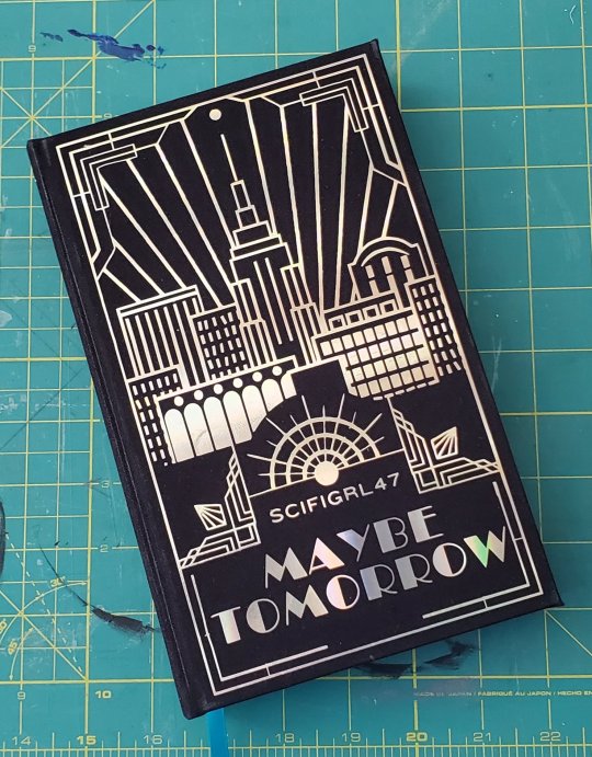
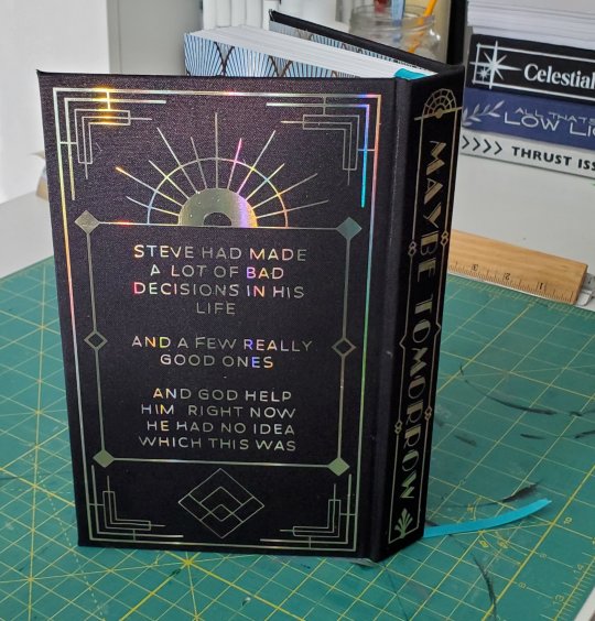
Maybe Tomorrow by @scifigrl47
Fandom: The Avengers (Marvel) – All Media Types
Ship: Steve Rogers/Tony Stark
Start Date: 4/12/24
End Date: 5/2/24
Pages: 433
On my list of fics to bind, Maybe Tomorrow was the one I saw the most clearly in my head before I started. I had an idea in my mind immediately - knew what I wanted the cover to look like, knew the chapter headers - the vision for this bitch was so clear the entire time I was working on it.
The fic is a an Annie retelling. I wanted the cover to combined a playbill vibe - pulling the city scape from some of the covers - and the Gatsby vibe. The Empire state building was my main inspiration - it combines those two thing brilliantly.
I could not find a skyline of New York that I like. So I made one. This cover is built out of MANY small squares that are masked behind other squares. There are…so many individual paces of this cover. It took me WAY to long, but I this was one of those times where I knew exactly what I wanted this to look like, and I did it.
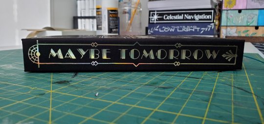
Ok, let me nerd out for a second. Specifically I wanted the sun burst on the front - and on the top of the spine - here to look like some of the old art deco elevators floor indicators. The hollow gold really fucking pulls the whole cover together. The Broadway font, the hollow gold vinyl - honestly, this was my favorite cover. It's the most themed, that's for sure - and also the most detailed.
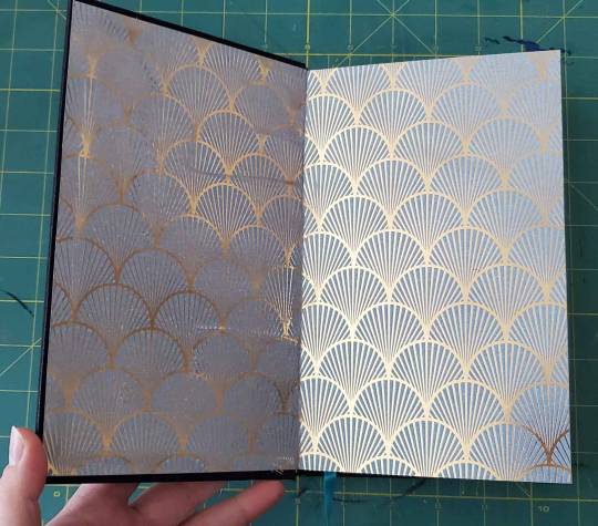
End pages are that lovely art deco arch. Commit to the bit. Can tell that the binding tape is a little thick/the end paper is a little to thin - so you can see them ghosting just slightly. Still, the shiny gold fans were fucking perfect.
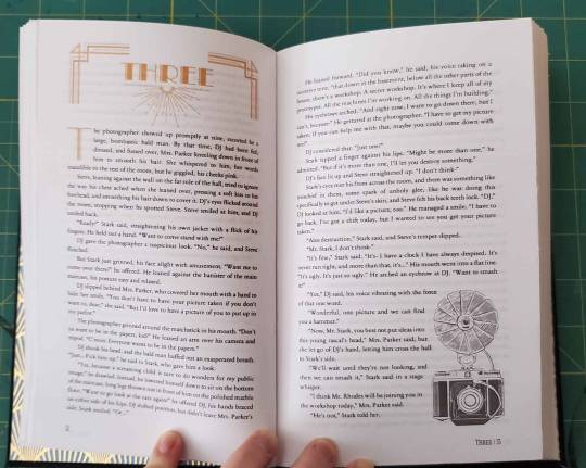
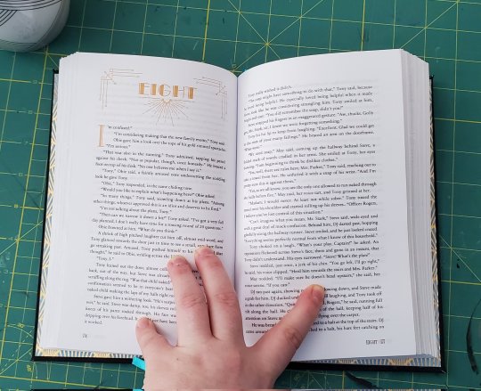
Ok, moving on. The typeset for this chunky boy is also lovely. Every chapter has different top header frames. The Broadway style font for the headers and the drop caps are all gold.
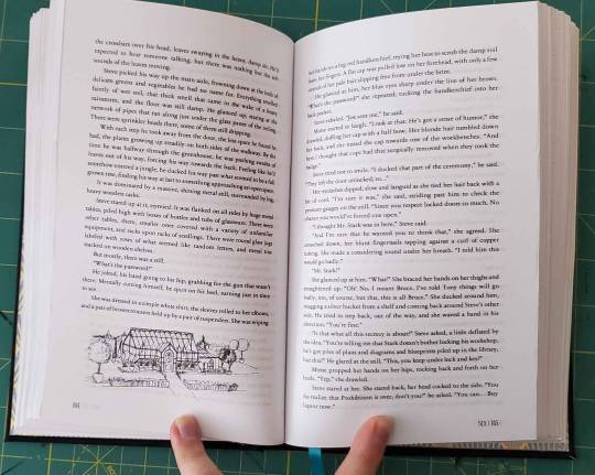
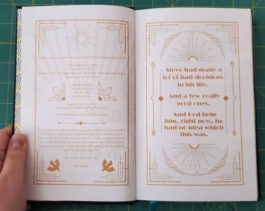
This was my first try imbedding images into the chapters as well, relating them to whatever is going on in the fic.
Including the shot of my splash page too. I've started to define this a lot more now, but this was the first time I think I detailed this page this much.
This is one of my fucking favorite fics. I love everything about it - the plot, the character writing, the mood. Scifigrl47 was the first writer I tripped over on my way into the Steve/Tony fandom….fucking, what? Ten years ago? It's a pleasure to read their fics, always, and I'm ecstatic to have it on my shelf now.
If you somehow haven't read this fic, you're welcome.
#zeros fic binding#stony#ficbinding#steve rogers/tony stark#2024 bind#bookbinding#mcu#handbinding#steve/tony#stevetony#typesetting
312 notes
·
View notes
Text
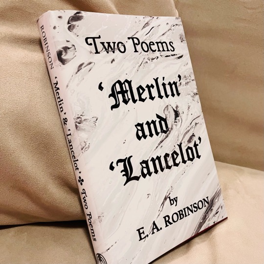
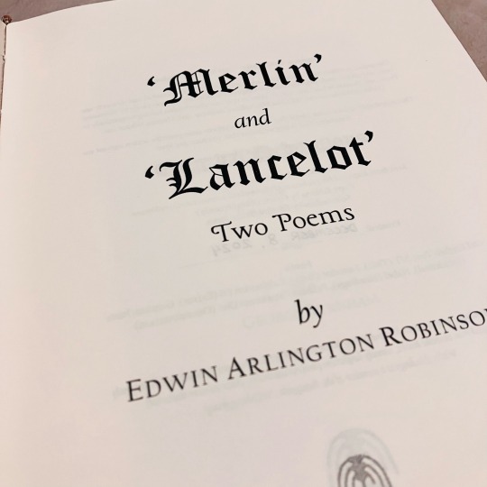
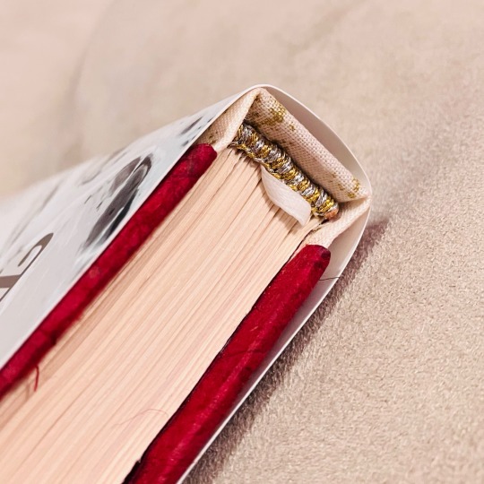
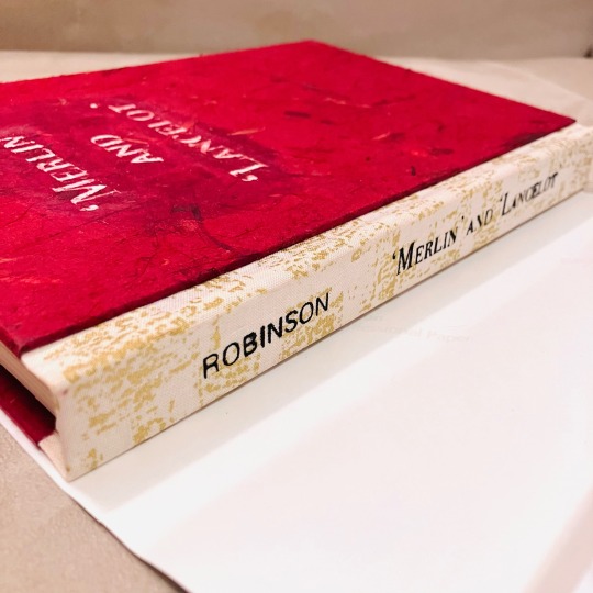
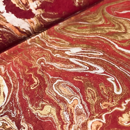
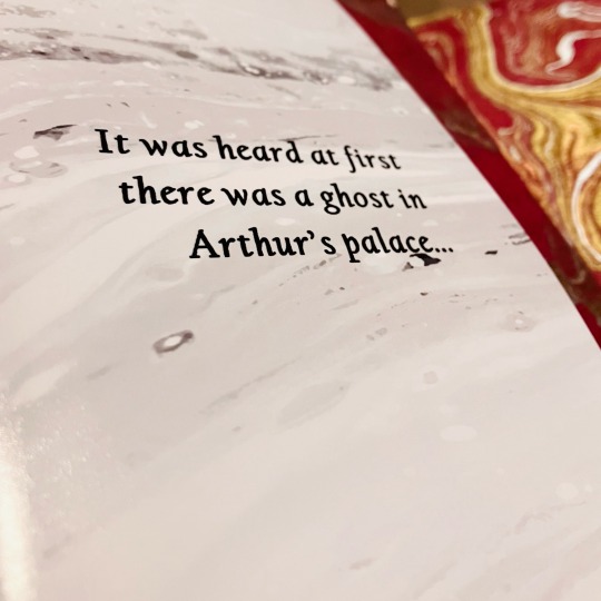
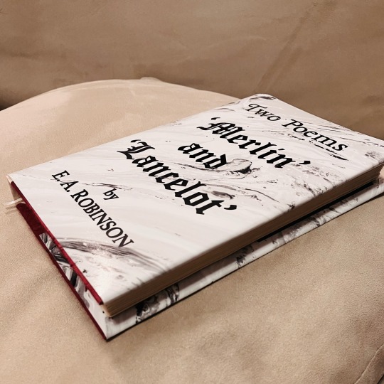
'Merlin' and 'Lancelot' by Edwin Arlington Robinson
This is the first full book I've typeset and bound that is not fanfiction—which means I finally have something to show off to the normies in my life LMAO!
'Twas a Christmas gift for my lovely Misery (@whoawhataconcept), who has dragged me right after her into a fascination with Arthuriana ❤️
✨ Details below the cut! ✨
🤍 NEW METHODS 🤍
Printing at home: In the past, I've sent my typeset PDFs off to a local print shop to be printed, but with access to a home printer for the first time, I battled the fucking thing to print it entirely at home. I had a lot of trouble getting my printer to do the whole thing (I think it was so long that the printer's memory started giving up), so I eventually ended up sending the PDF to print in smaller signature groups at a time. Due to misprinting, I ended up with many good glue sheets & pages to protect drying boards and such
Leather-core for endbands: I finally splurged and bought some leather jewellery cord to use as the core in my sewn endbands and it was FANTASTIC!
Ribbon bookmark: 🤍🤍🤍
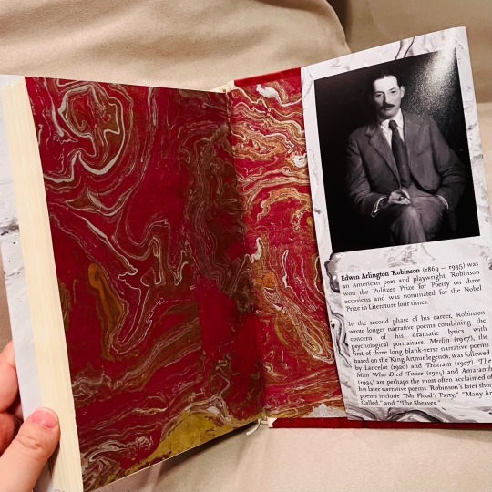
Backed papers: I purchased two large sheets of artisan paper for the endpages and the cover material. Both were too flimsy for my comfort, so on the advice of some folks at @renegadeguild, I backed some cut-down sheets with regular printer paper using a mix of 50/50 PVA and rice paste. I pressed them flat between protective sheets and they came out perfect!
Paste mix: I enjoyed working with the PVA-paste mix so much that I used it for the rest of the project for pretty much all of my gluing :)
Using an actual book press: Not much to say here except that I finally have an actual press and it made everything 100% easier haha!
Cricut stencil: My sister donated her time and cricut to help me title my cover and spine (under the dust jacket). We cut out stencils with cricut's stencil material & with stick-on vinyl (when we ran out of stencil material LOL). The spine turned out lovely but with some bleed; the cover was a bit of a mess since the stencil material started peeling up the fibres of the cover paper (which I had somehow not thought to seal). But live and learn!
🤍 BOOK INTERIOR 🤍
Copy-editing: Done by they lifesaving and gracious @highlynerdy, who saved me from agonizing over if the raw text source I took from had typos or mistakes. Thank you again, Gracie 💛
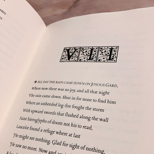
Typeset: I was inspired by the original typesets from when these poems were first published, updated to my own aesthetic sensibilities (as much as I had patience for)! The main body-text font is 'Lancelot' which seemed the only appropriate font to use for this project <3
Art: (Not pictured) I included some art by Edward Burne-Jones, "The Beguiling of Merlin", and "The Failure of Sir Lancelot"
🤍 EXTERIOR DESIGN 🤍
Cover: I originally wanted to do this book in blue, but when I went to the paper store, I could not find any marbled blue paper that wasn't wildly over-budget, so I ended up doing another red book. I tried to stick to a colour scheme of white-heavy monochrome + red + metallics.
Dust jacket: Much to my dismay, I realized that I've been lucky in the past, with access to a small nonprofit print shop where their ordering process involves emailing them and describing what you need. To print a dust jacket, one needs access to a print service with "large format" printing, and as I've discovered, that usually means an industrial printing service. Sorely missing my usual nonprofit print shop, I ended up going with a custom photo printing service, requesting a large photo print on their thinnest paper. Due to my special instructions, the cover came back almost-perfect. The edges were jagged, and the paper was a bit too thick, but it is perfectly serviceable and I'm overall happy with how it came out.
#Withy Bindings#bookbinding#book binding#books#E. A. Robinson#Edwin Arlington Robinson#arthuriana#arthurian legend#arthurian literature
73 notes
·
View notes
Text
So... @muffinlance wrote a really awesome story. I read a post from a point in time, though I truly do not remember when since it seems like I've been working on this project forever, saying that she gives blanket permission for people to print and bind the story into a book (I think there was an also addendum saying that they do not give permission to be sold, since selling fic is illegal). This fic has had total control over my whole brain since it was sent to me (@creatorofthemind I believe it was you, so thank you forever for tuning me into it) back during the days of like chapter six or seven.
So here I am now, sharing this amazing journey of my first ever bookbinding adventure. Further reading below.
So to give you an idea of what's going on, this is a fanfiction about Zuko (Avatar the Last Airbender) (animated show version, the LA show did not exist yet and we do not speak of the movie) being adopted by Hakoda, Father of Katara and Zuko. (This might have also been what kicked off the Give Zuko A Parent craze, but don't fact check me.)
Overall, the characters from the show stick very well to the cannon versions, but where MuffinLance really shines is in the rich backstories and fleshed out feeling of all the non cannon elements. Especially the background characters. I would argue that the writing in this peice of fanwork could easily rival the cannon show at many points of comparison.
Now that you have context, we can get into the actual process.
To start, I used this guide to figure out where to even begin, and fount the included resource list to also be quite helpful. I cannot for the LIFE OF ME figure out where I found the template I used for the front matter and such, but it must be somewhere and I will link to it when I inevitably come across it again.
Then I began to typeset. This step took... a long time. I worked in chunks from about September of 2022 to late March of 2024. I would get a big section done, sometimes even the entire thing, but then find I hated the way I had done it and give up for months at a time. Such is the life of ADHD and flitting interest in projects I suppose.
And then finally, step one was done, and I was left with pages on a word document that look like this. (And do please let me know if you want the link to the document. It was so much work, and I would love to not be the only one to use it.)
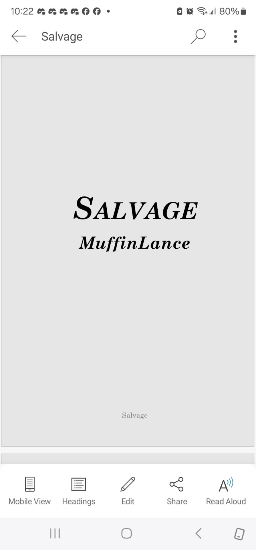
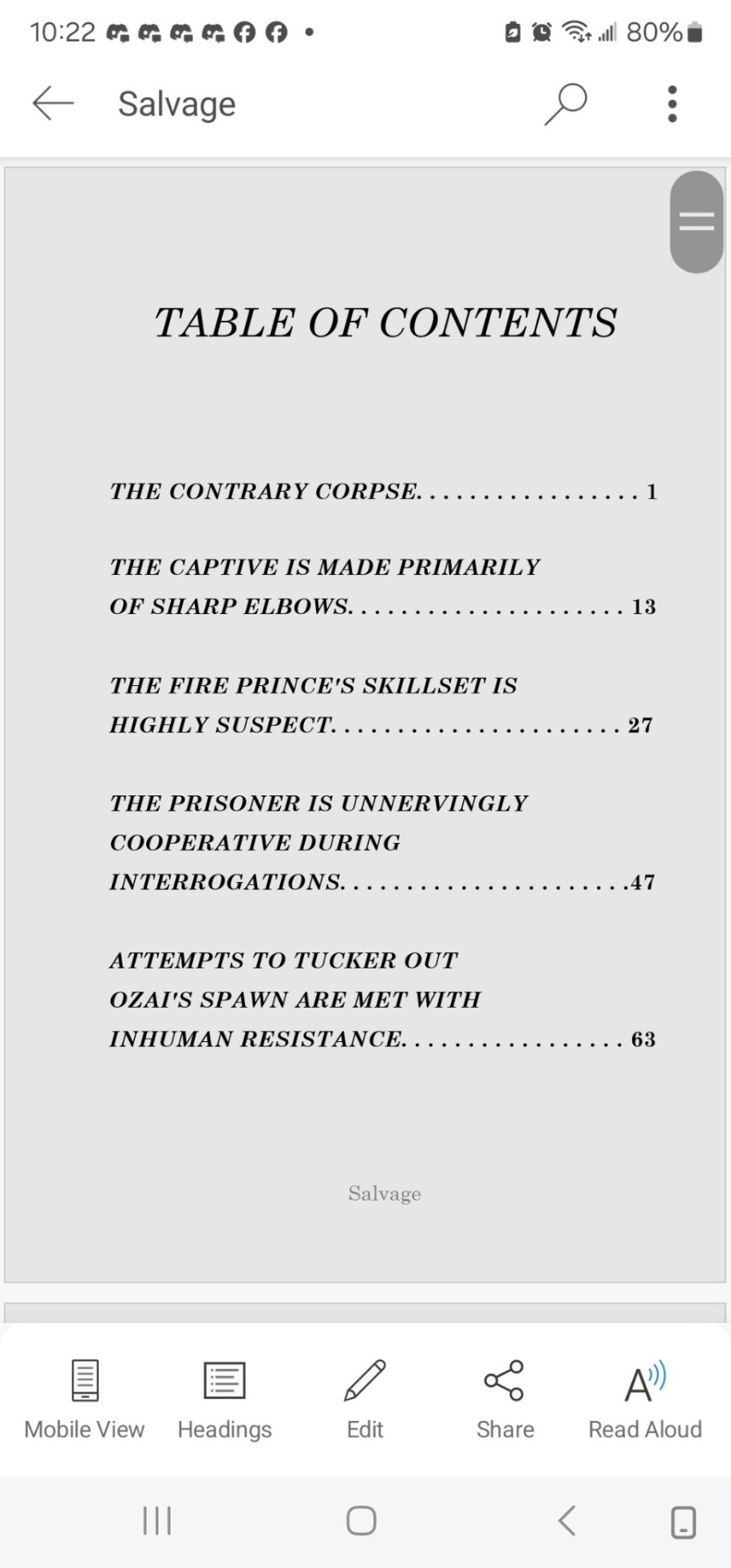
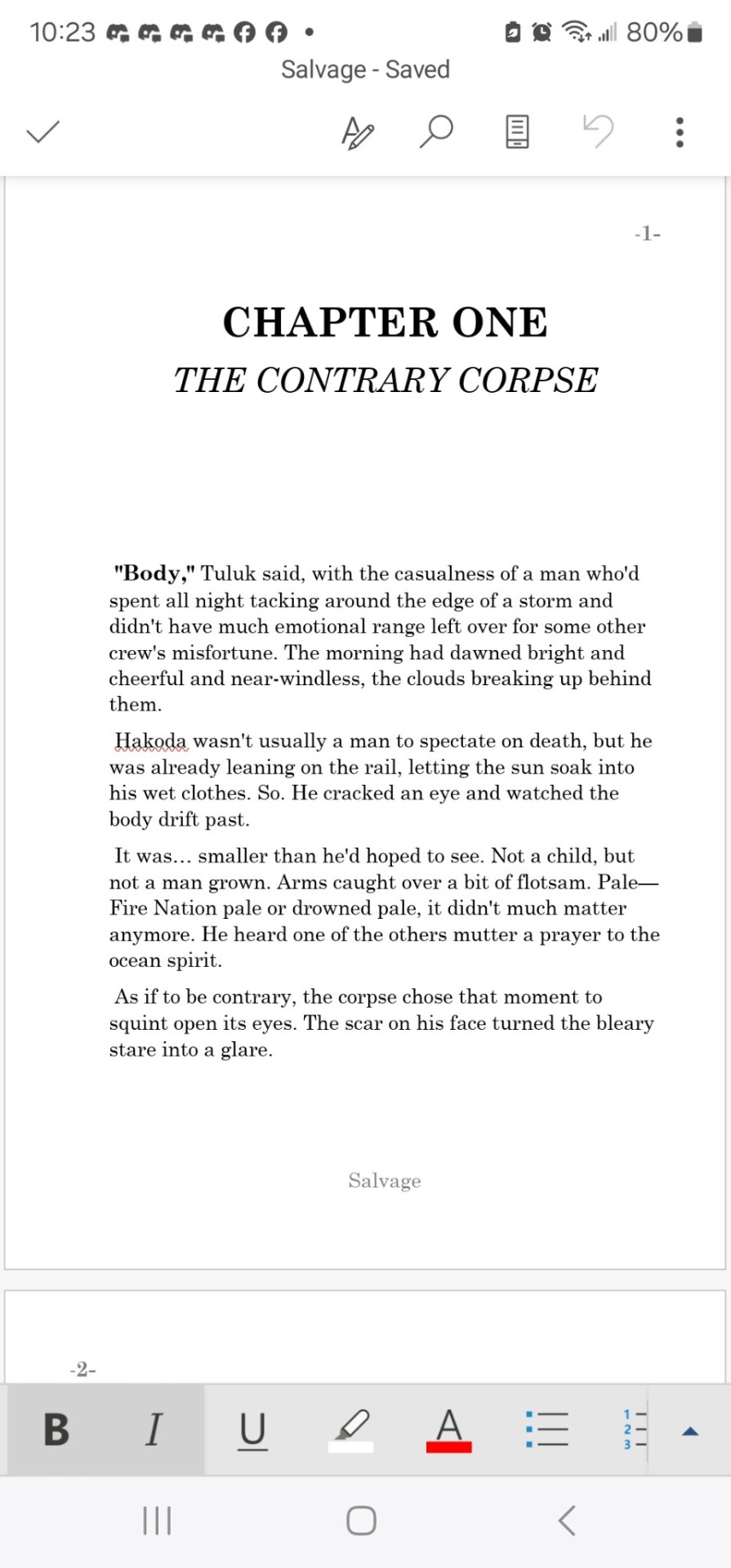
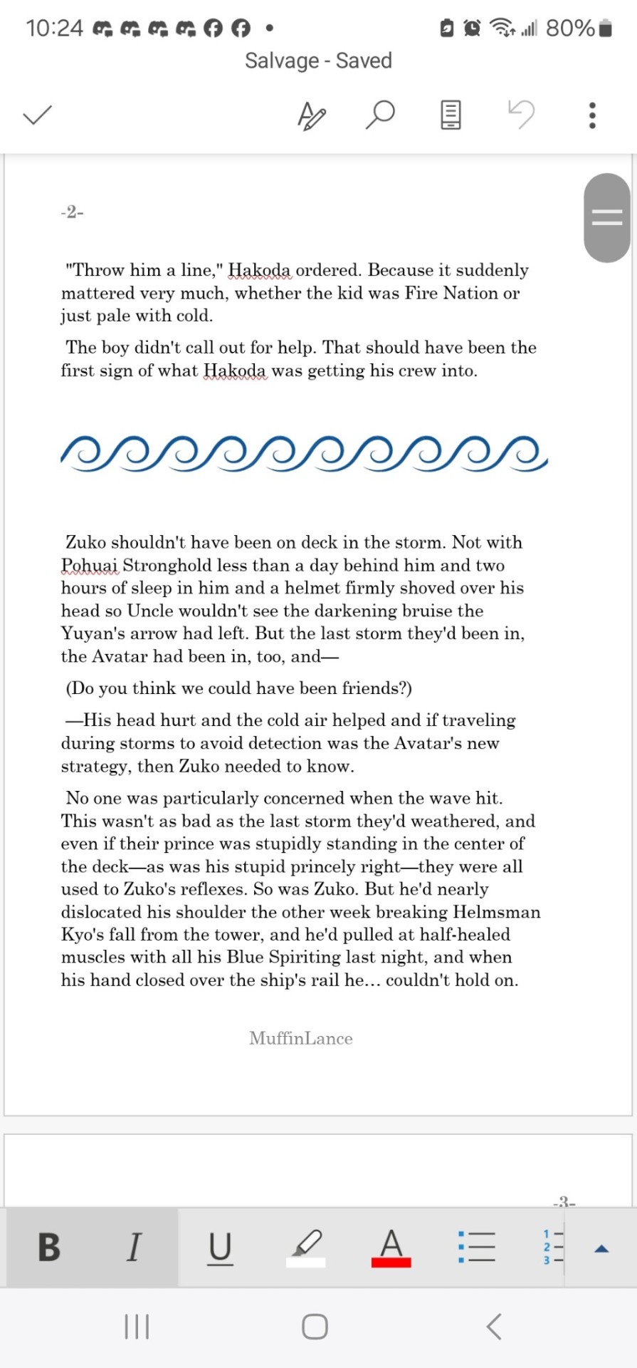
Next step was printing out this beast. Ended up being about eight pages of front matter, and about 630 pages of body text.
That I printed wrong.
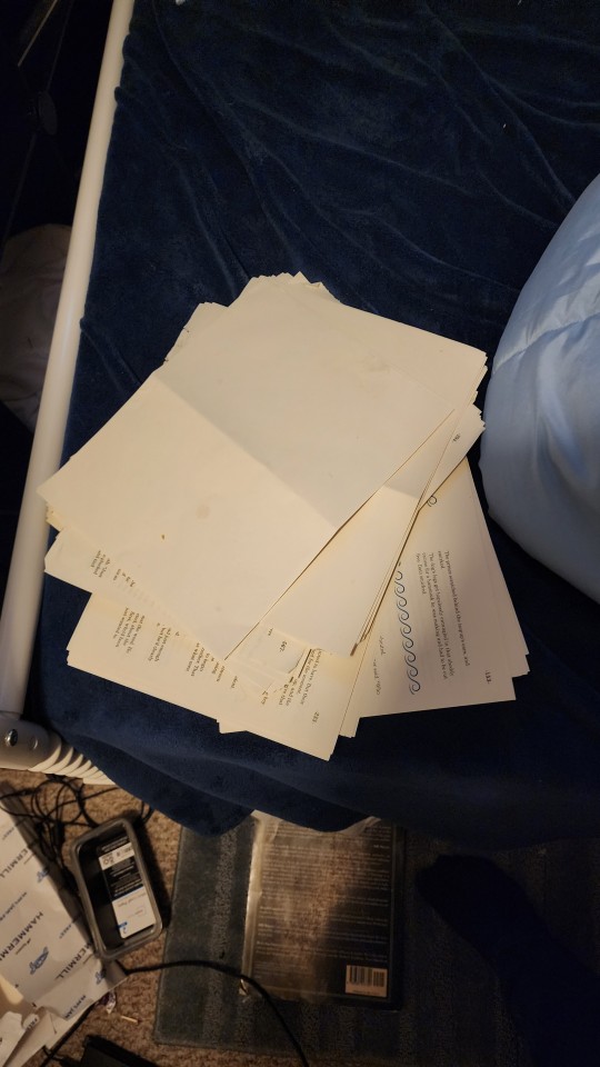
Twice.
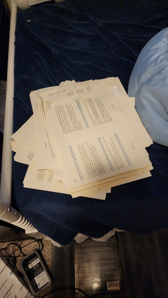
Before finally getting it right. And then not getting a picture of it, because I finished at 4 am and had work at 7, and am also an idiot.
Then I simply stitched along, putting everything together into a beautiful text block.
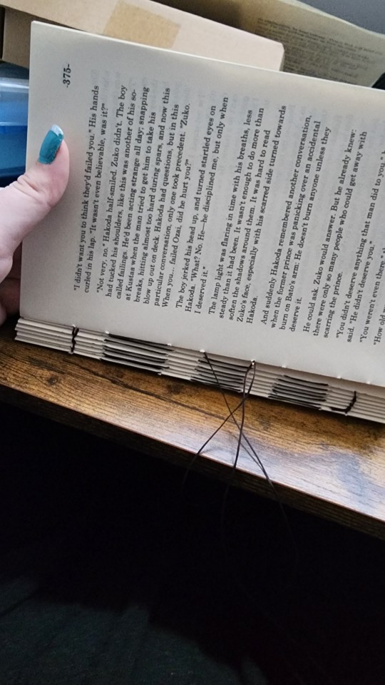
And came up with a design for the cover.
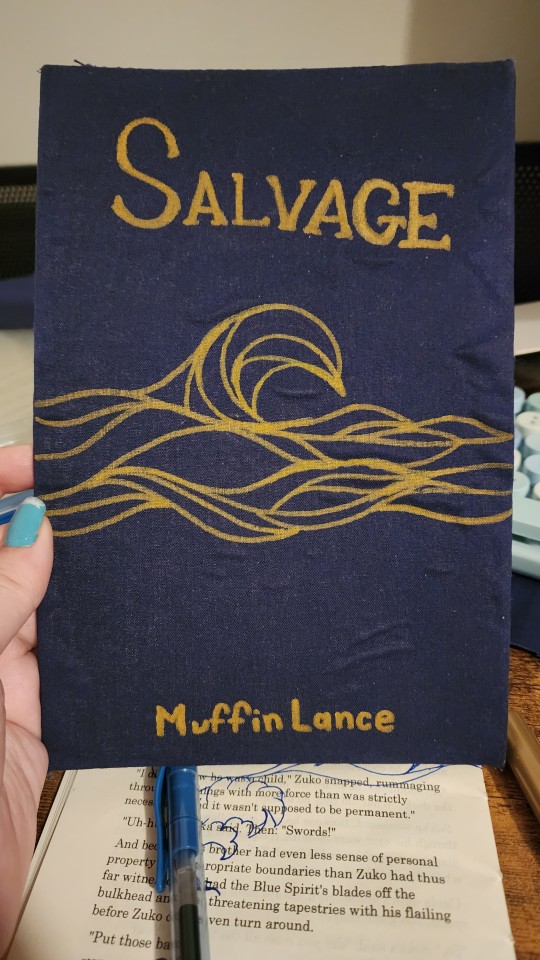
Yes the glue did end up lumpy. Ignore it.
Yes I did have to sketch out the design onto a scraped page several times before I figured out what I was doing. Ignore that too.
The cover design does wrap around the entire cover. No I did not get a picture before I glued the thing down. See again: I'm an idiot. And just... massively impatient.
Finally, we get to the stage of gluing. Behold, my bookpress.
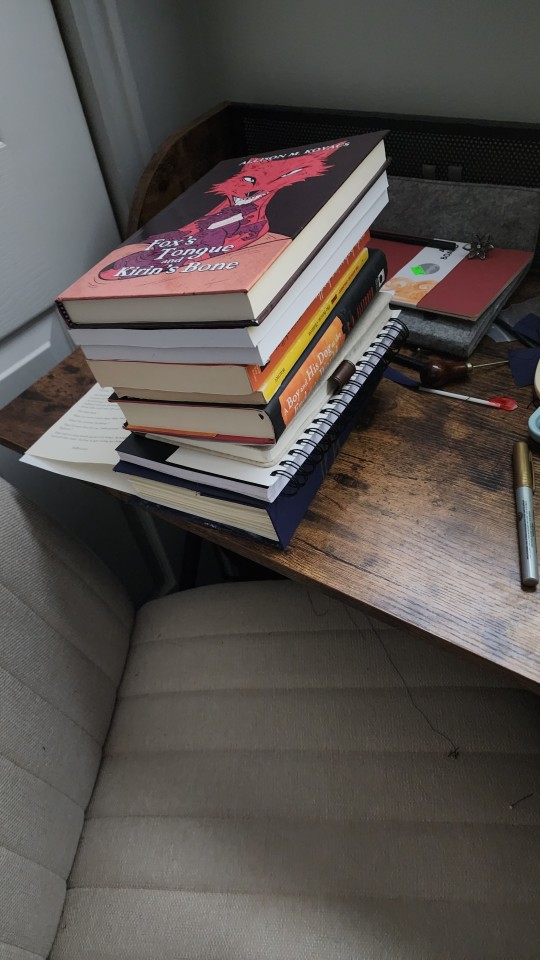
Of course, topped with Madam MuffinLances own actual professional-people book, Fox's Tounge and Kirin's Bone. It is Excelent. Here is the LINK so you can go and support this amazing author with the real-monies as well as the internet-kudos.
Then, once everything is glued together, one must give the book its "gilt" edges.
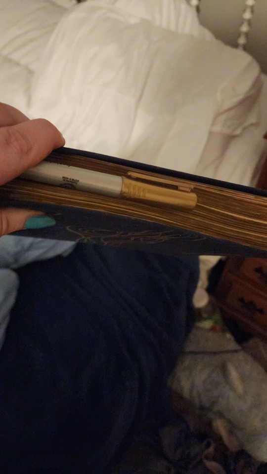
#atla#salvage#bookbinding#fanbinding#muffinlance#I'm a really big fan of this story and the characters ok?#They're really fun and I love them.
150 notes
·
View notes
Text
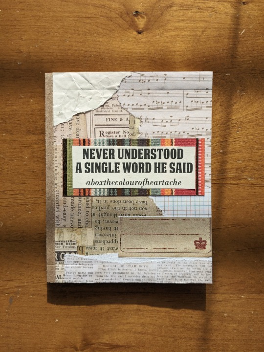
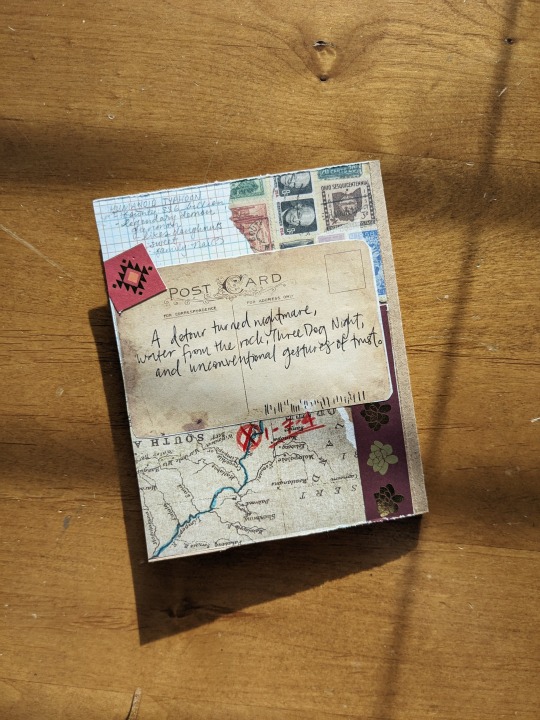
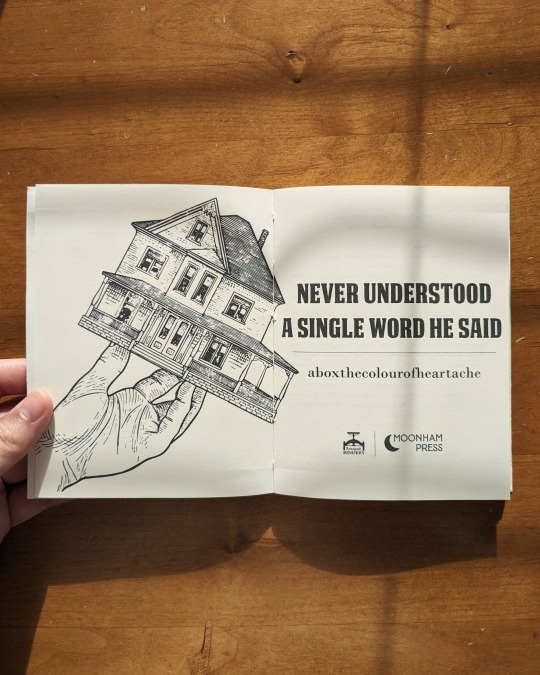
Happy Binderary 2024!! Kicking things off with the fantastic Never understood a single word he said by dear friend @aboxthecolourofheartache. I had the best time beta'ing this for Box and just had to have it on my shelf! More pics and process info under the cut:
had an absolute blast packing as many easter eggs as I could into this one! it's a roadtrip gone wrong fic heh, so I went for a scrapbook/collage cover made of the same kraft paper I usually use for paperbacks, but left the hinge + spine exposed. I tore each piece from a different sheet of scrapbook paper, so the resulting texture is really fun:
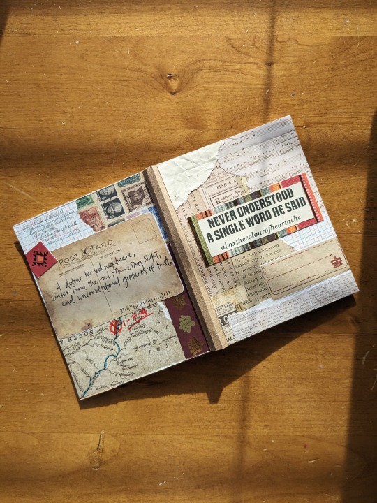
I also went to town with references to some of the events in the story, particularly on the back of the cover. the postcard is probably my favorite element; here are my few first practice runs on scratch paper (along with some of my colored pencil testings for the markings on the map) before I went for it on the real cover!
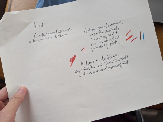
I repurposed the ribbon graphics I originally drew for another bind (@feralrookie's right where I should be ❤️). the music notes on the first page notate the rhythm of the opening lines of the song the fic is based on, Three Dog Night's "Joy to the World," which I had on loop while I was typesetting this! ("Jeremiah was a bullfrog/Was a good friend of mine.") Box's taste in trigun-themed country and blues is impeccable, and I have a whole spotify playlist made almost entirely of her recs ehe :3

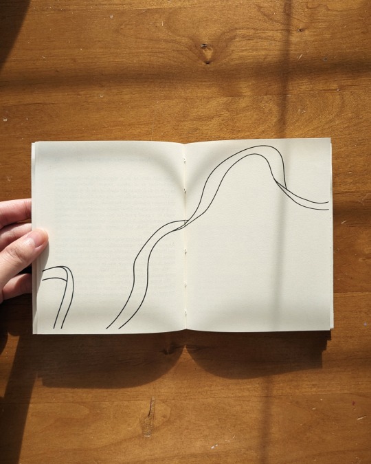
the blank/empty ribbon appears between chapter 1 and the epilogue for story reasons ehe; really wanted to convey the feeling of "where did the music go?", because I also listened to American Pie a lot while making this lolol.
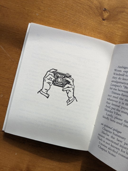
also added little camera graphic at the end, which reminded me of meryl's occupation as a journalist, but the hands/lack of a face holding the camera also gives me the uncanny feeling of being watched/photographed (also plot relevant heh). camera graphic and the house graphic at the beginning are both sourced from Heritage Type's free vintage illustrations, from a series of packs called "Hands Holding Stuff."
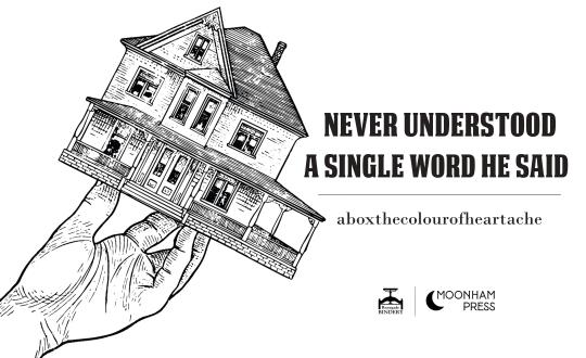
the hand holding the house on the title page gave me wolfwood's confessional-on-the-go vibes, BUT it was originally held straight like this:

so I decided to tilt it to give it more of that feeling of instability and "oh shit my entire world is being turned upside down rn god the exits WHERE ARE THE EXITS (there are no exits)" feeling present in the fic :D so I guess it's more of a knives reference?? still, the kind of "what is even going on here?" reaction I had when I first saw it fits well with the title, so I went with it!
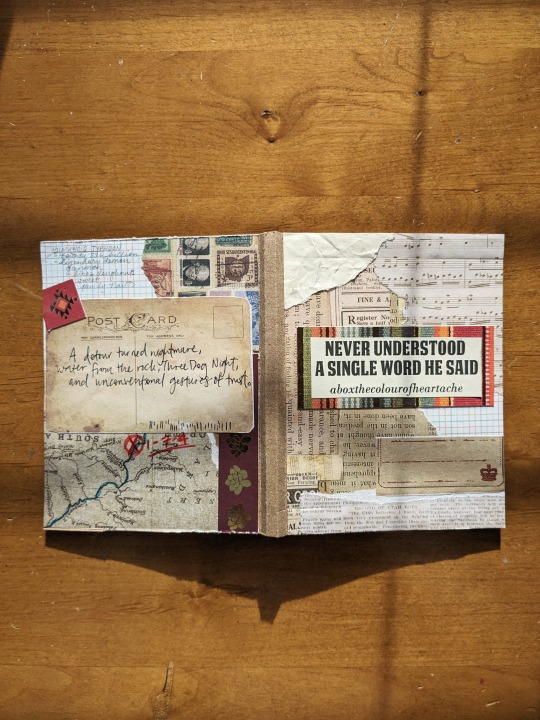
and that's it for now!! I'll be out of town for the next week or so, but I have a bunch more projects I'm really excited to share this month, along with some long-overdue author copies that I'm excited to get mailed to their rightful homes!
finally, thank you SO much for letting me bind your work, Box!!! it's always such a pleasure <333
#trigun#vash the stampede#meryl stryfe#nicholas d. wolfwood#fanbinding#bookbinding#ficbinding#binderary 2024#Never understood a single word he said#aboxthecolourofheartache
226 notes
·
View notes
Text
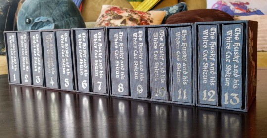
It's time! for! 2ha!!!!!!! I've had 'the husky and his white cat shizun' on my radar as a bookbinding project basically from the very start, back when I thought it was impossible that any of these danmei novels would ever be licensed for english translations. But this book is so long, and besides, the translation wasn't complete, so it went onto the backest of back burners. Until now! So, the book has been licensed. It's started releasing! As usual, please support these authors, they have a passionate english-speaking fanbase, and I very much want them to enjoy that success in a practical sense and not just an abstract one. And I also want more of these novels translated, haha. But the nature of licensing means I've also gotten a lot more interested in preserving prior translations in formats that can't casually be yoinked from the internet.
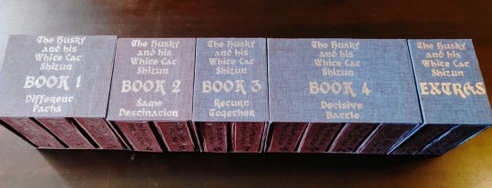

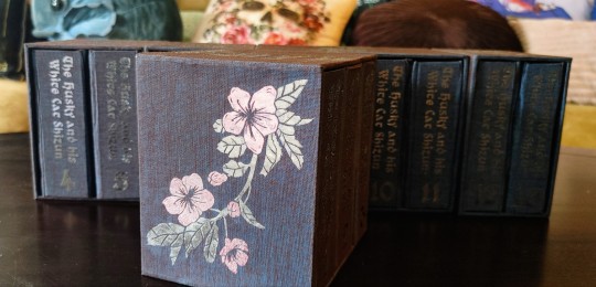
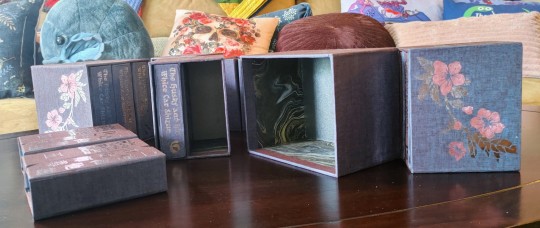
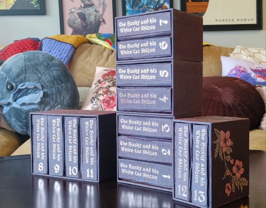
Now, this is a big novel. This was 1.1 million words. The stack of pressed text quarto blocks was over 15 inches, and once I added covers (very thick, for reasons I'm about to cover) and boxes, this thing was 22 inches long. Oh my god. This sustained effort naturally overlapped with an international trip and two crucially Important work presentations. I almost died. I had to split it into multiple boxes because I wasn't sure I could laminate boards thick enough to support so much weight at so much length and still cut it with any precision, lmao
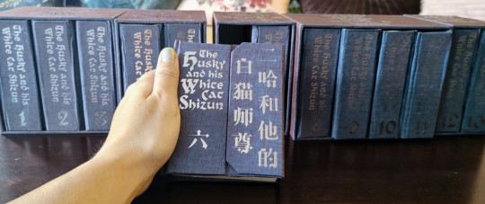
And those covers? I took inspiration from notebooks I've sent with cover flaps like these, and also decided to see if I could incorporate the strip magnets I bought for peller box experiments and barely used. The downside that didn't make itself apparent until late in the construction process was that laminating boards to match this depth made the covers REAL thick, and difficult to cover with a crisp finish. Duo bookcloth can get wrinkly and fragile when it's wet, so it didn't entirely take me by surprise, but it's something I'll be accounting for next time I try this construction!
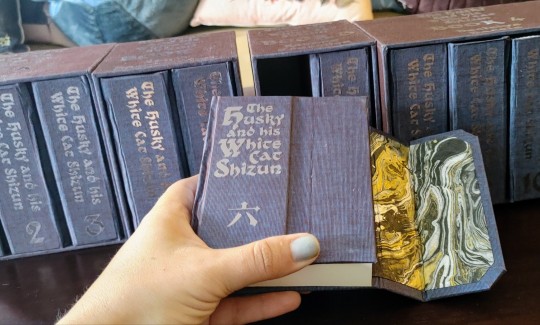
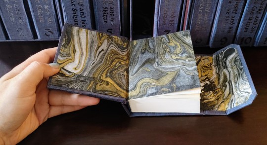
I tried to stick to a black and blue and silver color scheme, because it matches the book, but I also accepted some gold highlights on the endpapers. The duo bookcloth tends to photograph with a bit more brown in the color shift than I see in person, but I think it plays out well in person or in photos! The endpapers make for a nice striking pop when the book opens and don't blend into the cover fabric, which was something I definitely wanted to avoid.
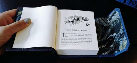
And, speaking of thematically appropriate, I found this image for chapter headers that was almost perfect, but the wrong kind of flowers. So I did change those to haitang blosoms, haha. That happened early in the typesetting process, but I did also have that on my mind as I worked out decorations for the boxes! Mostly, I just titled what book of the novel it was on the top and left it there, but the very last detail I added was a pair of foil flowers done in pink and silver, on the outside edges of the boxes for book 1 and the extras. I finished that last night and then went to bed SO excited to take pictures in the morning. I really had an incredible time with this book, and the whole adventure reminded me just how much I love 2ha. I'm so happy I did this, I really had just an incredible time!!!!!
#crafts#bookbinding#2ha#the husky and his white cat shizun#erha he ta de bai mao shizun#long post#with any luck ill be pulling together instructions for my case construction here soon
1K notes
·
View notes
Text

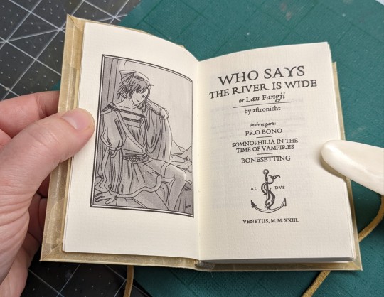
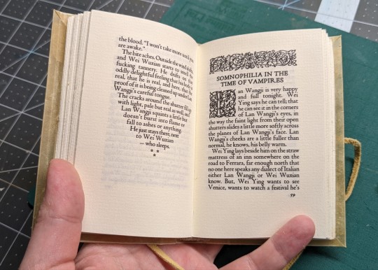


Ficbinding: 誰謂河廣、一葦杭之 | who says the river is wide (or, Lan Fangji) by @astronicht
Astronicht's Lan Fangji series is a wangxian Italian Renaissance AU (they are visiting). Also, a vampire AU (“A european vampire,” he says, “my uncle will be so disappointed.”) Please read it if you haven't, I'll wait.
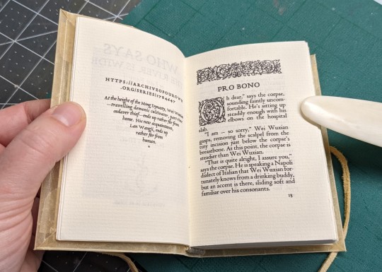
Anyway so a year or so ago I did a mockup title page just for fun in a vaguely historically appropriate style, but at that point I had no intention of actually binding the series because at under 20k words in total, it would make for a pretty thin tome. Enter: @renegadepublishing's tiny book bang! This was an event where participants typeset fic in miniature and passed it off to someone else to bind. On a smaller page size, it worked out well. The typesetting is loosely modeled after Aldus Manutius (did you know you can just look at full scans of really old books on archive.org? it's very cool). He's credited with inventing italic type and with popularizing printing 8 pages on a sheet (octavo) for more conveniently sized books. This book is also an octavo! But on smaller paper. I don't know if shaping the text into a triangle at the end of sections was his thing or if everyone did it back then but I like it, it's very fun. The AU setting is a little before his time but iirc not too far off. I printed the art (by @butleronice, included with permission) in black and white to better match the style.
Here I will pause to recommend KPS Fonts (a collection of historic fonts) and Bookbinder JS (an online tool which can rearrange your pdf into an octavo or pretty much any other imposition you might want).
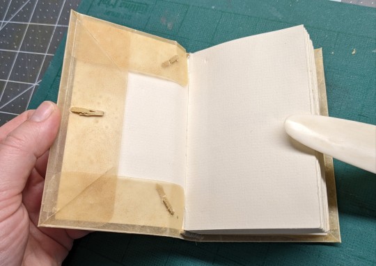
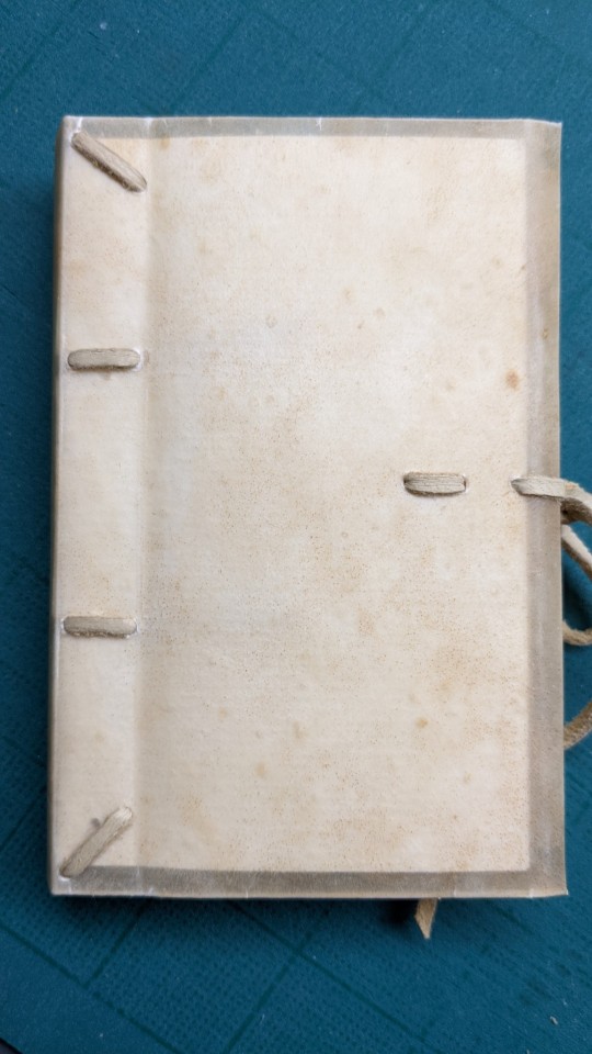
So, I didn't do the binding for the exchange, but I couldn't help thinking "what if I bind it in a historically appropriate style too?" and then this happened. This style of limp vellum binding covered a wide historical range and I think is reasonably appropriate? Though the specific details of construction are closer to modern conservation techniques, because that's what I could find instructions for. I'm not entirely sure that what I bought from etsy was the right sort of vellum for this project, but the nice stuff is beyond my current purchasing power so this will have to do. For the paper, I bought some big sheets of drawing paper from the craft store (off-white cotton paper, with a laid texture instead of smooth like printer paper) and cut them down to letter size so they would fit in my printer.
391 notes
·
View notes
Text
The Saga of Hermitcraft on r/Place (1 April 2022 - 4 April 2022)
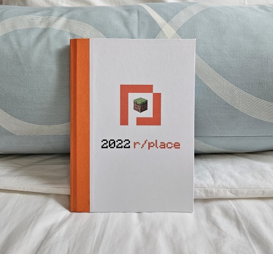
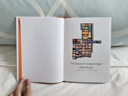
On the 1st of April 2022, Reddit unveiled a white blank canvas where every user had the ability to place one colored pixel in every 5 minutes. At its height, about 4 million people participated in one of the biggest internet collaborations ever made. The ripple effects reverberated into news reports as far away as Turkey, and the final canvas represents a snapshot of the multiple communities, events, memes, and what was popular around the world at that time.
This is a documentation of the Hermitcraft mural on r/place 2022.
aka.
Remember what I said about my latest ficbind being a distraction? This is what I wanted to be distracted from.
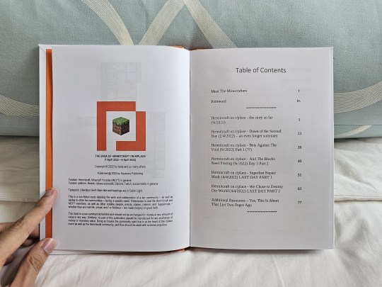
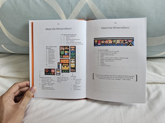
After Reddit's API fiasco of this year and the subsequent controversial event that was r/place 2023, I decided to save as much documentation about the 2022 event as I could. Luckily, I remember how there are already a series of posts by @riacte who documented the progress of the Hermitcraft mural throughout the whole event, from beginning to end. Her blogposts form the bulk of this book (like, 95%!) and I cannot thank her enough for preserving the happenings of the block men mural.
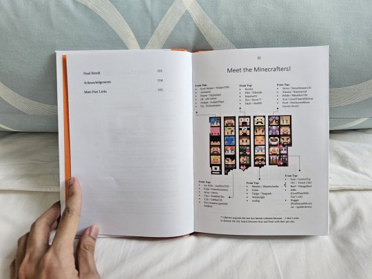
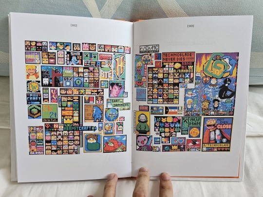
With that said, I quickly realized that someone who's not a Hermitcraft fan - or me if I'm older - might not get the gist of who's who on the mural. The solution? Make several pages dedicated to just listing who's who on the murals! Because of the sheer number of heads, the mural was divided into several pieces for easier labeling. As a bonus, I also threw in another mural nearby which was connected enough to the Hermitcraft community.
For consistency's sake and preserving focus, I decided to not label the peeps from Dream SMP or the MCC secondary mural. Wrangling Microsoft Word to create an infographic was hard enough, let alone 3! If I inadvertently left out a few bits of extra context from this decision, mea culpa.
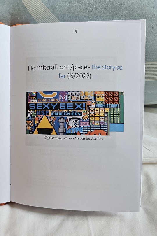
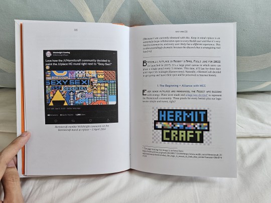
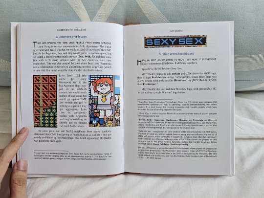

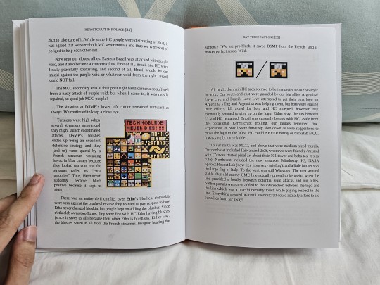
When it came to typesetting the entire text block, I decided to make some consistent rules. Titles denoting each day or stage of the mural are on their own pages. New sections are titled using the Bahnschrift font and colored blue, while the first paragraph has their beginning lines look Minecraft-coded and topped with a drop cap (aka. those super-large alphabets).
The names of Hermitcraft and Minecraft players in general are bolded when they first appear in the text. Afterwards, they are bolded if they are contextually important to what's being said.
Extra context would be placed in the footnotes section at the bottom of the page. This is also where I dump some background information that would be invaluable for any readers who aren't Minecraft fans, which is why the SpaceX page looked like... uh, that.
My image policy is to go with the flow; I used as many images from riacte's posts as possible, but I also added-in some of my own if more context is needed. Placing them to look smooth with the text was harder - some are small enough to not cause any problems, others are large enough to fill entire pages without any problems, but a few like the Dream SMP mural (hey there! I managed to put you in!) are too wonky to fit perfectly without leaving no empty spaces.
So in that mural's case, I placed them to the side and let the contextual text flow around it. This principle was also used for the Dota2 / Love Live images and in a few other places throughout the book. The biggest case of this are the few images that are just too wide.
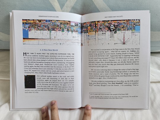
Like this one.
Making double-page spreads is not the easiest thing to do in Microsoft Word, and there are a few r/place images that are too wide to fit perfectly in a single page. Confining them to one page would also mean losing all their details, so making them a double-page spread was necessary.
Didn't make it easy though, especially when there are paragraphs of text and other images that needed to be shuffled around. Mess up the double-page images, and they won't meet in the middle. Mess up the text and other pics? There goes the layout and overall flow!
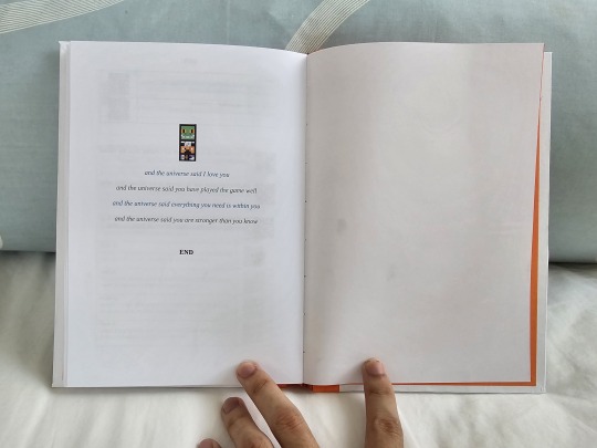
In the end, making this book took a lot longer than I expected, but I am still grateful to have made this as I have now read through many posts from Tumblr, Reddit, and even Youtube - people expressing joy that they have collectively made something together. I can only hope I have made some justice to them by compiling their work and (even if a small sliver) preserving their testaments.
May this r/place be remembered.
#r/place#rplace#Hermitcraft#reddit#MCYT#rplace 2022#r/place 2022#bookbinding#fanbinding#documentation#my bookbinds#hermitblr
373 notes
·
View notes
Text
Bound: That Old Black Magic by @bixgirl1


Last weekend, I really wanted to make a book, and when I saw that a binder on Instagram (ladybobbitt) had a typeset of this fic I could use, I jumped on it. I had just re-read the fic last week, so it seemed like a sign.
It's really fun to typeset someone else's bind. To see how other people interpret things, and the choices they make, and the little differences. And it also saves me hours and hours of work.
So this was a fairly straightforward bind, after I had it all printed up. I did put foil on the title page, and that was a pain to cut out since I didn't want it on the letters. I only had to reprint it once. Heh.
The cover is simple. I used endpapers that evoked wallpaper (because they're stuck in the house for basically the entire fic.) And if the edges look raggedy, they're not. That's just dust and bits from sanding the edges. I should have wiped those down better before taking pics.
76 notes
·
View notes
Text

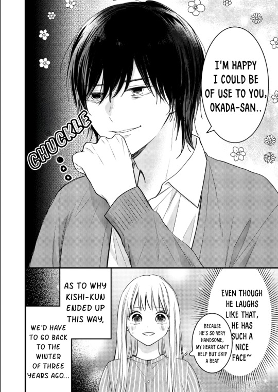

My Yandere Neighbor (Manga)
Created by: 杏蜜
Genre: Comedy/Slice of Life
So this is a translation that we picked up, and while we have five chapters of raws currently, only one of them has been translated and typeset, so we'll be going off of that. The story so far has some yandere action between Kishi and Okada but is overall pretty light, with Okada mostly just being confused and slightly offput by Kishi as of now.
The story starts out with Okada working with Kishi and her being offput by him as he seems to be following and noticing very minute details about how many inches of hair she's cut off of her bangs and that she's sighing more than usual. We learn that Okada has recently been promoted to Art Director and is currently very busy. Kishi can be helpful towards Okada which she appreciates but is still a bit weirded out by her reaction. We get a backstory about how the two meet with Kishi grumbling outside and Okada concerned and bringing him in so they can talk. We find out that Kishi has been mistreated by his boss, as he's made a mistake which caused his boss to severely berate him and forcing him to apologize to everyone. Okada feels sympathetic towards Kishi and his situation and decides to help by talking to her boss about it to get the situation resolved. This leads to Kishi being transferred to her department, allowing him to get a better job and to be closer to Okada, which leads to him just becoming a stalker. We get to Kishi hanging out with coworkers after hours, with them eventually rooting for Okada to look after him after hearing his story. Kishi then goes on an entire thing where he talks about how much he worships her and even ends up following her to the bathroom just to tell her that they were all going to sing karaoke. When it's Okada's turn to sing, Kishi brings an entire boom mic just to record her, though Okada promptly shuts it down. After singing and drinking, Kishi brings her home and he's pretty drunk and she's shocked to find that the two are now neighbors as he's moved in next door.
So already starting out, we can kind of see how the comedy of Kishi and Okada has unfolded, though it doesn't seem like it'll be a very drastic in terms of yandere actions are more of a light comedy type of thing, at least so far considering Okada's attitude. She doesn't seem really scared of Kishi only weirded out by the things that he does and Kishi is at least kind enough respond to Okada when she tells him not to do something like go into the girl's bathroom as well as try to actually help her during her job. This seems like a quirky love that might bloom between them then, along with a lot more comedic moments, though it's hard to judge from the first chapter alone.
Kishi himself seems to be the worshipping type as noted by his own words (and his own imaginations of him), which makes a lot of sense considering Okada basically was able to fish him out of an abusive boss and eventually land him a much better and healthier job. Most of his actions are strange, but relatively harmless, from trying to record Okada's voice while singing karaoke, to knowing what kind of tea she likes, to I guess following her to the bathroom. I imagine as the series continues, these actions will just get more and more bizarre but ultimately harmless and only really affecting Okada's suspension of disbelief. If they wanted to go a more serious route, they could also probably run in the direction of Kishi slowly realizing that Okada isn't as much of a goddess as he thinks she is, treating her more as person as the story goes on, or maybe just continuing the hijinks as they are.
Anyways, I'm curious to see where this series will go after all of this time. Since we're translating it, I would be very happy if you all read it so I can see your reactions.
93 notes
·
View notes
Note
dungeon meshi final chapter out, cant wait for ur opinion........
I love this question I have been dying to answer this okay so. First of all, I waited the entire day for the dungeon update to drop, I was clutching my pearls and sweating and actually shedding skin and molting and losing hair just for it to drop. Around 4 or 5 pm I start to get hungry as fuck and I don’t have money so I post the adopts to buy chicken and eventually I can afford the chicken so I order the fried chicken and it arrived at around like 6 pm, I have my fried chicken next to me and I really want to eat it because I hadn’t ate anything else that day other than like the 2 biscuits that came with the order and I had been cleaning the house earlier so I was just making hunger through the entire process. I decide that it’d be magical if I waited for the update to come out and be eating at the same time as I’m reading like a grown ass man watching the superbowl right, and so I wait, and I wait , and I keep waiting and I know in the bottom of my starving feeble little heart that the raws came out late as hell and that EverydayHeroes was working their machinery like crazy to typeset and translate the entire thing so of course it’d come out like late but I still persisted, I didn’t ate my chicken becuase i wanted to keep waiting and hoping the update would come out, 9/10pm rolls around and my boyfriend is back to his home and We hang out for like 3 hours while I’m still persistently waiting on the background for the update to drop, nothing, then I realize my food had like fries on it also so I decide to eat the fries and leave the chicken for the update, then Like at ariund 11:30 pm I’m hungry as hell and I decide okay whatever man I’m eating the chicken already so I eat it and I assume the update will come out tomorrow right okay. Then at like nearly 2 am I say goodnight to my man and I turn the Intelligence Pad off and I’m ready to go to bed but like a swarm of wild pack of roaches approache me in the shape of a discord notification to tell me that the update dropped and that I need to read it ASAP, and so I’m laying on my fucking bed with no food or life or anything to read the update As fast as I could, and after I finish reading it one comically huge tear drop falls down my cheek as I realize that Ryoko made laios so damn hot on those last drawings with the medieval art style like damn she hunker him up to the max I just know he was eating gooooood. But yes no it was a very sweet ending I think the funny part is that it ended in a very predictable way liek all of this was set up since like chaoters 40 or something and we all thought “nahhh that seems to cliche like there’s goign tobe a grand ending to this” but I think the grandness was the friends and Food and cannibalism we made along the way. It was good as hell I love a good happy ending I can’t wait for the anime to drop
103 notes
·
View notes
Text
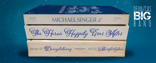
Title: Michael Singer & the Heroic Happily Ever After
Author: darcydelaney
Artist: Marvfortytwo
Rating: Mature
Pairings: Dean/Castiel
Length: 27000
Warnings: No archive warnings apply
Tags: The Lost City movie AU, writer Castiel, cover model Dean, Castiel POV, thinly veiled bitterness over finale, there was only one hammock, happy ending
Posting Date: October 19, 2023
Summary: When struggling writer Castiel Novak’s father disappears, Castiel inherits his cult classic “Michael Singer” book series. Following a disastrous first panel of a new book tour with Dean Winchester, the series’ cover model (and big-time fan of both the books and, well, Castiel himself), Castiel decides that he’s going to end the series by killing off the title character, much to Dean’s dismay. Shortly after said panel, Castiel is kidnapped by Arthur Ketch, who has discovered that Castiel’s father had been using real supernatural folklore in his book series, and wants Castiel to help him figure out the spell for eternal life by using his father’s work. Dean sets out on a mission to rescue Castiel, win his heart, and maybe even save his favorite book series in the process.
Excerpt: To Castiel’s surprise, he’s already got a few hundred followers. He taps over to the list of the four accounts he’s following: his agent, Angel of Thursday Publishing, what appears to be a bot devoted to posting snippets of his father’s previous books, and— “Dean Winchester, keep that wig on your head before I staple it there.” Castiel looks up to see the series’ cover model standing in the doorway of the hotel suite, dressed in well-fitting jeans—too well-fitting, if Castiel is being honest—and a forest green henley, a long blonde wig clutched in one hand. His breath catches in his throat. Castiel has to give Angel of Thursday credit: aside from his hair, Dean is a picture-perfect depiction of Michael Singer, the lead character in his Michael Singer series. Well, not really his, he supposes; it’s his father’s, but just like his beat-up gold Lincoln Continental, the ramshackle house that’s seen better days, and the frankly incredible amount of debt racked up from self-medication, takeout, and failed writing fellowship application fees, his father had passed it on to Castiel before promptly dropping off the face of the earth. Following the adventures of Michael through all things haunted and heroic as he fights against supernatural malpractice and devastation, Michael Singer began as a way for Castiel’s father to pass the time when Castiel was an infant. He’d pour himself a cup of coffee, plop Castiel down on his knee, and bounce him up and down as he wrote, all while simultaneously dragging Michael to hell and back—more often than not, literally. “It’s itchy and it makes me look like a fucking Hemsworth,” Dean grumbles, tossing the wig to the side and dropping down onto the couch in Castiel’s suite. “Hey, Cas.” “H-hello, Dean.” Dean looks at him, mouth twisted into a crooked little grin, and winks. “There’s nothing wrong with looking like a Hemsworth, sweetie,” Anael says. Castiel would never say it aloud, but Dean looks better than a Hemsworth, with or without the absurd wig he’s been forced to wear. In Castiel’s opinion, Dean’s always looked better than a Hemsworth, ever since he’d first been hired as the Michael Singer cover model. With a jaw that has Castiel’s gut doing somersaults and strong, broad shoulders that pair perfectly with a slim waist, as well as striking green eyes that can convey entire sentences, if not paragraphs, in a single expression, Dean Winchester must have been born to one day grace the cover of supernatural romance novels. He fits right in among the dramatic, stock-photo backgrounds and large, golden typeset of the titles on each cover, but now that Castiel’s in charge of Michael and his looks, maybe he could throw Dean a metaphorical bone. Maybe he could make it canon that Michael gets a much more practical haircut for monster hunting; surely that would give Dean a break (and hopefully put Castiel in his good graces).
DCBB 2023 Posting Schedule
61 notes
·
View notes
Text
Varney the Vampire: A Preface
I want you to think back to what it’s like to reread your old work from years ago—your old stories or poetry, your old school papers, or even your old tumblr posts. Sometimes you’re actually kind of pleased, sure, but I want you to really go back and locate yourself in the heady cringe of that feeling.
In related news, I'm going to pick back up with the Varney the Vampire recaps I started in late 2010 CE. I got about nine chapters in, and then something, who knows what, derailed my life, as things tend to. Like, I'm used to this, it happens with the regularity of a lunar cycle. But I like writing about vampires (clearly), and since I feel like Dracula has been tread pretty thoroughly in recent times, I figured I might go back to something different; we had some lively discussions about Varney back then.
But 2010 was a time before A Lot of Things happened. I was in my early 30s at that point, so I won't say, "Oh, I was so young," but I had a very different energy as a blogger 12-13 years ago. So I've decided to rewrite the recaps a little—some more than others, some not much at all. I just feel like I have a really different perspective on the first chapter in particular, in 2023.
As before, I'm using the full, unabridged text. It is hideously long, something like 230+ chapters, but go big or go home, I figure. The thing is, I was using the files hosted at the University of Virginia, and now you can only get those through the Wayback Machine, but they are still usable for now. I have various backups saved, but I do want you to be able to see that I am, as ever, Not Making It Up.
I'm also not going to quibble anymore as to whether James Malcolm Rymer or Thomas Peckett Prest wrote this behemoth. Per Wikipedia sources, scholars seem to agree that it was all or mostly Rymer. When it's mentioned that they figured this out based on his dialogue style, I went... yeah, that checks out. Because it sure is A Style, and I'll be honest, the repetitive filler dialogue in chapter 10 was such a speedbump for me that I just threw up my hands and said, "I don't know how to recap this. Something I can't remember now is going on in my life and I Cannot. I no longer Can."
Well, it's the 2020s and we're gonna. Like I can't tell you how much stress I do not have about this. I've had covid three times and also spinal surgery. Varney the Vampire can no longer hurt me.
To start, this ordeal has a preface—apparently written upon the occasion of collecting the serial into book form—wherein The Author expresses his gratitude for "unprecedented success of the romance of Varney the Vampyre." First off, Rymer uses "vampire" and "vampyre" interchangeably, because fuck me for caring about consistency, I guess. Second, as Wikipedia notes,
It first appeared in 1845–1847 as a series of weekly cheap pamphlets of the kind then known as "penny dreadfuls." The author was paid by the typeset line [YEAH, I NOTICED], so when the story was published in book form in 1847, it was of epic length: the original edition ran to 876 double-columned pages and 232 chapters. Altogether it totals nearly 667,000 words.
For comparison, all of Lord of the Rings plus The Hobbit is 576,459 words. I sure do blanch every time I see those numbers! It's fine. We're gonna be fine. Back to the preface:
The following romance is collected from seemingly the most authentic sources, and the Author must leave the question of credibility entirely to his readers, not even thinking that he is peculiarly called upon to express his own opinion upon the subject.
"Seemingly" is doing a lot of work here.
Nothing has been omitted [for real, nothing down to the tiniest fly-swat has been omitted] in the life of the unhappy Varney, which could tend to throw a light upon his most extraordinary career, and the fact of his death just as it is here related, made a great noise at the time through Europe, and is to be found in the public prints for the year 1713.
I've seen more than one Dracula multimedia art project where people recreated the letters and diaries and recordings in the book (have you heard my whole thing about how Dracula actually was a cutting-edge techno-thriller back in 1897?), but I've never heard of anyone creating ARG-style media for the Totally for Actual-Fact Real tale of Sir Francis Varney the Vampire, and I think it would be hilarious if someone did.
I won't belabor the entire preface, but what I do want to touch on is Rymer's mention of "unprecedented success." Varney is actually standing on the shoulders of a vampire giant, and it's not the one we would think of. Nowadays, our big touchstone—the influence so great that most works either evoke it or take the trouble to say "Our vampires are different"—is Dracula, obviously. Which was published exactly 50 years after Varney, in 1897. But Varney's touchstone is Polidori's short story "The Vampyre" (1819). And for most of the 1800s, this was everyone's touchstone. Per Wikipedia (which I'm going to lean on for how concise it is, but I concur with this from my own research as well):
An adaptation appeared in 1820 with Cyprien Bérard's novel Lord Ruthwen ou les Vampires, falsely attributed to Charles Nodier, who himself then wrote his own dramatic version, Le Vampire, a play which had enormous success and sparked a "vampire craze" across Europe. This includes operatic adaptations by Heinrich Marschner (see Der Vampyr) and Peter Josef von Lindpaintner (see Der Vampyr), both published in the same year. Nikolai Gogol, Alexandre Dumas [note: I have the Ruthven play he wrote around here somewhere] and Aleksey Tolstoy all produced vampire tales, and themes in Polidori's tale would continue to influence Bram Stoker's Dracula and eventually the whole vampire genre. Dumas makes explicit reference to Lord Ruthven in The Count of Monte Cristo, going so far as to state that his character "The Comtesse G..." had been personally acquainted with Lord Ruthven. [...]
In England, James Planché's play The Vampire, or The Bride of the Isles was first performed in London in 1820 at the Lyceum Theatre based on Charles Nodier's Le Vampire, which in turn was based on Polidori. Such melodramas were satirised in Ruddigore, by Gilbert and Sullivan (1887); a character called Sir Ruthven must abduct a maiden, or he will die.
Back when no one gave a shit about copyright, Polidori's work was spun out into a cottage industry of knock-off stories and plays, an entire horror zeitgeist. Lord Ruthven was, for 78 years, who you copied, who you riffed on, who you parodied, what Count Dracula is to us now: the archetypal vampire. The Big Guy. And Varney is clearly cut from his cloth—the ostensible gentleman who worms his way into the lives of respectable, unwitting people. Unlike Dracula, there's no foreigner Othering, no "historical basis," no undercurrents of contagion and infection, no ambition to make the world his wine-press, none of that; Ruthven is a simpler figure, but the dominant one of this time no less. He is a stranger who shows up in the middle of London high society, icy and distant, his eyes “dead grey”—stern, yet somehow compelling when he cares to be. And when he cares to be, you're in trouble.
And this is the cultural consciousness when Francis Varney shows up.
[Chapter one will go up sometime this week, March 8-10 or so.]
#varney the vampire#vampires#vampire studies#honestly I am nervous about what I want to say about the first chapter#not sure it's gonna go over very well#long post#welcome to hell it's my blog#tv tropes warning. here is your rope to climb back out
187 notes
·
View notes
Text
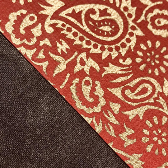


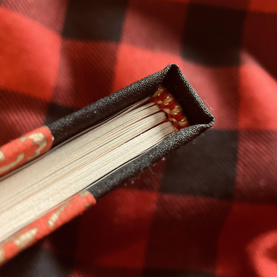
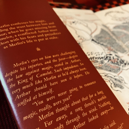


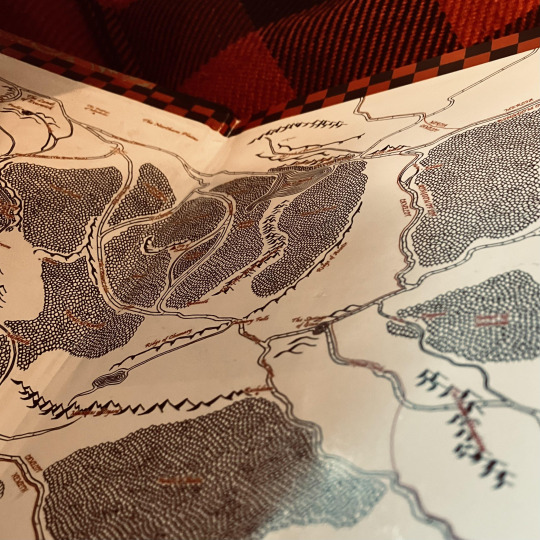
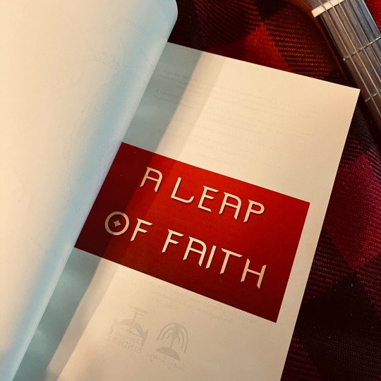
A Leap of Faith by Misery_C_Epicaricacy & Ynnéalay
Merlin confesses his magic, upending the trust between him and Arthur; when he goes missing from Camelot, a conflicted Arthur must reckon with his fears and prejudices as Merlin’s life is put at stake.
Fandom: Merlin (TV) Rating: Teen And Up Audiences Archive Warning: Graphic Depictions Of Violence Category: Gen Relationship: Merlin & Arthur Pendragon, Minor Gwaine & Arthur Pendragon, Minor Gwaine & Merlin Words: 40,475
Fanbinding of A Leap of Faith. Process, commentary, and additional pictures under the cut ♥
First of all, thank you to all the lovely folks from the @renegadepublishing discord for enthusiastically encouraging me to fanbind my own work, though this is not entirely just-mine. This fic was co-written with the awe-inspiring @whoawhataconcept (Misery_C_Epicaricacy on AO3) and this binding is as much a love letter to her writing, her mind, and our creative collaboration as it is to my own contributions.
On: Textblock & Typesetting
I've bound a couple fics at this point, but was saving Garamond for this one because I fell in love with how these particular words look set in Garamond. The headings are done in a simplistic all-caps Calibri with expanded spacing to pay homage to how many hours editing this damn thing were spent looking at the font in question. I've also used font 'Merlin' for the front title page—which I got linked out of the @merlinbingo discord server—and Felix Titling for the interior title page.
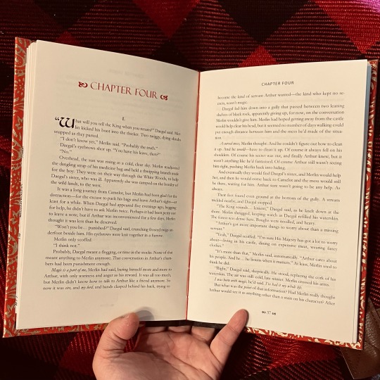
The body is printed on EarthChoice colour cream paper, and stitched with red crochet thread.
On: Endpapers
The endpapers were a tricky one for me! They are prints of my own fanart which was not the correct aspect ratio to use as endpapers for a book printed on letter paper. This was also the first large map I created, and if I could go back, there are things I would do differently. But in the end, I decided to use it as-is because I'm proud of it. To fix the sizing issue, I up-sized the map so the width was correct for a letter-sized print, which left a border on the top and bottom of the image—this I filled in with black and red checkerboard pattern to match the banners and standards of Camelot.
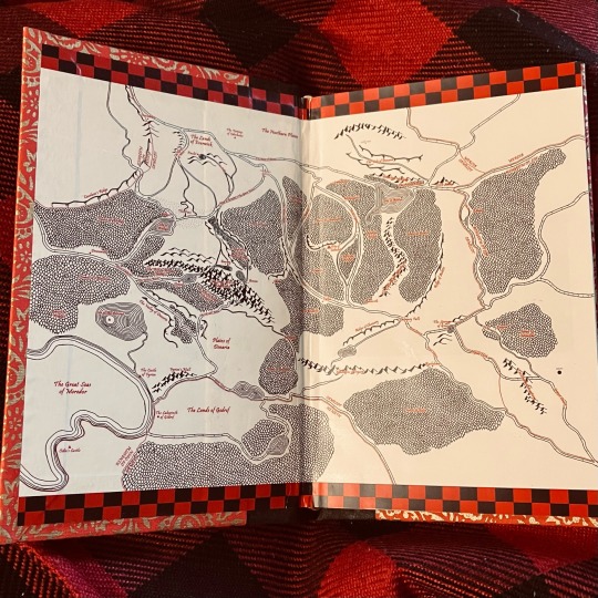
Originally, I wanted it printed on this textured, pearl-finish linen paper, but then the print shop I use didn't have it in a large enough size to do endpapers on and I was heartbroken. I ended up using topkote gloss paper by Oji.
On: Endbands
Hand-sewn in red and gold crochet thread. I redid these like three times to find a core I liked, and ended up doing them over tightly rolled paper.
The Dust Jacket
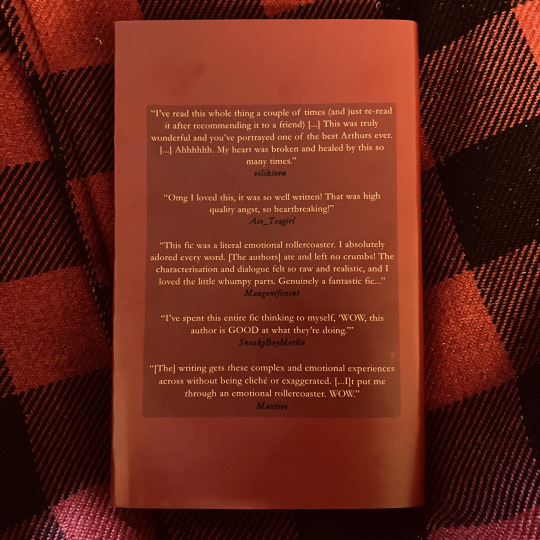
I'm not a graphic designer, so the jacket design is simplistic. It includes a cover, back cover (with a 'praise for' section), and two inside flaps (which contain the fic summary and author bios). I took some cues from this dust jacket post. It's printed on a thicker weight of topkote paper by Oji, this time with a dull finish.
Closing Thoughts
I'm so proud of how this turned out! It's my best work yet in terms of straight-ness of the spine/cover paper, and I learned a lot about printing. Lots of firsts for me here, and I feel that every time I make a book, I improve. I've gifted this copy to my co-author, Misery. Seeing her flip through it, and seeing it on our shelf, is giving me a lot of joy today!
#Withy Bindings#fanbinding#fic binding#ficbinding#fan binding#book binding#bookbinding#fanfiction#whoawhataconcept#Misery_C_Epicaricacy#Ynnealay#renegade bindery#renegade publishing#bbc merlin#merlin bbc#merlin fanfiction#bbc merlin fanfic#A Leap of Faith#The Weavings of Destiny
212 notes
·
View notes
Note
First, I want to say that I adore your binds. They are stunning.
I am working on getting into book binding, but I do have some questions/things I’m struggling with that I’m hoping you might be able to help with.
I’ve designed several typesets and covers, I’ve just not yet made it to the finish line. Perfectionism is kinda kicking my butt tbh.
1. What kind of printer do you use? (And do you love it?) I’ve currently got a b&w laser printer, but I want to be able to print typesets in color, but I’m debating between an ecotank inkjet printer or a color laser printer. I’ve never had a color printer before so I don’t really have a frame of reference for what’s better.
2. My other big issue on my typesets has been figuring out the margins. I’ve been formatting my typesets in MS Word. If you use word, do you mind sharing what you set your margins at? And how much you cut off when you trim your textblocks?
I can’t seem to find the best balance between wasting space/paper and having margins that look too small.
Thank you! :)
Hiiii! Thank you for the sweet words 💖🫶🏼
For printers—I have a canon pixma ip8720 that I use for wrap covers, dust jackets, paperback covers and endsheets. I LOVE this printer so much (any of the pixmas are solid color printers) I also use off brand ink bc I can’t be bothered to spend $$ on brand name and it works like a gem.
My other printer is the canon imageclass which I love/hate. It’s a color laser printer so works like my b&w but with color (so I could do foiling on it) the quality is great but I did have issues with it once I put off brand toner and I need to clean the cartridges so I don’t fully love it 100% yet. Still a fan though for the price point. Thats what I used for my Sugar High & ‘tis the damn season typesets. Otherwise I just use my brother b&w for typesetting.
For margins I typically go for .6 on the side margins and usually .5 top and bottom for hardcover. Larger for paperbacks. I try to cut the least amount off on my guillotine but I def have cut off far too much sometimes.
Make sure your layout settings in word are for a letter sized paper and under book fold. Then update the margins and then you can upload it into book binder js to make the pdf into a signatures! (Also I would HIGHLY suggest using Blak Bindery’s macro (find them on insta) it saves me so much time with typesetting in word. (Also ALWAYS hit control A to highlight the entire doc before changing margins/page layout (have learned this the hard way hehe)
Hope this helps!
#ask jules#I love love love when new binders come to me with questions#welcome to the most fun and frustrating hobby#bookbinding#bookbinding asks
9 notes
·
View notes
Text
Pulse of Life Press 1st Anniversary - and an experiment!
It's been a whole year since I started this crazy artform! I can't believe it myself. The amount of books I've made in the past year has long since hit the double digits, and each and every one of them is incredibly important to me, flaws and all.
However, there was one book - my first book - that had more issues than the others, some that outright interfered with reading. Luckily I've been learning book repair at the same time as binding, but when I tried to fix some of the problems for Bernhardiner, it went...well... about as badly as it could.
What to do, then, with a ruined book? I didn't have enough decorative paper to completely redo the cover, with all the little dogs. But then I thought - why not leave the cover? I know how books work - I could pretty easily detach the whole case from the ruined textblock, make a new textblock, and just reuse the old case. It seemed like a sound experiment. Now, for the press's first anniversary, I have compiled most of the process under the cut, complete with pictures.
Please come along with me on this journey!

This was the beginning of the process, after having slooowly and carefully detached the endpapers of the textblock (right) from the case itself (left). You might remember this from my recent shitpost! To loosen the adhesive and separate the two parts without ruining either one, I initially slid a bonefolder into the hinge area of the case, and then switched to a thin little boi called a microspatula to slip through the glue not unlike a letter opener.


This did lead to some wear and tear on the boards of course, but it could have gone a lot worse. Most binders that I've learned from use a homemade wheat paste to attach case to textblock, but so far I have not been able to make it without the ingredients turning into an Oobleck-esque gelatin. Thus I use PVA glue, which is far stronger, and can lead to things like this. Still, not too bad. The case was successfully salvaged!
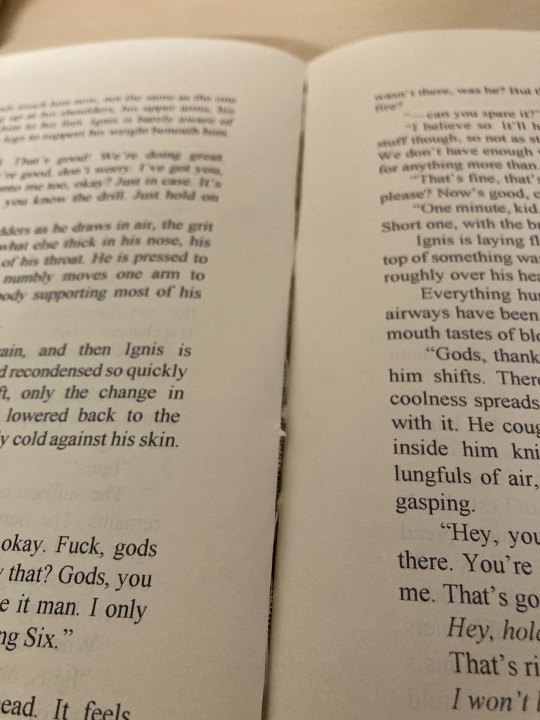

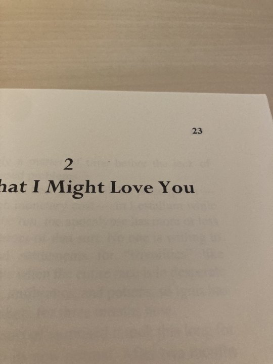
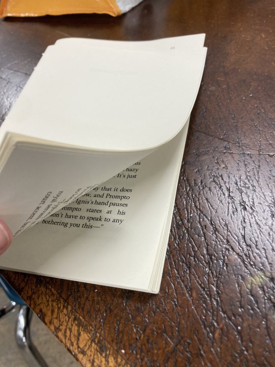
Before I describe and show off the redux, I just wanna share a couple of the errors and mistakes I made on the first textblock here, as I usually try and photograph my books with the least amount of flaws visible. Here we can see, firstly, that the glue job on the spine was shoddy at best; none of it really got quite between the individual signatures of the book, leading to weird gaps like that which compromise the stability of the book and show off the spine liner/mull, to my dismay.
In the other two pics you can see page numbers where they're definitely not supposed to be. Ah, MS Word, you son of a bitch and your terrible, terrible pagination settings. Took me months and months to learn how to paginate my books correctly, up until about my FINAGLC bind.
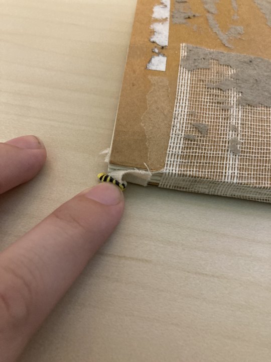
Not enough glue here on the pre-made endbands, either. It would sometimes fold under while reading, which wasn't super fun to see.

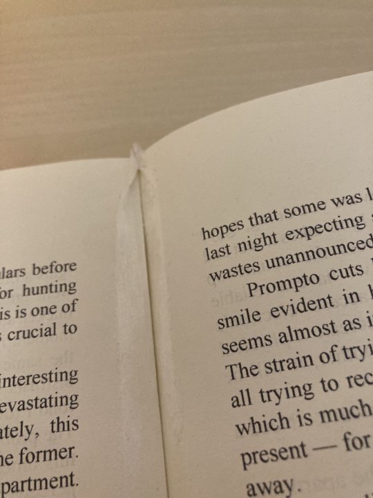
Finally, the botched repair that started this whole journey - I had attempted to fix one of the gaps between signatures (seen earlier) with some Japanese repair tissue, but ended up sticking these pages awkwardly together and fucked up that little top part there. A nightmare!
For all the above reasons, I actually decided to go back to my original typeset and revamp it. I've gotten some... teasing in my binding groups for the fact that my first few books were set in Times New Roman (which I actually find satisfying to read, thank you very much), which apparently gives off a sort of amateurish vibe. I've been experimenting with body fonts since, and the two I reliably use at the moment are usually Sylfaen (for shorter, smaller books) and Baskerville Old Face (for longer books). I switched it to Sylfaen here, and you can compare and contrast the results far down below.
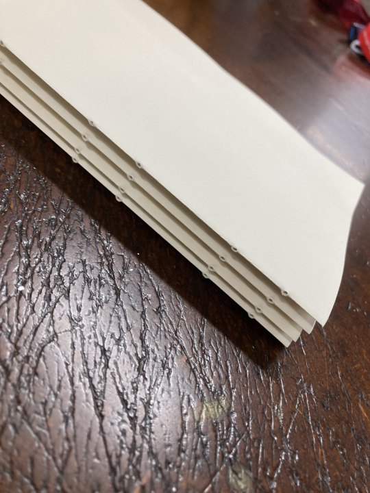
Now, I'm not going to detail the entire bookmaking process here - just the interesting bits. If you want to learn how to make books, I highly suggest checking out @renegadepublishing's resources, as they're how I learned. But here we can see all the new signatures of the new edition nice and crisp and printed. In the second photo they've even been punched for sewing already!
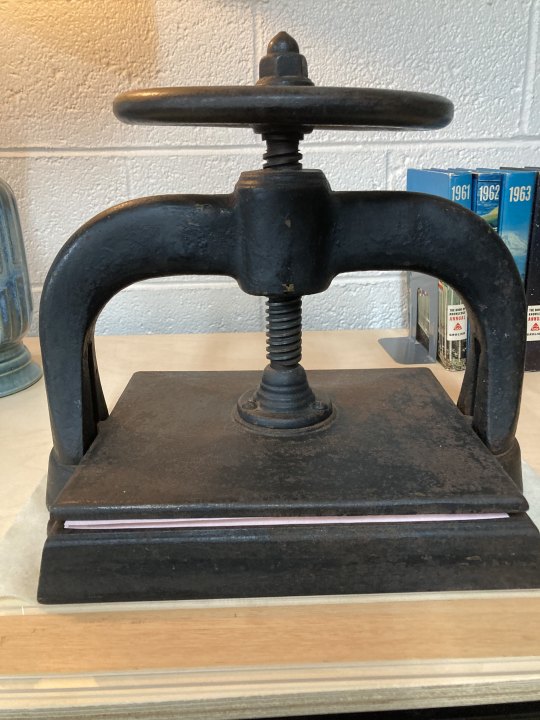
At the co-op where I print and sew my textblocks, I often get to use real nipping presses like this bad boy right here. It's entirely metal (iron?) and way too heavy to lift. Between the two scrap papers peeking out is the new Bernhardiner!
But at home, this is my current set up:
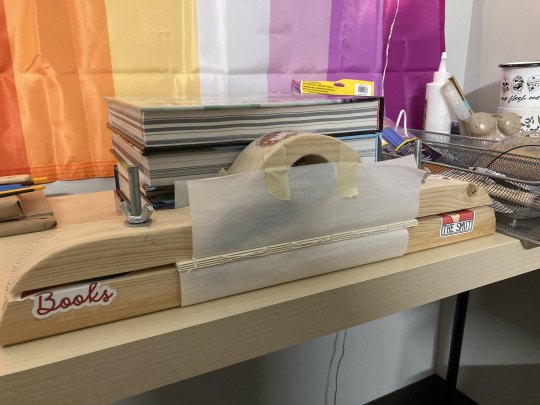
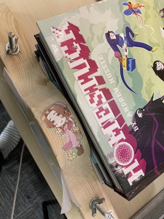
Everyone, meet the eponymous Pulse of Life Press. POL Press, meet everyone.
A family member of mine made the wood part (obviously, a separate piece from the HS books) for me last Christmas, with no real knowledge of what a book press should look like at all. It's sort of a cross between what's known as a lying/finishing press and just some sort of regular old clamp. I line it with wax paper, stick the spine of the book in the center, tighten, and then cover the rest of the textblock with my trusty viz Homestuck books. It's a little MacGyver-y, but it's served me well.
This is the part where you glue the spine, attach the endpapers, and so forth.
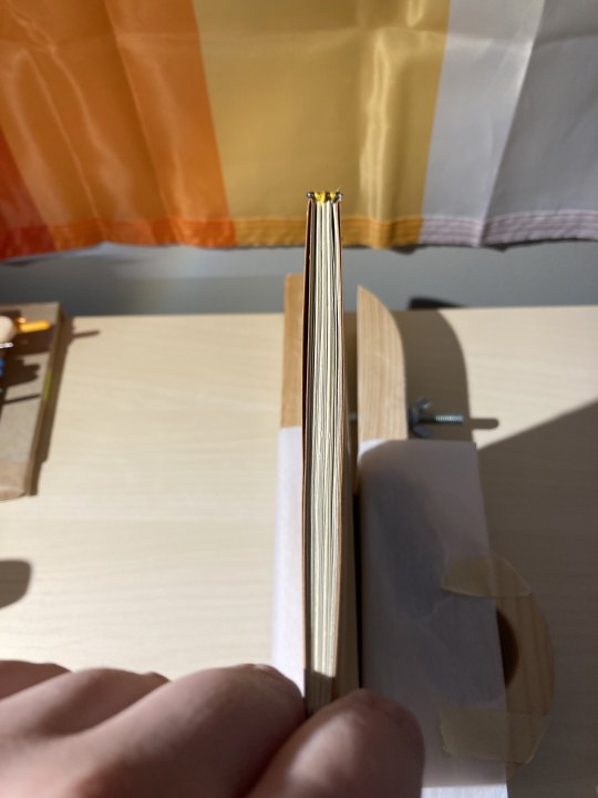
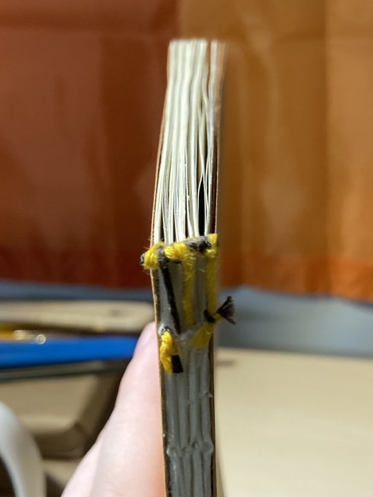


For this redux, I decided to continue practicing making my own endbands instead of using the same pre-made ones I had for the first copy. These ones actually came out pretty darn well, if I do say so myself! They're the absolute neatest I've made them so far, and that's a relief. Obviously I still need work, but it's so lovely making them. <3
After this, I actually don't have a lot of pictures! It's basically just press, attach the spine liner and glue again, press again, casing in, and then...

Et voila!

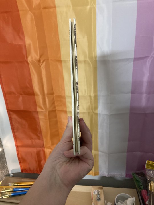
Lookin' pretty good, if I do say so myself.


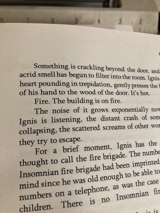
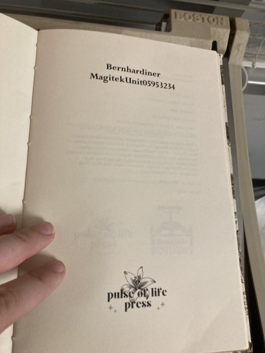
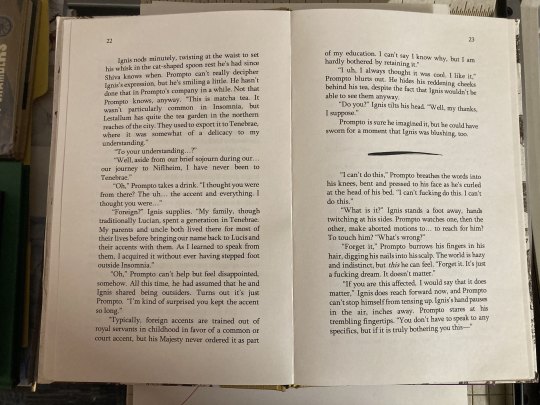
I didn't get exact duplicate photos of the original textblock's mistakes for a before/after, but you can probably just tell from these just how cleaned up the new one is. Rest assured those pesky out-of-place page numbers are long gone, and my spine gluing has gotten a lot better. I'm honestly just glad that it cased in so well - I was worried about that flaky board for a minute there!
And that's all. Thank you for coming with me on this little peek behind the scenes! Here's to many more books in the coming year - more to read, more to make, and more to write.
Cheers!
#cyborg rambles#POL press#bookbinding#fanbinding#book repair#it's also my birthday month so! double the warm and fuzzies#long post
36 notes
·
View notes