#i cannot wrap my wrinkly pea brain around this
Explore tagged Tumblr posts
Text
Color Theory Confusion [long post/call for help]
There is a concept in color theory [it might have a different name?] that NOBODY talks about/teaches that I cannot wrap my head around, and it frustrates the hell out of me.
SO every video or w/e I find is like 'this is complimentary colors! Tri-whatever color palettes! blah blah blah' and I'm like YES. I know how to PAIR UP color types! But they're only! Talking about HUES!!!
They're talking about THIS:

Like! cool! I know how to use THIS part! I know my bullshit of like. All these colors technically work together. [READ MORE]

But these are all at full saturation. My knowledge stops here. And this is where I get frustrated. they'll whip out palettes like this:
Monochromatic:


Complementary:


Etc:

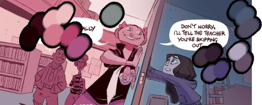
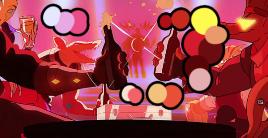
AnD THIS IS WHERE I GET GRUMPY. I understand 'this has red and blue so it works, this has different shades of green and blue so it works' but HOW DID YOU CHOOSE THE VALUES? THE SATURATION??? Each of these palettes has varying values and saturation for each color, and it looks great! SO HOW DO YOU FIGURE /THAT/ PART OUT??? Why doesn't anyone talk about this part of color theory? I can only ever find people talking about how to pair HUES. I'm going insane.
HOW DO THESE COLORS GET PICKED??
Sources: Girl and the Glim


Sources: Magnum Bullets


Some of these palettes have SO many colors, but they're completely cohesive. And like! I understand why the HUES work together. Yellow and pink and blue, yellow and red, pink and green and brown, etc.
But all of these palettes have massive ranges of value and saturation. And that's why they work. But how do you figure that stuff out??? I hate trial-and-erroring my way through every project. Or worse, trying to make palettes for model sheets. I just don't get why I can't seem to find info/teachings on this specific aspect. It's like every 'color theory' video stops at 'here's how to pair up hues on the color wheel' or completely skips over this step like you should just. Know what to do.
Like, let's say I have a picture I wanna do. It's a forest scene. so I go 'okay, blue yellow and green. Those work together.' And I start with full saturation. But okay, I don't want full saturation... I want a muted palette. If I just choose randomly inside blue, yellow, and green, I get shit like this:

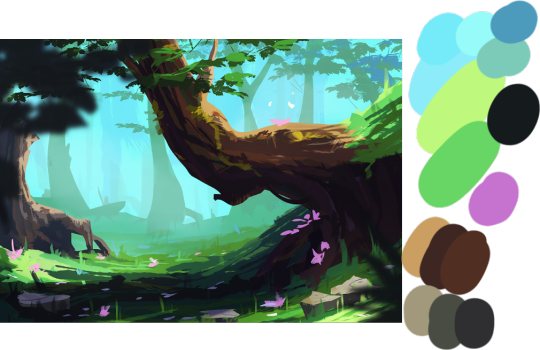
only ONE of these even remotely looks okay! And that's cuz they're ALL desaturated. But then look at this piece!

This does exactly what I WANTED to come up with, but like. How do you land on these colors? How do you pick them?
Bah
I am lost and confused and this is something seriously holding me back in my art. I'm so tired of doing Local colors on a character and then shading them with effects layers. I want to know how to /color them/ to be cohesive with a background. Or just... how to make colors for a background in the first place.
#vt text#color theory#i am small fish tangled in the nets of the web#confused why nobody talks about this process#help#Greek you also do a great job with using the right colors for a scene#forgot to put some comic page examples on here#i cannot wrap my wrinkly pea brain around this
122 notes
·
View notes