#i can’t get the website icons to png crop right so you get it like this for now
Explore tagged Tumblr posts
Text


#i can’t get the website icons to png crop right so you get it like this for now#i made the doggo and priestess ones 🥰#fields of mistria#icons#fom eiland#fom adeline#fom march#fom valen#fom ryis#fom reina#fom hayden#fom celine#fom balor#fom dozy#fom juniper#fom dragon priestess
338 notes
·
View notes
Note
How do you make the manga caps transparent?
oh, i have been waiting for this question.
before i start, i’d like to say that i make all of my transparents on my iPhone. my tool of choice? my finger, and the app ibispaint x. i’m sure there are quicker and better ways to make transparents (scratch that: i know there are quicker and better ways to make transparents), but this way is fun for me. feels a bit like i’m coloring a coloring book.
the tutorial is under the cut because i go into quite a bit of detail!
alright, here we go!!
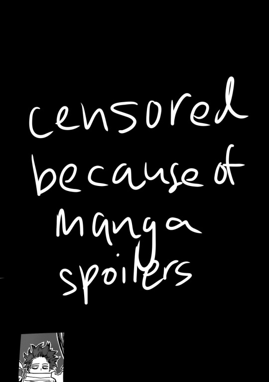
(i blocked out everything in this image outside of the part that we actually care about, because this is a page from a recent chapter.)
STEP 1: alright, so we got a page from the manga with this adorable little shinsou, which we’re going to make transparent. ideally, get a page that has solid black lines, and that doesn’t have little stray fuzzy bits outside of the lines. otherwise your life just becomes a whole lot harder. the reason i prefer not to do earlier chapters is because the website that i use to get pages doesn’t have good quality images of the first hundred or so chapters, and i’m too lazy to find another website. so what we’re gonna wanna do is…

STEP 2: crop the manga page to the part you actually care about! you can also do this in the app that i’m going to use, but i just prefer to do with the photos app. nice and easy.

STEP 3: when you open ibispaint x, there’ll be three options, “my gallery”, “collection”, and “online gallery”. pick “my gallery”, and it’ll take you to a screen that looks something like what’s pictured above. click that fancy little plus button indicated in the image to start a new canvas!
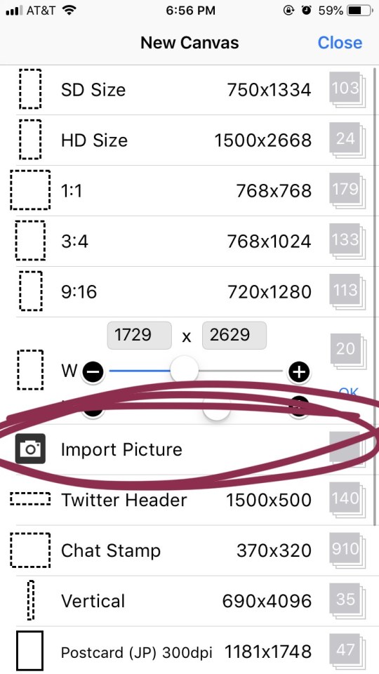
STEP 4: the option you want to pick is import picture.
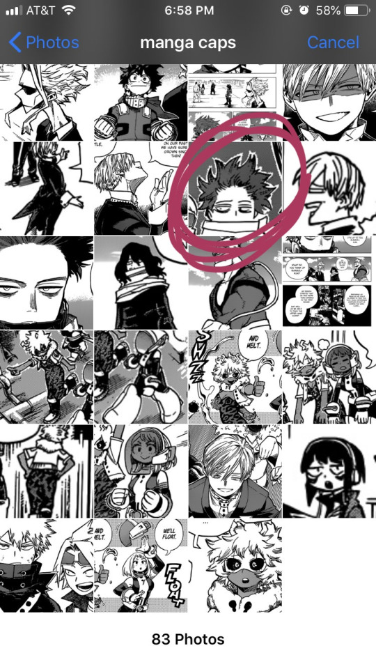
STEP 5: alright, there’s our shinsou! we’re just gonna click on him, pretty easy, right? also yes, i have an album on my phone dedicated solely to manga caps that i plan to make transparent.
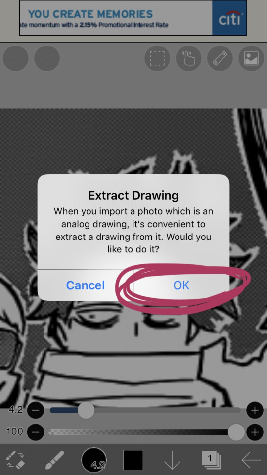
STEP 6: the moment you click the image, it’ll take you to a canvas and ask if you want to extract the drawing. you’re going to hit “OK”, because extracting the drawing makes it so that all the white areas in the image become transparent, leaving only the black and grey.
NOTE: this won’t quite work properly if the background isn’t pure #ffffff white! if you are making a transparent from someone else’s manga cap, make sure that the manga cap has pure white values. if it does not, there will be a very light, barely detectable film of nearly transparent grey values, but it isn’t full transparency. this means if someone uses your transparent over something like…say, a solid colored background, the colored background will appear darker in the final image. there’s a way to get rid of this film, but it’s hard to explain, so please ask me if you want to know how to do this. heroacacaps is a very popular blog that editors get their manga caps from, but their images do not have a pure white background. (it’s kind of funny, i can often spot when someone made their transparents using a manga cap from heroacacaps.)
OPTIONAL STEP: if you are using ibispaint x for importing anything that you don’t want to make transparent, then 99% of the time, you are going to want to hit “cancel”. also, this ONLY works well for black and white images, and trying it on a colored image with make the image turn monochrome. you can still use it on some colored images with white backgrounds, but it you need a few extra steps to make it work (hint: clipping layers, if you know how to use those. duplicate the extracted layer until it is completely black without creating black values outside of the lines, and merge the layers down into one layer. clip the original image over this layer. ask me if you ever want me to go further into detail!)
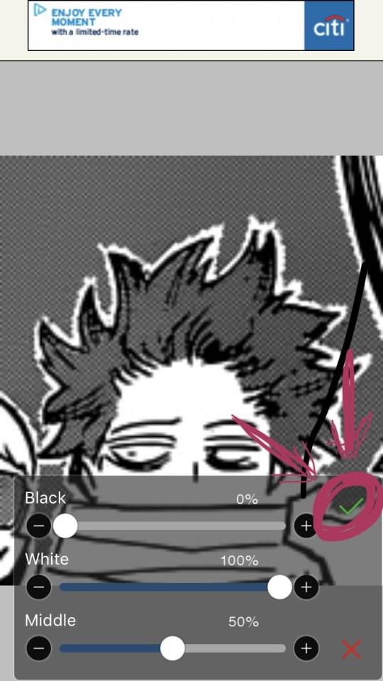
STEP 7: once you hit “OK”, this will pop up!! if you are using a good image where the lines are solid black values, the default option will be perfect for you.
click the green checkmark once you’re satisfied with the appearance of the image!
OPTIONAL STEP: you can manipulate these numbers if you need to. i find this useful for making the lines on sketches clearer. increasing the black percentage makes middle grey values appear darker, and decreasing the white percentage makes middle grey values appear lighter. the white percentage cannot be lower than the black percentage. i’m���not quite sure how to explain what the middle percentage manipulates, but you can mess around with it and see what happens.

STEP 8: so we’ve got the image on the canvas, but now we have a bunch of stuff in the background. to get rid of it, hit the little brush icon, and click the eraser icon. if you’re not sure what the eraser icon looks like, the next image has an image of it in the location where the brush icon was.
next, just…use your finger (or a stylus if you’re fancy) and erase away all of that outside stuff!
OPTIONAL STEP: some manga caps require the extra step of drawing any parts that were covered by things like text bubbles and other characters. it’s sometimes the most tiring part of the whole process, and i can’t really tell you how to do it. you just have to experiment with the available tools. there are lots of brush options you can try to imitate the way the lines look, if you click the button to the right of the brush icon, and there are also (painful and tedious) ways to replicate more complicated textures. i often have to do this step which is why i have an entire goddamn tag dedicated to transparents i needed to patch up.
if there was only one reason i had to pick for why you should respect the people who give you manga caps without backgrounds for you to use in their edits, it’s because a lot of times, they patch up manga caps without any comment. some replicate the actual style so well that you’ll have never realized that the person you got the manga cap from added in their own bits. here’s an example. this transparent? it took an hour. just look at the original, and consider how many different areas are covered by text. imagine how many different textures and lines that have to be replicated.
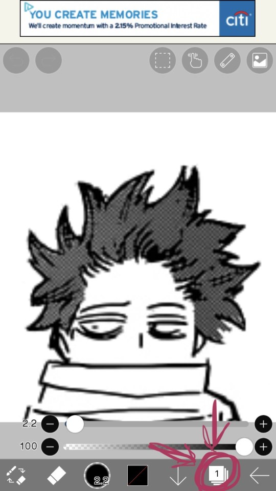
STEP 9: alright! now we’re ready to actually make this sucker a proper transparent image. this image is actually just lines, and if you stop here, you’ll only have the outline of the image! what we’re going to have to do is take parts that we don’t want to be transparent, and color them white. unfortunately, this is the bulk of the work, most of the time. to do this while still keeping the outline intact, we’ll have to use layers. hit the button with the rectangles stacked on top of each other to open the layers menu.
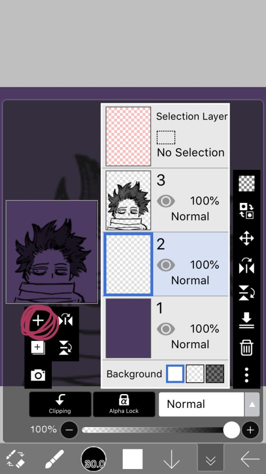
STEP 10: hit the plus button to create a new layer, and make sure to move it underneath the layer with the manga cap. i actually like to make two layers, with the lowest one having a color that’s dark, but not too dark. this added layer makes it easier for me to see what i’m coloring, and i really recommend it. if you don’t do this, you’ll have to hit one of the checkerboard patterns next to the word “Background” located underneath the layers. ideally the darker one, it’s easier to see the white on it.
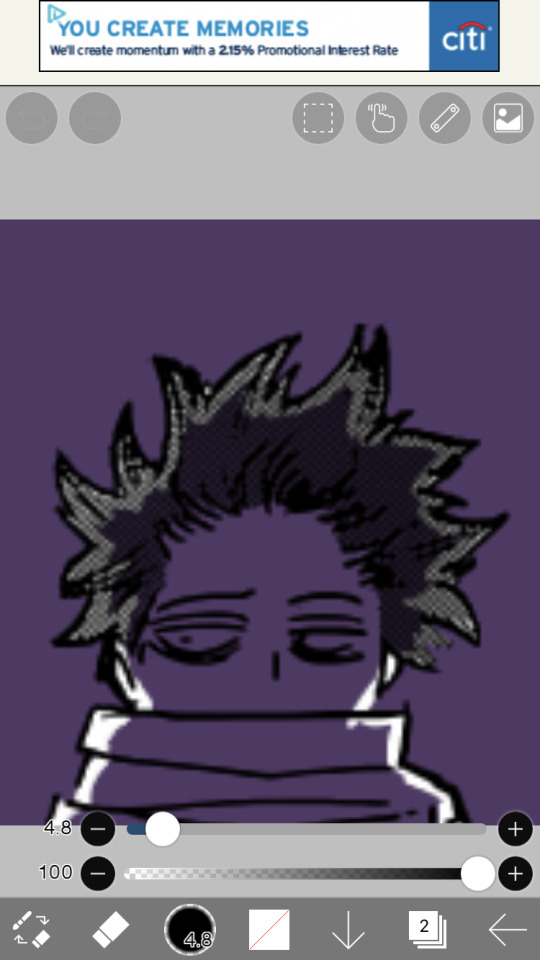
STEP 11: hit the eraser icon and click the brush icon again to be able to draw! and now, it’s just simple coloring. if you’ve ever used a coloring book, then this might evoke feelings of nostalgia within you, because this is basically just a glorified digital page of a coloring book.
i like to color the parts closest to the line first with a small brush size capable of getting in corners (use the little slider next to the text that says “4.8″ in the image to change the brush size). it’s not that helpful for a transparent as simple as this, but more complicated transparents with lots of corners to color make this step a blessing. or maybe that’s just me.
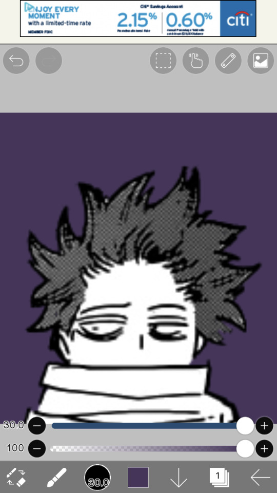
STEP 12: aaaaand finish coloring all of it, with a bigger brush size. if you colored near the lines first like i mentioned in the previous step, then this will feel a lot more like using a coloring book than the previous step.
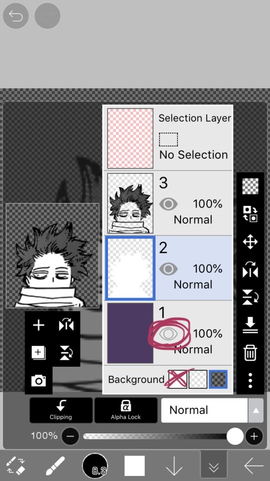
STEP 13: alright! if you used a colored layer underneath to help you see the white, then you’re going to want to hit the little eye button on the colored layer to make it invisible. after all, we do want the image to be transparent.
STEP 14: next, there are three background options underneath the list of layers, next to the word “Background”. if you want your image to actually be transparent, do not pick the solid white option. pick either of the checkerboard options, both will give you a transparent image.
STEP 15: you’re done! now just to save the image. click the little arrow pointing left on the bottom right of the screen. this will exit you out of the canvas, and back to your gallery.
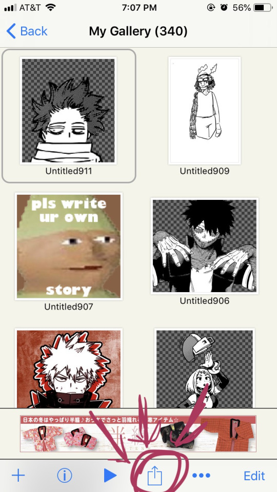
STEP 16: click the button indicated in the above image.
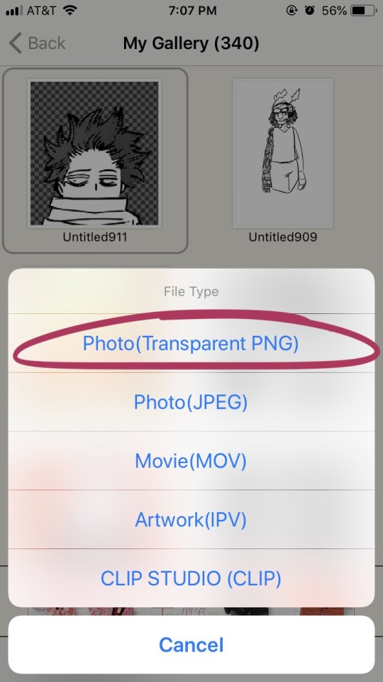
STEP 17: the above will pop up, click “photo (transparent png)” to save the image as a transparent image.
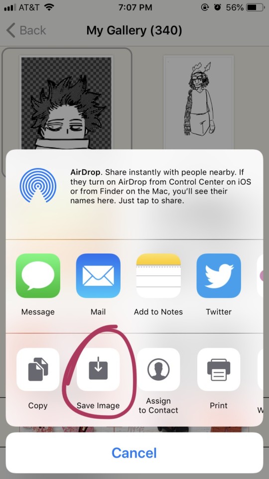
STEP 18: click save image!
and that’s it. you should have yourself one gorgeous transparent in your photos. i would probably suggest checking the image to make sure that it isn’t transparent in areas that you don’t want it to be.
210 notes
·
View notes
Photo
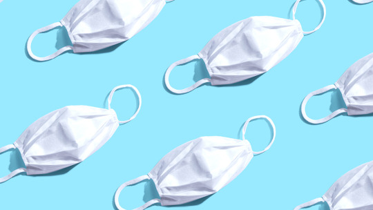
Image of mask https://www.netsafe.org.nz/healthline-covid-19-calls/
For starting my assignment 2 processing code, I have chosen to do use New Zealand covid cases data and turn this into a digitally embodied face mask. This is because I am not to sure how the LEDS work and how much it would cost for me to buy the equipment to make. The quiz website idea was also a possible option but I couldn’t decide what kind of quiz, I also went to the warehouse to find a tote-bag but they had ran out. I thought covid 19 was the most relevant idea especially with New Zealand being in level 2 again. I also have access to data through https://www.health.govt.nz/our-work/diseases-and-conditions/covid-19-novel-coronavirus/covid-19-current-situation/covid-19-current-cases. This data shows New Zealand’s current cases, how many total cases, how many deaths and other relevant information. During lockdown I would always look on this website and I know that this has lots of possible data I could use for my assignment 2 work.
My current workflow:

This is a photo of my current workflow. A work flow is important to understand each step you will take in your process and also allows other people to see your work flow and understand how the mask was made.


https://www.health.govt.nz/our-work/diseases-and-conditions/covid-19-novel-coronavirus/covid-19-data-and-statistics/covid-19-current-cases
Step 1: Saving as a .CSV
First I used the data on health.govt.nz and copied and pasted it into sheets, this pasted into one column and row, so I had to rewrite each New Zealand city. I also decided only to have the DHB (district health board) and TOTAL (total number of cases) because this was the two headers I want my mask to represent compared to how many are active, recovered, decreased ETC. This means my mask shows the total number of cases for each NZ place. I have also gotten rid of the “Managed Isolation and Quarantine” row. This is because it isn’t a New Zealand city, and I am unsure where they are in isolation.
We have learn’t about saving as a .csv through spreadsheets. CSV means Comma Separated Value. We have previously worked on birthdaydata.csv and have imported this into processing through using Table birthday data. Table is the variable. To make sure the data is imported correctly, you have to save your .csv file into a “data” folder in your sketches folder otherwise it would not be able to find the document. I will be using the birthday example as an example for reminding me how to import a .csv into processing.
(THE COVID STATS WHERE UPDATED FROM THE 5TH OCTOBER 2020, I would have to get regular stats but currently I am working from this dataset)
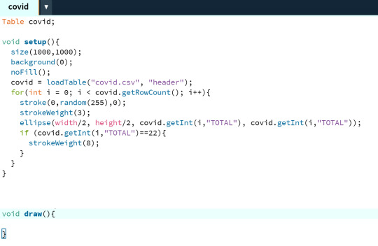

Step 2:
Putting it into processing. I have used the birthdayData template as a guide, I have changed the data sheet and therefore the ellipses represented the covid 19 cases in New Zealand in each city, for example Capital and Coast had/has a total of 95 cases. Therefore the ellipse will be medium shaped close to small. The bigger the total case number in that New Zealand city the bigger the ellipse(). I have made sure to change where the birthdayData was put and changed this to Table covid. Table covid gets the table from covid=loadTable(”covid.csv”, “header”)
I have chosen New Zealand stats because I wanted it to be relevant to where I live. It was also easy to find the correct stats because over the lockdown period I would always check https://www.health.govt.nz/our-work/diseases-and-conditions/covid-19-novel-coronavirus/covid-19-data-and-statistics/covid-19-current-cases and I knew they had the statistics written on the page. I also found it interesting to see what city in New Zealand had the most cases. According to my statistics Waitematā had the most cases with 293, therefore they are the biggest ellipse() on this sketch. Overall I have changed the birthdayData and used it as a guide to import my own statistics into processing
Colour
I have decided to choose green because green resembles the colour of germs from a snotty colour. Green I can relate to bacteria and thats what I want to show through the ellipses. I have done stroke(0,random(255),0). Processing uses RGB, green stands for G and therefore is the middle parameter. I decided to use the random function, to have a varied amount of greens this means each time you run the code you’re not always going to get a dot with the same green. It creates randomness and variation within the data visualisation and I feel that it adds another layer of complexity to the code.
The black background has been chosen to display contrast between green and black. Sometimes the ellipses would get to light and therefore be hard to see. I have set the background to black by using background(0); function. This therefore shows that I have considered contrast in my making.

Step 3:
I have now worked on the idea of random. I want to create random dots as if the bacteria bubbles have spread across the page. This is because I feel that it is more interesting to have variation in the bubbles but this means your mask is personalised to you, when you run it you get a different mask pattern and therefore know that it is your mask. It also means that you can decide which mask you like when buying them in a shop.
When randomising I like how the bubbles appear spread out but also overlapping each other, it would look affective on a mask. I have the idea of instead of a bubble how could I show bacteria? I thought that I could try and import an image of a photoshopped bubble and replace ellipse() with an image. I will have to do some research on how to add a image into processing because I have not done this before.
Step 4 photoshop bubble

https://www.freepik.com/premium-vector/covid-19-coronavirus-virus-bacteria-outlined-icon-illustration_7972163.htm
I have creative commons sourced an image of a covid 19 bubble. This is because we want to make sure there is no copy right within the image. I can use photoshop to crop the bubble and change the colour to green. This is because I want my overall final covid bubble mask to be green. Green means germs and bacteria and works well to show the bubble.

I have used photoshop to edit the covid bubble. I have used the “wand” tool to get rid of the background and made it transparent to save as a png file ready for processing. The purpose of the .png format is because when the bubbles overlap I want to be able to see through the covid bacteria bubbles. In photoshop I have also cropped the image so that you can’t see the word “Covid-19.″ I then changed the colour of the bacteria image to green by overlaying the colour. Overall the png has worked successfully.

I have saved this png into the data folder. This is because the data folder is where processing can access the correct image. This works similar to when importing a .csv file, you have to put it within the data folder.
Step 5 research
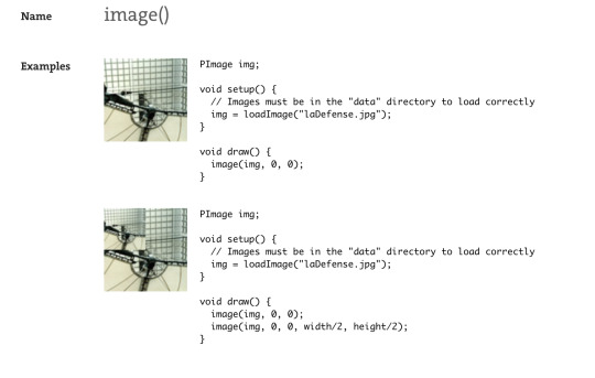
https://processing.org/reference/image_.html#:~:text=Select%20%22Add%20file...,%2C%20JPEG%2C%20and%20PNG%20images.
For creating my mask I have done some research on how to get an image into processing to replace a ellipse();
The image() function draws an image to the display window. Images must be in the sketch's "data" directory to load correctly. Select "Add file..." from the "Sketch" menu to add the image to the data directory, or just drag the image file onto the sketch window. Processing currently works with GIF, JPEG, and PNG images.
We have to write PImage img; at the begining of the code as a variable. Then replace the ellipse() code with image(img, random(1000), random(500), covidData.getInt(i, “TOTAL”),covidData.getInt(i, “TOTAL”)); this therefore means that instead of a ellipse, it gets the png image and sizes it depending on the data from covidData.csv. This is an example of experimenting and improving my code. (This also works with .svg images);
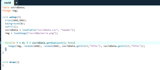

Step 6: Running my code
Overall my code has successfully worked. I have used PImage img; to get processing to find the image in the data folder. The “img” has been set in the void setup(), it calls processing to get the image and put it in the variable of img. img= loadImage(”covidBacteria.png”) (processing gets the image from data folder). We then replace the ellipse function with - i(img, random(1000), random(500), covidData.getInt(i, “TOTALl”),covidData.getInt(i, “TOTAL”)) It gets the integer of total number of cases from the data set and then uses the bacteria img to show the size of the cases in that city along the 1000x and 500y canvas size. I have used random as the same size as the canvas, therefore the bubbles appear around the whole canvas, not just a section of the x and y. Overall the width and height is determined by the the number of total cases in that place. EG. if the total number of cases was 95, therefore the bubble will be 95width and 95 height. The (”TOTAL”) also means that proccessing gets the “header” of the csv and inputs all the values that are bellow that column in the csv file. This overall shows the number total cases New Zealand had/has of covid 19 by each city.
Improvement idea:
I think that I could further improve this code. Some of the covid bubbles are small and look like dots. I need to make sure that the embroidery machine is to pick up the small details in my design. This means that my face mask will look better in the final outcome. I could do this by experimentation. Experimenting maybe *5 each bubble by covidData.getInt(”TOTAL”) *5 = TOTAL number is times by 5 and therefore a bigger bubble in size. EG: 95 width and 95 height x 5 = 475. This could be too big so I would have to experiment. I could also change the smaller bacteria bubbles by using the ellipse() inside of a if statement, if it is < 100 = an ellipse().
0 notes
Photo

i was asked to do a tutorial on how i make my icons by anonymous, so here’s my super easy way of doing it. there’s no major editing or backgrounds simply because i’m super lazy and i prefer the look of clean, bright icons. i’ve only ever used this method on cartoons (voltron. i’ve only ever made voltron icons lol), so i can’t say for sure whether this method would work well with real people. just keep that in mind!
for some examples of what you can make, here’s my icons page.
please like/reblog if you try it out, and feel free to ask me any questions.
in order to follow this tutorial, you’ll need a basic knowledge of photoshop - i use cs6, for reference. you might be able to create a similar product on other programs like gimp? idk.
one. choose a screencap to use for your icon. generally, i take my own screencaps right from netflix on my computer, but there are a wide array of websites you can get better quality ones from. i’m just lazy and this works for me.

it’s best to choose a scene where the character’s body is in full view, and one with a simple background, as this makes it easier for you later on.
two. isolate the character from the background. for this, i like to use the magnetic lasso tool. it can be a little fussy to deal with at times, but i find it’s a quick, effective way to get the job done. if the background is one solid color, i’ll sometimes use the magic wand tool, but other than that i use the lasso.

once i’ve got the subject outlined, i right click and choose the option ‘select inverse.’ then i delete the background.
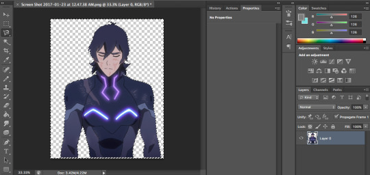
three. next, you’ll want to clean up any areas the lasso tool might not have gotten. for this, i zoom in at 100% and use the eraser to get rid of any weird bumps or leftover background.
four. i find that my icons look best when i use the stroke option on the subject. i double click on the layer and select stroke, leaving whatever default options are set. since my screencap is so large, having a 3 pixel border makes it look like the original drawn outline is still there (something that the magnetic lasso tool usually erases). plus it just makes the subject look a lot more crisp.
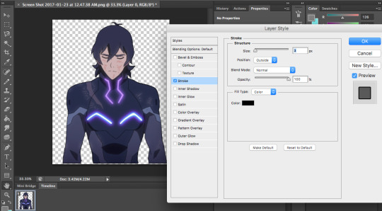
i clean up with the eraser one more time after applying the stroke, because it’s easier to see imperfections and stuff once they’re outlined.
five. i crop the image so that it’s square, and resize it to 300x300 pixels. i like this size because they look nice in photosets and that way, people who want to use them can crop them if they want.
six. coloring! for this, i use my own psd that i use for voltron gifs as well. i couldn’t find a good psd that didn’t whitewash hunk, lance, and allura, so i made my own on a whim and now i’ve been using it for everything. because i’m lazy. if you ask nicely i might post it.
the general idea for icon coloring is that you want higher contrast and bright colors because of their small size. most voltron screencaps are bright enough already, so it’s really just a matter of adding contrast and a little vibrance.
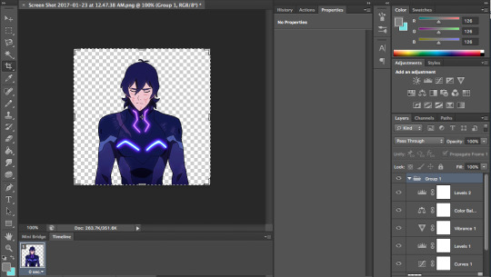
so that the coloring doesn’t interfere with the background, you should right click on the subject layer, select ‘select pixels,’ then go to your coloring group and apply a layer mask.
seven. create a new layer and bring it to the bottom. for background colors, i usually like to pick out colors from the subject because i find it makes everything feel a lot more cohesive.
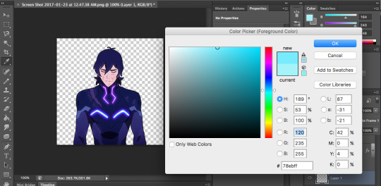
then you’ll want to use the paint bucket tool to create a solid background.
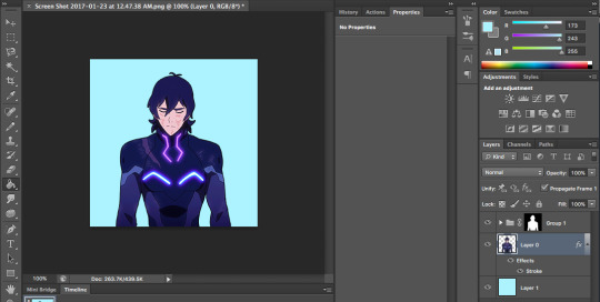
eight. so that nothing looks too flat or boring, i add soft light layers of gradient. the first one goes right in between the background and the subject. go to layer > new fill layer > gradient...
set mode to soft light, and choose the black to white gradient. adjust accordingly, depending on how strong you want the background gradient to be. for this one, i’ve kept it at 100%
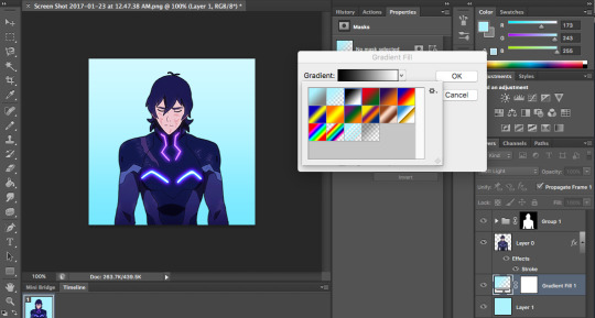
the second gradient i add goes over the entire icon, at the top. do the same thing in creating a new gradient level on soft light, but this time choose the color to transparent one. this just helps make the icon look a little more put-together imo.
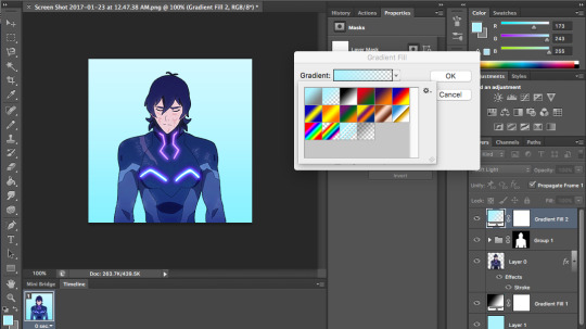
again, adjust opacity to your liking. i adjusted mine to 90%.
nine. sharpen the subject layer. i use smart sharpen, and the default settings. if it looks oversharpened, that’s fine because it looks better when it’s actually icon-sized.
ten. save (for web) and use! i save my icons using the png-24 settings... i think they’re default - i don’t remember tweaking them ever. does everyone with photoshop have a png-24 option??? i know nothing about photoshop truly.
here’s my final product:

this tutorial was actually a lot longer than i anticipated... i promise it doesn’t take that long to make these!!! usually it’ll take me anywhere from 5-20 minutes to make an icon, depending on how often i fuck up the magnetic lasso tool.
hope this is helpful to some people. any questions, feel free to pop into my ask box and i’ll do my best to help you!
#icon tutorial#photoshop tutorial#itsphotoshop#yeahps#ps tutorial#idk i hope this helps#i've never written a tutorial before rip i feel like this might be long-winded#lmk if there are any grammar mistakes too i didn't really edit this#bye
375 notes
·
View notes
Text
Shopify Speed Optimization
Shopify is a great platform for sellers. It provides you with free and unlimited bandwidth that keeps it running. When you start, everything looks so bright and brand-new, and people seem to like it. With time, you add more images, more extensions, more integrations, and your site load time increases. And in this line of business, time literally means money. The longer your site takes to load, the more people will leave it for good. Nobody is going to wait 10 seconds for your site to load. The optimal site load time is 2 seconds or less.
First of all, run the load speed test on GTMetrix. This tool is great for this purpose since it shows you the factors affecting your page speed as well as their priority and your score.
The components with the lowest score, i.e. the ones you have to focus on, are at the top. Now that you know your score, let’s find out how to speed up your Shopify store and keep it looking good?
1. Optimize images
Images take 50–75% of the web page’s total size. The more high-quality images you have, the more time is required to load the page. However, you don’t have to remove half of them, just try keeping every image under 100 KB. There are a few ways to reduce the size of an image without a significant loss of quality:
1. Online tools like tinypng.com. They can help you reduce your images’ size by up to 80% and nobody will be able to tell the difference between the quality of the images.
2. Specify the dimensions in the HTML code. Regardless of the images you will use in future, they will never be bigger than you have indicated.
Or you can specify either the width or the height and Shopify will determine the other dimension according to the original image size.
If the image is bigger than your stated parameters, it is better to use crop. The parameter defines what part of the image will be shown. Don’t use it and Shopify development will fit the image to the stated size, which might not be the whole picture. Write one of the following words next to crop:
top;
center;
bottom;
left;
right.
Eventually, everything must look like this:
3. Using apps. A free tool like ImageOptim will optimize your image size, but you need to do it before uploading the image to the site. Instead, you can use an integrated ImageRecycle app that will automatically do it with the images and PDFs on your site. Also, there is such a thing as “Lazy image loading”. It means using a Javascript library to load images only when they are required. It is particularly user-friendly when the visitor doesn’t need most of your content, and it improves the initial site load time. In order to implement it, use the lazyload jQuery attribute.
2. Forget about homepage sliders
Yes, not so long ago sliders were popular, but now research recommends avoiding them. They don’t just increase page load time, but also annoy people. Sometimes, sliders change too fast and the user doesn’t has enough time to get fully engaged with every slide.
Sliders are also a problem for the mobile version of the site. Firstly, it takes extra traffic and even more time to load; secondly, just scrolling down is much easier. Consequently, a slider causes lagging. No matter whether your site is accessed via a computer or a smartphone, only 1% of users actually click on a slider. Thus, the hero layout is gaining in popularity now. Generally speaking, a hero image is a large web banner image at the top and in the center of a web page. It introduces an overview of the site’s content. It often contains an image and text; it can be static or dynamic. Here is Shopify’s article on how to create the Hero Layout.
3. Change the theme
Mostly, the Shopify page speed depends on the theme. A theme that is not optimized for website performance has numerous CSS and JavaScript files. An optimized theme, on the other hand, has one CSS file for all the styles, and one JavaScript file for all the scripts, which decreases the page loading speed. So, before choosing the theme to install, run the load speed test of the preview page through Google Pagespeed Insight.
4. Get rid of the broken links
Such links are troublemakers. They increase the number of HTTP requests, which increases the load time and irritates the potential customers. Get rid of them using Broken Link Checker. Furthermore, take care of redirects. Too many of them slow down the site as well. For Shopify stores, you can use 301 redirects.
5. Leverage browser caching
To properly display a page, the browser caches (downloads) all the HTML, CSS, JavaScript files and images the moment you access the site. This is why it takes so much longer for the page to load for the first time than when you visit it again.
Leverage browser caching means storing your webpage files in the browser cache. Therefore, returning to the previous page entails less load time. In order to implement this, you’ll need the .htaccess file. Here’s what should be added to the top of it:
## EXPIRES CACHING ## < IfModule mod_expires.c> ExpiresActive On ExpiresByType image/jpg “access 1 year” ExpiresByType image/jpeg “access 1 year” ExpiresByType image/gif “access 1 year” ExpiresByType image/png “access 1 year” ExpiresByType text/css “access 1 month” ExpiresByType text/html “access 1 month” ExpiresByType application/pdf “access 1 month” ExpiresByType text/x-javascript “access 1 month” ExpiresByType application/x-shockwave-flash “access 1 month” ExpiresByType image/x-icon “access 1 year” ExpiresDefault “access 1 month” < /IfModule> ## EXPIRES CACHING ##
You can use Cache-Control as well. It is an HTTP header that establishes how and for how long a file is to be cached. It is the best to use it in the .htaccess file too. In general, it will look like this:
<FilesMatch “\.(ico|pdf|flv|jpg|jpeg|png|gif|js|css|swf)$”> Header set Cache-Control “max-age=604800, public” </FilesMatch>
So, we have the max-age directive for timing. It is expressed in seconds. The common timings are:
max-age=60 — one minute;
max-age=3600 — one hour;
max-age=86400 — one day;
max-age=604800 — one week;
max-age=2628000 — one month;
max-age=31536000 — one year.
The directives for the types of cacheability are:
public — any cache may store the information;
private — the response is individual for every user (what one user sees cannot be seen by another user; Twitter is a good example here);
no-cache — the response can’t be cached.
6. Compressing pages
Pages rich in content tend to slow down the load time. In order to avoid this issue, you can compress the pages. By decreasing the page’s bandwidth through zipping the pages, you reduce the HTTP response. This is where a commonly known tool, Gzip, comes in handy. A lot of web servers out there are able to compress files in the Gzip format. According to Yahoo, using the tool can help you reduce the response time by up to 30%.
7. The less, the better
This is the case with apps. Apps are good — they help to improve the look of your site and add new features. However, it’s no good when there are too many of them. Most script files for apps are inserted into the <head>. Hence, the app’s content is one of the first to load. Some apps are built to load their code before loading the other page content, which is time-consuming.
It is quite doubtful that you will use all of your 20+ apps. Meanwhile, they remain running and slowing down your store. So, keep watching your app list — don’t load too many of them, and delete the ones you don’t use.
The Bottom Line
People hate waiting. So, for your site to be successful instead of being a waste of time and money, it should be fast. All it takes is just a few unsophisticated tricks to optimize it. This won’t take you much time, but you can be sure it will pay its way. If the site load time is 2 seconds or less, the customers won’t leave before loading is complete. Moreover, there is a good chance they will be back.
A source https://spur-i-t.com
0 notes