#i am trying out this style with using the canvas texture and the water color brushes; i dont like it but i think it looks cool
Explore tagged Tumblr posts
Text
Fish......bones.....fishbones......fish.........bbbb...
G

#one piece#art#digital drawing#one piece fanart#artists on tumblr#jinbei#one piece jinbei#brook#jinbe#soul king brook#jinbrook#i am trying out this style with using the canvas texture and the water color brushes; i dont like it but i think it looks cool#i don't remember what jinbei was talking about but it looks funny#fishbones#jinbei x brook
296 notes
·
View notes
Text
Love at First Paint: A Beginner's Guide to Painting

"Almond Blossom" by Vincent van Gogh (1853 - 1890), Saint-Rémy-de-Provence, February 1890
Have you ever dreamed of being like Picasso or Vincent Van Gogh? If you do, you are looking at the wrong blog because I am far from them. But hey there! I'm Eden Amor, a freshman student and a self-taught artist who just loves to paint.
Art has been my passion since I was a kid, and as I grew older, I fell even more in love with it and started trying out different mediums and styles. But there's just something about painting that really excites me! I started with graphite, then moved on to colored pencils, and even dabbled in charcoal (although I never got around to using those charcoal pencils I ordered online). Finally, I found my true love in watercolors, and I've been obsessed with working with wet mediums ever since!
If you are a beginner in painting (like me, have been a skill of a beginner for years), you can enjoy my blog and get some tips that I learned from my starting journey. But if you are just interested in painting or in art generally, you can still read this blog.
Just a disclaimer: I am no expert and just a self-taught artist. Some things might work for me and not for you, and vice versa, so take this blog with a grain of salt.
LEARN ABOUT PAINTING
Since I am a self-taught artist myself, I never applied for workshops in drawing or painting. But most of my art knowledge is from YouTube tutorials, shorts, and IG reels (I have no TikTok, I don’t know why). I suggest learning about the basics before painting whatever you want because you’ll get disappointed after the result or wondering why everything is not working the way you wanted.
But before anything else, find the medium that you want. Mediums like acrylic, oil, gouache, and watercolor. There might be more but these four are some of the common wet mediums. One thing to address about these mediums is that they all have different properties and the techniques you’ll approach, the materials you’ll use, and the finish or outcome of the painting will depend on the medium.
MEDIUMS
Watercolor
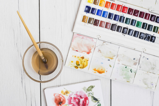
My recommendation for anyone wanting to start painting with no experience is to use watercolors. The only things you need are watercolor paint and water. Unlike acrylic paint, which, although water-based, can get pretty messy and dries quickly, giving you little time to blend and touch up unless you use an acrylic medium called Retarder, which is a medium that you mix with the paint to slow its drying time, but will cost you more. So, as simple as watercolor can be, it's a great starting point for a beginner in painting.
However, watercolor painting can be tricky when it comes to water manipulation. The amount of water your brush holds affects in creating an even layer of paint. The drying time takes hours, especially if you are working in layers, if you paint the still-damp surface too early, you will ruin everything and you cannot cover it up since watercolor is transparent. That is why watercolor painting is done light-to-dark because dark colors cannot be covered by light colors. So planning ahead of time is suggested and should not paint with watercolor impulsively.
Acrylic
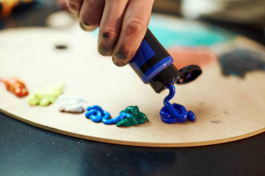
If you want to take the next level or just explore other mediums, acrylic painting is great for high coverage and textures. What watercolor doesn’t have but acrylic has is the ability to cover mistakes. In acrylic painting, you can paint on top of a painting, which is great especially if you change your mind or decide to start all over again, as long you coat more than one layer of white paint then you have a blank canvas again.
However acrylic paint, as said earlier, dries quickly which can be a disadvantage if you are a slow painter (like me) and especially if you are making a seamless gradient, which is very difficult to achieve and not as easy as you think. Since acrylic is water-based, cleaning is very easy with just water as long as the paint is still wet. Hardened paints can be peeled off easily but only on smooth surfaces, but if you got it on something like fabric, it will be forever on it.
Gouache

I describe gouache (pronounced as ‘goo-aash’) as a combination of watercolor and acrylic. Because like watercolor, gouache is water-activated paint, which means that dried paints can be revived and used the paint again when wet. And just like acrylic, gouache has high coverage and a thick consistency which is great for texture. But unlike acrylic, which has a glossy finish, the gouache creates a matte finish once the paint is dry and it also dries fast giving you no more time for creating flawless gradients.
I use gouache for mini projects, or creating art trends I saw online, but I don’t recommend it for painting a big major project since it can be smudge once wet, and as of now, I don’t know if there’s an appropriate varnish for gouache so if you have any idea please let me know in the comment section.
Oil
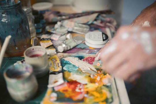
The most expensive of the four mentioned paint mediums is oil paint. However, oil paint creates the most realistic paintings. Despite its high cost, what makes me love oil paint is how smoothly the paintbrush glides, like butter. Blending oil paint is very easy, and you can create flawless gradients between colors. Oil paint has a very slow drying time. For small projects, such as those the size of half a sheet of bond paper, it can take days to weeks to fully dry and be ready for varnish. This slow drying time can be both an advantage and a disadvantage, depending on the complexity of your painting. It allows you to fix mistakes or make adjustments even the next day. Additionally, a small amount of oil paint goes a long way.
Oil painting can be hazardous because it involves flammable oil-based paints, as well as mediums like thinner and linseed oil. While water is used to dilute watercolor, gouache, and acrylic paints, oil paint requires the use of thinner. It's important to avoid washing oil paintbrushes with water, as it can damage the brushes and won't effectively remove the paint. Additionally, it's crucial to store oil paints, thinner, and linseed oil away from sources of heat and fire.
Since I am only new to oil painting, I cannot give much in-depth information about it and if you do please I beg for some advice and tips in oil painting.
Materials in Painting
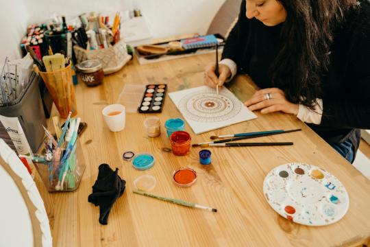
Painting can be an expensive hobby given that the materials used (especially the branded ones) are not really as cheap as a pencil and a piece of paper. But aside from being a painter, I am also a cheapskate.
I will never buy an art supply that is as expensive as my kidney, UNLESS if it is worth it or I can make money out of it. I don’t really have all the money to buy all the art supplies I want, I am still dependent on my parents and have no job yet (currently at college, 18, and an irresponsible young adult).
That is why I chose to buy art supplies online instead from the art stores near my place. And I think as a beginner, expensive materials are unnecessary because for me an artist should be able to make a masterpiece with his/her skill and not the tools. But that doesn’t mean the quality of materials will not make a difference. So if you are the same as me, you can use my tips.
Paint
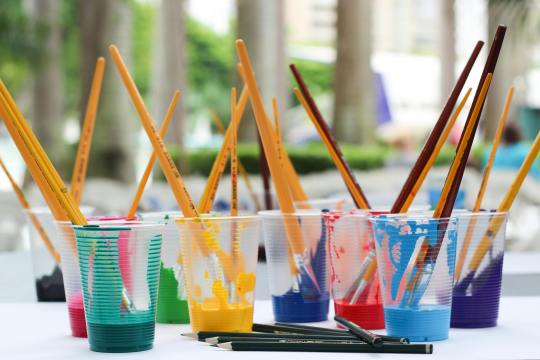
The paints I use are not of great quality, but they are good enough. I honestly thought that some of the paints I bought were much better than the pricier ones.
In watercolor, there are two common types: in the tubes and in the pans. The tubed paints have a consistency of acrylic, unlike the ones in the pans, which are hardened. What I have is the Superior Watercolor in pans set. I bought them online for less than $10, and it is a set of 18 colors with a brush pen and sponge included. The quality is great, it is not chalky, and it doesn’t smudge once dried. I spent my money wisely, and I do not regret buying it even though $10 is already a lot to me.
When it comes to acrylic and oil paint, I suggest buying the primary colors (ultramarine blue, crimson red, cadmium yellow), titanium white, black, and magenta only. I highly suggest buying a large amount of white because you’ll need it most of the time. Buying a set is very costly, but with these 6 colors, you can create any color, save money, and at the same time improve color-matching skills, which is an essential skill as a painter. If you wonder why I added magenta, it is because the combination of red and white is not bright enough to be pink or it is just different from the color magenta, and I think having magenta in the collection is a good addition. I used the Mont Marte brand in acrylic and Marie’s for oil paint.
Paintbrush
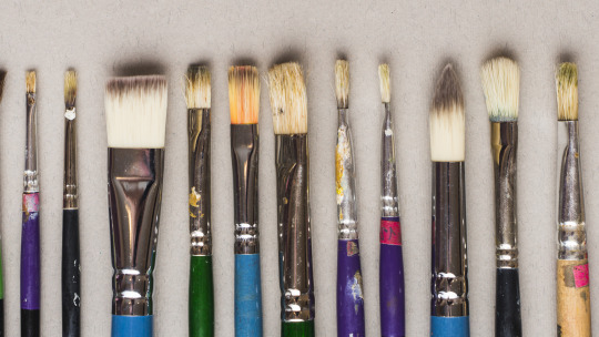
There are different shapes of brushes: flat, round, filbert, and detail are the commonly used shapes, and it depends on the medium you are using. For watercolor, a round brush is recommended, and a flat brush is recommended for thick paints like acrylic and oil paint. A filbert brush is also a flat brush, but the trim is round, and it is good for painting clouds. A detailed brush is used for small details like painting dots and thin lines or for small paintings. There are more shapes of brushes out there, but having a variety of brushes can be overwhelming. Get only the brushes you need and have them in sizes small, medium, and large. The size of the brush will depend on how small or big your painting is. Using the appropriate shape and size of the brush will lessen your expenses and you’ll learn to depend more on your skills than the tools.
There are cheap but not too cheap brushes available online. They are not branded, but the quality is good enough (like the ones I use), and the bristles don’t come off easily.
Paper
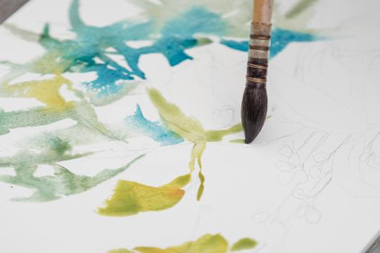
We can paint on anything, but nothing beats paper. However, the paper used in painting is not just an ordinary paper. The thickness of the paper used in painting, particularly watercolor paper, is important so that the paint would not easily destroy it.
Watercolor paper is usually combined with cotton, making it more durable than regular paper or cardstock. The percentage of cotton in the paper varies as the price varies. It is recommended to use 200 gsm paper, which is what I have because it is affordable and good enough to hold a few layers of paint.
However, I highly recommend using 300 gsm paper because the 200 gsm papers I use still curl up or bend and get wavy, which is a hassle when painting. The higher quality, 300gsm paper or paper containing 100% cotton is easier to work with, as I have observed online, even without taping the paper down, it doesn’t curl up. But of course, high-quality paper costs more, so 200 gsm paper is good enough.
If you are wondering why I called the paper used in painting "watercolor paper," it's because you can also use watercolor paper for acrylic, gouache, and oil painting.
There are two types of watercolor paper:
Cold Press - Cold-pressed watercolor paper has a rough texture, which is great for watercolor painting because it gives more depth to the flat painting (water is water, they can't have shapes and textures like acrylic).
Hot Press - The hot-pressed one is recommended for thick paints because it has a fine, smooth surface, which is great for blending smoothly.
Aside from paper, you can also use canvas paper, stretched canvas, or a canvas panel for thick paints. However, since you are only starting in painting, paper is recommended for practice and is much cheaper than the canvas mentioned above.
OTHERS
Masking Tape
Why masking tape? It is used for tapping down the edges of the watercolor paper so it stays put and flat on the surface which makes painting much easier, and also it creates a clean border. You may see other artists use washi tape because they are less sticky and won't damage the paper once it is peeled off, but I think using washi tape costs more, instead, stick first the ordinary masking tape onto your clothes until it becomes less sticky, and then you are good to go.
Mixing Palette
Usually in watercolor paint sets, the lid of the container serves as the palette. However, when using thick paints like acrylic or oil, a better alternative to a traditional paint palette is a picture frame. Mixing paint on a glass surface is convenient for two reasons: (a) it is smooth and does not absorb the paint, and (b) it is easy to clean. Dried acrylic or oil paint can be easily peeled off the glass or scraped with a blade or glass scraper, leaving a fresh and clean surface for mixing. Additionally, the wood or plastic frame around the glass provides protection against breakage and sharp edges.
Towel/Tissue
A used towel or tissue is not only used for cleaning; it is also mainly used for soaking up the excess water on a brush or for wiping off the excess paint. It is very handy, so you should always have it by your side while painting.
Jar
A brush washer is a must-have for painting. This is where you wash off the paint with water from the brush. You can use an old cup or jar as a brush washer instead of buying the fancy ones which is unnecessary. I prefer using a jar because it is heavier than a regular plastic cup, which prevents it from tumbling or spilling.
Here's a tip I learned from YouTube: use two brush washers. When you wash your brush once in a single container, the water gets muddy. This can make your fresh paint muddy when you switch colors. To prevent this, wash your brush twice: once in the first container and then again in the second container. This ensures that the water picked up by your brush is clean and not muddy.
ART STYLE
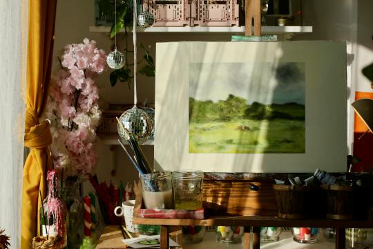
Early in my painting journey, I started practicing by painting scenic landscapes because they seemed easy to me. Of course, I overestimated myself. So I continued practicing more. Painting nature has grown on me, and I realized that my genre is landscape painting. The good thing about it is there is less structure unlike a portrait of a person, and shapes are organic so I will have no problem with imperfections.
However, I still don’t have the ability to create my own work. I still have to watch tutorials online to have a guide. Most of my artworks were tutored by the artists I follow. Once I start painting with just a reference from Pinterest, I tend to get lost and suddenly don’t know what to do. I end up not continuing the work, which is a waste of time, energy, and material.
Lately, I returned to working with watercolor, but instead of nature, I used a reference photo of a person as a subject. Sketching the face first is my least favorite part, because if I mess up sketching the face, the whole painting is also a mess. Most of my subjects are K-pop idols, especially BTS, because I am also an ARMY! Working with faces is difficult but once you succeed, it is all worth it.
Social media has highly influenced my art style. The fact that I get envious whenever I see new art trends gives me a push and inspires me to continue doing my art and explore more.
Check Out These Artists I Follow
Correa Art
Youtube: https://www.youtube.com/@CorreaArt
Instagram: instagram.com/correaart_
Jess Chung
Youtube: https://www.youtube.com/@JessChungArt
Instagram: instagram.com/jesschungart
Emily Mackey Art
Youtube: https://www.youtube.com/@EmilyMackeyArt
Instagram: instagram.com/emilymackeyar
Genelyn Sandaga
Youtube: https://www.youtube.com/@GenelynSandaga
Instagram: instagram.com/genelyn_sandaga
Socials
If you want to know more about my art, you can visit and support my two Instagram accounts:
@ChiliCheeseLover
@paintwith_amore
💜💜💜
If you have feedback to share, please do! I am eager to hear your thoughts. If not, kindly give this blog a heart; it is greatly appreciated!
💜💜💜
49 notes
·
View notes
Text
Unlock Indian Flavors: Mastering Paneer for a Delicious Dinner

Master the art of cooking with Paneer and embark on a culinary journey through the rich tapestry of Indian flavors. This versatile and delightful ingredient is the key to creating mouth-watering dishes that elevate your dining experience to new heights. I am glad to welcome you to this blog. This blog defines how Hygienic Paneer in Madurai can master your dinner.
1. Paneer’s Cooking Canvas: Paneer, also known as Indian cottage cheese, serves as a blank canvas ready to absorb the myriad spices and flavors that define Indian cuisine. Its mild flavor and unique texture make it the perfect accompaniment to a variety of dishes, from appetizers to mains.
2. Spice It Up — Paneer Style: Indian cuisine is renowned for its bold and aromatic spices. When cooking with paneer, you have the opportunity to infuse these flavors into your dishes. Be it the heat of cumin, the kick of red chillies or the earthiness of coriander, paneer serves as the perfect carrier for these exquisite flavours.
3. Enjoy the classics: Dive into classic Indian recipes that showcase the brilliance of paneer. Paneer butter masala, succulent paneer cubes swimming in a delicious tomato gravy, the ever popular palak paneer, a dish where paneer meets the goodness of spinach — these classics are sure to take center stage in your dinner. .
4. Fusion Fun with Paneer: Take your dinner to the next level by experimenting with fusion dishes. Paneer integrates seamlessly into a variety of cuisines, providing a delightful twist to traditional dishes. Try paneer tacos, paneer pizza or paneer stir-fry with an Indo-Chinese flavor — the possibilities are endless.
5. DIY Paneer Magic: Make your own Paneer at home and enhance your night out experience. It’s surprisingly easy and allows you to control the freshness and quality of this delightful ingredient. Homemade Paneer adds a touch of uniqueness to your dishes, turning every bite into a celebration of flavors.
6. A feast for the senses: Dinner isn’t just about the food; It is an experience for the senses. The sound of paneer on the grill, the aromatic dance of spices and the vibrant colors of your dishes — let paneer be the star that turns your dinner table into a feast for the senses.
7. Paneer Twisted Sweets: Don’t limit paneer to savoury dishes — explore the sweet side of Indian cuisine with paneer-based desserts. Indulge in the creamy decadence of rasagulla or savour the richness of rasamalai — desserts that bring the perfect sweet ending to your dinner.
Unleash the magic of Indian flavours with Hygienic Paneer in Madurai and turn your dinner into a culinary journey full of spice, warmth and pure joy.
Find us inside Subiksha Foods at No 110 A, Bypass Road, Bethaniyapuram, Opp Babu Sharkar Marriage Mahal, Madurai — 625016, or call us at +91 80567 44906. You will be able to browse our website at https://subikshafoods.in/ for details.
#InstantChapatiMadurai #InstantPooriMadurai #InstantParathaMadurai #WholeWheatParathaMadurai #IdlyDosaMavunearmemadurai #idli dosa maavu in madurai #Readymade Poori Madurai #Readymade Paratha Madurai #Readymade Whole Wheat Paratha Madurai #Readymade Idly Dosa Mavu near me madurai #Readymade idli dosa maavu in madurai #Readymade Chapati Madurai #InstantChapati #ReadyToCookChapati #SemiCookedChapati #ReadymadeChapati #ReadyMadePoori #InstantPoori #ReadyMadePuri #SemiCookedPoori #ReadyToCookPoori #ReadyToCookPuri #SemiCookedPuri #InstantParatha #ReadyToCookParatha #SemiCookedParatha #ReadymadeParatha #ReadyToCookParota #SemiCookedParota #ReadymadeParota #WholeWheatParatha #ReadyMadeWheatParatha #SemiCookedWheatParatha #IdlyDosaMavu #IdlyDosaBatter #Curd #Thirunagar3rdstop #Thirunagar6thstop #Vedarpuliyankulam #Thirunagar4thstop #Thanakankulammainroad #Thirunagar4thstop #SRVnagarharveypatti #Thirunagar #Mahaboobpalayam #Sscolony #Vanamamalinagar #Nehrunagar #Karimedu #Nearmathitheatre #Melaponnagaram #Neardinamalarofficechockalinganagar #Athikulammainroad #Bankcolony #Iyerbungalowmainroad #EBcolonystreet #Nearkarthiktheatre #survivorcolony #Pudurbusstop #Pudur #Mahatmagandhinagar #Valluvarcolony #Vishwanathapuram #Umatchikulam #Thirupalai #TVSnagar #Jeevanagar #Villapuramhousingboard #Agriniapartment #Avaniyapuram #Subramaniyapurammarket #Palanganatham #Annanagar #Gomathipuram #Karupayurani #KKnagar #Othakadai #Koodalnagar #Sikkandarchavadi #Anaiyur #Basingapuram #Alankulam #Alankulam #Panagadi #Kulamangalam #Palamedu #Alanganallur #Nagamalai #Kochadai #Thenimainroad #HMScolony #Vellichamynadarschool #MKUuniversity #Nearsaravanahospital #BBkulammenambalmainroad #Reserveline #Sellur #bestgheeproduct #bestghee #gheeatitsbestquality #bestqualityghee #bestgheeinmadurai #bestgheeintamilnadu #pureghee #puregheeinmadurai #puregheeintamilnadu #purestformofghee #purequalityghee #bestgheeforfoods #bestgheeforfood #bestgheeforcooking #bestgheeforbiriyani #bestgheeforsweets #puregheeforfoods #puregheeforfood #purgheeforbiriyani #puregheeforsweets #tastiestghee #tastiestgheeinmadurai #tastiestgheeintamilnadu #bestgheeforladdu #puregheeforladdu #bestgheeforhalva #puregheeforhalva #bestgheeformysorepak #puregheeformysorepak #bestgheeforjalebi #puregheeforjalebi #bestgheefordosa #bestgheeforgheeroast #puregheefordosa #puregheeforgheeroast #bestgheeforpongal #puregheeforpongal #bestgheeforhalwa #puregheeforhalwa #halva #halwa #ghee #pongal #dosa #gheeroast #jalebi #cooking #laddu #sweets #purestghee #healthyghee #healthiestghee #gheeatlowcost #lowcostghee #bestlowcostghee #bestgheeforgheeproducts #bestgheeforgheefoods #bestgheeforkesari #kesari #purecurd #bestcurd #bestcurdforcooking #bestcookingcurd #bestcookingcurdinmadurai #tastiestcurd #healthycurd #healthiestgcurd #creamycurd #bestcreamycurd #bestcurdinmadurai #bestcurdintamilnadu #bestcreamycurdinmadurai #tastycurdinmadurai #purecurdinmadurai #bitterfreecurd #bestcowmilkcurd #bestbuffalomilkcurd #flavourfreecurd #offodorcurd #bestflatcurd #bestqualitycurd #curdatlowcost #lowcostcurd #bestlowcostcurd #bestcurdcompany #bestcurdcompanyinmadurai #bestcurdproductinmadurai #bestcurdproduct #bestcurdsupply #bestcurdsupplyinmadurai #bestpaneer #bestpaneerinmadurai #bestqualitypaneer #bestpaneeratlowcost #tastypaneer #tastiestpaneerinmadurai #bestpaneerproduct #bestpaneercompany #bestpaneercompanyinmadurai #bestpaneerproductinmadurai #bestpaneerproduct #bestpaneersupply #bestpaneersupplyinmadurai #bestpaneerintamilnadu #unsaltedpaneer #bestunsaltedpaneer #bestunsaltedpaneerinmadurai #bestpaneerforpaneerbuttermasala #bestpaneerforpaneertikka #paneerbuttermasala #paneertikka #paneerpulao #bestpaneerforpaneerpulao #purepaneer #purepaneerinmadurai #purequalitypaneer #purequalitypaneerinmadurai #bestpaneerforcooking #bestpaneerforfoods #bestdairyproducts #bestdairyproductsinmadurai #subiksha #subikshafoods #subikshadairyproducts #dairyproducts #PureGheeInMadurai #BestPaneerInMadurai #FreshPaneerSupplierMadurai
#idlydosamavunearmemadurai#wholewheatparathamadurai#instantpoorimadurai#instantchapatimadurai#instantparathamadurai#instantchapati
0 notes
Note
allow me to rant about the only thing that has been in my brain for the past two months and that is doll customizing babeyyyyy
i know there’s a 90% chance that you wont give a Shit about any of this but here we go anyways
SO first you gotta choose a doll. preferably one with a high range of motion to avoid creating new joints or having annoying limitations like not having elbow joints for some fucking reason. what the fuck mattel. give monster high dolls back their ball jointed shoulders and elbow joints. smh
the most common dolls ive seen used as bases are monster high and ever after high. most customs ive seen are highly stylized so the stylized face molds work well for those types of dolls but dolls like barbies are good for when you want a more realistic face-ups.
once you’ve got your base picked out you gotta wipe that bitch’s face off with like. acetone or nail polish remover or something strong like that. you can also use acetone to shrink doll heads which is cool as hell imo. n e way once the face is wiped you gotta chop off the hair and remove the hair plugs from the inside. ive seen this done several ways but the easiest and most common way ive seen is to dunk the head into boiling water for ~30 seconds until it gets squishy and malleable. once you’ve got the head back, you can use pliers (i think tweezers would work in a pinch) to pull out the hair plugs which are kinda icky because theyre covered in glue and other gross shit. ew
now you must decapitate the doll. dunk em back in the boiling water to soften them back up then just tug the head off. the neck pegs look funky and are usually a different color than the body so thats cool ig
once the head’s off, you can start the face-up which is basically just giving the doll a new face using stuff like watercolor pencils, acrylic paint, gouache, and a whole lot of other stuff. hell ive seen people use person makeup on these dolls.
next,,,,, hair. there’s about twenty million ways to do hair from gluing yarn wefts to sewing to rerooting with purchased nylon doll hair or yarn wefts but i’m gonna talk about the most common one ive seen which is rerooting and gluing.
before you can reroot, you need doll hair. which, as i mentioned, can be bought at stores like the doll planet or made at home with yarn in literally any color. have fun with it! make rainbow hair or something idk
to make homemade wefts, you take some acrylic yarn, cut it twice as long as you want the hair to be (keep in mind you can cut and style the hair once it’s been rerooted), fold them in half, and tie it to something sturdy like a wire coat hanger for the next step.
once you’ve got your yarn tied to your hanger, use a pet brush and brush the yarn until it’s wispy and looks like hair. then take a straightening iron and iron the weft flat. then remove from the hanger and boom. hair wefts. ta-da
to reroot the wefts onto the head, use a rerooting tool (which can be as simple as a needle with the eye cut at angle) (just google it please i’m shit at descriptions)) to poke small sections of the hair into the head. you can use the pre-existing rooting holes for your own reroot as they’re usually pretty reliable. to reroot, take a small length of you doll hair (about 10-15 strands), loop it in half, and put the middle of the loop into the reroot tool. poke the end of the tool with the hair on it into the pre-existing hole and remove the tool. the hair *should* stay in and fill up that plug!! also remember to plug thickly at the hairline and part of the hair where it's most noticeable. it doesnt matter as much in the center of the head as that’s not usually visible on the doll. once you’ve rerooted, squeeze in strong glue through the neck hole and squish around the head to make sure it covers all the plugs and secures them in place. then pour hot water onto the head to make the hair lay flat for styling later.
also, you can reroot yarn directly into the head to make thicker, more textured hairstyles. and since the yarn is thicker, you dont need to glue the inside of the head for the hair to stay in place!!
if youre not doing body modifications (which are also cool as hell) then it’s time for clothes but clothes are boring and i like body mods more so i’m gonna rant about them instead
the material ive seen most doll artists use is apoxie sculpt, which is like play doh on steroids. it comes in two parts which you gotta mix together for some reason. why dont they sell it pre-mixed. what was the reason. also once it’s dry it’s super super strong and you can sand it, drill into it, paint it, and all kinds of stuff. very nice and i want some for myself.
you can use hand saws and drills and shit to whack off doll limbs to make stuff like digitigrade legs or new joints. also dont be afraid to use other mismatching doll parts when customizing like heads and bodies and forearms and hands and shit. it literally does not matter if youre gonna recolor the doll anyways so have fun with it. make frankenstein’s doll if youre feeling spicy
accessories my beloved. stuff like tiny beads and clay baubles and shit will literally transform the entire doll plus they’re adorable and multi-purpose
i suppose i must talk about clothes now. ah well. you can find great clothing patterns if youre new to customizing on other customizer’s etsy shops and probably google although those will probably be lower quality than paid pattern pieces. and keep in mind that if it exists as clothing irl, you can likely make it doll-sized. there are literally no limits to your clothing options as long as you can execute your idea.
the once all your components have been made, you can assemble the doll again!! and finally see what all the parts look like together!! very cool 10/10 stars.
ight that wraps up my doll rant. i could really go into more detail on certain parts but thats a whole other rant for a whole other day smh. sorry for fucking flooding your inbox ender ahaha……………. you asked for this
little did you know that dolls have been one of my favorite things since like ever. if i can read a 25 chapter long fanfic i can read this B)
mattel definitely fucked up by completely ruining MH doll designs and just stopping EAH, alot of their profits most likely came from people who collect and customize dolls and by changing MH doll designs/Stopping EAH dolls they 1. most likely lost a small (or big if we're not jus talking people who customize dolls) part of their profit and 2. made it harder for doll customizers to make dolls/get commissions out rather quickly because they probably have to waste more time making joints or learning how to make joints.
EAH/MH dolls (specifically MH dolls) had AMAZING MODELS because there was so much variety with height, face shapes, etc (my favorite molds had to be the short/tall dolls and the cat molds because of the tails) and doll customizers really went all out with enhancing a molds unique features. The only "downside" abt MH dolls is that they (or atleast most)(from what i remember)) had slimmer faces but wider eyes while EAH dolls have wider faces with slimmer smaller which left a canvas for the face and not the eyes (and vice versa for MH dolls)
I've never seen any videos where a barbie is customized (maybe because i absolutely despised barbies at the time) so I'll definitely have to check those out but they seem to be good for realistic makeovers. I've seen like like semi realistic makeovers for EAH/MH dolls that were pretty good too tho (pretty sure mostly EAH dolls since yk MH dolls were used for creature makeovers while most EAH dolls weren't)
yeah i was always amazed by the head shrinking with acetone. honestly i still am?? idunno i have no idea how that chemical bullshit works. Ive seen a few of uh makeovers that just pain over the face (in multiple layers ofcourse) but that's usually when they're painting the entire body a different colour (again usually when they're turning a doll into a funky little baby man). I've also seen a few that just chop the hair off and take out the hair plugs yk without uuh like softening the head or just go straight for the hair plugs after taking off the head (i used to do that it was funny to me??). i always really liked when they used watercolour pencils or just colour pencils in general to draw/sketch on the face cause like wow ur drawing on ur doll without ruining it?? kinda epic maybe even poggers and pogchamp?? oh god my brain is failing wjshsmsj.
Watching them putting the hair back on the doll was, other than the face stuff, was the BEST part for me. Favorite type of hair was iuuuuuh was either thick yarn or brushed out yarn. Literally worship the people that would reroot the hair, theyre the most patience people on this earth!! it's literally insane but i guess that's what happens when you've been doing that for years? you guess kinda get used to it. when they put glue into the head does it just become stiff?? like it's just a clump of dried glue or does it like..hollow out again??
dude you literally cannot convince me most of the supplies used for doll makeovers. APOXIE CLAY LOOKS SO FECKING GOOD. its edible and i will die on that hill. The body mods are literally so amazing!!!!! it's so impressive how theyre able to imagine certain features THEN LIKE ACTUALLY MAKE IT LOOK ACCURATE TO WHAT THEY WANTED TO LOOK LIKE AFTER LIKE ON TRY (or many yk trial and error is very necessary for..everything). Absolutely loved when doll customizers would saw off a dolls legs and use different ones or just completely get rid of the torso to use a different one. it's like uuh that one big guy that's mismatched and sewn together. very cool. The accessories are so fun!! just small little details you seen really need but can add because it's your feckin doll!! I used to be absolutely obsessed over the doll clothes i would find on etsy, so much so that i started sewing shitty shirts and dresses for my uh "customized" dolls (they were absolute HORRORS idk WHY my mom let me feck up my dolls like that).
Thank you for this!! i haven't been able to talk about any of my interests for a while and this just really made me happy!!
Question fer u my fellow MH/EAH enthusiast: what was your favorite MH/EAH movie/episode and doll series. Mine was The fusion dolls (MH obvi) and that MH movie "Haunted" cause we got to know more about Spectra :D
#YOOOO LONG POST?!#long post#:) hehehe#this was very fun to read cant wait for ur next fanfic length ask#asks :D#theoreticallyjasper
2 notes
·
View notes
Text
MEET NEIL ENGGIST
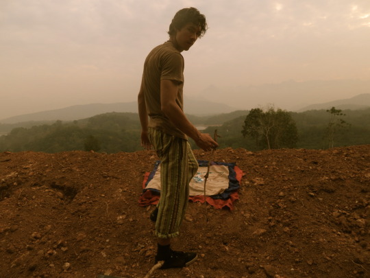
We recently interviewed Swiss-American painter Neil Enggist to talk about his life, work and how he is coping with self-isolation. Neil’s exhibition The Practice of the Wild was supposed to open at the Consulate General of Switzerland in New York last month as the 8th edition of Art@The Consulate but was postponed due to COVID-19.
Hi Neil, thank you for taking the time to talk to us. Where are you right now? It is my pleasure. I’m in New Jersey. I have a backyard studio near Princeton, in the old house where I grew up. I’m staying put as much as I can.
Tell us about yourself, where did you grow up? My mother is from Taiwan and my father was born and raised in Luzern, both coming for graduate studies in 1969 to Buffalo. I was born and raised in Princeton Junction in an old stone house near a small forest and the train station. My father was teaching in the Bronx and Connecticut, then trying his hand at importing Swiss Chocolate, but at some point in the 1970s, he turned to stained glass. I remember him cutting, wrapping, and soldering in the backyard. My mother worked for the state of NJ, and drew from the model in her spare time. I drew dinosaurs like a maniac, not very well I may add, but at some point around age 7, my father asked me to draw a dinosaur that he made into a stained glass panel. As a family we traveled to Luzern about every 2 years, and I still remember the smell of Birenwecken and lightning over the Vierwaldstättersee. I drew all the time but wasn’t precocious, as a youth, I was shy, quiet, hot tempered, diligent with school, perfectionist, and mostly played soccer and saxophone and you know, did my math homework.
When did you know you wanted to become an artist? I went to art school at Washington University in 2000, but it wasn’t until studying abroad in Florence in 02 that I had the feel of becoming an artist. There is a laminated portrait from first grade, age 6, where I put into writing that I wanted to be an ‘Artist.’ But in Florence my life felt like it shifted from art student to artist, 3 dear friends and I shared an apartment on Piazza Independenza, learning photography, printmaking, illustration, bookmaking, Italian and art history at a tiny art school called Santa Reparata. My future Love lived up the street and sometimes the cheap red wine would flow. Behind every door were Renaissance frescos, leaping off the walls were Donatellos, and it was the beginning of my explorations as a painter. I would paint plein-air small landscapes and cityscapes with oils, but by the end my ambition grew into a very large Kandinskyesque abstract rendition of Michelangelo’s Final Judgment fresco from the Sistine wall. A year later, back in St. Louis I declared painting as my major, and in the words of Joe Campbell, began ‘following my bliss.’
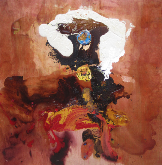
Neil Enggist, Sea on Earth, acrylic and stain on wood, 2011
How would you describe your style? Has it changed over the years? I would say it’s an Organic Abstract Expressionism, or Nature Action Painting. Over nearly 20 years, YES it has changed! Like a photon going from point A, painting the Ponte Vecchio, to B, dancing on a piece of steel with turmeric and ocean water, taking every single possible path! To say it’s moved linearly would be wrong, but there is a sequence of transformations or leaps, in the Ozarks, Mysticism, Heartbreak, Dylan, New Mexico, Traveling Europe, The Mir, snow painting, India, Brooklyn, Voice and Veil, Gardening, going cross county, yoga, India again, the dance, steel, the tides, The Tao and the Yellow Mountains, devotion. I’m very interested how Dylan’s work has transformed and shifted, beyond expectation, without calculation, yet somehow almost always in line with his poetic essence. My paintings have changed like dinosaurs and birds, from a common source, many branches, some seemingly from different worlds, some becoming bones and fossils, some soaring through the sky.
Tell us about your artistic practice, where do you paint, what inspires you? Well we can start with Highway 61.. music of the American vernacular, jazz, blues, country, rock, folk, hip hop.. from Louis Armstrong, Strange Fruit, Charlie Parker, to the early Bluesmen of the Mississippi Delta, Robert Johnson, folksingers like Woody Guthrie, onwards and outwards to Wutang and Nas. Basquiat inspires me. Ana Medieta, DeKooning, Paul Klee, David Hammons, Polke, Mel Chin, James Turrell, Richard Long, Kerry James, Doig, Ofili, Wangechi Mutu, John Akomfrah, Bonnard, Matisse, Puryear too. Gary Snyder's brilliant collection of essays 'The Practice of the Wild,' from where the title of the exhibition comes, has helped me attune to the wild systems at play in nature and within, and continues to evolve my way of thinking, seeing, and creative being. Taking a journey into nature, not just a dip into nature, but really feeling the connections, the web that runs through the forest and is woven into your own nature. The Redwoods, the Swiss Alps, the Coast of California.. I lose and become myself here. In my practice, nature is welcomed into the process of artistic creation. The imagined line between artistic intention and the creative functioning of wilderness is blurred, or more accurately, these spheres merge into a unified moment. It’s a spiritual practice, a kind of Taoist exercise, merging with the changes of the natural world, not holding, not fixing, listening to what the painting wants to become, and finding the color to enable the beholding. I paint outside and on the road, sometimes inside.. anywhere..

Neil Enggist, Odyssey III, acrylic, dye and turmeric on canvas, 2020
What role does Switzerland play in your life/art? My family has a house in Luzern, with a balcony opening to a view of Mount Pilatus that I would call perfect.. at least on the days where it’s not obscured by Nebel! Since 2012, I’ve been spending many springs / summers living there, in the bohemian remodeling of our chalet attic called the Macolette. I have painted and drawn our view of Pilatus so many times, it is ingrained in my mind’s eye. I’ve explored and hiked the mountains surrounding the Vierwaldstättersee, Grindelwald, Engadin, and Zermatt, finding places on and off the path to paint. When I am in the mountains, alone with my pack, in the quietude and breathtaking beauty, I feel something akin to being home, being one with myself, being on my true path. This feeling is fleeting and eternal. Also, during many of the summers, I have worked with my great friend and mentor, garden designer, Andre Ammann, constructing and maintaining gardens around Luzern. Working with him has taught me in so many ways, to notice the minute changes of spring, to work with contrasts of nature and culture, to understand placement of boulders and trees, how to create a riverscape, to dissolve into the consciousness of the river. When we are done with the work, all cleaned, raked, and hosed down, Andre and I look at our work, and he’ll say, ‘Now, the garden starts, try to see how this will look in 10 years, in 50 years..’ This has been a major influence in my own ‘Practice of the Wild’ and painting. It has also taught me how to shovel!
You have traveled all over the world, how has the nomad life shaped your art? As a traveler, painting becomes the act of experiencing and processing place; the painting becomes an archive of experience. Traveling serves to connect the painter with the uncomfortable and uncalculated, which forces a spontaneity and body-memory response. I aim to paint as one would do battle and dance and play jazz at once. In traveling, the painter becomes the abstraction, inhabiting transient and visionary territory. Materials from places of special significance, white gypsum sand from New Mexico, pigment from the Holi festival of India, black sand from Kanyakumari, gravel from Highway 61, layer into the topography, giving the painting a personal geographic context, while opening formal and textural possibilities. On the road, I explore the spiritual territory of color, and natural occurrences of unearthly blues.
With the COVID-19 pandemic, travel is no longer possible, in what ways has the pandemic shaped your practice / life? I just drove from California to NY in 5 days to install the Consulate show, just before the Covid situation hit the fan. I am supposed to be in India right now, doing a residency in the Himalayas! I’ve had a number of shows postponed and it just really doesn’t seem like people are buying many paintings right now.. But, really compared to people who are sick, caring for loved ones, and risking their lives to care for others, my sacrifices are minuscule. And I can most surely still paint! But I’m trying to use this time to do things I would have done in ‘normal’ times, but there are no normal times anymore. I’ve been making sculptures out of half rotten wood using an ax and a handsaw. I’ve been learning some Tai Chi from my Ma. I’ve started reading the Mahabharata. I’ve been texting whole a lot of hearts to California and writing love songs, and staying out of the bar..
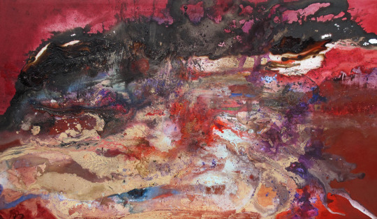
Neil Enggist, That Great Mysterious Storm, acrylic, ink, oil and sand on canvas, 2010
What important lessons do you think we can learn from the impact of the pandemic? Well, first and foremost gratitude for life, health, and for the things that we used to take for granted. To be grateful for the people who are dear to us. This may sound cliché, but the pandemic has shown us how connected we are, for better and for worse. We are interdependent, and what affects one region affects the global community. I hope that people can stop and reassess their personal and collective relationship with the planet. In a profound and dire way, humans and our socio-economic systems have entered an unbalanced, virus-like relationship with this Earth. Humans seem to need wake up calls to affect changes, I hope this pandemic serves as a paradigm shift for enough of us. We are in this together. Yes when this is over, it will be great to go to a yoga class, an Indian restaurant, and to toast with friends, but we each need to use this time to reaffirm our commitments to each other and to all beings of this planet, and not go back to business as usual.
What advice do you have for people stuck at home? Can you recommend something to read, listen or watch? Well I’m a Liverpool fan, and we were just about to WIN the premier league, so I’ve had to go back and watch Liverpool highlights to cope. There’s a lovely interview with the legendary skipper Steven Gerrard in conversation with Gary Neville on youtube. I’m a very lazy television watcher, meaning I don’t really watch new things, so it’s The Sopranos, and very little else. Peaky Blinders is good, violent, but solid. Kurosawa’s ‘Dreams’ is a ravishing movie. I just saw ‘Purple Rain’ again, EPIC. When I drove across country I listened to Toni Morrison’s own reading of her novel ‘A Mercy,’ and it took my breath away, literally every sentence .. I don’t know how I even made it! She’s a true master in telling a harrowing story in pure poetry. Also reading ‘An Indigenous People’s History of the United States’ and Leonard Peltier’s ‘Prison Writings.’ Musically I needed a lil rock, so I went back to the Black Keys ‘Brothers’, Brittany Howard’s solo ‘Jaime’ is good, JS Ondara, Black Pumas, Valerie June’s ‘Love Told a Lie,’ AM!R’s ‘Parachute, ‘ and the syrupy ‘Cigarettes after Sex.’ I’ve been listening as well to Gann Brewer’s most recent ‘Absolution.’ I made the video for his ‘River Song.’ Tracy Chapman’s first album is incredible. Springsteen’s ‘The River’ is like his White Album and sometimes I need to hear the Boss sing ‘Heart and Soul’ over and over.. and hear that ‘Drive All Night’ sax solo by the late great Clarence Clemons. I am from Jersey, don’t forget. Listening to a lot of John Prine too, and with his recent passing, his music shines like a diamond ring. ‘Christmas in Prison’ is one of my favorites of many. Oh and Bob Dylan just released a 17 minute song about the assassination of JFK, and it’s .. indescribable.
Thank you Neil!
To find out more about Neil Enggist go to www.neilenggist.com, contact Neil at [email protected] and follow him @neilenggist
Scroll down for more information about the exhibition The Practice of the Wild which will open to the public as soon as it is safe to do so. Please note that all paintings depicted in this article are featured in the exhibition.
NEIL ENGGIST
THE PRACTICE OF THE WILD
8TH EDITION OF ART@THE CONSULATE
THE PRACTICE OF THE WILD by Swiss-American painter Neil Enggist is comprised of a series of abstract mixed media Nature Action Paintings, a method by which nature performs an integral part in the artistic process.
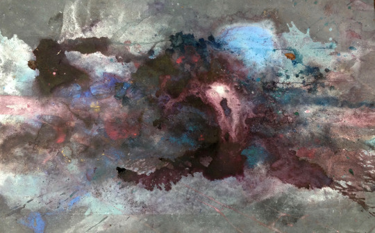
Neil Enggist, The Storm Ends, acrylic, ink, dye and sand on canvas, 2019
“My work seeks to embody the random precision through which life and spirit intersect. Within a liminal environment, I present set of conditions where the form can be born through an unfolding of natural currents. The nature of water, marks of evaporation, melting, freezing, burning, gravity, animal tracks, traces of dance, time, storms, tides and all manner of seasonal and emotional weather coincide to transform the canvas into a terrain in flux. Whether I am dripping ink into a melting tuft of snow, pouring the ocean on burning ink, or slashing the surface with a fallen pine branch, each action is composed within a system of nature. The result is a site of becoming where oceanic, emotive, and mystical stories interplay”
Raised in Princeton, New Jersey, Neil Enggist studied fine arts at Washington University in St. Louis and Santa Reparata in Florence. He earned his MFA at San Francisco Art Institute in 2016 where he made paintings on steel in the tidal zones of the Bay Area, searching for a language between art and nature, incorporating ideas of performance and sculpture imbedded in the earth art movement. Enggist has participated in a number of art residencies including the Lucid Art Foundation in Point Reyes, CA, and most recently journeyed to the land of his grandmother to paint the City of Shanghai and the Yellow Mountains of China. Through his extensive travels in Europe, the Americas, and Asia he developed a body of painting and poetry shown in New York, Milan, Mumbai, Luzern, and Paris. Enggist lives and works between New York and Luzern, Switzerland.
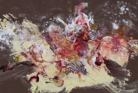
Neil Enggist, The Schreckhorn, acrylic, ink, pigment and oil on canvas, 2007
THE PRACTICE OF THE WILD is the eighth edition of Art @ The Consulate, a curatorial initiative by the Consulate General of Switzerland in New York to showcase the work of Swiss artists living in the United States. Follow Art @ The Consulate on Social media #SwissArtNYC
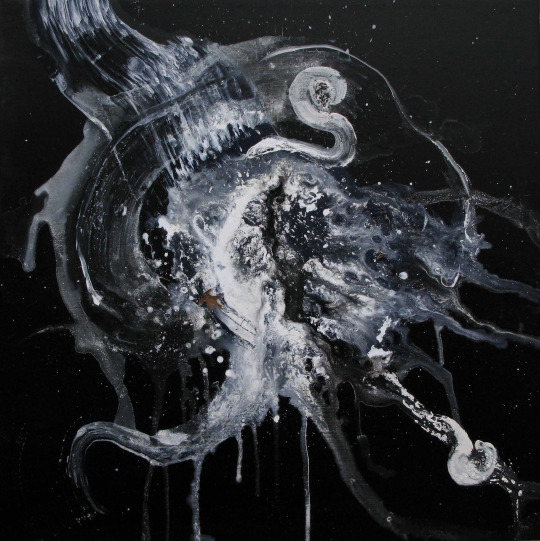
Neil Enggist, A Candle Burns at Night, Acrylic and ink on canvas, 2008
2 notes
·
View notes
Text
[SketchBook] Draw a mountain reflected in the lake


TUTORIAL by @aristina.z Draw a mountain reflected in the lake with SketchBook Hey friends this is aristina.z! I am here to present Part I of my tutorial. From the time I joined PENUP I have learnt so much from each and everyone of you! Have seen your wonderful art and unique styles of art out here...have enjoyed great support and lovely feedback from you all, so this my way to thank you all Pen.ple for being there for me! Difficulty level : pretty easy Style: Most of us have our own style of drawing. And those who haven’t found their style yet but are reading this means they are motivated enough...and will soon be making great art too! I for one am still learning and developing my style and skills.

STEP 1: My first step is choosing a nice color. depends upon my mood, a suggestion, or seeing a striking color even! I thought of choosing blue today!!!! lots of shades...lots of possibilities. Hence the color gives me an idea of what to draw. As I love drawing landscapes I decided to draw a landscape with mountains. TIP ALERT: To get good results do MORE of what makes you happy....it can be doing more of Landscapes, cityscapes or portraits. The trick is to love what you do and do what you love.

Step 2: I browse through several photos and paintings on google of the subject (in this case mountains) I am going to draw. So now there are a lot of reference pictures for inspiration which I can draw digitally in my own style. TIP ALERT: Always try do something with digital art that a photograph CANNOT do ...or traditional art cannot do....so don’t copy a picture just study it :
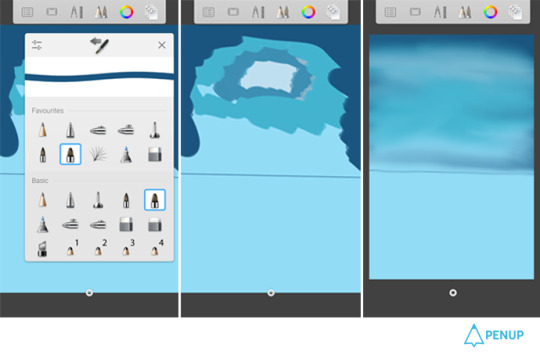
STEP 3: On the first layer divide the canvas into 2 halves and on the upper half use the paint brush to put in several shades of blue for the sky. I will limit the color use to shades of blue here but we can easily use 2 or more different hues. Use smudge to get an evened out appearance. TIP ALERT: Limit color use and blend colors and shades to make landscapes look natural.
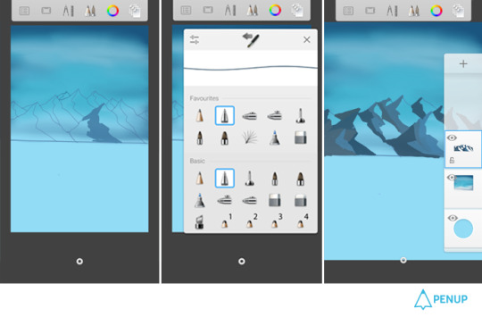
Step 4: On the second layer pen the mountain range on the upper part and color in the dark shades of blue on left half of each mountains. (as though light is coming from the right side) TIP ALERT: keep in mind the direction of light and how it bounces off objects.

Step 5: Add a third layer. On this color the lighter side of the mountains and also add texture by using different brushes. Add some vegetation (shades of blue green) near the base of the mountains. Use the different texture brushes e.g. the crayon brush for the mountains. TIP ALERT: Why use 3 or 4 brushes when you can use more than 80 brushes on sketchbook...try all the brushes. Reset them...explore and experiment to get great texures.

Step 6: Add layer number 4. we can easily do it in 2 layers but its time to get comfortable with more layers! On this layer add snow (greyish white) to the upper half of the mountains with more snow near the mountain peaks and also draw some clouds in the sky.
Add definition to your artwork in this layer if its your final layer.
TIP ALERT: Take one risk(at least)with every new artwork. Try out something new on a different layer so if it goes wrong you can delete the layer without scrapping the whole artwork.
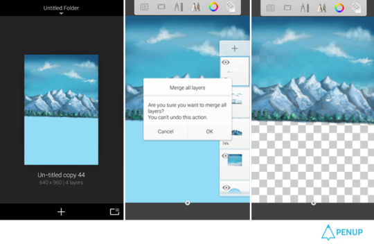
STEP 6: Time to add the reflection. Make a copy (duplicate )of the artwork in the gallery section of your sketchbook. In this duplicate copy use the “merge all” option to merge the layers of the artwork and hide the base color (in this case blue usually its the white layer) TIP ALERT: Always keep the opacity of every layer below 100 (90 -95%)to give your landscape a better finish.
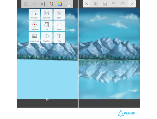
Step 7: Come back to our original artwork with the 4 layers. Use the “import image” option to bring the duplicate layer here and then the “flip vertical “option to get it as a mirror image in the lower part.
The gap between the actual image and reflection should be filled by smudging the edge of the imported image. TIP ALERT: Perseverance, practice and patience are vital. Its easy to abandon an artwork but much more satisfying to finish it.
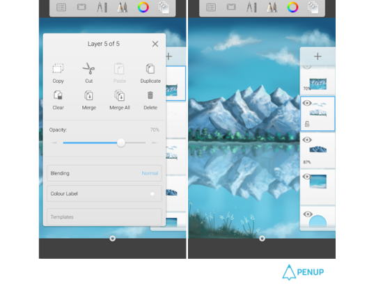
Step 8: This duplicate layer will be the layer number 5. Reduce the opacity of this layer to 70% to make it look like a reflection. Swap the position of the 4th and 5th layer so that the 4th layer becomes the final layer. TIP ALERT: Trust your instincts, if while looking at the artwork at this point (by holding it at a distance) something doesn’t feel right probably it isn’t ...change it...

Step 9: On the new final layer the edge of the lake can be drawn too. Give the final touches to your artwork and don’t forget to give it a nice title! TIP ALERT: Try to give interesting names to your artworks...it helps the viewer to relate better. Step 10: Time to Post it on PENUP! TIP ALERT: And while you are on PENUP don’t forget to appreciate the original artworks of other artists. Your ♡s is the support and encouragement every hardworking artist needs! My first tutorial ends here! You can leave your comments on my fan book page on PENUP. Will be doing a tutorial on light effects next. Just wanted to say that consistency, honest effort and hard work is always rewarded(sooner or later). Like on PENUP where the winners for challenges are NOT always the artworks with popular votes or many reposts but the ones done with honest effort, original and creative ideas. Looking forward to seeing some great art from you all! How was it? We were able to draw the landscape reflected on water in easy and natural manner with drawing features on the app. Even a beginner will be able to draw beautiful landscape just in 10 steps. Also, as what the artist said, the attitude is as important as the skills. Don’t forget that you need consistency, genuine efforts and diligence. Please send thank you notes to @aristina.z who has taught us very useful tips.


Artwork Sharing Social Network, PEN.UP! http://www.penup.com - The PEN.UP Team
0 notes
Text
Patience, Expression and Appreciation - A Conversation with Turkish Marble Artist Gökçe Tercioglu
After walking the streets of downtown Copenhagen in search of Irish born Turkish artist Gökçe Tercioglu, I discovered her in her studio and exhibition space by a park. Inside was a table of mixed paints, plastic sheeting, and metal trays filled with what looked like water. Along her walls hung what she is best known for: the traditional Turkish art of Ebru or marbling. It is an ancient technique originating from over 800 years ago that Gökçe reimagines to fit her minimalist and modernist aesthetic. These images resemble multicolored ripples of water and mimic waves. Gökçe draws from her multicultural background and surroundings to create her unique pieces.
View this post on Instagram
A post shared by Gokce Art (@gokceart) on Nov 20, 2019 at 12:16pm PST
Her artworks are a testament to patience, letting go, and enjoying the small moments in life. They hold a deep appreciation of nature, from what inspires the paintings themselves to what they’re actually made of. It was one of the reasons I was excited to speak with her on her creative process and journey as an artist. After aweing at her framed paintings in the studio, I sat down to speak with her about culture, women’s rights, positive energy, and using art as a tool for expression and self-reflection.
RC: Thank you so much for inviting me to your studio! First off, how do I pronounce your name?!
GT: I’m used to people saying it wrong and in different ways [laughs] but it's pronounced “g aw k ch eh”.
RC: Okay perfect, I have the same problem sometimes especially when I move somewhere new. I read that you’ve lived in 7 different countries. That’s a lot!
GT: Having lived in so many countries throughout my life, the world starts to feel tiny sometimes. I was born in Ireland, and have lived in Moscow, Stockholm, Prague, Rhodes, Turkey, and now I’m in Copenhagen, Denmark.
RC: So after living in all those places, what made you settle on Turkish Marble Art?
GT: I've always been into art from a young age and I've tried a lot of different mediums but it was only in the last three years of high school in Turkey that I came across it. I knew about Ebru already, because it's a traditional art technique in Turkey that is a large part of Turkish culture. But I found that we only learned about it as decorative motifs or 2D patterns. So it wasn't very interesting for me to see the same design in different colors. But when I went to Turkey, one of my friends was going to an Ebru workshop and asked if I wanted to join her. I said, 'Sure, why not? Let's give it a try!' [laughs]
RC: So it was purely accidental?
GT: Yes! When I went to the workshop and met the teacher, he quickly became my favorite artist. I feel lucky to know him since he inspired me to pursue this passion. It was his openness to try new things and his approach to teaching that made me feel like he was showing me something new. He allowed me to experiment and told me ‘It's your own world and you can do what you'd like’. It was almost like therapy after school, I visited the workshop every weekend for years!
RC: You’re really lucky to have gotten a teacher that understood that you didn't want to recreate the same images. Do you have a certain personal style that you aim for each time you create something?
GT: At that first workshop I went to, everyone had their own approach to the art, so I learned how to approach this art in a new way. Most of the people in the workshop were retired, so they were doing this as a hobby, which was a different mindset from what I was used to. I was influenced by them because they made me feel that they had experienced life and were doing this art now -
RC: And you were doing it with them!
GT: [laughs] Yes! So you could tell, person to person, that each style was different. What I try to do with mine is to focus on minimizing and modernizing the details by focusing on one color at a time. It lets me focus on the movement and patterns in the paint itself, rather than lots of colors. I also like to use the color blue. [smiles and points at the blue artworks hanging up in her studio].
RC: [laughs] I noticed that!
GT: Blue is my favorite color and my name actually means 'sky blue' and 'sky goddess', so it fits perfectly! Also in this art, blue is the kind of color that you can vividly see every detail in the painting. So for me, the color blue really lets me explore my mind.
RC: When I saw the blue in your paintings, I wondered if you were trying to recreate waves or elements from nature. Is that something that also inspires you?
GT: Yes for sure, the technique is completely organic. The paint is homemade and I bring all the pigments from Turkey. The pigments are basically crushed stones turned into powder or sand [shows some bright colored bottles] This is the concentrated version, it's like powder, which I buy and mix myself without measurements so the paints I make are always different. When I'm painting, I am inspired by nature because I'm closely working with it, which makes me feel like I'm one with nature. So all my paintings are made with natural materials and are a recreation of nature.
RC: It's a full circle kind of cycle…
GT: Exactly! It’s funny because the technique inspires me, but at the same time, I'm inspired by what exists around me. The textures I see on the surface of the water resemble things in real life. It's like looking through a microscope because everything I see actually exists in nature. It just happens to be the kind of things we don't see in our daily lives, especially being surrounded by concrete and buildings.
RC: You’re super lucky to have your studio beside a park then!
GT: Definitely. [chuckles]
RC: This makes me think of it as a therapeutic meditative process.
GT: That's how I feel. My teacher said that the water absorbs your energy, so when I'm nervous, angry, or frustrated, it reflects in my paintings, and I don't like anything I make. For most artists, feeling grief or pain is an inspiration, but for me, feeling happy and energetic is the source of my inspiration. So all of these paintings on the wall here are diaries of when I'm feeling really good.
RC: Art definitely is able to reflect emotion and I think people can tell. What do you hope people take away from your workshops?
GT: So there are two main things I want people to experience when they're at my workshop. This is not just art, but it's a way to develop your personality. I know when I started, if there was a minor detail I didn't like, I'd throw the whole painting away and get quite frustrated. So with my workshops, I really want them to free their minds and understand that they can't control everything.
RC: That's definitely a useful lesson to learn. I imagine this is the kind of art where you can't make alterations - once it's done, it's done. Love it or hate it, it's there. [laughs]
GT: Definitely, another thing I hope to do is create a comfortable space for people to be themselves and explore themselves. I try to get them to relax their mind and realize life is not all that bad: a kind of mental vacation for a day. It can be challenging when I'm not in the mood and have to shake it off. But that's a good lesson too, and I enjoy being around other passionate people.
RC: That's interesting since people come here expecting to learn only one skill and they come away with some big life lessons. [laughs]
GT: [laughs] Exactly! It's linked to another thing I try to show people while they are here; that there are so many things out there that we haven't seen. We should still keep exploring.
RC: And now one technical question, if someone has never heard about Turkish Marble Art. How would you explain it?
GT: I would describe it as a technique that uses water as its canvas. The paint is a mixture of water, earth pigments, and cattle gall. The water we paint on is mixed with a plant substance to make it denser. Its an art technique that stylizes nature: the same way you can't see the same patterns or colors in the sky, you can't make the same thing again in this art. Even if you tried to make it identical, there is no way a painting can be replicated. Marble art has its origins from way back in Asia, a little similar to the Japanese art Suminagashi. The main difference is the choice in materials. I've been doing this art for 7 or 8 years now, and through the years, you learn how to work with water: you learn how to control it and what kind of hand gestures will create different movements and textures.
RC: So this process definitely involves a lot of experimentation?
GT: Yes! I have a vision in my mind of what I want to create, and I see what color works that day. I usually spend the whole day using the same color and repeating the same gesture to try and achieve an idea. Sometimes it takes a week to get the results I'm looking for. So you have to be really patient, it's not about wanting to make something and creating it. You need to be patient and gentle with water to get it to work with you.
RC: That's a really good takeaway for people today who move so fast; to take it slow, be patient and let go. It feels a little like artistic therapy.
GT: When I look at my paintings, I remember the day and what I was trying to achieve. For many of them, I try to use the traditional tools in a completely new and different way, to the point that you can't tell what tools I was using at all. It's a very different process from other art techniques, where you tend to have an idea and then stick to it. Here, your initial idea changes since you end up being inspired along the way.
RC: So it sounds like your artistic journey has involved lots of innovating and experimentation.
GT: I knew I wanted to pursue art for a very long time, since I was seven and made a booklet about wanting to be a recognized painter. My family has always been huge supporters of me being creative and when I realized I wanted to become an architect after all my travels, I found that I didn't want to let go of this art. So now I’m working on bridging my two interests by designing a building on the water first, and then translating the shapes into an organic technical structure.
RC: That's amazing, I can’t wait to speak to you again once you’ve designed a building! [laughs] On a broader note, what kind of message do you hope to get across to your audience? I feel like part of your message is about learning to take it easy and learning to be patient.
GT: I would say that. It is something I always tell myself as well, but I don’t live in this mindset every day [laughs]. In my daily life, I use my art as a tool to appreciate the small moments, but I do sometimes use art as a tool to express my views, just like with my first exhibition in Turkey. Culture played a big part in what I decided to present. I portrayed women from all kinds of backgrounds and ages to show that we all exist, and all of us should be appreciated. I think art is the best and most peaceful way to communicate with people. They have the chance to look at something and think, before speaking aloud. That exhibition revolved around women and had paintings and nude sculptures of women. For Turkey, my exhibition was considered racy and controversial, even though I feel like women's rights and feminism aren’t political.
RC: That was a very powerful message to share...
GT: That exhibition strongly reflected my inner thoughts and anger in Turkey at that time. I wanted to make my message come across stronger so I created a sculpture of a strong postered woman covered in wires out of the image of a woman I saw in my marble painting. It was a way to bring the painting alive by making it into a sculpture. And that, for me, was the place of women in society at that point. No matter how strong we were personally, we were being caged up.
RC: I feel like these themes are very timely, because right now there are reports of femicide and gender based violence in Turkey. It feels like you should just copy and paste your exhibition since it's still so relevant.
GT: Exactly! When I had that exhibition in Turkey, I remember talking about it and I could see the faces of some people. They were very intimidated by the topic. I could tell they were thinking: ‘where is she going with this?’. I went with it anyway, and it turned out that people that I would not have expected, really appreciated it. People think themes like these are very political, but they aren’t political to me. It’s about human rights.
RC: I think something nice that you do as an artist, is show a different side of Turkey. Often the negative news that we hear about a place overshadows the other more positive sides. Or we tend to hear only one dimension, and the rest rarely get discussed or celebrated.
GT: I think that's true. Even though I was raised in different countries I can feel the Turkish roots in me, which is what I want to keep alive with this art. It's the most beautiful thing I can teach to others from my culture. We are always talking about Turkish politics and I feel that I don't have enough power to change anything yet, so I can only do my best to make the people around me aware.
0 notes
Text
field trip to the art institute.
I attended the Art Institute of Chicago on a rainy Sunday morning, full of possibility. It had just opened, and the hallways were open wide, some galleries completely empty. It felt like a place for retreat, a place to come and set down my responsibilities, my worries, my to-do list, and just exist, for a little while. To think, compare, and talk to myself, learn about myself – why did I like this piece? What about it draws me to it, what keeps my attention? How would someone go about making it, what is the process like? Learning about myself alongside learning about art, being in a place with artifacts and histories from around the world feels like cumulation of humanity under one roof. It’s beautiful, a little sad, and leaves me with many more questions than my curiosity has answers for.
Some of the pieces that caught my attention the most were of various different sorts, styles, and mediums.
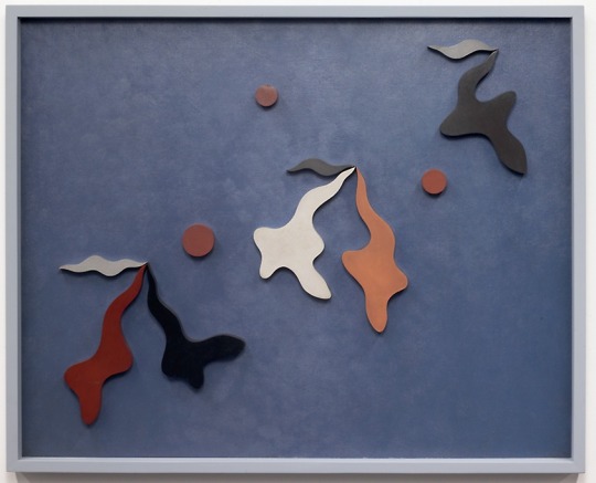
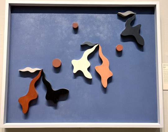
Relief, Charles Green Shaw, 1937. The Art Institute of Chicago.
Relief, by Charles Green Shaw, was on view in one of the American Art galleries, next to other paintings and objects in glass cases. Yet it stuck out, looking like something more fitting towards the abstract galleries, with its shapes and pops of color, as well as the fact that it is made out of wood. Unlike its neighbors, Shaw’s piece is more than just paint on canvas, quite literally jumping out of the frame’s two-dimensional space. It was unlike anything else in the room, in the gallery, and I loved it.
Upon further research, I found that this work was inspired by Shaw’s challenge for himself, to create a piece of art that did not require a specific subject to provoke an aesthetic response from its audience. It is both painting and sculpture, within a frame. It meshes traditionalism with new age abstraction and conceptual efforts, and it amazes me – art that challenges and makes you question your initial reactions to art in general. (Shaw)
I’m including two pictures – one in neutral lighting from the Art Institute’s website, and another that I took in the gallery, where the light shining down onto the piece caused multiple shadows that made it look like the pieces themselves were vibrating. The piece is absolutely stunning, conceptually and visually.
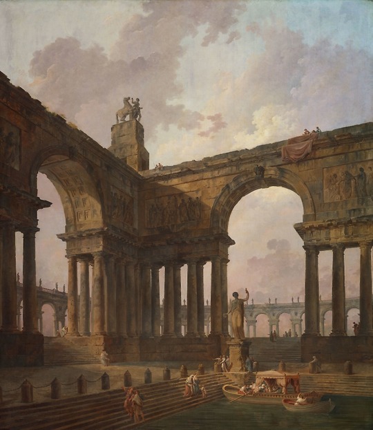
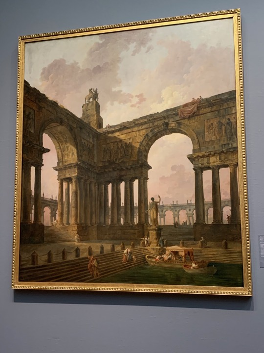
The Landing Place, Hubert Robert, 1787-1788. The Art Institute of Chicago.
Hubert Robert’s The Landing Place is one piece in a collection of four colossal paintings that were a part of a commission to decorate a salon in the late eighteenth century. The size of it is the first thing you really see when you walk into the gallery – it’s nearly eight and a half feet tall by nearly seven and half feet wide. They take up almost a fourth of an entire gallery wall. Walking towards it, it feels more like a portal than a painting, the details and color so rich that you could step into it, and come out into the scene itself.
Something about the light of the gallery adds a golden-hued touch to the piece. The shadows seem more pronounced in their details, the direct light highlighted brighter. Like a more direct lighting approach that doesn’t quite copy itself to the online version, so I’m putting both pictures in here as well.
This was also the piece that I sat with for fifteen minutes for the Responsive Time Exercise.
It is the sky that pulls me in first, after looking up from starting my stopwatch. The contrast of light to dark, the clouds beckoning dusk, or daybreak, how people have already gathered together in this space in the early hours of the fabricated day. The canvas is stunning, in both scale and content. If I close my eyes to my surroundings, the painting’s scene feels incredibly real, like I'm there, the warm breeze and insects chirping, the light falling in, shading the structure, full of depth and scale.
I can’t seem to grasp the scale accurately in words – the painting must be twice my height, maybe a little over, how incredibly vast and wonder-filled this piece looks, how the people gathered all around are ants compared to the towering architecture, and how yet it makes them feel as if they are so alive, within their detailing. The boats. The texture of the water, the differences in clothes and colors and ages. It brings so many questions to light: who are they? Why have they come? Who are they meeting, and where are they going to go? Why have they come here, now, or is it then? Where is this place? What smell does the wind bring? How hot is the air?
Or maybe, there isn’t a story here at all. Or there are too many stories to be seen. Who built this place? Where did the materials come from? Why choose these pictures – is it a shrine? A place of knowledge? A place of peace? Why did Robert choose this scene, these types of locations for his patron? Reviving Hellenistic ideals? Is he trying to show calmness through scale? Peace through space and time? Domesticities and how history makes romantics of us all? How even the smallest of activities can be beautiful?
I’m now five minutes into the response, and I’ve come to decide that there are two versions of this painting - one version up close, and one far away. The entire piece is too big to really feel the scale up close, where the gallery’s lights reflect the texture of the brush used and the sky, the clouds, the colors, all disappear beneath the shine of it. Yet from afar, it almost seems like the scale is more striking. The color vibrates. The structure and framing of the scene seem to focus the lighting, the whole of the scene.
Up close, the details are in their full glory. There is nothing you cannot spot; wrinkles, shadows, texture and incredibly minute, small details you may have missed from afar. The woman peeking out behind the column to the right. The groups beyond the right-side gate. How they are together, or separated. The woman below catching the large boat from her own. The effort that Robert put into this piece, as well as his other three in the collection, isn't for even a moment half-hearted, nor half-hazardly detailed, every face has eyes, a nose, a specific look to them and only them. The statue has a dedication written on it. There are faces and further statues on the gates beyond. There is so much attention to lives that don’t even exist, the piece is overflowing with love and care. There is so much beauty in this piece, it strikes and never stops. It feels never ending, beauty upon beauty upon beauty – nature, architecture, humanity, domesticity. Once you see it, you can’t stop.
Ten minutes in, and surprisingly, I'm not yet tired of standing here, nor of this piece. It feels as if every time I look up there is something new to see, and maybe I’m cheating a little bit, choosing such a large piece, but it is everything I admire put in a painting. Parts history, humanity, domesticity, all under a rosy sky. The romanticism of everyday life, how it in itself is art. It leaves me wondering what the other people passing by are seeing. What are they drawn to first? What am I supposed to take away? What am I supposed to see, where am I supposed to look? Is it not subjectively, not entirely up to me? Aspects like shading and lighting can direct my eye, but the pieces that portray love and humanity – how am I to look away?
The detail is too much, now, almost, you feel too powerful, seeing everything. To be able to control this perspective of daily life. It feels unnatural, but real in the same tone. I want to hang it from my wall, peace and power and domesticity. I adore this piece because it feels like a memory, I've decided. Something rose-filmed but true, depending on how you see, where you look. Beauty, everywhere. So blatant, like it has nothing to hide, in everything, afar, close, in every step in-between.
I hadn’t planned out what pieces I was going to pick for the exercises beforehand, deciding on wanting to find them within the museum and being inspired, pulled towards them. I found one for the response exercise in the colossal pieces done by Robert, and found my secondary pick, for the criticism analysis, tucked into the Contemporary galleries on the second floor.
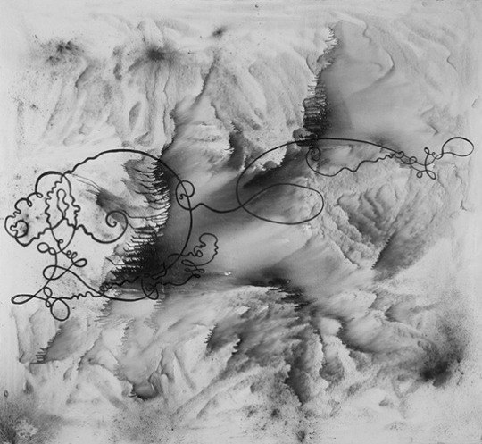
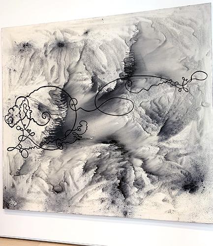
Velocitas – Firmitudo from the Dürer’s Loops series, Sigmar Polke, 1986. The Art Institute of Chicago.
Velocitas – Firmitudo is a graphite, silver oxide and damar resin made piece by Sigmar Polke in 1986. The plaque on the wall had no further background information. It was a mystery within the gallery, and one I wanted to piece apart and see if I could solve by analysis, so I chose it for the analysis exercise. Yet even before that, it stuck out to me, feeling almost like an mounted optical illusion – part topographical map, part three-dimensional treasure map, part story told through script, part picture of the sea taken from space – it felt like everything worldly poured down into one piece, in shades of grey. It looked like sand struck still on the canvas, inked and blown away to create dunes. How did one piece manage to convey so many different perspectives, so many images that I could list and list for what felt like forever? What was Polke thinking when creating this piece, this series? Why does it look like it will change, as soon as I look away?
It’s a fairly large piece – nearly eight feet wide by eight and a half feet tall – and is incredibly striking, for using only black and white for its range of color. It has many different textures on the underlying later, that look like they are overlaying themselves. There are thin ones, thicker edges, like mountain ranges of contrast. It is more sparse in activity around the edges, and then gets more intense the further to the center of the piece you look. Over the center of the piece is a black detailing. It looks to be two lines that intersect towards the center of themselves, and yet diverge greatly. The left is circular for most of it on the right, but on the left diverges into a looping, almost cursive-like detailing that twists and curves along and around itself. On the left it curves off to the opposite right side of the piece, a great curve leading to smaller details, looping in and around itself there as well.
The design elements this piece portrays are space, color, texture, form, and line. The line is the first thing that draws your attention into the piece. The dynamic dark blacks contrast the lighter greys in color, playing against the different textures. Some look to be almost splattered or spray-painted, others traced upon itself over and over until bleeding-edged and dark, others dripped down to look elongated and heavy in form. The space of the entire piece is enthralling, it is heavy in some places and blank entirely in others, a conundrum in itself. The design principles present in the piece are emphasis, balance, variety, and movement. The emphasis of the contrasting colors and textures. The balance in them as well, the whole piece looks equal on both sides, not one heavier than the other. The variety in textures, in shades, in the touch of elegance in the line symbol that adds movement to the piece. Polke has organized his work in almost diagonal quadrants, from range to range, the blurred darkness to the heavy edges to the lighter outlying edges of the entire piece. Your eye follows the line, at first, from left to right to back again, before it really sees beneath, and then gets stuck in the middle range of shading before following the rest of the piece up and counter-clockwise, before starting the whole process again and again.
This piece is stunning in its abstraction. It looks like it could be a list of things, and yet none of them at the same time. It’s chaotic, and yet looks like it has a central concept or meaning, due to the emphasis and contrast of its elements. It looks like it’s meant for you to get lost in. To turn over and over, to follow that line again and again like it will lead to some final message of the piece. I think that that is what Polke wants, this repetition, this losing of oneself in the piece. Every bit of design choice that I could figure leads to this – the variety and yet balance, the constant linearity of perpetual guessing– there is curiosity at the center of this piece, I believe. It’s what makes your eyes go for one last time around the piece, tracing the edges of darkest blacks one last time. Polke wants you to feel the textures, the question, the never-ending curiosity of it, with just your eyes.
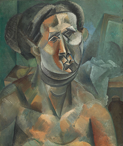
Head of A Woman, Pablo Picasso, 1909. The Art Institute of Chicago.
The Institute’s collection loses me, sometimes, within the modern contemporary galleries. I understand that there is incredible technique and thought that goes into the creation of these pieces, and it’s not a technical issue that separates them from my eye. Sometimes, it feels as if there are just too many concepts at play and it overwhelms me, seeing them all crisscrossed across one another. Pieces, for example, like Picasso’s Head of a Woman, are technique-based of interest, but the visual aspect I find lacking. I don’t know if it is the color choices or the style, but overall, it just doesn’t end up appealing to me. I really do love many types of abstract and contemporary pieces, and yet some don’t connect with me. Though, they are easier to walk past in knowing that others love them as I love other pieces.
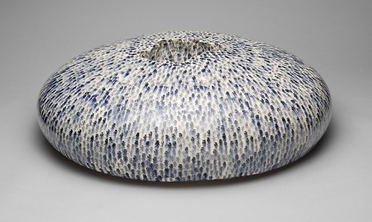
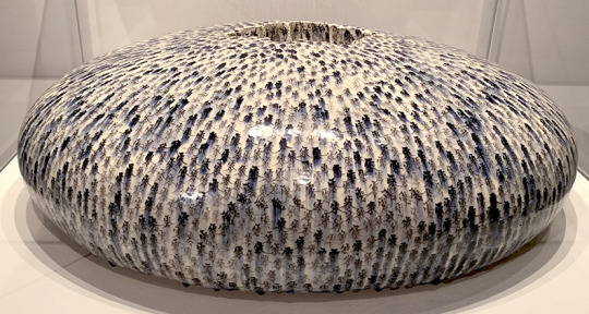
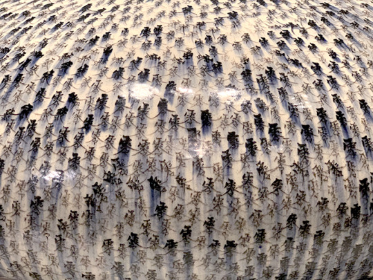
Water Drop, Mineo Mizuno, 2011. The Art Institute of Chicago.
The piece that affected me the most emotionally I actually stumbled upon, tucked away in the corner of one of the Asian Art galleries: Mineo Mizuno’s 2011 work Water Drop. Personally, I really don’t believe that the online photograph does this piece justice. Seeing it in person, it feels like you’ve just caught it mid-bounce, pressed pause right where it has flattened itself at its lowest point, right before springing back up again. There is weight to this motion, to the curve of it. It’s surface tension that never breaks, forever holding, existing, keeping. It gleams with a lost possibility.
This feeling was emphasized upon reading the wall description – it’s a personal piece. Mizuno dug his hands into the center of the piece, his fingers curving marks into the sides of hollow crater at the piece’s center. The Japanese character Mizuno has written all over the piece represents “zero”, “null”, “void”, or “nothingness”, as well as the title of Japanese World War II fighter planes. Mizuno’s father had died in the war before he was born, addressing that loss in this piece. The emotion of it is nearly tangible, palpable, like you are waiting for the return of motion, the bounce, the breath of life – but it never comes.
Art Cited:
Mizuno, Mineo. Water Drop. 2011. The Art Institute of Chicago. URL. Picasso, Pablo. Head of A Woman. 1909. The Art Institute of Chicago. URL. Polke, Sigmar. Velocitas – Firmitudo from the Dürer’s Loops series, 1986. The Art Institute of Chicago. URL. Robert, Hubert. The Landing Place. 1787-1788. The Art Institute of Chicago. URL. Shaw, Charles Green. Relief, 1937. The Art Institute of Chicago. URL.
0 notes
Text
The 13 hottest mermaid hair colors
Mermaid Hair is a hair color trend that transmits two or more pastel shades or vivid colors to long, beach-front hair. Lush, long hair plus waves and a whole lot of magical fashion colors. This trend is well on the way to becoming the next favorite hair color for everyone! Multicolored pastel tones and vivid colors make this style an intense fun to wear, aside from all the attention you get.
Tight, small curls to soft, big waves are the usual styling to complete the presentation of various fashion tones. Length can also give you the ability to create flawless transitions of color and intensity. Blac Chna, Kesha and Lady Gaga have all transformed their manes into this beauty, and the trend has not stopped since!
With beautiful hair comes great responsibility. Be prepared for multiple bleaches and a lot of patience to make your desired colors appear on your strands. The care after dyeing, such as the use of hair protection products and occasional salon travel for grooming is a must!
Leave your comfort zone for exciting days and nights and try one of these trendy mermaid hair looks!
Green and blue lagoon mermaid hair
How would you describe this look?
This is a half and half color melted mermaid hair that is currently in vogue. For this masterpiece, I wanted the green to be the main attraction. I knew my line would fall to that half-and-half look at the side of the green that's the one I wanted to emerge from! That's how I knew it would completely change half the look and create a more dimensional look.
Dimension! That's what I love most about this look! You can see the different shades of blue and mint and then green. (I used Guy Tang's MyDentity Mystic Blue, Arctic Blue and Mint of Steel and Pulp Riot, as well as Absinthe and Area 51.)
Then I opted for the styling of using a 1 "rod to give these beautiful mermaid waves, and in the end I used Shine Spray for the finishing touch. (My favorite shine spray #mystardustshinespray by Guy Tang Mydentity.)
Any advice for someone considering it?
I think a color like this looks great on light skin, but overall, if you have a great personality, you can rock pretty much anything! Everything is in the attitude!
Things to keep in mind when doing color like this is that you need to have a clean level 10 canvas, so I want to make sure I use a pH bonder to protect the hair from damaging the flash process (I use Olaplex). A good brightener to achieve a perfect clean canvas is the key to great results (My favorite is Guy Tang Big 9).
These colors take a very long time to reach, so be prepared to spend the day with your hairdresser. Also keep in mind that these colors are very expensive, but they are so worth it.
Now I always recommend to my customers to use a sulfate-free shampoo and a good hair mask (Pai Shau Supreme Revitalizing Mask is my favorite), healthy hair is very important to me! Using the right products after the application will help your colors last longer.
Light Clear Blue Hues
How would you describe this look?
It definitely makes me think of a clear blue sky, maybe with a few clouds, especially after I made it look the way I did. Also with the cut and style of my client (she has many tattoos / additions), it really makes me think of old school punk / grunge.
We like to cut the layers fairly short to give the whole thing a more shag look. It also has shorter bangs, so it definitely gives you more of this punk mood. This is my favorite thing about this cut / style – you can make it look a bit more polished or you can really mess it up and have fun with it.
Any advice for someone considering it?
This type of color is very caring and can be harmful if you do not handle it properly. My customer comes every 6 weeks at least usually only about half an inch to one inch regrowth. This allows easy and safe regrowth with the brightener. For anyone with dark hair, I would not recommend this type of color. For people who want more of the pastel colors, I would stay with someone who is naturally blond / tan.
For those who want something on the blue / green side of the spectrum like this client, it's a little more engaging, as the underlying greens can be pretty hard to remove. Usually I always make sure that they are willing to leave it that way for a while when I'm doing a blue / green at a customer. Product-appropriate weekly deep-tissue treatments are usually required because of the lightening of the hair, as well as a leave-in conditioner and heat-protective agent, if you use a lot of heat on your hair. I would not suggest this look for someone who is pretty conservative.
This look is definitely more for someone whose style is more on the punky / edgy side, or for someone who wants to add more of that look to his style! Although this type of color can be very caring, it's still worth it if you want a look that's more fun and out there!
Deep blue sea
How would you describe this look?
The hair of this mermaid is one of my favorite pastimes! It's "Waves of Deep Topaz" and has a deep purple root that blends into a beautiful and dimensional mix of topaz colors. My favorite thing about this look is how I am able to create a seamless blend as the color runs down the strand! It's certainly a statement piece! I've developed my own technique with fashion tones to get a great melt of color. Mermaid hairstyles are definitely popping with color.
Creating textures with my favorite curling iron Paul Mitchell was fun for this customer. The topknot is always a nice and simple style to teach my clients. All in all, this style is very versatile and looks fantastic on every hair type and every hair length! The mermaid's hair is definitely a big trend that starts to stay here!
Any advice for someone considering it?
When consulting with a client, I always ask important questions. How often do you wash your hair? What type of maintenance is this customer ready to do? Do you use styling products and hot tools? This look is definitely not for the average girl. It takes a certain look and style to make it! This look is very caring. The care at home is super important, so they must use a sulfate-free color care shampoo and conditioner!
In order to maintain this style, you need specific styling products such as a styling oil, mousse and hair spray! A good curling iron or wand is the key to these beautiful waves! I mean, how sweet and effortless is this topknot? Choosing an artist who specializes in this type of color is so important. I can not stress enough how important it is to conduct a proper consultation, to make sure they have a portfolio, so that you can see their work before you agree to the service. You really want to look for a specialist to get the look right!
Wave with silver, blue and purple
How would you describe this look?
The best thing about this mermaid hair color is that we put a lighter shade in the middle, which gives it a little something other than the typical ombré look! I love the darker root and the darker final color! It makes this midline even more popular! Some loose waves and a great little gem by Pink Pewter make it even better!
Any advice for someone considering it?
Fashion / vivid colors are my passion and I love to make them customers, but they are a commitment. I have a long consultation in advance in which I inform you about the end and end of home care. Sulfate-free shampoos, such as Pulp Riot or Biolage, with minimal laundry in cold water, are a must! Low temperature settings on hot tools and good heat protection (I prefer Kenra 22 spray) before styling are also important. Violet tones generally fade pretty well, so these tones are not as well-cared for as others, but be prepared to be back in the salon in 6-8 weeks to retouch!
Sea foam green
How would you describe this look?
This look is an elegant punk. We wanted to transform them from a high growth line, also known as bleach, and tone with magenta to more of easy-care, sassy dimensional color.
Teri is 100% Nicaraguan and has many dark, thick hairs. We always want to give her a cut that decreases weight and gives texture and shape. This was simply blown out with a 2 "ceramic round brush to add volume and bend.
I love how the color attracts your eyes and flows together so well. It pulls it away from the "youthful, punk, colored stigma". Let's just say that the multidimensional tones help to fade them in various ways and develop with washes.
Any advice for someone considering it?
The key to this is that you do not wash your hair as often and wash in cold water and with moisture.
Investing in good products is a crucial factor! Use sulfate-free, paraben-free, sodium chloride-free products, less alcohol with styling products and less heat, as you can immediately melt your color!
I also like to send my clients home with a container of the right color to freshen up the paint before they have to return to the salon. I have had vivid colors for many years of my life, and care is the key to a rich color.
I began to fall in love with bright colors, with an elegant spin. There is so much dimension and abundance in color, but it is realistic when it comes to care. You have a smoother growth, and who does not love that ?!
Bright colors have changed the game, and I am so happy that people are becoming more open in different companies. Art, colors and self-expression flow together so well, so why not accept it in every way!
Pink, Purple, Green and Blue Rainbow
How would you describe this look?
My customer, down in the picture, leaves me a free hand. Her skin is pale and her hair is Dark Cool Level 4. My favorite part of this look is the fat bang that sits under her forehead and frames both sides of her face. Her haircut was so much fun. I love how her face is like a mischievous fairy. She wears her hair up, but with bangs down, so her ponytail's look is glamorous with longer pieces that she could pull along sides of the face to soften her look.
I framed her pony hairdo in black, thinking it would be wonderfully combined with her naturally inky dark lashes. My color picker for her hair was inspired by beta fish, so I kept dark blue, light blue and mint green as our main colors with sections of pink, purple and neon green puzzling under and around the face frame.
Melting is the name of the game. I want one color to change to another. A constant ebb and flow, I did not want a staccato rhythm in my hair, which distracts the attention of her bang! My goal was to create movement in the hair that has a soothing effect on the top and then opens in bold pops of color. The dark blue shadow root helps enormously in the way her hair goes over during the growth / fading out.
Any advice for someone considering it?
Every time a customer comes in and asks for Rainbow Mermaid hair, I first look for personality. How does she get over? Is she wide open? Or is it reserved? If it is quiet, I would choose pastel shades and softer tones for this relaxed atmosphere. If she is brave then I would of course choose strong colors! Skin tone? Is she brown or pale? Do I have to create undertones in their color to combine them with their skin tone?
My advice is, whatever you do, start with a clean canvas. I take all my clients to level 9 or higher. The cleaner the canvas, the more beautiful the fading will be. I think about fading more than the original color. Yes, it's a process of turning into a blonde, but worth the wait, especially when it turns into pastels! It feels good to receive compliments 2 months after the color, so do it the first time!
Some girls come in unaware. I start her in baby steps. The appearance of color through the neckline or a small panel on the side can be enough to make you feel brave and empowered! Hair can literally change your view of life! Create a work of art that can not only be enjoyed by you and your customers, but can also bring joy to the people around you.
Strong blue and purple
How would you describe this look?
This look is a mermaid hair color with a purple sunset hue along with a beautiful blue ocean hue. My absolute favorite is how amazing and true it was. An amazing thing about our color line (Pulp Riot) is how you can formulate for underlying pigments and still achieve the color for the desired hue.
Any advice for someone considering it?
It is always good to seek detailed advice from your stylist. You have to talk about your wardrobe, whether you're wearing make-up and how you're petting your hair. It's also important to know your face shape to see how your stylist can cut and shape the color so that when you look at it at eye level, you see that contrast.
My client, for example, has beautiful blue / green eyes, so the blue and violet complemented her eyes so well. When you try to achieve that look, you need to consider how you get up.
Colorful ocean ombre
A rich combination of blue roots and teal ends is almost like carrying the ocean as the crowning glory! Mermaid hair made in Ombre dyeing techniques creates a unique flair.
Colorful coral pink shades
Wear this Pantone 2019 color with pride! Peach tones are in fashion, but you can start the trend by wearing this shade of medium-long hair.
Pastel green sea algae
One word: fascinating. Experience your mermaid hair dreams with kelp-colored hair that are obviously out of this world!
Blue and blue ocean
Mermaid hair is now available in fascinating turquoise colors! I definitely see these lush seaweed and seaweed species under water. If you want to definitely consider mermaid hairstyles, light tones like aqua and turquoise.
Mermaid Hair: The Fishtail Braid
Swim back to the good one with the ultimate merpeople hairstyle. Fuschia and magenta tones fused into a fishtail make you a native under the sea!
Mermaid hair in a pixie
Short-haired girls are also having fun! Get ready for the hottest mermaid hair color mix and cut this summer.
The 13 hottest mermaid hair colors
0 notes
Text
The 13 hottest mermaid hair colors
New Post has been published on https://www.easypromhairstyles.com/the-13-hottest-mermaid-hair-colors.html
The 13 hottest mermaid hair colors
Mermaid Hair is a hair color trend that transmits two or more pastel shades or vivid colors to long, beach-front hair. Lush, long hair plus waves and a whole lot of magical fashion colors. This trend is well on the way to becoming the next favorite hair color for everyone! Multicolored pastel tones and vivid colors make this style an intense fun to wear, aside from all the attention you get.
Tight, small curls to soft, big waves are the usual styling to complete the presentation of various fashion tones. Length can also give you the ability to create flawless transitions of color and intensity. Blac Chna, Kesha and Lady Gaga have all transformed their manes into this beauty, and the trend has not stopped since!
With beautiful hair comes great responsibility. Be prepared for multiple bleaches and a lot of patience to make your desired colors appear on your strands. The care after dyeing, such as the use of hair protection products and occasional salon travel for grooming is a must!
Leave your comfort zone for exciting days and nights and try one of these trendy mermaid hair looks!
Green and blue lagoon mermaid hair
How would you describe this look?
This is a half and half color melted mermaid hair that is currently in vogue. For this masterpiece, I wanted the green to be the main attraction. I knew my line would fall to that half-and-half look at the side of the green that's the one I wanted to emerge from! That's how I knew it would completely change half the look and create a more dimensional look.
Dimension! That's what I love most about this look! You can see the different shades of blue and mint and then green. (I used Guy Tang's MyDentity Mystic Blue, Arctic Blue and Mint of Steel and Pulp Riot, as well as Absinthe and Area 51.)
Then I opted for the styling of using a 1 "rod to give these beautiful mermaid waves, and in the end I used Shine Spray for the finishing touch. (My favorite shine spray #mystardustshinespray by Guy Tang Mydentity.)
Any advice for someone considering it?
I think a color like this looks great on light skin, but overall, if you have a great personality, you can rock pretty much anything! Everything is in the attitude!
Things to keep in mind when doing color like this is that you need to have a clean level 10 canvas, so I want to make sure I use a pH bonder to protect the hair from damaging the flash process (I use Olaplex). A good brightener to achieve a perfect clean canvas is the key to great results (My favorite is Guy Tang Big 9).
These colors take a very long time to reach, so be prepared to spend the day with your hairdresser. Also keep in mind that these colors are very expensive, but they are so worth it.
Now I always recommend to my customers to use a sulfate-free shampoo and a good hair mask (Pai Shau Supreme Revitalizing Mask is my favorite), healthy hair is very important to me! Using the right products after the application will help your colors last longer.
Light Clear Blue Hues
How would you describe this look?
It definitely makes me think of a clear blue sky, maybe with a few clouds, especially after I made it look the way I did. Also with the cut and style of my client (she has many tattoos / additions), it really makes me think of old school punk / grunge.
We like to cut the layers fairly short to give the whole thing a more shag look. It also has shorter bangs, so it definitely gives you more of this punk mood. This is my favorite thing about this cut / style – you can make it look a bit more polished or you can really mess it up and have fun with it.
Any advice for someone considering it?
This type of color is very caring and can be harmful if you do not handle it properly. My customer comes every 6 weeks at least usually only about half an inch to one inch regrowth. This allows easy and safe regrowth with the brightener. For anyone with dark hair, I would not recommend this type of color. For people who want more of the pastel colors, I would stay with someone who is naturally blond / tan.
For those who want something on the blue / green side of the spectrum like this client, it's a little more engaging, as the underlying greens can be pretty hard to remove. Usually I always make sure that they are willing to leave it that way for a while when I'm doing a blue / green at a customer. Product-appropriate weekly deep-tissue treatments are usually required because of the lightening of the hair, as well as a leave-in conditioner and heat-protective agent, if you use a lot of heat on your hair. I would not suggest this look for someone who is pretty conservative.
This look is definitely more for someone whose style is more on the punky / edgy side, or for someone who wants to add more of that look to his style! Although this type of color can be very caring, it's still worth it if you want a look that's more fun and out there!
Deep blue sea
How would you describe this look?
The hair of this mermaid is one of my favorite pastimes! It's "Waves of Deep Topaz" and has a deep purple root that blends into a beautiful and dimensional mix of topaz colors. My favorite thing about this look is how I am able to create a seamless blend as the color runs down the strand! It's certainly a statement piece! I've developed my own technique with fashion tones to get a great melt of color. Mermaid hairstyles are definitely popping with color.
Creating textures with my favorite curling iron Paul Mitchell was fun for this customer. The topknot is always a nice and simple style to teach my clients. All in all, this style is very versatile and looks fantastic on every hair type and every hair length! The mermaid's hair is definitely a big trend that starts to stay here!
Any advice for someone considering it?
When consulting with a client, I always ask important questions. How often do you wash your hair? What type of maintenance is this customer ready to do? Do you use styling products and hot tools? This look is definitely not for the average girl. It takes a certain look and style to make it! This look is very caring. The care at home is super important, so they must use a sulfate-free color care shampoo and conditioner!
In order to maintain this style, you need specific styling products such as a styling oil, mousse and hair spray! A good curling iron or wand is the key to these beautiful waves! I mean, how sweet and effortless is this topknot? Choosing an artist who specializes in this type of color is so important. I can not stress enough how important it is to conduct a proper consultation, to make sure they have a portfolio, so that you can see their work before you agree to the service. You really want to look for a specialist to get the look right!
Wave with silver, blue and purple
How would you describe this look?
The best thing about this mermaid hair color is that we put a lighter shade in the middle, which gives it a little something other than the typical ombré look! I love the darker root and the darker final color! It makes this midline even more popular! Some loose waves and a great little gem by Pink Pewter make it even better!
Any advice for someone considering it?
Fashion / vivid colors are my passion and I love to make them customers, but they are a commitment. I have a long consultation in advance in which I inform you about the end and end of home care. Sulfate-free shampoos, such as Pulp Riot or Biolage, with minimal laundry in cold water, are a must! Low temperature settings on hot tools and good heat protection (I prefer Kenra 22 spray) before styling are also important. Violet tones generally fade pretty well, so these tones are not as well-cared for as others, but be prepared to be back in the salon in 6-8 weeks to retouch!
Sea foam green
How would you describe this look?
This look is an elegant punk. We wanted to transform them from a high growth line, also known as bleach, and tone with magenta to more of easy-care, sassy dimensional color.
Teri is 100% Nicaraguan and has many dark, thick hairs. We always want to give her a cut that decreases weight and gives texture and shape. This was simply blown out with a 2 "ceramic round brush to add volume and bend.
I love how the color attracts your eyes and flows together so well. It pulls it away from the "youthful, punk, colored stigma". Let's just say that the multidimensional tones help to fade them in various ways and develop with washes.
Any advice for someone considering it?
The key to this is that you do not wash your hair as often and wash in cold water and with moisture.
Investing in good products is a crucial factor! Use sulfate-free, paraben-free, sodium chloride-free products, less alcohol with styling products and less heat, as you can immediately melt your color!
I also like to send my clients home with a container of the right color to freshen up the paint before they have to return to the salon. I have had vivid colors for many years of my life, and care is the key to a rich color.
I began to fall in love with bright colors, with an elegant spin. There is so much dimension and abundance in color, but it is realistic when it comes to care. You have a smoother growth, and who does not love that ?!
Bright colors have changed the game, and I am so happy that people are becoming more open in different companies. Art, colors and self-expression flow together so well, so why not accept it in every way!
Pink, Purple, Green and Blue Rainbow
How would you describe this look?
My customer, down in the picture, leaves me a free hand. Her skin is pale and her hair is Dark Cool Level 4. My favorite part of this look is the fat bang that sits under her forehead and frames both sides of her face. Her haircut was so much fun. I love how her face is like a mischievous fairy. She wears her hair up, but with bangs down, so her ponytail's look is glamorous with longer pieces that she could pull along sides of the face to soften her look.
I framed her pony hairdo in black, thinking it would be wonderfully combined with her naturally inky dark lashes. My color picker for her hair was inspired by beta fish, so I kept dark blue, light blue and mint green as our main colors with sections of pink, purple and neon green puzzling under and around the face frame.
Melting is the name of the game. I want one color to change to another. A constant ebb and flow, I did not want a staccato rhythm in my hair, which distracts the attention of her bang! My goal was to create movement in the hair that has a soothing effect on the top and then opens in bold pops of color. The dark blue shadow root helps enormously in the way her hair goes over during the growth / fading out.
Any advice for someone considering it?
Every time a customer comes in and asks for Rainbow Mermaid hair, I first look for personality. How does she get over? Is she wide open? Or is it reserved? If it is quiet, I would choose pastel shades and softer tones for this relaxed atmosphere. If she is brave then I would of course choose strong colors! Skin tone? Is she brown or pale? Do I have to create undertones in their color to combine them with their skin tone?
My advice is, whatever you do, start with a clean canvas. I take all my clients to level 9 or higher. The cleaner the canvas, the more beautiful the fading will be. I think about fading more than the original color. Yes, it's a process of turning into a blonde, but worth the wait, especially when it turns into pastels! It feels good to receive compliments 2 months after the color, so do it the first time!
Some girls come in unaware. I start her in baby steps. The appearance of color through the neckline or a small panel on the side can be enough to make you feel brave and empowered! Hair can literally change your view of life! Create a work of art that can not only be enjoyed by you and your customers, but can also bring joy to the people around you.
Strong blue and purple
How would you describe this look?
This look is a mermaid hair color with a purple sunset hue along with a beautiful blue ocean hue. My absolute favorite is how amazing and true it was. An amazing thing about our color line (Pulp Riot) is how you can formulate for underlying pigments and still achieve the color for the desired hue.
Any advice for someone considering it?
It is always good to seek detailed advice from your stylist. You have to talk about your wardrobe, whether you're wearing make-up and how you're petting your hair. It's also important to know your face shape to see how your stylist can cut and shape the color so that when you look at it at eye level, you see that contrast.
My client, for example, has beautiful blue / green eyes, so the blue and violet complemented her eyes so well. When you try to achieve that look, you need to consider how you get up.
Colorful ocean ombre
A rich combination of blue roots and teal ends is almost like carrying the ocean as the crowning glory! Mermaid hair made in Ombre dyeing techniques creates a unique flair.
Colorful coral pink shades
Wear this Pantone 2019 color with pride! Peach tones are in fashion, but you can start the trend by wearing this shade of medium-long hair.
Pastel green sea algae
One word: fascinating. Experience your mermaid hair dreams with kelp-colored hair that are obviously out of this world!
Blue and blue ocean
Mermaid hair is now available in fascinating turquoise colors! I definitely see these lush seaweed and seaweed species under water. If you want to definitely consider mermaid hairstyles, light tones like aqua and turquoise.
Mermaid Hair: The Fishtail Braid
Swim back to the good one with the ultimate merpeople hairstyle. Fuschia and magenta tones fused into a fishtail make you a native under the sea!
Mermaid hair in a pixie
Short-haired girls are also having fun! Get ready for the hottest mermaid hair color mix and cut this summer.
0 notes
Text
My name is Prerana Kulkarni. I am an artist based in Southern California, USA. I love to create vibrant and colorful paintings. I am a self-taught artist who has taken short workshops and online classes with master artists like Susan Sarback, Camille Przewodek and Geri Medway to enhance my skills.
I grew up in India and during my school years, I always loved art class. During summer vacations, I used to try out different mediums – watercolor, acrylic, fabric paints etc. – all on my own!! But I never had formal instruction. Later, I got busy with studying engineering college, job, life…
In 2008, I took my very first oil painting workshop in a community college and fell in love with the painting process. Within 3 years, I started getting selected in local juried shows. I was inspired by the feeling that even others had started liking my paintings!!
This slideshow requires JavaScript.
The experience of creating brought profound joy to me and it almost felt like I got addicted to the smell of oil paints and palette knife painting. Each year, I took intensive week-long workshops with master artists and for the rest of the year practiced in my studio. And this journey continues… painting became my passion!!
In 2016, I rediscovered myself with watercolor painting. I just started to experiment on my own and was stunned by the results! Specially, I liked my flower paintings better in watercolors. So I continued to paint even in larger sizes and started getting into national juried shows!
So now, I paint both in oils and watercolors. In whatever medium or subject I choose to paint, I first try to find an interesting composition of light and shadow shapes. Then, I study the effect of light and try to capture the light in my paintings. I paint from photographs for the most part. But for still life paintings, I like to paint from a live setup.
My Inspiration is light anywhere and everywhere! I paint pets, flowers, fruits, still life, portraits – and inspiration has always come to me by the beauty of the natural world, as well as fond memories.
For my oil paintings, I paint in an impressionist style using a palette knife. One, I like the texture of the painting when a palette knife is used and two, cleanup is a breeze. Just wipe with kitchen towel and you’re done! It also produces a clean paint on the canvas. The oil paints I use are M. Graham Artists’ oil colors and I use canvas panels. The last couple of years or so, I am working on watercolor paintings and developing a series on florals.
Interestingly, my watercolor florals are created in realist style. Don’t know how that happened! I mostly use Maimeri Blu Artist Colors. I do have a few Winsor & Newton and Holbein colors too. The paper I use is natural white Arches Paper, either 140 lb OR 300 lb coldpress. Typically, for a painting bigger than 16×20 inches, I like to use 300 lb Arches coldpress since it is a bit heavier.
In terms of techniques, I never mix 2 or more different colors on my palette. I use the palette only to mix water into a color to vary its intensity. Instead, I use a glazing/layering technique a lot to achieve a desired color in my watercolor paintings. In other words, all my “color mixing” happens directly on the paper.
This technique allows me to work on my paintings over multiple days, a little bit at a time. I find this very useful since I have limited time to paint at the end of the day after my day job and house chores.
While doing all of the above, I do teach private students or conduct workshops on demand. I feel teaching someone is a very valuable experience and very satisfying to see a student making progress in their desired medium.
My Artistic Challenge And Fun Project
I like to take up challenges, my last one was live painting in an opening ceremony at the Anaheim Convention Center. The stage was huge, with live musicians on one side and my painting setup on other side. In the center of stage were Indian Classical dancers.
The music was Indian Classical music, representing the theme “five elements of nature”. My challenge was to create a 5 x 9 foot painting on canvas in 12 minutes, in the designated theme and presenting a magical experience in front of a 4000+ audience. It was an absolutely fulfilling experience!!
youtube
I hope my paintings bring JOY and COLOR into your life!!
Prerana Kulkarni Etsy Instagram Facebook Website Pinterest
GUEST ARTIST: "Journey to Magical Watercolors" by Prerana Kulkarni - #doodlewash #WorldWatercolorGroup #watercolor #watercolour My name is Prerana Kulkarni. I am an artist based in Southern California, USA. I love to create vibrant and colorful paintings. 784 more words
#WorldWatercolorGroup#artist#Botanical Painting#doodlewash#featured#flowers#India#oils#painting#palette#watercolor#watercolor techniques#watercolour
0 notes
Text
Nature and the Flow of Time
This past weekend, I visited the New Museum’s exhibits “Trigger: Gender as a Tool and a Weapon” and “Petrit Halilaj: Ru” on Friday, attended the Future of Storytelling Conference on Saturday, and watched the Andy Goldsworthy documentary “Rivers and Tides” on Sunday.
It was my first time exploring the New Museum, and I was very surprised by its size. The gender exhibit spanned multiple floors and offered numerous amounts of works by artists. My favorites included Liz Collins’ woven multimedia-pieces- I was enthralled by the texture and vibrancy of the yarn and how it interacted with the flat surface of the canvases, as well as the feminist subversion of the common dismissal of crafting and weaving as a stereotype of ‘women’s work’ not worthy of high status in fine art.
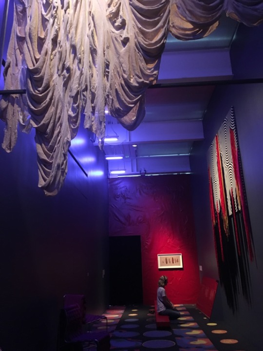
I also really admired the painting style of Christina Quarles’ work. At first glance, I assumed that her paintings were mixed media, using both acrylic paints and marker due to the thin and vibrant strokes visible in each piece. However, the artist simply painted each canvas with acrylic. I hope to attempt to mimic her mastery of light and color in my future painting endeavors.
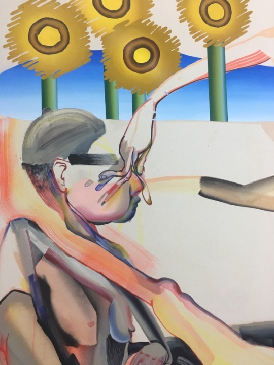
As I was leaving the museum, I also stopped by Petrit Halilaj’s exhibit “Ru”, which to me was the most memorable of that visit. I was really touched by the humor and gentleness of the bird sculptures, as well as the sheer size and amount of work that required to put up the exhibition.
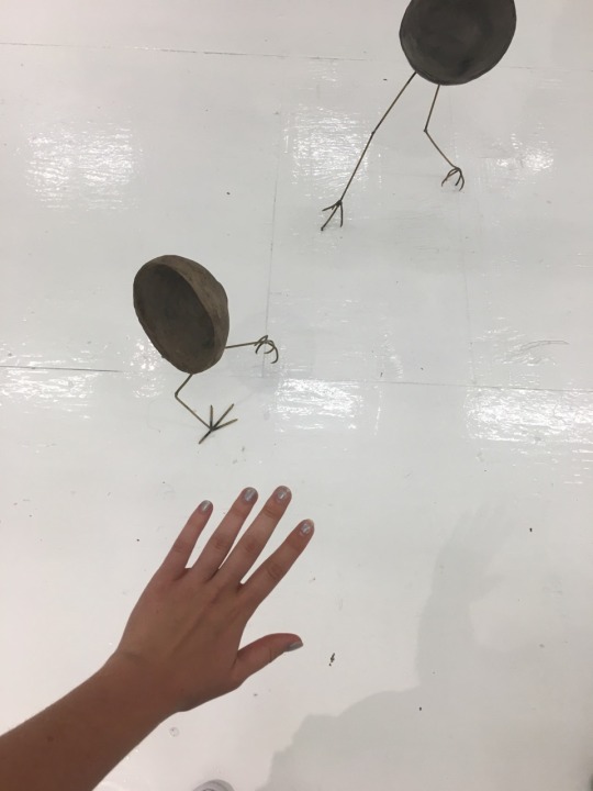
The following day, I visited the Future of Storytelling Festival in Snug Harbor Cultural Center on Staten. This experience was artful to me in a way that I did not expect. Due to lack of time and most of the lengthy VR shows being booked up for the day, I did not actually get to experience a lot of the VR performances or films. Instead, I was very moved by the amount of nature present at the gorgeous botanical garden setting of the festival.
I love living in New York City, but having lived in suburban Virginia for a good portion of my life made me very accustomed to great amounts of forests and greenery. Even when I was little and living in Russia, my dad and I would always visit his mother’s dacha in the countryside, and I spent the majority of my time playing outside.
Seeing the open fields in Snug Harbor contrasted with the white hemispheres of the VR tents made it seem like I was stepping into a futuristic landscape. I really like the idea of holding such events in open natural space, because it makes one realize the stark contrast between virtual and actual reality, both being beautiful in their own right. It also helps contain some of the nausea caused by watching certain VR films, something I experienced after watching a 360 animated PSA about tuna fishing created by the Nature Conservancy.
The next day I went on a long run around the Lower East Side and spent a lot of my time exploring the environment. I realized that one of the reasons I become very unhappy and stressed out during school is because I do not give myself enough time to be alone with my surroundings as an explorer. Travel and nature is a central part of my human experience, and shutting it down hurts me both emotionally and creatively. I am in love with the entire landscape of New York city, and it is the fuel that made me begin drawing the series of foam panels I am currently working on.
Later that night I watched the Andy Goldsworthy documentary titled “Rivers and Tides”, which chronicled the artist’s travels and work on several pieces, offering his insight on the role of nature in time and his creative process. I found the film and Goldsworthy’s ideas to hit close to home, making me realize that I have been spending too much of my energy focusing on the negativity that goes on inside me instead of spending that energy on listening to the world around me. It was really comforting to watch the artist do, as he states, “so much effort to make things look effortless”, pushing himself to physical limits by working in extremely cold environments or very fragile materials, watching his pieces crumble and fall apart over and over again whenever he made a single wrong move, yet continue to build them despite all of the setbacks.
The past two weeks have been especially heavy for my mental health and creative ambitions, and I found myself at a breaking point on Saturday night. Having experienced these feelings many times over, coupled with my incessant paranoia about turning 20 and the increasingly fast passage of time which has only gotten worse as I have gotten older, I was really appreciative of the wisdom that Goldsworthy offered on the flow of time and the cyclical nature of life. I am trying to learn how to be less harsh on myself and spend more time appreciating the incredible existence of the people and the world around me, and to focus my mental energy more on ‘analog’ experiences rather than digital ones.
Technology has enabled me to obtain the knowledge and technical skills that I would have not been able to possess a mere decade ago, but social media has also created a false notion of ambition and reality for me. As I turn 20 this week in anguish (not logical, but it’s there), I look to use my art, both visual and music, to help me process my identity and the changes I am going through, as well as figure out what values matter to me most as a person, a young woman, and an artist. As Goldsworthy states, “the river does not depend on water”, and life itself will always continue to flow and change.
Current Panels:
0 notes
Text
21 Purple highlights Show your colorist in 2019
Purple highlights are a new, curious way to instantly enhance the look of a punk princess! With bright, ultraviolet shades you will definitely enjoy creating a modern and sexy color melt for your locks.
Purple fits very well with any base color, and there are many shades to choose from. You will not have a hard time adjusting your mane to this electric color, as long as you know what works well with your skin tone. Warm tones work surprisingly well in purples with a rather red note, while cool tones are combined with bluish-purple tones.
The care is a breeze, because you do not dye your hair completely violet. Just make sure you have color-safe products at all times, and you're sure to rock this luxurious shade!
Here you can see the top experts for purple highlights that you should try as soon as possible!
Light purple highlights
How would you describe this look?
This look is cool, modern and above all fun! These purple highlights are perfect for those who have always wanted to try a fashion color, but do not want to sacrifice their traditional full-head color. The soft baby lights make an ideal surface to add any dimension, but my favorite piece in this look is the fact that we chose Lila. Purple is the ideal color if you want to be bold, because you can decide whether you want to hide it to a frosty blond or change your mind again. Purple tones are a low-risk way for blondes to experiment without sacrificing their platinum goals.
I chose Baby Light for my client because I find it looks different, depending on how the customer wants to style their hair. I decided to wave her hair so that the purple baby could radiate against her natural brown not only from the surface of her hair but also from the inside.
Any advice for someone who thinks about it?
Do it! I think that Lila is a very soft color that almost anyone can try, and once you start with fashion colors, it opens a whole new world of hair options.
The best thing about purple baby lights is the care. Fashion colors are notoriously difficult to care for, but with purple, fading out becomes a truly entertaining and entertaining process! If you let it go for a few weeks you will get a pretty ash blonde and if you are in love with the purple I would recommend an Evo Fabuloso Custom Conditioner for care. Colored conditioners are not only ideal for maintaining a fashionable color, they are also very easy to use and can be applied as little or as often as you like! If you have ever looked up the idea of a fashion color, Lila is the starting point.
Dark purple on black hair
How would you describe this look?
The goal for the achieved look was a purple Balayage with shadow root and for the hair an angled rag (angled long rag). I love to create new looks with fashion tones. This was done with Violet by Pravana. I love Beachy Waves, I think they are so trendy and really bring the whole look together!
These purple highlights are created by pre-flashes of 1 1/2 under the roots to the ends. After washing and drying our hair, we started our second process using Baco Level 1 in semi-permanent. Then partially with the violet ausfedern and balance! What I love about Violett is that you can be level 6 and still see his liveliness! So many customers can reach it without lighting it up first. Even if the hair is lightened, the violet will sound as possible and turn the ends into a beautiful lavender!
Any advice for someone who thinks about it?
When customers want something more adventurous, such as fashion colors, I always make sure that I am very open, honest and thorough. To achieve the most fashionable colors, the hair must be blonde. I like to make sure that if my clients want a fashionable color, they can lighten without damage (hair integrity is a top priority), they will get the book they want after the pre-flash. I make sure that it is an investment in yourself and in good products.
Fashion colors only last so long and must be maintained so that the colors do not fade. You must invest in sulfate-free shampoos, use cooler water, and handle heat tools with care. Everything will help a long span for the paint! I do not recommend colors like silver or pastel colors, if I know that the customer's hair does not reach level 10 or higher, and if I know they still want a color that may not be achievable, I recommend a new route with extensions!
In addition, fashion colors are a costly investment. If customers want to dye their hair completely pink, but this is not included in the budget, I recommend renewals! I do not think certain hair colors are just appropriate to age, as long as something is done right, the taste is right and the customer feels nice, that's the most important thing.
Amethyst highlights
How would you describe this look?
Lavender is one of my favorite trends. I do not see it going out of fashion soon. It was the first fantasy color I chose for my own hair and it is now number one in the market asking for unconventional hair color in my chair. If you're looking for light purple accents, consider lavender.
My inspiration for creating this bespoke lavender was Amethyst. I wanted it to be reflected like a crystal geode. The styling was easy. I wanted gentle waves to match this color because her hair was so healthy that I did not have to overdress her. I just wanted their natural texture to be improved.
Any advice for someone who thinks about it?
Applying pastel hair color to any color does not adhere. Your hair must be very light yellow from the start. Think of a canvas. When you cover a black canvas with a light lavender color, you will not see as much as on a white canvas. The same applies to the hair color. So unless you're naturally blond, you'll need to consult with your designer to see if your hair is as light as pastel colors.
Products are something you want to invest in to keep that color alive. Thermal protection products are a must and colorfast shower products. Heat and non-colored sage ingredients are the main cause of fading. Yes, this heat category includes water! Always use cold water.
"If you have it, flaunt it." Bright hair attracts a lot of attention in the end. Desired or undesirable. Be prepared for many questions, compliments and comments on your new radiant look! Having the personality to rock is what it's all about !!
Make sure your work allows for unconventional hair colors! Depending on your job, it will be more acceptable in most jobs. However, make sure that this is allowed before investing time and money to create this look.
Have fun! With these colors, you can feel like a creative unicorn and it's a magical experience when you accept it!
You can visit me at the hair salon Jayden Presleigh in Carlsbad, California to get such a look!
Silver hair
How would you describe this look?
This look indicates that it is also very portable in a professional environment with a touch of color. With their natural roots that mix in both silver and purple, different arrangements are possible for different occasions. She can tie her hair back during a job interview to get a subtle look. If she wants to go to parties and festivals, the colorful hair fits the wild mood.
With this style, you can wear the hair smooth or curly and the dimensions are displayed properly. The cut is a cut with long layers that allows the customer less daily maintenance.
Any advice for someone who thinks about it?
Whether you're working in a professional environment or just trying something new, purple highlights are for those who do not mind getting noticed! However, achieving this color requires a lot of care.
It is best to have healthy hair to lighten to a level of 9-10. After accepting a light blonde color, I alternately added the colors silver and purple. Since these cooler tones do not last long, you should preserve the longevity of the colors by washing with colorfast hair care products. The best part of these colors is that every time you wash and the color gradually fades, it still retains a beautiful color in a beautiful ash blond. As long as you can spend extra time and effort to maintain the color and integrity of the hair, it will work!
Metallic Purple Highlights
How would you describe this look?
This color was applied to a young girl with natural light hair – about level 6/7 with natural highlights. I would say this look is a natural twist on fantasy hair color. What I love is that we were able to give her hair a purple metallic tone while enhancing what she already had. With the styling of loose waves it lets see through the dimension of their natural highlights and the hair that has not been touched by the sun.
Any advice for someone who thinks about it?
The most important thing to achieve this look is natural light or lightened hair. In order to preserve the pastel or metallic hue of violet, the hair must be bright enough for the soft violet to grab it. With these types of colors, a sulfate-free sage color shampoo and conditioner is a must to ensure the longevity of the color, and you also need to wash your hair in cold water. When heatstyling you have to keep the temperature low! The higher the heat, the faster the color fades out. High heat expands the color molecule! I would say if you try to give your hair a twist, this is a fun way!
Always make sure that your hair is in a suitable condition to achieve that color. Especially if you naturally have dark hair, you need to lighten your hair. That means you need appropriate aftercare products, especially treatments. Now, this look can be achieved on other structured hair. It looks different when you have naturally curly, wavy and straight hair. And that makes each color unique, because no one has exactly the same hair.
Purple highlights
How would you describe this look?
I loved creating this beautiful cut and style with purple highlights! I would describe this look as purple, pastel purple highlights. I love to create pastel colors because they bring straight blond hair to life, especially when the seasons change to warmer weather like spring. I can only recommend all blondes to try it! I promise you will not regret it.
At the beginning, I emphasized my customers with balayage and foil highlights to achieve a beautiful platinum blonde. For someone to get that color, you have to be very, very blonde / platinum. I use an adhesion reinforcement to protect my client's hair throughout the lifting process. You want to deal slowly and evenly with blondes, as their hair is usually more fragile. I used Manic Panic Professional to create the pastel purple color. To complete the look, I've made a long, layered haircut and styled it with a 1.5-inch curling iron to create gentle waves in her hair that adds even more dimension to the hair.
I always encourage my clients to try new things. Most of my repeat customers always allow me to share my referrals with them, so that we can both get a great look, especially if they want a big change. In this particular case, my client was really open to try out a pastel purple. We've already made a rose gold, a great color if you play it safe and still enjoy your color. Well, that opened the door for my client to try a more vibrant / vivid hue like purple. I could not be more excited and proud as it came out! I love everything about this look and I can not wait to try it again.
Any advice for someone who thinks about it?
The important things first! You have to be platinum blonde to get that kind of look! Remember to add purple to a piece of white paper. You will see that it is a real pigment, right? If you now print a yellow or an orange sheet of paper with purple, you will see the purple less. The brighter your hair is, the more you theoretically see this color. If you want pastel violet accents and your hair is not bright enough, you should use a darker violet tone instead, until you work your way up to a lighter blonde.
These types of services usually cost you a pretty dime! It can sometimes take hours to get the perfect blonde color for the color you want, so you'll have a pretty big bill that's probably worth it if you're ready for this step and commitment. I recommend consulting with your stylist about pricing before joining a hair project. Sometimes, when building a paint, it will take more time and money to achieve the color you want, as the hairdresser will need to take time to remove that color to achieve the desired color. Consultations and hair history are the key to successful hair care.
You also want to talk to your hairdresser about taking care of this type of color. To get a pastel tone, you usually have to visit a hairdresser every 2 to 4 weeks to get the vibrancy of the color.
When choosing a hair color, I recommend finding out what your true skin tone is, so you can determine which colors suit you best. You also want to consider your eye color to complement and emphasize the colors in your eyes. I recommend going to a wig shop to try on different colors to see what looks best on you.
For example, I have brown eyes, but in certain lighting conditions and with the right hair color you can see the honey color in my eyes. I have an olive skin tone, so I look better with warmer tones: brown, red, green and orange. Normally, I also wear these colors in my clothes because they can help me highlight my skin tone and give it a nice glow. Since orange works for me and there are pastel shades this spring, I make a peach / coral tone for me. It's always fun to try new things!
Red hair with highlights
How would you describe this look?
This look was designed specifically for my saloon load, which loves to disguise as fantasy / cosplay elf characters! I absolutely love a natural copper color, which I formulated with a deep copper base and roots and pulled toner over lightened areas with Joico hair color. I had imagined that purple peekaboos would give a little sheen, while remaining true to the different levels of spicy copper tones I gave her.
Her hair is very supple with a medium density, making it soft by mixing long layers that have worked perfectly for her length. This complete look reminds me of a sunset that was the inspiration for this look. When her hair is curled, her eyes capture the depth of the deep red copper and the tips of the bright copper as it melts like a sunset in the purple waves!
Any advice for someone who thinks about it?
My best advice for anyone considering Red Copper and Purple is to consult with your stylist first! Copper paints are so underrated, but it's important to decide if your natural copper-tone hair color pigment works against your skin tone, as it can be a bit difficult to change.
Fashion colors like this purple are unlikely to last long. Your colorist should work out a game plan that will help you maintain the health and vitality of home care. My guest here is getting married in June, and we plan to pull out any remaining purple before toning and retouching their copper on all surfaces.
Dark hair with highlights
How would you describe this look?
It is an amethyst purple color. This look is perfect for someone looking for a radiant and vibrant purple look. I love how alive this color is because it's only because the hair was first illuminated.
Any advice for someone who thinks about it?
In no case would it be recommended to someone who is in a strict work environment. Remember, my client came in with virgin hair, so results may vary depending on your hair. Contact your hairdresser to make sure this is right for you. Fashion colors tend to fade quickly, but a quick one-and-a-half month toner can fix it.
My client wanted to do something with less maintenance, so I suggested Balayage highlights that, unlike a monochrome color that needs to be reworked every four weeks, give it a much more outgoing look. It is a beautiful and strong color, but requires a part of the maintenance. The product also plays an important role in the longevity of your paint. Make sure you use sulfate-free shampoo and conditioner. I sent my client home with Davines MINU shampoo and conditioner designed for dyed hair.
Magenta highlights
How would you describe this look?
This color makes a courageous statement while radiating self-confidence and playfulness. I love the vibrancy of magenta and it fits in perfectly with this purple metallic color. You can wear this straight and curly and when it's curled, it really makes the colors pop!
Any advice for someone who thinks about it?
Follow your stylist's instructions to keep your hair healthy. To achieve these vibrant colors, you need to be platinum blonde. Platinum is damaged. If you are already blond, this is easier to achieve than if you were previously brunette or redheaded. It can be achieved, and there will be only a few appointments and a lot of tender, loving care needed. This type of color is an investment and the products that keep your hair healthy are your insurance for your investment. They go hand in hand! So be creative and try some vibrant colors!
Black hair with highlights
How would you describe this look?
This look is very nervous, very modern, but not too loud! In this case, it's a mother who still wants to be stylish and cool, but not over the top!
Any advice for someone who thinks about it?
Anyone who asks for bright colors for the first time, I always suggest purple. People always feel most comfortable with Lila. It's easy to take out if the customer does not want it, but it fades out to be a very pretty blonde (strange as that may sound)!
Any vibrant color like this is very easy to care for without the right products! Looks like a customer at home needs a lot of trouble, along with everything we do for him in the salon!
I always recommend the highly pigmented shampoo and conditioner (purple in this case). The styling shown on this photo is very simple and very time saving for someone who leads a busy life, but still looks like finished!
Blue and purple highlights
How would you describe this look?
I would call this look indigo spaces! I've used different shades of blue and purple on balayage hair to activate it and give it some fun!
To style this, good heat protection is the key. A good heat protection not only protects your hair from heat and ironing, but also from the fading of your color, if you like to iron. I also recommend using a texture spray to complete your look. The use of a texture spray gives you hold, volume and spice for these curls!
Any advice for someone who thinks about it?
I feel that this gaze can be focused on many different people – just changing how light or dark you handle it so it will not wash you out. In my opinion, fantasy colors look good on everyone. I would not recommend such a color if you wash your hair very often and are unwilling to invest in high quality products. Colors like these can last from 1 month to 3 months, and sometimes longer, with proper care. We darkened it a bit, giving it an amazing life span. I recommend that you do not get too bright with these colors as they wash out immediately!
Blond hair with highlights underneath
How would you describe this look?
This look is a dimensional blonde with a hint of purple. The best thing about this look is how the curls emphasize the purple highlights. Her eyes are instantly attracted to the fun, glowing purple and it complements the overall style. It's a modern, trendy color that's subtle but makes a statement!
Any advice for someone who thinks about it?
Do it! Be brave. A temporary color that is washed out and faded with every wash helps you to test a fashion color. If you place it underneath, it is not a complete commitment. If you want the purple to last a long time, use a shampoo and colored hair conditioner. If you use hot tools, set them to a lower setting.
Any type of hair can achieve these purple highlights – some may require pre-illumination if the violet is to become lighter. This color fits any face shape. If you want to emphasize your face shape, place the purple highlights around your face to frame it. Purple highlights bring out the fun, experimental side of your personality. As it is only a peekabo, it is suitable for every lifestyle.
Ultraviolet highlights
Get a hair color from this world with blues and violet. The colorist Diana has created this alien in an accessible way.
Violet Purple Peekaboo highlights
Purple highlights
Gorgeous plum is an unexpected highlight even with blond hair! Good that stylist RayAnne has done a great job with it. Really think about the different colors before deciding on purple highlights.
Subtle purple highlights
Beautiful violet accents give bright hair a certain dimension. His powerlessness has a huge impact on the appeal of the style!
Blond hair with highlights
The color of the royal family is over, or could I say! Serve looks with a variety of lavender lights on blonde hair.
Lavender highlights
Pastel violet reflexes appear bluish on brown hair, which is luxurious and so irresistible!
Gray hair with violet reflections
Icy lilac highlights, highlighted by smoke gray color, are the perfect ingredients for a mysterious, magical evening.
Dark brown hair with purple highlights
Brunettes can also be fun! Who would have thought that dark lavender would go well with your brown hair in a sweet bob?
Electric purple highlights in brown hair
Ultraviolet highlights for a versatile girl like you! Cope with the hair of your Teen Titan Raven and save the world with your radiant beauty.
21 Purple highlights Show your colorist in 2019
0 notes
Text
21 Purple highlights Show your colorist in 2019
New Post has been published on https://www.easypromhairstyles.com/21-purple-highlights-show-your-colorist-in-2019.html
21 Purple highlights Show your colorist in 2019
Purple highlights are a new, curious way to instantly enhance the look of a punk princess! With bright, ultraviolet shades you will definitely enjoy creating a modern and sexy color melt for your locks.
Purple fits very well with any base color, and there are many shades to choose from. You will not have a hard time adjusting your mane to this electric color, as long as you know what works well with your skin tone. Warm tones work surprisingly well in purples with a rather red note, while cool tones are combined with bluish-purple tones.
The care is a breeze, because you do not dye your hair completely violet. Just make sure you have color-safe products at all times, and you're sure to rock this luxurious shade!
Here you can see the top experts for purple highlights that you should try as soon as possible!
Light purple highlights
How would you describe this look?
This look is cool, modern and above all fun! These purple highlights are perfect for those who have always wanted to try a fashion color, but do not want to sacrifice their traditional full-head color. The soft baby lights make an ideal surface to add any dimension, but my favorite piece in this look is the fact that we chose Lila. Purple is the ideal color if you want to be bold, because you can decide whether you want to hide it to a frosty blond or change your mind again. Purple tones are a low-risk way for blondes to experiment without sacrificing their platinum goals.
I chose Baby Light for my client because I find it looks different, depending on how the customer wants to style their hair. I decided to wave her hair so that the purple baby could radiate against her natural brown not only from the surface of her hair but also from the inside.
Any advice for someone who thinks about it?
Do it! I think that Lila is a very soft color that almost anyone can try, and once you start with fashion colors, it opens a whole new world of hair options.
The best thing about purple baby lights is the care. Fashion colors are notoriously difficult to care for, but with purple, fading out becomes a truly entertaining and entertaining process! If you let it go for a few weeks you will get a pretty ash blonde and if you are in love with the purple I would recommend an Evo Fabuloso Custom Conditioner for care. Colored conditioners are not only ideal for maintaining a fashionable color, they are also very easy to use and can be applied as little or as often as you like! If you have ever looked up the idea of a fashion color, Lila is the starting point.
Dark purple on black hair
How would you describe this look?
The goal for the achieved look was a purple Balayage with shadow root and for the hair an angled rag (angled long rag). I love to create new looks with fashion tones. This was done with Violet by Pravana. I love Beachy Waves, I think they are so trendy and really bring the whole look together!
These purple highlights are created by pre-flashes of 1 1/2 under the roots to the ends. After washing and drying our hair, we started our second process using Baco Level 1 in semi-permanent. Then partially with the violet ausfedern and balance! What I love about Violett is that you can be level 6 and still see his liveliness! So many customers can reach it without lighting it up first. Even if the hair is lightened, the violet will sound as possible and turn the ends into a beautiful lavender!
Any advice for someone who thinks about it?
When customers want something more adventurous, such as fashion colors, I always make sure that I am very open, honest and thorough. To achieve the most fashionable colors, the hair must be blonde. I like to make sure that if my clients want a fashionable color, they can lighten without damage (hair integrity is a top priority), they will get the book they want after the pre-flash. I make sure that it is an investment in yourself and in good products.
Fashion colors only last so long and must be maintained so that the colors do not fade. You must invest in sulfate-free shampoos, use cooler water, and handle heat tools with care. Everything will help a long span for the paint! I do not recommend colors like silver or pastel colors, if I know that the customer's hair does not reach level 10 or higher, and if I know they still want a color that may not be achievable, I recommend a new route with extensions!
In addition, fashion colors are a costly investment. If customers want to dye their hair completely pink, but this is not included in the budget, I recommend renewals! I do not think certain hair colors are just appropriate to age, as long as something is done right, the taste is right and the customer feels nice, that's the most important thing.
Amethyst highlights
How would you describe this look?
Lavender is one of my favorite trends. I do not see it going out of fashion soon. It was the first fantasy color I chose for my own hair and it is now number one in the market asking for unconventional hair color in my chair. If you're looking for light purple accents, consider lavender.
My inspiration for creating this bespoke lavender was Amethyst. I wanted it to be reflected like a crystal geode. The styling was easy. I wanted gentle waves to match this color because her hair was so healthy that I did not have to overdress her. I just wanted their natural texture to be improved.
Any advice for someone who thinks about it?
Applying pastel hair color to any color does not adhere. Your hair must be very light yellow from the start. Think of a canvas. When you cover a black canvas with a light lavender color, you will not see as much as on a white canvas. The same applies to the hair color. So unless you're naturally blond, you'll need to consult with your designer to see if your hair is as light as pastel colors.
Products are something you want to invest in to keep that color alive. Thermal protection products are a must and colorfast shower products. Heat and non-colored sage ingredients are the main cause of fading. Yes, this heat category includes water! Always use cold water.
"If you have it, flaunt it." Bright hair attracts a lot of attention in the end. Desired or undesirable. Be prepared for many questions, compliments and comments on your new radiant look! Having the personality to rock is what it's all about !!
Make sure your work allows for unconventional hair colors! Depending on your job, it will be more acceptable in most jobs. However, make sure that this is allowed before investing time and money to create this look.
Have fun! With these colors, you can feel like a creative unicorn and it's a magical experience when you accept it!
You can visit me at the hair salon Jayden Presleigh in Carlsbad, California to get such a look!
Silver hair
How would you describe this look?
This look indicates that it is also very portable in a professional environment with a touch of color. With their natural roots that mix in both silver and purple, different arrangements are possible for different occasions. She can tie her hair back during a job interview to get a subtle look. If she wants to go to parties and festivals, the colorful hair fits the wild mood.
With this style, you can wear the hair smooth or curly and the dimensions are displayed properly. The cut is a cut with long layers that allows the customer less daily maintenance.
Any advice for someone who thinks about it?
Whether you're working in a professional environment or just trying something new, purple highlights are for those who do not mind getting noticed! However, achieving this color requires a lot of care.
It is best to have healthy hair to lighten to a level of 9-10. After accepting a light blonde color, I alternately added the colors silver and purple. Since these cooler tones do not last long, you should preserve the longevity of the colors by washing with colorfast hair care products. The best part of these colors is that every time you wash and the color gradually fades, it still retains a beautiful color in a beautiful ash blond. As long as you can spend extra time and effort to maintain the color and integrity of the hair, it will work!
Metallic Purple Highlights
How would you describe this look?
This color was applied to a young girl with natural light hair – about level 6/7 with natural highlights. I would say this look is a natural twist on fantasy hair color. What I love is that we were able to give her hair a purple metallic tone while enhancing what she already had. With the styling of loose waves it lets see through the dimension of their natural highlights and the hair that has not been touched by the sun.
Any advice for someone who thinks about it?
The most important thing to achieve this look is natural light or lightened hair. In order to preserve the pastel or metallic hue of violet, the hair must be bright enough for the soft violet to grab it. With these types of colors, a sulfate-free sage color shampoo and conditioner is a must to ensure the longevity of the color, and you also need to wash your hair in cold water. When heatstyling you have to keep the temperature low! The higher the heat, the faster the color fades out. High heat expands the color molecule! I would say if you try to give your hair a twist, this is a fun way!
Always make sure that your hair is in a suitable condition to achieve that color. Especially if you naturally have dark hair, you need to lighten your hair. That means you need appropriate aftercare products, especially treatments. Now, this look can be achieved on other structured hair. It looks different when you have naturally curly, wavy and straight hair. And that makes each color unique, because no one has exactly the same hair.
Purple highlights
How would you describe this look?
I loved creating this beautiful cut and style with purple highlights! I would describe this look as purple, pastel purple highlights. I love to create pastel colors because they bring straight blond hair to life, especially when the seasons change to warmer weather like spring. I can only recommend all blondes to try it! I promise you will not regret it.
At the beginning, I emphasized my customers with balayage and foil highlights to achieve a beautiful platinum blonde. For someone to get that color, you have to be very, very blonde / platinum. I use an adhesion reinforcement to protect my client's hair throughout the lifting process. You want to deal slowly and evenly with blondes, as their hair is usually more fragile. I used Manic Panic Professional to create the pastel purple color. To complete the look, I've made a long, layered haircut and styled it with a 1.5-inch curling iron to create gentle waves in her hair that adds even more dimension to the hair.
I always encourage my clients to try new things. Most of my repeat customers always allow me to share my referrals with them, so that we can both get a great look, especially if they want a big change. In this particular case, my client was really open to try out a pastel purple. We've already made a rose gold, a great color if you play it safe and still enjoy your color. Well, that opened the door for my client to try a more vibrant / vivid hue like purple. I could not be more excited and proud as it came out! I love everything about this look and I can not wait to try it again.
Any advice for someone who thinks about it?
The important things first! You have to be platinum blonde to get that kind of look! Remember to add purple to a piece of white paper. You will see that it is a real pigment, right? If you now print a yellow or an orange sheet of paper with purple, you will see the purple less. The brighter your hair is, the more you theoretically see this color. If you want pastel violet accents and your hair is not bright enough, you should use a darker violet tone instead, until you work your way up to a lighter blonde.
These types of services usually cost you a pretty dime! It can sometimes take hours to get the perfect blonde color for the color you want, so you'll have a pretty big bill that's probably worth it if you're ready for this step and commitment. I recommend consulting with your stylist about pricing before joining a hair project. Sometimes, when building a paint, it will take more time and money to achieve the color you want, as the hairdresser will need to take time to remove that color to achieve the desired color. Consultations and hair history are the key to successful hair care.
You also want to talk to your hairdresser about taking care of this type of color. To get a pastel tone, you usually have to visit a hairdresser every 2 to 4 weeks to get the vibrancy of the color.
When choosing a hair color, I recommend finding out what your true skin tone is, so you can determine which colors suit you best. You also want to consider your eye color to complement and emphasize the colors in your eyes. I recommend going to a wig shop to try on different colors to see what looks best on you.
For example, I have brown eyes, but in certain lighting conditions and with the right hair color you can see the honey color in my eyes. I have an olive skin tone, so I look better with warmer tones: brown, red, green and orange. Normally, I also wear these colors in my clothes because they can help me highlight my skin tone and give it a nice glow. Since orange works for me and there are pastel shades this spring, I make a peach / coral tone for me. It's always fun to try new things!
Red hair with highlights
How would you describe this look?
This look was designed specifically for my saloon load, which loves to disguise as fantasy / cosplay elf characters! I absolutely love a natural copper color, which I formulated with a deep copper base and roots and pulled toner over lightened areas with Joico hair color. I had imagined that purple peekaboos would give a little sheen, while remaining true to the different levels of spicy copper tones I gave her.
Her hair is very supple with a medium density, making it soft by mixing long layers that have worked perfectly for her length. This complete look reminds me of a sunset that was the inspiration for this look. When her hair is curled, her eyes capture the depth of the deep red copper and the tips of the bright copper as it melts like a sunset in the purple waves!
Any advice for someone who thinks about it?
My best advice for anyone considering Red Copper and Purple is to consult with your stylist first! Copper paints are so underrated, but it's important to decide if your natural copper-tone hair color pigment works against your skin tone, as it can be a bit difficult to change.
Fashion colors like this purple are unlikely to last long. Your colorist should work out a game plan that will help you maintain the health and vitality of home care. My guest here is getting married in June, and we plan to pull out any remaining purple before toning and retouching their copper on all surfaces.
Dark hair with highlights
How would you describe this look?
It is an amethyst purple color. This look is perfect for someone looking for a radiant and vibrant purple look. I love how alive this color is because it's only because the hair was first illuminated.
Any advice for someone who thinks about it?
In no case would it be recommended to someone who is in a strict work environment. Remember, my client came in with virgin hair, so results may vary depending on your hair. Contact your hairdresser to make sure this is right for you. Fashion colors tend to fade quickly, but a quick one-and-a-half month toner can fix it.
My client wanted to do something with less maintenance, so I suggested Balayage highlights that, unlike a monochrome color that needs to be reworked every four weeks, give it a much more outgoing look. It is a beautiful and strong color, but requires a part of the maintenance. The product also plays an important role in the longevity of your paint. Make sure you use sulfate-free shampoo and conditioner. I sent my client home with Davines MINU shampoo and conditioner designed for dyed hair.
Magenta highlights
How would you describe this look?
This color makes a courageous statement while radiating self-confidence and playfulness. I love the vibrancy of magenta and it fits in perfectly with this purple metallic color. You can wear this straight and curly and when it's curled, it really makes the colors pop!
Any advice for someone who thinks about it?
Follow your stylist's instructions to keep your hair healthy. To achieve these vibrant colors, you need to be platinum blonde. Platinum is damaged. If you are already blond, this is easier to achieve than if you were previously brunette or redheaded. It can be achieved, and there will be only a few appointments and a lot of tender, loving care needed. This type of color is an investment and the products that keep your hair healthy are your insurance for your investment. They go hand in hand! So be creative and try some vibrant colors!
Black hair with highlights
How would you describe this look?
This look is very nervous, very modern, but not too loud! In this case, it's a mother who still wants to be stylish and cool, but not over the top!
Any advice for someone who thinks about it?
Anyone who asks for bright colors for the first time, I always suggest purple. People always feel most comfortable with Lila. It's easy to take out if the customer does not want it, but it fades out to be a very pretty blonde (strange as that may sound)!
Any vibrant color like this is very easy to care for without the right products! Looks like a customer at home needs a lot of trouble, along with everything we do for him in the salon!
I always recommend the highly pigmented shampoo and conditioner (purple in this case). The styling shown on this photo is very simple and very time saving for someone who leads a busy life, but still looks like finished!
Blue and purple highlights
How would you describe this look?
I would call this look indigo spaces! I've used different shades of blue and purple on balayage hair to activate it and give it some fun!
To style this, good heat protection is the key. A good heat protection not only protects your hair from heat and ironing, but also from the fading of your color, if you like to iron. I also recommend using a texture spray to complete your look. The use of a texture spray gives you hold, volume and spice for these curls!
Any advice for someone who thinks about it?
I feel that this gaze can be focused on many different people – just changing how light or dark you handle it so it will not wash you out. In my opinion, fantasy colors look good on everyone. I would not recommend such a color if you wash your hair very often and are unwilling to invest in high quality products. Colors like these can last from 1 month to 3 months, and sometimes longer, with proper care. We darkened it a bit, giving it an amazing life span. I recommend that you do not get too bright with these colors as they wash out immediately!
Blond hair with highlights underneath
How would you describe this look?
This look is a dimensional blonde with a hint of purple. The best thing about this look is how the curls emphasize the purple highlights. Her eyes are instantly attracted to the fun, glowing purple and it complements the overall style. It's a modern, trendy color that's subtle but makes a statement!
Any advice for someone who thinks about it?
Do it! Be brave. A temporary color that is washed out and faded with every wash helps you to test a fashion color. If you place it underneath, it is not a complete commitment. If you want the purple to last a long time, use a shampoo and colored hair conditioner. If you use hot tools, set them to a lower setting.
Any type of hair can achieve these purple highlights – some may require pre-illumination if the violet is to become lighter. This color fits any face shape. If you want to emphasize your face shape, place the purple highlights around your face to frame it. Purple highlights bring out the fun, experimental side of your personality. As it is only a peekabo, it is suitable for every lifestyle.
Ultraviolet highlights
Get a hair color from this world with blues and violet. The colorist Diana has created this alien in an accessible way.
Violet Purple Peekaboo highlights
Purple highlights
Gorgeous plum is an unexpected highlight even with blond hair! Good that stylist RayAnne has done a great job with it. Really think about the different colors before deciding on purple highlights.
Subtle purple highlights
Beautiful violet accents give bright hair a certain dimension. His powerlessness has a huge impact on the appeal of the style!
Blond hair with highlights
The color of the royal family is over, or could I say! Serve looks with a variety of lavender lights on blonde hair.
Lavender highlights
Pastel violet reflexes appear bluish on brown hair, which is luxurious and so irresistible!
Gray hair with violet reflections
Icy lilac highlights, highlighted by smoke gray color, are the perfect ingredients for a mysterious, magical evening.
Dark brown hair with purple highlights
Brunettes can also be fun! Who would have thought that dark lavender would go well with your brown hair in a sweet bob?
Electric purple highlights in brown hair
Ultraviolet highlights for a versatile girl like you! Cope with the hair of your Teen Titan Raven and save the world with your radiant beauty.
0 notes