#i also took some liberties in the color motifs to fit the characters
Explore tagged Tumblr posts
Text

it girls 📸
#aerti#aerith x tifa#ff7#final fantasy#final fantasy vii#aerith gainsborough#tifa lockhart#ff7 fanart#my girls wearing miu miu <3#i couldn’t pass up the opportunity to swap the brand with moogle hahah idk i think it’s pretty cute#i also took some liberties in the color motifs to fit the characters#supermodel au#woooo
187 notes
·
View notes
Text
Finished first draft designs of the hazbin cast- Alastor., Charlie, Angeldust, Nifty , and Vaggie.
Some of them got minor redesigns while others got revamped, so I’ll be going down the line and discussing my reasoning for each one (please note, these are not perfect, and probably are not animator friendly, I did this for fun, and a lot of the decisions I made were because I felt like it. Do not throw a fit if you don’t like them)
Alastor- when redesigning alastor I focused on 3 major details: that he was from the 1920s-1930s, he was from the south, and that he was a “radio demon”. I took away the voodoo stuff cause that felt like a really weird way to associate him with Louisiana culture, and instead went for the more “southern gentleman” feel using the slicked back hair and simple clothes. I also replaced his monocle with a full pair of glasses, because I think not being able to see his eyes makes him more menacing, same thing with the straight teeth. I made his color palette into warm browns to kind of give the vibe of an old timey radio- with a highlight of gold as well. Side note: I like to imagine he doesn’t open his mouth, and instead it just lights up like an actual radio- cause I think that’s cool character flavor. I also kept his deer motif cause ,apparently, it was supposed to connect with how he died- plus I’m always a sucker for the kind of evil character that has an innocent animal theme, super fun. (Also his microphone is sentient and does change the text depending on the situation)
Charlie Morningstar- I think Charlie is a lovely character, she’s one of favorites, but she felt pretty plain in some aspects. I learned that she was kind of inspired by porcelain dolls, which gave me an interesting idea of making into kind of a “devils Pinocchio”- because what’s more innocent than a doll imbued with the power of her father’s dreams? So I really leaned into the soft friendly doll look, giving her ball joints and large eyes that stare into your soul. I softened a lot of her colors and gave her rounder shapes as well as leaning into the goat aspects of her character, because i thought it could be fun to have her play off the deer motif that alastor has.
Angel Dust- My boy , my good lad. He is also pretty solid when it comes to design , however- HE DID NOT LOOK LIKE A SPIDER. I had no idea that his freckles were supposed to be eyes until I rewatched it. Soooo I definitely tried to make him more spider like by making his eyes more prominent and giving him pointy side burns that act as mandibles. I also gave him him his spider butt and some weird ass legs. Oh and , unrelated, I like to imagine he does burlesque.
Nifty- MY FAVORITEE , I love nifty guys, she’s my POOKIE bear. When going into her design I knew I wanted to make her look older since I thought it was weird how much she was infantilized so I gave her lipstick and pearl earrings to make her look more like a refine 1950s housewife, as well as give her an apron and cleaning gloves to make her feel more like a maid. I also leaned into her subtle bug theme by giving her antennae, and giving polka dots on her dress for a very subtle lady bug theme (cause she’s my little lady). Some more small things I gave her a little swirl in her bangs to call back to victory rolls, as well as some subtle hints of green to call back to the uranium craze of that time.
Vaggie- she was difficult. Initially, I had no idea what I wanted to do with her, but I think that’s also because she’s not a very fleshed out character? Her whole story is kind of , Support Charlie and be a fallen angel.(still love chaggie tho) So I took some creative liberties, and gave her a more mature look- with some periwinkle to act as a subtle hint to her angelic nature. I also gave her the monocle from alastor design cause I thought it made more sense for her? Like, if anyone is gonna have the one eyed visual aid it’s gonna be the bitch with one eye. It also makes her look more matured? And I gave her a moth broach to call back to her moth inspo.
Annnd that’s it! I’ll be working on the next batch soon, which will likely have husk and sir pentious, if you have any other people you wanna see lmk!

#hazbin hotel#hazbin#hazbin art#hazbin hotel oc#hazbin hotel redesign#fypシ#helluva fanart#helluva boss#angel dust#hazbin hotel alastor#hazbin hotel charlie#hazbin hotel vaggie#hazbin hotel nifty#fyp
86 notes
·
View notes
Text
I have something for you guys ….
here are my redesigns of the four known 7 deadly sins from the hellaverse! I’ll go in order explaining.

Here’s Lucifer — the adjustments I made were primarily to his hair and smaller features, such as giving him goat eyes, a snake themed cane, and pulling more classical and biblical inspiration forward. I love a lot of the artistic liberties in the Hellaverse designs but I do think that him being a curly-redhead is a pretty important thing that I hated to see left out of his design. I also gave him hooves and claws because I felt like he was a bit too human compared to the other sins, and wanted to make him stand out a bit more!

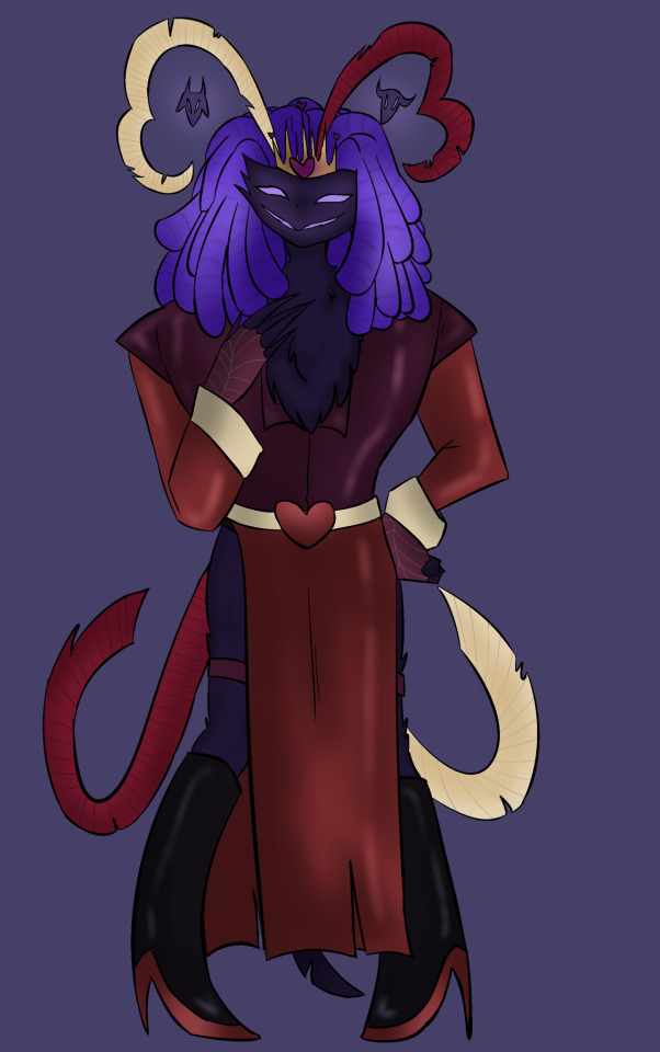
Next is Asmodeus! My main focus was to make it more evident which sin he represented — while I love Ozzie’s design, I felt like his color palette could be slightly more representing of the sin of lust, so I shifted toward warmer toned colors such as red and purple, while sacrificing the green and blue. I wanted to bring across more gender-fluidity since lust is something I think it is important to represent through various gendered lenses and so I went for the whole upper-half masculine lower-half feminine thing that you see here with a vest+button up and a long slit skirt! I also wanted to show more heart motifs that appear to be evident in ironically all of lust and its inhabitants besides Ozzie most of the time, and so I curved his tail and head feathers in a way that made heart shapes, and I placed Bull and Ram in a way where they’re more visible and stand out more so as their own little entities since it’s implied they’re separately sentient.

My girl Beelzebub! I LOVE her design, but I do feel like it leans heavier toward hellhound (and fox somewhat) and not enough toward her insect features, so I gave her Bee stripes as well as putting more emphasis and effort into her wings. I kept the multicolored lava lamp hair and belly but made an extra effort to highlight the gold in it to emphasize the honey/bee theme, while also placing this texture in other places such as her paws and inner-ears. I also gave her a honeycomb crown, and more loose-fitting flowy clothing to display her fun and laid-back nature, while referencing her bee themes again by adding a yellow gradient meant to mimic pollen that gets stuck on bees during their pollination process. I also gave her the funky bug eyes :) anddd sorry but I took away the mohawk, it just felt too cluttered for me to draw among other things.


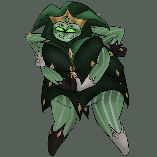
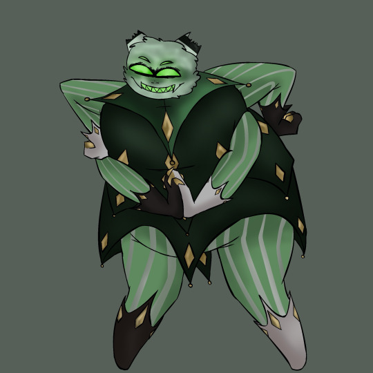
Here’s Mammon! I may be biased but I love his design so much already that it was difficult to change a whole lot. However, I did find things that I wanted to change. For one, you may notice there are hat and no-hat versions of Mammon here, and that’s because I wanted to display the broken imp-like horns I gave him. In biblical mythology, Mammon often disguised himself as someone who was poor or in need so that he would be able to garner profit from pity, and I think that there is no better way to represent that than ripping off his favorite little brand-baby. I edited a lot of the black in his color palette to be gold instead, as well as adding gold to the fingertips of his gloves as a reference to Midas’ touch. I gave him more of a spider-like appearance since according to a lot of the fandom his species is fairly ambiguous, and I made his shirt (or whatever you call that lol) a bit shorter and less cluttered because I often struggled with drawing it. I also attempted to adjust his proportions a bit as I feel like the designs for the fat characters in Helluva and Hazbin often struggle a bit with proportions and it feels important to me to better represent them.
That’s all I got, but I also created my own takes on the sins that haven’t been revealed yet, which may end up being one of my next posts! I’m doing my best to stay active in the art community and this media has given me some motivation and fuel. Any input is welcome as long as we stay positive ❤️
Reminder as well that my commissions are very open!
#bunneclair art#wlw artist#queer art#queer artist#art#commissions open#helluva boss#hazbin hotel#helluva boss fanart#hazbin hotel fanart#helluva boss redesign#hazbin hotel redesign#lucifer morningstar#hazbin lucifer#helluva boss mammon#helluva boss asmodeus#helluva boss beelzebub#hellaverse art#hellaverse fanart#hellaverse#helluvaboss sins#looking for commissions#character design#character redesign
36 notes
·
View notes