#i also keep making like. icons for him. like drawing and cropping etc.
Explore tagged Tumblr posts
Text
okay so i am still procrastinating making the oc posts but I realized that i never actually posted these answers to questions about newt that no one asked and I actually wrote them like ages ago (aka a few months i think) but yes here they are!! keep reading if you're interested in the crop-top wearing blond mullet twink i keep drawing!! i am copying them straight off of my deviant art page in case you're wondering why they're written more properly than my regular posts. also i am on pc for once idk how thisll look on mobile
content warning for drug use, alcohol use, sex and self harm idk if there's a way to tag it officially or if i should just mention it here
Full Name? Nathan Anthony Cooper
Nicknames? Newt
Pronouns? He/Him
Age? Depends on "when" in his storyline we're talking about, but I typically draw him around 20-26 :]
Birthday? January 15
-----------------------------------------------
Where was he born? Where does he live now?
He was born in Florida, USA, and lived there for the first few years of his life, but moved to Texas with his mother and younger sister when his parents divorced. A few more years later, they moved to England, which is where he lives now. I have yet to decide where in England, though.
Who are his parents?
His mother, Sally Mae Cooper, is a business woman, and she used to breed Tennessee Walking Horses back in America. She still has a breeding program in England, but in a much smaller scale, and most of the foals get exported back to the states, for her old breeding partners to use. She doesn't like to just lounge around, and almost always keeps busy. She sometimes struggles with balancing her attention, which has made Newt feel quite left out, especially when he was younger. When Sally isn't busy with her job or the horses, she's often spending time with Newt's sister, Emily, as the two of them have more in common than her and Newt does. She does love her two children equally, even if she struggles with showing it. Newt's father is an irrelevant pos and does not even have a canon name.
Does he have any siblings?
Yes! I've already mentioned her briefly, but he has a younger sister. Her name is Emily, and she's two years younger than Newt. She likes sports, specifically soccer, horseback riding (eventing and vaulting), and roller skating. Her and Sally travel to horse events together quite often, which, once again, makes Newt feel a little left out. Her and Newt get along like siblings typically do, with screaming matches and pointless arguments, quickly solved by a "hey, can I borrow your charger?" five minutes later. She did distance herself somewhat when Newt's mental health spiraled.
What does he work as?
Once again, depends on when in his life we're focusing on, but the answer is either university student, stripper, prostitute or bartender.
-----------------------------------------------
How tall is he?
193cm, which I believe is around 6'3''
Hair and eye color?
His hair is blond naturally, but he used to dye it when he was younger. (Turquoise at 13, black at 14, natural with a turquoise streak at 15, and natural since then). His eyes are blue.
What style of clothes does he wear?
Does he consider himself attractive?
Oh, loaded question!! So many thoughts!! Okay, so, Newt's response to this question would probably be something like "Well, duh, have you seen me? Are you blind? Suffering from some kind of brain damage?", but truthfully? He's very insecure. He doesn't leave the house without spending an hour on his appearance - including make-up. Yup, he canonically wears make-up. Also, those iconic, long lashes of his? They're fake. He most definitely says they're real though. So, to answer the question: He does not.
I am absolute garbage at labeling styles, but in public, he mostly wears leather pants, boots and crop tops, with accessories like a harness, bracelets, rings, etc. At home he wears sweatpants and comfier crop tops. He wears short shorts at the gym specifically to get attention and looks, fun fact.
Any scars, piercings, tattoos, birthmarks, etc?
Pierced ears, snakebites, an eyebrow piercing, and a tongue piercing. He's got tattoos on his hands and arms, and a tramp stamp. He also has a small, shitty tattoo on his inner thigh. He got that one for free at a party.
-----------------------------------------------
Allergies?
Pollen
Left- or right-handed?
Left-handed
Any notable body language?
He scratches the back of his neck when he's nervous, and he almost always sits with his legs crossed, if that counts. He also covers his mouth when laughing.
School stuff
Newt was one of the few kids in his high school who were openly LGBT, which had its obvious side effects. That, combined with his obsession with his appearance, left him with very few friends.
He only stayed in uni for about two years, eventually dropping out. Even if he hadn't dropped out, he would likely have been expelled, as he had straight F's and mostly spent his time there partying. He spent more of his days there intoxicated than he did sober.
What about after uni?
He moved back home to Sally, still intoxicated most of the time, using his mother's money to fuel his addictions and habits. A few arguments and crashed cars later, Sally had enough of his shit, got him a house, gave him enough money to survive until he got a job, kicked him out and told him to get his shit together.
What was his dream job as a kid?
Rockstar
-----------------------------------------------
Greatest fear?
Abandonment
Attachment style?
Fearful avoidant
Does he have a partner?
Newt has had multiple partners through his life, always wanting to be in a relationship, but getting cold feet as soon as things get serious. Him and Ben are endgame though.
Friends?
Marc is Newt's closest friend. They met wayyy back as kids, when one of them saw the other harassing bugs at the park. Max is another relevant friend, him and Newt met in uni, being friends with benefits and generally just enabling each other's bad habits. Newt ghosted him after Max OD'd at one of Newt's parties.
Does he tend to argue with people, or does he avoid conflict?
He gets into arguments quite often as he's emotional and impulsive, but he retaliates quite quickly. He's all bark and no bite.
Is he a listener or a talker?
Talker, or infodumps, listens to infodump, infodumps, etc etc.
How quickly does he judge people?
Very
-----------------------------------------------
Hobbies?
Playing the guitar, clubbing, most music related things, working out, and video games.
Favorite color?
Black, or dark turquoise
Favorite food?
Salads
Favorite candy?
Lolipops
Favorite snacks?
Popcorn
Favorite ice cream flavor?
Mint chocolate chip
Favorite movie genre?
Horror and slashers
-----------------------------------------------
Does he smoke?
Yes
Use drugs?
Yes, specifically cocaine and MDMA.
Alcohol?
Yes. He prefers wine, if you're curious.
How does he deal with stress?
How long is his attention span?
Diagnosed ADHD.
Self harm in the form of drugs and sleeping around. Alternatively, breaking down sobbing on the bathroom floor.
-----------------------------------------------
Does he like animals?
Yes, especially cats.
What about children?
He finds them loud, gross and annoying. His niece is the exception.
Does he have any pets?
Yes, multiple!
Onyxia, a super black pastel ball python
Asparagus, a calico cat with a bob tail
Petrol, a tortie cat (he made a vest for her out of an old pair of jeans)
Jägermeister, an older, black tabby cat with a relatively harmless but permanent cough
Other notable stuff?
He's not actually gay, he's bisexual with a heavy male preference. Common misconception, especially as I never really draw him with women.
If you've got any questions at all, ask away, I could talk about this guy for hours :]
1 note
·
View note
Text
i just realized anyone coming from my main blog (cursedfortune/mortem) had the old link (pinkfxry). oops. i followed you all on here. i’m gonna be getting the characters i’ve had muse for up soon and tidying up this place.
thanks for the follows! i hope we have fun here. :D
as it stands the character list at the moment looks like the following:
the archon (mass effect: andromeda)
amisen parm (dragon ball oc)
mordred (arthurian legends/my own interpretation)
skull knight (berserk)
florian greenheart (overlord 2)
sparrow (fable 2)
#fun fact: i keep almost making a blog for florian greenheart because. i love that prick. and only wrote him a short while#but i haven't been able to like. commit i guess? to making a single blog since he's a bit of an unique elf and like#idk anyone outside of like two people who know the overlord games so it's me inserting a weird envious and malicious jerkoff into other#elven based fandoms and that hasn't led me to much success#but i have just. so much muse and hc's and stuff for him for YEARS. so hoping having him on a multi helps?#i also keep making like. icons for him. like drawing and cropping etc.#i just want to write my jerk boi gdhtyjfhdgrdh#but yes i love this list so far lmao it will eventually grow but it's neat atm ouo
4 notes
·
View notes
Note
hi!! i love your moodboard a lot :) do you think you could do a tutorial on how you color them?
Hey there! First of all, thank you so much for your kind words! I’m glad you’re enjoying them. ♥
Now, if it’s only the coloring part you’re interested in, the short answer is Photoshop, but there’s not much of a process set in stone. Each moodboard is different and unique, so there’s a lot of experimentation and fiddling and tinkering until things start looking good. But! I will try my best to give you a few tips and pointers on how I go about it.
Under the cut, because it got long:
Part 1
First, I start by gathering my pictures. I only end up uploading nine of them but I often start with 20+ because I like having many options to choose from. I crop and resize them so they’re all 300x300px using Photoscape. I find it easier to do this in Photoscape than Photoshop, the batch edit feature is especially handy for resizing all pictures at once.
It helps a lot when you have a general theme in mind and details like colors you want to use, whether it should be more faded or vibrant, bright or dark, colorful or monochromatic, etc. because you can gather visually similar pictures from the start and make your job of editing them so much easier.
For example, I’m working on a moodboard for Willy from Stardew Valley right now. I associate him with blues, greys, sandy colors, all desaturated and light. So this is what my folder of pictures looks like:

I know this isn’t exactly part of the coloring process, but it’s probably the best tip I can offer. If your pictures already match one another, you’ll have a much easier time making the final product look homogeneous and pleasing to the eye once you put them together.
Part 2
The next step is loading them all in Photoshop: File > Scrips > Load Multiple DICOM Files and then select the whole folder. Make sure your Workspace is set to Motion (from the Window tab) and then press Create Frame Animation. At this point it should look like this:

Next, you click on that little icon I highlighted in red and Make Frames From Layers. To make things easier, click on the same icon again, and then Reverse Frames, just so that the first frame on the timeline at the bottom corresponds to the layer at the top of our stack on the right and the layers don’t get mixed up.

Now we have all our pictures loaded and can edit all of them at the same time. I find this infinitely easier than editing each one individually, especially because you get to see what they look like next to each other without having to switch back and forth between 20 different windows.
Important note: for this to work, your pictures must be the exact same size. Otherwise, they won’t load properly and it’ll be a mess, so make sure you resize them beforehand.
Part 3
Now to the actual coloring! This is where it gets tricky because as I’ve said, it’s different for each moodboard. Sometimes I use .psds I’ve made myself, sometimes made by other people (a quick search of ‘free psds’ here on Tumblr will help you find tons of resources), sometimes I make something new (and then forget to save it, lol), other times I put together all of the aforementioned.
For the sake of this tutorial though, I’ll create something new just for this moodboard and try to explain a bit of what I’m doing.
Things to keep in mind: if you want a layer to affect all pictures, you put it at the very top. If you want it to edit only one picture, you use the Create Clipping Mask feature and put it directly above the picture you’re editing.
Here are the first three layers I started with: two adjustments to Saturation and Brightness and one Fill layer with a medium grey color set to Lighten.

Already my pictures look like this, which I think is very promising!

But some pictures have more green and yellow in them than others and I want to ‘equalize’ that, so next I’m going to play with Selective Color layers.

I add a Color Lockup layer set to Drop Blues as well because I think it adds a ‘misty’ feel to the pictures, which is in line with Willy’s fishing / sea aesthetic.
My pictures look like this now and I think that’s it!

As I mentioned in the beginning, having visually similar pictures helps a lot, so I didn’t have to edit too much this time. But there is no wrong or right here, just play around with adjustment layers a lot, add Fill layers and set them to different colors and different Blending Modes to see what happens and what looks good.
Part 4
To save your edited pictures, all you have to do is go to the File tab > Export > Render Video.. and make sure your settings look like this:

Then simply click Render and all your pictures will be saved in your chosen folder. All I have left to do now is play around with arranging my pictures until I find nine that look good together. Maybe like this:

Another tip I can give you here is to pay attention to the composition of each picture! Which ones are more ‘light’ and which ones feel more ‘heavy’ so you can balance them together. In my example, the right corner and the left bottom feel ‘heavier’ to me so I placed them like that to balance the whole thing. The popping red that draws the eye first is in the middle, and around it, there are four pattern-like pictures. The top left and bottom right also have about the same amount of the same hues, so they’re placed at opposite corners.
I don’t know if this is the best example, so here’s another from the Sandy moodboard I posted recently. Bright, intense purples in the corners and the middle, balanced by cream, orange, and green in between:

I would that this is my biggest ‘secret’ when it comes to making moodboards: it’s all about finding a balance! :D
I hope this whole thing makes sense and it’s helpful somehow. If you have any more questions or need me to clarify anything, please don’t hesitate to ask! I know I’m not the best at explaining things so it might be a bit confusing haha
#asks#cockbiteproductions#random stuff#tutorials#long post#thank you for the question and i hope this helps at least a little bit! :)
30 notes
·
View notes
Link
Today’s blog is going to be a bit different. It’s one of the rare Mondays we aren’t holding our weekly meeting, in that it’s the Labor Day holiday here in the US and a bunch of us are all over the place taking care of everything from finishing up conventions to driving a kid back to college.
So, while we still have our updates and all that, I don’t have a meeting’s worth of notes to share with you in some mutated form. Instead, I thought I’d selfishly take the opportunity to talk about one of my processes; specifically, the process I go through to design the look of one of our game line’s cover treatments.
In this case, I’m talking about the cover for Trinity Continuum: Aberrant.
To do that, we need to go back to when I was designing the overall look of the entire Trinity Continuum line. Sitting down and considering what direction to go with it, I made the a call to make sure the covers let folks know that they were part of a series, rather than the direction of the original editions where I wanted each core book to reflect the genre the game was designed to emulate.
I’m talking about the funky and unique plastic binding of Trinity (Aeon), the graphic novel look of the Aberrant cover, and the pseudo-distressed look of an old pulp magazine for Adventure!.
I think we did a pretty nice job on them way back when, but now that we are emphasizing the fact that these game lines exist in a Trinity Continuum, I was looking for a way that the cover treatments would also relay that information.
A timeline sort of feel – something that could be read as moments along the Continuum – was what I was looking for, but my first idea, a single illustration that we’d cut sections out of for each main book, just wouldn’t work as intended. After all, we expect to add all sorts of new time periods and genres, so how could those be worked into a single illustration before we even could know which ones we were doing?
Instead, what if each point on the timeline that represented a new slice of the Continuum was represented by a vertical illustration that collaged together the high points of that setting? I could picture them springing up all along the timeline, with maybe the “tent pole” game settings of the Trinity Continuum: Core, TC: Adventure!, TC: Aberrant, and TC: Aeon, getting the largest and most involved images for their covers, and other books having treatments that were as involved as the books warranted.
Something like this:
That would give us an underlying structure that tied into the Continuum concept – and it is always a good thing to try and put new concepts into some sort of visual design that reinforces and even explains that new concept – yet not have a design that would constrict our ideas and cover visuals.
Here’s what the TC: Core and TC: Aeon covers look like:
Now for TC: Aberrant, I was able to start with continuing the structure set up with the previous covers, and I had the original edition’s collage cover by the awesome Tom Fleming to draw imagery from to give us the quite accurate sense of a connection between the two editions. So things like a cityscape at the bottom, and making sure we got a T2M logo somewhere in it, were natural choices for imagery.
Which scenes, which head-shots, and which full figures to be featured were a different matter entirely. A lot depended on just what we wanted this edition to have as themes, or basically, what kind of moments and characters best show off the setting folks will find past the cover?
For the biggest, focal-point full-body figures: we’d talked about the changes to The Fireman’s story, so I knew he was still an inspirational figure – maybe even moreso in this edition. I even played around with having the central image be his statue, but decided on keeping the focus on the living hero.
Divas Mal, of course, needed to be in a position of prominence, and I wanted the swirl of his cloak to talk about one of our most iconic characters also being a comic book character. Around him, the leading figures in his movement, since Mal was still a messianic figure that movements coalesced around in this edition.
Some rough sketches along the way to the cover design.
Then between them, another iconic and powerful character, Antaeus – even before we knew the lead-in webcomic would feature him. Smaller figures would run the gamut of the various kinds of Novas – mercenary Elites, celebs in the public eye, T2M members, etc. I also wanted a wide range of physical types.
Some head-shot characters as a call back to the first edition cover, and to break up the figures on a visual level. I knew Matthew and Eddy were anxiously awaiting a chance to pitch a supplement detailing the Nova wrestlers that featured way to prominently in first edition (IMHO), so Lance Stryker reprises his head-shot, along with the iconic Cestus Pax to reassure long-time fans that the hero you love to hate was still in there. (Especially since Ian Watson had already made some strong changes to the character).
Just like on the previous two book covers, the three characters above the cityscape are new ones, but again, I was pushing to hit some archetypes and expand some physical types. Plus, we had discussed a long time back that “inventor” type characters would be able to go all Tony Stark, so a powered-suit character needed to be on there to suggest that change in this edition.
For iconic scenes, I started with the Galatea explosion, and the attack on the Lincoln Memorial by Geryon. Both of those have also been moments from which a lot of the further events of the setting sprung. Then a few more, like a T2M rescue just to get the team into the cover a tad bit more, as even tweaked, I know they were still a great entry point for lots of folks coming to TC: Aberrant already aware of the idea of superhero teams.
Because, even with all that pre-planning, there were still tweaks to be made. The biggest came late in the actual illustrating when I was reminded that in this edition’s continuity Slider isn’t murdered. I’d designed the cover before the writing was done, and forgotten I’d included the Slider assassination as one of the cover moments. Whoops! We had to get that fixed even later than Mirthful Mike’s cover mock-up for the Kickstarter.
And please, lest you think this whole blog is me suggesting the covers are all a RichT production of a RichT idea, directed by and starring RichT, let me be clear that most of my efforts end by handing off my sketches to Mirthful Mike Chaney, who not only art directs the cover illustrations based on the sketches, but follows up on the illustrator’s versions and my notes on them, and then makes the illustrations sing by how he has done the graphic design for the covers.
Fantastic artist Shen Fei, who has illustrated the covers for all three books so far, has so far blown away and improved my ideas by a quantum level – and I expect that TC: Adventure! will also be for more beautiful than I imagined as I sketched it out! (And I can imagine a fair bit of beautiful.)
So, that’s pretty much it for this week. Just a little peak behind the scenes on how we do the voodoo that we do so well in order to illuminate our:
Many Worlds, One Path!
BLURBS!
Kickstarter!
Keep an eye out in this space as well as on our social media for the Deviant: The Renegades Kickstarter that will be launching later this month!
Onyx Path Media!
This Friday’s Onyx Pathcast features recordings from GenCon! Go to https://onyxpathcast.podbean.com/ or to your favorite podcast venue!
The Onyx Path News show went out live today, with talk of Vampire, Werewolf, Chronicles of Darkness, They Came From Beneath the Sea!, Dystopia Rising: Evolution, and all kinds of other games, along with lots of meandering nonsense from Matthew! https://youtu.be/ZVmX1n_54Fc
Our Twitch channel has a bumper crop of content coming up this week, with almost every day populated with a show! There’s Scion, Scarred Lands, Vampire, and more! Check us out and give us a follow on www.twitch.tv/theonyxpath
Here’s a special treat for fans of Mage: The Awakening! Occultists Anonymous have four new episodes for you right here as follows:
Episode 37: Forging Futures With Atratus still within her soul and tensions running a little high, Wyrd and Songbird split the party. Plans are made for the future of the cabal and the individual mages. https://youtu.be/ay54wbYhs7Y
Episode 38: In the Wings Wyrd the Seer and Songbird work to restore a wounded Hallow. Atratus experiments with the new strength of her Matter Arcana. https://youtu.be/ZsMa26FER4g
Episode 39: Lady of the Lake Wyrd the Seer delves into her Oneiros to confront the conflicts within her own soul. Songbird prepares for his UFC fight. Atratus speaks with her dead brother. https://youtu.be/AD2UTOzWSq8
Episode 40: He’s Back Acanthis, the fighter formerly known as Songbird, returns to a UFC fight, then the cabal goes to Jimmy “Smalls” Patinko’s place for a party. Enjoying the nightlife in New York City… https://youtu.be/yULxjFKo-iE
The Story Told Podcast continue their excellent Dragon-Blooded actual play. As the Dragon-Blooded set out again on the road to Daric, Kai discovers evidence of a small band of travelers attempting to hid their presence. The Dragon-Blooded decide to investigate. https://thestorytold.libsyn.com/
Our Scion: Athens, Ohio actual play is now on our YouTube channel right here https://youtu.be/gQv3599lczo along with promo videos here https://youtu.be/drNIV5G8Vys and here https://youtu.be/9_1X8l1RXaQ Expect more to come in the coming weeks!
Drop Matthew a message via the contact button on matthewdawkins.com if you have actual plays, reviews, or game overviews you want us to profile on the blog!
Please check any of these out and let us know if you find or produce any actual plays of our games!
Electronic Gaming!
As we find ways to enable our community to more easily play our games, the Onyx Dice Rolling App is live! Our dev team has been doing updates since we launched based on the excellent use-case comments by our community, and this thing is awesome! (Seriously, you need to roll 100 dice for Exalted? This app has you covered.)
On Amazon and Barnes & Noble!
You can now read our fiction from the comfort and convenience of your Kindle (from Amazon) and Nook (from Barnes & Noble).
If you enjoy these or any other of our books, please help us by writing reviews on the site of the sales venue from which you bought it. Reviews really, really help us get folks interested in our amazing fiction!
Our selection includes these fiction books:
Our Sales Partners!
We’re working with Studio2 to get Pugmire and Monarchies of Mau out into stores, as well as to individuals through their online store. You can pick up the traditionally printed main book, the screen, and the official Pugmire dice through our friends there! https://studio2publishing.com/search?q=pugmire
We’ve added Prince’s Gambit to our Studio2 catalog: https://studio2publishing.com/products/prince-s-gambit-card-game
Now, we’ve added Changeling: The Lost 2nd Edition products to Studio2‘s store! See them here: https://studio2publishing.com/collections/all-products/changeling-the-lost
Scarred Lands (Pathfinder) books are also on sale at Studio2, and they have the 5e version, supplements, and dice as well!: https://studio2publishing.com/collections/scarred-lands
Scion 2e books and other products are available now at Studio2: https://studio2publishing.com/blogs/new-releases/scion-second-edition-book-one-origin-now-available-at-your-local-retailer-or-online
Looking for our Deluxe or Prestige Edition books? Try this link! http://www.indiepressrevolution.com/xcart/Onyx-Path-Publishing/
And you can order Pugmire, Monarchies of Mau, Cavaliers of Mars, and Changeling: The Lost 2e at the same link! And NOW Scion Origin and Scion Hero are available to order!
As always, you can find most of Onyx Path’s titles at DriveThruRPG.com!
On Sale This Week!
This Wednesday, Night Horrors: Shunned By the Moon for Werewolf: The Forsaken 2nd will be available in PDF and physical book PoD versions on DTRPG!
Conventions!
Save Against Fear: October 12th – 14th GameHoleCon: October 31st – November 3rd PAX Unplugged: December 6th – 8th 2020: Midwinter: January 9th – 12th
And now, the new project status updates!
DEVELOPMENT STATUS FROM EDDY WEBB (projects in bold have changed status since last week):
First Draft (The first phase of a project that is about the work being done by writers, not dev prep)
M20 Victorian Mage (Mage: the Ascension 20th Anniversary Edition)
Exalted Essay Collection (Exalted)
Dragon-Blooded Novella #2 (Exalted 3rd Edition)
Exigents (Exalted 3rd Edition)
Many-Faced Strangers – Lunars Companion (Exalted 3rd Edition)
Contagion Chronicle: Global Outbreaks (Chronicles of Darkness)
Player’s Guide to the Contagion Chronicle (Chronicles of Darkness)
Contagion Chronicle Jumpstart (Chronicles of Darkness)
N!ternational Wrestling Entertainment (Trinity Continuum: Aberrant)
Creating in the Realms of Pugmire (Realms of Pugmire)
Redlines
Tales of Aquatic Terror (They Came From Beneath the Sea!)
Kith and Kin (Changeling: The Lost 2e)
Wraith20 Fiction Anthology (Wraith: The Oblivion 20th Anniversary Edition)
Crucible of Legends (Exalted 3rd Edition)
Lunars Novella (Rosenberg) (Exalted 3rd Edition)
Yugman’s Guide to Ghelspad (Scarred Lands)
Vigil Watch (Scarred Lands)
Pirates of Pugmire KS-Added Adventure (Realms of Pugmire)
Second Draft
Tales of Good Dogs – Pugmire Fiction Anthology (Pugmire)
Dragon-Blooded Novella #1 (Exalted 3rd Edition)
Across the Eight Directions (Exalted 3rd Edition)
One Foot in the Grave Jumpstart (Geist: The Sin-Eaters 2e)
Scion: Demigod (Scion 2nd Edition)
Titanomachy (Scion 2nd Edition)
Trinity Continuum Jumpstart (Trinity Continuum Core)
Terra Firma (Trinity Continuum: Aeon)
Monsters of the Deep (They Came From Beneath the Sea!)
Development
M20 The Technocracy Reloaded (Mage: the Ascension 20th Anniversary Edition)
Creatures of the World Bestiary (Scion 2nd Edition)
Heirs to the Shogunate (Exalted 3rd Edition)
City of the Towered Tombs (Cavaliers of Mars)
TC: Aeon Jumpstart (Trinity Continuum: Aeon)
Mummy: The Curse 2nd Edition core rulebook (Mummy: The Curse 2nd Edition)
Masks of the Mythos (Scion 2nd Edition)
TC: Aberrant Reference Screen (Trinity Continuum: Aberrant)
Manuscript Approval
Creatures of the World Bestiary (Scion 2nd Edition)
W20 Art Book (Werewolf: The Apocalypse 20th)
Scion: Dragon (Scion 2nd Edition)
Scion Companion: Mysteries of the World (Scion 2nd Edition)
Legendlore core book (Legendlore)
Post-Approval Development
Trinity Continuum: Aberrant (Trinity Continuum: Aberrant)
V5 Chicago Screen (Vampire: The Masquerade 5th Edition)
Deviant: The Renegades (Deviant: The Renegades)
WoD Ghost Hunters (World of Darkness)
Scion LARP Rules (Scion)
Geist 2e Fiction Anthology (Geist: The Sin-Eaters 2nd Edition)
Oak, Ash, and Thorn: Changeling: The Lost 2nd Companion (Changeling: The Lost 2nd)
Cults of the Blood Gods (Vampire: The Masquerade 5th Edition)
Editing
Night Horrors: Nameless and Accursed (Mage: the Awakening Second Edition)
Lunars: Fangs at the Gate (Exalted 3rd Edition)
TC: Aeon Ready-Made Characters (Trinity Continuum: Aeon)
Hunter: The Vigil 2e core (Hunter: The Vigil 2nd Edition)
Chicago Folio/Dossier (Vampire: The Masquerade 5th Edition)
City of the Towered Tombs (Cavaliers of Mars)
Let the Streets Run Red (Vampire: The Masquerade 5th Edition)
W20 Shattered Dreams Gift Cards (Werewolf: The Apocalypse 20th)
Post-Editing Development
Memento Mori (Geist: The Sin-Eaters 2e Companion)
DR:E Jumpstart (Dystopia Rising: Evolution)
Pirates of Pugmire (Realms of Pugmire)
Indexing
Geist 2e (Geist: The Sin-Eaters 2nd Edition)
ART DIRECTION FROM MIKE CHANEY!
In Art Direction
Contagion Chronicle
Trinity Continuum: Aberrant
Hunter: The Vigil 2e
Ex3 Lunars – Contracted. Sketches rolling in.
TCfBtS!: Heroic Land Dwellers
Night Horrors: Nameless and Accursed
Ex3 Monthly Stuff
DR:E Threat Guide – Helnau’s Guide to Wasteland Beasties – Contracted.
Deviant (KS) – Contracted. Putting together KS graphics.
Trinity RMCs – Contracted.
Cults of the Blood God (KS) – Sending out art notes.
Chicago Folio – Art notes going out this week.
Mummy 2 (KS) – Got Matthew’s notes.
Memento Mori – Small book, throwing it to Drew and Luis.
In Layout
They Came from Beneath the Sea!
Dark Eras 2 – Files with Aileen
Trinity Continuum Aeon: Distant Worlds
VtR Spilled Blood – With Josh. Everything is in, so he should be cruising.
Aeon Aexpansion – Need to do cover.
Proofing
C20 Cup of Dreams
Signs of Sorcery – Inputting errata.
M20 Book of the Fallen
DR: E – Back to Eddy for XXs.
DR:E Jumpstart
CoM – Witch Queen of the Shadowed Citadel
At Press
Dragon Blooded – Shipping wrapping up.
Dragon-Blooded Cloth Map – Shipping wrapping up.
Dragon-Blooded Screen – Shipping wrapping up.
Trinity Core Screen – At Studio2.
TC Aeon Screen – At Studio2.
Trinity: In Media Res – PoD proofs coming.
Trinity Core – Printing. PoD proofs ordered.
Trinity Aeon – Printing. PoD proofs ordered.
V5: Chicago – Prepping files for press.
You Are Not Alone (TC: Aberrant Comic) – PoD proof ordered.
Shunned By the Moon – PDF and PoD physical book versions available this Wed. at DTRPG!
Today’s Reason to Celebrate!
Thanks to Impish Ian Watson for posting this: “50 years ago today, two computers at UCLA were connected via a 4.5-meter cable, giving birth to what we call the Internet. Happy birthday, Internet.” Because without the internet, Onyx Path would just not work – we need the connections around the world to do what we do!
2 notes
·
View notes
Text
Animation Direction and Aesthetic Appeal: Why I Didn’t Like Book of the Atlantic
For the record, if you really loved Book of the Atlantic and thought it looked great and/or are sick of people bitching about it, you probably won’t want to read this post.
If you didn’t like the movie, thought the movie looked terrible, are curious about how and why people don’t like it, or, most importantly, want to read about aesthetic techniques and how they relate to anime in general, please continue.
I want to really talk about animation, visual direction, and adaption techniques, and I want to use Kuroshitsuji: Book of the Atlantic as a negative example, because I soooo wanted to love this movie and ended up really disliking it.
For the most part, this post is just me getting something off of my chest, because I feel like there’s this grand misunderstanding held by people who didn’t like the movie about why the movie looked bad.
I just disagree with the consensus so strongly that I...I have to make a post about it. Because every review I’ve seen of this movie mentions how just the cgi is bad, or it just looks like they didn’t have enough money amiright?
I just think it is so much more interesting complicated than that.
Lots of text under the cut.
I’ll just get the basics out of the way: the cgi does not look well integrated and some of the background faces are derpy.
Moving on.
Part 1: Something to keep in mind:
Anime movies tend to look better than weekly anime tv shows because they are given both more time and a higher budget. This is why so many people thought it was unfair that A Silent Voice was up for Best Animation in the Crunchy Roll awards.
This is kind of unimportant but I would like you to keep it in mind while reading the rest of this post.
Part 2: What does good animation even mean?
I’ve heard a defence for the movie’s lacklustre animation is that it looks like all of the money went towards the fight scenes, or that the fight scenes make up for everything.
I’ve seen the fight scene between Sebastian, the reapers, and Undertaker a few times and I’ll admit, there are a few nice cuts early on with some very dynamic dodges and attacks, but after that it’s a lot of easier techniques, like held poses, slow motion falls, cut aways, frame movement, etc. The fight scene as a whole I would (personally) consider to be pretty “meh.”
This might sound kind of harsh, but even if you totally disagree with me and think the fight scene looked great, that just means it looks nice.
That fight scene is not especially well animated.
What takes up the most time and money in animation is the amount and detail of movement (key animation). Look at any important fight scene from FMAB, or BNHA, or the early episodes of Kabaneri of the Iron Fortress. Those big fight scenes have a lot of key frames and details, and they all have wwwaaaay more key animation than the big fight in BotA despite being weekly tv shows.
One Punch Man is a great example because the animation in that show is fucking stellar and the director straight up said that the budget for One Punch Man is not much higher than a typical tv anime budget. Time and skill are the more important factors.
So, not speaking from the perspective of visual appeal, but from the perspective of animation quality, the big reaper fight scene in BotA isn’t that good.
Even the scene everyone raves about, where Lizzy fight all of the zombies: there’s a nice cut of her steps and a cool shot where she stabs one of the zombies in the head from above, but her sword then turns into a flash and we don’t see many details involving aim or choreography. Her stabbing them through the hallway also doesn’t have any real choreography other than her running and spinning once. After she stops to talk to Ciel, the scene gets a little more dynamic with more complicated moves, but it’s shot from far away and still has few key frames. I’ll admit I think it still looks kind of cool and maybe better than how it looked in the manga, but I don’t even think it’s close to the level of quality that’s in a lot of Bones shows.
Anyways, even if you’re in the majority camp and think these scenes look good, compare them to any of the shows mentioned above and you’ll see that even if they look good, they wouldn’t be especially difficult or expensive to animate, and aren’t impressive from a technical standpoint.
Part 3: Make a collage with those cut corners
Shifting focus a little bit, let’s talk about Higurashi.
Higurashi is one of my top 10 favourite shows (I highly recommend it if you’re not too squeamish). This show also looks awful. Like, really awful. There’s barely any movement, the characters are off model almost 100% of the time, and it has a very simplistic art style.
Despite being outright ugly, Higurashi still visually impresses me more than BotA because of one very simple, yet very very important fact:
The director and animators are trying their best.
Check out the scene in this gif set (gore warning). There’s a shadow silhouette, repetitive movement, and not much detail in the eyes, so it’s not technically impressive in terms of animation, but the way that the screen shakes when the bat lands, the lower angle used to put Keiichi in a dominating position of the frame, and the colour blur expressing the fact that this is both very emotionally intense and set at a different time make my brain say “ah yes, thought was put into making this scene look good with limited resources.”
Simpler yet is this scene, where it’s just two characters standing and talking while being atrociously off model. But the way they’re placed on the screen (ie parallel but opposing) is both cool visually and thematically relevant. It’s got a nice colour pallet, too.
Higurashi likes to play around with visual perspectives. This scene (violence warning) has no animation in the first gif and repetitive, fast movements in the second, but it takes the perspective of a man about to be beat to death with a baseball bat, which still makes it feel tense.
There’s another top fucking notch scene where someone is digging their own throat out with their finger nails, and instead of showing what would be a difficult scene to animate, they have a zoom in on the character’s back from the perspective of an impending threat that may or may not exist closing in on him and it’s terrifying despite the fact that nothing is animated.
Directing choices like these are extremely common in Higurashi.
Another slightly less obvious example would be Princess Tutu (which is one of my top 5 favourite shows that I recommend to everyone). Princess Tutu has very very few moments of sakuga and lots of repeated animation and kind of inconsistent movement in some scenes.
It looks cheaply made and is not well animated, but literally no one gives a fuck because that show has beautiful character designs, beautiful colour design, and interesting/creative set pieces.


The point is it’s 100% possible to make a cheap as fuck, poorly animated show and not have it look terrible.
I guess this is just my opinion, but when I compare the visual direction in Higurashi and the art of Princess Tutu to the flat, poorly blocked, and underwhelming visuals that make up a lot of BotA, I grow significantly less impressed with it.
The production team stuck pretty damn close to the manga, but the manga looks good because the panels are highly detailed illustrations that are specifically designed to look good when they are standing still and in black and white. They are also placed on a page which controls the visual pacing and lets you fill in movement with your imagination.
Translating this directly into animation but taking out the detail and shading in the illustrations and having the movements look worse than they did in my imagination does...not...look as good.
Part 4: Adapt
Let’s say, hypothetically, that BotA had fewer resources than most anime movies for some reason (money, time, staff, etc.). Sure, I don’t know the behind the scenes details. I doubt this was the case, but it very well might be.
.......Then why did they adapt the source material the way they did?
The manga for Kuroshitusji is fucking gorgeous and has some really iconic panels. For example, check out this post comparing a beautiful panel with the same scene from BotA.
...Why? Why would you make it that way?
Is it because you think it’ll please the fans to keep it the same? Because you wanted to cut a corner and use the manga as a storyboard?
Because it sure as fuck wasn’t because it would look good in the anime adaptation.
If the director and/or animators wanted to do the same scene but with limited resources, they could have maybe cropped it so it focused just on the undertaker’s face and the girl’s face, and then focus on making that look pretty and/or detailed. They wouldn’t have to put extra time and effort into drawing a nice full body shot, but they could still have it look good.
I came up with that time and money saving idea in less than 10 seconds and I’m not even a god damned animation director.
This goes back to my previous point, where it can be possible to make a passible looking show with limited resources, but this movie opted for sticking to the source material even though they really couldn’t do it justice.
Which is fine!!!! Embrace stylism!!! Kill la Kill has some goofy looking fight scenes with cut outs and cheeky techniques, but it does it in a way that builds the environment of the show and works within that universe because it’s clearly a part of the style.

Heck, studio Shaft practically gets away with murder by embracing weird styles with some of their older, cheaper shows.
Those particular styles almost definitely wouldn’t work with BotA, but find your own! Adapting the source material means exactly that: adapt it. Change it in a way that makes it just as good, if not better, than the original product in this new format.
In fact, I remember 2 scenes I thought looked pretty cool in this movie: one where it’s showing how the bizarre dolls work and the animation goes all Madoka Magica, and one where it shows this shadowy version of Sebastian before he makes his contract.
Both of those scenes have a style that is unique to animation and were not in the original manga.
I mean I guess it’s somewhat admirable that they were trying to stick to the source material, but they just...didn’t do it well.
Part 5: Does anyone here know CPR?! Because we need to breathe some life into this movie!
LITERALLY ALL OF MY PROBLEMS WITH BOOK OF THE ATLANTIC CAN BE EXPLAINED IN ONE SCENE.
IT’S KIND OF INCREDIBLE HOW MUCH THIS SUMS IT UP.
So there’s this scene in the manga where Ciel thinks he’s about to watch Lizzy get eaten by zombies and is, understandably, pretty torn up about it, as seen here:
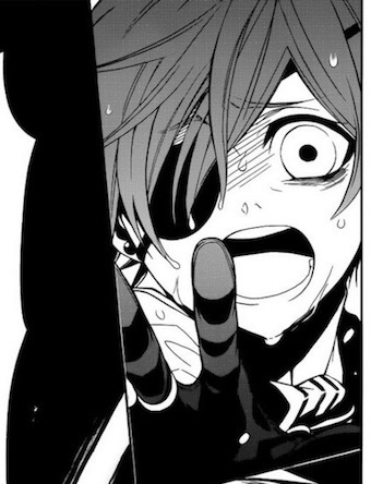
This is a really great panel: Ciel’s face is expressive, the sea water makes it ambiguous whether or not he’s crying or sweating, and it’s from a unique angle that ensures his face and desperately reaching arm are both in the foreground.
Here’s the same scene in the movie:
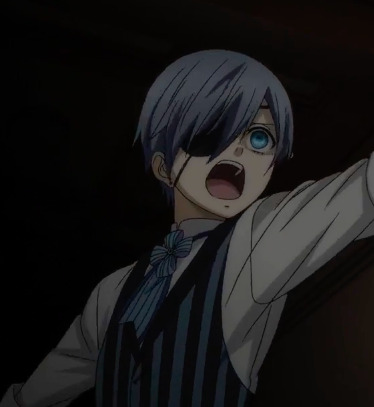
Ciel’s face is less expressive, the angle is a lot simpler, and minute visual details are straight up omitted.
It’s like “yeah, we’re practically using the manga as storyboards*”
*unless the panel is like, hard to draw or expressive to the point where it might look off model.
I feel like the studio was deeply afraid of using animation that was too off model for reasons I don’t understand. Maybe it’s because they were afraid that the characters would look too unattractive but like...
it’s okay to have a character look a little fucked up if they feel a little fucked up.
Returning to Higurashi: that horror series has become famous for its highly emotive facial expressions.
Check out Rena’s furious face in the fourth gif of this set.
Or Rika’s super fucked up expression when suffering intense harm.
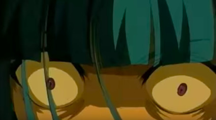
Or the sheer intense terror in Keiichi’s eyes in this gif and this gif set.
Like sure, the show looks like garbage and has lots of other derpy, off model faces, but they clearly had an idea of what they were going for and how to use animation as acting.
I feel that maaaybe the production team for BotA confused looking ugly (having faces distorted by emotion) for looking bad, but that’s 100% speculation.
Part of my reasoning for that speculation is in the following scene:
So, in the manga/BotA, Sebastian and Ciel run into Druitt, and the scene plays out like a well timed joke when Druitt asks them how they know him and they go like this
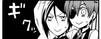
and it’s funny.
The exact same punchline is in the movie but it looks like this
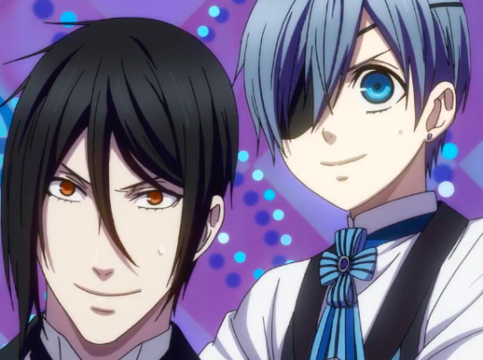
like, the idea of the joke still comes across, but the expressions aren’t as humorously exaggerated and the joke isn’t as funny as a result.
This is also a scene where I don’t want to hear any “this scene looks bad because of money” arguments because drawing the simplistic expression from the manga would have been easier and less time consuming.
Again, let’s look at the comedic scenes from Higurashi:


This particular style probably wouldn’t look good in a Kuro adaption but the idea is that you can deform facial expressions for the sake of joke and sometimes it will make the joke funnier.
The point is also that Higurashi is a really well directed show despite being poorly animated. Can you tell I’m pushing Higurashi?
Please do not misunderstand this point: BotA for the most part has fine facial expressions that communicate the desired emotion. It’s fine. My point is that they probably should have been more daring with their creative choices to make certain scenes more emotionally/comedically effective.
In fact, part of the appeal of animation as a medium is the ability to play with reality through drawings.
Or just, you know, just draw a kid looking sad from a nice angle.
Conclusions:
Kuroshitsuji: Book of the Atlantic is obviously not the worst movie ever. In fact, there are quite a few scenes with good animation, good framing and competent direction.
(Ooh, I should have mentioned this earlier, but there is a legitimately good cut where Sebastian and Ciel are reaching for each other and it shows blood appearing before you see Seb get stabbed. This was a good choice and I don’t think it’s a coincidence that it was not in the manga.)
I can totally see someone saying this movie looks good, and that’s a perfectly justified opinion, I just strongly disagree when looking at the overall product and how it compares to the manga and pretty much every other decently made show/movie.
I’m just upset because this arc in the manga is amazing and the most cinematic, and it clearly was not adapted to its full potential. And now it probably never will be.
Please let the impossible happen and let Bones or Madhouse get the rights for the Green Witch arc and make an amazing adaption. Pleeeaaaassseee.
When I die I want A-1 Pictures to lower me into my grave so they can let me down one last time.
That being said, if you have not seen this movie and (for whatever reason) are dead set against ever reading the manga; give this movie a watch. The story’s utterly fantastic and it’s a...watchable...movie.
But here’s the moral of this whole post:
Book of the Atlantic does not look bad just because it looks cheap. .
Book of the Atlantic looks bad because it looks bad.
Thanks for coming to my Ted Tal-- *passes out*
129 notes
·
View notes
Text
Issue 1: Tass
How long have you had your store: I started officially selling clothes after I finished college in 2013 and moved back home to the suburban midwest, so I guess 5 years now! I was working at the local newspaper at the time but was looking for an extra way to kill time, not necessarily even to make money. I started with Poshmark and loved connecting with other people who liked similar clothes, which was actually kind of rare for where I lived. I loved being able to see people showcase their own style in the form of their own closets and let people “shop their closet”. I also became really interested in clothes trading, which I like doing with my irl friends, so the fact a lot of people were willing to trade items was also really cool to me and something I hadn’t seen before.
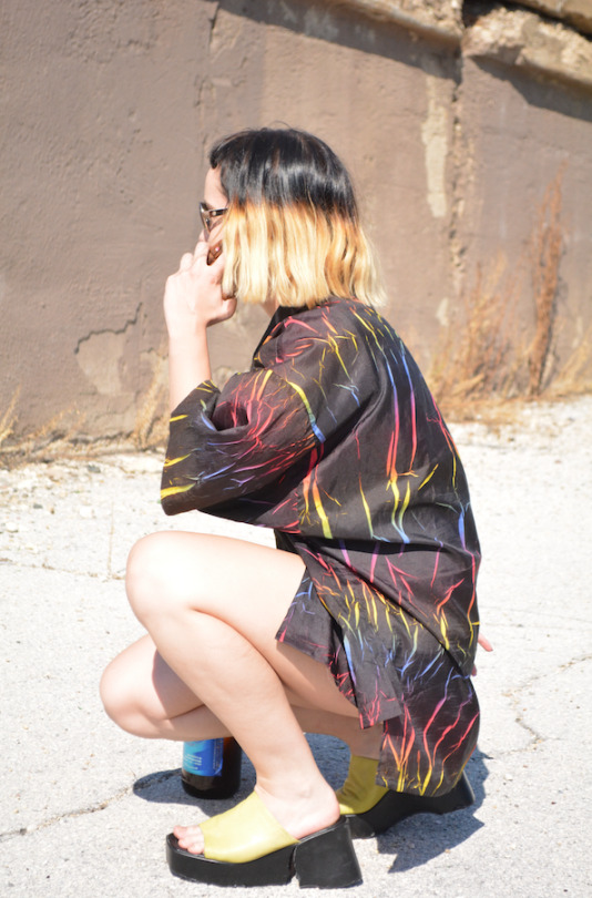
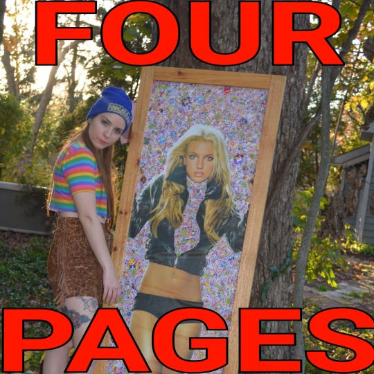
How would you describe your shop? I think the clothes I sell are kind of more one-off like something that would be worn as a funny statement piece - I love a bright color and bold pattern, power clashing, and anything rainbow, glittery or that can incorporate faux fur in a tasteful way. It’s pretty reflective of my midwestern lifestyle and probably the clothes I consistently have the most of are windbreakers and winter coats, the main way we can express ourselves here for half of the year or more… There are a few sticker art projects I have in my store that I started doing around 2012 out of boredom when I was still in school, the most prominent one probably being the 6 foot tall Britney Spears poster that’s completely covered in (vintage) Lisa Frank stickers but never intended to actually finish or take seriously. Over the years I used sticker collaging as a way to keep my mind off things and have it be a means to add color and vibrancy to otherwise more plain posters/art.
When I first opened my shop in 2013, I made a holographic wall out of posterboards to hang my clothes on and that was my first store display on Poshmark and Etsy and always tried to have unique ways to show my clothes ever since, and to change the look of my store at least once a year. I’ve wavered between thinking having consistent “branding” is best and thinking it’s best to change as my ideas change, and have ended up going with the latter at whatever expense that has had, resulting in my store bio now being “Hi I’m Crazy Branding” lmao. The last time I re-did my store I got a mannequin from the city off Craigslist that I painted hot pink and move around my yard or put against different backdrops/bright colored walls to model the clothes. At one point I put velcro on the back of all my stuffed animals plushies and trolls and stuck them to a white wall in my apartment I was living to use as the background. I used to love to bring around solo holographic poster boards to my friends’ houses before we went out so that we could all take pictures behind them as the backdrop, portable aesthetic is essential.
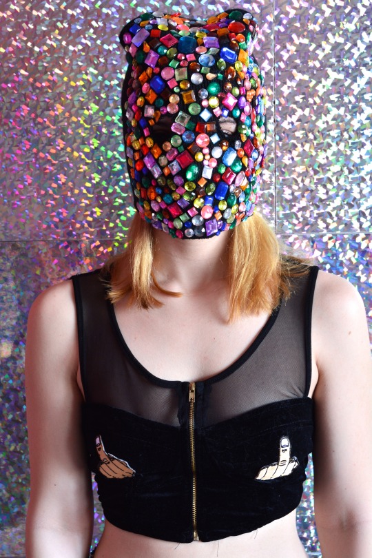
What era or year is your favorite in fashion? My favorite looks are early 90s minimalistic grunge but not too minimal - Black jeans, velvet dresses, and plain tees, all of that, but then on the flip side I love the super excessive part of those eras of fashion too, like rainbow everything and floating glitter inside plastic holographic accessories. My favorite outfit of all time is something my aunt gave me from her 80s closet, it’s a long elastic teal leopard mermaid-style skirt with a matching teal leopard flowy button down shirt, all cotton and polyester. I love outfits that are completely matching like that and have been seeing that lately in brands that I follow, so I hope that sticks.
What item of clothing in the world are you lusting after or saving up for?
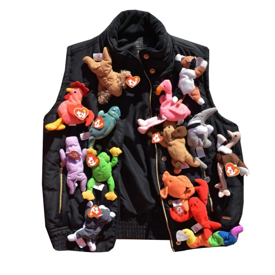
One of those new robot dresses that react to your moods or whatever lmao but if I’m being more realistic there is a designer who I really love that I found on Instagram who knits beaded sweaters using like thousands of different colored beads and completely covers them. They’re works of art and I would love to have one some day and be able to support an artist too! I’m definitely always lusting after new pairs of plain black pleather platform (but not too high anymore) shoes. I love the brand Hot Lava and I guess if I'm saving up for one thing it would be their "Barbed" rainbow matching bralette/pants combo.
Favorite clothing brand/brands and why? Since I usually only buy thrift for myself these days, my favorite brands are probably just based on design only but I love Discount Universe and other sequins-covered clothes or otherwise outlandish/tacky patterns, especially if they’re owned/designed/produced by women - Wacky Wacko, I have the Tabloid Dress they made a few years ago and it’s one of my favorite of all time even though I never wear it I also LOVE everything from Big Bud Press and YardSale666 in general.
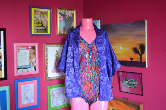
What music do you like, does it play a role in your personal style? The music I listen to most now is probably "experimental pop" and growing up I loved pop punk. Both of those have affected my style and stayed with me to this day, I still wear skinny jeans and slip on Van-style shoes most often no matter what else I’ve layered on top of it. I used to like to purposely wear edgy clothes and do my hair to provoke a reaction out of people when I was younger - my brother would pass down band shirts to me that said things like “What the F*** are you looking at?” (lol) and I would cut them off into a crop top and wear it with a super long high-waisted thrifted pink and purple plaid skirt. That was definitely my go-to outfit for like an entire summer straight. I’ve always liked clothes that makes a statement even if it’s in a literal way with words, clothes with a lot of text on them, and I really like the new wave of DIY embroidery, especially on thrifted or up cycled clothes. Band tee shirts were also just like a huge part of growing up for me, buying them at shows and collecting them and wearing them all the time. Also in my shop I have a guitar that I completely stickered/bejeweled which was one of my longest running projects that I really want to make more of. It was one of my brother's old acoustic guitars that he let me completely deck out and it perfectly combines the femme pop elements I love with an actual instrument. Music and fashion are so intertwined all the time I think, and clothes/accessories are something that always stuck out to me about singers and bands too! I love how fashion plays a role in music today too and can make or break an entire aesthetic or era.
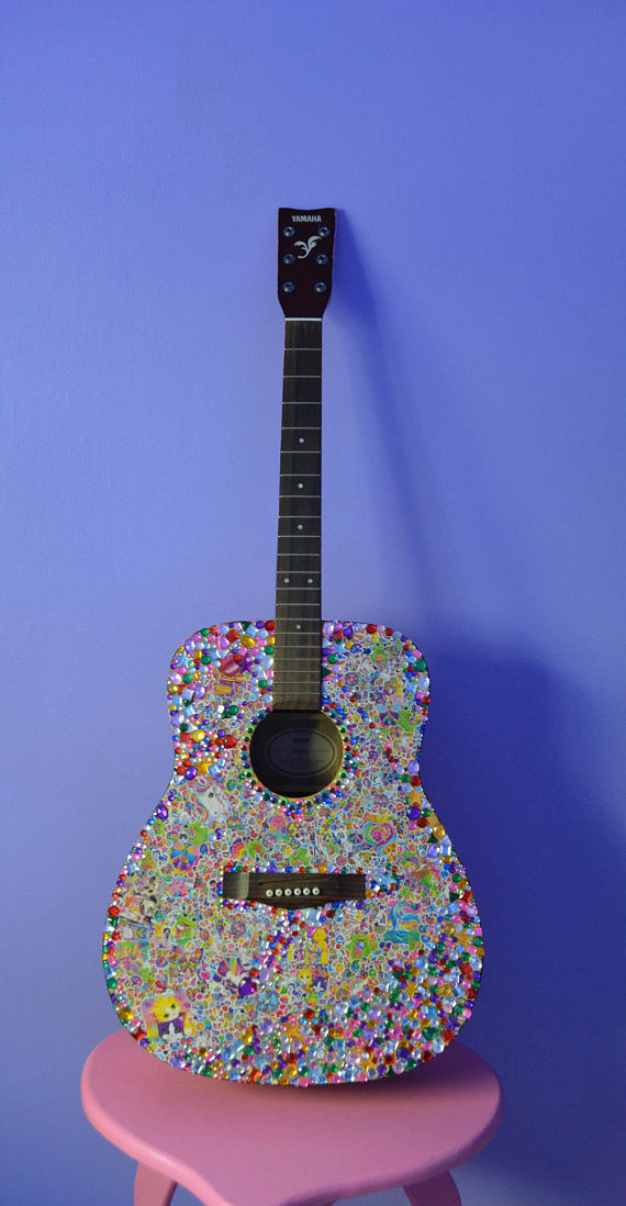
Does living in your city/state inspire you? Where are you most creative? Yes lmao living in rural suburban Illinois actually inspires me a lot and I’m probably the most happily creative here. When I lived in the city, things were a lot more stressful so it made me work on a lot of projects to distract myself, but I eventually burned out from that pretty bad. I get inspired by midwestern people but mostly in a way that most people find cringey, I mocked it more when I was younger but now try to tastefully incorporate it into my looks. State Fair Chic is inspiring to me. My mom has a lot of handpainted and iron-on sweatshirts for different holidays that are staples of my closet. Living in the midwest and being bored definitely made me thrift more and imo makes the thrifting better, it made me always be working on craft projects, and always changing my hair and style.
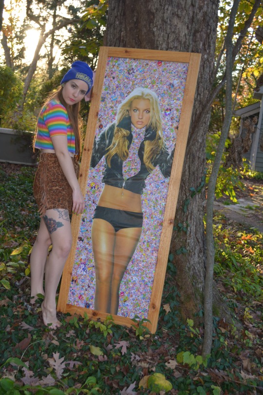
What things do you love to create? I think my favorite things to create are entire rooms and looks, I like to make different aesthetics through combining colors, furniture and fabrics that all feel familiar even if it’s a little chaotic. My long term project with my bedroom was turning my walls of thrifted art (with 20-30 framed pictures) into matching colored frames that fit the whole look of the room, so I guess just really getting at the details of design. I think I’m pretty tacky so I like to stick to things that embody that and will always love stickering huge projects, painting everything plain into bright colors and incorporating anything I find thrifting or in the garbage into larger art aesthetics. My favorite thing to do is thrift and upcycle clothes, furniture, wall art, lamps, etc. anything that I see “potential” in lol.
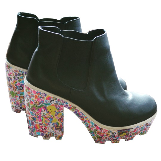
Who are some of your favorite artists?: There are a ton of artists I follow that inspire me every day, definitely just “regular” people or like more lowkey artists. People who thrift or collect and refurbish toys are amazing to me and I love the doll community on IG. Witches or people I’ve met through astrology who are creating more spiritual art inspire me every day with their words and presentations. I also love comedians and movies, I love John Early and Kate Berlant and recently saw they collaborated with Peggy Noland and Seth Bogart of Wacky Wacko so that was iconic to me.
I collaborate a lot with my brother who has done a lot of graphic design stuff for me over the years. He makes resin toys of his own and designs t-shirts. He’s great at painting and drawing, two skills I never was good at that I really appreciate in him that he is always willing to lend a hand to me. He is two years older than me and went to school for advertising so exchanging ideas and doing projects with him is something I like to do too. He also has more of a background in music production so we recently started trying to make music together. We both love combining fashion and music!
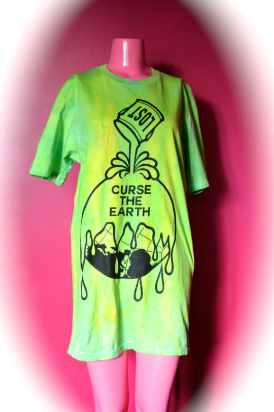
What album do you recommend to pick up ASAP? Hayley Kiyoko - Expectations, hands down the vibe for summer
Follow Tass on Depop!
Depop.com/trashbitch
1 note
·
View note
Text
‘Simple Folk’ - Flat Illustration Workshop
Artist Influence
Before getting into any practical work, I wanted to establish a list of key principles in which I could use for my own work. I did this in my Saul Bass case study and found it to be very effective in taking direct influence from something. To get these, I looked at the following artists which have a flat and sometimes minimalistic art style.
Lillie Carre
Oliver Jeffers
Luke Pearson
Eleni Kalorkoti

Mirroring the Saul Bass case study, I made a list of rules to follow in order to maintain a similar style with the outcomes of this workshop. These rules were:
No gradients, just use flat colour to build tonal value
For texture, only use a subtle grain
Leave plenty of negative space to draw focus to the main subjects.
Throughout all of the work, these were the aspects of visual language that caught my attention as they are consistently used effectively.
Materials and Tools
Pencil
Paper
Scanner
Mac
Illustrator
Rectangle Tool
Ellipse Tool
Pentool
Direct selection tool
Pathfinder Window
Shape Builder tool
Process
The first task was to sketch someone and try to simplify their face as much as possible. The person I chose as my subject was Bob Ross. As well as being arguably one of the most influential artists, his hair is an iconic feature which is largely associated with him, so I thought this would make it easier for me to illustrate something which could be recognised as Bob Ross. Whilst sketching I kept in mind that geometry was a large part of the artists’ work I looked at beforehand. So my method of simplifying was to just construct the facial structure from circles and lines, and I feel like this is what mainly gave them their ‘cartoony’ effect much like the artists I looked at.
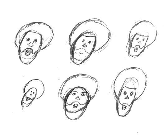
This is an important part of developing an idea because it allows for a quick way to generate lots of variations of one idea you may have in your head. So for this task I gave myself a very limited amount of time for each small sketch which made me make decisions I wouldn’t have thought of if I gave myself more time to sketch one idea. As an example, after a few times at sketching the beard, I found it quicker to use a shape which resembles a rounded rectangle for the top, which not only made it easier to repeat but in doing so I simplified my first idea further.
At this point, I had a simplified version of my subject which follows the rules I set myself before. Now I could take this into Illustrator as a reference and start the process of making a digital illustration with various shape tools.
I scanned the sketches in, and cropped the one I think worked best at showing the construction of shapes for the head, in this case the top left sketch. After this, beginning the digital process, I started with a rectangle by using the rectangle tool, which I then built up the different features on top. The hair was the next feature as this was the main feature which was going to decide how similar the illustration would look to Bob Ross. For this I just used a singular large circle using the Ellipse tool, but by holding “Shift” whilst dragging the tool I was able to keep a 1:1 ratio and therefore a perfect circle. Following this was repeating the use of these two tools, along with the direct selection tool to select individual points of paths to adjust the position of to create all of the other facial features (beard, mouth, nose and eyes). At this stage I had used an outline for all of the shapes so I could easily see where everything was placed, as with a fill certain shapes may get hidden under others. Once I had the general structure, I selected all of the shapes, and used the Shape Builder tool to combine shapes or get rid of unwanted areas, to create a combination of more complex shapes which would then take the shape of the final face. However I was still using outlines, and at this point I was satisfied with the shape and positioning of the face and features, so I added colour which then made it easier to see it was a person and separate the large areas of skin from the large areas of hair.

At this point I was happy with how the face had developed, but I thought there was an element missing between what I had created and the examples I looked at in the beginning of the workshop. Because of this, I looked back at my rules and the examples of work to find shadow and highlights were something I had not included, which at this point I thought would transform it into something closer to the artists’ work.
The next step was a personal extension to the workshop, as the workshop didn’t ask for anything more than singular flat colours. For the shadows and highlights, instead of using shapes to construct them, I used the pentool in an attempt to get more organic lines and create a juxtaposition between the geometry of the face and liquidity of the tone above it. With the highlights, instead of creating fill objects with the pentool, I created a single path which I added a stroke to in order to make it as accurate as possible. This was to not redirect the face from it’s original geometric aesthetic.

Reaction
Overall, this workshop was a success for me. I learnt how to simplify someone into a character which could be used for a huge range of things. Because it is in vector format, it is perfect for print or large scale digital use. As well as this, from the start of the project I have wanted to explore illustration and how that could be used in my final outcomes. With this style of simple flat illustration I feel like I can apply these skills to work in the future without ignoring my initial artist research. The styles of my original artists show through this workshop so I am confident this has helped me develop skills I can use effectively to create something I will be happy with.
Looking forward, I am planning on further exploring illustration in similar but varying styles. Maybe using more abstraction in terms of the visual language (colour, line etc.) to create something with more inhuman qualities.
Linking to the Brief
Illustration has always been something I’ve wanted to explore, so it was good for me to do so whilst looking at a key style. The artists I’ve previously looked at I’ve found rarely use patterns, so finding a link between this workshop and the pattern workshop was quite difficult. As a primary aspect of their work, patterns would deter the audience from the work itself, which further solidifies my point of using excessive pattern will make something less effective in communication. Lillie Carre is the most noticeable use of pattern out of the examples I chose. Her pattern usage however is completely hand-made, making it more authentic than the digitally produced patterns. The hand-rendered quality is portrayed well and this is complemented by the roughness of the patterns, which still tessellate but not perfectly systematically. This is a perfect example of how they can be used subtly but powerfully.
Lillie Carre also makes work tailoring to a younger audience, which makes her work all the more relevant to the brief as I am also aiming to do so. Book illustration is a good example of how culturally, this type of work can influence a group of people. The illustrations featured in books is exactly what turns them from a book into a story; an experience for a young person.
0 notes